#so by rotoscoping i mean marking position of the body and guessing how should I draw and shade it
Text

I still remember the day when I accidentally saw the spoiler and people were like "oh, but it was without a context, we have to wait for it!" and it made me truly curious and excited to see what the whole scene was about
And let me tell you it turns out I was perfectly happy not knowing what it was about
(But you know, curiosity killed the cat. And I loved this scene, it was positively heartbreaking, angst in its truest form. Exactly opossite to what I expected to happen knowing this season was supposed to be quiet and gentle and romantic, really.)
#good omens#good omens 2#good omens season 2#good omens spoilers#go season 2 spoilers#fanart#digital#animation#crowley#david tennant#aziraphale#michael sheen#ineffable husbands#not exactly quiet and peaceful and romantic#wonderful scene though by the way#definitely worth watching and crying over it#and yes I rotoscoped otherwise it would take me days#I don't have days#I also didn't have good quality pictures#so by rotoscoping i mean marking position of the body and guessing how should I draw and shade it#you can see it by the awful quality of some frames
1K notes
·
View notes
Text
Motion Poster
Ideas:
When this task was set, I had three initial ideas that came from my creative vault storming my brain; the first was creating a book ad for my favourite book, The 48 Law Of Power.

The book tells stories from eras all across history and breaking down the moral of the story and how to implement that into your life to achieve ‘Power’. Originally I wanted to do an edit that resembles a title sequence, but instead of the names of the people involved it had different laws, for example there was a Law based on King something of somewhere, and for that I wanted to put the laws name and add a 3D crown with stuff going on through the background, it was going to be like the Vikings title sequence.
But then I decided that I might save that for my 3D tracking project even though I have a different idea for it already.
The second idea was to do 3 motion posters for the upcoming game, Battlefield 5, which is set in world war 2, I had a great plan for it but it also required a bit of 3D so i decided to save it for later since i don’t want to bite of more than I could chew.

My final idea and the one I ended up executing was creating 3 motion posters for Footasylum, a street wear store that focuses on trainers.
About Footasylum
By no means is Footasylum the biggest trainer retailer in the UK, it would probably be JD or Footlocker, but I decided to create my motion posters for Footasylum because it is the only one out of the two that appeals to the streetwear culture. They do this by endorsing Youtubers and UK celebrities that are big in the streetwear culture. They also adapt street brands that the other two retailers avoid such as Glorious Gangsta
youtube
JD has a foot in each playing field, streetwear and sportswear, because most of the streetwear fashion is taken from sportswear, the tracksuits and trainers especially, so making a motion poster for them would make me adapt the sport aspect in the poster. Footlocker is completely focused on sportswear, and I’m just not interested in sports at all so I’d rather avoid spending a whole project on creating a sports motion poster.
Posters
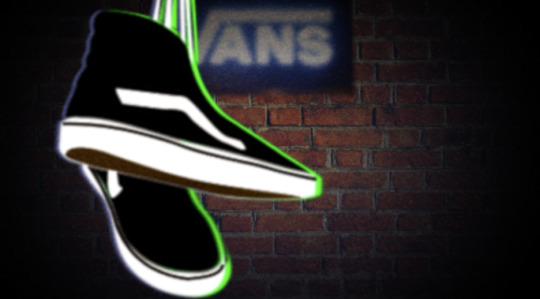
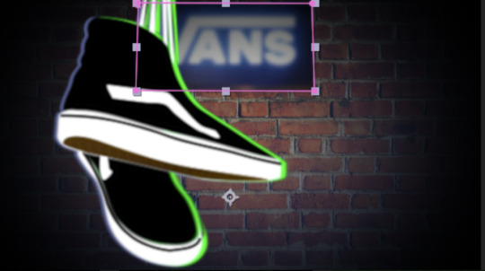
Vans
For my first motion poster, which is the one that involved the Vans.
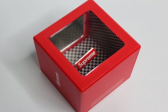
I wanted to create a illusion box like the ‘Supreme illusion coin box’, but instead of just checkers I was going to have the Vans checkered print on there.
But then I wasn’t convinced that it would look good and decided to go for my second choice which is the hanging shoe piece which is inspired by the old trend of having shoes hanging over wires.
Vans is a skateboarding brand, it is deep in the streetwear culture and has a history in it. So something like this is like paying homage to it’s journey and that it survived for so long.
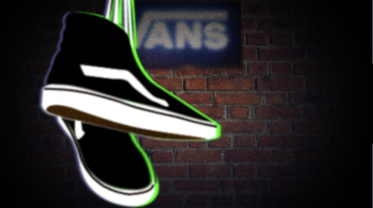
I wanted the show bouncing result, as if someone has just hung them over, so I asked my friend to hold the shoes from a high place then drop them but pull them up again.
This achieved the desired result but was a pain to rotoscope which resulted in a lot of wobbly lines.

This clearly isn’t enough by it self, so I added the green outline since it is a Footasylum motion poster, and their colours are black and green.

Then I added a brick wall to emphasise the streetwear aspect. Then I added a shadow using a black solid, but it still looked plain so I added a Vans store sign which bought it all together, blurring the sign made it seem more real, because after the sign was added I had to take it into account and that’s when I added the blue.
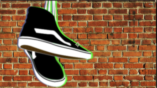


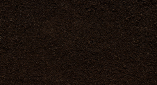
Finally what really bought it all togther and made the piece miles better was a dirt overlay that helped hide all the mistakes.
Problems and Solutions:
The biggest problem that really slowed me down was the laces on the body of the shoe, not the ones hanging the shoe. Rotoing them would’ve taken for AGES so i just settled with the laces I had and decided to mask over them and make them look as if they’re part of the body.
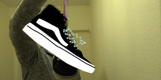
Also to achieve a nice base effect and make it look like rubber I rotoed out the bottom and applied a layer effect to it to make it look better and more like rubber.
I also filmed this in 50fps without realising so I had to rotoscope even more, I had to keyframe once every 5-9 frames whenever I could to stay in the time limit.
Evaluation:
Overall with this particular motion poster I didn’t commit much research for, it was more of a creative spike that just hit me so that’s why this didn’t mention any inspiration because there wasn’t really any, I didn’t have time to even explore because I spent way to long rotoscoping the shoe.
Which brings me to my next point, the rotoscoping of the shoe was 50/50 I’d say, the upper body was solid and the gum surface was ok too, but the sole and the sole rubber which is the black line going across was wobbling like crazy, I guess I added too many keyframes, but also there was so much motion blur that it was kind of difficult to place the mask correctly. But with everything together, the brick wall, the sign and the dirt overlay, I’m not too mad with this piece. The only thing I forgot to add was the “Available at Footasylum” text at the end, I even left a bit of space for it but it just slipped my mind.
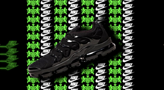
TN Vapormax
This is defiantly my favourite and it came out exactly how I imagined it, I actually managed to add to it and make it look even better.
So this piece is obviously inspired by the carpet photoshoots where they have a print of the networks logo behind the star, and since the TN Vapormax is a new shoe and foot-asylum was trying to introduce to the world I decided to put it in the star position and have Footasylum’s logo everywgere because it is their event.

The colour choice also came from Footasylum’s website, it consists of a lot of greens, and whites with a black background. Its huge part of their brand, instantly recognisable colours.
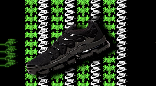

Originally the print was all footasym, and the print was animated to go up, all of it.
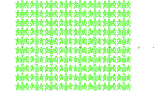
I found out that it kind of irritated my eyes and it caused blurriness because all the greens will merge. So I decided to add a nike column and animate it to go downwards instead and it looked much better.
A thing I’m really pleased with is the nike neon sign as the bottom left, it just felt like that the side was empty and needed something to fill it, I’ve also been trying to find an easy neon effect and I finally manage to accomplish it, it also helps that it is small and not the centre of the screen so people wouldn’t really notice how bad and simple it is.

After I finished this piece I looked at it and thought why don’t I have a go at adding camera flashes since this was inspired by the red carpet shoots, plus it was a little plain, just a little, the camera flashes where the cherry on top.

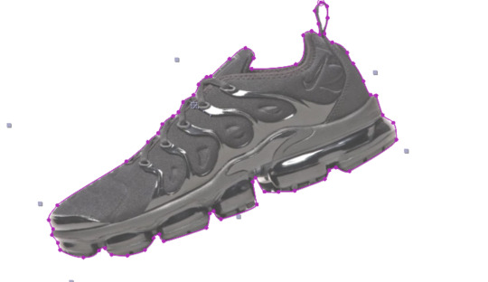
I also used to different images of the shoe to make it look like a 360 view, I had them animated as if they were striking poses for the cameras.
Problems and solutions
There were a few problems with this project, not much though. The main thing is that I probably precomped ALOT, more than I should have, but sometimes I just did it to get rid of the mess in the main comp, because the print used up a lot of layers and it would’ve been a nightmare to animated each print separately. Another small problem was the shoes looked plain so I had to give them ‘life’ essentially and make them look desirable.

Finally I just added blur and contrast on all layers to make it look smoother.

Loop Poster:
Ok so this is the one that i had the highest hopes for, and the only thing that let it down was how fast everything was animated, plates were barely on the screen for more than a second at times, but other than that, if you play it slowly it’s a decent piece.
This piece was inspired by a scene of an anime called mob Psycho, skip to 13 sec.
youtube
Out of all the whole opening I was excited to attempt the phone transition the most and then make it loop from there, but sadly I didn’t have enough time to attempt it.
I like this opening because it is trippy and it is filled with assets, there’s always more than one thing going on. And that’s how I feel footasylum treat their posters, always full.

I ended up with a phone transition to promote footasylum’s instagram but it was animated too fast so you didn’t really get to see it.

Not much to say about this one honestly since I didn’t have time to screen shot it and explain what I did like the others.
Conclusion:
In conclusion I feel like I really, hit the mark with promoting Footasylum, I used mainly their colours in my work, black, green and white, the quality of the motion posters is sort of consistent across all three, apart from the last one where I miss calculated the time.
I would’ve liked to do something with the ‘asylum’ in ‘footasylum’ since it is halloween, I thought about putting shoes in cages and having them wobble about like they’re trying to break out and kill you, but I literally came up with that concept on Thursday and the deadline was Friday so sadly I didn’t take an attempt at it. Also the trippy phone transition is something I really wanted to do but time is always against me I REALLY need to start planning my time.
But its not all bad because the red carpet type motion poster featuring the TN Vapormax was phenomenal in my opinion, probably had a bit to many camera flashes but they go overboard in the red carpet too so I don’t really know.
Overall I am content with this project and feel like I gave it my all.
0 notes
Last Seen Blogs
lswieckitay
Logan Swiecki-Taylor

moodysasuke
Are You Banging Your Head Against a Wall?

ruinoussigil
small nut

abestcareswhouston-blog
Outstanding assisted living placement Katy TX