#so when I put stuff in the search bar and only got a couple relevant posts I got very sad
Text
Guess who just figured out how to properly look through the will of the many tag here on tumblr???
Anyways there’s more of us than I thought in this wee little fandom, which makes me very happy
#the will of the many#I’m lowkey still kinda new to tumblr#so when I put stuff in the search bar and only got a couple relevant posts I got very sad#we’re a small but mighty fandom#seriously tho someone please make more fan art#I would if I could#my posts
4 notes
·
View notes
Text
The Sommelier (Hannibal x Female!Reader) pt. 2
Since the police department let the youth pastor get away, the FBI has to step in. Will suspects something is off, but nobody listens. @deadman-inc-bikeshop this one’s for you, comrade
Trigger warnings: discussion of substance abuse, drug use, blood, graphic descriptions of violence, Christianity
Will had become somewhat of an expert at tuning out background noise. The shuttering of camera lenses, the blasting of sirens and of course all the talking. The dissemination of information between parties; some relevant, and some just noise.
Another inept local police department let a killer get away. That put the onus on the FBI to clean up the mess. With a restaurant full of witnesses, Will doubted his usefulness to this particular investigation. Surely, they could get a more thorough description of the killer from eyewitness testimony. He thought maybe Crawford was getting too comfortable with his secret weapon.
But Crawford wouldn’t have let Will get involved if he had any doubts that this one would kill again. And he was determined to throw every weapon in his arsenal at this case before it happened. The blood wasn’t even dry yet. This was as much of a head start as they could hope for.
So, whether he felt it necessary or not, Will Graham sat at the corner booth, stone still, while the investigation progressed around him.
He put the scene in backwards motion. No police, no media, not a drop of blood in sight.
This is the day the lord has made. Rejoice, rejoice, hallelujah.
The restaurant was packed from corner to corner with bodies and sin. People, sinners, who didn’t deserve to have Christ’s name on their lips, let alone blood on their hands. Sinners who wore cross necklaces, but couldn’t carry a cross.
Today I will save lives. This is God's design.
The waitress approached. Asked for a drink order.
My grip on reality is still firm enough to initiate worldly conversation, so long as it is in the pursuit of rescuing souls.
She was visibly uncomfortable. Not willing to engage in conversation.
My patience is dwindling. I must heighten my senses.
He placed a bit of cocaine under his nose. The clarity hit him all at once with a glance at the specials menu.
It's a sign. The lamb of god must be avenged.
He gave the waitress one last chance. If she had repented right then and there, perhaps those people would still be alive today.
With that small display of empathy, Will was ripped from his trance and brought back to reality. He took off his glasses and pressed his fingers to his forehead.
"Welcome back." Jack greeted, dryly.
Will stood up. "I really should have paid more attention in Sunday school."
"Well, how about you tell me what you can." Jack answered. "See if I can fill in the blanks."
"Okay, first of all," Will sighed, trying to collect his thoughts. "This man is deeply deluded."
"Forensics already found trace amounts of cocaine on the table." Jack agreed with a nod.
"No, see-" Will stopped him. "This is a deep-rooted, purposeful delusion. The drugs feed the delusion, not the other way around."
"And what is this delusion?"
Will took a deep breath in. "This guy believes he's some kind of divinely-ordained morality police. And the waitress was the catalyst for this spree killing."
"So, what did she do that was so egregious?" Jack folded his arms. "Have a small tattoo? Wear her apron too tight?"
"She was working on the Sabbath." Will said.
“So he’s a literalist.” Jack inferred. “Realism and practicality be damned. Hard drugs will do that to you.”
Will was starting to grow annoyed. “Pretend for a minute that he wasn’t high.”
“That’s a pretty tall order.” Beverly interrupted from across the room. “Turns out his coke was as pure as it gets outside of the rainforests of Colombia. Might as well have snorted a leaf right from the tree.”
Jack turned to face Beverly, who was scraping under the fingernails of a body. “Sounds expensive.”
“Well, that eliminates one suspect.” Will commented under his breath. “The FBI only deals the cheap stuff.”
Jack’s face hardened. “Something to add, Will?”
“Yes, actually.” Will tilted his head. “Are we here for the murder, or the drugs?"
"What does it matter?"
That was most assuredly not an answer.
"Do we want this guy in prison?" Will adjusted his oversized coat. "Or are we going to grant him impunity for telling us where he got this particular brand of powdered sugar?”
Jack heaved a frustrated sigh. "We're not in any position to refuse information about a potential drug trafficking ring. If that means amnesty--"
"So if this is a drug bust, why do you need me?" Will cut in.
"Where is this coming from?" Jack protested. “If you have a problem with this investigation, you’re free to leave.”
If that was a bluff, Will called it. He walked out. Jack clearly wouldn't listen to him, so he was off to the person he knew would.
He almost regretted that decision when the esteemed Dr. Lecter took it as an opportunity to dissect him. Any chance Hannibal got to put him under a microscope, he took. A part of him knew that and another, subtler part liked it.
"Federal intelligence agencies and cocaine have a complicated history." Hannibal said as simply as if he were describing a married couple. "It's not something I would imagine Crawford likes to bring up."
"And now he's trying to absolve himself." Will leaned forward in his chair and rested his arms on his knees. "Trying to put the FBI back on the right side of history."
"So why did you walk out?" Hannibal raised an eyebrow.
"I'm a profiler, not a drug-sniffing bloodhound." Will shot up from his seat. "I made my analysis and he dismissed it out of hand."
"So this is a matter of pride." Hannibal concluded.
"You could say that." Will mumbled. "Some would call it self-respect."
"You are not one to talk about self-respect." Hannibal smirked. "Especially not with a jacket covered in dog hair."
“What if there was a way to turn this investigation around?" Will offered, electing to ignore the snide commentary.
“You’d have to find some way to prove that he would have struck with or without the cocaine.” Hannibal tented his hands in his lap. “Re-center his motivation.”
“His motivation was justice,” Will said. “Or at least some perverted, fundamentalist Christian notion of justice.”
Hannibal gazed admiringly at Will, as if watching the gears turn in his head. “You and I know this, but how do we go about proving it?”
Will dropped his shoulders. “We’d have to find the man first.”
Hannibal glanced down at his phone and punched an address into the search engine. He made a small, but noticeable gesture that caught Will’s attention.
“I hardly ever see you use that thing.” Will chuckled. “What’s got you so interested?”
Hannibal placed his phone face-down on the side table. “One of my favorite wine bars is re-opening soon.”
#will graham#hannibal lecter#hannibal x reader#jack crawford#beverly katz#hannibal nbc#hannibal x you
164 notes
·
View notes
Photo

My family's beloved 16-year-old Siamese cat, Webley, died in my arms last year. He'd been a sleek fat kitty before he got ill, but he'd lost weight and lost weight till he was little more than a bedraggled shadow. At the end he could barely lift his head, and then the vet gave him the shot and he couldn't lift his head at all. I was scratching his ears as I'd so often done before, and suddenly they dropped, and whatever I was petting wasn't Webley anymore. It's one of the worst memories of my life.
I've been thinking about Webley a lot while listening to the new Fire-Toolz album, Rainbow Bridge, which comes out May 8 on local label Hausu Mountain. Angel Marcloid, a Chicago musician who records as Fire-Toolz (as well as under several other names), made Rainbow Bridge about her 16-year-old cat, Breakfast, also a Siamese, who died in December 2018. The album is an idiosyncratic collage of guttural death-metal roars, electronic bleeps, and vaporwave ambience. Bleak, sweet, and quietly unflinching, it slides back and forth between two emotional poles: one boils with rage and grief, while the other is steeped in a comforting lyricism as gentle as a cat rubbing its chin against your hand. "It's been a while, but I think about her every day," Marcloid says. "I still have moments where I feel her close and I just cry a whole bunch. I've got her ashes two feet from me right now. I have a tattoo of her on my chest. So yeah, I'm happy to honor her in my music."
From as early as she can remember, Marcloid says, music made her feel things "that are just so abstract and visceral and hard to put your finger on." She was born near Annapolis in 1984 to a music-loving family; her parents constantly played CDs of hair metal, the Beatles, and her all-time favorite band, Rush. Marcloid started making little drum sets out of pots and pans almost as soon as she could walk.
Her first public performance was when she was seven. Her parents knew a local bar band, and she sat in with them to play drums on a cover of the Black Crowes' "Hard to Handle."
"This is a smoky bar, women showing their boobs and stuff—it was not an environment for kids!" Marcloid says. "But I sat down with the drum kit and we played the songs, and they were just amazed. They were looking back at me while we were playing, like, 'Holy shit! This kid's actually keeping time!' I'll never forget walking off that stage, and all these drunk, smelly adults cheering me on, and a couple of people just gave me money. 'You're awesome, kid! Here's 20 dollars!'"
Marcloid soon taught herself to play guitar and bass too, and her musical interests expanded. As a child she had a formative late-night exposure to Morbid Angel's 1993 video for "Rapture" via MTV's Headbangers Ball, and soon she was also listening to jazz and electronica. She performed in several short-lived bands, and in the late 2000s she launched her own label, also called Rainbow Bridge. Through it Marcloid released cassettes and CDs by other musicians, as well as a blizzard of her own music under various names—including ambient acoustic music as the Human Excuse, punky dream pop with the trio Shadow Government, and electroacoustic noise as Water Bullet.
Marcloid came to Chicago in 2012 to move in with a girlfriend, who owned several cats and had just adopted Breakfast. Like most Siamese, Marcloid says, Breakfast "has always been a little strange." She was neurotic and disliked the other cats, and she never really warmed up to Marcloid's partner. In fact she only had one clear favorite. "She took to me immediately," Marcloid says, "and always wanted to be on me and just wanted to spend all her time with me." When Marcloid and her partner split up, there was no question who Breakfast would go with. The kitty ended up spending most of her life in Marcloid's bedroom to avoid other cats. "The rest of the house was just scary for her. There were too many other cat smells," Marcloid says.
"On the one hand, it may seem weird or maybe even borderline cruel to keep a cat in a single bedroom for their entire lives. But that's what she wanted; she was happy."
Marcloid has featured Breakfast in tracks throughout her oeuvre. "Spirit Spit" from the 2017 album Drip Mental (Hausu Mountain), for example, is a short wordless suite in which Marcloid imagines the usually shy Breakfast grown adventurous enough to go exploring in the house during a storm. The track opens with Breakfast engaging in some Siamese vocalizing and squawking, with thunder in the background. The rest of the narrative unfolds through auditory cues. "She comes down to the basement and turns on her ancient computer, which dials in to AOL," Marcloid explains. "Then she puts on a Telepath CD, which is a vaporwave artist that I absolutely love. You can hear the CD drive opening, you can hear the Telepath song start. And then she types some stuff and is meowing. And then she turns off the computer and goes back upstairs."
In 2018 Breakfast began to go into kidney failure. She was constantly peeing in Marcloid's room, and she wasn't eating. Eventually she was so uncomfortable and miserable Marcloid had to euthanize her. "And that was just so fucking traumatic for me, and so emotional," Marcloid says. "It really energized the search for truth and meaning that I had already begun years ago."
Marcloid began making Rainbow Bridge during Breakfast's illness. The title isn't just a callback to her record label (which she folded around five years ago) but also a reference to contemporary folk mythology about a rainbow bridge that, in Marcloid's words, "our pets either cross when they die to go to the other side, or they go there and they wait for us." The cover art, by Marcloid and Jeremy Coubrough, shows a Siamese cat sitting in a green field with her back to the viewer, looking at the prismatic steps of a bridge that leads upward into a kind of bloated growth of exploding colors.
The chaos of different hues fits the Fire-Toolz aesthetic. As Hausu Mountain cofounder Doug Kaplan puts it, "There's just nobody else that sounds like this, and there will never be another. Each track goes a billion different places but has a strong sense of oneness." Marcloid's other projects often follow particular rules or fit into particular genres; Mindspring Memories, for example, is mostly slowed-down and otherwise manipulated smooth-jazz samples. A recent album under the name Path to Lobster Believers is tape-collage improvisation. But with Fire-Toolz, Marcloid says, "Anything goes. It's a no-rules catchall; everything reports to it. It's the top of the pyramid."
The violent shifts in tone and genre on a Fire-Toolz track often feel exuberant and playful. On Rainbow Bridge, though, they create splatters of emotion: nostalgia, confusion, loss, hope. The opening track, "Gnosis .•o°Ozing," starts out as ranting death metal, with Marcloid screaming distorted, virtually indecipherable lyrics: "Arms wrapped in neon like a warning / A rainbow bridge unfurling / And now I lay listening to nothing / I feel my organs locking up."
By the second verse, she's superimposed smooth-jazz keyboard flourishes atop the noise, so that it sounds like the metal is battling easy listening, anger struggling with happier memories. "Layers in grief not unlike stages of passing / There are many / Not too many / Not so much."
The video for the song "Rainbow ∞ Bridge," created by Marcloid with Armpitrubber (aka Christine Janokowicz), provides an intense visual analogue for the music's smeared palette. This song too starts with a death-metal feel, pairing double kick drum with Marcloid's throat-tearing vocals. "Please don't be mad that I cut your cord / Fear lodged in my gums / Pressing into my face with fingerlike force / Breakfast!" she yells, as images of the kitty strobe and dissolve into colors, lights, emojis, a door opening, SpongeBob screaming. Tinkly new-age keyboard ambience plays over purple clouds and the on-screen words "Heaven! They say I can sit and soak you up." A guitar solo fit for a classic-rock ballad cuts through the shifting landscape, and then the song briefly fades into ambience as Breakfast romps across the screen and dissolves. It's a vision of a loved one disintegrating, perhaps into nothing, perhaps into memory or heaven, while pain and happiness alternate in spasms of glitches.
"Heaven has no location," Marcloid howls near the end of the track. That's a statement of spiritual hope; heaven is everywhere, Marcloid believes. "It's not any particular place. It's something that is all-encompassing," she says. "I think that it's everywhere and everything. It's the flow of life." You can hear that hope on tracks such as "⌈Mego⌉ ≜ Maitrī," which is all gentle surging keyboards and pattering electronica, encouraging you to gently drift into an ether of soft fur and purring.
A heaven without location can also simply be a heaven that doesn't exist, though, and that fear and doubt is also part of Rainbow Bridge. On the jittery "Microtubules," a throbbing beat loops around and around as Marcloid asks, "Were you afraid of crossing?" It's an unsettling question: of course she'd worry about a cat who never wanted to leave the bedroom going off on a long journey alone.
"When Breakfast was sick, anxiety was a huge, huge part of it," Marcloid says. "And even after she passed, and I knew that there was nothing to be done, there was still so much anxiety. I became frustrated because I wanted to know where she was, if she was anywhere. I just want the truth. I don't even care what it is, even if the truth is we're all just dead, and that when my body stops working, it's completely over."
Marcloid finished Rainbow Bridge months ago, and of course she didn't know it would be released at a time when anxiety, uncertainty, fear, and isolation would be so pervasive. In the context of a pandemic, the album seems even more relevant, not just because of its grief but also because of its prescient reminder of the importance of pets: during the stay-at-home order, animal adoptions have broken records as humans turn to cats and dogs to keep them company, and keep them sane, in isolation.
Marcloid adopted another cat herself after Breakfast died, and she now has three. "It's incredibly comforting to have them during a time like this," she says. "They're a solid rock for me to lean on. Especially lately, because they just don't fight with themselves. They're just such simpler creatures, and they're so much more connected to reality than any human could possibly be because of how complex our lives are. When they're in pain, they'll react—they won't like it, but they don't conceptualize and theorize about it. They don't get into this existential dread. They're just in pain, and they just want the pain to go away. That's all it is. It's that simple. We are just hopeless cases in comparison."
Marcloid's music, for all its genre shifts and chaotic oddness, can also reach for that kind of simplicity of thought and emotion. The six-minute instrumental "Angel (of Deth)" is elegiac, oceanic Muzak—a soundtrack to play while the waves roll in, or while watching a kitty sleep. At its conclusion the track breaks up into electronic blips and warbles, as though the world were coming apart and something else were wavering into existence behind the static.
"It's a mystery because we don't know," Marcloid says. "So I have to love and honor that mystery. I don't even know what God is, or if God exists, but whatever it is, that's what I love." Marcloid's tribute suggests that cats may know more about love than we do. They trust you even at the end, to help them die. Rainbow Bridge is not just a eulogy but an expression of hope that they'll lend you a paw in turn when your time comes. It's a comfort to think that when you start up those stairs, there will be a small someone to show you the way.
5 notes
·
View notes
Photo

Even if you think you're already a Google pro, these tips – including how to add search shortcuts to your browser’s address bar – will help you find what you're looking for even faster. https://t.co/vMAq5qJdl7
— The New York Times (@nytimes) September 1, 2019
Use quotation marks to find a specific phrase
It’s one thing to search for a couple of words, like Sony HT-Z9F soundbar, and find the product(s) you’re seeking. But let’s say you need more specific information — like the dimensions of the speaker drivers inside that soundbar. Searching for HT-Z9F soundbar driver diameter does not return any pages that list that particular spec, nor does including the word inches. Instead, we need to think about how this would exactly be phrased on the page, and use quotation marks to narrow our search.
When you put quotation marks around a collection of words, it tells Google to look for the words only in that order. So, sony HT-Z9F inch drivers (don’t worry, capitalization doesn’t matter) will search for any page that has the words “inch” and “drivers” on it — but not necessarily together. Searching HT-Z9F soundbar “inch drivers” on the other hand, narrows our search considerably, producing a result right at the top that lists the exact spec we’re looking for: 2.5-inch drivers. (If you can’t find the terms you searched for on the resulting page, press Ctrl+F on your keyboard — Command+F on a Mac — to locate your words on that page.)
Bonus tip: If you’re looking for a specific page but aren’t sure the exact words it uses, you can put an asterisk in those quotes to symbolize any word. For example, if you forgot the title of Taylor Swift’s dance-pop single from “1989,” you could search taylor swift “* it off” and find the “Shake It Off” lyrics you’re hunting down.
Exclude words with the minus sign
It’s frustrating when a search returns oodles of results that have nothing to do with what you’re looking for. This is especially common with homonyms — words that are spelled and pronounced the same but have different meanings. For example, let’s say you’re searching for a music group to play at your wedding. Searching for wedding bands brings up a ton of results, but most are for wedding rings — often called bands — not musicians that play at wedding receptions.
The minus sign is your friend here. Think of a word that would appear on all the irrelevant pages — in this case, “jewelry” or “jeweler” is probably a good bet — and include it with a minus sign in your search: wedding bands -jewelry. Just like that, you’ve got yourself a bunch of sites that review wedding bands across the country.
I also use this often for products with similarly-named siblings — say, Apple’s MacBook line, which includes the MacBook, MacBook Air, and MacBook Pro. Getting too many results for the Air and Pro? Just eliminate them from your search with macbook -air -pro and you’ll get more relevant results.
Narrow your search to a specific time period
If your head is spinning after that last one, here’s an easy tip for you. Occasionally, search results will consist of older articles that have ranked on a given topic, but haven’t been updated to include recent changes. If you encounter this problem, you can put a date restriction on the results by clicking the Tools button under Google’s search bar, and then clicking the “Any Time” drop-down. You can narrow your results to the previous week, month, year, or a custom time frame.
Search your favorite sites with the “site:” operator
If you’re looking for an article you read a while back, but can’t find now — or if you specifically want to see what one of your most trusted sites has to say about a topic — you can use the site: operator to limit your search to that specific publication. (This is especially useful for sites that don’t have a search function — though it’s often better than a site’s built-in search bar, too.)
Let’s say I want to read about the Iran nuclear deal, but I prefer coverage from The New York Times. Instead of just Googling US iran deal for the latest news, I can search site:nytimes.com iran deal to see coverage only from The Times. This also allows me to see everything The Times has done on the topic going back weeks or months, rather than my results getting cluttered with versions of today’s news from other publications.
Add search shortcuts to your browser’s address bar
Ready for a more advanced lesson? Tricks like the site: operator are great, but they take a while to type out — especially if you search for Times content regularly. You can save yourself precious seconds on every search by creating a short keyword for bits of text you search regularly, if your browser supports it, and most do. That way, instead of typing site:nytimes.com every time, you can just type nyt in your browser’s address bar, add your search terms, and get right to the good stuff.
To do this, perform an example search on Google, then copy the URL from the address bar. Using the above example, my URL is:
https://www.google.com/search?q=site%3Anytimes.com+iran+deal
This is what we’ll use to create our shortcut. In Chrome, right-click the address bar, choose “Edit Search Engines,” and click “Add” to create a new one with nyt as the keyword. In Firefox, right-click the Bookmarks Bar and create a new bookmark instead with nyt as the keyword.
Paste the search URL you copied earlier into the “Search Engine” or “Location” box, and replace your search terms with %s (making sure to leave in any terms you want to keep as part of the keyword). So, since I want my nyt shortcut to search site:nytimes.com and whatever search terms I add, my URL would look like this:
https://www.google.com/search?q=site%3Anytimes.com+%s
See how I replaced iran+deal with %s in the URL? Now, whenever I type nyt into the address bar, I can search The New York Times for any terms I want.
I use this for all kinds of common searches: sites I like (nyt searches site:nytimes %s), authors I trust (jk searches Jolie Kerr %s), or — if you want to get really advanced — other URL tricks, like getting driving directions from Google Maps (http://maps.google.com/maps?f=q&source=s_q&hl=en&q=from+123+main+street+to+%s).
Find the source of a photo with reverse image search
Finally, not all searches are made up of words. Sometimes, it can be handy to know where a certain photo came from, or to find a larger version of it. You probably know you can type a few words to find a photo with Google’s Image Search, but you might not have realized it works in the other direction too: Drag an image into Image Search and Google will find other versions of that photo for you.
A few years ago, I was searching for an apartment, and found one that looked great — it had the number of bedrooms I needed, in the part of town I wanted to be in, and the photos looked nice. But I found it on one of those “members only” apartment listing sites, so I had to pay a monthly subscription in order to get the name, address and contact info of the complex. Not to be outdone, I dragged the building’s photo to my desktop, then dragged it into Google Images. Google immediately found another site that had used that photo: the building’s official website, where I could call or email and ask directly about open units for rent.
Google isn’t the only site that has this feature, either. TinEye is a similar tool with a few more options, if you’re trying to find where the image first appeared. EBay’s iPhone and Android apps also let you search by image, which is useful if you’re trying to find a rare piece of china with no markings, or something like that. It doesn’t always work, but when you’re in a bind, it’s worth a shot — and if nothing else, it may give you another clue to add to your search terms.
3 notes
·
View notes
Video
youtube
R.I.P. Grant Hart
When some kind of celebrity death occurs -- and that “celebrity” can be Prince or Paul Hamann -- there’s often a genuinely heartfelt and/or morbid need to reach out and tell someone. Add the internet into that instinct, and this human action takes on more strange, conflicted, even narcissistic layers.
I woke up yesterday to a text about Grant Hart having passed away. I told myself my girlfriend was awake, and gently tapped her on the shoulder to tell her. She has been working a lot lately, and it was probably best to let her sleep and talk about this later. Telling her, telling anyone wasn’t going to bring Grant Hart back. Basically I just confused her, though she sweetly said “Sorry,” and went back to sleep, somehow.
The emotions were flooding through me, and it was one of numerous deaths that have occurred in my sphere of late, so the usual sinking heart feeling sunk as low as it’s been in awhile (and that’s saying something in this Trump era). One song popped in my head, “Think It Over Now,” from Hart’s excellent 1999 solo album, Good News for Modern Man. In a sea of great Grant Hart songs, it’s Ronettes-meets-rainstorm ramble makes it one of my favorites of his, and it’s positive message helped instantly assuage some sadness. I posted it on Facebook for whatever fucking reason, and went to work, unable to think about much else the rest of the day, into today, and I don’t know, maybe from now on.
It feels awkward to make a celebrity death personal with some tossed-out Facebook post. But I am at that point now in my life where the passing of such monumental artistic figures starts to occur closer to you, more frequently, and it’s inevitable that it spurs you to seek comfort from just telling others why this death is monumental. I mean, in my early 20s, if I had heard the bassist in the Johnny Burnette Trio died, oh, that’s sad. But had that bassist been close to my age, had I seen that bassist play live, got to hang out with him a bit, cranked his records through headphones throughout my teens, well...
It was early summer, 1985, I was 17, about butt-deep into a growing pile of records, increasingly punk records, and my au currant desire was to “get into hardcore.” I mean it was all over college radio, Cleveland had a decent scene of it (although in that odd Ohio-y, weather-beaten way), and I just thought, well, that’s what a guy like me should be doing right now. So I went to my local rack jobber and asked him for a great new hardcore album, and he hands me New Day Rising.
I took it home and played it, but I was a bit nonplussed. This wasn’t the bald-head dude screaming in a circle pit shit I thought I was searching for. It was loud and fast for sure, but not the polka-beat, the government and your parents suck spiel. Instead, as I noticed while I self-surprisingly kept playing the record over and over for the next week, was an instantly recognizable melancholy, damp atmosphere, and intense energy I’d already loved from midwest acts. Husker Du just felt like me and lots of strangers I was starting to get to know at Cleveland punk shows -- already a bit beaten by long winters, mall jobs, and terrible sports teams we didn’t care about, but you live in Cleveland, so you’re going to hear about the fucking Browns whether you like it or not. My image was the three Huskers sitting in their dank basement, from about the first week of October until the first week of March, with a space heater sparking in the corner, complaining about fucking jocks, drinking the cheapest local beer, excited only about the tunes they were coming up with, grasping for hopes maybe winter will end early this year (the last week of February), but knowing for sure it’s just gonna come around again anyway, so whatever, let’s go through that new one again.
I already knew enough about the California-based SST Records to know a shlubby band from Minneapolis with cutoff shorts and an almost sobbing seriousness to their loud fast rules, featuring lyrics about folklore and summer ending, was not that label’s raison d’etre. No doubt most of their bands had shitty lives, crappy parents, drug problems, and whatever. But to me, nothing I’d heard on that label (save some Black Flag), had this depth of pathos and seething spirit. I mean come on, it’s California. You don’t spend your teens hanging out on beaches and seeing pretty girls all the time all year and think, “Damn, remember those good times we had? Fuck! Where’s my copy of Being and Nothingness?!” (Well, maybe the Minutemen did.)
Indeed, from what I understood through the grape, er, hops-vine of the time, many diehard SST fans didn’t dig Husker Du. (Someone did, because I think Husker Du was the best selling act on SST, but you record scholars can correct me on that.) To me they were a sudden, jarring connection between the jangle of ‘60s folk and garage rock -- meaning they were contemporaries more with R.E.M. than Saccharine Trust or what have you -- and a huge leap into some fuzzed-out new world of extreme emotional and sonic confessional. Even moreso than the, truth be told, kind of cute Replacements, Husker Du were the gnarled heart pumping to where punk could grasp towards, to survive not just the winters but encroaching adulthood abyss. Even their name, from an old board game (fun!) that translated to “Do You Remember?” (sad), was reflective. They were 20-year olds and already nostalgic, wistful. But their own apocalyptic Reagan-era shakes were vibrating them out of that basement. They toured like fucking crazy, rust belt work ethic and all; and with hooks that finally put a relevant nail in skinny tie power pop’s coffin.
New Day Rising has mostly remained my favorite Husker Du album since, the opening title tune being my favorite opener on any album (save maybe “I’m Stranded” by the Saints). But their whole catalog is worth churning through. And it wasn’t just Grant Hart’s massively manic drum pounds that hit you hard, but his and Bob Mould’s strained, splitting-at-the-edges voices. Like their Minneapolis contemporaries (Replacements, Soul Asylum, Magnolias), they sounded like they were incredibly pissed off and ready to fight, to the point of tears. Not to belabor the midwest/California dichotomy, but the Offspring never struck me as tearful guys.
Of course soon enough I gathered, via unexplainable gut impressions and gossipy fanzine articles, that there were gay men in Husker Du. And there’s no doubt that the usual animosity towards jocks for this punk band left larger scars.
The scar I personally got from their records was a band. When I first met New Bomb Turks’s guitarist Jim Weber at our college dorm, one of the earliest conversations centered on how Jim couldn’t get to the Warehouse tour stop in Cleveland, and hence never got to see Husker Du. I’d seen them twice, regaled Jim with some details, and made tapes of the Husker Du albums he didn’t have. You can ask him, but I think Bob Mould was his biggest early guitar inspiration. And further discussions involved the gender identity of the band, though being early-20s guys in the late ‘80s, we probably didn’t talk about “gender identity” as much as how/when we were called the ol’ “f”word in high school, and how the Huskers must have dealt with tons of awful shit from the more unseemly sides of the hardcore scene.
Husker Du was a favorite band, but also our introduction to really thinking about these issues that were still pretty swept under the turkey at the family Thanksgiving meal back then. We were both raised Catholic, so...
So, Grant Hart. After the Warehouse show at the Phantasy Theater in Cleveland in summer 1987 (they would break up soon after the end of that tour), I made my way to the adjacent upstairs bar, whose backroom was being used as a backstage. I saw Grant and said, “Great show!” He looked at me a little cockeyed, then turned around, asking, “Does anyone have any heroin around here?” So, that was that.
I loved his 2541 EP from 1988, the first post-Husker Du release. By then I was best friends with the first friend to ever come out to me; and that happening right around the release of that EP, well, one should always appreciate life’s teachable serendipity.
Then, the first time I ever went to New York City and first time I went to CBGB in 1989 with said out pal, the first band I saw there was Hart’s Nova Mob. (Well, technically Run Westy Run opened up.) They were pretty good, and I was glad to see Hart still going at it, but it seemed soon enough that he wasn’t. Didn’t hear much except sporadic solo stuff after Nova Mob split up, and given the usual rumors, figured he was done. But then my band was pretty busy those years, and I was soaking up tons of new bands, so who knows.
Then, in mid-summer 1999, I get a request from an editor at the Cleveland Free Times to write a preview for Grant Hart’s solo show in Cleveland, and found out he’d be playing Columbus a couple days before. So we hooked up a meeting, which is a whole other story for another post, or if I had the power, a movie. It was a strange couple of days, involving breaking into the trunk of the early ‘80s Cadillac he was touring in (”Got it from Rent-a-Wreck, seriously”), the club, Bernie’s, not paying him what they promised, Hart rightly taking a monitor as payment (probably not worth the $250 he was guaranteed), and me getting a call from him at 3 a.m. asking to be a character witness in court on Monday. Nice dinner with him in there too.
After relative (college) radio silence for a few years, I didn’t know what to expect of the show, and without going into details, let’s just say this seemed like a “rent tour.” Hart was fairly disheveled, but super nice. He’d recently become close with Patti Smith, and I guess she told him her parents last names were Grant and Hart, and that once she heard of him, she took that as a sign from the stars to work with him. Anyway, standing in Berne’s with like 10 other people watching him, I was utterly floored once again. His voice was just teeming with the weight of all those slushy winters. I just kept thinking, this is unbelievable how intense he is, and how good these songs are, and how no one even in my circle of music heps even knew this show was happening, in the middle of summer no less, when campus is pretty dead anyway. Unfortunately, a horrible flu had also floored me, a 102 temperature, and I could only stay about four songs of his set before heading home to sweat in bed. “Ah, I’ll see him again.” That was the last time I saw him play.
R.I.P. Grant Hart.
7 notes
·
View notes
Note
nielwink hitman au (I enjoy your writing a lot!! honestly it doesnt have to be hitman au but nielwink is all I need)
anon-sshi i, forthe love of god, am too mild for hitman!au. here, have a 2.5k fluffy bodyguard!auinstead.
feat. another thug!daehwi, lame bodyguards, jihoon being a teenager, a girl group member, glorified age AND size-difference, all the good stuffs for sunday. plz comment, likes, and reblogs, tell your friends about my fics etc ʕ – ㉨ – ʔ ʕ – ㉨ – ʔ ʕ – ㉨ – ʔ
also tagging le queen @6ungjin tell me whachu think imma on a roll.
one of the newbodyguards looks like a big dog. no. an overgrownpuppy. oh my god, jihoon thinks, ashe hides a grin behind his hands and steals another glance at the man who isso, so big and wide. his glaring ash blonde hair further convinces jihoon thathe’s a… samoyed puppy? or maybe a golden retriever? ugh, especially when hesmiles and his eyes disappear like he just demonstrated over somethingjisung-hyung says. the apples of his chubby cheeks aren’t helping his cute appearance at all! he doesn’t looklike a bodyguard no matter how much black attires he’s wearing from head totoe! jihoon is weak for cute things!
“bro, controlyourself,” daehwi hisses from his left. he’s speaking without moving his lips,a talent that he’s mastered for variety show appearances but actually comes inhandy at situations like these. everyone’s been picking up his talent andchecking out girl group members are easier nowadays god bless lee daehwi andthe entire k-pop industry.
“what the fuck?”jihoon hisses back, coughing a little to cover up his never-ending grin andmostly his portrayed image as this aegyo machine who’s just oh so pure and innocent—not the foul-mouthed prettyboy he really is.
“you’repractically vibrating,” daehwi says while pretending to look down to his phone.“he’s cute, i know. i want to hug him too. but seriously control yourself.don’t scare him away on his first day.”
“shut up itagged him first.”
“no, you’renot.”
on his right,jinyoung hisses at them as he opens a bag of potato chips loudly, “guys,please. just share him, we still have dongho-hyung, remember?”
daehwi hums,acknowledging his slip. dongho-hyung is their favorite bodyguard who’scurrently on leave due to sickness—lies,they know he got knocked over by a horde of fangirls with folding chairs andexpensive cameras when they were at incheon airport last week—thus the reasonwhy management is hiring two new bodyguards in the name of kang daniel(jihoon’s, thank you very much), and im youngmin, a smiley but tall and just aswide, if not wider, man with red hairand huge hands.
now, don’t getthem teenage boys wrong. living the lush life of being an idol can be lonely;they stutter when they try to talk to any girl groups and they can’t reallymake friends with another boy group since they’re still new, the still need toestablish a solid fanbase before worrying about befriending their literal‘rivals’. they—jihoon, daehwi, jinyoung, samuel, and euiwoong aka boy’sgeneration, the nation’s hottest idol to date—are all lucky to have a superhilarious manager-hyung slash talkative uncle who takes a good care of him.jisung-hyung was once a trainee who got denied his chance to debut thrice, andvowed to be a good manager to every groups he’s managed and he did. boy’sgeneration saw with their own eyes how red velvet girl group members, yes, the red velvet from sm entertainment,always flock around jisung-hyung like he’s their mama bird every time theyhappen to run into each other in music shows recording because he was theirmanager for a long, long time before he got transferred to manage boy’sgeneration.
anyway, besidesjisung-hyung, they also have kind-hearted stylist noonas and hairstylist noonasto talk to in between hectic schedules. choreographer-hyungs and don’t forgetcafeteria staffs.
and then there’sdongho-hyung and his team.
real men in suits with muscles, notjisung-hyung and his bb cream compact but don’t tell jisung-hyung that or elsethey will be denied late night sneaky snacks.
okay, so! realmen! because dongho-hyung is menacingwith the sides of his head shaved and cool tattoos, lots of them! he doesn’tshave and doesn’t moisturize at night! euiwoong once looked him up on naversearch and found that he had black belt in taekwondo and got an honorable medalfrom the navy because he helped rescuing a north korean refugee from drowningat the yellow sea. wow, right? daehwieven talks about him a lot on interviews, saying that he aspires to be as manly as one of boy’s generationbodyguards so please wait for me blooming as a real man a little bit longer,guys, saranghae~
daehwimonopolizes dongho-hyung all by himself whenever they have a vacation, sittingnext to him in the plane and clinging to dongho-hyung’s thick arms as they tryto swim across beastly fangirls waiting for them at the airport. dongho-hyunghas three people with him, all looking like they can kill with their gaze butis actually a sap. there’s wonshik-hyung who talks too fast, gets confused bywhat he says, and teasing him is boy’s generation favorite pastime. next, theyhave taekwoon-hyung; the quietest, the scariest, but also the sweetest when itcomes to tending any of boy’s generation needs. he’s got a soft spot forjinyoung who blurts out random nonsense at times that never fails to crack himup, and jinyoung even introduced taekwoon-hyung to his cousin-noona. the lastone in the bodyguard team is shinwoo-hyung, an actual bear personified. he’ssquishy and wide, sleeps a lot, and lets samuel and euiwoong braid his longhair.
jihoon is closeto all of them, but he wants one just for himself. kang daniel seems like agood candidate because im youngmin looks like he’ll be strict despite hisoverall soft-looking appearance.
ʕ – ㉨ – ʔ
nothing majorhappens.
daniel-hyung, asit turns out, is a dork. he’s a big fan of harry potter the series and he anddaehwi are bonding over their favorite book; harry potter and the goblet offire. he speaks english too, and if jihoon is a lesser man—boy—he would havehidden all of daehwi’s shoe lifts because daehwi’s been looking so smug afterhe talks to daniel-hyung about finding nemo or other american stuffs jihoondoesn’t really care. youngmin-hyung, true to his prediction, is the gentlestand smartest and prefers to tutor them instead of fully doing their mathhomework (shinwoo-hyung did it before but their grades didn’t actuallyskyrocketed ha ha ha).
jihoon is bored.
he’s recording apopular eating show alone today as a special guest alongside a girl groupmember who made jihoon’s heart skipped a beat the first time he got a good lookof her smooth, long legs clad only in a pair of pastel pink colored tennisskirt. she’s super nice, not overly friendly or even touchy with boyish cutblack hair and orange tinted lips, but jihoon can’t afford to be comfortablewith an opposite gender now. probably not ever until they’re years into keepingboy’s generation relevant.
jisung-hyungcan’t go with him because the rest of the members are filming an openingsegment for their newest variety show, boy’sgeneration 101, that jihoon had filmed prior this schedule. daniel-hyunggot assigned to accompany him instead and he’s being chummy with the girl’smanager-noona, both standing underneath the shade of the years old oak treejust across the road, looking like a movie star with a simple black polo shirtand black bermuda pants. jihoon notices that daniel-hyung’s calves are just assmooth as the girl’s and he chokes on a quiet laughter.
“hi.”
jihoon yelps,and the girl apologizes for startling him.
“no no, it’sokay,” jihoon splutters, standing up from the plastic chair he’s sitting. he’sjust barely a couple of inches taller than her and it’s making him sad. “hi.hello.”
the girl,ahreum, smiles and it’s not a flirty kind of smile. jihoon hopes he doesn’thave a chili stuck in between his teeth or something when smiles back at her.
ahreum says,“the PD-nim told me we’ll be back filming in ten minutes.”
“right, whew. ican’t wait to have the dessert to be honest,” jihoon nods, thanking the godsthat his stutter isn’t as severe as samuel that foolish maknae. “um. what wasyour favorite dish?”
“i loveeverything,” ahreum giggles, “i just love seafood so much. you’re allergic toshrimps, right?”
they’re filming,you guess it right, in busan. it’s dongho, daniel, and youngmin-hyung’shometown. jihoon is not even a big fan of seafood but at least he could enjoyeverything else that wasn’t shrimp. the dessert is some unique flavor, homemadeice cream. jihoon loves sweets and he’s going to eat a lot because jisung-hyungis not here with him to watch his sugar intake. the agency told him to lose acouple of weights because he looks bloated lately. it’s the goddamn chocolatebars jihoon bought on impulse the last time he got his paycheck. tch.
“are youthirsty?” ahreum asks, “let’s go to 7-11 just down the road. i’ll treat youcola.”
as much asjihoon loves cola, he can’t have it due to his sugar diet. “can i have pocarisweat instead?”
ahreum nods,smiling. she’s pretty. “anything you want.”
jihoon tellshimself not to blush like a pre-pubescent boy. “um, wait here. i have to telldaniel-hyung,” he says, putting his hands in the pockets of his sponsored denimshorts.
ahreum looksover to where her manager and daniel-hyung are still talking, and comments,“your bodyguard, right? he’s really handsome.”
jihoon, in lieuof snorting in annoyance, blurts out, “he’s a dork tho.”
“still.”
yeah, well.
daniel-hyung iscrossing his arms on his chest; they’re bulging heavily unlike jihoon’stwig-like ones. he doesn’t wear any makeup but his skin is flawless and jihoonenvies him for sweating freely, while he has to be careful not to smear his bbcream away whenever he dabs his sweat with tissues. daniel-hyung smiles whenjihoon approaches near, and the manager-noona greets him politely.
“ahreum and iare going to the 7-11,” jihoon says, “do you want something, hyung?”
daniel-hyung’sanswer is immediate, “i’ll go with you.”
ooo…kay?
jihoon frowns.“it’s just down the road,” he waves a hand to the general direction of theroad, even though truthfully he hasn’t seen a 7-11 near the dessert house.
daniel-hyungtilts his head, a very cute habit that makes him look more and more like anovergrown puppy. if only he’s not being annoying right now, jihoon would havebeen squealing. in his head.
but he’s beingannoying right now.
“right,whatever.” jihoon mumbles and makes a u-turn, and he hears a loud horn ananosecond before he realizes he’s being held back by daniel-hyung’s strong andheavy arms. someone curses out loud but jihoon’s ears are ringing with howdeafening his heartbeats are. he wasn’t looking and he almost got hit by aspeeding motorcycle, all because he thought daniel-hyung, who saved his life,was being annoying for wanting to go to 7-11 with him and ahreum.
…
daniel-hyungsmells like baby powder.
“jihoon! are youokay?!” that’s ahreum, eyes as big as saucers as she runs towards him but notbefore looking both ways for any vehicles. jihoon gets a glance of the eatingshow crew in a various state of shock, and daniel-hyung is still holding him upwith gentle hands because jihoon doesn’t think he can stand upright without ahelp anyway.
“ahjusshi, is heokay?” ahreum asks, addressing daniel-hyung formally. weirdly. daniel-hyung is only twenty seven years old, exactly tenyears older than jihoon but his birthday is on december. he’s an oppa, really,not ahjusshi.
…
did jihoon tellyou already that daniel-hyung smells like baby powder? because he really does.
“he’s alright,he’s fine,” daniel-hyung sighs, softly, like he doesn’t want to spook jihoonmore if he speaks in a normal tone. “jihoon-ah? can you hear me?” he asks,carefully maneuvering jihoon in his arms, cupping jihoon’s face with his gentlehands that smells like milk. probably his hand cream.
jihoon blinks atthe question, and a tear falls.
ahreum makes adistressed sound as daniel-hyung envelopes him in a hug. he’s so warm, sogenerous with how he strokes jihoon’s hair to reassure him that he’s stillhere, safe and sound. jihoon wraps his arms around daniel-hyung’s torso, nailsdigging onto the fabric and the thickness of daniel-hyung’s skin, vaguelyrecalling whispers from ahreum and her manager-unnie and soon enough the PD-nim’sconsolation that they will hold the filming until jihoon recovers from hisshock. jihoon wants to go home. he wants to curl up on his bed with hisfavorite polar bear plushy and a bar of dark chocolate cadbury. he wants toerase his makeup and sleep with a clay mask he got from his fans. but mostimportantly, he doesn’t want daniel-hyung to let him go.
ʕ – ㉨ – ʔ
nothing majorhappens after that.
it takes jihoonapproximately a week and a half to get back to his old self, to get over thehumiliation of his own childish view of life that almost cost him his life or aleg or worse; his face. daniel-hyungnever brings up the issue and he seems to pay more attention to jihoon eversince. he volunteers to accompany jihoon on his next personal schedule and he’salways the first to reply to jihoon’s question on their group chat, actuallycoming over with a bag of cheetos when jihoon jokingly asked for it, summerthunderstorm be damned.
he looks like awet, overgrown puppy as he shows up on the front door and jihoon pouts, whiningand pulling him inside where it’s warm and jisung-hyung just cooked spaghettiand kimchi soup.
“i’m sorry!”jihoon squeals as he runs to his room to get towels. euiwoong is eyeing himfrom the top bunk, one earphone dangling as he monitors their latest music bankperformance like a good leader he is.
“are you talkingto me?” euiwoong asks.
“no,daniel-hyung is here. he brought cheetos!”
“what the…”euiwoong sits up. “cheetos that you asked on group chat? and what are youdoing?”
“towels! can iborrow yours? i’ll laundry it tomorrow.”
“bottom shelf.”
jihoon grabs twowhite towels embroidered in his and euiwoong’s initials—the perks of livingwith four other boys and one adult in one apartment, they can’t risk sharinggerms thus the territorial towels—and runs back to the front door wheredaniel-hyung is laughing at something jisung-hyung says.
“yah, thisbrat!” jisung-hyung scolds jihoon, but he’s helping daniel-hyung pattinghimself dry. “and you! you didn’t think to use any umbrella or what?”
“i was alreadyout,” daniel-hyung sniffs, concentrating on his hair. “thanks, jihoon-ah.”
jihoon nods,tongue-tied mostly because he was just joking about craving cheetos yet herethey are.
jisung-hyungclaps his hands. “oh, right! how was the date?”
daniel-hyunglaughs and tells them that she ditched him. jisung-hyung gasps, scandalized,and proceeds to rant about how dare she to passover someone as hot as kang daniel! and daniel-hyung laughs again, hiswhole body shaking with the mirth.
…
um.
what?
what was that?
why did jihoon’sheart skip a beat at the sight? is he for real?he’s seen daniel-hyung laughs multiple times before! why now, park jihoon, why?!
#nielwink#winkniel#wanna one#kang daniel#park jihoon#wanna one fic#wanna one scenarios#kpop fic#* le post#drabble#kudos to maself i'm on a fucking roll this week god bless me
10 notes
·
View notes
Text
Buenos Aires
It's hard to know where to start with BA. Undoubtedly the most eventful 6 consecutive days of my trip. Some events I'll discuss in vaguer detail than I could, and maybe get in touch if you'd like to know more! I arrived late afternoon at Milhouse Hostel. It's a party hostel but with more heart than most. Every member of staff was awesome, and you really got to know them over the week. The way the nights worked, was that there was a party at the hostel, or its sister hostel across the street, until 2am. Once this rounded up you could buy discounted tickets to clubs. The first night was Saturday, and accordingly the biggest club of the week. The ticket we bought from the hostel included minibus travel there and queue jump. The only issue was that this used up all my cash, and that of 4 others. The club, with 4 rooms and an outside area was great, but we all realised our predicament at the same time as we came to leave. With no money and only one phone between us, there was pretty much no option but to walk the 5 miles back to the hostel. It meant that we left the club at 4:30am, not to get back until 7am. This should have been a forewarning for what was to come on the following nights. The next day was taken up almost entirely by my attendance at the Boca Juniors vs Union game. Going to a Boca game was on my bucket list, and it surpassed every possible expectation. Boca had won the title a week previous, so this was the crowning home coming party. The atmosphere started off lively, and then built to deafening noise from 20 minutes to go until the end. It's hard to explain what it was like to be in the middle of such a crowd, and I don't think I'll ever surpass such an experience. We had to be at the ground 4 hours in advance so we could get in with our technically illegal tickets. Boca run a strict members only policy which I respect, and I do feel slightly conflicted about being a football tourist, a trend at the Emirates that I loathe. There was partying in the streets late into the night, however not the streets your advised to go to as a tourist. I went to a club that evening with Andrew from Dallas, it wasn't great and so we left in search of a better bar. On the way to such bar I was somewhat attacked by a zombie looking meth-head (guess, I cannot confirm her condition). Luckily she only managed to rip my shirt apart, and steal about £25 worth from my pocket. A little shook up we ended the night at a local girl's 19th birthday party. The bar were very apologetic on behalf of the city, and gave me some antiseptic for the couple of deep scratches she'd managed to make with her nails. This was night one of an incredibly unlucky trilogy. The next day was pretty relaxed for the most part, just attending a tour of the Boca neighbourhood and Stadium with Museum, put on by the hostel. It is at this point that I'll introduce Roy de Booij, pronounced 'Roy de Boy'. This 6 foot 7 Dutchman was my partner in crime throughout my time in Buenos Aires, and one of the best people I have met on my trip. I do intend to visit him in Rotterdam at some point, and he has sold me very highly on Dutch lifestyle and cities. We went that night to an incredible steak restaurant with a friend he met in São Paulo. It was the best I have ever had by some distance. At some point pictures will follow on here. Our bromance was never stronger than this Monday night, as we won the hostel's beer pong tournament. We were the last pair standing from an original pool of 8. The fact we beat Americans on our way to immortality, a country where it is the national sport, made it even sweeter. We won hostel t'shirts as a result, with our names "Will and Grace" (Our team name, after the sit com), written on the back in permanent marker. After our victory we headed out to another club. This one was alright, though as we left (myself, Andrew, and a couple of other English guys), we soon realised we were being followed by 6 locals. Followed soon turned to chased. This was pretty exhilarating even if scary, and we lost them after a couple of blocks and got a cab back to the hostel, something we should have done in the first place. On Tuesday myself and Roy felt like we hadn't seen enough of the city, so took a stroll through town, followed by the nature park by the coast. This was after we'd been to the world famous Pizza Guerrin. In the Italian neighbourhood, the restaurant with an absolutely epic concoction of organised chaos, serving pizza by the huge slice. Mine was about 80% mozzarella, 10% tomato, and 10% base. It was unreal, and a must visit if in Buenos Aires. We walked back to the hostel via Galleria Pacifico, a high end shopping centre with a cathedral like mural on the ceiling. That evening was pretty uneventful for the most part, staying in the hostel. At the end of the night one of two Argentinian girls at the hostel had been somewhat abandoned, and didn't want to walk home alone. In retrospect and hindsight and all that great stuff, I should have considered my current run, and not helped out. The short of the story is that as we talked on the steps of her apartment we were encircled by 4 men, who requested her phone, and for an unknown reason....my shoes. Being left on the streets of Buenos Aires barefoot was not the greatest of situations, however I managed to get my hostel to order me a taxi. The bigger issue was that the whole saga caused me to miss my flight to Lima that was to depart at 6.30am that morning. So I stayed an extra two nights in BA, and booked a flight direct to Cusco for Friday, missing out Lima, of which little positive had been said. The next day I slept a lot, and made a visit to the police stadium to report the loss, so an insurance claim can be made hopefully for the missed flight and new shoes. I don't think the police quite knew why I was bothering with such a claim, and I did happen to turn up at the same time as left wing protest turned violent in the city centre. My last day involved visiting the current Pope's old digs, the cathedral, and buying some new shoes. It ended with one of the highlights of my trip. The circus/rave/party/dance show known as Fuerza Bruta. It was an incredible, and a frankly indescribable experience. It felt quite like Cirque de Soleil, but more intense and with audience participation. It was one of the most unique things I have seen on the trip, and again is not to be missed. That same night/morning I caught a 6am flight to Cusco, via Lima. I do look fondly on Buenos Aires, and there is still loads I would love to see that I couldn't manage this time. Yes, I could have been more streetwise at times, but my trip has been so incident free for the last 4+ months, that maybe I let my guard drop. It is a beautiful and lively city, and I am certain I will return. Tumblr has been playing up recently, when I try and add photos, so this will be a text only post, and I will try and add relevant photos from Chile and Argentina.
2 notes
·
View notes
Video
youtube
An Interview with POMAGRANITE:
We had the opportunity to chat with the members of Pomagranite, a new, exciting group with a unique approach to production and songwriting. Check out our recent article about them at this link.
I love how you manage to render your tracks so personal and organic. Does the melody come first, or do you focus on the beat the most?
Everett Gibbons: usually beat first then melody and then finally the verses but we handle it differently on every song, whatever comes naturally
Della Kinetic: Everything I create flows out by feeling. If I hear a beat and I’m feeling a melody or a hook, I work on that to start. If I’m feeling like I got bars to spit, I start with that. As far as making beats goes it’s kind of separate from writing lyrics. I make a lot of beats, sometimes I forget about them for months or years and write to them when I come across them again.
Joeyroxitt: melody for sure, but I have to get in tune with the beat first.
Bryll: I think it will totally depend on the mood of the session. What's been going on in everyone's head that day. A lot of the stuff that we make is on a beat produced by either Mixwelh or myself if we didn't make it together. MixwelH will crank beats out left and right so he might make a pack over the week and play for us to write to. Most of the time when we get in the studio together everything starts with a blank session. I start from scratch with the guys in the studio and quickly build from there based on the vibe. Everett and Della might start writing and the cadence of something from them will inspire the beat to go in a different direction or start arranging and seeing the song take shape. I think that might be a big thing that sets us apart from other artists. We've got a pretty solid team of key players and everyone knows the roll. The key to our tracks being personal and organic is having the ability to have everyone in the same room PHYSICALLY together and to start things organically. I constantly remind myself that the vocals are going to be one of the last elements that get recorded in the session. Get to a good spot where you can vibe on the same loop and take a break. Start adding in the last instrument, vocals, and then finish building the song AROUND that. The best songs are the perfect combination of producer and artist...we work together and its all love. We throw ideas around all the time. Some are great and some are fucking terrible when we keep pushing each other the personal and organic vibe continues to show.
CharlieMixwelH: It all really depends on the moment. Whatever I have an idea for when I go to create. But if I really had to pick I would say I usually start with the melody. I feel like that's an easier way for me to create the vibe of the track and then once I have that going I can start to hear how the drums should sound.
Do you perform live? If so, do you feel more comfortable on a stage or within the walls of the recording studio?
Everett Gibbons: I definitely feel comfortable on stage. the studio is more about precision and getting your best take, while performing is more about your passion and communicating with a crowd
Della Kinetic: Yes I do perform. As far as being comfortable it all depends on energy & headspace. Recording and performing are two completely different animals. They’re both super fun, but they’re also both work. As long as I’m in the proper headspace I’m just as comfortable while performing as I am while recording.
Joeyroxitt: I’m just getting my stage legs, so in the studio for sure. I love performing live it’s a weird feeling, a different type of high.
Bryll: We do perform live and I love to perform. I also love being behind the computer at the studio. Even if we do a show I stand with mixy while he DJs and control the audio for the mics. maybe its the production side of me, I don’t know. The blunts and slippers vibe is much different than the stage vibe.
CharlieMixwelH: I don't perform per se, but I'm the DJ for POMAGRANITE, so if you call that performing then yeah. I'm definitely more comfortable in the studio, creating, but it never gets old playing our music for a crowd of people.
If you could only pick one song to make a “first impression” on a new listener, which song would you pick and why?
Everett Gibbons: Man, a lot of this new stuff we're about to drop would make a good first impression, we just gotta drop it first haha
Della Kinetic: Every listener is important to me and every person is unique in song preference. So this one is tough. If I had to choose I would probably go with “Talk” from my 2017 album “Scatterbrain”. That’s just one of my personal favorites.
Joeyroxitt: well at the moment I only have one single that’s out. The rest is group music so I would have to say Netflixxx but the group stuff is what I’m focused on right now
Bryll: If I were to share one solo song it would be "People Up" featuring Everett. It was the first song I produced/wrote/sang/recorded/mixed/mastered/released on all platforms. I had been working on music for a while leading up to that. Shout out ViN wya, one of my best friends who was the one who pushed me to continue making beats and then writing and recording. Then I linked back up with Everett and did his "Pomagranite Music" album that sparked the whole idea of Pomagranite Records. "People Up" reminds me of who was there motivating me leading up to Pomagranite Records
CharlieMixwelH: My one pick would be one of our unreleased songs "rest". It just has a different vibe to it and everyone really did something different than what is normally expected from their music. I also produced it.
What does it take to be “innovative” in music?
Everett Gibbons: being innovative means not being afraid to make something a little more unorthodox or different than people are used to hearing.
Della Kinetic: Involvement. Be heavily involved in the area of music in which you want to innovate. Not so much as to copy or replicate the artists around you, but to soak it all in. Soak in what the music means to you, and spit it back out with your own, dope sound. Also life experiences, everybody’s life is extremely unique. BE YOU!
Joeyroxitt: just not trying to overthink things. Get into your good mind space and write.
Bryll: Might sound dumb but I think in order to be innovative you need to truly be creative. Creative in a way that you're not trying to think outside the box... creative in a way that you realize there is no box other than the one you put yourself in. FUCK THE RULES. Music is a listening/feeling process. If it feels good why second guess it? The definition of insanity is trying the same thing over and over again while expecting different results. Try new things. Don't be scared... those are happy accidents. Shout out, Bob Ross.
Any upcoming release or tour your way?
Answer:
Everett Gibbons: I'm just focused on making music right now, shows and tour are sure to come later this year. we have the Treatment dropping mid-February as well
Della Kinetic: Releases... As a unit, the team and I have a LOT of content on the way. The POMAGRANITE stuff is scheduled and set to be announced. As far as solo joints, I have quite a few things brewing for this year. Shows... No tour yet, but we do have a few shows booked for the next couple of months.
Joeyroxitt: couple shows around the corner and tour this summer!
Bryll: Our new EP "The Treatment" should be here mid-February. I'm excited for people to hear this new shit because I feel like we broke down some of those walls and just did what felt good. We'll see!
CharlieMixwelH: We have a POMAGRANITE RECORDS album coming out very soon!
Anywhere online where curious fans can listen to your music and find out more about you?
Answer:
Everett Gibbons: @everett_gibbons on Instagram but you can stream my music everywhere by googling Everett gibbons
Della Kinetic: All my music is available on pretty much every relevant streaming/downloading service. Spotify, Apple, iTunes, Soundcloud, YouTube, Tidal, etc. Just search “Della Kinetic”. I’m also very interactive on Instagram & Snapchat and I welcome listeners to engage! IG: @della_kinetic Snap: @dellakinetic
Joeyroxitt: on all social media platforms @Joeyroxitt
Bryll: Follow me on Instagram or any social media @bryhoss. I love Instagram though. BRYLL is on all platforms Spotify apple music you name it. Reach out I'm always down to collaborate with some different brains.
CharlieMixwelH: On all streaming services search POMAGRANITE for all the music from the label, and look out for new releases from Charlie MixwelH on streaming as well.
Find out more:
https://linktr.ee/pomagranite_records
Instagram handles:
@pomagranite_records
@everett_gibbons
@della_kinetic
@joeyroxitt
@bryhoss
@mr.mixwelh
0 notes
Text
Mapify360 Review Discount And Large Bonus
Mapify360 Testimonial - Are you searching for even more knowledge concerning Mapify360? Please check out my straightforward testimonial concerning it before choosing, to evaluate the weaknesses and toughness of it. Can it be worth your effort and time and money?
Exactly How to Enhance Google My Business and also Utilize It For Even More Sales (Component 1)
Simply a couple of days back, I found something that stunned me.
A phone book.
These still exist?
Besides, 60% of Americans utilize mobile phones and tablets to search for neighborhood products and services. Which number just continues to expand.
Details is at our fingertips.
Why would you put in the time to look up a service' number in a phone book when you can locate it promptly with a Google search?
Now, let's transform the table.
Think of that very same situation however from your perspective as an entrepreneur.
What are your consumers discovering when they look for your company online?
If they require to understand your contact number, exactly how swiftly can they access it?
If they need to know if you have parking available, just how will they figure out?
You need to see to it this Mapify360 info is available to customers prior to they also reach your web site.
Yet exactly how?
Enter: Google My Business (GMB), a listing of your company' running info, evaluations, messages, therefore far more.
Although most of this information can likely be discovered on your web site, Google My Business indexes the content you provide for uniformity across Google Browse, Maps, as well as Google+.
So when your customers look for you, it will be awaiting them.
Yet it's not just an area to locate fundamental info about your organisation.
When utilized properly, Google My Organisation is a powerful device that can increase your earnings and also supply valuable understandings about your customers.
I'm mosting likely to describe its relevance and also just how you can enhance it to generate more sales.
The leading blunder business owners make with Google My Organisation
Allow's encounter it. Google controls search.
According to Net Marketshare, approximately 80% of all searches occur on Google.
To place points into perspective, there are 3.5 billion searches each day.
The twist? Most people do not get past Google's first page of search results page.
A research study Mapify360 checked out the variety of click-throughs for each Google search engine result, and also they tremendously lowered on page 2.
To put it simply, your clients are discovering what they need on Google's first page.
That's why Google My Service is so essential.
Although there are various other methods to get your company to turn up on the initial web page of Google, Google My Business is an extremely valuable (as well as simple) device to make use of that assists you:
Control, index, as well as present pertinent business info
Connect with prospective customers as well as handle your online testimonial online reputation
Curate customer images, video clips, as well as various other user-generated content
Collect insights regarding exactly how your customers are arriving on your website
The signals sent from Google My Service even contribute in local Search Engine Optimization technique.
Yet, 56% of local merchants have not asserted their complimentary Google My Organisation account.
This is surprising because a Google research study located that "50% of consumers that performed a neighborhood search on their smartphone checked out a store within a day."
There is a substantial advantage for using Google My Business, and also the procedure to assert your Mapify360 business only takes a few steps.
Next, input the standard info (name, address, contact number, web site) concerning your service.
Then, you'll be called for to confirm your account by submitting a code that is mailed to your company address. This step is essential to unlock all GMB features.
After your company details is added, you can access your control panel to begin customizing your listing.
But do not stop there. You're refrained!
A lot of business make this mistake. They assert their Google My Organisation account, add the bare minimum details, as well as desert it.
They're leaving loan on the table.
You need to maximize it.
Asserting the account is simply the start. There are so many ways you can use it.
When leveraged appropriately, Google My Business can cause increased sales and boosted consumer commitment.
Right here are the actions you need to enhance it in order to make even more loan for your business.
1. Ensure your details is exact, extensive, and also updated
There are many different components of your Google My Company listing, so allow's begin with your core business details:
Call
Address
Phone Number
Site
Summary
Category
Attributes
Google My Service requests your name, address and telephone number (otherwise referred to as NAP) to begin the listing.
This Mapify360 information will be indexed by Google Search, Maps and Google+, supplying a structure for your local Search Engine Optimization.
Your details ought to follow what is presently detailed on your internet site.
Actually, you require to make certain the details is specifically the same.
Variances in the information will negatively impact your search position.
When inputting your address, ensure it matches with the right collaborates on the map and also include the very same zip code (5-digit vs. hyphenated 9-digit code) supplied on your website.
Additionally, it's better to have a local number instead of a nationwide or call center alternative.
After you have actually given SNOOZE, you can concentrate on two extremely essential items of your listing: your company classification as well as your business connects.
These locations require you to be particular in regards to what sort of business you run.
You need to consider your key words strategy when adding your service category and features.
Be careful, though.
I don't advise you stuff your listing with keywords.
Google My Company bans that type of actions. In 2016, they eliminated users' ability to modify GMB summaries and also presented attributes to provide a more precise listing.
While your category is meant to be very details, qualities can paint a more clear picture of your Mapify360 service and the experience you provide.
It is helpful to search the full checklist of 2,395 service categories to make certain you're recording the proper category of your company.
Remember to be certain. Do not place "Cosmetology" if you run a "Nail Hair salon."
Attributes allow company owner to expand their service' capacities in ways that might not be apparent from business category they have actually selected.
Does your restaurant have an outdoor patio or bar seats? Is it kid-friendly?
What are the amenities in your apartment complex? Tennis courts? Indoor pool?
Does your coffee bar provide free wifi? Public toilets?
These characteristics can be added to respond to questions your customers will likely have as well as provide a better understanding of business' abilities as well as offerings.
After your fundamental info is total, you can carry on as well as customize the appearance of your listing.
The first point your customers will discover when searching for your business?
Your account image.
No listing is complete without an image.
A Synup study found, "Listings with pictures are 2x as most likely to be considered credible and also get 35% more clicks."
Google My Organisation urges you to submit a profile photo, cover image, and also Mapify360 video clip to showcase your business. Each has their very own purpose shown listed below:
Not only can you publish your own top quality content, but you can likewise feature user-generated material as well.
Somebody snapped and also posted a wonderful picture of your front runner entrée?
Utilize it as your profile picture by picking it under the "Photos tagged of your business" alternative.
Urging your clients to include images of their communications with your business can result in a plentiful gallery of user-generated material on your listing.
However they don't need to just share their experiences in images.
They can cover their experience also.
Mapify360 Evaluation & Summary
Maker: Han Fan et alia
Item: Mapify360
Release Day: 2019-Jan-23
Introduce Time: 11:00 EST
Front-End Rate: $27
Specific niche: Video
What Is Mapify360?

Mapify360 is a Cloud-Based Remedy that helps marketing experts around the globe to Locate and also Determine "Un-claimed" or "Un-Optimized" Google My Organisation Local Leads.
This POWERFUL DEVICE Is completely outfitted TOOLBOX For Google Maps & Google MY Organisation Optimization.
Regional Is ending up being an increasing number of popular, and also the need for locally based solutions is ending up being widespread.
In 2019 It's essential for local companies to get on that 3 Map Pack,
as well as with Mapify360, you can scan the precise elements and also download the report for each of the discovered leads!
End Users will have the ability to:
Discover Unlimited Regional Leads from Google Maps!
Determine Un-Claimed or Un-Optimized GMB Profiles.
Download And Install FULL & Specialist GMB Optimization Report.
Earnings by marketing GMB Optimization Services to Local Leads
Mapify360 Includes & Perks
Discover Unoptimized or Unclaimed Local Service Leads
Mapify360 will certainly Scan & Identified Local Company Leads from Google Maps that are unoptimized and even unclaimed!
Produce Specialist Looking SEO Optimization Reports
Mapify360 is assessing the most important ranking variables as well as offer you with comprehensive PDF Records.
Develop Citizen Authority with information visualisation Search Engine Optimization Reports
We've included the full procedure to Mapify360 so your clients will look and feel expert when utilizing our system to locate and also close more clients.
Closing Customers just got much easier!
Mapify360 comes with done-for-you Email Layouts to utilize in conjuntion with the specialist Local SEO Records to make client closing very easy for everyone!
... Plus Dozens Of Other Excellent Attributes
Right here's what you can do with Mapify360 just minutes from currently:
Discover & Identify Un-Optimized and even Un-claimed Google My Company Pages
Disclose all Google My Business Optimization Issues in 1 click
Determine and Explain Bad Google Maps Reviews for Companies
Optimize Google Maps Listings for Local Leads.
Help Customers Ranking Their Google My Service Locally in the 3-Pack of Google Maps!
Generate unrestricted Google My Business Optimization Record Data.
Already Done For You Email Swipes to offer Google My Organisation Optimization Providers for $497 or even more to regional businesses.
Conclusion
"It's A Large amount. Should I Invest Today?"
Not only are you getting accessibility to Mapify360 for the best cost ever offered, but additionally You're investing entirely without threat. Mapify360 consist of a 30-day Money Back Guarantee Policy. When you select Mapify360, your contentment is ensured. If you are not entirely satisfied with it for any type of factor within the first one month, you're entitled to a complete reimbursement - no question asked. You have actually got nothing to shed! What Are You Awaiting? Try It today as well as get The Complying with Benefit Currently!
0 notes
Text
Two-Faced Jewel: Session 6.5

A half-elf conwoman (and the moth tasked with keeping her out of trouble) travel the Jewel in search of, uh, whatever a fashionable accessory is pointing them at.
[Campaign log]
Last time, Looseleaf and Saelhen fought their way to the top of the evil torture tower of the evil torture wizard- only to find out that the guy's been dead for at least a year, and that a dragon has apparently been squatting in his tower. Not content to wait another week to find out what this means, we had an off-schedule mini-session wherein the party finished exploring the unexplored nooks and crannies of Lumiere's Tower.
The first thing to deal with is the thing blocking their return down the stairs- there's a weird big metal coffin-looking dealie that waddled up to the stairs on the fourth floor, but couldn't chase them any further. Going back down, though... they could take a window, but they figure there's no way this thing could be a serious threat. It can barely move, after all- they can probably just push it right over!
Looseleaf pokes it with a stick, and its front splits open down the middle, revealing a giant maw of horrible spikes which snaps at her threateningly.
So it's an iron maiden! Adorable! Still doesn't have legs, or arms, so it's fine, right? They can just stand on the stairs and
whoops nope it's got animated canvas straps inside it that shoot out and ensnare orluthe like a chameleon tongue. okay. so maybe this monster is dangerous actually.
The ensuing fight makes heavy use of a mechanic in D&D called "called shots", where you can take disadvantage on an attack roll in exchange for inflicting some kind of injury on the opponent by hitting them in different specific body parts. They don't want to let Orluthe get shut inside and take a fuckload of stab damage, so they jam Looseleaf's quarterstaff in the doors, slice up its canvas straps, and by force of numbers manage to render nearly all its appendages impotent. The poor torture instrument has disadvantage on all its attack rolls after the called shots go through, and it can't land any more hits! The party eventually wears it down, and Looseleaf lands the finishing blow by scrambling its spirit.
All that's left in their way is the translucent red barrier blocking off the 3rd/4th floor stairs. Not finding anything on the fourth floor to shut it off, they just go via the window like before. Back down on the third floor, Looseleaf uses her spirit sight to notice that the barrier is connected magically to some runes inscribed on the central pillar- it looks like there's some sort of creepy puzzle involving stabbing creepy dolls with creepy doll-sized knives.
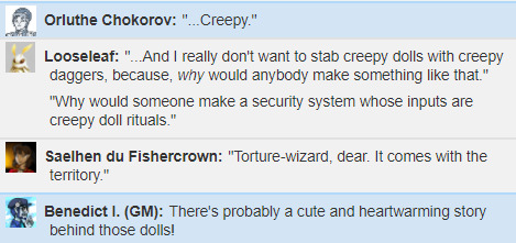
Not interested in risking whatever the consequences of solving the puzzle wrong are (given that they already have a way up and down), they move on.
While they're there, Saelhen decides to take another crack at the trapped chest she couldn't open earlier. Rather than risk the trap, she first spends some time expertly disarming the trap built into the lock, before working on the lock itself. A couple good rolls later, and they acquire the treasure! Which is... 60 gold pieces, and a piece of paper with a list of words.
Saelhen fails her Nature check, but Looseleaf recognizes the words on the paper as... the names of craters and other geographical features of the moon.
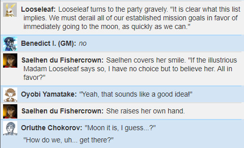
[WAR_FLASHBACKS.jpg]
No one's quite sure why a list of moon landmarks would be locked up in a highly-secure chest protected by a poison needle trap, but no one rolls high enough on Religion to puzzle it out.
Moving on down, they reach the second floor, which appears to be a laundry room of some sort. The sort where the irons and ironing boards and scrub brushes are alive, and appear to be washing the same clothes over and over and over to the point where most of them have been reduced to sparklingly clean rags. Seems like these animated household objects have been stuck on a loop for a good long time!
There's what appears to be an intact magical cloak hanging on a clothesline in there, but the party opts not to try and take it- doing so would likely provoke some protective laundry automatons.
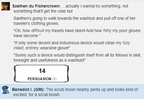
Saelhen's plan to lure the scrub brush away from the washtub (for... reasons??) fails, since the brush doesn't seem to want to leave the tub- and it's visibly disappointed when Saelhen gives up.

So, they head down to the first floor, finally! As they head down, they're noticed by more animated knives... but it seems these ones have been tasked with cooking a delicious meal, which they happily serve up to the tower's guests! The wheelbarrow from before is there, too, supplying the kitchen with food. The only question is... who's been eating this stuff? Why is the table not covered in rotten, uneaten banquet, if the wizard's been dead? Who's been putting grocery money in the wheelbarrow?
Other things of note in the room...
Benedict I. (GM): The shelves around the center seem to be festooned with various trophies and awards.
Looseleaf: trophies. what, like, participation trophies??? school trophies?
piano recital trophies??
Benedict I. (GM): These would actually be somewhat recognizable to most of you- you've seen similar things in trophy cases at school.
The plaques beneath them seem blacked out in various places- a lot of [REDACTED].
Looseleaf: warball champions of the 1034 school year?
Benedict I. (GM): Often built into the plaques.
Saelhen du Fishercrown: huh
who
redacts a plaque
Benedict I. (GM): Like, there'll be a flat section of the plaque painted black
like it was engraved that way
Looseleaf, with a 20, Investigates a bunch of pertinent information. For instance, a diploma:
Hal Lumiere, PhD in [______]. Blacksky University, Department of Restricted Arts
It appears Hal Lumiere was an alumnus of Blacksky's School of Restricted Arts- the same place Vayen is from. Lumiere was apparently something of a darling there, considering all the awards- but no one in the party has ever heard of him. Except maybe a certain someone who's not telling.
Looseleaf also finds some unopened mail! One is illegible, written in Abyssal, the language of demons.
(Lore note on demons: demons are just like other monsters- evil things that come up from below the mountains and cause trouble. They aren't generally aware of their origins beyond waking up in a deep cave, usually, and aren't motivated by much except causing conflict and hurting people.)

Another letter is written in Common, with just plain awful handwriting:
"hey Lumes why tf arent you home today u fuckin flake ass fairyboy. who am i supposed to get that dank good ouch from if youre off on magic adfentures. this months number shits are: 14.3 6755 304° and then the little bar thing was on the green side but wobbly. now gimmeeeeeee"
It's a bit of an enigma- but even more enigmatic is the third letter Looseleaf finds, written in a hand Looseleaf recognizes. Looseleaf knows who this letter was written by.
"Dr. Lumiere- find enclosed the new spirit hollowing diagrams and the corrected sigil of Aaaaaaagh. This should satisfy our agreement, so I'll leave you with a warning: the lesser gods are not to be trusted."
"Yes, their revolution is our best shot at the Project- that much is obvious, barring a road to apotheosis. I understand we need to work with them. I doubt we'll have further contact, so I won't ask you not to reignite this argument- but insofar as it's at all relevant to you in the future, I favor your approach over Kron Green's."
"But again, they are not to be trusted. The enemy of our enemy wishes mainly to supplant them, and despite their alliance, not all of them share the same aims. In particular, the one you've taken an interest in seems utterly hostile to the Project. "
"If we are to impact the cosmic boardstate, we must play the game. Trust is the abdication of discovery. Choose your allies carefully."
And then it is signed with a mark.
The mark is of a book, facedown in the way that ruins the spine, sort of shaped to look like a skull.
And the initials "Y.T."
Looseleaf: youtube.
the villain of our story, youtube.
Saelhen du Fishercrown: trust is the abdication of discovery, what a goddamn motto
Looseleaf: oh my god she's being so edgy
well, that is characteristic of her.
She also finds what appears to be a trophy- but the trophy is shaped to look like a globe. Not of the Jewel, but of the moon. Obviously, they take it.
youtube
Some experimentation with the moon trophy seems to indicate that the locations marked on the paper from the chest draw out a sort of connect-the-dots pattern, which might be used elsewhere for some purpose. Whatever the pattern is meant to be used for, there's no indication of it here. All that can reasonably be inferred is that it has some connection to the School of Restricted Arts.
Meanwhile, the bookshelves have a few more things of interest. Amidst textbooks on neurology, magic, and speculative religion on a lower shelf, they find a hand-bound book that seems out-of-place.
Benedict I. (GM): Inside, it appears to be a diary.
"i m choss n ths iss MY BOOK," it begins.
It appears to span several years of diary entries, from year 259 to 266- ending seven years before the current date, 273. The handwriting gets progressively less atrocious, and the entries are very sporadic- riddled with apologies to the diary for forgetting to write in it.
Benedict I. (GM): Choss, apparently, is a little girl who grew up in this tower.
Initially she was very fond of her dad, the owner of the tower.
Looseleaf: initially, huh.
that's... a... great sign.
Benedict I. (GM): Dad is a cool wizard who does fun magic all the time, which she helps with!
She is very proud of how much pain she can withstand, and she's developed this sort of self-image as a connoisseur.
Of pain.
Saelhen du Fishercrown: hell
Saelhen's face is getting progressively... stiffer, as she reads.
Not angrier, per se, just... flatter.
Benedict I. (GM): She helps out with the experiments except for not being allowed to take the hoods off the subjects in the lab.
Looseleaf: Lumiere what the shit.
Benedict I. (GM): And when there's no subjects, she fills in, and does a very good job, the best job.
There's an entry describing how she designed a security system for her dad- she made some dolls and dad enchanted them so they open the door if you stab them right! She's very proud of it.
You now know the order of stabs to disable the barrier.
Anyway, the later entries seem to represent... entirely standard teen angst.
Looseleaf: Hmm.
Benedict I. (GM): Dad is being boring and not letting her do the experiments she wants to do and not letting her visit the towns and ugh dad.
She gets fed up with him, and the last entry is about how she's leaving to go start her own life in Wheat.
Looseleaf: REALLY NOW.
Saelhen du Fishercrown: WELL.
Looseleaf: ...god, maybe those rumors about wheat being full of insane murderous murder-os weren't,
wrong.
Saelhen du Fishercrown: if she is in fact a
baby dragon
Looseleaf: which is not at all guaranteed, by the way.
If you recall from a few sessions back:
To speak with a dragon is to be condemned to some sort of great misfortune, brought about by your own hand. You know the Simurgh from Worm? Listen to its song for too long, and you become sort of a sleeper agent of self-destructive carnage? It’s like a diet version of that. Whatever path your conversation with the dragon puts you on, it’s invariably bad for you, somehow. The metallic dragons, who’re ostensibly “good”, will still ruin your life in some way just by talking to you, even if your immolation does some good for the world on the way out. Nobody wants to talk to a dragon.
Also discovered in CHOSS BOOK is a brief account of a time she had to go to the basement, using the secret entrance underneath... something. Looseleaf almost immediately checks under the table they're sitting at, and finds... yep! A trapdoor leading to the basement!
Next time: the basement awaits!
4 notes
·
View notes
Text
Episode 132 : All Love
"They don't never see the work, only results of it."
- Rapper Big Pooh
Another month inside, and one that has been tinged with sadness; we say Rest In Power to Ty, Andre Harrell, and the soul legend Betty Wright. The month's selection starts with a favourite of mine from Ty's catalogue, and though the styles change, we keep a steady pace all the way through - I know some of you are running to try and stay in shape during this time, so I hope it helps!
Twitter : @airadam13
Twitch : @airadam13
Playlist/Notes
Ty ft. Kwadjo and Michelle Escoffery : Ha Ha
"Feeling like my left toe's equal to Pele" - always loved that line, I think it's the delivery! We start off with a track from Ty's second studio album ("Upwards"), which was also on the B-side of the "Groovement" 12". From the off, he was an artist who never pretended to be anything other than who he was and represented his life with skill and humour, which is well-demonstrated here! The beat is kind of staccato, with no hi-hat between drum beats and the synth bass stabbing in hard. Wicked tune from one of our greats who will be sadly missed.
[Dante Ross] Casual : Turf Dirt (Instrumental)
The 2001 "VIP" single was dope, but the headline track was definitely an example of an artist trying to step into the unfamiliar sonic territory of the club lane! "Turf Dirt" was the last track of three, and the B-side has instrumentals of everything - in this case, Dante Ross with a stomper.
J-Live : Harder
I'd almost forgotten about this one until it turned up as part of the vinyl digitisation project! A 2005 single release from "The Hear After", this is a loud and proud statement of intent from one of the hardest-working artists in the business. The beat is courtesy of the five-headed production team "The Fire Dept", who also did some work for GZA the same year and have also performed as his live band.
Conway the Machine : Be Proud Of Me
Buffalo's Conway is an artist who knows of the life that he speaks, and this is a really personal track. He's clawed his way up to a career as a respected MC, but as you can hear, not everyone with him was really with him as he tried to make it. Khrysis is on production, giving this real-life story an appropriately downbeat backing, on the penultimate cut on "EIF 2 : Eat What U Kill".
Big Twan ft. Big Kwam : The Hellgate Rebel
This track has some of my favourite scratches on a rap record of all time, with Tony Vegas of the Scratch Perverts flaring out in an ill fashion! The deep listeners might know Big Twan from his debut professional appearance, a verse on Big L's "8 Iz Enuff", but the "One Time 4 The Lyricist" 12" is his sole vinyl release as a soloist. The main track is heavy, and having this on there as well makes the vinyl a great addition to your library. It's a meeting of the Bigs, with Twan sharing mic time with the UK MC Big Kwam over a killer beat from The Creators - the horns and bass might be the drivers, but check the plucked guitar-type sounds all over the verses too.
Genaside II ft. Eek-A-Mouse : Just As Rough
The UK's Genaside II were a really unique crew who had Hip-Hop, rave, jungle, and more in their stylistic blend. In various combinations and configurations since the 90s, they've been a low-key influence on quite a few big names, despite being unknown to many! This track is from their debut "New Life 4 The Hunted", and features the legendary reggae artist Eek-A-Mouse on vocals, telling a story of a hard life on the streets. If you've got the ear for something a bit different - especially if you like D&B or breakbeat - then the album is well worth picking up if you see it.
Blue Stone : Lost Sun
This is probably a bit "New Age"-y and ambient for some if heard in isolation, but I think it fits well here! It's got a little bit of a north African/Arab vibe to the drums at the start, and builds up from a gentle start to a thundering peak before easing back down. It's one of the many well-produced tracks on the 2007 "Worlds Apart" LP.
The Mouse Outfit ft. One Only : Sunrise
Brand new single, and perfect for the season! An all-Manchester affair with One Only showing versatility on the mic, and Chini and Metrodome taking the production reins. A welcome return, no doubt.
Pitch 92 ft. Tyler Daley : Confused
Chilled again, Manchester again, this time from the "3rd Culture" album from last year. Pitch 92 showed the talent from early in his career, and the release of his producer project was great to see. If you're looking for top-shelf local mic expertise, Tyler Daley should be one of the first names on the list, and you get him switching effortlessly between the bars many don't recognise him for and the singing voice that they do.
Black Star ft. Black Thought : Respiration (Pete Rock Remix)
No doubt, the original "Respiration" from the "Mos Def & Talib Kweli are Black Star" LP is a great track. But how do you make it better? First off, bring in Black Thought, one of those who could be described as "your favourite MC's favourite MC". That kicks things up a notch. Not enough? Ok, why not bring Pete Rock in to remix it? This should be illegal. Brilliant re-working of the 1998 classic, which I'm pulling from the "4 Pete Sake" (bootleg?) remix compilation, but which is also on the B-side of the main single.
Camp Lo : Life I Love
I absolutely loved the "Ragtime Hightimes" album, and while there are many tracks that are more of an immediate sonic hit, this one is a quiet killer. This is a group who need to be called in to score a heist movie, as they drop slang-heavy, super-dense rhymes about a glamourised crime life all over a Ski beat that's as cool as the other side of the pillow.
[Prince Kaysaan] Royal Flush : Can't Help It (Instrumental)
Kaysaan's run may "only" have been a few releases between 1997 and 1998, but he forever gets props for this one from "Ghetto Millionaire" alone. The combo of an 80s R&B sample with the filter coming in and out together with crispy jazz-sourced drums made this a late 90s winner that I'm happy to throw on a mixtape anytime.
Kris Kross ft. Da Brat, Aaliyah, Jermaine Dupri, and Mr Black: Live and Die for Hip-Hop (DJ Clark Kent Mix)
RIP Chris Kelly, gone seven years as of this month. Most people don't even realise that Kris Kross continued to record after their "Jump" and "I Missed The Bus" days, but they did indeed, and this is a remix of a track from their third and final album, 1996's "Young, Rich, & Dangerous". Laid back, cooled out, but in a different and even better-done fashion to the LP version - that bass flavour is definitely working.
Little Brother : Work Through Me
The return of Little Brother last year was much-welcomed by those who've been with them since the beginning, and they are standouts when it comes to bringing the changes in their lives into the music. This is a track about not just their own music career, but getting up every day and doing your best - which is pretty appropriate right now. Phonte and Rapper Big Pooh have continued to improve with age, and while 9th Wonder didn't join them this time, Focus and BlaaqGold slay this bumping and soulful beat.
Reks : Due Diligence
The "Revolution Cocktail" album by Reks seems to have all but disappeared - you won't find it on Spotify, and I can't find it on Amazon or other download sites either. It's a shame, as I think he had some high-quality tracks on there. I don't have a producer credit for this, but the beat was what drew me in first. You can almost hear Reks warming up on the first few bars before he hits his stride and brings it home. The Massachusetts native is incredibly slept on, even after twelve albums - but I appreciate the grind.
Boyz II Men ft. Erick Sermon, Redman, Keith Murray, and 2 Ta Da Head : Vibin' (Kenny Smoove Remix)
As @DragonflyJonez recently suggested, you might not be able to think of any gatherings where it was demanded that Boyz II Men be put on, but this might be an exception! Kenny Smoove was part of the Untouchables collective that also included Eddie F, Dave "Jam" Hall, and one Pete Rock, and he did his thing on this remix. Granted, I'm not exactly Mr R&B, but this slaughters the original, not least because he brings in heavy artillery - the whole Def Squad, headed up by Erick Sermon. There's a whole 12" of remixes that this is drawn from, should you want to hear some alternative takes!
Ilajide : Mothership Connection 1-2
Detroit in the house, with the trademark bump of Clear Soul Forces' Ilajide, from his killer 2015 "Latex" LP.
Bronx Slang : Excuse Me Officer
We close with a great track from 2019's debut LP from the link up of Jerry Beeks and Ollie Miggs - Bronx Slang. If you're very eagle-eared, you'll recognise a couple of these bars from the track I did with Jerry Beeks ("I'm A Cop"), which is on episode 86 of the podcast! Sadly, as this topic continues to be relevant, new names enter the roll of the fallen, and Beeks expands still further on police violence.
Please remember to support the artists you like! The purpose of putting the podcast out and providing the full tracklist is to try and give some light, so do use the songs on each episode as a starting point to search out more material. If you have Spotify in your country it's a great way to explore, but otherwise there's always Youtube and the like. Seeing your favourite artists live is the best way to put money in their pockets, and buy the vinyl/CDs/downloads of the stuff you like the most!
Check out this episode!
0 notes
Text
Why You Need Pre-Cart Landing Pages for Ecommerce (with Examples)
Here are a couple of interesting—terrifying?—statistics for ecommerce marketers:
The average click-through rate (CTR) for an ecommerce search ad on Google is just 2.69%. Facebook isn’t any better, with a 0.09% CTR across all industries.
But wait—it gets worse. Only 2.81% of people who click your Google ad will take an action (like buying something) when they land on your website.
That’s… not awesome. Just a handful of people who see your paid ad will click it, and only a tiny fraction of them will actually convert to a sale. There are some things you can do to optimize your ad clicks—write attention-grabbing copy, pack your slug with keywords—but you’re always gonna be at the mercy of Google and Facebook. (Algorithms!) As it becomes harder and harder to stand out against your online competition, it’ll be the ecommerce companies that make the most of each and every paid click that are most successful.
The good news is there’s one thing you have total control over: the destination URL of your ads. We want to talk about how you can get more sales outta those clicks you do get by sending your paid traffic to pre-cart landing pages.
What Are Pre-Cart Landing Pages (and Why Do I Need Them?)
Let’s pretend you own a brick-and-mortar sporting goods store and you’re running a promotion on commuter bikes. You put up a sign in your window advertising your two-wheeler discount, maybe send out some flyers, then wait for the roadies to show up.
And they do. But when a customer enters your store, here’s what happens:
The first thing they see is a bunch of stuff they don’t care about: helmets, bells, baskets. Oof.
They spend a few minutes wandering around, searching for the bikes, before they finally find them at the back of your store. Not good.
It’s kind of an expensive purchase (even with the discount), and they’ve got some questions—but there’s nobody around to ask. Uh oh.
And so, frustrated, they leave.
We’ve all had this experience in the offline world, but it’s also a huge problem in ecommerce. People are interested in buying a product, click an ad that seems to fit, then wind up somewhere that doesn’t deliver what they’re looking for—so they bounce.
Pre-cart landing pages are designed to help move prospects from your advertisement through to your checkout. They expand on the unique value proposition of your product. And unlike your homepage or your product pages, they’re customized to deliver on the promise of your ad and maintain the momentum of that initial click. That makes them an important first touchpoint that can totally shape your prospects’ purchasing experience.
Here’s how our earlier brick-and-mortar scenario plays out online:
In the example above, you’ve got a Google ad that promises a 15% discount on commuter bikes. But when a prospect clicks through, they end up on your homepage. Sure, there are some indications that you sell bikes, but where are the commuter bikes specifically? How does someone claim the discount that you promised?
Compare that with this example below, where you decide to use a pre-cart landing page. (Clever marketer, you.) The prospect sees exactly what they expect when they click your ad: a commuter bike. There are more details about what makes this particular bike great, and the sticky bar highlights how prospects can claim your offer. This page delivers on your original promise and it’s far more likely to close the sale.
Pre-cart landing pages can be especially helpful for complicated products, or products with multiple use cases. Maybe instead of a bike meant for commuters, you’ve got the most impossibly awesome bike that’s great at everything: road biking, mountain biking, sky biking. You can create specific ads and pre-cart landing pages for each product use case—that way, prospects will see what makes your bike a good choice for whatever they’re doing. (Or learn exactly how a three-speed can let them soar like Icarus.)
Getting super granular with your ads and landing pages like this can also save you money. A component of Google’s Quality Score is landing page experience and relevance—so, the more you can match ads with very specific pre-cart landing pages, the higher your Quality Score and the lower your cost-per-click. (Facebook factors in relevance for its ads, too.)
All of this is to say: if your ecommerce brand is running paid search and social ads, you really, really oughta be using pre-cart landing pages. But maybe the best way to understand pre-cart pages is to see them in action. And so, without further ado:
4 Ecommerce Pre-Cart Landing Pages Built with Unbounce
#1. Perfect Keto
Image courtesy of Perfect Keto. (Click image to see the full page.)
The Context:
Perfect Keto sells snacks and supplements geared towards the keto crowd—that is, people on a ketogenic diet who don’t eat certain types of food, particularly carbs. This pre-cart landing page for Perfect Keto’s protein bars was built by CRO and PPC management agency Webistry, who here uses a combination of Google and Facebook ads to drive traffic. Search ads target terms like “low carb protein bars” and “things that taste like foods I miss”:
Here’s an example Google search ad from Perfect Keto.
Meanwhile, Perfect Keto’s social ads (which include a ton of video content) talk about the benefits of their product in an engaging, lighthearted way. Here’s a screenshot from a recent Facebook ad for a new bar flavor, chocolate chip cookie dough:
Perfect Keto’s social ads typically use video to demonstrate some of their brand personality.
The Page:
From the matching imagery and copy to the defined call to action, check out how Perfect Keto’s pre-cart landing page provides a consistent and accelerated path to purchase:
Here’s what potential Perfect Keto customers see when they first land on the pre-cart page.
When someone clicks one of these ads, they wind up on the Perfect Keto protein bar pre-cart landing page. The header copy tells you why this product is worth your attention—it’s “your new keto secret weapon”—and the hero image shows you exactly what you’re getting, mirroring the chocolate chip flavor featured in many of the social ads. Clicking the “Buy Now” call to action bumps you down the page, where you can add the product directly to your cart.
Ready to buy? This pre-cart landing page lets visitors add items directly to their shopping cart, shortening the buying process.
Jonathan Naccache, President of Webistry, explains how this helps drive more ecommerce conversions:
On-page checkout streamlines the customer’s journey. We let them choose their flavor and quantity, then they can check out right from the page. That way, we can avoid overloading them with too much information and keep them focused on the purchase.
Since ketoers—ketoites?—tend to be a savvy bunch, this page gets into the nitty-gritty, listing the ingredients and nutritional value of each bar. Perfect Keto describes how the product can improve your lifestyle, helping you stick to your diet while still satisfying your sweet tooth. It’s these kinds of details that really help prospects understand the value and make them much more likely to buy.
Now that we’ve talked about the pre-cart landing page, take a look at Perfect Keto’s homepage:
Perfect Keto’s homepage has a ton of distractions that could prevent visitors who clicked an ad for protein bars from converting.
It looks awesome, sure, and the imagery currently matches the chocolate chip flavor our visitors were after—but you can see why this wouldn’t be a great spot to send someone who clicked one of those earlier ads. The other products, the educational content, and the limited-time promotions are only distractions for a visitor who’s already demonstrated buyer intent for protein bars. In contrast, the pre-cart landing page speaks directly to that product, provides all the information a visitor could need, and simplifies the buying process.
#2. Mizzen+Main
Image courtesy of Mizzen+Main. (Click image to see the full page.)
The Context:
Here’s an example from Mizzen+Main, a performance menswear retailer that does a ton of its business online. The brand has a monster social following across Facebook and Instagram, where it runs targeted ads like the one below:
Mizzen+Main promote exclusive deals to their huge social following with ads like this one.
When a prospect clicks through this Facebook ad for dress shirts, they find themselves on a pre-cart landing page (built by Agency Within) specifically for that collection.
The Page:
Mizzen+Main shows off their style with this slick design above the fold.
This Mizzen+Main pre-cart landing page uses a hero shot of a sharp-dressed guy with a crisp shirt on his way to do something important. (Lower, we see the same guy from the Facebook ad—nice message match.) The headline tells us we’re in the right place while cleverly speaking to the main product use case: “The business of dressing up.”
And, if we’re ready to buy right now, we can click the “Shop Now” call to action and immediately see Mizzen+Main’s full selection of dress shirts.
This more traditional store page is great for visitors who are ready to buy, but it’s not so great at persuading those who aren’t.
But most people still need some convincing before they make a purchase, and that’s when the rest of this pre-cart landing page goes to work.
Mizzen+Main knows that their clothing is all about the visual, so they don’t commit much space to copy. Instead, they highlight just their top three value points—wrinkle resistance, moisture-wicking, stretch fabric—then they get right to what visitors want to see: the shirts in action.
Instead of flat, folded dress shirts, Mizzen+Main uses this space to show off their product in the context of use. Each image is hyperlinked, so visitors who are interested in a particular shirt can click right through to the product page. Add a logo bar featuring authoritative brands like AdWeek and Esquire, and Mizzen+Main closes out with XL social proof that’s sure to help their sales.
Langston McCullough, Digital Marketing Manager at Agency Within, elaborates on the importance of pre-cart landing pages:
By building a cohesive experience between our ads and this landing page, we were able to effectively reinforce our messaging while differentiating Mizzen+Main from competitors.
Something that might make this pre-cart landing page even more effective? Using a popup or sticky bar to reiterate the offer made in the ad and incentivize the purchase each step of the way. Another idea could be to create a variant of the landing page so the headline can match the Facebook ad copy exactly—for example, the “wrinkle resistant” message could replace “the business of dressing up.”
#3. Samuraw
Image courtesy of Samuraw. (Click image to see the full page.)
The Context:
Samuraw is a nutritional supplement with two main audiences: one option for adults, one for kids and teens. The brand runs some ads on Google, but unless someone is already searching for something like this product, they’re not likely to see it. Social media, on the other hand, lets Samuraw reach out to their core demographics with messages that resonate.
Check out this ad they’re running on Facebook:
This Samuraw ad is a great example of how ecomms can reach out to their ideal customers with super-targeted messaging.
Samuraw explicitly appeals to one of its key audiences—the “supermoms”—and describes the key benefits of Samuraw for children, differentiating itself from competitors that might “cause more harm than good.” Throw in a picture of cute kids enjoying the product and you’ve got yourself an attention-grabbing ad for a nutritional supplement.
The Page:
So, where do people end up when they click one of these ads?
Samuraw uses this space above the fold on their pre-cart page to tell visitors exactly what the product is.
Samuraw’s pre-cart landing page (another built by Webistry) looks a lot like what you’d expect to see. The headline uses language from the ads word-for-word—like “the highest quality multivitamin mineral and probiotic formula ever created”—and the hero image shows the product from the ads alongside a bunch fruit, signaling its nutritional content.
There’s a call to action above the fold prompting visitors to add Samuraw to their cart (and it’ll follow us as a sticky bar as we scroll the page), plus free shipping on orders over $50 as an extra incentive to make the purchase. Like with the Perfect Keto example, this pre-cart landing page accelerates Samuraw’s customer journey from ad to purchase by letting people add products right to their cart.
Moving lower, a series of sections tell us everything we need to know about the product: the main differences from other supplements, the ingredients and nutritional value, the customers and health experts who swear by it. It’s a long page, no doubt. But nutrition is a complex industry, and transparency is essential in establishing trust with potential customers.
This isn’t your conventional landing page. It’s much longer than what we’re used to building, but we wanted to focus on educating the visitor and validating our core differentiators. Our hunch was that our target market is well-read and educated, and they’re wary of false promises. They value being informed.
This was actually our variant page, which we tested against a much shorter counterpart. This version won by a landslide.
Samuraw’s homepage, which is comparatively light on copy, doesn’t as convincingly convey the product value to people who are on the fence.
Someone who doesn’t know much about supplements probably isn’t going to be persuaded by Samuraw’s homepage.
With added complex nutritional information and added navigation, pointing Samuraw’s Facebook ads here would just as likely distract a prospect as result in a sale.
#4. Cramp Defense
Image courtesy of Cramp Defense. (Click image to see the full page.)
The Context:
Cramp Defense is a magnesium-based supplement that helps people—you guessed it—defend against cramps. As you might imagine, it’s an ecomm product that absolutely benefits from further explanation. Here’s one of the ads you might see if you search “stop leg cramps” on Google:
An example of the Google search ads Cramp Defense is using to drive traffic to the pre-cart page.
As with any health-related product, one of Cramp Defense’s main challenges is convincing people that it works. That means the company spends a lot of online real estate providing evidence from medical studies and answering frequently asked questions. The result is a website that’s really informative, but not exactly optimized for sales.
This is just a small part of Cramp Defense’s product overview page. (You get it.)
The Page:
Unlike other examples, Cramp Defense’s pre-cart landing page isn’t about providing additional product information. It’s about distilling the information that already exists (like from that product overview page) into something more manageable. It’s also about establishing trust with the company’s potential customers.
Cramp Defense establishes credibility above the fold of their pre-cart page, assuring visitors they’ve found a legitimate leg cramp solution.
This page does a lot of work above the fold. The headline introduces the product through a question people probably haven’t asked themselves: “Do your cramps need magnesium?” (Spoiler, yes.) Bullet points quickly highlight some of the key benefits, like “fast results.” There are also a bunch of indicators of legitimacy: “Made in the USA,” “Over 500k Sold,” and the Amazon review score. That’s all followed by a logo bar that features brands like WebMD, BBC, and the Chicago Tribune.
The rest of the pre-cart page explains the science behind the product, but it makes clever use of footnotes (plus an expanding “Read the Full FAQ” button) to lighten the copy and keep people focused on converting. There’s also a sticky bar, which ensures that purchase incentives like free shipping and a money-back guarantee stay top-of-mind.
When someone clicks the “Buy Now” call to action, they’re taken to a page that presents another incentive: discounted prices for buying in bulk. Having already demonstrated their intent to buy, the visitor is a lot more likely to take Cramp Defense up on the offer.
After someone has clicked the call to action, Cramp Defense makes one final upsell attempt with this clever page.
Top-Selling Ecommerce Brands Use Pre-Cart Landing Pages
Let’s close out with a few more ecomm marketing statistics, shall we?
The average cost per click (CPC) for Google search ads is currently around $2. (Same with Facebook ads.) And that number has been rising for years.
Competition for people’s attention online is already fierce, and it’s only getting worse. Successful ecommerce brands are the ones that make the most of every paid click they get. Often, that means using pre-cart landing pages to reflect visitor intent, expand on product value, and streamline the path to purchase.
If your ecommerce brand isn’t already pairing search and social ads with pre-cart landing pages, it’s a great time to start. And with Unbounce’s 100+ high-converting templates, it’s a lot easier than you think.
from Marketing https://unbounce.com/conversion-rate-optimization/pre-cart-landing-pages/
via http://www.rssmix.com/
0 notes
Text
Why You Need Pre-Cart Landing Pages for Ecommerce (with Examples)
Here are a couple of interesting—terrifying?—statistics for ecommerce marketers:
The average click-through rate (CTR) for an ecommerce search ad on Google is just 2.69%. Facebook isn’t any better, with a 0.09% CTR across all industries.
But wait—it gets worse. Only 2.81% of people who click your Google ad will take an action (like buying something) when they land on your website.
That’s… not awesome. Just a handful of people who see your paid ad will click it, and only a tiny fraction of them will actually convert to a sale. There are some things you can do to optimize your ad clicks—write attention-grabbing copy, pack your slug with keywords—but you’re always gonna be at the mercy of Google and Facebook. (Algorithms!) As it becomes harder and harder to stand out against your online competition, it’ll be the ecommerce companies that make the most of each and every paid click that are most successful.
The good news is there’s one thing you have total control over: the destination URL of your ads. We want to talk about how you can get more sales outta those clicks you do get by sending your paid traffic to pre-cart landing pages.
What Are Pre-Cart Landing Pages (and Why Do I Need Them?)
Let’s pretend you own a brick-and-mortar sporting goods store and you’re running a promotion on commuter bikes. You put up a sign in your window advertising your two-wheeler discount, maybe send out some flyers, then wait for the roadies to show up.
And they do. But when a customer enters your store, here’s what happens:
The first thing they see is a bunch of stuff they don’t care about: helmets, bells, baskets. Oof.
They spend a few minutes wandering around, searching for the bikes, before they finally find them at the back of your store. Not good.
It’s kind of an expensive purchase (even with the discount), and they’ve got some questions—but there’s nobody around to ask. Uh oh.
And so, frustrated, they leave.
We’ve all had this experience in the offline world, but it’s also a huge problem in ecommerce. People are interested in buying a product, click an ad that seems to fit, then wind up somewhere that doesn’t deliver what they’re looking for—so they bounce.
Pre-cart landing pages are designed to help move prospects from your advertisement through to your checkout. They expand on the unique value proposition of your product. And unlike your homepage or your product pages, they’re customized to deliver on the promise of your ad and maintain the momentum of that initial click. That makes them an important first touchpoint that can totally shape your prospects’ purchasing experience.
Here’s how our earlier brick-and-mortar scenario plays out online:
In the example above, you’ve got a Google ad that promises a 15% discount on commuter bikes. But when a prospect clicks through, they end up on your homepage. Sure, there are some indications that you sell bikes, but where are the commuter bikes specifically? How does someone claim the discount that you promised?
Compare that with this example below, where you decide to use a pre-cart landing page. (Clever marketer, you.) The prospect sees exactly what they expect when they click your ad: a commuter bike. There are more details about what makes this particular bike great, and the sticky bar highlights how prospects can claim your offer. This page delivers on your original promise and it’s far more likely to close the sale.
Pre-cart landing pages can be especially helpful for complicated products, or products with multiple use cases. Maybe instead of a bike meant for commuters, you’ve got the most impossibly awesome bike that’s great at everything: road biking, mountain biking, sky biking. You can create specific ads and pre-cart landing pages for each product use case—that way, prospects will see what makes your bike a good choice for whatever they’re doing. (Or learn exactly how a three-speed can let them soar like Icarus.)
Getting super granular with your ads and landing pages like this can also save you money. A component of Google’s Quality Score is landing page experience and relevance—so, the more you can match ads with very specific pre-cart landing pages, the higher your Quality Score and the lower your cost-per-click. (Facebook factors in relevance for its ads, too.)
All of this is to say: if your ecommerce brand is running paid search and social ads, you really, really oughta be using pre-cart landing pages. But maybe the best way to understand pre-cart pages is to see them in action. And so, without further ado:
4 Ecommerce Pre-Cart Landing Pages Built with Unbounce
#1. Perfect Keto
Image courtesy of Perfect Keto. (Click image to see the full page.)
The Context:
Perfect Keto sells snacks and supplements geared towards the keto crowd—that is, people on a ketogenic diet who don’t eat certain types of food, particularly carbs. This pre-cart landing page for Perfect Keto’s protein bars was built by CRO and PPC management agency Webistry, who here uses a combination of Google and Facebook ads to drive traffic. Search ads target terms like “low carb protein bars” and “things that taste like foods I miss”:
Here’s an example Google search ad from Perfect Keto.
Meanwhile, Perfect Keto’s social ads (which include a ton of video content) talk about the benefits of their product in an engaging, lighthearted way. Here’s a screenshot from a recent Facebook ad for a new bar flavor, chocolate chip cookie dough:
Perfect Keto’s social ads typically use video to demonstrate some of their brand personality.
The Page:
From the matching imagery and copy to the defined call to action, check out how Perfect Keto’s pre-cart landing page provides a consistent and accelerated path to purchase:
Here’s what potential Perfect Keto customers see when they first land on the pre-cart page.
When someone clicks one of these ads, they wind up on the Perfect Keto protein bar pre-cart landing page. The header copy tells you why this product is worth your attention—it’s “your new keto secret weapon”—and the hero image shows you exactly what you’re getting, mirroring the chocolate chip flavor featured in many of the social ads. Clicking the “Buy Now” call to action bumps you down the page, where you can add the product directly to your cart.
Ready to buy? This pre-cart landing page lets visitors add items directly to their shopping cart, shortening the buying process.
Jonathan Naccache, President of Webistry, explains how this helps drive more ecommerce conversions:
On-page checkout streamlines the customer’s journey. We let them choose their flavor and quantity, then they can check out right from the page. That way, we can avoid overloading them with too much information and keep them focused on the purchase.
Since ketoers—ketoites?—tend to be a savvy bunch, this page gets into the nitty-gritty, listing the ingredients and nutritional value of each bar. Perfect Keto describes how the product can improve your lifestyle, helping you stick to your diet while still satisfying your sweet tooth. It’s these kinds of details that really help prospects understand the value and make them much more likely to buy.
Now that we’ve talked about the pre-cart landing page, take a look at Perfect Keto’s homepage:
Perfect Keto’s homepage has a ton of distractions that could prevent visitors who clicked an ad for protein bars from converting.
It looks awesome, sure, and the imagery currently matches the chocolate chip flavor our visitors were after—but you can see why this wouldn’t be a great spot to send someone who clicked one of those earlier ads. The other products, the educational content, and the limited-time promotions are only distractions for a visitor who’s already demonstrated buyer intent for protein bars. In contrast, the pre-cart landing page speaks directly to that product, provides all the information a visitor could need, and simplifies the buying process.
#2. Mizzen+Main
Image courtesy of Mizzen+Main. (Click image to see the full page.)
The Context:
Here’s an example from Mizzen+Main, a performance menswear retailer that does a ton of its business online. The brand has a monster social following across Facebook and Instagram, where it runs targeted ads like the one below:
Mizzen+Main promote exclusive deals to their huge social following with ads like this one.
When a prospect clicks through this Facebook ad for dress shirts, they find themselves on a pre-cart landing page (built by Agency Within) specifically for that collection.
The Page:
Mizzen+Main shows off their style with this slick design above the fold.
This Mizzen+Main pre-cart landing page uses a hero shot of a sharp-dressed guy with a crisp shirt on his way to do something important. (Lower, we see the same guy from the Facebook ad—nice message match.) The headline tells us we’re in the right place while cleverly speaking to the main product use case: “The business of dressing up.”
And, if we’re ready to buy right now, we can click the “Shop Now” call to action and immediately see Mizzen+Main’s full selection of dress shirts.
This more traditional store page is great for visitors who are ready to buy, but it’s not so great at persuading those who aren’t.
But most people still need some convincing before they make a purchase, and that’s when the rest of this pre-cart landing page goes to work.
Mizzen+Main knows that their clothing is all about the visual, so they don’t commit much space to copy. Instead, they highlight just their top three value points—wrinkle resistance, moisture-wicking, stretch fabric—then they get right to what visitors want to see: the shirts in action.
Instead of flat, folded dress shirts, Mizzen+Main uses this space to show off their product in the context of use. Each image is hyperlinked, so visitors who are interested in a particular shirt can click right through to the product page. Add a logo bar featuring authoritative brands like AdWeek and Esquire, and Mizzen+Main closes out with XL social proof that’s sure to help their sales.
Langston McCullough, Digital Marketing Manager at Agency Within, elaborates on the importance of pre-cart landing pages:
By building a cohesive experience between our ads and this landing page, we were able to effectively reinforce our messaging while differentiating Mizzen+Main from competitors.
Something that might make this pre-cart landing page even more effective? Using a popup or sticky bar to reiterate the offer made in the ad and incentivize the purchase each step of the way. Another idea could be to create a variant of the landing page so the headline can match the Facebook ad copy exactly—for example, the “wrinkle resistant” message could replace “the business of dressing up.”
#3. Samuraw
Image courtesy of Samuraw. (Click image to see the full page.)
The Context:
Samuraw is a nutritional supplement with two main audiences: one option for adults, one for kids and teens. The brand runs some ads on Google, but unless someone is already searching for something like this product, they’re not likely to see it. Social media, on the other hand, lets Samuraw reach out to their core demographics with messages that resonate.
Check out this ad they’re running on Facebook:
This Samuraw ad is a great example of how ecomms can reach out to their ideal customers with super-targeted messaging.
Samuraw explicitly appeals to one of its key audiences—the “supermoms”—and describes the key benefits of Samuraw for children, differentiating itself from competitors that might “cause more harm than good.” Throw in a picture of cute kids enjoying the product and you’ve got yourself an attention-grabbing ad for a nutritional supplement.
The Page:
So, where do people end up when they click one of these ads?
Samuraw uses this space above the fold on their pre-cart page to tell visitors exactly what the product is.
Samuraw’s pre-cart landing page (another built by Webistry) looks a lot like what you’d expect to see. The headline uses language from the ads word-for-word—like “the highest quality multivitamin mineral and probiotic formula ever created”—and the hero image shows the product from the ads alongside a bunch fruit, signaling its nutritional content.
There’s a call to action above the fold prompting visitors to add Samuraw to their cart (and it’ll follow us as a sticky bar as we scroll the page), plus free shipping on orders over $50 as an extra incentive to make the purchase. Like with the Perfect Keto example, this pre-cart landing page accelerates Samuraw’s customer journey from ad to purchase by letting people add products right to their cart.
Moving lower, a series of sections tell us everything we need to know about the product: the main differences from other supplements, the ingredients and nutritional value, the customers and health experts who swear by it. It’s a long page, no doubt. But nutrition is a complex industry, and transparency is essential in establishing trust with potential customers.
This isn’t your conventional landing page. It’s much longer than what we’re used to building, but we wanted to focus on educating the visitor and validating our core differentiators. Our hunch was that our target market is well-read and educated, and they’re wary of false promises. They value being informed.
This was actually our variant page, which we tested against a much shorter counterpart. This version won by a landslide.
Samuraw’s homepage, which is comparatively light on copy, doesn’t as convincingly convey the product value to people who are on the fence.
Someone who doesn’t know much about supplements probably isn’t going to be persuaded by Samuraw’s homepage.
With added complex nutritional information and added navigation, pointing Samuraw’s Facebook ads here would just as likely distract a prospect as result in a sale.
#4. Cramp Defense
Image courtesy of Cramp Defense. (Click image to see the full page.)
The Context:
Cramp Defense is a magnesium-based supplement that helps people—you guessed it—defend against cramps. As you might imagine, it’s an ecomm product that absolutely benefits from further explanation. Here’s one of the ads you might see if you search “stop leg cramps” on Google:
An example of the Google search ads Cramp Defense is using to drive traffic to the pre-cart page.
As with any health-related product, one of Cramp Defense’s main challenges is convincing people that it works. That means the company spends a lot of online real estate providing evidence from medical studies and answering frequently asked questions. The result is a website that’s really informative, but not exactly optimized for sales.
This is just a small part of Cramp Defense’s product overview page. (You get it.)
The Page:
Unlike other examples, Cramp Defense’s pre-cart landing page isn’t about providing additional product information. It’s about distilling the information that already exists (like from that product overview page) into something more manageable. It’s also about establishing trust with the company’s potential customers.
Cramp Defense establishes credibility above the fold of their pre-cart page, assuring visitors they’ve found a legitimate leg cramp solution.
This page does a lot of work above the fold. The headline introduces the product through a question people probably haven’t asked themselves: “Do your cramps need magnesium?” (Spoiler, yes.) Bullet points quickly highlight some of the key benefits, like “fast results.” There are also a bunch of indicators of legitimacy: “Made in the USA,” “Over 500k Sold,” and the Amazon review score. That’s all followed by a logo bar that features brands like WebMD, BBC, and the Chicago Tribune.
The rest of the pre-cart page explains the science behind the product, but it makes clever use of footnotes (plus an expanding “Read the Full FAQ” button) to lighten the copy and keep people focused on converting. There’s also a sticky bar, which ensures that purchase incentives like free shipping and a money-back guarantee stay top-of-mind.
When someone clicks the “Buy Now” call to action, they’re taken to a page that presents another incentive: discounted prices for buying in bulk. Having already demonstrated their intent to buy, the visitor is a lot more likely to take Cramp Defense up on the offer.
After someone has clicked the call to action, Cramp Defense makes one final upsell attempt with this clever page.
Top-Selling Ecommerce Brands Use Pre-Cart Landing Pages
Let’s close out with a few more ecomm marketing statistics, shall we?
The average cost per click (CPC) for Google search ads is currently around $2. (Same with Facebook ads.) And that number has been rising for years.
Competition for people’s attention online is already fierce, and it’s only getting worse. Successful ecommerce brands are the ones that make the most of every paid click they get. Often, that means using pre-cart landing pages to reflect visitor intent, expand on product value, and streamline the path to purchase.
If your ecommerce brand isn’t already pairing search and social ads with pre-cart landing pages, it’s a great time to start. And with Unbounce’s 100+ high-converting templates, it’s a lot easier than you think.
Why You Need Pre-Cart Landing Pages for Ecommerce (with Examples) published first on https://nickpontemrktg.wordpress.com/
0 notes
Text
Why You Need Pre-Cart Landing Pages for Ecommerce (with Examples)
Here are a couple of interesting—terrifying?—statistics for ecommerce marketers:
The average click-through rate (CTR) for an ecommerce search ad on Google is just 2.69%. Facebook isn’t any better, with a 0.09% CTR across all industries.
But wait—it gets worse. Only 2.81% of people who click your Google ad will take an action (like buying something) when they land on your website.
That’s… not awesome. Just a handful of people who see your paid ad will click it, and only a tiny fraction of them will actually convert to a sale. There are some things you can do to optimize your ad clicks—write attention-grabbing copy, pack your slug with keywords—but you’re always gonna be at the mercy of Google and Facebook. (Algorithms!) As it becomes harder and harder to stand out against your online competition, it’ll be the ecommerce companies that make the most of each and every paid click that are most successful.
The good news is there’s one thing you have total control over: the destination URL of your ads. We want to talk about how you can get more sales outta those clicks you do get by sending your paid traffic to pre-cart landing pages.
What Are Pre-Cart Landing Pages (and Why Do I Need Them?)
Let’s pretend you own a brick-and-mortar sporting goods store and you’re running a promotion on commuter bikes. You put up a sign in your window advertising your two-wheeler discount, maybe send out some flyers, then wait for the roadies to show up.
And they do. But when a customer enters your store, here’s what happens:
The first thing they see is a bunch of stuff they don’t care about: helmets, bells, baskets. Oof.
They spend a few minutes wandering around, searching for the bikes, before they finally find them at the back of your store. Not good.
It’s kind of an expensive purchase (even with the discount), and they’ve got some questions—but there’s nobody around to ask. Uh oh.
And so, frustrated, they leave.
We’ve all had this experience in the offline world, but it’s also a huge problem in ecommerce. People are interested in buying a product, click an ad that seems to fit, then wind up somewhere that doesn’t deliver what they’re looking for—so they bounce.
Pre-cart landing pages are designed to help move prospects from your advertisement through to your checkout. They expand on the unique value proposition of your product. And unlike your homepage or your product pages, they’re customized to deliver on the promise of your ad and maintain the momentum of that initial click. That makes them an important first touchpoint that can totally shape your prospects’ purchasing experience.
Here’s how our earlier brick-and-mortar scenario plays out online:
In the example above, you’ve got a Google ad that promises a 15% discount on commuter bikes. But when a prospect clicks through, they end up on your homepage. Sure, there are some indications that you sell bikes, but where are the commuter bikes specifically? How does someone claim the discount that you promised?
Compare that with this example below, where you decide to use a pre-cart landing page. (Clever marketer, you.) The prospect sees exactly what they expect when they click your ad: a commuter bike. There are more details about what makes this particular bike great, and the sticky bar highlights how prospects can claim your offer. This page delivers on your original promise and it’s far more likely to close the sale.
Pre-cart landing pages can be especially helpful for complicated products, or products with multiple use cases. Maybe instead of a bike meant for commuters, you’ve got the most impossibly awesome bike that’s great at everything: road biking, mountain biking, sky biking. You can create specific ads and pre-cart landing pages for each product use case—that way, prospects will see what makes your bike a good choice for whatever they’re doing. (Or learn exactly how a three-speed can let them soar like Icarus.)
Getting super granular with your ads and landing pages like this can also save you money. A component of Google’s Quality Score is landing page experience and relevance—so, the more you can match ads with very specific pre-cart landing pages, the higher your Quality Score and the lower your cost-per-click. (Facebook factors in relevance for its ads, too.)
All of this is to say: if your ecommerce brand is running paid search and social ads, you really, really oughta be using pre-cart landing pages. But maybe the best way to understand pre-cart pages is to see them in action. And so, without further ado:
4 Ecommerce Pre-Cart Landing Pages Built with Unbounce
#1. Perfect Keto
Image courtesy of Perfect Keto. (Click image to see the full page.)
The Context:
Perfect Keto sells snacks and supplements geared towards the keto crowd—that is, people on a ketogenic diet who don’t eat certain types of food, particularly carbs. This pre-cart landing page for Perfect Keto’s protein bars was built by CRO and PPC management agency Webistry, who here uses a combination of Google and Facebook ads to drive traffic. Search ads target terms like “low carb protein bars” and “things that taste like foods I miss”:
Here’s an example Google search ad from Perfect Keto.
Meanwhile, Perfect Keto’s social ads (which include a ton of video content) talk about the benefits of their product in an engaging, lighthearted way. Here’s a screenshot from a recent Facebook ad for a new bar flavor, chocolate chip cookie dough:
Perfect Keto’s social ads typically use video to demonstrate some of their brand personality.
The Page:
From the matching imagery and copy to the defined call to action, check out how Perfect Keto’s pre-cart landing page provides a consistent and accelerated path to purchase:
Here’s what potential Perfect Keto customers see when they first land on the pre-cart page.
When someone clicks one of these ads, they wind up on the Perfect Keto protein bar pre-cart landing page. The header copy tells you why this product is worth your attention—it’s “your new keto secret weapon”—and the hero image shows you exactly what you’re getting, mirroring the chocolate chip flavor featured in many of the social ads. Clicking the “Buy Now” call to action bumps you down the page, where you can add the product directly to your cart.
Ready to buy? This pre-cart landing page lets visitors add items directly to their shopping cart, shortening the buying process.
Jonathan Naccache, President of Webistry, explains how this helps drive more ecommerce conversions:
On-page checkout streamlines the customer’s journey. We let them choose their flavor and quantity, then they can check out right from the page. That way, we can avoid overloading them with too much information and keep them focused on the purchase.
Since ketoers—ketoites?—tend to be a savvy bunch, this page gets into the nitty-gritty, listing the ingredients and nutritional value of each bar. Perfect Keto describes how the product can improve your lifestyle, helping you stick to your diet while still satisfying your sweet tooth. It’s these kinds of details that really help prospects understand the value and make them much more likely to buy.
Now that we’ve talked about the pre-cart landing page, take a look at Perfect Keto’s homepage:
Perfect Keto’s homepage has a ton of distractions that could prevent visitors who clicked an ad for protein bars from converting.
It looks awesome, sure, and the imagery currently matches the chocolate chip flavor our visitors were after—but you can see why this wouldn’t be a great spot to send someone who clicked one of those earlier ads. The other products, the educational content, and the limited-time promotions are only distractions for a visitor who’s already demonstrated buyer intent for protein bars. In contrast, the pre-cart landing page speaks directly to that product, provides all the information a visitor could need, and simplifies the buying process.
#2. Mizzen+Main
Image courtesy of Mizzen+Main. (Click image to see the full page.)
The Context:
Here’s an example from Mizzen+Main, a performance menswear retailer that does a ton of its business online. The brand has a monster social following across Facebook and Instagram, where it runs targeted ads like the one below:
Mizzen+Main promote exclusive deals to their huge social following with ads like this one.
When a prospect clicks through this Facebook ad for dress shirts, they find themselves on a pre-cart landing page (built by Agency Within) specifically for that collection.
The Page:
Mizzen+Main shows off their style with this slick design above the fold.
This Mizzen+Main pre-cart landing page uses a hero shot of a sharp-dressed guy with a crisp shirt on his way to do something important. (Lower, we see the same guy from the Facebook ad—nice message match.) The headline tells us we’re in the right place while cleverly speaking to the main product use case: “The business of dressing up.”
And, if we’re ready to buy right now, we can click the “Shop Now” call to action and immediately see Mizzen+Main’s full selection of dress shirts.
This more traditional store page is great for visitors who are ready to buy, but it’s not so great at persuading those who aren’t.
But most people still need some convincing before they make a purchase, and that’s when the rest of this pre-cart landing page goes to work.
Mizzen+Main knows that their clothing is all about the visual, so they don’t commit much space to copy. Instead, they highlight just their top three value points—wrinkle resistance, moisture-wicking, stretch fabric—then they get right to what visitors want to see: the shirts in action.
Instead of flat, folded dress shirts, Mizzen+Main uses this space to show off their product in the context of use. Each image is hyperlinked, so visitors who are interested in a particular shirt can click right through to the product page. Add a logo bar featuring authoritative brands like AdWeek and Esquire, and Mizzen+Main closes out with XL social proof that’s sure to help their sales.
Langston McCullough, Digital Marketing Manager at Agency Within, elaborates on the importance of pre-cart landing pages:
By building a cohesive experience between our ads and this landing page, we were able to effectively reinforce our messaging while differentiating Mizzen+Main from competitors.
Something that might make this pre-cart landing page even more effective? Using a popup or sticky bar to reiterate the offer made in the ad and incentivize the purchase each step of the way. Another idea could be to create a variant of the landing page so the headline can match the Facebook ad copy exactly—for example, the “wrinkle resistant” message could replace “the business of dressing up.”
#3. Samuraw
Image courtesy of Samuraw. (Click image to see the full page.)
The Context:
Samuraw is a nutritional supplement with two main audiences: one option for adults, one for kids and teens. The brand runs some ads on Google, but unless someone is already searching for something like this product, they’re not likely to see it. Social media, on the other hand, lets Samuraw reach out to their core demographics with messages that resonate.
Check out this ad they’re running on Facebook:
This Samuraw ad is a great example of how ecomms can reach out to their ideal customers with super-targeted messaging.
Samuraw explicitly appeals to one of its key audiences—the “supermoms”—and describes the key benefits of Samuraw for children, differentiating itself from competitors that might “cause more harm than good.” Throw in a picture of cute kids enjoying the product and you’ve got yourself an attention-grabbing ad for a nutritional supplement.
The Page:
So, where do people end up when they click one of these ads?
Samuraw uses this space above the fold on their pre-cart page to tell visitors exactly what the product is.
Samuraw’s pre-cart landing page (another built by Webistry) looks a lot like what you’d expect to see. The headline uses language from the ads word-for-word—like “the highest quality multivitamin mineral and probiotic formula ever created”—and the hero image shows the product from the ads alongside a bunch fruit, signaling its nutritional content.
There’s a call to action above the fold prompting visitors to add Samuraw to their cart (and it’ll follow us as a sticky bar as we scroll the page), plus free shipping on orders over $50 as an extra incentive to make the purchase. Like with the Perfect Keto example, this pre-cart landing page accelerates Samuraw’s customer journey from ad to purchase by letting people add products right to their cart.
Moving lower, a series of sections tell us everything we need to know about the product: the main differences from other supplements, the ingredients and nutritional value, the customers and health experts who swear by it. It’s a long page, no doubt. But nutrition is a complex industry, and transparency is essential in establishing trust with potential customers.
This isn’t your conventional landing page. It’s much longer than what we’re used to building, but we wanted to focus on educating the visitor and validating our core differentiators. Our hunch was that our target market is well-read and educated, and they’re wary of false promises. They value being informed.
This was actually our variant page, which we tested against a much shorter counterpart. This version won by a landslide.
Samuraw’s homepage, which is comparatively light on copy, doesn’t as convincingly convey the product value to people who are on the fence.
Someone who doesn’t know much about supplements probably isn’t going to be persuaded by Samuraw’s homepage.
With added complex nutritional information and added navigation, pointing Samuraw’s Facebook ads here would just as likely distract a prospect as result in a sale.
#4. Cramp Defense
Image courtesy of Cramp Defense. (Click image to see the full page.)
The Context:
Cramp Defense is a magnesium-based supplement that helps people—you guessed it—defend against cramps. As you might imagine, it’s an ecomm product that absolutely benefits from further explanation. Here’s one of the ads you might see if you search “stop leg cramps” on Google:
An example of the Google search ads Cramp Defense is using to drive traffic to the pre-cart page.
As with any health-related product, one of Cramp Defense’s main challenges is convincing people that it works. That means the company spends a lot of online real estate providing evidence from medical studies and answering frequently asked questions. The result is a website that’s really informative, but not exactly optimized for sales.
This is just a small part of Cramp Defense’s product overview page. (You get it.)
The Page:
Unlike other examples, Cramp Defense’s pre-cart landing page isn’t about providing additional product information. It’s about distilling the information that already exists (like from that product overview page) into something more manageable. It’s also about establishing trust with the company’s potential customers.
Cramp Defense establishes credibility above the fold of their pre-cart page, assuring visitors they’ve found a legitimate leg cramp solution.
This page does a lot of work above the fold. The headline introduces the product through a question people probably haven’t asked themselves: “Do your cramps need magnesium?” (Spoiler, yes.) Bullet points quickly highlight some of the key benefits, like “fast results.” There are also a bunch of indicators of legitimacy: “Made in the USA,” “Over 500k Sold,” and the Amazon review score. That’s all followed by a logo bar that features brands like WebMD, BBC, and the Chicago Tribune.
The rest of the pre-cart page explains the science behind the product, but it makes clever use of footnotes (plus an expanding “Read the Full FAQ” button) to lighten the copy and keep people focused on converting. There’s also a sticky bar, which ensures that purchase incentives like free shipping and a money-back guarantee stay top-of-mind.
When someone clicks the “Buy Now” call to action, they’re taken to a page that presents another incentive: discounted prices for buying in bulk. Having already demonstrated their intent to buy, the visitor is a lot more likely to take Cramp Defense up on the offer.
After someone has clicked the call to action, Cramp Defense makes one final upsell attempt with this clever page.
Top-Selling Ecommerce Brands Use Pre-Cart Landing Pages
Let’s close out with a few more ecomm marketing statistics, shall we?
The average cost per click (CPC) for Google search ads is currently around $2. (Same with Facebook ads.) And that number has been rising for years.
Competition for people’s attention online is already fierce, and it’s only getting worse. Successful ecommerce brands are the ones that make the most of every paid click they get. Often, that means using pre-cart landing pages to reflect visitor intent, expand on product value, and streamline the path to purchase.
If your ecommerce brand isn’t already pairing search and social ads with pre-cart landing pages, it’s a great time to start. And with Unbounce’s 100+ high-converting templates, it’s a lot easier than you think.
from Digital https://unbounce.com/conversion-rate-optimization/pre-cart-landing-pages/
via http://www.rssmix.com/
0 notes
Last Seen Blogs

candy-crush-saga-cheats-l9z
🏅 candy crush saga cheats level 440 (trainer free)

mjhartwork
It's called an olm

swipe63
Untitled

shadoops
Shadoopi

gardianskars
Alexander Skarsgård