#to work on my embroidery project - have i shown you any pictures?
Text
OC Backstory Week 7 - Free/Secrets:
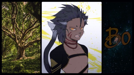
Here we are at the last week – thanks so much to @yourocsbackstory for hosting, I've had a blast! As always I've discovered a couple new WIPS I'm eager to learn more about, and I've had the best time digging into Bo's past and uncovering what goes into his prickly and standoffish yet unexpectedly delightful personality.
Bo is a viewpoint character from my current WIP Thorunn, which will be my second young adult novel, and my first published sci-fi tale, and I can hardly wait to share his further adventures with everybody in 2020. But without further ado, the last backstory! (Yes, I wrote my own questions.)
What secrets does your OC have? Is it something innocent, or something that would be their downfall if discovered? To what lengths will they go to protect their secret?

Haven't you wrung enough secrets from me already? Fine I'll bite. No, not literally. Tch. You people.
Anyway, growing up I didn't really have much of a filter – still don't, much to certain people's, whats the word, consternations – so me and secrets didn't mix much. But uh, there's a couple things I can think of that were big enough for me to keep quiet about.
(Hey, Ken, remember that time the Innah's ceremonial spinner-floss robes mysteriously vanished?)
Bo hadn't meant to take them, he really hadn't.
What he'd wanted, just a for moment, were for things to go back to the way they used to be. When P'rraa wasn't gone, and Bo would help him piece together the exquisite robes worn by the Tribe Elders on special occasions. He'd been little, but his father had had him fetch spools and tie knots and snip dangling threads. Together, they'd created delicate, shimmering garments that seemed spun of flowers and wind and sunlight.
P'rraa had always squinched his eyes tightly together and purred deeply whenever he caught sight of an Elder wearing one of his creations, embroidered with scenes telling the wearer's personal history – their battles, their losses, their accomplishments – and Bo couldn't help but bask in his happiness. He'd always been happy when P'rraa was happy.
He hadn't touched anything related to the craft since that awful day five years ago.
And then he'd seen it. While playing hunters and prey with Ken and Seri at the Innah's loft Bo had discovered a hidden compartment cleverly disguised to appear as part of the wall. He'd slipped inside, grinning wide at his success; Ken and Seri wouldn't find him this time! He'd quickly grown bored of the waiting however, certain in his imminent win, and started quietly exploring. The space he'd concealed himself within was cramped but smelled pleasant, like fragrant flowers after a morning mist. Clothes hung all around him, and he felt his ears prick with embarrassment at realising he'd chosen a hiding spot inside the Innah's personal closet.
But he'd wanted to win, so he stayed put and occupied himself by trying to read the histories writ in pictures on her many colourful robes. The very last spinner-floss garment he'd taken into his hands had forced tears to well up. He knew the cut of the cloth, the style of the embroidery, the peculiar placement of the buttons. Afterall, Bo watched Nyss slip on a similar set of robes before hurrying to his work every day, spent hours sitting amongst the forever unfinished projects hanging in his father's long neglected workshop.
Why hadn't P'rraa stuck to stitching? Why did he have to call upon his dusty Igis training and go out to Ethaba with everybody else?
The thoughts overtook Bo like the Laika river dragging storm-broken branches downstream, and he heard the rip before he saw the unwitting damage he'd caused. Eyes wide, he'd stared at the leaf thin garment irreparably shredded between his claws – but no, no it wasn't. He could fix it, P'rraa had shown him how to make them, and he remembered the process.
And so that was how Bo had ended up in his current predicament, feigning a sudden cough to beg off playing, the priceless robe stuffed under his vest while he stole back to the cobwebbed space that was at once comforting and unfamiliar. He laid the ruined material on a dusty workbench and stared at it, close to tears at the extent of the damage. Hours, days worth of work, and he'd destroyed his father's most prized handiwork in a matter of moments. Slash marks tore right through the scene depicting the Innah being anointed Elder, and long trailing threads had pulled away from the fraying edges.
But he could mend it, Bo knew he could, so he blew off the dust and cleared away the cobwebs and set to work.
His first attempt was an utter disaster, wherein he made the problem that much worse, and lost several buttons which rolled away and refused to be found, no matter how hard he looked. He learned then, to test-sew on scrap pieces of fabric first. His second and third and fourth attempts were hardly any better, and he quickly learned to wear gloves to stop his claws piercing and damaging the flimsy bolts of cloth he worked with.
But bit by bit, Bo improved, dashing into P'rraa's workshop every day after school before Nyss could return and ask what he was up to, and taking a sudden, avid interest in spinner-floss production. The ruined parts of the robes he replaced entirely, carefully cutting together pieces from what parts of his father's half-finished garments hadn't been moth eaten. Some of the Innah's story ended up missing, but he carefully drew it as best as he could remember, before following his dark lines with bright coloured threads. The better he grew, the faster he worked, driven by guilt and the memory of the night the robes had been discovered missing.
They'd questioned everybody on the garment's whereabouts, as the Innah used them for all her most important ceremonies, and was not pleased to have lost them, and Bo had almost fainted after squeaking out that he knew nothing of the missing garments. Nyss had thrown a rather sideways look at him, but never thought to look in P'rraa's workshop. Afterall, Bo was known for destroying things, not trying to fix them. He started begging off playing at the loft, electing instead to take their adventures to the river and the mines, unable to sit still for an afternoon in the Tree of Elders knowing the Innah's jaggedly stitched robes sat stuffed into a box in the corner of his workshop.
But the day finally came when Bo could do no more, and he climbed out of his window one night, trying to return the repaired mass of fabric before anyone could see him and discover his awful secret.
“I've been wondering when this day would arrive.”
Bo froze, a dark shadow between the beams of moonlight slanting soft across the floor of the Innah's loft.
“It's alright, child, come closer.” The Innah melted out of the darkness, a pipe in one hand and beckoning with the other.
Terrified, and already caught, Bo did as instructed, almost shifting to s'hinoian form half a dozen times in his fright.
“It was you. I thought so. May I see?”
“It, it was an accident!” Bo stammered out, unwilling to part with his precious bundle right away. The Innah only waited, patience written in every crinkle of her smiling eyes. Bo gathered up what little composure he had left and shook out the cloth in his arms.
Even as he offered it to the Innah, he could tell his best efforts hadn't been enough. The parts he'd added weren't the same colours, and where P'rraa had originally made the scenes life-like and vivid, Bo's attempts looked like a kit who'd just learned to glyph.
“It was an accident,” he said again, trembling, his fur rising puffy from his skin. “I didn't mean to, I'm sorry.”
The Innah took the garment from him, smoothing it over and inspecting every inch. Bo screwed his eyes shut, not wanting to see the loathing in hers when she discovered how badly he'd destroyed his fathers' handiwork, and what a poor job he'd done in repairing it.
“You've worked hard haven't you?”
Bo cracked open an eye to see the Innah still smiling at him, the robes now draped over the soft sleep-tunic she wore.
“I do wish you'd come to me straightaway – the sooner one confesses their misdeeds, the less one has to live with guilt. But I forgive you, child. You've done your best to make amends, even if you don't quite have the touch with stitchery that your father did. Now go home and sleep, and come back and play with Ken and Seri in the morning.”
(Yes. It was me. Surprise!)
I quit sewing again after that, but I never forgot how kind she was to a scared little kit who was convinced she'd throw him out of the tribe on account of his destroying and rather badly repairing her favourite robes. She never told anyone either, despite the looks she got the next time she wore her obviously altered robes to the next important tribal affair, and I was always honest with her after that.
We're done now, right? It's been an. . . a not entirely awful experience, and I'm looking forward to coming back never. Jolene, Matt, Brett – thanks. You've not been terrible hosts, and if this whole thing helps humans be less afraid of klia'ans, I guess it was worth it.
But next time, ask Seri?
@igotablankpage @musicofglassandwords @elaynab-writing @sheabutterskyes @alcego-writes @valdifarniente @writeanapocalae
#thorunn#writeblr#am writing#wip#yourocsbackstory#a bit longer today for the last one!#seriously this has been so much fun!#I very much enjoyed myself you do wonderful work Cirianne#I'm hoping to clean these up a bit and throw them up on wattpad at some point.#writblr#Bo#etjwrites#writers on tumblr#scifi#scifi writeblr
7 notes
·
View notes
Text
Final Outcome
It took me some time to finalize my decision with what I wanted to present as my final outcome. I didn't want to use my sketchbook as I felt as though it it wasn't as strong as I wanted a final outcome to be. I was reflecting on which workshops were my favourite and I narrowed it down to embroidery and print. As this project is focusing on textiles, I was interested in creating come sort of accessory which relates to my contrast to city and nature. I concluded to creating a pillow however due to the limited time and too many ideas, I thought it would be better to create a collage board instead.
In addition to this, in order to get the best results I could, I decided to create a digital print design rather than free embroidery. This is because although I loved picking up new skills in the workshop, I did find a lot of things I didn't particularly like about my work whether it was tension problems or messy stiches. I didn't feel any weak points when creating digital prints other than collage layouts.
It was important that I created something which shows my narrative vividly to the audience which is why I thought it was a good idea to create a collage so I was able to put as much related content into this board without it looking too cluttered. If I did this design on a pillow I think it would look messy as pillows are traditionally quite plain and if I did a design like that my message wouldn't be as visible.
I spent majority of the afternoon printing the right array of pictures and creating the collage. I was surprised how long I spend on this until I seen that it was the end of the day and I hadn't even heat transferred yet. I wasn't too specific with the pictures I wanted to print off. I just knew I needed a good balance between city and nature. Luckily I had enough pictures taken whether they were buildings or landscapes where I could send to Kelly to print off on the special paper. I was fortunate to have enough space to print more images which is why you can see duplicates of certain pictures which I might need more of in the collage. This was very beneficial as I ended up using all of my printed pictures.

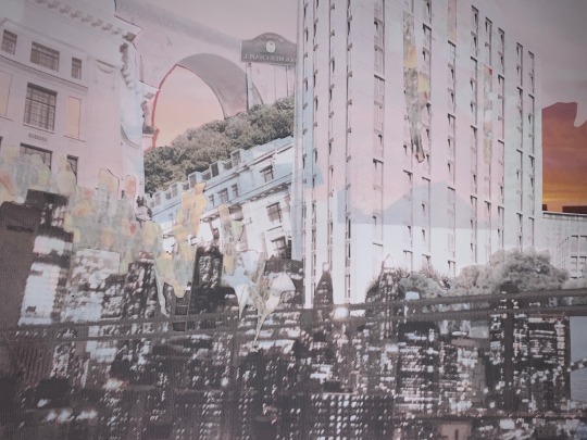
This is a very faded picture of my collage after it went into the heat press. I spend a lot of time trying to get the right layout and include techniques which I have shown before. The aim of this collage was to show the obvious contrast between city and nature and how the two different landscapes reflect my current self. The city reflects aspects of my life which are chaotic, busy and rushed which I experienced much more often prior to lockdown. ‘The city that never sleeps’ and is always awake conveys my mind and how there is always thoughts running through my head no matter how drastic they are. Although I don't do as much travelling to the city as much anymore, I wanted to incorporate this landscape into this everyday moments projects because I think it reflects a part of my lifestyle. Although I may not enjoy these chaotic moments, whether that's arguing with my family or being stressed for no apparent reason, they are a part of me and how I present myself. The country side conveys my life post lockdown. The countryside is very quiet and peaceful which also reflects my mind. When we was able to sit back and rest for a long period, I was able to reflect on certain things and my subconscious habits. I felt like I really opened up and discovered myself in a way. You could say I brightened up which is why I have tried to use a pop of bright colours in my work.
I love the collage I made and like the way I have added the nature into the buildings. Looking at the collage, you can see that nature blossoms out of the buildings. This is reflects my mind aswell as I said above. The buildings represents the structural very repetitive life which I was a part of before lockdown. From waking up, going to school, then sleeping. The bloom conveys my new inner self which is much more calm and controlled. Also where I have the right balance between working hard for my aspirations but also looking after my mental being. All this analysis reminds me of the message of starry night and how he created a beautiful landscape of this view outside his window. Whether this was true or not I think Van Gogh portrayed his mind well despite having so much going on. This is what I've attempted to do with this final outcome which I hope I have achieved.


Because there is so much colour, I pressed the collage a few times to get different results. In the picture above you can see the colours fading each time. My favourite is defiantly the first two as the colours blend so nicely. I decided to use the second sample as my final outcome where I will hand embroidery onto certain parts of the fabric to merge other skills into the piece. I also added some styles which I've done this term aswell. You can see some of the windows are cut out and there is a cut out of some people on a sidewalk in a picture I took. These styles remind me of negative space which I have looked at quite a lot throughout this project. You can also see some of the flowers bleeding through the windows in the middle which was inspired from the previous digital print lesson I had.
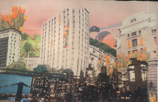
Here is the final piece. I have added some embroidery onto the piece but I didn't want too much as I didn't want it to look too cluttered. I used cardboard to attach the fabric onto something more sturdy. Overall I actually really love this piece as my final outcome. I don't usually collage like this and seeing how well this has developed in comparison to some I made in my first digital printing lesson, I will defiantly keep working on using collage as I think it will be beneficial to make my work look better. Using this technique of print enables me use my own pictures, making it even more personal than a weave piece would and helps me convey my storyline much better. Although I had an idea to create a piece showing the same message but on a pillow, with good reasoning, I think doing a board like this gets my message across much better and seals the story well.


0 notes
Text
Week 9 - Assignment Progress
Links and info on chosen issues...
https://www.pewresearch.org/global/2016/08/02/number-of-refugees-to-europe-surges-to-record-1-3-million-in-2015/
https://journals.sagepub.com/doi/pdf/10.1177/233150241500300301
https://journals.tplondon.com/ml/article/view/274
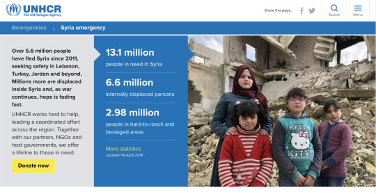
https://www.unrefugees.org/news/syria-refugee-crisis-explained/
https://www.unhcr.org/syria-emergency.html
The Syrian refugee crisis is the result of a March 2011 violent government crackdown on public demonstrations in support of a group of teenagers who were arrested for anti-government graffiti in the southern town of Daraa. As violence increased, families began to flee. Within two months, the first refugee camps opened in Turkey – by March 2013, more than 1 million people had fled Syria. Today, 12 million Syrians are displaced from their homes and more than a million Syrian children have been born in exile.
Finding the data...
I have decided that the data that I am going to use is going to be the number of people that are exiting Syria and where they are going (distance) depending on what types of statistics I can find...
https://data.humdata.org/dataset/unhcr-global-trends-forced-displacement-in-2019-data
Whilst searching for some relevant data found the site above which links to a 2019 data of the displaced people of Syria and where they relocated and has a lot of other data that I will have to sort through. But this seems like a very promising set of data.
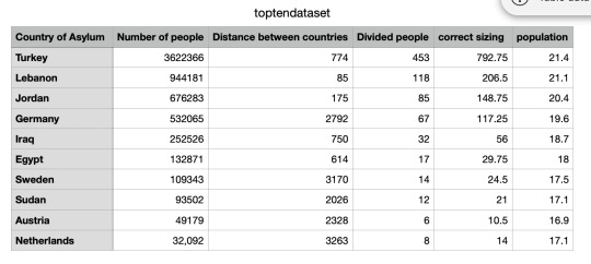
From the data I gathered all the information that I would need from the table. The distances although were not in the table which means that I had to manually find the distance from Syria to each of the individual countries.

Even though this is a very promising start to my project I noticed one issue off the bat and that was the numbers themselves. Because there is 3.6 million people that went to Turkey and 14 people that went to Algeria this posed an issue. Firstly because a number like 3.6 million is very difficult for processing to deal with, but usually we would simply divide to reduce them to a number that we are able to handle much easier. The issue with that is that the smaller numbers like the 14 that went to Algeria would become infinitely small.
This means that I have a choice...
- I could either priorities the data and make it so I use the top 10 results or how ever many I want to use.
- Use a technique that was mentioned by Tim called Mapping that can change the original number range and you can set it at your personal number range.
- Or change the data that I am using and focus on a different area.
Putting the numbers into Processing...
Although, I haven’t set on how I am going to manipulate the data so it will work in a way that is visually appealing to the audience, I still want to make sure I have the basics of the code down. This way no matter the data I use I will still be on the right track.
Table dataSheet;
void setup() {
size (600,600);
//fullScreen();
dataSheet = loadTable("numberStats.csv","header");
//println (dataSheet.getRowCount());
println (dataSheet.getInt(3,0));
for(int i = 0; i < 4; i++) {
strokeWeight (3);
stroke (0);
fill(255,0,0);
ellipse(width/2, height/2, dataSheet.getInt(i,0)/20, dataSheet.getInt(i,0)/20);
}
//ellipse(50,50,50,50);
}
void draw() {
}
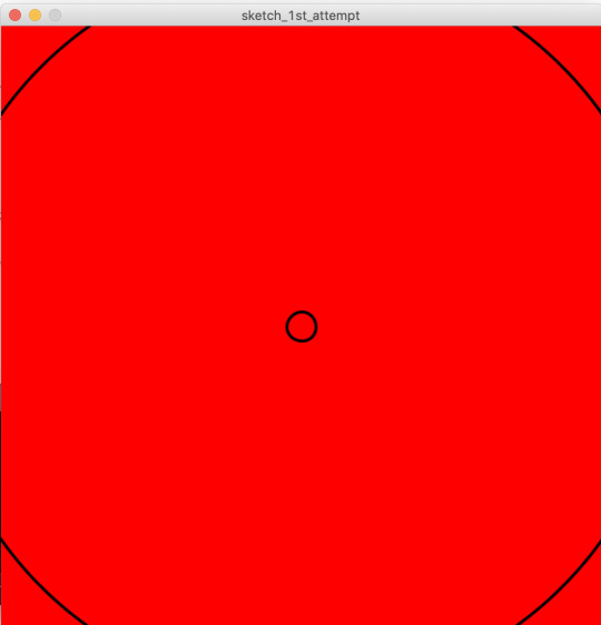
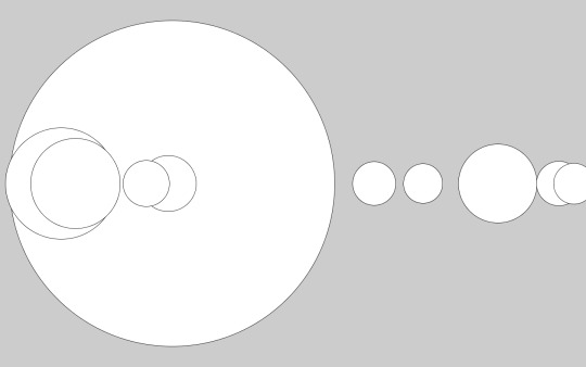
The code shown above is the code I used to creates that output and although I do understand this output is not successful at all at representing my chosen data set it is still a good indicator that I am using my code correctly.
Using the Top 10...
Table dataSheet;
void setup() {
size (2000,950);
dataSheet = loadTable("toptendataset.csv","header");
println (dataSheet.getRowCount());
println (dataSheet.getInt(0,3));
for(int i=0; i<10; i++) {
ellipse(width/2, height/2, dataSheet.getInt(i,3), dataSheet.getInt(i,3));
}
}
void draw() {
}

The circles above were displaced because the sizing of the canvas was incorrect so to change to the picture below I simply changed the size (2000,950); to fullScreen();
Playing with sizing...

Went back into the data sheet and times the data by 2 to create what is shown below.

Now this is too big

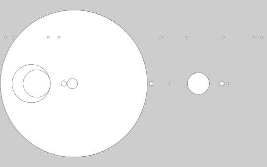
Playing with layout...
I then inserted the data of the distance between the countries into the x-position of the ellipse function.


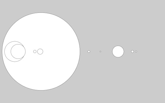

Table dataSheet;
void setup() {
fullScreen();
dataSheet = loadTable("toptendataset.csv","header");
println (dataSheet.getRowCount());
println (dataSheet.getInt(0,4));
for(int i=0; i<10; i++) {
ellipse((dataSheet.getInt(i,2)/3)+100, height/2, dataSheet.getInt(i,4), dataSheet.getInt(i,4));
}
}
void draw() {
}
This is the code from the last attempt of the positioning.
Attempting to use the map function on the data...
After some research into mapping
https://processing.org/reference/map_.html
map(value, start1, stop1, start2, stop2)
Table dataSheet;
void setup() {
fullScreen();
dataSheet = loadTable("toptendataset.csv","header");
println (dataSheet.getRowCount());
println (dataSheet.getInt(0,4));
for(int i=0; i<10; i++) {
float value = dataSheet.getInt(i,2);
float m = map(value, 85, 3263 , 30, width-30);
ellipse(m, 200, 10, 10);
ellipse((dataSheet.getInt(i,2)/3)+140, height/2, dataSheet.getInt(i,4), dataSheet.getInt(i,4));
}
}
Inserting the m value into the ellipses line of code I did this first just to assess if I had copied the code correctly.

I then applied it to the data ellipse themselves and it worked well which is why in the next image I just adjusted the starting point of the new range so all of the circles were visible.

Table dataSheet;
void setup() {
fullScreen();
dataSheet = loadTable("toptendataset.csv","header");
println (dataSheet.getRowCount());
println (dataSheet.getInt(0,4));
for(int i=0; i<10; i++) {
float value = dataSheet.getInt(i,2);
float m = map(value, 85, 3263 , 150, width-30);
//ellipse(m, 200, 10, 10);
//ellipse((dataSheet.getInt(i,2)/3)+140, height/2, dataSheet.getInt(i,4), dataSheet.getInt(i,4));
ellipse(m, height/2, dataSheet.getInt(i,4), dataSheet.getInt(i,4));
}
}
void draw() {
}
The transition from the image above to the image below was the change in the range that I chose to

Decided to add random colouring mainly for the purpose of myself being able to differentiate between the circles.
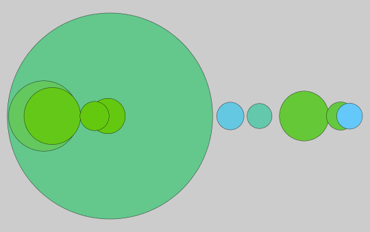
Table dataSheet;
void setup() {
fullScreen();
dataSheet = loadTable("toptendataset.csv","header");
println (dataSheet.getRowCount());
println (dataSheet.getInt(0,4));
for(int i=0; i<10; i++) {
float value1 = dataSheet.getInt(i,2);
float m = map(value1, 85, 3263 , 170, width-80);
float value2 = dataSheet.getInt(i,4);
float n = map(value2, 14, 792.75 , 100, 800);
//ellipse(m, 200, 10, 10);
//ellipse(n, 200, 10, 10);
//ellipse((dataSheet.getInt(i,2)/3)+140, height/2, dataSheet.getInt(i,4), dataSheet.getInt(i,4));
//ellipse(m, height/2, dataSheet.getInt(i,4), dataSheet.getInt(i,4));
fill(100,200,random(255));
ellipse(m, height/2, n, n);
}
}
void draw() {
}


Any other options of data sets...
I feel as though my design is too simple so I am going to try and incorporate another data set or attempt to do something else with my current data set.
I have found some population statistics over the past 10 years in Syria and I think I am going to try and incorporate that into my code. The
I have become keen on the idea of using rectangles within my design.

Table dataSheet;
void setup() {
fullScreen();
dataSheet = loadTable("toptendataset.csv","header");
println (dataSheet.getRowCount());
println (dataSheet.getInt(0,4));
for(int i=0; i<10; i++) {
float value1 = dataSheet.getInt(i,2);
float m = map(value1, 85, 3263 , 170, width-80);
float value2 = dataSheet.getInt(i,4);
float n = map(value2, 14, 792.75 , 100, 800);
//ellipse(m, 200, 10, 10);
//ellipse(n, 200, 10, 10);
//ellipse((dataSheet.getInt(i,2)/3)+140, height/2, dataSheet.getInt(i,4), dataSheet.getInt(i,4));
//ellipse(m, height/2, dataSheet.getInt(i,4), dataSheet.getInt(i,4));
fill(100,200,random(255),50);
ellipse(m, height/2, n, n);
rect((width/2)-dataSheet.getInt(i,5)*5,(height/2)-dataSheet.getInt(i,5)*5,dataSheet.getInt(i,5)*10,dataSheet.getInt(i,5)*10);
}
}
void draw() {
}
After I did some research into the issue I have decided to focus on creating a patch to display my data this way it can be fixed to a backpack, t-shirt, blanket etc.
So I needed to find a way to present it that would. be effective as a badge and a more aesthetic way of displaying the data.
Back to the drawing board...
My attempts at trying to find an idea that would work using both the ellipses and rectangles.
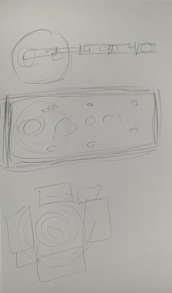
Out of the designs that I had I became very fond of the last 3rd one as I feel it would provide an aesthetic patch whilst also displaying the data.
What this means for the code...
This means that I will need to isolate the turkey statistic, without removing it from the distance data.
It will also mean placing the rectangles in the centre of the circle and potentially using the
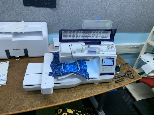
Intro to Digital Embroidery...
So I then went to the embroidery induction on 30th September, where we learnt how to use the digital embroidery machine using the inputs created from processing.
import processing.embroider.*;
PEmbroiderGraphics E;
void setup() {
size (600,600);
E = new PEmbroiderGraphics(this, width, height);
String outputFilePath = sketchPath("PEmbroider_test.dst");
E.setPath(outputFilePath);
E.beginDraw();
E.stroke(0,0,0);
E.strokeWeight(10);
E.strokeSpacing(2);
E.fill(0,0,0);
E.hatchMode(E.SATIN);
E.rect(100,100,300,300);
E.textSize(2);
E.textAlign(CENTER);
E.textFont(PEmbroiderFont.DUPLEX);
E.text("PEmbroider",250,250);
E.optimize();
E.endDraw();
E.visualize();
}
void draw() {
}
To make the file an embroidery file you basically need to add E. before each line that you want to apply to the embroidery. The code must always start with import processing.embroider.*; followed by PEmbroiderGraphics E; this is all defining that it is an embroidery document so processing can register it.
0 notes
Text
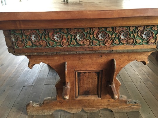
Conversation with a Native Son... (sort of)

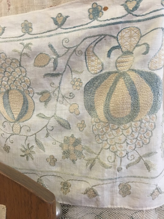
And Bardejov Guild trade goods!
Weaving and embroidery shown above. Linen from medieval Bardejov was highly prized.
For this trip it was clear that I was fine having an outline and filling in details as I went along. For Bardejov, one of the nicer details came from my decision to pick anything along my way with the name “Bellevue”. That’s how I ended up staying at the Bellevue Hotel and Resort, situated on a hill just outside of town.


Wrought iron items were another highly prized category of medieval trade goods from here.
Checking into the Bellevue Hotel was when I could paraphrase Dorothy Gale: “Toto, I’ve got a feeling we’re not in Poland anymore!”
The Bellevue Hotel presents as slightly past its prime, typical of higher end, late Soviet period: quasi-opulent with a lot of mauve, marble, and mirrors. And lots of lights turned off or not working. My room was very nice, though the main lamp, mini-fridge, and bathroom mirror light didn’t work. When approached about these issues, in typical post-communist Slovak style, the front desk attendant essentially shrugged her shoulders. Fortunately her shift was almost over. Her replacement was much more helpful and got in touch with León, who quickly got things straightened out.
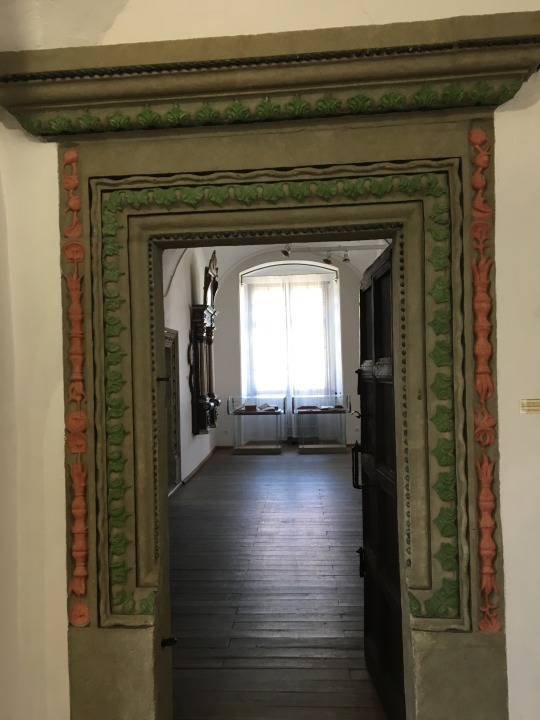
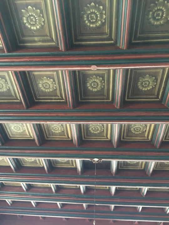
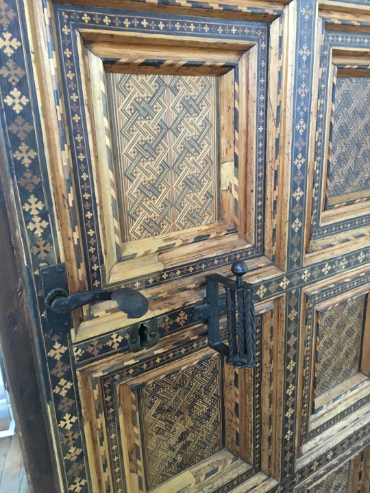
Door frame, ceiling, and table from medieval times in Bardejov... what folks did before TV and the internet! (Not pictured- the door was even more intricate with teeny-tiny inlay. Sadly, unable to get a decent image.)
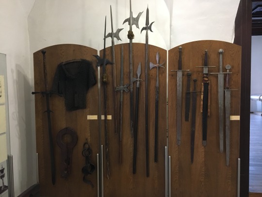
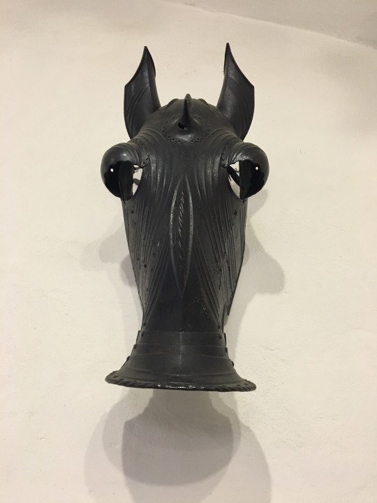
Medieval weapons display, Bardejov Museum.
León turned out to be a native Slovakian, raised in Toronto for much of his youth. Employed by a consortium of hotel owners, he was there to get things at the troubled Bellevue back in order.
Returning late after a day of touring the town, front desk attendant #1 was ready to dismiss my request for dinner at the hotel. León stepped in, arranged for my dinner, asked me to join him, and bought me a Heineken! It was lovely to spend the sunset hour talking with him- in English!- with the beautiful view.
León could be described as roughly my age, friendly, and an astute businessman. I’m unsure what brought him back to his homeland but I surmise it’s related to post-communist economic opportunity, and a lower cost of living. He could fit in with Bellevue, WA politics very easily: pro-development, pro-business, anti- liberal. Note- I didn’t say Conservative.
Our conversation gave me food for thought. I appreciated the opportunity to hear commentary from a business perspective It was particularly insightful from one who’d lived in North America, plus both communist and post-communist Eastern Europe. I am not going to comment on how “PC” OR FACTUAL his comments were or not, nor whether I agree or disagree with them. I present a paraphrased synopsis here to give you an idea of this side of the political landscape in Europe at this time of incredible and increasing immigration stress.
León’s Perspectives:
1. In 50 years, give or take a few, Europe will be gone, taken over by Islam, due to the EU’s inability to deal with the “Muslim Issue”. It’s already too late for France & Sweden. In Sweden the Muslim immigrants come and are supported by the State. The Swedish citizens are working to support the immigrants, not their own countrymen or their social security type plans. Also big problem in the UK, the immigrants do not want to or have to work. The State supports them. Liberals don’t know what they’re doing.
2. Shari’a law is in place in every EU country, without any local law consequence. 2 examples given- a) streets being shut down in France at prayer times, against the laws of France but no one is doing anything about it. b) A young woman moved to the EU to get out of her oppressive environment & go to college. Her family sent her 15 year old younger brother along to police her. She pushed back her hijab a bit in class, to which he accompanied her just for policing. He came to her seat & pulled her scarf back into place, then slapped her in the face in front of the whole class- without repercussion. Liberals don’t know what they’re doing.
3. Finding good workers in post-communist Eastern Europe, Slovakia in particular, is terribly hard because no one wants to work. They all expect to get their support checks from the State, and are fine putting in the minimum effort on the job. No one is required to take overtime, in fact laws are in place to prevent it. The laws are so stacked for the workers and against the owners that it’s very tough to be in business in Slovakia. Communism and socialism has ruined the work ethic for generations. Liberals don’t know what they’re doing.
4. Corruption is rampant in Slovakia, and most all former Soviet Block countries. It’s become a part of the system. One Slovakian highway contractor has been building a cross county highway for decades, on the state dime, goes bankrupt, gets paid off, reorganizeds and comes back in time to get the next contract, with a new company name and the same people. They’ve completed less than half of the project in the course of many decades, costing the country many hundreds of millions. Liberals don’t know what they’re doing.
5. Barack Obama was the worst US President because he insisted upon paying respect to the Muslim Brotherhood, plus he bowed & kissed the Saudi King’s ring. As US President and world leader he was an equal to the king and needed to show strength, not reverence. Liberals don’t know what they’re doing.
There’s a lot of controversy about some of these comments. Below are Muslim and Christian websites & commentary. One can look up more as desired. 🙁🙃😉🤣🥨
0 notes
Photo

Well worth the work
Waited for it to be released in the US, was worth the wait. Full of wonderful patterns. some simply designed others lavishly planned. Great way to use up those left-over yarn from other project. Book laid out with basic pattern on a foldout page in back so you can open it and leave it out as you work the various birds.
Go to Amazon
Fun
This is a fun book. The photography and heft of this book make it feel much like a coffee table book. Although there is fundamentally only one bird pattern in the book it does provide some awesome ideas on how to jazz up your bird. I very much enjoyed the writing style, pictures, and overall fun in this book. the bird is easy to work up and I'm now onto decorating it! the fun part! and the miniature hats are adorable!!!
Go to Amazon
I have found a new love!
Arne & Carlos are fabulous, and this book is delightful and entertaining. Even if I never make a bird, the book will stay on my coffee table because it is beautifully photographed, the birds are wonderful (for knitters AND for birders), and it is so much fun to browse through. I see something new every time I open the book. Arne & Carlos have a bunch of other pattern books that seem equally fun and beautiful. This was a wonderful discovery.
Go to Amazon
Amazing. Fun. Clear.
I'm not sure I've ever seen a better written and illustrated knitting book. The actual book is very well made, and the content is even better. Those birds are wonderful! Who knew knit birds could even be a "thing". By the way, the photography and charts are excellent. Written work is clear. Everything about this book is fresh and fun. Highly recommend.
Go to Amazon
What a "hoot"! (Pun intended)
This is really a very delightful read for knitters and crafters. The writing is interesting and entertaining and the photography is beautiful. More than one knitter I've shown it to has said it would make a nice coffee table book. In addition to all that, the instruction is clear, concise and inspires readers to create their own flock.
Go to Amazon
Beautiful book with amazing ideas
Beautiful book with amazing ideas! Not really colorwork, focuses on embroidery skills to add to the different knitted Bird patterns
Go to Amazon
The birds are beautiful and I especially like the different stages of difficulty
This book is intriguing. I haven't tried any of the patterns yet but the instructions are very clear and comprehensive. The birds are beautiful and I especially like the different stages of difficulty. The bird stands might cause a bit of a problem to make and it will be my first attempt at intarsia. However, there are clear pictures and instructions. I imagine a whole flock of birds of many feathers on a Christmas tree.
Go to Amazon
Whimsical and quick to make, with good, clear instructions
I impulse-bought this book because I loved the whimsical cover and title. The instructions for the various birds--a "field guide" drawn from actual Scandinavian wildlife and from the authors' vivid imaginations--are clear and simple, and the resulting birds are wonderful. I am imagining our Christmas tree decorated with a whole flock of these, and an extra bunch designated as stocking-stuffers for my bird-loving friends.
Go to Amazon
It's Finally Here!
Four Stars
Five Stars
i love the birds
Wonderful book
Quirky and fantastic
One big ommission but otherwise a very cool book
Another treasure book
Great Book!!
1 note
·
View note
Text
FAS3000 resubmission blog only:
This project is not for the faint of heart, I’m sorry but it’s not. It focuses on the violence and distress of the world today. But it also focuses on my life, the people in it and the surroundings I’m so familiar with.
For my first page I wanted it to be an informal introduction to who I am and the brand that I have created. I wanted to have mostly gold on the first pages as I had to wait for materials and tools to arrive. However, the gold is still relevant as my colour story for this project is gold, black, red and pink. My reason for me choosing these colours is they are all favourite colours of mine plus I have an unhealthy obsession with Harley Quinn, hence the black and red. The pink is also used as my hair is pink so I see this colour multiple times a day!
I also did a sketch of myself (from memeory) so if it looks off, it’s because I didn’t use a reference picture.
The symbol in the middle of the page is my brand logo along with my signature on every page to show that it is all original work that belongs to me.
The second page has my continuous line sketches and some quick 1 minute drawings too. Some blue colours pop in and out of my sketchbook to pay homage to Harley Quinn’s Suicide Squad look. I have also chosen the letter ‘X’ to represent the phrase ‘no face no case’ which I heard through people talking and is also mentioned in Smuggzyace - Just Do It (YouTube). We were also instructed to not use words within our sketchbook. I did break this rule a few times throughout the sketchbook but this was because I needed the extra push so people could understand what the story of my project is. I did refrain from adding the whole phrase in and instead opted for initials to be used (NFNC). What I want to create is a collection of my experiences, but not just physical. I wanted to showcase my mental state and how I think, how I perceive people as we never really know anyone. We only see what they present to us, the face is taken out of the picture as eyes can be seen as windows to the soul.
The third page has another quick sketch along with a more detailed and scenic sketch, I have used Washi tape to decorate the empty spaces on the page and to stick the photographs down as I didn’t have a glue stick at this point (I was still waiting for the order to arrive). I tried to make the colours match to my theme as much as I could, I also masked the faces to also keep on track with my concept. I chose to focus on the female body for this portion as I knew I wouldn’t be including other females as I don’t connect with females as well as I do with males. So the only female I could include was myself, and I feel I know myself so I allowed my face to be shown.
Onto the fourth page I have introduced the ‘NFNC’ initials along with blocks of colour that match my theme. I wanted to have a little break within my sketchbook to allow for there to be variety in the placements of my work. I didn’t have any samples up until the next page as I didn’t want my pages to be too bulky and I wanted to get my sketchbook as flat as possible to prevent warping the pages and samples. Unfortunately, I didn’t manage to avoid this entirely. But I feel as though it adds to my work by making it look a slight bit disheveled.
Here on page 5 is where my samples start to play a major role in my work, I used disperse dyes to create the images I want onto paper and then heat press them onto fabric. I tried to experiment with placements and overlays and wanted to create an almost grungy type look to my samples.
Carrying on through to page 6 I have more printed samples along with a 3D painting, I made this by adding thick layers and letting them dry completely before adding more layers. I wanted this to look like the X is drawn in blood as I want to emphasise the violence that can occur within gangs and territories. Gang related violence is a massive issue, not only for the members of said gangs but also their families, the public, everyone is and can be a target.
Moving through to page 7 I have made a drawing of a person masked up with a balaclava and wearing gloves holding an outline of a gun to avoid any identifying information ( not a drawing from a reference but from my imagination). Along side this I have a drawing of a bullet to reinforce the danger element. On the next 5 pages I have my primary photographs of the mandem (friends), I wanted a natural look to these photos in the poses but when I edited them I wanted a more intense vibe so I chose to stick to mainly grey scale and highlights of colours.
Following these pages I decided to mix both samples and photographs in my pages. This is where the attitude and vibe ramp up really expressing the messiness and violence of being on road (this means people who are out in public either selling or on other gang related activities). I rely on sublimation printing, embroidery and knitting. I am very angry with myself though, I did have more samples like weave and more prints, however, they have decided to disappear and I couldn’t find them in time to put them into my sketchbook. I had also made quite a few mistakes on some samples and decided to not add them or layered and built on top of them. I took inspiration on how to place and build into my work from different artists and different things. The artists I took the main inspiration from is Sebastian Herzau who also uses coloured strips of paper and tape to cover identifying characteristics in his photographs. Top Boy (Netflix show) has also heavily inspired my theme as it focuses in on gang hierarchy and activity.
I have also added headlines and newspaper stories of what has been happening in the world, what they feel is important and how the media can influence the public. I have used the same tactics when picking which stories I wanted to showcase, I picked the stories that lines up with my concept. This then paints the media in the way that I want you to see them. It’s one of the oldest forms of propaganda, manipulation. I thought that it would have an impact on how I’m trying to convey how we never know the full story. Even when we are confident that we have seen something with our own eyes, our brain lies to us. For example: if you look side to side quickly it will look like a fluid motion in your eyes, but our eyes focus on one or two points along the way and make up the rest based on the surroundings. Or a better way of getting my point across, you can at all times see your nose. Our brains just ignore and erase them!
When looking back over my work, I feel like I should have definitely created more art and samples as it’s hard to see what my concept is, I wanted to create a visual book, a book that shows the horrors of this day and age. But also how we dress them up, how we present a version of ourselves to the world that isn’t true. But I also wanted to show the true horrors that happen everyday. I didn’t want to design an outfit for this project, I wanted to create a physical piece of my history. What I have seen, what I have heard and what I have felt. I do however, feel that the mood I am trying to create with my work is being successfully acquired. I could have also used different location imagery like Handsworth with the AR12’s and B21’s gang members located there. But this would have been very dangerous so I refrained. Instead of taking inspiration from fashion designers I wanted to take inspiration from how people in my daily life present themselves, their fashion.
0 notes
Text
Evaluation
In this project, I need to be able extend my understanding of the potential of visual imagery as a means of communication, the idea is to communicate visually things that happen in everyday moments as there are many ways in which you can visually communicate in everyday life with things such as, magazines, artwork, photographs, social media, body language and emojis. My idea at the start of the project began with what people wear and how it reflects on their mood / how they are feeling, but as I began to research I realised that it was extremely broad and decided to go with how happiness is shown in everyday moments.
My research started with a visit into Birmingham city centre where I was initially taking photos of bright things that stood out to me, and the things that stood out the most compared to the other things in the city centre. Although my idea wasn’t clear to me at this point I knew I wanted to do something that involved fashion and how people feel. After the visit to the city centre I started to decide on what I wanted to try and visually communicate with people. The pictures I have taken link to my project as they stand out although I didn’t add as many pictures to my work as after deciding on my narrative the pictures didn’t really go other than the colour. With the photos that I had I decided to pick out the things that stood out the most and draw and design over them extending the pictures I had taken, so they weren’t just place on to a blank page I used bright colours to create something more eye catching. I also cut up the pictures which has the most colour in to make the images more interesting to look at.
Once the research began, we were introduced to the workshops, Embroidery, Print, Traditional Print and Weave, which we were all spilt into smaller groups so it was easier for us and so we had more people around to help. Each work shop we had the opportunity to create something that was relevant to our work. I feel that in the workshops, as I wasn’t familiar with the equipment and hadn’t done anything like it before I was always asking questions on how things work and what to do, so for around the first two weeks I feel I wasted a lot of my time just trying to pick up how each thing worked. Once I had become more confident in using the equipment I began to make things which were a lot more relevant to my work, after looking at artists that used bright colours within their work. I started to look at what colours resemble happiness and how the artists used those colours, so when I was in the workshops I was creating things similar to what the artists did for example when I was in weave I looked at the artists artwork and created something using similar colours to what they had used. My strengths and weakness varied throughout what I was doing, as some things were easier than others. A huge weakness for me was embroidery as that was something completely new to me and I had not used a machine before, and I felt that I wasted most of my time trying to learn how to set it up, although I didn’t enjoy it I feel that it is a good skill I have picked up and became helpful in parts of my work that I did. Another weakness for me is that I don’t really enjoy practical i.e. sketchbook work and embroidery, so none of what I had done worked in my favour and was all new to me, but I tried my best throughout the project. A strength for me is that I enjoyed weave as it was a simple technique to pick up and you could create almost anything using all the different colours, and there were many different ways in which you could weave, I kept mine basic and added things to make in look more interesting and relevant to my work. Another strength for me is that if feel like I am a creative person so although I didn’t enjoy sketchbook word, I feel that my layout is very clear and understanding, and if anyone was to look at my work, they would understand what I am showing. In the end I ended up enjoying putting my sketchbook together and feel that it shows how those bright colours can make someone feel, and I kept using the bright colours throughout my work. Potential improvements for myself would be to make sure that I understand the skills required for the task before starting so I could allow myself time to learn how to use the equipment and all the different techniques.
Within all my work you will see the relevance to each artist and how I used each workshop to create something, relevant to their artwork as well as my narrative. I have used the artist’s work to create different pieces of work, all using bright colours to symbolize happiness in everyday moments, and how bright colours may make someone feel.
In the workshops I was always experimenting and asking questions about all the things we could make, and all the different samples that I could produce. I don’t think I was the most confident in the workshops, but what I did, I would do it to the best of my ability and to the highest standard I could. I feel the I had a balanced number of samples from each workshop, although I could have had more samples within my work, I feel that if I didn’t lack the confidence, I could have produced many more than what I had.
Throughout my project I always had a plan for each day, and always knew was each day was going to consist of. For the first few weeks we were in smaller groups working in rotation in the different workshops, where we were taught all the different skills and techniques within each workshop. There was always a plan in place and I always knew what I was going to work on, although I may have aimed to do a lot more than what I had done, but I feel that I struggled a lot in the workshops and was spending most of my time practicing before creating my samples. Planning what I was going to do before each lesson was important as the time in the workshops was designated to us so I needed to make sure I used to benefit my work, planning was also important because if I knew what I wanted to work on and wasn’t sure I could ask for help first thing and work with my teacher one to one, discussing all the possible outcomes. I feel that I have progressed massively through the period of doing this project and I have picked up many new skills, from the samples I was making at the start to some of the things I have produced towards the end the improvement is clear, and I feel that I was able to work a lot more independently.
Within my work I came across many problems, but always tried not to let them hold me back. While working in embroidery I probably came across the most problems as I wasn’t confident on the machines, trying to familiarise myself with all the different equipment and all the parts to them was probably the hardest thing, as I would spend most of my time trying to set up the machine. Although this was a problem for me, I was ensuring that I was always asking for help and not only off of my teachers but some on my friends in my class that were familiar with the machines. I started to practice more and more on the machines and slowly became more confident on them, and actually used the machine for stitching a few things onto my final outcome. All the problems I came across I wouldn’t let them knock my confidence or hold me back, I either worked on something else until someone was available to help me or asked others around me, I always made sure that I wasn’t just sitting around I was always doing something that would benefit my work.
I feel that my progress throughout this project is noticeable, as from not knowing how to use any of the equipment, to become able to use the equipment independently is a huge achievement for me, as I feel that I lacked confidence when it came to working in the workshops but I always ensured that I was trying my hardest. As well as not doing sketchbook work before so also lacked confidence in that I feel that my work slowly became clearer and came together. I feel that in this project I have picked up many skills that will benefit work that I do in the future, and if I was to come across certain problems in the future I know there are many possibilities in which I can overcome them.
My final outcome is a t-shirt as that is what some will wear in day to day life, wherever it may be. I felt the t-shirt was relevant to my idea as I was talking about the colours people wear, so when I have designed my t-shirt I have used bright colours and incorporated shapes into it, I had also knitted bright colours and used the sewing machine to stick them one, and also did some free hand embroidery as I had taken inspiration from one of the artists that I had researched. I feel that my outcome is successful in the sense I made it to the best of my ability but feel that I could still add more. I am also pleased with my outcome as for my I have come extremely far within this project so tried to showcase some of the different techniques I had learnt along the way. I feel that my outcome could be developed as in, it could be a lot neater, but I feel that I used my skills I had to the best of my ability.
0 notes
Video
youtube
Buy it on Amazon - http://ift.tt/2Cm5cWS - Buy LE PAON 8m Metallic Embroidery Floss,24 Skeins All Purpose Assorted Mix Colours Cross Stitch Tread Set for Craft ,Needlework,Hand Embroidery,Bracelets -- Click the link to buy now or to read the 25 4 & 5 Star Reviews.Subscribe to our Channel: https://www.youtube.com/channel/UCq9ht8h4kUZXoOuTK9cXJ4Q?sub_confirmation=1 Like us on Facebook for videos, pictures, coupons, prizes and more - http://ift.tt/2wCDdi2 Buy LE PAON 8m Metallic Embroidery Floss,24 Skeins All Purpose Assorted Mix Colours Cross Stitch Tread Set for Craft ,Needlework,Hand Embroidery,Bracelets I love it. Its functional and works just like I was expecting. Amazon Review... Reviewer : Jacob I received this item very quickly and was able to put it to use right away. Very happy with my purchase. Amazon Review... Reviewer : Tyler Click http://ift.tt/2Cm5cWS to buy now on Amazon or to read more reviews. COLOR NO- 24 skein with 12 colors as shown in the pictures.COLOR NO:E718 E3849 E3837 E321 E699 E825 E155 E334 E703 E317 E3852 E415 PACKING DETAILS-24 skeins 8m Metallic Embroidery Floss,24skeins /opp bag,Total 12 different colors -enough for any project GREAT QUALITY THREADS FOR YOUR NEEDS-Metallic thread fine texture, colourful is gorgeous, even color, color is complete, stable quality, super soft, acid and alkali resistance, high temperature, high color fastness WIDELY USE- Perfect for tying cakes boxes, gift wrapping , crafts, birthday, party, holiday decoration. And This dazzling versatile thread can be used for a variety of techniques, from cross-stitch to needlepoint to all types of embroidery I was hesitant about purchasing online, but after opening the package I could not have more surprised at how easy it was and how good the quality is. Amazon Review.... Reviewer : Michal Click http://ift.tt/2Cm5cWS to buy now on Amazon or to read more reviews. ***Let Us Know What You Think… Comment Below!!*** Watch my other review Videos – https://www.youtube.com/channel/UCq9ht8h4kUZXoOuTK9cXJ4Q See other products on http://ift.tt/2xhK4Ru Subscribe to our Channel: https://www.youtube.com/channel/UCq9ht8h4kUZXoOuTK9cXJ4Q?sub_confirmation=1 Like us on Facebook for videos, pictures, coupons, prizes and more - http://ift.tt/2wCDdi2 #Wuxi Chaoqiang Adornment Co., Ltd., #LE PAON 8m Metallic Embroidery Floss,24 Skeins All Purpose Assorted Mix Colours Cross Stitch Tread Set for Craft ,Needlework,Hand Embroidery,Bracelets This is a review video for : B01M7X67NS Manufacture : Wuxi Chaoqiang Adornment Co., Ltd. Thanks for watching! http://ift.tt/2xhK4Ru Related Videos in Channel
0 notes
Text
Fall Tree Cross Stitch and How I Create My Own Patterns (Free Download!)
Ready for fall? Check out this fall tree cross stitch that is easy enough to make in just a few days. In this tutorial, I also cover how I create my own cross stitch patterns and provide a free download for this pattern.
In the blog world, it seems pretty commonplace for DIYers to create things out of embroidery hoops. From decorative wreaths to wall hangings and terrariums and light fixtures — even spider webs! But what about actual cross stitch? I know I’m not alone in having a love for this craft, but I’ve only ever shared sneak peeks of my patterns in IG stories before. It wasn’t until a few people reached out about their own crafting that I thought, “hmm, maybe I should show people how I create my own!”. So, here I am with today’s tutorial after this little DIY fall tree cross stitch.
*some links to products are affiliates. thanks for supporting the UDH!*
I first learned how to cross stitch from my Granny as a kid. She would spent hours and hours stitching gorgeous Lavender & Lace angels (those of you who are fans of cross stitch will know this manufacturer well… but those of you that don’t, here, here, and here are some great examples). She lovingly made one for each of the women in my family, including me and my younger sister Emily (or Em, as you’ve seen me mention her before). As a kid, I was fascinated with her craft and eager to learn how to do one myself. I picked out a very tiny pattern (with some beading, since I was ambitious as hell) and made my first angel out of a small kit (wow, I can’t believe I found that online too).
I made a few more, but during high school and college, I pretty much dropped it while I did lots of other crafts (painting, drawing, upholstery, scrapbooking, clay, etc.). Then seemingly random, I decided I wanted to start cross stitching again. I have an old kit from my Granny that I still use today, but when it comes to making patterns, I use a much more modern process!
How I Create My Own Cross Stitch Patterns
For creating my own cross stitch pattern, I use pic2pat.com. I’m not even sure how or when I found the site, but it works insanely well for such a complex process.
Step 1: Find and upload a photo or clipart.
I find that vector or clipart images work great, but I’ve also done some photorealistic patterns as well. In this example, I found a free clipart of a fall tree (I’m not a lawyer obviously, but for copyright reasons, ONLY use images that you have created yourself or are “Creative Commons CC0” — Google images may seem like a good resource on its face, but a great deal of those are still under copyright protections… which means using them can get you into a lot of hot, expensive water… try a site like Pixabay for lots of good free-use options instead).
Step 2: Select settings
On the next screen, you’ll have multiple options to set your pattern, which are based on the type of floss used(which is just the name used by cross stitchers, but it’s just multi-strand thread), the number of stitches per inch (the more stitches per inch, the tighter and more detailed the image can look), and the actual size of the end design (the size of the finished product). The “floss” brand I use is the best DMC. Most of the cross stitch fabric I pick up is size 14, but I also use 16 and 18 when I know I’m doing something more complex (the higher the size, the smaller the stitch… but that also means you can do more photorealistic patterns and not have to make the canvas HUGE to get enough detail).
The thing that also contributes to the overall quality of the pattern is the physical size of the pattern you want, which is the next selection on the drop-down menu. The dimensions will auto-generate based on the shape of the image uploaded, so if for example you want a square pattern, be sure to upload a square file. It will start at around 2 inches (which will greatly pixelate the image because it’s so small), and go up incrementally. Since I wanted this one to be relatively small and was fine with it looking more abstract, I picked an option just around 5×5 inches.
Step 3: Generate and download pattern
Once I click “next”, the pattern generates with multiple options. They go from the highest color variation (say, 70 colors) and on down, so you can choose how complex of a pattern you want to stitch. I usually settle in somewhere around 40 or so colors (when you hover with your mouse, it will indicate how many colors).
When you click on any of the options, it immediately downloads a PDF copy of your cross stitch pattern, along with a list of the colors you’ll need!
(I always skip the background color, which is why this one is crossed out.)
With the pattern printed out, I just start stitching. I don’t always have the colors I need, so I’ll sometimes match a thread that’s “close enough” and use it in the pattern as a substitute. For example, in my pattern, I didn’t have color 301 (Mahogany Medium), so I used a color 780 (Topaz Ultra Very Dark) instead. I just plain don’t like running out for other thread colors if I’m missing one, so this happens with my patterns pretty frequently.
For more photorealistic designs (I’ll show you guys those in the future, but they take MUCH longer to complete), I do even more than that. I often use both a printout of the actual picture and the generated pattern, side by side, to use as reference and get as close to the real thing as I can (there are plenty of colors in the DMC family, but sometimes you have to use your own eye to make sure house colors/flesh colors are accurate).
Fall Tree Cross Stitch Pattern – Free Download
So that’s it! Any fellow cross-stitchers out there? Or anyone who has ever wanted to try? This is a great starter project because it’s all really simple x-stiches. For every thread you see pictured, I used 2 strands (the DMC thread comes with 6 intertwined, so you cut some of the floss, separate the individual threads to be 2 strands each, and then start stitching).
And bonus: subscribers get access to my pattern for free. All you have to do is click the image below and follow the prompts, and you’ll get an email that allows you to download a PDF version of my pattern. The fall tree pattern comes in 2 versions: one that has a lot of color variation (like mine), and one that’s more simplistic with fewer colors (which also has the benefit of not having to track down as many colors).
If for some reason that image doesn’t work, you can also get it here.
Happy stitching!
Other Patterns I Love
Turn on your JavaScript to view content
The post Fall Tree Cross Stitch and How I Create My Own Patterns (Free Download!) appeared first on The Ugly Duckling House.
Website // Subscribe // Advertise // Twitter // Facebook // Google+
from car2 http://ift.tt/2xVSNts via as shown a lot
0 notes
Text
Embroidery Workshop 2
In addition to the previous post, I have attempted some free embroidery techniques and have also tried making some aqua film samples since having the third lesson.
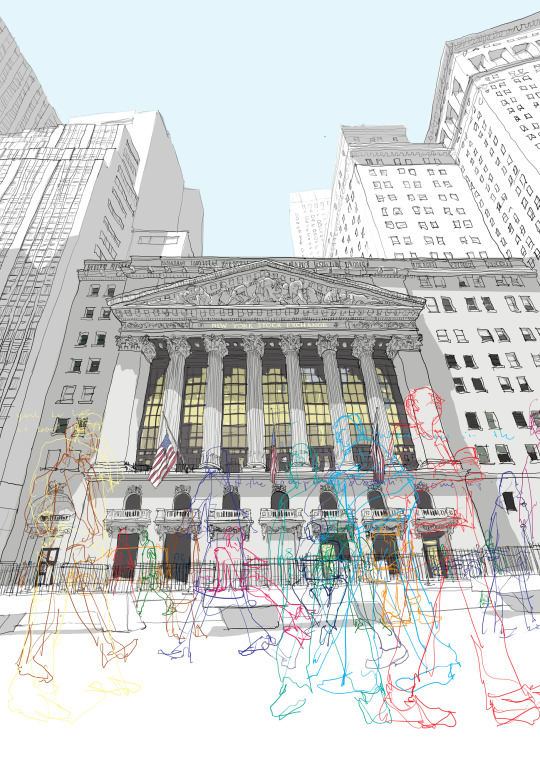
I really enjoyed this lesson and I was the most focused I've ever been. Since researching some artists I have created some more designs inspired by this work. In the morning I looked at a few free embroidery artists that used continuous line within their work. I developed a new love for this style as it allows me to sew much more loosely. At first, I found it strange to not ever lift the line off the page but keeping it on actually helps my narrative of my journey this year. Specifically I looked at work that focused on buildings and I wanted to bring some more city related samples to my project.
I found an artist relating to these interests and this was Debbie Smyth. She uses a lot of loose lines and thread to create landscapes. In her Jubilee Bridge pieces, I found a lot of pieces which I wanted use in my work. Although she doesn't use continuous line nor I don't think she uses a free embroidery machine, she still creates the same delicate landscape piece which gave me inspiration for this workshop. I wanted to use minimalistic art like this so I could incorporate nature or brighter colours without it looking to clashed which is why I like the use of only black thread in her work. I will achieve this sort of outcome on aqua film as its much easier to sandwich pieces of nature or other pieces of fabric relatable to my narrative. I want this idea to not only show the contrast between city and nature of course but also show a sense of growth and blossom. I want these two contrasts to reflect the new discoveries I've found within myself this past year and breaking through the old habits and ongoing cycle of my life prior to lockdown which is reflected by the busy city scrapes throughout the project. Here is some of Debbie's work below.
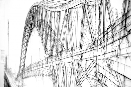

As you can see Its much more complex. I believe she uses pins to form the landscape and wraps the thread around these to create the outline. This is a beautiful piece of art but considering the little time I had left to get as much of my story through textile techniques I needed to find a artist which uses free embroidery to create this design. This is where I discovered Tucker Schwartz. This artist uses continuous line and also other colours to show the design on the fabric. Here is some of his work.
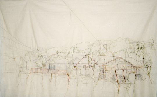

Since finding these artists I used these ideas for the embroidery lesson. What is different about the previous lessons the machine has some slight changes in order for the free embroidery to work. Firstly the groves on the machine which allows the fabric stay in a firm place are pushed down as well as replacing the original footer. The new footer doesn't clamp the fabric down but kind of floats above the fabric so you are able to make anything you want. Although this could sound rather tricky to maintain the embroidery hoop helps the fabric stay in place so I can move it much more freely without things getting tangled. Below is the piece I made in the style of these artists but with a picture which I took when travelling to the city at the beginning of the year. I placed the picture on top of the fabric and placed it in the hoop so I could trace the architecture of the buildings. I decided to experiment and use a mixture of swirls, straight lines and layering to define certain areas of the building. When I finished, I had the intention of removing all the paper and cutting all the loose pieces of thread however I actually liked this look of distress and decided to keep some paper on as well as leaving the loose thread aswell.

This was the back of the fabric.


This was the final piece. Following up on the previous opinion of keeping the paper on I think I will actually remove is as you can barely see the work I've done and I much prefer the back of the fabric which is plain.
In addition to this artist and following up on the point of wanting to use objects and colours against the black thread, I found a few artists that achieve this. In the next session or at home I intend to make a piece with brighter thread colours like Rubert Van Wyk has done below. I think these pieces hold much more power now then they probably did before. From looking at the pictures, you can see the colours of thread are of people walking around the city. The continuous line technique portrays the people being temporary through the use of thin and delicate thread in comparison the the buildings which are drawn in and look permanent. This for me, portrays not only the absence of people in public places in lockdown, like I've shown on the first page of my sketchbook, but I feel like it could convey the normality of people not always being there. This enhances my intention of showing change throughout this module.

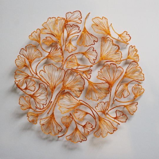
In the afternoon I wanted to try something new so I decided to try the aqua film technique. Since being introduced to this, I had yet to think of any ideas that would show real progress of all the things I've learnt but I found some artists which have really benefited in me getting one of my favorite samples so far. In the video which I was shown they explained the different ways you could create aqua film outcomes. This is where they showed a sandwich method where they use two pieces of aqua film instead of one. Since mentioning nature a lot and have some form of nature in my sketchbook, I wanted to bring it into the aqua film sample. I picked up the wide selection of leaves on the front of my house where I've spend 99.999% of my time this year and sandwiched some into the aqua film. I think I enjoyed this the most because I was less stressed about having to make a really good sample. Over the short time I've been on this course, I put myself under a lot of pressure and felt as though I had to plan every sample perfectly but I forgot that the aim of this course is to trial anything without the fear of going wrong and I've only just realized this. Looking at the artists below benefited me in having some ideas with how I wanted the aqua film to look but I just wanted to try a bunch of different styles.
Meredith Woolnough was the major artist I was interested in as she does a lot of embroidery work with leaves incorporated. As the material is disposable and isn't visible when washed, it is important to keep the leaf skeleton which is what Meredith does nicely. Keeping with the delicate design these pieces defiantly shows this which is why I also did some with the sandwich technique I talked about earlier.

More in the next post.
0 notes
Photo
Editing errors
I have knit about half of the patterns in this book. There are charting errors on all that I have knit. I would expect better of Interweave.
Go to Amazon
Hot Mess
Wow...this book. I completely love the designs, and all of the history (and research) put into this book which is why I gave it a two star rating. However, as a practical matter, the editors did a horrible job, and if it had been based on that aspect alone, I would have given it NO STARS! First off, I spent hours knitting the front panel for the Rusila pattern on page 29...before I figured out that there was a MASSIVE error in the chart legend. For the stitch used as the pattern background stitch it says "purl on right side, purl on wrong side," when it should have been purl on right, knit on wrong. Completely rookie error. However, after correcting that and starting the panel over (from the beginning *yikes*), I quickly realized that the design was still not coming out like it looked in the photo. Back to the drawing board to try and correct it again. In addition, the pattern instructions read like you are trying to install a home stereo...in Chinese. A huge, frustrating disappointment. I would love to work on Viking designs that actually work! I would buy that book all day long. This one, I feel like I just threw away my money and time. #FTL
Go to Amazon
Viking Knits and Ancient Ornaments
I purchased this book for its use of the traveling stitch. History buffs would do well to acquire this book. The designs are very intriguing. Not a beginners book.
Go to Amazon
A must-have for every knitter's library
One of the best knitting books I've bought in a long while, & a more than worthy successor to Lavold's excellent "Viking Patterns for Knitting." Lavold begins with a brief but fascinating history of early European migrations/invasions & the cultures that likely influenced Viking design (Mongols, Goths, Langobards, Huns, as well as Islamic traders, Christian missionaries & possibly Native Americans). Each chapter is based on a different ornamental pattern used by the Vikings on their rune stones, jewelry, embroidery, swords, helmets, etc. - Loops, Rings & Chains, Knots, S-Hooks & Braiding - with plenty of photographs & drawings from Lovald's source materials. Within each chapter, there are numerous charts of loop & cable designs based on these sources, plus several lovely patterns for sweaters, cardigans, scarfs, tams, etc. at the end of each chapter, which are shown in excellent color photographs. Well-written & designed, culturally rich, & inspiring in every sense of the word.
Go to Amazon
Big frustration and disappointment, and now I fing it hard to trust ...
I was half way through knitting the charted pattern for the back of this sweater when I realized it was not producing the sweater pictured on the book cover. To be sure, the variation is mentioned, but how that affects the row count and shaping of the piece is not. Big time loss, frustration and disappointment, and now I find it hard to trust any of the other patterns in the book.
Go to Amazon
Beautiful cables for everyone
Cables, cables, cables! This book is mostly sweaters, with a few notable exceptions. There is a cute matching hat & bag set ("Tova" on pgs. 50-52) and a skirt & shrug set ("Fulla" on pgs. 68-70) which is to die for.
Go to Amazon
Viking Knits
Great transaction - speedy and without incident. The product is as described and I love the book. Elsebeth concentrates this book primarily to patterns using the Viking knots to embellish her sweaters. I have enjoyed the history she included in her book of the Viking knots as seen in their carvings and drawings and art work. Very unique ancient and beautiful. I will cherish this book....
Go to Amazon
Fantastic!
The patterns are all very beautiful, it is hard to decide which to start from... The patterns and the projects are lovely and unique, this Viking knitting is a real surprise for me! I also love the history which accompany the knitting patterns. Fabulous also for Aran lovers.
Go to Amazon
Five Stars
Five Stars
I will definitely recommend this book to others
Love the illustrations and the history and the way she ...
Great Reference Book
Four Stars
Excellent shape. I've been eyeballing this book locally for ...
Beautiful and delightful!! :)
nice
This had some nice techniques and history in it
0 notes
Last Seen Blogs

dance-moms-dancer
dance and dance moms
renthebarbarian
rated G for gay

masleehaechan
TERJAMIN KUALITASNYA, Jenis Carpet Court Badminton

thebestmegaanever-blog
Respira , Inspira e não Pira!

masailworld
Untitled