#triangle strategy artbook
Text
Cordelia Concept Art


Cordelia concept/reference art. Translation notes and image id below the cut.
Translation Notes
The word for "sash" on this page was literally "obi," the type of sash a woman would tie around a kimono. "Obi" is a valid English word, so I went back and forth between what to use, but since her dress isn't technically a kimono + the sash isn't tied in the style an obi usually would be, I decided to go with the more catch-all term.
"White as snow" was a word that literally just meant "white," but the first character and the word in general had some connotations with innocence/purity, so I added "as snow" to try and give that same connotation.
"Simple" as it refers to the fastener might have also meant "casual."
"Once upon a time" wasn't exactly the Japanese phrase for "Once upon a time," but it was fairly close. A more literal translation would be, "In the olden days, it just so happened that..."
"Girl of innocence" appears to literally be the word "witch". However, if you take the first character as a separate prefix to the second, it would mean something along the lines of "pure/genuine/true girl." I'm not really sure if that's how it works, but it seemed to make more sense than "witch," so that's what I ended up going with.
Image IDs
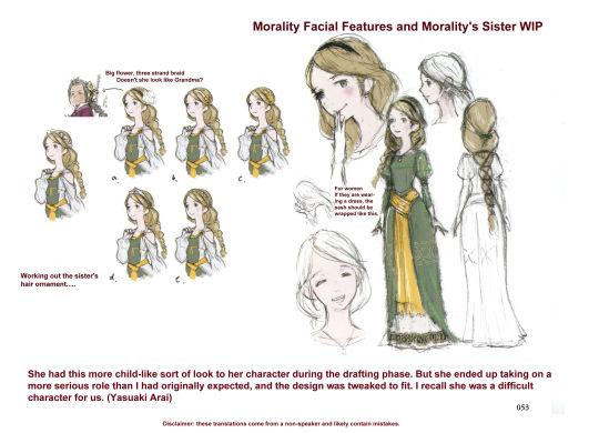
[id: Five images. The first two are the full pages of Cordelia's concept art in Japanese, the other three are translated versions of the text. On the first page, there is a colored and uncolored version of Cordelia's portrait. Underneath, there is an illustrator's note that reads, "Cordelia's overall tone is pale, so I thought it ended up being pretty difficult to choose a shading color. And actually, her initial facial features were much younger, but Mr. Ikushima redesigned her several times to give her the elegant look she has today. (Rina Yoshiura)". The second page is titled, "Morality's Sister (Healing Hands to Protect) Rough Draft". It has a small illustration/comic of a childhood Cordelia and Roland. It has the notes "Country A," "13 year old," and "girl of innocence." It then has a note that says, "I have to protect," with a large bracket beside it that contains the list, "small, dainty, gentle". There is also the word "pure" nearby. Underneath that is the illustration, titled, "Sister and Morality" with the subtitle "about 8 years ago". In the illustration Roland seems to be throwing a caterpillar-like bug aside. It's labeled, "Weird Bug Arm Bar Throw." Roland has some dialogue that reads, "I've for real gotta catch it!" Cordelia has some dialogue that reads, "huh?" Underneath them both, there's a note that reads, "Once upon a time, a warm fuzzy feeling made him think, 'I have to protect her!'" To the side there are several portraits of Cordelia, some full-body (one of which has a note about her braid being brought in front of her shoulder), and two that are labeled as "Bust portraits". One of the portraits shows Cordelia in a simple cloak with the fastener being labeled, "simple metal fastener." There's a top-down diagram of the metal she wears at her dress's neckline, labeled, "Decoration rough draft." On the second half of the page there is a portion labeled, "Working out the sister's hair ornament….." One version has a large flower on it. Next to it is a small portrait of Groma. A note reads, "Big flower, three strand braid. Doesn't she look like Grandma?" Another section is labeled, "Morality Facial Features and Morality's Sister WIP". There are several drawings of Cordelia's face, along with a full body rendition of an alternate design. She still wears the same sash as she does in canon, and nearby is the note, "For women. If they are wearing a dress, the sash should be wrapped like this." At the bottom of the page, there is another illustrator's note that reads, "She had this more child-like sort of look to her character during the drafting phase. But she ended up taking on a more serious role than I had originally expected, and the design was tweaked to fit. I recall she was a difficult character for us. (Yasuaki Arai)" /end id.]
#triangle strategy#triangle strategy artbook#ts artbook character ref sheets#cordelia glenbrook#roland glenbrook#that weird bug comic was one of the first things I translated! kinda fun coming back to it again#and this page was just fun in general#cordelia's such a cool character. I would play a whole game of just cordelia#sometimes I wonder how exactly she ended up being the character that she ended up being#bc it seemed like she was originally supposed to be younger + just serve as roland's main personal motivation for taking back whiteholm#but then someone must have looked at her and said okay but consider! we could have her try and stage a coup#and I want to give that writer a high five you know??????
34 notes
·
View notes
Text
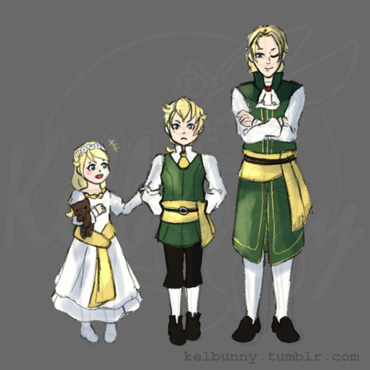
I like to imagine they were closer at one point
#triangle strategy#roland glenbrook#frani glenbrook#cordelia glenbrook#Roland and Cordelia's designs are from that one doodle in the artbook with the caterpillar#while frani's is from one of Roland's concepts#kelbunn's art#still trying to figure out quick sketching on my laptop#Also this looks too saturated and not quite what was in my head#I blame stress from work#Might make this a full better piece that actually looks right
34 notes
·
View notes
Note
1, 4 and 6 for the fandom ask game, for Triangle Strategy
Thank you so much for the ask!!! <3
1. My favorite thing about the fandom
I've probably said this before, but I honestly really like that tri strat's a pretty small fandom! I love some more popular things like fire emblem, but I rarely participate in those fandoms because it's more intimidating to post stuff that I know significantly more people will be looking at. Even my stuff on triangle-strategy-notes, which isn't super creative (like fanfic or fanart) is stuff I probably wouldn't do for fe. There's already Japanese -> English translation discourse going on over there and I know I'd probably get zinged for a lot of the mistakes I make on the artbook stuff hahahaha.
4. My favorite fanart from the fandom
I'm going to do several here bc there is SO MUCH cool fan art for triangle strategy esp. considering how small it is.
@kelbunny's Cordelia paladin concept has lived in my head rent free ever since she posted it because I am thinking 24/7 about how cool it would have been if Cordelia had ended up with a more significant role after retaking Whiteholm (not that a healer can't have a significant role but. we all know JRPG protags have to have at least one sword or will the devs REALLY let them be a JRPG protag). It's such a fun concept, and I also really love the way it parallels Avlora's dark knight thing she's got going on. It's just!!!! very cool!!!!!
@cullensart's Avwell drawings. I just think they're neat :)
This is on Twitter so I am going to very cautiously repost it a little bit with a screenshot of the entire tweet, but I really love this art by DelaneyJanuzzi of the Time to Say Goodbye battle ending. The scene in general is SO GOOD and I just think it's a really cool drawing of it :) She also has a ton of other cool tri strat + fire emblem art that I really enjoy

6. My favorite character
To the surprise of probably no one I love Avlora a whole lot :) :) :) I'm a sucker for morally grey characters in general and Avlora in particular is really interesting to me for a few different reasons. One big difference between her and a character like Edelgard von Fire Emblem is that Avlora is just super unapologetically not feminine in the typical sense. She super easily could have been written as a man with essentially zero changes to the script outside of pronouns, and there's no "whoa isn't it nuts that we're taking orders from a woman?" moments or really any acknowledgement whatsoever that it's uncustomary for the setting. And the same thing goes for a lot of Tri Strat's female characters which I think is really cool! I don't have anything against girlbosses getting to be a little girly on occasion (and I think for Edelgard in particular it works well considering her whole arc with trust + vulnerability), but there's definitely something really cool about Avlora getting to step outside the stereotypes a bit and just get to be a general without so many references to her gender.
#triangle strategy#asks#nonbinary avlora also lives in my heart on occasion#I just think she doesn't care about the whole thing very much#her gender is the sword etc. etc.#but yeah!!! thank you so much for the ask!!!!!!!! <3#edit: WAIT THAT ISN'T FOR YOU MY HEART it's 'time to say goodbye'. my bad#I noticed it was the fountain they were standing near but my brain went#'ah yes chapter 14!! isn't for you my heart such a cool chapter :)' and temporarily forgot other routes exist
9 notes
·
View notes
Text
Seems the Triangle Strategy artbook’s gonna be delivered in Japan only in April. Hhhh
2 notes
·
View notes
Text
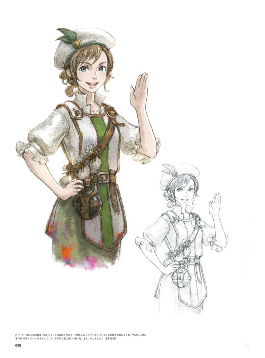

[Image id for the two images above: The first image is a scan of the first page of Medina's concept art. There are two versions of Medina's canon portrait, one colored, one uncolored. There is an illustrator's note at the bottom in Japanese. The second image is a translation of that note, which reads, "The face on the bottom of the next page came from the first draft. It didn't look quite right, so I was grumbling to Ikushima about it, and he redrew the whole thing, giving it the look it has now (laughs). Sorry about that, I was pretty busy at the time. In my opinion, she's become the most beautiful woman thanks to you! (Tatsuaki Urushihara)" /End id]

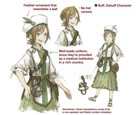

[Image id for the three images above: The first image is a scan of the second page of Medina's concept art. It has several drawings of Medina, including a full-body portrait that shows some details of the belt and pouch she wears, and has an additional illustrator's note at the bottom. The second image is a translation of the title, which reads, "Buff, Debuff Character," and translations for the captions. One points to a feather decoration on her hat and reads, "Feather ornament that resembles a leaf." Another points to her uniform and reads, "Well-made uniform, since they're provided by a medical institution in a rich country." Another caption points to a version of her without her hat, and says, "No hat version." The third image is a translation of the illustrator's note at the bottom of the second page, which reads, "I put this together based off a concept for an apothecary costume in 'Various Daylife' that I was given. (Tatsuaki Urushihara)." /end id]
Translation notes under the cut.
"I put this together based off a concept for an apothecary costume" might have been making a reference to a specific job class in Various Daylife. I looked it up a little and found one called "Herbalist" that might match, but I'm not super familiar with the game myself, so I wasn't 100% sure about it.
#triangle strategy#triangle strategy artbook#ts artbook character ref sheets#medina alliam#I didn't wait for the poll to end lol but hopefully this is easier to read!#I went back and forth on whether or not to include a full version of the translated page#but eventually opted against it because it just felt like extra clutter#feel free to leave tags/reply if you have any thoughts!#but yeah! seems like opposed to other characters Medina's development was a little more gameplay-driven vs story-driven#it's a little sad! I was kinda hoping for more of her backstory#just based off skin tone I kept kinda wondering if she might not be from Aesfrost/Glenbrook originally. but alas#sometimes I go a little nuts about how most of the PCs from Hyzante don't seem to have actually been designed to be ethnically Hyzantian#after looking it up seems like you've got medina geela corentin ezana quahaug archibald and (probably?) narve#which of those only two have a darker skin tone#I'm not calling square enix cowards BUT
36 notes
·
View notes
Photo
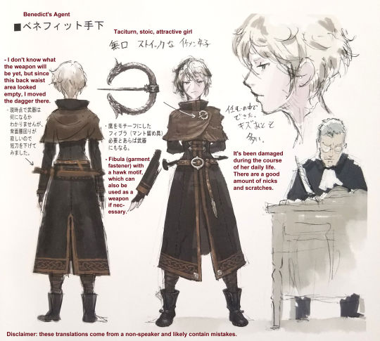
Anna’s reference materials!
A transcript of the longer passages + translation notes under the cut:
Anna was the best from the very beginning ^_^. The clasp was originally intended to be Wolffort's hawk motif, but for narrative reasons, I decided to change it to "a memento from my parents." The silver hair was used to depict the parent-child relationship between her and Benedict. (To eliminate exposition as much as possible . . . ) (Yasuaki Arai)
I initially received the prompt from Mr. Arai, referring to the set of Anna and Milo (from page 50), "Let's have an intense female spy showdown!" So I thought, "In that case, I'll make them opposites, each with their own type of charm to show off!" I aimed for "super stoic vs. super glamorous" and got the OK on my first try. During the design phase, I thought, "I haven't had a chance to draw her, so I'd like to do the drawing when we get to that point!" But my coworker Urushihara liked Anna's design so much that I asked him to finish it. He really put a lot of care into getting the atmosphere of the art just right; when I saw it, I thought, "I'm so glad I asked!" Stoic women who fight are so cool! (Naoki Ikushima)
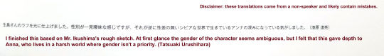
I finished this based on Mr. Ikushima's rough sketch. At first glance the gender of the character seems ambiguous, but I felt that this gave depth to Anna, who lives in a harsh world where gender isn't a priority. (Tatsuaki Urushihara)
Translation notes:
“Agent” is a word that’s literally translated as something like “subordinate hand”. In most dictionaries the direct word association is “minion,” “henchman,” or “underling,” but the connotations seemed a little too cartoonishly evil for the general tone that’s usually used in these titles, so “agent” felt like a better fit. It was probably meant to sound more sinister than just “agent,” though, so it was a tradeoff.
The word for “intense” in “Let’s have an intense female showdown” was this one, which can also be translated as “hot,” “ardent,” or “passionate.” The sentence as a whole likely meant to read more like “It would be hot to have a female spy showdown!” but since I wasn’t certain which they meant, I erred on the side of the more mild term.
#triangle strategy#anna pascal#benedict pascal#ts artbook character ref sheets#triangle strategy artbook#jackes clan#milo yuelle#it's sort of a tricky thing with the translation of words like 'hot' where I don't necessarily want to overly sanitize what they said#but since I'm not a speaker I don't want to read into things and potentially misattribute something potentially-unprofessional when#that might not have been the intent#so I kind of run it through a 'would I send this in a business email' filter in my head as I'm translating#but anyways#in all likelihood Mr. Arai was in fact referring to the inherent eroticism of femme fatale showdowns and he's so right for it#can't believe they're narrative foils.........
78 notes
·
View notes
Text
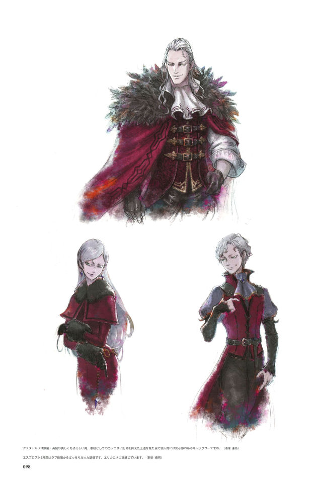
Gustadolph, Thalas, and Erika Concept Art
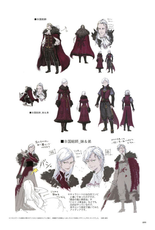
Concept/reference art for Gustadolph, Erika, and Thalas! Translation notes and image id under the cut.
Translation notes:
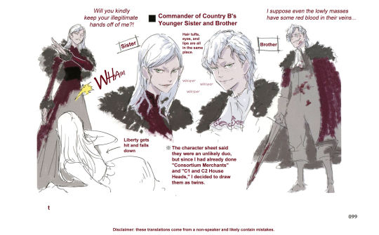
"Will you kindly keep your illegitmate hands off of me?!" was probably more directly translated like, "You're a bastard, stop existing in my vicinity." But it was a question and also used some polite language, so I changed the wording around a little to suit that.
"Hair tufts, eyes, and lips are all in the same place" was one I felt pretty uncertain about and ended up going a lot off of context. It definitely seemed to be saying something about hair, and was probably saying something about lips and eyes, but there might have been something about eyebrows or something else in there too.
"Wham" was a mimetic word that meant something more like "violent; holding nothing back."
Image ID:
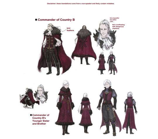
[id: The first two out of the five images are the full Japanese pages of concept art for Gustadolph, Thalas, and Erika. The first page has their official canon portraits. In the third image, which is a translation of the notes on the first, there is an illustrator's note that reads, "Gustadolph is a beautiful yet terrifying man with long, silver hair. Personally, I find that his design puts me at ease since he has more of a restrained royal look instead of the typical stylish villain look. (Tatsuaki Urushihara)" and another illustrator's note that reads, "I remember thinking the three Aesfrost siblings were spot on from the first rough draft. Erika has a cat-like quality to her. (Yasuaki Arai)"
The fourth and fifth image are translations of the second page. The top half of the page is titled "Commander of Country B" and has several images of Gustadolph. One has a caption pointing to his ruff collar that says, "bird feathers." Another two notes next to his face read, "He's beautiful but rather cold…" and "He's overflowing with dangerous charisma." The second half of the page has pictures of Thalas and Erika. It's titled "Commander of Country B's Younger Sister and Brother". There is a drawing of Erika having thrown Frederica to the floor. Erika's dialogue reads, "Will you kindly get your illegitimate hands off of me?!" and there is a note next to Frederica that reads, "Liberty gets hit and falls down." In another drawing Thalas is holding a sword, both he and the sword spattered with blood. His dialogue reads, "I suppose even the lowly masses have some red blood in their veins…" There is a note between the two of them that reads, "The character sheet said they were an unlikely duo, but since I had already done 'Consortium Merchants' and 'C1 and C2 House Heads,' I decided to draw them as twins." Another note between mirroring portraits of Thalas and Erika's reads, "Hair tufts, eyes, and lips are all in the same place." There are also some small copies of the word "whisper" between them. There is an illustrator's note at the bottom that reads, "Erika and Thalas's setting and plotline never changed much, and even in the trial version they had a nice, simple bully feel to them that made them easy to design. (Tatsuaki Urushihara)" /end id]
#triangle strategy#triangle strategy artbook#ts artbook character ref sheets#gustadolph aesfrost#thalas aesfrost#erika aesfrost#cw abuse#happy halloween! vampire siblings for the occasion!#I keep trying to tell whether the 'I feel safe looking at Gustadolph' was supposed to be a joke or not#because it was worded JUST ambiguously enough that it might have been sort of a more poetic straightforward thing????#but I kept having to relook at the words because I kept laughing at it#it did very much have the vibe of 'look at those cold terrifying eyes. aren't those just the most darned trustworthy eyes?'#I get it tho!! he's right!!!! gustadolph's just got that coolness factor
23 notes
·
View notes
Text

Happy Triangle Strategy 2nd Anniversary!! To celebrate, here are the translations from the foreword and the first illustration provided in the artbook.
---
Foreword translation:
GREETING
Thank you so much for picking up this book! We've put together a collection of art—a war chronicle filled with the “battles and wars” we waged to create the designs used in Triangle Strategy.
I’d like to reflect back on the beginning of Triangle Strategy's art development. . . . I’ll recall it bit by bit.
The first time I heard about this project was several years ago, when I was working on art and design for Various Daylife and Bravely Default II on a weekly basis.
The first words I received during the early planning phase were Mr. Asano’s, “What if war came to a world like Octopath Traveler?” and Mr. Arai’s, “Salt . . . Iron . . . ”
They were simple words, but they captured my heart and filled it with excitement. From there, I began to draw, and it was as if those feelings grew and spilled out of me.
And, as is natural, a story about war will have many characters . . . The depth of the worldview was crucial as well. I had to add a lot of details to really get across the project’s heavy themes! I very much enjoyed the challenge. However, our time was short, and thus it was the beginning of a war for the artists. We were thrilled by the magnificent setting and plunged headlong into drawing each day.
The art team fought alongside me. This included Mr. Urushihara, an old comrade-in-arms who has a cool head, good sense, and substantial analytical and drawing ability; as well as Ms. Yoshiura (a student at the time the project started), who was positive, fun, and worked very hard on everything. Without them, I don’t think I’d have been able to do anything like this. Thank you very much!
Mr. Morimoto, who brought the characters over to neat, orderly pixel art . . . Mr. Matsumoto, who was over the UI and worked steadfastly through trial and error . . . Everyone at Art Dink for bringing art and design to life on the game screen and creating a wonderful world . . . Everyone who has been involved in and supported Triangle Strategy—I apologize for not naming you all. Thank you so much! And Mr. Asano, who always provides me with new opportunities and challenges. It was a great experience for me to be entrusted with the art for this project. I’d like to thank you again! I look forward to making use of this knowledge in my future work.
For those who are interested in this project, we hope you can play the game and find your favorite character!
I hope the world of Triangle Strategy continues to expand. Best regards, and thank you for your support!
- Naoki Ikushima
---
My name is Urushihara and I was given the opportunity to serve as an assistant on this project. Thank you very much for your support!
Several years ago, Mr. Ikushima introduced me to Mr. Asano’s team, and the first project I got involved with was Triangle Strategy.
I recall that, as someone who was greatly influenced by Square's games from the SNES/PS era, the chance to work on a project that has the same feel as those classic simulation RPGs had me shaking with excitement.
I've had the opportunity to work on a wide variety of projects during my career, from background designs to characters, illustrations for advertisements, etc., and this project has incorporated all of my experience! It’s turned out to be a monumental work.
I hope that it will be a profoundly memorable experience for all of you.
I would like to take this opportunity to express my gratitude to Mr. Asano, Mr. Arai, the development teams at Square Enix and Art Dink, and above all to Mr. Ikushima for giving me this opportunity and for providing me with so much guidance every day!
We’d also like to once again thank everyone who purchased the game software and this book! We look forward to your continued support of the Asano team's works!
- Tatsuaki Urushihara
---
Translation notes, and image ids under the cut.
Translation notes:
"SNES" was actually the letters "SFC" (you can see them in the foreword text in plain English) but it was referring to the Super Famicom, which was the Japanese version of the SNES, so I decided to localize as SNES.
"Salt...... iron......." really was just like that. I'm not sure if there was some formatting/grammatical thing I missed or if Arai really did just send over two words, but. either way it's really funny to me!!
I've recently looked more into Japanese grammar and all the particles that are used, and since I'm feeling a little more confident in what things mean, I inserted more filler words than normal to help things sound more natural. For example, "something along the lines of 'a fleeting instant made up of infinite possibilities'" would probably read more directly as "something that feels like 'a fleeting moment of infinite possibilities'." It's not a huge difference, but I guess I just wanted to make a note that I've taken some liberties with the grammar and the exact phrasing.
Image ID
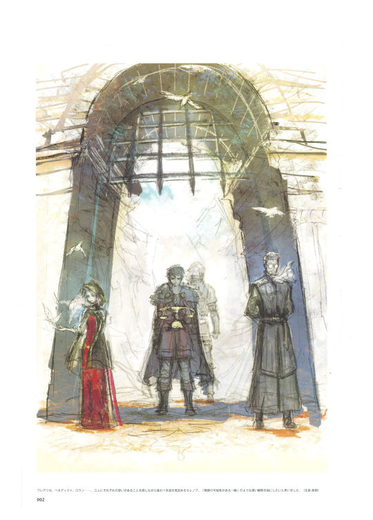
[Image id: The first image is a picture of the foreword (written in Japanese), which includes a small drawing of Serenoa, Roland, Frederica, and Benedict's faces. The second image is a drawing of Frederica, Benedict, and Roland standing with their backs facing Serenoa, who holds the Scales of conviction, along with the illustrator's note in Japanese. The third image is the translated illustrator's note, which reads, "Frederica, Benedict, Roland… Serenoa has to determine the path he should walk while knowing that the three of them each have their own individual desires concerning what should happen. In this picture, I wanted to illustrate a weighty moment, something along the lines of 'a fleeting instant made up of infinite possibilities.'' (Naoki Ikushima)" /end id]
#queue#triangle strategy#triangle strategy artbook#naoki ikushima#tatsuaki urushihara#I love all the illustrator's notes#they're so cool!!! and this project was so huge!!!
15 notes
·
View notes
Text
Exharme and Sorsley Concept Art


(More) concept/reference art for Exharme and Sorsley. Translation notes and image id under the cut.
Translation notes:
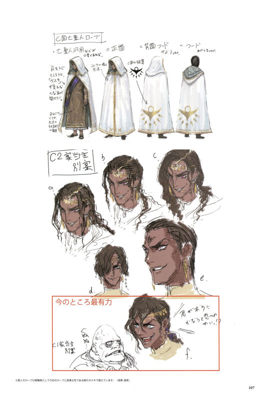
"Tasuki" is in reference to a specific type of sash used to hold up the sleeves of a kimono (Wikipedia link). It doesn't 100% resemble the sash we see here, but it did seem to be the word they used to describe it. When "tasuki" was put in quotes (up by the Tenebris-looking designs) I kept it as explicity "tasuki," but down in the illustrator's note I translated it as "sash" for clarity.
"Grrrrr...." is actually a mnemonic sort of word that's an internet slang term for "blood boiling"/"furious and speechless". There were a few forum posts I found about it, and most people seemed to agree that there isn't a great English equivalent. "Grrr....." kind of gets the general meaning across though.
"Pulling up vers." on the hoods was sort of a weird one. I'm guessing it's sort of supposed to mean "lowered," but it seemed to be using a word more like "raising." I might be missing something connotation/context wise there.
ID
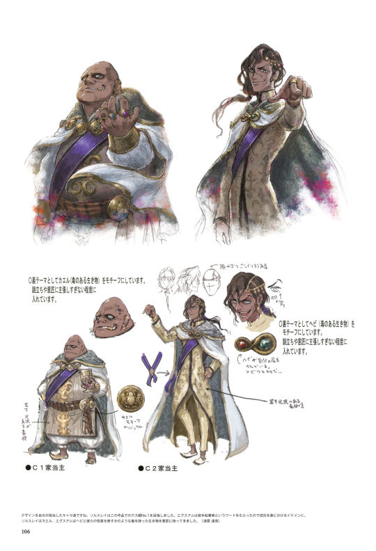
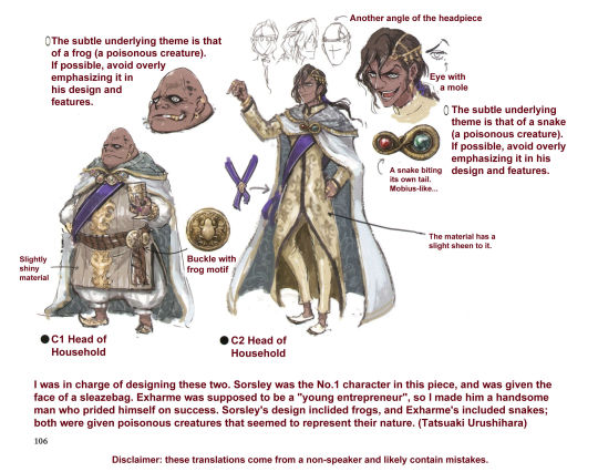
[id: The first two out of the five images are the original Japanese pages for Exharme and Sorsley's concept art. The next image is a translation of the bottom half of the first page. It has several notes detailing motifs of Exharme and Sorsley's outfits. Next to Exharme it reads, "The subtle underlying theme is that of a snake (a poisonous creature). If possible, avoid overly emphasizing it in his design and features." There is also a note pointing to a small Next to Sorsley it reads, "The subtle underlying theme is that of a frog (a poisonous creature). If possible, avoid overly emphasizing it in his design and features." There is also a close-up of Exharme's cloak-clasp with the caption, "A snake biting its own tail. Mobius-like…" Exharme also has a note pointing out a mole next to his eye, as well as some smaller drawings with alternate angles of his headpiece. Sorsley has a similar note next to a close-up of his belt buckle that reads, "Buckle with frog motif". There is also a note on Sorsley that mentions that the fabric of his clothing has a slight sheen to it. Exharme is labeled as "C2 Head of Household" while Sorsley is "C1 Head of Household". There is an illustrator's note at the bottom that reads, "I was in charge of designing these two. Sorsley was the No.1 character in this piece, and was given the face of a sleazebag. Exharme was supposed to be a "young entrepreneur", so I made him a handsome man who prided himself on success. Sorsley's design inclided frogs, and Exharme's included snakes; both were given poisonous creatures that seemed to represent their nature. (Tatsuaki Urushihara)".
The next image has the basic Seven Saints' robe design. It shows the front view (both with and without the cloak hanging open) and the back view (both with the hood up and hood down). There is a note near the front open robe image that reads, "If you close the front, you won't be able to see the "tasuki" so you'll want to keep it open," and another that reads, "The color is dark, but it looks shiny and expensive." There is also a note about the robes having a silk-like luster, as well as another that points to the golden emblem on the back of their robe that reads "Country C Emblem". There are then several different versions of Exharme's design, one of which has short hair that hangs in his face and has a small "Mwahahaha...." note next to it. There are then two more drawings, one of Exharme and one of Sorsley, that have a red box around them labeled "MOST PROMISING SO FAR". Sorsley has a note that reads, "Grr....." next to him, while Exharme looks to be shouting, "Do you really think you can match me!?" There is another illustrator's note at the bottom that reads, "The Seven Saints' garb is comprised of white robes similar to a clergyman's and a purple sash, which gives it a noble color. (Tatsuaki Urushihara)" /end id]
#triangle strategy#triangle strategy artbook#ts artbook character ref sheets#exharme marcial#sorsley ende#exharme with hubert von fire emblem hair is cracking me up
21 notes
·
View notes
Text
Quahaug Concept Art


Quahaug's concept/reference art! Translation notes and image id under the cut.
Translation notes:
"OP sort of powerset" was literally translated as something like "cheat-like." I feel like OP is the more common English term for that sort of thing, so that's what I used, but some of the meaning was probably lost there.
"Older-tween-ish" was specifically a reference to a particular middle school year for children who are about 12-13 years old. Since grades and names of grades vary a lot from country to country, I just went with "older tween."
ID:
[Image id: Several images displaying different parts of 2 pages of the Triangle Strategy artbook, with both the original Japanese as well as versions with English translations. There are several disclaimers noting that the translator doesn't speak Japanese, and that there are likely many mistakes.
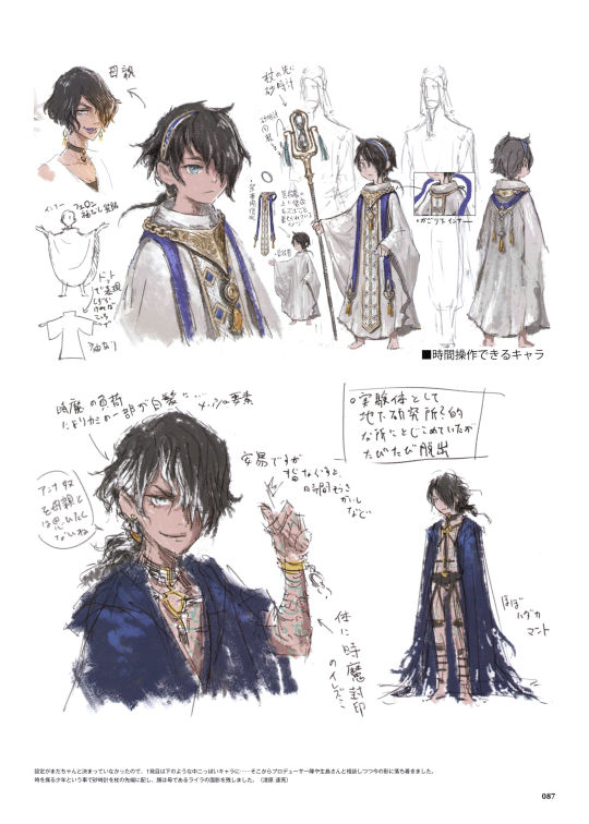
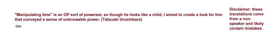
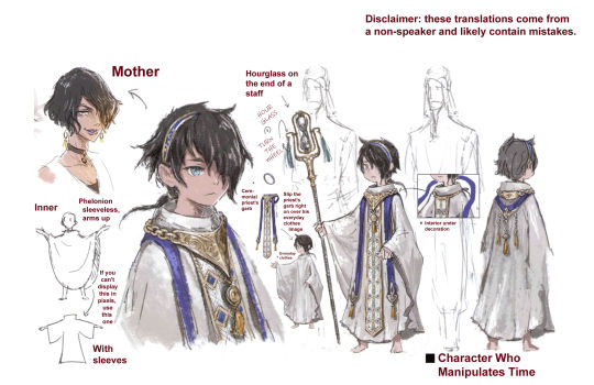
On one page, there is a large colored version of Quahaug's canon portrait, along with a smaller, uncolored version. There is an illustrator's note at the bottom that translates to read, "'Manipulating time' is an OP sort of powerset, so though he looks like a child, I aimed to create a look for him that conveyed a sense of unknowable power. (Tatsuaki Urushibara)".
On the second page, there are many drawings of Quahaug, including a closer bust-up portrait in which he's compared to Lyla, with an arrow and label reading, "Mother." There's also several notes that explain the construction of his costume. The costume is labeled as a Greek "phelonion" (a priest's outfit with no real sleeves, just draping fabric). There is a small drawing of this version, with an arrow leading to another drawing that does have sleeves, with the note, "If you can't
display this in pixels, use this one." There are several notes that explain how this draping cloth should be considered his everyday clothes, while the ceremonial decoration that goes around his neck is placed over it. There is a close up of the ceremonial dressing's fastenings underneath the metal decoration. Some more notes highlight details on his staff, emphasizing the hourglass on top and the small wheel to the side that can be turned to flip the hourglass. A larger piece of text underneath one fullbody drawing reads, "Character Who Manipulates Time."
On the second half of the second page, there are drawings of some beta designs for Quahaug. He looks much more punk-ish. On one bust-up portrait, there are the captions, "The burden of the time demon caused some of his hair to go gray…." and "All-natural highlighted tips." On the same portrait, he is snapping his fingers, and there's a note that reads, "Manipulating time is as easy as snapping your fingers. You just have to want it or whatever." A speech bubble near his head reads, "I don't think of Anna as a mother." A caption pointing to some green markings on his arm reads, "Demonic time seal on body." In a fullbody drawing of his beta design (which is made up mostly of chains that barely cover him as well as a long roughed-up cloak, there is the note, "Almost naked cloak."
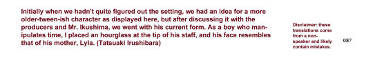
At the bottom of the second page, there is another note that reads, "Initially when we hadn't quite figured out the setting, we had an idea for a more older-tween-ish character as displayed here, but after discussing it with the producers and Mr. Ikushima, we went with his current form. As a boy who manipulates time, I placed an hourglass at the tip of his staff, and his face resembles that of his mother, Lyla. (Tatsuaki Irushibara)". /end id]
#triangle strategy#quahaug#lyla viscraft#triangle strategy artbook#ts artbook character ref sheets#at long last. emo quahuag#despite the WTF factor I really love the page. HE'S SO LITTLE. SO SO LITTLE. like in his canon portrait he could arguably be like 14-15#but in those drawings on the second page he is indisputably a baby. look at that little face. HE'S SO CUTE#and that note about Anna really cracks me up. can't believe we missed out on having Anna try to wrestle with an angsty 12-year-old#also! trying out a slightly different format from last time! I will at some point probably throw up another poll about it#as always feel free to leave a comment/tag/anything else with feedback if you have any#at some point in the distant future I will probably go through and try to make all of the translation posts more consistent#but I probably won't go back and do that sort of thing until I get all of them done#oh and also also! as a note I actually messed up my order a bit; I meant to do lyla's first before this one#but she and the other saints will be up next#edit: one of the images had an old version of a translation (used 'something' instead of 'whatever' in the note about snapping fingers)#just reuploaded it
27 notes
·
View notes
Text
Lyla, Booker, Tenebris, Sorsley, and Exharme Concept Art


Concept/reference art for Lyla, Booker, Tenebris, Sorsley, and Exharme. Translation notes and text id beneath the cut.
Translation notes:
Gonna be real haha, I kinda gave up on the note that's pointing to the sash. The handwriting style is a little disjointed/vague, and I wasn't able to tell what exactly the characters were. But there seemed to be some reference to "inner" there, so I made reference to that.
The comment about Booker being an assassin might have been something more like "Booker plays the role of an assassin" or "Booker acts the part of an assassin" (with the implication that he's not literally an assassin).
Tenebris's name in Japanese is phonetically "Enigma." His name is probably the one that changed the most in the Japanese -> English localization.
Text id:
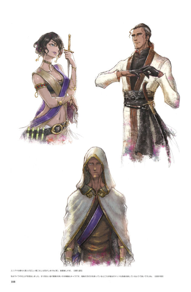
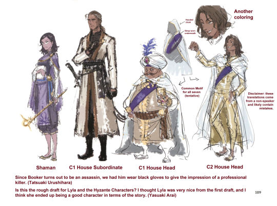
[id: The first image is of the full first page. It has portraits of Lyla, Booker, and Tenebris. There is another caption with an English translation of the caption on the first page. The first part reads, "I feel like Tenebris is the correct way to dress the Saints (lol). Everybody else dresses up too much. (Tatsuaki Urushihara)". The second part reads, "I was in charge of finishing Lyla. She is a wonderful character with many subtle gold elements. I like the fact that she's holding the blade of the dagger, which seems to show her mad-scientist-esque personality. (Rina Yoshiura)". The next image is of the full version of the second page, with several WIP drawings of Lyla, Exharme, Sorsley, and Booker. The next two images are English translations. The page is titled "C5House_Mad_Scientist." There is an image of Lyla walking toward the viewer, with some bowing men behind her. These men are labeled "Homunculi". Next to an image of Exharme and Sorsley, there is a diagram of their hooded capes and the purple sash they both wear. The same drawing is repeated below it, but with slightly different designs; Sorsley has a turban and Exharme has shorter, lighter brown hair. There are also beta designs of Lyla and Booker next to them. Lyla is labeled "Shaman", Booker is labeled "C1 House Subordinate", Sorsley is labeled "C1 House Head", and Exharme is labeled "C2 House Head." At the end of the page there is are some illustrator's notes. The first reads, "Since Booker turns out to be an assassin, we had him wear black gloves to give the impression of a professional killer. (Tatsuaki Urushihara)" The second reads, "Is this the rough draft for Lyla and the Hyzante characters? I thought Lyla was very nice from the first draft, and I think she ended up being a good character in terms of the story. (Yasuaki Arai)". /end id]
#triangle strategy#triangle strategy artbook#ts artbook character ref sheets#lyla viscraft#booker peynorth#tenebris mistel#sorsley ende#exharme marcial#lots of booker! I wonder if he wasn't supposed to be a bigger character at some point#and seeing all of the saints like this really makes me wish that more of them had survived the game#lyla is a favorite of mine and I really love the way they did her whole arc#but sometimes I'm like. who put her back in charge of things!!!!! let her rest!!!!!!!#I think she'd be down to just kinda vibe after everything that happened#kamsell and exharme on the other hand I think would've jumped at the chance to lead#I'd have to go back and watch the liberty ending but I think exharme straight up says he shares a lot of serenoa's goals#but he's just really particular about getting the glory for it#interesting stuff though. I love good villains and the saints are really really cool ones
21 notes
·
View notes
Text


Archibald's reference/concept art! Also included is the drawing of Kamsell referenced in Ikushima's note. Translation notes under the cut.
The note that says, "Sad✅" is one I feel really unsure about, in part because the handwriting and angling makes the middle character a little hard to make identify, and in part because there's just not really a lot of context to go off of. I ended up saying that it was a phonetic spelling in Japanese for the Chinese synonym of 鬱 (you can see this particular spelling listed as the "On" pronunciation), because all the other more obvious options (mainly the word "cow" or a word that meant something like, "ulp! [nervous exclamation]," didn't really make sense. That said, I don't think that sort of spelling is used very often (or even possibly at all), so there's a pretty decent chance I just misunderstood that one.
Related to that, I'm kind of going with the theory that since "Sad✅" definitely reads like a joke in English, that might have also been the intention in Japanese. That could explain the unusual spelling, the same way we might write something like, "I guess you could say it has a certain jen ay say kwah" and phonetically spell/misspell "je ne sais quoi" for comedic effect.
And as far as the checkmark goes, that came from the circle symbol at the end of the original Japanese caption. From what I can tell, circles can represent a few different things in Japanese: they can reference the actual word "circle"; they can mean something like a blank (e.g., it happened in the year 20XX, but where English puts Xs, Japanese puts Os); or they can mean "correct" in the same way a checkmark does in English. Circles are also sometimes shorthand for ロ, so it might have meant something related to that as well. I ended up going with the idea that it was a checkmark.
The "God of War" note was a little hard to make out for some reason, and I feel a little unsure of the exact meaning--mostly, I'm not sure whether they were saying that the God of War was Archibald/Kamsell, or whether it's more the person/bear that they're sitting on top of. I ended up just leaving it kind of vague, but there's probably some nuance I missed there. If I learn more when I translate the Kamsell page, I'll make an edit here.
"Strong brow and eyes" might also be translated as "prominent and intense brow and eyes." I used "strong" because it felt like a more natural way to express that concept in English, but I feel like it loses a little nuance in the process.
As an interesting note, "Archibald" in Japanese is something more like "Arch bolt," so there's a little bit of wordplay going on with it.
#triangle strategy#triangle strategy artbook#ts character ref sheets#archibald genoe#kamsell pharant#archibald is such a funky little dude!!! love him#I'm also really psyched that they gave us his age!!#I've been reworking my 'this is how old everyone might be' doc recently#and I continually go insane over how little we actually know
30 notes
·
View notes
Text
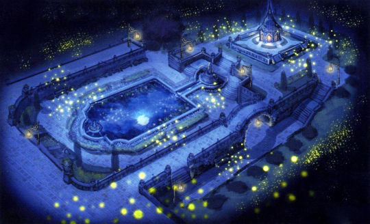
Whiteholm Castle's Gardens Concept Art
Blank versions with a little bit of color/contrast altering that can be used for wallpapers and that sort of thing :)


12 notes
·
View notes
Text
Whiteholm Castle's Gardens Concept Art
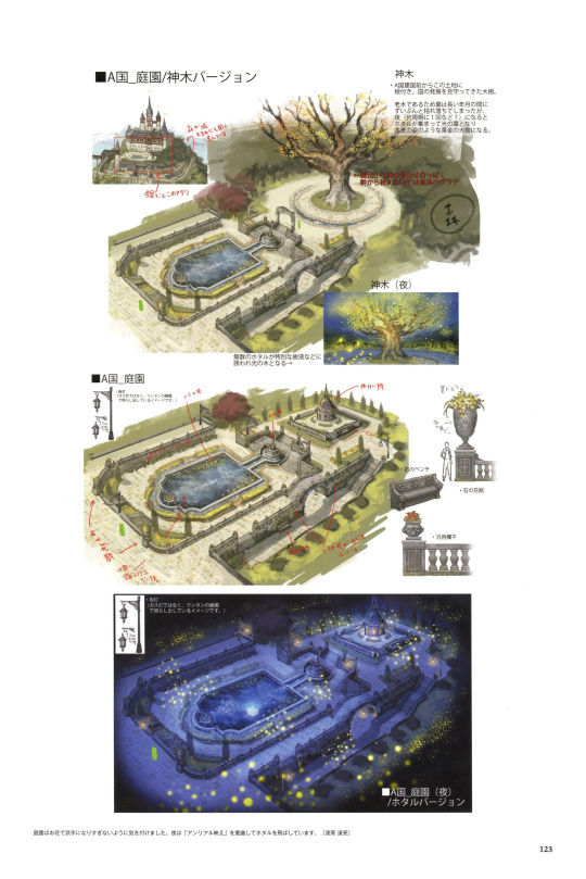
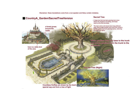
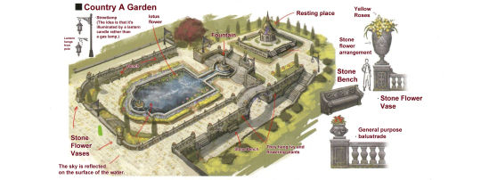
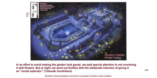
Concept art for Whiteholm Castle's gardens! This has been something I wanted to translate for a while, purely because it's just really pretty :)
Translation notes and image ids under the cut.
Translation Notes:
"Resting place" might have meant something more like "shrine," but given the appearance I leaned toward "resting place."
"Unreal splendor" was lit. the Japanese phonetic spelling of English's "unreal" + the Japanese word for splendor. I'm not really 100% sure why that English word was used there, but I think it's just meant to be a little extra fancy/emphasized.
There were a lot of little words on here that I was a little iffy about, in part because the handwriting was kind of small and I had trouble making out the characters. Longer sentences are usually actually easier to translate because you can use grammar and sentence structure context clues to figure out what the word is supposed to be. When it's a one-off little label, it becomes a lot more important that you know exactly what each character is. The image of the lantern hanging on the lanternpost is one in particular that I still feel sort of unsure about (it definitely mentioned hanging the lantern, but I couldn't 100% figure out what exactly the rest of it meant).
Image Id:
[id: A set of 4 images. The first is the original Japanese version of the page of concept art for Whiteholm Castle's gardens.
The second is the top third of the page, with English translations. It has the heading, "CountryA_Garden/SacredTreeVersion." There is a small shot of Whiteholm Castle with a red box outlining the section with the gardens, which has the label, "here is a wide shot of the area," as well as another label pointing to some trees outside the gardens that reads, "a forest grows around the castle." There is then a much larger and detailed illustration of the gardens, which has a large tree centered to the far right side. There is a label that has a text box with the heading, "Sacred Tree." The text in the text box reads, "A large tree that has been growing here since before the kingdom's founding, and keeps watch as the land develops. The tree is old, so its leaves have long withered away. But at night (maybe once every few cycles?), fireflies gather and form glowing leaves, returning it to its former glory." There is another nearby note that reads, "White gradient from the base to the trunk and brown gradient from the trunk to the branches." Another small label is put on the smaller, less distinct foliage nearby, reading, "forest." There is a small image of the tree at night, labeled "Sacred Tree (Night)" with the caption, "Countless fireflies are drawn by the tree's special sap and form a tree of light."
The third image is the middle section of the page, and is labeled "Country A Garden." It has a small diagram of the streetlamp with the label "Streetlamp (The idea is that it's illuminated by a lantern candle rather than a gas lamp.)" Another nearby note reads, "Lantern hands from pole." There are several additional simple labels pointing to the lotus flowers that grow in the large rectangular fountain, as well as the small semi-circle fountain that serves as a source for the rectangular one, a gazebo that is called "resting place," some large stone flower vases, some benches, some flowering plants and ivy that hang from the balustrades around the garden, and the reflections on the water, which reads, "The sky is reflected on the surface of the water." Off to the side there are some more detailed close-ups of the stone vases (which contain yellow roses), a stone bench, and a "general purpose balustrade."
The last image is of the garden at night, labeled "Country A Garden/Firefly Version." It is the same as the previous image, but with different coloring, and devoid of many of the labels. It has the same note about the streetlamps. At the bottom, there is an illustrator's note that reads, "In an effort to avoid making the garden look gaudy, we paid special attention to not overdoing it with flowers. But at night, we send out fireflies with the deliberate intention of giving it an "unreal splendor." (Tatsuaki Urushibara) /end id]
13 notes
·
View notes
Text
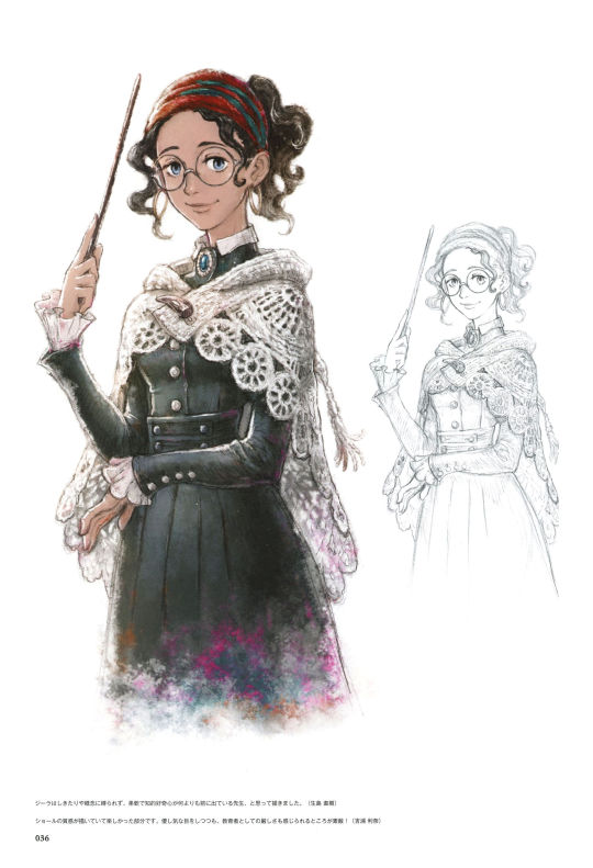
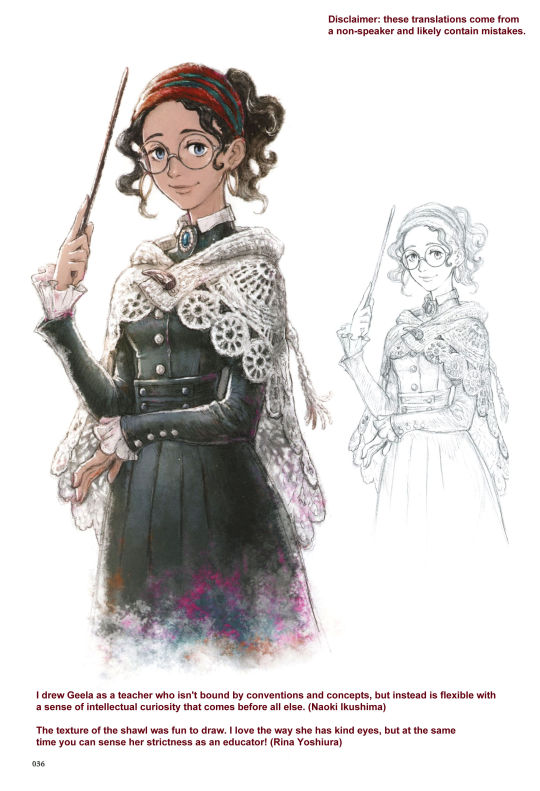

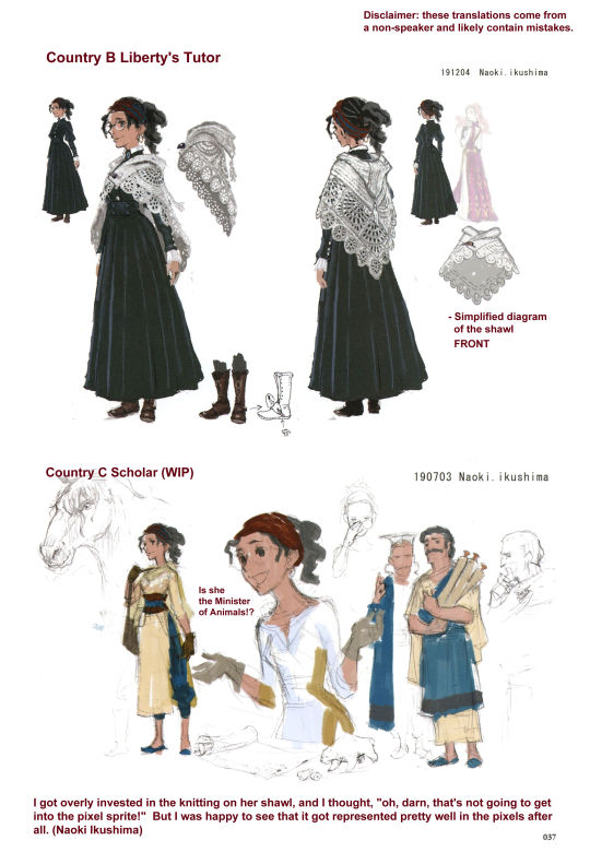
Geela's reference/concept art!
Translation notes under the cut.
I'm really not sure about the "Is she the Minister of Animals!?" caption. The sequence of characters there appear to be "さま大臣動物!?" The first two characters (さま) are the sama- honorific, indicating it's referencing someone of higher status. The last two characters (動物) mean "animal." The middle ones, however, are kinda weird. "大" can be read as "large," or possibly "university," and "臣" means "retainer or attendant." So, taken at face value, this would read something like, "Sir/Ma'am, [are you/am I/is this] the retainer of large animals?!"
However, for what I'm guessing were grammatical reasons, no automatic translator would translate it that way no matter how much I fiddled with things; and would always default back to just spitting the Japanese words back out. However, if two of the characters are switched around (臣大 becoming 大臣), every automatic translator was suddenly able to interpret it, and I could successfully find the characters as words in a dictionary--but it was translated as "Minister of animals" instead of "retainer of large animals." So it would have read more like, "[Are you/am I/is she] the Minister of Animals?!"
Given the sama- prefix and the way the sentence is formed (as well as the fact that "Minister" is the big title we see used in Hyzante), I decided to go with the "minister" translation, but I'm making the assumption that there was a little bit of a typo there. There's a pretty good chance that this is just a grammatically-shorthanded version of "Ma'am, are you the retainer of large animals?!" Or, as always, it's possible there's a completely different potential meaning that I missed.
#triangle strategy#triangle strategy artbook#geela breisse#also I was really hoping I could figure out who those guys were off to her right#friends??? family??? coworkers??? the world may never know#I do really love the thought they put into her characterization tho as far as being both kind and strict#I went back and re-watched her character story scenes after translating this and she's just. so good#like her whole thing with not really caring much about frederica to begin with and then slowly learning to love her is so neat#and it's always so interesting to me how geela went from hyzante -> aesfrost -> being the aesfrosti princess's royal tutor#like! she's ambitious!! she's clever enough to do pretty much anything she wants!!! and yet she still chooses to remain an attendant#because she feels like that's where she can make the most impact on the world#anyways! I love her#ts artbook character ref sheets
52 notes
·
View notes
Text


Hughette's concept/reference art!
Translation notes under the cut:
The note about her master was a hard one to get the exact words for, but in general I'm pretty sure it said something about her master standing. The "before a journey" is likely a little off, though.
#triangle strategy#triangle strategy artbook#hughette bucklar#I simply think these pages should have had more hawk drawings!!#that one with flanagan was so sick and I would have loved to see more of that with hughette too#I feel like both hughette and geela didn't have a ton on their pages which is a little sad#I do think the thing about Flanagan potentially being Hughette's mentor is really fun to me though#(from that drawing on Roland's page)#I really love thinking about how different people within your party might be connected to each other outside of the war#ts artbook character ref sheets
33 notes
·
View notes
Last Seen Blogs

xlauranadine
Unbetitelt


losewsswiftly
Lauren

allegragario
ame
art-by-andrew-orton
Art by Andrew Orton