zekarlos
ZK
architecture | design | photography
15084 posts
Don't wanna be here? Send us removal request.
Last Seen Blogs

c3llybaby
Untitled

shitzun
Untitled
cho-chng-blog
s h e l t e r

pillowgraveyard
pillow graveyard

harinam
Hari Nam Singh
Text

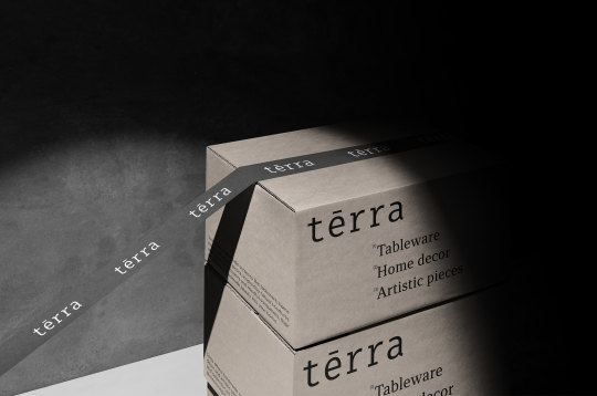

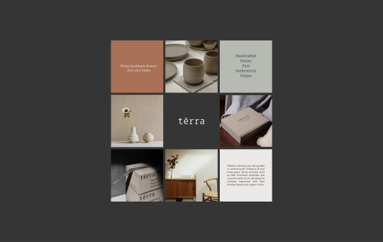


Terra – Handmade Ceramics Branding
Mockups used in this project ⚡ Post Packaging Mockups
Design by criarestudio.com
4 notes
·
View notes
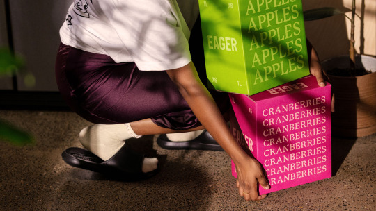
Photo

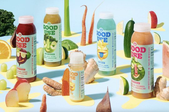

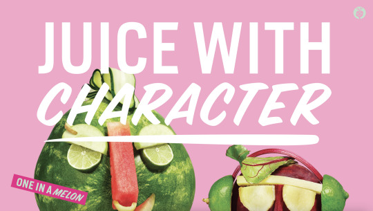


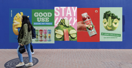
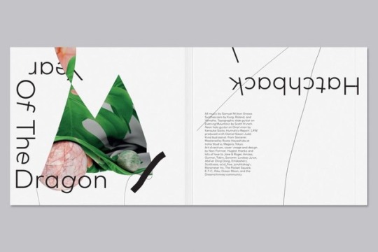
Good Use by Hatch Design.
47 notes
·
View notes
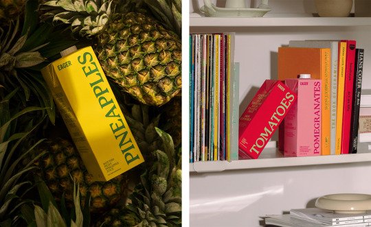
Photo
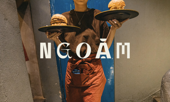

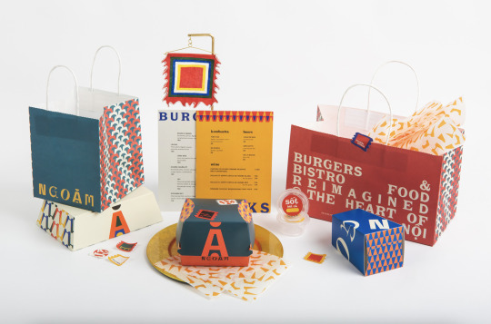

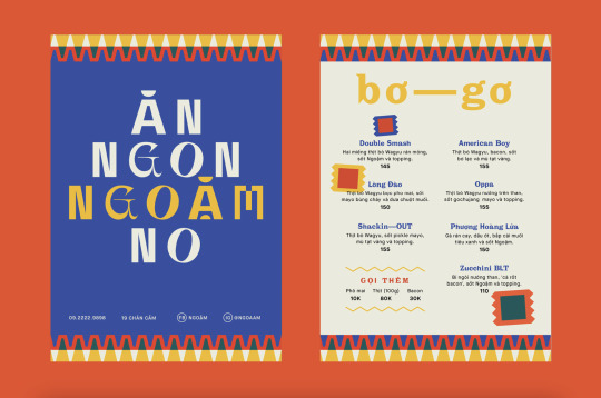
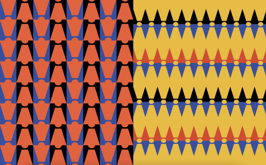
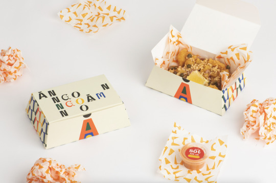
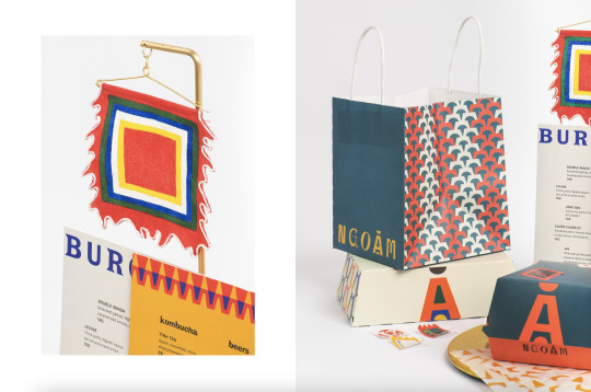

NGOẶM by Studio Cohe.
28 notes
·
View notes


Photo
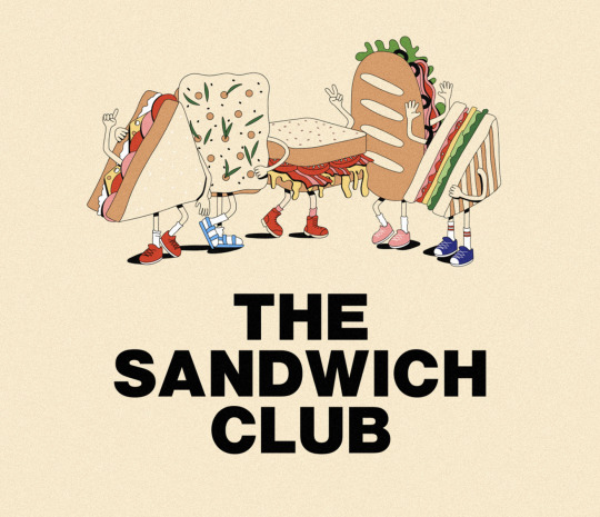
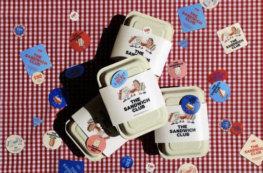

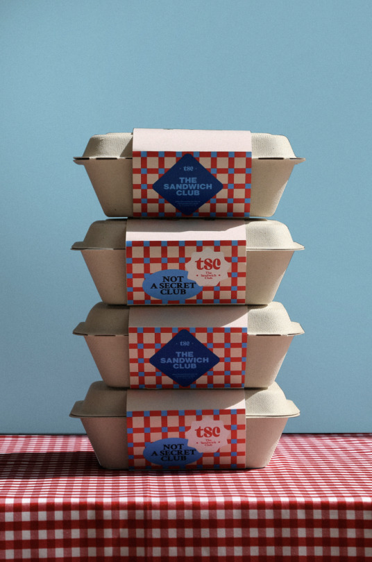
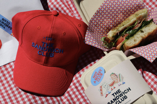

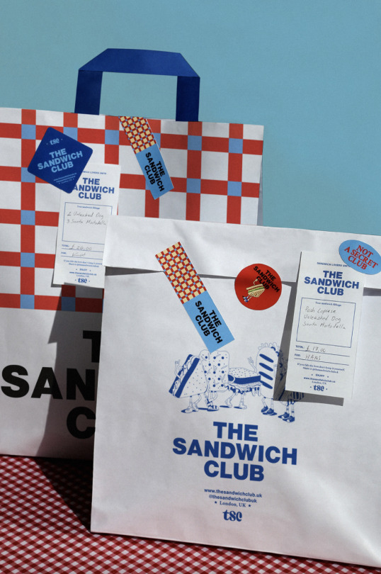
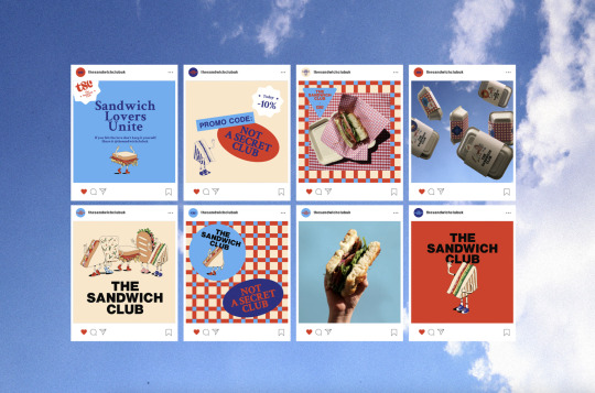
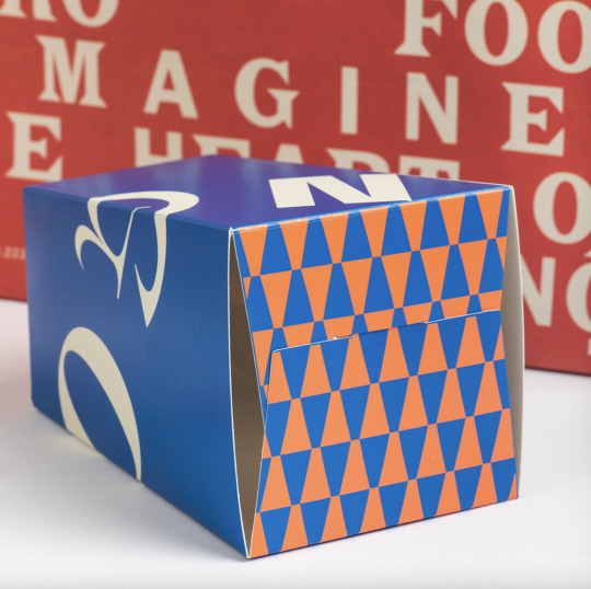
The Sandwich Club by Karla Heredia.
297 notes
·
View notes
Photo
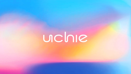
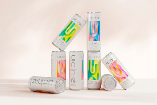

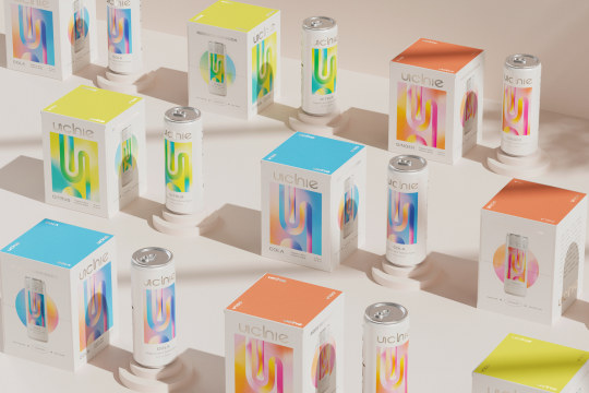
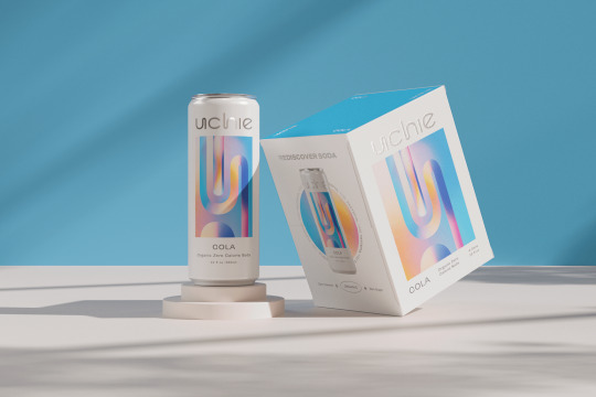


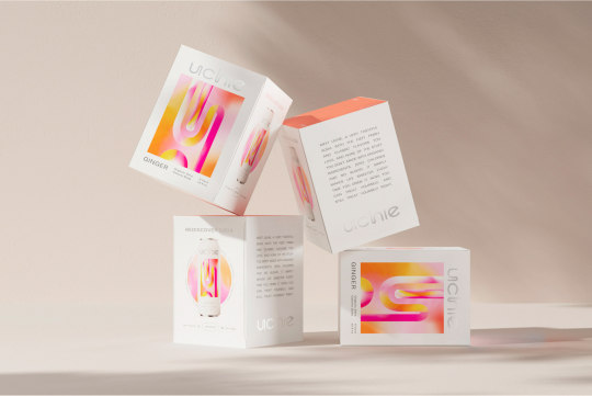
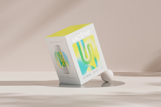
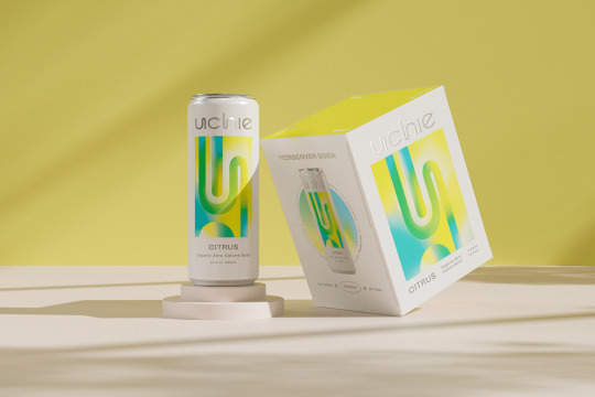
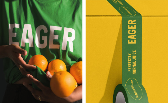
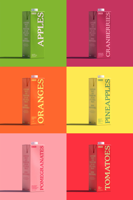
Uchie Packaging by Kati Forner
Uchie came to us to help former pop lovers rediscover the joys of soda in a healthier form—with zero calories, no sugar, all-organic ingredients, natural sweetness and no shame. We positioned Uchie as the soda for who you are now, so you can treat yourself, and still treat yourself right.
Leaving out trendy add-ons in favor of flavor focus, Uchie innovates in a tasteful, and tasty, way to simply bring us more of what we love and none of what we don’t. Which led us to the perfect tongue-and-cheek tagline “Very Tasteful.” Inspired by the art of the Light and Space Movement, we gave the brand a visionary graphic palette that spoke to innovation and artfulness.
The logomark feels clean, inviting and playful with an innovative twist. Contrasting type pairings bring bold personality and presence to the identity. An unexpected palette brings a dynamic, modern feel to timeless colors, elevated by future-forward silver. (KF for dieline.com)
TDB: instagram • twitter • facebook • newsletter • pinterest
339 notes
·
View notes
Photo
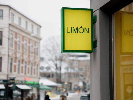
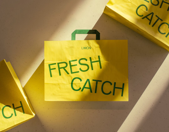


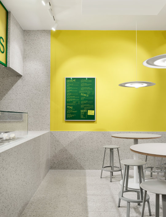

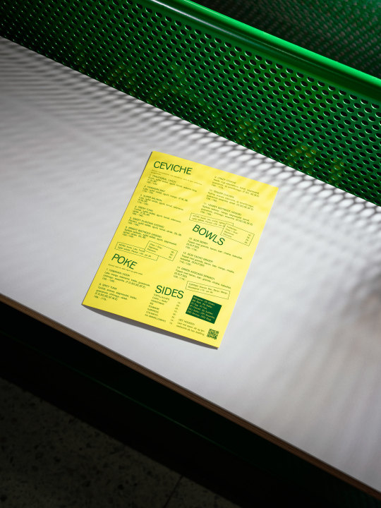
Brand Identity for Limón by Goods & Heydays
Limón is a fast-casual food chain in Oslo, Norway, serving fresh pokés, mouthwatering ceviches, and healthy bowls. Inspired by the oceans that connect Norwegian fish with exotic South American tastes, the concept has inspired everything from Limón’s website that’s literally floating to perforated metal interior details that resembles fishing nets.
All packaging is responsibly sourced and features bowls made from sugarcane pulp, lids from recycled PET bottles, and fiber cutlery instead of plastic.
Brand Strategy, Naming, Visual Identity, Packaging & Web: Goods & Heydays
Interior Design: Omhu Projects, Interior photography: Einar Aslaksen
TDB: instagram • twitter • facebook • newsletter • pinterest
383 notes
·
View notes
Photo

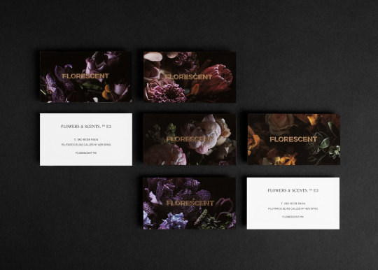
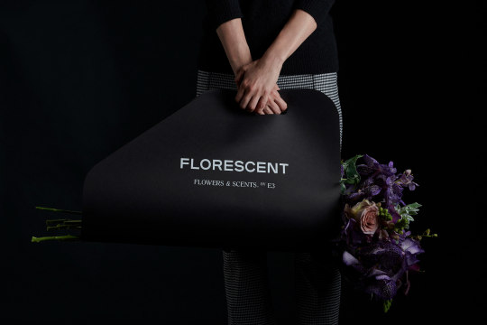
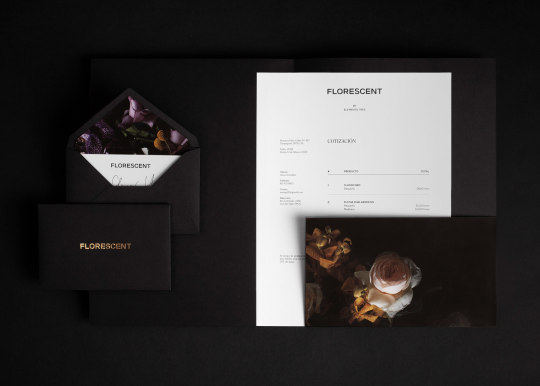
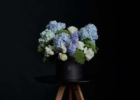

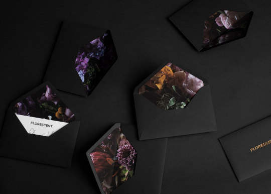
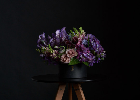
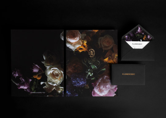
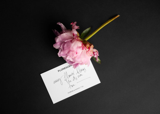
Florescent
Mexico-based design studio La Tortilleria have created a stunning visual identity for Florescent, an blooming high-end flower shop inspired by the best practices and boutiques in the world. Florescent caters to a most discerning audience providing signature creations with beautiful and very special flowers. But the brand sells more than exotic orchids, peonies and statement flowers like the fascinating king protea, it makes exquisitely scented candles as well.
127 notes
·
View notes
Photo
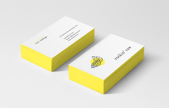


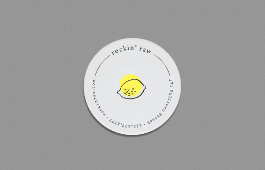
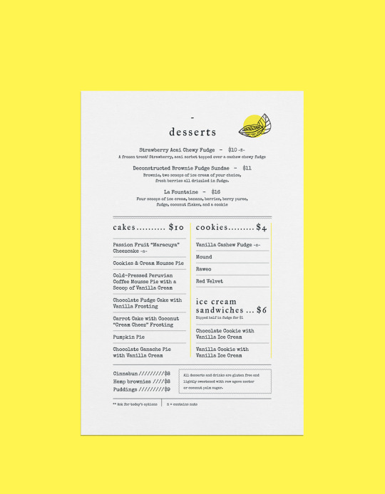

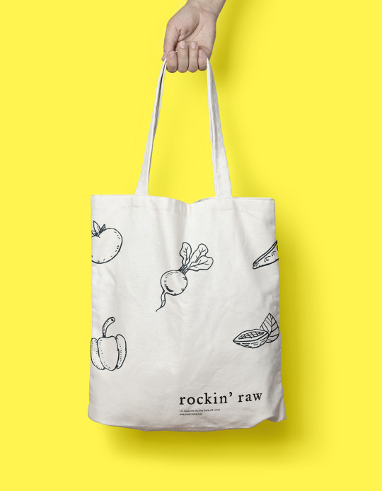

Allan Revah / USA
Established over a decade ago in the heart of the west village, rockin’ raw was one of the first restaurants to introduce a full vegan, gluten-Free, live and raw food menu. Development of a more contemporary brand in order to elevate it’s ranking among the health-food restaurants currently operating in NYC and to help enable people seeking better health practices immediately understand and associate with the environment.
740 notes
·
View notes
Photo
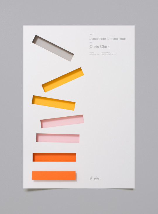
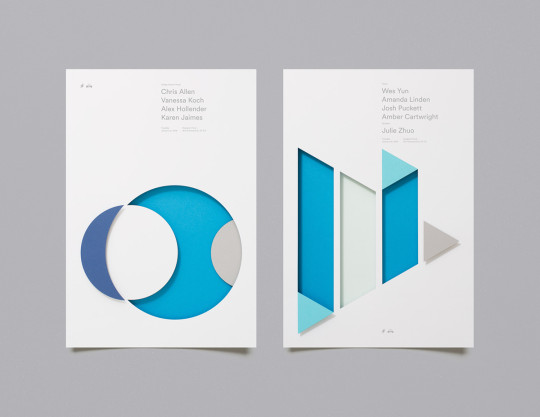


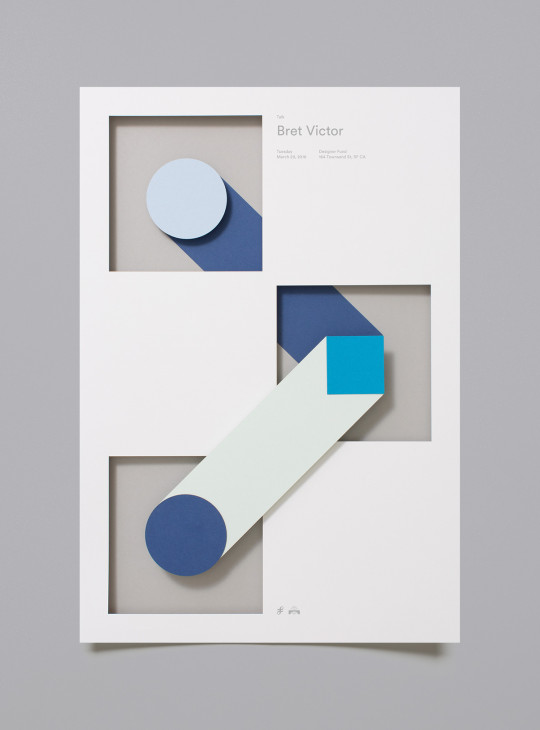
Designer FundBridge - Poster Series / 2016. By Moniker design and branding studio from San Francisco CA.
529 notes
·
View notes
Photo

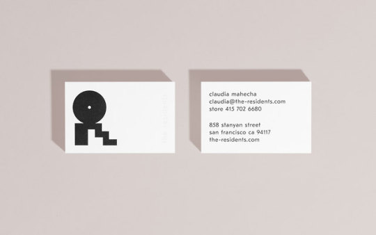


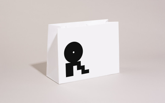

The Residents Brand Identity by Landscape
The Residents is an interior design firm and furniture dealer devoted to design that is resourceful, sustainable, expressive, and inspirational. They believe in the power of consumers to better the world through the selection of design that is thoughtful, functional, and well-crafted.
To coincide with the launch of their new brick-and-mortar retail location, Landscape worked with The Residents to clarify their brand story and to craft a new extensible identity system that reflects their passion for design, self-expression, and community. The system was extended across an array of customer-focused collateral including business cards, shopping bags, environmental graphics, and digital marketing templates.
—
Landscape is an internationally recognized brand strategy and design studio committed to the creation of forward-looking identities and experiences. They translate narratives into systems to create long-term, scalable business value. The studio embraces the arts and technology equally, providing guidance to clients that pursue influential change through their products and services.
T D B: instagram • twitter • facebook • newsletter • pinterest
132 notes
·
View notes
Photo
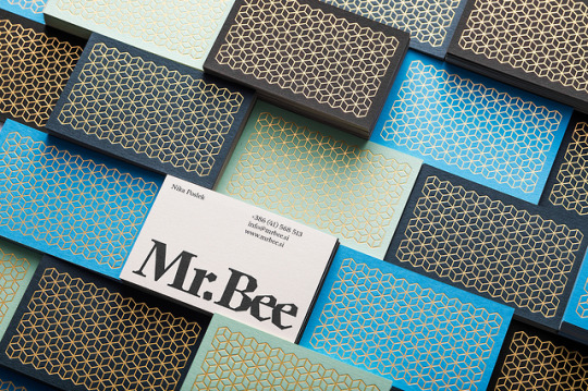
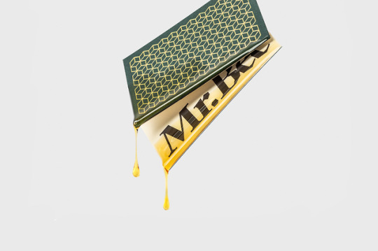

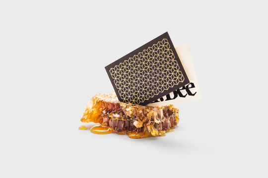
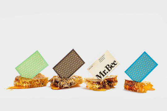

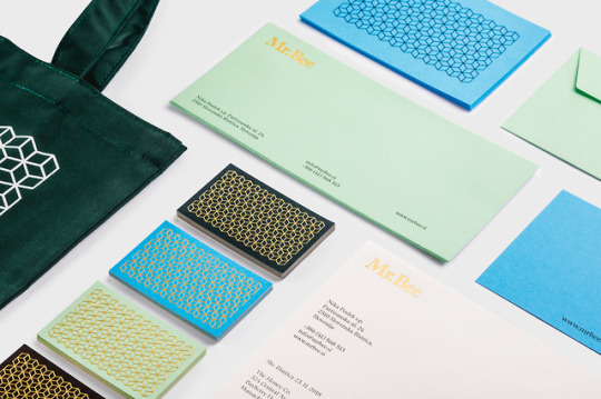

Identity for Mr.Bee by Diano Kitanovski
The enthusiastic entrepreneurs at Mr.Bee wanted a versatile visual identity, one that could be applied on items as diverse as, staff uniforms, aprons, beehives, social media, packaging, and print collateral.
The idea was to capture the vibe of their colorful beehive, people, the elements of the honey industry and build the identity with roots from the heart of their home, where they started producing high-quality honey and bee-related products.
—
Diano Kitanovski is a Ljubljana based collaborative designer, fond of modern & simple creative solutions. He has worked with clients and studios, both locally and internationally. The studio’s experience has included designing for a diverse range of sectors including early-stage startups, professional services, and hospitality.
T D B: instagram • twitter • facebook • newsletter • pinterest
238 notes
·
View notes
Photo
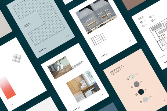


Vistto Building Studio Branding by The Woork Company
Follow WE AND THE COLOR on:
Facebook I Twitter I Pinterest I YouTube I Instagram
28 notes
·
View notes
Photo
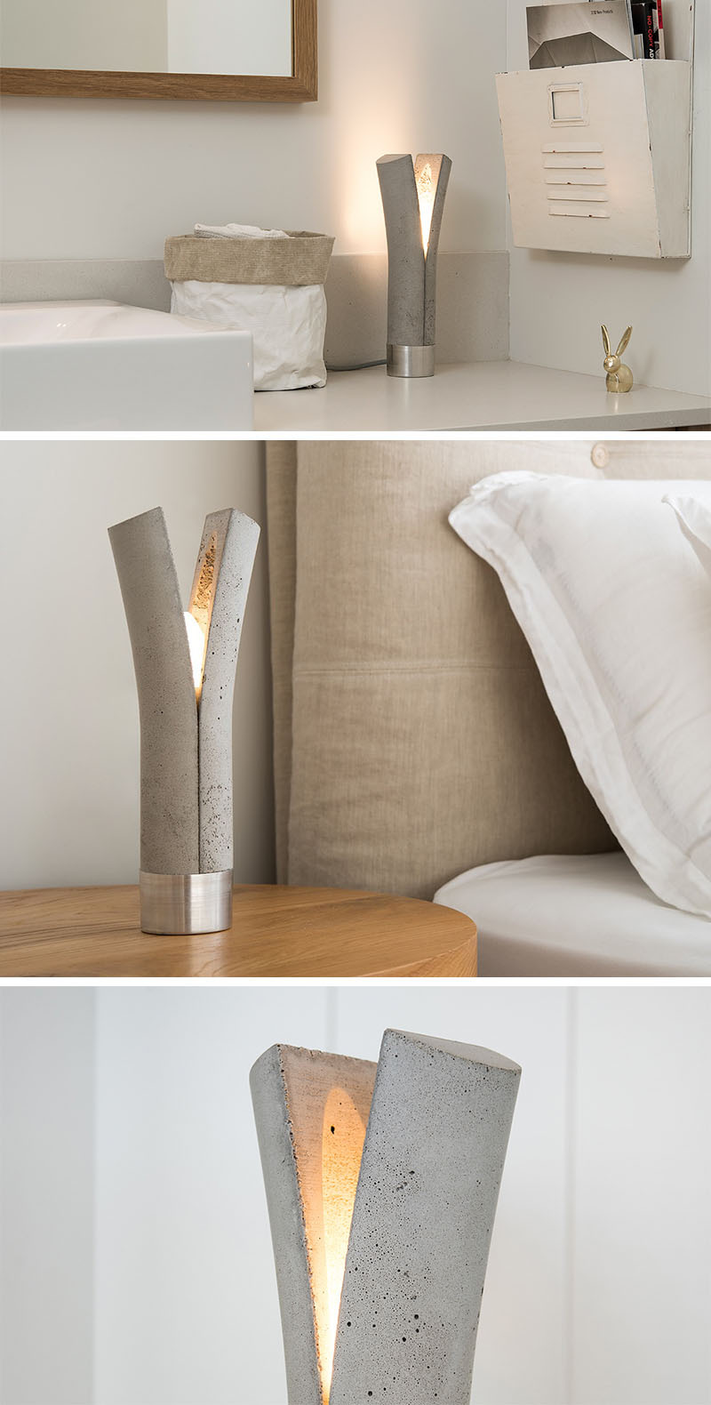
Designed by Dror Kaspi of Ardoma Design, are these concrete and aluminum lights that come in two variations, a pendant light, called Split, and a table lamp, called Release.
245 notes
·
View notes