#I also need to make a graphics page since I removed my graphics section from the homepage and still want to show off my stamps and such
Text
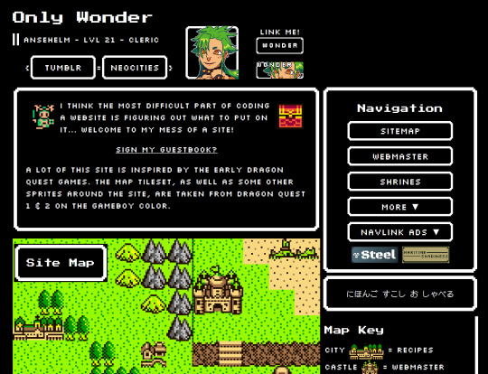
working on a mobile responsive homepage for my neocities and it's coming along so well :) look at himb
#rice rambles#neocities#it's a lot like my current homepage but STILL#I'll be uploading it on New Year's :3c#I'm gonna work on updating my default page layout as soon as I'm finished with this#I also need to make a graphics page since I removed my graphics section from the homepage and still want to show off my stamps and such#and I need to make a Japanese page bc that's my new year's resolution: learn more Japanese#and I want to share resources I've found :)
14 notes
·
View notes
Text
Alrightyyyyyyy! I need some help from my lovely FFXIV community members!
I've finally finished up my feedback about the face changes in the graphical update, but I can't post them on the official FFXIV forums myself because of that pesky old profanity permaban. I'll post it all here, so if one of you beautiful and wonderful people could copy and paste it over to the thread I'll link below I would really, really, really appreciate it.
It's been about 8 years since I could post there so I don't know the situation for posting images, but if you need me to host them someplace so you can use the necessary html, just let me know!
This was the thread I was hoping to post my feedback in, but if you see more that it would be helpful to add parts of it to or a different one you feel it's better suited for, feel free to paste it there as well!:
Add whatever note you want at the front to clarify that this is just a post made on behalf of another player! My own character info is: Nozomi Kei on the Balmung server, Crystal DC, NA
Feedback starts under the cut~
I'm going to try to cover everything I can find wrong and pray that at least the biggest issues are addressed, otherwise I may have to retire the character I've played for almost a decade. I will be talking primarily about face 2 male Duskwight Elezen, as that is what I play. Some of these issues might be present in all Melezen faces or isolated to face 2, but I wouldn't know unless one of you here has talked about it.

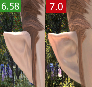
First, an issue several others have mentioned: Face 2 Duskwight suddenly having the textures of a Wildwood; eyebags being especially noticable and unwanted. I chose my character to be Duskwight specifically because I didn't want the eyebags.

Actually something seems off with all of the textures on face 2 Duskwight? My previously powder-smooth, even-toned skin now has a mottled, almost artifacted appearance, same with the skin on the lips which have both mottling and oddly darkened edges on the lower lip especially. The eyelid textures seem to have just straight up been placed wrong, with part of the weights snagging a section of the eyebrow down and leaving a notch during blinks. The eyebrows also look like maaaybe they were misplaced and that's why they're thicker for some of us, because they're being stretched over a different area than intended that is bigger than their previous real estate.

The obvious texture stretching aside, the new eyelid has removed my faint eyeliner, and changed the gently pink lid to the same jaundiced beige as areas like the forehead. Eyelids are naturally pinker in real life because of the thin skin amd abundant blood vessels. This ties into the larger observation I've made about the changes to face skin textures for 7.0, which is that their color now looks unnaturally one-toned and even more lacking in the natural hue variation of living skin than the current faces.
A note on the eyebrows and lips that is more of a suspicion than confirmed, but I'm starting to feel like these features have just been outright homogenized? Perhaps in order to make applying morphs easier? Several people have made mention of their brows being straightened out and/or thickened. The elderly faced gentleman on page 12 posted by Cio had his magnificent, shapely brows reduced to mundanity. A lot of unique lip shapes are being changed in a consistent direction. The 'standard' shape is a strong cupid's bow on top with very pointed peaks, color wrapping around the corners of the mouth, a wide and shallowly curved underside to the bottom lip, and less fullness overall. Some are seeing their gently rounded peaks made pointy, others are seeing skinny-in-width bottom lips widened, folks with broad upper lips are being thinned. My little lift in the center underside of my bottom lip was flattened
My lips are also now weirdly dark by default, and trying to colorcorrect the unattractive mauvish beige leaves me looking like I'm wearing heavy lipstick. I think part of this is the change in how lips handle lighting, and part is the bad texture that was swapped in, plus the harsher edges to the liplines where previously there was a gentle, natural transition.

At first I thought I was imagining it before I imported my current settings, but now I am sure when I say my cute and small triangular ears whose shape added to the sharpness of my face have been made bigger and rounder. I made the smallest, most Tolkien elf ears I could because I wanted them to be subtle and elegant. This reshaping has added to the myriad changes that mean my character no longer looks like the same person.
While I can see changes to my beloved hook nose I will concede that at least in profile the shape is nearly identical. Like others observed there has generally been a lessening of the details that made the nose unique. Raised ridge, bigger septum, nostril shortening.

I'm going to try to list things out, starring the things that I think are issues that especially need to be changed/fixed because they are errors rather than just somewhat expected (if unwanted) differences caused by increased poly count and modelling changes.
☆☆• Face 2 Duskwight face textures have been swapped for Wildwood textures?
☆• Lips have been reshaped
☆• Eyebrows have been thickened
• Ears have been made bigger and more rounded in the middle and lobe regions
☆• Lips are darker by default which causes issues with lipstick
• The edges of lips have a hard edge instead of the previous gentle transition
☆• The bizarre 'milk mustache' above the upper lip
• My chin has been made bigger and more round in profile
• My lower lip has been plumped.
☆• Mottled skin textures, especially on my cheeks
• Very flat lip lighting/sheen
☆• Elongated dark smudges about 2cm long on either side of my mouth?
☆☆• Texture issues in eyelid region (very visible during blink animation)
• Harsher, darker eyelashes (not thicker from above though??)
• Lack of eyeshine and dark upper iris making my lids appear lower and changing my default expression
• Angular facial geometry in cheeks seems smoothed which changes the harsher look of the race (possibly just the faulty benchmark lighting)
• Hair lighting has changed; seems more matte, less hue variation between lit and shadowed areas
___
Changes I've seen in other players:
• Face skintone now seems very one-note and unalive
• Waxiness
• Harsher eye makeup that appears too dark or stark
• Removal of texture detail that was unique to individual faces, especially in eye regions
☆• Moon Miqo fangs drastically shortened
___
In seeing all of this unfold I've been dismayed to notice a lot of the unique charm of faces across the board being airbrushed away, from subtle shading in eye areas on various viera faces, to expressive and quirky default expressions being toned down and made more average in Elezen girls and Miqo girls, to wrinkles disappearing from older faces, to facial topology that created personality via cast shadows being rounded and smoothed and lightened into nonexistence. The result is consistently a more calm, mature, generic look. A lot of female characters' makeup has turned weirdly harsh, sharp-edged, and dark so that it more closely resembles stage makeup, both eye and lip. Then the awkwardly single-toned skin tops things off with me left feeling that very few looks are 'upgrades' even when the owner is happy with the result.
A couple side notes: Something odd is happening to the hairline on this style near the middle? Looks like an error. My racial gear necklaces have changed from a visible leather texture to some unidentifiable line-y texture?
#ffxiv#ffxiv graphical update#7.0 graphical update#dawntrail graphical update#ffxiv graphical update feedback#my writing#my character#feel free to translate and post in the other language forums!#the more reach#the better#we know they're listening and I appreciate that
8 notes
·
View notes
Text
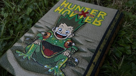
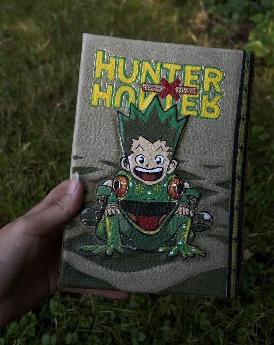
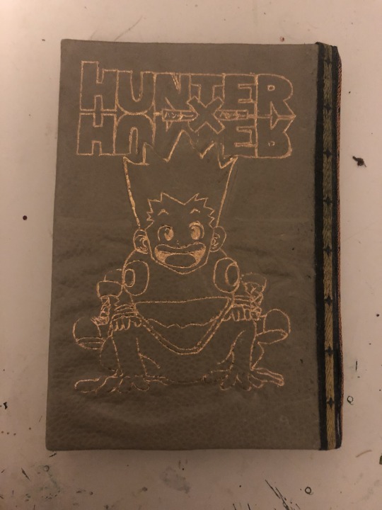
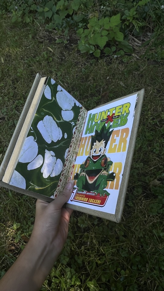
HxH manga rebinding! (vol. 1)
(project master post here)
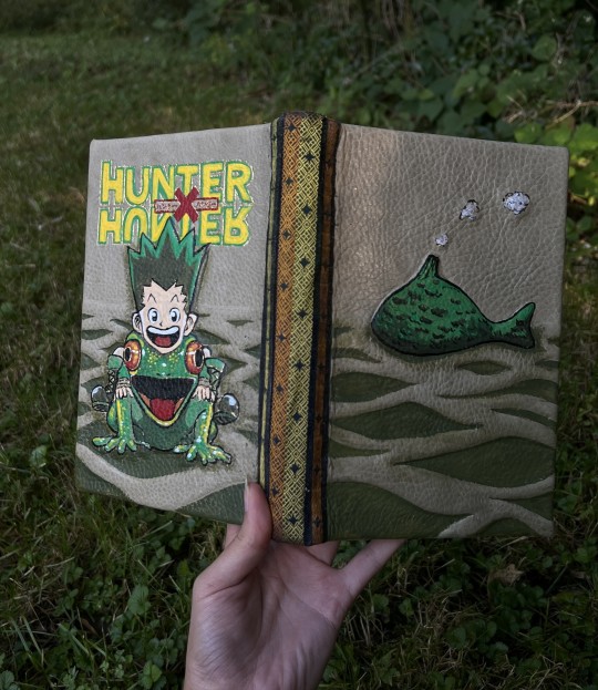
Let me just start this off with that from my 7 years of experience bookbinding, a LOT went wrong with this project. Like, almost everything that could've went wrong. It is not to my usual standard of work, though I tried to make up for errors where I could.
Nonetheless, I'm doing this for practice and to document my progress, so here's how it went!
⍔ (More final pics at the end) ⍔
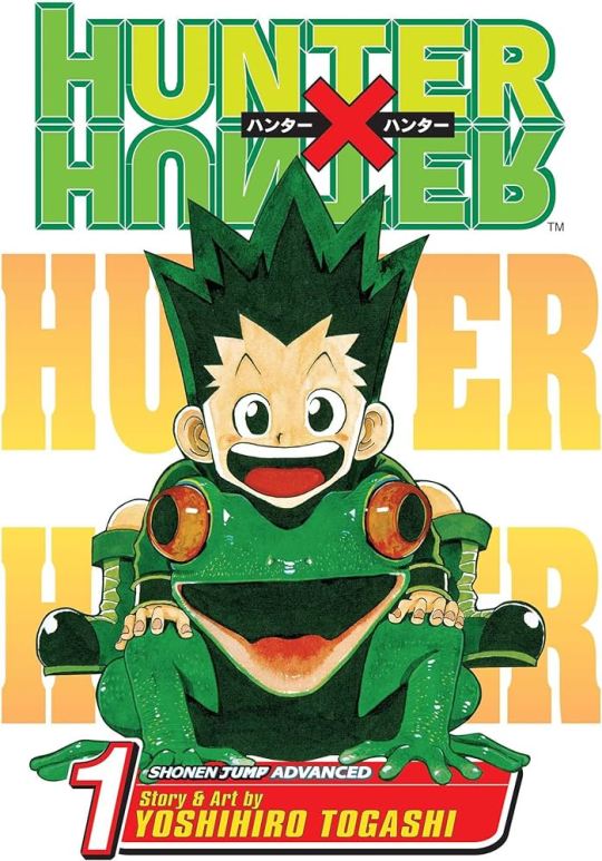
I absolutely adore the cover of the first volume as-is. It's really great graphically: the palette pops and gives a clear hierarchy to information in different areas, the illustration of Gon on the frog is super cute, it's overall just fun.
My first design decision was to retain the green/yellow/red color palette. I don't think I've ever done anything with these colors, I don't really gravitate towards them, so I definitely wanted to keep them in the design.
I didn't have a piece of leather large enough in any of these colors-- all the leather I use is industry scraps and remnants, so I don't really purchase full hides. So, I had to get creative with it:
I did have enough of this laurel green leather to cover a front and back board, but I'd need to hide the seam along the spine. I also have this really cool tie silk jacquard, I want to guess it's from the 80's (I got it for a dollar at a flea market). Technically I'm using the backside of this stuff, but I like it better because of how vibrant the colors are. I only need a thin strip for the spine, so I cut out a matching green, yellow, and orange section.
Here are some reject cover material contenders: different leathers, vintage kimono silk, and snakeskin!
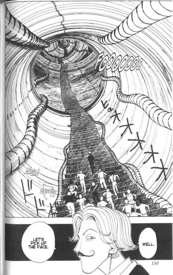
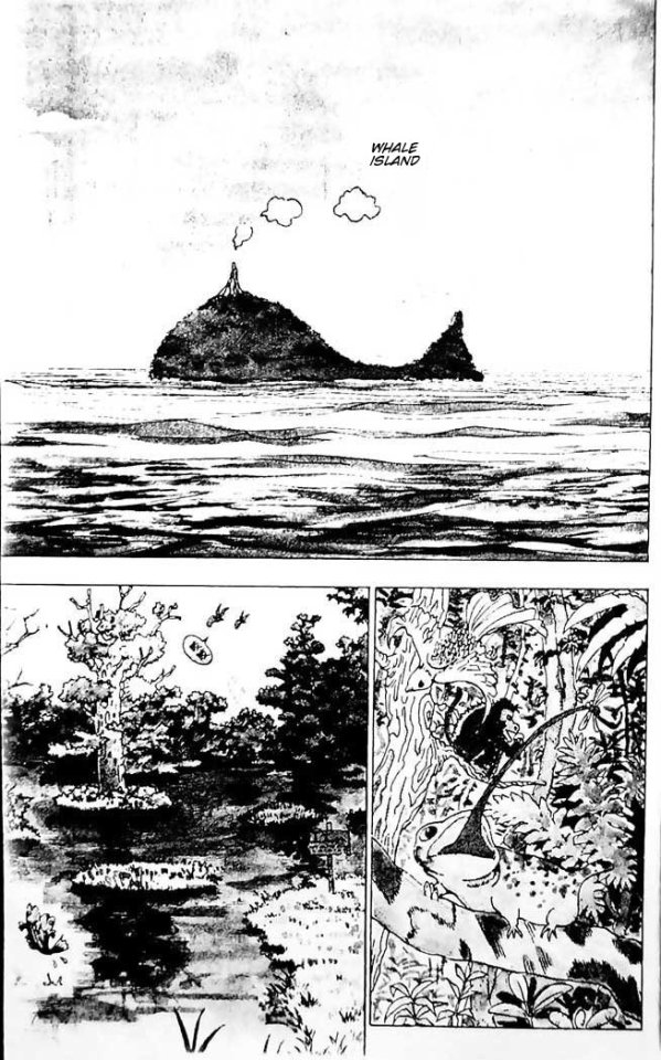
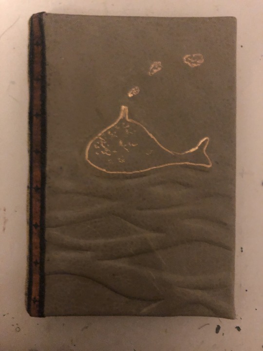
I didn't want to just copy the cover for the board design, so I looked at the panels for some inspiration. My favorite panel from volume 1 is actually of the tunnel from the Hunter exam (left), but since this is the first volume, I really wanted to pay homage to this being the beginning of Gon's journey. So, I included this panel of Whale Island (right), along with a wave pattern.
Here's the design I sketched out, and it carved into chipboard:
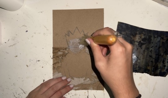
Normally I'd just sketch directly onto the chipboard I'm carving, but I wanted to have a template to use for gold foiling. This is my first attempt at doing so; I don't actually have the proper tools for traditional hot stamping, so I'm using a hot foil pen (video on the tool/technique).
First mistake: Trying to brute force the original cover off the block.
Lesson: Use a heat gun.
Removing the text block from the original softcover was pretty straightforward, except I originally tried to get the cover off the block by gentle tearing/cutting away at the original glue, which resulted in me just destroying the attached page anyway. This volume doesn't give you many "junk" pages to sacrifice, so it meant I'd have to glue my end paper onto the last page of the volume D:

For the other cover, I hit it with a heat gun for a few seconds, and it peeled right off.
Here's a progress shot of attaching the leather to the boards, smooth sailing there:

Second mistake: Not backing fabric with Heat n' Bond
Lesson: Always make bookcloth properly
I have made my own bookcloth before (video on how to do it), and really, truly, know better than to apply liquid glue to fabric. Nonetheless, I was stupid and did it anyway. I even diluted the glue with water, thinking that would mitigate the effects of glue seepage? It didn't. My spine fabric lost all its vibrancy and was just an ugly, goopy mess.
Before I attached the board and spine to the block and endpapers, I added the foiling. At first, that came out pretty well, but then I lost patience, and started freehanding Whale Island on the back.


Third mistake: Not sticking to the template
Lesson: Stick to the fucking template (and start saving for a CNC)
The drawing itself was fine, so normally this wouldn't be an issue, but because I have Whale Island sitting on top of a raised embossed silhouette, it was painfully obvious that my drawing wasn't in the position or scale it was supposed to be. My freehand lettering also leaves something to be desired, though I don't think the template would have helped a lot with this either. Honestly, for a position-sensitive blind transfer for lettering like this, using a CNC like a Cricut or Silhouette would be best. This might be my push to finally invest in one?
The endpapers are actually paper I had marbled myself, a while back, and met the green/yellow criteria. Attaching those to the block went smoothly, though I had to slightly glue over the panels at the back of the volume T^T... I used some of the spine fabric for head/endbands as well. It's... pretty ugly up close. Glue seepage, and the next mistake.


Fourth mistake: Gluing the entire fucking block upside down
Lesson: Anything but that
The cosmetic mistakes on the cover this book are pretty forgivable, but the inside is a genuinely disgusting mess. I was working on getting this done before a friend came over, and was pretty happy to get the block glued in and the whole thing in the press before she arrived. I decided to take it out of the press show her when she arrived, only to realize I HAD GLUED THE BLOCK UPSIDE DOWN. AAAAAAAAAAAAAAAAAAAAAAAAAAAAAAAAAAAAAAAAAAAAAAAAAAAAAAAAAAAAAAAAAAAAAAAAAAAAAAAAAAAAAAAAAAAAAAAAAAAAAAAAAAAAAAAAAAAAAAAAAA
I tried to remove the block nicely, but the glue was already half dry and tacky and it was an awful awful mess, and I was already SO DONE with the project. So, I just cut the block out along the middle of the endpaper, and stepped away for the evening.
I really wanted to use the marbled paper I made, and I had no scraps to use over the seam where I had to flip the block, so I had to find a complimentary alternative. I just used some chiyogami, with, once again, green/yellow/red. Slapped that on the seam. Probably could've done a better job with it.
I had been saving the original covers, and wanted to incorporate them, so I decided to use them as sort of bookmark pages? Not sure how to call it, but like how hardcovers with a paper cover will have those folded flaps on the inside usually with an about or review section.
As for the cosmetic fixes:
First thing I did was properly make bookcloth with the sliver of extra silk in the right colorway that I had, and glued that over the lumpy fucked up original spine. It's not perfect by any means, but it's definitely a lot better.
When I started writing this, I had only done gold foil on the covers. But as I was looking back at early design process photos, I remember how much I wanted to incorporate the red into the design, which mine was absent of. So, I started to accent Gon and the frog with red paint.
It looked absolutely horrifying.
So I kept painting, and painting, and painting, trying to make it look good, and it was 4AM and I was tired, and I'm used to oil paint so I forgot you can't just leave ugly globs of paint wherever and wipe them up later, and it just kept looking worse and worse.
I got jumpscared by this monstrosity this morning:
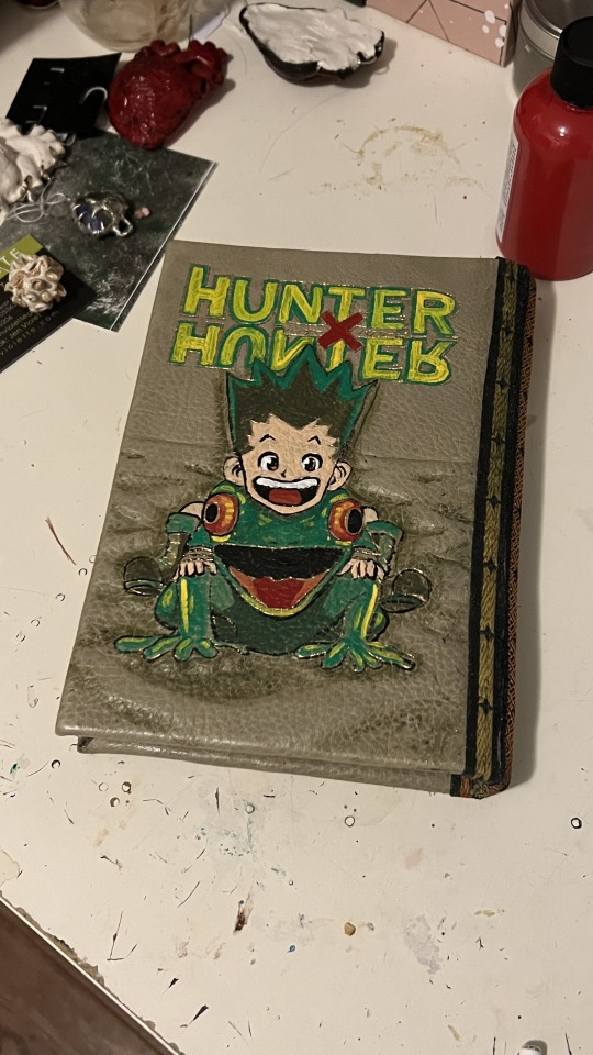
Don't paint while tired!!
I tried to salvage my awful paint job the next day, and kept adding more colors and paint into the design until I had ended up just repainting the original cover. I didn't get the lettering perfect or anything, but I got it to a presentable point at least. I really wanted to make some semblance of a re-interpretation of the original illustration, but oh well, the painted version was a necessary fix.
It's not perfect by any means, (honestly, it's not even good either), but I did what I could, and I'm ready to move onto the next project. Here's the final pictures!


Thank you for reading this far! Please leave a comment with any thoughts or suggestions, they really encourage me to keep going :D
3 notes
·
View notes
Text
Arts 102: Blog Post, Weeks 9-10 + Reading Reflection
Week 9: This week was focused on my concept statements and the digital rendering of my two logos for Matilda and Trunchbull. I sketched and scanned out the several logo ideas I was most likely to go with (attached below), and chose the floating book with for the character Matilda and the newt trapped inside the glass for the character Trunchbull.

When receiving feedback from professor Khalili, she suggested removing the arch of text for Matilda's logo and doing scrambled letters instead for more visual impact, and removing Trunchbull's hand on the newt logo. I suggested changing my character from Trunchbull to Lavender (she did the original initiation of the prank in the movie), and professor Khalili agreed, resulting in the character change in my project. Class on Wednesday was asynchronous and was focused around the completion of my concept statements (attached below). In my concept statements, I described the character, discussed the Gestalt principles used (similarity and area), the font (Big Caslon Medium and Chalkboard), and my color scheme (contrasting and analogous).
Week 10: This week was focused on the completion of my character logo project. During the weekend, I spent a lot of time working and editing my character logos. Using Adobe Illustrator was a challenge as my logos both featured illustrations (Matilda's hands and the newt) more than shapes, leading to a lot of time being spent in revising and reediting the digital art. Eventually, I ended up using another program, Clip Studio Paint, as a way to complete my digital art as I find there to be more line and tool diversity on this program for digital art. After finishing my artwork on Clip Studio Paint, I brought it back into Adobe Illustrator, and had to make some more digital touchups since my imported images were not to scale and were heavily pixelated. The process was arduous, but eventually, I found myself to be satisfied with both of my logos. My project was completed on Wednesday, when I used an Adobe InDesign template to import my images and concept statements. Then, I sent my work to the printing lab, where it will be printed on 11"x17" matte presentation paper. Though this project came with many of its challenges (The main one being me being a novice student and still learning to achieve proficiency with the Adobe programs), I found myself to be happy and satisfied with the end result.

Reading Reflection (246-291): With app design, I never realized that there are so many factors needed to be considered, such as the state of the person using the device and potential interfering technologies (like headphones). I think it's interesting how this is a potentially high-reward form of design. The work that stood out to me the most was Michel Chanaud's- I am visually drawn to visually vintage works like his Etapes magazine cover, which appears to be illustrated with an airbrush and has hazy color choices, like the fainted blue in the background. I also thought the excerpt on Girls and Games (page 262) to be interesting, as it comes to show how modern open-mindedness in thinking and disattatchment from old stereotypes and beliefs is a valuable trait to have in the world of graphic design. In the section for E-commerce, I found the clean, modern, and floral work of Randy J. Hunt to be visually striking. The edge in Lucy Sisman's ink art designs also stood out to me from a chaotic, yet harmonious stand-point. I found the fact that in the past, message delivery was prioritized over consumers to be surprising- It comes to show on how many fronts graphic design has evolved.
2 notes
·
View notes
Text
Operation: Sunset
(Cheesey operation title aside, here’s my Take Action Masterpost)
OK! So @krysmcscience has a fabulous contact list located here, and @yashahimewasamistake has some great example messages located here.
I wanted to help out and do my part by adding some more Copypaste messages, and other people to contact about this trainwreck of a show once I started sending out my own complaints.
Please note that this post will change as I edit it to add more, so keep checking back.
Also please share this because with all the outside links I’m posting I doubt this is going to show up in the anti tag.
Hulu:
Now this one is not as easy for everyone because Hulu is a paid service, and it also doesn’t have just a simple email address to send a letter out to, and I am avoiding any form of contact that would require me having to call and talk to someone on the phone.
I DO however have a hulu account, so I used my account to create a Community Help Center topic located here:
https://community.hulu.com/s/question/0D53h000018m7FaCAI/can-the-age-rating-for-yashahime-please-be-changed
If you have an account please feel free to log in and back me up, maybe it will actually draw the attention of moderators there.
Disney:
I emailed both addresses provided on Krysm’s post with the following message, please feel free to use it if you would like to do the same:
Title: In regards to children's programming on Hulu portraying a child-grooming relationship
There is a children's show called Yashahime being aired on Hulu currently that portrays a romantic relationship between an adult man, and a young girl who he's known since she was 8 years old. In the most recent episode it was revealed that this young girl gave birth to the man's children at approximately 14 years of age.
Considering that this is the age range for the target demographic many find this to be in very poor taste. We are asking that at the very least the age rating for this show be changed, or that the program be pulled from Hulu's lineup.
Thank you very much for your consideration.
~A Concerned Citizen
Crunchyroll:
This is an interesting route because on one hand anyone can actually make a free Crunchyroll account to contact them about this show, however on the other hand, I feel like Crunchyroll as a whole would be less concerned about the themes of pedophilia and grooming featured in the show because the app is not really intended for kids to use.
HOWEVER, they cannot afford to turn a blind eye to people who report triggering content. A request for a Content Warning to be put on the show is not asking much.

Yashahime contains clear and distressing themes of pedophilia and grooming. The latest episode featured an approximately 14-year-old girl giving birth to babies fathered by the adult man she's known since she was 8.
Now I'm not new to anime, I know that there are many genres with different age demographics and as such different levels of graphic content. However, most of the time the rating, target demographic, and any content warnings that are given in the description can help people navigate what content they are looking to be exposed to.
There is absolutely no warning or indication that Yashahime should contain such triggering content.
Please put a content warning on this show!
Note: Crunchyroll is also a great place to drag the show in terms of reviews as it’s one of the main review sources Google pulls from when you do a search for the show. Ya’ll have NOT disappointed, and the first almost 3 pages of recent reviews are ALL doing the lords work, it’s hilarious, and if you haven’t seen it yet I recommend it.
I’ll get more into review-bombing later in this post.
Sunrise/Funimation/Viz:
Krym didn’t link a contact form for Viz Media. I’m not gonna lie, at the end of the day I don’t really know if Viz and Funimation are basically the same entity, but I went ahead and contacted Viz too just to be thorough:
https://www.viz.com/company-contact
I sent this same message to all three companies.
This show that has been heavily marketed for children, and has main characters that are 14-years-old, features a pedophilic relationship as romantic?
Sesshomaru knew Rin since she was 8-years-old, and she gave birth to his children at approximately 14-years-old, THE SAME AGE AS THE MAIN PROTAGONISTS AND MARKET DEMOGRAPHIC!
How is this appropriate content for children? How are we supposed to teach our children that inappropriate attention from adults is wrong if their favorite shows feature it as good?
Yashahime needs a new age-rating and a content warning.
~Review Bombing~
When you Google Yashahime there are 3 main sources that Google lists when showing review scores, Crunchyroll, MyAnimeList, and IMBD. Making accounts for these platforms is free, and I encourage anyone who had a few extra minutes on their hands to roll up and help us tank this show’s ratings.
https://www.crunchyroll.com/yashahime-princess-half-demon/reviews/newest/page1
https://myanimelist.net/anime/41911/Hanyou_no_Yashahime__Sengoku_Otogizoushi/reviews
https://www.imdb.com/title/tt12287748/reviews?ref_=tt_ql_3
~Brand Advertisers~
This section is still going to be under heavy construction, but the idea is a similar one to what brought about the YouTube Adpocolypse.
Now let me just be clear that while I disagree with how YouTube handled this situation (and is still handling it) it did shed light on a lot of terrible content on YouTube that was flying under the radar, so as a plan of action I think it’s entirely valid.
Basically the idea is to contact any brands we see being advertised during Yashahime on Hulu and Crunchyroll. This phase of Operation: Sunset is going to be much easier to pull off on Twitter, so I have not yet started it (getting a Twitter account and blocking the horde of shippers over there so they leave it alone and don't get all my tweets removed is the next phase in my plan).
PLEASE MESSAGE ME, OR POST HERE WITH ANY BRANDS YOU HAVE SEEN RUNNING ADS ON YASHAHIME!
Basic idea of a DM or tweet to a brand being:
Hey @[Insert Brand] do you really want your advertisements running on a children’s show that has heavy themes of child grooming?
-or-
@[Insert Brand] Did you know your ads are being run on Yashahime on @[Insert Platform], a children's show that features a grooming relationship?
Brands seen advertised so far:
Lexus
Progressive
Campbell’s
Eharmony
~
OK! That’s all I’ve got for tonight, stay tuned friends.
67 notes
·
View notes
Link
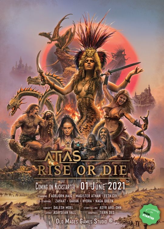

"Only a few understand adventurers. Most consider us insane driven by treasures, ancient secrets, fame, admirers, power, or what comes to mind. It couldn't be farther from the truth." /Adbjorn Haig/
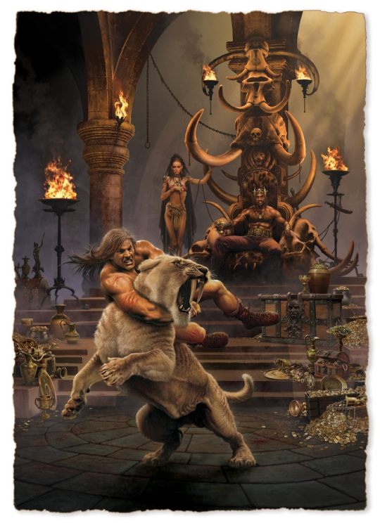
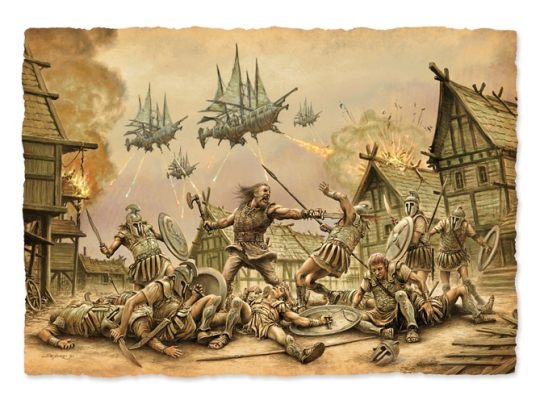
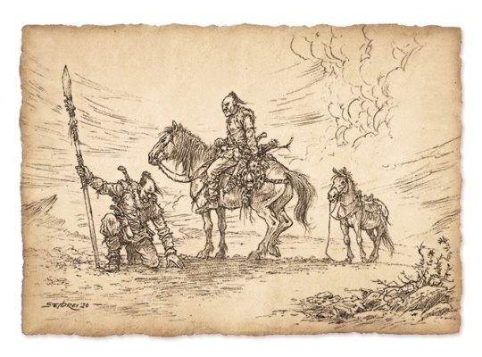
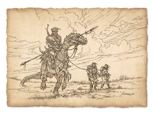
Enter the cruel and savage world of Atlas, where the ruins of forgotten civilizations are desecrated as the strange bones of the past begin to stir. Dark rituals mixed with corrupt technologies animate the ashes of the dead. As bloodthirsty hordes of barbarians and beasts alike roam the plains, the stern land can never be satisfied by the sweat and tears of the innocent. Mighty despots pass the time with their concubines behind high stone walls. Metal and magic have formed the land, erected floating islands, and twisted the deadly mountain paths. Take all you can before others plunder everything in this land of limitless possibilities! Rise as a mighty warlord or rot away like a maggot! Join us in the world of Atlas right here, right now!
"I have seen many shitholes on my voyages." /Feth Col/
Atlas – Rise or Die is a classic, vintage sword & sorcery tabletop RPG. In its style and mood, Atlas brings about the renaissance of the epic RPGs of the '80s with a modern, clean design and breath-taking illustrations.
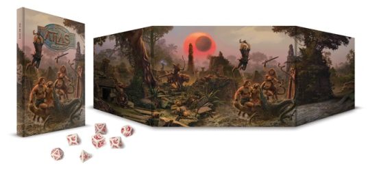
If you are interested, don't wait! Get a sneak- peek of the layout right now! Come and look at how we imagined the book's design and the base of the 2d10 system!

https://drive.google.com/file/d/1-e7_UOnNPa2cGsnwsowr55X9J2tFIPu1/view
The campaigns are housed in a brand new, progressive system that facilitates fast-paced and fluid gameplay. The system rests on the following seven main features:
A realistic, d20 compatible 2d10 system with low numbers. We believe that by using the result of rolls with 2d10s, we can eliminate some of the radical distribution of values often associated with d20s. This makes "Nat20" rolls even more epic and memorable, since their chance decrease from 5% to 1%.
We use a three-dimensional (race, class, archetype) character creation system, where by removing the traditional "alignment" aspect of characters and introducing the archetype system, well-rounded personalities can be created and played out.
The Atlas system allows for completely free character advancement, even maxing out a single stat is possible, though not encouraged by the system. It favors balanced characters and allows unique combinations of strengths and weaknesses.
Subsystems for NPC interactions, that allow overcoming obstacles by not only violent means. These make social interactions and investigations as enjoyable and manageable as combat encounters, resulting in immersive role-playing.
The XP system supports actual role-playing, not only combat.
The combat system is fast-paced and not roll-heavy. Alongside customary mechanics for damage distribution, it also emulates the dynamic physical positioning of combat participants. Combat maneuvers, boosts, and the decisions made in a fight scene this way become a fun activity instead of brainless rolls and damage calculation. Aiding our teammates and getting them in position come with substantive strategic rewards.
D&D 5th Edition compatible Setting on a brutal, bloodied, barbarian world of ancient technologies and dark rituals

“A great sword consists of three parts. You grab the grid, you defend with the middle and you kill with the point. It can’t be simpler.” /Adbjorn Haig/
Frankly speaking, ATLAS- Rise or Die, is not one but THREE unique books merged into one revised and united volume.
The first part is the Corebook which contains the basics of the game. This includes descriptions, explanations, added tables, and examples. All the presented sub-systems represent one, merged system that can be used as a core for any alternative games. It is with 5th Edition and with d20 system also compatible.
The second section is the Player's Handbook. This contains detailed information for players to create their character through the Handbook's unique 3D character creation system. Roles, Races, paths, highlighted classes, and much more are included in this book. Everything listed above serves the ultimate purpose of exclusive character creation to ensure that each player generates their unique character that is entertaining and cool to play with.
The third and last book is called Setting, which presents the wonders and dangers of ATLAS, a description of places, creatures, and everything that can be found on this barbaric land. It is full of adventures bringing you forgotten treasure, ancient monsters, and thrilling legends. The descriptions in this edition contain all the information a player needs to survive this brutal world. It is also "5th Edition-friendly".

All this will be brought to you in an old-fashioned hardcover book with the following parameters:
Hardcover, straight spine book
Classic portrait A/4 size
Matte art paper- core pages for stunning looks and to be easily readable

"When Enoon, our Dark Sun, arises, it shakes the calm waves of magic with its power. At such times, numerous disconcerting events manifest themselves all over Atlas." /Magister Athan/
Atlas – Rise or Die is more than another boring remake. Our goal is to bring back the atmosphere of classic game sessions in a unique new format, never seen before, through a completely modern, fresh, and trendy gamebook.
We are aiming to evoke a retro, vintage feeling with our design, all the while using high-quality, contemporary graphics, that would not have been possible in the ’80s.
Our own 2d10 system is less random and unpredictable than the classic d20, but it offers the same ease when it comes to calculation and keeping track of events. By using two ten-sided dice, average rolls are more frequent and exceptional rolls, like natural 20s, even more valuable - but is with D&D 5th Edition compatible.
We were adamant to retain as much as we can from the proven template of classic sword & sorcery RPGs while adding a few twists to make them better suited for the brutal world of Atlas. Our elves for example are sickly, degenerate nobles who rule their people through intrigue. Their savage relatives are bloodthirsty head-hunters, protecting their ancient forests and hunting down all intruders. The dwarves are tyrannical conquerors at the head of an enslaved populous, dwelling in underground fortresses, that they call cities. They often make deals with subterranean creatures only to have their aid in their territorial clan wars.
The fast-paced, narrative, and tactical combat system goes a lot further than the classic, "attack roll–damage roll" format. The combat maneuvers infused in attacks alongside the collected bonuses make combat less hectic, more enjoyable, and realizable.
It is not only the lovers of fight sequences who can find something to please them. We have developed influence and intuition systems to support non-combat situations, which give flexible frameworks for meaningful interactions, information-trade, and realizing player goals through NPCs.
In the world of Atlas, everything is about brutality and blood sacrifice, and so it is with our magic system. It is optimized for coming up with unique combinations, while it supports the creation of your own spells. Magic twists and drains its user, should they become too greedy, the price could easily become their lives.

“Atlas is a cruel violent world, where barbarism, blood, and brutality dominate. But it wasn't always like that... A long time ago, ancient civilizations, advanced races, and rich kingdoms ruled this world, using their magic and technologies, rather than cold steel and muscle power.” /Magister Athan/
ATLAS is much more than a simple sword and sorcery world. It was shaped by barbaric realms, ancient monsters, and pioneer spaceships from forgotten civilizations.
Kickstarter campaign ends: Thu, June 24 2021 11:00 AM BST
Website: [Old Mages Games] [facebook] [instagram]
17 notes
·
View notes
Text
King’s Men chapter 19 & Epilogue


Click to see the rest of the snark & image descriptions.


Chapter 19
Renee needed one for her foster mother and donated the second to Matt so his father could bring his current mistress.
Did we need to know about Matt's dad dipping his dick where it doesn't belong?
That night Nicky and Aaron showed up to evening practice uninvited. Neil expected Kevin to send them packing with a "too-little, too-late" speech, but he put them to work immediately. On Wednesday the upperclassmen tagged along too. A week and a half wasn't enough time to make anyone an expert on Raven drills and scrimmages, but Kevin tried his best.
And the reason why they haven't been studying the Ravens this entire time is because...????? No really, I want to know. This book has been building up to this singular event, and yet, everybody's acting like this championship match-up came out of the blue.
"Your father's death left a void that's not easy to fill. Little boss is cleaning house and cutting losses everywhere he can, taking out people from California to South Carolina. Cops, doctors, moles—doesn't matter. If there's even a chance they're a liability to his new rule they're gone. Interesting stuff, the reshaping of an empire. Bloody, too."
This is literally the last goddamned chapter; I don't care about any of this! Get to the fucking game already!
Dan threw her arms around him and buried a choked laugh against his padded shoulder. "Yeah, Neil. We won!"
Chapter 19 summary: Well, as you would have imagined, the final championship game ends up being Ravens vs Foxes. The foxes throw themselves into their last stretch of training before the big game. But finals are also upon them as the spring semester wraps up.
One day, Kevin doesn't come to practice, and shows up later in the dorms, shitfaced, with something over his cheek. He's always had the Ravens tattoo on his cheek, but looks like he went out and randomly got a queen chess piece tattooed. He talks a lot about how Riko can be the king, which I think is a weird way to hammer in the book's title. But I don't know enough about chess to make a comment about it.
On game day, as they go to the “castle” at Edgar Alan, there's a whole lot of extra security. Seems as though Renee's foster-mother's threats against Edgar Alan and what the dean saw about Jean were taken so seriously, that now everybody's worried about the ravens hurting anybody who comes visiting.
Since this was such a huge game, they passed out a list earlier to reserve seats for two people per player. However, since this is a team of “rejects”, most don't have anybody, but people still manage to fill up the reserved section anyway. Neil's uncle Stewart, the one who randomly showed up just to kill Nathan, randomly shows up again. He talks about more mafia business, about cleaning house now that Nathan is gone. I don't care, and this goes nowhere.
They play, but it's a close game. In the end, it's 10-9 with foxes on top. After the game, Neil decides that taunting Riko, of reminding him that he'll always be “number two”, is a good idea, and almost gets murdered for this. But Andrew shows up and punches Riko out.
Epilogue
EAST was written above an elevator in bold red letters, and Neil forgot about the banners. The guard had to swipe his badge and key in a six-digit code to get access. There were only two buttons inside, "Floor" and "Tower". Neil closed his eyes for the ride to the top.
The guard stayed behind when Neil stepped out, so Neil went on alone. A short hall opened up into a spacious room Neil recognized. Nine years ago he'd been here with Riko and Kevin while his father carved a man into a hundred pieces.
This is literally the goddamned epilogue; can we not be sneaking in random info like this INTO THE LAST THREE PAGES?!
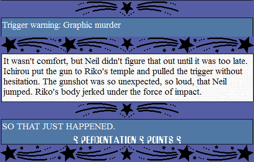
Trigger warning: Graphic murder
It wasn't comfort, but Neil didn't figure that out until it was too late. Ichirou put the gun to Riko's temple and pulled the trigger without hesitation. The gunshot was so unexpected, so loud, that Neil jumped. Riko's body jerked under the force of impact.
SO THAT JUST HAPPENED.
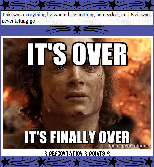
This was everything he wanted, everything he needed, and Neil was never letting go.
[image description: Frodo Baggins looking sweaty and dirty, right after he threw the One Ring into Mount Doom. It is captioned with “It's over. It's finally over.”]
This was everything he wanted, everything he needed, and Neil was never letting go.
Epilogue summary: The police end up getting called out tot he stadium following Andrew's beat-down of Riko. So nobody but the fans get to leave. Eventually, Neil is called up to where the mafia family hangs out to watch the games. Ichirou, Riko, and the raven's coach are all there, along with Stewart. Eventually, Ichirou pulls out a gun, shoots Riko point-blank in the temple, and then puts the gun in Riko's hand to make it look like he'd killed himself. He also says that the coach is dead, even though he's clearly standing right there; the implication being he won't be alive for much longer.
This entire thing was Ichirou cleaning house, of needing to remove the shitstain that Riko had turned the ravens into.
Neil goes back downstairs, and joins the others as they leave to return home.
With that, the series is put out of its (and my) misery.
#All For The Game#The King's Men#chapter 19#epilogue#Renee Walker#matt freeman#um... ew#Nicky Hemmick#Aaron and Andrew Minyard#Kevin Day#HEADDESKING#Move on already!#nobody cares#ugh just ugh#bad writing is bad#i would ask where the editor was but i think we all know there was none#Riko Moriyama#so that just happened...#Neil Josten
4 notes
·
View notes
Text
docharvard’s stardew mega modlist v.2
howdy doody everyboody!
my last modlist did pretty well with regards to notes, but there have been some major changes to both stardew and my modlist since then, so i thought it was high time i made a new one!
once again, this is mostly graphical overhauls, with a few gameplay tweaks and cheats here and there. most of these mods are fairly popular, so chances are you would already know them, but i hope this compilation finds its use anyway. now, without further ado, the list starts under the cut!
one final warning before i proceed, as of today 21st of February 2020, some of these mod’s official releases do not work with Stardew 1.4.5, but they do have unofficial patches floating around on the forums that update them to work with this patch, and i will be linking to those instead of the official releases for those mods (you will need a chucklefish forums account to download them). if you see this in a few months or weeks time from when it is posted, it is probably in your best interests to check the official releases for updates.
ENGINES/PRE REQS
most of, if not all, the mods on this list will require some combination of the following engines to run. i know nothing about coding, so i cannot give an apt description of what they do or how they work, but trust me, you will need them. if you don’t download all of the mods in this list, you might not need all of them, check the requirements segment on a mods nexus page to see which of these engines you will need to run it.
SMAPI - SMAPI is the modding API for Stardew, necessary for all modding (besides old xnb mods).
Content Patcher
Custom Critters
Json Assets
Mail Framework Mod
More Grass
PyTK
SpaceCore
TMXL Map Toolkit
QUALITY OF LIFE
mods that don’t change the game significantly, but slightly improve the base mechanics to make it easier/better.
Auto Animal Doors - automatically opens all barn and coop doors at a set time every morning, and closes it once all animals are back inside at night.
Big Silo - increases the hay capacity of silos to around 200k.
Casks Everywhere - gives the player the ability to put casks anywhere, instead of only in the basement of the house.
Crop Transplant - gives the player the ability to move crops and trees without destroying them.
Mod Update Menu - puts a handy-dandy extra button on the main menu that shows you your modlist and whether any mods are out of date. clicking on a mod in the list will take you to its web page, if you want to download the updated version. (sometimes, like SMAPIs console, it is wrong. occasionally will tell you a mod is out of date when it isn’t, but is more often right than wrong.)
No Crows - removes crows, no more losing crops to those thieving corvid so-and-so’s.
No Fence Decay - fences no longer decay and break down over time. they stand for time immeasurable, like the monolith in space odyssey, or the empty shell of a blockbuster video.
Safe Lightning - lightning will only strike lightning rods, or if none are available, it will not strike at all.
Stack Everything - gives the player the ability to stack every item in the game, items like casks can now be stacked instead of having a 1:1 ratio in inventory/chest space.
UI Info Suite - ui overhaul(ish) that adds things like being able to see if you’ve pet an animal that day, whether the travelling merchant is in town, what your luck is for the day, or how many days a crop/keg has until it’s finished, etc. this mod is a must have for any playthrough, even if you’re going completely vanilla. possibly the most useful mod that exists for stardew.
GAME TWEAKS
things that add mechanics or change gameplay.
immersion (i don’t know what else to call it)
Babies Take After Spouse - makes your children actually look like the offspring of your chosen spouse. also adds some more outfits for toddlers, if you’re into that.
Canon Friendly Dialogue Expansion - adds a metric buttload of new dialogue for all of the friendable characters, in case you’re sick of seeing the same four sentences on loop.
Cat Gifts - bit of a misnomer, makes your pet (either cat or dog) occasionally bring you gifts of random items. it’s pretty darn cute.
Climates of Ferngill - expands the games weather system, as well as tweaking the original one, to add new things like fog, and weather that changes over the span of a day instead of being one set thing.
Eemie’s Bees - adds bees! they hang around your beehives! very cute!
Lunar Disturbances - adds a rad lunar system to the game, including an overhead moon that goes through phases. also adds stuff like eclipses and blood moons.
Mizu’s Flowers - adds so many new flowers to the game. frankly, it’s quite homophobic how few variations are in the base game.
Oasis Greenhouse - completely reworks the greenhouse to be way bigger (on the inside, it doesn’t take up more space on the actual farm) and have more rooms in which to do greenhouse things, like spots to grow trees.
Seasonal Villager Outfits - stardew residents will now change clothes on the reg, including during different events, depending on the weather, and with the seasons.
Slime Hutch Winery - retextures the slime hutch to look Not Garbage, and adds a customisable inside space that you can combine with Casks Everywhere to make a usable winery.
cheats
there is only one mod in this section but i couldn’t figure out what other section to put it in.
CJB Cheats Menu - it’s a cheats menu. for cheating. amongst normal cheaty things like infite health and stamina, gives you the ability to increase your movement speed, and harvest crops with a scythe, which i find immensely useful.
AESTHETIQUE
who needs the orignal graphics when you’ve got soft pastel versions? most of these are by elle, aka junimods. she’s good at aesthetic overhauls, sue me.
Bathroom Replaces Spouse Room - replaces the spouse room with one of three nicer looking bathrooms, in case your spouse has decided to have an unchangeable hideous colour scheme that does not go with the rest of your house, like all of them do.
Better Artisan Goods - retextures the artisan goods (milk, cheese, fruits, etc) to look prettier/more accurate.
Elle’s Cat Replacements - highly customisable cat retexture, including fur patterns, and the colour of its collar.
Elle’s Critter and Butterfly Replacements - retextures the little critters and butterflies that hang around the valley.
Elle’s Dog Replacements - same as the cat replacements but for dogs. the nomenclature is difficult to grasp, i know.
Elle’s New Barn Animals - retextures of all the barn animals, with a whole bunch of customisation options to choose from for each.
Elle’s New Coop Animals - same as the barn animals one. shocker.
Elle’s Seasonal Buildings - highly customisable retexture of all the buildings on the farm. pick from a bunch of designs and colour palettes to make your farm the best representation of you it can be. or don’t, i’m not your dad, i can’t tell you what to do.
Flippsie’s Alternative Lamp Posts - retextures lamp posts to look a little more victorian and aesthetic-y.
Garden Variety UI - customisable ui colours! let’s you customise the look of all the menus, inventory bar, etc, from a buuuunch of different colours and designs.
Industrial Kitchen and Interior - retextures the kitchen appliances and benches to a softer aesthetic.
Starblue Valley - reshades the whoooole of stardew to make it colour gooder. greens are more green, blues are more blue, and the whole game looks a lot less yellow and harsh. much softer and easier on the eyes.
Wildflower Grass Field - retextures and adds a bunch of variation to the grass that grows around the valley. instead of one grass texture everywhere, there is now over 50 possible combinations, really makes the whole place look much more realistic and varied.
Yellog’s Wood Craftables - retextures and redesigns the craftables (chests, beehives, kegs, cheese press, etc) to have a softer palette, with a rustic wooden aesthetic.
and that’s that folks! i also use these two harvey dialogue expansion packs, but that’s because he’s my favourite bachelor, so i kept them off the general list.
i hope y'all found this modlist useful, sorry it took me so long to get around to making/updating it.
thank you so much for all the followers on this newer sideblog of mine, it’s really cool to see other people enjoying a game that i love so much.
catch y'all on the flipside! ^-^
#stardew#stardew valley#stardew valley modding#stardew modding#stardew mods#stardew valley mods#stardew modlist#stardew valley modlist
75 notes
·
View notes
Photo

April 2020 Reading and Reviews by Maia Kobabe
Hoot by Carl Hiaasan
I bought this paperback used at least 10 years ago because it had owls in it. With the library closed, I am finally chipping away at some of the novels in my eternal to-read pile! This was quick and fun, if a bit predicable. One day Roy sees a barefoot boy running across a series of lawn as the school bus pulls away from the curb in his Florida town. Curious, Roy tries to figure out who he is and what he was doing. It turns out this mysterious runaway is trying to defend the burrowing owls who live on a plot of land slatted for development into a Miss Paula's Pancake House. Very much in the tone of Holes, though without the inter-generational curse. A good book for a young reader.
Dragman by Steven Appleby
This is a weird but delightful comic. It follows August Crimp, who has a secret superhero identity as Dragman. When he is wearing women's clothes he can fly, and he fights crime with his side-kick Dog Girl. Or he did, until he retired, got married, and had a kid. But now more than ever the world is in need of saving, because an inventor has developed a device that can remove people's souls and store them on small disks. People without souls continue living- sort of. But they have no joy, no personality, no opinions, and often no will to live. In addition to this, trans women are being targeted by a serial killer. August is drawn out of retirement and into the case, which is complicated, as he has never revealed his secret identity to his wife. Drawn a loose, sketchy style, this story is told in a mix of color comics for present-day scenes, monotone comics for flash-back scenes, excerpts from "officially licenced character comics" and sections of prose that describe the most violent incidents without any illustrations. I've never read anything quite like this before, but it worked for me!
Haikyu!! by Haruichi Furudate vol 1
It's been so long since I read a sports manga! This one is really fun! It gets right into the story very quickly. It follows Shoyo Hinata, a boy who is short but very good at jumping, who wants nothing more than to play volleyball. His middle school doesn't have a team but he manages to scrape together enough friends to enter exactly one competitive game. His little rag tag bunch is beat by a team with an ace player: Tobio Kageyama, who has the ironic nickname "King of the Court", because of both his talents but also his bad temper. When Hinata gets to high school he's so excited to finally be part of a real team. Imagine his surprise when he learns that none other than Kageyama is on the team too! I'm definitely going to keep going with this series, which is all available to read online for free here: https://ww4.readhaikyuu.com/
Haikyu!! by Haruichi Furudate vol 2
Hinata, Kageyama and the teammates they've just met already have a practice game! It's against one of the top high schools in their area- and two of the members where on Kageyama's team in middle school. This is the beginning of a satisfying rivalry already in the making :) I love the way this author draws fast motion, I look forward to watching how he ups the ante, art wise, when we get to the more serious games.
Art Life by Catherine Ocelot
I read an English language edition of this that I can't find on Goodreads. It was strange. There were things I really liked about it, but overall I didn't feel like the book really went anywhere. It follows a bird-headed alter-ego of the author as she goes through life as a single mom. The best parts were conversations on the nature of inspiration and creative work with other artist friends. The more off the wall parts included a visit to a small publisher which is flooded knee deep in water, and scans of sketchbook pages supposedly part of the pitch packet for this very graphic novel. Very meta.
Haikyu!! by Haruichi Furudate vol 3
This remains a solid and very fun story! By the end of this volume we've finally met all of the members who will make up Karasuno's volleyball team for, I assume, the majority of the story arc. A great batch of quirky characters, some of whom struggle from over-confidence, some from nerves. All of them are diamonds in the rough, but finally they have a coach who is ready to polish them into brilliance.
Lab Girl by Hope Jahren
This is one of the best books I have ever read about science, and about a life. Jahren is a passionate and witty writer, and in this book she tells stories beginning with her strict Minnesota childhood in the 1970s, ending with her current career as a tenured professor and researcher at the University of Hawaii. She has loved both plants and the scientific process for as long as she can remember, but it was a long and hard road to turn those two obsessions into a livelihood. Jahren writes of working long hours as a hospital runner to pay for college; of meeting her best friend and future research partner in grad school on a soil study field trip; of upending her entire life multiple times to move thousands of miles on the promise of funding to build her own lab. There are short chapters woven through that explain with vivid, careful detail the lifestyle stages of a tree, and each stage is mirrored in Jahren's only human development. She doesn't shy way from discussing her own manic depression, the difficulty of her pregnancy, and the discrimination she faced as a woman in her field. But she also relishes in the joys of discovery, of breakthroughs, of adventure, of a fairy-tale like love romance and an eternal striving towards being her own truest, purest self. This book is going to join my self of favorite memoirs. I highly recommend it!
13 notes
·
View notes
Text
FAQ
1. Where do you find those AU’s?
Well, mostly those are the AUs that cross my dash - when I happen to be active on tumblr. So you see, it is a bit restrictive and means there are probably lots of AUs I never found and I don’t even know exist! Every once in a while, I try exploring blogs or using tumblr search engine. It gets me results, but not as much as you would expect (tumblr search engine is not the most effective tool for that kind of things...). My ask box is also open in case you want to suggest a new tag/new post (see Q4 & Q5).
2. Are new AU tags meant to be added on the list?
I intend to. But it vastly depends on the AUs that cross my path (see Q1) and of the time I can manage to spend on the list. But I am always happy to discover new AUs :) On a side note, I intend to edit this version of the list rather than posting new versions. As long as I don’t have to split it again it should be fine!
3. Do you continue tagging the posts you reblog?
Yes, I try. So if you click on the same tag now and then in a few months, you may see new posts. ‘May’ of course, because I don’t encounter every AU everyday and some AUs are more popular than others...
4. Can I suggest an AU tag?
Yes please! The more tags the better. I can’t guarantee I’ll add it to the list though. Maybe I already use a synonym (or a concept too close to create a new entry). I also need to have more than two posts about an AU to create a tag (otherwise, it will be tagged as “Other AU” and possibly “Other /thematicName/ AU”). So it is best you also suggest post(s) bond to the AU you suggest (please send me links to those or directly submit the post(s) otherwise I might never find them!). It can also take me a few weeks to effectively add the new tag to the list since I must check possible affiliations/redirections/proximity (see “HOW” section of ABOUT) and see if it fits in any thematic list.
I must also warn you that I reserve myself the right to refuse an AU I am really uncomfortable with (typically heavy gore and obvious/graphic abuse). I try to be inclusive but there are some things I can’t bring myself to reblog. You can try reblogging and tagging that AU yourself, then create a post with a ‘yourBlogName.tumblr.com/tagged/tagName’ type of link, and I might add a link to that one post in the list. To be discussed. However, I will not add a pe /dophilic AU to the list. Ever.
5. Can I suggest post(s) for existing AU tags?
Yes, please do!! You can send me the link via an ask or submit it. Just try to look at the post’s notes beforehand (”see notes”) to see if I haven’t reblogged it already.
6. Can I suggest a new thematic list?
Yes you can! I can’t guarantee I’ll have the time to make it, but it could happen. Please try to provide an explanation for the theme (to make sure I get what you mean), with maybe a definition and an example of which tags you can see belonging to it (and which you think don’t). Note that all the tags appearing on thematic lists already exist in the general AU list, so I won’t come up with new tags for a new thematic list.
7. What about Kylux adjacent?
I only included technicians (Matt/Techie), since it was the first adjacent paring to emerge. Also, since Matt is a radar technician he is still technically in the Star Wars universe. I wish I could have “tracked” every adjacent pairing but there are so many and I lost count. It would have taken me an incredible amount of time I didn’t have. If you happen to have your own tag list referencing all/part of those adjacent ships, you can contact me if you’re ok with me adding a link in my AU list redirecting people to your blog for Kylux adjacent.
8. The same post appears twice or more for the same AU. Is it normal?
No, I try to have each post to only appear once for each AU. BUT this list has been in the making for so long and some tags have so many posts that it is sometimes difficult to avoid duplication. If it bothers you, you can send me the links to those posts (all of them please) and I’ll try to settle it.
9. I am confused as to why you tagged a certain post like you did. Could it be a mistake?
It could. I do my best but sometimes it is hard to sort posts into tags. It could also be that the post comes from a series of posts and that it only becomes clear that the serie belongs to an AU when you read/see all the posts. Both scenari are an option, so feel free to message me about it.
10. I am the OP of a post and you definitively tagged it wrong...
Ooops sorry! Please send me an ask so I can settle this!
11. I encountered a broken/incorrect link inside the list...
That is not normal. All of the tags displayed in the list should be working. This is however possible. There are many tags and I might have made a mistake. Please send me an ask with the name of the broken tag so I can fix it!
12. In ABOUT you said that there needs to be more than two posts for an AU to become a tag. Yet I found an AU tag with only two posts...
It happens. As I said in ABOUT, this is a general rule, and there are exceptions. If there are only two posts, but (one of) those posts are(/is) long, contains multiple art or a combination moodboard/fic, I might decide to make it a tag anyway. If, on the contrary, you spot a tag with three or more posts that doesn’t have a proper tag in the list, please let me know!
13. I don’t understand why you tagged a specific post “other” alongside already existing tags...
“Other AU” is a default tag I use when there is no existing category fit for a post. A post tagged “other” can also be tagged “Other /thematicName/ AU” if it fits in any of the thematic lists. Also, you must remember that posts can be multi-tagged as a same post can have multiple “dimensions”. For example, it can depict a scene happening on a boat (”Cruise AU”) where Kylo happens to be a secret agent (”Agent Kylo AU”). Thus, if there’s a specific dimension about an AU that would justify the creation of a new tag, but I don’t have enough posts of that kind to actually create it (yet), the post will be tagged “other”, even though the other(s) dimension(s) are already depicted by existing tags. Let’s pretend that in the previous example, “Agent Kylo AU” was not yet part of the list. I would have tagged it “Cruise AU” and “other AU” (+ “Other Jobs AU”). I might even have added the “Agent Kylo AU” tag for internal purposes (so I can check how many of them I have and determine if it is time or not to add a new tag to the list).
14. A “Read More”/redirection link on a post doesn’t lead anywhere...
A “Read More” link redirects you to the OP blog. If the blog has changed name/been deleted or if the OP removed the post, you will end up nowhere. It is sad but you won’t be able to read the full post and there is nothing I can do about it. When it happens, you can however send me a message so that I can precise on the post that the “Read More” option is not an option anymore (please send me a link to my reblog of the post otherwise chances are I’ll never find it). Same goes for any other redirection link(s) present on the posts. If the page you were supposed to land on doesn’t exist anymore, I can’t do much about it, save warn people about it.
15. You reblogged comics in the wrong order...
Reblogging multiple pages comics is difficult. Either you reblog it entirely at once, either you reblog each page as it goes (the comic appears thus in reverse order in your blog). And if you miss some, it quickly becomes a mess. I tried to reblog relatively short comics at once, starting with the last part (so that the first page appears first when people scroll/navigate) but I often couldn’t. Some comics are not even complete, either because they were left unfinished, either because I just lost the thread. If there are navigation links within the posts, it is probably best you follow those. If not, maybe try to open the pages in different tabs and to order those accordingly. Or, and this is probably my best advice, try looking on the OP blog. They probably have a tag for their comic and it may make things easier!
16. You reblogged one of my posts and I’d rather not have it referenced by your list...
No problem! Please contact me I’ll untag it asap!
17. I have a question regarding the list that is not referenced above. Is it ok for me to ask it?
Yes, of course. Just be sure your answer doesn’t already lies in the ABOUT section (and refer to Q18 in case my answer doesn’t come too fast...).
18. I asked you a question but am still waiting for an answer...
Obviously (except if you were sending (anon) hate), I am not mad at you. I might need a few days to answer you. If a week has passed and I didn’t post an answer, chances are: 1) I didn’t see your message (tumblr eats it sometimes) or 2) I’ve been out of tumblr (busy with work, on holiday or something) or 3) my brain is not really complying at the moment. I do have down periods and, when it happens, I might not have the heart/energy to answer. It can last a few weeks or several months. I try to look at my inbox when I come back on this site but I might miss a message if too much have been sent. In any case, you can try and send your question again later.
See ABOUT for more general information
1 note
·
View note
Text
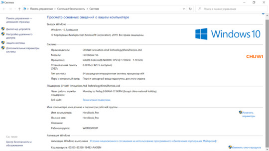
Chuwi HeroBook Pro: Review of the improved version

Complete Review of Chuwi HeroBook Pro of the most affordable laptop of the company.
2020 NEW ARRIVAL CHUWI HeroBook Pro 14.1 inch 1920*1080 IPS Screen Intel N4000 Processor DDR4 8GB 256GB SSD Windows 10 Laptop.
Today we are testing the Chuwi HeroBook Pro, which has expanded the range of available entry-level devices and is an advanced version of last year’s Heroobook.
Buy Chuwi HeroBook Pro on Aliexpress NOW!!
The main feature of the previous version is its low price — only $ 289. In fact, this is a very affordable device for working on the Internet — a netbook. The demand for the model was high, but there was also a lot of criticism. Basically, the device was scolded for a terrible TN screen with a low HD resolution and an Atom series processor that does not even have hardware support for the VP9 codec, which is critical for Youtube. And now, a year later, meet — an advanced version of the Chuwi HeroBook Pro laptop, in which the manufacturer has eliminated most of the shortcomings. The new product has a higher quality IPS screen with FullHD resolution, a more powerful processor of the Celeron line, and also added RAM and installed an SSD drive as the main drive. At the same time, the fundamental advantages such as a long-lasting battery and an affordable price have been preserved.
Literally the day after tomorrow, the Spring Reboot sale kicks off and the laptop will sell for ~$ 300. Add to cart and do not forget to additionally use the seller’s coupon (available on the product page).

Chuwi HeroBook Pro specifications:
Display : IPS 14.1 “with a resolution of 1920 * 1080, aspect ratio 16: 9
Processor : Intel Celeron N4000, 2 cores / 2 threads up to 2.6 GHz
Graphics : Intel UHD 600
RAM : 8 GB LPDDR4
Built-in storage : SSD 256 GB (slot for M2 2280 or 2242 SSD up to 1 TB)
Communications : Wi-Fi 802.11b / g / n, Bluetooth 4.0
Camera : 0.3 MP
Battery : 38 Wh
Operating system : Windows 10 Home Edition
Size : 332 x 214 x 21.3mm
Weight : 1.39 Kg
Packaging and equipment
Consistently austere yet sturdy packaging guaranteed to withstand international shipping. It has been tested on personal experience more than once.

The laptop is housed inside a foam box. In addition, the box is protected by an air sectional packing (like an inflatable mattress), but it was not preserved after unpacking.

Included: laptop, power supply, power cord with Euro plug, documentation and mount for SSD drives of size 2242.

The 12V / 2A power supply provides 24W of power, which is more than enough to operate the laptop and simultaneously charge it.

Appearance and interfaces
The sleek design is in line with current trends: a sleek silver lid, rounded edges and a small logo in the corner. Minimalism is good. Since this is a very cheap laptop, the case is completely plastic, but there is no feeling of cheapness, and when you open the lid there is no annoying crunch of plastic.

Compared to its predecessor, the outward appearance of the device has not changed a bit. This approach allowed saving on development and making the final cost of the product as attractive as possible.

The hinge is fine-tuned: the laptop can be opened with one hand and held securely at a given angle.

The full-size keyboard makes working with text easy. Typing on a laptop is easy and for complete happiness, only the backlight is not enough.

Low-profile large buttons and minimal bezels on all sides of the keyboard make use of every millimeter of free space here.

The touchpad is gigantic and a pleasure to work with.

The touchpad has a diagonal of 5.75 “and it supports multi-touch gestures.
In the left corner there are laptop status indicators, caps lock and num lock.

The keyboard comes with only Latin letters, but the seller completes the laptop with special stickers. I work with text a lot and remember the location of the Cyrillic alphabet by heart, so I didn’t even stick the stickers. But for most users, they will certainly be useful. Although I don’t like these stickers, they are really small and without a transparent backing. In our stores, they sell larger ones, with a transparent base and adding only Cyrillic (Latin ones will be visible anyway).

The maximum opening angle is about 135 °, which allows you to use the laptop both on a table and just on your lap.

Now let’s take a look at the connectors. On the left, there is a power connector, high-speed USB 3.0 and mini HDMI for connecting to a TV or monitor.

Since the processor supports hardware decoding of H264 / H265 / VP9 up to 4K, the laptop can be connected via HDMI to a TV to watch movies on a big screen. During the day, while you work, you download a movie from a torrent, and watch it in the evening.

But back to the connectors. On the right side we have another USB 2.0 connector, a micro SD card reader with a supported volume of up to 512 GB and an audio headphone output, which can also be used to connect stereo speakers.

In terms of the sound in the headphones and when connected to acoustics, everything is quite simple, because here we have a budgetary audio codec Realtek ALC269. And the sound of the laptop itself is not amazing. A system is used here, consisting of 4 small speakers, which are hidden in the cabinet. Sound goes out through special holes behind the hinge, is reflected from the screen and reaches the listener. The volume is decent, but due to the small diameter of the drivers, there is practically no bass, and the sound lacks volume. This solution is enough for watching video and system notifications, but if you want to listen to music, then you should connect external acoustics.

The base has large rubber feet for stability.

And an SSD enclosure (2242 and 2280 supported).

The Chuwi HeroBook Pro laptop is already equipped with a 256 GB Netac SSD with a size of 2280. For a netbook, this amount of memory will be sufficient, but if desired, the drive can be replaced with a larger one.

The drive model is Netac S535N256G. Under the sticker you can find the Silicon Motion SM2258XT controller.

And 2 TLC memory chips from Intel PF29F01T2ANCTH2 128 GB each.

Screen
Here, in comparison with the basic version, it is just a giant step forward. The manufacturer installed an IPS screen, albeit an inexpensive one. Well, you can’t use TN screens in 2020! And it’s not even about the viewing angles (although of course they are too), but the overall fading of the screen, inexpressive colors and low brightness of TN matrices. Such claims were made to last year’s Chuwi Herobook, and in the PRO version the manufacturer first of all improved the screen. In addition to the type of matrix, the resolution became better here, it was increased from HD to Full HD. The color rendition is natural, the brightness is sufficient for use in bright ambient light, the detail is good. The screen is matte, with an anti-silicone coating. The bezels are large enough, but let’s not forget that this is a very cheap laptop.


Visually, the image on the screen looks no worse than on more expensive models, such as Chuwi Lapbook Pro. According to the HW info utility, the BOE082C (NV140FHM-N4K) matrix is installed here. According to the datasheet, the screen has WLED backlighting, a maximum brightness of 250 cd / m² and a contrast ratio of 800: 1.


At an angle, the image does not change in any way: the brightness drops slightly, the contrast remains high, and there is no inversion.


The uniformity of filling the white field is good. There are no abnormalities such as yellow spots or brighter areas.

The backlight uniformity is quite good, with a maximum deviation of 12.67% at maximum brightness.

But with the black field, not everything is so rosy. In my copy, there are quite strong highlights in the corners at the top and at the bottom closer to the center.

At maximum brightness, the backlight does not flicker, the ripple ratio is 1.3%.
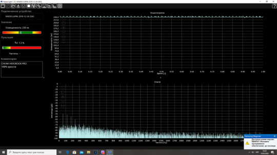
The screen brightness is adjusted using PWM, therefore, at any brightness below 100%, modulation appears with a frequency of 200, 400 and 600 Hz. With a decrease in brightness, the ripple coefficient increases, for example, at 80% of the brightness of the CP it is equal to 74%, and at the minimum brightness of the CP it is equal to 131%. This means that people with an increased sensitivity to flicker may experience rapid vision fatigue.
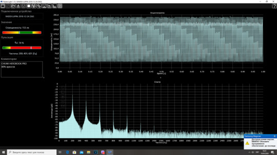
If you are a flicker-sensitive person, it is best to use a laptop with a high brightness screen backlight. If you still need to turn down the brightness, then there is a life hack that helps to do this without increasing the ripple. To do this, go to the application for managing the video card, in our case it is the Intel HD graphics control panel, go to the “color settings” tab and reduce the brightness with the slider to the desired value. It really works and at minimum brightness the ripple ratio is just over 2%.

Disassembly for cooling system assessment and component identification
We unscrew 10 screws around the perimeter of the case and 2 more behind the upper legs, remove the cover. From the inside, it is covered with aluminum foil for better heat distribution over the entire surface. In the area of the legs, the plastic is reinforced with a grid.

Internal layout. Motherboard with main components on the right, on the left an option board with connectors. At the top of the speakers in their own case, in the center is the battery.

The battery consists of 2 batteries connected in series, capacity 38 Wh.

An additional board with a card reader, USB and audio output is connected to the main board by a ribbon cable.

Although the case itself is plastic, a metal “skeleton” is installed inside to which all the components and hinges are attached. The hinges are also metal and look reliable. As I said earlier, the hinges and hinge are smooth and the laptop can be opened easily even with one hand.


The processor, memory and other components are covered with a metal shield that is used for cooling. The cooling here is very formal, but since the heat dissipation of the processor is scanty, it is enough.


Let’s consider the main components. Intel Celeron N4000 processor, 2 x 4GB SK hynix LPDDR4 RAM chips, ITE8987E multicontroller, Realtek ALC269 audio codec and Realtek RTL8723BU WiFi module. There is no flash memory, so the SSD is the only drive.

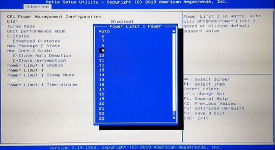
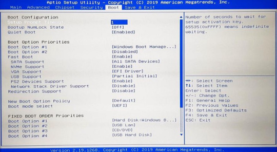
Bios
The input is standard, when you turn it on, click the del button and get into UEFI from American Megatrends.
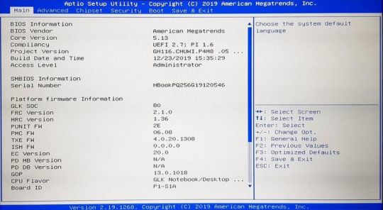
The settings are unlocked and very extensive.

Among other things, there are Power Limit settings. The default is 9W and automatic time to get maximum performance (depends on temperature). You can try to change, depending on what you want to get — more performance or less heating.
Temperature limits are hard-coded in the system and cannot be changed, nevertheless, judging by the data, the processor starts throttling at 95 degrees (Active Thermal Trip Point), and turns off at 110 degrees (Critical Thermal Trip Point). In fact, this is all with a large margin, because even in stress tests I did not manage to warm it up to more than 80 degrees, because it regulates the heat packet by reducing the frequency, but more on that later. By and large, despite the huge number of settings, the user may only need the penultimate partition, which allows you to choose the boot order of the drives or run the installation flash drive to reinstall Windows (for example, if you want to install a more capacious drive). And playing with other parameters is fraught with the most unexpected consequences,
System operation and basic tests
The laptop comes with Windows 10 Home Edition preinstalled. Be prepared for the fact that after the first startup, the laptop will start downloading and installing the latest updates, which are quite voluminous by the way. And since the processor is rather weak, then at this time it will work rather slowly, because at some moments the processor load is under 100%. But after installing all the updates and rebooting a couple of times, you can finally get to work.
Work in the system is quite comfortable, applications and folders open instantly, everything is decided by the SSD drive. Scaling up to 150% is enabled by default, so fonts and system elements are read well, folders and labels are large. I have installed the applications that I use for work and in everyday life, as well as a couple of elementary toys. But let’s start with benchmarks.

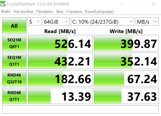
While the system was clean and the hard drive was not full of programs, I checked the speed of the Netac SSD. The disk is connected via the SATA 600 interface, there is no temperature sensor, so the value is always displayed at 40 degrees.

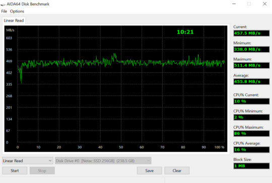
The CrystalDiskMark speed test showed 538 MB / s read and 462 MB / s write. I tested it twice: with 1GB of data and 8GB of data.
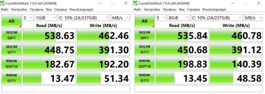
Even when testing with a data volume of 64 GB, the read speed dropped slightly.
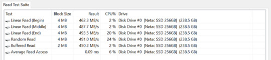
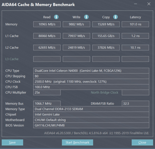
Reading test with Aida 64
RAM and cache speed:
The next thing I did was check the internet. Here, as in last year’s version of the laptop, WiFi only works in the 2.4 Ghz range. This is sad. The laptop catches the signal confidently even through 2 walls from the router, but the speed is not encouraging: in an apartment building, I could not get more than 30 Mbps.
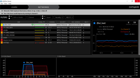

There is a way out, you just need to use another WiFi adapter. Disassembly showed that here the WiFi adapter is soldered on the board and there is no PCI-E slot for connecting another module. So we will use an external adapter with AC support, operating in the 5 GHz range.
Buy Chuwi HeroBook Pro on Aliexpress NOW!!
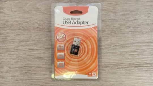
Windows 10 didn’t even need any drivers, just plugged it into the USB and connected to my router.

In the 5 GHz band, my router was the only one in sight.
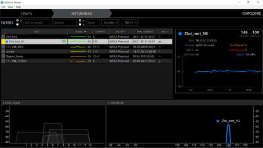
Download and upload speed increased to 184 Mbps .
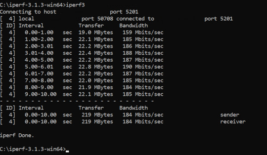
Now about performance. The Intel Celeron N4000 CPU is an entry-level solution with low power consumption and heat dissipation. 2 cores \ 2 threads and a maximum clock frequency of 2.6 GHz allow you to use the device in everyday life for common user tasks: Internet, multimedia, office applications, editors, etc. Cooling is completely passive, that is, the laptop in operation makes no more noise than your smartphone, and this is captivating. An integrated UHD 600 is used as a graphics solution.
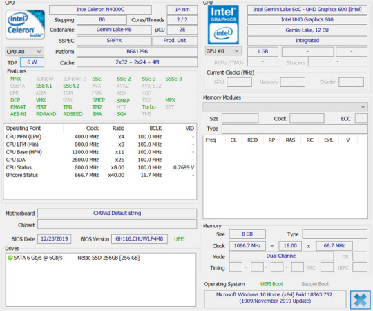
In Geekbench 5, the laptop scores 423 points in single-core mode and 762 points in multi-core mode, Open CL — 1062 points.
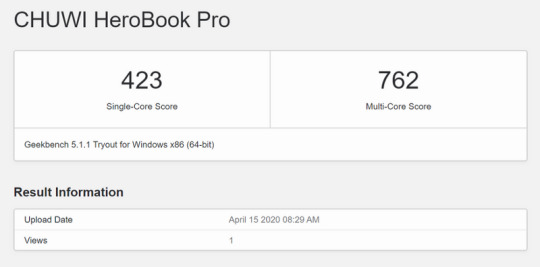
Geekbench 4: single-core mode — 1844, multi-core mode — 3189. For comparison, the regular version of Chuwi Herobook on Intel Atom X5 E8000 processor gains 948 points in single-core mode and 2562 points in multi-core. That is, the performance gain of Chuwi Herobook PRO in single-core mode is almost twofold, and in multi-core mode it is 25%.
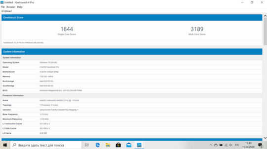
Open CL — 11505 points. The predecessor had 4011 points. That is, the performance gain is almost 300% !
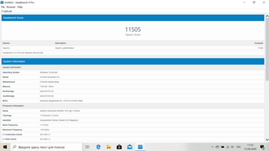
Another popular benchmark is Cinebench R15. In the processor test — 105 points, in the graphics test — 12.45 fps. Again, let’s compare with the previous version of the Atom laptop: in the processor test — 96 points, in the graphical test — 7.79 fps. There is also an increase, although not as significant as in Geekbench.
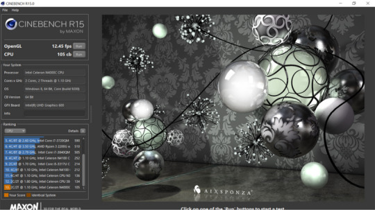
Now there are more real tests that simulate real activity. Designed for notebooks and entry-level computers, the PC Mark 10 Express is designed for light workloads such as web browsing, editing documents and spreadsheets, launching applications, and video conferencing. The result is 1936 points, which is almost 2 times more than its predecessor (1068 points).

The processor temperature varies from 50 to 70 degrees depending on the load.
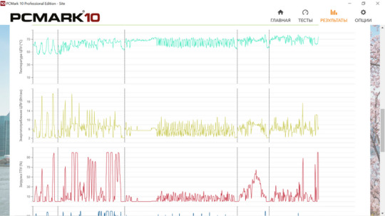
In the advanced test PCMarrk 10 Essentials, where photo processing + rendering is added, the result is 1469 points (the previous version has 838 points). As you can see, the laptop received the PRO prefix for a reason, because in real conditions of use it has become almost twice as powerful and works much faster.

Laptop in real working conditions
With tests, I think enough and now I will try to describe my impressions of use. It is clear that the main purpose of such a machine is to use the Internet. In the evening on the couch, surf in the browser, read the latest news and chat with friends on social networks and instant messengers. You can of course do all this on a smartphone, but on a laptop it is much more pleasant. There are no problems with this at all: in chrome, you can safely open more than 10 tabs, RAM allows you to do that. Heavy pages open normally and do not slow down even if they are stuffed with gif animation.
I also checked the programs that I personally use. For example photoshop. Doing something serious on a 14 “screen is a laughing matter, for this I have a 27” monitor. But of course you can do some simple things. Everything works fine, but of course with a certain thoughtfulness.
It’s the same in Lightroom. Don’t expect an instant reaction to your actions, but it is quite possible to work. Although here it is rather convenience due to the fact that such a laptop can be easily taken on a business trip or on vacation and photo processing right on the road or any other place in your free time from work. It is not even necessary to have an outlet, because the battery allows you to do without it for a long time.
The next point is video editing using Vegas 15. A very real task for a laptop, because the processor supports Intel Quick Sync Video hardware video encoding acceleration technology. I often work with the program, because I create videos for my youtube channel.
A test project with a video length of 10 minutes was processed in 19 minutes 54 seconds. For comparison, my main computer with a 6th generation core i7 copes with the same video in 3 minutes 49 seconds. Yes, it will be longer. But he can do it! Now, in connection with the quarantine, many were transferred to a remote location, the children study remotely, and all the devices were simply occupied in my house! The wife works with accounting, so she took the old laptop, the child is studying and he spends most of the day on the computer. Well, I sat on the couch with the Herobook Pro. It is a pleasure to type in the text, I am writing this review directly from it. And the video can be edited: a 30 minute review will be rendered for more than an hour.
For accounting also a laptop of norms. I installed 1C and dropped the working database (quite impressive) into it, after which I asked my wife to rate the performance. She said that it was somewhat slower than when working from the server (they recently improved the equipment there), but it is quite good and it can work.
Games
With laptops of this class, you need to understand only one thing — it is not suitable for games…. If games are very important to you, then I don’t know what else you are doing here. Neither dota, nor cs go, nor fortnite will work here. No way. Built-in graphics are not for that. I explain this in video reviews all the time, but still, in the comments to the videos, some continue to persistently ask: Will GTA 5 go? Will PUBG work? Yeah, go … Fly :) Red Dead Redemption 2 at maximum speed :) Well, now that the gamers are gone, I’ll tell you what you can still run on a similar laptop. Well, at least all sorts of toys from Alawar, like quests with the search for hidden objects. For those over 30, it will probably be interesting to play turn-based strategies, like the heroes of might and magic 3/5, which work great even on atoms, but they just fly on seleron. It turns out Chuwi made a laptop for heroes and even named it accordingly: ) In general, you can play old strategies. What is modern? For example Wot Blitz. There are 2 options here: either medium graphics settings with vegetation and shadows, or high graphics without vegetation and shadows.
The average FPS in the game floats from 40 to 60, the processor temperature in 30 minutes of the game has risen to 78 degrees.
Another game that I checked out because I regularly play it myself is Hearthstone. Despite its seeming simplicity in terms of graphics, it loads the processor very heavily and does not go smoothly everywhere.
The game has a maximum limitation of 30 fps, but even this value the laptop cannot maintain at a constant level, on average fps is at the level of 25–30, but sometimes there are drawdowns up to 20 frames per second, which becomes noticeable and cannot play too comfortable. You can set the graphics settings to low, this slightly improves the situation and adds 2–3 frames per second.
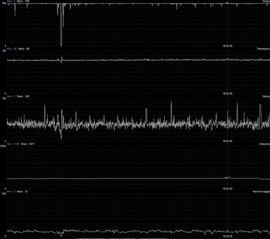
Multimedia capabilities
Here, the changes compared to the previous version are positive. In addition to the bad screen, the first version of Herobook was scolded for poor codec support on the hardware level. Well, the Atom could not even pull FullHD at 60 frames per second, because it did not support hardware VP9 decoding. Here the graphics core is already newer and there is hardware support for decoding both VP9 and HEVC, and in resolutions up to 4K. Well, actually in youtube video in FullHD at 60 fps goes fine: after buffer loading (the first couple of seconds), the video goes without dropped frames and very smoothly.

You can even watch 4K / 30 fps, only there is no sense from this on a Full HD laptop screen, because you will not see the difference.
But 4K / 60fps the laptop no longer pulls, there are frame drops and video does not play smoothly.
You can also download and watch movies in Full HD and 4K. In the first version, directly on the laptop, and in the second version, by connecting it to the TV via HDMI. Even heavy films in good quality, the laptop turns without straining. For example, here is the movie Fast and Furious: Hobbs and Shaw. 4K resolution, HEVC codec, movie size 65 GB, bit rate 63.7 Mbps.Spins without any difficulties, and the processor is loaded by less than 30%, and the graphics by about 50%.
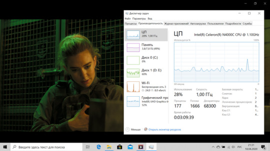
An important point! If you download and run a movie in HDR quality, then it will automatically be converted and displayed in SDR quality, even if you have an HDR TV. But I think no one in a sober mind expects that a simple laptop can replace a home theater or an advanced media player. Expecting HDR support or multichannel audio from it is at least silly.
By the way, there is an interesting point with the HEVC codec. Initially, it is not installed on the Windows 10 system and when you try to start the movie, it asks you to download and install the codec from the official store. Well, OK. I drive into the search for the store “HEVC” and see that the codec is paid and costs $ 0.99. Kind of inexpensive, but WTF? Why should I pay for what is now free in any deshman console?
In fact, there is another link, with a free codec, but it naturally does not appear in the search and I found it by accident on one of the sites.
Also, a laptop can be used by analogy with TV set-top boxes for playing movies online, for this there is an FS client application. Everything is standard here: choose a movie and watch it without downloading it to disk. Works great.
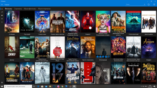
Testing the cooling system with stress tests
When working in a browser, with text or watching a video, the laptop does not heat up at all. On the one hand, this is due to low heat dissipation, on the other hand, due to the adaptive operation of the processor. The maximum frequency on it lasts for a very short time and is designed rather for “explosive” performance when working with the system (navigating through sections, opening folders, launching applications, etc.). But if the cores are loaded 100% for more than a few seconds, then the frequency is automatically reduced to 2.2 GHz — 2.3 GHz. It is a little bit, but it keeps the temperature under control.
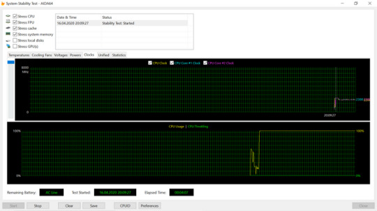
After 30 minutes of the stress test, the picture does not change.
According to the passport, the maximum allowable temperature on the crystal is 105 degrees. The temperature rises very slowly and stops at 77 degrees.
In addition to slow heating, we have fast cooling. After removing the load, the temperature instantly drops by 10 degrees and within 30 seconds by another 10 degrees, quickly returning to the standard values. This all suggests that the laptop has sufficient cooling and does not threaten overheating.

Autonomy
In work, the laptop lasts for a very long time, in fact, for a whole working day with the maximum screen brightness. In the morning I turn on my laptop, read the news, actively use the browser, after which I sit down to work: processing a photo or writing an article. Periodically distracted by mail, watching social networks and videos on YouTube. At lunchtime I take a break from work, sending my laptop to sleep and in the afternoon again into battle. Usually by 5 pm he already asks for exercises. That is, 6 hours at maximum brightness, it can withstand exactly under such a load. And if the brightness is reduced, then it is quite possible to get the claimed 9 hours from a single charge, because the screen here is probably one of the main consumers.
Also ran some custom tests. In the evening at 20:08, on a charged laptop, I launched a Full HD movie with maximum screen brightness. The movie played in a loop until the laptop shut down (03:55 AM). In total, he worked for almost 7 hours . And this will be repeated at maximum screen brightness.

A couple of days later, the test was repeated, but using Youtube 1080p, that is, the Internet was actively working via WiFi. The screen brightness is at maximum again. This time it turned out less — 5.5 hours.

I also used the PC Mark 10 battery tet: At 50% brightness in Modern Office mode (constantly simulating office work), the laptop worked for 7 hours 33 minutes.
And in idle mode (brightness 50%, white fill of the screen) — 9 hours 56 minutes. In real use, the result will be approximately in the middle, because the person usually alternates active work with periods of downtime. In general, you can count on 8–9 hours of operation at a brightness of 50%.
Outcome
When I test expensive devices, the demand for them is corresponding. After paying a lump sum, a person expects that everything will be at the highest level. Therefore, each flaw is felt critically and is perplexing. Another thing is such inexpensive devices. Buying them, you don’t expect much, but sometimes they pleasantly surprise you. For example, having paid $ 230 for the Heroobook Pro, I am surprised to understand that in many things it is not inferior to expensive fancy laptops, the potential of which is not used by everyone. The screen is pleasant, there is enough RAM, thanks to the SSD drive — it works quickly. Of course, if you need a powerful laptop for gaming or specific work, then this model will not suit you. But most people just want an inexpensive laptop for the Internet and simple everyday tasks. So why overpay? And still, What are the disadvantages of this model? I note strong flashes on the screen (visible against a black background) and WiFi only at 2.4 GHz. And if the second is easily fixed by buying a penny WiFi module with AC support, then the first will remain forever. Although for that kind of money, I’m ready to be patient As a result, in my opinion, we have: an excellent, cheap laptop for the Internet with a nice unobtrusive design, light weight and compact size. Chuwi has worked on bugs and, in comparison with the previous version, eliminated the most relevant comments. Chuwi Herobook Pro is great! we have: an excellent, cheap laptop for the Internet with a cute unobtrusive design, light weight and compact size. Chuwi has worked on bugs and, in comparison with the previous version, eliminated the most relevant comments. Chuwi Herobook Pro is great! we have: an excellent, cheap laptop for the Internet with a cute unobtrusive design, light weight and compact size. Chuwi has worked on bugs and, in comparison with the previous version, eliminated the most relevant comments. Chuwi Herobook Pro is great!
Buy Chuwi HeroBook Pro on Aliexpress NOW!!
1 note
·
View note
Photo

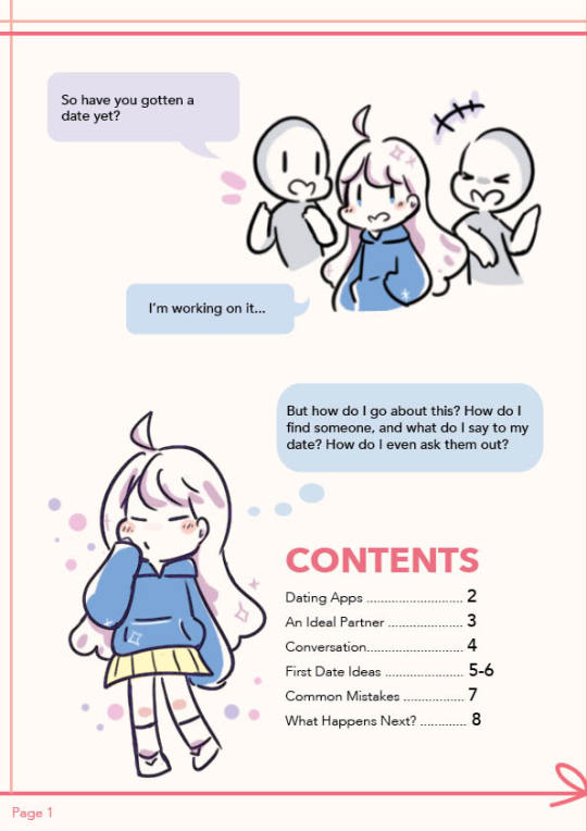
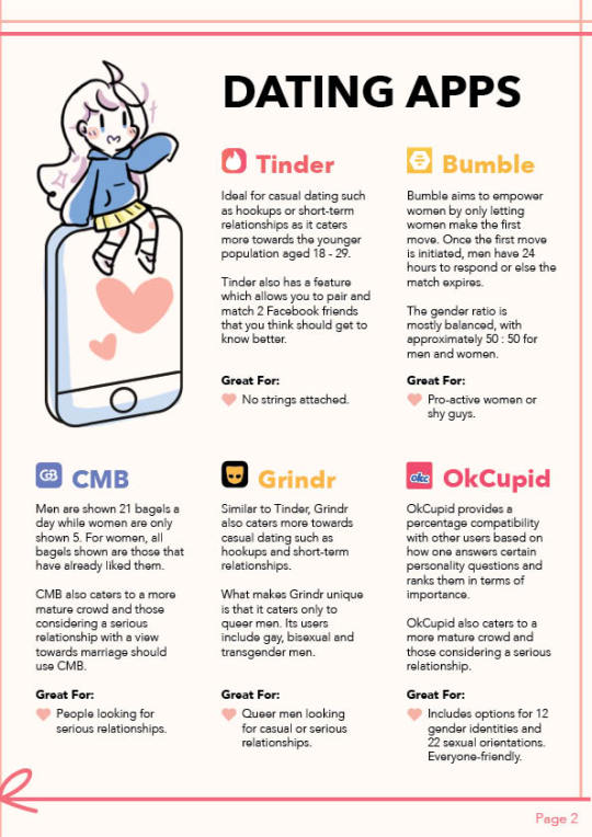
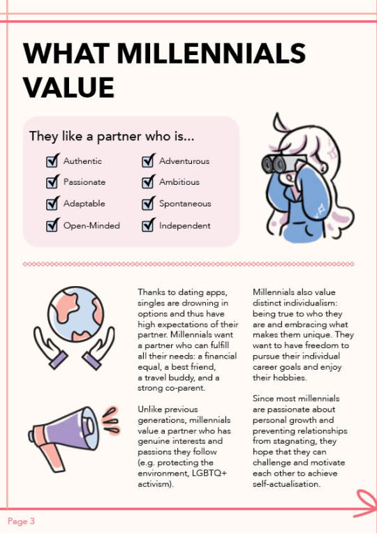
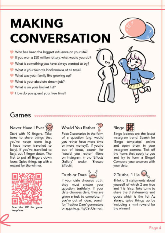
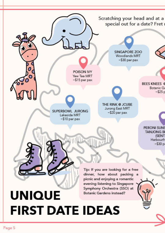
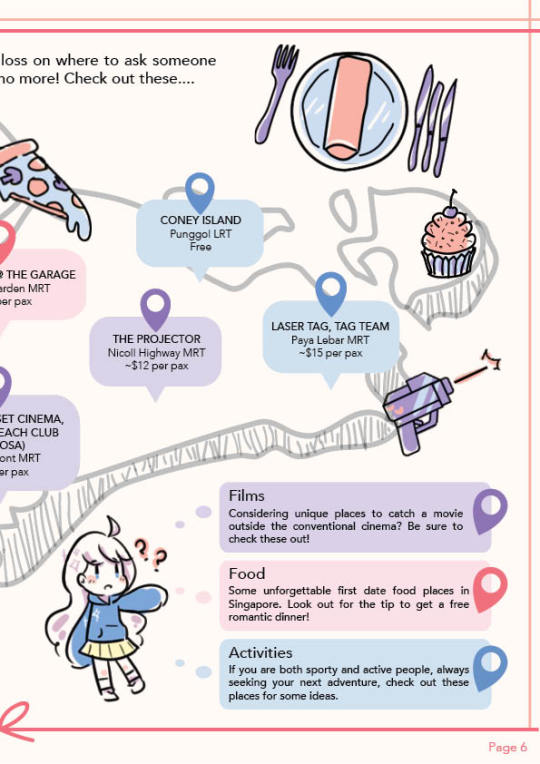
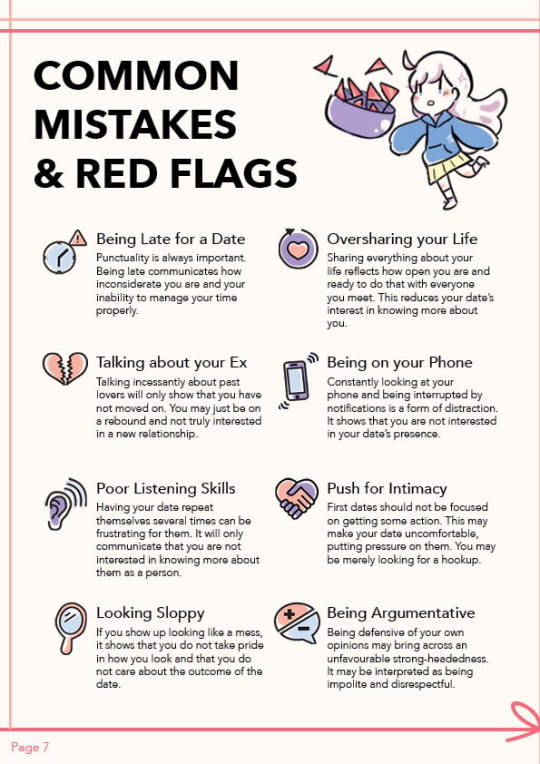
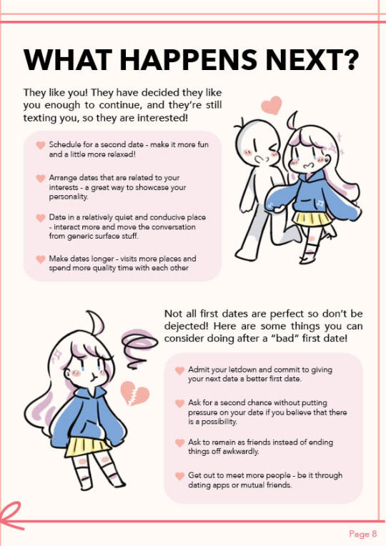
Planning
Our group initially planned on creating a guide about dating for Millennials in Singapore. We first came up with the overall content and sketched the layouts of our assigned pages. I was tasked with the Cover, a Comic as the Premise and Content Page.
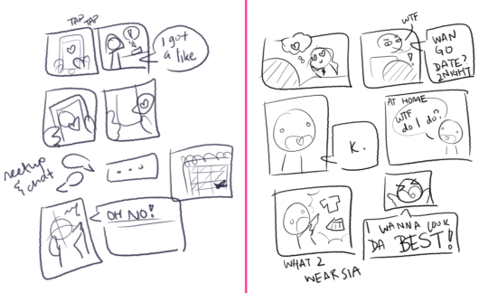
I first came up with 2 comic strip drafts and explained the story to the group to get feedback. They liked the story on the left, which depicts a main character finding a date through a dating app. This established the art style that we were going to use as a cute, cartoon-ish style. Then, I proceeded to draw out the more concrete draft, with a proper layout and text:

Next, I worked with my group to come up with a general colour scheme. We knew we wanted to use soft colours, and the initial palette was based on pastel pink, purple and blue.

After Feedback 1:
The first feedback was that the comic may be too time-consuming to do. Hence, I decided to scrap it for a much shorter premise for the book. I felt that was enough to introduce our main character, as well as convey our idea of a said main character wanting to find a date.
Our e-book underwent some restructuring in terms of content and flow of pages. We brainstormed and researched for content together to determine the final content flow. We decided to combine the content page with the “comic” so that pages 5-6 could remain a spread of a map. Hence, I came up with a second draft of the content page:

I next worked on character designs. I got inspiration from Pinterest for the stylistic direction of our e-book. I especially liked the style that utilises minimal colours, with cute, hand-drawn, cartoon-ish characters and objects.
My initial idea was to make the main character androgynous, as seen in the first comic sketch. However, I noticed that classmates were more likely to see the character as a girl and suggest adding a male character as a counterpart in their initial feedback. With these references and feedback, I proposed the main character (coloured):

Whilst creating the cover page, I felt that the colour of the girl’s hoodie did not stand out because the cover had a lot of pink and white elements. So I chose a darker shade of blue instead. I also did up the graphics for the content page:
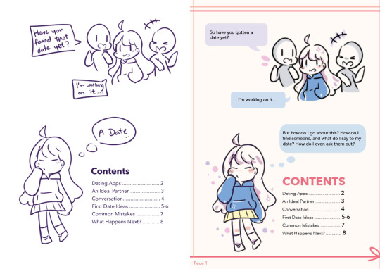
Art Direction and Graphics
With my pages settled, I begin my role of maintaining the art direction of the e-book. I compiled a list of graphics of the girl that my members needed for their pages so that I may start to draw them. I also devised a way to keep the style of icons as similar as possible. Because there are many people working on the design, having everyone submit their own completed graphics would have been rather disastrous for the art style. Since most of the group enjoyed creating flat icons, I proposed that they sent me the vectors of their icons and I would add colour to them.
I did this by importing the vectors (without fill) from Illustrator to Photoshop and colouring on a layer beneath the vector outlines. We decided to standardise a basic black stroke for our icons. By standardising the colour palette to just 3 colours and applying colours in a stylised manner, I managed to achieve a style that worked coherently despite different people handling the outlines. The colours chosen were analogous colours that complemented each other and of different tonal values to ensure that the coloured icons did not look too flat.

We encountered the problem of different art styles when one particular line work stood out more than the others. It did not really follow the cutesy style we had going. To solve this, I worked with the groupmate to select some references from Google and redid the graphic in a more suitable style:

Compiling the e-book
Whilst the rest of the group were working on their pages, I set up the InDesign document to be used and inserted completed graphics first. I created a border made of red-pink lines and a ribbon and included page numbers and a Snow background in the Master page. I also set up character and paragraph styles to standardise the text in the e-book.


After my group members transferred their Illustrator files to me, I coloured and exported the icons in .PNG as it preserves transparency. Most of the graphics were done in 72ppi as the e-book was not meant to be printed, and that resolution was good enough for web-browsing. However, I found that some icons lose a lot of quality when exported and recoloured them in 300ppi instead. (It is a bit difficult to tell from the image below, try this link instead)
Our group met up on Zoom to work on the e-book together. Since only one person could work on the file at a time, I shared my screen with the group and started compiling all the content. Everyone chipped in by giving feedback on where edits should be made to improve the design. For example, the content on page 3 was divided into 2 sections but did not have a clear-cut distinction between the sections. Some groupmates pointed this out and I added a pink divider to solve it. This was a team effort.
I utilised the text wrap function of InDesign to subtly give text boxes a more interesting look. Since the initial idea was to have a lightbulb overlap a text box, I decided to wrap the text around the lightbulb’s bounding box.
After exporting the e-book to .pdf, I opened it on my macbook preview and found that the colour had changed slightly. I did a bit of research and learnt that different software rendered colours differently. I then tried to open it on the Google Chrome browser and the colours looked correct. Remembering that our e-book was to be viewed on both laptops and mobile, I opened the file on the Google Chrome browser on my iPhone, and it seems the colour looked different as well. The page was more yellowish and the pink was duller. This could be due to the settings for my device’s screen. Therefore, I concluded that the e-book should be viewed on the browser of a laptop or desktop.

After Feedback 2:
One main feedback we got concerned the map page. The outline of the map appeared to be too light and difficult to notice, and the legend looked too much like the bubbles accompanying the geotags.
To fix this, I worked with my groupmate to come up with a few edits to the design of the map. We removed the waiter graphic and shifted the legend down. We also added more content to explain the 3 different categories we had. Finally, we changed the colours of the corresponding geotags on the map to further emphasize that they belonged to their respective categories.

Another feedback we got was the inconsistent spacing between the heart-shaped bullet points and the text beside it, which I promptly fixed.
Challenges
One of the biggest challenges I faced was collaborating on the style for the e-book. Up until now, most of my design works have been solo projects which gave me full control over the design. However, with groupmates, we have to adapt to each other’s styles and sometimes that involves sacrificing our own preferences.
To make things easier, I proposed the workflow and a simple style that I felt was both appealing and easy enough to work with given our project constraints (deadline, inability to have physical meetings, lack of software for some members). I was lucky to be in a very helpful and accommodating group, though keeping the style consistent was a rather persistent problem we faced. Since I was in charge of compiling most of the pages and graphics, it was extremely time-consuming.
Another problem we faced was broken links when passing the InDesign documents around. We did minimal transferring of files. When we did, we found that links sometimes got broken. To fix this, I suggested using InDesign’s package function and explained to the group why links broke and how to fix them. We zipped the packaged folders before sending them to other groupmates. Since I am working on an earlier version of Indesign, I learnt that I should use the .idml files to open the document instead.
Design Document
I helped out with the Design and Layout, Production, and Reflection sections of the design document. Since I handled most of the InDesign and compiled graphics, I helped to add the more technical parts of the design document. I also explained the design principles our group used in our e-book.
Workspaces
Better quality gifs can be found here: ID | PSD
4 notes
·
View notes
Text
Protest First Aid: A Complete Guide
I want to apologize for deviating from the title of “art blog” so quickly, but as you most likely know there are more pressing issues currently impacting our country.
George Floyd was murdered by officer Derek Chauvin on May 25, 2020. Since then, cities in all fifty states have taken to the streets to protest the senseless brutality shown to Floyd, and countless other innocent black lives lost at the hands of the police.
Police forces have been using violent crowd-dispersing military tactics on civilians despite protests remaining overwhelmingly peaceful. Tactics range from deploying tear gas canisters to firing rubber bullets, and injuries from these weapons have caused life-altering damage.
As a white person, I do not feel it is my place to tell anyone how to protest for their own equality, especially as their country brutalizes them. However, as protestors, it is your duty to keep each other safe. At most protests there are trained medics able to tend to the injured, and if you are able, always try to seek them out before treating yourself or others. However, in a country where the police are geared for war, I don’t think it is harmful to learn a bit of first aid to prepare for the worst.
I need to make a disclaimer, I AM NOT A LICENSED OR TRAINED MEDIC, I am simply compiling this list based on my own research due to the mass amounts of misinformation I’ve seen on the subject of first aid. It’s easy for misinformation to spread, so I want this to be a helpful and accurate guide.
(Each section is organized differently based on the information provided. At the end of each section there are additional links to graphics, resources, and videos with more information.)
TEAR GAS:
As stated by Healthline: “Tear gas is a collection of chemicals that cause skin, respiratory, and eye irritation. It’s usually deployed from canisters, grenades, or pressurized sprays. Despite the name, tear gas isn’t a gas. It’s a pressurized powder that creates a mist when deployed… the U.S. Army adopted it for controlling riots in 1959.”
While tear gas and other riot control weapons can be painful, their primary design is to induce fear. This account of a woman tear gassed in front of a CNN building states "It's more of a panic than anything else... Every time you open your eyes it feels like there's lemon juice in them."
If you plan on attending a protest, it is best to be prepared for tear gas. Large amounts of these protests have become violent, resulting in canisters being deployed. Not wearing makeup, wearing face coverings, and covering as much of your skin as you are comfortable is the best way to protect yourselves from the effects of tear gas.
The IMMEDIATE SYMPTOMS you can expect if you are exposed to tear gas are as follows:
Watery eyes
Eye pain
Tight closure of the eyelids
Burning sensation in the throat and nose
Increased nasal secretions
Chest tightness
Sneezing, coughing and retching
General skin irritation in any exposed areas
If you are hit in the eyes, rinse IMMEDIATELY. Long term exposure can cause permanent damage and even prove fatal.
TO HELP YOURSELF OR OTHERS WHO HAVE BEEN TEAR GASSED:
This Instagram post by user goldngelic does an excellent job explaining step-by-step how to treat yourself and others when exposed to the gas.
This video gives a good demonstration on how to rinse someone’s eyes out if they are gassed. In the video she uses a mixture of antacid and water, referred to by street medics as Liquid Antacid and Water (L.A.W.). However, due to lack of testing this mixture is not recommended. I cannot stress enough, the only thing you should be flushing out eyes with is cool, clean water.
ADDITIONAL INFO ON PREPARING TO TREAT TEAR GAS:
ONLY USE COLD WATER to rinse out eyes. There is a solution of baking soda and water that some suggest might be effective on rinsing out tear gas. This is unproven, and only anecdotally helpful. Generally, baking soda is considered an eye irritant, and should not be used as a rinse.
Milk and antacid are also commonly quoted to be good for alleviating the effects of tear gas, but they are untested, and can prove to be more dangerous. The best rinse is A LOT of cold water from a squeeze bottle.
When attending a protest, wear glasses instead of contacts to prevent the tear gas from sticking to them. If the individual you are treating is wearing contacts, ask them to remove their lenses themselves before rinsing.
If you are tear gassed inside a building, evacuate immediately, the gas is much more effective indoors.
---
Video of a former Marine Corps Nuclear, Biological, Chemical Defense Specialist discussing the effects of tear gas (more useful info in the description and on her page):
https://www.instagram.com/tv/CA0aQRdjus6/?utm_source=ig_web_copy_link
Tear Gas FAQ:
https://www.instagram.com/p/CBCDzQ0jODH/
Infographics on tear gas:
https://www.instagram.com/p/CBBseYhpOyC/
https://www.instagram.com/p/CBBU4hzAFik/
https://www.instagram.com/p/CBBokhvJQKB/
https://www.instagram.com/p/CAxxlaOgT5L/
FLASH BANGS/SONIC CANNONS:
A flash bang, also known as a flash grenade, flashbang, thunderflash or sound bomb, is a less-lethal explosive device used to temporarily disorient the senses. Much like tear gas, the flash bang is not meant to injure, but rather confuse, scare, and disperse crowds. However, they have been known to cause injury, or even be lethal when shot directly at civilians.
The ones police officers are meant to use when crowd controlling are aerial flash-bangs, which travel anywhere from 20-30 ft over people’s heads to initiate dispersion. From the wiki on stun grenades: “The flash momentarily activates all photoreceptor cells in the eye, blinding you for approximately five seconds... while the sheer volume of it may also cause temporary deafness.”
Other sound devices to be aware of are sound cannons, or Long Range Acoustic Devices (LRAD). These devices are used to create a high-pitch frequency to disperse crowds. The main thing to know about them is that they are LOUD, and can be incredibly painful to the human ear.
This New York court document states that LRADs “can project (sounds) up to 600 meters away, produce a maximum continuous output of 136 dBs (decibels)...” For comparison, a fireworks display is usually around 140-160 dBs, and anything above 120 dBs can cause permanent damage to the ear.
Sound cannons can produce a frequency up to 600 meters away, causing a deafening noise that will disorient the victim. If a sound cannon goes off near you, as this article from NBC succinctly puts it, all you can do is close your ears and run. Ear plugs are a useful tool, but may prove less effective when met with high pitch frequencies.
Now, flash bangs and sound cannons again are not meant to be deadly, but I bring them up mainly to spread awareness. When you hear a large bang over your head, or a paralyzing high-pitch frequency, you may panic. Keep in mind that these weapons may disorient you, but they should not kill you. The best thing to do when met with these devices is evacuate to safety.
---
Video describing how to protect yourself from LRADs and more info on the technology:
https://www.youtube.com/watch?v=3sqIvak-4Ek&feature=youtu.be
RUBBER BULLETS/LIVE ROUNDS:
Rubber bullets are the supposed non-lethal alternative to open firing into a crowd of civilians. However, as seen in the account of this doctor treating a rubber bullet wound, this is not always the case. In this 2002 study of these non-lethal projectiles used on Palestinians showed that in almost 40% of cases rubber bullets penetrate skin, and when fired closely enough could lead to extreme complications or even death.
Then there are live bullet rounds, which we know the police have used on civilians during protests. We as American’s are familiar with the impact of gun violence, so it may be beneficial for us to learn the basics of tending to bullet wounds while medics/EMTs are on their way.
HOW TO TREAT A GUNSHOT VICTIM:
GET TO SAFETY. If you can locate a medic in the crowd, alert them and have them help you get the individual to safety. If not, move away from the crowd.
INSPECT THE VICTIM. If they are conscious, ask them to sit how they are comfortable. If they are not, put them in recovery position to ensure safety. Depending on where the victim was hit, there will be up to two holes, an entry and an exit wound. It does not matter which is which, treat both starting with the one bleeding more profusely.
STOP THE BLEEDING. There are a few ways to do this, depending on where the wound is located:
IF THE WOUND IS ON A LIMB:
Apply large amounts of pressure to the area. If they are losing blood at rapid rates, do not be afraid to use a knee to lean on the wound. It may be uncomfortable for the victim, but it will save them.
If available, dressings like shirts, towels, or medical gauze will help to seal the wound.
NEVER put your fingers/tampons into a wound. It can cause damage by moving around shrapnel, and will mostly inflict pain onto the victim. If the wound is terribly deep, apply mass amounts of pressure to control bleeding until an EMT or a trained medic arrives on the scene.
Lift the limb above the patient’s heart if they are able to help control bleeding.
A tourniquet may be applied to help stop bleeding, but this is a last-ditch effort, as homemade tourniquets are prone to failure. ONLY use a tourniquet if you are treating a limb injury. From Verywell Health:
“Using a tourniquet requires wrapping a cravat (non-stretch material like terry cloth or linen) around an extremity and tightening it with the use of a windlass stuck through the bandage. The tourniquet should be tightened until the wound stops bleeding. If there is any bleeding at the wound after placing a tourniquet, then the tourniquet must be tightened.”
IF THE WOUND IS TO THE CHEST:
Plastic pieces (about 3x larger than the wound), such as seran wrap, should be applied to a bullet wound to the chest to prevent a collapsed lung. Tape down only three sides of the plastic, with one side open for air flow. If they complain about not being able to breathe, or are showing signs of extreme discomfort, remove the seal.
NEVER lift the patient’s legs to treat shock if the wound is to the chest or abdomen. This could cause more blood flow to rush to the sites, causing the patient to lose more blood.
OTHER INFO:
If your victim is unresponsive, give them CPR. This will help provide airflow to their lungs.
Never give your victim anything to eat or drink.
Never try and remove a bullet yourself, you may injure the victim more by shifting shrapnel.
Consider investing in a proper first aid kit. Homemade tourniquets often fail, so investing in a proper one may be useful if you plan on attending a variety of protests.
Celox gauze has proven to be the most effective gauze used to treat bullet wounds.
---
Courses to become certified in treating excessive bleeding:
https://firstcareprovider.org/
https://www.dhs.gov/stopthebleed
https://www.stopthebleed.org/
Treating a gunshot wound:
https://www.artofmanliness.com/articles/how-to-treat-a-gunshot-wound
1 note
·
View note
Note
Hey, I saw an old post of yours about you finding a ton of dogs and bringing them home in Minecraft, and you mentioned that you were playing with mods. I was wondering if you'd be willing to recommend some good mods to me? Been playing with them for awhile but it's hard to find more good ones
I’m sorry it’s taken over a month for me to answer this – I’ve been using the mobile app way more than the browser lately and I always forget to check my inbox on mobile.
Anyway, I made a mod rec post before but it was almost two years ago and I’ve changed up my mod lineup a lot since, so here’s an updated list.
Right now I’m using Minecraft 1.12.2 and Minecraft Forge 1.12.2-14.23.5.2814. (Looks like there’s a newer edition of Forge, I just haven’t updated it yet.) Also some mods are dependent on other mods or require you to download additional resource packs/libraries/etc., so just make sure you check the requirements before downloading (probably goes without saying, but just in case).
I’m putting the list under a cut because otherwise this post will be an absolute wall of text.
PERFORMANCE MODS
OptiFine: This one’s a performance mod that aims to boost FPS and improve the graphics.
NotEnoughIDs:This expands Minecraft’s ID limit for blocks and items, which is necessary if you’re using a ton of mods that add a lot of new content.
CONVENIENCE MODS
Just Enough Items (JEI):This one is an item/block/recipe viewing tool with a search feature. There’s also a cheat mode that lets you just drop whatever item you want into your inventory.
Inventory Tweaks:This adds new options for managing/sorting your inventory (on your person or in storage chests) and some convenience features, like automatically replacing tools or item stacks when broken/depleted as long as you have more in your inventory (which also includes your backpacks, if you use the Backpacks mod listed below).
Multi-Hotbar:Just gives you 2-3 additional hotbars, so you aren’t just limited to nine slots and don’t have to constantly go into your inventory screen to move things around if there are more than nine tools/stacks you use regularly.
JourneyMap: This one automatically maps your Minecraft world as you explore – there’s a minimap in the upper right corner of the screen, and it can be expanded to view the whole map if you want. It also lets you set waypoints (which you can teleport to), with an option to mark them with visible beacons that can be seen from the overworld. It also automatically creates waypoints when you die, so you can easily teleport back to where you died once you respawn.
Nature’s Compass:In-game biome finder, with teleport feature. Also works with biomes added by mods (e.g. Biomes O’ Plenty).
Find Your Way:Adds some new compasses to point you in the direction of various overworld structures (strongholds, mansions, villages, etc.).
Backpacks: Adds recipes for backpacks. By default they’re 3x9 but by crafting and adding backpack pouches, they can be expanded. They start out brown but can be dyed. They can also be nested, so if you want a backpack within a backpack within a backpack, you can do that. Which I do. Excessively. My inventory situation is… hellishly recursive. But at least I can collect stuff forever before I have to go back home and stash it all.
Fence Jumper: A very simple convenience mod that lets players jump over fences. Doesn’t apply to mobs.
Survival Flight:This just lets you use Creative Mode’s flight mechanic in Survival Mode. Is it cheating? Probably, but it’s your Minecraft world and you can fly if you want to.
WORLDGEN/ITEM ADDITIONS MODS
Quark: This one adds a lot of new features – blocks, decoration, mobs, automation options, underground biomes, recipes, convenience tweaks, etc. etc. etc. Main website with descriptions of all the added features can be found here.
Roguelike Dungeons: As the description says, “a mod that generates large underground dungeon structures which have a procedurally generated layout and loot.”
Actually Additions:Adds a lot of random stuff, check the manual to see the full list.
Chisel:More decorative blocks, including many new texture variations of vanilla Minecraft blocks.
Biomes O’ Plenty: Adds over 60 new biomes to the world, with new trees, blocks, plants, etc. Works best with the creation of a new world, but you can make it work with an existing world with some extra steps (see the installation section here). It’s pretty simple, but you need to download an NBT Editor to do it (last time I had to do it, I used NBT Explorer).
Terraqueous:New fruit trees, flowers, mineable cloud blocks, tools, etc.
Natura:More new worldgen stuff.
Ferdinand’s Flowers:Literally just adds A Lot of new kinds of flowers to the overworld and makes things very, very colorful.
Pam’s HarvestCraft:More crops, food recipes, etc.
Fairy Lights: Adds recipes for creating hanging lights, string lights, etc. for decoration and lighting options.
MrCrayfish’s Furniture Mod: Adds recipes for furniture. Mostly good for decoration, but some are also functional (e.g. cabinets and refrigerators that provide storage).
MOBS/CREATURES MODS
Mo’ Creatures: Adds a bunch of new mobs to the game (passive, neutral, hostile, and tamable).Many of the tamable mobs can be used as mounts, such as big cats, wyverns, manticores, giant scorpions, elephants, komodo dragons, dolphins, manta rays, bears, and several different kinds of horse (including unicorns, winged horses, ghost horses, and fairy horses). The config files are straightforward and easy to edit if you want to tweak the spawn rates of different mobs. Note: The Forge page says that DrZhark’s Custom Mob Spawner is required, but when I was having trouble with another mod’s custom mobs not spawning properly, Custom Mob Spawner turned out to be the culprit. I removed it, and it seems like Mo’ Creatures is still working even without Custom Mob Spawner, and it takes far less time to load a world than it did before.
Dragon Mounts 2:Tameable dragon mounts. I love them.
Ice and Fire:Adds new mythical mobs – dragons, sirens, cockatrices, sea serpents, etc.
Doggy Talents:Your tamed wolves can Do More Stuff.
Wolf Armor and Storage: What it says on the tin. Wolf armor is very similar to horse armor, and chests can be added to wolves like they can be added to llamas.
DIMENSIONS MODS
Twilight Forest: Adds a new dimension, the Twilight Forest. The list of added features can be found on the Wiki here. Each new biome has its own boss (usually with a corresponding dungeon) to defeat (bosses can be defeated more than once since there’s at least one per biome and, like in the overworld, there’s more than one of each kind of biome in the world). It follows a progression system, meaning certain areas (and therefore boss fights) are locked until you defeat other bosses (e.g. certain biomes having a weather effect that renders it virtually impossible to traverse until defeating the boss and getting the item that will allow you to pass through the area). It can be a bit laggy but it’s still fun.
Advent of Ascension:Adds several new dimensions with their own biomes, mobs, items, bosses, etc. It’s fun but I don’t recommend it if you hate clowns because there is an entire clown dimension and even though you can avoid that, there’s also this one clown mob that spawns in the overworld underground, you’ll just be minding your business mining and suddenly BOOM creepy murder clown in the shadows. Also, if you’re using Mo’ Creatures, don’t use the Custom Mob Spawner because it’ll prevent Ascension’s mobs from spawning properly.
Cavern II:Adds new cavern dimensions to explore, new blocks and ores, and a miner stats/progression system. It’s the successor to the original Cavern mod. One of my favorite things is the randomite ore, which drops a random item when it’s mined (which can include items added by other mods).
The Betweenlands:This one adds a dark, swampy dimension with its own lore and survival challenges (e.g. you can only eat what you can gather in the Betweenlands and any food from the overworld rots when entering the dimension; there are new mechanics like food sickness, player decay, and tool corrosion that occur when spending long periods of time in the Betweenlands; etc.).
Erebus:Erebus is the “dimension of the arthropods” and is exactly what it says on the tin.
Better Nether:Some tweaks to the Nether that make it more fun to explore – new biomes, new mobs, new structures, etc.
AbyssalCraft:New eldritch dimensions, mobs, biomes, items/blocks, etc. You do some inadvisable rituals, read some questionable tomes, collect some dubious artifacts, encounter things with lots of eyes and tentacles… oh and one time, when I was playing one of the earlier versions of the mod, Shoggoths invaded my home and killed all my horses and left a residue all over everything and I had to restore an old backup save, so. I recommend reading the wiki before you do any summoning rituals.
VoidCraft:This is an older mod no longer in development, but if you’re like me and get bored easily and download every new dimension mod you can find, have at it.
The Aether II:This is the sequel to the old Aether mod (which also has a reboot for Minecraft 1.12, here). It’s still in development and I actually haven’t had a chance to explore the new dimension much yet myself, but it looks interesting.
20 notes
·
View notes
Note
Hey Liss, I really want to start a small horror group rp but I never ever done one on Tumblr and I'm scared of messing up. Could you give me some advice? Is running a group rp on tumblr too stressful?
First of all, I’m so sorry for the late reply!
The biggest factor in how challenging it will be to run a group is how much time you have to put into it. That’s not to say that if you go to school or work full-time you can’t run one, but if you don’t have much time to commit to being online, it can be a lot to handle. That said, it’s incredibly rewarding to watch a roleplay thrive!
The two most important parts of your group are going to be your plot and your graphics. I wish the second wasn’t the case, but how your roleplay (and your promo graphic) looks is a huge deal when it comes to drawing people in. Roleplays with ‘basic’ graphics, sadly, often find it difficult to gain any traction in the community. If you’re not great with graphics, you may want to consider getting a co-admin who is, or contacting RPHs who do those types of services. That said, a solid plot or location is what will make people stay. Your roleplay will need to be either plot-driven or character-driven. A plot-driven roleplay is going to be harder to keep up with, as you’ll have to provide lots of events and plot drops to keep the ball rolling. Character-driven roleplays can often take a little longer to set up, as you really want to make your location come to life by providing a history and places around town for people to set their interactions, but require less upkeep as the members create their own plots. For a horror group, chances are it’s going to be a little more plot-driven.
Setting up your blog can be one of the more stressful parts of running your own group. You want to make sure everything looks good, all of the writing is error-free, and the page is properly organized so viewers can find what they’re looking for. Below is a list of important pages your page should include and my advice for them.
NAVIGATION: It’s very, very important that your navigation be properly laid out. People aren’t going to want to join a roleplay if they can’t easily find everything they need to do so. Most roleplays divide their navigation into two sections–before applying and after acceptance. The first should include your plot, rules, characters, taken/banned face claims, wanted connections, and application. It should also include any other information you’d want people to know going into it, like locations around your town. The second should include your checklist, blogroll, trigger list, and OOC masterlist.
PLOT: This should be at the top of your navigation page and, ideally, directly linked from your home page. It shouldn’t be too long or too short, just a few paragraphs. Your paragraphs also shouldn’t be too lengthy–large blocks of text can turn people away.
RULES: The most important rules are as follows. Activity–most roleplays have an activity limit of 5 or 6 days. This allows members to balance RP with real life while still preventing too much inactivity on the dash. Characters–the number of characters you can have, the age requirements for characters/face claims if you have one, and whether characters can be on a multi-muse account or should have separate blogs. Drama/inclusivity–there should always be a zero tolerance policy for OOC drama, and rules in place to promote inclusivity such as requiring that members reply to at least 3 starters before posting their own.
CHARACTERS: This is where keeping up with a roleplay can start to get tricky. There are two types of RPs you may choose to go with–bio or appless. If it’s a bio roleplay, you need to make a graphic for and post the biography of every character. If it’s appless, you need to make sure that each time you get a new character, you update your character page. Either way, you’ll also need to keep on top of your taken face claims page. Many admins choose not to post a bio or add a character to their page until they’ve received the account for that character.
WANTED CONNECTIONS: This isn’t required, per se, but can inspire more people to join your roleplay. You should have a form for your members to fill out, and they’ll send in their wanted connections. That’s another thing to keep up with–you’ll have to put all of these on your WC page as well as remove taken connections, or edit connections that have 1 out of 2 or more muses taken (think bandmates, or multiple siblings).
APPLICATION: Your application should include, at the very least, the character’s name, age, gender AND pronouns, and face claim. Most choose to add positive and negative personality traits to their app. If it’s a bio roleplay, you’ll need to request a biography, either by simply stating ‘bio here’, or by dividing it up into sections. For instance, you can split it up into background, present, and personality, and include a paragraph or word requirement for each section if you’d like.
CHECKLIST: This should be the first thing in your ‘after acceptance’ section and should include everything your new member has to do after being accepted. This should include getting their account in within 24 hours, following everyone on the blogroll, tracking your tags, looking at your trigger list and sending in any triggers they’d like added, sending in wanted connections, asking for the OOC blog/Discord link, posting an intro for their character, and finally posting their first interaction. Speaking of tags to track–yours should include tags for character intros, starters, events, tasks, admin notes, and new blogs to follow.
TRIGGER LIST: Some basic triggers you should include: sexual assault, suicide/self-harm, eating disorders, blood, drugs, death, abortion, violence. You should also ask that your members send in any personal triggers that they’d like added, and this should always always always be kept confidential.
OOC MASTERLIST: You may choose to only include OOC information on your character page, but an OOC masterlist can be helpful when it comes to plotting. This lists each member’s name and which characters they play, and often includes other OOC info such as age, timezone, and pronouns. This way when plotting with someone, members can immediately see all of the characters the person they’re plotting with plays.
As mentioned before, graphics and theme are also very important. Your theme should be neat, organized, but ‘pretty’. Almost all themes are going to involve at least one graphic. The color scheme of your graphic(s) should closely match that of your theme so that everything looks coherent. If there’s more than one graphic, they should look nice together without being repeats of each other. You’ll also need to create a promo graphic to post in the tags. Note that you should create a sideblog to post your promo graphics, rather than flooding your main page with them. Your promo doesn’t have to look quite as similar as the others, since they won’t be shown side-by-side, but should still give off the same ‘vibe’. You’ll want to make sure to double-check all of the writing on your page for errors, click on all of your links to see that they’re working properly, and go through your navigation from the point of view of a potential member.
The next part is being a good admin. You should be able to get on almost every single day, even just for long enough to post something in the tags and empty your inbox. Admin activity is crucial to group activity. As soon as members see the activity of the main die down, they start to decline in activity or find other groups.
There are three key elements to promoting your roleplay. The first is through your promo sideblog and promo graphics. You should be posting these often enough that they regularly show up in the tags without being too overbearing. You’ll have to check the tags you choose and use some trial and error to figure out how often that is. {Remember that your post will only show up in the first five tags you put down.) The second is posts on your main. You can let viewers know a little about your roleplay, let them know you’re going to be around for a while, or just include a tidbit about your day. The same rules apply for how often to post these as with your promo graphics. The third element is requesting shoutouts from RPHs. This gets your RP back into the tags without having to put yet another post on the main, as well as gets news of your RP around the RPH community. Remember to always read the RPH’s rules, be polite (please and thank you), and use their name if it’s on the blog. You only have a certain amount of characters for your shoutouts, so make them count. Keeping on top of all three of these things can be difficult, but is incredibly important to running a successful roleplay. You need to make sure you have time to do this on top of your other admin duties. I’ve always found it easiest to take care of all of my other admin things first, then dedicate a chunk of time solely to promotion.
Keeping the main up-to-date is one of the most important things you’ll have to do. This includes your character page/biographies, taken face claims list, triggers list, wanted connections, OOC masterlist, and one more thing we haven’t mentioned yet. Something Tumblr has been doing lately is eating posts in the tags. That means even though you have a tag dedicated to your group’s starters, most of them won’t show up in the tag. As an admin, it’s your responsibility to keep track of all of the starters in your group and get them out to your members another way. Some groups choose to compile a list on their page, while others choose to creat a sideblog and reblog all of the starters there. Either way, this is very, very important to making sure all of your members are included. As an admin, I prefer to take things one ask at a time. New account comes in? Post the follow, add the character, add the face claim, onto the next one. Wanted connection? Put it on the WC page, post a new wanted connection on the main, onto the next one. I find that this makes it easier to keep track of everything than getting everything out of the inbox and then trying to go back through it all.
Because there’s so much to do, you may want to consider getting one or more co-admins to help you. At least to me, it seems like most RPs have around 3 admins. It is possible to run one yourself, but you can always try on your own and ask for co-admins if you’re having trouble. You want to make sure you stay on good terms with your co-admins and consult them about updates, events, and plot drops.
Speaking of events and plot drops, that’s another thing you’ll have to take care of. Plot drops and events keep the RP alive, and if you find that the RP’s activity is a little low, something like that can help. You don’t have to do it super often, but a few days every month or so dedicated to an event can be really fun. With a horror RP, you may also want to have plot drops here and there.
You’ll also have to deal with any problems that arise in your RP. If someone comes to you with a concern about another member, you’ll have to use your critical thinking and problem-solving skills to determine exactly what’s going on and what action you should take. If you notice that someone is only writing with one or two other people, you’ll need to address it to them directly. This part can definitely be stressful and nerve-wracking, but it’s an important part of being an admin.
One way to see how you can improve your RP is to ask RPHs for their opinions. The trick is you actually have to listen to them. If you’re repeatedly being told that your graphics need work, consider getting some help with them. If they point out a broken link or typo, you’ll need to fix it. Another way to improve is to check out other RPs! You definitely should not lift anything directly from another RP, but it can help you get a feel for how everything should be set up and what types of themes and graphics are ‘in’ right now.
I’m going to end this with a link to this amazing masterlist from rpthemehelper that includes multiple posts on every topic you could need help with. I’m sorry that this was probably way more than you were expecting to read, but I hope it helped some!
8 notes
·
View notes
Photo
Colored Pencil Workshop (Free Resource!)
Download for free here: http://fav.me/dd15m1v
____
Graphic Design is such a chore sometimes. :P
So what is this, exactly?
This was inspired by Coloring Bliss on YouTube, who uses the sheet that inspired this one for her colored pencil reviews. Since the moment I saw it I was hoping she'd eventually release it for others to use because it seemed so thorough and useful. I remember a while back in a video she mentioned they were thinking about making it available on their website, but that was a while ago and I was unsure if it ever came to fruition and also got a little impatient; So I decided to make my own. This technically works out a little better since I was able to customize it to my personal needs.
And I did specifically go out of my way to make mine different in some aspects to hopefully stay out of trouble.
Likewise and also because if they ever do release theirs to the public it will likely only be for the "Premium" or higher members on their website, I'm posting mine for free.
Now, the above image, as I said, was custom made to suit my own needs, and I'll go pretty blow-by-blow over what's here and my intention in a second, but just in case, if you hit the download button on the right, in the .ZIP file I've also included a "blank" version that does not have the Tan/Gray Paper slots filled in and named and the testing boxes at the bottom do not have labels, so that if you so desire you can better customize it to fit your own needs, too.
My major rules for either version (the regular one or the "blank" one) are:
1. Please DO NOT remove the "Created by MysticSparkleWings" Mark
2. Please DO NOT re-upload or redistribute the empty worksheets without my explicit written permission (If you've say, filled one out for a review/blog post/etc. and want to upload it, that's fine as long as you follow Rule 1)
Now then, as for my intention of how you would actually use this (or at least how I'm going to use it):
Up at the top, left to right, we have the "Color Samples & Mixing Test" and instructions, and an area for information about the pencils. Hopefully, these are pretty self-explanatory.
The Color Samples I personally will be picking based on my Pocket Color Wheel for the Primaries (Red, Yellow, Blue), and then using those three to mix the Secondaries (Orange, Purple, Green). This tests both mixing ability and color matching/how the color choices for that particular set were to a certain extent, and when completed will also be a nice pop of color to the page . Then you would give that test a Star Rating. Same with Packaging Appearance of the pencils under the information section; I used Star Ratings because that just makes more sense to me to be able to quickly compare different sets, as well as it might be helpful when recommending pencils to others or writing a review.
Also, I will note before moving on that by "Available Colors" I meant "Number of Colors Available," but the former fit better both in terms of space and in terms of how it sounds to me. It wouldn't make sense to try and write literally every single color name on that one little line. Oh, and the "Core" line is for the size of the core and stuff like if it's wax or oil-based.
Moving on, we have what I call a "Pigment Check" even though it's not labeled, the Softness/Durability Test, and a box for Notes. The Pigment check is meant to test how well the white pencil works if the set came with one (which is particularly important to me), how true of a black the black is (again, using my Pocket Color Wheel), and to see an example of how well they show up on my toned tan/toned gray papers, each section with its own star rating. (I didn't just fill in a solid color; I grabbed pieces of the paper in Photoshop from scanned pictures I had so they would at least visually mimic the look/texture so I don't have to go chop off triangles every time I need to test some pencils)
The Softness/Durability Test is a slight modification of Coloring Bliss's "Core Usage Test." It's meant to provide an opportunity to judge how soft the core of the pencil is, if it has any issues with breaking, and it'll give an idea of how layering works with them. The idea is to do three layers; light pressure, medium pressure, and hard pressure, to fill in the circle completely. This also provides an opportunity to see how long the pencil can go before it needs sharpening and then how it sharpens, and then all of that gets another star rating. (And me personally I might end up writing over top of the finished test with a Gel Pen as a test of how they work over the pencils, as I've had issues with that in the past and couldn't manage to squeeze a dedicated Gel Pen Test area in this already packed sheet).
The Notes area is for things you might notice during testing, additional tests you might have, any star ratings you need to explain to yourself, etc. Stuff like that. I wanted to have at least a moderate bit of space for that, just in case.
Then we have the erasing test, which is explained on the sheet pretty well, I think. I didn't give this one a star rating partly because it was a little tight and also because I didn't think it was necessary. No colored pencils erase perfectly, and generally speaking, results will vary from color to color. And for me personally, I just need to see how well (or not) it lifts off to determine if that's something I need to be worried about or not.
The "Overall Rating" Is technically next as we move down the page; And again I think this should be pretty self-explanatory. This is essentially what you would rate them on a site like Amazon, though there are two ways you could go about getting this rating: 1. Be like me and just go with your gut after taking all of the tests and information into consideration, or 2. Average all the other star ratings together.
At the bottom, we have arguably the most important section: All the other tests. For me, I have one for layering, blending, blending with the Derwent Blender Pencil, blending with a Colorless Alcohol Marker blender (my choice being the Prismacolor Brush one), and an area to test water resistance; All things I've found myself doing repeatedly on scrap paper. This way I'll have all the tests in one dedicated place where I can refer back to them at any time. But you can write in whatever tests you want on the blank version since I figured not everyone would want to test the same things as me. (This was actually a sticking point with me on Coloring Bliss's; If that version was released there were some tests included that I just simply wouldn't use because they aren't techniques I practice, etc.)
I think this will be a good resource for myself to figure out what pencils do what things best, and in theory, I'll be wasting less scrap paper and time trying to test things as they come up. Plus, I'll have more of a standard when doing pencil reviews. (Though all of the tests are based on things I was already checking for; that'll just make it easier to compare and to refer back to after I've not used them for a while).
It took my three days of on-and-off working and tweaking, but I think it was worth it. Although if my printer would just print the thing the way I wanted it to begin with, I could've been done a little bit sooner. Which is my excuse for why the overall placement may be a bit off/weird. But hopefully, you guys can negotiate with your printer better than I can with mine.
Like I really don't understand; I designed the thing on an 8.5"x11" canvas, so in theory there should have been literally no issue, but it kept trying to give it a border so I had to keep adjusting it bit by bit to get it to print in the right place, and I still haven't gotten it exactly perfect. But I did manage to get it close enough that I'm going to live with it until my knowledge of how to adjust the printer settings and what size canvas to use to manipulate it into printing correctly expands.
But hey, it's done and now we can all test out our colored pencils to our hearts content
____
Artwork © me, MysticSparkleWings
____
Where to find me & my artwork:
My Website | Commission Info + Prices | Ko-Fi | dA Print Shop | RedBubble | Twitter | Tumblr | Instagram
2 notes
·
View notes
Last Seen Blogs

applelon
You look quite divine tonight

godofcuckoos
Праздное уныние

chinchulinpirulin
pirulin

letsflorenciariera
canner

han7uu
Untitled