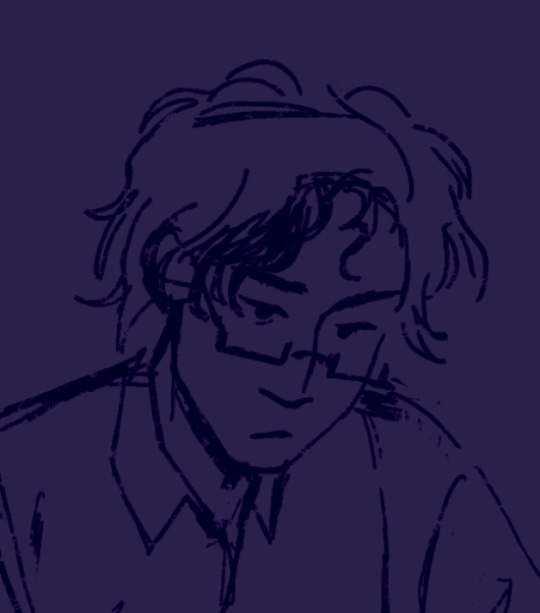
#So one layer of line art and one layer for colour on it that was it
Note
So this isnt a pride req but you still don't have to answer!! But how do you draw so quickly?? I swear you draw like 2-4 times a day? I wanna get on a really good schedule about that so I can keep up with a art blog but idk how to draw fast! How'd you do it?
I hope it helps If I go over my entire process here because I've been wanting to showcase my process for awhile anyways :}
Haha! Yeah, i usually try and draw ~4 things min a day. Now, let me clarify, to run an art blog you don't have to draw fast! I do try and take breaks if I need them!!! But a lot of my speed has to do with the fact I've just been in a very art-inclined mood as of late :} It's a lot easier to draw if you WANT to draw! and knowing people like my stuff is a huge motivator.
Long post below where I explain my process and some of the shortcuts I take!! :]
For more skill-based tips though, my method definitely helps. Drawing lineless and paying attention to my stabilizer helps a lot. I'm definitely not a perfectionist when it comes to my art and I do tend to reuse poses I KNOW im comfortable with if I'm not in the mood to go all out.
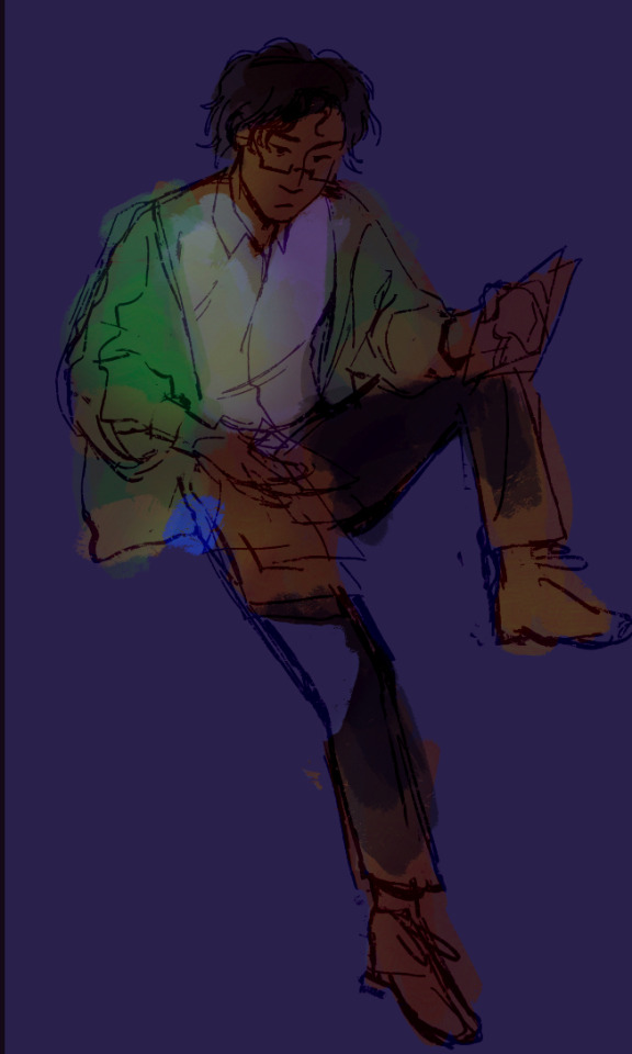
I sketch freely with loose stabilizer using a pencil-like pen that allows me to get a good idea of the details I want down... Ex:

I have a very good grasp on the way i draw slugcats and how their bodies are shaped! Depending on the characters you're drawing, you should try drawing them a TON to get to a point where you can sketch them without even looking at a ref of any kind. My designs tend to stay consistent as I have a solid idea of each slugcat in my mind! It helps me pace myself as I generally don't need refs! :}
Next, I blot out my main body shape. I then, using a clip layer, add in lines and line in limbs! Generally I do this all in the same colour, get the main shapes down before you add detail and all that...


I blot out different regions of my character in different colours and section off areas to ensure I can later select these and go over them! Doing lineless helps me a ton as I don't use a lot of layers! it's just the style im more used to :}
Lastly, I add in my colours and adjust places where I can adding in all markings and details and recolouring where I need to! I use the selection wand to help me and I also use clip layers.

The details are relatively easy for me, most of the time its just getting to doodle whatever I want to make the colour combo look the best I can!!! :} The final result of this one will be posted on its own, but I just use CSP tools to add an outline-- I'm not sure if you use Clip Studio Paint, but if you do, you can use the effect feature!

Its just a little thing I add to make my drawing pop against the background!!!! :D
Anddd thats how I pump out art at an inhuman rate! Drawing is one of the few things I can do without my chronic pain kicking my ass so a lot of my day is spent at my computer cozy n' arting!
Drawing for too long does cause fatigue in anyone though! I reccomend listening to something engaging in the background (if your attention can take it) and taking regular breaks every ~15-30 minutes.
This piece took me 30 minutes?? maybe a little more!
I hope this gave you what you were lookin for :D!!!!! I wish u well in ur art blog n' make sure not to stress urself!!!!!
#moons - talks#long post#art guide#art tips#art advice#I hope this is actually helpful lolll ive been wanting to talk about this for a stupidly long time
26 notes
·
View notes
Text

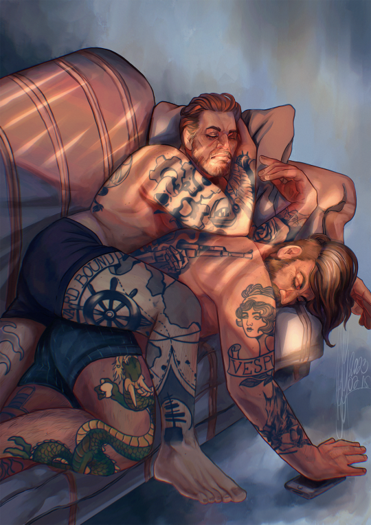
Sleepy Akira clings so hard he drags Goro into bed with him too, forced to cuddle in jeans - how tragic
#persona 5#persona 5 royal#shuake#akeshu#akechi x ren#persona 5 protagonist#akechi goro#goro akechi#amamiya ren#akira kurusu#This one was fun to draw! The background was painted and rendered solely on one layer#So one layer of line art and one layer for colour on it that was it#It really made it fun to render and think about#I love how the lighting turned out as a result I kinda want to colour this way more often#It's definitely great for doing backgrounds#also flowers on the window sill are forget me nots and red asters for anyone wondering#referencing those keychains of course#also personal headcanon that Mona 100% will play with cat toys and deny it to anyone who sees or asks so Akira buys him tons of them and#pretends not to notice them scattered across the floor#definitely unplayed with guys
269 notes
·
View notes
Text
Sleepy boys after a night of hard work for @overlyenthusiastic-personalblog
#my art#art commission#other's ocs#digital art#artists on tumblr#digital painting#digital illustration#queer artwork#procreate art#I love working on tattoos on characters can you tell?#I've learned this nice trick where you duplicate your line (and colour layers too tbh) and blur that one a little#it'll look a lot more natural and like the ink is well under the skin and doing that is just so satisfying#commissioned art
55 notes
·
View notes
Photo

i guess the last time you had any fun was way back when you weren’t anyone
#warrior cats#wc#dovewing#more meant to be dovepaw/kit here but. whatever#i havent drawn a cat in so LONG... getting back 2 my roots#caption's from ordinaryish people by ajr which has SUCH dovewing moments...#literally havent stopped thinking about how she got her Entire childhood robbed from her#this is a bit of a mess but i wanted to practice lining n colouring on one layer each#(excluding clipping masks for the line colours)#just getting back into the swing of things lol#my art#2 cents
116 notes
·
View notes
Text

Snork mimimimimi
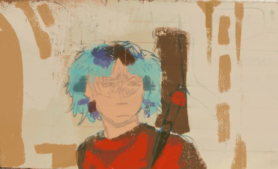
#BWAHHHHHHHH I LOVE THIS STYLE SO MUCH I WANNA DRAW MORE IN THIS#i finished one assignment so that means 3 more to go#but also a drawing break cause life is tough the past month. but its getting better#artystary#im also testing a new look again lol#the bangs and hanging things and layered short hair#feels better for me#i rly rly want to do art fight but i dont think i can haiz#coloured#transparent#lined#its me stary
5 notes
·
View notes
Text
⋆ ˚。𝒽𝑒𝒶𝓇𝓉𝓈 𝒶𝓃𝒹 𝒽𝒶𝒷𝒾𝓉𝓈 ୨♡୧⋆ ˚。⋆

enhypen 8th fem!member x hyung line
genre: fluff
type: oneshot
word count: 723

˚ ༘ ೀ⋆。˚ synopsis: in which (y/n), enhypen's 8th member, has certain tendencies that give their boyish dorm teeny touches of femininity... or just plain messes. and eventually, these habits lead to the boys developing their own as well ˚ ༘ ೀ⋆。˚
bringing her scrunchies everywhere (l.hs & p.js)
"Use this," Jay says upon noticing (y/n)'s struggle and helps tie her long hair up into a loose ponytail as she eats her breakfast.
(y/n)'s brows raise and she emits a closed-lip gasp of surprise, occupied with chewing her rice before smiling gratefully at him when he takes the seat in front of her.
"Thanks! Where'd you find it?"
"On the couch," the older replies with his lips pulled into that casual, charming half smile of his.
"I think I saw one on the coffee table too," Heeseung chimes in and (y/n) makes a mental note to check on it. Later on, she does in fact find her scrunchie— and not just one of them but two.
After leaving her scrunchies and hairties practically everywhere, Heeseung and Jay tend to be the ones picking them up or the ones to find them— leading them to unintentionally be her very own scrunchie lockers.
Award shows? Heeseung will probably have a pink hairtie around his wrist, hiding under his sleeve. Jay will probably have some stuffed into the pocket of his pants.
En-O' Clock? Jay has some new scrunchies he randomly bought for her still in his bag while Heeseung picked her hairtie up from the makeup room when she got dolled up.
Basically anytime in the dorm? Oh, the scrunchies are layered on their arms like warmers. They might even be using one for their own hair— just walking around the dorm with a palm-tree on their crown held together by soft, fluffy rubber ties.
using flowery coasters (s.jy)
"Look at these new ones I made! Aren't they cute?" (y/n) asks excitedly while showcasing Jake her freshly made pieces of crochet coasters on their coffee table.
He gasps dramatically with a hand flying to his mouth, eyes widening and brows raising to express surprise before he grins brightly at the girl.
"Wow~~ These are beautiful, (y/n)! I still can't believe how fast you made these! They're perfect!"
"Thank youuuuu!!" She elongates her word, emphasizing her gratitude towards him for complimenting her works before she looks up at him curiously.
"Which one do you like most?"
Jake gazes down affectionately into her expectant eyes, chuckling at how purely ebullient she is and hums thoughtfully with narrowed eyes shifted towards the choices of handiwork. "I like that one."
He points to one in beige with dark green-stemmed yellow tulips adorning its circular shape and (y/n) gives him the piece before choosing another with the same design but different coloured tulips to match with his.
"We have matching ones!" She chirps, holding hers next to his before she goes to find the other members to gift the remaining coasters.
Jake smiles warmly at her furthering back before at the soft material in his hand. Ever since then, he's left the coaster on the table and uses it whenever he has a beverage. A hot drink, cold drink, bottled, canned or boba— uses it for every type.
If he finds another member using it, he won't hesitate to just snatch it before putting it under his drink aka. 'its rightful place,' as Jake calls it. As the collection grows, so does his greed. He is not sharing.
giving his arm/hand (p.sh)
(y/n) crochets, paints, does diamond art, basically all that artsy d.i.y stuff. And sometimes, she needs extra hands to keep things steady— and somehow, Sunghoon's always there.
"Can you hold this for me?" She asks Sunghoon to hold her crochet hook while she tries to untangle the knot in her thread. He holds it, and very stably too.
She's doing some diamond painting and accidentally knocks her small tray of colourful jewels— Sunghoon already has his hand out, palm facing upright and (y/n) naturally puts her sticky canvas on it like it's a dish, not wanting to accidentally knock it away while picking up a few fallen beads.
They're having a photoshoot and (y/n)'s called onto the set but has a mini fan in her hold— Sunghoon magically appears to take it from her then proceeding to stand obediently at his post, watching her and waiting patiently until she finishes to give her back her stuff.
She's out shopping for clothes and groceries— Sunghoon's there with a shopping basket hanging on one arm and her clothes on the other.
Some even say that Sunghoon's her personal assistant.
ᡣ𐭩ྀི₊ ⊹ masterlist ᝰ.ᐟ✮⋆˙
𝜗𝜚 hi, it’s romi here!! thank you so much for reading to the end!! if you enjoyed it, don’t forget to leave a heart and reblog—they give me some motivation, ya know? but please do not spam like!! X♡X♡, romi ⋆.ೃ࿔*:・
copyright © 2024 thinemoonshine
all rights reserved
#heeseung x reader#jay x reader#jongseong x reader#jake x reader#jaeyun x reader#sunghoon x reader#enha x reader#enhypen x reader#enhypen x female reader#enhypen x you#enha texts#enhypen fanfiction#enhypen au#enhypen imagines#hyung line#enhypen drabbles#enha drabble#enhypen 8th member#enhypen oneshot#enha oneshot
803 notes
·
View notes
Text

ms paint. you know her. u used her age 8 to make loads of rainbow ovals all over the canvas and then scramble it with selection tool. now u will know her true powers with my handyrandy tips under the readmore. some will be pretty basic and others are very special.
this post has 8 cool trix to learn for you. enjoy and i may do another in the future if i remember/learn more stuff
some of it might be common knowledge. but its got some deep cuts. all tips have gifs to show process easily.
🙂 enjoy and i hope this encourages you to fuck around in mspaint more
soundtrack for this post (loop it while you learn for advanced learning experience)
TIP 1) the right click trick
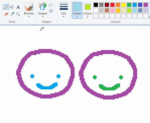
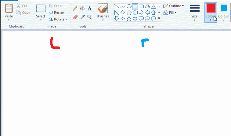
left and right mouse click correspond to col1 and col2 respectively, which u can see in the top bar. this applies to all brushes and the fill tool like above. when using shapes col2 will be the fill colour (if you have solid fill selected). right clicking with shape maker will reverse the colours use on the shape.
TIP 2) right click eraser
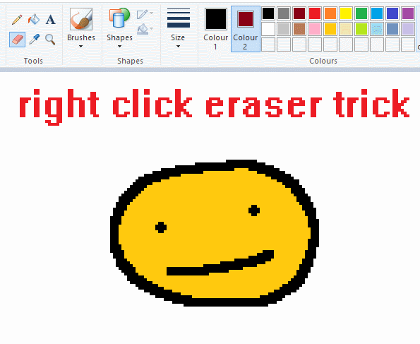
this one is extremely helpful for lineart or add shading. the eraser always uses col2. so your eraser can technically be any colour. but here's where you get powers: right clicking with eraser will only erase onto col1, with col2.
TIP 3) transparent selection change a guy destination
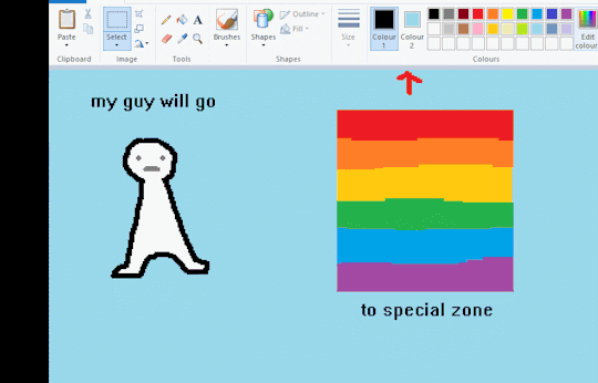
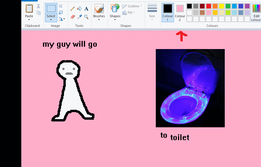
the beloved transparent selection tool works based on what is selected as col2. so long as you have the correct colour as col2 you can make any image transparent and put it on top of anything else. and yes this works with photo bg as you can see.
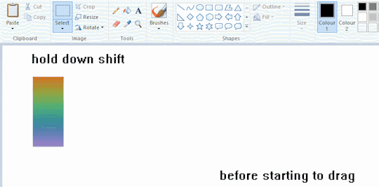
TIP 4) the gradience
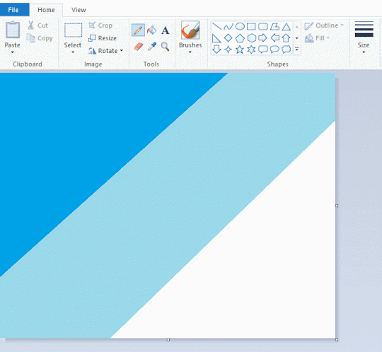
this one is a little more complex. you want to start off with any canvas size, and make as many diagonal coloured bands as you want. (protip: holding down shift makes a perfectly diagonal line with line tool)
then you need to resize the canvas to a width of 1px (make sure you resize by pixels, and do not maintain aspect ratio). then resize again back to its original width (or a different width i cant stop you). you will have your lovely gradience.
TIP 5) superimposter

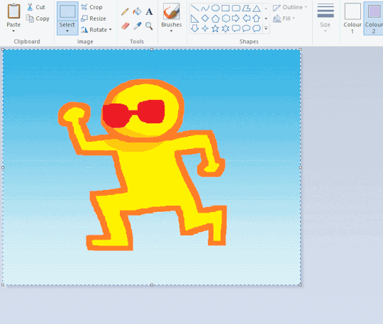
so. you got a cool gradient and wanna put a guy on it. heres what i do:
i open a 2nd mspaint with same canvas size and draw whatever i want on there. i then pick a completely unrelated colour to my entire piece, and set that as the bg. you could use white, pink, geen, whatever you want as long as it doesnt appear somewhere else in ur drawing. copy the guy.
go back to your gradient tab. ensure that col2 is set as that bg colour you picked (lilac for me). have "transparent selection" enabled. paste your guy in. cue fanfare
TIP 6) advanced superimposter
the great thing about this method is u can put multiple gradients in multiple areas of the image. this is where it gets all japanese printmaking type of shit. ukiyo-esque
all you need to do is make another canvas with a new gradient, ensure col2 is set as the colour you want to replace, then paste your original piece onto the new gradient. now my guy has a soft fade. you can do this as much as you want. (you could even make a canvas with a texture or photo and paste your drawing onto there)
TIP 7) "sketch layer"
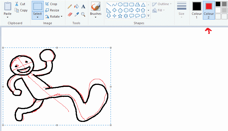
so as you now know, col2 is what is removed when you click "transparent selection". which means you can also remove any instance of a colour from ur drawing. which means you can have a unique colour for sketch layer and remove it from the drawing later. i admittedly dont do this but it is a great trick to have.
now combine this with lowering your dpi for smoother lines. may seem obvious but it helps. its like a free stabiliser whenever u want.
TIP 8) rainbow art
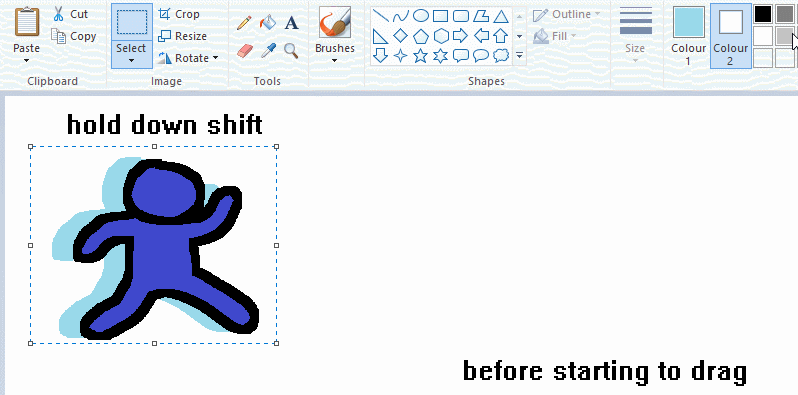
now this is where you can get dizzee rascal "bonkers". check out my small and shitty rainbow trick. you can select anything and hold down shift, then drag with left mouse, to turn that selection into its own brush. i even did it with a guy. and you can of course do this with a photo as well.
🙂well that it for now. hope you liked it thanks for reading now back to your regularly scheduled tgcg programming
2K notes
·
View notes
Text
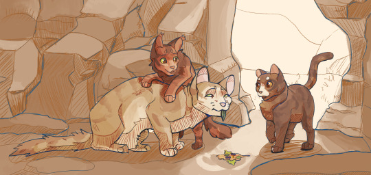
Leafkit and Squirrelkit make "travelling herbs" for Sandstorm before she goes for a walk. They're delicious, she assures the kits, through tears in her eyes. They run away proudly, she rushes out of camp for the nearest creek to wash her mouth in. Nasty, she mouths, but she'll eat whatever they make. The kits' smiles make it worth a wet face.
~~~
Had a ton of fun with this one but don't wanna bog down the main post. A lot of unrelated-to-wc process talk below the cut!
So this was a bit of experimentation with a new brush which turned into exploration into gradient maps.
The original idea was simply to modify csp's mechanical pencil brush into something that felt a bit more natural. It started with simply turning on a bit of tilt-controlled thickness and setting my colour to about 80% grey, rather than black. It didn't quite feel right, but setting the brush to blend with the subcolour on each tip, setting the subcolour to the 80% grey and the main colour to the canvas' colour, then setting the brush's blend mode to darken gave me a brush that felt like it had FAR finer line control.
The lines themselves look like this (on a more saturated bg to show how the values layer/fade in and out with pressure and tilt):
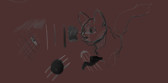
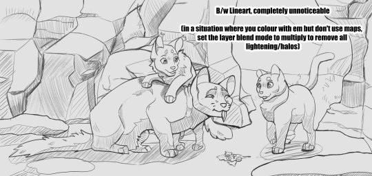
(edit to pic: completely unnoticeable when on the intended base colour*)
This is where the gradient maps come in. The way I usually change my linearts' colours is to make a new layer, mask over it, and manually paint. It gives a lot of control to your end result, but it's time consuming and often takes many adjustments to make it feel like it has enough contrast to make the drawing actually *readable.* If I wanted to add a gradient map to the lineart, it would be unable to read the transparency and would pick from the single value that the lineart is (usually black), then the transparency would take over. This gives me a dull result.
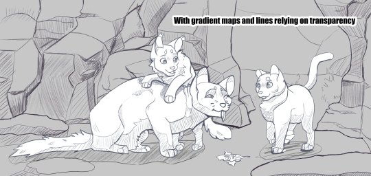
With the "transparency" being an actual colour, that gives it an actual value for the gradient map to read. So instead of having your lines fade from black to the colour behind it (often desaturating as it goes), it'll go from something like dark blue -> reddish-grey -> orange -> yellow. It adds a little something i think, and while I absolutely don't have this down pat, it could be something interesting to explore!
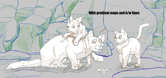
I also wanted to go further with this piece, namely painting it rather than a shading layer set on overlay with the aforementioned gradient maps all over it but ... it wasnt happening. The art skills clocked out for the day. That said, I definitely want to explore how this would look if I coloured everything for realsies rather than doing the fallback method. Could be where they really shine!
#warriors#warrior cats#squirrelflight#leafpool#sandstorm wc#btw. the post did get bogged. i talked a lot but damn it was fun to doodle around with !! give it a shot if u want!#2023 art
1K notes
·
View notes
Note
what are your go-to brushes and what drawing program do you use? I love your line-art and overall art style!
My friend, my pal, my guy.
My secret is, it's pencil.

My lines are pencil. It's all pencil.
Well.... Kind of. The Borders on this piece are digital, but also, you can tell.
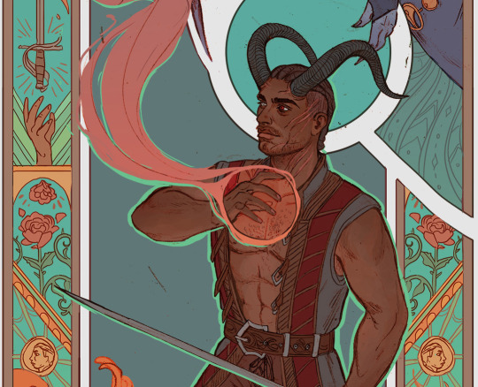
So like, the rose and hand reaching for the sword, and the very straight lines for the borders. That's all digital. But it is also just a plain circle brush.
I draw most of the piece in pencil, scan it in, edit it a little (like making the head smaller, I always draw it weirdly big). Then I colour it all digitally on Photoshop with a circle brush.
And for those wondering, I have the lineart layers set to multiply and they sit above the colour layers
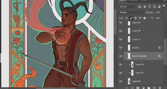
Back in the day my very old laptop and tablet didn't have pen pressure, so I had to find a work around for that, and it has stuck ever since. I have pen pressure now, but I also like how pencil lines look.
One day I'll find a nice brush that mimics pencil textures, but today is not that day.
471 notes
·
View notes
Note
I love love LOVE your watercolour work! Are you still using the strathmore paper in your faq or have you switched to something else? (I’m shopping for new paper rn - trying to work out what’s a tool problem & what’s a me problem!). And would you every consider doing a little walkthrough of your process? Do you work in lots of thin layers? Your illustrations really evoke lovely stories so I’m always happy to see them. Have a great day!
hello!! Sorry It took so long to reply anon!
To start, Thank you so much!
Alright now about my matierial, Not much has changed but I am not using Hot press paper (Saunder Waterford Hot press 300g/140lb) the most nowadays!
Its very similar to the Hot press from Strathmore I liked so either are not a bad choice! (And cold press from both brand are still a perfectly good choice! especially if you want more texture in your paper!)
Now for my process!
I normally start with colored pencils lines for all my art. You can choose one color or many! I try not to choose too dark of a colour so that it blends in better.

Then its paint time!
Watercolour is all about layers! (Like Onions, Like an Ogre)
Patience is key with watercolours! Believe me I still to this day add way to much water/paint because I am excited to do a certain effect or want to get that wash right. But there is always a way to make it work!
Half watercolours for me is to work with the little accidents water or paint caused.
So I start with a pale color (often a soft yellow or orange or a blue but Go wild!)
and then I build on it!
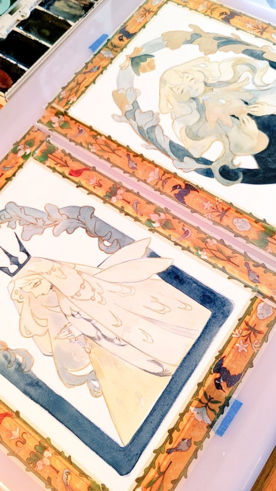
and you just continue to do that, waiting in between paint layers for them to dry (Or almost dry depending of the effect) . You can work on another section during that time, or (My favourite thing) just sit back and watch a long 4 hours video essay.:)
Then once the paint is done I normally define and add some details with Colored pencils again!
Then I scan the art and will adjust a bit or go full on mix media in procreate! It depends on the piece!
And then you have the full piece!
Hope this helps!
232 notes
·
View notes
Note
I noticed when looking super close at your line art that the there's slight red green and blue on the sides of the lines like an old 80s anime and i think that's super cool! How do you do it?
oh, that's chromatic aberration! i guess you could say its a kind of colour/visual distortion.
it's pretty simple to do, but i usually just use a csp auto action to do it for me to make things go quicker, but i can teach you how to do it manually in most programs.
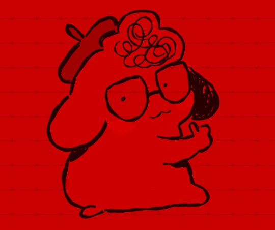
i'm going to use this silly doodle of me as pompompurin as an example lol
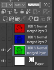
youre gonna wanna merge everything onto a single separate layer first and then we're gonna work with that merged layer. make two copies of that merged layer so you have three of them in total.
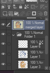
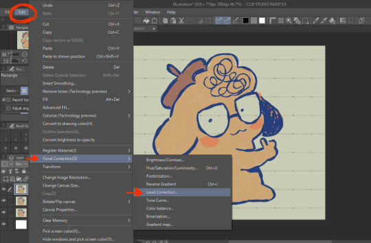
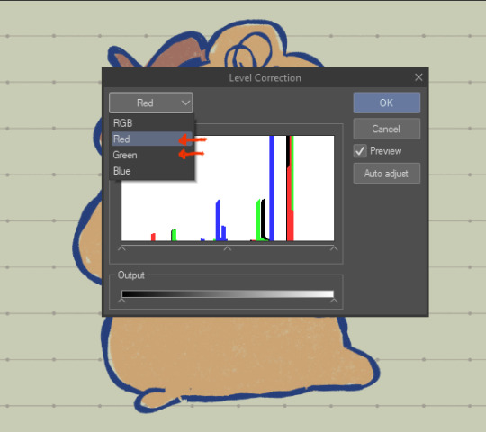
the top merged layer will be our red layer, so youre going to want to got to EDIT > Tonal Correction > Level Correction
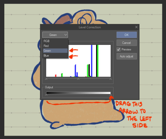
the level correction graph will pop up. since the top layer will be our red one, select the green level and drag the rightmost arrow on the Output scale all the way to the leftmost side. do the same for the blue level.
the image should be red like this afterwards.
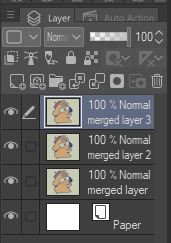
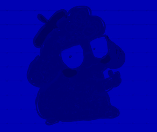
the middle layer is going to be our blue layer so do the same thing we did for the top layer except youre going to reduce the green and red levels instead, and the middle layer should be all blue like this.
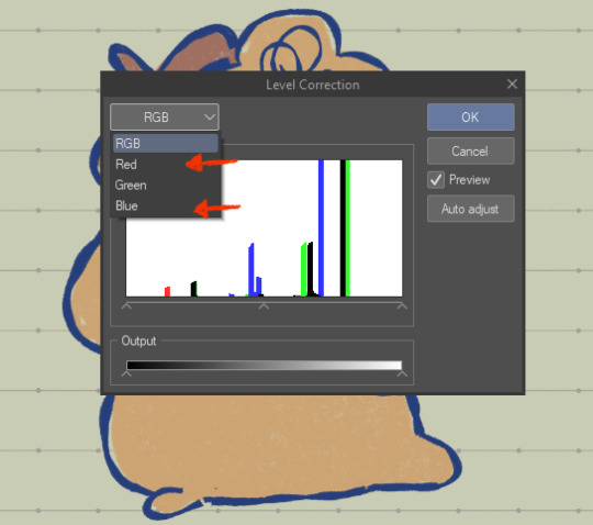
for the bottom layer, it will be our green layer. same process as before, reduce the red and blue levels so its all green.
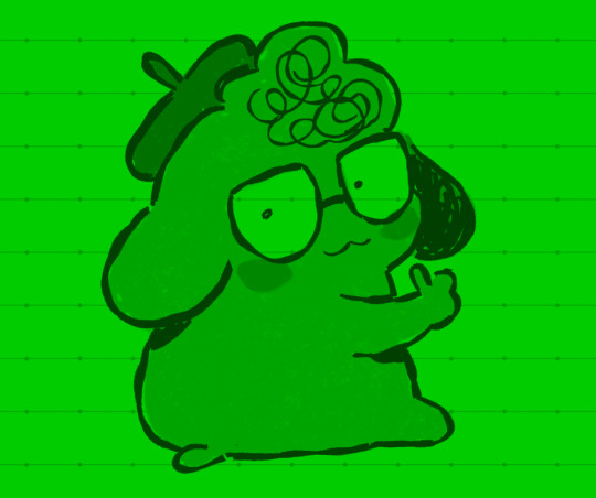
your layers should be looking like this now
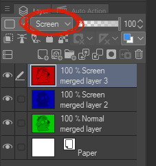
from here, you want to set the layer modes of the red and blue layers to Screen, DON'T do the same for the bottom green layer though. you'll notice once you've done that, the image will look normal again!
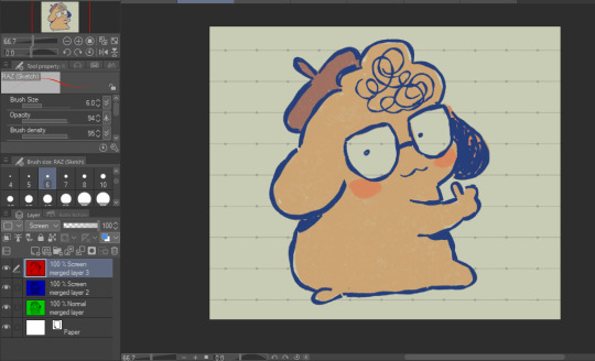
from here, all you need to do is shift the red layer in one direction, and the blue layer in another, to as much of an extent you want. the further they are from each other, the more drastic the effect will be
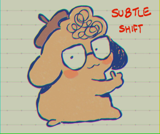
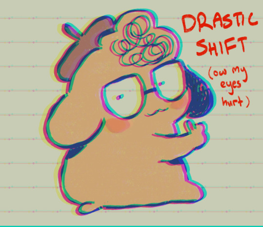
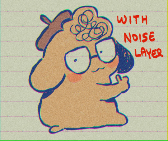
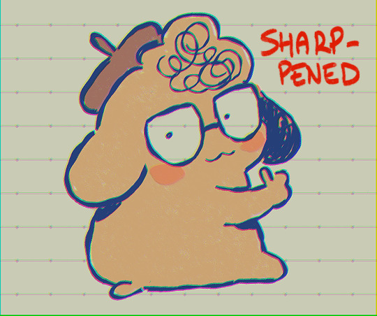
and that's how you do it! my other personal tip would be to add a layer of noise set to Overlay or Soft Light at a lowered opacity over the drawing bc it goes well with the aberration, or even sharpen the image.

if you dont want to do all that hard work though and you happen to have clip studio paint, just use an auto action, like this one!:
https://assets.clip-studio.com/en-us/detail?id=1713222
anyway i hope that helps? ^^;;;
649 notes
·
View notes
Text
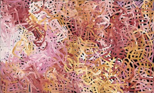
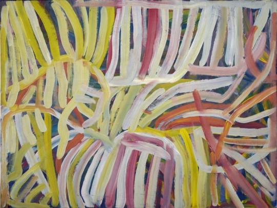
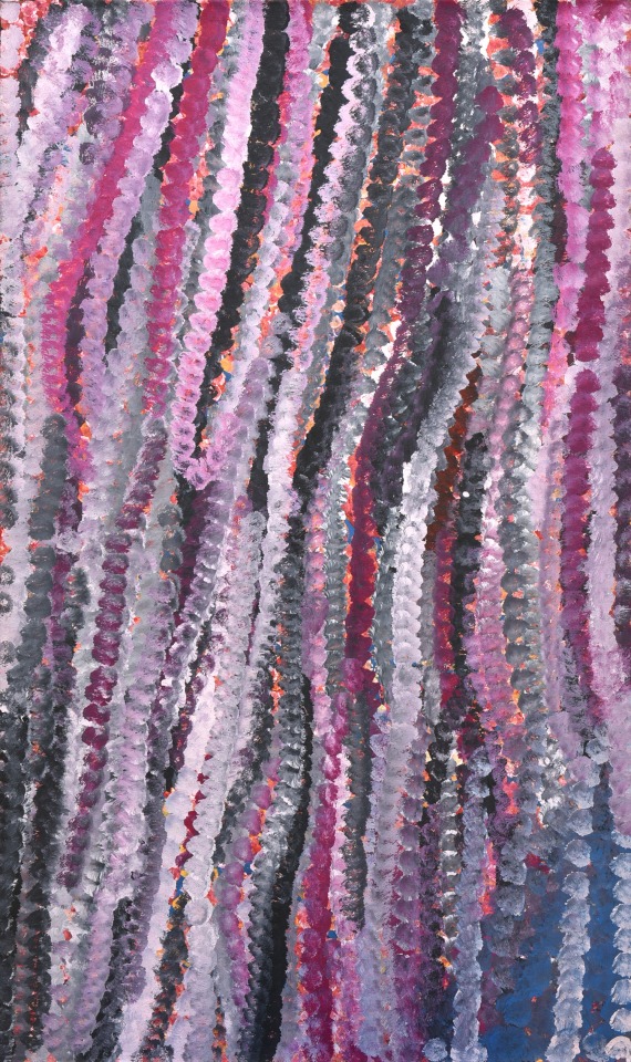
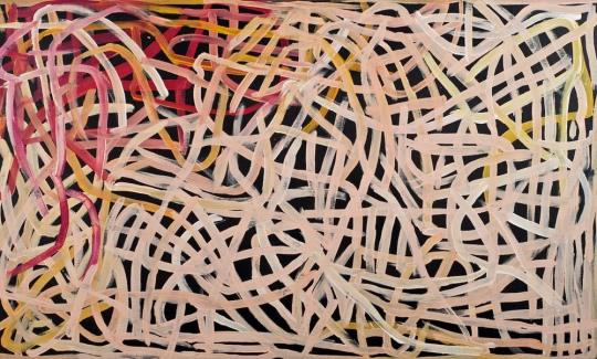
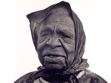
Emily Kame Kngwarreye (1910 – 1996) is considered one of Australias most significant artists. Amazingly, she only began painting with acrylics in her late seventies but in a few short years became an artist of national and international standing.
Emily was the first female painter to emerge from an art movement dominated by men and did so in a way that transformed Aboriginal painting. Employing a variety of styles over the course of her eight-year painting career, she painted her Country and sacred Dreamtime stories in a deeply emotional and expressive manner.
She was born around 1910 at Alhalkere (Soakage Bore), on the edge of the Utopia pastoral station, approximately 250km north-east of Alice Springs. Alhalkere was her fathers Country, and her mothers Country was Alhalpere, just to the east.
Despite being married twice, she had no children of her own but raised her relative Lily Sandover Kngwarreye and her niece Barbara Weir. Both becoming famous artists in their own right. Other nieces that also became famous artists include Gloria Petyarre, Kathleen Petyarre, Ada Bird Petyarre, Violet Petyarre and Nancy Petyarre.
Well before she became one of its most senior contemporary artists, Emily held a unique status within her community of Utopia. Her strong personality and past employment as a stock hand on pastoral properties in the area (at a time when women were only employed for domestic duties), reveals her forceful independence and trailblazing character.
Her age and ceremonial status also made her a senior member of the Anmatyerre language group. She was a senior custodian of cultural sites of her fathers country. She was considered the Boss Woman of the Alatyeye (pencil yam dreaming) and Kame (yam seed dreaming).
Emily started as a traditional ceremonial artist, beginning painting as a young woman as part of her cultural education. An important component of this education was learning the womens ceremonies, which are associated with in-depth knowledge of the Dreamtime stories and of womens social structures.
This knowledge is known as Awelye in Anmatyerre language. Awelye also refers to the intricate designs and symbols associated with womens rituals. These are applied to the womens upper chest, breasts and arms using fingers or brushes dipped into rich desert ochres.
Aboriginal art outside of ceremonial painting began in Utopia in 1977, when batik-making was introduced to women as part of an extended government-funded education program. In 1978, Emily was a founding member of the Utopia Womens Batik Group. In 1988, the Central Australian Aboriginal Media Association (CAAMA) completed its first project with the Utopia Womens Batik Group. This became an exhibition called Utopia - A Picture Story.
From the beginning, Emilys art stood out from the others. Rather than filling her batiks with Aboriginal symbols, she preferred patterns of layered lines and dots that revealed plant, figurative forms and cell like structures. The 88 silk batiks from this first project were acquired by the Holmes a Court Collection in Perth.
In the same year the CAAMA shop initiated The Summer Project, introducing the Utopia womens batik group to the use of acrylic paints on canvas. Among the 81 paintings completed was Emilys first artwork on canvas, Emu Woman.
Inspired by the many Dreamtime stories of which she was a custodian, Emily employed an extraordinary array of styles over the course of her eight-year painting career.
In her early works, Emily preferred the use of an earthy ochre colour palette, reflecting her experience of using natural ochres during ceremonies. Over time she expanded her repertoire to include a dazzling array of colours found in the desert landscape. Colours are significant in her paintings. Yellow, for example, often symbolises the season when the desert earth begins to dry up and the Kame (yam seeds) are ripe.
Her shifting styles also reveal her self-confidence and willingness to experiment with form, pictorial space and artistic conventions. She drew creatively from the geographic landmarks that traverse her Country and the Dreaming stories that define it. Whenever she was asked to explain her paintings, her answer was always the same:
Whole lot, that's the whole lot. Awelye (my Dreamings), Alatyeye (pencil yam), Arkerrthe (mountain devil lizard), Ntange (grass seed), Tingu (a Dreamtime pup), Ankerre (emu), Intekwe (a favorite food of emus, a small plant), Atnwerle (green bean), and Kame (yam seed). That's what I paint; the whole lot.
This is because she chose to present a very broad picture of the land and how it supports the Anmatyerre way of life. Her artworks embrace the whole life story of the Dreamtime, seeds, flowers, wind, sand and everything. Although her works relate to the modern art tradition, this resemblance is purely visual. The emphasis in Emilys paintings is on the spiritual meaning, based in the tradition of her people.
The evolving styles of Emily Kame Kngwarreyes paintings
Emily started to paint in 1988. Her early style featured visible linear tracings following the tracks of the Kame (Yam Dreaming) and animal prints associated with the Emu Dreaming. Fields of fine dots partially obscured symbolic elements.
By 1992 her paintings were so densely packed with layers of dots that her symbolic underpainting was no longer visible.
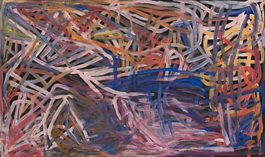
Another evolution in her painting style occurred when she began to use large brushes. She worked faster, more loosely and on a larger scale. Sometimes dragging the brush while she dotted, producing lines from the sequential dots.
By the mid 1990s she had pioneered a style of Aboriginal painting referred to as dub dub works. They were created by using large brushes which were laden with paint and then pushed into the canvas in such a way that the bristles part and the paint is mixed on the canvas.
Using this technique, she created wildly colourful artworks and her paintings became progressively more abstract. Different artists from Utopia including Polly Ngale and Freddy Purla have subsequently adopted this style.
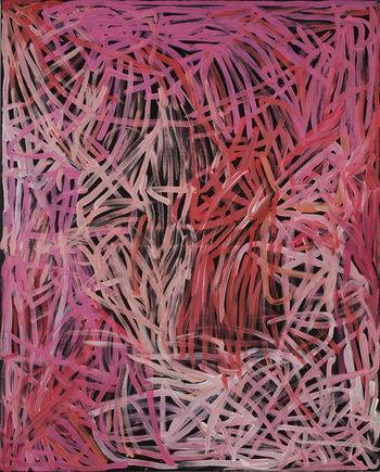
During the last two years of her life, she used the linear patterns found on womens ceremonial body designs as the primary inspiration for her paintings. The abstracted sequential dots of colour gave way to parallel lines which were much more formally arranged. She had used lines earlier before gradually submerging them under layers of dots. This time, she created simple, bold compositions of parallel lines in strong dark colours.
The above style in turn evolved to looser meandering lines which appear to trace the shapes of the grasses and the roots of the pencil yam as they forge their way through the desert sands.
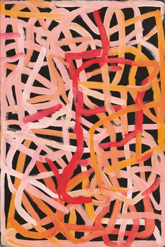
In 1996 she produced a body of work in which she depicted pencil yam dreaming using a rich ochre colour palette. In this final burst of creative energy, Emily produced a beautiful body of work known as her scribble phase. In these atmospheric paintings, lines and dots were replaced by flowing fields of colour.
https://www.kateowengallery.com/.../Emily-Kame-Kngwarreye...
183 notes
·
View notes
Text
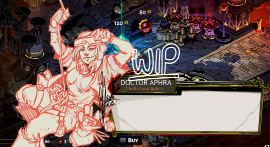
SW Hades AU Status Update
I wanted to make a dedicated post about what I’m currently working on for the Star Wars meets Hades AU that looks more consistent than just sharing bits and pieces whenever I’m tagged in a Last Line Challenge. Because what else do I have but the poly sketch requests and this AU for my weekends? (If nothing else I know that the Hades AU has got me XD)
For now Obi-Wan and Maul are stuck at the same stage: they are both lined, have their base colours down as well as the two adjustment layers of coloured lighting.
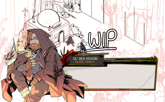
I suspect if I were ever to get through the agonozing few hours of shading Obi-wan’s face it would be mostly smooth sailing from there. The problem is that there are at least 2 - if not 3 - separate stages where the shaded face looks like I have no idea what I’m doing, and you need to get through the whole thing before it really comes together 😅 on the other hand Hades 2 has a lot of the directional shading I might need for his character art so that might help to get me there.
It also needs to be said that Obi-Wan comes with the extra disadvantage that is the entire background behind him. I’m really hyped to line it finally, it is quite a challenge, but at the same time I’m slowly coming to the realization that I have no idea how I will colour it. Hades backgrounds are so so pretty and full of details and gorgeous colours, and while I’m not delusional enough to think I could match that on first try… I still wish I could, you know? At the same time I will have to erase or recolour a lot of my lines, which will hurt quite a bit, I imagine. I’m so bad at killing my darlings 😅 also I hate laying down flat colours. I just find it very difficult to immerse myself in that process, while lining and shading can have their flow.
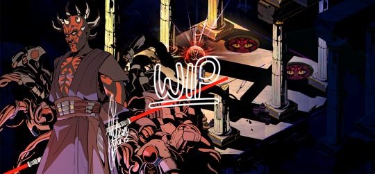
I had covered up so many lines and details in Maul’s spider parts it’s a miracle I didn’t cry XD However, tips on grouping my shadows and allowing the shape to speak for itself and the details in them are very helpful and on point.
Worrying over writing dialogue for them is also not as far down my to-do list as I wish it were. I have a good enough idea for a quip for Obi-wan, but Maul? He’d need a whole melodramatic rant of his own XD
Aphra has gotten some new lines and I had fixed the satchel I had forgotten the last time I shared the rough sketch for her, thanks to the new character art for Hades 2! Seeing Odysseus and Hermès’s updated looks were great helps here, so I might as well move on to lining her, and finally adding another female character to the roster on top of Ahsoka!
And then there is the biggest update on these little guys below! I will need to clean up the ones I had drawn for Cobb and Boba (and Din) well over a year ago, but with these my version of chtonic companions are done, and thanks to @lesquatrechevrons I have a full list of keepsakes for each character as well. I’m not very good at drawing these little tchotchkes (I say with Rex’s blaster right there LOL) but I hadn’t been very good at lineart or cell shading when I started this project either, so through forced practice I’m determined to change that :D
(It’s not a screwdriver under Boga, it’s one of Cody’s antennas. “It will grow back, don’t worry,” he says as he snaps it off his pauldron and hands it over to Din. Rex backs him up on that one without question. They can't lie for shit but trolling the shiny is their thing.)
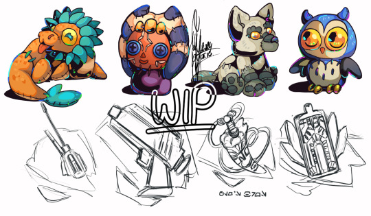
Additional fun fact: the reason why I’d picked up the chtonic companions concepts was because I’d been poking at minor details in the background behind Maul (aside from the Chaos doors), and I started adding credits and recoloured nectar to the corner (before I realized that they wouldn’t be visible once the character interaction comes up oops), and I tried to figure out to whose keepsakes Maul would react favorably. I also mixed up companion dolls and keepsakes, so that’s why the Ahsoka doll came to being (I also forgot that that one belongs to Rex, and not Ahsoka herself but uh… they are close enough that they should count by proxy anyway. It’s not Obi-wan’s cup of tea and that should be enough!). Also bless @mapleowl18 for suggesting Lil Soka as companion for Rex ❤️
So this is the current state of this AU project right now. I have my lists and notes, a few scribbled pose ideas in my sketchbook for Sabine (she might be next, unless Bo and her Nite Owls make a comeback), Satine and Omega (with Batcher), as well as some angry scribbles and question marks for Quinlan (who has apparently made his way back into this AU even though he didn’t get a little icon of his own originally orz), and Obi-wan The Second that would stand with Cody post reunion, but I cannot make that one work for now 😅
#I have absolutely nothing for a very long time and then a lot of SOMEthings - this is how we roll apparently#I wish I could spend as much time on these as I wanted to and keep dreaming about them but my attention span still sucks T^T#I will try to make posts like these a regular thing what do we think?#maybe that will keep me on track#hades au#my art#obi wan kenobi#darth maul#doctor aphra#star wars fanart#wip#work in progress#long post#artists on tumblr#sw fanart#hades au update
121 notes
·
View notes
Note
hey, i see you have been answering!! so i just wanted to say i LOVE your art, i just love how effortlessly swift your lines look + i enjoy the colors you use.
i was wondering if you had a specific process when rendering the artwork cuz i would be interested&honored to see/know!!!
much love and have a nice day!
Hi anon and thank you!
Here's the general workflow of how I colour in CSP. I usually spend most of my time on lineart, as I enjoy it most, so I keep my rendering simple. Sometimes I skip some of the steps below :)
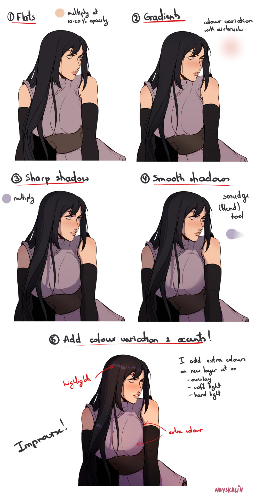
Step 1: flats. I add a 'Multiply' layer on top at 10-20% opacity and fill with single colour, usually peach-y one since I like my colours to be warm.
Step 2: gradients. Here I add some variation to the flat colours. I use airbrush for this, or sometimes low-opacity brush that allows colour mixing (Magda). I add blush and gradients to hair and clothing using similar but darker colours.
Step 3: shadows. I use solid round brush (G-pen) and just block in shadow areas on a separate layer set at 'Multiply'. Sometimes I use different colour for skin/clothing/hair.
Step 4: smooth parts of shadow where needed. Not all shadows are sharp and I use Blend tool to soften some areas.
Step 5: adding colour variety. Essentially, I improvise and play with adding different colours until I like it (or hate it and delete everything). I use 'Soft light' and 'Hard lights-out add different colours, usually with airbrush. And add accents (reflections) on 'Overlay' layer.
Hope it helps! Here's the time-lapse:
203 notes
·
View notes
Note
I absolutely adore your art!!!! Can I ask, how do you pick your colors? Have a lovely day!!! <3
thank you!! my colour picking process changes a lot (basically every piece) but in essence i aim to vary the temperature (warm/cool) and hue (green->teal->blue->purple) a lot, as well as using a lot of complementary colours - annotated melanie as an example:

a more in depth explanation under the cut (my entire drawing process), here r some things that i do most times (w aid of recent examples) ->
for choosing base colours,
first thing underpaintingggg. this can be a solid colour or texture or an image with a gradient map slapped on it. for the jon piece i used a layer of dark blue, but for the melanie drawing i drew directly on top of a photo of my notebook

i then lay down local/base colours on an overlay layer (eg. jon) or using a brush with low opacity (eg. melanie) so the underpainting shows through. (use an airbrush or colour jitter brush for maximum effect.) i use local colours to see how they interact with the underpainting from all around the colour wheel

i usually sketch in a saturated, brighter colour. so i put my sketch layer on colour burn/multiply so that the shade varies with the colour underneath it, and ensures the sketch remains dark/legible. you can see how the lines are reddish near jon's face and blue/purple near the lit parts of his clothes
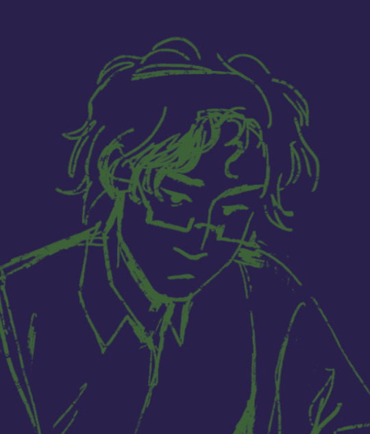

the way i add shadows is usually to pick the darkest colour on the canvas, fill the canvas, erase away where the light hits and stick it on multiply layer mode, however i generally try to keep lighting warm and shadows cool if my characters arent floating in weird abstract collage space
throughout the entire process: change around layer modes all the way baby, mess around with the curves, mess around with the hsb, i either decide on colours right off the bat or deliberate over them painstakingly. gradient maps r your friend too
these are usually the base colours/colour guides that i have before rendering after all that stuff is done (jon one is without all the images on overlay)
when i start rendering ill put down all the darkest shadows/focal areas in a really dark colour. and then after that put down colours in different groups with hatching/other mark making for texture/blending. i colour pick loads and slide the hsb of the colours i'm using around even more. essentially i try to work off all the colours i get from the 'base' i made (the little sketch colour variations, random jitter colours, colour picking inbetween gradiens) and then keep varying the colours little by little
i tend to charge into picking colours until it 'feels right' or has the general vibe that i want, but i hope this explanation(?) helps ^-^ i'd always recommend colour picking on an area of a drawing that looks interesting to you and seeing how the artist changes the colour throughout !
76 notes
·
View notes
Text
personal style inspired by Lucy Westenra
Bram Stoker’s classic brought many iconic characters that continue to inspire fashion and art to this day, one of them being Lucy Westenra. Set in 1890’s, her look was based on late Victorian fashion. Described as soft and sweet, her style is very feminine and modest at first, but as her character changes into a deadly vampire, so does her style evolve into a more dark romantic look. To translate that into a personal style, it’s a perfect inspiration to bring both contrasting sides into one single creative and ethereal aesthetic.
I would keep the classic and feminine pieces and softness of colours as base, and mix it with modern, more relaxed cuts and details, as well as accessories and jewelry that add a little bit of edge and pop of colour for that gothic and vampiric element. Waist is usually emphasised/cinched while silhouette is rich on top or bottom. It can be achieved by combining pieces such as long ruffled skirts of sleeves, or lace and lightweight sheer fabrics like organza/chiffon, with lined and harsher pieces like corsets and bodices. Layering over with items that resemble lingerie, slip dresses and nigh gowns also incorporates well into this style. Some of the go-to pieces – lace turtlenecks, corsets, ruffled skirts/dresses, drop jewelry, laced boots, puff sleeve blouses, off shoulder dresses and tops, stockings, floral details, choker necklaces


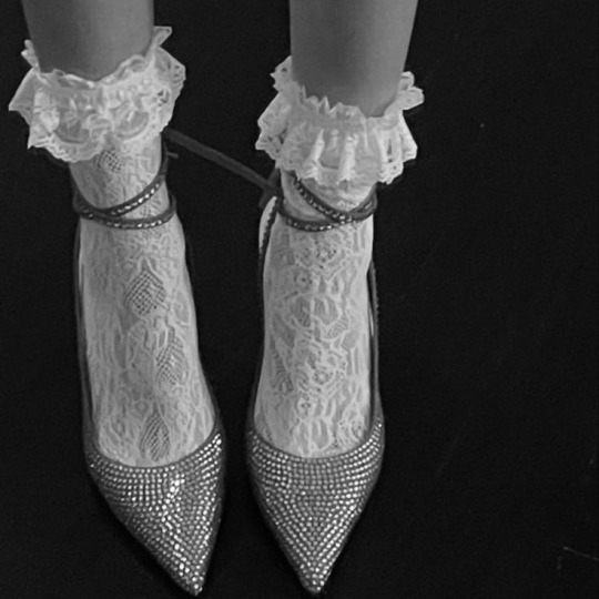


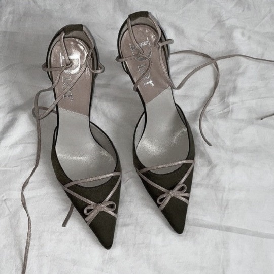
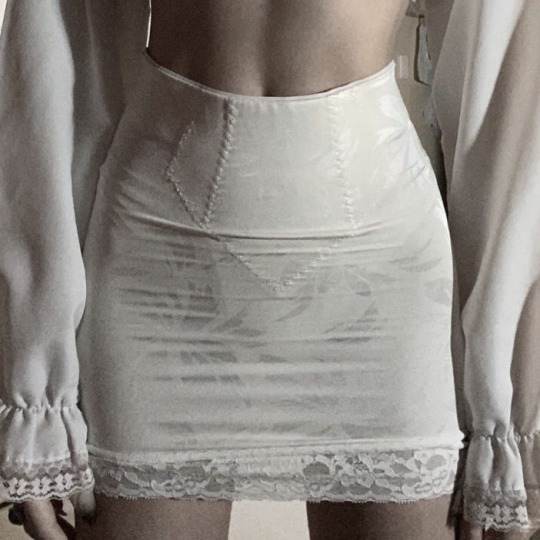
colours – off white, silver, peach, muted shades of orange and pink, red
hairstyle – romantic waves or relaxed bun, any type of feminine head piece/accessory
makeup – minimalistic makeup with blurred/stained red lips
Lucy Westenra outfit inspiration
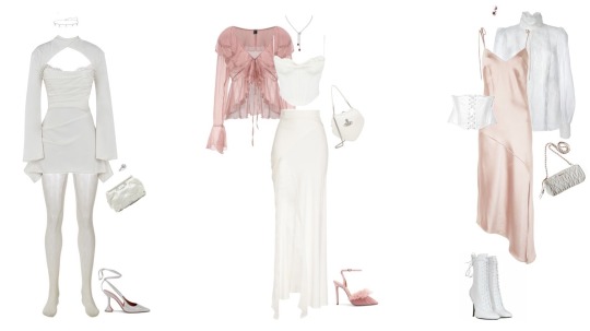
ethereal, dark romantic, lace pieces, muted colours, ruffles, stained lips, red details, feminine
100 notes
·
View notes
Last Seen Blogs