#and some fancy new art
Text
TIME TO UPLOAD MORE THINGS~~~~~~~~ because I’ve been on a roll with posting my drawings lately

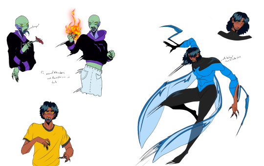
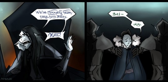
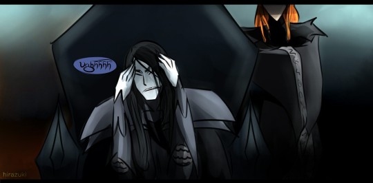
I was practicing with the Tender Trio during my long break, and it was real good. For a long while before I even went on that break, I was enamoured by a user’s art for a TTTE/Land of the Lustrous crossover and thought it was a really good idea! In fact, it’s been so good at getting my creative juices flowing that I kinda want to keep going with it. I’ve fallen in love with this concept hard, and there’s just no stopping now. So while I go through my likes, I’m going to upload what I have been making so far for my new Thomas au, to empty out everything before I pack off for a different social media thing. Apologies, but for as much as things have picked up, other things from here have hurt me one too many times and I’m not forgetting what kind of damage that wrought to my overall health, so...it’s safer for me to head somewhere else. I have a couple of places in mind that shouldn’t be too hard for you guys to visit though. Will keep posted for the links. (UPDATE: Deviantart the good ol boi, and possibly Gaiaonline and a general free image hosting site buT WITH COMMENTS :D I might also consider FF.net or AO3 too!)
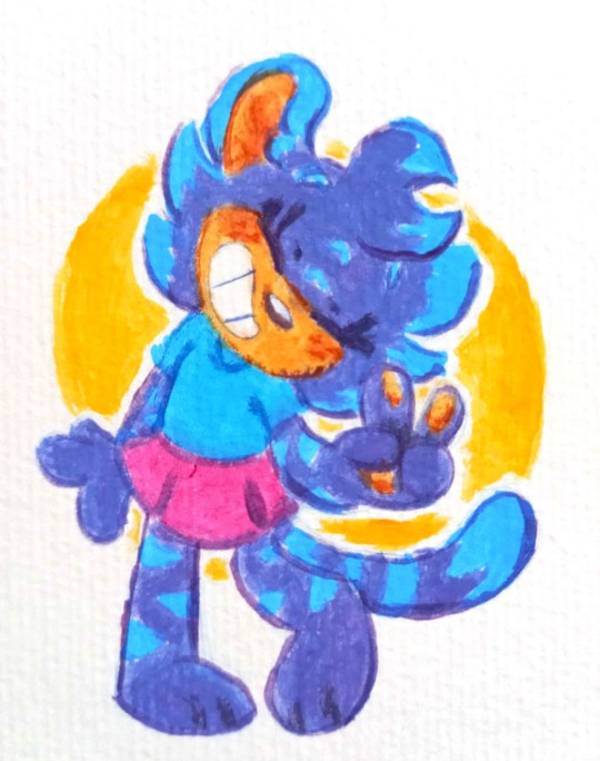
But for now, I am SUPER HAPPY with how my boys turned out! So fine. I said I’d get James’ nose right, didn’t I? And Rosie too, I’m so happy to draw one of the girls! BUT OH NO...I didn’t colour in her other glove. Ugh well I might edit this post later for the fix, but I just want to get the commentary out of the way. Some parts of the poses on the main four I wish turned out better, but the basic form is there and I got the mood I wanted in it. AND THE HAIR. I AM SO GLAD THE HAIR TURNED OUT RIGHT. IT WAS TOUGH BUT IT TURNED OUT THE RIGHT WAY. I REALLY LOVE DOING HAIR LIKE THIS AAHHHHHHH
it can go so wrong sometimes with ink, it’s very hard to do without the right control. so the fact that the gloss turned out even a little in the direction I wanted is a total victory for me! Maybe I might try to make Henry’s hair a little deeper green, as there’s a plot reason for that.
And I am really sorry if anyone was expecting me to go further with my canon renditions, but I think I just got too ambitious with the costume designs! They got elaborate and I’ve always enjoyed being meticulous with details and accuracy, which I liked...but then it got hard to manage and recreate for other pieces, so it was kind of like I shot myself in the foot but was too happy about it to notice the wound. Whoops. Drawin trains is harddddd
I will finish up those pieces so they’re not going to be left incomplete, and I did get Duck and Diesel underway(!), so those pieces will be made sometime soon too. Moving forward, there’s just gonna be a lot of train gems in black suits, but I’ve still planned unique designs for them all anyway. It won’t look too samey. It is going to be really fun! I have writing too! It almost feels like I’m making railway series stories, but with HnK it is wild
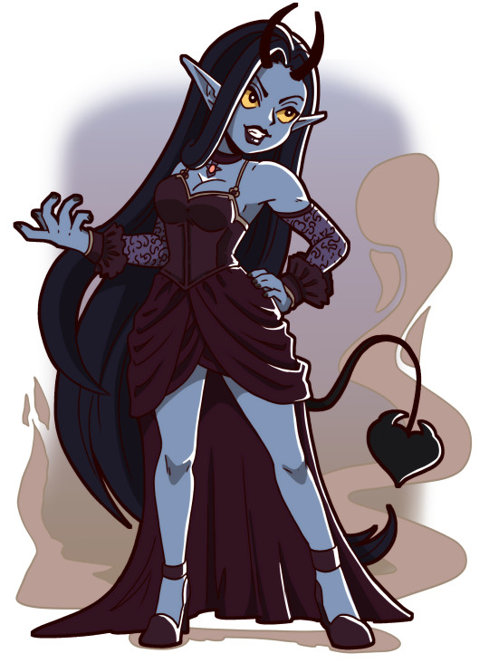
Gordon and James are just...*chef’s kiss* I have so many ideas for these two and they are looking so hawtie rn, they definitely came out as the best gem renditions so far. I’m so proud of myself for designing the leg pattern on James, that’s another plot related thing but it’s so on brand for him! In this au, their names (from left to right in the front) are BlueDiamond - mohs 10, Red Zircon - mohs 9.5 (and if you notice, the black I added for his hair is supposed to be Painite, which is why he’s not at a 10), Verdelite - mohs 7.5 (but he’s going to be fixed up with another type that bumps his mohs up BUT I CAN’T SAY YET rhrhhhh), PinkTourmaline - mohs 7. Now who’s in the back? There’s a couple you might be able to guess, but the other one won’t be familiar. Who’s who?
well I just want to save the surprises for later. Expect more to come soon!
#oh boy another long post#and some fancy new art#or at least only a few months old art#I wish I could remember the name of the person who first made Thomas and friends as gems that would be more helpful#ttte#houseki no kuni#zomg my art!#get ready for very beautiful humanized trains everyone
12 notes
·
View notes
Text
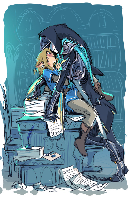
i don't draw ship art often,,, but even I'm not immune to office desk smooching aesthetics
and i already had this whole room designed so
#bazz#bazzlink#bazz botw#botw#totk#he's wearing his fancy captain getup hence the scarf and additional armor bits#but yeah i dont have that much to say about it i just wanted to draw some desk action and those two fit the bill#also twitter went bonkers for this one i think its now officially my most popular piece there (on that account at least)#and it got me like 100 new follows#just one shippy art#its nuts#does it mean i should draw boys smooching more often if i want to pull those sweet sweet numbers lol
474 notes
·
View notes
Text
looking at all the comparisons of the oldest to newest tmn arts again and honestly so sad that fjords nose got so straightened out like 😐 who gave him a nose job ! !!!!!!!!!!!!!!!!!!!!!!!!
#kiddo say#hell on planet exandria#hes just so yassified but not in a way thats fun to me#give him some fat back into his face its so sad </3#i like th long hair but . the hooked nose + beard with it couldve been so good. but instead he just looks dehydrated#thee post i mentioned in prev ask. it was in my drafts#matching post to me mourning cads hooded eyelids that got deleted in the fancy collectors figure sculpt </3#but he has monolids in the new art so ^_^ . we stay winning#i wont talk about the newer yasha designs . yous know how i feel lol#i dont want to be mean also bc i think jesters new look is cute and fun but shes also got that league of legends splash art anatomy going o#like the waist and back arch is so extreme her spines just misaligned#it makes me sad . someone help my girl . get her a snack also
242 notes
·
View notes
Text

my OC Tera at the Shellendorf Institute, enjoying some sun from the overhead skylights.
I saw an outfit on Pinterest that I liked so much I decided to draw her in it haha
#Heehee hoohoo I have a fancy new watermark now#I might makes some lighting changes but this is fine for now#my art#splatoon#splatoon oc#splatoon 3#nautilus#chambered nautilus#nautiloid#splatoon art#splatoon fandom#oc art#character design#creature design
99 notes
·
View notes
Text

Continuing to be back on my bullshit, I'm rounding out the year with the next installment of my Blue Beetle au nonsense or.
AKA @wazzappp 's Blue Beetle headcanons give me life and I'm yoinking them because. Everyone deserves a little body horror. As a treat.
(Well. Except for Oo'Li, by virtue of being the type of alien (yk more or less) that the scarabs are using for that sweet sweet basic DNA template)
Anyway, following my timeline of Jaime ending up with his second 'upgrade' after the reboot re: Khaji Da's last ditch effort to keep him from smashing into the ground of terminal velocity, Xiomara and Roma end up more buggified after their altercation with the Crimson Scarab in issue...2? I think, when their powers get drained, in the same vein of their scarabs getting inventive with ways for their hosts to defend themselves in power drain scenarios.
In keeping with their power-sets/specialities, Roma ends up with a scorpion-esque tail (yes ik that's not an insect but if she can manifest tentacles Im saying it counts) and retractable claws, while Xiomara has fully armored hands/gauntlets and extra insectoid legs
#jaime reyes#oo'li a'barr#roma lopez#xiomara erazo#reachling au#it took me almost a. month and fighting for my life against art block (and ok. being distracted by ghost rider) but i made it#kicking and screaming but i made it#yeah idk why i added fancy dress even tho. i lost steam soo fast its just. some social/public event about the Horizon idk#anyway roma and xiomara might have escaped reachification but buggification leaves no prisoners#speaking of which. technically ig the Horizon are fairly alien-y for. a protagonist alien species (<so has to be bc of the Reach) but#can always be more :)#it is. soo obvious i started using references 4/5 the way into this but. whatever its fine#and ok. the teasing between oo'li and jaime did get me#....it might just bc bc i made jaime like. 1/3 reach and i think the hypothetical interplay would be fun#the cultural barriers! the flipping of it being his humanity that's new to oo'li vs the uh. everything else hes got going on#its about the vibes (<aroace and yet again leaning into relationships as a thought experiment maybe but. whatever)#also she's taller than him and yk. thats always fun
60 notes
·
View notes
Text
I can't help but adore that there are not one, not two, but six gods of death in FR lore!
Like...
God of Death
In pretty okay grim reaper way
God of Death
In bloody stabby stab way
God of Death
In dominant daddy bbc way
God of Death
In chaotic stupid bullshit way
God of Death
In fair unbiased judge way
God of Death
In insidious alien insect mummy way
They warms my dark soul in an inexplicable way :3
#dnd#forgotten realms#bg3#I love them all your honor#(all except Cyric)#Myrkul#love his new bg3 hat and scythe#makes him look cool and fancy#Bhaal#he's okaaay ladies just don't look at the face#best dad#Bane#“Forgive me Black Lord for I cannot help but admire your MTG design”#“...and want you to be less twinky”#I hate the chains will never draw them again#Cyric#stupid bastard man#never do anything right in his whole mortal life and in his godhood too#also unintentional Mask image so there are two bastards on the same art!#Kelemvor#the man that erased his own personality in order to work better employee of the month#hope this kind of life is worth it after everything that you've been through in Avatars trilogy Kel#Jergal#favorite insect granddad!#with some of his bg3 jewelry it suits him#bg3 withers#the dead three
28 notes
·
View notes
Text

//Can you keep a secret?
#secret life#secret life smp#trafficblr#secret life fanart#traffic life spoilers#grian art#grian#gladumf does art#fancy art#dude the watcher lore in this season is amazing#I am living for it#the secret keeper scares me#I love it#also I was experimenting with a new brush so some of the strokes look weird#so ignore that
26 notes
·
View notes
Text
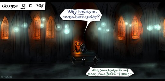
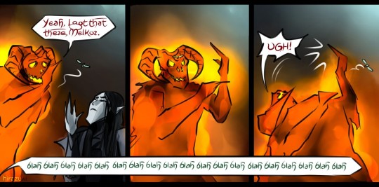
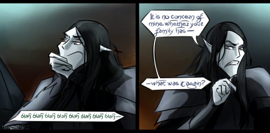
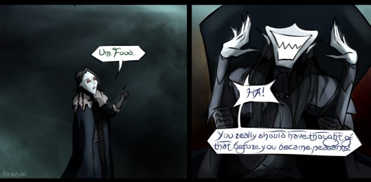
For @melkors-defense-attorney
This was the first and last time Mairon ever let him hold court in the traditional fashion. Everything from there on out was communicated through detailed written reports, directly on Mairon's desk XD
#melkor#morgoth#mairon#sauron#silmarillion#tolkien#gothmog#the silmarillion's new groove#my art#and yes the massive gothic-architecture style underground throne room has fancy windows that#look out onto the insides of the volcanoes and underground fires/lava pits#for some additional ambient lighting. for mairon's sake.#the interior lights are still heatless and gem-sourced though and it is still cold as fuck. sorry buddy.#silm#hira draws tolkien
90 notes
·
View notes
Text
Spent the past few days watching Layers of Fear (2023) walkthroughs
#and each and every endings#notes and whispers#also collectibles#PHEWH that was a lot to take in#nobody told me to prepare myself for the heartbreak that was the family ending 😭🤜💥#loving the rat queen’s voice tho#ghost wife’s new design reminds me of all the dried up paint textures on my palette#like i haven’t washed it for about 3-4 months now ew#cackled at the fact that rat queen called the daughter a rat for no reason in inheritance#lmao what is your beef with her#game also revealed the wife can play the flute woah#and her favorite color is green :D so real of her#i guess they didn’t really change much of the story in inheritance and lof 2#fancy glove for the actor now#also i need to draw the writer tho i like her fr#devs pls give concept art of the character if yall have any#the writer making au endings where the painter and wife just leaves the house lol#mr. scooter has two designs now????#akh :’’ but i really hoped the game delved in deeper about the writter and her son#the director and the rat queen’s lore gimme some of that lovecraftian shit#((i loved him most when he lost himself)) rat queen so insane for saying this#also wtf the game suddenly talking about the wife having green eyes in my head she will always have dark brown eyes 😭😭😭#how did the painter and wife get involved with the rat queen tho#thomas caldwell looking kinda sus hmmm#given the fact that the writer was recruited by some sort of agency/management but that’s just my speculation#okay i need to stfu tags r getting outta hand#should i tag this as layers of fear? idk#lof spoilers#bacotan loisiru
20 notes
·
View notes
Text


Some traditional oc stuff :)
#dottie the ladybug#melon blake#garin slate#mr. alder#lilly watts#yarrow watts#snap butterscotch#sabrina amaryllis#anthro#toma ocs#toma draws#these are all from like september-ish but i never got around to posting them so here they are#first four are watercolors and the others are gouache :] (like school gouache not the fancy expensive ones. but theyre very fun to use)#im a big fan of the dottie and mr. alder ones i colored those with watercolor and did the lines with gouache and i rly like the vibe#i should do some traditional stuff again.... i got a new watercolor pack thats super fun to use#(not pictured here these watercolors are like nearly a decade old and only like 4 colors survived)#anyway YEAH traditional art rules its super fun to get back to it once in a while
39 notes
·
View notes
Text
With dark horse confirming something w the trigun manga, I hope if it's a fancy new edition, it won't look like what they did to hellsing/berserk
#personal#please include nightows art on the cover im begging 🙏#instead of some logo#literally my ideal new fancy manga edition is how parasyte or the girl from the other side is#nice hardcover. medium size. glossy pages w colors and bonus content in the end 👌#show me that trigun omnibus bonis content!!#*bonus
16 notes
·
View notes
Note
Hello, hello! Remember me? It's been a while and I only just joined Tumblr so. Haha.
Anyways, just out of curiosity, which is your most favourite fanart that you made this year compared to when you first started? :D
Hello, you! Of course I remember you! Thank you so much for the ask~
The Metal Slug picture is definitely my favourite! It has everything I want to show off from bright colours to chaos, and even has scanlinese too which make almost any picture 10x better!
I have to give a special shoutout to some of my ArtFight pieces though! I really was able to practice the style I want to use for my game more and some other styles too!


My art has kind of gone in stages:
Learned how to draw
Learned how to scan drawings in to colour
Learned how to use a drawing tablet
Joined fandoms to draw more
And now I'm at a stage where I just want to create me own things and draw & write for them all the time. It's been a fun journey, despite the.... many, many, many, many, MANY detours, issues and general torment of wanting to create things.
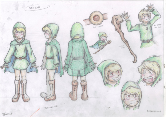
#i got an ask#me!#fancy that~#gem art#metal slug is the best#and hell#scanlines are for God-tier art#Fire Emblem is still fun#Three Houses is the best of them#New Darkstalkers please#please#please please#Bebby boy Alfin in his earliest design#He's evolved#...some...#actually...not much
7 notes
·
View notes
Text
The portrait art made for this post. My flower skills have a long way to go as usual, but from left to right, the intention was: lily-of-the-valley, woundwort, aconite (wolfsbane/monkshood), black hellebore, yew (flowering), bluebell, and lily.
#on some level I want to make another attempt at this to try to get it to match the style of the old carmen and balthazar better.#but also I could just. update those to be bigger and fancier#that's the evil voice in my brain saying I could always do a new fancy balthazar portrait for no reason#asperia (system)#emi art#I like how I'm 90% sure that the colors I lazily chose for Nausea directly contradict the description I wrote of it
5 notes
·
View notes
Text
i think its kinda funny that ibis paint is regarded as the Broke Artist App or whatever (as opposed to more mainstream programs like csp or procreate) because its free and because of how popular it is with phone + finger artists while im jusg sitting here having used ibis for a cool eight years on purpose.
like i have an ipad and an apple pencil and all theyre very nice and i absolutely could move to a more powerful program i have the resources to do so but my change averse brain has decided they like it here a lot and im not leaving
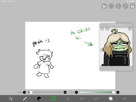
#not talking smack on phone and finger artists btw. some of my mutuals use their fingers and their art goes crazy i respect that so much#even when i did use my phone (most of 14 crush was done on a phone!) i still had to use a cheap rubber stylus hahaha#anyway maybe ill try procreate someday but also i hate learning new programs and i like ibis's brushes too much#fingers crossed that they add fully custom brushes someday though#like id love to be one of those artists that makes really cool art with ridiculous shapes and nobody even knows until they tell you#younger artists might not know this but modern ibis is STACKED compared to how it was in 2015#like i remember when clipping layers were first implemented. and they sucked. like they didnt fully go over the lower layer#so it just left a gross tiny outline around the shape#and there wasnt any border or text tools either#and there was a hard cap on layer count depending on your device's storage and the canvas size#modifying brushes wasnt even a thing HAHAHAHAH you just used what you had#anyway okiku reference window unrelated shes just there for something else im working on<3#bri talks#for the record all this is to say i think the smack talk towards ibis is pretty unwarranted#like yeah maybe its not as powerful as a lot of these fancy paid apps but i honestly think its insanely good for being a free program#i think getting rid of the ads costs more now than it did when i paid to get rid of them but i mean#free with ads is still a lot more than csp's ever gonna give you!!!!#(psst. secret from me to you! you wont get any ads if you disable the app's data usage and turn off wifi when you use it)#(alternatively just use airplane mode but you can still get texts and stuff the first way)
17 notes
·
View notes
Text
HEY there's new folks here since I last rambled about Rebelle, and they've got a HUGE sale going on for the preorder of the next version, SO
TL;DR: amazing traditional-paint-emulating drawing program on huge preorder discount, $30 for Pro version GO GET YOU YOURS
I've been using the digital art program Rebelle for a bit over a year, and it is SO GOOD at emulating the feel of working with traditional paints, pencils, and pastels! It's got thick (or thin) impasto texture for oils/acrylics, water physics (!!) for watercolors, and can actually use the texture of your canvas to affect both wet and dry media brushes. It feels SO MUCH better than hooking a texture into a brush and working on a canvas that just...doesn't match it, or applying a texture afterward.
BUT ALSO they're gonna be updating it soon, and adding not just standard digital niceties, but also METALLIC. PAINTS. Plus more texture stuff you can control, and even better texture reactivity, but METALLIC! PAINTS!! USING THE BUILT-IN LIGHTING AND TEXTURE SHENANIGANS, INSTEAD OF HAVING TO MESS AROUND WITH WRANGLING/OUTSOURCING EFFECTS YOURSELF
And the pre-order price from now until November 30th is ONLY $30 for the Pro version (which I absolutely recommend!), when the price is usually $150 (!!). The Pro preorder price will increase to $50 from December 1st to the 13th, then full price when it releases on December 14th. And they don't do subscription! Just free updates (typically good and/or requested features, as well as bugfixes), in between full upgrades like this that have been HUGELY discounted on release.
You can check out further info on Version 7's upgrade features, as well as the link to buy it, via the link at the top of the post. BUT if you wanna test out basic watercolor simulation, and/or test the trial version of Rebelle 6 (I think) to see if you like how it feels? You can check out this link: https://www.escapemotions.com/products/rebelle/try/
(Also they often do this sort of thing with the free bonus papers for spreading the word, as mentioned at the beginning of the Version 7 info link. I think it's happened...at least each time they've done a version upgrade, maybe once or twice in between? And it's been a different set of papers each time. But I already did my shared-post earlier. This post is genuinely just 'cause I think stuff like the feel of brushes reacting to visible texture and water physics (which you can pause!) are SO NICE, and the preorder price is bonkers-cheap. I still need side stuff like Affinity for like...fonts, but Rebelle is my current favorite for actual drawing and painting.)
PERSONAL EXAMPLE TIME
Playing around with watercolor drips, because you can control the "tilt" of the canvas (via either a tablet's features if it can, or a disk in the UI if not): Bakuratober Ghost prompt
Using canvas texture to get a RAD cracked-paint look on a dark canvas (I used the Straw canvas from the "Mulberry Coconut & Straw" purchasable paper set): Bakuratober Vampire prompt
Taking advantage of thick acrylic texture (plus watercolor which flowed into the brush streaks for emphasis), to simulate both muscle and sand texture (body horror warning): Bakuratober bonus prompt (Nightmare)
Combining a mildly textured pencil with a subtly textured canvas to emulate how I use physical colored pencils (plus layer effects for glowy ghosties): Bakuratober Dancer prompt
Combining wet canvas and watercolors to let the pigment feather out to create a "blurry" foreground effect (plus setting lineart as a masking fluid layer to keep colors contained): Disco (Elysium) Harmony
#rebellle#rebelle 7#art programs#get you some fancy digital paint#that uses 3d-type features to make the canvas and thick paint look legit#and feel so much closer to traditional art than any other program I've used#except I can actually work well with watercolors because I can pause the physics or cleanly erase#there's more neato features but I've already rambled so much#I've done some other stuff but most of my experimentation was with Bakuratober prompts okay#and I did those in Rebelle 5 but they would've been easier in 6#because that added clipping masks and suchlike#but otherwise they would've looked the same#I'm kinda glad I've been too burned out to do an upgraded/Rebelle iteration of Dr. Armitage yet#(as is my wont every time I find a new drawing program)#because now I'll be able to use the TYPOGRAPHY PAPER since I can change its color#and NOT HAVE TO SWAP PROGRAMS TO ADD THE GRADIENT#and shiny new unique bonus of LEGIT-SILVER PEN NIB FINGERNAILS
1 note
·
View note
Photo
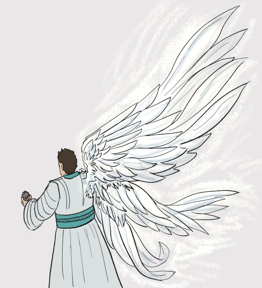
q in tapestry but he has fucked up trigun plant wings because i can
#my art#doodle#rough sketch#digital art#idk messing around with some new clip brushes i downloaded#nothing fancy
19 notes
·
View notes
Last Seen Blogs

undersinkwaterfiltersfan
Under Sink Water Filters

tiredvp
K 🦇

parthh-digital
PLUS SIZE CLOTHING MANUFACTURER

playonrepeat
Untitled