#my main issue is tutorials that are like ‘this is a color scheme’
Text
i hate that every time i look for color studies and tips to improve my art and make it more dynamic and interesting all that comes up are rudimentary explanations of the color wheel that explain it to me like im in 1st grade and just now discovering my primary colors
#text post#my main issue is tutorials that are like ‘this is a color scheme’#like you’re not saying anything!!!!#top posts#check notes for references!!#10k#15k#20k#30k#40k#50k#60k#70k#80k#90k#100k
138K notes
·
View notes
Text
oh yeah, now that it's closed, here's the post i wanted to make about that rt rebrand poll i made last week. this will be pretty long and kinda rambly, so feel free to just blacklist the "long post" tag :)
so like, i made the poll because of 2 main reasons: 1. because of a mix of comments i saw on other sites from people who also didn't know what color it was supposed to be, and 2. because of myself confidently believing it was some shade of orange until i switched from looking at it from my laptop screen to my phone screen.
it being a godawful shade of red/red-orange was mentioned in the article itself, which is why my question was phrased "what color do you guys think it is?" since either red or orange is both technically correct. going more into the specifics of the poll numbers:

tumblr doesn't show the specific number of people who voted for any given poll option by default, just the percentage, so i went digging and followed this tutorial to get the raw data using firefox's inspect tool. the final results are, with 934 votes total, red at 551 votes (59%), orange at 303 votes (~32.4%), and other/a secret third thing at 80 votes (~8.6%).
red winning wasn't a surprise, really, but i was pleasantly surprised at how many people didn't have a definite answer or switched between answers like i did. i can't exactly pin down why that is, but if i had to wager some guesses...
the color scheme has a high chance of being a callback to rooster teeth's Popular Web Series Red Versus Blue™:

and with a want/need for rt to rebrand, the idea of keeping the color scheme while also making it modern and pop out is really cool, but its execution is uh...
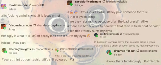
i couldn't fit everyone's tags, but you get the gist. it fucking sucks, man.
as @god-of-arts-and-crafts has pointed out:


orange and blue are complementary colors, with them being opposite each other on a color wheel except the people who made the rebrand chose a deeper shade of blue??? they couldn't even get that right, oh my fucking god, so while its technical color is red-orange, it can be overwhelmingly orange when paired with a similarly bright shade of blue, which is what's causing many people eyestrain. hell, the first time i looked at the picture when the news dropped, it literally gave me a headache lol
finally, as i've said in the tags of a different post about this eyesore, this is an accessibility nightmare. with the worst color combination possible, the colors used for the new font and logo are definitely not ada-compliant. there are free sites out there to test images for general accessibility issues. contrastchecker is what i use sometimes, and below is what i got using red-orange as the background and blue as the foreground, and vice versa:
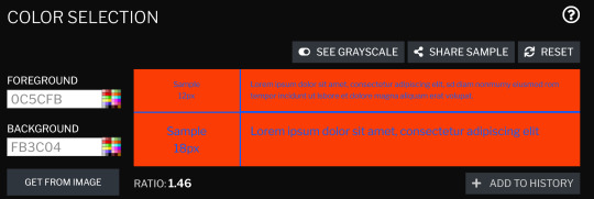


(both versions had the same ratio and color difference lmao)
the americans with disabilities act recommends that the contrast ratio be 7 at the lowest, but should ideally be higher than that, if possible. this is objectively and subjectively a very bad corporate rebrand, and i really, really want rt to break their "no jokes on april 1st because that's our anniversary" rule this year. if for nothing else, then just so that people who haven't read the variety article and/or the reactions on social media aren't jumpscared once the new intros/endcards/whatever else start rolling in.
#i almost made the third poll option be ''it's bad/ugly whatever it is''#but i knew that would win by a landslide#roosterteeth#rooster teeth#achievement hunter#funhaus#rvb#red vs blue#rwby#eyestrain tw#this is a joke buut i hope whoever finalized this got fired#i would say someone in-house could've designed a better one#but given how many people got their roles dissolved or voluntarily chose to quit last year#i genuinely don't know how many graphic designers are left at rt hgfdhhgfdxgh#long post
53 notes
·
View notes
Text
Progress Report #2
Quite a lot has happened since the last update, some good, some bad...
First of all, there’s the pre-production phase. Last time, I mentioned that I had to do the color schemes for Sasha and the obstacles. To be honest, that was much harder than I anticipated. The first issue was that I switched to digital for the color scheme. I am still not good at drawing on an iPad, so it took a while to finish the drawing. Then, there was actually figuring out Sasha’s colors. I had decided early on that her main color would be green. Beyond that, though, everything was difficult. I experimented with a lot of different colors schemes, but they were not working. At one point, I figured out one reason why I was having trouble: Sasha’s boots were messing with the balance of colors. So, I redesigned her to have longer pants and sneakers instead. Not only did this make her palette work better, but I feel that this makes Sasha look more like a vigilante teenager (versus the boots, which I now think made her look more like a professional soldier). The palette on the far right (not the transparent one :P) is the one I decided to stick with for the time being, though for reasons I’ll explain soon, I may change it again…

I also did the color schemes for the firewalls and servers, which was much easier. Then, I worked on the UI. This is where I encountered yet another issue with the color scheme. I originally wanted the floor of the play area to be a light color with dark grid lines. However, I found that the opposite (dark with light grid lines) works better. The only problem is that now, the servers, firewalls, and even Sasha don’t stand out enough against the floor. This is clear when you look at the grayscale version of the UI: Sasha and the obstacles are already dark, so they almost blend in with the floor. Since I already decided that the floor needs to be dark, the only solution will be to change the color schemes of Sasha and the obstacles… hopefully, I can find some time to do this.
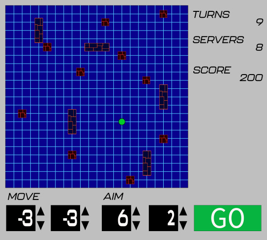

Okay, but enough of the bad news. Let’s get to the good news. Save for adding the concept art, I finished the game design document (or at least the first draft… I’ll explain pretty soon). I also got started on the first build of the game! I have included a video showcasing what I have so far:
That being said, I am not completely finished with this build yet. As you can see in the video, Sasha (the blue square) moves and shoots at the same time. However, I want to make it where she will only shoot once she has finished moving. I think I will be able to figure this out rather easily, though.
Of course, making this build didn’t come with its challenges. The first obstacle involved following a tutorial I probably didn’t need to follow; although it was useful for creating the grid, I realized that it also involved a movement system that my game would not use. Once I realized this, I decided to stop following it.
A bigger issue involved Sasha’s movement. I encountered so many bugs when trying to program it, such as:
Sasha not being perfectly aligned to the grid when she stopped moving
Sasha shaking uncontrollably whenever she stopped moving (and even when I just booted up the game)
Sasha not even moving at all
Sasha respawning at the wrong area when she ran into an obstacle (she is supposed to respawn at her last position)
Fortunately, I was able to solve all of these issues. Right now, besides making Sasha shoot after she finishes moving, my biggest issue involves the respawn mechanic. I originally had it where Sasha immediately respawns. However, my plan was for her to have a short “hurt” animation beforehand. The only problem is that Sasha seems to get stuck inside the obstacle. This means that the collision code keeps triggering, meaning that Sasha will never get a chance to respawn. I think I can find a way around this, but it may involve changing the animation I had planned.
Speaking of changing plans, I have decided to remove the eviction bot from the game. Considering all the trouble I’ve been having with the code so far, I do not feel too confident that I can properly implement this feature. The main reason I had the eviction bot was to force the player to keep moving across the grid; now, I’m thinking that I can do this just by placing the servers and firewalls in a certain way so that the player cannot shoot all of the former down from a single position. I’ll have to update the game design document to reflect this.
That’s everything that has happened up to this point. In the next few weeks, I’ll finish the build and redo the color schemes (I’m also thinking of changing Sasha’s hair style… we’ll see…). Then, it will be time for some playtesting. Let’s see how things go from here…
4 notes
·
View notes
Text
AI swimming, key/doors and "RUNAWAY"
After adding SWIM and CLIMB states, i tried adding SWIM states to the Companion but there's a catch.
I technically succeeded at adding swim states to the Companion (2 states equivalents to FOLLOWME and STANDSTILL so it can chase the Player underwater) but the one issue is that the character vibrates when on SWIMMING state.
My theory is that the movement is coded in a way that there's no proper diagonal movement, so it's actually switching between horizontal and vertical movement really fast.
It's what i get for simply copying Gonkee's Jared AI project without studying a bit further.
Because otherwise, it's technically "there" but it just looks off.
Key/Doors:
There's solid doors that block paths and keys that can be picked up to open them (With a basic red/blue/yellow color system).
Best part is that the Player's "has key" variables are false by default as a scene is loaded, so i don't have to check if the Player can or can't open a door without picking up a key first.
An issue (Besides maybe some notifier on the HUD/screen) is that i wanted to make Companions able to use keys but so far, it didn't work.
Which can be weird because stuff like the Health pickup and Jump pad work for both characters.
"RUNAWAY":
I simply thought "what if the Player will want the Companion to go forward without having to use FOLLOWME?" and created a "RUNAWAY" state/command.
It's essentially the opposite to FOLLOWME and could be useful in some scenarios.
Perhaps an issue here is the future controls of the game, since this will be a keyboard focused PC game unless i figure a way to set console controller inputs somehow.
It's also clear that the Companion AI will always be limited and impact level design in some way.
What else:
Pushable situation: Still on a break.
Maybe the "hurtbox/iframe" situation may also be on break.
Even in the main Github page, i've already written stuff that may need fixing in the future like if the health bars of both characters should be placed on the screen like a proper HUD.
But i've also been thinking on working on a level switch/button feature.
Something inspired by Pacman World where yellow/blue/green switches have specific functions based on their color.
Blue is "permanent", green is "toggleable" and yellow is timed (Not entirely like Pacman World but still).
The idea is that these switches are "modular" in the sense that in different levels, they can fill different effects and uses, even if this area is complicated.
I was thinking that at least, they could be related to moving platforms or something else besides doors because technically, the door stuff is already fulfilled by the keys (Maybe).
Unless i create different scenes for specific blocks/platforms with code based on receiving some signals and select some of those scenes for a level.
This also makes me wonder about the actual interaction:
If it's "automatic", the Player has to be carefull with when they touch the switch and if the Companion can bring a bit of trouble with pressing a switch in the wrong time.
If it's manual, i'd be setting up even more RayCast2D nodes and creating a new Input to make the control scheme more complex.
But this is just speculation.
I've seen a tutorial video where both a switch and door were under the same "scene" and the video used "editable children" to place each object uniquely in a level. But i'm pretty sure that "editable children" can impact a scene in general if i wanted to reuse it differently in multiple levels.
0 notes
Photo


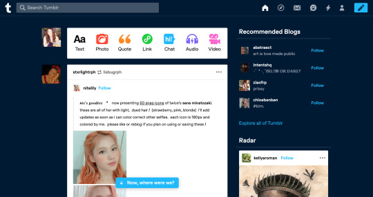
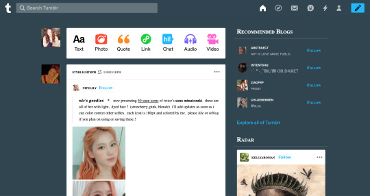
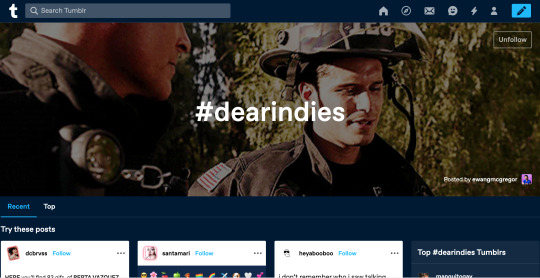
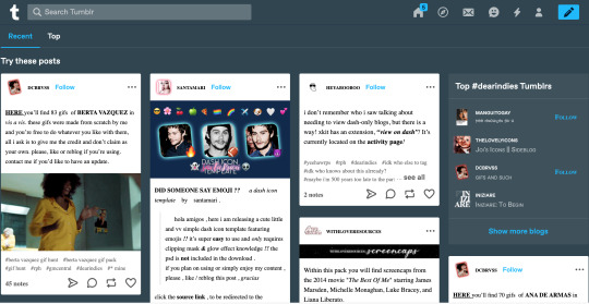
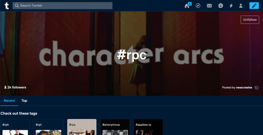
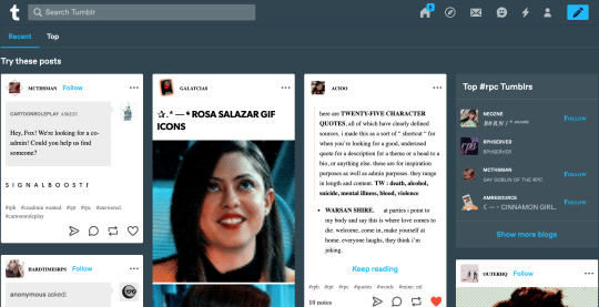
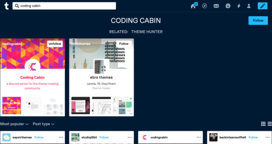
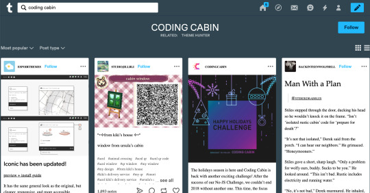
Stylus Dashboard: ‘Ashy Blue’
Blue/Grey themed Tumblr dashboard made with Stylus/Stylebot for Google Chrome or Firefox. This dashboard theme fixes/changes:
the huge banner (highlighted post) on tagged and search pages
it removes that annoying ‘Now where were we?’ on the main page
it makes all small, sup, sub, etc. fonts, into the SAME size (say good-bye to squinting)
1. Install Stylus: download & install Stylebot extension for Chrome or Firefox; make sure it’s pinned or otherwise easily accessible!
2. My CSS: copy my code from HERE
3. Install CSS: click the Stylebot app (for chrome, it should be to the right of the address bar), click “Open Stylebot...”, click “Edit CSS”or “Code” (it’s on the bottom), paste my css code & SAVE!
If you notice any glitches or have any troubles, please don’t hesitate to send an ask. If you’d like to learn how to make your own/edit, check out this handy tutorial. If you’d like to request a color theme/scheme for me to make, feel free to hop into my inbox! A like/reblog is always appreciated but not necessary! ENJOY! revamped 8/3; fixed issues with headers & color displacement!
60 notes
·
View notes
Text
What Paints are Good for Historical Miniatures Beginners
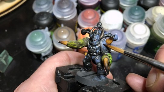
(This article is credited to Jason Weiser. Jason is a long-time wargamer with published works in the Journal of the Society of Twentieth Century Wargamers; Miniature Wargames Magazine; and Wargames, Strategy, and Soldier.)
Having been a wargamer for 37 years and a miniatures (tabletop) gamer for 34 of those, I tend to get one question from a lot of novices - “What’s a good paint brand to use?” The truth is, everyone has their favorite brand, and everyone has their likes and dislikes. Some paints are, confessedly, better than others. At least, in my humble opinion, they are. But you are reading this because you did just want my opinion, right?
I am going to stick to paint brands I am familiar with. And the first thing I am going to tell you is the first rule of paint selection I learned and never forgot in 34 years as a miniature wargamer.
USE ACRYLIC PAINT!
Acrylic paints are just better all around. They mix easier, are cheaper overall, and clean up a lot easier than oil-based paint. Your cleaning solvent for acrylic paint is as close as your sink tap! However, don’t get any on the carpet. No paint is coming out of that easily! Also, another tip: Use flat paints. Gloss does not look good on historical figures, or any sort of wargaming figures for that matter.
So, with that, let’s get started.
Vallejo
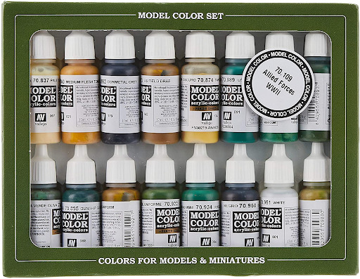
Vallejo is, to me, the best general-purpose hobby paint line out there. Most of the line comes in 17ml eyedropper bottles and are clearly labeled as to the contents. (Pro tip: Put the Vallejo stock number on the cap, as it’s a good way to know what’s in the paint bottle). The paints themselves are of a good quality, but you have to be careful how much you load your brush as they aren’t pre-thinned. You’ll need a palate to use the paints, but that’s a plus as a bottle can go a long way. Many of their Model Colors and Panzer Aces lines correspond to historical colors, which is also a plus, and many tutorials have the Vallejo Model Colors or Panzer Ace stock numbers as default color listings, so matching colors to the cool tutorial for “How to paint your Bolt Action 28mm Hungarians,” for example, is a snap.
Vallejo is my go-to brand, and I really recommend it for the novice painter. They also come in sets with everything you need for a given subject (in fact, Vallejo even markets specific sets for Flames of War and Team Yankee. A big plus for you guys!). However, be careful of the Model Air and Game Air sets, as they’re meant for airbrushes and do not take well to brush painting. That said, if you have an airbrush, they’re a good solid set of colors to start with.
One of the other things I like about Vallejo is it’s a full-service line. They sell primers, spray paints that match their Model Colors and Game Colors (Fantasy) lines, and just everything you might need. As your painting and techniques improve, they have the product for you. You just cannot go wrong with Vallejo.
Army Painter
Army Painter is another fine beginner-friendly line. I use a lot of their specialty products (their ready mixed tones and washes and their tools), but their paints are awesome.) They offer a good pigment and also come in the eyedropper bottle, like Vallejo. I am a little bummed they don’t have direct matches (or attempts at matches) to historical colors, but I really like their reds. It’s a really vibrant color that stands out on a figure (Pro Tip: Use grey primer instead of black.
It’s a lot easier to paint red, yellow, or even white against, useful for those yellow Spanish or White Austrian Napoleonic uniforms). You also get a little more for your money at 18ml of paint in a bottle. The paint lines also come in beginner-friendly sets and tend to be a bit cheaper than Vallejo. Get the Warpaints Starter Paint Set pictured below:
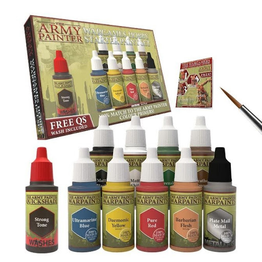
It comes with your ten basic colors, a brush, some shading which will do wonders for the looks of your models, and a very handy instruction manual. If you’re a novice painter who’s never picked up a brush, this is the set to get.
Reaper:
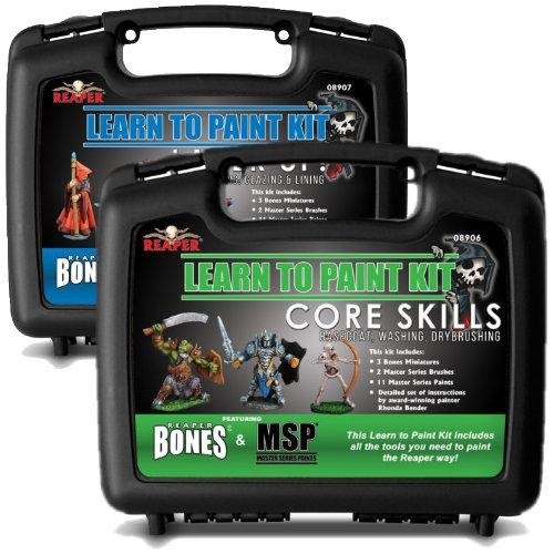
Reaper is also another line of paints where you “can’t go wrong.” I find their flesh tones very high quality and would recommend them over any paint line outside of Foundry (more on that later). Reaper also has paint sets, and it will take a lot of work to match them to historical colors, but it can be done.
Their eyedropper bottles come in a little smaller than either Army Painter or Vallejo, but the paint is also a bit cheaper in the States as Reaper is an American company (Vallejo’s based in Spain and Army Painter is mostly based in the UK). Reaper has its own beginner sets, and while they’re fantasy-oriented, the paints work as well for virtually anything. It also has its own carrying case.
They’re slightly more expensive than the Starter set Army Painter puts out though, but you do get a lot more for your money with a carrying case, 11 bottles of paint, two brushes, and an instruction guide. You also get an empty paint bottle if you want to preserve mixtures, and a few free fantasy minis (gotta practice your historical schemes somewhere, right?). It also has a very useful instruction manual that will give you some useful tips on how to paint.
MiG/AK:
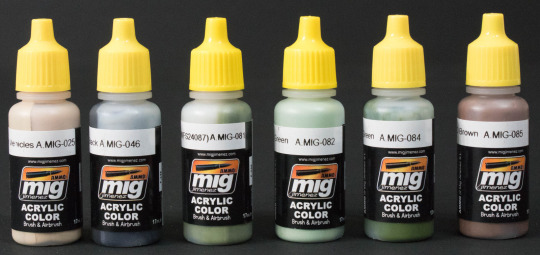
While both lines are great and have a lot of specialty options, these really aren’t paints for the beginner model painter. Heck, it took yours truly a while to crack the code on both colors. Are they good colors? Yes. They both have the nice eyedropper bottle setup and are just wonderfully pre-thinned paints that brush on or work well in an airbrush. And they both have a ton of specialty colors that match the historical wargamer’s needs (especially 20th-century conflicts). However, they’re not for beginners. But once your skills increase, give them a try. Trust me, you will love the results (Pro Tip: They look especially good with an Army Painter wash).
Foundry

I rather like Foundry, especially their non-Caucasian flesh tones. Often, their other colors are a bit off. The paint is a bit thicker than Vallejo, but if you thin it out just right, you get some really vibrant results. Moreover, I love their “Triad” system, where they sell the same color in three different shades including a base, a shade, and a highlight. While this means they don’t sell singles, or at least I haven’t seen it, it does mean you get a system that works well for a lot of subjects. They even wrote a book about it by Kevin Dallimore (who’s probably one of the best painters out there).
It’s a weighty tome, but it’s worth it, and it has a wealth of historical subjects and details on “how to paint them.” My biggest complaint about Foundry? The bottles. I really do wish they’d go over to the eyedropper model. I don’t love paint pots, though you do get a lot of paint per bottle (20ml). The cap can become hard to close the more you use the paint, which then leads to dried out paint.
Solutions to the problem include either:
Getting a pipette set, empty eyedropper bottles from Reaper or Army Painter, and transferring the paint,
This idea from Dr. Tabletop.com, where with a bit of work, you remove the cap, snap on the spout and voila! Instant eyedropper bottle.
Citadel
Many people swear by Citadel as an option for beginning painters (especially with their new Contrast system.) More often than not, though, Citadel is as hit or miss. Sometimes, like with some of the Contrast colors, you can get a really nice shade and wash pattern (the reds in the system, for example, would do well for British uniforms from the 17-19th Century, for example), but less vibrant colors, such as greens or greys, don’t do as well in the system. And, you have to prime white with Contrast colors, or at least a light grey. This means, if you miss a spot, it’s going to be rather obvious.
That said, there have been good results with some figures (especially science fiction projects, but that shouldn’t differ from Historical miniatures). The main issue is this, Citadel has two major problems. One, it’s expensive, especially the Contrast paints at $7 a bottle for 18ml. And second? The bottle design. In two words? “It stinks.” The bottle is topsy-turvy and top-heavy that spilling is almost a guarantee. Considering what you pay for Citadel paints, this wasn’t a particularly good move on Citadel’s part. I’d recommend either, again, transferring the paint, or getting Dr. Tabletop’s toppers. Either way is going to save you a lot of aggravation and money.
Also, keep in mind, Citadel is made for fantasy and gothic sci-fi, so the names of the colors are lurid, to say the least. That said, they do have beginner-friendly sets:
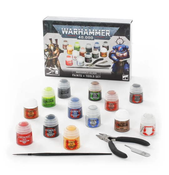
At 45$, it’s pricy, and there are cheaper, better alternatives for someone just getting into the historical side of the miniatures hobby.
Tamiya
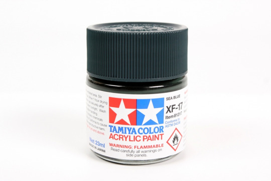
Tamiya is one of the old stalwarts of the model building community and was one of the first Japanese model makers to market kits in the US. They have a really good line of paints in rather large bottles. If you’re not going to go eyedropper, then this is the way you package your paints. Everything just fits together in terms of the bottle, including the price of the 23ml of paint you receive. The paints fill historical needs very well (especially for Cold War and Modern subjects, or WWII Japanese), and they are of good viscosity.
Like Vallejo, they also have a complimentary spray paint line, but you don’t get as much for your money, so unless you need a specific color, it’s not worth the cost. Other than that, I don’t have any complaints about them. I tend not to use them as my go-to, save for certain applications like NATO 3 tone woodland camo for 1980s American and West German Tanks. They play well with other colors as well, but they are bit pricy. I wouldn’t recommend them to someone just starting out in the hobby, but as your first paint line to step up from? You could do a lot worse.
Lifecolor
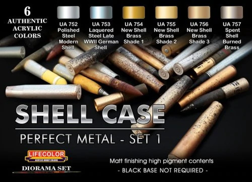
Lifecolor is an Italian company, and I only have one set of theirs. Their bottles aren’t the greatest, but I am happy with the quality of the paint. The choices of colors abound, but I would recommend Tamiya slightly over Lifecolor, even though I think the latter may have the edge in choices of colors and the breadth of historical subjects is as wide as you can imagine. If you want it, Lifecolor probably makes a set to cover it.
Surprisingly, you get 22ml of paint from their bottle, but the bottle is all plastic. The paint is pre-thinned, but slightly thicker than Ammo or MiG, but I still think it’s not really something I’d recommend to the beginner. That said, they’re a great set of paints if you’re ready to make the leap to the advanced level.
Privateer Press (aka P3)

P3 paints are a solid, workmanlike choice for the beginner. They are bright, vibrant colors, that, while flat, they go on solid and have no real sins to speak of. They come either in sets of six or individually. I have a bunch of them, but to be honest, I don’t use them as much as some of my other color ranges.
Despite their perks, P3 paints do suffer from the same problem as the Foundry paint line, where they have subpar bottles. They have 18ml of paint, which is about average for the industry, and I do like their Pig Iron color for a lot of gun barrels and other metallic items. It’s a solid set of colors for a beginner, but I really think you could probably do better with Army Painter or even Foundry.
A Word About Craft Store Paints
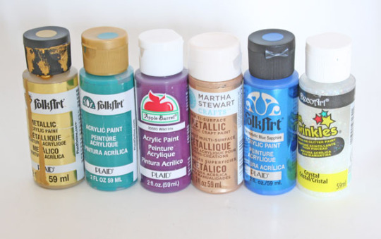
You can find them at Michaels, or Walmart, or just about any other craft or big box store out there. They’re cheap (ranging between $1-$1,50 a bottle, whereas your average hobby bottle ranges around $3), acrylic, and you get a lot of paint (the average craft store paint bottle is 59ml). And, you get a squeeze top, which is darn nice to put paint into the palate with. But, as they say, you get what you pay for.
I have come home with paint I was looking forward to using from Michaels only to find out the paint was separated (pigment and fluid have come apart) or it’s become rock hard. That said, I have wargame buddies who only use craft store paints, including one guy who painted some very nice 28mm German WWII Fallschirmjagers (Paratroopers), and I have to say, I can’t tell it was all craft paint. Just know what you’re buying and don’t buy some glossy glitter bomb paint by accident.
At SJR Research, we specialize in creating compelling narratives and provide research to give your game the kind of details that engage your players and create a resonant world they want to spend time in. If you are interested in learning more about our gaming research services, you can browse SJR Research’s service on our site at SJR Research.
2 notes
·
View notes
Text
The Sims 4 Console: New Game Patch (October 31, 2018)
There’s a Sims 4 update available for players on console.
UPDATE: 10/31/2018 – v1.12
Hello Simmers!
‘Tis the Seasons to be jolly, almost! As we approach the end of the year, we looked at some of the more requested features from console Simmers to bring to this update. As well as feature requests, we focused on stability improvements and prepare your Sims for one of the most requested packs. Let’s jump in to what’s new.
What’s New?
The Main Menu is important - you can start a new game, resume an existing game, see what packs you have, check the control scheme and… that's about it. Turns out that you wanted to do more, so how about switching which pack background you see? While on the Main Menu simply press Left or Right on the Right Stick to cycle through the backgrounds from The Sims 4 game and some of the packs you have installed. Best thing, your preferred background will be there the next time you return to the Main Menu.
To Save or not to Save? That is the question! For some Simmers, 5 saves was not enough so we have bumped that up to a 10 save capacity plus your Autosave.
General Issues
Some of the tutorials contained images that were inexplicably different sizes; we did a pass and now they are perfectly aligned.
Autosaves should always be represented by a portrait of your Household, but there were some opportunities for it to be blank. We have refocused our cameras and readied the photographer to generate accurate Household images for your save games.
Glass Roofs weren’t quite as glass as we would have liked with sunlight not reacting as we would have hoped. With a bit of polish, the glass lets the light shine through just like you would expect.
Oakenstead and Cypress Terrace in Willow Creek are some of the largest lots. They aren’t so big that daylight should act differently compared to the rest of Willow Creek.
Building takes skill and a creative eye. What it doesn’t need is a camera that appears to have a mind of its own. Now the build camera will stay on the floor you are working on, it is up to you when you want to move up and down floors.
The Camera Speed setting seemed to have its own speed in mind and it wasn’t necessarily the one you wanted.
Sometimes you zoom in on your Sims to check out what they are up to, but sometimes you couldn’t zoom back out. Now you can!
Live dragging objects makes moving things around a lot easier. Being able to Live Drag objects into a Sims’ inventory takes that a step further.
We addressed an issue which saw performance levels drop in some Lots and only recover if you travelled to a different Lot.
"Change Personality Traits..." panel for the Re-Traiting Potion can be backed out of, if you change your mind about changing your personality traits that is.
When creating your Sim, the profile icon had an distracting side effect as it updated to your changes. The profile icon will instead update when you have finished making adjustments and de-selected the active slider.
More community creations have been added into My Library.
We have dealt with a number of nasty issues that led to some stability issues.
Get to Work
A good detective follows the clues and solves the mysteries. Previously it was difficult and even impossible to investigate when you arrived on the scene. We polished the magnifying glass and isolated the witnesses so now you can investigate and solve your way to being the best detective in town.
Part of solving a crime is to talk with witnesses. While we can’t guarantee the answers you get will help you solve the case, the “Chat with Civilians” lets you talk with the Sims without having to repeat yourself a second time.
Get Together
While in Club Manager and accessing the Club Perks, the controls sometimes jumped around like a Sim on the dance floor. That made it difficult to select your options. Things are a lower tempo now, except the music beats.
Cats & Dogs
Everyone loves pictures of their Cats & Dogs but that doesn’t mean the camera should magically gain another frame. Now you get 5 photographs per photography session and no more, so pick your shots wisely.
Vampires
Vampires may not be able to see their own reflections, but that doesn’t mean you shouldn’t be allowed to remove facial features you added and changed your mind about. Eye Sockets/Brows/Mouths/Eye details can all be removed by selecting them again in CAS.
PlayStation 4
Simmers are creative by nature, so it came as little surprise that you needed more space to save your creations into My Library. There is now significantly more room to save additional Lots, Rooms and Households without compromising on what to keep.
The Sims is a colorful world, and if you tilted the camera just so, you got even more color thanks to the multi-colored walkways that would appear. We toned down the color scheme, so now the walkways shouldn’t look like a rainbow fell onto the ground anymore.
If you bought a Bundle of The Sims 4 packs and need quicker access to download them, the icons on the Main Menu will now take you to the download section of the PlayStation Store.
Xbox One
During the initial loading of The Sims 4 there was a black void that seemed to last forever. While it is part of the loading sequence, it should be a lot shorter, meaning less time wondering whether your TV is still turned on.
If you prefer to buy your packs in bundles, you may have noticed that the pack icon on the Main Menu incorrectly informed you that you didn’t own the pack. The pack icons should now accurately reflect whether you own the content or not regardless of how you prefer to shop.
If you purchased a Bundle of The Sims 4 packs and hadn’t installed them, the Main Menu icons will now correctly reflect the packs you own.
Xbox One X owners may have noticed some lower than expected shadow detail cast by Glass Roofs while zooming out. This has been rectified so the shadow detail is more detailed at all zoom levels.
Additional texture quality improvements have been made to allow Xbox One X owners to get more from their hardware.
As always, we appreciate the feedback and do read all the comments so be sure to let us know what you think of the changes once you have had a chance to try them out.
- SimGuruLegacy
17 notes
·
View notes
Text
Brief 1 - UFlix
The Beginning
We were asked to develop a concept for a brand, product, service, event for a clearly defined target audience. we had the option to choose any target audience we wanted, due to that I decided to choose something that I was passionate about, films. I have always been interested in films, I love the whole idea of being immersed in a whole other universe, it is the perfect example of how strong humans imagination is.
I started researching about the film industry to see what type of apps and website there were already, how they were used and by what target audience they attracted. What I started noticing is that there weren’t any websites in which users could watch a movie and at the same time review it. It was such a simple idea, since we as humans try to create the easiest route to do anything, we want everything to be there at the tips of our fingers.
I feel like the concept that I have created opens the door of opportunity to users that Netflix might have not yet considered, the type of customer that I am interested in reaching is somewhat an extension to Netflix customers today, however, they will be customers that would be more interested in the making of the film, for an example, the cinematography and framing of the shots.
Brief
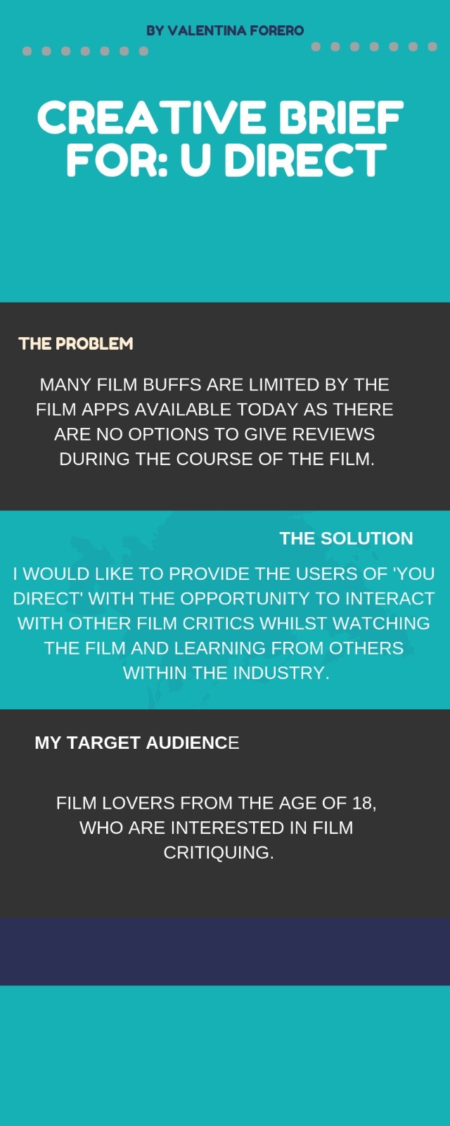
I started off my project with focusing on the brief since it was the first time I ever made a brief I thought the best option for me was to look at other briefs to learn the structure in which it should be made in. Since Scribershive project was given at the same time as this project I simply looked at the structure of that specific brief to identified the key concepts to include for my Brief 1.
With a brief you must have these key concepts:
- Problem: identifying the issue in which your concept was influenced by
- Solution: how you would be able to fix that issue with your idea
- Target Audience: defining my target audience by market research
By having these key concepts it gave me a clear understanding of how to plan and create my project, along with giving the viewer a clear understanding of my product.
Research
With the research, I wanted to see how other apps and websites had structured their content. What I noticed they had:
- profile page
- review page
- news page
- rating system
- activity page
- watched list
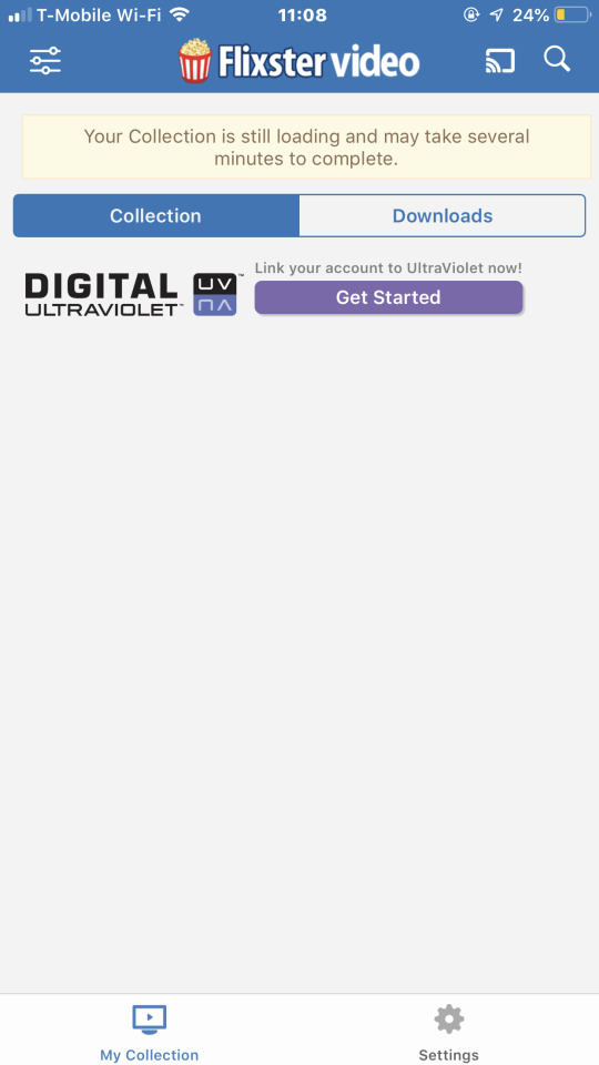
- Flixster Video App


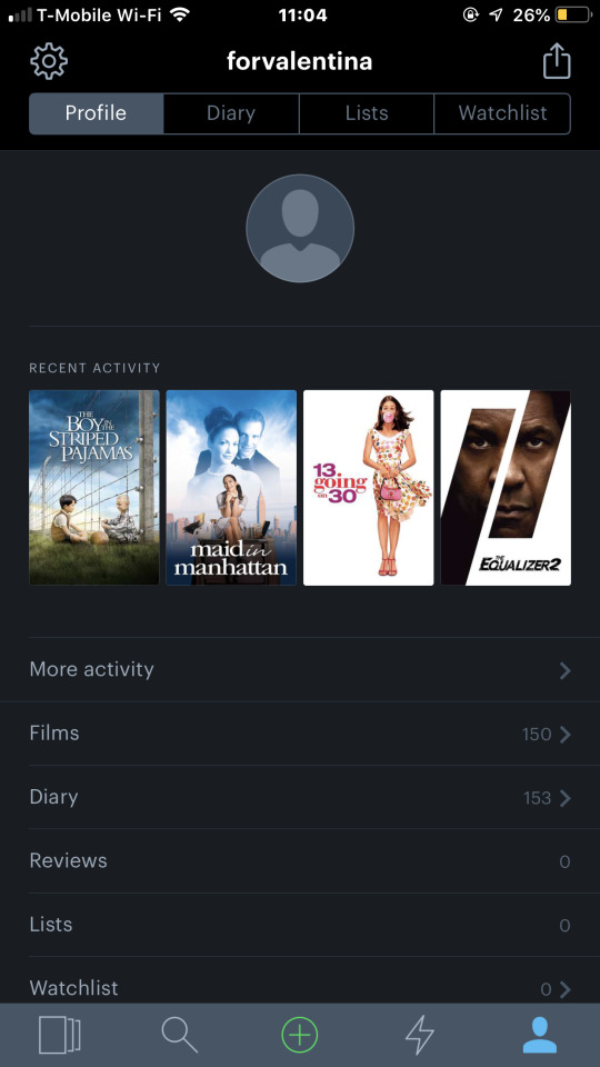
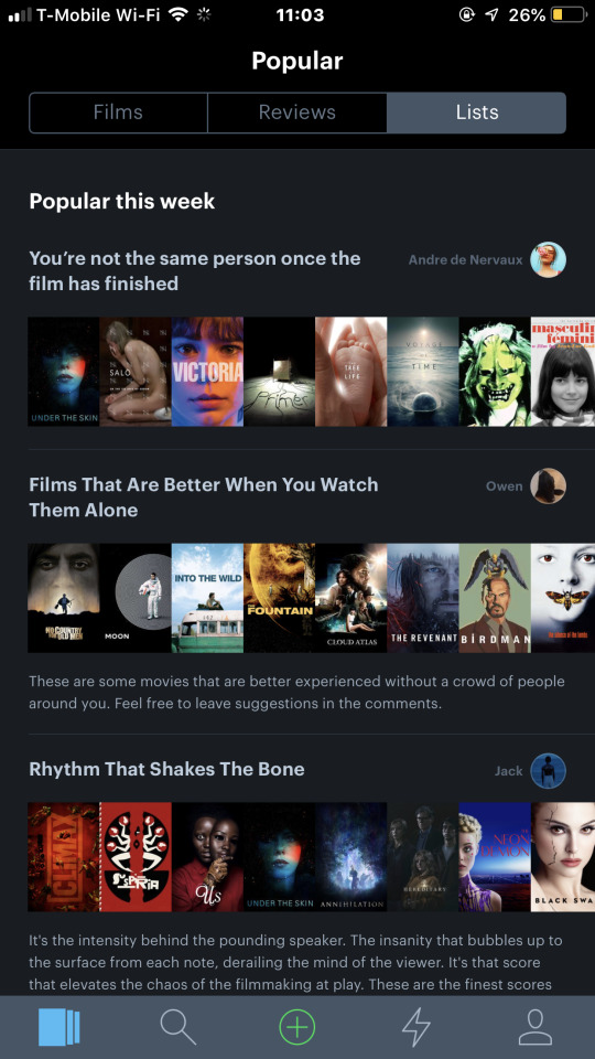
- Letterbox App
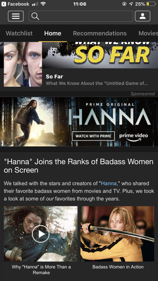
- IMD.d App
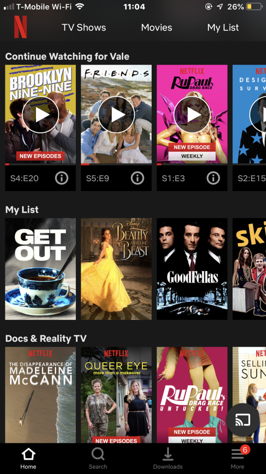
- Netflix App
All these apps gave me key ideas in which I should have for my website, however, none of them had the feature of being able to critique a film while simultaneously watching it. In addition, none of the apps I research had a social media feature which I believe is a key concept which this market is missing.
Target Audience
Since I decided to create my website for film critics and ‘film industry lovers’, I have always included myself as the type of target audience in which my website should be aiming for. Due to that, I was able to identify the key concepts and features that were missing on the pre-existing film apps and create a website in which I was able to include the additional features I as a target audience would want.
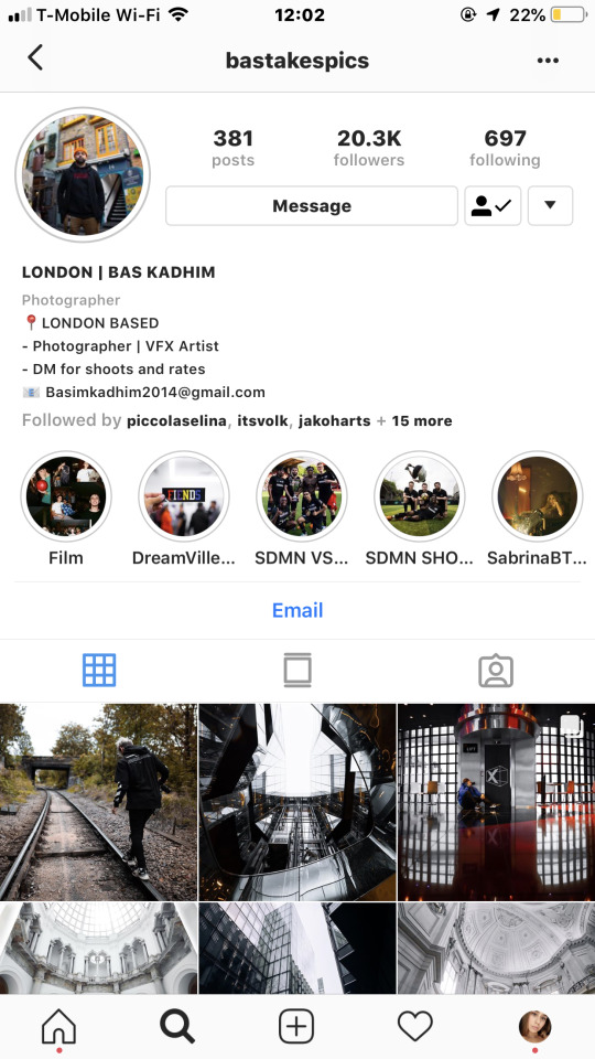
In addition of being a target audience, I wanted to do a target audience questionnaire my close friend Basim Kadhim to get a better understanding of what is missing in pre-existing film apps to have a clearer vision of what I should include on my website.
Basim Kadhim:
- Studies BA The Art of Visual Effects at Escape Studios (High Holborn, London)
- 22 years old
- Cinephile
Target Audience Questionnaire:

Basim Kadhim Social Media :
What will my website do
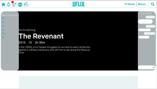
- Provide the ability to critique a film while simultaneously watching it
- Allow users to communicate with other users to create a sense of community
- Create a platform for cinephiles to be able to connect with their favorite icons in the film industry
- Allow users to create lists (just like playlists) of films to recommend other users
- To saved star scenes of films onto a ‘watchlist’ to view in the future
- Repost other user’s critiques onto their profile
- See a live feed of what the user’s followers are watching or have watched (Friend Activity)
- ‘Popular This Week’ section
- Trend section with film news with the user would be interested in
Logo Design
While deciding how I wanted my website to function, I was noticing that for my website to function exactly how I envisioned it I needed an existing platform which users are already using to watch films. Due to my own experience, I choose Netflix, since it’s already an internationally well-known platform.
Deciding a name, font logo, and color scheme
Since I decided that my website should be a branch of Netflix to be able to use their film rights. I wanted Netflix users to recognize my website logo which is why I decided to create my website font using Graphique.
Staying along with the whole idea of being a branch of Netflix, I wanted a color scheme which complemented Netflix’s color scheme. Which is why I decided to go for a light turquoise (color code: #16b1b5) to be the main color since when it comes to complementary colors, red is complemented by blue and I wanted to use white ( color code: #ffffff) as a fill-in color since white represents beauty and minimalism.
When it came down to the name I was simply brainstorming several words such as Netflix, film, screening, watching, theater, movies, youtube, and cine.
Prototype Names:
- YouCine
-FlixThru
-YouPic
-UView
Final Name: UFlix
Old Netflix Logo:

New/Recent Logo:


Final Logo Layout:

Subtitles Logo Layouts:

Final Icon Layouts:

Learning Adobe XD and Photoshop
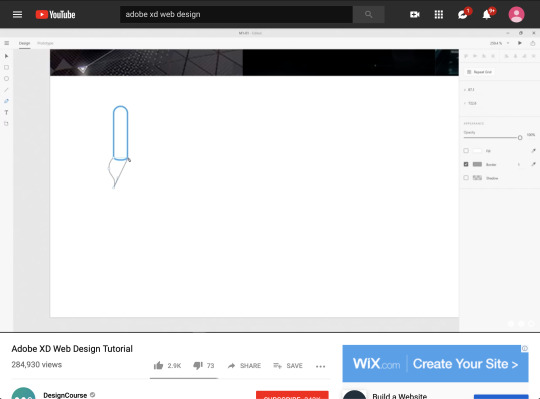
When it came to creating my website I researched different programs to see which one was best to design on. I came to the decision to use Adobe XD since I noticed it was a practical program to design since it had several similarities to Photoshop. I started by looking up tutorials on how XD works and even read up on some short cuts so I could get familiar with the program. Once I learned the basics of XD I was able to start on the basic layouts of my website and even proceed to create the details within the pages.
This project was an opportunity for me to learn photoshop again, I always knew the basics of Photoshop but I found myself some moments during this project stuck on some aspects of photoshop. I retaught myself with Youtube tutorials and can now say I am 100% comfortable working with Adobe XD along Photoshop.

Website Design Development
Home Page:
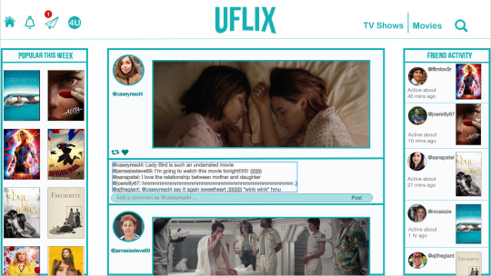
With the home page, I was influenced by several different social media layouts.
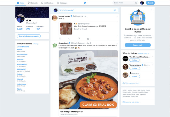
Twitter: The whole scrolling through a home page is a major concept that I wanted for my home page. I thought it was the clearest way for the user to view their follower’s reposts, along with being about to repost and comment.
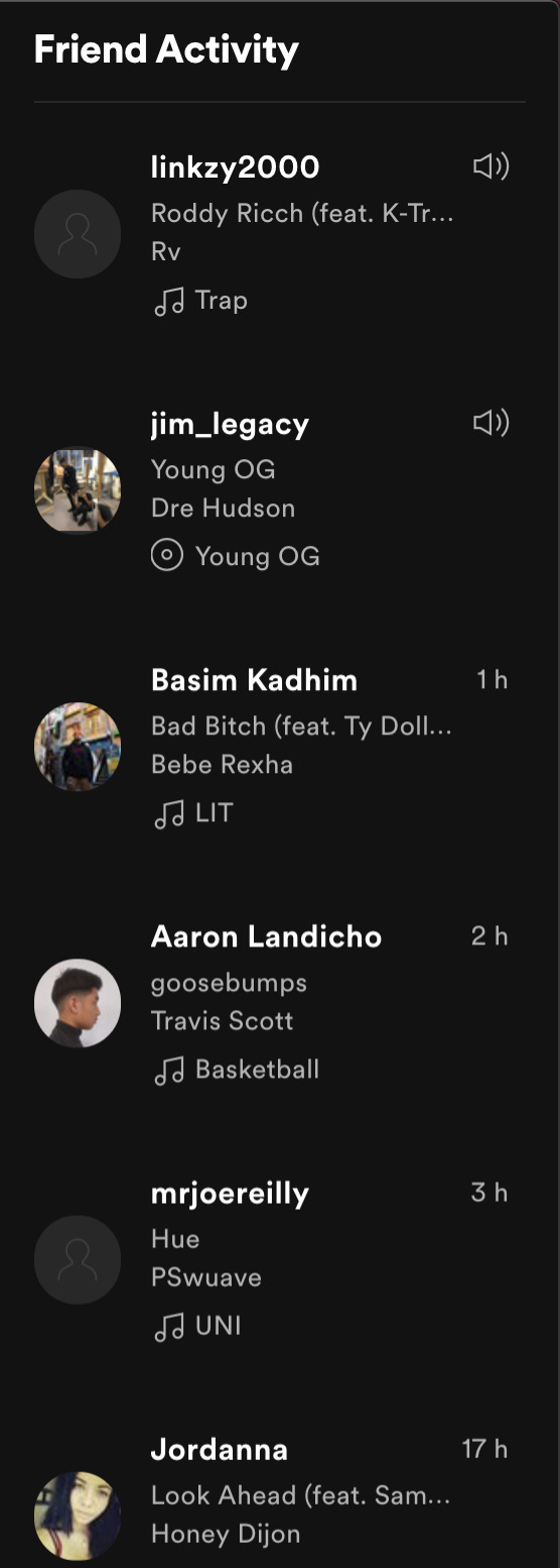
Spotify: The idea of ‘Friend Activity’ was created when one day I was listening to my Spotify on my laptop and it gave me the ability to see what were the lastest song which my friends were listening to. Since the whole concept of social media is to communicate to the world, everyone wants to see what everyone else is doing. Which is why I believe is concept is one of the strongest features on my home page.
Letterbox: The ‘Popular This Week’ feature was inspired when I was on my letterbox app and saw the ‘popular films’ section. This is such a convenient feature for the user when they need some suggestions. This feature can also be found on Netflix at ‘Popular on Netflix’ section.
By finding the pros and cons during my research I was able to create an interactive home page which has the best and missing features from popular social medias, to be the ideal website to go to.
For You Page:

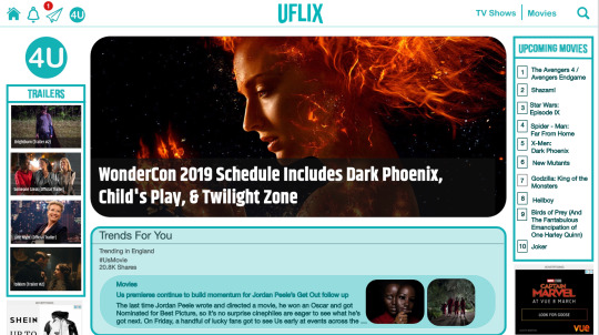

The For You page was design based on the ‘For You’ page on Twitter in which you can find several twitter hashtag trends which the app knows that you would be interested in following from what you have liked and reposted. I wanted to have the same feature on my website since I believe it’s the best part on Twitter because you get to be updated on news that customized for the user.
Profile Page:
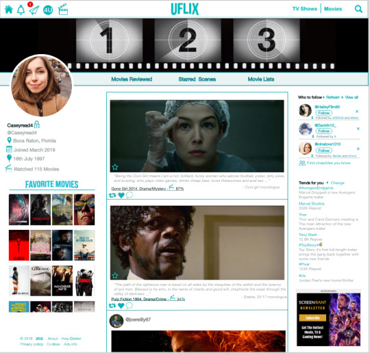
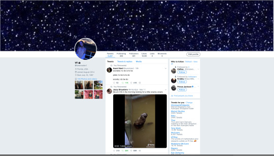
I was heavily influenced by Twitter when it came to the profile page, what I noticed was the several social media profile pages have the same layouts. I believed that the Twitter website profile page layout was the best design for UFlix, it keeps the same scrolling design from the home page which still makes it simple and easy to read for the user. Along with having a ‘Favorite Moves’ and ‘Trends for You’ section for the users to get to know other users interests.
Screening Page:
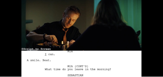

With the screening page, I was influenced by this Youtube channel called, Script to Screen. Which is a channel that shows you scenes from a movie while showing the script right under it. From there I got the idea of why not change the script to a messaging/writing platform so the viewer can chat or critique at the same time. It was a simple idea which I couldn’t believe didn’t exist yet.
Login Page:
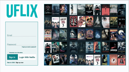
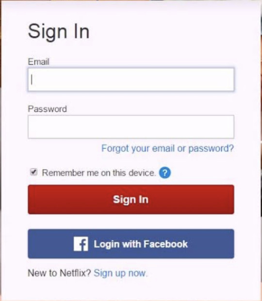

On the idea of the login page, I didn’t go too far on the design concept since I wanted my login page to be part of Netflix. I took the design and created the login page with UFlix’ s color scheme (color code: #16b1b5).
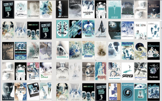
This was a prototype version of the side image on the login page. I was not satisfied with how it was difficult it was to read the titles of the films.
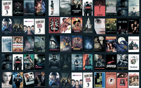
I wanted to add a bit of me within my designing of UFlix, which is why I created this collage of movies to be a side image on the login page. All the movies that are in the college are movies which I have already seen.
Improvements
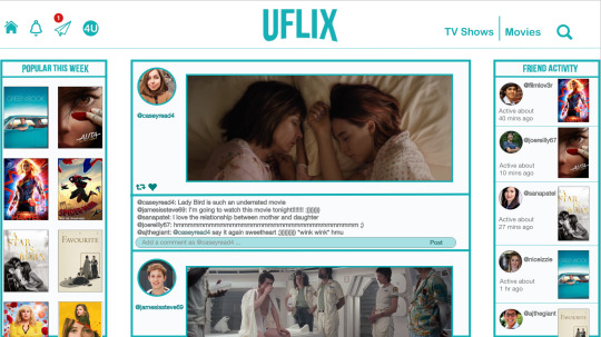
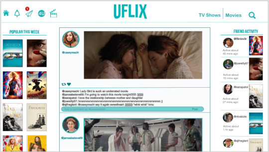


Halfway through designing my webpages I started looking through the slides and noticed that the bold border around the sections on the website made UFlix unprofessional, almost childish. Which is why I redesigned it without the border to give it a clear look.
Final Outcome
Login Page

Home Page

Screening Page
For You Page

Profile Page

Preparing for Exhibition
For the preparation of the exhibition on the 20th of March, I decided that the best way for me to present my project was to use the XD feature using the wireframing that I created to project how the website would work by clicking through.
I also printed out slides of my website so the audience can have a clearer view of pages.
Conclusion
Ove all this project has given me a clearer understanding of identifying the target audience. Especially since this was an independent project I found myself having a better understanding of this course and of my future career.
2 notes
·
View notes
Text
Developmental Blog
Introduction
My name is Jerome Modeste I am currently a student at SBCS studying Art and design HND level 5 & 4.
The purpose of my task is to report about different digital content delivery systems, to discuss UI features and its principles and finally to evaluate the relationship between digital content systems and key UI elements for different devices.
We were asked to explain the purpose of different digital content delivery systems, the UI principles that apply to them, and the UI features that apply to them.
Purpose of digital content delivery systems
Digital content delivery systems basically mean using a device such as a computer or phone to send a message to another device. However, they could have added features over time that has changed it to be able to do more things than originally could.
The examples of digital content delivery systems that I will be using as reference will be computers and mobile phones:
Computer
Computers are stationary hardware that can be used for communication and send digital content to other devices around the world by using communication websites like G-mail or Facebook. However, it can be used for a number of tasks such as entertainment where you can watch or listen to many videos, musicals, shows or movies on app devices such as Netflix or YouTube. It can also be used for planning PC video games on apps like Steam. Computers can also be used for information gathering on many topics like nature, food, sports, music, history, science, poetry, etc. Which can be found in a number of ways such as websites of text information you can read from a primary or secondary source, looking up documentaries about a topic or a tutorial on how to learn a new skill, it might also have the added feature of sub-text for the viewer to read in case they have problems hearing or there are deaf or they speak another language and can’t understand what the person is saying. On the other hand, there’s audio books which give information or stories by sounds for simpler reasons but for people who can’t see right or are blind. Another great use for computers is to store information you gather from all different sources. Such as data you find on the web or book information scanned onto the computer. Information can include text information, images, photos, colors, sounds, music, videos, etc. This information feathering would be very useful for online courses people access if they wish to proceed education through online or finding a course to go to though college. You can also use it to find a job by advertising your CV or finding it on a job site like irishjobs.ie or creating your own business.
2. Mobile Phones
Mobile phones are similar to computers, they can ring or message someone from anywhere around the world with or without the need of the Internet however it is easier to send a message though the internet connections. A main use of messaging people with a phone is Facebook messenger who you are friends with on the server or the WhatsApp text or call people with phone numbers without passing them any credit. Another access you have with messaging people is video chat where you can talk to people face to face with a built-in camera phone usually (some older versions don’t have this future) and a few of the main apps used for video chat or Facebook messenger or Snapchat. Another thing mobile phones can do is gain access to the internet and find a number of information such as education or news, entertainment purposes that it can be used for like watching videos on YouTube, reading an article or book on the websites or playing mobile video games that you can gain access on app stores like Clash of Clans. You can also use your phone to gain access to looking for college and jobs for the future. Mobile phones are way small that you can fix in your pocket and bring with you anywhere you go. You can call or text anyone and anywhere at any time you need to as long as the other person answers. You can take photos or videos wherever you go and store them on your save drive on the phone as well as saving information like notes, contact, internet history, audio recordings, apps and many more things so long as it can hold that information on it which really depends what phone you have, old phones can only hold about a gigabyte or 2 of information while the new phones can hold up to about 300 gigabytes of information.
Purpose
The purpose of Triple J Graphics Studio website is to gain reputation as a designer targeted at business owners delivering a sample portfolio that consists of the history of the firm, team information, contact info. and services.
Differences
Both mobile phones and computers have many things in common but also have future or functions that make them completely different. The common things they do have with most of the two devices are communication where anyone can call, message, voice message, e-mail and video chat to anyone around the world however mobile phones don’t really need the internet to do this. Another thing they can do is have access to a large variety of information such as history, documentaries, images, photos, news, education, job seeking, etc. Their also great use of entertainment with their access to videos, films, music, digital design and video games. However, there are few major differences between them. For starters mobile phones are usually much smaller than computers and it can fit in your pocket, you can take it around wherever you want to go. Another difference they have is although mobile phones can contain more information or data for short computers most of the time can contain more information on it’s hard drive. Another thing a computer can do better than mobile phones is that it can function better software systems that can be used on it be it video games, audio editing, adobe software like Photoshop or illustrator.
All data below was used for the creation of the website:
The navigation role is a landmark role.
The HTML <nav> element, navigation landmarks provide a way to identify groups (e.g., tags) of links that are intended to be used for website or page content navigation. If a page includes more than one navigation landmark, each should have a unique label.
Tags allow users to find content in the same category. Some tagging systems also allow users to apply their own tags to content by entering them into the system.
The HTML <input> element specifies an input field where the user can enter data. The <input> element is the most important form element. The <input> element can be displayed in several ways, depending on the type attribute. (e.g., Buttons, Text fields).
Text fields allow users to enter text. It can allow either a single line or multiple lines of text.
A button indicates an action upon touch and is typically labeled using text, an icon, or both.
Communication is simply the act of transferring information from one place, person or group to another.
Every communication involves (at least) one sender, a message and a recipient. This may sound simple, but communication is actually a very complex subject.
The transmission of the message from sender to recipient can be affected by a huge range of things. These include our emotions, the cultural situation, the medium used to communicate, and even our location. The complexity is why good communication skills are considered so desirable by employers around the world: accurate, effective and unambiguous communication is actually extremely hard. (e.g, text-base).
text-based communication is one of the most popular categories used. Emails, SMS text messages, social media interaction, and instant messaging programs are all widely used by companies to accelerate communication between parties.
User interface principals used in the design of the website are:
Place the User at the Center
Strive for Clarity
Simplicity
Make It Accessible
Visual Structure
As always, the first UI design principle is to focus on the user. A good user interface is easy and natural to use, avoids confusing the user, and does what the user needs.
The purpose of the user interface is to allow the user to interact with the website avoiding anything that confuses people or doesn’t help them interact.
Simplicity exist for a reason; they’re timeless and never go out of style, though they do benefit from modern touches. A user interface should be simple and elegant.
UI designs need to take into account accessibility issues. Online, this often means ensuring the visibly impaired can access and use the product. Don’t forget about color blindness as well. Use colors were used to accentuate and emphasize.
A consistent visual structure was used in order to create familiarity and relieve user anxiety by making them feel at home. A few elements to focus on include a visual hierarchy with the most important things made obvious, color scheme, consistent navigation, re-use elements, and create a visual order using grids.
User interface (Mobile UI)
User interface or UI for short is the interaction and communication of people with devices. This can include computers, tablets, mobile phones, smart phones, laptops, etc. The futures that are linked to these devices and UI can include but not limited to keyboards, screens, torch screens, mouse’s, cameras, etc. This can also interact with software like apps like google or G-mail. Mobile UI is the mobile user interface is mostly the graphical and usually touch-sensitive display on a mobile device such as Huawei or iPhones. Mobile UI phones mostly show a tread of information on how to use the touch screen display like how to use the apps like the main apps used in most phones like contacts, messenger and calls which is usually used for getting in contact with other people's phones. Each app does have its own color icon and logo to tell it apart from the others.
The relationship between digital content systems and key UI elements with a phone
The UI and digital content system relationship with phones they have are when using video websites or apps to watch shows like YouTube or Netflix and if you want to increase the size you can do so by placing it on its side and the auto-rotation UI will be reposed to the digital content system video content. Another feature the UI and digital content system (or DCS for short) have is whenever you save or download or send something to anyone or a messenger site like Facebook messenger or E-mail gets saved on a file on you UI phone. These can include the following but not limited to photos, images, website link, videos, audios, etc. This has a few good perks such as it can put a reminder on your calendar dates like someone birthday party or wedding day, the ability to ring people online with the numbers without using credit on WhatsApp, the phone UI feature can auto save username and password on its device on a mostly safe software where no one can get access to them however it not always safe in case someone hacks your account. These username and password accounts include but are not limited to online banking accounts like First Citizen or Republic banking or online shopping account like Amazon, wish, book depository or social media account like Facebook, Instagram, Snapchat or information gathering and save drive like WordPress or the Moodle or Google drive.
The Approach used for this website was a filezilla upload to byethost.com in order for the website to be online.
0 notes
Note
Sorry if this is a bother but I’m really trying to get into the ask blog community but I don’t really know how to start off or do anything? You have a lot of blogs and seem popular so I was wondering if you could give a newbie some advice if it’s not too much trouble? o^o”
Oh it’s no trouble at all reallyalthough I would HARDLY consider myself as “””popular””” hhhhiknowlike8peopleI did something like this once before on one of my ask blogs but I’m just gonna trim it up and rewrite it.+*~ Below The Cut For Shitty Jazzy Advice ~*+Be warned it is long and wordy.This is my own personal blog process/blog beliefs.Don’t take all of these to heart fully because there are many ways to do/interpret things. I am simply sharing how i personally do things.If anyone feels the need to add more onto this, feel free to.
First lets get The Blog Theme down.Believe it or not this is actually important and can affect you and your blog a lot more than you think.-> THIS ACCOUNT IS WHERE I GET ALL OF MY THEMES -Please note there are other blogs like this one, I just use that one specifically.You can also use the default theme that tumblr gives you, there are ways to edit it but I do not know how to edit it you would have to ask someone else.Simple Theme Color rules that I use:- Do not add bright neon colors with black. I love black n neon as much as the next guy but it makes your theme eye burning.- Blog colors can determine a blogs theme as well. A bright colored theme suggests a happy upbeat blog. But this only applies if you care for that sort of thing.- Make the text easy to read. Please even your links in the sidebar make them a color that is different enough from the other colors on your blog so you can actually read them. Use a easy to read font as well.What I always make sure to add in a theme:- Ask Box. Obvious thing to add, never feel ashamed or hesitant to close your ask box if needed. Whether it be due to plot reasons or you have asks piling up. Feel free to close it for the time you need and open it up again when desired.- Submissions Box. Not REALLY needed, I just always add it for ease of access. You can get to someone’s submit box just by adding /submit to the end of their url but I prefer to have a tab for it.- Character page or reference tag. Seriously add a reference page or a reference tag that is easy to find. It’s kind of a turnoff if you don’t have a easy to access reference. Don’t be upset if you feel your reference isn’t good enough. As long as you have a color palette to it you will be golden. Never shade a reference without a normal color palette we are all begging you. If you draw art traditionally, you can always add a color palette in with MSpaint nobody will judge you for that.- Rules Page. Now this isn’t 100% needed. I just add them to avoid getting spammed with questions or like… nsfw questions or something. If you don’t care about that then don’t worry ‘bout it.These are the main things I add to a blog. I also add these things because I’m extra:- Lore/Plot page. This usually contains links n tags to follow all of my plot posts or specific lore posts.- Ask Hints page. This is a HUGE help to people who are shy like me!! I usually can’t think of good asks to send so Ask Hint pages are such a help. I always try to add them whenever I can! Also they can help people ask more plot relevant questions when needed.Other Important things to add to a theme of a blog:- Add warnings. If your blog isn’t going to be happy go lucky, please consider adding a warning somewhere. Whether it be in the blogs description or your rules page. You don’t HAVE to add a warning, but its best if you do. - Add a tagging system if needed. No again, don’t have to do this. Some don’t tag things at all which is fine! I prefer to have tags and tag everything so I don’t accidentally trigger someone or just have peeps upset at me in general. I always have trigger tags, sensitive content tags and OOC tags. I go overboard with my tagging, I am aware of this, but I would rather be safe than sorry.Lets talk about Blog Playlists:- It is perfectly fine to have a blog playlist. Most complain about blog playlists but that is generally only if AutoPlay is on. I’m neutral on blog playlists just as long as the autoplay is off I am good lol. AutoPlay tends to give me a spook. It’s a highly debated thing in the community, but from what i’ve seen people just don’t like AutoPlay lol-> IF YOU ARE GOING TO USE A STOCK PHOTO FOR YOUR BACKGROUND, TRY USING THIS METHOD FOR FAIR USE I know most don’t honestly care about fair use of stock photos like this, but try to be fair +*~ Onto the character’s themselves ~*+What do you choose as your main pokecharacter?Literally whatever you want. I know some try to challenge themselves by choosing a pokemon they dislike/is hard to draw as their main character, but please note there is a difference between challenging yourself and doing something that you dislike to impress others.Choose whatever you want. Whether it be a popular pokemon or not, as long as you enjoy it, go for it.Need Help designing the character themselves or their personality?Enjoy some links that I’ve used in the past when i was in a bind.- Master Post of Character Design/Story- Character Flaw List- Color Scheme website - A big thing containing stuff for character design - Here is a Palette Blog that I follow that I use for color palettes when I come up blank!- Need help portraying better speech bubbles for characters? here is some examples of some fun things you can do with them!- Are you a mainly text based blog or just want to word some of your things better? Enjoy this.I could link you so many more things, I also have a bunch of Art Tutorials saved/tagged!But I’m going to move on to avoid spamming~In the end. Have fun with your character design. If you aren’t enjoying what you are designing/drawing then maybe you should try something different! Again, there is a difference between challenging yourself and just forcing yourself to do something you dislike.+*~ ONTO BLOG THEMES ~*+What kind of plot should your blog have? Should it have a plot? What is better?Literally whatever you want!! Do what you want!! You want a big plot blog?? DO IT!! You want a silly nonsense blog?? DO IT!! Want a mix of both?? DO IT!!Now. Lets discuss blogs that contain sensitive subjects:- Do research on sensitive subjects. I know you are doing blogs for fun! Why would you want to research something that sounds boring right? Yeah it can be boring. But DON’T TRY TO PORTRAY SOMETHING YOU LITERALLY KNOW NOTHING ABOUT. Because then that’s just being ignorant or offensive. If you want a blog starring a depressed character? Please at least just do some research on depression so you aren’t just doing one big stereotype splattered everywhere.- I know doing research sounds boring but there is a line that you have to do research on before portraying it unless you just straight up want to be offensive or ignorant. In which case if you would want to be offensive… why? just why? idk shoo bEGONE.- Doing research on the subjects you are portraying can actually teach you things and help you better your characters and plot. Believe it or not… studying something you don’t know that much about will…. help you LEARN??? wow shocking I know. I know I sound sarcastic and rather salty with this, but it happens more than you think.- Portraying a subject you know nothing about just requires some research. It’s honestly not that hard. You don’t always have to portray sensitive subjects 100% by the book. You can add your own twists or portray them differently if you wish! But there is a line between adding a twist and just being ignorant and offensive.+*~ Ask Time ~*+Alright, you got your blog all set up! You are ready to go! Now you need to get out there, get known! Get ASKS.How to go about it?- Get your blog signal boosted. The PokeAsk community loves signal boosting one another! A signal boost can go a long way to someone who is just starting out. If you don’t have a friend already in the community that can signal boost you, try asking a mod for a signal boost! Most mod’s love to signal boost others, go to one of them and ask for one POLITELY.- Make a Ask Call. One of the big ways to get asks is to simply make a ask call. Just make a post saying “Hey I need asks” or something.- Go onto other’s ask calls asking for one. Lots of Mod’s do Ask Calls in which they SEND OUT asks to others, go onto one of those! Ask for a ask! There is absolutely no shame in doing that.- Interact with others in the community. You can’t expect to get asks if literally no one knows who you are. Send asks to others! Get yourself out there! Make yourself known! If you are like me and have social anxiety or have issues sending asks, look for people’s ask hint pages! Send them a ask from the ask hint page!- Make a Ask Hints page of your own. Sometimes people just don’t know what to send you or are too shy to come up with something themselves. A Ask Hint page can help others send you asks.- There is no shame in asking a friend for a ask. There is literally no shame in asking your friends for asks if you really need them. Even if your friends just send them on anon. There is no shame in it.- Make sure your blog is clean. If your blog is filled with randomness that has nothing to do with your blog or is just random content from you, it will be hard for others to figure out what to ask about. If your askblog looks more like a personal blog, you probably wont get that many asks, its a harsh truth. Also again, having a easy to navigate blog can do wonders.- Make your content appealing. This sounds horribly harsh I know but you can’t expect to have others be instantly filling your inbox if you don’t have some sort of appeal. You can’t have around 4 posts of your character doing nothing interesting and expect others to go “oh I wonder this characters backstory is” or something. Spice it up! Make things interesting! You have to have a hook, make others want to question about your characters or your plot. Make them want to know more! Feel like you don’t know how to make things more appealing? Literally just ask others for advice. Even if the advice is criticism, USE THAT to become better. There is no shame in asking others for advice.- Don’t rely. On. Asks. Only. I understand it is a PokeASK community, but don’t rely on asks fully. Not getting any asks? Time to draw some character shenanigans! Do some plot to lure people in! Make us see your characters outside of asks! It can do wonders for character development and will also help lure others into wanting to learn more about the blog!You do not need a constant stream of asks to run a ask blog.If you just sit and do nothing because you have no asks, then guess what? You still aren’t gonna get asks. Sitting around doing nothing will get you nothing.Getting asks can be hard. For literally all of us it can be hard sometimes.Even that blog you think “omg they are so popular they must get so many asks” struggles because I bet you their inbox is full of nonsense that they can’t actually use.Don’t beat yourself up if you aren’t getting any asks, just keep moving forward with your blog and make the community get hooked on your stuff.+*~ Tips on things you should NOT do~*+- Do not force ships onto others. Most of us in the community love shipping characters, but don’t force it. If the other Mod expresses discomfort with the ship or doesn’t want to ship with you, don’t force it.- Don’t god mod others. Don’t waltz into someone elses inbox going “my character totally PUNCHES YOURS IN THE FACE AHAHA YOUR CHARACTER IS WEAK COMPARED TO MINE.”. Unless you and the mod planned that out beforehand, it is mostly unwanted. Don’t try to randomly attack or take over someone else’s plot. Discuss things like that with the mod, if they don’t want to do that sort of thing? Don’t send it. It’s extremely annoying. Also if you aren’t involved in someone’s plot or ask?? Don’t try to reply or force yourself in it. I’ve had people respond to my plot posts that had literally nothing to do with them. Its annoying and disrespectful. Always discuss things of that nature with the mod beforehand-.If you don’t like someone in the community, block them or ignore them. Do not make a huge deal out of it. It takes zero effort to block someone you dislike and move on. I know some go “Oh I don’t block others UwU” but then they go and constantly start crap with others? Just… If you dislike someone move the hell on with your life and leave them be.- Don’t do call out posts unless there is a clear threat to the community. Oh honey I’m so sorry you dislike someone in the community, but please spare me the time of scrolling past your huge call out post for a person who hurt your feelings a bit. Don’t cause the community unnecessary drama with call out posts for things that aren’t really community issues, this includes vague-ing about others publicly on your blog. Call out posts should only be for community threats or something. Is the person you are going to make a call out post on a pedophile/art scammer/submits porn or body horror to blogs/blatenly sends out hate to others openly/sends fetish asks or something of that nature? Then yes that is a community issue that needs to be addressed. Is the person you are going to make a call out post on someone who just hurt your feelings/you had a fight with about something that is only directed at the two of you or your friend group? Then don’t.A community issue is a issue that addresses the entire community, not just you and your issues with someone else. Move on don’t throw a temper tantrum like a child because someone blocked you or something. Nobody cares if you and someone else don’t get along, its private business so let it remain private.CALL OUT POSTS NEED TO REMAIN RARE AND WITHIN GOOD REASON.- Don’t reply to anon hate. Seriously don’t. Even if you have a witty comeback do you think everyone really needs to see anon hate spamming their dash? no. Ignore anon hate and move on. I know sometimes anon hate can hurt you, it can cut you to the core. But please try to ignore it and move on. Always remember that you can turn off anon or block anons. Granted sometimes anon hate can just be a misunderstanding in which case feel free to reply. I’ve had some “anon hate” which was actually just a misunderstanding. There is a difference between clearing up a misunderstanding and fueling anon hate.- Mind your business. If a drama is happening and it has literally nothing to do with you? Mind your business. Too many people try to get involved in drama that doesn’t even involve them and all that does is fuel more crap. Mind. ya. Business. It can save ya from unnecessary drama trust me. You can support others who are victims of drama or something, but don’t just try to insert yourself and make things worse. There is a difference between a supportive friend and a white knight. A white knight attacks without reason, they don’t know the full story nor care to know. Just…. seriously mind ya business.- Did I mention that if you dislike someone you should just block and or ignore them? Seriously. - Criticism is not automatically hate. Too many people take any negative criticism as hate. You can’t honestly expect everyone to only ever have GOOD things to say about your stuff? You aren’t perfect, nobody is perfect. If someone gives you criticism on your art or your writing or character development, listen. Listen to it. Take it in! Become a better artist/writer/blogger. I know sometimes criticism can be hard to take, especially if its something you worked hard on or something you care about deeply. But please know that criticism isn’t always hate. You never even have to accept criticism, granted its better if you try to learn from criticism, but you don’t have to accept all of it. It’s really up to you on whether or not you accept and listen to the criticism or ignore it. Just don’t automatically take any sort of criticism as “hate”. There is a clear difference.Criticism is to help you improve, hate is just to hurt.- Your mistakes do not define you,how you choose to act after the mistakes is what defines you. Have you done any of these things above? Are you worried about accidentally doing these things? I’m sure all of us in the community have accidentally or even purposefully done one of these things once or twice before. But the difference is, we realized what we were doing was wrong. We changed for the better. If you make a mistake, change for the better! Changing for the better can be hard sometimes, especially if you didn’t realize you were doing something wrong. But what it is important that you can get better, you can redeem your mistakes. A apology wont just fix a mistake, the best apology is changed behavior. You can’t just apologize for sending someone hate and then continue to send hate. That is not how it works.Granted yes, sometimes mod will hold grudges, some mods wont want to forgive you for your mistakes. But don’t let that stop you from getting better.If you make a mistake, choose to become better and redeem the mistake. Do not become your mistake. It can be hard, but you can become a better person, a better mod, even a better storyteller.+*~ The Moral of the Story ~*+Have fun with your blog. Choose a pokemon you enjoy. Design a design that you enjoy. Choose a theme that you enjoy. Have fun and don’t be a dick.Most of us in the community are generally kind and welcoming, we would be happy to have a new person join the ranks of PokeBlogging.Have fun, don’t be afraid to ask for help if needed.This was really rather long, but I hope maybe it helped you.I’m not that great at giving advice or explaining my though process clearly.But I hope maybe you got something from this other than “Damn Jazzy talks too much” lol
#long post#text post#not art#anon#answer#swearing#cursing#cussing#Jazzy Advice#literally just made that tag so I can find this post and link it if ever needed lol
6 notes
·
View notes
Text
12/4/2017 - 2/5/2018: QuixolMC Changelog #21
Happy new year! It’s been a whole YEAR since we- ok, just kidding, it’s been 2 months since our last changelog post. How have you all been? The holiday season was a joyous one for us, hard times irl set aside.
Quixol has been awfully quiet lately, but we have some big plans in store for you all that we’re hoping we can get going soon enough. If you haven’t already, please go check out our community poll which is still running.
There’s not much else to get into here, so let’s jump into the changes we’ve made over the past 2 months!
Key:
+ Feature added
- Feature removed
% Feature changed/bug fix
^ Feature updated (usually plugin updates)
# Comment (for… comments.)
Notable changes from 12/4/2017 to 2/5/2018:
% Tweaked admin sell shop prices at Amanita a bit.
# - Lapis Lazuli: 10.00 -> 7.50
# + Soul Sand: 0.10 -> 0.15
# - Rotten Flesh: 0.50 -> 0.40
# - Bones: 0.50 -> 0.40
# - String: 0.75 -> 0.65
% Changed rent of market shops, added new market rules as outlined here
^ EntityLWC -> 1.9.4
% Fixed wolf AI finally!
# This was a long-standing bug with the server where wolves, especially tamed dogs, would never attack hostile mobs. They should attack mobs again now!
# Held a fun Holiday party!
+ Added a Privacy Policy for Quixol... worth noting. Read it here
^ Factions -> 2.13.6
% Factions bug where the plugin forgets peoples' usernames fixed
+ Updated new player kit.
# All items now have an updated lore which is more informative, example
+ Rules book updated with 2 new rules, changed color scheme, now contains a clickable link to the full list of rules.
^ Craftbook -> 3.9u20
^ EssentialsX -> 2.0.1 b559
^ Jobs -> 4.2.1
^ mcMMO -> 1.5.09 b4
% Tempbanned players should now see how long they have left until they are unbanned
% Changes to how quickly chunks will be loaded/generated by players
+ Gave players permission to use /tpacancel
% Made some pretty big changes to staff permissions
^ PerWorldInventory -> 1.11.5
% Fixed some bugs with inventories getting erased
+ Droppers and shulker boxes can now be locked using LWC!
% You now lose 1/2 your exp levels when you die
% However, you lose no exp levels when you die in warzone
% Additionally, you lose just 1/8th of your exp levels when you die in your own faction territory
% Changed factions power per hour to 5
% Changed factions power per death to -5
+ Added qHelp 0.1.0
# A new and in-depth help menu, custom written for Quixol. The main part of our "Helpful Update", which seeks to streamline the process of finding information about various plugins and scripts we run on the server. Try it out with /qhelp !
# Still a WIP, but should be in working order for the most part. Just missing some additional stuff.
^ Pronouns -> 2.7.0
% Formatting of Pronouns is now stricter
^ Biography -> 1.6.0
+ You can now see when people last updated their bio information. Hover over where it says "profile" to see
^ playtime -> 0.4.0
% All scripts updated to comply with the Helpful Update. Help menus streamlined & paginated.
% Custom script commands such as /ch should now un-afk you when you run them.
List of known bugs/issues:
! Crafting recipes do not appear in the recipe book until you craft an item
! The market guide is broken... woops.
! Lighting glitches in some places still
! Parrots spawn in jungles very, very, very rarely
! mcMMO considers raw salmon, clownfish, pufferfish as “raw fish” when summoning cats
Things to come:
• Building a new Tutorial
• Updating to 1.13!
• Another very large build project...!
• Adding some new parkours/minigames to the grove
• Releasing custom advancemements
• Updating qchat to 1.0.0, making a comprehensive guide/tutorial on how to utilize qchat
• Other stuff!
last changelog post (#20)
about changelogs
My, my. That was pretty long! You still with us?
One of the biggest changes over the past 2 months is something we just released today: qHelp . qHelp is a custom script developed for QuixolMC that is essentially a fully-featured help menu... designed specifically for Quixol!
If you’d like to check it out, the command is /qhelp. There’s a lot of reading involved, as it’s designed to try to help out players who may be completely new to minecraft- however it should be relatively helpful for all players!
If you have any feedback about qhelp (or the server in general!) please drop it in the #feedback channel in our discord server, or wherever you can contact the staff. We appreciate any feedback, even if it’s negative (just try not to go out of your way to be a jerk about it).
Oh, also you now lose exp when you die on the server. If you’d like us to rollback this change, please let us know about it. We’re open to your suggestions!
We have some big plans for the next couple months, so keep your eyes peeled for more announcements!
Thanks for reading, - Quixol Staff
5 notes
·
View notes
Text
Week 2 - Preproduction Research
Over the past week I have been conducting research into both the subject detail (ant hierarchies within a colony, species of ant, etc.) and the subsequent systems I shall be using in the game. I have also started work on the conceptualization art of the ants design (though I still have to decide the games colour scheme, and as such left the concepts uncolored). On top of this I have been working on prototypes in Unreal to see if my ideas are viable.
Some Technical Issues
The results of the prototypes have not been good. My idea depends on having many ants with behaviour trees all performing their individual tasks. This could be numbers in the tens/hundreds of thousands. In testing how many characters I could spawn in the world at once, I have found that reaching 1000 ants will be tough enough work, as framerates dropped below 5fps, and as such I have reduced the scope to this. In the end product I hope to have at least 1000 ants running around at once at a decent framerate.
I have begun thinking about ideas on how I can optimise this high-cost system. Obviously, for one, my ants will have a much smaller poly count than that of the standard UE4 player character. This should help a great deal, and on top of this, I will work on having the models not spawn if not in the players view. This could potentially be done by utilizing the LOD system Unreal has by default.
Another issue I will have to face to optimise the game is how to run at least a thousand AI ants at once. One idea I had here was to ‘group’ X-amount of ants together and have them all run under the one behaviour tree however I am still unsure how viable this is. If this is possible, I could potentially use the Singleton design pattern to designate tasks to groups of ants in order to reduce the amount of functions running off ticks.
On researching Unreals AI system a bit further I have discovered that it is not designed for ‘bulk AI’ but rather a ‘quality over quantity’ sort of framework. ALthough not ideal, I feel like I can work around this. I have also found that switching to Unity for this project may not make it much easier for much the same reason, running AI is going to be expensive.
Following the advice of others who had the same problem/idea, I have got collected a pool of data to go over to see if it could help in anyway, although I am unsure as of yet how helpful it will be in terms of game development.
“ What you need is a cache blocked system in which you can directly control when and how npcs are loaded from the ram into the cache, as well as decent prediction modeling for which are going to need an update this iteration and which wont “ (FerretDude, 2015)
I also should look up
Hierarchical task network
Cache-oblivious and cache-conscious programs
and specifically a paper titled An Experimental Comparison of Cache-oblivious and Cache-conscious Programs (Roeder, Yotov, Pingali, Gunnels, & Gustavon, 2013)
RTS Design
As I have not before designed an RTS game, I decided to go through some tutorials to get an idea of what kind of systems would be standard in them. One very useful series I have been following has been teaching me a lot about how to use the mouse for both the UI and the game at the same time.
Tutorial Series link (3 Prong Gaming, 2015)

Through this series I have also found out how to have a system that keeps track of the time and date, and set the rate of time passing through a float. I have also been playing around on my own outside of the tutorials to get a system working that allows the player to switch from the top down view to an ants perspective, possessing an ant and taking control of everything it can do. Although far from something I could put in a game, it is a system that is coming on easier than I expected it to, which was a pleasant surprise amongst all the other technical news.
Concept Process
Here is some concept work so far for the queen ant. As previously mentioned it is not colored as of yet as I am still deciding on the colour scheme. Although this is not the main focus of my project, I feel like it is still something to be considered to get the correct feel of the game.
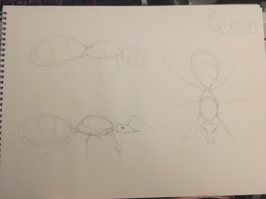
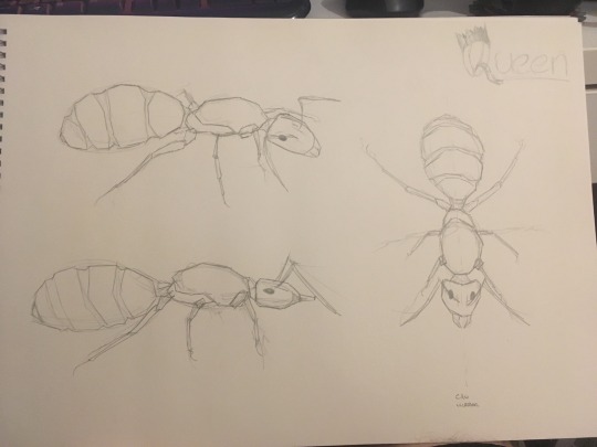
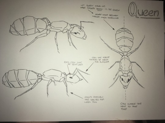
These sketches were based off of Alex Wild’s gallery on queen ants
References
3 Prong Gaming (Director). (2015). UE4 RTS Tutorial Series [Motion Picture].
FerretDude. (2015, February 06). What is UE4's performance like with very high numbers of low-poly, AI-driven entities? Retrieved from Reddit: https://www.reddit.com/r/unrealengine/comments/2v0b3h/what_is_ue4s_performance_like_with_very_high/
Roeder, T., Yotov, K., Pingali, K., Gunnels, J., & Gustavon, F. (2013). An Experimental Comparison of Cache-oblivious and Cache-conscious Programs. Austin: The University of Texas at Austin.
Wild, A. (2009). Camponotus vicinus queen greatly swollen with eggs. Mt. Tamalpais.
1 note
·
View note
Text
Website Insights for a Site That Attracts More Clients

This week I launched my brand new website: actionplan.club
Over the last 20 years, I’ve designed and launched a total of seven different versions of my site.
In the process, I’ve learned a number of things, made a lot of mistakes and gained some wisdom about how to make a website serve your business and help you attract more clients.
Today, I’d like to share a summary of those insights.
A client-attracting tool
That’s ultimately what a website is. It’s not a monument to your ego or something beautiful to look at (although there’s nothing wrong with a visually attractive website).
For independent professionals, a website needs to explain to your prospective clients why you’re the person to help them with their particular issues and challenges.
A Lead-gathering tool
When someone visits your website, they should be inspired to take some sort of action right on the spot – otherwise, the chances of them ever visiting your site again are immensely low.
And that’s why I believe the most important part of your site is its ability to build an opt-in email list. If you don’t have a list, it’s like having a wonderful car with no gas in the tank.
Virtually all my business over the past 20 years has come from email promotions to those who joined the list on my website. When you don’t have a list, you severely limit your marketing possibilities.
Make opt-ins obvious
I can’t tell you how many clients have shown me their website with a tiny little opt-in box that says, “Please join my list,” or some other tepid appeal. And they wonder why they have a tiny e-list.
Fewer people want to join lists these days. We already have too much email in your in-boxes. But if you give away some substantial value, many will still opt-in to get it and join your e-list in the process.
Your opt-in box should be attractively designed and attention getting. And you should use various two-step opt-ins throughout your site. They are like little ads that say, in effect, “Go here and get my valuable free stuff,” which directs them to your sign-up page. Free Stuff
Simple navigation – in-depth content
The biggest change I made in my new website was to dramatically simplify my navigation. My old site had links to so many pages that it become overwhelming to navigate.
But I still have in-depth pages that describe my services. These are the main pages I want my prospects to visit, that explain in detail how I help my clients. Not everyone will read long copy but serious prospects will read much more than you think. Programs (link)
Publish a Blog
For 20 years, I’ve sent out my email newsletter to thousands of subscribers. With my previous website (since Jan 2011) I took the weekly ezine article and also posted it as a blog. Why? Because blog posts are indexed by Google and after seven years I have 355 blog posts on the web, all pointing back to my site. Blog page.
People ask how I’m able to write a new article every single week. My answer is stupidly simple: I make Mondays the day I write my ezine/blog article and it’s usually the first thing I write Monday mornings, even before I check my email. Now it’s become a habit that comes easily and naturally.
Development Tips
Use Wordpress. It took me a long time to make the transition as I’d invested a huge amount of time and money on the previous site. But you can do almost anything you want on a Wordpress site with easily installable plugins. It’s knocking my socks off!
Hire a designer. The average independent professional is not a terrible writer. But most are hopeless designers. If you design it yourself, you’ll probably love it, but you may be the only one!
It’s worth the relatively small one-time investment to get a design that will make your site look both attractive and professional.
Hire a Wordpress developer. Setting up a Wordpress site is tricky technically. My developer understands every little bit of code that makes it run smoothly. Get someone who says, “no, problem, I can do that!”
By the way, sometimes a designer and developer are one and the same person, but these are very different skill sets and few people can do both well.
Learn Wordpress basics. Once your site has been designed and developed, you need to learn how to edit and adjust it yourself. A short tutorial from your developer will give you what you need. Make sure they build that into the fee for your development.
Design Tips
Larger fonts (typeface). These days, computer monitors are bigger than ever. So, small fonts get buried.
Readable type. Don’t make your type so light that it’s a strain to read. I recently looked at an associate’s website and it was literally unreadable because his small, thin typeface was also light grey. It looked cool, but I couldn’t get through one paragraph.
Color scheme. Keep your font colors to black or dark gray, for readability, and then have two main colors for page headlines and subheads. Too many colors detract from the overall look and feel.
And by the way, reverse type or light-colored type on a dark background, are almost always a no-no. It’s not good for readability.
Also, I highly recommend using text bolding to make your key ideas pop out – but only on first sentences of paragraphs. Too much bolding can make it harder, rather than easier, to read.
White space. Text needs space to breathe. Remember, it’s all about readability. So have ample left and right page margins (about 25% of the total width of your pages), space between paragraphs, and paragraphs no longer than five lines.
Also, side columns that contain other content make your main column of text narrower, hence more readable.
Graphics. Various pictures and photos on a web page not only make it attractive, they increase readability. For instance, I like breaking up text on long sales letters with high-quality photos of independent professionals.
The site of a colleague uses beautiful pictures from nature. It really depends on your business and identity.
Remember, there is no perfect way a website should look. The primary considerations are attractiveness and highly readable text.
Web Content
I’ve written about this extensively in the past and even developed a program on this (the Website Toolkit). Ultimately, this is the most important part of your site – what you say and how you say it.
One of my favorite marketing quotes: “Write when drunk, edit when sober. Marketing is the hangover.”
If not drunk, write with passion and abandon. Then go back and tone it down a bit.
Content Flow. Most of us can write coherent sentences, but what style or approach works best for writing website content?
I use an approach called, “Marketing Syntax,” where I put ideas in a certain order or syntax. This can be used for your Home page, About page, and Services pages (which are the most important pages on your site).
The content flow goes like this:
1. Who – A section on who your ideal clients are.
2. Problem – A section on the problems and challenges your prospective clients are experiencing.
3. Desire – What your clients would like to have if they could resolve their problems and challenge.
4. Solution – The actual results you are able to deliver to your clients that fulfill their desires.
5. Credibility – Why you are uniquely qualified and experienced to help your clients.
6. Call-to-Action – What the prospective client should do next to find out more or to meet with you.
What about the process of what you do? Unfortunately, too many websites go too deeply down the “process rabbit hole” where they explain too much about how they do what they do.
Prospective clients are more interested in the results they get from your services and if you’re the right person to help them. Of course, at the end of sales letters (services pages), you can outline a little of the structure of how you work.
This is hardly an advanced course on writing for websites (the Website Toolkit is), but it’s a reliable and simple framework for writing copy that your prospective clients will relate and respond to.
Finally, I highly recommend you hire a proofreader/editor who will undoubtedly find a number of typos, grammatical mistakes, and poorly expressed ideas. It’s worth it if you are to make a professional impression.
I invite you to visit my new website and you can judge for yourself how well I’ve adhered to all of these website tips I’ve offered today.
Cheers, Robert
Action Plan Marketing helps self-employed people attract more clients through action-oriented marketing strategies that get you in front of prospective clients. Get our free report on how you can attract more of your ideal clients at this link: http://actionplan.club/free-stuff.
0 notes
Photo
Stylus Dashboard: ‘Cerulean Blue’
Blue themed Tumblr dashboard made with Stylus/Stylebot for Google Chrome or Firefox.
1. Install Stylus: download & install Stylebot extension for Chrome or Firefox; make sure it’s pinned or otherwise easily accessible!
2. My CSS: copy my code from HERE
3. Install CSS: click the Stylebot app (for chrome, it should be to the right of the address bar), click “Open Stylebot...”, click “Edit CSS” (it’s on the bottom), paste my css code & SAVE!
NOTE: this code does not work on inbox, activity or explore pages; it only functions on the main dash, the blog dash (posts, followers, drafts, & queue), & the likes pages
If you notice any glitches or have any trouble, please don’t hesitate to send an ask. If you’d like to learn how to make your own/edit, check out this handy tutorial. If you’d like to request a color theme/scheme for me to make, feel free to hop into my inbox! A like/reblog is always appreciated but not necessary! ENJOY! revamped 8/3; fixed issues with headers & color displacement!
29 notes
·
View notes
Text
51 Worldwide Classics Review — Check, Mate
June 16, 2020 4:00 PM EST
The Switch helps bring some new life to these classic tabletop games.
Back in 2005, Clubhouse Games by Agenda launched exclusively for the Nintendo DS, or as I knew it in Europe, 42 All-Time Classics. The game featured a bunch of card, board, and parlor games, teaching me the rules of blackjack, passing the time with a balancing game, and owning online players in billiards. It’s 2020, and Clubhouse Games: 51 Worldwide Classics is now available for the Nintendo Switch and brings back the magic with some modern improvements.
Developed by NDcube, Clubhouse Games: 51 Worldwide Classics takes over the success of the original and comes with a focus on providing the player with numerous games to learn, enjoy, and discover from across the world. As the title suggests, there are 51 of these classic games available to play from the off with no unlocking required.
When starting the game, I had to choose and customize a human character that bears resemblance to a board game piece. For some reason, Clubhouse Games asked what my favorite food is and what my main aspiration in life is, so already I had embarked on an existential crisis on what I want in life when all I wanted to was to play billiards.
youtube
You can view all the games as a whole with no information, or individually with a brief rundown of what to expect from a game. There’s something that Clubhouse Games: 51 Worldwide Classics does to shake things up though, which is introducing a globe. This interactive area features numerous Game Guides scattered across the globe that are available to “invite.” These guides are essentially playlists in the form of “people”, ranging from categories such as Solo Fun, Historical Games, and even Nintendo History.
Whichever playlist you’ve chosen will appear at the start of the list of games for easy access, and usually have around 5 games available related to the category. It’s a nice way of suggesting games to play, especially if you’re overwhelmed by the choice of games and don’t feel like choosing. As you can see from the screenshot below, all 51 games can be crammed onto one screen, which makes for quicker browsing.
I personally preferred jumping right into games I knew I wanted to play. Each game comes with a tutorial video that plays before you go to its hub screen. The tutorials can be skipped but also play every time you open the hub screen which becomes a nuisance. Each of these videos are fully voiced with cheesy dialogue that mostly just acts as entertainment while the video does a better job of showing how to actually play.
Also available from the hub screen for every game is the option to see relevant hints or unlocked trivia. There are also small toggle options for changing some rules and game types such as choosing who goes first or how many matches you play. But there’s so much negative space on the screen that it baffles me as to why controls aren’t shown in this area. When you start a game, bowling, for example, you get indicators to show what controls can be used. In this case, touchscreen controls and motion controls.
Why wait until the game starts to display this information when the control schemes could be easily outlined in some of that negative space? This would save the player time of having to go into the game to discover the controls.
The information throughout Clubhouse Games seems to be problematic which stems from trying to look sleek and minimalistic. The fonts are thin, white, and blend into the bright cyan background, while the button prompts usually appear small and round the edges of the screen. The reference guide that contains hints and trivia is also incredibly small both in docked and handheld modes.
But when it comes down to the games themselves, they’re brilliant fun and come with pleasing graphics and realistic physics. The majority of games are styled to look as if you’re playing them within a digital room. Backgammon is on a table rather than taking up the whole screen, for example.
The touchscreen precision with my finger felt brilliant, even on games that required a finer touch. However, a touchscreen pen would be a preferred option for some games. The controllers work nicely for games that are tap focused such as chess or mahjong, but for anything that requires dragging, it feels slow when using the thumbsticks. There are some games that make use of the gyroscopic motion control which works remarkably well, but the number of games using this feature feels far too low.
It’s almost as if a lot of potential was missed with some games utilizing the motion controls. Billiards would have been nice to use the Joy-Con as a cue, flicking the Joy-Con could have rolled dice, and one feature I’d have really liked is the option to press a button to enable some sort of free-camera so I could maneuver my camera around some tabletop games. The controllers also utilize the HD Rumble with different strengths and patterns for different actions such as reeling a fish in, hitting an object, or even just lightly rumbling to remind you that it’s your go.
I feel like Clubhouse Games: 51 Worldwide Classics lacks in offering rewards to players, While I can get a whopping 3 stars in some games, all I seem to get rewarded with is some trivia. I recall the 2005 DS version unlocking different styles for your games if you did well enough, and I think offering the player that bit of customization would go a long way in not only adding some personalization but also accessibility.
As I mentioned earlier the font choices on the cyan background are an eyesore, and being given the chance to change that color scheme would really benefit me. I’d also like to be able to have a variety of styles for games, even to the point of having themed pieces…imagine something like Animal Crossing chess if you will. A bit like Tetris 99.
Clubhouse Games: 51 Worldwide Classics isn’t just single-player, it’s also available to play as a couch game with a second player on one system using a Joy-Con each. There’s also the option for up to 4 systems being connected together in what is called “Mosaic mode” that finds one game spanning 4 Switch screens.
With the single system multiplayer, I was disappointed that you couldn’t link two sets of Joy-Cons. To put it this way, the darts game, when using motion controls, works much better using the right Joy-Con, but the left Joy-Con winds up not only feeling uncomfortable, but the controls become inverted because it’s a left-handed controller.
As for the online experience, I wanted to enjoy it, but the problem is, unless you’re using Nintendo’s mobile application for voice chat, there’s no way of communicating with another player. The lack of emotion and communication between you and the player makes the online experience feel incredibly hollow. Where’s your text chat, Nintendo? There’s also the issue of locking the player into a match online. In single-player, you’re able to pause the game, open the reference guide for the game, and even leave. In online mode, you can’t do any of that and are locked into the match unless you close the game down.
Clubhouse Games: 51 Worldwide Classics is a fantastically fun game that offers hours of pick-up-and-play fun and is brilliant with friends and family. The lack of communication and locking players into games dampens the online experience. But with a total of 51 games to play at will, both offline and online, and with enticing graphics along with realistic physics, this game is a joy to play.
June 16, 2020 4:00 PM EST
from EnterGamingXP https://entergamingxp.com/2020/06/51-worldwide-classics-review-check-mate/?utm_source=rss&utm_medium=rss&utm_campaign=51-worldwide-classics-review-check-mate
0 notes
Text
EONIA download Normalgo.com
Disclaimer:
Eonia is very early in her life as a game, and as I’m in the Early Access phase, I’ll try to be careful how much I read into certain facets of the current game and gameplay.
So far, it’s almost more of a walking simulator with some puzzle elements, but you can die pretty quickly if you’re not careful and don’t use save points. Game over is over. You’ll start wherever you last saved, so keep that in mind.
Pros I love the game’s look, color and design. You’re thinking in a painting. Reminds me of a specific quest in The Elder Scrolls: forget, if anyone knows the trolls ‘ turpentine quest.
Many species have a draw feature. It’s more like a bar of progress if you’re within a certain threshold compared to where the creature is. When you suit them, you can go and read more about them. It’s fun and all, but I wish there wasn’t a barrier on some animals if you don’t have the right knowledge from a book. Many skills work this way-finding a book spot, reading over the pages, and then getting some degree of control or mastery of saidskill(s).
Music is also very nice to listen to-atmospheric, not distracting or too loopy. It’s not boring, not overpowering. Wherever it feels okay. If I don’t like the sound, it can make* me* feel a little loopy, so it’s always nice to hear something better here.
Movement seemed very safe and fast, even with the controller in sections where I used it-speed was just off with controller, so I went with mouse instead. Generally, both mouse / keyboard and my controller are good, but I think I mainly ended up using mouse / keyboard based on button schemes and motion issues.
Also the animals in the game are nice to look at and have different qualities / colors like real ones with certain tendencies. The approaching and animal process, whether running away or attacking, was a nice concept to bring in, with a kind of “meter” calculating how alert an animal is. In some cases, you almost have to learn their weaknesses, to figure out how to draw some properly. Some can not be drawn until some other game-first tasks are completed. Each animal isn’t the same. Some will hear you when you whisper, some will need distractions, and others will need to know more about it before it makes sense.
Production was constantly modifying and adjusting this game. I like seeing it! They’re committed to the cause— refreshing in an early access environment. I’ve had a lot of negative encounters in this game aspect, so I’m expecting some good progress over time.
Cons Due to the map’s smaller size, and constraints on where to go… I don’t like running here and there (and teleporting to save stations until I found it out). Such dark puzzles-I was somewhat confused and lost in places. I mean, it made sense later on, but the apparent wasn’t obvious to me at the moment. Right now, I’m kind of in a “sandbox”-like mode, uncertain what I need to do to keep it up. That could change. Perhaps it’s me…
The tutorial wasn’t as thorough as I’d like, from what I remember? It went over the main points, but I was puzzled, for whatever reason.
I’d like the map to make more sense. I can’t explain it, but I just don’t like map feeling or overall orientation.
Repeating those things during a save crisis wasn’t fun. I wasn’t conscious, so that’s completely on me. It’s a con, as it messed with my experience, but it was also my lack of reading updated news to sort it all out, so I had to start again…
Conclusion A nice game! Too early to say go all in, but I think it’ll improve. Progress is moving along, and as described above, it’s effective. I need time to do very well. Check back soon-but keep it listed or maybe make a note if you like progress later and want to check it out.
If you really want to start now, be weary that it’s very early in the process, like many / all Ea games. Overall, I’m giving this a break. Only remember to come back later and try the next bit as it starts shaping more! Try waiting for it to go on sale if you have other stuff you’re focusing on, and it’s not something you think you’ve got to play as soon as possible, or for whatever reason you’re die-hard with this name. On a good deal, it reveals it may be something surprisingly nice!
Despite a fair amount of annoyance, most pros far outweigh all drawbacks. Keep an eye on it.
Geometrics Bytes built a fascinating world of features to entertain you for hours. Much work went into this venture, and more to come.
Pros: Music, sound effects, visuals, craftsmanship, exploring, creating, and repairing are fantastic. Lots of animals, places to explore in the game, but a NOTE: some areas are not finished or you need a quest to unlock them.
Cons: Most of the people you’re sent to see left you messages. It would be nice to finally have characters to connect with not only a living breathing world, but also NPC’s.
The game feels linear, but it’s because you have to open every quest stage to move into new areas. Some of the quests need a bit more clarity and I’ve had to do the task more than once to complete it.
Bottom line: I don’t think this is an asset flip. Design can take time as only one developer does all the work. I look forward to progressing with developers and developers, and if you like early access and involvement in indie development projects, you’ll be active too.
The post EONIA download appeared first on Normal.
from Normal https://ift.tt/32uwMOT
via NormalGo.com
0 notes