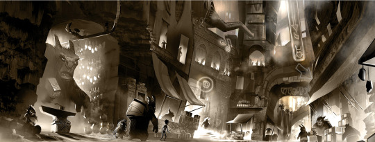
#some of the art is in the other artbooks and on internet but
Text
Hello ! I just got the 10 Years of Dofus artbook, would anyone be interested in seeing some of the art from it ?
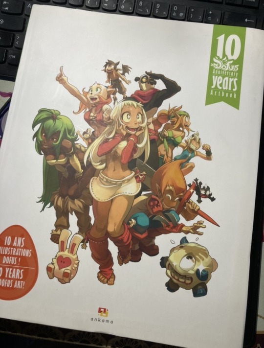
#dofus#wakfu#krosmoz#there's stuff from the games/manga/animations in it!#this thing is nearly 300 pages so I definitely won't be able to share everything#some of the art is in the other artbooks and on internet but#I don't think I've seen the stuff from the animation category anywhere
57 notes
·
View notes
Text
Chiho Saito’s 1999 Revolutionary Girl Utena Original Illustration Collection
IT’S HERE. IT’S DONE. IT’S FINISHED. NOW…IT’S YOURS. Happy Holidays, my friends.
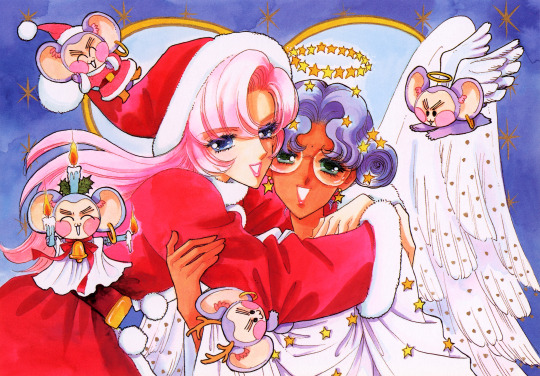
Vanna here! I have posted some already about this project, and the responses I got, public and otherwise, have been absolutely incredible. Y’all have been reblogging and hyping this before it even finished…I haven’t felt so encouraged about an Utena project since the musicals! (Yes, streams soon, I promise.) You can read the other post to get more details, and catch my post here with more details about the process if you’re interested. The long and short of it?
This is the first artbook I ever scanned. I did it in 2001. In Photoshop, using multiple scans per page that took hours to process. But it was 2001. A half megabyte file that was 1250px wide was considered extremely hardcore and impressive. That’s just always been the business I’m in when it comes to Utena art, you know?
It’s now the latest artbook I’ve scanned, and so much of the process, and effort involved, is unchanged. What has changed, is the result. Welcome to your new desktop background. Your new phone background. Your new poster print.
What I’ve done here is attempt to create definitive digitized images of Chiho Saito’s work as offered by this book--I have removed the print moiré of the original scans, and used my literal decades of experience to try and tease out as much information from them as possible. Without being physically in front of the original artwork (which is a thing I’ve had the great fortune to get to do) this is The Most Chiho Saito you are ever going to get. I’ve tried my best to make sure there is a way to get it that works for everyone:
Do you just wanna scope 'em out? Look at some disaster gays? Grab your favorite one or two? This is the path for you! Check out the ‘compressed’ (not very) 10k ‘web friendly’ (not really) copy at the Bibliothèque, the media archiving wing of the Something Eternal forums at Empty Movement*. All the following links are also available from here.
Do you want these copies? All of them? Don't just grab them individually, friend. This batch is 375MB and can be downloaded as a zip of the individual files here on our Google Drive.
Do you like digital archiving? Are you looking for a copy that preserves the archival quality of the effort but sits nice and comfy in a single file? This is for you. A minimally compressed 10k, 513MB version worked into a PDF is now up, shiny and chrome, on the Internet Archive.
Do you like the idea of the minimal compression, but want the individual files in a zip? Yep I did that too, here's the drive link.
Are you looking to print these in a larger size? This is probably the only reason on Earth you’d ever want them, and yet a bunch of you are going to go straight for these. Here are the zero-compression JPG full size copies, most of them are 15k across, like simply a ridiculous size. Pick your fave and download it from our Google Drive!
I am genuinely really proud of this work.** I was able to tease out so much new detail from these…her incredible layering techniques, the faintest brush of her highlights, and the full range of her delicate hand at whites and blacks… details commonly lost in digitization. I sincerely hope you find something here that you’re looking for, as an artist looking for inspiration, as a weeb looking for a desktop, as an archiver excited to see incredible 90s manga artwork saved forever in the digital realm. I feel like I have already said so much about them, and could keep going, but you know what? This work speaks for itself. Enjoy, use, explore, and definitely tell us what you think!
We love y’all. ~ Vanna & Yasha
* AHEM ASTERISK AHEM
You might be wondering what any of that is. Something Eternal? Biblewhatawhat??? EmptyMovement.com? You might even have done a double take at the word ‘forum.’ And you should!!!
I have a confession. This artbook was my ‘side project’ as I worked on this, *the main project.* For a couple years I’ve been banging around with a new domain, and originally I had other plans for it, but Elon Musk ruined my Twitter and Discord is well along on its way to enshittification, and well….we joke on the Discord a lot about ‘reject modernity, embrace forums’ and you know what? We’re right. So Yasha and I are putting our money where our mouths are once again, and doing something insane. We are launching, in 2023, a website forum. Obviously, this is not the official ‘launch’ per se, but I cannot announce the artbook without directing you to the forum, since it sits on the attached very cool gallery system. Oops! Told on myself. Another post more focused on the forum will be forthcoming, but if you are just that motivated to get in right away, you absolutely can! (This will help stagger new arrivals anyway, which is good for us!) If you would rather wait for the ‘official’ launch, by all means that’s coming, including a lengthy screed about how and why we’re doing this. In either case, remember: this is a couple weebs trying to make internet magic happen, we are not website developers by trade. Give us grace as we iron things out and grow into this cool new website thingie…hopefully along with some of you! :D
If you do join up, naturally, there is a thread about this project!
** If you like this kind of content, consider helping us pay for it! We do have a Patreon! If you’re wanting to use these in some public-facing distributive way, all we ask is for credit back to Empty Movement (ohtori.nu or emptymovement.com, either will work.)
I would like to say ‘don’t just slap these files on RedBubble to get easy money’ but I know that saying this won’t effectively prevent it. Y’all that do that suck, but you’re not worth letting it rain on the rest of this parade. :)
#revolutionary girl utena#utena#rgu#sku#empty movement#chiho saito#90s manga#digital archives#manga aesthetic#shoujo kakumei utena#utena art
2K notes
·
View notes
Text
Today is the 20th Anniversary of the release of Haibane Renmei, which is a great time to post art. Good art, you ask? Oh the best - early 2000′s wallpapers from the dregs of the internet, of course!
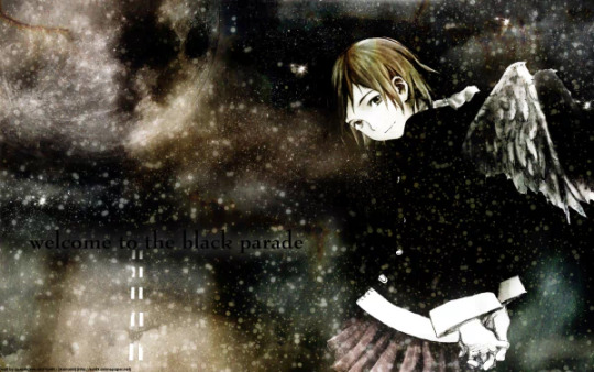
Nothing says “graphic design is my passion” like throwing black font on a black background because, like, its the Black Parade? It has to be black???
Another genre of Wallpaper at the time was the ‘anime + poetry’ blend, which Haibane was a poster child for:

Posted by “Knight Of Lain” in 2005 as their first wallpaper, King tier shit. This genre really died out by ~2010, but I think early internet had a lot of quasi-spiritual, “Christian-ish but I don’t like, read the bible ya know?” teens for whom Haibane’s ennui & iconography really hit home. Those people are either practicing capital-W Witches or Gwyneth Paltrow now.
Something I did discover when browsing DeviantArt was the people who uploaded “wallpapers” that were just screenshots? Of their desktops? So like their UI was still there, so you couldn’t really download it as a wallpaper:
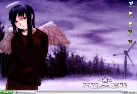
At the time that would be frustrating, now its perfect Y2K-core vibes. “Posted in 2006″ yeah I gathered that, show me the Warcraft 3 mods don’t tease me like this!!
To diversify a bit, I did find this Winamp skin in the Museum, fully ‘flipped image’ and everything like how it was done at the time:

I find this particularly amusing because I know why it exists - Serial Experiments Lain was hugely popular with the techno scene for obvious reasons, so there are tons of winamp skins for that show, and Haibane is related to Lain, so even though Haibane shares like none of Lain’s aesthetic in that regard...why not right?
On the more professional side, Megatokyo Author Fred Gallagher absolutely did a Haibane-inspired sidestory in his webcomic in 2007! He loved the anime and I think its ‘genre’ was something he was trying hard to emulate in the late 2000′s:

Link if you want to read it, though the Haibane elements are more aesthetics than plot.
To end this a little meta, Haibane wallpapers, like everything back then, were built out of “constituent parts”, official art from scanned artbooks and promotional material, cut & recoloured in photoshop. One of the big source ones at the time came from this image, if I recall correctly:
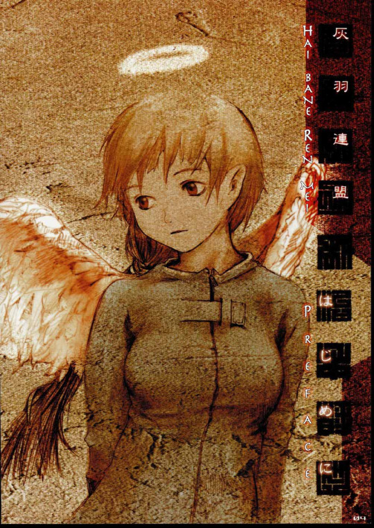
Which is funny, because it kindof isn't from Haibane Renmei? That isn’t Rakka. Its from Yoshitoshi Abe, in a doujin he published in 1998 *called* Haibane Renmei, but it was extremely different from the show. Its just a collection of standalone art jumping between cute and gothic-creepy, and these angels live in modern Japan:

The latter creepy stuff is actually kindof funny, as you can tell this guy is definitely designing for Serial Experiments Lain at the time - which shares that sensibility deeply - but its an aesthetic that would barely survive in the actual product by the time the *true* predecessor doujin of the anime, Haibane of Old Home, would be released in 2001. But since so many Haibane fans *were* alt-edgy goth loving freaks due to how Haibane was situated & transmitted in western anime cultural spaces at the time (and its inherent themes, not taking that away), pulling from the extant creepy art out there was a natural instinct. So that og image just...became Rakka.
You can check out the 1998 doujin here in full if you want - if you are a fan of NieA under 7, the other anime based on one of ABe’s doujin, you will definitely notice some proto-characters for that story in this.
(Also since it has happened before, every art featured here is unironically great, their creators are great for making them. Cringe is dead, I love all of this)
605 notes
·
View notes
Text
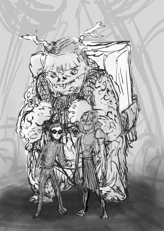
Troll Dads Design Path - Part 1
This thread is long overdue and has hit further problems in being posted delaying it further, apologises for that. Anyway we're here now and finally it's time to look at some troll dads.
This has been pieced together from what has been found online and acknowledges that there is further content in the artbook or somewhere online that has yet to be found. The timeline will also be as accurate as can be guessed

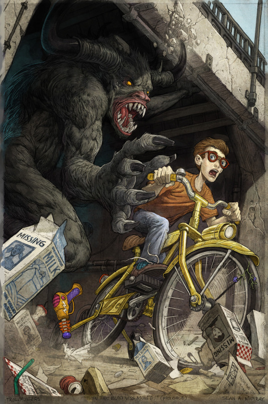
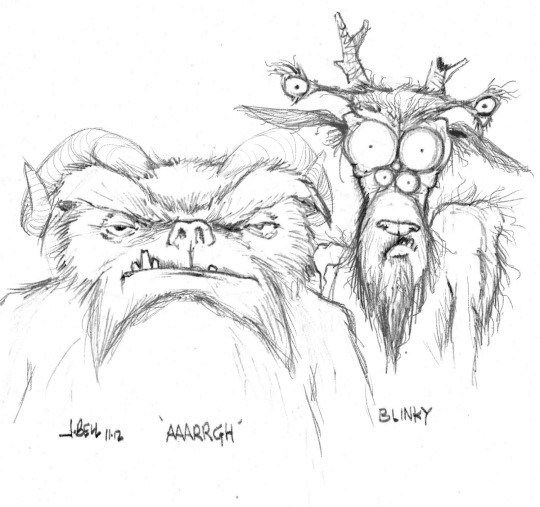
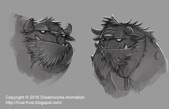
Might as well start with the original Trollhunters book where a much wiggly Blinky of the Lizzgump clan and the fetching lady Johannah Mmmm ARRRGH!!! looked very different to their tv designs. E. M. Gist produced the below artwork that was to be the cover though was replaced by Sean Murray's Amulet artwork fairly last minute. It often blows around the internet in bad quality and never credit so it's a pleasure to finally be able to do that.

Source
Sean Murray has two illustrations with his own take on the duo! If Blinky was more visible you'd see a skirt made out of medals he's wearing. These were part of a set of interior illustrations.
Source includes other illustrations he made for the novel
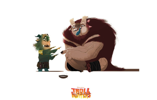
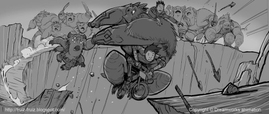
Understandably for the original Trollhunters film their designs had to be changed to be both more animation and child friendly. Rodrigo Blaas produced this version in 2010 showing Jack Sturges, Handsome Blinky and AAARRRGGHH carrying a hunk of Gunmar around, something that sticks around in the artwork for a long while.
Handsome Blinky can kindly stay away.
Source
On his website John Bell has this artwork from 2012, clearly still in the film phase, of his take on the duo. You can certainly see some themes still sticking around from the earlier days.
Source
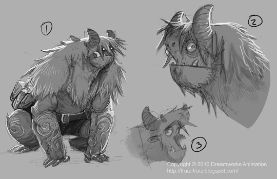
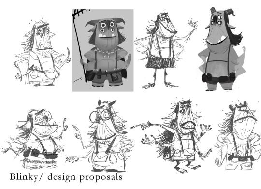
Blinky went all sorts of directions as can be seen in this artwork by Francisco Ruiz Velasco. His four arms didn't seem to show up until he took on a more familiar shape and surprisingly he had a tail at one point!

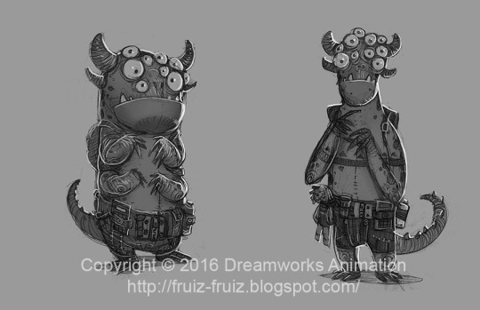
Source
Headless Studios were also trying out different Blinky designs including a tall variant until his more rectangle shape we're more used to started to crop up more and more. There are even more of these in the artbook.

Source
As they deserve a special place being so unique these fuzzy Blinky's are by Francisco Ruiz Velasco and show a rather familiar outfit starting to appear. He still has a little tail though his feet are more feathered than solid but it only adds to his adorable charm.

Source
This one wasn't posted in the original thread, figured it'd be a nice treat for the long wait. Simon Rogers did concept art for the original film and if you look at the bottom middle and left a bit there is a squat Blinky, A tall standing but short legged AAARRRGGHH with a chunk of Gunmar and likely Jim in Trollmarket.
This seemed a good transition piece between the dads too.
Source
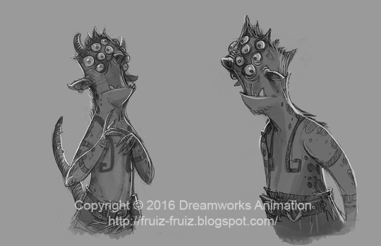
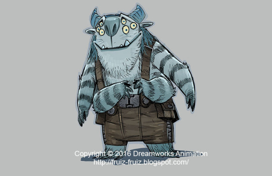
AAARRRGGHH seemed to hit his stride much sooner than Blinky did with most changes focusing on how much fluff, facial shape and his tattoos. These images are by Francisco Ruiz Velasco and include shorts prior to that loincloth number he'll be sporting soon. With his build heading the right direction too he's already looks like a good boy.


Source
Meanwhile at Headless Studios, AAARRRGGHH design started to cement into something more familiar to us by keeping that scruff n fluff and extending it. This is the first appearance of his arm stripes which will stick around for quite a while along with leg wraps. His tail is pure fuzz when it appears.

Source
Shown in the artbook along with an art version by Headless Studios (A version of is below too), this small statue was used in the original pitch and was created by Chris Ryniak! Poor Toby.

Source
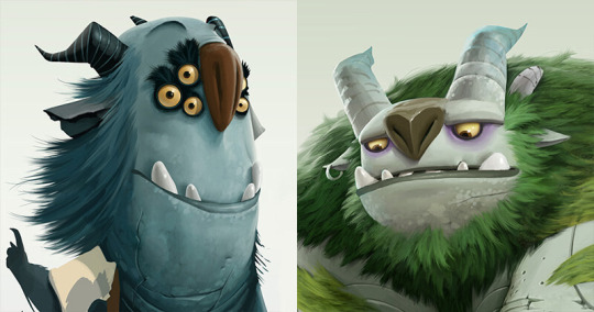
Blinky in the meanwhile was still being fairly fast and funky though now his shape seemed to stick and it was more the specifics that were in flux. His number of eyes kept changing, glasses, fabulous eyeliner and even a camp counselor look going on.
Bar minor adjustments though he too would hit his stride. All the below are by Headless Studios.

Source
The colours remained in flux for a while though and a number plate temporarily appears on his shoulder. He does look rather fetching in pink though? The chunk of Gunmar is back and AAARRRGGHH remains stable for the time being other than being red. Both are Headless Studios again.

Source
Sergio Casas did a colour pass making the trolls makeup game the best it'll be. AAARRGGHH's arm stripes are starting to dwindle though the earring is sticking as it will until the final. This is also the last appearance of Blinky's number plate.

Source
More Headless Studios! His arm warmers make their last stand here and the more obvious loin cloth putting an appearance. The bottom middle one is likely what Betsy Bauer based the phone artwork in Wizards on. Look at that smile.

Source
Two more by Francisco Ruiz Velasco, while the top image does have vague hints of fuzzy Blinky AAARRRGGHH lacks his arm warmers for clear rune marks instead. The second image showing "Gunmar" at Killahead Bridge comes much later and AAARRGGHH having a sharper design than the softer rounded one he did previously.

Source 1 / Source 2
Jonatan Catalan Navarrete portfolio includes a poster for when it was still very much the film version and a slightly terrifying Blinky model (A textureless version is in the artbook) and the final appearance of the hunk of Gunmar.

Source
There is actually two versions of the below image by Alfonso Blaas though this is the lesser known one with gorgeous lighting, the other being an earlier blue concept used to announce the Trollhunters tv project. AAARRGGHH has his loincloth still but very much looking like who we know and love now.
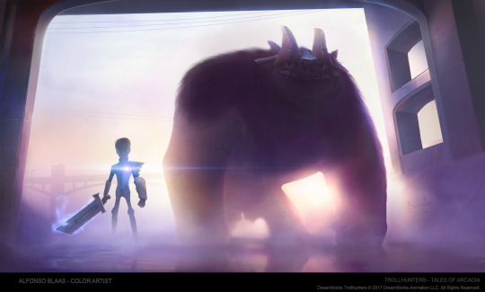
Source
Due to hitting the image cap the thread has been split into two! You can find the second part here.
#Trollhunters#Tales of Arcadia#Vis Dev: E. M. Gist#Vis Dev: Sean Murray#Vis Dev: Rodrigo Blaas#Vis Dev: John Bell#Vis Dev: Francisco Ruiz Velasco#Vis Dev: Simon Rogers#Vis Dev: Headless Studios#Vis Dev: Chris Ryniak#Vis Dev: Sergio Casas#Vis Dev: Jonatan Catalan Navarrete#Vis Dev: Alfonso Blaas
89 notes
·
View notes
Note
Tigera, your art is very beautiful and unique! I always recognise your style when I see it. Do you think you can provide some tips on developing such a unique style? I’ve been trying, but it is a struggle. Thank you, and I understand if you cannot !
Thank you very much!!
Yes, somewhat. Ysee the thing is, I never focused on having a "style". I've always just tried to draw things i like as exact as possible. I also often study art I happen to see and I think is amazing is well done, which often makes me test new approaches in my art.
I never really understood other artist obsession with "having my own style", you will always draw things that exist or have existed, from the world your brain can perceive and comprehend, or from other fictional works. Nothing is quite new, and that's great! Because it means you can stop stressing about being 100% unique. And perhaps you might come up with a cool concept that people haven't heard of before who knows.
But that aint all. I didn't get to my level by just doing that and sitting down, I studied basic principles. These are the building blocks, the base concepts, that you can use to make your art: shapes, volumes, shading, color, composition, values, perspective, etc... If there's a word/concept in there you don't understand, RESEARCH IT RIGHT THE FUCK NOW. Be curious, observe things around you carefully. Pretend you are a fucking scientist in a lab and you have a bunch of cool liquids and you can mix them up with not much consequences, try things!! It's ok if you fail it, you'll be fine!!
Also for studying said principles, here are some ressources:
youtube
youtube
I didn't get the luck of being able to attend an art school, so I'm self taught. We are EXTREMELY LUCKY to have a library of knowledge available to us at any time called the internet, USE IT.
So just have fun, I know social media nowadays makes it hard because of peer pressure and shit, but please, make art because you love making art and because you love whatever it is you are drawing!
TLDR: calm down, it'll come in time. I'm here right now because I kept drawing my pikachu plush when i was 6, and a buncha pokemons and Spyro and shit. You'll be fine! Good luck, have fun, and stay curious! OvO
10 notes
·
View notes
Note
do you have any tips on how you draw kitty and puss? I really like how you draw them and I'm struggling a bit since I don't draw animals alot ( also i don't wanna accidentally fall into the sexualized female anthro animal trope with kitty )
Honestly, before this movie, I didn't have much experience drawing anthro-ish animals, or even just animals in general. One scroll thru my art tag can probably tell you that Im not really much of a furry artist, and I mostly draw people. So starting out attempting the characters, I really just did a bunch of sketchy screenshot redraws, trying to find shots from different angles to get a feel for the proportions and how I personally wanted to stylize them.
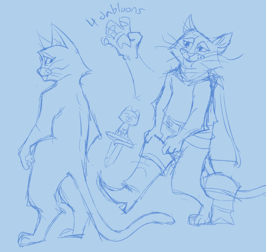
(redraws of the doctor scene, practicing him undressed and from the side)
The good thing to note is that if you know how to draw puss, you know how to draw kitty. Kitty is literally a modified model of Puss (all the cats in tlw are, according to the artbook), therefore without accessories their sillouettes are basically identical. This makes sense considering Puss and Kitty are... not really anthro animals? The most humanoid things about them are their paws being slightly more hand-like than is realistic for a cat, and the fact that they stand just a little too straight when on 2 legs. Otherwise they are basically just normal cats. Which means you can also use the internet's extensive plethora of cat images as body reference as well.
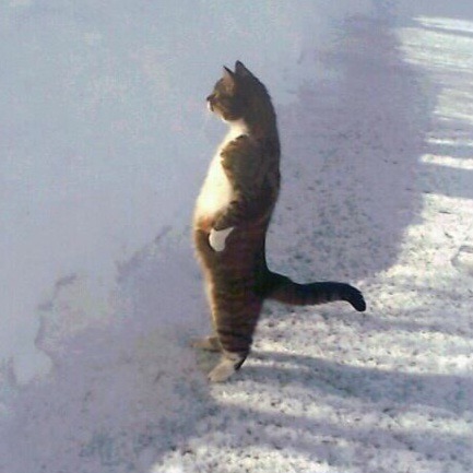
(literally cats just look like that when standing like a person. its ridiculous)
So I basically use the same base for both characters. Most of the differentiation of them is in details, for me. I personally make my Kitty have softer angels than Puss, especially in the face. I also give Puss longer, wavier whiskers. But these are all personal stylistic choices. If I were you I'd look to some of the concept art as well. The artbook is really great to have tbh! But obviously if you can't afford that, like 99% of the art in there has been floating around on the web anyways. You can get a better sense for how various artist chose to stylize and simplify the characters, and experiment from there.
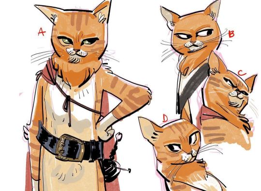
(jesus alonso iglesias's puss concept arts. I personally take inspo from these for my own interpretation)
so that's about it? really all this advice boils down to is "use reference and take stylistic choices from other artists" but that's basically how you learn how to draw anything, so mileage may vary. The real answer to this question is go back in time and hand your ten-year-old self a copy of Warriors: Into The Wild so you already have a way to draw cats etched into your psyche.
66 notes
·
View notes
Text
Get That Bit of Chunibyo Inside You
"We must have a bit of 'chūnibyō' inside us. The fact is we like manga because of the moral within that could touch us emotionally, and we have to behave as we are taught from these media." -Chloe Lisa Kung, Organizer of Rainbow Gala 30, Source: Rainbow Gala 30 and the End of an Era: Hong Kong's Biggest Doujinshi Convention Set to Shutter
I stumbled across an Anime News Network article about a Hong Kong doujinshi event, Rainbow Gala, possibly not existing anymore after a long run in a convention center set to be demolished in the near future.
The organizer, Chloe Lisa Kung, was asked about the future and what led to the impending doom of her event. She spoke about how Hong Kong youth aren't allowed to thrive or chase creative pursuits. Kung lamented on how there's no breeding grounds for young artists to shine or inspiration for art in Hong Kong compared to almost 30 years ago when she started to draw at the age of 12 after seeing doujinshi art.
It does make me think about Hong Kong's anime culture today. I remember visiting Mong Kok Shopping Center back in 2009 and it felt like going to Akihabara in some ways. Every floor was filled with anime, manga, video games, artbooks, toys, etc. When I hear about Hong Kong now, I hear that it's "dead." And reading what Kung said now makes me hesitant to go back there in some way. I do feel that Hong Kong is a bit too commercialized at times. I never liked Canto-pop much and listened to counter-cultural Cantonese music. While anime has always been popular in Asia, it does feel like there's a very genuine communal vibe in that part of the world when it comes to anime/manga fandom and outside forces are slowly stripping that away as everyone wants to jump in on the fan convention train.
There's something that Kung says about the future of Rainbow Gala that makes me think about fans in general and the growing appeal of anime to doujin artists.
"Indeed, there are more consumers now than ever, but the most important lead still lies in the people inside drawing."
I think about the kids who draw manga after watching an episode of anime. I think about the various drawings I've seen over the years of their favorite characters. Sure, some adults will find it "cute" and suggest that it's just a "phase." But to me, the magic starts to happen there.
There's so many consumers, but not enough people to create stuff that can touch lives. It's hard to be creative. Creativity is often devalued due to a general obsession over measurable outcomes.
Kung's words about learning from manga also make me think about how much manga has meant to me. While I did write that I needed mahjong to save me, manga is still what I care about the most. A lot of my mannerisms and attitudes still come from manga. I try to incorporate my manga reading experiences into how I behave. Sometimes, I make blunders, but I still try.
I think about how most fans aren't like me and countless others who use their love to talk about manga on the internet (shout-outs to the bloggers, YouTubers, and podcasters that promote manga in their way). What drove us to start talking about our love to manga to people who don't know us in person? What drove us to become more than just consumers? How do we cultivate that mindset? Those are questions that I'm still trying to get the answers for.
I can only speak for myself in that my own personal mental health experiences combined with the environment I grew up in made me want to blog in the first place. I continue to do so because of how much manga has grown in the past few years. I know it's not just a phase for some youth.
Until then, I'm proud to say that I still got a bit of 8th grade syndrome in me. I'm proud to say that stuff that's mostly read by teens still gets me pumped to seize the day. I'm proud to be a fan that wishes for future creators and their youthful enthusiasm to be treasured as much as the mainstream works that inspired them.
2 notes
·
View notes
Note
I love your work! Do you happen to have any tips for artists looking to get into digital art using procreate?
Sure! I absolutely love using procreate. For whatever reason it’s considered a lowbrow art tool by major studios and companies??? But I can do pretty much anything I’d want to do in Photoshop in Procreate at a fraction of the cost. Plus working on an iPad means portability— If I want to draw in the car, on a plane, in a cafe, etc. I totally can. Glad to see more people are getting into using it! 💖 Alright, onto some tips.
The best way I can think to give tips is leading by example and offering points of reference through my own work and process. If you have follow up questions or are looking for something specific definitely send them my way. ✨😊✨
1. Know Yourself; Know Your Art Style
Whether you’re a long time digital artist or a traditional artist porting over to the digital medium it’s very important to know your work, your strengths, and your personal style. For example, I was very much a traditional artist who delved into digital artwork to keep up with career demands. For a LONG time there was stylistic dissonance between how I drew on paper and how I drew on SAI (the desktop paint tool where I got my start) because what I was subconsciously doing was keeping my style to myself traditionally and just mimicking the artwork I saw online when trying to make digital art.
Here are two pieces I made back in 2018, one traditional and one digital. They're both nice pieces, but if someone was asked which one was definitively one of my pieces they're much more likely to say the traditional piece because it's consistent with my style: limited colors, lineart heavy, etc. I kept trying to divorce from my traditional style when what I should have been doing was taking the extra time to learn how to do what I could already do traditionally in a digital program.
It's especially important to know your style and practice maintaining it regardless of media because the next tip is
2. Invest Time In Watching Others
In nearly every hobby, profession, skill, or interest one of the best ways to hone your craft is to see how other people do it. Hozier said in a recent interview when he's not writing or performing his music he's listening to someone else's music. It's very important to our ability to learn to see how a task can be done to help influence how we ultimately do it.
I of course do not mean try to copy someone else's work, which was something I had to learn the hard way when I was starting out in digital art. One of the things I frequently did early on was tried to copy someone's painting technique as closely as I could which resulted in some less-than-inspiring artwork that didn't look much like my usual body of work.
Which is again, something that is easily prevented by just knowing your style.
Some places I go when looking to see how other people draw are YouTube, Tiktok, Artbooks, and Pinterest. Youtube and Tiktok are fabulous sharing platforms usually dealing in quick media where a single search for "procreate" or "speedpaint" yields THOUSANDS of results. Artbooks require a little more financial dedication, but they're great visual references that frequently come with some kind of tutorial in them. Some in my personal collection are Gothic Lolita Punk, Japanese Comickers, and The Complete Masters of The Poster. And Pinterest is frequently painted as a digital piracy war zone, but searching "art tutorial" or "digital art techniques" yields lots and lots of valuable information.
I've been professionally illustrating since 2017 and I STILL go back to these points of reference to see how other people are drawing, painting, etc. Who knows? I may learn something new that takes my art one step further.
3. Explore Brushes!
There are literally Tens of Thousands of brushes that are available all across the internet and I highly recommend taking the time to search google for packs of them. For the first year or so of working with procreate I ONLY used the default brushes that came with the program and while the art was decent I definitely could have used more experimentation to make more cohesive pieces.
As of right now I use a Frankenstein pack of lining and painting brushes that are a mess of brushes I made myself, brushes I got in art packs I found on itch.io or etsy, and some default brushes I've heavily modified to match my style.
I highly recommend playing with brush settings, searching for new brushes, and trying literally every brush you come across to see if you can find a use for it.
I've mentioned it several times throughout but it deserves its own bullet point, so my final tip is
4. Don't Ever Be Afraid To Google It
No artist knows everything. No one who claims to be an expert on Procreate knows absolutely every function, every application, and every trick all on their own--- but between all of us you can find practically anything just by googling it.
I have found super specific pattern brushes, youtube tutorials for pattern creation, configurations for pressure sensitivity, ideas for color palette building, templates for sticker making-- whenever I personally can't figure out someone else likely knows what to do. That's what community is all about!
You are not beholden only to your personal knowledge, so remember google is your friend!
I hope this helped! I tried to pair down the tips as much as I could but I just love getting asked about how I draw. 💖 If you or anyone else reading this has any specific questions you're more than welcome to DM me or send another ask. 😊 Have fun! Good luck drawing!!!
14 notes
·
View notes
Text
Obscure Animation Subject #55: Serial Experiments Lain
Originally posted on Twitter on April 15, 2023.
Created by Yasuyuki Ueda, written by Chiaki J. Konaka and directed by Ryūtarō Nakamura, this is a 13-episode miniseries produced by Triangle Staff, and aired on TV Tokyo from July 6 to September 28, 1998.
The series follows Lain Iwakura, an adolescent girl in suburban Japan, and her relation to the Wired, a global communications network similar to the internet. The show is an original idea to the point of it being considered "an enormous risk" by its producer Yasuyuki Ueda.
Ueda had to answer repeated queries about a statement made in an Animerica interview. He stated that Lain was "a sort of cultural war against American culture and the American sense of values we [Japan] adopted after WWII". He later expanded this in numerous interviews.
He created Lain with a set of values he took as distinctly Japanese; he hoped Americans would not understand the series as the Japanese would. This would lead to a "war of ideas" over the meaning of the anime, hopefully culminating in new communication between the two cultures.
When he discovered that the American audience held the same views on the series as the Japanese, he was disappointed. The Lain franchise was originally conceived to connect across forms of media (anime, video games, manga), but due to its failure that was scrapped.
Ueda said in an interview, "the approach I took for this project was to communicate the essence of the work by the total sum of many media products". The scenario for the video game was written first, and the video game was produced at the same time as the anime series.
However, the anime was released first. A dōjinshi titled "The Nightmare of Fabrication" was produced by Yoshitoshi ABe and released in an artbook An Omnipresence in Wired. Ueda and Konaka declared that the idea of a multimedia project wasn’t unusual in Japan, as opposed for Lain.
Despite the show’s confusion to the audience it wanted to appeal to, critics responded positively to the thematic and stylistic characteristics, and it was awarded an Excellence Prize by the 1998 Japan Media Arts Festival for "its question the meaning of contemporary life".
According to Christian Nutt from Newtype USA, the main attraction to the series is its keen view on "the interlocking problems of identity and technology". Nutt saluted Abe's "crisp, clean character design" and the "perfect soundtrack" in his 2005 review of series.
He said that "Serial Experiments Lain might not yet be considered a true classic, but it's a fascinating evolutionary leap that helped change the future of anime." Anime Jump gave it 4.5/5, and Anime on DVD gave it A+ on most criteria with some As for volume 3 and 4.
Lain was subject to commentary in the literary and academic worlds. The Asian Horror Encyclopedia calls it "an outstanding psycho-horror anime about the psychic and spiritual influence of the Internet". It notes that the red spots present in all the shadows look like blood pools.
It also notes the death of a girl in a train accident is "a source of much ghost lore in the twentieth century", more so in Tokyo. Gilles Poitras describes it as a "complex and somehow existential" anime that "pushed the envelope" of anime diversity in the 1990s.
Susan J. Napier in her 2003 reading to The Problem of Existence in Japanese Animation, compared the show to Ghost in the Shell and Spirited Away. According to her, the main characters of the two other works cross barriers; they can cross back to our world, but Lain can’t.
Napier asks whether there is something to which Lain should return, "between an empty 'real' and a dark 'virtual'". Mike Toole named SEL as one of the most important anime of the 90s. Anime Academy gave the series a 75%, but criticized it due to the "lifeless" setting it had.
Michael Poirier of EX magazine stated that the last three episodes fail to resolve the questions in other DVD volumes. Justin Sevakis of Anime News Network noted that the English dub was decent, but that the show relied so little on dialogue that it hardly mattered.
So all in all, this show is one of the weirdest shows out there, but despite being a miniseries, it still has significance thanks to the bizarre nature and sci-fi themes. Not in the levels of Neon Genesis Evangelion or Cowboy Bebop, but still really interesting to go through.

3 notes
·
View notes
Note
hi hachi!! im really interested in hearing your thoughts on 5, 14, 29!
hi hi!! i forgot to check inbox again after rblogging that oops
5. Estimate of how much of your art you post online vs. the art you keep for yourself
I think i post everything except artbook/commission work and most of my art this year has been commissions so... i guess it's 30/70 proportion
I want to return to a 90/10 proportion next year though, i have ideas and I'd like to post more bc my online presence has been almost none in comparison I miss the internet...
14. Any favorite motifs
Contrasts... that's vague but yeah
As a whole I like touching in art and I wish for my art to reach certain level of intimacy if there's interaction between characters who care about each other TCH that's so long of an explanation... I like thinking on how to make hands touching, mouths touching, tails touching (thanks to most comms i get i learned to draw catppl LOL) and not make it look silly but that can convey closeness like friendship or romance
Also as hypocrite as I am for saying this I adore insects in art more than irl they are so aesthetically interesting... irl they are so delicate or outright harmful/annoying but I'm sure they feel the same way about us humans ANYWays I like them bc they kind of remind me of fairies (most of the winged ones) or of illness/fear/death (most parasitic, flies, maggots). I love contrasts and the fact insects can mean so many contradicting things is very cool to me
extra I like some of them irl too I'm just not good at handling them u_u
I also like mythology and fairytale motifs :] i'm ignorant of most literature so I cannot recognize many references when I encounter them but I like seeing fanart or comics of books I know and I'm taking this chance to plug gianni de luca's shakespeare comics bc they do feel like watching a play
29. Media you love, but doesn't inspire you artistically
I was legit going to reply with music but just this month I unironically wanted to draw OC animatics. To TSwift and Avril and Carly Rae Jepsen songs. I wasn't as unhinged as i wanted as a teenager and it shows now
I'm gonna answer with found footage style films!! they are my not guilty at all pleasure and I love LOOOVE media that replicates that style in art or videogames/ARGs etc but they don't really inspire my art, maybe if i tried doing some horror they would but that's not on my current plans sooo
#alicenpai#answered#i got a couple more asks but they take longer than i thought so i'll reply later sorry OTL#insect cw
10 notes
·
View notes
Text
regardless of what mediums you wanna use how you wanna draw ever heres what you need to do
-if youre a cartoonist be very specific with anatomy studies. if youre gonna stick to really stylized cartoony shit then keep anatomy studying to just basic forms, joints etc and focus on figure drawing. id reccomend 'figure drawing methods for artists' but for fucks sake just go on youtube, watch a couple videos they all say the same thing anyways. as long as you're not getting blatantly incorrect info from a guy that doesn't actually know how things work and cuts corners. it's better to sweat and bleed learning how to draw basic forms like the torso and pelvis than do what i did (go through as many shortcut pinterest guides as possible, develop a flawed and stiff understanding of anatomy, use it as a crutch) .
but yeah figure drawing is useful because learning how to set characters up in different poses and composition are useful. for every cartoonist!
-2... i ran out of points to make. Think about artists you like, you don't even have to make long rambly analyses , just jot down why you like their art and what appeals about them to you. anything from that vintage mustang poster you saw the other day, to a 'fine art' artist you'd see in a museum to your favorite blog
3: study practically.
read artbooks, look at tutorials online, watch youtube tutorials from a variety of sources: but remember, regular practice is the goal here. don't get too hooked on watching tutorials or studying and just go outside and draw a little. try and apply those skills bit by bit.
4 here are my (amateur guy that draws online and isn't going to art school)'s random advice bits
supplies i think are a godsend no matter what: one really good pencil. doesn't matter what kind it is. i got fancy ones but in all honesty light or dark you just need one that feels comfortable to write and draw with. practice those artist grips! consciously think about lines: do i want thick or thin lines? and what can I do to change it? Are my lines unsteady? and am I unhappy with that? sure, then try a different grip, or see if a thicker, more bulky pencil works! but hey, i'm just some guy on the internet telling you to do things.
ironically, even as I wax poetic about how fun it is to collect wood/mechanical pencils, my favorite thing to draw with is a #2 pencil.
I could go on and on about art supplies and practical applications but all I can say is if you really like something, splurge on it and if you're not sure about it get cheap ones. It's not really about the subtle intricacies of each medium but if you even like it in the first place. Cheap vs expensive watercolors aren't gonna matter if you don't LIKE using watercolors.
..that being said I think color pencils are the exception to this as each brand varies in quality regardless of price.
here are some artbook reccomendations to finish off this jumbled, disjointed and haphazardly written post
-Sketching People by Lynne Chapman: I tend to lean towards the more practical when it comes to any advice. something that really boils down the way you do something and why to its core. This book is really good for that.
-Figure Drawing Methods for Artists by Peter Boerboom and Tim Proetel: it's a really fun exercise book.
-Space Drawing and Perspective by Superani: once again, practical, well translated , and really fun to do. Don't get superani's anatomy book though it's racist and pervy as fuck
-and so many more that I can't even list here. Just go to your local library and open up one of these babies, grab a sheet of paper, and just jot anything down that seems interesting to you. Capiche?
#im on fever medication right now because I am sadly once again sick so this might be incoherent#but this post is really just my contribution to the discourse around instagrammable marketable clean and palatable art and#expensive art supplies and confusion and#just in general a lot of online spaces have made artists feel like their art has to be super palatable all the time#so a lot of people forgo learning the bones and joints and MEAT of art#ie structure and foundational skills#in favor of getting a cleaner product out faster#so this is just kind of me ranting on my lawn chair about how I THINK is the right way to do it and git gud faster#dont rb#fish talks
2 notes
·
View notes
Text
Okay so I thought of making a post showing all my art related books. I shall begin with DC comics
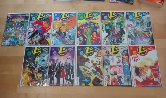
I am a fan of the Legion of Super-heroes, it is unfortunate that they don't get alot of attention in todays media and are barely known in Germany. I had to import a bunch of them from America which was already a hard task to find a seller who'd be willing to do that. But I got them either way!
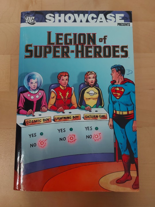
Only thing I didn't read here was this thick book I bought at a comic store all those years ago, somehow it doesn't speak my interest that much but it also showcases all the appearances of the legionnaires in the old comic books.
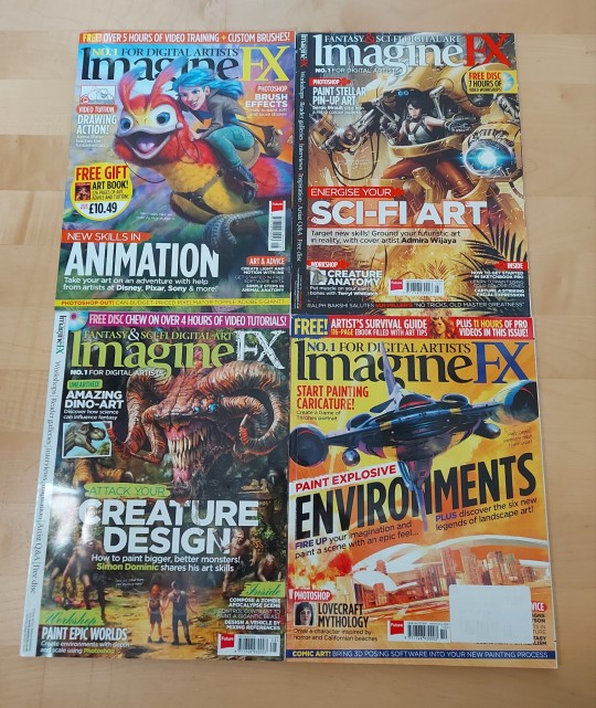
Then I have these 4 magazines from ImagineFX, I find the content really cool where they showcase so many different artists I haven't seen before. Also the old magazines have the extra content on a website where you can easily access the downloadable files of any other magazine from that time by editing the URL. Tho alot might not be useable or because I don't use Photoshop. Well I could pirate it, but also I am spooped of catching viruses.
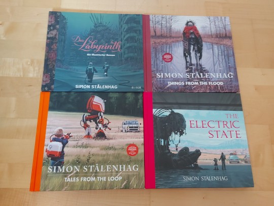
These ones got recommended to me by a friend, I am so amazed of Simons works and the way the storytelling takes place. I wish to be able to draw like him one day, it would be so cool to be able to properly visualise everything I'd imagine.
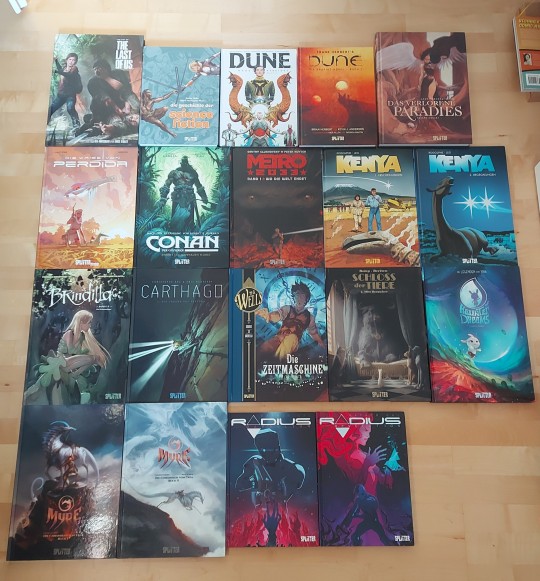
Oh boy this is a big bunch.
I haven't read all of them thus far, my school stress and worries made me not touch some of them at all since purchase, but I'll try to change that the coming months.
I wasn't a big fan of Conan and Metro, it's not my taste in comics. Perdida for example was a really neat one with a huge twist at the end. It honestly flabbergasted me.
And Myre + Radius are my favourite ones among these comic books. They're the first ones I purchased from Splitter Verlag.
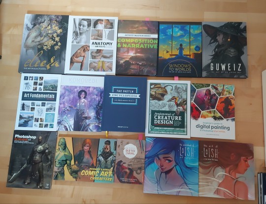
Oh boy and here we have all my books from 3D total (tomorrow I'll get a few more)
Some I still have to read, two I already finished and 3 of them I already started reading.
I got the Composition & Narrative one on Christmas day. The Hermes delivery guy was also playing music when he was at the door. Like a Santa Claus haha.
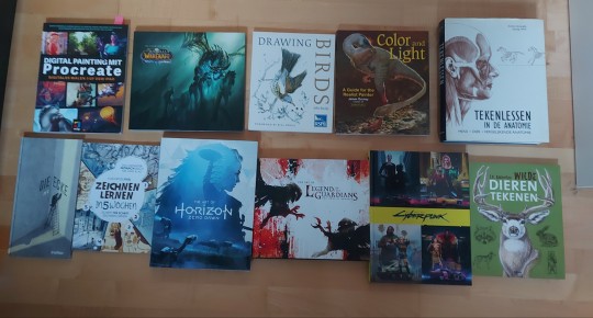
These ones are from all different kinds of book retailers. I saw the Procreate one in my local bookshop and was like, "I need that" and it helped me greatly.
I remember importing the Legends of the Guardians book directly from Australia. It took a while to arrive but it came in December of 2020? I believe. Really gorgeous artworks in there, I love owls so much.
4 of the books were gifted to me, which are equally as cool. I loove the animal anatomy books I got from my dutch friend.
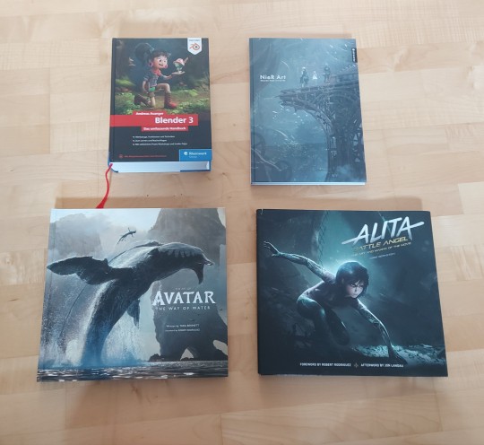
Last books I have here are from different things. Firstly blender... I, I know there are free internet tutorials. But I am stupid so I need a book where everything is written down so I don't melt my brain trying to google a solution. It's reaaaally big
I haven't read the Nier artbook yet, but maybe soon.
The other two are as seen from avatar and alita battle angel. I went through both of thwm and really enjoy the contents presented in there. I still remember watching Alita back in the cinema, I was soooo mindblown by everything, and the OST of the movie just rocks.
Oh boy I don't think my artbook obsession will ever stop, they atleast greatly help me learning new things for my own artworks. Yes there are youtube tutorials but I also would like to read up on things.
I can't wait to look at the contents of my new books tomorrow. I must absorb the knowledge into my brain!
2 notes
·
View notes
Text
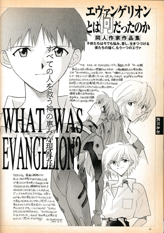
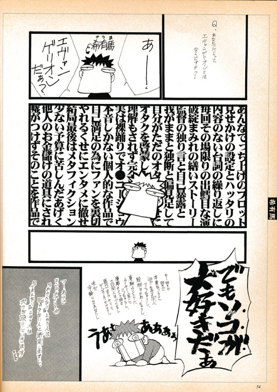
Comic Box 1997 End of Evangelion Issue - Archive Scan
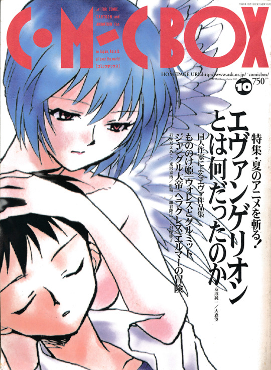
Comic Box was a magazine in Japan launched in, from what I can gather, 1982. It was a bit of an ‘alt” magazine - it has an imprint, Comic Box Jr, which focused on doujinshi for example - and would cover anything anime-adjacent, including western films. The October 1997 release of the magazine was dedicated to the release of the End of Evangelion film, and to answering the question “what was the phenomenon called Evangelion?”. Towards that end it features fan submissions, art, comics, essays, all talking about what Eva meant to them. Some are serious, some are fully comedic, way way more than I expected are erotic, and overall it is a time capsule of how the anime community was thinking about Evangelion when EoE came out. The magazine dissolved in 1998 from what I can tell, so this was one of its last releases - you can still see its absolutely vintage website here! Complete with dashing chibi cat gif.
I discovered this magazine through japanese anime/manga archivist-in-residence ehoba on twitter, who provided photos and rough summaries of some of the pages. They are just camera photos of an open magazine though, not scans, and not at all complete. I hunted around for a while to find a scanned version, messaged ehoba and a few others, posted on forums like Evageeks, and drew total blanks. I couldn’t find any listings of it online, so I set the quest aside...until I was placing another order for some artbooks for import and decide to check Yahoo Auctions Japan and lo and behold, there is was! It arrived this week.
So that image above is not one pulled from the internet - I have scanned the entire Evangelion segment of Comic Box - October 1997 issue. I am a neophyte scanner & image editor, these aren’t gonna be amazing or anything, but while I hope to make a more polished version I wanted to share the drafts now. I really aspire to translate it, but of course I don’t speak Japanese, so I am going to see how far working with some people I know and brute-forcing with AI would go. If you are interested or know someone who would be, definitely reach out! 100% would crowdsource this. If someone already scanned and translated this, also let me know, I would groan heavily and curse my google skills but i’d rather it be available and know, and not waste time.
Below will be some reduced-down PNG’s of the magazine to fit Tumblr image limits with Ehoba’s notes and a few of my own attached to them. A link to the full images as a singular PDF is on the Internet Archive [Here]


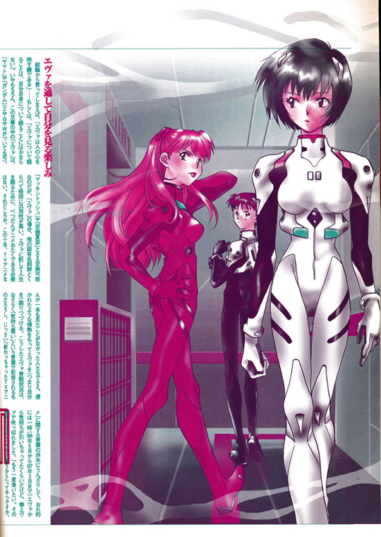
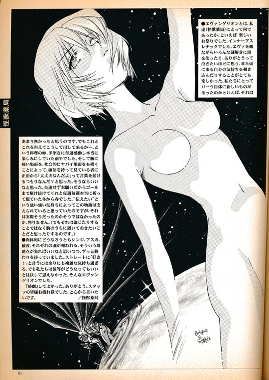
A reflection of a very known thing in this magazine is that, from my perspective, End of Evangelion is definitely Asuka’s moment to shine, but it didn’t matter because the 90′s Eva fandom *loved* Rei. She was the most popular by far, and I think dethroned Sailor Mercury on the ‘best girl’ polls in magazines of the era. Nowadays if you poll audiences - as the NHK did recently - Asuka is the most popular girl, but it was a different, proto-moe-boom time.


"Evangelion was fake. A fake made by one director, or by the staff. However, it was a very real fake. God, it was so good."

Watermelon Kaji absolute goat here; so cool indeed
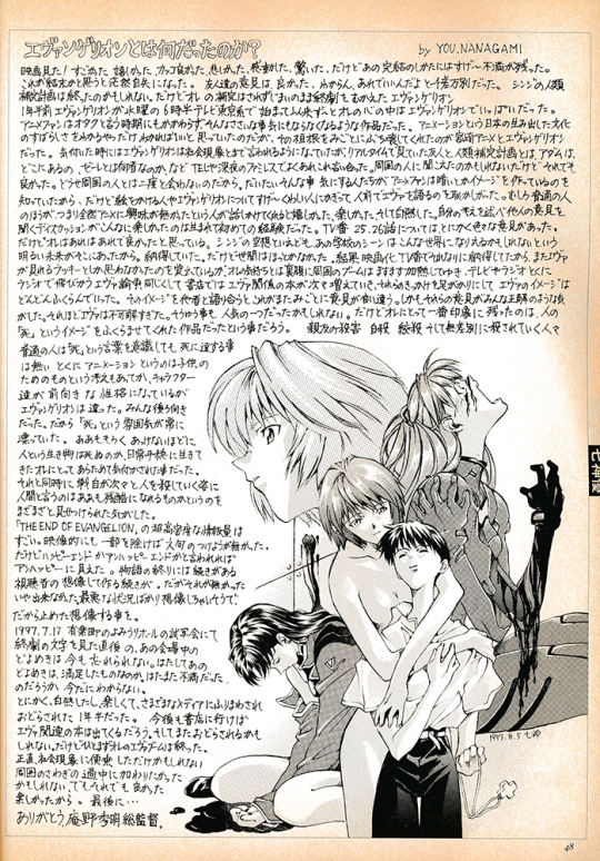
How much Asuka is suffering in all these images vs god-salvation Rei is, again, saying alot about the waifu wars.

"I don't think episode 25 and 26 were professional work. I understand that the ADR script and previews with layout sheets are supposed to be avant-garde, but something is wrong with it." "TV show is not an individual's job, so I wanted them to deal with the schedule limitation."
90% sure this Asuka ‘escaped’ and I saw it on the internet in the early 2000′s - maybe the author published it elsewhere in a doujin, I assume a lot of this art would have been repurposed for other mediums.
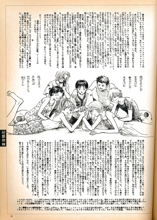
Honestly the art is incredible for this magazine sometimes, the splash pages they have are filled with Evangelion’s anime-spiritual energy.

"Unit 02 has a mouth, which means it can give a blow job." "The biggest surprise is Rei in cowgirl position. The official content does that, so hentai authors have nothing to do."
(Gainax putting hard-working hentai doujin authors out of a job, what assholes!)

"My heated up feeling toward Evangelion was quick-freezed by episode 25 and 26. EoE defrosted it, but now I feel distant from Evangelion."
How much Episode 25-26 come up here is great evidence for how divisive they were - End of Eva is absolutely seen as commentary on, and opposition to, the TV ending. I think in the west the initial reception of the original ending is overall more positive? Certainly nowadays, would be curious how it is seen in Japan today.

OCR’ing this image will literally murder me, pls I can’t
"Bullshit plot, surficial information, shallow dialogues, inconsistent direction, story with tons of plot holes, the director's masturbation, the otaku's useless attempt to enlighten other otaku..." "BUT I LOVE IT."
10/10 take

"'Sincerity' of someone I don't like just confirms that I still don't like them. Anno apparently thought that honest depiction of himself can be depiction of otaku, but that's not wrong. Anno is exceptionally creepy."

God-tier Anno portrait here. I love how many of this art showcases ��settings” from End of Eva and which ones hit the audience - re-using the movie theatre seats for Shinji, that is really cool!


Evangelion - Slayers edition! The artist names are in the black box panel on the page lining, I absolutely hope to track down a few of them and see what kind of works they made.


"I think each material of Evangelion was nothing new. In the early half, however, I was moved by their techniques of arranging and remixing those materials." "Creators' strong desire for expression supported this story, but I'm not sure."
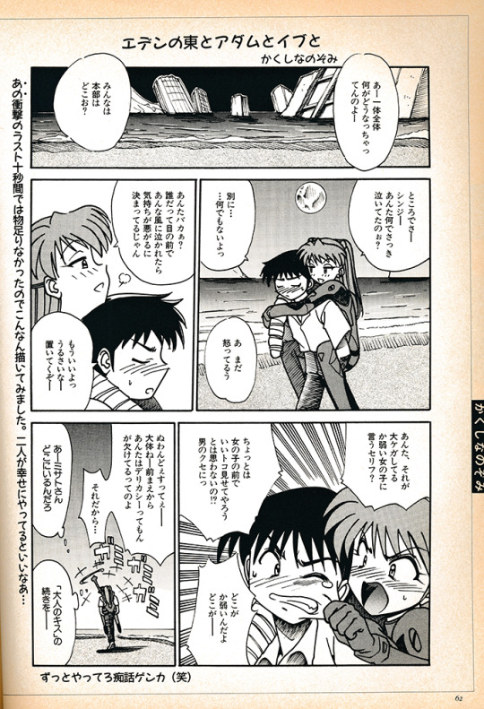
"Adam and Eve in the Eden East" "I hope they will live happily after the ending."
"The theater was like a funeral after the screening. No, I should say it was a literal funeral. Evangelion ended, it died. In terms of entertainment, Evangelion was completely and brilliantly killed."
Kaworu’s insta-inclusion into the ranks of the kid cast is always amusing to me; he is in one episode of the show after all, barely in Eva! But he is all over the art immediately. The power of design - and also being one of the first gay characters on television (as opposed to OVA’s) in Japan.

Hopefully if I can make progress on translation I can have actual thoughts to add to the scan, certainly I will post results if I get them.
I value, way too deeply to be honest, the preservation of the other side of the ‘media mix’ - how people responded to the media in question and what it meant to them. It is way more likely to be lost than the media itself or documents from the production side. May this contribution to preserving a bit of that experience be of value to those out there who would be interested in the history of Evangelion, and anime more generally.
If you think you know anyone or your followers overall would be interested in translation help, I would appreciate the broadcasting!
104 notes
·
View notes
Text
Some forms of media are blessed with robust cooperative preservation efforts undertaken by passionate fan bases. To name some examples: Video games, video game magazines, comic books, and anime to some extent. But preservation efforts for Japanese manga are close to non-existent, varying widely by series. Some of the most exciting and interesting mysteries and treasures that lie beneath the surface of the manga iceberg are not even researched or documented on the internet. This can take the form of:
Manga chapters from famous series or one-shots that were serialized during their magazine run, but never republished in book form for various reasons. Entire series from famous authors that never got a book release at all, no longer purchasable or readable. Manga chapters redrawn or rewritten from magazine to book, or between book editions - this can range from simply changing some dialogue bubbles or doing art touch-ups to completely restructuring the work. Pages that were originally in color during the magazine serialization forever reprinted in black and white (in these cases the original page drawn by the artist is in color and it's only converted to black and white for republication after the fact.) Magazine margin or table of contents comments from the author printed during the magazine run. Interviews with manga authors containing important information never translated and left to rot on the disintegrating pages of old magazines or other publications. Manga chapters collected into book form in a different order than they were originally serialized (it clean lead to some enlightening revelations sometimes to know these things). Art from chapter title pages lost to time after not being collected in the books. Magazine cover artwork that is never collected into an artbook.
The list goes on from there. If a series is very popular it stands some chance at having fans document these things on some wiki, but I find I have to do this research on my own in the vast majority of cases. From time to time I will blog about these things.
3 notes
·
View notes
Text
Game Night: Mega Man Phantom of Network
It’s truly amazing what fans can accomplish. Even with some of the biggest series out there, it’s easy for one or two installments to simply fall through the cracks, never to be seen again. Video game preservation has only recently become a significant topic of conversation, and still faces more than its fair share of pushback; even games from only a few decades ago have vanished without a trace. But time and again, fans lead the charge in preserving more media than most of us thought possible, and there’s a recent major victory on that front involving a series that’s near and dear to my heart.
Mega Man Battle Network was pushed HARD by Capcom during the early 00s, rapid-firing installments left and right at all sorts of platforms…including mobile phones. Keep in mind this was a pre-iPhone world: mobile phone games of this era had far less power to work with, smaller screens, fewer keys, less reliable internet connections, slower download speeds. It was an exercise in pushing extremely tight boundaries, and it didn’t always pay off. But despite the risk, Capcom decided to put two Battle Network spin-offs into these uncharted waters: Phantom of Network and Legend of Network. While they seemed to be remembered fondly enough, and were notably included in the OCW artbook and Legacy Collection gallery, the games always proved somewhat elusive (at least from an American POV, as they were never localized) with little to no hope of us ever seeing anything more than all that concept art.
Enter fan preservation group SciLab Secrets, who managed to procure and dump both of these BN spin-offs as well as a few other Mega Man mobile games. The Rockman EXE Zone, another prominent fan group, then began work on an English translation patch…and, for good measure I suppose, added a couple quality of life changes to create a truly definitive way to play these long-lost games. Thanks to all these fine folks, I’ve now gotten the chance to experience these games, and after beating Phantom of Network I can’t help but want to talk about how it exceeded my expectations.
Spoiler-free tl;dr: PoN is far more ambitious than I thought an early mobile game could be, and all in all I have to say it sticks the landing. It feels (almost) just like any other BN! It takes a little finagling to get started, and the controls may take some getting used to, but once you hit cruising altitude it’s a fun and nostalgic ride (especially since the patch adds Buster MAX Mode to deal with some series-wide aspects that have come to show their age). If you like Battle Network, I urge you to try it for yourself! It took a while, but BN 3.5 is finally here!
That’s right, PoN is set some time between BN 3 and 4, and leans moreso towards the former in terms of gameplay. Believe it or not, the combat is actually a very faithful recreation of combat in the GBA games! There’s some obvious visual differences, some changes to timing and whatnot, but there’s no denying that this plays like BN. Outside of combat, things are noticeably scaled back: the Real World functions more as a visual novel, and the Cyber World abandons the main series’ isometric perspective for a simpler, vaguely RPG Maker look. (I might just be saying that because an RPG Maker BN fangame was a shockingly huge part of my childhood and this reminded me of that. Who knows.) It’s all perfectly serviceable, and taking into account hardware limitations, I’m inclined to say that focusing the game’s resources on combat above all else was undoubtedly the right call. While you can’t run around mashing R to find jack-in points (each area has a “Jack-In” menu option), sometimes new comps will be added to previous areas, and new Mystery Data will spawn in comps you’ve already cleaned out—there are no random GMDs in this game, just fixed BMDs, and if you don’t take time to backtrack you just might miss some. I think these are interesting ways to emulate that incentive to explore, though the former only occurred a few times and the latter can be difficult to track. Jacking-in is also how you access the Chip Trader and Request BBS at Higsby’s. The BBS here works more like those from BN 2 and 3 than the one in 6: new batches of requests are added with each chapter you clear, and you can mostly tackle them in whatever order you want. I say “mostly” because there are a handful of quest chains that you have to unlock one step at a time, including the classic quiz givers and (my personal favorite) an old man who sends you on treasure hunts with cryptic hints. There’s one in particular that, uh…might need a content warning; I won’t go into detail but the job is titled “Please delete me”. Things do work out, I promise.
One system change that sounds small but makes a huge impact is in the way battle rewards work. In the GBA games, at the end of battle you get one random reward. In PoN, you have separate chances to get zenny, a chip, and Bug Frags, often all three at once! There’s still some randomness, obviously, but I remember being frustrated by the choice of focusing on grinding either zenny OR chips, and like this so much more. Now I can accumulate ALL the resources at the same time! And you still have ways to affect your drops: Collect to ensure you get a chip if your busting level is 6+, and MoneyMaker to double the amount of zenny you get. Very handy, especially for the post-game grind.
Now, you’re probably thinking “Collect? Does that mean this game has a Navi Customizer?” No, but it has something very similar: the Skill Editor! Opening the Editor will show you MegaMan’s Skill Slots—you start with 3 and can expand up to 12—and then a list of the Skills you’ve obtained, with each Skill requiring a certain number of Slots to be equipped. Skills can include various abilities like SuperArmor, HP boosts, and level-ups for your buster’s Attack and Charge (there’s no Rapid for some reason). Very simplified, right? (Reminds me of Star Force’s Ability Waves to a degree.) Well, there’s one other wrinkle in the system: each Skill has an Element assigned to it, out of Null, Fire, Aqua, Wood, and Elec. The Element that takes up the most Slots then becomes MegaMan’s Element, bestowing the familiar weaknesses, panel interactions, and Style Change Charge Shots. So, the Skill Editor is not only a NaviCust stand-in, it’s also an interesting mix of Style Change and BN1’s elemental armors, letting you swap your affinity on the fly to have a greater degree of control over it. Of course, aside from Skills bought from shops, what Element each Skill gets assigned is randomized…buuut, there’s an NPC you encounter not long after getting the Skill Editor who, for the reasonable price of 100 BugFrags, can change the Element of one of your Skills to whatever Element you want. Including Null! The randomness of Elements has always been my biggest gripe about Style Change, so having an option here to circumvent that randomness feels so, so good. And speaking of things about the Skill Editor that should’ve become series mainstays, you can (easily) acquire a Skill that dramatically raises your chances of encountering Navi Ghosts! (Ghosts also work differently: V2s are random encounters rather than fixed, the next tier ghost can be encountered immediately without needing to jack-out, and they go up to “SP” which is essentially V4.) These are real innovations to the established systems here, in an early mobile game spin-off of all things! Wild!
I think that about covers the mechanical side of things. As for the story…I’d say I enjoyed it. I don’t think it’s a contender for best in the series, but it works well enough and does have some really interesting ideas. The gist is that “phantom” copies of deleted Navis are appearing and wreaking havoc, and Lan and MegaMan need to figure out what’s causing this strange phenomenon in addition to dealing with the more immediate threats. There’s a sub-plot involving a new transfer student in Lan’s class, Shuichi, and his Navi HatMan (he got Classic Magic Man’s aesthetic while MagicMan.EXE got the name); they get tricked into causing some chaos due to Shuichi feeling ignored by his dad, but things work out, he and Lan become friends, and he contributes what he can to solving the mystery of the Phantom Navis. Pretty standard stuff. What stands out to me, though, is that when Shuichi admits his involvement to his dad, Lan stands up for him saying that he also knows what it’s like to never have any time with your father. As I’ve said before, playing the Legacy Collection made me realize there was a deeper nuance to the relationship between Lan and his dad that I felt tapered off as the series went on, so I really enjoyed seeing that incorporated here. Back at the main plot, it turns out that the Phantom Navis are made from cache data; an old cache server was left running unsupervised in an abandoned lab (courtesy of a certain ex-SciLab scientist because of course), which has given rise to a sentient amalgam of cache data that calls himself…well, Cache. Being thus abandoned, and having access to essentially a library of humanity’s mistakes in the cache data, Cache grows to hate humans and seeks a way to wipe them out. As edgy as he can be, there is a tragic element to Cache that I think lends him a bit more presence: if someone had been there to monitor and properly care for the cache server, then even if the data had still become sentient, the resulting being at least wouldn’t have been all alone, would’ve known something other than loneliness and hate. While not discussed, I think it’s telling that Cache not only keeps surrounding himself with Phantom Navis, he even creates an entirely new Navi to help him, JammingMan (who has a SUPER cool design I love him). Especially taking into consideration JammingMan’s ability to disrupt the connection between Navis and NetOps. Regardless, you can probably see where this is going: if someone tries to separate Lan and MegaMan, they’ll blow them away with the power of their bond, and that’s exactly what lets them finish off Cache before he can destroy critical networks all around the world. BN is nothing if not consistent with its theming, and I do appreciate that.
I guess my takeaway on Cache is that he’s a great idea that leaves a little untapped potential, but in a good way. Also it’s morbidly hilarious that a personification of lonely abandoned data is the villain of a game that was actually considered lost media for a time. On a related note, the concept of cache data has some fascinating worldbuilding implications: it can be used to explain things like “image data”, Mega Chips, Navi Ghosts, maybe even how some Navis are able to return despite being deleted in previous games. How much of this was intentional, it’s hard to say, but it’s a fun idea to think about. Maybe if I ever write a BN fic I’ll get to play around with it myself, hah.
There is indeed a post-game area sectioned off by gates that require you to reach certain milestones of Library completion, as per series tradition, but only a few easy milestones, nothing too extreme. Something I find interesting is that, while the secret areas in 2 and 3 prevent you from jacking-out, this one uses one-way paths to prevent you from returning to the entrance, meaning you HAVE to jack-out. There are secret bosses here as well, and after defeating them they can be re-challenged at any time just like NetBattling friends, no ghost hunting required; it’s from these fights you can get the game’s 4 Giga Chips, along with a certain special Skill. I’ve made it to the final gate—complete all BBS requests—but it may be a while before I can get past it because one of the requests wants a rare drop from Secret Area, which feels…excessive.
I would’ve valued the chance to experience Phantom of Network even if it was bad, but I’m far happier knowing it’s actually pretty good. Part of that is definitely down to the patch, though: Buster MAX was essential to keeping my sanity during the “backtrack the whole internet” segment, as well as the area that reduces the size of your starting hand of Battle Chips. Don’t be afraid to use it is what I’m saying. But with that (mostly) done, Legend of Network is next, and I’m very excited to see what it has in store!
0 notes
Last Seen Blogs


strangeavenuelady
Untitled

vanyatovias
Módulo 11 LEIP

nerdyconnoisseurmiracle-blog
Без названия

patrysparty1
Patry's Party