#think different
Text

#the matrix#be different#think different#non conformist#do your own thing#weird#weirdo#spiritual awakening#spiritual awareness
365 notes
·
View notes
Text

Banksy
#banksy#work of art#street art#contemporary art#think different#master piece#wise words#wise quotes#apreciation post#society#nowadays#style#find your purpose#inspirational quotes#guide#poems and quotes#book quotes#reading#makes you think#painting#finding freedom#art style#journey#findyourthing#art#inspiring quotes#creativity#creative writing#content creator#dare to dream
133 notes
·
View notes
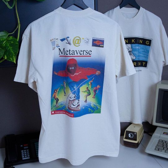
Photo
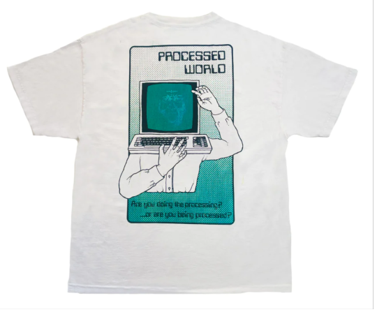

Thinking Different
#thinking different#think different#apple#retro apple#retro computing#technology#fashion#style#streetwear#streetstyle#tshirt#t-shirt
79 notes
·
View notes
Text
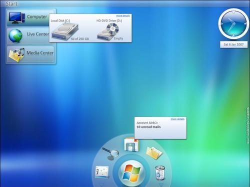


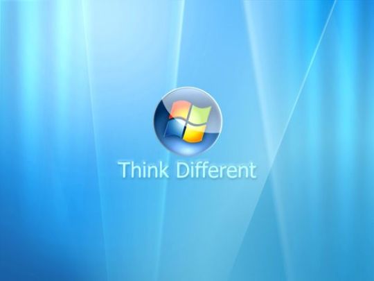

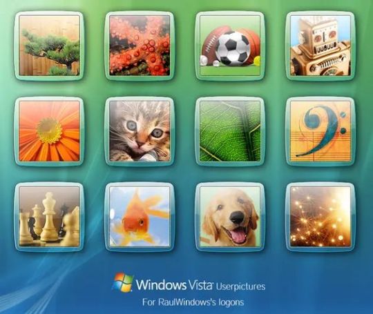

Windows Vista/7
#frutiger aero#windows vista#windows 7#frutiger aqua#y2k#2010s#2010s nostalgia#nostalgia#frutiger eco#think different
15 notes
·
View notes
Text

Apple Think Different
8 notes
·
View notes
Text

For the 20th anniversary of the iPhone, they should create a Steve Funko Pop of this pic, and sit back and watch the chaos ensue.
11 notes
·
View notes
Text

Think different
169 notes
·
View notes
Text
Society has gotten so comforted with lies, the truth is offensive now.
#society#comforted with lies#wake up#societal norms#its a joke#truth#what is the truth#lies#be different#think different#love different#live different#clone#truth is offensive#live free#love free#LHA#introvertedsage#who's real anymore#reality#sham#craving honesty#honesty is the new sexy
36 notes
·
View notes
Text


☆
57 notes
·
View notes
Text

#unique#do your thing#be yourself#don't fit in#i feel different#be different#self esteem#self empowerment#you are amazing#you are awesome#think different#think outside the box
130 notes
·
View notes
Text
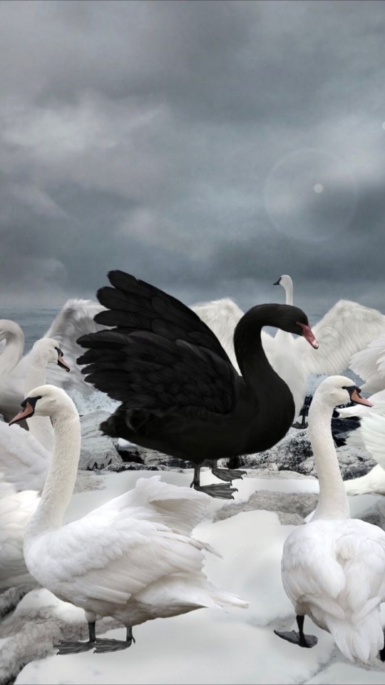
Individuality
#self expression#self knowledge#photography#art#modern art#unique#poetry#awareness#spiritual awakening#spirituality#authenticity#authentic self#self love#be your own light#master piece#sociology#be your own inspiration#contemporary art#symbolism#think different#individuality#society#be your true self#personal journey#black swan#bold#strong#spread the word#dare to be different#painting
147 notes
·
View notes
Photo
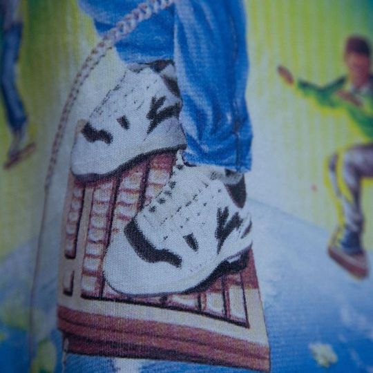
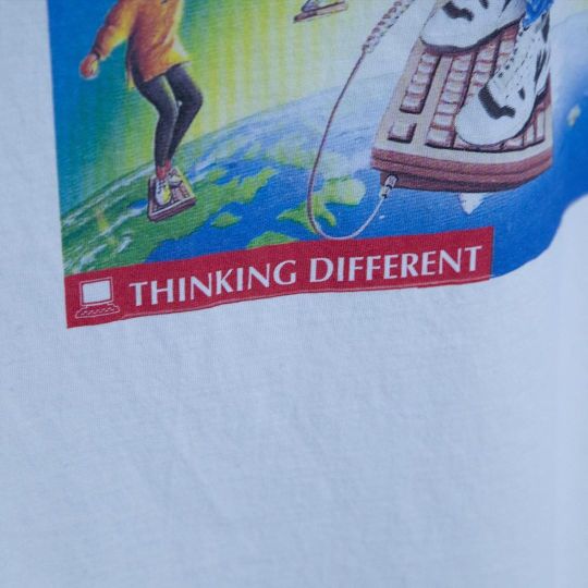

Thinking Different.
#thinking different#think different#apple#retro apple#retro computing#80s#90s#fashion#aesthetic#pop art#meme fashion#streetwear#style#y2k#retro#vintage#bootleg
23 notes
·
View notes
Text
La rabbia non basta
BIGMAMA
youtube

.
3 notes
·
View notes
Text

APP 3: PASSAGE
For this design I worked with the manifesto Think different by Apple. I used hierarchy to bring emphasis to the most important parts, by using a bolder typestyle and making some words bigger. I algo played with the alignment to balance the weight of the bold words. Adjusting the tracking and the kerning made the text look different, so I also adjusted the tracking in some words to make them look longer, without having to make them bigger. I learned that the way you stylize the words can give a whole new perspective to a text.
Manifesto:
Apple: think different
Here’s to the crazy ones. The misfits. The rebels. The troublemakers. The round pegs in the square holes. The ones who see things differently. They’re not fond of rules, and they have no respect for the status quo.
You can quote them, disagree with them, glorify, or vilify them. About the only thing you can’t do is ignore them. Because they change things. They push the human race forward.
And while some see them as the crazy ones, we see genius. Because the people who are crazy enough to think they can change the world, are the ones who do.
Keywords:
Hierarchy
Bold
Different sizes
Alignment
Left align
Right align
Important
Important words
Leading
Kerning
Tracking
2 notes
·
View notes
Text

Thinking outside the box
This t-shirt is perfect for people who are creative, think differently, and don't like to follow the rules.
#shirt#t shirt#t shirts#tees#tee shirt#funny shirt#funny stuff#funny memes#meme shirt#shirts that go hard#shirts#thinking#think outside the box#funny quote of the day#be different#think different
2 notes
·
View notes
Last Seen Blogs

fastmoneyclicks
FASTMONEYCLICKS
ihaveredwings
Luciferian Lantern

rickandmorty
RickiLeaks

jusstya
𝐔𝐋𝐋𝐘 𝐕𝐈𝐂𝐓𝐎𝐑𝐈𝐀

quittheshitletsgetfit
too legit to sit