#thinking about how their character and costume designs are so communicative and are designed with each other in mind. for example havijg bc
Text
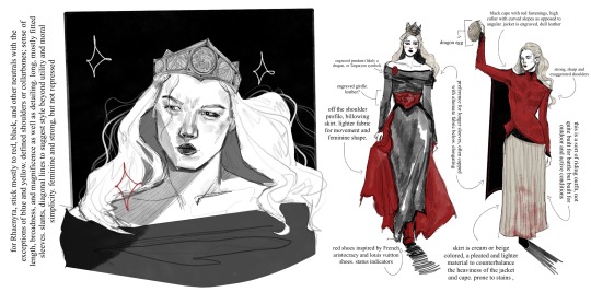

This technically applies to my Stepmother AU in which Alicent is around six years older than Rhaenyra, and occupies a wicked stepmother role as opposed to ex ‘friends-to-first loves-to-enemies’. Despite lacking the foundation of shared girlhood, both find simultaneous comfort and rivalry in one another, and undergo a gravitational pull. A young Rhaenyra’s eagerness to participate in swordplay and political affairs at a young is accommodated for, and she grows up with a sword in one hand and the weight of experience in another, which further helps pave her way to the throne.
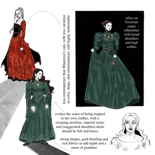
Alicent’s Costuming
Alicent’s clothing is almost entirely bottle, emerald, or forest green. While there is layering present in her skirts and jackets, the accent should always be a darker green than the base color. The fabric is deep, rich, and retains an undeniably high-quality luster. Look to velvets and silks. Gold embroidery lingers around her sleeves, neck, and hemline to elevate the coloring.
Metallic embellishments should be almost military-like, and appear heavy. Contribute to the imagery of chains or shackles in addition to her status
Draws inspiration from historically accurate stiffness and Victorian shapes, with a tapered waist, imposing, puffy sleeves, and a high neckline. Despite inaccuracies, this shape is evocative of someone elegantly and conservatively feminine, repressed, and capable of exerting power over others. Reference a classic, trussed hourglass shape. Skirts should be notably heavy and full; may make noise in movement
The coloring and shapes remain relatively consistent but lack variation; this is to demonstrate a lack of freedom and exploration, as well as an adherence to conventional feminine roles
Despite these limitations, her costuming should always be put-together, coordinated, and unquestionably fashionable. Tight sleeve cuffs may be accompanied by a more traditionally medieval fan sleeve
Shoes should stick mostly to slippers, or flat designs
In this AU, her hair leans more towards a dark brown instead of auburn, as her show counterpart. This is mostly due to faux-book accuracy and to simplify the sketch process, since keeping her hair darker in comparison to Rhaenyra’s lighter hair translates more easily in uncolored renderings.
Keep her hair either in a tidy bun or pulled back and loose; avoid too many intricate shapes, braids, or styles. Occasionally, the hair will hang loose. Lean into medieval or royal headpieces, clips, coverings, etc.
Rhaenyra’s Costuming
Rhaenyra’s clothes are primarily black and red, occasionally accented or substituted with neutrals such as beige, white, or gray. Exceptions may include blue or yellow, but she generally stays in this color palette.
Strong focus is drawn to her shoulders and neckline, sometimes with embroidered or embellished detailing. She often has strong, angular shoulders in her dresses or jackets, occasionally theatrically pointed. Off-the shoulder necklines emphasize her collarbones and a certain broadness.
There should be decent variety in her clothing; there is a hypothetical outfit for every occasion and more (for battle, for riding, everyday, formal, feasts, everyday, etc.), and most should be composed of multiple pieces and utilize generous layering. This includes under-fabric, belts and corsets, jackets and doublets, draped fabric for aesthetic purpose, and even functional capes.
Most of her clothes should provide visual aid for movement; additional fabric to her skirts, for example. Her clothes should be highly stylized but still easy to move in. In riding and battle gear, it is presumed that she wears pants and boots under her skirts, even if they are not visible.
Shoes lean more into boot cuts, still practical but should have a sleek and uniform quality to them. When she walks, she should make some kind of noise. Shoes should usually be black or potentially red, the latter for decorative purposes.
Overall her style should be more contemporary and lean into the fantasy element. She’s not opposed to oriental details or showing skin, and her costumes should reflect both couture-height drama and period-reliant aspects. Longer lines and diagonal hems mean she is not as devoted to an hourglass shape, and her high collars should always be decorative in some respect.
Keep her hair long and mostly loose, sometimes pulled back. Small braids should be implied as incorporated. Occasional hairstyles feature complicated braids. With the exception of highly decorative braided styles, simple buns should be avoided unless accompanied with very high necklines.
Avoid headpieces that are not either a) her crown or b) ceremonial.
#rhaenicent#rhaenyra targaryen#alicent hightower#house of the dragon#hotd#rhaenyra x alicent#asoiaf#my art#thinking about how their character and costume designs are so communicative and are designed with each other in mind. for example havijg bc#the strong shoulders and embroidered necklines keeps them connected although imo they could’ve played around with it a lot more#I just have a lot of thoughts about them ok
1K notes
·
View notes
Note
I know it would probably bring a lot of hate comments but I am begging you to roast the hazbin character designs because I'd love to have someone properly articulate why they don't work so I could send it to people who won't believe me when I tell them. 🫠 Understandable if you don't want to get into it though.
I don't think there's that much there to roast, honestly?
Those designs are clearly an extremely specific stylistic choice, and because that style is consistent throughout the show, it ultimately feels coherent with itself.
There are trade-offs being made. Because Hazbin's design style is SO stylized and so heavy on decoration and detailing, because it puts a lot of emphasis on costuming, it isn't as good at communicating specific character storytelling as a more grounded style could be (it's kind of the same tradeoff that stuff like Genshin Impact makes).
Like, why does Sir Pentious' hat have an eye and a mouth on it that makes its own expressions? Apparently not for very much reason at all, except that Pentious has a bit of an eyes-motif going on in his design and it was one more place to put an extra eye. And that's a valid criticism of his design, but also the entire show is designed like that, so frankly it would be weirder and more out of place if his design alone didn't have that kind of overelaborate decoration going on.
It does create a situation where I have a hard time "reading" the character designs sometimes. For example, Vox, Alastor and Pentious all wear a similar style of suit with upwards-turned shoulders, butterflies and pinstripes. Now, am I meant to read that as Vox imitating Alastor due to his crippling need to replace and outdo him, and Pentious imitating the style of powerful Overlords because he thinks that possessing their level of power will finally give him relief from his paranoia and self-loathing?
Or is it just a design fixation of the creator who keeps putting their characters in suits because that's just what they like? I can't really be sure, because sometimes design elements are used to intentionally tell stories about how characters relate to themselves, their world and one another, but plenty of other times designs look the way they do Because Of Vibes.
But again, that lack of clarity is clearly an intentional trade-off - and the benefit of that trade-off is a design style that is extremely varied, wild, expressive and memorable. Hazbin Hotel seems like a very easy show to draw fanart of, and a very fun show to draw fanart of. Those designs (especially the hyper-expressive faces) are begging to be the subjects of traumatic headcanons, unbearably cotton-candy soft fluff fantasies and weird, taboo, homoerotic power dynamics. Slaps roof of character design, this bad boy can express so much vicarious emotional intensity.
It's very exuberant, very excited about itself and very self-indulgent, it's a style that prioritizes visual impact and visual interest over readability (something which the animators of the show navigate with real skill, props to them) and individual aesthetics over worldbuilding.
And I don't blame anyone for being turned off by that (I certainly was the first time I started seeing those designs going around), but I would struggle to call the show's designs "bad" when they are clearly achieving exactly what they want to achieve.
I have some criticisms, especially re: how the show treats skinny bodies as an unquestioned, desirable default, and employs fatness as a means of alienating and abjecting the audience. That sucks very badly, and is a serious disappointment, and one of the few places where the show feels like it is being cowardly in its design philosophy. But I don't have it in me to do some kind of Hazbin Hotel Sucks And Here's Why takedown, its problems are not unique or extreme enough to warrant it, at least not as I currently understand them.
585 notes
·
View notes
Text
Costume Meta 7x01
Aaaaaaannnnd we're back!!
OMG I cannot tell you how good it feels to be back writing costume meta - I have missed it so very much and this first episode has given me lots and lots to talk about so lets crack on with it shall we!
Where to start?! Firstly - Its amazing to have Alayna Bell-Price back in the driving seat and she is a genius because she knows the characters better than anyone and I have to say from my perspective there is a pretty clear difference between this episodes costumes and the ones from season 6 - not that s6's costumes were bad, just that you could see the shift of having a designer who didn't know the characters to the same level. I’m going to go in order of character appearance in a non uniform capacity for this one I think so we’re going to jump around from character to character a bit. There is no Maddie or Hen this week, as we don't see them out of uniform, but every one else is accounted for and I've included Norman and Lola as they've got a multi episode arc and their costumes are interesting and playing into a colour theme!
putting it below the cut as its a long post and I on't want to overtake everyones dashes! Enjoy!
We start off with Athena in this pale pink high neck ribbed sweater with large bell sleeves. I've spoken a fair amount about pale pink over the last couple of seasons of costume metas and how, in clothes its representative of childish and immature behaviours or thoughts. That holds true here - the pale pink is playing into Athena's childhood - when she developed her fear of cruise ships - its creating a connection between her childhood experiences and the woman sitting in Franks office.
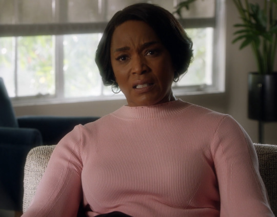
We get a flashback that shows her in yellow and orange - the yellow for communication and the orange for transformation. A literal moment where we see Athena transform from the innocence of youth to her developing anxiety and fear around cruise ships. Its really clever visual storytelling connecting adult with child and shows us her fear is genuine and founded in something that she may not have been able to articualte fully as a child, but she can as an adult, even if she doesn't actually articulate it to Bobby.
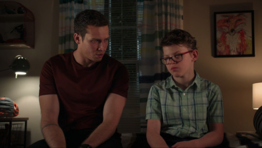
Our next non uniform costume is Chimney. The lighting is really low in this scene, so it's kind of hard to be 100% sure of the colouring, but he seems to be wearing either a dark navy or black button up shirt under a dark green and black bomber jacket. The use of really dark green in combination with black, Back is a colour that can be about hiding ones vulnerabilities - concealment and masking, but it is also a colour associated with magic (generally dark magic) as well as pessimism. The green is growth and renewal, and the hope for a better future. to use them in combination i this way is playing on Chimneys insecurites and fears, his desire to keep the 'magic' alive in his relationship with Maddie, but it also speaks to his growth, that he goes home and talks to her about it (even if he does come up with an insane plan to 'date forever').
Eddie in the locker room - aside from being shirtless for much of it and pulling some epically good faces - was a super interesting costume choice. Especially the use of his watch! first though - Denim shirt time! We don't actually see Eddie in a denim shirt all that often and we've seen him in the super washed out one far more than dark denim shirts. I've been laughing a little bit at a few people (on twitter mostly) claiming its the same shirt he was wearing at the hospital during and after Bucks coma and it being a play on bringing Buck back to life. While I like the theory, its actually a very different shirt - the one in the hospital was black with a grey wash out and was made of velveteen - so different colour and fabric.
This shirt, is however one we have actually seen Eddie wear before and its far more telling than if it were the hospital shirt. You need to bear in mind that this scene is about Buck and Eddies respective girlfriends (or lack there of) and the fact that Christopher has a girlfriend now as well. This shirt is the same shirt Edie was wearing when he (re)introduced Ana to Chris in 4x08 (breaking point my beloved! the gift that keeps on giving!) and this puts a conversation about Marisol and things going well with her into the same category as Ana - suggesting she is ultimately destined for the same fate as Ana. the other thing that plays into this narrative is the use of the watch.
Eddie does not put the Christopher watch on until after he has found out that Buck has broken up with Natalia - so during the entire conversation about their respective girlfriends, he is only holding the Christopher watch, rather than wearing it.
In the picture below from 4x08 you can see that Eddie is wearing his black 'work' watch rather than the brown strapped 'Christopher' watch. Remember that the first time we see the Christopher watch is when he goes for his first date with Ana in Jinx, so he already has this watch and in theory should be wearing it in this scene. The fact he isn't is pretty telling and I'll go into that a bit more later when we get to Chris's (and Eddies) date scene.
Then we have Buck in his outfit of many colours! The white trainers, continue to play into my theory of Buck wearing them when he is in key points on his journey to discover his self - her it is about showing his growth - that he ended the relationship with Natalia - this is a massive thing when we saw how long it took for him to end things with Taylor - The man who clings is growing and getting out before it drags him down!
The jacket is similar in style to many of the ones we've seen him wearing in season 5 and 6, but this one is much brighter and more colourful. I know I go on about white meaning bad things for Buck, but that isn't relevant here - the white bad things happen to Buck theory is much more about t-shirts, jumpers and shirts rather than jackets - its an under-layer rather than a top layer that = danger. So i'm not thinking of its relevance here for this scene. What I am going to say is that this (according to my spreadsheet!) is the first time we've seen Buck in a white jacket of any description. To me, it's playing into the idea of purity and rebirth which is what white is often associated with. This plays into the comment Eddie makes welcoming Buck back to 'the land of the living' but also implies that Buck is starting a new chapter and making a fresh start - the check patterning suggests it might not all be plain sailing though.
The check pattern is an interesting one, obviously check pattern theory comes into play here, but whether its only in relation to the reveal that he split with Natalia, or if its also foreshadowing Buck getting himself into danger/trouble down the line, remains to be seen.
I'm going to quote myself again because I did predict that this scene may be about his relationship with Natalia when we got the stills dropped - the costume department never let us down!
The only thing I can do is scream into the void about check theory because check does't bode well for people - they always end up in the middle of the drama (see my check theory posts linked on my pinned post for more) and while they come out the other side (99% of the time) Buck in check for that scene in 6x18 pretty much doomed his relationship with Natalia (its specific to her and not C&K's baby as Buck wasn't wearing it when he delivered it!) and as that shirt in the still is very un Buck like, has not only yellow ochre in it, but also its a white base (and we all know buck in white is a bad sign!!) and its check patterned - my theory is that this scene is connected to Natalia in some way - either Buck is not being true to him self in more than one way - that things are going to/have come to a head for their relationship (my kingdom for a reverse of Buck to Eddie about Ana in 5x03!!!) and lead to a pretty big change in some way (fingers crossed for Buck to end it and then finally break down and deal with his trauma!!!)
Some other things about that shirt - the colour combination - the green blue and yellow ochre are giving me call backs to coma Buck (another reason I think it might be connected to Bucks unresolved trauma around his death and Eddies absense in his dream)
In the quote above, I was also referring to the blue and white check pattern shirt he was wearing when he and Natalia got together, but there was also the fact that in the balcony scene at the end of 6x18, we also saw her in one of Bucks white shirts. I wrote in my 6x18 meta about how those two things combined didn't bode well for that relationship going forward, and thats what leaves me unsure about the check pattern on this white jacket being purely about something that has already happened. If I put my Buddie goggles on, I would perhaps suggest that the troubled times ahead may be more connected to Buck and Eddies relationship, and this would fit in with a couple of the things Oliver and Ryan have said. The thing with check theory though, is that generally speaking if it's on one of the mains, they come out the other side of the dram/trauma stronger than before. So if it is connected to Buck and Eddies relationship, then we can expect it to be in an even stronger position on the other side of whatever goes down (and at this point you can't strengthen their relationship any further and keep them as just friends imo!)
Chimneys forever dating proposal to Maddie, connects with his outfit when he's talking to Hen - it's the same jeans and black shirt, so the meanings of black, can be continued on into this scene - the idea of magic and hiding his vulnerabilities. The addition of the jacket with this brickwork pattern in its weave is a fun choice, it's playing into the idea of building something, but also plays into the idea that Chimney has his walls up - again fitting in with the black meaning of hiding his vulnerabilities - because instead of expressing his fears to Maddie ad then them talking it thorough, he comes up with his insane forever dating concept. the fact that much of this scene is a contrasting parallel with the scene from season 1 when he is pretending to be someone else entirely for Tatiana all ties in perfectly with this costume. The fact that he reverts to wearing blue (ran out of picture spaces so I couldn't include one) later on - when he's realised his plan isn't realistic, talks to Maddie and they end up back on the same page is really good to see - the blue being a signature Chimney colour and is indicative of him being true to himself.
Bobbys blue suit and blue check patterned shirt. The brightness of the blue is a really important choice - it's the only time we see him this brightly coloured on the cruise until he ends up in the bright red at the end. This is important because this is the moment when he's still all excited and hopeful for his honeymoon cruise - everything is good in Bobby's world at this moment in time - the check pattern is telling us that it's not going to stay that way for long. From her on out we see the colours of Bobby's costumes slowly beginning to dull and take on a washed out tone, but here in this moment all is good.
Athena's bright yellow dress is all about making her stand out - communicating with the audience, she is the brightest person in the room (in more ways than one!!). The thing with yellow, apart from the communication aspect, is that it can also be a symbol of anxiety and fear, so this dress plays rather nicely into the theme of Athenas fear of being on that ship.
The colour does have other good traits too - its fresh and bright and is a colour of happiness in its more jewel like tones and I think we can see all of these meanings in these scenes - Athena might be anxious about being on the ship, but she is also happy and enjoying herself with Bobby in that moment.
Lola and Norman. Lola is the one we need to focus on in her very bright very check patterned Victoria Beckham dress. Obviously the check pattern plays into check pattern theory, but the red also acts like a neon sign to the audience - highlighting that Lola is in danger - the ga won't pick up on check theory, although they might connect the dots about the fact this check patterning looks very like a cage - foreshadowing her being held captive later on, but also as a nod to the fact she was incarcerated previously.
The red is also a nod towards romance and love - playing into the rekindling of their relationship and romance in the aftermath of the freeway 'see me Norman' incident.
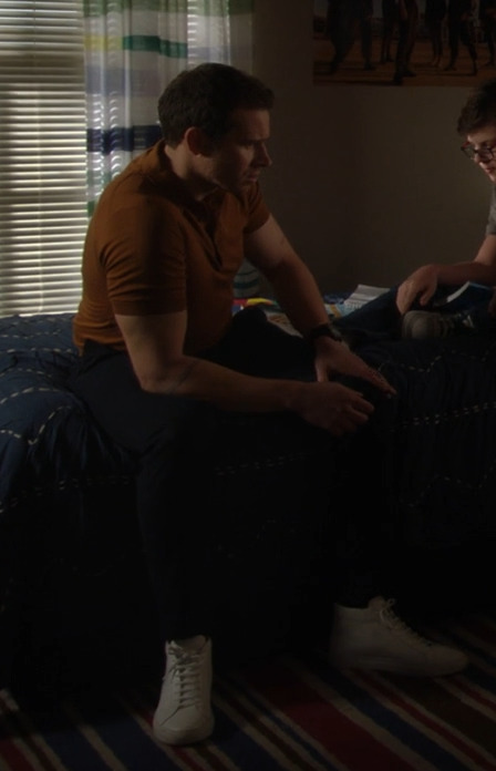
Ok so Christophers date night and by extension Eddies date night! This is where this meta is goingto get a bit messy and I'm goingto jump around a bit becasue I need to talk about the way colour theory is at play in all the scenes in Christophers bedroom, so we're going to talk about Christophers bedroom as one big thing rather than the two separate scenes that it actually is. They are extensions of one another and build on so much of the groundwork we've already seen in previous seasons.
Chris in plaid check yellow and red check plays perfectly into check pattern theory - it’s a signifier that something is about to go down with him - namely that the fact he’s dating multiple girls at the same time.
He’s also wearing a white shirt which is not a colour we see on him all that often - in fact, the only times we’ve seen him in a completely white shirt is with his suit in 5x01 when suit shopping and again in 6x08 for his school dance. He did wear a white vest when dressed as wolverine for halloween So as you can see its not a common colour for him, but the times have seen him wear it as a solid colour have been connected to school/girls and dating (i’m including the suit shopping in this because Ana was there and it was kind of a Eddie and Ana date of sorts - in that it was suppose to be for this Christening - meet the family - date type thing).
The most interesting thing is the plaid hooded shirt though. It was such an interesting choice to go with for a couple of reasons. the colour way is especially loud - we tend to see Chris wearing greens and blues and greys, with the odd other colour thrown in occasionally. So red and yellow are not common colours for him to be wearing.
On the red front we see him in it a couple of times - the adapted skateboarding scene and the scene in 4x10 when he joins Eddie and Ana on the sofa - getting in the way of their date night. We do also see him wear red in Christmas related episodes (so I don’t tend to count them in the same way as the Christmas colour theming will nearly always override any other colour theming intention - the use of stripes or check or other patterning is more important in those episodes!).
On the yellow front things are even more clear cut - the Tsunami arc, the aftermath of him falling off the skateboard, Mays graduation party and 5x03’s Eddie Ana break up! These (apart from the tsunami shirt) were all bright almost neon yellow.
This new plaid shirt is more into the yellow ochre part of the yellow spectrum, therefore tying much more to the tsunami arc, which is actually really fitting if you think about it in a little more detail - its a connection, not only to Buck, but also to loss and grief. Eddie might have been using his secret weapon (Chris) to get Buck out of his moping (read mourning) over not being able to go back to work, but Christopher is also still grieving the loss of his mother at that point as well, so its not just about cheering Buck up, its also about giving Chris a chance to do something fun and distract him from his own grief. That is why the use of yellow then ties in so nicely with its use on Chris now.
The other thing that really grabbed my attention about this shirt though is the fact that the two times we’ve seen Buck have a conversation with Chris in his bedroom, he has sat in the same spot and has been wearing one of those two colours - post shooting in maroon and this episode in the yellow ochre - if you watch those two scenes side by side, you see that they’ve used almost identical camera angles as well to film Buck.
I've spoken a lot about the use of maroon as a colour connected to parenthood - especially fatherhood , which is how its intended to be read on Buck - connecting to Eddie and his being shot, pushing Buck into a parental role in Eddies absence.
That alone is a pretty loud reference to Christophers connection and relationship to Buck, but then we have the yellow ochre of it all.
I feel a little bit insane about how close my prediction was on what the Buck Christopher scene was going to be about - this is from the meta I wrote when t he stills dropped;
Whatever this scene transpires being about, based on what we've seen with Buck wearing yellow ochre, we can assume its going to continue to play into this idea of Buck not being fully truthful with people and fitting into the role he thinks people want him to pay rather than being true to himself.
I do want to add to this theory by looking at Christophers shirt as well. The grey/ yellow combination is a bit reminiscent of Breaking point (the episode that really is the gift that keeps on giving) because we get Chris in grey and Eddie in tan - that is yellowish toned whilst not actually being yellow
There isn't a good screenshot of them together, but the placing of Chris and Buck in the new one has echoes of Eddie and Chris in that scene (one that is interestingly enough playing into the idea of changing family dynamics, but also the moment before and the one that happens afterwards at Bucks loft, directly placing Buck into a parental role (as an aside the idea of Buck being a miracle worker plays into the theme of Eddie looking for magic, just saying!))
Indirectly this scene was about Buck not being true to himself with people and fitting into whatever role he thinks people want him to fit into, only this wasn't an active situation - this was a scene where Buck could draw on his experience of having done that in the past to help Christopher - the line from Eddie 'you didn't end up being like you' is such a call to this and actually shows how valuable Bucks own experiences and learnings are in helping Chris (we've all been joking about Eddie choosing Buck to help him with this Chris's issue, but in actual fact he was the perfect person for the job - not just because of his being a 'reformed player', but also because of his relationship with death and the death of a loved one where you are reliant on others for their memories of a person rather than having your own)
The thing with the Yellow ochre (this meta here that i've already quoted from above is the place to go if you'd like more detail on its use on Buck more widely) isn't just its about it's connection to Buck, his place in Christopher's life and more loosely to the will of it all, (the fact that Buck and Eddie are both wearing the same colour ways as in the hospital bed will reveal scene and are both on the same sides of the screen in both scenes is a stroke of genius and is meant to connect these two scenes together) its also its connection to Shannon.
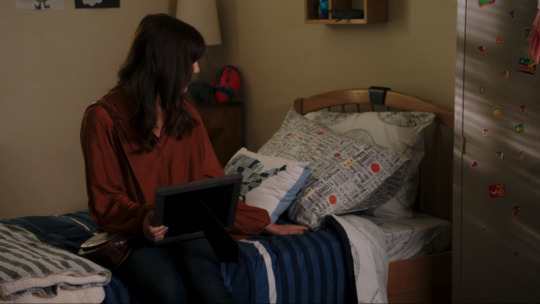
The first time we meet Shannon, she sits on Christophers bed in more or less the same position as we see Buck and Eddie sit, and looks at where Christopher has been positioned in all these conversations, and she is wearing a burnt orange top thats pretty close to the dark yellow ochre we see Buck wearing. Shannon wears a lot of yellow - as in it there are only a couple of times we don't see her wearing something yellow or with yellow in it and those are key scenes (which I will talk about later on).
Shannons appearance in Christophers room to read the letter she wrote him had her in this black top with a floral patterning on it. She was also wearing green trousers (which can be seen in the still below but aren't actually seen during the scene.
I actually really loved the green trousers and black top as a choice because the top is very Shannon - it sits perfectly with the floral patterns we saw her wearing when she was still alive. The green trousers are a bit of a departure for her, but I think its very intentional for two reasons .
The first is that they are very much in the Eddie trousers wheelhouse, especially in combination with black - he wears green khaki trousers a lot. The inference being that the black and green combination is an echo of Eddie.
The second ties to Christopher. Green is also a colour we've seen on Christopher a lot, it's probably the colour we see him in most. It's being used as a reflection of the fact he is growing and transitioning from child to teenager. But having it here in this scene - on Shannon connects a Christopher growing up without his mom.
Both of these combined really connect into Shannon in this scene, tying the three of them together and on Eddies efforts to keep her alive for Christopher - the underlying implication that his growth into who he is so far is as much to do with Shannon as it is to do with Eddie.
Her necklaces were not identical to the ones we saw her in in season 2, but that's most likely because they don't have them any longer, so they've replicated them as best as they can. The other little nod that I enjoyed is the brown bracelets on her right wrist - the same place Eddie wears his brown strapped Christopher watch!
But the top they have her in plays into a couple of other things - the prominent yellow flowers make an obvious connection to Buck from the previous scene, but they also tie into the 'I want a divorce' scene from 2x17 where she is wearing a dark blue dress with bright yellow ochre flowers all over it. the dress is not especially close to the top in the wider sense - blue dress with white squares v black top with florals in a variety of colours, but the yellow flowers are the prominent aspect of both items of clothing and play into the yellow theme connected to Shannon and then to Buck.
This is espeically relevant when you remember that Eddie is in a black suit in that scene and he's wearing black when he gives the letter to Christopher.
The black for this sequence of scenes is such a poignant choice - its Eddie mourning all over again, not for his loss, but for Christophers loss. I did find it telling that again in this scene, we have the absence of the Christopher watch. Eddie has very rarely not been wearing a watch in his scenes, so the times when we don't see him wearing one are very telling.
For me, in this sequence of scenes, it's about the fact that they are not about Eddies relationship with Christopher, but about Shannons relationship with Christopher. The watch is much more about Eddie and Christopher, so to have it absent from this story arc makes total sense and is symbolic of Eddie being a good father
Then we have Christophers grey shirt - I said when we first got the stills from that scene, how it was likely to be connected to complex family relationships - a la when we’ve seen Buck wearing his grey shirt. And what do you know - the scene was about complex family dynamics/ relationships.
It wasn’t perhaps in the manner I was expecting, but that series of scenes played with the full scope of Chris’s complex family relationships - from the relationship he has with Buck -not only as Christophers friend, but also as more or less Eddies co-parent (the way Eddie asked for Bucks help screamed co-parent rather than friend imo - that whole burnt out car scene was two co-parents discussing their child!) to the relationship he has with his dad - which is a pretty great relationship, but it is a complex one.
The relationship he has with his mom - or the fact he feels he doesn’t have a relationship with her despite Eddies best efforts, because as he grows up she feels further and further away.
Eddies 'date' night with Marisol. Again I ran out of pictures (30 is not enough!) so you're going to have to use your imagination or go back and rewatch the scene for yourselves, but trust me when I say that Eddie is wearing the same shirt he was wearing for this date night as he was in 4x10 - when Christopher interrupts because he can't sleep!
It's also a similar tee to the one Eddie wears when he has his breakdown and trashes his room (that one was more green when this one is much browner). Its slouchy and has cut and stretched raw edges at the sleeves and on the pocket - in the same way his breakdown shirt did. there is an element of being in familiar surroundings and being comfortable at home, but stretched out raw edges and Eddie generally tend to mean not so great things.
Of course there is the element of his parenting skills being tested by Christophers having more than one girlfriend, but if that where the only reason, then it would've made more sense to have him in that shirt when he's listening in to Chris talking to Buck, rather than when he's on a date with a new girlfriend.
This is especially true as the screen time for that tee has more connection with Marisol than it does with Chris. Combined with the fact that once again, like in the locker room scene, he is not wearing his Christopher watch in this scene and that speaks volumes.
If we are to read the scene as being about Christopher soley, he should be wearing his watch because that watch is a physical embodiment of the importance of Christopher in Eddies life - that he puts Christopher first in all things.
Got to say I was a bit shocked to see Marisol in his bright magenta silk spaghetti strap top when you consider the costumes we saw her in last season - mostly dressed down, t-shirts, jumpers and dungarees so this is a complete 180 for her character.
There are a few interesting things connected to her outfit, firstly it low key ties into Natalia - we saw Natalia in a red version of this top for her first proper onscreen date with Buck (when they go to the badge and ladder joint) so there is an interesting low key parallel to draw there. There is also the fact that her bracelet is a chain one - much like we've seen on all of Buck and Eddies previous girlfriends - although those have been necklaces, so I'm undecided if this chain bracelet is paying into the same trope as those.
Then there is the pink of it all.
You see Eddie and Pink on his girlfriends doesn't bode well for Marisol.
Both Shannon and Ana wore pink. Ana wore it a lot - there are two examples below, but generally speaking its her most commonly worn colour - including on her first date with Eddie in Jinx.
The first example below is from the first time we see her in the Diaz house. the shades are different, but the fact that the first time we see both characters in the Diaz house they're both wearing pink, speaks volumes.
The other key use of Pink is when Shannon is at the beach with Eddie and Christopher and she tells Eddie she's pregnant - Eddie takes it as the sign he has been looking for - the chance to effectively start over with their marriage, but this is the beginning of the end for their relationship, even if she hadn't died a short while later. She is wearing pale pink in that scene and it's the only time we see her wear the colour in the show.
The fact we can also contrast the use of pink with when Buck wears it is telling in its own right - we see the relationship between Buck and Eddie strengthening when Buck wears pink - May's graduation party, the tsunami, the Hildy coffee machine - all moments (big and small) that show the development of various aspects of their relationship and its ability to endure.
Essentially all this use of pink on the women he has had previous relationships with, doesn't bode well for Marisol and the longevity of her relationship with Eddie. How quickly it will end I can't say, just that it will end.
I spoke earlier in this post about colour theming for the episode and this is where I talk about it!
Pink - and in particular the very bright pinks we saw scattered across the episode. Marisol above wearing it, isn't just about connecting her to Ana in costume terms (especially as at this point that costume is a departure of her costumes from s6) it also connects her to the other characters we see wearing bright pink in this episode - Lola and Norman.
At this point in time I'm not sure if we're going to see it play out as a theme across the season, but its use in this episode was very loud on characters that are going to be around for more than 1 episode. It suggests that there is some underlying theme that connects them (by this I don't mean that they're gonna meet and hang out I mean that personality traits are going to be similar)
Magenta and bright pink in colour theory means a few different things, and like with all colours, has positive and negative traits. Generally speaking its a loud and brash colour thats designed to stand out and draw attention to it's wearer.
Things that are considered positive traits for this shade of pink are; intensity, acceptance, kindness and it's supportive and uplifting nature. It's connected to naive love (as in lust rather than the passionate and enduring love of red) can also be considered a nurturing colour.
Negative traits are; intensity, volatility, arrogant and impatient, irritability and irritating and frustration. it is also said to be a stress inducing colour and is said to be overly emotional.
Theres a clear and fairly loud connection between Lola and Norman getting into danger - Lola is in magenta trousers when she is kidnaped. Norman also has bright magenta flowers on his shirt at this point as well. My guess at this point is that we're supposed to lean into the stress inducing element, and also the irritating nature of the colour (On Athenas part at the very least!) and we'll see if those are the themes that play out for Marisol as well down the line.
Norman is in bright pink when he's lying and claiming she's unwell from being outside or too long. We also see that he is wearing pink in the ditsy print shirt later on (again I ran out of picture spaces!)
Athena's black top in this scene is much like the use of Chimney in black in his scenes. It's all about power and authority but it's also about her hiding her vulnerabilities. The other thing it does is creates a huge contrast with Bobby and all of the other passengers - she is the only one in black in the scene and it contrasts her with the underlying white of Bobbys shirt - juxtaposing them and visually putting them at odd with one another.
Like I said above about him becoming increasingly pale - here we see Bobby in a sea-foam green shirt - its the palest and washed out colour we've seen him in on this cruise (grey pyjama shirt not being included as its blink and you miss it and a pyjama tee!!!). Sea-foam green doesn't really play into the traditional meanings of green - there is still the element of renewal about it (the sea washes the sand etc)but its mostly a self-conscious and uncertain colour - both things that perfectly sum up how Bobby is feeling in this moment.
The other fun thing about this outfit is the palm tree shorts the patterns Bobby has worn in relation to this cruise, up to this point (and that includes the shirts from season 6) have all been tropical themed but on his shirts, the fact that they've now slipped down onto his shorts is a visual representation of him becoming increasingly dissatisfied with the way his honeymoon is going - that the tropical vacation vibes are slipping away.
Athenas red and white shirt, in my opinion is showing her cross purposes - its the duality of investigating and being on a cruise in a shirt. The bright red ties into the red and blue first responder colour way the show uses (for obvious reasons) while the white and the palm fronds, the lei flowers and the watery theming of the pattern fit into the troipical cruise they're on.
Bobbys red shirt contrasts with the lavender that we see on Athena - its not a colour we see on Bobby all that often and that makes its use all the more important. Especially considering the entire cruise thus far we've seen him in blues and greens - especially pale closer to pastel tones.
This red is bright snd bold and unlike his usual choices. Red is a colour of cross meaning - there is obviously the connection with love and the heart, which is absolutely at play her - his love for Athena is spurring him on and is part of what is pushing him in to investigator Bobby mode - and its representation of love is what is going to be the key player in the up coming episodes on the ship - when he is looking for Athena during the evacuation etc. But the other meaning of red is war, courage and anger and that is very much present here in this episode, and will (i'm assuming) be later on in 7x02 and 3.
The other thing I think its worth pointing out at this point (which is pure conjecture on my part at this moment in time but that I think will become relevant in the next two episodes rather than this one) is the foreshadowed parallel with Buck in season 5 when he broke down Eddies door. The bright red we saw him wearing then was an uncommon colour for him, in the same way it is for Bobby here. It's paralleling the way Buck was prepared to go into battle for Eddie, with the way Bobby is prepared to do so for Athena - going to war for your closest person, your loved one and doing what you need to do to save them.
Putting Athena in lavender the moment she gets to go into cop mode was a choice that had me giggling! Lavender is a colour of relaxation and order so for her to start wearing it the moment she gets to start being a cop again - speaks volumes for her state of being - it shows that her fear of being on the cruise ship and of being alone with bobby, has been overridden by her need to do her job and start investigating things. Its the perfect colour for this moment and for the impeding trouble brewing on the ship - Athena will bring order to things as order has been restored to her inner world.
Hopefully you've enjoyed this little canter through the costumes of 7x01 we're back in business and I can't wait to read your comments in the tags and comments 🥰
Tagging for those who've asked to be tagged - drop me a comment on this post if you'd like to be added to the list for the next meta 😎
@theladyyavilee @mistmarauder @xxfiction-is-my-realityxx @mandzuking17 @spotsandsocks @loveyou2thecore @wanderingwomanwondering @oneawkwardcookie @leothil @copyninjabuckley @nathleigh @shammers86 @crazyfangirlallert @missmagooglie @inandoutoffocus @katyobsesses @radiation-run @gayandbifiremenofmine @lemotmo @bi-moonlight @satvojihusana @crazyaboutotps @princesschez75 @mongreloer @alliaskisthepossibilityoflove @sherlocking-out-loud
#911 abc#I hope you enjoy!#its good to be back#I can't remember my costume tags 😂#911 costume meta#season 7#s7 costumes#7x01#Kym costume meta#Kym colour theory#911 costumes#long post#the costume department never fails#still feeling feral about so much of the stuff I got right and the new stufff I've spotted
176 notes
·
View notes
Note
Would it be too much to ask, how do you draw your faces? / avoid same face syndrome ?
etc etc
not too much at all, thanks for the ask !
the way i think about faces is like a puzzle - the eyes, nose, lips, ears, chin, etc. being the puzzle pieces. it's a sort of "mix and match" game.


for example, these three characters all have a similar, strong nose and droopy eyes with puffed eyebags (except for azariel in the last pic), but thanks to different face shapes, body builds (how a character is built also reflects in their face) ears, hair and other details the characters can be told apart.
incorporating your character's personality into the face design is a great idea. perhaps the way they express a certain emotion is different to the way other characters do. maybe their resting face is happier-looking than another character's. the face is a big element of character design, because it's a tool of storytelling on its own.

take a look at my lucifer, for example. woah ! what the hell happened to them ? (he's still pretty though)
the face should entice, force the beholder to ask questions about the character and be curious about their story. i'm not saying every face you draw should suggest the oddest of backstories and personalities, but give each of your characters something unique to their face that would spark someone's interest.
now, i haven't exactly checked how well they stand out amongst eachother by removing the hair and the rest of the body, but i did draw a bunch of my characters together without colour on one paper.

my biggest tip is - exaggerate ! find a feature you want to stick out in your character's face and construct the rest of the face to compliment it. matching a face with the character's personality is also something you should know how to do, so i suggest doing research on shape and colour language.
it's important to take note of how faces look as people (or humanoid characters) age and grow older. wrinkles are one of the main ways i add character to ... well, my characters.


as much as i enjoy drawing wrinkles, i usually save them for "wise old" or nurturing characters. but of course, wrinkles appear on all sorts of people, especially if they have a fuller face.
(i am speaking specifically for my stylization which often strives to be somewhat anatomically realistic)
another tip is to reference life when you study ! human people have such a wide array of features you can utilize, it's amazing and beautiful ! just make sure you do research on ethnic features and when they appear on which face (unless you're going for something supernatural/humanoid, then the nose gallery is all yours /j).
also, don't drastically diversify faces all the time. siblings and family members often have similar features and it's okay to repeat them in these cases.

(this artwork is pretty old)
if your character and costume design is good, "same face syndrome" shouldn't worry you at all. avoiding this art community boogeyman is just one way of diversifying your art and adding spice to it. lacking this diversity really is no sin.
at worst, it's just going to look odd. for example, if you're so used to drawing young, wrinkle-less characters and attempt to draw an older character without any exercise prior to that, chances are this character is going to look oddly youthful, resulting in a sort of silly outcome.
but just like with everything, take your time ! changes and improvements don't happen overnight, and it takes time for you to get used to new things. with all that said, i'm wishing you the best of luck and happy drawing !
70 notes
·
View notes
Text
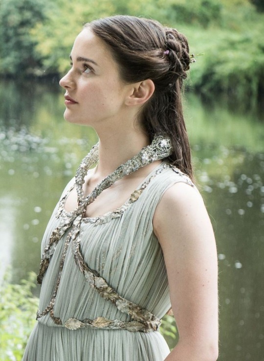
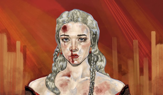
I know there's already been a lot of complaints about GOT's Rhaegar and Lyanna. But, I finally finished my GOT's rewatch, and I was just thinking this whole scene: what the fuck is this dress?
This show became known for its costumes. I mean, look at Cersei's dresses! Margaery is almost always slaying, and Dany looks majestic (minus the low effort Dothraki outfits, but we aren't going to go into that). But by the last few seasons everything just fell off (not just the writing lol). The main part of that is they got a new costume designer (I think anyway).
But this dress specifically just really pisses me off. Lyanna has become such a legendary character by the end of the show, so why is so little effort put into her? Her dress is so plain and boring, not even in a way that could communicate how she ran away, it's just lazy. They do nothing to incorporate the important symbols of her story (like the blue rose) aside from some leaves.
Speaking of the leaves, that collar thing is hideous. It looks like something a celebrity would were to the met gala, and not in a good way. Like I can practically feel it pulling on her hair. It just looks ridiculous and not even trying to be in the fantasy aesthetic.
I think this outfit is emblematic of how little effort they put into Lyanna's character. She has massive impact on the story from beyond the grave, yet she's just reduced to the dead mom of the hero. Her rejection of social norms and traditional femininity is glossed over, along with her actual personality.
This makes sense with how the show treats non-conforming women. Acknowledging and portraying Lyanna as she is in the books would undermine their efforts to demonize nontraditional women. It would also require them to make the parallels between Lyanna and Arya.
By the time of the flashback, D&D have solidified Sansa as their favorite Stark. So putting any effort into Arya's storyline and character would take away from the gratuitous spotlight on Sansa. Actually making Lyanna into a realistic person would detract from the borderline psychopath Arya narrative.
In conclusion: I hate the dress, I hate what D&D did to Lyanna, and I hate GOT.
55 notes
·
View notes
Note
gene im so glad you said this cause I haven't seen anyone else comparing it to the book as source material for like character and tone but i am So sure that if terry was alive the season would not be like this but i fear good omens fans dont realise how big a factor the lack of terry's influence is?? or like they forget that good omens was never just neilman???
ok before i go any further: i rly don't want to detract from anyone's enjoyment of the season and everything im going to say comes from a place of love for a) the original novel (& season 1 to a certain extent bc it got me back into it lol) and b) tv as a medium so like peace and love on planet let people enjoy things etc etc
but
like u said, terry's influence on the book was enormous – what makes gomens gomens is the balance of his genuine warmth and precise understanding of humanity tempered with neilman's sardonic voice and general like.....savvy approach to storytelling? i guess u could call it? anyway what rly helps the book is that it took them years to write it, passing ideas back and forth and rewriting each other's work until their voices blended seamlessly and a well structured capital-s Story was created. when i praise the book for being self-contained i think a huge part of that comes from the circumstances in which it emerged: two authors with complementary styles writing in a v particular time period where they had both the space to play with their ideas and the constraints of the novel as a storytelling format from which to craft something extremely specific.
adaptations are a tricky business and a tv version of gomens produced literal decades after the book was always going to have some unique challenges, but i don't think that's a bad thing bc the challenges could prove to be creative opportunities to take both the established audience and those new to the story by surprise. my biggest hot take here is that i don't think translating a story into a different medium means it has to follow the original narrative exactly, bc each medium has its own ways of communicating information and these structures, rules and traditions in turn inform what that story is. what matters more than following a story beat-by-beat is capturing what that story is about at its core, what themes and messages and ideas it works through and how.
all this is to say i never expected tv gomens to be a perfect reproduction of the book and if it had it been, it probably would have been worse off for it. that being said, there are parts of the book – like u said, its tone and character – that needed to have some fidelity in order to pull it off, and for the most part s1 did that bc it was still working predominantly within the bounds of the novel & its core ideas. while i did have some issues w how neilman & amazon adapted some details and characterisations, i generally rly liked s1 – it reminded me of why i loved the book and it was just generally fun to watch.
s2 was. not that fun to watch
a few positives before i go ham w the critiques:
the hair & makeup + costumes were fantastic (although i feel like s1 was slightly better re: makeup?)
the sound design & score made some of the more awkward scenes bearable and thats no mean feat imo
david & michael gave incredible performances w what they were given – michael especially managed to salvage aziraphale enough that his complete 180 didnt feel completely tonally dissonant (more on this later)
the detail of the sets is NUTS and i genuinely want to see more of hell bc of how intricate and fun the props look
i actually like gabriel/beelzebub!! their getting together montage worked for me, although they could have spent sliiiightly more time establishing what it is they like abt each other so much + why gabriel wanted to stop armageddon 2.0 so suddenly
the opening scene, although not on par w the novel's & s1's, was visually gorgeous and thematically resonant (although neilman owes me royalties for ripping it off from this shitty fic i wrote back when raphael!crowley was all the rage lol)
now w THAT being said:
like i said yesterday, the pacing was fucking awful. flashbacks are hard to work w at the best of times and the way they were used in this season felt so needless, especially the 40s one in ep 4 that takes up like 90% of the episode. in both flashbacks + present day there were scenes that dragged for no real reason, dialogue that looped back around on itself to stretch out the runtime, and weirdly enough places where there should have been character & plot work where there just,, wasn't any?? for example, maggie & nina's night locked in the café – some parts of the dialogue in later episodes made out that they'd had some rly deep conversation abt how they feel about each other or even that they'd had an affair, but that isn't clear from those scenes in the café. i'm not saying we had to see that conversation in its entirety but that there needed to be more connective details – either in dialogue or direction – that gave that part of the story coherence.
(there were pacing issues w the editing too but i don't want to jump down the editor's throats on this one bc im more focused on writing & direction issues)
the second major problem that i mentioned in my tags yesterday is the protagonist shift, which is an issue that started in s1. aziraphale & crowley are side characters in book gomens – significant ones, yeah, but still somewhat peripheral to adam (& anathema who counts as a deuteragonist imo). this works incredibly well w who they are as characters: they're Just Some Guys who happen to be involved in this epic biblical-level bureaucratic nightmare and importantly, they don't want to be in the spotlight. the arrangement was created so that they could explore what it meant to be themselves away from the Big Narrative; literally any time they get involved in larger affairs is bc the plot is alive and caught them unionising on company time. the last fucking chapter is adam (& god) being like haha u guys are alright keep it sleezy and letting them go. like. hello. neil u let them go.
but then!! tv gomens s1 does something interesting at the end w the body swapping addition that i dont totally hate – it gives aziraphale & crowley the extra bit of character work that brings them slightly more adjacent to their book selves. see i kinda view tv a/c as the younger, less settled versions of book a/c; they're still caught up in the immediacy of being key players and haven't fully realised that earth is their home. i haven't watched s1 in a while but one scene i remember rly clearly is crowley throwing all those astronomy texts in the air and angsting abt when he was an angel; i remember it bc his anguish in that scene feels a lot newer and rawer than book crowley's feelings about falling. when tv a/c do their bodyswap, it gives them the chance to land a blow against heaven/hell in a way that solidifies their allegiance to earth in a way that more closely resembles what book a/c have been abt the entire time (still adjacent, though. not parallel).
the reason why this works is that it does one final pivot to orient aziraphale and crowley as almost-main characters in a manner that makes sense in relation to a) their book selves and b) the position the tv show has placed them in. a combination of factors made tv a/c feel a lot less mature than their book counterparts but at the end of s1 they're sort of facing the same direction the book ended in, albeit through their own flashy late 2010s means.
when s2 was announced i was.......apprehensive bc to me, that felt like a satisfactory ending. i get the impression that amazon saw how wildly successful the adaptation was and was like oh shit we could make way more money out of this and neilman, having all those undead darlings that he and terry killed in the process of whittling the book into a workable novel, jumped at the chance to resurrect all those half-realised ideas. but not only were those ideas probably discarded for a reason, they've either been laying in wait for years unworked or they're new inventions, which means they weren't molded in the way that the book had been. like i said before, book gomens underwent years of rewrites and creative collaboration, and i think that process was what made it so good; s2 didn't have that. even if some of terry's ideas made it into s2, his influence is still missing bc he and neilman weren't in dialogue the same way they were in the book (and in some ways s1 bc i know terry was involved in the process of adapting gomens to screen before his death).
i don't think it's a case of newer fans forgetting terry so much as it is the context of terry's involvement being so removed from the current circumstances that certain aspects & discourses (i.e. is the s2 finale queerbaiting (no), does binge watching change the viewership experience (yes), etc etc) about the show overshadow other discussions that would usually be taking place. and before anyone says it's a case of neilman forgetting terry, i definitely don't think it's that either bc thats. yknow. wildly disrespectful. but also there are larger systems and structures at play than one writer no matter how much beef i have w him and his decisions, bc ultimately he's just one guy (a powerful and wealthy guy, but just a guy) and there's a wider cultural shift happening rn towards rehashing old stories without understanding what made them successful in the first place, and that same culture just doesn't allow for much, if any, constructive discourse analysis
so yeah
#replies.txt#Anonymous#god this is so long and rambling i hope it makes sense lmaooo#i have further thoughts on the general fic-y feeling of the season but that wasnt rly anon's question so i'll save that for another time#good omens#good omens spoilers
153 notes
·
View notes
Text
7/?? germs.
(Previous) | (Index) | (Next)
⛬
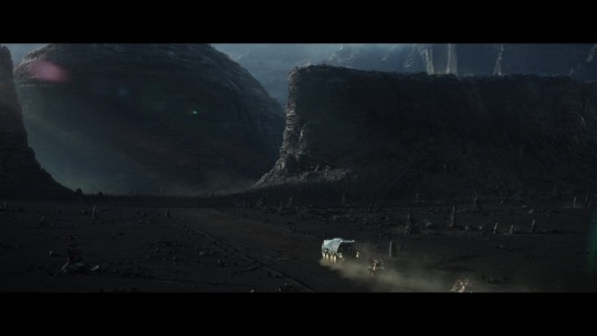
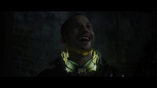
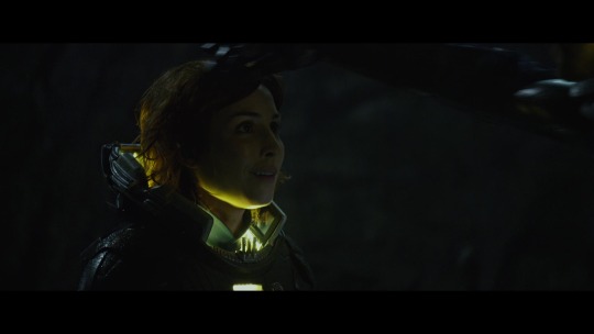
We return to a movie that disrespects the archaeological importance of roads, Prometheus.
I am still not over that. I will never be over that.
This time, content warnings for continuing frat boy archaeology, cringeful application of racist terms to lily-white androids, me screeching about site contamination some more, and Apollo’s dodgeball striking this movie with a glancing blow about masking.
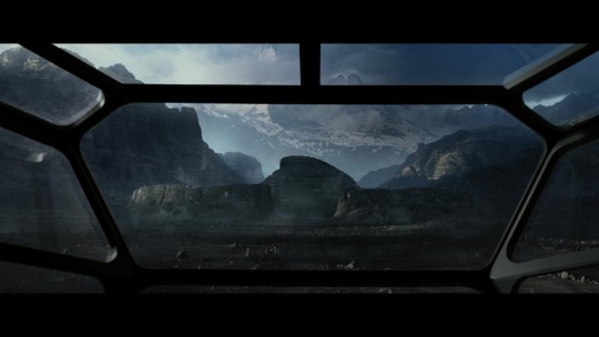
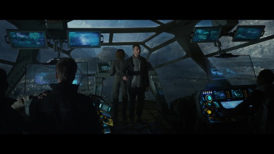
So, back in the theater in 2012, I had already lost sympathy for the cast. They were being set up as stock horror movie characters, they were doing their jobs in a way with a certain flair for the incompetent.
And one of them, I suspect, the movie intends to make into a “flawed but you feel for him” kind of guy. Or, I hope they intended to make him “the guy in the slasher movie who you hate and want to see die”. That’s Holloway, one of the two archaeologists. He’s robot racist.
Like, seriously robot racist. The whole crew is, David literally gets referred to as “boy” here, which isn’t so much a dogwhistle as a tornado siren. No wonder David is quietly starting to show his disdain for the human crew.

“They're making you guys pretty close [to human now], huh?”
“Not too close, I hope.”
One of the few themes the movie handles halfway competently is the parallel between the humans stumbling all over themselves as they rush to go meet their makers, while David is already experiencing the disappointment of actually meeting his, and finding out they’re a bunch of clueless assholes. Are we supposed to believe the same of the Engineers? I don’t know. They definitely think of humans as lesser, though. More to come on that later.

Because right now, an expedition is barrelling toward the alien structure–again, driving all over the FCKING ALIEN ROAD–and they’re doing it with only six hours of daylight left, because Holloway literally says “It's Christmas [...] and I want to open my presents.”
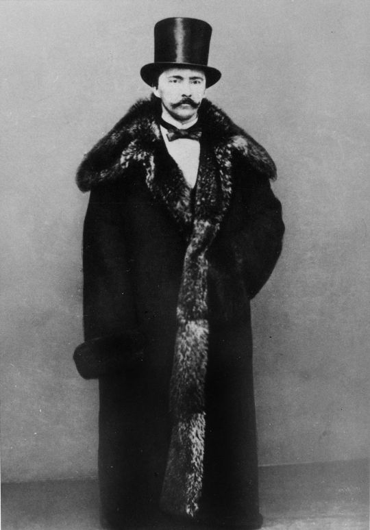
I cannot communicate how heinous this character felt. The actor did a perfectly fine job playing him, but if Charlie Holloway was real, his name would be said with the same venom as that of the man pictured below: Heinrich Schliemann, the man who found the real, actual city of Troy, and immediately dynamited a trench through the royal palace, destroying who knows how many artifacts from the period the Iliad was based off of. Yes, I picked out the most assholish-looking photo of him I could find on purpose.
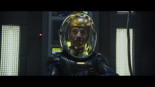
Also, Holloway’s an anti-masker, apparently.

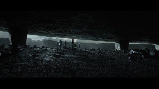
I’m going to step back for just one second and list the one practical, movie budget reason why characters might take their helmets off. The costume designers did an admirable job coming up with something that fits the general requirement of a helmet in major studio releases, prior to The Mandalorian: make the actor’s faces completely visible, because without actors with a strong sense of physical presence and voice acting, you’ll lose connection with the audience.
They did a great job with that. Unfortunately, shiny helmets are a bastard to digitally edit film crew out of.
It’s not impossible to place lights and crew so that the audience won’t notice them. Alien certainly pulled it off. Clear plastic elements in helmets also mean other logistical challenges, though: fogging being the main one. This, and cooking your actors in a fishbowl under studio lights.
Both problems can be simultaneously combated by installing A/C fans within the helmets, but because these helmets are entirely clear, you’re limited to hiding them down near the neck, and anybody who’s done similar for a cosplay or suit will know that it’s potentially noisy and not always effective. You can actually see condensate on the helmets in the movie, though whether that’s from the actor’s breath or a deliberate choice, I don’t know.
All this adds up to increased time resetting actors (i.e. cleaning sweat off of them without disrupting their makeup), more exhaustion from said actors, and the worry that the highest-paid, plot-critical actors may decide they don’t want to do a sequel if the shooting experience is too physically unhealthy.
And then there’s also more time spent carefully arranging crew and lights to hide their reflections, or more time making some poor VFX artist erase a transparent, curved reflection from frame and replace it with something else, or make the actors more comfortable by adding the glass in later with CGI, at the potential loss of some realism. The average modern movie studio would choose one of these VFX-driven options and demand it done in a week, which is why VFX artists need to unionize.
So. I understand at least a few logistical reasons why you don’t tend to make actors wear helmets for too many shooting days. But it has to be balanced with the story. It has to feel believable. It has to fit the story. It has to not make your characters look like mud-witted morons.
As soon as they find liquid water and the oh-so-deadly CO2 levels start to drop, Holloway takes his helmet off.
“Don't be an idiot.”
“Don't be a skeptic.”
Flames on the side of my goddamn face.
Now, this is the moment a lot of people lost sympathy for the human characters, even back in 2012. It was a dumbass idea even then, in the pre-’rona years. Sadly, Millburn the biologist isn’t written smart enough to punch Holloway in the nuts over even thinking of doing this, because we have two problems with what Holloway’s doing here: Biology, and biology.
First, biology.
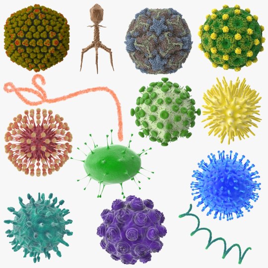
(https://www.turbosquid.com/3d-models/13-viruses-virus-3d-model/1071200)
Obviously, they don’t know if anything’s in the air. He could find out that humans are deathly allergic to alien dust mites. He could have just caught himself a case of space covid, which he and the lemmings that follow him can then transmit to the entire crew if he’s not kept in quarantine. They can sterilize the sealed suits, but they can’t sterilize the inside of his lungs. Yet.
Second, biology.

Specifically, Earth biology. Do you know how carefully modern space agencies sterilize anything that’s headed for Mars, or anywhere else that might have a biosphere of its own? A lot! They sterilize everything a lot! Because microbes are hardy little bastards. We’ve never found extraterrestrial life, only precursor molecules that show the capacity for life to develop in other places. How are you going to verify you’ve found alien life, or even those precursors, if you can’t prove that your samples are uncontaminated? What happens if microbes from Earth manage to survive the trip and establish a foothold somewhere? What if they destroy native life?
This movie’s characters treat this with only a fraction of the gravitas that the cinematography does, which is part of why this remains so jarring throughout. The practical sets, the art direction, and the camerawork are all excellent. The editing continues to do its best, though it almost feels like things were cut very tight through this to speed things along and to give more time, unfortunately, to what the characters are doing.
their crimes against my sanity are not done yet
⛬
(Previous) | (Index) | ⛬
⛬
As a side note, rounding up some discussion from a previous entry: The most excellent artist @noordzee pointed out that the clashing artistic style of the moon and stars slapped onto the carving of Kʼinich Janaab Pakal I. In the previous post, I focused on the link between that carving and its use in ancient aliens conspiracy theories. But let's dig a bit into actual Maya iconography around celestial bodies instead.
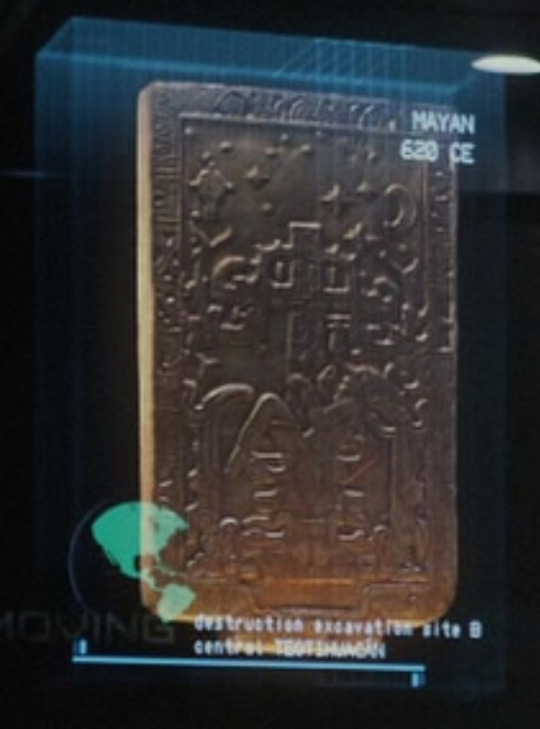
Now, I am not an expert on Classical Maya stuff. Not in the slightest. And there is a lot of information on their art that is linguistically inaccessible to me, as a non-Spanish speaker. But out of the Maya art and writing that survived the book-burning conquistadors, we have some iconography for the moon and stars, and they don’t look like what’s in the movie.
I wasn’t able to find any specific pieces of art that contained stars, but I did find the glyph for star, ek’.


I was only able to find depictions of a crescent moon in the context of the moon goddess, where she tends to be sitting on the crescent like a chair, or one part of it is shown behind her, almost like a tail (though I can’t be certain whether that’s due to chipped paint).
The moon by itself was somewhat harder to find. I couldn’t find any Maya depictions of it with my limited poking around of the spanish internet, but I did find a (much later) Mixtec depiction of the moon, complete with a lunar rabbit! Much like East Asian cultures, the darker markings on the moon are culturally interpreted as a rabbit shape.
Thanks again to nordzee for pointing out the dissonant art style, because the real mesoamerican art on this subject is phenomenal.
Next time, the movie will hurt me more, so if anybody else has fun facts to share or details to point out. PLEASE. Ease my pain.
⛬
(Previous) | (Index) | (Next)
⛬
Alt text citations:
None this time. Many ramblings, though.
#prometheus 2012#prometheus (2012)#I work in a place where quite a lot of people have to put on clean room suits to go to work#their rooms are behind airlock doors#and that's just to make sure outside germs don't get in#to keep things clean#we don't even have the REALLY scary containment rooms that a few biological laboratories have#I'll ramble more about the logistics of that later#when the movie gets around to breaking laboratory safety standards as well
49 notes
·
View notes
Note
Hi chaos,
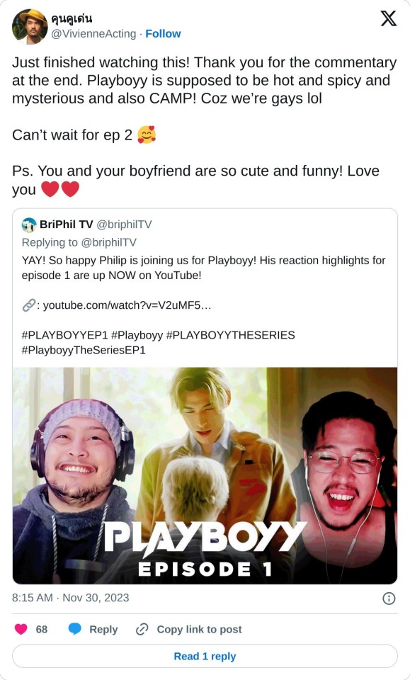
So people on other socials are saying playboyy is camp? I don't quite get that vibe so I'm asking do you? Why?
*cracks neck* okay let's do this; this got wildly long so I'm putting a chunk of it behind a cut b/c unlike some blogs I'm not gonna subject anyone to endless and endless scrolling just b/c I added pictures anyway~~
So people are probably getting this from Den himself:
I talked about camp an itty bitty bit before, specifically I quoted Susan Sontag who was an American academic, novelist and writer mostly known for her essays. You can read more about her here. Specifically I quoted her essay Notes on Camp:
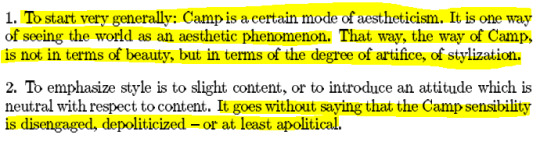
(source)
I really recommend reading the entire essay, it's a bit dated, but Sontag also makes a point that camp changes with the times as well. This essay was written, after all, in 1964, before Hairspray (1988), Batman (1966), Rocky Horror Picture Show (1975), or Mommie Dearest (1981) which are considered camp classics now. However there's a lot of good stuff to learn in her essay and she also names a lot of prominent either queer creators - Oscar Wilde, Jean Cocteau - or prominent figures that the queer community sorta like, claimed - Bette Davis, Greta Garbo.
Camp is a concept, it's not a hard and fast rule. Not every film or TV show that gets claimed as camp is intended to be camp - Showgirls and Mommie Dearest are sincere in their intentions, they are not trying to be camp at all, but through sheer accidental glory they stumbled right into the camp valley. Similarly with a film I recently learned about via this amazing essay, Valley of the Dolls which was also sincere in it's depiction of drugs, sex, and show business but just ended up...campy (this is part 2 which is my favorite part but part 1 is great too):
youtube
I would also recommend this video by Kennie JD on Showgirls and you get a modern idea of how a non-film critic sees the camp in Showgirls even tho it's not intended as camp (Paul Verhoeven is never going for camp in his films he's often going for satire and yet, alas lol):
youtube
Okay so this is getting away from me, the question was "Is Playboyy Camp?"
I would argue, yes but definition but it's more classic definition rather than what people probably associate with "camp" in the modern day. Which is "bad" films, or so-bad-they're-good films, or drag queens - would love to see Zouey in full drag actually - but Rocky Horror isn't a "bad" film, heck Showgirls isn't a "bad" film, neither is But I'm a Cheerleader or Jawbreakers, or many other camp classics. Some are "bad" in that they didn't achieve their intentions - again Mommie Dearest is a great, if unfortunate, example of this actually - but films that intentionally try to be camp tend to fail, like Cat and the Hat starring Jim Carrey. They're to fake, they try to hard.
As Sontag said, camp is both sincere and pure and it is also abstract and highlights aesthetic first and foremost.
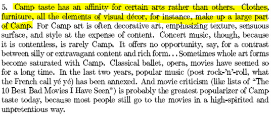
Showgirls grabbed people in part b/c it's so so so very over the top; from the acting yes but also the costuming and set design. But I'm a Cheerleader had a way smaller budget, but it's very aesthetics focused:

I've seen people say that Playboyy looks "fake" or "artificial" but so does But I'm a Cheerleader. However artificial is the wrong word, imo, to use here; rather both are camp and surreal. They're going with surrealistic aesthetics to emphasize the emotions of the characters and also, cause gays like color. We love that shit. It stands out. It's fucking fun, it's campy!
I don't think Playboyy is strictly camp but it does take inspiration from camp - it pushes its priorities of the film making to be about the aesthetics rather than emphasizing reality. It's not uninterested in reality - the discussions of sex work in a amoral way (which sidenote I think is a good thing), of sexual desires, the complexities of relationships and boundaries, the acknowledgement of kink etc - but it's uninterested in presenting the world of the show solely through a "realistic" lens visually.
Fantasy is part of the narrative of Playboyy thus that is reflected in the visuals.
BIAC is part satire, which I wouldn't say Playboyy is, since it's not satirizing anything specific - unlike Lovely Writer attempted and didn't accomplish imo doing well from what I watched - it's clear to me that Den is playing a lot with genre. Now how well him and Cheewin the director are accomplishing this, well that's up to individual interpretation.
I can't force people to like Playboyy as much as me - even tho I'm right - b/c I'm not a weirdo and we all like different shit. I do think that Playboyy is using like, actual cinematography however. Like I see that word thrown around a lot and then people provide really like basic examples. Like I'm so sorry but 2Gether's cinematography is basic at best and boring at worst. Two dudes standing in a badly lit room in a mid-shot does not impressive cinematography make - which is fine because a lot of these shows are made on shoestring budgets.
I don't expect Moonlight level cinematography from gmmtv or MeMindY shows. And Playboyy doesn't have that level either it can't it's clearly also made on a small budget.
That said it IS filmed with purpose, and with a specific visual language. Not every shot is great but I do love the sincerity here, it's using color, lighting, and set design with actual thought to enhance the overall aesthetics of the show, enhance the fantasy at play, the camp.
Camp films aren't inherently "bad" films. They make you laugh, scream, and the best ones, actually do say something or spark discussion. Rocky Horror is meaningful to people, But I'm a Cheerleader means something to people, they're both unashamedly queer films that were both kinda bombs - critically and financially - and then slowly gained a cult following b/c they were way ahead of their times.
I get the feeling if camp applies to Playboyy at all it's in that sense, a series that's being pretty harshly maligned and disregarded critically at the moment, but that actually has a ton to say and may end up gaining a following down the line after it's over.
This was like, wildly long and I apologize lol
81 notes
·
View notes
Text
Wish Granted AU: Star: 🌟
Yeah, I finally got to the boy! Took long enough, huh? 😂 So I dud make a short character inspiration from a reblog chain a few weeks ago, so I'll go more into Star's character here:
So, much like the film itself, Star comes to Earth because of Asha's wish was so powerful, and aids her save Rosas. However, for "Wish Granted", he has no idea how to actually grant her wish. She basically fills him in on what's going on, and agrees to help. But he doesn't really understand why they need help. From his point of view, most of the humans on this part of Earth, and especially in Rosas look happy enough. He's just utterly fascinated with the animals, the trees, Asha, and just experiencing what humans see everyday.
But then he visits the Hamlet (in an animal disguise) when Asha wants to say goodbye to her Saba and mother. Star sees how sick Sabino has gotten, and the fear Sakina has for her daughter going back into danger. The Starboy sees that Asha's wish is entirely to help her family and community. (Its greatly emphasized once he gets to Rosas itself too) He partially understands and gladly accepts the task to help her. Asha can't believe this magical boy is a Star, it should be impossible. But just as her father said, the stars are there to believe in possibility. Star here is the impossible, made possible! Its no wonder his loveable and joyous personality leads her to falling for him! 😆
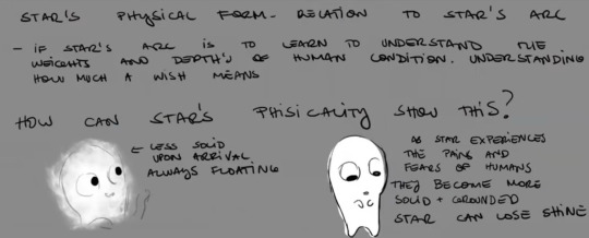
I took inspiration from this segment of the concept art book where they attempted to give plushie Star some kind of depth and character arc leftover from Starboy. They really tried to give Star something more than just being a toy, and Disney said "nah, a toy is good enough. Kids will love it." So Star's arc will be he starts off naive about the world and thinks everything is perfect. But once he starts seeing more of the people having other emotions other than happiness, he's processing how a human feels this. It hits harder when he actually feels a wish get destroyed, he feels their pain for a while after he connects with them. This is all going to connect to "At All Costs" when finally get that love confession scene! 😉
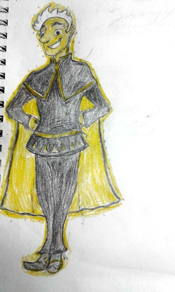
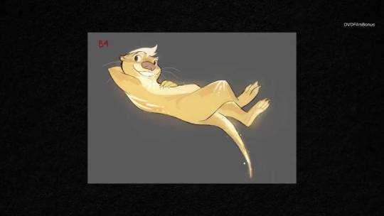
Now, my favorite part: POWERS!!! Star can shapeshift into different animals he sees, with his telltale sign of him being gold with white fur/hair. (Example image below) He's got a white six pointed star on his parts of his body that glow slightly, even in a human form, its just covered up by his black caped outfit.
I still kind of hate that Disney actually thought Star was too similar Genie just because he changes into animals. Like, what are you talking about? (I actually thought of MK or Beast Boy more than Genie.) Yeah, Genie could do that too, but he also changed costumes, size, shape, face, broke the 4th wall and did impersonations of movie actors of the time. Star didn't do all that. Besides, YOU MADE MAUI CHANGE INTO ANIMALS AND APPROVED OF IT!
Rant aside, He can change into any animal, but only has one human form. That's not only because there's way too many variations of people for him to adapt and he's not at that level of power yet. He mainly choose this particular human form because.... he thought Asha would like it. (He even gets the cape idea after he sees a picture of Magnifico. He just LOVED how that looked) Think of it as a boy trying make himself look better for the girl he has a crush on. 😂 His design is inspired by these three pieces of concept art combined with a dash of a superhero vibe. (Superheroes are hardwired into my brain, I tried my best NOT to do that! 😂)
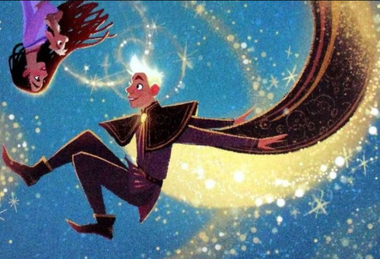

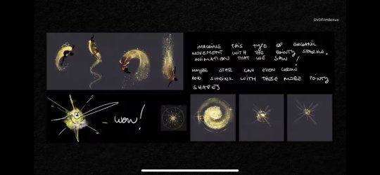
Star can make animals talk, at least for a limited time, like when be has his big introduction song and the forest animals are his band. Animals are naturally attracted to Star, because he literally radiates pure joy and love. Those little critters just adore him! Think of this scene here:
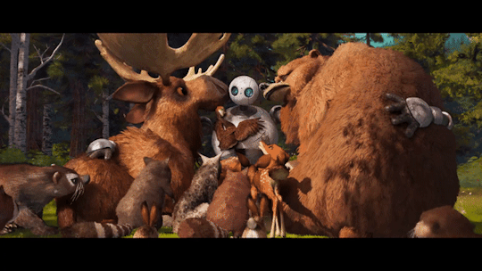
One last thing to add is that once he's on Earth, and gets into Rosas, thus is when he gets the most attached to the planet. He has a big family with the stars, but he really wanted to be where the people are. He wants to see them dancing, ect...Meeting great people didn't just end with Asha, but also meeting the 7 Teens. He learns about their wishes as one desires, while confused on Simon's sleepiness/sadness. He actually attempts to heal Simon and can gain a new power. Star is not sure on how to react to Dahlia, who doesn't seem to have a wish. She seems happy cooking for the king (whom she has a crush on) and queen, no questions asked. Although, Dahlia does seem particularly curious about Star, even before finding out his magical side. She even tries to tell him to give up on granting Asha's wish, but he's definitely not doing that. 😂
When he meets the King and Queen, let's just say there's going to be a lot of angst/comedy with that. But when he has the mini stand off with Amaya. OH BOY, he's going to understand way more heavy emotions after meeting her...
(Star in this version is voiced by Jeremy Jordan, because he's a musical and VA legend! Plus he sounds so fun in every role he's in!)
Aaaand, that does it for Star! I mentioned in another post how when you look into his eyes, you can see microscopic galaxies or mini stars in eyes, like you can see the universe in his eyes! (When it gets to the At All Costs song, Asha can be seen in his eyes like she becomes part his universe) Any other bits will be revealed later, but I wanted to flesh the guy out here! He's a lot of fun to write and draw!
Now next up are the King, Queen and their ferocious yet spoiled pet Lynx! 😉
@signed-sapphire @oh-shtars @chillwildwave @lazytitans-world @emillyverse @annymation @kstarsarts @uva124
#rascal entertainments#wish 2023#wish concept art#wish granted#wish reimagined#disney wish#wish rewrite#wish movie#wish starboy#wish star#wish asha#wish fandom#starboy#wish granted au#Wish AU#kingdom of wishes#the fallen star au
29 notes
·
View notes
Text
i havent overshared something extremely complicated and personal on here in awhile so its time to fix that
you might recall that after this past summer i've been trying to recover from anorexia. progress has been....ok. i suppose better than nothing but im certainly in the rocky/awkward phase of it now. Thats part of why i've been doing more illustrative art/doll art as opposed to sharing images of myself/things that relate to my appearance like cosplay.
which brings me to the primary thing thats on my mind which that historically, whenever people give accolades or shout out my strengths as a costumer, a majority of the time its on my shilloweete. and sure, i do work a lot with petticoats and padding to make things more dramatic, but fully and genuinely 90% of that is just because of how disproportionately weird my measurements are with respect to my head and skeleton. its not actually a skill, talent, or anything i've put effort into, its just a consequence of anorexia. and its hard because when people draw attention to it, i cant be like "thanks. its because ive been intentionally and resolutely trying to off myself for the past 10 years."
i guess this is something that i shouldn't be picky about, i feel bad getting upset over compliments but i do wish i could be recognized more for my design work, material strategy, and actual craftsmanship over how i look. especially because of the next thing, which is the fact that i get...a not insignificant amount of feedback from people saying they wished they looked like me in a post, or saying that they dont feel like they can cosplay the same characters because of their body.
and at the risk of being controversial, i know that oftentimes the response to statements like that are "COSPLAY IS FOR EVERYONE <3" or a similar sentiment, but this ignores that fact that cosplay is not the same for everyone. because look, there was a brief period in 2016 when i actually was at a healthy weight and my treatment in the cosplay community was like night and day. i dont know what to say when i know that the way we're going to be viewed for doing idential things is going to be significantly different, and i think back to how much praise i get for things that are disordered behavior. If those comments wernt there...would anything else actually fill that void? if that person wasnt giving me a compliment on how much i "actually look like that character", would they have said anything at all?
one of my goals is to eventually get to the point where i can make good on my word and my internal morals and try to challenge those ideas by existing in spite of them, but dawg. i just simply do not have that mental resolve yet. at the very least ive wanted to address it on tiktok and IG where this problem happens the most, but i both dont know how to approach the topic responsibility and if i could handle the upsetting comments, be them well intentioned or otherwise.
46 notes
·
View notes
Text
Okay I'm finally sitting down to properly watch the PJO series so here's an episode-by-episode live blog I guess. (Fair warning, I haven't read the books since I was a teenager, I am a smidge of an apologist for the films, and my favorite adaptation so far has been the musical.)
Episode One:
All of the actors are doing a really good job, I especially like Sally.
The costume design for both the monsters and the humans is pretty killer. I want Percy's sweater.
I also love the little seaside cabin and want to live there!!!
This is such a mild gripe BUT as someone with dyslexia I wish there was a better way to visually depict it without like, doing the swapping letters thing cuz that's just not what it's actually like at all.
Gabe maybe feels a little too funny. Like I'm supposed to hate him and think it's justified that he deserves to be turned into stone at the end, this version of him is really.....toned down, and his banter with Percy and Sally was fun to watch. I should hate him, but really he just came across as unpleasant. Less abusive asshole and more "old married couple who share interests but can't communicate without shouting" you know?
Loved Grover's little "I'm 24 actually" lmao that was great.
Not a fan of Percy immediately recognizing the Minotaur within a millisecond of it appearing before the audience even got a good look at it. Like, I just sat there thinking "how can he even see it?" rather than feeling scared of a big monster barreling at them.
The action is uh....fine? Feels a little lackluster. Or kinda....divorced from the rest of the show weirdly?? Idk it makes me feel like I'm watching a movie of a movie if that makes sense?? But we'll see where they go with it. (I know banter during a fight isn't realistic and people make fun of Marvel for it, but like...it helps to have at least a little talking. We don't wanna be Man of Steel.)
I feel like there's been a few "slightly out of sync ADR" moments but they weren't too distracting.
Pacing into Sally saying goodbye felt a little long, kinda took the shock of her dying out of the scene, but the actress REALLY sold all the emotional beats so I'll forgive it.
I LOVE the credits sequence!!! Reminds me of the designs on that one box set of the books in a really cool way.
Episode Two:
Oh yes the ugly ass neon orange shirts are here bless!
FUCK YES THAT'S DIONYSUS BAYBEEE!! My ONLY note is that he def could have turned up the energy a little, but that's probably just bcs I love how loud and unpleasant he is in the musical and I also know how unhinged this actor can be.
Chiron is such a delight <3
I like the cabins too, way better than how I imagined them as a kid reading the books lol
Oh, I can see why the new fans fell for Luke so hard.
Grover assuming a human being squished would be like an old banana is very funny. Felt very book-humor in a good way.
Clarisse!!
Oh damn actual disabled half-bloods, very cool!
Minor but I can't actually tell what Percy did wrong with the bow? Weird editing I guess.
Aside from that I actually love a good "fuck up" montage, I honestly wish it were a little longer.
Probably doesn't matter but I don't get having them burn the food after they've started eating? I thought that was a before you sit down type thing.
Percy burning the blue candy to try to talk to his mom was sweet tho T_T
"real friends" hahahaha.....yeah.......about Luke.......
yay! hazing!
Oh I love Annabeth already >:D
Thalia.....is pronounced differently than I thought....?
(I'm sorry I'm too much of a fan of 'Tree on the Hill' for this exposition dump. That shit hits harder when coming from Grover.)
Percy giving Annabeth the "actually I suck and my self esteem is riding on this so like pls don't ask me to do anything hard T_T" talk is just, so good lmao
ofc he doesn't know what's going on Annabeth you didn't tell him anything
Okay the action is a lot better when it's between the actual characters and doesn't involve a 3D monster, though I still had trouble following all the hits Percy was taking.
Oooh I can see why people did so much art of Percy being claimed that was a good shot.
FUCK YEAH TELL HIM YOU'RE SALLY JACKSON'S SON
(I hope they kept the Oracle in the attic...)
Okay I have to go do some things and then I'll be back for more!
29 notes
·
View notes
Text
A Comparative Analysis of Hook’s Ship and Cabin in Popular Media Portrayals
Part 3: Steven Spielberg’s Hook
Not gonna lie—visually, Hook is one of my favorite versions of the character because both the captain himself and his living space are just so incredibly over-the-top with lots of attention to detail. The costuming and set designers really went all-out on this one.
Dustin Hoffman’s Hook has a ship like no other! His Jolly Roger leaves absolutely no doubt from the second you lay eyes on it that it is a pirate ship and throws all sense of practicality out the window in favor of lavish decadence fit for a king. From the outside, the cabin itself is reminiscent of a large skull wearing a bicorn hat with two large windows serving as the eyes. Perhaps most interestingly, the very center of the hat bears what appears to be a slightly altered version of the Eton crest with a skull and crossbones over it. This “knock-off” Eton crest (which was probably altered in the film for legal reasons) or one similar to it, shows up in multiple places inside the cabin as well.


If you look closely and zoom in on the two images above, you’ll notice one (not colored) crest over the piano, one on the desk, and one over the fireplace (which, by the way, does not seem practical on a wooden ship). Some other neat details I noticed in these shots include what looks like gramophones on the desk, images of fencing stances on the wall, and that the bottom of the bed which lowers down from the ceiling appears to be painted. I don’t know for certain but believe that the painting is meant to be this image used for promotional material but not ever actually visible in the film. (Thanks to the HookPosting community on Facebook for the image.)
Interestingly, it still features the hook on the right hand. Perhaps that’s why it was never shown in the film. If this godlike portrayal is how Hoffman’s Hook sees himself, it borders on pathological narcissism.

Back to the cabin itself… When the camera pans over to the other side of the room, we see another mock Eton crest in the background. In another, closer shot, we can clearly see the words “Good Form” over this one. This guy is Eton OBSESSED! (Which, to be fair, is pretty canon.)

We get a few more interesting views of the cabin in the scenes where Hook is attempting to teach Jack and Maggie. There is another self-portrait—though this one is a bit humbler and more realistic. Again, narcissist much? But what’s especially intriguing to me is the fact that if you zoom in close, you will notice that below the painting, there are black and white photographs. Now, so far, everything else about this Hook screams 17th century with the one odd exception of the gramophone(s) on his desk. But one might explain that away as something he picked up while visiting the outer world. But to have photographs would seem to imply that he (or someone he cares about) is from a much later time period. The one seems to be a photo of a young man (Perhaps Hook himself?) while the other is, I think, a couple (His parents? A younger Hook and his former love?). There is another black and white photo, too, that you can see in a shot behind Jack and Maggie that looks like it might be of a sports team… Might this be a team photo from his time at Eton? Unfortunately, without better quality close-ups on these images and input from the set director, there is no way to know for certain, but it certainly is intriguing…and it might explain Hook connecting with Jack over his love of sports.
Hoffman’s Hook is an enigma. His ship is unlike anything that sailed during the Golden Age of Piracy—far too gaudy and over-the-top, both inside and out, to be practical. And yet, there are details that no child would think to make up like the ever-present Eton crest and the black and white photographs. The clashing of time periods apparent in his wardrobe and personal effects lines up well with Barrie’s own conflicting information regarding Hook’s murky past, but it leaves us as the audience a little unsure what to make of this man. Perhaps, Hook and his ship are still the product of Peter’s imagination…but since Pan has grown up in this retelling, the details of Hook’s cabin have shifted to reveal the same larger than life character as imagined by an adult.
#captain hook#hoffman hook#captain hook dustin hoffman#Dustin Hoffman#steven spielberg#hook 1991#the jolly roger
29 notes
·
View notes
Text
I just finished the first episode of Heartstopper, so here are some of my thoughts in no particular order.
The opening song is cool (will probably look up the shows soundtrack like I did with XO, Kitty).
Why did the camera focus so much on Charlie's bag & Elle's drink? Is it product placement?
Wow, no hate to the actor, but Charlie's eyebrows are THICK!!!!
Tori is beautiful but also kind of looks like a ghost (I think she’d be great for the role of Violet Baudelaire from A Series Of Unfortunate Events) & why was she so pushy about the "dream guy" thing? Like let the poor boy breathe.
Is Nick's actor that much taller than Charlie's? I hadn't noticed.
I’m sorry, but knees are so weird to me lol. Also obligatory, 🎵 she's a runner she's a track star🎵.
Wait, is that PE teacher that will later interrupt the team theorising about Nick & Charlie's relationship? It's crazy how they’ve found actors who look so much like the characters in the graphic novels (other casting directors should take notes).
Ok fair enough about wanting your team to be good & wondering if the quiet, skinny, nerdy, boy is even into sports but the shit about him being gay is so stupid (bet it was Harry that said that).
Glad Charlie didn't get injured learning rugby, lol.
Nick's shorts seem a lot smaller than Charlie's ones do, but maybe that's the costume designer's way of helping Charlie’s actor look more skinny?
Omg Stephen Fry, what are you doing here lol?
Wow, people weren't kidding. Olivia Colman really did show up just to say one line. What a legend, lol.
Ben, did you really make Charlie walk all that way for such a lame ass kiss? Also, let him talk about his Christmas, you jerk!
I don't think that Form tutor is very good at his job (while Nick thankfully turned out to be nice) it’s usually not a great idea to put the skinny, gay, nerd that has already been bullied with the bigger, popular, seemingly straight, athlete, especially at an all boys school!
Ben, you dick. Like I get wanting to keep your relationship secret, but you did not need to pull the 'who the hell are you!' card. All you had to do was say hi in a confused/uninterested tone (then apologise later). If anything, your reaction came off more weird than what Charlie did.
I'm sorry, but I don't get the leaf animation. I mean, I GET it, just why leaves? Why not flowers or hearts or something? It just doesn’t seem that impactful to me, but maybe they have a deeper meaning that I'm just not grasping yet? If so, please let me know.
Ok, so I'm torn over the gay teacher. Like artistic? That's cool. Those glasses? Cute. Him giving Charlie a safe space to eat lunch? Great. Him being worried over Charlie potentially being bullied again? Awesome (take notes, Form guy), but his advice to Charlie seemed slightly lacking. Obviously, honesty & communication are important in relationships, but I'm a little surprised that possible safety concerns weren't addressed at all, especially from a fellow gay guy. Like I get that he doesn’t know the kind of guy Charlie's "dating" & that just because someone doesn't want to come out yet doesn’t mean they should be labelled as dangerous but internalised homophobia can make some people lash out & after everything Charlie's been through his clearly more likely to be vulnerable to situations like that.
Nick is a golden retriever in human form, they're 100% correct 😊.
Isaac? What happened to Aled? I hope he still shows up. He may be quiet, but he was so cute during Charlie's 15th birthday in the graphic novel.
Interesting to get to see Elle's time at Higg's (fuck that transphobic teacher & whoever was throwing sandwiches at her). Sad she doesn’t have any friends but I'm sure that'll change when she meets Tara & Darcy. Wow, is it strict over there, though, like you can't even be on your phone at lunchtime? Damn! Surprised they did it this way, though, as I was assuming they'd just make Truham co-ed so all the characters could be in the same place.
Tao, my guy, the drink thing is sweet but that hair is.....certainly.....a choice 😅.
The shots of Charlie looking at food, without eating, make me ☹️.
I gotta be honest, the montage of Nick & Charlie saying hi to each other was a little cringy to me compared to how it came across in the graphic novel, but they're meant to be teens, so I'll let it slide. It's also an effective way to highlight how differently Charlie's "boyfriend" treats him compared to an acquaintance.
Ben's hand covering up Nick's smiley face got me like ☹️/😠. They're not even together yet & I already felt like telling him to get off Charlie, like that boy is not for you! It’s ridiculous, lol.
Ben what you did was fucked up but it's hard to be scared of someone who looks so much like a meerkat in a wig (no hate to the actor) also did it seem like he just....skidded away when Nick pulled him off Charlie? Like, was the actor wearing Heelys lol? Or had someone just mopped the floor without telling anyone? Also, it's lame to wear a coat when you're cold? What in the toxic masculinity are you fucking on about Ben?
Omg the bathroom scene was so adorable, but I wanna know what kind of pen Nick was using because being covered in that amount of ink is crazy 😆.
Overall, it's very cute. I like Nick & Charlie. It’ll probably take a bit longer for me to really care about the other characters. Ben can catch these hands! And I’m looking forward to watching the Narlie relationship develop.
So while not overly ground breaking (though obviously important for LGBTQ+ rep) it's definitely enjoyable in a comforting sort of way which (considering medias fascination with marginalised suffering) is obviously important for queer youth but also must be quite healing for queer elders. Because you deserve wholesome, cheesy, romance just as much as anyone else.
#heartstopper#netflix heartstopper#heartstopper season 1#heartstopper episode 1#charlie spring#nick nelson#lgbtq+#lgbtq+ media#elle argent#harry greene#stephen fry#olivia colman#ben hope#issac henderson#aled last#tara jones#darcy olsson#tao xu#narlie#that's nick & charlie's ship name#at least according to google#also good job on the casting directors for hiring people who actually look like they could be teenagers#as I'm assuming they're not#queer media#trans#trans character#gay#gay character
16 notes
·
View notes
Text
Since David Jenkins has (basically) officially confirmed 'Our Flag Means Death' will not be getting a third season, I've been thinking about it a lot and that thinking has made me emotional and thoughtful
It makes me so sad that Max decided to end the series and even sadder that no other streaming platforms decided to pick it up.
Out of the new upcoming queer trinity (Good Omens, OFMD, and WWDITS), OFMD has made me and many queer individuals feel truly seen. OMFD showed pure beautiful queerness, acceptance, and love. How people can metamorphosize and be their authentic true selves. It had many relatable characters whether they were related to because of their extremely real flaws, their identity, or their journey and fleshed out characters they became throughout the show.
Though the queer community is becoming much more normalized and represented than it has in the past, it's still so impactful to see characters with they/them pronouns or dressed in drag without anyone questioning or batting an eye. It's also so wonderful that this show was made up of so many queer characters, but none of that queerness was made a plot point or a spectacle.
As an artist myself, I'd also like to show some appreciation to the costume design, the set design, the writing, sound, music, lighting department etc. etc. These people were who made the show possible and who made the show just that much more special. After watching both seasons, I found out that they were given a much smaller budget for the second and I was just truly blown away (however also upset with whoever decides the budgets) how they were still able to create such an extraordinarily beautiful second season. (I admit that I go back and watch Calypso's Birthday episode several times for every single reason I've mentioned in this little rant)
We need to support shows like this, and I applaud renewasacrew and its members for all their work put into doing just this, even if it didn't work out in the end. I encourage any aspiring creatives to work together, work hard to get your ideas seen and heard because we can have even more beautiful and impactful shows following in the footsteps of OFMD. 🏴☠️🏳️🌈
#ofmd#ofmd s2#ofmd s1#our flag means death#renew as a crew#queer#queer community#lgbtq#david jenkins#ofmd max#rant#yapathon#i just relate so badly to izzy and stede and ed i just want a good ending for them so SO much
20 notes
·
View notes
Note
top 5 headcanons? Your own or just faves!
GREAT question so these are just the ones off the top of my head:
1. This headcanon for Mando teaching the kid sign language, and the kid communicating back
2. Not something I came up with, but I like the idea of Luke having permanent Force-lightning scars as a result of Palpatine using it on him in RotJ
3. Personal headcanon: I think Han Solo would have taken Leia’s last name when they got married: Han (at least in the movies) had no family ties to the name ‘Solo,’ it was the name the Imperial officer gave him when he enlisted in the military to escape Corellia. It’s the perfect description for a smuggler on his own who only thinks of himself and his ship (though eventually Chewie becomes a part of The Only Things Han Solo Cares About).
The most important thing about Han Solo’s character that I think many audiences and even official creators (INCLUDING GEORGE LUCAS SOMEHOW) seem to forget is that Han’s whole character arc is that he was NOT a good guy— He BECOMES a good guy. All of the tension surrounding him in the original trilogy is based on the fact Han Solo looks out for himself. His return at the end of A New Hope is predicated on the audience being surprised that he came back.
Each movie, there was no guarantee that he would stay or stick around when the going got tough. By the end of the trilogy, Han’s character arc has ended with him choosing to be a part of something bigger and caring for people beyond himself and beyond his circle of friends. Choosing to marry Leia means choosing to remain relatively sedentary and present for her (and by extension their family, friends, and the New Republic), and besides, what better way to throw people off the scent and protect yourself from your criminal past than by marrying into the royal and political-leading family?
TLDR: Han takes Leia’s last name after they’re married because he finally has a family he chooses to tie himself to.
4. Personal headcanon: Leia does not forgive Vader for what he became, regardless of whether Luke says he redeemed himself in the end.
Leia not only saw the war he led and the atrocities he committed her entire life, he enabled/directed the destruction of her entire home planet before her very eyes. Leia loves her brother, but she cannot reconcile what Luke says about Vader being a good person with the war criminal she knew him to be.
Bonus headcanon: I think in the sequel trilogy Leia should have been the one to see a vision of her son’s future and she should have been either the catalyst for Ben Solo leaving, or she should have been the one who said she saw too much of Vader in him as an adult and he had to be killed in order to be defeated, while Luke and Han should have been the ones trying to bring him back. Luke’s character in the original trilogy was defined by compassion and mercy even towards one of the worst people the galaxy had to offer, and Han’s character was defined by the people who didn’t give up on him and whose encouragement and support and willingness to see the good in him were the reasons he was able to become a good person.
5. Personal headcanon: I’ve had the idea since 2020 that Mando’s family on Aq Vetina were part of the Disciples of the Whills. I’ve liked the idea of Mando being connected in a non-Force-sensitive way to other lore surrounding the Force, and I’ve based it on the similarities in costume design and because I think thematically, the idea of exploring the Force through a different lens than the Jedi would have made a much more interesting and compelling story in what was originally a relatively independent TV show with new characters on a much smaller scale, exploring different parts of the galaxy.
How I understand the doctrine of the Whills is that it’s more trying to understand the direction of the Force as it tries to find balance in the world, and the result of those teachings means seeing how the Force working in others is what benefits people— In Rogue One Chirrut says “May the Force of others be with you,” which I’ve interpreted as “Yes the Force exists and has an impact on life and death, but because it is the connection binding every living thing together, it’s our choices and the actions we take and the connections we form that exhibit the Force, which are what will ultimately save us in the end.” Chirrut says “The Force protected me,” and Baze Malbus says “I protected you,” and they are both right.
In the context of The Mandalorian, I wanted to see what could have happened if the show diverged from the Jedi, who to be clear were a specific order of Force sensitive followers whose primary purpose was as protectors of the galaxy— The Jedi teachings weren’t just a belief system, they were combined with a martial art and specific learned abilities that were intended to be used to protect people. That doesn’t mean their way was the only way Force-sensitives interacted with the Force.
Long story short, I wanted Mando’s potential ties to a different part of Star Wars lore to be the gateway to exploring more of the galaxy that these stories were set in. I think it would have been a lot more interesting and would have freed up the story to go whatever direction it needed without being confined to the Jedi and prior source material
#The latter three points are important to how I interpret and write those characters#and will be relevant to stories I intend to post down the road#long post#my writing#headcanons#ask games#THANK YOU I love getting to ramble#Luke Skywalker#Han Solo#Leia Organa#Kylo Ren#Din Djarin#Baby yoda#the mandalorian#original trilogy#Baze Malbus#Chirrut Îmwe#hounds speaks#The Disciples of the Whills#Aq Vetina
12 notes
·
View notes
Text
How do I communicate to people that the main issue with casting Alexander Skarsgard as MurderBot is that he's white and the likelihood they would get costume and makeup designers to make him look androgynous is low, and not that he's a man?
In the same way it's overall not helpful to demand that actors only play characters they have the same sexual orientation as, it's also not really helpful to demand that actors only play characters they have the same gender as.
And yeah, there's a handful of nonbinary actors of color that I also would have liked to be in this role instead, but most of them are afab, which leads me to my next point that nonbinary people aren't just masculine-leaning afab people.
There's a really goss and sticky web of gender politics going on behind the image of nonbinary identity that I don't like. Cause if you notice, there's also not a lot of media with big, thick butch women... the kind of masculinity that is androgynous enough to make you question her gender.
Feminine-leaning anyone are only relegated to being seen as and playing as women, because masculinity is default and broad, whereas femininity is specific and dependant on masculinity.
And all amab people are really men, unless they look very much like women.
Androgyny of the flavor where male and female secondary sexual characteristics are combined (body hair, beards, breasts, makeup, and dresses) is obscene and/or to be laughed at, mocked, and gawked.
Hollywood doesn't actually like androgyny and neither do you. You still want to know who is really a woman and who is really a man.
So please do, like, even 5 minutes of thinking about it when you want to complain about the casting choice, cause I'm fucking tired of transmisogyny.
20 notes
·
View notes
Last Seen Blogs