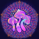
#tildexart
Text

penelope
#I’ve been listening to so much epic the musical guys#underworld saga has pulled me back to my theatre kid days#penelopeeeeee#the odyssey penelope#the odyssey#epic the musical#tildexart
44 notes
·
View notes
Text
Completely baseless but extremely funny TMAGP headcanon of mine:
Gwen 100% had Tumblr as a teenager but doesn't anymore and will deny it until the day she dies
Alice is on Tumblr a lot and one day she references some old Tumblr meme or fandom, Gwen laughs before she can stop herself, and Alice then makes it her mission to figure out a way to make Gwen admit to having used Tumblr
Sam and Colin are talking bets on who will break and give up first
#tmagp#the magnus protocol#tmagp headcanons#alice dyer#gwendolyn bouchard#gwen bouchard#samama khalid#sam khalid#colin becher#colore speaks#also shout out to my lovely friends tildexart and melandrops for also enjoying this hc and making it better lmao#love yall <3 /p
294 notes
·
View notes
Text
The beauty of watching someone listen to TMA for the first time
@tildexart Have fun with season 5! 👁️

#tma#the magnus archives#magnus archives#tma season four#magnus archives season 5#tma spoilers#magnus archives spoilers
75 notes
·
View notes
Text
Yooooo!
My name is Martin (he/him) and welcome to my blog!
This blog is a space for me to share my thoughts on anything and everything film/tv related! Movie reviews, trailer reactions, industry news, etc. I hope to work in film preservation and archiving one day and I thought this would be a good, albeit small, way to start.
As of now, there will be five kinds of blog posts:
Review: Your standard film review! This will usually be saved for first-time watches. Chances are higher that I'll post a review if I saw the film in theaters, otherwise I'll just post one if I feel like it. (otf: reviews)
Rewatch: The same exact thing but for films I rewatch! A film changes every time you watch it. To me, it didn't feel right to group first-time watches with rewatches. I'll probably share my previous experiences watching the film and how it changed. (otf: rewatch)
Remember when: A spot for sharing industry facts, historical moments, and behind-the-scenes information. Everything about the movie industry and filmmaking process... just not the film itself. (otf: remember when)
Retrospective: I'm most looking forward to these posts. Retrospectives will be long, in-depth analysis on genre tropes, filmmakers, and the films themselves. This is where you'll see my favorites- what I love to talk about. Consider it a mix of all of the about. It's a review, usually of something I've watched many times, combined with behind-the-scenes information. What makes the project stand out and why. Retrospectives will be about whatever I'm captivated by at that moment, something I've been stewing on for awhile. (otf: retrospective)
Reflection: A shortened version of a retrospective where I focus on a single aspect of a movie. This could be thematic or technical, but most of all: short. Just a mini essay on a topic I find to be important.
I'm open to taking recommendations and giving my thoughts on certain films. My ask box is always open!
I run another blog (@tildexart) where I post about my art, The Magnus Archives (and other horror fiction podcasts), and generally anything that comes to mind.
Anyway, I hope ya'll enjoy this blog! If you like what I post then you can follow me on Twitter (@oneticketfor) for film news and current events related posts. If this isn't your thing, no worries! Thanks for reading and I hope you have a lovely day! :D
6 notes
·
View notes
Text


🕸️CONTRIBUTOR SPOTLIGHT🕸️
Welcome fellow Spider Society member @tildexart! You can find his artworks here as well as on Instagram and Twitter.
#marvel zine#across the spiderverse#into the spider verse#spider verse#miles morales#gwen stacy#peter parker#fandom zine#spider man#contributor announcement#contributor spotlight#spideyverse zine updates
4 notes
·
View notes
Text

them.
based on one tumblr post THAT I CAN’T FINDDDD if anyone knows what I’m talking about pls send it thank you thank you
#tildexart#hobie brown#spider punk#atsv hobie#pavitr prabhakar#spiderman india#miles morales#spider gwen#gwen stacy#across the spiderverse#spiderman atsv#astv#astv fanart#spiderman into the spiderverse#spiderverse#this was a scribble#my actual art is better I swear
84K notes
·
View notes
Text

mr gerrymandering keay, as the people wanted
#gerry keay#yes gerrymandering keay was intentional#tma#the magnus archives fanart#the magnus archives#tildexart#this was inspired by lisa frankenstein#man’s painted his nails with whiteout#god the cigarette is too long#I worked on this instead of my English homework and may have screwed myself#it’s worth it for Gerry
4K notes
·
View notes
Text
The Magnus Archives (Season One) Production Design Project
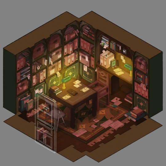

Hello everyone! Let me introduce myself- I'm Tilda (or Tilde), and I'm want to be a production designer.
Production designers create the overall look of a piece of media. From costumes, lighting, environments, props, etc., these designers make sure that everything looks cohesive and sets the mood.
So, I thought it would be fun to put my skills to the test by designing season one of The Magnus Archives. My winter break started as soon as I became interested in the show. Needless to say, a new obsession and an abundance of free time go well together.
You may have seen these illustrations posted separately, this is a master post of the whole project. My thoughts, processes, and critiques are all included under the cut. If you read them, I hope you enjoy! If, not, thank you for supporting my work regardless.
The Characters
When designing these characters, I tried to avoid being influenced by fan interpretations. Though, that was a challenge (especially with Jon and Sasha). I found that I looked to my friends for inspiration. Certain elements (Jon's glasses) were based off of what they wore.
Pinterest was also useful for finding clothing and pose references. Some looks were based off of different actors- in particular, Tim was inspired by Nicholas Galitzine and Elias inspired by Matthew Lillard.
Jane was the most fun to design! I believe in making terrifying characters actually terrifying.
Elias's design needs the most work. Having now finished the show, I see that it doesn't fit him. The purple is overly saturated, especially compared to the set. He looks out of place! I'd reverse the color palette to mostly green/yellow with purple accents instead. Although, I will forever defend the purple tint in his gray hair.
The Set
Jonathan's office was a treat to design! Balancing the color and clutter was especially important. This room is meant to be claustrophobic and uncomfortable, but not overbearingly so.
The wood looks to be full of splinters, but not so worn that it can be thrown out. The chairs offer no back support, and the shelves make the room smaller. The goal was to represented Jon's mind. Intricate, messy, and suffocating (Note: that is more of a season two description).
One goal was to capture the look of an actual archive. Valuable times was spent researching the different kinds of storage, files, paper, etc. The texture and color had to be accurate.
A split-complementary color palette of blue-green, yellow-green, and red was used. Of course, I had to get green in there, and the varying hues and desaturated reds worked well for the wood and filing supplies.
Jane's ashes and the Web lighter on the desk place this set at the end of season one. I find details like this to be important, it's one of my favorite parts of design. There is much needed abundance of eye imagery as well. Most obviously in the carpet, but eyes are carved into the table and watch from the shelves.
My main critique is the lighting- the filters used could be adjusted as to not distort the colors of the boxes. They look inconsistent. The Web lighter could also be more obvious, yet it is small and pixelated.
The Props
I designed these as I re-listened to season one, and it is the most recent piece I finished. Combining the details described in the show with what the objects would have realistically looked like was interesting. That was most useful for the clown, the Ming vase, and Ex Altiora.
Each of these objects came from a specific time with a specific look. Ex Altiora was bound in calf leather from the 1800s, so those books were referenced. Same with the frills on the clown's outfit.
The Ming vase was especially interesting, as it is from the Jiajing period. When looking at photographs of Jiajing vases, I found that many of them lacked handles and had an hourglass shape. That was fascinating to me, as many artists depict a standard oval-shaped vase. Also, the vase's design is described as straight lines that create distorted patterns when looking at it. That effect was achieved using chromatic aberration and the liquify tool (chromatic aberration was used to create a vertigo effect on Ex Altiora).
My critiques are... nitpicky. minimal. The shading on top of the garbage bag is unnatural. The thickness of the gold engraving on Ex Altiora is uneven. The "I" in "Immediate Consideration" is not capitalized. Other than that, I'm happy with how the props look.
Conclusion
First off, if you read everything, thank you!! It is a lot, I know.
My greatest takeaways are that 1) ask for critique, always 2) research skills are necessary for design 3) references are your friend! Seriously guys, use your references.
I hope you enjoyed this project and I'm excited to share more of my work in the future!
#and before anyone asks#i am not doing this for any other season#feel free to ask any questions about this project!#tma#the magnus archives#tma season one#production design#tildexart#tilda rambles
3K notes
·
View notes
Text

let’s go lesbians
1K notes
·
View notes
Text
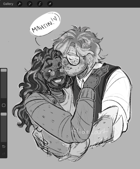
the people demanded jonmartin fluff!!
probably gonna post another “who should I draw poll”, but y’all’s rights to jonmartin fluff have been REVOKED /j
#the magnus archives#tma#tildexart#jonathan sims#martin blackwood#jonathan sims x martin blackwood#jonmartin#jmart#tma fanart#procreate#sketch#this looks a lil wonky but it’s aight
3K notes
·
View notes
Text
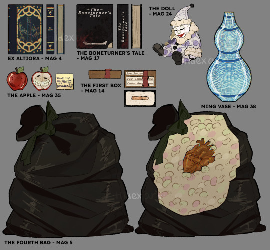
TMA Season One Objects 🕸️📼👁️
#and thus concludes my Magnus archives production design project!#I’ll probably post all three parts in one big post#hope y’all enjoyed :]#tildexart#tma#the magnus archives#prop design#procreate#production design
3K notes
·
View notes
Text

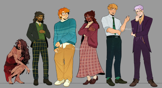
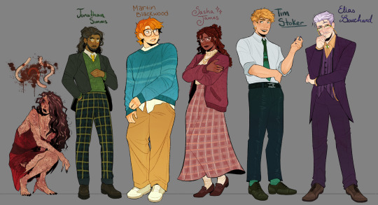
TMA Season 1 Character Lineup
#this podcast has overtaken my brain#I’m on s3 no spoilers#digital art#procreate#digital illustration#tildexart#character design#the magnus archives#the magnus archives fanart#tma#tma fanart#jane prentiss#jonathan sims#martin blackwood#sasha james#timothy stoker#elias bouchard#tw scoleciphobia
2K notes
·
View notes
Text
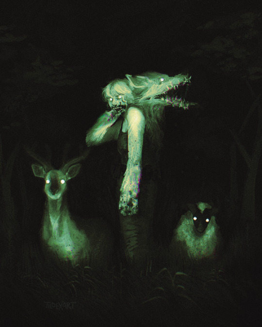
you see this on your trail cam wdyd (unedited ver. below the cut)
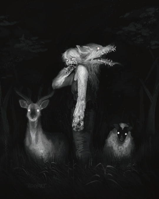
#needed to add a bit of Appalachia horror to my favorite podcast#tma#the magnus archives#tildexart#procreate#digital art#tmagp fanart#mag pod#daisy tonnor#daisy tonner#alice daisy tonner#body horrow cw#cw blood#tw blood#horror art
1K notes
·
View notes
Text


The Archivist’s Office 👁️🕸️📼
#the magnus archives#tma#tma podcast#jonathan sims#tildexart#digital art#procreate#production design#finally putting my production design degree to use#/j I haven’t taken any prod classes yet#am getting that degree tho!
2K notes
·
View notes
Text

quick jonmartin warmup
#this looks a little awful#but it doesn’t matter#it’s them <3#procreate#sketch#tildexart#the magnus archives#tma#jonathan sims#martin blackwood#tma jmart#jonmartin#jonathan sims x martin blackwood#mag 167
1K notes
·
View notes
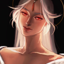
Text
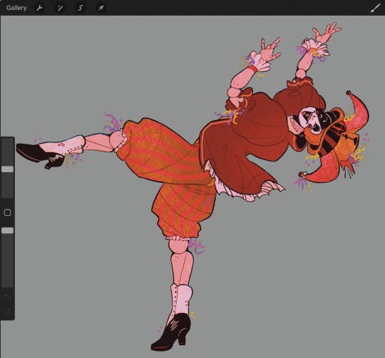
“I had to borrow this one?!?!” 🎭🎡✨
552 notes
·
View notes
Last Seen Blogs

sataensoo
dongwin↻

imahungrynacho
Nacho's Art
kentuckyvapecarts
Kentucky Vape Carts

closetspngirl
closetspngirl
azperja
Azperja | Fanart & Doodles