Last Seen Blogs

forsupersonly-blog
For Supers Only

jodhabhullar
rabb rakha 🙏

womansound
was i just a fool

an-evolutionary
teasing the moon
inmymindthismadesense
If my thought-dreams could be seen
Text
a subdued and moody retreat for an art collector house in kyiv: project by men bureau
the house is surrounded by the unique terrain and colors which blend with the environment. being connected with nature again was the owners’ primary need, so it was also the primary purpose of the design.
each room takes natural light in a way to create a spacious atmosphere and maximize the outside view. each room is picturesque in its way, yet still modest and connected to each other.
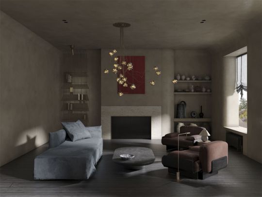

for men bureau's studio, it’s important to get to know the house we’re working with, as it gives you some degree of guidance as to which direction to go in. but it’s important for it not to feel like a museum.
"this house might have been built 50 years ago, but we live in 2021. we have to balance preserving the history of the house with making it habitable and adapting it to fit the way our clients want to live. after all, that’s what interior design is for: improving people’s lives." explained the team.

"therefore, we made several decisions to change the look of the interior of the house; added rounded corners to various areas and used a large number of circles and arcs. all of the colors we’ve used are quite neutral and warm. a subdued shade is sure to evoke a sense of calm and tranquility in the home."
the rough and timeless living room
the first thing that catches our eye is the “bocci 57” pendant light - a distinctive statement piece that refracts light through its sinuous curves of white glass. a cluster of 25 lights dangle from the ceiling at different angles and shapes, yet despite their asymmetry, they afford the space a sense of balance.
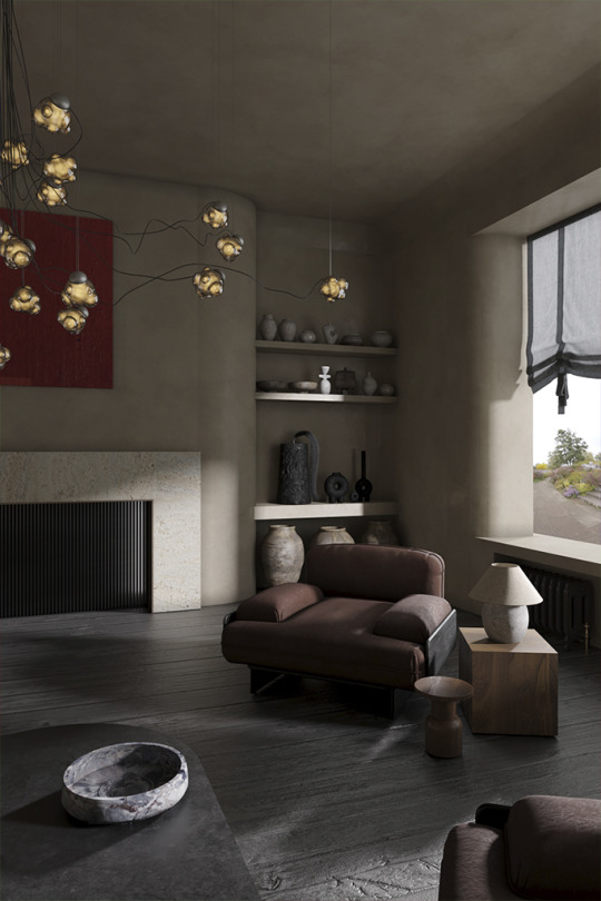
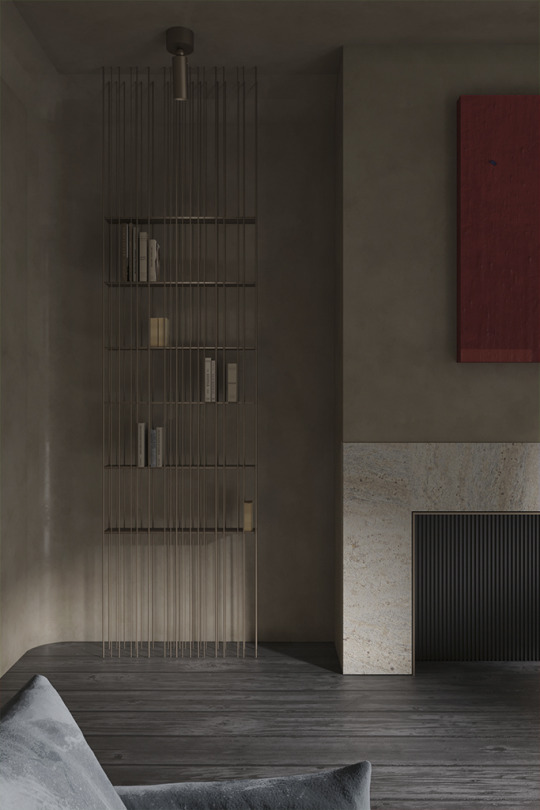
to create timeless designs, the team prefer natural materials and details form the basis. “bardot” armchairs by baxter and “ghost 20” by gervasoni are the details that make the design timeless.
read more: https://bit.ly/3zsslod
0 notes
Photo

yunē redefine modern living aesthetics and eastern philosophy: project by ice design
ice design recently created a comfortable multi-functional living space for yunē, to present a brand new lifestyle in the only 1.7km2 urban area within beijing third ring road by designing life aesthetics around natural elements and layered space. the gate is connected to a series of visual elements, such as point, line, and plane, with folding planes at oblique angles. the background wall at the entrance to yunē highlights artworks. there are landscape pools with slowly flowing water inside on both sides of the corridor. with natural oak wood and natural gauze curtains made of silk, a glass screen stands high with gauze inside, guiding guests to step inside in an orderly manner. these symmetrical layered elements and the low-to-high hall restore the pure humanistic life in combination with a downy tone and light. in the reception hall, the two-way door and the vertical arc-edge slabs on both sides form a layered background. facing the outdoor landscape and green plants, these spatial layers form a visual connection between the near water and the distant scenery. https://bit.ly/2RvQqd8
0 notes
Photo

julius taminiau on architecture, music, and nature #storyofdesign
music and architecture are paralleled in many ways that we often don’t recognize the connection. we may have seen rhythm in a building facade or an interior, but might only think of it as a pattern ‘sequence’. though we must admit that sensing the harmony and ambiance caused by it is inevitable. rhythm and melody, in fact, are intangible qualities that make architecture so lively. just as in music, through them we can feel the layering of different sounds and rhythms through various apparatus. when coherent materials that display multiple textures result in endless harmony, proportional intervals and notes produce meaningful sound and songs. potato shed by julius taminiauthis blurs the lines between two different spheres—one that always seems closer to art and also one that houses plenty of emotion and feelings; as we conversed with amsterdam-based architect julius taminiau, he unveiled the powerful bond between music, nature, and architecture. seeing architecture as an artrhythm house by julius taminiauarchitecture is a form of art, and it should be something cherished, celebrated, not as a commodity. architecture should inspire, invite, connect, be inclusive and elevate. great architecture can make people happy. therefore, we manage to emphasize deeper connectedness in every project by seeking beyond the architectural scope and looking for multicultural connections with nature, music, art, philosophy. it is manifested in our minimal design approach, which accommodates the beauty and relation with space, time, context, elements of weather, nature, natural materials, art, and - very importantly - the users. https://bit.ly/3ilT0xa
0 notes
Photo

khaled el mays's furniture collection is both snug and unique
beirut-based multidisciplinary design studio atelier khaled el mays recently unveiled its unusual furniture collections that resemble both snuggly, comfortable yet unusual design, taking the shape of a robot and flora-inspired. entitled transformer collections and flora collections, each of these furniture processes are organic with a predilection for natural and reusable material while utilizing local craftsman as he always does. let's take a look at them! pair of armchairsthis so-called pair of armchairs is part of the transformer collection that el mays developed in lebanon during the pandemic. the design, which was inspired and taking the shape of the transformers robot, is made of bulbous, overstuffed cushions with 1980s vintage cotton materials. "for me, the idea of the robot represents a glimpse of the future of humanity. me intentionally interpreting this is something very humble and static also presents a way to bring simplicity to the future; not everything needs to be fully engineered and mechanized to serve us," explained el mays, as cited from dezeen's interview. https://bit.ly/34MjbVW
0 notes
Photo

10 ways to design art-inspired mid century living room that will stimulate your mood
the mid-century modern interior is one amongst other design trends that is timeless and undeniably appealing. the trend was popularized in the united states almost a decade ago and developed post-world war 2, yet still impresses us in many ways through their organic forms, clean lines, high functionality, and some with minimal ornamentation. with one of the notable design, eichler house in california by german architect joseph eichler after he migrates into the town, several kinds of mid-century modern design came to history that flies through times and inspires us until today. especially ones that blend in arts and popping color that stimulates positive mood at all times. read on our summarize on tips on designing an art-inspired mid-century living room that speaks more than just history and modernity but also a unique and flaunting representation. 1. add some unique pieceseveryone loves unique pieces. be it in furniture parts, such as the unusual form of the chair, sofas, coffee table, and pastel nuance, blend into an all-white room with nice natural lighting exposure. for a mid-century modern living room, this kind of design scheme can guarantee a happy and cheerful mood all day. 2. vibrant and bright colored furniture and decorthere is no limitation to what color should be applied in mid-century modern interior. even eccentric, vibrant, and neon-colored sofas and paintings will host an excellent impression of your room! 3. bright and whimsical room read more https://bit.ly/3uPVdUb
0 notes
Photo
inside the bespoke art house residence by nina maya interiors
the art house sees the transformation of a generously proportioned but dated mansion into a stunning contemporary home fit for a growing family. the existing house’s mediterranean postmodern style was replaced by a modern lodge aesthetic influenced by the architecture of the likes of anne decker and selected celebrity homes. to enhance a glamorous lifestyle, nina maya interiors turned the art residence into an enchanting house with a fully fitted steam room and spa, underground gymnasium, 20-meter crescent-shaped lap pool spanning the full width of the property, and three separate external entertaining areas. all have been wrapped in a soft and subtle form with an exquisite sense of purity of space. photography is by felix forestphotography is by felix forestentering the house, you will be warmly welcomed by a magnificent curved plaster staircase which sits in a 2-storey void which is seen upon entering the home, creating a very grand entrance to the residence. the interior design preserved all that was good about the original house and developed it, improving the flow between the generous spaces but shunning full open plan by retaining individual rooms. this, combined with the cool whites and soft grays of the wall and floor finishes, allowed for each space to develop its own character and palette within the whole. https://bit.ly/34ONzyZ
0 notes
Photo
8 stunning buildings with melodious facade to inspire you
music and architecture belong to each other. we always love to see how rythm, texture, harmony, and proportion, portrayed in a building, as much as we love to hear in music. we summarize some of the best buildings from around the world, from residential projects to gigantic buildings with inspiration drawn from the harmonious melody of music, read on! daeyang gallery and house - seoul, south koreadaeyang gallery and house is a multifunctional private gallery and house designed by new-york based steven holl architects to sit amongst the hills of kangbuk in seoul, south korea.as holl is considered one of america's greatest architects with impeccable ability to blend space and light with great contextual sensitivity, daeyang gallery and house was designed as parallel experimentation to a research studio on "the architectonics of music." a 1967 sketch inspires the basic geometry of the building for a music score by the composer istvan anhalt, "symphony of modules," which was discovered in a book by john cage titled "notations." photo credits: iwan baan o house - bali, indonesianestled in the tropical land of the goddess, overlooking lush surrounding green rice paddies and coconut trees, o house is one amongst ubud-based german architect alexis dornier's residential projects for a musician-composer with a desire to enhance the feeling of being inside of an instrument.unlike many common houses, the sculptural design translates a single sound wave into an overarching architectural gesture that will define the house's interior and exterior spatial qualities. through an iterative process of manipulating the curve of a single line, both in plan and elevation, it begins to articulate a multi-planar space in which the ground plane and roofscape are directly intertwined. https://bit.ly/2RqVOy2
0 notes
Text
four stories about the garden by sergey makhno architects
"give the lanes your quiet steps
listen to the dews tickling your feet
somewhere among the twigs, there is peace
there is beauty somewhere amid the trees"

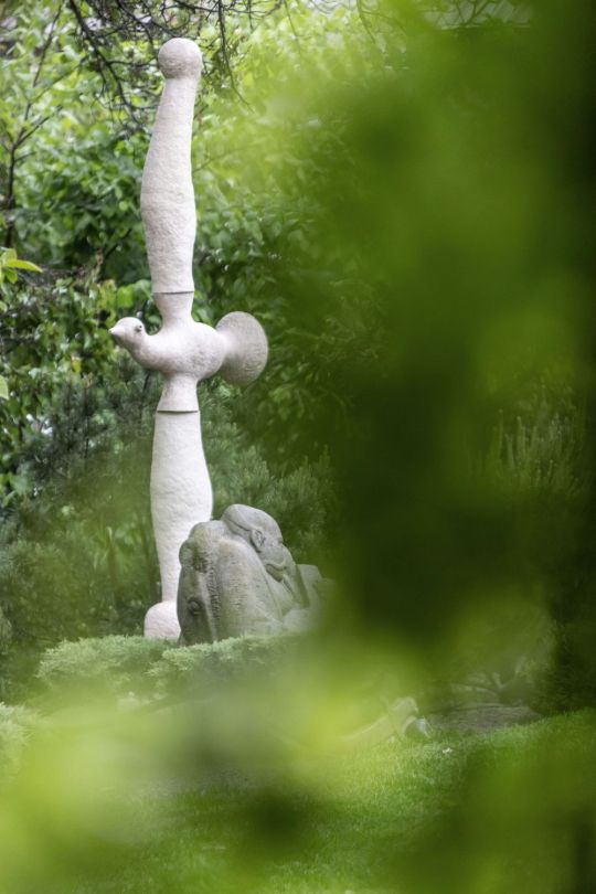
the first story, about spring
first, there was a house. serhii makhno created it for his family and called it shkrub. the style of the house is woven from memories of japan and dreams of a real ukrainian house — spacious and bright, filled with ceramics and memory, wrapped in love. shkrub was built in the contemporary ukrainian style and became the embodiment of everything native and traditional.

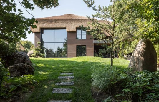


....... and then, there was a garden.
serhii wanted to have his own cherry orchard near the house to talk to the trees, listen to the bees buzzing and remember his childhood.
thus, japanese maples and cherry trees met traditional ukrainian zoomorphic pottery and contemporary art. the land generously accepted 250 tons of stones arranged traditionally as in japanese gardens — where it is believed that the stone itself must choose where to lie. so the wasteland disappeared and the birds chirped. this is the beginning.

2 notes
·
View notes
Photo

villa fifty-fifty is half a house and half a garden in one industrial entity
located on the green edge of strijp-r in eindhoven, studioninedots designed family home villa fifty-fifty as a pavilion where volumes alternate between open and closed, and where life happens just as much outdoors as indoors: a new typology for maximizing visual and family interaction. prior to designing villa fifty-fifty, studioninedots took the opportunity to push the typology of this transparent house. the clients, who commissioned studioninedots some years back to design their first house, now desired a minimalist lifestyle and requested to live with nature. half house, half garden in one single volume. fifty-fifty. "when we first visited the site and looked around, we saw that each completed house was designed in the same way: one big volume on the north side of the lot and a big garden facing the south. while on these lots the north had an extra special feature: a forest." explained the team to the design story. "so what we tried was to reinvent the traditional housing layout by making the outdoor areas just as important as the interior spaces. the only way to do that was to make them equals, as with a chessboard," they added. "in the regulations of the municipality, each owner was asked to include a tree on their lot. instead of placing it somewhere at the edge of the garden, we chose to place it centrally. now it is visible from all the spaces and it challenges the residents to interact with it differently. sometimes when there is something to celebrate they actually sit around the tree as a sort of ritual." this resulted in a pavilion-like house that unfolds across the garden, enhancing the relationship between the building and the landscape, and in a unique patchwork of connections between open and enclosed, between inside and outside. "green can be a very important tool to organize spaces differently. in our studio, we do not use green as an afterthought, but more as a design tool. as a result, it will always be an integral part of the design." pavilion meets tiny housethe shared family spaces and parents’ spaces are located on the ground floor. the two teenage daughters have their own rooms in the tiny house in the tower which is designed to be self-contained. this tower protrudes vertically through the two horizontal slabs. https://bit.ly/3i3WyUI
0 notes
Photo
inside the transclucent sky yard hotel in henan china: project by domain architects
surrounded by unfinished building sites, wasted land, and industrial sites, this project is definitely not blessed with a beautiful site. this hotel near a scenic area consists of 48 rooms, an independent restaurant, a banquet hall, swimming pools, underground parking, and spaces preserved for later phase development. the site area, construction budget, and time are also extremely tight and limited. fortunately, taihang mountain is still visible from the site. usually, a hotel room would be designed as an outward box to maximize the view. consequently, a typical hotel building would be a collection of opened boxes. domain design architects rejected this conventional model and went back to the starting point of the design, the room experience. "we reinvented the actual experience in a typical unit: first, the exterior view below eye-level is blocked, while the view above is left open; then the opening is “lifted” or enlarged to invite more light and air; at last, full-size glass doors divided the unit into a combination of interior room and exterior micro courtyard, while the boundary in between is highly blurred." explained the team. with imperceptible boundaries and a visually continuous experience, the beautiful, scroll-like view of the sky and the mountain powerfully draws attention. during different times in a day, the sunlight interacts with the curved wall of the opening in different ways, producing a dramatic and moving atmosphere. https://bit.ly/3fAKgkZ
0 notes
Photo

8 high-end furniture pieces by kelly wearstler that make use of natural materials
if anyone ever says that working with natural materials such as wood and stones would be boring and never succeed in projecting high-end furniture design, these eye-opening pieces of furniture by the world-renowned designer, kelly wearstler, will inspire you to explore more with the material. chalon coffee tablechalon is the type of coffee table that would fit in any interior design, especially in modern and minimalist ones. the soft wide curved plum legs made the natural oak's unique qualities elegantly displayed. with hand-carved wood on top and a wire brush finish that properly merged with the wooden texture, chalon portrays a raw yet refined table worth $11,900. echo benchat first look, eco-bench might remind you of a traditional bench found in the monolithic era, yet you have to pay $7,995 to bring it home. the undulating forms and sculptural look that resemble a bit of arch on the bottom successfully blur the line between modern art and functional decor. the design is a collaboration of wearstler with local la artisan to work on solid douglas fir and features a heavily hand-sculpted texture. read on https://bit.ly/3vsfEaT
0 notes
Photo
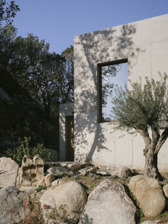
orma architettura harmoniously blends in wabi sabi into these two casa
there is never a precise explanation of why and how concrete, which always seems too rough and raw for a building structure and is never the first option to consider designing a tranquil villa, can seamlessly blend in the lively nature and offer a warm wabi-sabi retreat. but these two beautiful casa p and casa r designed by french-based orma architettura have proved how such a cold and brutal material can imbue a harmonious relationship with surrounding green nature. and amongst the multiple abilities, one is to minimize environmental impact, while the second is its natural ability to establish a dialogue with its surroundings easily. nothing less in between... the wabi-sabi casa p and casa r that camouflaged with naturein porto-vecchio, at the south of corsica, france orma archittetura find its way to balance a tranquil casa in rough and raw concrete into its natural sceneries derived from the city's strategic position that lays in between mountains and seas. the villa was relatively small, capturing only 135 square meter area and initially built in the 1980s. thus the studio's primary mission is to breathe in a new life without extension work or development of the existing volumes. to such extent, to maximize the living area without harming what was already built. hence the first idea was to convert the covered patio, the porch, and the garage into a single lively living space. leaving it in wabi-sabi shades that one may find raw at first impression, yet is humbly inviting and contemplative. read the full story https://bit.ly/3hRup3i
0 notes
Text
the newly launched zara beauty
there is something in zara's newest makeup line. despite the fact that it was established under pandemic recession, the brand's first-ever comprehensive beauty collection succeeded in promoting an anti-racism campaign at the same time deliver the importance of sustainability and eco-consciousness through its range of products and its clean-refillable packaging design.


developed under "zara beauty" sub-brand, the company collaborates with world-renowned luxury packaging design agency, baron & baron, which happens to be the same firm responsible for zara's recently overlapping letters logo.
https://bit.ly/3hZLzvA
1 note
·
View note
Photo

architekt maciej franta's polygonal shaped modern apartment in chorzów poland
villa reden is a newly completed residential apartment in chorzów, poland, designed by local architectural design studio architekt maciej franta. the building contains 76-75 square meters of apartments on 2 levels with usable area: 715,4 square meters. the unique context of the place and the potential negative consequence of implementing a new tissue in this unique area meant that the decision to shape a new building was not easy and had to refer directly to these guidelines; not compete with them, and "respond" to the environment with its uniqueness in a contemporary way. the task was even more difficult as the budget was limited and the investor's expectations were high. the idea and shape of the building resulted directly from the irregular polygonal shape of the area intended for development and the idea of leaving the largest possible tree stand on the plot. such a simple inspiration has become the basic guideline for shaping the building. read the full story https://bit.ly/3bTPzdf
0 notes
Photo

peek into coca cola x morphe the unity collaboration
news by the design story on tuesday, may 11th, 2021, morphe unveil their latest beauty series inspired by coca cola's iconic 1971 retro ad. this isn't the first time the two brands popped up with such unique collaboration, as last year's black and red bold, nuanced makeup pallette from their thirst for life series successfully make a hit. the inspiration behind the unity collection came from about 50 years ago, when advertising executive bill backer and jingle producer billy davis worked for mccann erikson, singer/songwriter roger cook was stranded at an airport in ireland on their way to london. the two have encountered grumpy travelers sharing fate and misery, while the others have a jovial time having a coke. read the full story https://bit.ly/3uatgGw
0 notes
Photo
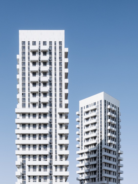
superimpose designs sculptural apartment towers for the Gen-Y community living
superimpose breaks with conventional residential planning in chinese industrial hinterland by creating three towers that reshape the living community for the post 80’s generation. beijing architectural design studio, superimpose, designed three white sculptural residential loft apartment towers for the so-called y-generation focused on quality of life and breaking with the conventional residential development typology. the fifty thousand square meters mixed-use development is located in a new cbd district of changzhi, a fourth-tier industrial city in shanxi province that is facing rapid urbanization and has around three million inhabitants. most often this urbanization process leads to a cookie-cutter residential typology referring to surrounding precedents instead of focusing on genuinely improving living standards and/ or striving for urban and contextual integration. superimpose convinced client and government to deviate from the standard approach in order to stand out and differ from classicistic european-style drab residential developments that are dominating the new-built residential skyline in china’s hinterland. most importantly the design challenge was to target and appeal to a young generation. also read: futuristic buildings in shenzhen that will make you feel like in another world sergey makhno architects projecting ethereal viter house inspired by the wind injecting new life into an old farmhouse in caparola's countryside: project by delta studio the team responded to this challenge on both macro and micro scale with simple tools in order to improve usability, liveability, general appearance, and connectivity with the other sites within the master plan. the plan layout intentionally opens up to the surrounding sites with schools, a hotel, cultural hubs, and hospital; the residential towers have been rotated, shaped, and positioned to increase uninterrupted views out from each single living space while simultaneously orientating each apartment to maximized sunlight exposure; light and bright materials have been used to contrast with the dull surrounding developments; a loft-concept has been applied in order to achieve more living space per square meter and a variety of unique balconies have been added to each residential unit in order to provide identity to the tower and valuable outdoor space to each inhabitant and unlike other nearby developments. unlike the majority of developments with balconies, this developer has agreed with providing strict rules on how inhabitants should remain to use their balconies as outdoor space. read the full story https://bit.ly/3fTSWCf
0 notes
Photo

5 essential guide to design dramatic bathrooms in monochrome shades
dramatic bathrooms in soft or rough grey, black or monochrome accents are everyone's favorite now. it is everywhere for some reason, redefining sophistication, intimacy, style, and the fact that the colors are easy to match with other shades. read on our summarize of 5 essential guides to designing a dreamy bathroom in dramatic dark shades for you to spend one contemplative bathing duty at all times! 1. mix and match with a series of smart dark bathroom tiles choosing the right tiles is on the first mandatory list you have to consider. with a mix of textures and finishes on the wall, floors, you can begin to imagine capturing yourself being in a glamorous bathroom where you can be the only star in the room. 2. add natural elements to the bathroom: stone and wood is the key! what would be best to fit in a dramatic bathroom always goes to stone and wood. yes! stone tiles always make the bathroom lively, beautiful while water-resistant and have good durability too. while some wooden accents, such as in the decorations, cabinets, or sink, will give the extra character that balances the essence of the "drama" in the room. 3. add biophilic accents while playing half and half with black and white. read the full story https://bit.ly/3oGGZU9
0 notes