
dontdropthedoughnut
Don't Drop the Doughnut
Blogging my art level-up attempts
169 posts
Don't wanna be here? Send us removal request.
Last Seen Blogs


Text
16 June 2020 - William Andrew Loomis learning: Day 1 (Part 1 - discussing the topic of mindset as I always do)
So reading through Andrew Loomis’ book “Drawing the Head and Hands”, my initial feeling is already the book feels dense and my concentration is starting to slip after 5 or 6 pages but at the same time I have already gleaned a few valuable golden nuggets of advice from here and there.
Below are is an extracts that I want to draw attention to:
“In general, textbooks seem to confine the material solely to problem and solution, or to technical analysis. That, in my own belief, is one of the reasons why textbooks are so difficult to read and digest. Every concentrated creative effort involves a personality, since skill is a personal matter.” (Loomis, p.19)
So the reason I highlighted this extract in particular is that I see it as Loomis saying to not make this too rigid and not focus on creating exact replicas (which is especially important for me since in my last post I say that I am a very systematic person who likes to work with formulas and specific guidelines). Hopefully throughout the learning process if I find myself feeling like I am falling into a rut over a specific exercise and frustrated because I can’t get the drawing exactly right, I’ll remember to remind myself of this quote.
Hopefully for anyone else reading this post and on the same journey in improving your art skills in drawing faces, this extract will also help to remind you to be more accepting of drawing imperfections.
#doughnut#Don’tDropTheDoughnut#donut#DonutDropTheDonut#art talk#art mindset#visual development prep#Loomis method#learning Loomis#vis dev prep#learning to draw faces#learning head anatomy#visual development up skill#visual development level up#art level up#art learning#get better at drawing#getting better at drawing faces#learning the fundamentals#prepping the mindset#listening to some spring classical music compilations whilst reading Loomis' book#feel so fancy and hoity toity imagining I'm sat in some grand drawing room with extravagantly decorated furnishings#this kind of music always makes me think of fancy high teas#all cream and gold furniture#currently also on a binge of CalArt submission sketchbook videos#living vicariously through these people since I've pretty much figured that it's not financially feasible for me to be able to apply#also I know that's not how you reference in text but putting the page number here seems more beneficial than writing the publish date since#I'm not also gonna be including a reference list as well#bringing back those referencing days whilst at uni#I actually really liked doing the referencing part compared to having to write the essay itself
1 note
·
View note
Photo
15 June 2020 - So I might be wrong but then I thought I might be right but then I checked again it seems like I’m wrong?...
So I have the weakness of being very systematic; if there’s a rule for something, I want to follow it 100% to every letter. But For the process of trying to build up my skills in drawing faces, this is definitely something that would slow me down since each face is different (and art in general is meant to be expressive and unique rather than a factory copy).
That’s why when I was so happy when I thought I’d made a personal breakthrough and figured out a rule I could apply to every face I drew. I always talk about the 1% increases in skill if you keep working consistently (even if you don’t feel like there is change), but here it felt like I’d made a tangible step forward with the rule:
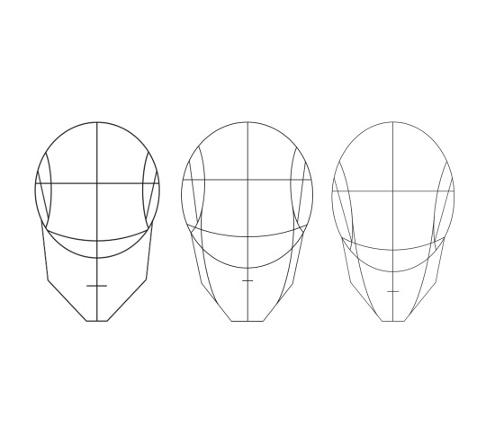
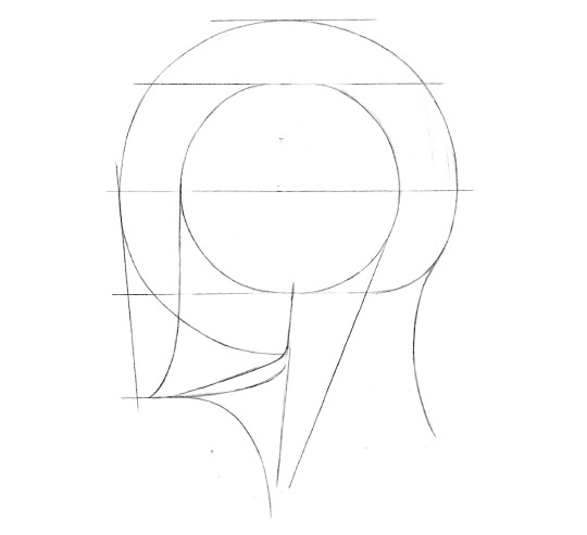
“The bottom of the base circle you draw rests on the cheekbones of the face”.
And even better was that I thought I had a legitimate explanation for it in that when you look at a skull, the bottom of the generally spherical part is the cheekbones!
But sadly when I went back to look at the sketches I did in my first lesson on facial structure from Ethan Nguyen’s class, it’s completely different from what I was claiming. The cheekbones and the bottom of the nose does not rest on the circle line. Instead the line lies where the mouth is and the bottom of the nose is within the circle.
It’s so frustrating to think that I’ve made some progress and then see that it was just a wild leap that didn’t land. What I really want to have is a set guideline for drawing a generic face that when I’m practised enough at drawing it, I can then play with the rules to create more interesting face designs (like how Blad Moran does it on an awesome level!). I know that Ethan Nguyen does tell you the guideline in his lessons but that’s in a more superficial sense leading to I know the rules but don’t understand them and I feel that if I don’t understand then I can’t break them.
So the next step forward is go directly to the source and learn from William Andrew Loomis himself. I’m going to read through his book “Drawing the Head & Hands” and learn the guideline. Hopefully from there I’ll be able to learn and understand how the guide works and start practising it.
#doughnut#Don’tDropTheDoughnut#donut#DonutDropTheDonut#art talk#art mindset#visual development prep#drawing#Loomis method#learning Loomis#vis dev prep#learning to draw faces#learning head anatomy#visual development up skill#visual development level up#art skills#art level up#art learning#get better at drawing#getting better at drawing faces#learning the fundamentals#Skillshare classes#Skillshare lessons#Skillshare learning#Ethan Nguyen#Portrait Drawing Fundamentals – How to Draw Realistic Heads & Faces#William Andrew Loomis#Drawing the Head & Hands#one step forward and three steps back#but being serious though I gotta think of this in the trial and error mindset
5 notes
·
View notes
Photo

12 June 2020 - My big realisation on the structure of the face
So in my last post I mentioned that whilst doing drawing exercises of faces at different angles, I had a sudden realisation on a rule that I could apply on how the face is structured. Realising this makes me so happy because for me I think it’s now so much easier to draw out the guide for all future heads.
And this is the rule:
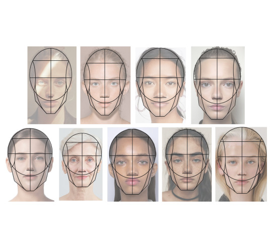
The bottom of the circle rests on the cheekbones.
It’s literally just this simple. I know this is probably something that is so obvious to other artists but as a beginner in drawing faces, I was really confused about the positioning of the circle for the longest time. Even at the beginning of Ethan Nguyen’s class, I was still unaware exactly where the circle fits in relation to everything else (I had a bad habit of the circle being too high and the bottom resting on the eye line).
To test out this idea, I did a couple of reference studies focused on the rule to see if it works on different faces and I saw something else extra that just triple confirms the rule but at the same time, bonus rule! So pretty much for every face the bottom of the nose rests on the bottom of the circle. There are a few cases where the nose might be quite a bit above or below the circle (as seen in the old man face) but otherwise this is another rule to follow when drawing faces.
Doing the study on the skull was the important because it let me see properly what I was visualising in my mind; the explanation of why the circle rests on the cheekbones. So the skull is made up of two parts and the top part is loosely a sphere with a little bit sticking out at the bottom (where the upper row of teeth goes). You can see the bottom of the sphere aligns with the cheekbones and the bottom of the hole for the nose rest on this line as well, confirming the two rules.
Just taking a brief look at the structure of the skull has been so useful, I should have done this sooner! I’m gonna do more studies and I’ll post all findings and new knowledge in future posts (getting back to this blog being focused on a guide for people who want to get into a visual development career).
In terms of goals for visual development levelling up, I want to have a solid understanding by the end of the year on the structure of how the head is built up; to have extensive knowledge on the fundamentals of drawing faces.
These are the goals I want to hit (or at least be working on) by the end of 2020 which is 6 months away:
Study the structure of the skull and know the generic rules for where the eyes, nose, mouth and ears should lie in proportion to each other
Study and understand the breakdown on the planes of face so that I can apply it to every face (like Angel Ganev does in his art reviews)
Read a Loomis book
#doughnut#Don’tDropTheDoughnut#donut#DonutDropTheDonut#art talk#art mindset#visual development prep#drawing#loomis method#learning Loomis#vis dev prep#learning the draw faces#learning head anatomy#learning skull anatomy#visual development up skill#visual development level up#art skills#art level up#art learning#get better at drawing#getting better at drawing faces#learning the fundamentals#Skillshare classes#Skillshare lessons#Skillshare learning#how to draw faces#so recently I watched a drawing livestream hosted by one of the story board artists working at Nickelodeon#and he made this point which I found so interesting!#so when you're drawing a close up of the character in storyboarding#and you're focusing on the face
4 notes
·
View notes
Photo
08 June 2020 - Class #1: Lesson #5 (Part 2)
So I did a few more the face mapping exercises as planned.
Originally I thought I could learn quite a bit if I used photos of different people; different genders, ethnicities, ages, etc... But looking at these three side by side, I don’t really see much difference. Sure, you can see that the proportion between lines such as the bottom of the nose to the chin is varied but overall it looks pretty much the same, especially between the first and second.
One factor that I didn’t take into account is the degree of the head tilt downwards and it’s affect on the proportions between lines. In the lesson, Ethan Nguyen explains the impacts of the degree. Looking back, the reference photos I used in my studies don’t have the same the level of tilt so I can’t really do an accurate comparison here.
Overall I don’t think I’m gonna learn much more doing these mappings. But I will do some super quick and loose sketches on faces titled downwards, just because it is important to train the hand and muscles in drawing.
From this exercise, there is a small win that I’m gonna take though; the understanding behind the placement of the base circle. Whilst working on the second head mapping, I was initially so confused about how artists chose where to draw the circle in relation to the whole head. Then I head a realisation which explains it and is a good solid rule that can be applied to every head I draw from now on. For me I think the realisation I had is so important (even if it is quite small in the grand scheme of drawing fundamentals) and for the next post I’m gonna go into it more in depth just for those who don’t know.
#doughnut#Don’tDropTheDoughnut#donut#DonutDropTheDonut#art talk#art mindset#visual development prep#drawing#tilted down view#drawing tilted down view#Loomis method#learning Loomis#vis dev prep#learning the draw faces#learning head anatomy#visual development upskill#visual development level up#art skills#art level up#art learning#get better at drawing#getting better at drawing faces#learning the fundamentals#Skillshare classes#Skillshare lessons#Skillshare learning#Ethan Nguyen#Portrait Drawing Fundamentals – How to Draw Realistic Heads & Faces#so glad that I decided to do these lessons#yes I do sometimes find it a little tedious but at the same times I feel like I am really leraning
2 notes
·
View notes
Photo
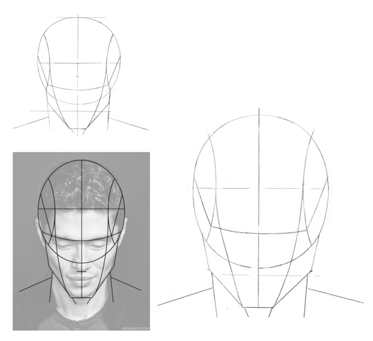
08 June 2020 - Class #1: Lesson #5
So here are my drawings from the class on drawing a face that is tilted downwards. This lesson was actually pretty informative since Ethan Nguyen explains briefly on how specific anchor lines (the hairline, the brow line, the bottom of the nose and the chin) change positions on the circle depending on the angle. He also explains why these lines are shifted which is then useful because once you understand how it works, it’s easier to recall and apply to other faces.
The smaller sketch is the one I did whilst following his class. During the class he mentioned using references so I decided to use a photo found online and map out the lines specific to the image since the ratios between features differs from person to person. The larger sketch is also my drawing which I did alongside mapping out the structure on digitally.
I really like the idea of finding photos of different people and mapping out the structure. It’s a much better way of seeing different structures without just trying to make it up in my mind. Also I imagine I can learn more this way since I’d be observing from real sources. I’ll find more reference images, do some more mapping and then post up the results together so you can have a look at the differences.
Also I think I might go forward doing more studies digitally like this rather than drawing by hand because it’s quicker but also at the moment, my main goal is to learn how the head and face structure works so I can apply these to more stylised drawings rather than trying to draw a realistic portrait from a reference (even though the name and aim of the class is to literally draw heads and faces realistically).
Finally want to note that the reference image used here is a photo by BRIAN SMITH. I found the image from a quick search on Pinterest. Kinda new to the whole copyright thing and posting images that are not created by me, so if you (Brian) come across this and are not happy for me to use this, send me a message and I’ll take it down.
#doughnut#Don'tDropTheDoughnut#donut#DonutDropTheDonut#art talk#art mindset#visual development prep#drawing#tilted down view#drawing the tilted down view#Loomis method#learning Loomis#vis dev prep#learning to draw faces#learning head anatomy#visual development upskill#visual development level up#art skills#upskill#art level up#art learning#get better at drawing#getting better at drawing faces#learning the fundamentals#Skillshare classes#Skillshare lessons#Ethan Nguyen#Portrait Drawing Fundamentals - How to Draw Realistic Heads & Faces#looking at my second sketch I know I know that the brow line is wonky on the left side#also the left rhythm line is not as curved and symmetrical as the right one
0 notes
Photo
07 June 2020 - Class #1: Lesson #4
#doughnut#Don'tDropTheDoughnut#Donut#DonutDropTheDonut#art talk#art mindset#visual development prep#drawing#side view#drawing the side view#Loomis method#learning Loomis#vis dev prep#learning to draw faces#learning head anatomy#visual development upskill#visual development level up#art skills#upskill#art level up#art learning#get better at drawing#getting better at drawing faces#learning the fundamentals#Skillshare classes#Skillshare lessons#Ethan Nguyen#Portrait Drawing Fundamentals - How to Draw Realistic Heads & Faces#not much to say really about drawing the side profile#the class on this was quite short though so I might do some more personal research on drawing the side profile
0 notes
Photo

06 June 2020 - Class #1: Lesson #3
So here is my drawing from the third lesson. More practise on the planes of the head and the structure from a different angle.
Again I tried to vary the ratios between features; the hairline, eye line, bottom of the nose and the chin. I was surprised that in the third sketch, just altering the width of the chin slightly can create an impact and difference in the shape of the head. Even without any features drawn in, it appears more typically masculine looking. For the second sketch I tried to make the angle of the turn more than 3/4 by drawing the oval more circular and showing more of the side plane. I think I need to learn more about angles and anatomy because at this angle I wasn’t sure how to draw the chin and it just became very pointed making the head appear younger.
#doughnut#Don'tDropTheDoughnut#donut#DonutDropTheDonut#art talk#art mindset#visual development prep#drawing faces#Loomis method#learning Loomis#vis dev prep#learning to draw faces#learning head anatomy#visual development upskill#visual development level up#art skills#upskill#art learning#get better at drawing#get better at drawing faces#learning the fundamentals#Skillshare classes#Skillshare lessons#Ethan Nguyen#Portrait Drawing Fundamentals - How to Draw Realistic Heads & Faces#looking at these#it feels like I'm drawing designs for robots#the new generation of Iron Man drones where the face is completely smooth and devoid#in that weird shiny metal plastic looking texture#signed up to Disney Plus for the free trial
0 notes
Photo

04 June 2020 - Class #1: Lesson #2
So here is my drawings from the second lesson. It was pretty fun practising this method and I can see that mastering this fundamental will be extremely useful in character design.
At first it felt pretty janky drawing these since I’m not used to drawing circles as evenly as possible and then plotting the lines at equal halves or thirds.
As recommended I tried to mess around with proportions and create different outcomes instead of just drawing the same ratios multiple times. Variations I tried out were:
Lowering / raising the hairline
Moving the eye line, bottom of the nose and mouth line closer and further apart
Making the chin shorter and longer
Just by playing around with these ratios, I can see how it affects the overall structure of the head but without drawing in the features, it’s not as impactful.
Overall I really like this guide on the structure of the face just because it can be pretty handy in creating different faces and avoiding that dreaded same face syndrome. Even better is it can be used to help in drawing characters who are related and actually make them look related (again without falling into same face syndrome) with templates such as having the hairline low down or eye line high up on the face be the common factor but creating variety through different features. Also I imagine it’s important to master this method to be a visual developer since it would be used so much in designing character profiles with the straight and centre image of the face being pretty much the primary shot.
#doughnut#Don'tDropTheDoughnut#donut#DonutDropTheDonut#art talk#art mindset#visual development prep#drawing faces#Loomis method#learning Loomis#vis dev prep#learning to draw faces#learning head anatomy#visual development upskill#visual development level up#art skills#upskill#art learning#get better at drawing#get better at drawing faces#learning the fundamentals#Skillshare classes#Skillshare lessons#Ethan Nguyen#Portrait Drawing Fundamentals - How to Draw Realistic Heads & Faces#it was only as I was writing up my thoughts on the second lesson that I noticed that I forgot to draw on the lines indicating the change in#plane around the jaws on the last head structure#also you might notice that from the third head onwards that I used a ruler to draw on the lines#seems a little bit like cheating but I reasoned with myself that the skill of drawing an accurate and straight line isn't so necessary#as a visual developer
0 notes
Photo

03 June 2020 - Class #1: Lesson #1
So here is my drawing from the first lesson. Looking at both images side by side, I can see a few small inconsistencies in my drawing;
lock of hair in the middle should be closer to the eyebrows
bottom right part of the lip is too big
bottom of ear too big
left eyebrow too prominent
gap between bottom of nose and top of lip too big
As a whole I think I managed to capture the likeness of Benedict Cumberbatch pretty accurately but I don’t think I’ll pursue more of this method of drawing. Whilst it can help develop observational skills as you plot points of intersection between the grid and reference image to draw the lines, it’s too much “three blind men and an elephant” for me. You get too focused on the small and lose sight of the overall image. This can definitely become a problem if you plot one of the points incorrectly without realising because it then throws off the ratio of the surrounding features.
Overall my main goal is to learn the fundamental anatomy of the head; how the structure works and the shapes that builds it up. If I carried on practising using the grid I’d be missing out on that and drawing on a superficial level (is that the best word to describe it?), learning to copy line for line. I don’t think this skill would be very useful for becoming a visual developer and designing characters.
#doughnut#Don'tDropTheDoughnut#donut#DonutDropTheDonut#art talk#art mindset#visual development prep#drawing faces#drawing Benedict Cumberbatch#Benedict Cumberbatch#Benedict Cumberbatch art#Benedict Cumberbatch drawing#vis dev prep#learning to draw faces#learning head anatomy#visual development skills upskill#art skills upskill#art learning#get better at drawing#get better at drawing faces#learning the fundamentals#Skillshare classes#Skillshare lessons#Ethan Nguyen#Portrait Drawing Fundamentals - How to Draw Realistic Heads & Faces#currently going through a marathon of cartoons on Netflix#watched some good ones#I liked The Hollow...well I liked it in Season 1#especially the start when it still had lots of mystery surrounding what was happening#but Season 2 kinda had a wack storyline
0 notes
Link
01 June 2020 - New month and onto the second half of this year!
So again these thoughts of “Oh no! I haven’t been posting to the blog with useful information” are popping into my mind. Same old same old babble that I’ve said before on haven’t got much art to show, doing personal projects instead of visual development skill practise, etc...
Time for some action and not just words then!
For me, Skillshare is a bit hit and miss. Although I also have to say that I do very heavily judge a book by it’s cover in this case and at first glance, many of the classes didn’t appear interesting to me so I dismissed them. Also my opinion is very unfounded (is that the right word to describe the situation?) since I haven’t actually watched many of the classes...in fact I’ve only ever tried out one class completely, the one ran by one of my favourite artists.
But still, Skillshare seems like the place to go to find a solid collection of classes on learning to draw the face the good old fashioned way with the basics and building solid fundamentals.
The plan now is to spend the next two weeks (since that is the remainder of the free time I have left until I go back to work) practising drawing faces for an hour a day. Then the rest of the time can be spent on personal projects so that I can achieve both and maximise progress.
The first class I’ve decided to try out is by Ethan Nguyen called “Portrait Drawing Fundamentals - How to Draw Realistic Heads & Faces”.
At first glance this seems like a good place to start, there is mention of following the Loomis methods (which I know vaguely is meant to be THE fundamental to drawing faces).
There is a total of 34 lessons. I’ll update after each lesson with my drawing attempts and progress and at the end do a review of the overall class and how effective I found it.
#doughnut#Don'tDropTheDoughnut#donut#DonutDropTheDonut#art talk#art mindset#visual development prep#art skills level up#art learning#get better at drawing#learning the fundamentals#really gotta read that book I bought on the Loomis methods#always buy books but then never read them#not good#used to read books so much#and now my life has been consumed by the internet#time to focus and really give these Skillshare classes a solid try#no more snap judgements and being dismissive#ready for my Skillshare sponsorship now#recently I watched a YouTube video from an illustrator I like and she gave me some perspective and refocused them goggles#she made a point that she currently works part time at a grocery shop and because she can't fully support herself through her artwork just#yet#but she uses that part time job to also focus her productivity and make sure she's not wasting away time not working on her skills and art#because she doesn't want all that time she has to suffer through customer service and working this menial job to be a waste because she#hasn't gotten anywhere with her art business#and this is exactly what I need to do as well#whilst being off work I have been doing bits and pieces and most days I am doing a little bit#but I am also wasting so much time on my laptop browsing online#on my phone playing games#all this wasted time is actually adding up to days that could have been used to develop and upskill
1 note
·
View note
Photo

19 May 2020 - The Sugar Bowl! (Forcing myself to get comfortable with using colour, even if this illustration is 99% greys)
So recently I watched Netflix’s adaptation of A Series of Unfortunate Events. I remember reading the books back in Primary school (so weird to think that that’s how long the books have been out for). Back then I loved Bret Helquist’s illustrations. As I read along, the most fun part (and also the bit I looked forward to the most) was his full page drawings depicting scenes of the story. I would just stare at each small detail hoping to catch a glimpse of some small clue to the mystery in the books.
Watching the TV series has just made me appreciate even more the creativity in the books and especially how even without Brett Helquist’s illustrations, the words conjured imagery so strongly. Lemony Snicket does well in fun descriptions.
Above is a work in progress on my interpretation on the sugar bowl. I know in the TV series it’s a ceramic bowl, but I wanted to go for a classic silver vintage style. I feel it would match better to the sophisticated style of Esme Gigi Genevieve Squalor for who appearance is everything; very hoity toity to match her personality.
Also I know I know that this has nothing to do with prepping my skills for a visual developer career, but for this year I’m going to do a little focus on fun art (which can still develop skills at the same time). I want to do more completed the illustrated pieces which I can upload to my instagram and website, to develop some sort of portfolio. And! I like to see the small win from this in that I’m using colour even (even though it is just 99% shades of grey).
#doughnut#Don'tDropTheDoughnut#donut#DonutDropTheDonut#art talk#art mindset#illustration#wip#art#drawing#silver#digital art#sugar bowl#sugar bowl art#drawing sugar bowl#vintage sugar bowl#flower sugar bowl#silver sugar bowl#A Series of Unfortunate Events#Esme Gigi Genevieve Squalor#I want the sugar bowl!#give me that sugar bowl!#what's inside the sugar bowl#been reading up on lots of fan theories recently#so far there's two main explanations for what could be inside the sugar bowl that the VFD are chasing after#but I want to come up with a theory that is so totally left field and crazy#that does not match what anyone else has said#trying to paint the effect of silver is tougher than I imagined#but I am slowly making small steps in progress I reckon#also I want to the find the balance where the use of colour looks good so your first thought is it looks like silver but I also want to
2 notes
·
View notes
Photo

10 May 2020 - After so long...an update! The furthest I’ve ever gotten with an illustration (very sad but true...)
So it’s been more than two weeks since the last post on this blog...lots of slacking done, very sad times. To be honest for the month of March, April and beginning of May there has been very little skill development for the visual developer career.
But looking to the small wins, I am well on the way to completing one fifth of my only art goal for 2020 (which I decided on in the middle of April); finishing 5 pieces of artwork and too 100% standards. The current project I’m working on is a pet portrait I started in the beginning of April with the deadline set for 26th April (missed it but even if the painting had been completed, the whole present is still missing a piece I can’t buy yet with lockdown happening so not completely on me).
My biggest weakness with creating art is I never finish pieces..ever...I have the mental block of “it doesn’t look good” which turns into “it’s hard to do” which becomes “it’s a chore” and finally “there’s a new exciting project I’d rather do”.
But to really give this goal a go because I’m sick of having no artwork to ever show for all my efforts and time spent on drawing (and I do spend a lot of time on it) and to be able to present this portrait and see how happy the friend would be, I pushed through even when all these familiar thoughts crept into my mind, especially “this is a chore”.
I’m really happy with the progress, in literal terms the line art and colouring might not have the wow factor and finely rendered quality that I was looking for from Beka Duke’s (thedrawingduke) Cats inspired cat illustrations, but it’s a big step forward for me! In my mind, my illustrations have gone through the dip into the “ugly stage” and come out on the other side where it looks good to me. Also like they say in sales, if you can make one sale you can sell! If I can finish one piece of artwork fully, I create more finished illustrations.
Overall the whole progress has been very very slow but it’s just getting started so hopefully the momentum is going to build and I will be hitting my 5 artwork for the year!
#doughnut#Don'tDropTheDoughnut#donut#DonutDropTheDonut#art talk#art mindset#illustration#food art#cat illustration#cat art#illustrated cat#pet portrait#money cat#money cat art#throw all dat money in the air like you just don't care#oh yeah#Cinci#the original hype beast money cat#the money the cat is throwing up is Hungarian currency since my friend is Hungarian#I drew the biggest banknote to symbolise getting lots of riches#but the thing is my drawing of the man on the banknote now looks like that serial killer from the TV series Mind Hunter#who is based on an actual real life serial killer#just minus the glasses#but still once I've thunk it I can't unsunk it#once I've thought it that guy is all I can see#I hope no one else sees the character#I tried to adjust the moustache so it would#be a little longer so there'd be more of a distinction between the two but I don't know if it made much difference#I hope it is more distinct#I just took another look and I think it's fine
0 notes
Photo

25 April 2020 - I made my first animation! Well...sort of (Also a short review of the iMovie application I used to make my animation)
So as the title says I made my first animation! It’s very very amateur but surprisingly it was quite quick and easy to do. The theme is a birthday message based on a quirk about the recipient’s pet cats; they have a fondness for pulling down towels from radiators and then lying down on them. He also tried the square / towel trick where if the towel / square fits, a cat will sit.
The creating process was quite simple; I started off with drawing the frames in Photoshop (in total there are 14 separate frames I’ve used) and then I used the iMovie program which comes free with all MacBooks to combine the frames and add some background music.
It was my first time using iMovie so here’s a short review of my first impressions. When you open up the application the first steps are pretty self explanatory, you click on “Create New” which then loads up two options; “Movie and “Trailer”. I watched a YouTube video for the beginners to using iMovie which explains that generally you want to go for the “Movie” option since the “Trailer” option follows the set structure for well...trailers.
Once the blank project opens up, it is a little confusing though. What would have been really good is if Apple added a quick tutorial feature (maybe there is one but it wasn’t enabled so it would be better to have that enabled for first time opening the application). It would be good for the tutorial going over the main important basics such as a short video demo on the components to go to putting together a video, important buttons and their functions such as “import”. Still once I learnt these basic functions from testing, it was quick and easy to get the hang of compiling and editing - it’s all about adjusting the duration of even frame.
The animation itself is simple where each frame has a new item pop up or change. I decided with the simplicity of the animation to go for a very minimal art style; Cream background, black and white foreground with clean and bold lines. I can’t quite describe it but this style has a posh and upper society vibe to it for me (and with the jazzy lounge music I chose to go with the animation it definitely conjures up the feeling of fanciness). It’s hard to put into words but this style along with a few other styles always makes me think of fancy living with shopping at places like Harrods or Fortnum & Mason followed with afternoon tea at the Ritz.
One last thing...I hate Ken Burns! Why the developers of iMovie decided to have all images dropped into the sequence default with this feature is baffling...
#doughnut#Don'tDropTheDoughnut#donut#DonutDropTheDonut#art talk#art mindset#animation#animated#iMovie#iMovie review#improvements for iMovie#get rid of Ken Burns#no one uses it anymore#cringe level 2000#only would be used ironically#excited about my completed mini animation#wonder what the recipient will say#better appreciate#cat animation#really like this style#don't know why I associate it with being fancy though#I suppose it's because it's been used in the marketing of upper end foods and snacks enjoyed by the upper society#oh the powers of marketing#so deeply ingrained
0 notes
Photo
18 April 2020 - Progress is slow but it’s going (Mindset Talk)
So I was speaking to my friend from university yesterday (we both studied the same illustration course and after uni, have both kept art as a hobby but with hopes to make it into an income source) and from the conversation I’ve come to the decision to mentally discard all these goals and expectations and self-disciplines of needing to create certain types of art or do specific art practises improve my skills. Since my high school days, I’ve always had a mental block and struggle with colour. Just something in my mind sees the use of colour in my artwork as difficult...too difficult for me to attempt, so I often avoid it and 99% of the art I make goes unfinished. The accumulation of vast amounts of unfinished artwork over the years has chipped and knocked down my confidence in my art skills and my frustrations over my lack of artwork to display proudly grows and grows.
So going ahead, I’m going to have just one goal; to have 5 finished pieces of artwork by the end of the year. It doesn’t matter that it might take me the whole 8 months to make just 5 pieces. If I can have these 5 pieces (which I fully complete with 100% effort not half-heartedly), then I will celebrate this as a big win.
I think to have the personal knowledge that I can make completed artwork will be a huge confidence boost and help me a lot with the mental block of abandoning artwork projects because suddenly I don’t find the process as fun anymore and the excitement of starting a new project has worn off.
Above is a small screenshot of the current illustration I’m working on as a birthday present. In the last two days I went through the frustration phase where the initial colours I laid down looked flat and it all looked wrong. Lots of doubts crept in as I tested out different colours on the jacket; I went from dark navy blue to warm orange to grape to finally settling on this salmon / coral pink. Even after settling on the pink, it stilled looked boring, flat, dull to me which just reinforced the thought of this isn’t working and the temptation to move onto something else.
What did change is after lots of mental sulking, I tried to work more analytically rather than emotionally. Before I start every project (this one included), I envision the vibe and style I want the final piece to have and I look at various examples of illustrations I want to emulate. For this project there’s a series of anthropomorphic animal illustrations I’ve been using as a guide. I’m completely in awesome of this set of illustrations for a few reasons; the character designs are fun and lively as they give off the posh British upper society vibes I like so much and more importantly the use of colour in each illustration makes the overall image vibrant and almost buzzing with life. It’s this energy I want to capture in my pet portrait.
So first I was going through my usual habit of looking at artwork and despairing that mine doesn’t look the same and that why couldn’t I achieve the same?! But then I took a moment to take a closer look and analyse why did the colours look more vibrant? To figure out how the artist’s method and how they worked with colour in the illustration. I managed to figure a few aspects and applied them to my own illustration. The result wasn’t some instant transformation but I did see small degrees of improvement which was enough to motivate me to continue working on this illustration rather than abandon it; to be able to see small signs of progress is enough I reckon.
The conclusion is that I hope to make this analytical mindset rather than emotional response a habit and hopefully lead to more skill progress and improvement.
#doughnut#Don'tDropTheDoughnut#donut#DonutDropTheDonut#art talk#art mindset#mindset talk#wip#illustration#pet portrait#birthday illustration#cat illustration#money cat#cat drawing#cat art#drawing#working on colour slowly#another reason that I'm sticking with this illustration as well is that the friend is important to me and there's a deadline that I really#really want to meet#really want to get everything done and painted in time to be presented for the birthday#after all the effort I'm putting in though they better be hanging this on their wall as a grand centrepiece#just picturing in mind the finished artwork being hang up on the wall as my motivation#surprisingly it is working#this was such a long rambling post#I know I've mentioned this before but sometimes I think to myself that people don't want to read the mental frustrations I go through when#it comes to improving art skills#that they are coming for the tutorials and knowledge I have to impart with but then I think actually if I was someone reading through the#posts in this blog I would like to read about the day to day struggles because maybe I am going through the same frustrations and to know#that it's not just me but something that is actually common for artists is reassuring because it is all pointing to that I am moving in the#right direction or that I am making progress even if I don't see it yet
0 notes
Photo

16 April 2020 - Just gone off the rails at the moment really in terms of skill level up
So I know that I put a lot of things on hold in terms of skill level up and hitting targets that I set for myself each quarter to do Ten Hundred’s 30 day online class. But even that has been procrastinated away now as I have started a new project; I am now currently working on a painted illustration of a friend’s cat as their birthday present (which is coming up in the end of April).
My attention span is so so limited which is worrying since working as a visual developer (or for any art career) requires the completion of projects and the meeting of deadlines. I think it’s less that I can focus but more that I have now come to the stage in Ten Hundred’s class where colour is being used and with my weakness in colour...I have put it off and off and off as it’s suddenly hard and no longer fun to do. Of course this is a mindset I will need to work on...instead of putting off something that is difficult to accomplish, I need to train my thoughts to dive in to try and master it...
For now I will try to at least finish this illustrated pet illustration (currently working on a colour mock up using Photoshop to make sure I get the colours and tones right) before going back to my sadly abandoned painting for Ten Hundred’s class. I do really want to complete it so that I can send photo of the finished piece in a message to Ten Hundred if nothing else.
I know this isn’t related to the development in skills or knowledge to become a visual developer but I wanted to update this blog with some sort of progress as I am very aware it has been a while since any posts have been made.
#doughnut#Don'tDropTheDoughnut#donut#DonutDropTheDonut#art talk#art mindset#illustration#drawing#cat drawing#cats with chains#cats with chainz#money cat#hype cat#ultimate hype beast CInci#slowly slowly working through the ugly stage in the colouring#I hate the ugly stage so much#always get caught up on the ugly stage and that's when I give up on the project and procrastinate it away to do something else#came across this artists work on instagram where she's done a few illustrated cat illustrations and they're amazing#I can't get over them#they have so much razzmatazz vibes#such Jeeves & Wooster vibes#posh upper gentry vibes but for cats#she's drawn a few illustrations so it's like series or characters for some comedy slice of life#just in love with these cat illustrations and I'm trying to capture the same fancy fancy vibes with my illustration#something is just missing though#sad times#also the names she comes up for the cats are amazing#I wonder if they're based on a show or series?#cat art#cat illustration
0 notes
Link
09 April 2020 - CalArt’s BFA Program in Character Animation
So doing a quick search I found the course catalogue for CalArt’s BFA Program in Character Animation where the modules are listed. Each module is accompanied by a very short summary of main points that will be studied.
It’s not an in-depth guide with detailed lessons plans but just having this list of main points gives me some direction to take my learning so that I can follow the same skill development that an animation student has.
Below I’ve listed the major aspects listed in hopes that it can help someone who is also struggling with focus and direction.
Character design; shape, composition, gesture and construction
Life drawing; form and anatomy
Design & application; shape, proportion, line and movement
Perspective
Story development
Digital methods; painting, composing and editing
CG foundation; Software and tools
CG Character Animation
I feel a little more focused having this list of pointers...now I have some sort of structure and guidance for the direction to follow for which skills to develop. From this list character design and life drawing are the two which I’m going to work on first, without strong skills in these two aspects, the rest are pointless when it comes to being a character visual developer.
Also a good read I came across whilst researching into the CalArts curriculum:
Game Designing; CalArts Animation Program Review
https://www.gamedesigning.org/animation/animation-calarts
#doughnut#Don'tDropTheDoughnut#donut#DonutDropTheDonut#art talk#art mindset#art research#CalArts reasearch#how to become a visual developer#how to work in animation#I feel more relieved having this list#it does confirm a little that I am going in the right direction#need to practise more more more portrait drawing#also figure drawing#get the technicals correct#I think as soon as I finish Ten Hundred's 30 day course I'm going to sit myself down and really look into practising the fundamentals of#drawing faces#practise how to draw proportions correctly
0 notes
Text
08 April 2020 - The Animation Ivy League...
So doing a quick look around, these are the big animation institutes if you thinking pro level (listed in no particular order than the name that caught my eye first when doing research). These are pretty much all US schools since it seems like if you want in with the big players of the animation industry, the US is where you want to be. I did look into some UK universities as well just because I live in the UK currently so the idea of attending one the courses seems more accessible.
(California Institutes of the Arts) CalArts; California
Ringling College of Art and Design; Florida
Rhode Island School of Design (RISD); Rhode Island
Savannah College of Art; Georgia
University of California; California (LA)
University of Southern California; California
School of Visual Arts; New York
Pratt Institute; New York
Tisch School of the Arts / New York University; New York
Texas A&M University; Texas
Bournemouth University; Poole
Royal College of Art, London
Falmouth University, Falmouth (Low key biased towards this as I complete my illustration degree at Falmouth)
University of Hertfordshire, Hertfordshire
Teesside University, Middlesbrough
I decided to cap the list at the first 15 that popped out to me from the multiple tabs I had open. Listing further would just be endless with the amount of great animation schools; just looking at the first website gave a list of 50 institutions.
So from these animation schools, I’m gonna see if I can find out some more specifics on the modules taught. I’ll post up findings in my next few posts.
Just for anyone who is interested doing further research themselves, these are the websites I looked at when compiling this list.
Reference:
Animation Career Review; Top 50 Animation Schools and Colleges in the U.S. – 2020 College Rankings
https://www.animationcareerreview.com/articles/top-50-animation-schools-and-colleges-us-2020-college-rankings
Animation Career Review; Top 5 Animation Schools and Colleges in the UK - 2019 College Rankings
https://www.animationcareerreview.com/articles/top-5-animation-schools-and-colleges-uk-2019-college-rankings
Ringling College of Art+Design; Grad Brittany Shively Takes Us Into the Spider-Verse (not related to research into art schools but the interview is an interesting read from the perspective of one of the visual developers working on Sony’s animated feature Spiderman: Into the Spider-verse.)
https://www.ringling.edu/content/blog/grad-brittany-shively-takes-us-spider-verse
College Magazine; The 10 Best Colleges for Animation
https://www.collegemagazine.com/the-10-best-colleges-for-animation/
Full Rotation; The top universities in the UK to launch your career in Animation or VFX
https://fullrotation.com/industry-advice/top-uk-universities-to-launch-career-in-animation-or-vfx/
#doughnut#Don'tDropTheDoughnut#donut#DonutDropTheDonut#art talk#art mindset#animation research#animation upskill#lots of feelings of frustration#just feels like I'm slipping further and further away from a career in animation#just the factor of time which is making me nervous#but I guess I gotta keep moving forward#no choice but to move forward because gotta remind myself of the one step forward analogy I have#no matter how small the step it's still more progress than I had a moment ago#always one step forward because to not have a career in the art field is way more sad#also I have to be positive because right due to current events I have a month to be at home everyday working on my art and I'm being paid#full time for it#gotta seize this chance#this constant demotivated and needing to consistently reassure myself makes me think back to my sales days#I think back often to this one really really high roller in sales called Razina#she used to beat the whole office in the most sales done daily and they were good quality sales as well meaning that she hadn't strong armed#someone into agreeing but sold to people who were happy to actually buy the product or service#anyways we used to all think that her mentality must have been like a rock who out knocking door to door having to go through so many#rejections everyday to find those few who were happy to buy#but she actually said that in those few seconds between when she leaves one door and the next door opens she would lose her attitude#those doubts and frustrations would creep in having being told no#but she would simply make sure that by the next door she had her motivations back and her goals in mind#so I guess I like to think that yes I can allow myself the constantly have these doubts and fits of demotivation as long as I also remind#myself of the big picture and make sure that my motivation returns
0 notes