
Last Seen Blogs

bootandtrail
Dave's Great Adventures

karmyforpresident
I just wanted to watch House Hunters

hexamineangel
darling angel

andym2015
Just whatever I like

boneee-y
spank me dude
Text
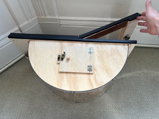
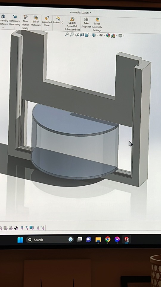
Commission for a friend. Bird feeder window in plywood and polycarbonate. Top door for easy access and a hinged mechanism to ensure a secure fit. Assembled in place to account for the window not being square, and sealed with a polyurethane foam.


0 notes
Text


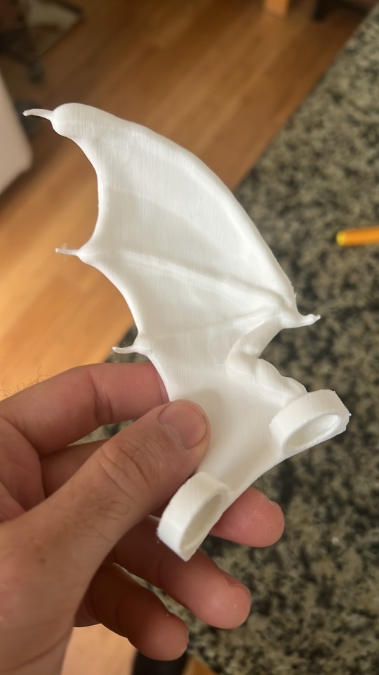

Commission for a friend. Remixed a couple models in Adobe Medium, printed them on my Prusa i3 Mk3s+, and painted with plastidip and acrylics.
0 notes
Text
To Boost Adoption, Improve Utilization
The most effective way to hit your adoption goals and get your robot out of product purgatory isn’t adding new features, it’s improving utilization.
To get your customers to broadly adopt your robot, your real-world productivity needs to be 3-5x better than the alternative. In order to understand how to improve real-world productivity, we can use this formula:
P_real_world = P_lab * E * U
P_lab is the productivity of your robot as measured in the lab. This is where most robotics companies focus most of their investment.
E is a factor measuring environmental differences between the lab and the real world. This could be anything from sunlight to crowds to flaky Wi-Fi. The only way to improve this factor is to develop and test your features in real world environments or accurate simulations thereof.
U is a factor measuring utilization—i.e. how frequently and effectively do operators in the field apply your robot to the task at hand. Although figuring out how to improve utilization is extremely complex, the solutions are relatively cheap and easy to implement. Utilization improvements are often the single biggest value opportunity for improving a robot’s real-world productivity.
So how do we improve utilization?
Good operators go through a complex set of moment-to-moment calculations to decide which tool to use for a task. To improve utilization, you’ll need to understand what goes into these calculations and design your robot’s features and processes to ensure those calculations come out in your favor. This means doing things like:
Developing an effective operator training program.
Conducting research to understand the values of your operators, their peers, their superiors, and their work environment.
Running usability studies to ensure operators aren’t getting confused or frustrated while interacting with your robot.
Designing the robot’s interface to be discoverable, predictable, memorable, communicable, and accessible.
Tuning the whole experience from out-of-box to end-of-life to tell a cohesive story.
If this all sounds overwhelming, don’t worry! I can help you implement all of these processes and more. Improving utilization is the cheapest and most effective way to improve real world productivity, get out of product purgatory, and hit your adoption goals.
0 notes
Text
Controlling Figma Prototypes Using Hardware
Figma prototypes are a fantastic tool to rapidly generate interactive UI for feedback, demos or user tests. By default, Figma prototypes support many types of inputs including mouse/touchscreen (e.g. click, drag, hover), keyboard, or gamepad buttons.
However, sometimes you need to make a prototype that reacts to inputs beyond a keyboard, mouse or touchscreen. This post will walk you through my approach to make that work.
The Big Idea
Broadly, we’re going to make a microcontroller pretend to be a keyboard so that it can speak a language Figma can understand. The microcontroller will collect input from the sensor and translate those values into “key presses” that correspond to the value of the sensor. Figma will then react to those key presses and make the appropriate transition.
Hardware
For this prototype, I’m using the Circuit Playground Express because it has a built-in light sensor. However, this technique will work for any microcontroller listed in in the “Available on these boards” section of the CircuitPython usb_hid library reference page.
After installing CircuitPython, put the following code into code.py and the adafruit_hid library into the lib folder.
import time import board import usb_hid from adafruit_hid.keyboard import Keyboard from adafruit_hid.keycode import Keycode from analogio import AnalogIn time.sleep(1) kbd = Keyboard(usb_hid.devices) light = AnalogIn(board.LIGHT) last_key = None while True: print(light.value) key = Keycode.ONE if light.value > 5000 else Keycode.ZERO if key != last_key: kbd.send(key) last_key = key time.sleep(0.01)
Because the CircuitPython is acting as a keyboard, you may start to see 0 and 1 characters printing from your cursor as if you’ve typed them. The 5000 threshold worked for me but you may need to adjust up or down depending on your lighting environment.
Figma
In Figma, add two frames of the same size with your light-theme UI and dark-theme UI.

Connect the frames with together with prototype interactions that trigger from “Key/Gamepad” and set 0 to transition to dark mode and 1 to transition back to light mode. You can also use the CircuitPlayground to set the correct values for you.
You’re done!
Run the Figma prototype and test it out!
0 notes
Text
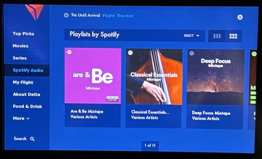
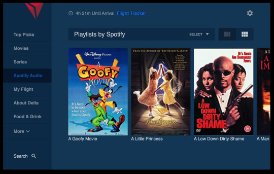
The Inflight Entertainment Challenge
On a recent flight from NYC -> SFO, I decided to try to re-create as much of the Delta in-flight entertainment system as I could.
Try the final result here: https://delta-inflight.vercel.app
And here's the code: https://github.com/paulmand3l/delta-inflight


youtube
Why do something like this?
Rapidly translating UIs into code is a core skill for UX engineers and design technologists. As I've moved more into management I've been doing less and less coding and wanted to test my skills. Obviously this isn't a perfect facsimile of real-world development, but it was an interesting challenge and a fun way to spend the flight.
Constraints
Started with a blank Vite project initialized with the react-ts template.
No pre-work aside from installing off-the-shelf npm libraries (recoil, lodash, mui icons, etc) and downloading any data sets you'll need (e.g. a bunch of movie posters).
No pre-built component libraries.
No internet access except for the in-flight wifi portal and the airline's website (useful for grabbing logos). No StackOverflow and no new NPM libraries.
Don't worry about production quality, just re-create as much of the look and feel of the UI as quickly as possible. No accessibility, responsive design, localization, etc; you just want something you can run through a user test.
Project-specific code can only be written from when they say you can use your laptop (once the plane has reached 10k feet) to final approach when they make you put laptops away.
What did I learn?
Going in, I thought that not having access to StackOverflow was going to be the biggest challenge. But that actually turned out to be ok! Aside from forgetting the syntax for CSS linear gradient backgrounds and how to ellipsize multiple lines of text I was able to remember most of my syntax and usage (and VSCode helped me fill in the gaps).
The biggest problem turned out to be not having access to new NPM libraries. Slick draggable scrolling is a key part of many screens in Delta's in-flight entertainment system (complete with momentum-based flicks, over-scroll, page-snapping, etc). Because I didn't have access to a component library and hadn't thought to pre-install a good drag scroll library, I ended up having to build my own. It went ok but took a long time and isn't nearly as good as many off-the-shelf options. Next time I try this I'll be sure to come better-prepared.
Another challenge was the sizes, spacings and colors. Usually when I build a prototype I'll include a hide-able screenshot of the comp to make it easy to achieve pixel-perfection. Without the internet I couldn't match the fonts and not having access to the raw visuals made it hard to compare directly. Sometimes I ended up trying to hold my laptop up to the screen which got me some funny looks.
One other major takeaway was feeling very good about my current prototyping toolchain. React, typescript, a vs code extension I wrote to quickly create new React components, recoil, css modules, stylus, and MUI make it really, really easy and fast to quickly build prototypes. They may not always be the right choice for production, but dang do they feel good to use.
Conclusion
This challenge was a lot of fun and I definitely want to do it again. I made good progress but didn't get as far as I wanted and I'm excited to take what I learned and try to do better next time.
If you're also a front-end engineer or work with designers I highly recommend giving this a try!
0 notes
Text
Replica of the dagger of Princess Ita

In the fall of 2022 I visited the Ramses II exhibition at the DeYoung Museum in San Francisco. One of the pieces on display was the dagger of Princess Ita. It caught my eye, so I decided to try to re-create it.

I took about 30 reference photos from various angles and used them to re-create the dagger in SolidWorks.
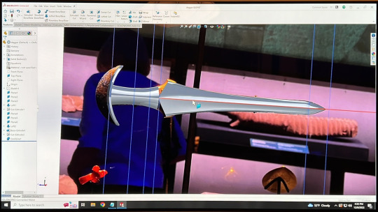
I used a sketch overlay to get the outlines right, then estimated the feature thicknesses using the steep-angle reference photos.

I printed the model in 2D to fine-tune the scale for my hand and what "looked right". It's incredibly hard to get a good sense of scale in CAD, so this step was very valuable for getting the feel of the final product right.

Once the scale felt right, I printed all the pieces on my Prusa i3 MK3S+ and super glued them together around a brass rod for stability.
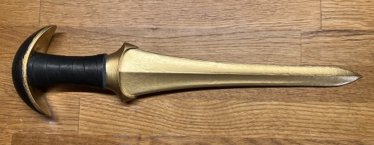
I used baby powder and super glue to fill the gaps in the seams, then progressively sanded and primed until the seams were no longer visible. For paint, I used two coats of gloss black spray paint, masked the pommel, and then two coats of Rust-Oleum Bright Coat Metallic Gold spray paint.
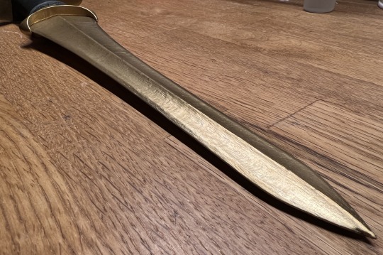
To highlight the edges and give a little extra depth to the color, I finished the blade with Antique Gold Rub n Buff.


I wrapped the handle in leather (tacked down with super glue and E6000) and then went over the pommel in black sharpie to give it a bit more visual interest.

The wood for the base came from an olive tree that had come down in a storm last winter and the mount is just a small scrap of wire bent into the right shape and spray painted black.
Overall I'm really happy with how it came out!
0 notes
Text
Coverage Frameworks vs. Classification Frameworks
Lots of folks have created frameworks for understanding various things. However, there are different kinds of frameworks that are useful for different things, and the folks who create them sometimes don’t tell you which is which. This can lead to confusion and frustration from applying those frameworks incorrectly.
Two of the most common types of frameworks are coverage frameworks and classification frameworks. Each help answer very different questions and need to be applied differently to have optimal benefits.
Coverage frameworks help answer the question “what am I forgetting?” Fundamentally, coverage frameworks are like checklists that help you spot gaps in your work or thinking. One of my favorite examples of this is the “ambient, task, accent” architectural lighting framework. It doesn’t really matter whether any given light is an ambient light, a task light, or an accent light; what matters is that you have enough coverage across each of the three types (i.e. that you’re not missing any). “Process” frameworks like Design Thinking also typically fall into this category since it’s more important to make sure you don’t miss any steps than to know with certainty which step you’re currently in.
Classification frameworks help answer the dual questions of “what is this?” and “what should I do about it?” Classification frameworks can help with putting names to things and understanding more about what to do or what to expect from them. Many psycho-emotional models like Myers-Briggs or Love Languages fall under this category in that the goal is to help understand whether somebody is (e.g.) INTJ or ESFP and how they may behave in a given circumstance—though of course your mileage may vary.
Trying to use a coverage framework as a classification framework (or vice versa) is often an exercise in futility and won’t produce useful results. It’s better to find a different framework more suited to the task at hand.
Next time you see a framework take a moment to think about whether it’s a coverage framework or a classification framework, how you plan to apply it, and whether or not there might be a more applicable framework out there that would produce better results for you.
0 notes
Text
How to write career goals that are actually useful
Lots of companies encourage you to periodically write and update career development goals. However, these goals can be hard to come up with and the whole exercise can end up feeling like meaningless busywork. As a result, you may be missing out on a fantastic opportunity to introspect about your role, impact, and how those align with your interests.
To write really good development goals, start by thinking about your current responsibilities, responsibilities you’re interested in growing into over the next 6-12 months, and the skills required to excel at those responsibilities. These could be taken from your career ladder or conversations with your managers or peers. Since this list can be a little long, narrow it down to 2-3 skills you want to focus on. When I was a prototyper in the UX Lab at Amazon, I picked “idea generation and development”, “prototype execution”, and “impact outside our immediate team”.
Next, for each of these skills, brainstorm a few specific, measurable ways that you can practice or demonstrate that skill and a specific number of times that you think will be achievable in the goal’s time frame. At Amazon, these were things like “Draft 3 project proposals and present them to the UX Lab”, “Deliver 9 functioning prototypes”, and “Make 3 technical presentations to VP-level or above". Aim for 2-3 ways to practice each of your 2-3 goals.
Now you should have a list that looks something like this:
Get better at front-end architecture
Read 4 blog posts about new front-end frameworks
Draft an architecture design document for a new feature
Build stronger relationships with PM team
Schedule 3 lunches with 3 different PMs
Set up a regular 1-1 with at least 1 PM
Present about my role at the PM conference in November
Get more comfortable leading meetings and presenting
Lead a sprint retrospective
Present a technical lunch & learn to the engineering team
Writing out your career development goals like this makes it easy to think and talk about the work that you’re doing and the skills that you’re developing, which in turn makes it easier to advocate for your impact and take the driver’s seat in progressing in your career.
0 notes
Text
Working at startups vs. big companies
Here's one of the ways I think about the differences between working at a startup and working at a big company:

A startup is like a sailboat. It's not always smooth sailing and you can feel every wave. Everything is moving fast and everybody is working hard to keep it sailing well. You can tell when the seas are getting too rough and if you're going to capsize you can often feel it coming for a while. Conversely, though, it's easy to feel the teamwork and how what you're doing impacts the whole. If the boat starts leaning too far in one direction, everybody piles on the other side and hangs off and their weight makes a difference.

A big company is like a cruise liner. You’re mostly isolated from individual waves, and though you may feel connected to the people around you it’s hard to feel connected to the ship as a whole. Your work may or may not be important to the overall operation of the ship and it’s hard to see the impact of your actions. Things are mostly pretty comfortable until suddenly, with very little warning, a rogue wave that you individually can do absolutely nothing about capsizes the ship and your whole department gets laid off.
I’ve worked at both small and large companies and I don’t think one is strictly better than the other—they’re just different with different benefits and drawbacks that work better or worse for different people. If you’re trying to decide between them hopefully this analogy is helpful!
0 notes
Text
The Cat Lie Detector
This is my cat, Tangy

Tangy loves food and very frequently lies about when she was last fed. Pretty much any time we go to the kitchen she meows up a storm trying to convince us she’s starving and hasn’t seen a meal in weeks. And since there’s more than one person living here, sometimes it works.
So we decided to build a cat lie detector
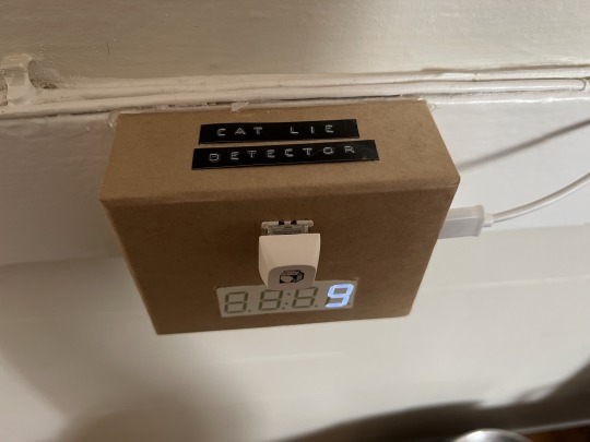
It’s a little cardboard box with a button and a count-up timer that tells us how many hours and minutes it’s been since the button was last pressed. It sits directly over her food bowl and we press it any time we feed her.
Inside is a Feather M0 from Adafruit running circuitpython, a Gateron green keyswitch with a keycap from the ”Milk and Honey” collection, a 4-digit 7-segment display also from Adafruit and a battery backup in case of power outages or momentary interruptions.
Now we can always see how long it’s been since she’s last been fed and are immune to even her most persuasive lies.
0 notes
Text
DIY Stanley Small Parts Organizer Rack Storage
I tend to keep a lot of small parts in my workshop, from screws to microcontrollers, hooks, plugs, sensors, etc. A while back I came across this video, where Adam Savage describes the Sortimo system he uses to manage his small parts. Now, I don’t make TV money and don’t want to pay $100+ per drawer of storage, so I took a look at the various options out there and found Stanley’s small parts organizers (in both shallow and deep).
These organizer are wonderful and are just what I was looking for (and vary from $20/drawer down to $13/drawer). The only problem is they don’t have a fancy storage rack for conveniently storing a lot of organizers (and I was planning to have a lot of organizers).
I found several designs online, but all of them required a table saw (which I don’t own). I decided to try designing a solution that was cost effective and only required some basic hand tools and the panel saw at my local big box store. Here’s what I came up with:

And here’s how you build it:
Cutting the frame
We’ll start with a sheet of 1/2″ x 4′ x 4′ plywood (ideally one of the nicer many-ply sheets but it doesn’t need to be baltic birch). Here’s how we’re going to cut it up:

The panels on the left will be our shelves, the long boards will be our uprights, and the smaller strips on the right will help reinforce the base.
This design and cut scheme work together to allow us to take advantage of the precision and perpindicularity of the panel saw without requiring high accuracy. As long as the shelves are all exactly the same width, they don’t need to be exactly 16-3/4″. Similarly, because we’re making multiple 13-1/2″ cuts without touching the saw, we know these cuts will all be almost exactly the same size (even if they’re not exactly 13-1/2″—which is ok).
First, set the saw to 16-3/4″ wide and make the cut marked “1″.
Next, set the saw to 13-1/2″ and take cuts 2, 3, 4, 5, 6, 7, and 8.
This should leave you with two uprights (4′ x 13-12″), three shelves (16-3/4″ x 13-1/2″), and three smaller strips (2 x ~4″ x 13-1/2″, 1 x ~4″ x 20-1/2″).
Assembling the frame
On a large, flat surface (I used my dining table), lay out the uprights and shelves like so

Note that the shelves should go on the sides of the uprights, rather than above and below the uprights.

Starting with the top and bottom shelves, attach them to the uprights using construction adhesive and some kind of mechanical fastener. Nails or screws would both probably work (don’t forget to pre-drill screw holes!), but I went with 1/4″ dowel pins in hand-drilled holes. I used corner clamps to hold the shelf at 90° while I was working.

It doesn’t need to be pretty, just get the job done. These shelves won’t be supporting the weight of the organizer bins; they’re mostly there to hold the uprights at a uniform distance from top to bottom.
Once the top and bottom shelves are in place, position the middle shelf so that there’s an 18.5″ gap between the top and the middle shelf. This will give you space for 8 shallow organizer bins above the middle shelf and 12 below. Attach the middle shelf the same way you did the top and bottom shelves.

You should now have a frame that kind of looks like the 8 on a digital clock.
Lay this frame down onto a piece of hardboard, plywood, or other thin, stiff material and make sure it’s perfectly square (you can check with a reference square or by measuring each diagonal). Trace the outer edge, and cut just inside your traced lines. You should now have a backing panel that’s just smaller than the outer dimensions of your frame.
Lay the backing panel on the back of your frame and use construction adhesive and mechanical fasteners to attach it. I traced lines 1/2″ in from the edges to make it easier to visualize where it would be safe to nail.

This backing panel will make your frame much more rigid.
Feet and casters (optional)
Take the two smaller strips from earlier (each should be ~4″ wide x 13-1/2″ long) and construction-adhesive-and-screw them onto the bottom of the bottom shelf, supporting the uprights.
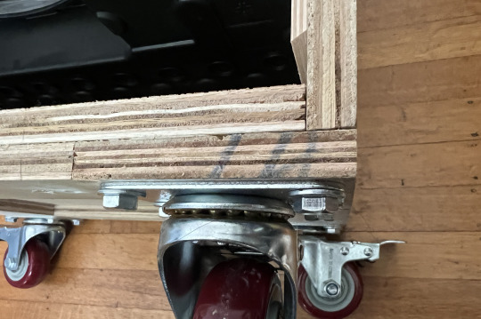
From the longer leftover 4″ strip, cut two strips that will just fill the gaps between the two feet and construction-adhesive-and-screw them into place. This step is totally optional but makes the finished piece look a little better.
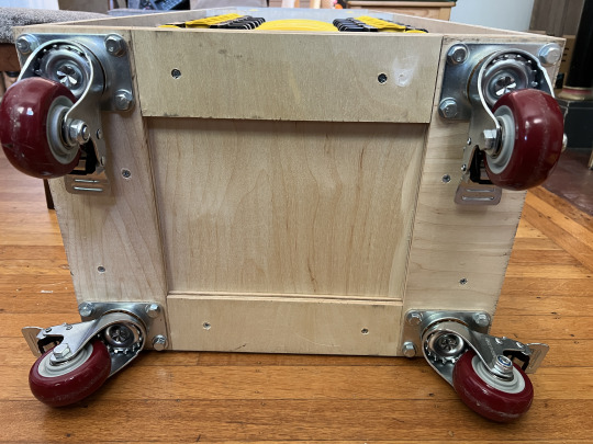
Finish off the base with some furniture pads/sliders or casters.
Adding the rails

I made the rails from wood moulding. Moulding comes in a variety of thicknesses, so you can pick which moulding you use to account for any variation in final shelf width. You want the final distance between the rails to be bewteen 16″ and 16-1/4″, so if your final dimension was a bit over 16-3/4″, use 3/8″ rails and if it was a bit under, use 1/4″ rails. If the shelves ended up way too wide, you can always add a plywood shim to bring the uprights in a bit.

Cut your rails into ~1′ lengths and taper one end using a miter saw, hand saw, file, plane, or sander. These tapers don’t need to be perfect; they’re there to help the organizer bins slide in more easily.
Rail layout and installation
Starting 3/4″ from the top of each opening, mark lines every 2-1/4″ all the way down each upright. To make this a little easier, I transferred the measurements to a helper stick, used that to mark the front and back points of each line, then used a straightedge to connect the points.

Align the top of each rail with each line that you’ve marked and space them about 3/4″ off the backing panel (my helper stick happened to be ~3/4″ square, so I laid it against the backing panel to act as a stop block that I could push the rails up against as I was installing them).
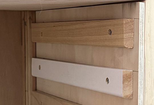
Pre-drill and counter-sink two holes to make sure the screw heads sit below the surface of the rails, then screw the rails into the uprights. I found a right-angle drill attachment to be extremely helpful for this step.
Once all the rails are installed, pop out the helper stick and start installing your organizers!
0 notes
Text
The evolution of handling asynchronous operations in javascript
http://callbackhell.com/
https://blog.ometer.com/2011/07/24/callbacks-synchronous-and-asynchronous/
https://blog.izs.me/2013/08/designing-apis-for-asynchrony
https://blog.domenic.me/youre-missing-the-point-of-promises/
https://promisesaplus.com/
https://stackoverflow.com/questions/36192728/understanding-the-promises-a-specification
https://developer.mozilla.org/en-US/docs/Learn/JavaScript/Asynchronous/Async_await
0 notes
Text
A Framework for Usability
Designing interactions with devices is challenging and requires weighing and balancing many factors. One factor designers frequently use and discuss is usability. But what does making something "usable" actually mean? Here are the five attributes that I think make something usable.
Discoverability of where and how to interact with the device.
Do I touch here or here?
Should I pull or push?
Predictability of what will happen and when will it happen.
Will clicking this button charge my credit card?
How long will this operation take to complete?
Memorability of where/how/what/when after some time has elapsed since first using the device.
How do I use this thing again?
Communicability of where/how/what/when from an experienced user to somebody who has no experience with the device.
"Just tap the speaker's forehead to play or pause music."
Accessibility of each of these factors to a wide range of people with differing backgrounds, contexts, and abilities.
Discoverability and predictability help people figure something out the first time they interact with it, which implies that excellent discoverability and predictability reduces the need for memorability and communicability. However, perfect discoverability and predictability aren't always possible and creating highly memorable and communicable experiences can make things significantly better for the second and third users down the road.
0 notes
Text
Good Names for a Cat
Bao
Big Mac
Biscuit
Bucatini
Butternut
Chanterelle
Cheese
Chickpea
Cinnamon
Fish
Gravy
Honeydew
Hotdog
Kimchi
Meatball
Melon
Mochi
Muffin
Mushu
Musubi
Nutmeg
Pancake
Pepper
Perogi
Potato
Poutine
Pumpkin
Ravioli
Salami
Sausage
Sushi
Taco
Taro
Toffee
Tofu
Turkey
Waffle
Wasabi
Ziti
0 notes
Text
Tourist’s Guide to SF Transit
Parts of the Bay Area are extremely well connected and quick to get between, and parts of the city are a total pain unless you take a Lyft.
Your two main options are BART (map) and MUNI (map).
BART is a light rail that runs from Berkeley and Oakland (including OAK) right through downtown San Francisco, through the Mission and on south to SFO.
MUNI comprises both subway, streetcars and busses. The subway is pretty good but slower than BART and branches a little more to give better access to more parts of the city. You can take Muni trains from downtown to the zoo or to the beach, but not the East Bay or either airport.
The F line is a streetcar that uses old PLC streetcar designs from other cities. It runs down Market Street to the Ferry Building, then up the Embarcadero to Fisherman’s Wharf. It’s pretty touristy on the weekends and during the summer but gives good access to tourist destinations and is a fun ride.
Almost all the bus stops and busses and things are wheelchair accessible, too, so wheelchairs/carriers/strollers won’t be a problem. All underground stations have elevators, but they go out of service pretty frequently.
Transit all works on the same card (Clipper Card). Just put some money on it and you're good to go. SF also has a couple tourist passes that get you onto MUNI and into a few museums and stuff.
Caltrain is only really useful to get to the South Bay. It hits the major cities, but apart from that it's not that useful.
0 notes
Text
Weight Loss
20,000 breaths / day 1
0.5L room temperature air / breath 2
0.04 L C02 / L air 3
1 mole C02 / 24 L room temperature C02 4
1 mole C / mole C02
12 g C / mole C 5
20000 * 0.5 * 0.04 / 24 * 12 = 200 grams of carbon exhaled every day.
Which is just under $8 worth of quarters and a bit more than most modern smartphones.
1 note
·
View note
Text
Asynchonous Callback Registration
Several days ago, I found myself stuck with the following problem. I needed to use an asynchronously loaded api that bootstraps itself into the page. Once the bootstrapping is complete, it runs an onload handler you specified in the script tag like so:
<script src="https://apis.bigcompany.com/js/client.js?onload=apiLoaded"></script>
The problem was that the script that contained the function that needed to be run on load is asynchronously bootstrapped (using $.get and Coffee.eval) later in the program. If I put the apiLoaded function in the script, sometimes the API would load first and run a nonexistent apiLoaded function. If I just used the API in the script, sometimes the script would load first and be trying to use a nonexistent API.
So, I included a little helper that makes sure the script's function always gets called after the API has loaded and included it immediately before the API's script tag:
<script> var apiLoaded = false, needAPI = []; window.withAPI = function(cb) { if (apiLoaded) { cb(); } else { needAPI.push(cb); } }; function apiLoad() { apiLoaded = true; for (var i = 0; i < needAPI.length; i++) { needAPI[i](); } }; </script> <script src="https://apis.bigcompany.com/js/client.js?onload=apiLoad"></script>
Then in my script, I can just use the withAPI wrapper to call the function that requires the API. If the API has been loaded, my function is called immediately. If the API hasn't been loaded, the function is called as soon as the API is available.
0 notes