#Gangster Grotesk
Text
I have posted a little bit about this before, but I finally read some very old X-Men issues to learn the brief history of the Changeling, the character who got retooled into Morph my beloved.
Changeling was absolutely an unambiguous villain back in his first appearance, and he talked basically the same way most comics villains talked back in the 60′s.
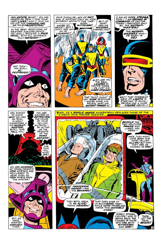
That’s Changeling in the goofy-ass purple helmet, Kevin, wtf are you wearing, bro? Are you okay? (Of course, he wasn’t Kevin back then, he didn’t have a name other than Changeling.)
Changeling was part of a group called Factor Three that wanted to heat up East-West tensions in order to trigger WW3, and destroy humanity to create a society ruled by mutants. This was a pretty short-sighted plan given that most mutants could die in a nuclear blast just as easily as humans, but whatever. The group consisted of old X-Men enemies like Vanisher, the Blob, and Unus the Untouchable, with the mysterious Mutant Master as the leader, and Changeling as his second-in-command.
The only interesting thing about Changeling in this first (and mostly only) appearance is that he starts to question Mutant Master’s actions. Not in a “maybe this is morally wrong,” kind of way, more in a “I don’t trust your motives” kind of way. Xavier also attempts to appeal to Changeling while he is captured by the group. It apparently works, because Changeling winds up freeing Xavier and Banshee, then confronting Mutant Master in Xavier’s form to call him out. Why that callout required Xavier’s form, I don’t know, but it was a fairly anti-climactic reveal of Changeling’s previously unspecified shape-shifting powers.
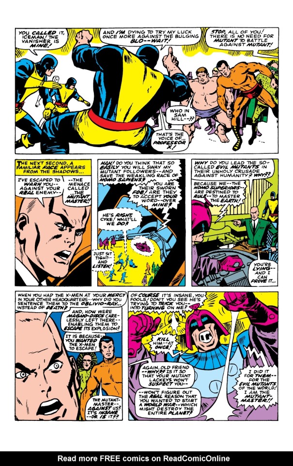

Mutant Master turns out to be an alien who actually wants to destroy ALL life on Earth, not just humans. The other Factor Three members are wisely not down with that, and help the X-Men defeat him. Then the groups just kinda awkwardly part ways.
That’s the last we see of Changeling until the retcon. Next is the story in which Xavier dies, and which was apparently originally intended to be the actual death of Xavier, until they wanted to bring him back and realized that they had a convenient shape-shifting character running around.
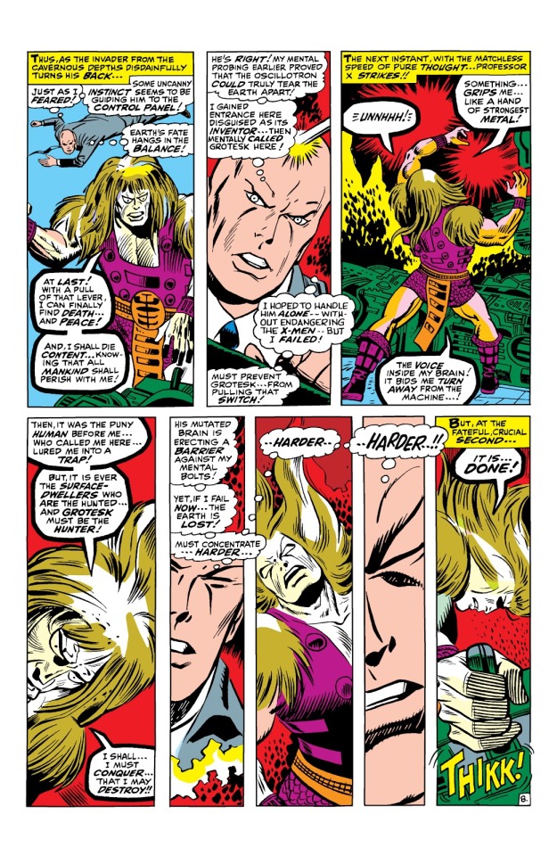
In the story, Xavier is acting weird, and sterner than usual, while making apparently irrational decisions and spending a lot of time alone with Jean. Meanwhile, the X-Men fight some dude named Grotesk, who is the last survivor of an underground society, and wants to destroy the world with an earthquake machine, and it’s all so dumb I really don’t care. But in the end Xavier stops Grotesk’s machine, and is mortally wounded in the explosion, Then as he dies, he reveals that he was already dying of an illness, and he pushed the team so hard because so they’d be prepared to fight on without him.
It’s a sad story when you read it as Xavier, but even sadder when you re-read it as Changeling going through all this, while wearing another person’s face. He’s genuinely heroic here:

“There’s no need for you to want to see the Earth destroyed! No reason!” Changeling, buddy, you were trying to start WW3 like three weeks ago. But I’ll call this character development.

Changeling takes “commit to the bit” to another level by dying as Xavier. He was already terminally ill, but since he’d only been leading the team for a few weeks, it’s safe to say his remaining time was shortened here. He basically sacrificed himself to save the world, and was buried and mourned under another man’s identity.
In issue 65, Xavier’s death is retconned and Xavier shows up alive and explains the switch.
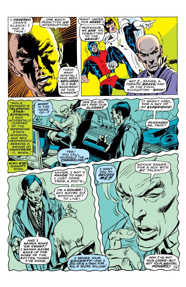
Changeling now talks like a gangster from the 1920′s, and I’m somehow imagining him with a Brooklyn accent. You can see where Morph’s character design came from, although I’m pretty sure TAS series Morph is meant to be much younger. Changeling here looks middle-aged. Although maybe it’s also because he’s dying?

Given that the Xavier’s death story was originally written to be actual Xavier, this sad little one-page retcon is all we get of the Changeling redemption story. He was basically just a plot device to bring Xavier back. And I have so many questions, the biggest one being:
He was in the basement? Xavier let another man die in his place and let his team mourn his death, and the entire time, he was in the fucking basement?! When I first heard about this story, I assumed that Xavier had to go away somewhere to do something really important to prepare for the alien invasion, and left Changeling as a temporary stand-in. But apparently, he just really needed time alone to concentrate, because he let his team of teenagers cry over his supposed dead body while he was in the fucking basement of the mansion the entire time.
Putting a former terrorist in charge of his students was already a pretty bad idea, even if Xavier could read his mind to know that he sincerely wanted to reform. Was Xavier monitoring things at all down there? Was he available to offer help or advice if Changeling or Jean came to him? Would he have done anything at all if Changeling changed his mind and went bad again? I feel like the answer is, “Probably not.” If Xavier needed absolute, uninterrupted time alone to plan, letting Jean or Changeling pop in to ask questions every day would kind of defeat the purpose - he may as well just keep leading the team.
More important, did Xavier intend to fake his own death? He knew Changeling was terminally ill, but the time frame was six months. He presumably couldn’t have predicted Changeling being killed by Grotesk. Was he going to come back and let Changeling retire for a peaceful death, or was he going to let him die as Xavier. Was Changeling’s death part of some messed up plan to force the X-Men to stand on their own, or just some unfortunate wrinkle in Xavier’s strategy that he ran with? Xavier actually had a “final message” to the X-Men that he had pre-recorded, which they play in X-Men 43 after the funeral. Who is speaking on that recording? Is it Xavier himself? Changeling? Were they really planning on having Changeling die while still in Xavier form?
And that’s not even getting into poor Jean. Jean was the ONLY one who knew the truth, and to hide it from the rest of the team. She was basically a teenager, and had to bear the burden of helping Changeling as fake Xavier, and watching all her team-mates mourn and struggle after Xavier’s death, never revealing the truth. There was an interview with Chris Claremont where he said that he thought Xavier’s retconned actions in issue 65 were really messed up. He doesn’t get into the isolating of Jean, just that it was an absolute dick move to fake his own death (either deliberately or unintentionally) instead of just telling the team that he needed to go off somewhere alone and they’d have to fend for themselves for awhile. In an issue retelling the X-Men’s history after Jean’s Dark Phoenix death, he wrote Cyclops as actually being somewhat resentful of Xavier’s decision.
If Changeling ever does get resurrected on Krakoa, I’d actually like to see some interaction between him and Jean. Jean was the only person who knew the truth, and the only person he could confide in or ask for advice during his tenure as Fake-X, assuming that Xavier was totally locked away. What did they talk about in private? Did he ask Jean for advice on how to properly be Xavier? Or was Jean just like, “I understand that you’re dying and all, but could you be a little less cranky? The team is starting to notice.” Jean also seems to be the only one who maybe mourns him. She appears to be just as upset as the rest of the team as “Xavier” dies, even though she knows the truth. And her comment on Changeling is “He....was a fine person, at the last.” Jean seems to care more than Xavier, who brushes the death off pretty quickly. “Yes, team, I let someone else die in my place while I hid in the basement, but that’s all water under the bridge. Now lets train to fight the aliens.”
Anyway, this is a weird story, and some of the weirdness is partially just due to the retcon. Changeling would have been a footnote in X-Men history if he hadn’t been adapted into the happy-go-luck Morph, who is so completely different, whether in TAS, AoA or Exiles. I still want to know Changeling wound up being such a cold-hearted and ruthless character compared to his alternate counterparts.
Also, Professor Xavier is a jerk.
7 notes
·
View notes
Photo
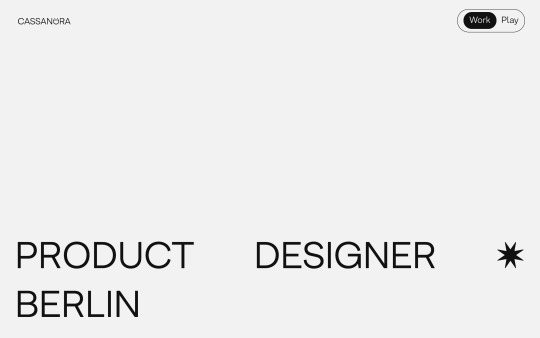
www.cassandratang.me
#Cassandra Tang#product#designer#Berlin#minimal#typographic#typography#font#Armin Grotesk#Gangster Grotesk#2021#Week 08#website#webdesign#inspire#inspiration#happywebdesign
11 notes
·
View notes
Photo
https://www.behance.net/gallery/79134711/Gangster-Grotesk-Free-Font?tracking_source=curated_galleries_list
7 notes
·
View notes
Text
7 Gorgeous Free And Open-Source Typefaces And When To Use Them
7 Gorgeous Free And Open-Source Typefaces And When To Use Them
Noemi Stauffer
2019-07-17T14:00:59+02:002019-07-17T12:06:48+00:00
To facilitate your font picking and pairing process, I’ve included examples of how these typefaces have been put to use recently, as well as a few pairing ideas. Enjoy and don’t forget to ping me on Twitter to show me how you’ve used them — I’d love to see it!
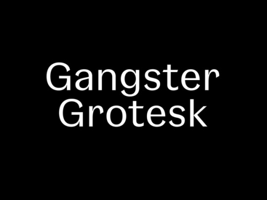
Gangster Grotesk
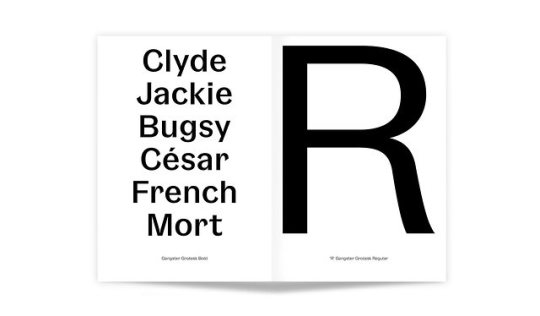
Designed by Adrien Midzic, Gangster Grotesk is a contemporary grotesque with angled terminal strokes that slightly curve inward. Because of these quirky individual touches, the typeface brings a unique flavor to headlines and posters when used at large sizes. Its low contrast and slightly condensed width make it a good choice for body copy and other texts of small type sizes as well.
The font family comes in three weights, from Light to Bold, with stylistic alternates, including a loopy expressive ampersand. Gangster Grotesk is offered for free when signing up for the Fresh Fonts newsletter.

Gangster Grotesk. (Large preview)
Download Gangster Grotesk →
Suggested Font Pairings
When applying Gangster Grotesk to titles, the quirky grotesque pairs well with low x-height serifs for text settings, such as FF Atma. Used at small point sizes instead, pairing Gangster Grotesk with Le Murmure (see below) offers the right mix of character and neutrality.
Use Case
Gangster Grotesk excels in punchy designs with strong colors when it’s asked to render strings of text, for example on this flyer designed by Tokyo-based Juri Okita for Pells Coffee.
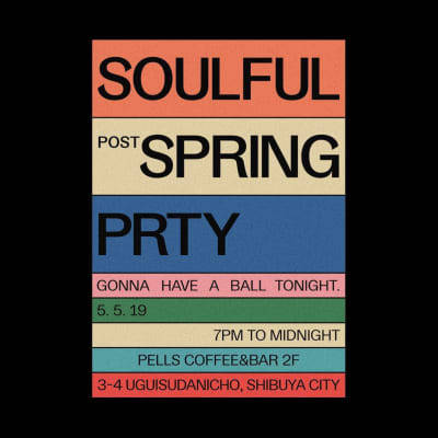
Gangster Grotesk in use. (Large preview)
Le Murmure

Le Murmure. (Large preview)
Recently awarded a Certificate of Typographic Excellence by the Type Directors Club, Le Murmure was commissioned by French design agency Murmure to renew their brand image. Drawing inspiration from magazine titling fonts, Le Murmure is a condensed sans serif with an interesting mismatch between its characters, making it especially distinctive for use at large sizes. Its height and the singularity of its shapes provide elegance while conveying notions of experimentation and creativity. Le Murmure comes with many — even more — original alternate letters, and there is even a stylistic set that ‘randomizes’ all alternates for you (SS08).
Download Le Murmure →
Suggested Font Pairings
Used as a titling font, Le Murmure can pair well with a sans serif with warm curves, like Standard CT, or with a sans that has more pronounced irregularities, like Dinamo’s Prophet.
Use Case
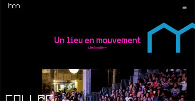
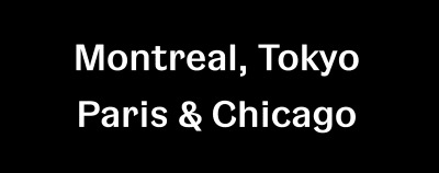
Marrakesh’s Untitled Duo picked Le Murmure for the headlines of their studio’s website, complemented with Classic Sans for the navigation, which they also used at smaller size for the body text.

Le Murmure in use. View full website. (Large preview)
Le Murmure in use. View full website. (Large preview)
Reforma
Reforma. (Large preview)
Reforma is a bespoke typeface designed by PampaType for the Universidad Nacional de Córdoba in Argentina, an educational institution more than 400 years old. The typeface is composed of three subfamilies: Reforma 1918, a classic Serif, Reforma 2018, a modern Sans, and Reforma 1969, an intermediate hybrid that combines the qualities of the other two (subtle modulation and flare serifs). I find all three subfamilies to adapt well to a wide range of bodies, from display to immersive text, and each one of them comes in three weights, with matching italics.
Download Reforma →
Suggested Font Pairings
This typeface allows for interesting combinations among its different styles. The most obvious would be to use Reforma Sans for display use and to pair it with its serif counterpart for body text. However, I would encourage you to do something more original and try it the other way around, using the serif for titling.
Use Case
Graphic designer Étienne Pouvreau chose Reforma for the creation of the annual programs of the two Caf family centers of the Loir-et-Cher department in France. The booklets feature Reforma 1918 (the serif) for the headings, in italic, and Reforma 2018 (the sans) for the titles, subtitles and body text.

Reforma in use. View full booklet. (Large preview)
Space Grotesk

Space Grotesk. (Large preview)
The new foundry of Florian Karsten is behind this versatile, geometric sans serif. Derived from Space Mono, a monospaced typeface designed by Colophon Foundry for Google Fonts in 2016, Space Grotesk kept the nerdy charm of its predecessor and its particular retro-future voice. Available in five weights, Space Grotesk is well-suited for a wide range of uses, from body text to bold headlines. In addition, it comes with five sets of alternate letters, the third one (SS03) removing the connections between the diagonal strokes of uppercase A, M, N, V, W, and lowercase v, w, y — which can be particularly effective to create distinctive headlines.
Download Space Grotesk →
Suggested Font Pairings
As one would guess, Space Grotesk pairs well with Colophon Foundry’s Space Mono, the typeface it was derived from, which is also open source and free to use. Alternatively, if you’d like to pair it with a serif typeface, I would recommend one with pointy serifs and sharp details, such as Fortescue, or Wremena, which is also free to use (see below).
Use Case
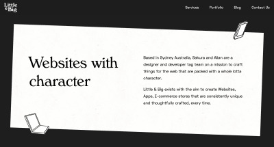
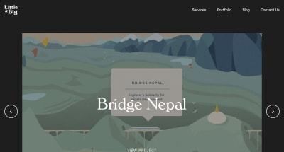
Little & Big, a web design and development studio based in Sydney, Australia, chose Space Grotesk as the body text font for their website, including on blog entries, header and footer. They decided to pair it with Verona Serial, giving the website a professional, yet playful look and feel.

Space Grotesk in use. View full website. (Large preview)
Space Grotesk in use. View full website. (Large preview)
Syne
Syne. (Large preview)
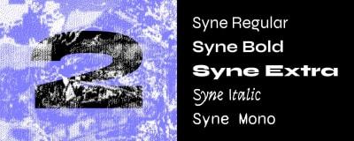
Syne is a type family designed by Bonjour Monde for the visual identity of Synesthésie, an art center close to Paris. It consists of five distinct styles, amplifying the notion of structural differentiation within a font family: Syne Extra is a wide, heavy weight intended for use at large sizes, Syne Regular is a geometric sans with short ascenders and descenders (visible in the lowercase ‘g’ among others), complemented with a wider bold style, an italic in a handwritten style and a monospaced with a distorted look. Updated just days ago, Syne now comes with more alternates, a set of brand new accents, and a variable font version.
Download Syne →
Suggested Font Pairings
The particularity of this typeface is that you can play with its different styles, and create fresh and atypical associations among them. For instance, Syne Extra does wonder for titles and headlines, and works well with Syne Regular for body copy.
Use Case
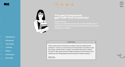
Syne was recently used by WeTransfer to present the results of their Ideas Report 2018, making extensive use of the typeface’s five different cuts on the website of the report and on its beautiful PDF companion.

Syne in use. View full website. (Large preview)

Syne in use. View full website. (Large preview)
VG5000
VG5000. (Large preview)
Named after the VG 5000, a computer created by Phillips in 1984, this typeface playfully combines pixelated and curved strokes, blurring the lines between old and new digital shapes. It also includes many early emojis and pictograms from the VG 5000’s original set, allowing you to create unexpected combinations. Moreover, the typeface comes with contemporary gender inclusive characters for the French language, replacing pronouns “il” and “elle” (“he” and “she”) with the neutral “iel”, and providing an alternative to gendered words by combining their masculine and feminine versions.
Download VG5000 →
Suggested Font Pairings
Because of its pixelated details, and to remain truthful to its origins, I would suggest pairing VG5000 with a monospaced font, for example League Mono, which is also open source. Alternatively, you could decide to pair it with the sans or serif version of Input, or with a semi-proportional typeface like ETC Trispace, which is also free.
Use Case
French design studio Brand Brothers put VG5000 to use for the visual identity of Les Halles de la Cartoucherie, a new, versatile space dedicated to cultural, artistic and gastronomic activities in Toulouse. Paired with a custom, grid-based logo that represents the structure of the space, VG5000 was used both at large and small sizes on print materials, on the website of the space and even on its walls, using VG5000's pixelated arrows for its wayfinding system.
VG5000 in use. View full project. (Large preview)
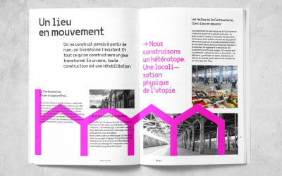
VG5000 in use. View full project. (Large preview)
Wremena
Wremena. (Large preview)
Wremena is a serif typeface designed by Roman Gornitsky and published by Moscow-based foundry Typefaces of The Temporary State. Its design was based on Vremena, a free typeface by the same designer, but it features more pronounced triangular serifs and sharper angles, which become even more visible in heavier weights. Wremena is available in three styles (Light, Regular and Bold) without italics but with support for the Latin and Cyrillic scripts. Because of its similarities with Times New Roman, Wremena can be used as a free, more contemporary alternative to the ever-popular typeface.
Download Wremena →
Suggested Font Pairings
A good tip to find pairings for a specific font is to browse the library of typefaces created by the same designer, as they often pair well together. This is especially true in this case, as Roman Gornitsky designed two sans serifs that are great matches for Wremena: Nowie Vremena, with its distinctive lowercase ‘g’, and more recently, Steinbeck, a lively font with intentional irregularities.
Use Case
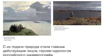
The Jewish Museum of Moscow is behind Russian Spleen, a picturesque interactive web project that explores how Russian landscape painter Isaac Levitan impacted the 20th-century cinematography. Designer Pavel Kedich decided to typeset the website in Steinbeck (used at large sizes) and Wremena (here used for captions). Both fonts being multi-script, they allow the website to be available in English and Russian languages.
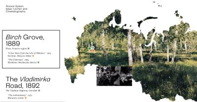
Wremena in use. View full website. (Large preview)

Wremena in use. View full website. (Large preview)
That’s It For Now!
While I’ve included great examples of how these free fonts can be used, there are many more on Typewolf and Fonts in Use. And if you’d like to discover new, high-quality free and open source fonts, make sure to subscribe to my newsletter Fresh Fonts.
All works and screenshots are property of their respective owners.

(ah, yk, il)
0 notes
Text
7 Gorgeous Free And Open-Source Typefaces And When To Use Them
7 Gorgeous Free And Open-Source Typefaces And When To Use Them
Noemi Stauffer
2019-07-17T14:00:59+02:002019-07-17T12:06:48+00:00
To facilitate your font picking and pairing process, I’ve included examples of how these typefaces have been put to use recently, as well as a few pairing ideas. Enjoy and don’t forget to ping me on Twitter to show me how you’ve used them — I’d love to see it!
Gangster Grotesk
Designed by Adrien Midzic, Gangster Grotesk is a contemporary grotesque with angled terminal strokes that slightly curve inward. Because of these quirky individual touches, the typeface brings a unique flavor to headlines and posters when used at large sizes. Its low contrast and slightly condensed width make it a good choice for body copy and other texts of small type sizes as well.
The font family comes in three weights, from Light to Bold, with stylistic alternates, including a loopy expressive ampersand. Gangster Grotesk is offered for free when signing up for the Fresh Fonts newsletter.
Gangster Grotesk. (Large preview)
Download Gangster Grotesk →
Suggested Font Pairings
When applying Gangster Grotesk to titles, the quirky grotesque pairs well with low x-height serifs for text settings, such as FF Atma. Used at small point sizes instead, pairing Gangster Grotesk with Le Murmure (see below) offers the right mix of character and neutrality.
Use Case
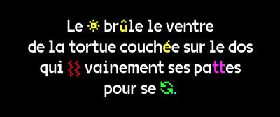
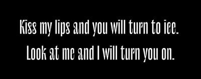
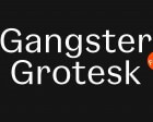
Gangster Grotesk excels in punchy designs with strong colors when it’s asked to render strings of text, for example on this flyer designed by Tokyo-based Juri Okita for Pells Coffee.

Gangster Grotesk in use. (Large preview)
Le Murmure
Le Murmure. (Large preview)
Recently awarded a Certificate of Typographic Excellence by the Type Directors Club, Le Murmure was commissioned by French design agency Murmure to renew their brand image. Drawing inspiration from magazine titling fonts, Le Murmure is a condensed sans serif with an interesting mismatch between its characters, making it especially distinctive for use at large sizes. Its height and the singularity of its shapes provide elegance while conveying notions of experimentation and creativity. Le Murmure comes with many — even more — original alternate letters, and there is even a stylistic set that ‘randomizes’ all alternates for you (SS08).
Download Le Murmure →
Suggested Font Pairings
Used as a titling font, Le Murmure can pair well with a sans serif with warm curves, like Standard CT, or with a sans that has more pronounced irregularities, like Dinamo’s Prophet.
Use Case
Marrakesh’s Untitled Duo picked Le Murmure for the headlines of their studio’s website, complemented with Classic Sans for the navigation, which they also used at smaller size for the body text.
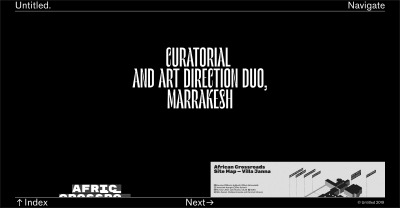
Le Murmure in use. View full website. (Large preview)

Le Murmure in use. View full website. (Large preview)
Reforma

Reforma. (Large preview)
Reforma is a bespoke typeface designed by PampaType for the Universidad Nacional de Córdoba in Argentina, an educational institution more than 400 years old. The typeface is composed of three subfamilies: Reforma 1918, a classic Serif, Reforma 2018, a modern Sans, and Reforma 1969, an intermediate hybrid that combines the qualities of the other two (subtle modulation and flare serifs). I find all three subfamilies to adapt well to a wide range of bodies, from display to immersive text, and each one of them comes in three weights, with matching italics.
Download Reforma →
Suggested Font Pairings
This typeface allows for interesting combinations among its different styles. The most obvious would be to use Reforma Sans for display use and to pair it with its serif counterpart for body text. However, I would encourage you to do something more original and try it the other way around, using the serif for titling.
Use Case
Graphic designer Étienne Pouvreau chose Reforma for the creation of the annual programs of the two Caf family centers of the Loir-et-Cher department in France. The booklets feature Reforma 1918 (the serif) for the headings, in italic, and Reforma 2018 (the sans) for the titles, subtitles and body text.
Reforma in use. View full booklet. (Large preview)
Space Grotesk

Space Grotesk. (Large preview)
The new foundry of Florian Karsten is behind this versatile, geometric sans serif. Derived from Space Mono, a monospaced typeface designed by Colophon Foundry for Google Fonts in 2016, Space Grotesk kept the nerdy charm of its predecessor and its particular retro-future voice. Available in five weights, Space Grotesk is well-suited for a wide range of uses, from body text to bold headlines. In addition, it comes with five sets of alternate letters, the third one (SS03) removing the connections between the diagonal strokes of uppercase A, M, N, V, W, and lowercase v, w, y — which can be particularly effective to create distinctive headlines.
Download Space Grotesk →
Suggested Font Pairings
As one would guess, Space Grotesk pairs well with Colophon Foundry’s Space Mono, the typeface it was derived from, which is also open source and free to use. Alternatively, if you’d like to pair it with a serif typeface, I would recommend one with pointy serifs and sharp details, such as Fortescue, or Wremena, which is also free to use (see below).
Use Case
Little & Big, a web design and development studio based in Sydney, Australia, chose Space Grotesk as the body text font for their website, including on blog entries, header and footer. They decided to pair it with Verona Serial, giving the website a professional, yet playful look and feel.
Space Grotesk in use. View full website. (Large preview)

Space Grotesk in use. View full website. (Large preview)
Syne

Syne. (Large preview)
Syne is a type family designed by Bonjour Monde for the visual identity of Synesthésie, an art center close to Paris. It consists of five distinct styles, amplifying the notion of structural differentiation within a font family: Syne Extra is a wide, heavy weight intended for use at large sizes, Syne Regular is a geometric sans with short ascenders and descenders (visible in the lowercase ‘g’ among others), complemented with a wider bold style, an italic in a handwritten style and a monospaced with a distorted look. Updated just days ago, Syne now comes with more alternates, a set of brand new accents, and a variable font version.
Download Syne →
Suggested Font Pairings
The particularity of this typeface is that you can play with its different styles, and create fresh and atypical associations among them. For instance, Syne Extra does wonder for titles and headlines, and works well with Syne Regular for body copy.
Use Case
Syne was recently used by WeTransfer to present the results of their Ideas Report 2018, making extensive use of the typeface’s five different cuts on the website of the report and on its beautiful PDF companion.

Syne in use. View full website. (Large preview)
Syne in use. View full website. (Large preview)
VG5000

VG5000. (Large preview)
Named after the VG 5000, a computer created by Phillips in 1984, this typeface playfully combines pixelated and curved strokes, blurring the lines between old and new digital shapes. It also includes many early emojis and pictograms from the VG 5000’s original set, allowing you to create unexpected combinations. Moreover, the typeface comes with contemporary gender inclusive characters for the French language, replacing pronouns “il” and “elle” (“he” and “she”) with the neutral “iel”, and providing an alternative to gendered words by combining their masculine and feminine versions.
Download VG5000 →
Suggested Font Pairings
Because of its pixelated details, and to remain truthful to its origins, I would suggest pairing VG5000 with a monospaced font, for example League Mono, which is also open source. Alternatively, you could decide to pair it with the sans or serif version of Input, or with a semi-proportional typeface like ETC Trispace, which is also free.
Use Case
French design studio Brand Brothers put VG5000 to use for the visual identity of Les Halles de la Cartoucherie, a new, versatile space dedicated to cultural, artistic and gastronomic activities in Toulouse. Paired with a custom, grid-based logo that represents the structure of the space, VG5000 was used both at large and small sizes on print materials, on the website of the space and even on its walls, using VG5000's pixelated arrows for its wayfinding system.

VG5000 in use. View full project. (Large preview)

VG5000 in use. View full project. (Large preview)
Wremena

Wremena. (Large preview)
Wremena is a serif typeface designed by Roman Gornitsky and published by Moscow-based foundry Typefaces of The Temporary State. Its design was based on Vremena, a free typeface by the same designer, but it features more pronounced triangular serifs and sharper angles, which become even more visible in heavier weights. Wremena is available in three styles (Light, Regular and Bold) without italics but with support for the Latin and Cyrillic scripts. Because of its similarities with Times New Roman, Wremena can be used as a free, more contemporary alternative to the ever-popular typeface.
Download Wremena →
Suggested Font Pairings
A good tip to find pairings for a specific font is to browse the library of typefaces created by the same designer, as they often pair well together. This is especially true in this case, as Roman Gornitsky designed two sans serifs that are great matches for Wremena: Nowie Vremena, with its distinctive lowercase ‘g’, and more recently, Steinbeck, a lively font with intentional irregularities.
Use Case
The Jewish Museum of Moscow is behind Russian Spleen, a picturesque interactive web project that explores how Russian landscape painter Isaac Levitan impacted the 20th-century cinematography. Designer Pavel Kedich decided to typeset the website in Steinbeck (used at large sizes) and Wremena (here used for captions). Both fonts being multi-script, they allow the website to be available in English and Russian languages.

Wremena in use. View full website. (Large preview)
Wremena in use. View full website. (Large preview)
That’s It For Now!
While I’ve included great examples of how these free fonts can be used, there are many more on Typewolf and Fonts in Use. And if you’d like to discover new, high-quality free and open source fonts, make sure to subscribe to my newsletter Fresh Fonts.
All works and screenshots are property of their respective owners.

(ah, yk, il)
0 notes
Photo
Gangster Grotesk: Free typeface in 3 weights http://bit.ly/2Ybk6K5
0 notes
Link
https://ift.tt/2o3H0a6
0 notes
Text
Gangster Grotesk
https://www.fontsquirrel.com/fonts/gangster-grotesk?utm_source=dlvr.it&utm_medium=tumblr
0 notes
Text
What’s New For Designers, May 2019
There are plenty of cool new tools and resources available for designers this month, and you’ll be especially happy if you are looking to find photos with ease, increase productivity or even create better documentation.
If we’ve missed something that you think should have been on the list, let us know in the comments. And if you know of a new app or resource that should be featured next month, tweet it to @carriecousins to be considered!
Creative Commons Search Engine
Looking for photos that you can use anywhere just got easier. Creative Commons fully launched its search engine, which can help you find photos from a database of more than 300 million images from 19 collections with easy to understand attribution rules. Creative Commons is the standard for open-source and with attribution sharing of assets. The nonprofit organization enables sharing and reuse of assets through tools and standardized licensing for creative works.
Milanote
Milanote, a note taking app now has an app that integrates with the desktop tool. The app is important, and different, from other tools because of what happens when you log in on your desktop computer. Organize content into visual boards designed to feel like a wall in a creative studio. All of your notes, images, links, tasks and files can be laid out in a shareable visual workspace. It’s fast, flexible and fun to use—think Trello meets Pinterest.
FlowCV
FlowCV is an online resume builder that can help you create, format and design a resume with ease. You can design it online and download a PDF for free. The biggest bonus might be prompts and resume advice packed right in to the tool.
CSS Grid: Style Guide
CSS Grid: Style Guide is a beautiful example of how to create documentation. You’ll want to fork Olivia Ng’s pen.
CSSfx
This collection of effects allows you to click-to-copy CSS. The collection is designed with a focus on fluidity, simplicity and ease of use with minimal markup. Every effect is open source and ready to use.
Mailtolink.me
Mailtolink.me takes all the hassle out of mailto links. Just fill in the fields and copy the code. All the markup is automatically generated.
Code Guppy
Code Guppy is a collection of resources and tutorials for kids, teens and adults to learn JavaScript. You don’t have to have an account to work through tutorials in a number of categories including drawing, math, games and more.
Nicedoc.io
Tired of ugly readme files? Nicedoc.io is the solution. It is made to create instant and beautiful documentation for any github repository. It’s compatible with any markup format and has light and dark themes.
WebThings Gateway
Mozilla WebThings is an open platform for monitoring and controlling devices over the web, including smart home gateways focused on privacy, security and interoperability. The associated framework is a collection of reusable software components to help you build your own “web things.”
Tutorial: Animating Links
Have you ever wanted to animate a link? This tutorial from Learn CSS Animation has the solution. It will walk you through how to animate the underlines on links, combine multiple transitions, group animation keyframes and look at the pros and cons of using animations in this space.
Editor.js
Editor.js is a free block-style editor. From the developr:
Workspace in classic editors is made of a single contenteditable element, used to create different HTML markups. Editor.js workspace consists of separate Blocks: paragraphs, headings, images, lists, quotes, etc. Each of them is an independent contenteditable element (or more complex structure) provided by Plugin and united by Editor’s Core.
Bubble
Bubble allows non-coders to build software. It’s a code-free programming language that lets you create web applications. The tool includes free and premium plans and include everything you need to create and host a responsive web app with drag and drop tools.
Google Duplex
Google Duplex is an AI assistant that can talk to humans to get what you need. Powered by Google’s AI and tucked into Google Assistant, you’ll be able to book reservations or schedule haircuts in seconds. The system makes the conversational experience as natural as possible, allowing people to speak normally, like they would to another person, without having to adapt to a machine.
Emojim
Search emojis and click to copy to your keyboard for easy pasting in documents, mockups, blogs or social media websites. Emojim’s essentially an emoji keyboard for your desktop and it’s amazingly easy to use.
City Life Icons
City Life icons is a fun set of vector shapes in SVG and PNG format. The icon pack includes 50 designs in full color and line styles. Use them in digital or print applications.
Developer Survey Results
Stack Overflow surveyed over 90,000 developers to find out how they learn and “level up,” what tools they use and what they think about the industry. Top takeaways include Python is growing as a most-loved programming language, half of respondents were writing code before age 16 and devops specialists are among the highest paid positions.
Dellmonte Sans
Dellmonte Sans is an elegant uppercase display font. It includes letters, numerals and some punctuation.
Gangster Grotesk
According to the designer: “Nodding to its historical roots in the 1920s, Gangster Grotesk is a contemporary typeface that combines a sharp contrast with angled terminal strokes that curve inward ever so slightly. These elements are simple but effective, lending the typeface character while being practically invisible at small sizes.” It includes a full character set with light, regular, bold and alternate options. The font is free with newsletter signup.
Ohio Script
Ohio Script is a modern brush typeface with a full set of upper- and lowercase letters. The script is free for personal use and you can buy the paired sans serif.
Pondspell
Pondspell is a brush typeface, with a handwriting style that is made with a natural brush or marker. The free version includes only letters. The design is flowy with connected characters and interesting strokes.
Public Sans
Public Sans is the font integrated with the design system of the United States government. The simple sans serif is strong and neutral and includes multiple weights with a full character set for pretty much all text uses online.
Add Realistic Chalk and Sketch Lettering Effects with Sketch’it – only $5!
Source
from Webdesigner Depot http://bit.ly/2Yq3jDq
from Blogger http://bit.ly/2JE8nQf
0 notes
Text
smashingmag @ May 07, 2019 at 04:42PM
A free typeface that celebrates the beauty of contrast in typography and in people (all three weights are free for both personal and commercial use).
↬ Gangster Groteskhttps://t.co/BaQEJturXW pic.twitter.com/0TjHPZqO2v
— Smashing Magazine (@smashingmag) May 7, 2019
from http://twitter.com/smashingmag
via IFTTT
0 notes
Text
Popular Design News of the Week: April 22, 2019 – April 28, 2019
Every week users submit a lot of interesting stuff on our sister site Webdesigner News, highlighting great content from around the web that can be of interest to web designers.
The best way to keep track of all the great stories and news being posted is simply to check out the Webdesigner News site, however, in case you missed some here’s a quick and useful compilation of the most popular designer news that we curated from the past week.
Note that this is only a very small selection of the links that were posted, so don’t miss out and subscribe to our newsletter and follow the site daily for all the news.
UI Design Inspiration – Apr 2019
New Logo and Identity for Nike by You
Are You Making these UX Errors?
The Ugly Truth Why your Website is Slow
Color Designer – Simple Color Palette Generator
Top 5 Design Tools for Getting Striking Visual Content
What Does Unsplash Cost in 2019?
How to Protect the Admin Area of your WordPress Site
Nord Design System
LinkedIn Redesign UI/UX Concept
Tips on Using Colors in UI Design
Open-source Illustrations for Every Project You Can Imagine and Create
Three – Free Semi Condensed Typeface with Four Weights
Accenture Sued Over Website Redesign so Bad it Hertz
The Story Behind the Redesigned Game of Thrones Title Sequence
Choose the Right Navigation for your Mobile App
Two Words that Have Made Millions
Instagram Hides like Counts in Leaked Design Prototype
Site Design: Museum of Digital Art
Greater than Avatars
What Creative Visionaries do that Most People Overlook
Ikonate: Fully Customisable & Accessible Vector Icons
Gangster Grotesk: A Sharp Typeface Free for Personal and Commercial Use
Will these UX Trends Stick or Fade Away?
The Art of Simplicity in Product Design
Want more? No problem! Keep track of top design news from around the web with Webdesigner News.
Add Realistic Chalk and Sketch Lettering Effects with Sketch’it – only $5!
Source p img {display:inline-block; margin-right:10px;} .alignleft {float:left;} p.showcase {clear:both;} body#browserfriendly p, body#podcast p, div#emailbody p{margin:0;}
Popular Design News of the Week: April 22, 2019 – April 28, 2019 published first on https://medium.com/@koresol
0 notes
Photo
Gangster Grotesk: a sharp typeface free for personal and commercial use http://bit.ly/2DthUpx
0 notes
Text
Popular Design News of the Week: April 22, 2019 – April 28, 2019
Every week users submit a lot of interesting stuff on our sister site Webdesigner News, highlighting great content from around the web that can be of interest to web designers.
The best way to keep track of all the great stories and news being posted is simply to check out the Webdesigner News site, however, in case you missed some here’s a quick and useful compilation of the most popular designer news that we curated from the past week.
Note that this is only a very small selection of the links that were posted, so don’t miss out and subscribe to our newsletter and follow the site daily for all the news.
UI Design Inspiration – Apr 2019
New Logo and Identity for Nike by You
Are You Making these UX Errors?
The Ugly Truth Why your Website is Slow
Color Designer – Simple Color Palette Generator
Top 5 Design Tools for Getting Striking Visual Content
What Does Unsplash Cost in 2019?
How to Protect the Admin Area of your WordPress Site
Nord Design System
LinkedIn Redesign UI/UX Concept
Tips on Using Colors in UI Design
Open-source Illustrations for Every Project You Can Imagine and Create
Three – Free Semi Condensed Typeface with Four Weights
Accenture Sued Over Website Redesign so Bad it Hertz
The Story Behind the Redesigned Game of Thrones Title Sequence
Choose the Right Navigation for your Mobile App
Two Words that Have Made Millions
Instagram Hides like Counts in Leaked Design Prototype
Site Design: Museum of Digital Art
Greater than Avatars
What Creative Visionaries do that Most People Overlook
Ikonate: Fully Customisable & Accessible Vector Icons
Gangster Grotesk: A Sharp Typeface Free for Personal and Commercial Use
Will these UX Trends Stick or Fade Away?
The Art of Simplicity in Product Design
Want more? No problem! Keep track of top design news from around the web with Webdesigner News.
Add Realistic Chalk and Sketch Lettering Effects with Sketch’it – only $5!
Source
from Webdesigner Depot http://bit.ly/2XRsgqN
from Blogger http://bit.ly/2UGO2f7
0 notes
Last Seen Blogs

twicepinkmeup-imagines
life with twice & blackpink
peacemaker70-blog
vintage_raritet_coins

enochscribbles
scribbling as per usual

eternal-peace-is-overrated
king valkyrie