#I put the text and graphics in photoshop for better legibility
Text

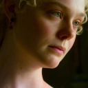
I wasn't going to post this because it was just meant to be a quick dumb thing to get me out of my art block, but I spent way too much time on my one stupid joke to not post it here.
...anyway, the joke [ tinyurl(dot)com/livegayreact ] (which I super duper pinky gay promise is not malicious, but don't feel obliged to click if you don't wanna) only works on desktop 🫠 I guess I should have checked if the execution was correct before I put that much effort into it lmao 😭
#I made A TYPO OH NO#my ipad had not been charging#and then when it was charged I realized my apple pencil was also not charged#so I went with paper and pencil lmao#I put the text and graphics in photoshop for better legibility#and to save you all from my shitty handwriting yw#kassandra#kassandra of sparta#assassins creed odyssey#live homosexual reaction#lgbtq#happy pride#I guess? lmao
251 notes
·
View notes
Text
graphics guide
a guide filled with basic info, tips, and answers to common questions that i hope helps people who want to start making graphics
*this was made based on my experiences of making graphics and is what i thought was important to cover but everyone has different ways and approaches so dont feel the need to follow everything on here
what is a graphic?
a graphic (also known as ‘gfx’) is a image edit that incorporates various elements (textures, filters, text, etc) in order to visualize a idea or to create a aesthetic composition
unlike making gifs, there is no right or proper way to make a graphic so dont get too caught up in the idea that a graphic should look a certain way - just stick with your style and what you think looks good
anatomy
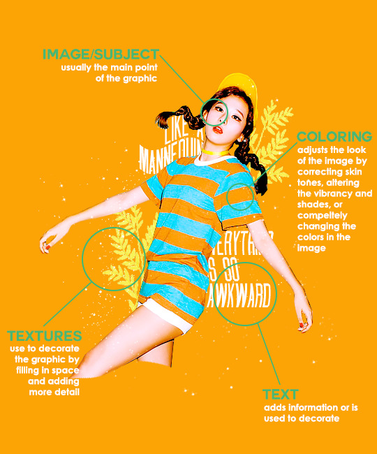
image/subject
usually the main focus of the whole graphic
you should always try to use a sharp hd picture - getting it from the original source is always the best option
make sure the source of the picture allows editing - pictures from public sources like a company or the news can be edited while fansite pics and scans need to have permission asked (and if they give you permission make sure you link them when you post your graphic!)
coloring
often referred as ‘psd’ because that is the format they are in (i.e. pink psd pack)
comprise of multiple layers that can alter the images look
a lot of people make their own colorings since the outcome of the look also depends on the image’s original coloring
textures
smaller cut out images that are often used to decorate the graphic
can also refer to a image that can be use as a background of a graphic
can be found in the form of a png (copy + paste into graphic) or a brush (”painted” on to the graphic)
avoid using any textures that does not state the original poster made them - you could unintentionally be using someone’s work that was not made to be used
[read more about it here + resources that you can actually use]
text
text can be used to tell information or just for decoration
try to choose fonts and colors that are legible
faq
what software can i use to make graphics
most people use some version of photoshop (i currently use photoshop cc 2018) and a lot people have it cracked but if you cant afford photoshop, find a cracked version or a patcher (i used adobe zii 3.0.4 for mac), or are uncomfortable with getting a cracked version then there are other softwares that are just as good!
i can only vouch for gimp since i used it when i first started making gfxs. it is very similar to photoshop and shares most of the same tools and has a similar look to photoshop. it is also probably the most popular photoshop alternative and would totally recommend it if you cant get photoshop!
[visit + download gimp here]
where do you get your pictures from
official sources such as teasers companies release, photos released by press, photos from idol’s instagram - basically photos that are made for the public to see are whats best to use for a gfx. you should download the photos straight from the source so you get it at its highest quality
some phrases you can use to search for pictures on google:
- [group name] photoshoot
- [idol name] press
- [group name] showcase
- [idol name] teaser
remember the more specific you are in your search the better! also when you search through google make sure you check your source!
avoid getting photos from reposting websites like we heart it and pinterest
avoid using fansite pictures and scans unless you are granted permission
i don’t know where to start/i’m overwhelmed and i don’t know what to do/ where should i begin
figure out what you want to make or a theme you want to follow - do you want to make a simple graphic or a infographic? do you want it to center around a certain theme like a comeback or a photoshoot? once you determine what you want to do it becomes easier getting ideas and finding stuff you will need for the gfx
example thought process:
“i want to make a loona graphic” → do you want it to be the whole group or a certain member or unit? will it just be a simple gfx or a AU gfx or based on a event that the group is doing?
“i’ve decided on doing a kim lip one” → do you want it to have a certain theme like kim lip smiling or kim lip with blonde hair? is there a certain frame of time in which you want the graphic to represent like during eclipse era or hi high era?
“i want it to be from max and match era with her teasers” → from here you can start finding pictures to use and thinking of colors and textures that would fit your theme
where do you get ideas/inspiration from
i mean it’s different for everyone but for me i literally just think of stuff and i’m like wow i want to make that happen asdfsdfj but mostly when i see pictures or watch something thats where i suddenly get a idea
but tumblr is full of graphic makers!!! ive seen so many amazing graphics from various fandoms like kpop, anime, marvel, etc.
some amazing graphic editors i know myself include:
primirene, ireone, nctjaemin, celo-mar, 1hyungseo, jeongahn, haechxnie, sonxiumin, syua, lulumelody, dinomite, lovelyeo, joohys, whatchatalkabout, yveu, maerinah, mihyon, lorbits, cherryjennie, thatporcelain, monoka, ifbin, 7ww
some other places you can look at are behance (dont go on behance if you have a cracked ver of ps - it might trigger a ingenue software alert that is a huge pain to deal with), pinterest, deviantart, dribble, and probably any social media platform if you just look up #graphicdesign
remember if you take inspiration from someone’s work then you should cite them in your caption - if you are afraid that you might’ve accidentally copied someone when you were trying to take inspiration from them its best to either try to remake the gfx again or just to ask the creator permission if its fine if certain details are similar/same
my stuff sucks how do i get better
literally just keep on making stuff aka practice. you can’t improve if you don’t bother putting effort.
ways i’ve forced myself into practicing making gfxs is by:
1) starting a gfxs series - its self paced and is based on what you want to make (i.e. introducing my biases gfx series, my favorite outfits gfx series, etc)
2) taking in requests - people who would request from you probably like your stuff so its a win win situation (i.e. send me a idol + era, send me your bias + palette, send me a group and i’ll make a gfx of my fav member, etc)
tips
only sharpen your pictures after you are done resizing them, if you sharpen and then resize it might result in a more blurry or grainy picture
always save your graphic every 5-10 mins in case photoshop crashes
have two copies of your image cutout: one will be the original and the other one will be the one you edit with - in case you mess up like over erasing or over sharpening your image you have a back up you can use
stick with a color palette so you don’t get overwhelmed when having to color everything and it makes all the graphic panels you have look more cohesive
on photoshop you can favorite fonts!!! take advantage of it!!! your computer has a lot of fonts saved on it and it takes forever to look through a whole list of fonts so by favoring fonts you can see all of the fonts that you like to use for graphics
combine a png pack to one psd → when you open a png pack you will probably get a lot of png files and it gets annoying having a lot of tabs open in photoshop when most of them are just textures so by putting all of those pngs into one psd you can cut down the files you open and can easily see all of your options
make folders dedicated to colorings and textures that way you can easily access them instead of looking through your computer for a certain file
name your layers... i dont do it because its easy for me to tell what layer is what but when you are working with a lot of layers its best just to name them it’ll make life easier
lock your main image/subject so that when you play with texts’ and textures’ location you don’t accidentally move your main image
use curves to help get a photo back to its original coloring! like if you have a photo that has a weird filter on it just use curves and it’ll help the picture look more natural! [tutorial]
try warping your text to make it stand out more! you can access it by pressing the icon on the top text bar that has a T with a curved line under it. i use flag and wave the most
alter a particular color by using a selective color layer
rather than changing the actual color of an image/texture you can:
create new layer → select the image/texture and color it on the new layer instead of on top of the image/texture → change the opacity or the mode of the layer so that the color is put on the image/texture while keeping its detailing and not affecting the actual image/texture
resources
colorings: can be found on deviantart or tumblr just look up ‘psd coloring’ or ‘[color] psd’
textures: can be found on deviantart (check to see if its og content or stolen) simply just search what you are trying to find or ‘png pack’ or ‘texture pack’
common textures you can try to find: vintage flowers, memphis shapes, organic shapes, doodles
other wesbites: pngtree, creative market, lost and taken, spoongraphics
fonts: if you are looking for a certain font then you can just do a google search but if you are browsing then dafont and font squirrel are really good websites too
some of my favorite fonts: abril fatface, agfatumc, antonellie calligraphy, arcadeclassic, bebas neue, century gothic, couture, daily news 1915, dark larch, hondurhas, kotori rose, krinkles, risingstar, sant joan despi, studly, zing rust
color palettes: i made one myself which you can find here, color hunt, and honestly a quick google search will give you tons of options
if you have any questions, other stuff you want me to cover, or want to add more resources and tips then please dm or send an ask! i hope this helps!
#i really hope this helps someone and that it makes sense#i literally woudlve been so happy if i saw this when i first started it took me so long to figure things out and im still learning#also i basically told where i got everything so like please dont take advantage of this and end up copying my gfxs... its happened to me a#lot#idk what to properly tag this alfkjasd#ps help
125 notes
·
View notes
Text
Dev Log: GUI Design for Non-Artists
Today’s dev log is on a small but indescribably important part of game design: GUI.
More specifically, I’d like to discuss how to make a GUI for your game regardless of whether you’re a writer, programmer, designer, cat, whatever. It doesn’t require any art training, nor any specific skillsets beyond a) understanding aesthetics (or having a friend who does), and b) an art program like GIMP or Photoshop.
“But Dovah!” you exclaim tearfully. “Ren’Py has a simple, customizable default GUI! I don’t want to spend time changing it when I could be doing something else more productive!”
Well, my nonexistent pupil, I’ll tell you why.
What is GUI?
GUI (or graphical user interface) is an essential part of any game. It’s the first thing the player sees--even if they only notice it subconsciously--and it immediately sets the tone and style for the rest of the experience.
I’ve seen countless games where the GUI is either default Ren’Py or slightly altered; as good as a game can be, this lack of effort always detracts from the game for me.

If Skyrim looked like this, your immersion might break a bit.
Now, if you have no artistic talent (like me), you might think that your only key to a good GUI is hiring someone to make one. This is not the case.
Once you have the one tool you really need to make a GUI--an image manipulation program, like GIMP or Photoshop--the steps from there are simple.
3 Steps to GUI
1) Close your eyes and imagine core aesthetic of your game. Is it fantasy? Sci-fi? Modern? What words would you use to describe your game? Are there any key colors, objects, elements?
2) Once you’ve done this, find pictures (royalty-free!) that match this aesthetic. For a fantasy game, maybe that’s a forest or a castle. For a sci-fi game, maybe it’s a fancy computer screen.
3) Slap those bad boys onto your canvas in your program. Think of what buttons you need, then find a font that matches your aesthetic. Start changing colors, moving elements around, combining them. Make sure everything is legible.
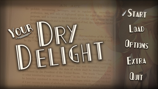
The menu screen for our current project, Your Dry Delight, is very simple. The key visual (our protagonist emptying a bottle) is combined with a royalty-free picture of the Volstead Act, which defined Prohibition. The font is an art-deco style that evokes the 20′s, while the bottle that servers as a hover marker hearkens back to Prohibition. The white divider is simply a line that’s been faded out on both ends, intended to draw the eye to the buttons.
Everything here, except for the key visual, I cobbled together in Photoshop. It’s not gonna win any awards, but it tells you a hell of a lot more about the game you’re going to play than a default Ren’Py GUI, and more importantly, it helps put you in the right mood.
The Good, the Bad, and the GUI
Now, professional drawn GUI art will definitely look better than most amateur creations. But there are barriers to getting a professional GUI--commission costs, lack of understanding the aesthetic, and so on.
It’s very possible you won’t be pleased with a GUI you create yourself. Heck, I iterate probably 4-5 times for every screen I do in Ren’Py (and often am still displeased with the results). But you can only get better through practice, and when you do get better, you may be surprised by how well you can convey your core concept of the game through something as simple as GUI.
And unless you’ve slapped bright yellow Comic Sans on a neon orange background, whatever you make will surely look more polished and immersive than nothing at all.
Also, the magical mistakes that happen (like setting text kerning to 1000 instead of 10 for your save text) make it all worth it.
Helpful, free resources:
GIMP (free Photoshop, basically)
Pixabay (look up banners, textures, designs etc that you can use in your game, all royalty-free)
Google Fonts (free fonts)
Visual Novel Interfaces blog (not updated regularly, but useful references)
Free resources on Lemmasoft

Support our future and current projects on Patreon for extra goodies, follow our Twitter for shenanigans, and join our Discord to chat with the devs (and other yaoi/visual novel fans!)
10 notes
·
View notes
Text
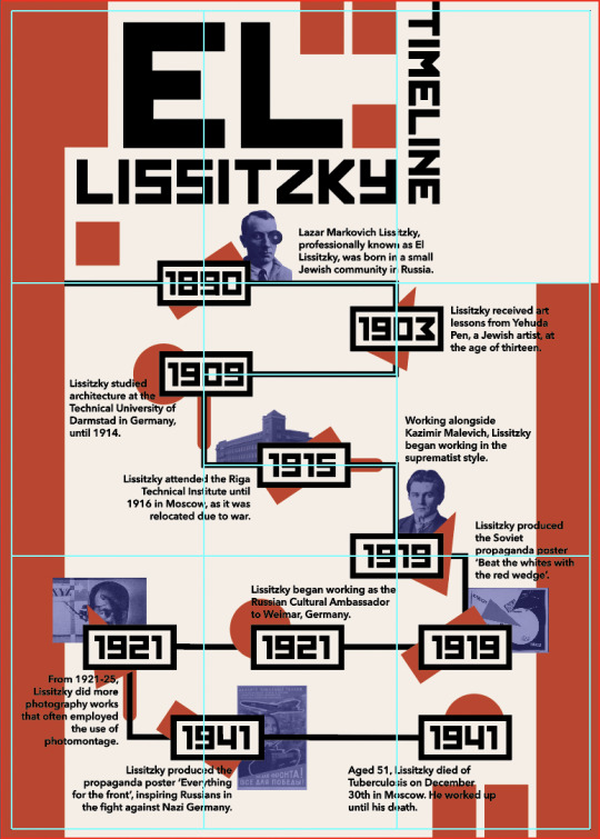
Week Six - Finalising Poster
Following my sketches, computer concepts, refinements, and experiments, I have created my final timeline poster, inspired by Lissitzky’s suprematist design work. The timeline covers 10 important dates and time periods in Lissitzky’s life, with some key dates including blue tinted images to help communicate key ideas. Images that weren’t artworks I created as PNGs in Photoshop. The colour theme in the poster is inspired by Lissitzky’s work, primarily using red, off white, and black. I used the eyedropper tool to make swatches, and then changed the RGB values to create the shades and tones I wanted. I made the black softer by making it slightly more grey, so it would be less overpowering. For the images I used a dark primary blue so the photos would stand out against the white background, and could be layered under red and black. Some of Lissitzky’s painted works use primary colours like the blue and red. To better communicate the timeline of Lissitzky’s life, I added a geometric shape like a rectangle, circle, or triangle behind the date box. These shapes are very common in his design work. I played with these shapes in previous weeks when tasked with creating graphic assets in Illustrator. Using elements that are present in his work strengthens the communication of Lissitzky’s life and works. To signify time periods, I put red rounded rectangles behind the black timeline. These show the extension of a date, meaning the event lasted more than one year. The typeface I chose for the poster headings and dates was chosen because of the Soviet style, linking to Lissitzky’s Russian background. It is bold and easy to read, clearly communicating key information. I made small edits to the type to make it clearer, such as changing the way some letters face, and removing unnecessary strokes. Paragraph text is written in a very basic sans serif type, to make the information clear and legible at a smaller point size.

This final poster is very similar to the last poster in my previous blog post about poster digitising. I made some small refinements to the final poster to make it clearer and cleaner. I smoothed the edges of the PNG images in Photoshop using the eraser tool, to make the edges less pixelated. I also made the stroke on the red date extenders slightly thicker to show the time periods more clearly. As well as this, I moved the arrangement of the shapes behind the dates to make the spacing more even. I also checked for stray points and deleted them to make the final product more professional.
This screenshot shows the guides that I used to make the poster. I used a very simple thirds grid that I created by splitting a rectangle into a grid and making guides from it. Lissitzky doesn’t consistently use grids in his work, so I decided to use a very simple one. I think the use of grids in my work could be improved on because the grid used in the poster is not very present when hidden.

This screenshot shows how the poster would look when printed as SRA3 and with the bleed lines trimmed. If physically displayed, this is how the poster would appear. Due to online learning, we won’t be handing in the physical poster, instead creating a PDF version. These digital screenshots don’t actually show the colour as accurately as I would like. In Illustrator, the red colour appears brighter, which I prefer.
0 notes
Text
Tips For Graphic Designers In The Digital Marketing Industry!

Digital Marketing job is the most challenging environment to work in. That being said, working as a graphic designer is most envisioning – one gets to bring out one’s real talents and creativity!
Being in this field has taught me how to manage my time well, how to ideate quick designs and to tune in my designs in line with the brand’s objectives. Here are some tricks and hacks I’ve learned in my time that has helped me enhance my work:
1. Shortcuts. Your Keyboard is your Best Friend!
If you are using Adobe Suites like Illustrator, Photoshop or Aftereffects you must become the guru of all shortcuts. Shortcuts helps you a lot of time. If you are lazy to find them out there is always an option of assigning your own shortcut key for specific actions!
2. KISS (Keep It Simple, Son!)
Be it Facebook, Twitter or any Social Media Platforms, minimalistic designs will always trend and get more attraction. Whatever design you make keep it minimalistic. Make your designs simple, clean and legible so everyone can understand!
3. Infographics! Infographics everywhere!
An infographic is the key to attract any kind of audience and is most useful for people who regularly blogs or visit blogs. Infographic is like storytelling in a picture format with all the data for people to see it and understand instead of reading pages and pages of text.
4. Colour Combinations!
This is the most crucial part! If you are a graphic designer trying to build your reputation, it is highly important to know the science of colors! Understand what colour to use in which place and what colour combinations work on social media is important. For example, blue coloured text on green background is a disaster. When it comes to Social media, contrasting and eye catching colours work better. Learn about split-complementary and complementary colours before starting your career in graphic design. Always save some colour palettes. Below are few palettes which will work well in social media :
5. All Together!
If you are designing posts for Facebook or any Social Media platform, make sure that you do a series of posts on the topic. This will save you time to work on other deadlines. For example, If you make a series of posts on Facebook Facts, make a series from 1 to 10 for every fact so that the entire album will have a comparatively more reach than regular creatives!
6. Font styles and Typeface
Choosing what typeface font for your designs is the crucial factor for your final output! Unprofessional fonts like Comic Sans, GiddyUP or HoboST will not work! Always use sophisticated and popular fonts like Helvetica, SegoeUI or Times New Roman. Keep in mind that placement of fonts on your design is also important. The better selection of font and placement of it, the best your design will be!
7. “Mock It Up”
Once you give the client his print designs, they will ask you for mock-ups. So always keep PSD (photoshop) mock-ups of various themes ready so that you can show them or impress them how good the design will look on the specific medium!
8. Maintain colour themes
Sometimes using multiple colours in your design may work out well. But when you are making a corporate presentation or advertisement it is best to follow the colour theme or guidelines in your designs. It is a best practice to make your design look appealing! For example if the background is predominantly green, follow the same green theme for fonts, slides or shapes! Given below is an example!
9. Balance and empty space!
For any design to look classy, polished and hi-profile, there must be some empty space. If you look at the online ads of iPhone or Armani suit they will be stylish with a lot of empty space. This makes the audience/consumer to feel sophisticated and contribute to purchasing the product. Empty space is not just blank space. It means your product/image can fill the space but not cluttered with textual information. The more empty space in your design, the more classy it will look! Have a look!
10. Call-to-Action!
This is a great deal when you are creating advertisements and posters for your clients online! Call-to-action is so important that it has more than 50% chance of audience clicking on the ad compared the ads which don’t have call-to-action. So go ahead, put those shiny attractive call to action buttons straight up your design 😉
11. Stack up your “Stock”
When it comes to best design practice, always use images from official stock websites like www.shutterstock.com or any other such website. By doing this you are preventing any copyrights issues with images or vectors you use for endorsing your products. So it is always best to purchase images officially. You wouldn’t want to get copyrights sue-letter from anyone do you?
Final Summation
I hope you find this blog useful! I shall be discussing in detail about designing tricks in Adobe Photoshop and Illustrator in the next blog. Now open your Software and start designing and start impressing! ADMS is providing Web Designing Services Denver, CO. Remember, Colours, Fonts and Placement! What you design should be your trademark. Your originality always speaks 🙂
0 notes
Text
‘Lost and Found: Part 1’ - Objects as type.
Aim:
For this workshop, the brief says we have been tasked to create typography from chosen objects and materials. This includes the 26 letters of the alphabet as well as the main punctuation; ? ! . , “” ( ) & @ #. We decided as a class we would only do the letters in capitals as this will make it a lot easier for us to be able to complete the task in the time frame given.
The typefaces we were creating are something called a display type.
What is a display type?
A display time is a form of typography where the characters shows are not functional for every day use. Its main purpose is to look good as a display. It is used for things such as posters, logos and titles. The other type of typography is text type; this is used for things as blogs, documents, books.
We also discussed important parts of creating a type face. It is important to ensure the characters are consistent throughout each and every character. This includes the style of the letters (how they are angled, are they curved or straight? ect.) as well as the size and scale of each letter. We have to carefully consider this when creating out type.
When considering the height of the character, It helps to give yourself a guideline to go by for each one. You must thing about something called the X height/ Cap height.
What is cap height?
Definition: cap height is the height of a capital letter above the baseline for a particular typeface.
So I decided for mine, I would draw a light, small line on the piece of paper to mark the top and the bottom of each of my characters.
Along with this, it is important that I consider the width or each character. However, I don't think this is as important as having a consistent height as some letters are inevitably going to be wider than others, for example; W is always going to be wider than V as it is literally 2 Vs next to each other.
When creating our type, we must also consider the readability vs legibility.
What is readability and legibility?
Legibility definition: Legibility is the ease with which a reader can recognize individual characters in text.
So it is important to make each character distinguishable enough so that it is easily to identify which character they are.
Readability definition: Readability is the ease with which a reader can recognize words, sentences, and paragraphs. Legibility is a component of readability.
So this is how the characters look together as words, sentences and paragraphs. Is it easy to read as a whole? Do the characters look right together/in a group?
Other things can affect the readability of a typeface. Things like: Line spacing, colour of text, colour of background, line length and the type size as a whole. If you’re using a small phone it is inevitable that some types are going to be harder to read than others compared to when you are looking at it on a large monitor or TV.
Task:
Initially, Dave put us into pairs and then gave us specific objects/materials that we would use to create a type face.
At first I had paired with Louis and we were given engine oil. We found this very challenging and time consuming as we attempted not to over spill and of the oil while we were also trying to make each letter. Our first couple of goes had failed completely as the letters were either not recognisable or we had spilled too much onto the page. Because of this, we had decided that Louis would carry on with the engine oil and I would go on to use little toy soldiers to create mine, just so we knew we would definitely have at least one type face by the end of it.
At first, I was a bit disappointed to be using toy soldiers as a type face as I thought I would be very restricted the style I would have to use. However whilst creating each character, I started to begin to like my outcomes.
Along with this it was quite easy to create the type as if I had misplaced one of them I could easily just adjust it. Where as with the engine oil, if you make a mistake you cant really correct it as it makes a permanent mark on the page.
Here is the collection of characters together: PHOTO
When taking these photos I had to consider the angle I was taking them from. I also took 2 pictures of each letter, one with flash and one without. In my opinion I think it is more successful with the flash on as it saturated the colours of the soldiers more and created a bolder text. Without the flash, you can see the shadows behind the soldiers and if I was to eventually go on and digitally manipulate this type so I could have it on a screen, these shadow would be a pain to get rid of.
However, someone else may prefer the type with the flash off so it is all down to personal preference.
Due to having to do a second typeface, I ran out of time and wasn't able to create any of the punctuation. This is something I could look to do when I have more time so that I have a complete typeface that I could put into my production file and portfolio and even attempt to use on something like packaging or clothing.
What went well:
I think every character goes by the same style, they are all very uniform and basic. By using quite a lot of soldiers for each letter, I was successfully able to make each character recognisable by incorporating the curves and angles of each one. If I was going to use less soldiers, it would be a lot harder to achieve this.
Ideas from this:
As I said before, I could attempt to incorporate this type on something like packaging or clothing. I could do this digitally by downloading a pre made asset on photoshop and simply place the file of said text onto the asset.
I think it is an interesting concept using a toy to create a type. It gives it a friendly feel and I think it would work well on some type of packing for toys for young children.
I will consider what other toys I could use for a type face, maybe teddy bears? Or nerf guns?
Poundland Object Type Face:
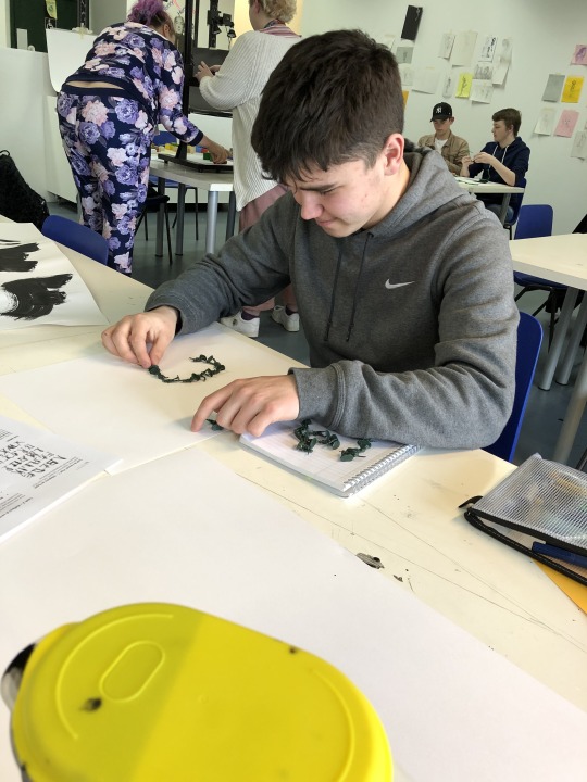
After this, we were then informed by Dave that we would each be given £1 to spend on an object/s or a material at Poundland that we would then go on to use to create another typeface.
I bought a set or thick wire balls that’s main purpose is to use them when cleaning pots and pans to scrub all the grime off.
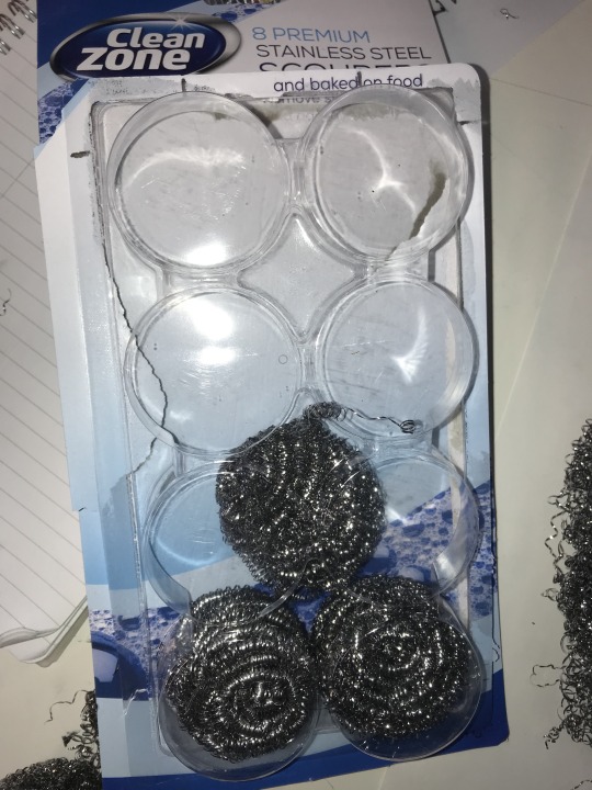
As I like to work 3D I thought this would be a really interesting material to use as I could rip and stretch the wire to form whatever characters I want.
I really enjoyed using this material as I think the typeface gives off a manic, wiry effect.

PHOTOS
I think while the style isn't as consistent as my toy solider typeface, I still think there is a high level of consistency throughout all the letters and punctuation. This is because I marked on the paper 2 lines to help me keep the same cap height throughout.
Overall I think this type face was quite successful and with some digital editing it could be easily used on products. In my opinion I think it would be most effective on industrial products as it would math the theme, however it could be used for things like a mechanics/electricians logo, cleaning products.
From here, I went on to take pictures of each individual character, once again doing one with and one without flash. Again I thought it looked better with flash as the colours were more reflective and bright.
I then air dropped the images of the type onto a mac and digitally edited the characters. Using the ‘levels’ tool, I brought down the dark colours in the images and slightly brought up grey colours. This got rid of all the dark white or the paper around the characters and made it a clear white, I done this so It would look cleaner and I was able to manipulate them easier.
What went well:
I think I successfully was able to create a whole typeface that is easy to read yet is quite complex. I think it is hard to realise what it is made out of until you look closely. But the metallic effect it gives makes it viable to use as on packaging for a relevant product or on a logo.
Ideas:
I could explore type in this project in various ways. I would look at different types in depth analysing the effect they give the viewer and how changing it can alter the effect.
I could spend more time modelling each character to create a unique style for the whole typeface and then experiment with different products and packaging to see how effective it is.
I could also think of a way that I could present this type face artistically. I could create a poster? a zine? Or I could create a variety of examples of this type being used in the real world.
Review:
In all, I quite enjoyed doing this workshop especially when considering typography isn't really something I enjoy doing that much. I think this is because I was able to use 3D objects instead of just using a computer screen. It required a high level of initiative and problem solving to be able to create a good-looking and consistent type.
Typography isn't something I was initially considering to explore in this project, however this workshop has given me a variety of ideas involving type that I could look to explore for my FMP.
Potentials:
I think typography is a huge part of graphic design that is possibly a bit over looked by most people. I may look at famous typographers and look at different techniques they have used to think of and create different type faces. I could also look at different and interesting ways that they have presented these type faces. Have they shown you examples of it being used? Have they jjst created a poster?
0 notes
Text
There’s an evil trifecta that will always affect everything you do. You must choose between:
Good
Cheap
Fast
And I’ve not figured out how to get around that. Sometimes you can get good and cheap, but it probably won’t be fast. Good and fast won’t be cheap, and fast and cheap are almost never good. This is true for food and books, and it’s also true for book covers.
So let it be known that if you follow the advice on this page, you’re at best going to get good and cheap. It won’t be fast, and at some level the “good” part will depend on your skill level. That being said, here’s how I make my covers.
1. Choose a Style
I like to pick a style first so I know what I’m going for. My cover for American Chimera, for instance, was done in an art-deco style. Evolution of the Predator was supposed to make you think of a peaceful homeland, and If I Only Had No Heart was honestly just bad but was supposed to make you think of evil computers. Good Intentions is a God-don’t-let-it-off-my-computer werewolf story that I wrote to prove that Twilight could have been “cool” instead of “garbo”, and I chose to go with something that reminded me of gangsters. The Poet of the Week Compilation was made with a style to imitate Colleen Chesebro’s website, nature-inspired works, the feel of the contest, and the need to have a printer-friendly cover. The Mercury Dimension is deceptive because it’s hard to see the stupid spaceship I painstakingly shopped in.
#gallery-0-5 { margin: auto; } #gallery-0-5 .gallery-item { float: left; margin-top: 10px; text-align: center; width: 33%; } #gallery-0-5 img { border: 2px solid #cfcfcf; } #gallery-0-5 .gallery-caption { margin-left: 0; } /* see gallery_shortcode() in wp-includes/media.php */
They’re all different, and I’ve learned over the course of all of them.
2. Make a Crappy Idea Drawing
Let’s say I have an idea for a book cover in my head. If I don’t commit it to paper in any form or fashion, I’m not really going to have an idea how it will look. I won’t know what kind of space it will take up on the page or if it makes sense.
Once it’s on paper, I can gauge if it has any merit at all. Sometimes I put it to paper and realize it’s melodramatic, or I realize it won’t have anywhere for a title to go. The other thing I realize by making a Crappy Idea Drawing is if the cover is too ambitious. Like on the Great British Baking Show, going for something too ambitious for your skill level can lead to despair later. If you’re having too hard a time drawing the crappy version, you can decide if your idea is just too much for you.
Once I settle on the Crappy Idea Drawing, it’s time to move to a computer.
3. Get GIMP
GIMP is a freeware photoshop. I guess you can get Photoshop instead (I can confirm that it’s better and more intuitive), but it’s so much less free than GIMP.
All of the covers I’ve made have been in GIMP.
4. Get a Template
No, not an art template – a template for the size of your cover! Amazon has standard sizes for their Kindle and Print-on-Demand services, and you can download a template for your book. If you plan on including the back and spine, though, you’ll need to have your book written already; that will allow Amazon to calculate how big the spine will actually be.
If you’re not going to do Print On Demand and just want a front cover, then huzzah and hurrah! You can choose whatever you damn well please.
5. Choose a Color Palette
This is most important if you’re making graphic art, but even if you’re going for something more natural, you’ll at least want to make some decisions about colors. With American Chimera, I wanted to evoke thoughts of gold, of riches, of opulence, which is why I went with the yellow and yellow-gold tones. Evolution of the Predator is a survival tale on an alien world, so I went with natural tones and then a red for a standout title.
6. Choose a Font
If there’s nothing else on this stupid post you pay attention to, this is the big one.
A font is everything. The font should match your style, should be daring. Yet, it should be legible, clear, easy to read. Serif and non-serif fonts have an enormous difference between the two and can make huge impacts on your work. Go to font download sites and look for exactly what you need. Then keep looking. Keep looking. Find the perfect font, and the rest of the cover will be easier.
Be sure to choose fonts that don’t require attribution.
7. Le Sigh… Draw It On GIMP…
Ok, this one’s the major step, and it’s the one that will screw with you the most. However, since no two covers will be the same, it’s excessively hard to tell you every step for your book specifically. Feel free to ask me questions in the comments, or there’s YouTube videos for almost anything you want to make.
Here’s some hints and tips, though:
It Will Take Forever
You’ll get dispirited if you’ve never used GIMP or Photoshop before. It takes such a long time to get a handle on the program. But that’s where your crap drawing and style will help you – figure out what your goal is, and you’ll be better equipped to put questions into Google. Take the time to figure out the how, and you’ll get better. Be patient and forgive yourself for sucking. People take classes on this crap for a reason.
Use the Pen (it takes forever)
The “Pen” tool (in GIMP, not sure if it’s the same in Photoshop) allows you to draw vectors or paths. These paths can be resized without diminishing image quality, which is something I wish I’d known when making that Good Intentions cover seen above. With American Chimera and the Poet of the Week compilation, I knew about paths and could make good use of them. Paths create smooth, crisp lines on any size document you want to make.
Understand Layers
A layer is like adding a clear piece of plastic overtop the image for you to draw on, except it remains stable and in place. You can afterward pull that piece out of the way, or you can switch which piece you’re working on. Or you can toss the crappy pieces. If you’re new to photoshop or GIMP, look up layers so you can get this concept.
Start With the Background Layer and Work Forward
Let’s pretend you want your cover to be a landscape. Start with the sky, then make a new layer and put in any mountains or items in the distance. Then draw the foreground. Put in another layer for things on top of the foreground. Work your way closer to the camera, putting layer on top of layer.
Keep A Color Palette Layer
It’s easy to lose track of what colors you have and where you want them. If you have a layer just full of stupid splotches of the colors you’re using, you’ll never completely lose it ever again.
When In Doubt, Start a New Layer
If you start a new layer, you won’t screw up anything you’ve done under or above it.
Use Guidelines
Guidelines are lines that don’t show up on the final image but help you with placement. Put them where you want them to be, and you’ll be well-off.
Huzzah! You’ve Got a Cover!
And, at last, you’ve drawn something. Like I said, a lot of it will depend on your skills, but these things have helped me make a lot of perfectly ok covers.
Cover Making On a Dime There's an evil trifecta that will always affect everything you do. You must choose between: Good…
0 notes
Text
BenQ SW2700PT: AdobeRGB You Can Afford
For the past two months I’ve been testing the 27″ BenQ SW2700PT QHD (2560 x 1440 pixels) monitor. Viewing my images on its screen, I am continually amazed that so many photographers out there are willing to spend thousands of dollars on cameras that eek out slightly more dynamic range and color depth than previous generations, and then view their images on narrow-gamut sRGB monitors with mediocre color accuracy (that includes you, Mac users). Part of the problem is that wide-gamut AdobeRGB monitors used to be quite expensive, but that’s no longer true: the 27″ BenQ SW2700PT monitor offers 99% of the AdobeRGB gamut with excellent accuracy and costs about $550.
Is it worth it for the non-professional, though? If you’re a serious, passionate photographer, then the answer is yes, though you’ll need to care enough about your images to add a little extra complexity to your workflow[3. The details are beyond the scope of what I can include in a monitor review, but there are plenty of good books and videos out there on color management. At the very least, you’ll need to get familiar with Photoshop/Lightroom/Affinity Photo’s color settings, and be comfortable switching between AdobeRGB and sRGB when you’re outputting for the web or narrow-gamut print. This monitor makes the switching of your hardware easy with the quick control pad.].
In the Box
Like most professional photography monitors, the BenQ ships with a screen hood to protect the screen from glare and color shifts caused by stray light. Additionally, it comes with a puck-shaped quick control pad that allows you to easily change color modes (AdobeRGB, sRGB, monochrome) and make changes to the monitor’s settings.
[/media-credit] The control-puck, seen here in its recessed dock, connects to the bottom of the monitor with a wire, which is not show here. You can put it wherever is most convenient on your desktop.
You’ll also find the expected assortment of cables: power, USB, and DisplayPort. As was the case with the SW271, unfortunately, the monitor only ships with a DisplayPort to mini-DisplayPort cable, which is useless if your graphics card has full-size DisplayPort sockets, since the monitor only has a full-size Display port socket, too. I hope that in the future they decide to include a standard DisplayPort to Displayport cable.
Display Performance
[media-credit id=1 align=”alignright” width=”264″][/media-credit]
The Colors
For about a month, I had the SW2700 set up next to the more expensive SW271 (the major difference being 4K resolution), and straight out of the box, the color reproduction from these monitors was almost identical. Like the SW271, the SW2700PT gave me gorgeous, accurate colors, particularly noticeable in blues and greens, but there were also significant improvements in the skin tones.
[/media-credit] While calibrating the monitor with my Spider5Pro, the display registered 99% of the AdobeRGB gamut.
[media-credit id=1 align=”alignright” width=”300″][/media-credit]
It’s was no surprise that the two monitors matched so nicely straight out of the box; both ship pre-calibrated and a calibration report greets you as soon as you open the packaging. The ΔE[2. Delta-E is a measurement of color accuracy, where 0.0 is perfectly matching, and 2.0 is the smallest difference that is indistinguishable to the human eye.] numbers were not quite as small as those of the SW271, but I couldn’t see a difference visually. The average ΔEs were 1.69. I achieved this result by using the quickest of the calibration procedures; using a longer one may have provided better results, but this was good enough for my purposes. You can see the complete chart, below:
General Results
Report summary
Passed
Fri Mar 30 13:20:48 2018
Manufacturer
BENQ
Model
SW2700
Serial Number
ECH01958SL0
Profile
SW2700 1_D65_AdobeRGB_L160_G22_2018-03-30T19.53.26Z.icm
Target
D65
Test
Measured
Status
Average ΔE
1.69
Passed
Maximum ΔE
2.52
Passed
Target
Measured
Color
Index
RGB
L*a*b*
L*a*b*
xyY
ΔE
0
255 255 255
100.00 0.00 0.00
100.00 -0.39 2.48
0.3164 0.3336 157.10
2.41
1
241 241 241
95.63 0.00 0.00
95.93 0.51 -2.00
0.3099 0.3250 141.14
2.05
2
228 228 228
91.20 0.00 0.00
91.51 0.93 -2.27
0.3099 0.3241 125.07
2.52
3
216 216 216
86.71 0.00 0.00
87.23 0.99 -2.18
0.3100 0.3240 110.73
2.51
4
203 203 203
82.14 0.00 0.00
82.90 0.48 -2.07
0.3093 0.3244 97.35
2.15
5
190 190 190
77.49 0.00 0.00
78.15 0.76 -1.96
0.3098 0.3242 84.01
2.21
6
171 171 171
70.54 0.00 0.00
71.16 0.49 -1.72
0.3097 0.3246 66.64
1.86
7
149 149 149
62.60 0.00 0.00
62.83 0.46 -1.72
0.3093 0.3241 49.31
1.79
8
128 128 128
53.98 0.00 0.00
54.64 0.37 -1.41
0.3096 0.3245 35.48
1.60
9
96 96 96
40.67 0.00 0.00
41.57 0.61 -1.42
0.3095 0.3232 19.20
1.82
10
64 64 64
26.09 0.00 0.00
27.13 -0.14 -1.21
0.3067 0.3235 8.08
1.43
11
42 42 42
15.44 0.00 0.00
15.99 -0.51 -0.56
0.3069 0.3266 3.30
1.00
12
255 0 0
61.42 89.56 75.15
61.26 89.83 74.64
0.6389 0.3308 46.83
0.29
13
0 255 0
83.30 -137.97 90.83
83.41 -128.00 91.25
0.2105 0.7112 99.75
1.68
14
0 0 255
32.98 80.31 -109.38
32.94 80.29 -109.46
0.1502 0.0605 11.90
0.05
It’s also worth mentioning that the SW2700PT uses 14-bit 3D look-up tables for processing color. The screen panel itself is, according to BenQ, a 10-bit, non-flickering panel (many consumer monitors are 8-bit, or 7-bit with FRC).
The Backlight & Screen Surface
I was very impressed by the smooth, even backlight of the SW2700. There were no apparent bright spots or bleeding around the edge, though a photograph in low light did turn up a very slight amount of bleed in the bottom center of the screen. Again, it was not visible during real-world use. Similarly, I photographed a white screen and didn’t detect any dark regions, color shifts, or ripples.
The surface of the screen has a nice, light matte finish to reduce reflections and glare. I didn’t encounter any problems with it: no color shifts at odd viewing angles, and the finish was not so heavy as to reduce the depth of blacks. Contrast was good.
Hardware Design
The BenQ SW2700 is a monitor designed for working professionals, and it shows. It’s not flashy looking like a Mac: the finish is simply flat black, with a very thin bezel and a nicely dim power-button. Also unlike Mac monitors, the monitor stand is very flexible, allowing you to adjust the height of the monitor from just a few inches above your desktop to about ten inches, and you can turn the screen from horizontal to vertical orientation for editing portraits or other vertical images. Because there’s so much movement possible with the screen, BenQ very cleverly built a carrying handle into the top of the base’s tower, making it relatively easy to move the monitor around on your desktop. There’s also a VESA mount if you want to use dual monitors or a wall-mount.
Although it looks like dark, brushed aluminum, the base of the monitor is actually covered with a textured plastic shell. It looks nice, but basic. Where the stand’s vertical column attaches to the base place, there’s a round recess that fits the puck-shaped quick control pad. The pad itself has a chrome band around the top, but is otherwise identical to the one that ships with the SW271.
The included (but optional) monitor shade is also black. The interior surfaces of the hood are lined in black velvet, keeping all light reflections to a minimum. If you work in an excessively bright area (I did for my first month of testing), a monitor hood makes a big difference.
[media-credit id=1 align=”aligncenter” width=”740″][/media-credit]
On the left side of the bezel, an SD card reader and two USB ports can be easily reached (especially if you’re not using the monitor hood), which is a significant improvement over the more expensive SW271.
Working With the Monitor : General Opinions
Side by side, the biggest difference between this monitor and the SW271 is that the pixels are actually visible on the SW2700. The experience is very similar to using a 23″ 1080p monitor: the pixels are not prominent, but they’re visible. If we do the math, the QHD screen of the SW2700 has slightly better pixel density than a 23″ 1080p monitor (109 ppi vs 96 ppi), but it’s not a huge difference, whereas a 27″ 4K monitor has a pixel pitch of about 163 ppi.
If you are passionate about photography, and the colors that you capture matter to you, do yourself a favor and get an accurate, AdobeRGB monitor like the BenQ sw2700PT.
This also means that programs designed for 23-24″ 1080p monitors will still look good on a QHD 27″ screen. The text should be legible, icons should not be too small to click on, etc.
Of course, if you’re working with 4K video, you’ll want to get a 4K monitor, but if you’re a photographer simply looking for a little more screen real-estate, a QHD is a good choice, and a clear steup up from a 27″ 1080p monitor.
Unfortunately, since I don’t work with video or play movies on my workstation, I didn’t test out the HDR capabilities of the monitor.
Price
The BenQ SW2700 currently costs $550 on Amazon, but it can also be purchased at places like B&H Photo for the same price. If this doesn’t sound like a great deal, you’re probably not comparing it to other AdobeRGB monitors. Eizo’s 27 inch wide-gamut monitors run around $2500 for QHD panels. The Asus PG278QR is sRGB only and costs $100 more than the BenQ, and while monitors like the Dell Ultrasharp U2717D ($379) look good at first, it only covers 99% of the sRGB gamut, and many other features are lower spec to match (8-bit color rather than 10-bit, no HDR, etc).
Conclusion
Over the years, I’ve used quite a few different monitors, including Eizo and NEC professional monitors, and the BenQ SW2700PT matches or exceeds the performance that I’d have expected from those more expensive brands.
And I’ll say this again: many people will tell you that you shouldn’t get a wide-gamut (AdobeRGB) monitor like SW271 unless you print with an inkjet, because most online printing companies (Shutterfly, Miller’s, etc) only accept photos as sRGB files, and everything posted to the internet will have to be sRGB, too. While this is true and practical advise, there is a certain amount of joy as a photographer in seeing your photographs displayed in beautiful, wide-gamut color. I love looking through my images in Lightroom and working on them in Photoshop (or equivalent programs) and seeing them with all of the greens and blues that get clipped out when using sRGB monitors. At least half of the photos that I shoot are not professional; they’re for myself. And if I’m shooting for my own enjoyment, I want to really enjoy my images with the best color possible. If you are passionate about photography, and the colors that you capture matter to you, do yourself a favor and get an accurate, AdobeRGB monitor like the BenQ sw2700PT.
Unless a 4K monitor is necessary for their workflow, I recommend the SW2700PT even to people who don’t think they need it. If you’re a professional and you know what you need, then rest assured: the BenQ SW2700PT will give it to you. If you need a 4K monitor, the BenQ SW271 is a great choice, too (see my review of that model).
[media-credit id=1 align=”aligncenter” width=”740″][/media-credit]
BenQ SW2700PT Monitor Review: Wide Gamut, Accurate AdobeRGB Color BenQ SW2700PT: AdobeRGB You Can Afford For the past two months I've been testing the 27" BenQ SW2700PT QHD (2560 x 1440 pixels) monitor.
0 notes
Text
05/03
Weekly Evaluation 1
I feel that this week has been a bit of a wake-up call for me in terms of how I am spending my time “working”. The work I was creating pre-tutorial was lacking, there was no real momentum or drive behind it. I was putting in a lot of hours, but not using my time wisely and therefor the work wasn't improving at all. After taking the time to really analyse where I was going so wrong on Tuesday, I feel so much more confident with how I should be working. I now know that I need to have a proper focus of each day, what I need to try out, what I need to research etc.

After my tutorial and the self-analysis I completed afterwards, I began to get stuck in with research. Not wanting to create my book in the conventional bold, flat, graphics aesthetic many of the leading activity books apply, I decided I needed to start looking harder to find books that had a similar visual style to what I did want. Marion Deuchars, who Nicolas suggested, creates books like these. I also looked at Hello Hull, by Studio Anorak, which is a really beautiful, exciting, and well-thought-out publication. Hello Nature, by Nina Chakrabarti is also along the same lines.
I carefully and critically analysed these, much more purposefully than I had been doing previously, and tried to pick out the specific elements I liked. Mostly, I decided that the hand-drawn aesthetic does work a lot better for me. In terms of both the subject matter and context of my work, the more organic, friendly, almost faux-DIY style is a lot better suited than the bold, flat, more computer based work or magazines like Okido and Dot.
Another really useful exercise I did this week was to go through my notebook and note down everything that I said I was going to try out/investigate/test yet never did. Experimentation and risk taking was something I had identified as being quite poor, and my lack of exploration was really effecting my ability to improve my drawing skill and my ideas.
Realism vs symbols I read that Dr Seuss said realism doesn't matter. Children see in symbols, memories and associations, and once they see that symbol their imagination will do the rest. I need to look into symbols and children’s drawings.
Computer drawings I keep saying I need to try this! Combining vector -based shapes with hand-drawn elements. I can make things look a bit more friendly, personal, organic through applying effects and certain tricks like slight mis-alignment of elements, creating a more hand-made effect.
Gouache I want to test out this medium, and then try scanning in and adding detail via Photoshop. Combining detailed imagery with more simplistic, clear elements.
Typography I want to look into the hand-lettering of Oliver Jeffers, Sara Fanelli and Marion Deuchars, and look into creating a font online.
Observational drawing I need to do lots more of this. Go to parks and draw specific trees, specific views. This will really help with both my drawing confidence, my familiarity with the subject matter, and my development of a personal style.
So far, I have looked into creating a font. I tried out a free online software but the results were really poor, similar to a bad quality image trace on Illustrator. I will look into perhaps using a paid service here. After speaking with Charlene Man she recommended to just pay for a service like this, as it would make life easier. However, after going to the Tate Modern bookshop and spending a long time looking through activity books there, I started to wonder if my handwriting was not legible/clear enough to be used a body font. I think I want to try a combination of hand-drawn and typed lettering. This might add a sense of continuity to the book, and create a distinction between my text and the child’s writing!

I have also started to try out gouache, which has been a difficult process, and a steep learning curve the past few days. I’ve been practising with gouache base and then crayon detailing and tone on top.

I think these fish and ducks worked really well, I took a lot of inspiration from Oliver Jeffers here. The animals are no longer flat, imagined doodles (as I was creating previously) but now appear realistic, whilst still retaining that quirky, cartoon style to them. I’m quite happy with these. I have also been looking at Christopher Corr, just as I have always loved his gouache paintings, and had a go at a more flat, colour based piece. I wanted to take advantage of the really thick, dense colour that gouache can achieve, so I built up a lot of layers here. I then added in crayon some symbols, the “birds” as an M with a line resting on top, for example, that I had found repeated in children’s drawings (from “Teaching Art to Young Children” by Rob Barnes). I really like the playful, folksy element to this image. However I think the heaviness is something I want to avoid in my book.


After my tutorial with Charlene I felt more confident to use some of my more “natural” skills, using crayon and pencil, with my newer skills i gouache. I began to experiment with this map page for my book. I used gouache animals, high in detail yet retaining that cutesy cartoon style, and scribbled, more flat elements such as the River Thames. Charlene told me not to be so scared of blank space on the page, which I think I had been previously - so I have tried to be brave with this! Blank space here will help set a slower pace to the page, it should separate the different elements nicely too, give the child time to use their imagination in between the facts. I tried to apply to symbolism I was looking into, by not using a traditional “map”. The Thames is accurate in shape but this is the only geographical element of London I will include in the picture - I think, once I label each animal with it’s location, it will be completely understandable.
I am a little worried that this is to similar to Jeffers’ work at the moment. However, again this is just a small exercise to test my new skills out. Once finished I will develop this way of working more, adding elements from the new skills I learn, and improving parts I decide don’t work as well. At the moment I am right at the start of Kolb’s Cycle - the “doing it” part. Next comes the reflection and then the analysing and planning. This is when my work should start getting better and better and better!
Tomorrow I am going to finish this map experiment, then do some research into Montessori and Reggio-Emilio learning/ teaching techniques. I’ll come back to analyse the progress, then start planning my next steps and the next experiment (possibly looking into combining computer drawn details).
0 notes
Last Seen Blogs

zakariahumels
Untitled

anime-fondos
Stairway Generation

murillogrey
Grey Designer
madefanning
Elle Fan Fanning
prayagraj
Allahabad District