#I used an acrylic medium for it to adhere better to the fabric
Text
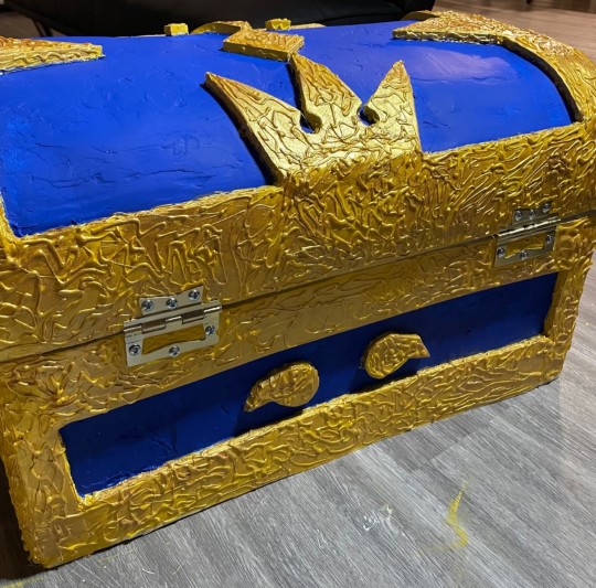
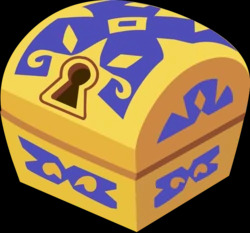
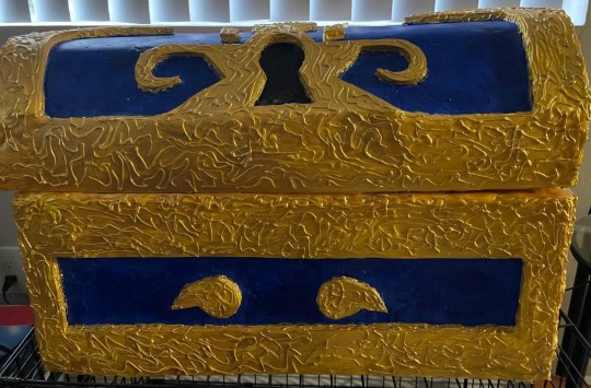
OOAK Kingdom Hearts Chest
Hey party people!
So a while back, I had two boxes that were from a DIY Thanksgiving kit and thought, "wouldn't it be cool to make a Kingdom Hearts Chest?" As a kid, I've always wanted one-and now that I'm old enough to buy the materials, now's the perfect opportunity. Funny yet, later on the process, I've decided that it wasn't going to be for me but for my nephew in his upcoming baby shower. I bought a lot of gifts for him so I thought this would be a cool add-on.
Here I will send you screenshots as well as my thought process/encounters; First off, materials.
I have used the following (Quantity depends on the sizing of the box):
Cardboard (I recommend stiff boards), Acrylic Paint (Warm Yellow, Blue, and Black), Door Hinges, Paint Varnish, Modeling Foam*, Foam Rolls*, fabric, Spackling, scissors, x-acto knife, plaster rolls. Sanding paper or blocks.
*I recommend using Worbla instead of both the modeling foam and foam rolls, I explain why further down.
DISCLAIMER: I'm no professional. I will be pointing out the flaws that I've encountered throughout the process-it is up to you if you want to follow along or find a better alternative.
First off, here's what we are working with. Ideally the shape is more rounded I bought about 3 to 4 stiff boards to act as my foundation. After I've placed the stiff boards down in place, I then placed some plaster rolls to hide the seams from each stiff board planks.
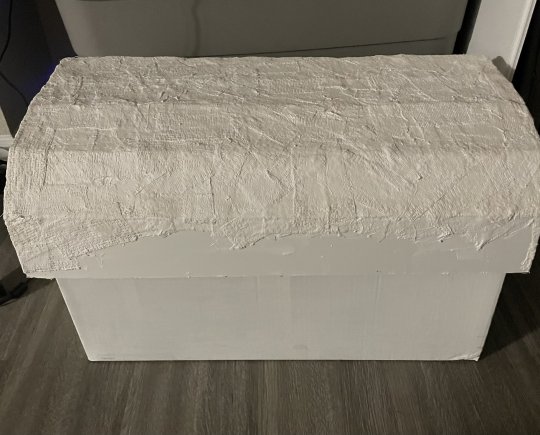
At this point, I figured the bottom looked weird. So I did the same process for what I've done on the top.
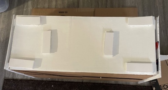
I'm glad that I ended up doing this because I knew the cardboard base was not going to hold for a while. I've made some supports (don't know what these would actually be called) so that I don't have to stack the stiff boards two or three times. If this was regular cardboard, I wouldn't do it since cardboard's weak when it comes to carrying weight, but luckily this held up throughout the process of making it.
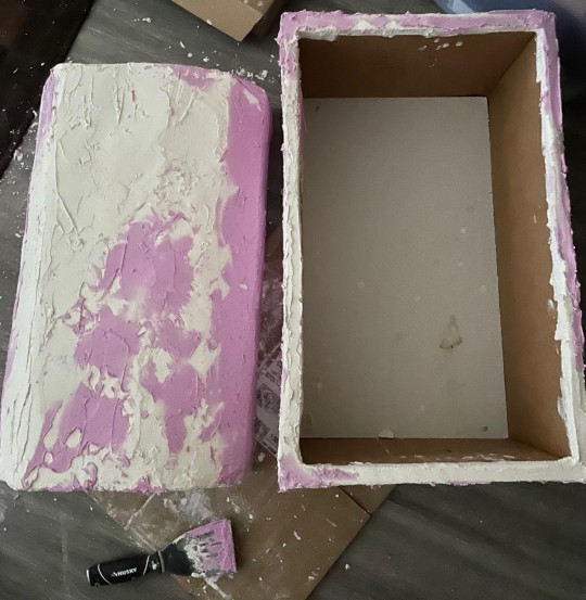
Time for the speckling.
Overall, this process was overwhelming. At this point, I thought I messed up since the speckling didn't want to adhere to the chest at first. However, with lots of patience and elbow grease, I've managed to get it done! I had to do this in multiple layers since soft speckling tends to go everywhere. When it's harden, it's easier to work with.
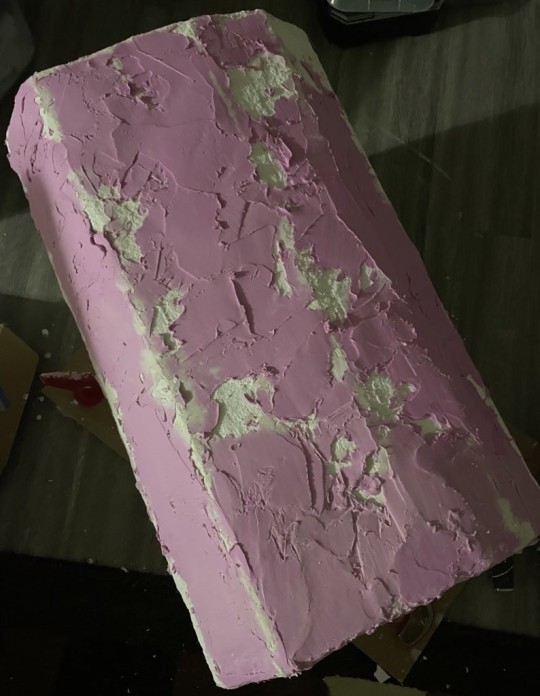
Oh, and yes this step was very messy. Especially when it came to sanding.
Overall, the chest ended two of my sanding block's lives and created a huge mess. Please sand with caution; don't inhale the dust! I know that there are methods to reducing the dust flying everywhere (like using water), but I was afraid to do since I've never used speckling for a project before; not sure if it would affect the cure process of some sort.
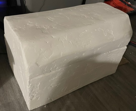
Once sanded, I then made a sketch of where everything will be going and how I want the pattern to be. I knew I wanted to make my own version of the chest instead of trying to make it a carbon copy of it, so I've implemented some key parts (like the keyhole and crown), but everything else was loosely altered.
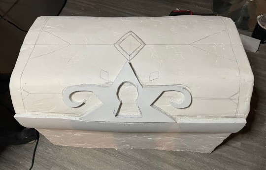

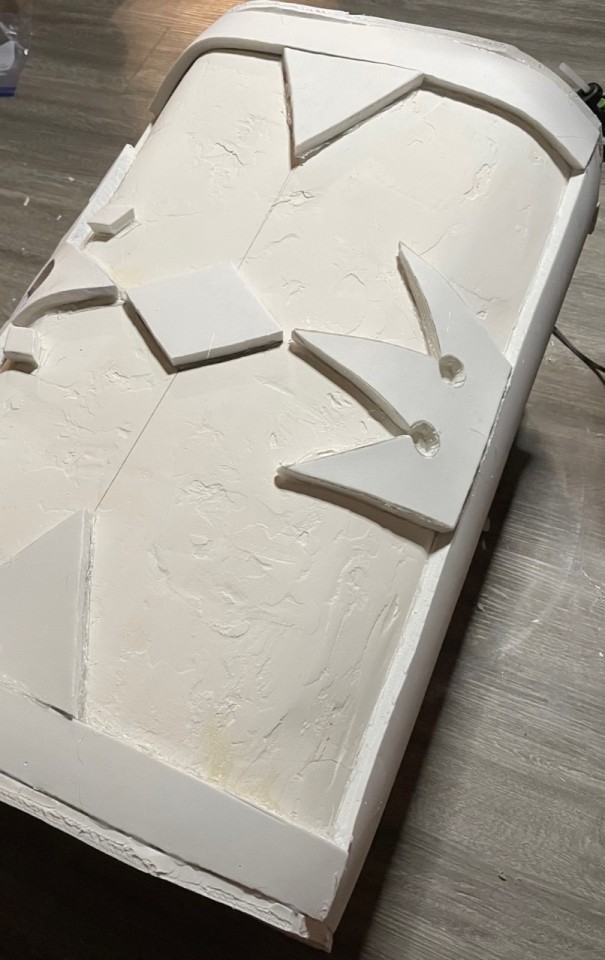
Just cutting the keyhole alone took me about 2 hours. I wanted to make sure that it was symmetrical and stayed in place nicely. I used Foam Rolls to create the trimming however I highly recommend using worbla instead. My local art store did not have any more worbla so I figured that this was another alternative. I found it difficult to work with and when gluing it in place, it would want to come out. Worbla tends to get sticky when heat is applied so glue might not even be necessary if you plan on applying a lacquer on the entire chest.
To hide the foam seams, I decided to use modeling foam. This...was another medium that I found interesting. Applying it is not as difficult but when it's exposed to air for about 10 minutes, the foam gets extremely sticky. Imagine slime without the activator, or imagine playing with a melted marshmallow. Again, it would just be easier to use worbla.
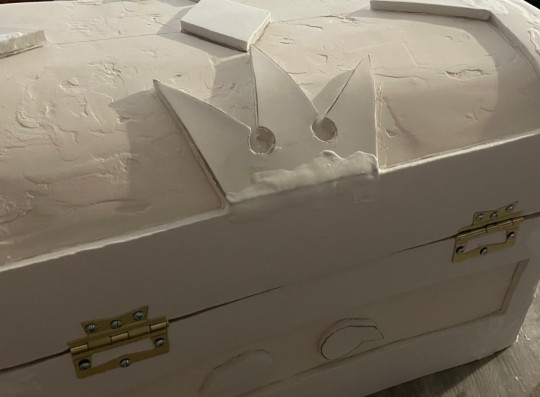
I knew I wanted the chest to open...like a chest so I got some door hinges. So the screws provided were too small for the chest so I ended up buying longer screws. Overall, I wish I had a drill to better secure the screws and bolts together, but not the worst thing ever. Still stays in place.
The paint job was fun, but difficult..my goodness...
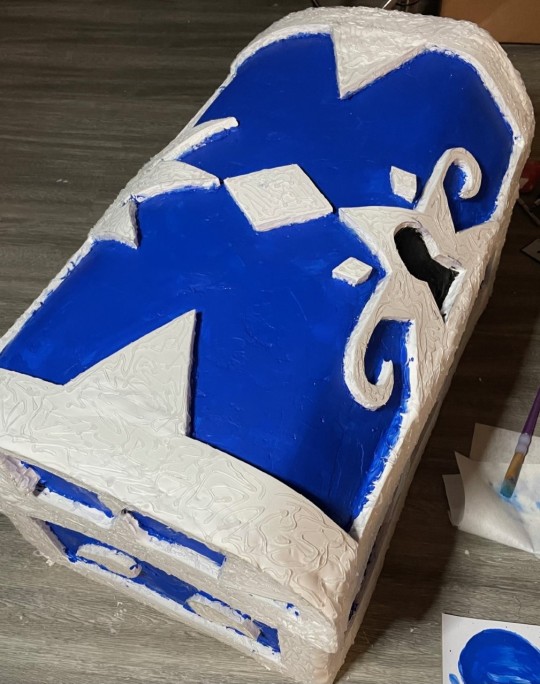
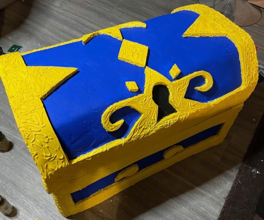
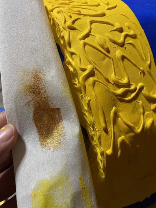
I knew the modeling foam would stick out like a sore thumb and unlike other clay or pastes, you can't sand it. So I got my hot glue and created some texture which I think did a well-good job on hiding the foam. While contemplating about the overall design, I thought it would be cool to give the yellow a metallic, gold sheen to it. I thought it was a good move. I love how the hot glue sticks out with the gold compared to just using the yellow paints.
Oh the inside... It's a hot mess.
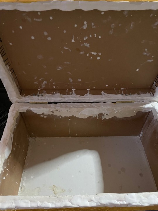
Instead of trying to paint, sand and use even more modeling foam. I've decided to hide this ugly mess with some fabrics that I have around from previous projects.
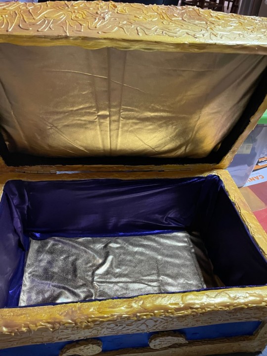
I've glued some gold fabric onto some felt (not necessary to be honest). and applied it on the base and the roof of the chest. I didn't have any blue fabric but I did have some shiny purple fabric. I think it works well with the gold.
(I know the base looks like silver but I guarantee you that it's gold)
After applying two layers of lacquer to prevent the paint from chipping, I'm finally done!
So happy with how this turned out! To be quite honest, this project took forever to finish. I think I spent about 15 hours on it? I know for some people, that sounds ridiculous but let me remind you that this is the first time for me and this entire project had a lot of trial and error.
I know there's a lot of flaws with it but one thing about me, I like to cherish my artwork-even if it's a hot mess.
Self Critiques:
Not use foam rolls/ modeling foam but rather worbla.
Pay more attention to how the chest looks opened and closed
Be more patient when applying the fabrics inside the chest. It looks messy in my opinion and I know I could've been more patient when cutting and folding the seam allowance.
Invest in a drill. the latch is not exactly the most secured when opening.
#ooak#kingdom hearts#instructions#chest#treasure chest#kingdom hearts treasure chest#kh#life size#life size chest#twitchartist#twitchstreamer#art#smallartist#digitalart#etsy#commissions#commissionsopen#twitch#crafting#smallcrafter#blue#gold
48 notes
·
View notes
Text
first time going to a con i was so nervous lol 😅
+ sometime you just snap and do that thing you've been thinking of for over a year on all fears casted from what's meant to be a rough start
(i was so happy when i was doing this (not as happy as writing something concrete but still a good level) i should do it more often so i can get better at it. The photos close-up do amplify so many flaws, and i'm learning my ways throught different medium. but boy, don't you have to be so patient with these stuff)

this still looks too soft lmao i'm not sure what to do next esp. with Suvi(ig)'s brilliant example. I wanna try using this sculpt on Rhayme and see how it looks. I realize the green top mtm actually is the dimple sculpt i really liked from Pop Star! so I waana use her for Riyo. Then, I'm thinking of getting a few more of the Looks girls…
The first one on my list is Viktoria, (then a winged demon whispered, "The two tall girls would look so good next to each other…"). I thought about getting either Kit or Tamika for the body swap with FoDka too often, even though that body would be too small for any clothes i already made, and possibly disproportionate with her big cartoon head… but then i thought i could just swap their head on an mtm-
So I'm leaning towards Tamika because she's the last one from Wave 2A I didn't have and I really liked the tones in her hair, bur color-wise Kit's probably a plainer canvas… (and she's a little bit cheaper…)
Anyway, probably going back to the original FoDLeia swap plan any way. Two weeks ago, I painted them with acrylics and plugged the head off. But presumably, a few hours isn't enough for it to dry and the paint SHEDS like snakeskin when i tried to plug the new head in (sidenote: it was surreal seeing a "naked" soka), so I just threw it aside, dejected. But I found them last night and the paint is much better adhered. I think it could still work if I take it serious with a good sealant.
I don't want the holiday dress tradition to break its streak just three years in, but there's a possibility Dka might have to stand in if I can't fix her big sis in time (and I also want to make pair outfits [wink]). Either way I'm going to make something simple with stock fabrics :)
1 note
·
View note
Text
How to make Glow in the Dark Spray Paint
Making your own Glow in the Dark Spray Paint is a fun and easy project that anyone can do! You just need a few simple ingredients and some basic supplies.
This article will show you how to make your own Glow in the Dark Spray Paint using everyday items that you probably have at home.
Let’s get started! But first, a small definition.
What is Glow in the Dark Spray Paint –
Glow in the dark spray paint is a type of paint that contains a phosphorescent pigment. When the paint is exposed to light, the pigment absorbs the light and stores it.
Once the lights are turned off, the pigment will glow in the dark for some time. The duration of the glow will depend on the amount of light that was absorbed, as well as the type of pigment used.
Some pigments only provide a brief glow, while others continue to shine for hours. Glow in the dark spray paint is commonly used for decorative purposes, but it can also be used for safety markings and safety signs.
What you will need –
To make your own Glow in the Dark Spray Paint, you will need the following items:
1. A clear plastic bottle with a spray nozzle (empty water or soda bottles work great)
2. A measuring cup
3. A funnel
4. A teaspoon
5. A black-light (optional)
6. Glow in the dark powder (check the best ones)
7. White glue
8. Water
9. Clear acrylic sealer (optional)
How to make the Spray paint –
1) Mix the glow in the dark powder with water –
Start by measuring out 1 teaspoon of glow in the dark powder into your measuring cup. Add 2 tablespoons of water and stir until the powder is completely dissolved.
2) Add the glue and mix well –
Next, add 1/4 cup of white glue to the mixture and stir until everything is combined.
3) Pour the mixture into the spray bottle –
Use the funnel to pour the mixture into your empty spray bottle.
4) Add the sealer (optional) –
If you want your Glow in the Dark Spray Paint to be more durable, you can add a few drops of clear acrylic sealer(check best ones) to the mixture. Stir well, and then your paint is ready to use!
How to use your Glow in the Dark Spray Paint –
Simply aim the nozzle at your desired surface and press down on the trigger to use your spray paint. The paint will dry clear, so don’t worry if it looks like nothing is happening at first.
Once it’s dry, you’ll be able to see the glow in the dark effect! For best results, charge your paint with a black light before using it in the dark. Enjoy!
Tips and tricks when working with Glow Spray Paint –
1. If you want to make a larger batch of paint, simply double or triple the ingredients.
2. Store your paint in a cool, dark place when you’re not using it.
3. For best results, use a high-quality glow in the dark powder(check the best ones).
4. If you want a more opaque paint, try adding less water to the mixture.
5. You can also add food coloring to the paint for a fun and colorful effect!
6. Don’t forget to charge your paint with a black light before using it in the dark.
7. Have fun and be creative! There are no rules for making your own glow in the dark paint.
Other ideas for using Glow in the Dark Spray Paint –
You can use Glow in the Dark Spray Paint on many different surfaces; just ensure you test it on a small area first! You can also use it to make fun and creative projects like these:
1. Make your own glow in the dark stars for your ceiling!
2. Use it to write secret messages that can only be seen in the dark.
3. Paint a picture or design on a wall and watch it glow in the dark.
4. Make your own glowing party decorations.
5. Create a cool, unique piece of art.
6. Whatever you can imagine!
FAQ –
Can I use this paint on the fabric?
Yes, you can! Test it on a small area first to ensure the paint doesn’t bleed through. You may also want to add a few drops of fabric medium to the mixture to help it adhere better to the fabric.
Will this paint wash off?
No, the paint is permanent once it dries. You can add a few drops of clear acrylic sealer to make it more durable.
Is this paint safe for kids?
Yes, the paint is non-toxic and safe for children to use. However, we recommend that adults supervise children while they are using the paint.
Do I need a black light to use this paint?
No, you don’t need a black light to use the paint. However, the paint will glow brighter if it is charged with a black light before use.
Can I make smaller or larger batches of paint?
Yes, you can easily make smaller or larger batches of paint by adjusting the number of ingredients you use. Simply follow the ratio of 1 teaspoon of powder to 2 tablespoons of water and 1/4 cup of glue.
How long will the paint last?
The paint will last for many years if it is appropriately stored in a cool, dark place. However, the glow in the dark effect will gradually fade over time.
What can I use the paint on?
You can use the paint on just about any surface, including walls, ceilings, wood, metal, glass, and fabric. Just make sure to test it on a small area first to see how the paint reacts with the surface.
{"@context":"https://schema.org","@type":"FAQPage","mainEntity":[{"@type":"Question","name":"Can I use this paint on fabric?","acceptedAnswer":{"@type":"Answer","text":"Yes, you can! Just test it on a small area first to ensure the paint doesn't bleed through. You may also want to add a few drops of fabric medium to the mixture to help it adhere better to the fabric."}},{"@type":"Question","name":"Will this paint wash off?","acceptedAnswer":{"@type":"Answer","text":"No, the paint is permanent once it dries. You can even add a few drops of clear acrylic sealer to make it more durable."}},{"@type":"Question","name":"Is this paint safe for kids?","acceptedAnswer":{"@type":"Answer","text":"Yes, the paint is non-toxic and safe for children to use. However, we recommend that adults supervise children while they are using the paint."}},{"@type":"Question","name":"Do I need a black light to use this paint?","acceptedAnswer":{"@type":"Answer","text":"No, you don't need a black light to use the paint. However, the paint will glow brighter if it is charged with a black light before use."}},{"@type":"Question","name":"Can I make smaller or larger batches of paint?","acceptedAnswer":{"@type":"Answer","text":"Yes, you can easily make smaller or larger batches of paint by adjusting the number of ingredients you use. Simply follow the ratio of 1 teaspoon of powder to 2 tablespoons of water and 1/4 cup of glue."}},{"@type":"Question","name":"How long will the paint last?","acceptedAnswer":{"@type":"Answer","text":"The paint will last for many years if it is appropriately stored in a cool, dark place. However, the glow in the dark effect will gradually fade over time."}},{"@type":"Question","name":"What can I use the paint on?","acceptedAnswer":{"@type":"Answer","text":"You can use the paint on just about any surface, including walls, ceilings, wood, metal, glass, and fabric. Just make sure to test it on a small area first to see how the paint reacts with the surface."}}]}
Conclusion –
So, there you have it! How to make your very own Glow in the Dark Spray Paint. This is an enjoyable project to do with kids, and it’s also a great way to add some excitement and spookiness to your next Halloween party.
If you try this project, be sure to share your results with us on our social media channels. We can’t wait to see what amazing things you create!
from WordPress https://ift.tt/sMcpT92
via IFTTT
0 notes
Text
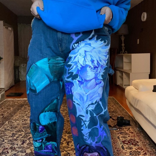
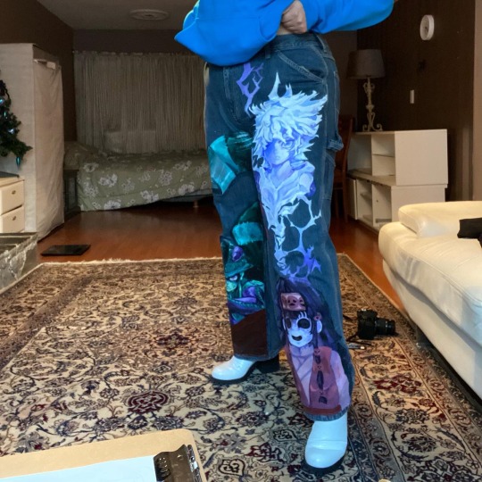
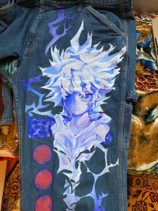
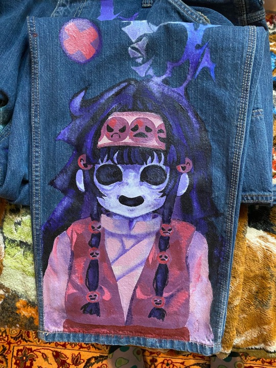


My cringe ass hxh jeans I grinded on a while ago
#hxh#hunter x hunter#killua zoldyck#hxh alluka#meruem#alluka zoldyck#killua hxh#chimera ant king#chimera ant arc#I wore this a total of TWO times because I really don’t wanna wash it#I used an acrylic medium for it to adhere better to the fabric#but still spooky#ignore my background please god
460 notes
·
View notes
Text
Party-size Paint By Number Projects
Need to paint a Photo of yourself? or then again re-live a memory of a lifetime? Send us your photograph and we will send you its adaptation of Paint by Numbers Kit. Make your own showstopper with Numeral Paint DIY paint by numbers unit. It is the ideal initial Personalized paint by numbers step for novices to appreciate the craft of painting. Paint your own divider craftsmanship, regardless of whether you have zero imaginative capacity. Also, it very well may be confined to be a magnificent design for your home.

Why you should arrange:
Improve Relationship: Share the enjoyment of painting with your family or companions. Accomplishing something innovative together helps a great deal in associating individuals. you can likewise amaze somebody you have with him an old story by giving him a chance to draw, find and recollect that extraordinary minute.
Unwinding and Joyful: Take your psyche off the tensions of the work day and your poop manager. Who needs treatment when you have paint by numbers?
Simple Drawing: You don't need any essential expertise of painting to do this. We will give you a guidance manual that is extremely simple to pursue and regardless of how great or poor you are at illustration.
youtube
Blessing Choice: If you are in a bad position finding a proper blessing, this is the perfect arrangement. DIY paint by numbers pack is an entirely decision as a present for Christmas, Thanksgiving Day, New Year, Birthday or different events. Inventive and Educational: This action helps with creating numerous great propensities in youngsters, for example, tolerance, focus, assurance, insight and so on.
What's in the bundle?
1x Numbered acrylic paint set (About 24 unique hues, contingent upon the artistic creation)
1x Numbered superb material canvas
1x set of 3 paint brushes (1x little, 1x medium, 1x huge)
1x hanging unit, including 2x screws and 2x non-track hooksTurn your most loved picture into your very own Paint by Number for a really interesting, stand-out magnum opus!
Basically transfer your image above, or email it alongside your request number to [email protected] after you have put in your request, and we will deal with the rest!
For tips how to accomplish the absolute best outcomes for your customized paint by numbersYou bring your imagination, we deal with the rest
Make a showstopper that you can hold tight your divider or give as a blessing, all while having a fabulous time and diminishing pressure! This satisfying, scripted DIY paint by numbers venture accompanies everything that you need go to from a clear, stamped canvas to a bit of cleaned fine art. Everything necessary is a little persistence and a spotless paint brush to make work of art that is certain to rouse discussion.
Your unit incorporates the canvas, paint, brushes, and hanging pack, so you don't need to be an occupant craftsman or even have your very own specialty supplies to succeed. Basically paint inside the lines agreeing with the comparing hues and watch the canvas come to life.Design your own special paint by numbers canvas with a customized print. Transfer your most loved photograph or configuration to make a custom paint map. Everybody will love the measure of time, care, and inventiveness that you put into the venture; also, the completed outcome will stagger. Paint a family representation for relatives, finish your home with painted photograph recollections, or make a painted form of your most loved selfie for no particular reason. The blessing thoughts are perpetual!
Any picture can be transformed into a paint by numbers creation and there are a wide assortment of sizes to look over. It's anything but difficult to transfer your picture straightforwardly onto the site. We prescribed picking a composition measure that intently coordinates the image's viewpoint ratio.CUSTOM DIY PAINT BY NUMBERS KIT FOR ADULTS. Presenting Custom Paint by Number packs! Transform your most appreciated individual photographs into Personalized Custom Paint by Number packs. The PERFECT blessing thought for any event!
Remove the battle from Struggling Artist!
Release your inventiveness with EASY, FUN, BEAUTIFUL DIY paint-by-numbers packs for grown-ups. Spend a loosening up night in and make your own great divider workmanship.
**Design not found in stores**
Why you should arrange:
Incredible GROUP ACTIVITY - Spend an extraordinary night in with the young ladies (wine prescribed)
DIY HOME DECORATION - Paint your very own divider workmanship, regardless of whether you have zero masterful capacity
Immaculate GIFT IDEA - Whether it's for a birthday or Mother's Day, give a present they'll adore
Unwind. Take your brain off the nerves of the work day and your poop supervisor. Who needs treatment when you have paint by numbers?
Gracious, and did we notice..
**FREE SHIPPING** We ship to anyplace on the planet at definitely no expense to you. As we fabricate our packs abroad, it should take around 12-20 days for your request to arrive. On the off chance that you request mutiple, you may get different bundles.
**100% SATISFACTION GUARANTEE** If you're discontent with your buy under any conditions by any means, we'll be upbeat to discount you 100% of the price tag. No inquiries, no issue.
Need assistance with your buy? Converse with a human and give us an email at [email protected] or hit us up on Facebook!
I'm in - what's in the bundle?
- 1x numbered acrylic-based paint set
- 1x pre-printed numbered top notch canvas
- 1x set of 3x paint brushes (Varying fibers - 1x little, 1x medium, 1x huge)
- 1x hanging unit, including 2x screws and 2x non-track snares
- 1x set of simple to-adhere to directions for useEverything you need is incorporated into the pack to finish your artwork. There's even a card mounting edge to complete it off pleasantly. You should simply pursue the number guide and apply the paints. There's no surge, simply take a seat, unwind and appreciate the experience. When complete, you and your companions will be flabbergasted at what you have created!A photo is great however an artwork? That is ARTISTIC. With custom paint by numbers you can get your pictures, wedding photographs, your pets' photographs or some other photograph you need changed over into a canvas for a depiction. Make your very own custom units and have a great time painting anything you desire or reproducing your most loved minutes on canvas!
We can change over any of your photos or recollections into the ideal painting canvas. What's more, learn to expect the unexpected. This is likewise the ideal blessing as you can give a companion or a friend or family member, an artwork of a unique minute in their life extraordinarily painted by you!What's New in Custom Kits?
You disclose to us what you need to paint!
A remembrance for a lifetime as you can reproduce recollections
A customized blessing or the ideal expansion to your divider
You can likewise give benefits by requesting custom packs for customer photos and paint for them!
The fun never stops!
It's anything but difficult to arrange and the packs are profoundly reasonable
Request now and you'll perceive how straightforward it is!
For what reason Should We Be Your Choice?
We ensure astounding items
We offer a 360-day merchandise exchange
Consumer loyalty means the world to us
We have a solid notoriety
Email bolster is accessible day in and day out at hi at-allpaintbynumbers.com
Reasonable rates and FREE Shipping.
Pretty much All Paint by Numbers
As a famous organization giving brilliant items, our highest qualities incorporate uprightness, reliability, and uncommon client administration. We mean to keep on giving astounding paint by numbers packs to our regarded clients so as to enable them to benefit as much as possible from their ability, spread liveliness and delight, and empower positive emotional wellness. We endeavor to give the most elite and nothing less!
Prepare yourself for a "supernatural occurrence" that paint by numbers is. The experience of illustration a brush aesthetically on a cloth canvas is precious. Also, the sentiment of finishing a perfect work of art like the one you are seeing on the left side is extremely valuable. So let the Painting make you with our flawless paint by number units.
Default Size: 40x50 cm/16x20 inch. On the off chance that the size isn't referenced in the item (varients), the size is 40x50cm. In the event that there are different sizes in the variations, you can look over there.
What will happen when I paint?
It will makes you feel "loose".
It drives off the "stress".
Makes you feel "more joyful".
Painting makes me "center" better.
It enhances the in general "psychological wellness"
Last yet not the least, it upgrades your "artwork abilities" since training makes a man perfect.When I made those a large number of you needed to realize how to transform a photograph into paint by numbers. I utilized Photoshop and Illustrator for that. It worked fine, yet it took me a super lengthy timespan and a great deal of calibrating by hand. In addition, the vast majority of you most likely don't approach that product.
Luckily, I found a free paint by number apparatus on the web!
So today I'm demonstrating how you can make your very own paint by numbers with your most loved picture highlighting DecoArt Americana Premium acrylics and free paint by number transformation software.Paint by numbers for grown-ups implies getting the chance to do it absolutely your way, isn't that so?
So I'm going to tell you precisely the best way to make a free paint by numbers format from your own photograph, comfortable. While this is best done from a PC or tablet, in case you're searching for a paint by numbers application, PBNify will at present work from a telephone. It's surely worth a strive for a less muddled image!tart with a photograph that is as straightforward as could reasonably be expected and has great complexity. I utilized this pretty bloom from Jeon Sang however transformed it from lavender to a greater degree a pink coralThe more hues you pick, the more detail your paint by numbers layout will have. In any case, each snap is another shading you need to paint, so locate a cheerful medium.Once it's changed over, you can click forward and backward among "filled" and "diagram" to perceive what the format resembles.
Here's the primary principle for picking the best inside paint—purchase top quality, top brand paint. These exceptional paints are demonstrated to give more inclusion in less coats, frequently disposing of the need preliminary.
To pick the correct shading for your space, get bunches of paint chips, place them on the divider close to the trim, and take a gander at amid various occasions of the day to perceive how light influence the shading. When you're prepared to begin testing shades, paint test hues onto sheets of overwhelming paper rather than the divider so you can move them around and not make a wreck of your dividers.
In conclusion, picked a sheen to coordinate the necessities of the space. Level completions shroud flaws well and ingest light which can make the paint look darker. Eggshells and silks are extreme enough to be utilized in family rooms, children's rooms, and foyers yet don't shroud surface flaw well. Semi-Gloss and polished completions are principally utilized for trim since they highlight woodwork subtleties and tidy up effectively.
You'll effectively locate the best inside paint hues for your home, from the best brands, here on the web and at your neighborhood Home Depot. Our proficient store partners can enable you to shading match paint from practically any brand to get the shade of your craving. We've likewise got you secured on all the basic painting supplies, including paint brushes, coverings, drop materials, plastic sheeting and more.Our group has some expertise in conveying a wide scope of administrations, impeccable to meet your requirements. We endeavor to make a bias free and receptive condition so as to give the best help to satisfy your vision. Regardless of what your vision is, be it for a private, modern, inside or outside task, we are the ones you need to make it a reality.Everyone can paint with Painting by Numbers. On account of the basic painting system, it's anything but difficult to end up a craftsman. Get some paint and a brush and make your own interesting gem . Or on the other hand blessing your friends and family Painting by Numbers with your own photograph. With our Paining by Numbers Generator you can make your own exceptional painting set with your very own image in only a couple of snaps. At that point your fruitful depictions, wedding photographs or pet photographs will transform into interesting mementos!my Painting by numbers - transfer your very own photograph and plan your very own extraordinary show-stopper
Making your very own Painting by Numbers is simple utilizing the Ravensburger Painting by Numbers Generator. Effectively transform your image into a point by point painting layout. Pick between 2 canvas sizes; 20 x 20 cm or 30 x 24 cm. The numbered painting areas and the amazing acrylic hues transform your photograph into an individual perfect work of art. Obviously, with each myPainting by Numbers, you likewise get a coordinating quality paintbrush.
Painting by Numbers - your very own structure decides the trouble
Ravensburger pursues a detailed procedure to make an individual painting format from your image. The choice of structures is essential: Pictures with the biggest conceivable surface and distinctive hues are less demanding to paint than little subtleties. For instance, vast configuration pictures of individuals or creatures where you can plainly observe the entire of the face are perfect. It is vital that the image layout is sharp and sufficiently bright. In our tips and deceives, you can study how you accomplish the ideal outcome for your photograph Painting by Numbers.
When you have made your Painting by Numbers, you will get an email from us inside 2 days which will incorporate a connection to various proposals for your artistic creation layout. Select the plan you like best. When you have affirmed the plan, we will start creation of Painting by Numbers with your picture.Suitable for children of all shapes and sizes from 7 years of age (contingent upon the structure)
Channels and impacts in the Product Designer grow your imaginative alternatives
Each Painting by Numbers is delivered independently in our production line and checked by our own strict quality criteria
Conveyed in a powerful box, you can pick your own diverse plans and customize the container with a welcome or title
Customized Painting by Numbers - the inventive blessing thought
Be it commitment, Mother's Day or for another event, a cherishing and individual photograph blessing is dependably a superb astonishment. Bring your customized Painting by Numbers plan to life and watch the eyes of the blessing beneficiary light up.Custom Paint by Number Canvas From Your Photo
1 note
·
View note
Text
Getting Tired Of H&c Decorative Concrete Sealer? 10 Sources Of Inspiration That'll Rekindle Your Love
Vital to ability wash to start with and allow quite a few days to totally dry out after that. 2nd coat only spots with higher site visitors or where by rain puddles. Amazon was best rate I could locate everywhere. I used six gallons for my extremely huge region but saved thousands more than various "Experienced" quotes.
This is comparable to oil and water based paints not mixing. They won't adhere to each other and you should have a large number on the hands. In order for you your concrete to possess a substantial gloss, Deco-Crete Supply's Diamond Shine is an efficient choice. If you want a matte end, Tremendous Stamp Seal, is a great sealer. Yet another issue you may want to take into account is incorporating an anti-slip additive from the sealer which adds traction for the surface.
Nevertheless, a mechanical system may match in selected situations. Soda blasting, a much less aggressive mechanical process, happens to be far more extensively utilized recently to get rid of sealers and coatings correctly. Soda blasting makes use of Distinctive high-stress blasting products with commercial-quality baking soda granules because the blasting medium.
Great recommends employing a complete sander to buff away any remaining bits of sealer. Hicks touches up by using a scrub brush.
If anyone looking through this site has any thoughts whether you are a Homeowner or Contractor I stand prepared to assistance and might be achieved by electronic mail at Ted@break up-rok.com.
In the beginning it seemed good. A couple of days later it appeared awful. Contractor claimed it can be colder out so it ought to be far better when it warms up. It'll be 60 tomorrow. I'm fearful that it had been a temperature concern While using the sealer or sand issue. Initial pic could be the day sealer was used second was a couple of days later. What do you believe? Any advice would be appreciated 014AC989-D9E6-4C1F-8A21-13041B439ACF.jpeg 6138B1EA-99AA-4B10-A71F-D5C273BCB644.jpeg FA11B5ED-85E8-43F5-85DE-8C418E33FB38.jpeg 86041984-BDDB-4F37-8D09-D2DEB8476AE6.jpeg "set":null,"listing":null Reply Share We are going to reply on your remark shortly The Sealer Shop · 10/22/2018 It is going to need to be stripped to fix. Appears like it could be sand caught to the top of the area beneath the sealer. "set":null,"listing":null Reply Share We'll reply to your comment shortly Sal Denaro · 08/27/2018 Humidity in sealed pavers, I do not Believe this patio experienced adequate the perfect time to dry just after being damp. Whenever we sealed with SRW lower luster the pavers appeared dry but I think humidity was underneath. How am i able to repair this issue 0827181042.jpg "set":null,"record":null Reply Share We're going to reply to the remark shortly Sal Denaro · 08/27/2018 Alright, I prepared on An additional coat but I failed to intend to make it worse by putting additional sealer on and further trapping in dampness. I've been in business 18 years, initial time I've viewed this and the first 1 where by I did not Individually set down the sealer. So I could just need An additional coat. Howevere it stays soaked like this for days. Now we have had lots of rain along with the sprinklers are on lots. The grass outside the world is soaked. "set":null,"list": "two":1 Reply Share We're going to reply for your remark Soon The Sealer Keep · 08/27/2018 It may need to have An additional coat as tumbled pavers are very porous. Do a check place. "set":null,"listing":null Reply Share We'll reply towards your remark Soon Fred · 08/07/2018 Used Solvent sealer to pavers looked good . 50 percent hour later surprising Tian shower, now white places in all places? Recommendations "established":null,"list":null Reply Share We will reply to the comment Soon The Sealer Retail store · 08/08/2018 Utilize this to repair: "established":null,"record":null Reply Share We'll reply for your comment Soon Sheila · 08/07/2018 I've applied a patio sealer blended with a few patio powder dye it has dried but when I rub my hand across the slabs it comes off as well as the black will come off onto my toes any suggestions you should "established":null,"record":null Reply Share 1 two 3 four 5
Enter ZIP code or city and condition or Enter store quantity Keep selection should be possibly 4 digits or alphanumeric (ex: 1234 or A123)
Satin to Semi Gloss overall look allows for far more natural glance and would not give the more than powering far too darkened wet seem like solvent based sealers do. Brings out the natural colors much better, including their refined nuances, although enhancing the concrete complete.
“You’re solving anyone’s challenge, which means you’re in the middle of a damaging problem in place of a optimistic a person. If there’s ever a time for expectation management, it’s stripping and resealing.”
When MasonrySaver Decorative Concrete Sealer starts to appear worn about the area, an individual coat of fabric may very well be used the moment area continues to be properly ready. For surfaces that were waxed, follow the waxing products's label directions for protecting the waxed area.
Chapin is a leading company of industrial strength sealer sprayers. Spray the floor working with an excellent forwards and backwards movement Using the sprayer wand.
They seal from in just by creating an ambiance that just won’t permit water to enter. It’s similar to filling a cup with molten wax, then attempting to increase water as soon as the wax has hardened. Since the House is now occupied using a waterproof substance, there’s nowhere for the water for getting in.
Definitely, the most well-liked and successful solution is employing a chemical stripper. This really is strongly advised for decorative concrete. You need to maintain the color and profile with the concrete which is amazingly critical. Chemical strippers have altered substantially through the years, providing additional environmentally friendly products and solutions.

youtube
Up to now, eradicating acrylic from concrete necessary using dangerous solvents like xylene. The solvents Utilized in regular strippers (xylene, toluene and mineral spirits) are thought of harmful because of the EPA and OSHA.
0 notes
Text

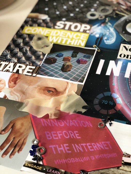
Moodboard
To start our mixed media workshops off, we firstly were each given a word pulled from a hat. My word was ‘INNOVATION’ - meaning a new idea/device/method. From here, we had to produce a moodboard using anything we wanted (printed images, words, collages, colour palettes, magazine cutouts etc).To begin my moodboard, I wrote out a list of things the word innovation brought to my mind. This list was as follows:
brain → thoughts → cogs → lightbulbs
inspo → ideas → imagination
creativity
success → business
technology → medical advances → mechanics → prosthetics → bionics
transformation → rearrangement → change → alter
From here, I chose the starting points that I felt were most interesting, which to me excluded the business/success area, and went more for the transformation and medical advances area. Then, I began to find images on the internet of prosthetics and bionics, as well as items I felt fit into the transformation and ‘new idea/device/method’ definition. This included things such as smart textiles → thermochromatic beading, uv fabrics etc; innovative packaging and product designs → new ways of lighting and packaging every day objects; as well as completely out of the ordinary architecture.
I also wanted to include prosthetics, so brought in 3D areas - adding nuts and bolts to represent the machinery and torn sections of latex and skin coloured balloons to replicate this.

Alongside this, my moodboard included words cut from magazines, which focussed on the element of creativity and superiority → ‘more features’, ‘more space’, ‘confidence within’; all which make me think of something that is a new idea/method - whoever came up with the innovative idea had to have the confidence to do so, hence the ‘ahhh!’ and ‘behind the nonsense’, and the ‘we the people are the work’ motif; and the idea itself must have been better than older ideas in order for it to be new, hence the repetition of ‘more’ and ‘stare’.

From here, we are to use the ideas from this moodboard to produce a piece of non permanent art to install at college, surrounding our individual word: innovation.
Art Bomb
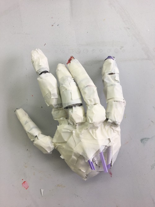
The second mixed media workshop was to produce a non permanent art piece to be placed around college, using any media (but not painting on walls etc.). We were to make our statement as a piece stemming from our moodboard, therefore my piece was to represent my theme ‘innovation’.
My plan for my piece was to produce a bionic hand, following this inspiration image that I found when creating my moodboard, seen above. I was to create the hand and ensure it stayed light enough to be able to adhere it to a window, allowing me to draw the ‘computer screen’ surrounding it. To build the hand, I used newspaper bunched and rolled up to produce each singular finger joint and the palm of the hand. Then, I attached each joint to a straw, keeping the finger print end of the finger connected to the bending section of the straw, and the lower part of the straw connected to the palm of the hand. I attached each finger using masking tape and continued to wrap the tape around the palm to ensure they were secure. Once the base was done, I then covered the structure in paper-maché, to make it more sturdy and one piece.
Once the maché dried, I went on to paint a base coat of emulsion to block out the newspaper print; before then painting the hand using metallic acrylic paint, following the pattern for the joints on the inspiration image. As I painted the structure, I came to realise that the hand was too messy, and the maché had given a rough, folded texture which I didn’t think suited the point of the piece. Instead of continuing to build up the base and trying to make it smoother, which simultaneously would continue to thicken up the fingers - to the point where they were too thick for those of a bionic hand. To move on, I started over again, this time using a different medium as oppose to newspaper and paper-maché - clay. This would allow me to get a much smoother finish, and would allow me to make the fingers as delicate as possible, something newspaper wouldn’t allow me to do. I made each joint and finger separately, as above, then assembled them into the palm of the hand using thin floristry wire. Once air dried, I was then able to paint the structure. I used the metallic acrylic again, firstly painting a base coat of light silver all over the hand.

Then, I went in with a mixture of silver and black for the shadows between each joint. I continued to do so for the patterns across the rest of the hand.
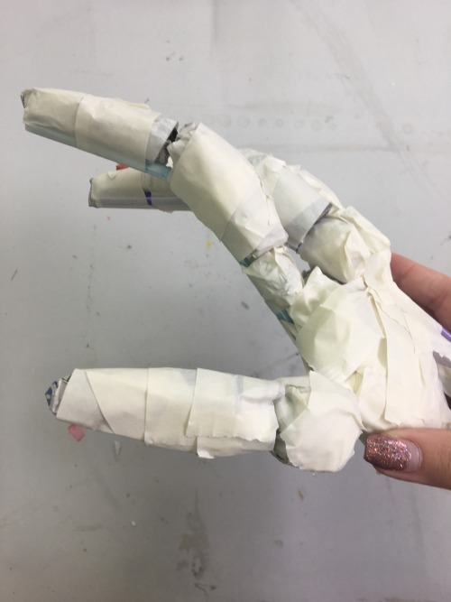
When thinking about this further, I decided that I hadn’t captured the look I had hoped for, and much preferred the style of the paper-maché hand, regardless of how textured it was. I returned back to the original hand, and painted the joints similarly. For my final outcome of this workshop, I photographed the finished hand on an acetate futuristic touchscreen, seen below. with an edited gradient background (done in photoshop).

Whilst I still really dislike the texture, I am much more pleased with this outcome as I feel the joints are much better placed and the position of the fingers is considerably more realistic than the clay hand.
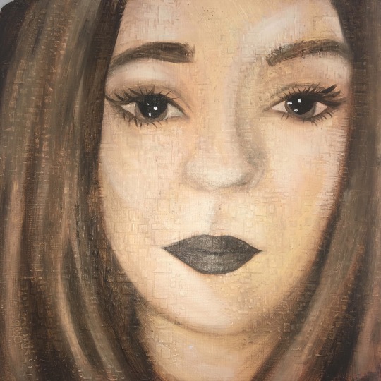
Oil Paint
Our third mixed media workshop was to produce a self portrait using oil paints. We began by coating our board in a layer of emulsion, to give the oil paint something to cling to when painting. After this had dried, we went on to use modelling paste (a mixture of PVA, white acrylic and talcum powder), pushed through a stencil, to produce a raised 3D pattern on the board. This would add an interesting element to an otherwise flat surface. My stencil produced tiny squares and oblongs, a pattern I liked, seen below.

Although I have used and loved oil paints throughout my A-Level, I found this particular technique of layering yellow ochre and burnt sienna as base shadows beneath the fleshy tones a difficult and lengthy one, which I didn’t particularly enjoy. Using the oils watered down considerably with white spirit meant that we were able to continue to layer as much as we wanted to get deeper base tones, but overall to me meant I was struggling to get a strong enough colour when it came to adding actual colours and skin tones, meaning my outcome had a very strong ochre tinge to it which I didn’t like. In past experiences I have found oil to be thoroughly enjoyable and easy to work with, but this technique just didn’t work at all for me. I liked the looseness that drawing our outline with a thin wash as oppose to pencil gave us, however I didn’t think this made up for how ineffective the end outcome was, therefore I wouldn’t use this layering technique again; but it hasn’t put me off using oils and this is a well loved medium for me which I will definitely return to in my development.
Paper Making
Our next mixed media workshop, was to produce our own homemade paper. Once made and dried, we will then use our paper for our upcoming life drawing classes, alongside our graphics and print workshops; and in our general development.The paper making process was as follows:
Cut up lots of paper into small pieces.
Fill bucket with water three quarters of the way.
Put the chopped paper into the bucket and churn with the paper churner.
Fill a large tray with water.
Pour the churned paper into the tray.
Use the sieving frame to scoop paper and drain the excess water.
Transfer the paper to a J-cloth on some newspaper and add any extras (eg. plants, flowers, petals, glitter, sequins, magazine clippings, string, thread etc.) ensuring they aren’t too chunky.
Make sure to ‘pin down’ the corners of the extras with some more of the churned paper.
Place a J-cloth on top and drain excess water, then remove it and leave the paper on drying rack to dry.
I have used this technique before, in A-level, which I used to print on, and it was very effective. Due to producing a whole class batch this time, as oppose to doing exactly what we wanted with a tiny kitchen blender as I had in the past, we were all using the same dye batches and therefore were limited to the colours/extras we were to add in. For this reason, I concentrated on using the plain white tray of paper, and adding in petals and flowers and patches of separately done dyed paper.The first sheet, seen in the scan below, was white with patches of teal and purple dye. I then added in purple flower petals, and matching ripped up sections of teal paper. I really liked the petals, and felt they worked well. The paper was quite thin, which is what I wanted, and ended up to be fairly flat, meaning I will be able to use this one for life drawing/printing on in future workshops.
For the next sheet, I added mini pieces of jigsaw, yellow flower petals, and tiny mixed ripped strips of orange paper. On top, I added glitter, as previously I have liked the look of glitter, however here I regretted adding glitter, as it was too thick and messy looking. I thought the pieces of jigsaw were effective, and using the two tones of orange paper was too, as were the petals.
For my third piece of homemade paper, I experimented with inks, filling a pipette with red and squirting it all over the page, then doing the same again with black. Then, I added glitter, not knowing that in hindsight I wouldn’t like the outcome. Whilst I quite liked the colours I had chosen, I think this was by far the least effective of my papers. The inks just looked messy, and didn’t bleed into the page as much as I had hoped, leaving exact lines and squiggles which I didn’t feel was very effective.
For my fourth and final piece of homemade paper, I used the yellow communal dye tray. This was by far the most effective and my favourite outcome, as the whole sheet was coloured, and my additions of matching yellow petals, leaves and threads were very effective. I will definitely be using this sheet for the printing and life drawing workshops and in my future development.
I additionally produced a 3D cup from my paper, using teal coloured paper, and moulding it around a plastic cup. I then left it to dry, and once done removed the plastic cup from the inside, leaving me with the cup itself. I felt this was very effective, and was inspired to do so after researching Brittany Spencer, a paper maker who produces 3D pieces, reminiscent of childhood, seen below in her ice cream sculptures.
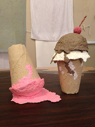
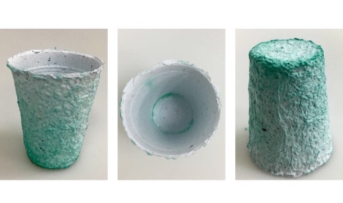
My cup is pictured below. I didn’t actually expect this to work, so in fact I am actually very pleased with the outcome, and would like to further develop this, perhaps adding more than just paper to the object.
To finalise my experience, I would definitely use the paper making technique again, now knowing that the particular type of glitter I used wasn’t effective, and that petals worked well. Mixed tones of paper was more effective than using only one colour, and matching the colour of petals/leaves to the colour of paper also worked best. Overall, colouring the dye tray itself as oppose to adding pipettes of ink worked the best, and therefore this is what I would take further when producing my own homemade paper again.
Mixed Media Sculpture with artist Mark Gibbs
For our fourth mixed media workshop, we were introduced to Mark Gibbs, a mixed media sculptor, who focusses on using wire, recycled electrical goods, cardboard and newspaper to produce his work.
Gibbs first explained his own practice, and challenged us to use ‘contextual analysis’ to analyse his work, trying to pick apart the layers in one particular piece to uncover the meaning behind it. Although I found this very interesting, I do disagree with his view that all art has to have a clear, easy to see story/thought behind the piece. I think this is a very set opinion, and realistically in the real world there is a great deal of art which can be appreciated without clearly being something very specific. There are lots of pieces with meaning behind them, which I covered a lot in my A-level, like Marc Quinn’s ‘Self’, which doesn’t need to be so obvious to have a very deep and thorough meaning behind it. I feel that these sorts of pieces, with meanings that have to be researched to be fully appreciated, as oppose to pieces that very clearly bit by bit tell a story, which I prefer considerably, and appreciate a great deal more; however this is just differing opinions.
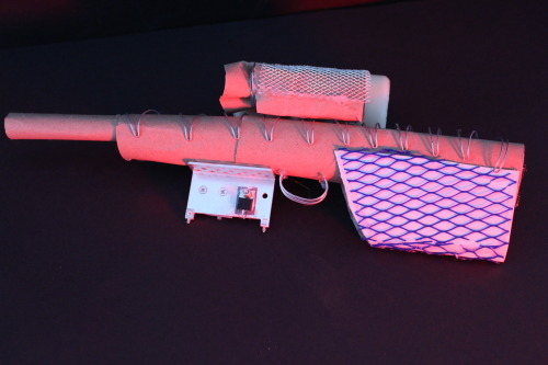
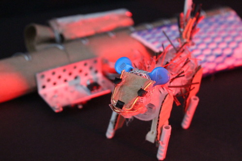
Then, we were told our pieces would depict ‘Craft&Conflict’ and that we were to choose an animal of significance, and an item of ‘military technology’, so I first set about producing some initial sketches of my ideas, in which I wanted my focus to be English Fox Hunting, as my conflict. I chose this idea as I felt it was a different kind of conflict; being more animal rights based as oppose to being ‘military’ as such. My choice of military technology was a gun, and from there I had to choose which animal I wanted to create to go alongside it. I had some options, seen in my sketches below, but settled on the main animal, the fox itself.

From here, I began to build both, steering away from the use of newspaper and paper-maché, and instead challenging myself to use the electrical wires and stiff chunks of cardboard etc. in the same way as Gibbs. This was a new technique for me, and I realised that attaching the wires required hot glue, which looked very messy and took away the more raw, natural aspects of the work. I found the cardboard not malleable at all, and as equally hard to work with as the wire. I felt that it was very hard to make the pieces look professional, and no matter what I did I couldn’t get anything to look anything other than childish. I felt that my choice of creature and weapon meant that it was hard to make anything very intricate and detailed, emphasised more so by how difficult I found the materials and technique to work with.
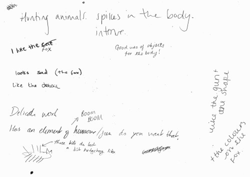
We stopped halfway through our making, and did a whole class crit, in which we each left a sheet of paper out to allow people to write their thoughts on our piece so far. Below, is my page from the crit, with people’s opinions on my piece so far. Gibbs explained that it is good to give both positive and negative points, and that as we grow as artists its important to be able to defend our pieces and explain why we have done certain things. I am pleased with my responses, particularly the ‘the fox looks sad’, and at the time I hadn’t clipped the fur yet so I understand the hedgehog feedback. One thing I didn’t understand, was how there was an element of humour, as I felt that a gun was probably the least humorous object, and couldn’t see any humour in the fox either, other than the large spikes.
After the crit, we were able to go back and continue with our pieces, where I built up some more extra details on the gun, and trimmed the foxes’ fur so they no longer resembled ’spikes’. Below, the fox and gun can be seen separately.

Overall, whilst I’m not particularly pleased with my end result, at least I now know that I find this style of working, technique and mediums hard to use, and that it is easier to work on a much smaller scale to allow for more intricacy and detail. I won’t be using this any further, but working alongside an artist and having a first proper crit was interesting and a learning curve.

Craft&Conflict Exhibition

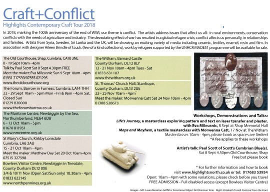
As part of our workshop with Mark Gibbs, our produced work was then going to be shown as part of the Craft&Conflict Exhibition, in The Forum, Barrow. This exhibition is part of the Highlights Contemporary Craft Tour 2018, and featured the likes of Conrad Atkinson and Paul Scott, amongst others.
We entered the exhibition and began with a talk from Karen, the curator, who explained that the theme of conflict was to mark the 100th anniversary of WW1; addressing issues that affect us all. After the introduction, we were able to walk around and explore the exhibition for ourselves.
Some of our work from the workshop with Gibbs was on show (seen below), which was great and showed us an exact timeline of how art moves from being a concept, an idea, to a base structure, to then being a finished piece in an exhibition.

Laura Moreton - Griffiths: Moreton-Griffiths’ work was by far my favourite of the exhibition. I loved her use of textiles and 3D structural work, and also felt that the bold juxtaposition between the soft materials and harsh reality of the war weapons the material depicted was extremely effective, making her work stand out amongst the rest; hence why it was my favourite.
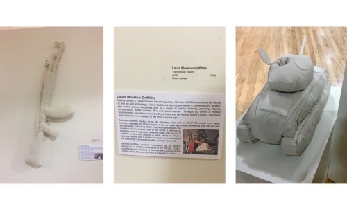
Matthew Day: Day’s work as a sculptor questions the taboo of missing limbs, celebrating them in plain sight. His pieces ‘explores the potential for limbs that move away from trying to replicate the human form’. Whilst I like the concept behind Day’s work, I didn’t feel that I necessarily felt they depicted ‘conflict’, and whilst the modern, more architectural take on prosthetics was effective and interesting, I didn’t feel very inspired by the work and therefore this part of the exhibition wasn’t my favourite.

Paul Scott - Scott’s work took a different direction to the other artists’ in the exhibition; creating ornate ceramics - porcelain plates and bowls, depicting a range of issues; such as inserting nuclear and coal fired power stations into pastoral landscapes on the plates. Similarly to Moreton-Griffiths’ pieces, I find the juxtaposition between the delicate, intricate medium (ceramics) and the horrific, conflict based additions, seen below, very effective.

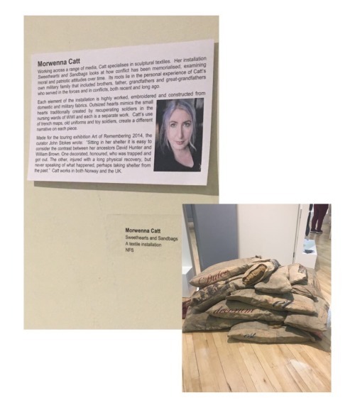
Morwenna Catt - Likewise to Moreton-Griffiths, Catt specialises in sculptural textiles, seen in her installation of sweethearts and sandbags, seen below. Whilst I think the use of military fabrics and embroidery suits the piece, mimicking the small hearts traditionally created by recuperating soldiers in the wards of WW1, the work isn’t to my taste, as I feel it looks too busy, and somewhat childish.

Eva Mileusnic - Mileusnic’s work ‘Counter Flow’, seen below, represents pairs of migrants’ feet, produced from slip cast porcelain. I love Mileusnic’s work, as I feel the detail and meaning behind the piece, which can only be properly understood upon reading the description, gives the viewer a connection to each pair of feet, and an overall touching and moving aura. I also love how each pair is adorned with a different pattern; referencing the movement of cultures from one place to another, and showing how each migrant’s story is different.

Overall, the exhibition was a good experience, and from here I have realised that I much prefer the pieces that depict moving, heartwarming stories that need further reading to understand (like Mileusnic’s) , and pieces that show contrast and juxtaposition through the use of materials and context (Moreton-Griffiths’/Scott’s). I think I will definitely re-visit Moreton-Griffiths’ work in particular in my future endeavours.
0 notes
Text
DIY Night Sky Mountain Painting (Easy Custom Art)
This night sky painting was so easy and fun to make! Catch the full step-by-step tutorial or take a look at the speed video to see it come to life.
Hey, friends! Hope your weekend went well. Mine was SO ridiculously busy: K and I built a new bed for the master bedroom (plans coming soon). Then, we made significant progress on the Murphy bed in the guest room (Charlotte, I’m comin’ for ya). Finally, Stella got into the garden bed so bad she needed an immediate bath (painted. the tub. with mud.). Oh, and I finished another DIY video, which means I can finally publish this night sky mountain painting today!
Before and After
As you can probably tell, this painting wasn’t originally any of those words. My original was a terribly painted flower vase at one of those “paint and sip”-style events. It was actually a promotional thing a brand put on with a bunch of Atlanta bloggers. It was honestly no different than what you would expect in one of those classes: show up, drink, paint (other than they put it all on their Facebook page; this isn’t a plug and they’re not my sponsor or anything; I just went because free booze and free canvas to take home and I got to see some of my blog friends like Erin Spain).
I know why I paint so poorly in those someone-teaches-you-how-to-paint-a-specific-thing classes. Since this is now the second time I’ve decided to paint my own thing instead, I think I’m just not into it. (It could be the wine. It’s a mystery.) If you’ve ever been fiercely put off by your horrible technique in one of those things, it’s because you’re being forced to paint something you don’t love. So, go rogue! It’s your canvas and to hell with the ugly flowers.
Finding Inspiration
I was inspired — random-est of things — by one of the screensavers displayed by the Amazon Fire TV device connected to the TV. If you aren’t familiar, it’s series of 182 different photos that would give just about anyone some serious wanderlust. And with my vacation to St. Lucia in my rear view and K and I talking about this whole vintage camper renovation project, this photo of The Milky Way over Mt. Hood (Oregon) just struck me. The other screen savers would come and go, and every time this one appeared, I would pause and stare.
So, I typed up a quick tutorial about an organic process that would be unique to every painting (I couldn’t replicate this to the same result every time either). Nothing about a bunch of swirling colors would really be repeatable, but if you want to give it a try, I highly encourage it and would love to see the variations you get! I stopped to take a few of these photos and grabbed a few stills from the video I took overhead.
How to Paint a Starry Sky and Mountains
The trick to a painting like this is pretty straightforward, believe it or not: it just takes continuous layering of colors. I used acrylic paints in the following colors (note: affiliate links to products may be used here):
Supplies
10×10 wood panel
Anita’s Craft Paint (picked up at Hobby Lobby ages ago): Twilight Blue, Medium Blue, Christmas Red (all matte)
Apple Barrel: White, Black, Wild Iris, Purple Iris (all matte)
Small and medium all-purpose paint brushes
Gesso (surface prep medium)
Frogtape Delicate Surface painter’s tape (I know they do a lot of sponsoring on blogs, but this isn’t sponsored)
paper towels
container for clean water
paper plate for mixing
Prep
Start by painting over the entire surface of the existing 10×10 panel with gesso, which is a “medium”. In this context, there are several mediums designed to do cool things with acrylic paint. Some add a crackling effect, some help paint adhere to fabric… this one is basically a thin version of white acrylic paint and simply helps prep the surface for adding more paint on top, like a primer.
I then did a quick pencil sketch to mark the sky, mountain, trees, and water on the bottom. A few general shapes are all that’s needed to get started.
Color Blocking
As you’ll see in the speed video, I started with the sky first — blocking off color areas such as black in the top corners and white in certain areas on either side of the mountain. This was somewhat monochromatic at first, but I also kept adding in blue and red. To layer in the paint, I also used a damp paper towel to help “sponge” in some of the texture and help layer in paint colors.
With most of the general color blocking done, I moved on to the tree line in black, and then the single mountain in the center — which pretty much exclusively has layers of black, white, and a small hint of blue. Since the sky would be the focus of my painting, I wanted to make the mountain highlighted but muted (so as not to compete).
The whole non-compete idea carried through in the rest of the painting. I marked off the mountains and created quick swipes with a small paint brush to give the trees texture (black only). For the water below, I painted large swipes of blue with white and black. Watering down the paint makes it look really streaky.
As the mountain dried, I added in more black and white areas for highlight and shadow.
After the first night (I did all of this while sitting in front of the TV), it looked like this:
This is a great stopping point, since acrylic sometimes needs some dry time when you begin to add water. Wiping off paint after it starts to dry might remove large blobs of paint (it happened to me a couple of times). General rule of thumb: do not mix more than 30% of water or use an acrylic medium to thin the paint instead; I’ll admit to using just water on this one, but you now know better!
More Color Layering
The next night after some sufficient drying, I added in more color to the sky area with the same swiping, sponging pattern: more blue, more purple, more white.
The photo below is after it had more time to dry and I added a second black layer of the trees.
Tape and Stars!
Once you’re done with this part and are happy with the sky’s color variation, let it dry COMPLETELY.
The canvas is now freshly painted, so protect the bottom area with painter’s tape meant for delicate surfaces. Tape anything that isn’t the sky.
Then, I used a VERY dry brush to dab just a little pure white paint onto the tip. With each flick little tiny spots flung all over the sky surface. I varied both with the quantity of paint on my brush and with how close to the canvas I got, so there were little clusters of white paint flecks and bigger flecks all randomly dispersed. This is the magic that makes it look like a starry sky, and my favorite part! If you make a mistake, use a tiny dab from a wet paper towel to take the paint back up. Do it quickly and don’t rub… it could still disturb the newly dried paint below.
In areas I wanted to emphasize a little more, I went in by hand and added a couple more stars.
With that done, I pulled all the painter’s tape off and my painting was complete. I plan to seal it with some art resin and frame (new posts!), but I’m really pleased with how it turned out. It will probably eventually hang in the vintage camper.
K immediately loved this painting. He’s offered to scan it at work for me, so I will have that available as a print soon as well!
Catch the full video:
youtube
Want another example of going rogue at a paint n’ sip class? Here’s my laundry room art inspired by talented artist Emily Jeffords.
The post DIY Night Sky Mountain Painting (Easy Custom Art) appeared first on Ugly Duckling House.
You'll Also Love
Wood Inlay Ornament with German Glass Glitter
The Saddest Little Guest Bedroom, Probably Ever (a...
.yuzo_related_post img{width:170px !important; height:170px !important;} .yuzo_related_post .relatedthumb{line-height:14px;background:#ffffff !important;color:#454747!important;} .yuzo_related_post .relatedthumb:hover{background:#ffffff !important; -webkit-transition: background 0.2s linear; -moz-transition: background 0.2s linear; -o-transition: background 0.2s linear; transition: background 0.2s linear;;color:#454747!important;} .yuzo_related_post .relatedthumb a{color:#102a3b!important;} .yuzo_related_post .relatedthumb a:hover{ color:#113f5e}!important;} .yuzo_related_post .relatedthumb:hover a{ color:#113f5e!important;} .yuzo_related_post .relatedthumb:hover .yuzo__text--title{ color:#113f5e!important;} .yuzo_related_post .yuzo_text, .yuzo_related_post .yuzo_views_post {color:#454747!important;} .yuzo_related_post .relatedthumb:hover .yuzo_text, .yuzo_related_post:hover .yuzo_views_post {color:#454747!important;} .yuzo_related_post .relatedthumb{ margin: 0px 6px 0px 6px; padding: 0px 0px 0px 0px; } jQuery(document).ready(function( $ ){ jQuery('.yuzo_related_post .yuzo_wraps').equalizer({ columns : '> div' }); });
DIY Night Sky Mountain Painting (Easy Custom Art) published first on https://bakerskitchenslimited.tumblr.com/
0 notes
Text
DIY Night Sky Mountain Painting (Easy Custom Art)
This night sky painting was so easy and fun to make! Catch the full step-by-step tutorial or take a look at the speed video to see it come to life.
Hey, friends! Hope your weekend went well. Mine was SO ridiculously busy: K and I built a new bed for the master bedroom (plans coming soon). Then, we made significant progress on the Murphy bed in the guest room (Charlotte, I’m comin’ for ya). Finally, Stella got into the garden bed so bad she needed an immediate bath (painted. the tub. with mud.). Oh, and I finished another DIY video, which means I can finally publish this night sky mountain painting today!
Before and After
As you can probably tell, this painting wasn’t originally any of those words. My original was a terribly painted flower vase at one of those “paint and sip”-style events. It was actually a promotional thing a brand put on with a bunch of Atlanta bloggers. It was honestly no different than what you would expect in one of those classes: show up, drink, paint (other than they put it all on their Facebook page; this isn’t a plug and they’re not my sponsor or anything; I just went because free booze and free canvas to take home and I got to see some of my blog friends like Erin Spain).
I know why I paint so poorly in those someone-teaches-you-how-to-paint-a-specific-thing classes. Since this is now the second time I’ve decided to paint my own thing instead, I think I’m just not into it. (It could be the wine. It’s a mystery.) If you’ve ever been fiercely put off by your horrible technique in one of those things, it’s because you’re being forced to paint something you don’t love. So, go rogue! It’s your canvas and to hell with the ugly flowers.
Finding Inspiration
I was inspired — random-est of things — by one of the screensavers displayed by the Amazon Fire TV device connected to the TV. If you aren’t familiar, it’s series of 182 different photos that would give just about anyone some serious wanderlust. And with my vacation to St. Lucia in my rear view and K and I talking about this whole vintage camper renovation project, this photo of The Milky Way over Mt. Hood (Oregon) just struck me. The other screen savers would come and go, and every time this one appeared, I would pause and stare.
So, I typed up a quick tutorial about an organic process that would be unique to every painting (I couldn’t replicate this to the same result every time either). Nothing about a bunch of swirling colors would really be repeatable, but if you want to give it a try, I highly encourage it and would love to see the variations you get! I stopped to take a few of these photos and grabbed a few stills from the video I took overhead.
How to Paint a Starry Sky and Mountains
The trick to a painting like this is pretty straightforward, believe it or not: it just takes continuous layering of colors. I used acrylic paints in the following colors (note: affiliate links to products may be used here):
Supplies
10×10 wood panel
Anita’s Craft Paint (picked up at Hobby Lobby ages ago): Twilight Blue, Medium Blue, Christmas Red (all matte)
Apple Barrel: White, Black, Wild Iris, Purple Iris (all matte)
Small and medium all-purpose paint brushes
Gesso (surface prep medium)
Frogtape Delicate Surface painter’s tape (I know they do a lot of sponsoring on blogs, but this isn’t sponsored)
paper towels
container for clean water
paper plate for mixing
Prep
Start by painting over the entire surface of the existing 10×10 panel with gesso, which is a “medium”. In this context, there are several mediums designed to do cool things with acrylic paint. Some add a crackling effect, some help paint adhere to fabric… this one is basically a thin version of white acrylic paint and simply helps prep the surface for adding more paint on top, like a primer.
I then did a quick pencil sketch to mark the sky, mountain, trees, and water on the bottom. A few general shapes are all that’s needed to get started.
Color Blocking
As you’ll see in the speed video, I started with the sky first — blocking off color areas such as black in the top corners and white in certain areas on either side of the mountain. This was somewhat monochromatic at first, but I also kept adding in blue and red. To layer in the paint, I also used a damp paper towel to help “sponge” in some of the texture and help layer in paint colors.
With most of the general color blocking done, I moved on to the tree line in black, and then the single mountain in the center — which pretty much exclusively has layers of black, white, and a small hint of blue. Since the sky would be the focus of my painting, I wanted to make the mountain highlighted but muted (so as not to compete).
The whole non-compete idea carried through in the rest of the painting. I marked off the mountains and created quick swipes with a small paint brush to give the trees texture (black only). For the water below, I painted large swipes of blue with white and black. Watering down the paint makes it look really streaky.
As the mountain dried, I added in more black and white areas for highlight and shadow.
After the first night (I did all of this while sitting in front of the TV), it looked like this:
This is a great stopping point, since acrylic sometimes needs some dry time when you begin to add water. Wiping off paint after it starts to dry might remove large blobs of paint (it happened to me a couple of times). General rule of thumb: do not mix more than 30% of water or use an acrylic medium to thin the paint instead; I’ll admit to using just water on this one, but you now know better!
More Color Layering
The next night after some sufficient drying, I added in more color to the sky area with the same swiping, sponging pattern: more blue, more purple, more white.
The photo below is after it had more time to dry and I added a second black layer of the trees.
Tape and Stars!
Once you’re done with this part and are happy with the sky’s color variation, let it dry COMPLETELY.
The canvas is now freshly painted, so protect the bottom area with painter’s tape meant for delicate surfaces. Tape anything that isn’t the sky.
Then, I used a VERY dry brush to dab just a little pure white paint onto the tip. With each flick little tiny spots flung all over the sky surface. I varied both with the quantity of paint on my brush and with how close to the canvas I got, so there were little clusters of white paint flecks and bigger flecks all randomly dispersed. This is the magic that makes it look like a starry sky, and my favorite part! If you make a mistake, use a tiny dab from a wet paper towel to take the paint back up. Do it quickly and don’t rub… it could still disturb the newly dried paint below.
In areas I wanted to emphasize a little more, I went in by hand and added a couple more stars.
With that done, I pulled all the painter’s tape off and my painting was complete. I plan to seal it with some art resin and frame (new posts!), but I’m really pleased with how it turned out. It will probably eventually hang in the vintage camper.
K immediately loved this painting. He’s offered to scan it at work for me, so I will have that available as a print soon as well!
Catch the full video:
youtube
Want another example of going rogue at a paint n’ sip class? Here’s my laundry room art inspired by talented artist Emily Jeffords.
The post DIY Night Sky Mountain Painting (Easy Custom Art) appeared first on Ugly Duckling House.
You'll Also Love
Wood Inlay Ornament with German Glass Glitter
The Saddest Little Guest Bedroom, Probably Ever (a...
.yuzo_related_post img{width:170px !important; height:170px !important;} .yuzo_related_post .relatedthumb{line-height:14px;background:#ffffff !important;color:#454747!important;} .yuzo_related_post .relatedthumb:hover{background:#ffffff !important; -webkit-transition: background 0.2s linear; -moz-transition: background 0.2s linear; -o-transition: background 0.2s linear; transition: background 0.2s linear;;color:#454747!important;} .yuzo_related_post .relatedthumb a{color:#102a3b!important;} .yuzo_related_post .relatedthumb a:hover{ color:#113f5e}!important;} .yuzo_related_post .relatedthumb:hover a{ color:#113f5e!important;} .yuzo_related_post .relatedthumb:hover .yuzo__text--title{ color:#113f5e!important;} .yuzo_related_post .yuzo_text, .yuzo_related_post .yuzo_views_post {color:#454747!important;} .yuzo_related_post .relatedthumb:hover .yuzo_text, .yuzo_related_post:hover .yuzo_views_post {color:#454747!important;} .yuzo_related_post .relatedthumb{ margin: 0px 6px 0px 6px; padding: 0px 0px 0px 0px; } jQuery(document).ready(function( $ ){ jQuery('.yuzo_related_post .yuzo_wraps').equalizer({ columns : '> div' }); });
from Home https://www.uglyducklinghouse.com/diy-night-sky-mountain-painting-easy-custom-art/
via http://www.rssmix.com/
0 notes
Text
DIY Night Sky Mountain Painting (Easy Custom Art)
This night sky painting was so easy and fun to make! Catch the full step-by-step tutorial or take a look at the speed video to see it come to life.
Hey, friends! Hope your weekend went well. Mine was SO ridiculously busy: K and I built a new bed for the master bedroom (plans coming soon). Then, we made significant progress on the Murphy bed in the guest room (Charlotte, I’m comin’ for ya). Finally, Stella got into the garden bed so bad she needed an immediate bath (painted. the tub. with mud.). Oh, and I finished another DIY video, which means I can finally publish this night sky mountain painting today!
Before and After
As you can probably tell, this painting wasn’t originally any of those words. My original was a terribly painted flower vase at one of those “paint and sip”-style events. It was actually a promotional thing a brand put on with a bunch of Atlanta bloggers. It was honestly no different than what you would expect in one of those classes: show up, drink, paint (other than they put it all on their Facebook page; this isn’t a plug and they’re not my sponsor or anything; I just went because free booze and free canvas to take home and I got to see some of my blog friends like Erin Spain).
I know why I paint so poorly in those someone-teaches-you-how-to-paint-a-specific-thing classes. Since this is now the second time I’ve decided to paint my own thing instead, I think I’m just not into it. (It could be the wine. It’s a mystery.) If you’ve ever been fiercely put off by your horrible technique in one of those things, it’s because you’re being forced to paint something you don’t love. So, go rogue! It’s your canvas and to hell with the ugly flowers.
Finding Inspiration
I was inspired — random-est of things — by one of the screensavers displayed by the Amazon Fire TV device connected to the TV. If you aren’t familiar, it’s series of 182 different photos that would give just about anyone some serious wanderlust. And with my vacation to St. Lucia in my rear view and K and I talking about this whole vintage camper renovation project, this photo of The Milky Way over Mt. Hood (Oregon) just struck me. The other screen savers would come and go, and every time this one appeared, I would pause and stare.
So, I typed up a quick tutorial about an organic process that would be unique to every painting (I couldn’t replicate this to the same result every time either). Nothing about a bunch of swirling colors would really be repeatable, but if you want to give it a try, I highly encourage it and would love to see the variations you get! I stopped to take a few of these photos and grabbed a few stills from the video I took overhead.
How to Paint a Starry Sky and Mountains
The trick to a painting like this is pretty straightforward, believe it or not: it just takes continuous layering of colors. I used acrylic paints in the following colors (note: affiliate links to products may be used here):
Supplies
10×10 wood panel
Anita’s Craft Paint (picked up at Hobby Lobby ages ago): Twilight Blue, Medium Blue, Christmas Red (all matte)
Apple Barrel: White, Black, Wild Iris, Purple Iris (all matte)
Small and medium all-purpose paint brushes
Gesso (surface prep medium)
Frogtape Delicate Surface painter’s tape (I know they do a lot of sponsoring on blogs, but this isn’t sponsored)
paper towels
container for clean water
paper plate for mixing
Prep
Start by painting over the entire surface of the existing 10×10 panel with gesso, which is a “medium”. In this context, there are several mediums designed to do cool things with acrylic paint. Some add a crackling effect, some help paint adhere to fabric… this one is basically a thin version of white acrylic paint and simply helps prep the surface for adding more paint on top, like a primer.
I then did a quick pencil sketch to mark the sky, mountain, trees, and water on the bottom. A few general shapes are all that’s needed to get started.
Color Blocking
As you’ll see in the speed video, I started with the sky first — blocking off color areas such as black in the top corners and white in certain areas on either side of the mountain. This was somewhat monochromatic at first, but I also kept adding in blue and red. To layer in the paint, I also used a damp paper towel to help “sponge” in some of the texture and help layer in paint colors.
With most of the general color blocking done, I moved on to the tree line in black, and then the single mountain in the center — which pretty much exclusively has layers of black, white, and a small hint of blue. Since the sky would be the focus of my painting, I wanted to make the mountain highlighted but muted (so as not to compete).
The whole non-compete idea carried through in the rest of the painting. I marked off the mountains and created quick swipes with a small paint brush to give the trees texture (black only). For the water below, I painted large swipes of blue with white and black. Watering down the paint makes it look really streaky.
As the mountain dried, I added in more black and white areas for highlight and shadow.
After the first night (I did all of this while sitting in front of the TV), it looked like this:
This is a great stopping point, since acrylic sometimes needs some dry time when you begin to add water. Wiping off paint after it starts to dry might remove large blobs of paint (it happened to me a couple of times). General rule of thumb: do not mix more than 30% of water or use an acrylic medium to thin the paint instead; I’ll admit to using just water on this one, but you now know better!
More Color Layering
The next night after some sufficient drying, I added in more color to the sky area with the same swiping, sponging pattern: more blue, more purple, more white.
The photo below is after it had more time to dry and I added a second black layer of the trees.
Tape and Stars!
Once you’re done with this part and are happy with the sky’s color variation, let it dry COMPLETELY.
The canvas is now freshly painted, so protect the bottom area with painter’s tape meant for delicate surfaces. Tape anything that isn’t the sky.
Then, I used a VERY dry brush to dab just a little pure white paint onto the tip. With each flick little tiny spots flung all over the sky surface. I varied both with the quantity of paint on my brush and with how close to the canvas I got, so there were little clusters of white paint flecks and bigger flecks all randomly dispersed. This is the magic that makes it look like a starry sky, and my favorite part! If you make a mistake, use a tiny dab from a wet paper towel to take the paint back up. Do it quickly and don’t rub… it could still disturb the newly dried paint below.
In areas I wanted to emphasize a little more, I went in by hand and added a couple more stars.
With that done, I pulled all the painter’s tape off and my painting was complete. I plan to seal it with some art resin and frame (new posts!), but I’m really pleased with how it turned out. It will probably eventually hang in the vintage camper.
K immediately loved this painting. He’s offered to scan it at work for me, so I will have that available as a print soon as well!
Catch the full video:
youtube
Want another example of going rogue at a paint n’ sip class? Here’s my laundry room art inspired by talented artist Emily Jeffords.
The post DIY Night Sky Mountain Painting (Easy Custom Art) appeared first on Ugly Duckling House.
You'll Also Love
Wood Inlay Ornament with German Glass Glitter
The Saddest Little Guest Bedroom, Probably Ever (a...
.yuzo_related_post img{width:170px !important; height:170px !important;} .yuzo_related_post .relatedthumb{line-height:14px;background:#ffffff !important;color:#454747!important;} .yuzo_related_post .relatedthumb:hover{background:#ffffff !important; -webkit-transition: background 0.2s linear; -moz-transition: background 0.2s linear; -o-transition: background 0.2s linear; transition: background 0.2s linear;;color:#454747!important;} .yuzo_related_post .relatedthumb a{color:#102a3b!important;} .yuzo_related_post .relatedthumb a:hover{ color:#113f5e}!important;} .yuzo_related_post .relatedthumb:hover a{ color:#113f5e!important;} .yuzo_related_post .relatedthumb:hover .yuzo__text--title{ color:#113f5e!important;} .yuzo_related_post .yuzo_text, .yuzo_related_post .yuzo_views_post {color:#454747!important;} .yuzo_related_post .relatedthumb:hover .yuzo_text, .yuzo_related_post:hover .yuzo_views_post {color:#454747!important;} .yuzo_related_post .relatedthumb{ margin: 0px 6px 0px 6px; padding: 0px 0px 0px 0px; } jQuery(document).ready(function( $ ){ jQuery('.yuzo_related_post .yuzo_wraps').equalizer({ columns : '> div' }); });
from Ugly Duckling House https://www.uglyducklinghouse.com/diy-night-sky-mountain-painting-easy-custom-art/
0 notes
Text
DIY Night Sky Mountain Painting (Easy Custom Art)
This night sky painting was so easy and fun to make! Catch the full step-by-step tutorial or take a look at the speed video to see it come to life.
Hey, friends! Hope your weekend went well. Mine was SO ridiculously busy: K and I built a new bed for the master bedroom (plans coming soon). Then, we made significant progress on the Murphy bed in the guest room (Charlotte, I’m comin’ for ya). Finally, Stella got into the garden bed so bad she needed an immediate bath (painted. the tub. with mud.). Oh, and I finished another DIY video, which means I can finally publish this night sky mountain painting today!
Before and After
As you can probably tell, this painting wasn’t originally any of those words. My original was a terribly painted flower vase at one of those “paint and sip”-style events. It was actually a promotional thing a brand put on with a bunch of Atlanta bloggers. It was honestly no different than what you would expect in one of those classes: show up, drink, paint (other than they put it all on their Facebook page; this isn’t a plug and they’re not my sponsor or anything; I just went because free booze and free canvas to take home and I got to see some of my blog friends like Erin Spain).
I know why I paint so poorly in those someone-teaches-you-how-to-paint-a-specific-thing classes. Since this is now the second time I’ve decided to paint my own thing instead, I think I’m just not into it. (It could be the wine. It’s a mystery.) If you’ve ever been fiercely put off by your horrible technique in one of those things, it’s because you’re being forced to paint something you don’t love. So, go rogue! It’s your canvas and to hell with the ugly flowers.
Finding Inspiration
I was inspired — random-est of things — by one of the screensavers displayed by the Amazon Fire TV device connected to the TV. If you aren’t familiar, it’s series of 182 different photos that would give just about anyone some serious wanderlust. And with my vacation to St. Lucia in my rear view and K and I talking about this whole vintage camper renovation project, this photo of The Milky Way over Mt. Hood (Oregon) just struck me. The other screen savers would come and go, and every time this one appeared, I would pause and stare.
So, I typed up a quick tutorial about an organic process that would be unique to every painting (I couldn’t replicate this to the same result every time either). Nothing about a bunch of swirling colors would really be repeatable, but if you want to give it a try, I highly encourage it and would love to see the variations you get! I stopped to take a few of these photos and grabbed a few stills from the video I took overhead.
How to Paint a Starry Sky and Mountains
The trick to a painting like this is pretty straightforward, believe it or not: it just takes continuous layering of colors. I used acrylic paints in the following colors (note: affiliate links to products may be used here):
Supplies
10×10 wood panel
Anita’s Craft Paint (picked up at Hobby Lobby ages ago): Twilight Blue, Medium Blue, Christmas Red (all matte)
Apple Barrel: White, Black, Wild Iris, Purple Iris (all matte)
Small and medium all-purpose paint brushes
Gesso (surface prep medium)
Frogtape Delicate Surface painter’s tape (I know they do a lot of sponsoring on blogs, but this isn’t sponsored)
paper towels
container for clean water
paper plate for mixing
Prep
Start by painting over the entire surface of the existing 10×10 panel with gesso, which is a “medium”. In this context, there are several mediums designed to do cool things with acrylic paint. Some add a crackling effect, some help paint adhere to fabric… this one is basically a thin version of white acrylic paint and simply helps prep the surface for adding more paint on top, like a primer.
I then did a quick pencil sketch to mark the sky, mountain, trees, and water on the bottom. A few general shapes are all that’s needed to get started.
Color Blocking
As you’ll see in the speed video, I started with the sky first — blocking off color areas such as black in the top corners and white in certain areas on either side of the mountain. This was somewhat monochromatic at first, but I also kept adding in blue and red. To layer in the paint, I also used a damp paper towel to help “sponge” in some of the texture and help layer in paint colors.
With most of the general color blocking done, I moved on to the tree line in black, and then the single mountain in the center — which pretty much exclusively has layers of black, white, and a small hint of blue. Since the sky would be the focus of my painting, I wanted to make the mountain highlighted but muted (so as not to compete).
The whole non-compete idea carried through in the rest of the painting. I marked off the mountains and created quick swipes with a small paint brush to give the trees texture (black only). For the water below, I painted large swipes of blue with white and black. Watering down the paint makes it look really streaky.
As the mountain dried, I added in more black and white areas for highlight and shadow.
After the first night (I did all of this while sitting in front of the TV), it looked like this:
This is a great stopping point, since acrylic sometimes needs some dry time when you begin to add water. Wiping off paint after it starts to dry might remove large blobs of paint (it happened to me a couple of times). General rule of thumb: do not mix more than 30% of water or use an acrylic medium to thin the paint instead; I’ll admit to using just water on this one, but you now know better!
More Color Layering
The next night after some sufficient drying, I added in more color to the sky area with the same swiping, sponging pattern: more blue, more purple, more white.
The photo below is after it had more time to dry and I added a second black layer of the trees.
Tape and Stars!
Once you’re done with this part and are happy with the sky’s color variation, let it dry COMPLETELY.
The canvas is now freshly painted, so protect the bottom area with painter’s tape meant for delicate surfaces. Tape anything that isn’t the sky.
Then, I used a VERY dry brush to dab just a little pure white paint onto the tip. With each flick little tiny spots flung all over the sky surface. I varied both with the quantity of paint on my brush and with how close to the canvas I got, so there were little clusters of white paint flecks and bigger flecks all randomly dispersed. This is the magic that makes it look like a starry sky, and my favorite part! If you make a mistake, use a tiny dab from a wet paper towel to take the paint back up. Do it quickly and don’t rub… it could still disturb the newly dried paint below.
In areas I wanted to emphasize a little more, I went in by hand and added a couple more stars.
With that done, I pulled all the painter’s tape off and my painting was complete. I plan to seal it with some art resin and frame (new posts!), but I’m really pleased with how it turned out. It will probably eventually hang in the vintage camper.
K immediately loved this painting. He’s offered to scan it at work for me, so I will have that available as a print soon as well!
Catch the full video:
youtube
Want another example of going rogue at a paint n’ sip class? Here’s my laundry room art inspired by talented artist Emily Jeffords.
The post DIY Night Sky Mountain Painting (Easy Custom Art) appeared first on Ugly Duckling House.
You'll Also Love
Wood Inlay Ornament with German Glass Glitter
The Saddest Little Guest Bedroom, Probably Ever (a...
.yuzo_related_post img{width:170px !important; height:170px !important;} .yuzo_related_post .relatedthumb{line-height:14px;background:#ffffff !important;color:#454747!important;} .yuzo_related_post .relatedthumb:hover{background:#ffffff !important; -webkit-transition: background 0.2s linear; -moz-transition: background 0.2s linear; -o-transition: background 0.2s linear; transition: background 0.2s linear;;color:#454747!important;} .yuzo_related_post .relatedthumb a{color:#102a3b!important;} .yuzo_related_post .relatedthumb a:hover{ color:#113f5e}!important;} .yuzo_related_post .relatedthumb:hover a{ color:#113f5e!important;} .yuzo_related_post .relatedthumb:hover .yuzo__text--title{ color:#113f5e!important;} .yuzo_related_post .yuzo_text, .yuzo_related_post .yuzo_views_post {color:#454747!important;} .yuzo_related_post .relatedthumb:hover .yuzo_text, .yuzo_related_post:hover .yuzo_views_post {color:#454747!important;} .yuzo_related_post .relatedthumb{ margin: 0px 6px 0px 6px; padding: 0px 0px 0px 0px; } jQuery(document).ready(function( $ ){ jQuery('.yuzo_related_post .yuzo_wraps').equalizer({ columns : '> div' }); });
DIY Night Sky Mountain Painting (Easy Custom Art) published first on www.uglyducklinghouse.com
0 notes
Text
Blogmas day 5: Behind already, Yikes!
Welcome to Blogmas day 5, and no formal intros, except the one with me making the announcement that I am doing one. How silly of me?
Let’s see….
First off, there is the preparation of getting ready for Blogmas and Vlogmas (Heh, did I mentioned I was doing that too?) I did not realize that there is so much prep work going into these things. There is the mental prep and the emotional prep. You must be ready to think on your feet at all times. Heh, no problem. OK, did I also mention that I have my normal Christmas, plus a cruise to prepare for? Yep, that’s me in a nutshell, always ready to think at the last minute on how I am doing something. You would think that in the nine years of blogging I would be prepared mentally, and really I am, but it is the organizational part that worries me. Don’t worry, I will do fine. I am getting used to this all over again. I would not be doing this if I thought I could not handle it. So that is the end of that subject. On to the next thing smoking.
Shopping for decorations
This is a tip for those of you who, say, misplace your decorations from one year to the next, or have very little to would with: Dollar Tree and 50% off sales.
50% off sales have been going on (at least in the United States) for a couple of weeks, and you have to act fast. I was late this year because I was a late bloomer (meaning I am now discovering this myself). I went to Hobby Lobby Saturday looking for the sales. It also helps that I was out of money as well. The shelves were almost empty when I got there. I am looking for a color scheme of red and silver, with maybe a touch of blue here and there. I am abandoning my traditional colors of burgundy and gold, with a touch of mauve or rose pink, whichever color name you choose. It is only for this year (maybe). My plan is to look at Michaels this week.
Unless you plan on keeping your decorations year after year, including the same color scheme. Dollar Tree is your friend. In fact, this store is your BFF. I have found more items that are as good, if not, a little better than name brands. Now, a word of caution: There are some items, like electronics, I do leave to the bigger brands like Target and Walmart, but since I am a crafter, I will upcycle the item. That is another tip: Upcycle when you can. I plan on posting this as one of my Vlogmas Videos, hopefully, this week.
When you upcycle a less than perfect product, there are some tools and supplies you will need:
· Adhesive
o Wet Glue
o Tape runner
o Painter’s tape (blue- I use 3M)
o Hot Glue Gun and Glue Sticks
o Double-sided tape (I use Scor-Tape, although there is a cheaper tape at Tuesday Mornings
o Scotch Tape
· Stapling gun (one for light projects and one for heavier projects like wood)
o Staples
· Paint
o Gesso
o White paint
o Black paint
o Mediums
§ Gel-to dilute the paint, available in Gloss, Semi-Gloss, and Matte. You can also use Gel mediums to adhere things to the paper or other materials
§ Texture-to modify the texture of the paint. Use as Modeling paste, which can be sanded or painted on. Use also with pastels,
§ Flow increase- it allows the paints to flow better on the canvas or wood
§ Slow drying- it allows you to blend colors. The reason is acrylic paint dries fast, allowing you more time to blend your colors.
· Paper-I will not go into the different types, but this is something you will need on hand.
· Fabric-same advice.
· Sewing machine. Some people like to upcycle clothing
· Scissors
· Markers and pens
These are the basics. I will have more in a future post or Vlog.
More Decorations…..
I mentioned that I am on a last-minute hunt for decorations. I went with my folks to look at the different neighborhoods in the city at lights. We have done it each year when I was a child, and for some reason, I want to start that tradition with my niece and nephews. Tonight, was not a good night to look, everyone does not have their lights up. We will try again later.
My plan is to keep the Blogmas blog post short and sweet. I also will not put a takeaway element at the end of Blogmas posts unless, I decide to combine the two.
Have a good evening.
from Blogger http://bit.ly/2irzrDL
via IFTTT
0 notes
Text
Studio Saturdays: Mixed-Media Planner
We’re waist-deep in January, so what better time to get organized and start a new planner? I was so taken by the planner featured in the article “Creative Days Ahead” by Dawn DeVries Sokol in the January/February issue of Cloth Paper Scissors magazine that I had to make one for myself. It seemed like the perfect project for Studio Saturdays.
If you haven’t caught planner fever, this project will convince you to get on board. Keeping a planner like this isn’t just about writing your to-do list; it’s about making something unique, using your favorite supplies and techniques, and documenting your creative life.
This Create Along series is in three parts: In Part One we’ll create the cover, in Part Two we’ll bind the planner, and in Part Three we’ll decorate the pages, using fantastic collage, painting, and layering techniques. If you’ve never made a book before, you’ve come to the right place. This project uses a repurposed book and a very easy binding stitch, so there’s nothing difficult or intimidating. If you’re a veteran bookbinder or book artist, you’ve also come to the right place. We’ll do some fun techniques for painting and collaging the cover, and the binding stitch is quick and eye-catching.
Let’s get started! Here are the materials you’ll need for Part One. Don’t freak out about the number of supplies—I urge you to use what you have on hand, and to experiment. This is all about making something that reflects you, so feel free to try something different, do a variation on a technique, or break free altogether. Some supplies, as you’ll see below, are optional.
• Book with an intact spine about 2″ wide: A book bound for the recycling center is great for this project, but make sure the book is sturdy, and the spine is not split or coming apart from the covers. The spine width is important—make sure it measures about 2″. The book I used is 6″ wide x 9 1/4″ deep.
• Utility or craft knife
• Scissors
• Sandpaper
• Ephemera, such as book pages
• Regular gel medium
• Paintbrushes
• Gesso (optional)
• Acrylic paint, white or ivory, and burnt umber, plus a variety of other colors in dark, medum, and light values
• White chalk pencil (optional)
• Paint pen (optional)
• Black permanent pen (optional)
• Baby wipes or paper towels
• Stencil
• Cosmetic wedge
• Soft gel medium, gloss or matte, or acrylic glazing medium (optional)
• Palette paper or palette
• Palette knife (optional)
• Acrylic ink (optional)
• Stabilo Woody Crayon, black (optional)
• Number stamps (optional)
• Stamp pad, black, permanent (optional)
Quick tip: When choosing the book for your planner, think about where and how you’ll use it. If you want to carry it with you, choose a small size. I knew I’d be keeping mine at home, so I went with a fairly big book—I also wanted larger pages to work on.
To remove the text block (the pages) from the spine, pull on one of the covers while holding the text block, and you’ll see them start to separate. Put the tip of the craft or utility knife blade in between the cover and the endpaper, and start cutting downward, making sure your hand is out of the way. Also make sure that you’re not cutting into the spine or any part of the book. Repeat for the other cover, and reserve the pages for later. Clean up any jagged edges along the inside of the spine with a craft knife, scissors, or sandpaper.
Use a utility or craft knife to cut the text block away from the covers.
The book I’m using was a prop leftover from a photoshoot, and it had been painted red. I left it that way because I already had the color in my palette. You can leave your cover the way it is, or, if you want to cover it completely, brush on one or two coats of white gesso and allow it to dry completely.
Collage some papers on both covers, leaving the spine intact. I used a variety of book text, but use whatever you have that’s interesting and has some contrast—this layer will show through, so papers with some kind of pattern is good. I adhered the papers with gel medium; allow this layer to dry.
The first layer of the painted covers starts with collaged ephemera.
Now it’s time to really have some fun. Paint a great big mess on the planner covers. Really go nuts and layer colors and shapes and brushstrokes, and make marks in the paint while it’s still wet with your fingers or the end of a paintbrush. I started with a palette of blue, teal, and turquoise, and added pops of red for contrast. I mostly used tube acrylics, but fluid works just as well. Use whatever you have on hand. If you’re incorporating complementary colors, wait for one layer to dry before going on to the next so you don’t get mud. If you’ve obscured the collage papers, knock back the paint a little in those areas with a baby wipe or paper towel. Let everything dry.
For the underpainting, get messy with brush strokes and colors.
Choose a design and paint over the first layer with a very light color (I used titanium white). You can freehand it or draw it first with a chalk pencil. Choose an open design that allows the underpainting to show through; I painted leaf shapes. If you have mad painting skills, now’s the time to turn them out. If you don’t, like me, simple shapes are absolutely fantastic, and you can’t go wrong. As before, make marks in the wet paint as you go. If you don’t like something, a baby wipe will take it right off. Let dry.
Brush on a light color, letting the underpainting show through.
Here are the planner covers after the second layer of paint. I drew some veins in the leaves with a paint pen. Also, you’ll see that I didn’t go completely up to the spine. That’s because we’ll be covering it later.
The underpainting shows through the white, creating depth and interest on the planner covers.
For the next layer, choose a stencil with a pattern that complements your design. With a palette knife, mix some acrylic paint with soft gel medium or glazing medium in a 1:1 ratio; I did this because I wanted the paint to be somewhat translucent, but you can just use the paint straight. Dip a cosmetic wedge in the paint, pounce some of it off, and stencil onto the cover, however you want the pattern to appear. Let dry. When my cover was dry, I outlined some of the stencil shapes and created some random dots with a white paint pen, and outlined the leaf shapes with a black permanent pen.
Stencil over parts of the design, using a mixture of paint and medium.
With a palette knife, blend a small amount of burnt umber paint and soft gel medium or glazing medium in a 1:1 ratio. Dip a paper towel into the mixture and lightly swipe it across the covers. I wanted to create a bit of depth and warmth with this layer, so I didn’t use a lot. A baby wipe will be your salvation if you apply too much.
A few swipes of burnt umber paint warmed the painted covers of this planner up a bit.
The next step happened because I made a big goof. Big. I thought the planner cover would look cool if I dripped some dark blue acrylic ink on it, but the drips were so large and ugly that I panicked and grabbed a baby wipe to try to take the color off. In the process of wiping it, I created a beautiful blue stain. This became one of those happy accidents that I will now use in a future project. Try this technique if you’re feeling up for it, but you can also skip it.
I don’t know if you’ve discovered Stabilo Woody Crayons, but if you haven’t, you should check them out. These big fatties are water soluble, and you can draw with them, or hit them with a wet paintbrush or water brush and get beautiful watercolor effects (Spoiler alert: I used them for my planner pages as well.). I used a black crayon with a water brush, painting around the leaf motifs, waiting about 30 seconds, and then rubbing in the color with my fingers. This created a kind of shadow/stain effect that I absolutely love. You can also get this effect with a black Stabilo All pencil, or plain watercolor.
A water-soluble Stabilo Woody Crayon added even more depth and shading.
I wanted to represent the year of this planner, so I stamped 2017 with the Montreal Large Numbers set by Michelle Ward, using permanent ink. Since the cover is textured I didn’t get solid impressions, so I filled in the spaces with a black permanent pen. I liked the way the zero looked, so I left that as is. I then added some dots on top of the numbers with the white paint pen, and enhanced some of the dots on the cover so they’d pop a bit more.
For the planner cover, the year was stamped with permanent ink and embellished with a paint pen.
Quick tip: To hasten dry time, use a heat tool. Be careful not to heat the area too much—acrylic paint can start bubbling.
Since I’ll be using this planner for a year, I need it to be sturdy. In the next installment we’ll reinforce the spine, collage the inside covers, and also bind the book. So you can get ready for next week, here’s what you’ll need:
• A piece of bookcloth 1 ½” taller than your cover and 2 ½” wider than the spine. Bookcloth can be found in some art supply stores, and online. You can substitute fabric, but if so, you’ll need dry adhesive, such as Grafix Artist-tac Permanent Dry Adhesive.
• PVA glue
• Glue brush
• Waxed linen thread, 4-ply, about 7 yards
• Bookbinding needle (you can substitute a sturdy darning needle)
• Bone folder
• Paper for the pages. Determine how you want to use your book, and choose your paper accordingly. I wanted to use wet media, so I chose 98-lb. paper from a Canson XL Mix Media pad. You’ll need 35 folded sheets. To determine the size for your planner, measure the pages from the text block. If those aren’t available, subtract ¼” from the height of the book, and measure from the flattened spine to the front edges of the cover (called foredges), and subtract ¼”. Your pages will be that height x double the width, and then folded in half. Based on my dimensions, my pages are 12″ wide x 9 1/8″ high. You’ll need 36 folded sheets.
• Scissors
If you have any questions on the techniques or supplies, please leave them in the comments. See you next Saturday! In the meantime, if you’d like to learn more about this article and other book-related resources, take a look at these great products from the North Light Shop.
See Dawn DeVries Sokol’s planner project in the January/February 2017 issue of Cloth Paper Scissors magazine.
Make your own custom three-ring binder, and turn it into a planner; see how in this Colorful and Custom Three-Ring Binder video with Erin Zamrzla.
Discover how easy it is to make your own travel journal in this Travel Journal video with Erin Zamrzla.
Delve into the world of artists’ books in the eBook Book + Art by Dorothy Simpson Krause.
The post Studio Saturdays: Mixed-Media Planner appeared first on Artist's Network.
from Artist’s Network http://ift.tt/2jiaRGU
http://ift.tt/2iqeOp3
0 notes
Last Seen Blogs

andresrap7
Twitter: @Andres7rap

binomikoto
ウサミン星

rocoderes
Rocoderes
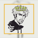
mr-maximoff
Mr. Maximoff
portkeygames-art
Art of Portkey Games