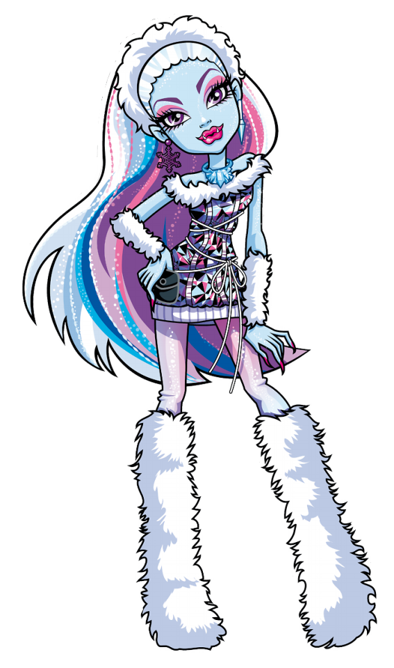
#also g2 representation!
Note
I, for one, will never forget that time i wrote a mlp g2 fanfic in which moon shadow stole an ancient powerful necklace which granted the wearer the ability to see into the future from queen silver rain because moon was an orphan with no friends except dainty dove, who was a pegasus/earth pony hybrid and couldn't fly even after her moult (in this fanfic pegasi have fluffy wings until age 12, then they grow into their flight feathers), but then the leader of the orphanage twinkle star (who was also a pegasus/flutter pony hybrid) got hired by queen silver rain to murder dove, but dove escaped and is now hiding in the woods near the pegasus kingdom, but moon doesn't know that and is planning her revenge on the monarchy.
meanwhile, sundance hates her responsibilities as the princess of the earth ponies, along with her brother firefly and her sister crystal, who has always been overlooked by her parents sunsparkle and night star (who dies while trying to stop moon shadow from escaping with the necklace), until light heart commits arson in the castle during the midsummer day tryouts for a new jester (her popular sister trixiebelle was chosen instead of her) and she ans sundance escape through a secret passage which sunsparkle ordered secret tale and merry moments to build before they ran away to the lost library in the middle of the rainbow forest.
Afterwards sundance meets sweet berry (who is melanistic and has really strong magic) in a cottage in the woods and together they go back to the castle, assuming light heart was captured. they sneak into the castle and watch crystal deliver a prophecy about incoming doom, then sunsparkle tells sundance that sweet berry killed her sibling ivy with her magic. they look for light heart in the dungeons, but instead find moon shadow, who drugged all the guards and she knocks sundance unconscious right before light heart showed up. turns out she had been in hiding in a nearby town. they run away from the scene of the crime and decide to go to the lost library, but not before scaring all the royal guards with sweet berry's magic.
they meet merry moments and secret tale at the lost library, who casually tell light heart that she is a hybrid and that trixiebelle is not her real sister. sundance captures moon shadow and makes her give up the necklace that she took from crystal, and she joins their friend group. merry moments suggests that they should go to the flutter kingdom, because she doesn't recognise the necklace and the flutter kingdom is the most mysterious of all the kingdoms. moon shadow leaves to contact her ex girlfriend dainty dove.
sundance, light heart and sweet berry go to the flutter kingdom, where they meet an exiled border guard named morning glory. she says that the flutter kingdom is an opressive dystopia ever since the old rulers mysteriously disappeared and were replaced by the new queen. morning glory disguses light heart and sweet berry as sundance's government officials and they visit the palace while sweet berry has an existencial crisis about killing ivy by accident five years ago. morning glory breaks into the royal library and finds out that she is actually the lost princess of the flutter ponies, but she rejects this responsibility in favour of escaping with light heart to the unicorn kingdom.
light heart meets her sister dainty dove, moon shadow, crystal (who ran away after sunsparkle tried to use her prophecy powers to declare war on the other kingdoms, and copper glow, who is an outcast from society due to not having magic. together they spy on queen silver swirl, and discover that she is stealing the unicorns' magic in order to conquer the world (why is every ruler in this fanfic trying to conquer the world smh) and that crystal is secretly half unicorn, and that the necklace was worthless all along. all the kingdoms go over and have an epic fight, which the main characters stop of course. crystal also turns her mom into a ghost because yes.
i spent half an hour typing this out.
DROP THE LINK-
but fr there's SO MUCH going on here. I love that you did that.
The corruption of ponies in power. arson. mysterious conspiracies. lost princesses. accidental murder?? turning your mom into a ghost. TRULY iconic. absolutely love it.
#also g2 representation!#truly the first time I have seen night star in anything#the high stakes and drama wow#this reads like the plot of a YA novel OR how we actually played with our toys in childhood#my little pony#my little pony g2#my little pony fic#g2 mlp
46 notes
·
View notes
Text
This might get the pitchforks on me but
I wish people stopped sucking G3's dick just because they have different bodies. Like people love to pretend that G1 wasn't inclusive because they all had the same body as if being different and being inclusive is just about weight. It's annoying.
Yall literally dragged G2 for having basic, lazy, garbage style which is what a lot of G3 has rn. The only reason you're brown-nosing this gen is for different bodies but you can just say "I love the new body representation but the outfits are not it" which is fine and CORRECT! They have so little detail and thought behind them.
Also I'm so tired of new adaptations of old shit that completely change something that already existed, the whole reason MH blew up when it came out was for being so different, but now it's so deyassified and just looks like every cartoon on TV, let these fucking kids watch Bluey and Miraculous!! Stop making our stuff look like shit!!
It's always been a show that focuses heavily on fashion, the song literally says "freaky just got fabulous" and "freaky, chic and fly" and they put a LOT of emphasis on outfits and style and LOOK WHAT THEYVE DONE OMG 😭😭😭 ripped skinny jeans and a beanie 😞😞 iris reincarnated as a 2013 5sos fan
And I don't wanna hear none of this "oh did you wear mini skirts and platforms in high-school" bullshit because I also did not have pink skin, a tail or limbs that detach and reattach so like idk what that argument is
Plus the way the show looks just furthers the argument that no one knows how to style bigger bodies and that when you're curvier what you do is hide the curves and wear long shit thanks byee


15 notes
·
View notes
Text
I've never mentioned it before but I'm a fan of monster high. I customized dolls and even own some of the og movies on DVD. I very much loved g1 monster high and even liked the updated bodies for g2. I was incredibly wary of g3 monster high going into it and am not a fan of the movie.
That being said, the constant negativity from fans of g1 in every post about g3 is tiring. G3 is cute, it's also way more diverse than g1 or 2 ever was. You're allowed to mourn the loss of the really goth looks of g1, you're allowed to be upset that they're moving away from Cleo and Deuce, you're allowed to mourn Iris' old design.
But stop doing it in spaces designed for positivity. It's common courtesy in fandom spaces to not just constantly try to drag something down because you personally don't like it. Monster high g3 is cute and clearly they care about giving the kids things they enjoy. G1 was out there when it came out, it was subversive which is what it was supposed to be. And g3 is carrying that legacy amazingly well.
Canon disabled representation, Twyla saying she's autistic out right, nonbinary frankie clearly showing their crush on Cleo and cleo very likely reciprocating, body diversity, fem presenting characters being allowed to dress in a nontraditionally feminine way (I love iris' new look honestly she looks so cool to me), as well as giving more gimmicky characters from the og series rounded personalities.
The comments about "g1 one Character wouldn't do this" need to stop. Because obviously they wouldn't but this is g3 and that's a different character. It's also gotten to the point that people will ignore context and not think critically about gifs/characters in g3 just so they can insult anything about it. If you don't like g3, block it. Move on, stop bringing your negativity where it isn't wanted. That's what I do when I don't like something.
28 notes
·
View notes
Note
I have some issues with you calling freshwater monster society "cruel and male-dominated". Since we know almost nothing about freshwater monster culture and traditions so we have very little to go on. Also, you are casting judgement on Gil's entire culture. Just because his parents are prejudiced asses doesn't mean that casting judgement on an entire society isn't harmful. And seeing as many interpret Gil as Asian-coded, calling his culture "cruel and sexist" carries additional implications.
This is a fair & lucid critique. I will address it as such.
I based my assumption on Fresh water culture being cruel & male dominated based on what Gil’s parents teach Lagoona in 13 Wishes & what Gil himself has said about them, I have A LOT to go on since I’m not pulling them out if the air. If you read my media analysis on Gil well enough to have an issue with it, you’d know that.
However my assumption MIGHT not be fair, you ARE correct. We ONLY see Gil’s family as our freshwater representation so I don’t exactly have a huge data pool to pull from. Lorna is freshwater but we only get a peak into her home life but her and her (ex?) boyfriend Fin - NOT Finnegan Wake, this guy ⬇️
are ALSO having the same saltwater vs freshwater prejudice problems that Lagoona & Gil had. This is why Lorna asks for Gil’s advice since he’s been there in the Episode “Looks Gil-Ty”Lorna is Gil’s friend. (just, his friend) it’s his job as a good friend to help her.
Most of our other sea monsters in Monster High are family to Lagoona (Kelpie), from the same sea as Lagoona (everybody in Great Scarrier Reef) OR non-descriptive of WHAT water they come from, I COULD be wrong but I don’t think it’s ever stated what body of water Sirena is from. Honey is from freshwater but we get even LESS of a peak into her home life than we do Lorna’s, her parents could be racist too, we don’t know. But I’m not disparaging Freshwater monsters as a whole Gil’s parents are the only bad ones we’ve met so far.
You’re right we don’t know what freshwater culture is like. There is a HUGE lack of information, I agree. But I can’t really DO anything about that, G1 is over, G2 didn’t matter & G3 is probably going to do with a new canon entirely.
So I have to go on what I saw & what I saw was Gil’s family teaching him AND Lagoona when she was freshwater some ancient stuff that does not favor women.
I’m aware Gil is Asian coded I said so in my media analysis several times. It’s also pretty obvious if you look at Gil closely (which no one seems to have done) but his varsity jacket, gym bag and most of his accessories have ”Great Wave” imagery on them also: his father was in the “Koi scouts” so they are heavily implying he’s Japanese. But if you don’t like my theory I got it from another Monster High fan who IS Asian & can correctly identify themes in Gil that I sometimes miss as well as relate to his struggles culturally in ways I just can’t because I don’t have the proper context. My dear friend @peppapigvevo has mentioned they see themes in Gil.
But just for the record… Gil’s parents being racist seems to be a Gil-only problem. Other Asian characters such as Jinafire Long & Kiyomi haunterly don’t have racist parents (as far as I know?) but Lagoona herself specifically stated in 13 Wishes that Freshwater Monsters look down upon Saltwater Monsters.
I don’t create the canon I just analyze it.
7 notes
·
View notes
Text
"Breaking Barriers Ashu Singla's Victory at Mrs. India (G2) 2024"

Ashu Singla's triumph at Mrs. India (G2) 2024 exemplifies the breaking of societal norms and stereotypes. In a world often fixated on youth and conventional beauty standards, her victory underscores the celebration of diversity and individuality. Singla's win challenges the notion that beauty competitions are solely reserved for a specific age group or ahgrchetype, showcasing that elegance and grace transcend age barriers.
Her success also signifies the evolving landscape of beauty pageants, reflecting a shift towards inclusivity and representation. By embracing contestants from diverse backgrounds and ages, such events become platforms for women to showcase their talents, intellect, and charisma, rather than merely their appearance.
Furthermore, Singla's journey serves as an inspiration for women of all ages to pursue their dreams relentlessly, regardless of societal expectations or limitations. Her determination, resilience, and confidence shatter stereotypes, empowering women to defy ageism and embrace their inner strength.
In essence, Singla's victory at Mrs. India (G2) 2024 is not just a personal achievement but a symbolic triumph that transcends boundaries, inspiring individuals to break barriers and embrace their uniqueness.
Read More : "Breaking Barriers: Ashu Singla's Victory at Mrs. India (G2) 2024"
0 notes
Text
Silva Injury Law, Inc.
Accidents can occur anytime; when they do, the experience can be perplexing and overwhelming. The aftermath of an injury can be stressful and painful. As a result, having a seasoned and knowledgeable personal injury lawyer on your side is essential. Silva Injury Law is committed to providing our clients compassionate and efficient legal representation.
One area of Personal injury law in which we have some expertise is domesticated animals' MVA laws. Accidents involving livestock can be particularly devastating for the animals and motorists who cause them. California drivers must follow specific laws when confronted by livestock on the roadways. For instance, if you are driving on a highway with a designated area for livestock crossings, you must approach these areas safely and cautiously.
Sadly, not all drivers know these laws and livestock-related collisions can still occur. You must seek legal counsel quickly if injured in a livestock accident. We at Silva Injury Law have the expertise and knowledge necessary to assist you in navigating the intricate legal system and obtaining the compensation you are entitled to.
Truck accident laws are another area of individual injury regulation we have practical experience. Due to the large and heavy nature of truck accidents, which frequently involve collisions that can result in significant damage, they can be particularly devastating. In addition, trucking companies must adhere to stringent safety, maintenance, and driver training regulations, and breaking these rules can result in serious accidents.
If you have been in a truck accident, you must hire a law firm focusing on this field of practice to represent you. We at Silva Injury Law know everything there is to know about truck accident laws and how to hold trucking companies accountable when their carelessness causes harm or death.
At Silva Injury Law, each client should have access to adequate and individualized legal counsel. We pay attention to our client's needs and concerns because we recognize that each case is unique. Our clients should be kept informed throughout the process so that they can make informed decisions regarding their cases.
When dealing with a personal injury case, one of the most important things to remember is that time is of the essence. After an accident in California, you have a certain amount of time to file a lawsuit under the state's statute of limitations; failing to do so could result in you not receiving the compensation to which you are entitled. As a result, it's critical to get in touch with a personal injury lawyer as soon as possible following an accident.
When you work with Silva Injury Law, you can be sure to collaborate with a group of skilled, caring lawyers who genuinely care about your case. We will put in a lot of effort to get you the best possible outcome for your case, and we will keep you updated at every stage.
We also handle many other personal injuries cases, such as slip and fall, dog bites, and medical malpractice. We also have expertise in the laws governing livestock MVA and truck accidents. We will fight for your rights and get you the compensation you deserve, no matter your injury.
Michael Joe, a lawyer at Silva Injury Law, graduated from the J. Reuben Clark Law School of Brigham Young University. Brigham Young University conferred a Bachelor of Arts in Theater Arts upon him. Michael Joe has been practicing personal injury law for more than two decades, so he is well-versed in the legal system and knows how to get results for his clients.
You should immediately hire a lawyer if you have been hurt in an accident. Contact Silva Injury Law immediately to set up a no-cost consultation and learn more about how we can assist you.
Silva Injury Law, Inc.
1170 W Olive Ave g2, Merced, CA 95348
(209) 618-2441
https://silvainjurylaw.com/
1 note
·
View note
Photo
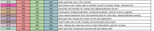
As promised, I have spoken with my psychologist about the point and purpose/use cases of my little health assessment tool I developed. Initially she was concerned that this was a way for me to minimize/distance myself from emotional experiences but after explaining further to her how I use it she endorsed it fully. I cannot stress enough that allowing yourself to healthily experience and work through emotions is critical to developing a healthy sense of self and identity. Understanding when you are healthy enough to handle emotional experiences or being aware that your emotions are going to be disproportionate due to a lower mental health state to help manage experiences can help you to work through and make positive memories out of situations which might otherwise overwhelm and shut you down.
At any rate, this tool is meant as a stepping stone to help train yourself to connecting with your full health and better self care. The more you use it the less you’ll need to ask the questions and be able to answer straight up, “today is a good day,” or “today my mental health isn’t so good, that is why i’m more emotional and i might not be eating well today.” I’ve been doing it for a month and am really seeing a lot of positive impacts in this regard.
---------
The RGB Self Care Assessment
Disclaimer; The purpose of this assessment is only to assist in better self awareness of the state you are in. Being aware of how you are physically, mentally, and emotionally doing on a day to day basis can help you treat yourself better and establish healthy boundaries. This can also be useful for tracking trends in your health and seeing how deficits or excesses in one or more categories can impact others. This is in no way a diagnostic tool and the RGB color spectrum side of things is entirely optional, but useful for creating an easy visual chart to see trends and patterns. The 9 questions are also not set in stone, feel free to develop your own questions to customize the system for your concerns regarding your health.
-----
To help practice awareness of my personal health and how I am feeling on a daily basis I developed a simple system of 9 data points, rated 1 through 10, to assess how I am currently doing in three categories. 1 being I am doing poorly at the point in question, 10 being I am doing excellent. After rating the three points of a color category you average them for a result. This, converted to a percentage (i.e. a 6 would be 60%) is then multiplied by 255 (the maximum value of the color in the RGB scale) to give you the final color value for that category (60% of 255 is 153, so Red 153 would be the final value). You can also just estimate where you think the final value is once familiar with the questions and bypass the math.
Each of the three points is accompanied by example questions to help understand the point and better rate it. The purpose is awareness of my own health so as long as I am thinking about the point that is the most important part. The final score/color value is a helpful visual representation.
Red - Physical Health - The purpose of the Physical Health category is to connect with your body and understand the condition you are in.
1. Current Physical Condition - are you healthy, injured, in pain, or uncomfortable?
2. Hygiene - have you been taking care of cleanliness and keeping well groomed?
3. Diet/Hydration - Have you been eating healthy and regularly; are you drinking enough water?
Green - Mental Health - The purpose of the Mental Health category is to connect with your mind and understand if you are experiencing difficulty and shutting down. If you have consumed any drugs or stimulants (coffee, cigarettes, recreational or otherwise) try to answer these 2-3 hours after finishing so that an honest, unaffected answer is achieved
1. Executive Function - How well are you handling day to day tasks and basic life skills? Are you struggling to carry through with simple actions?
2. Motivation/Creativity - Are you having difficulty finding interest in things? Are you shutting down when thinking through problems or simple actions?
3. Focus/initiative - Do you struggle to maintain a thought or interest? Are you having trouble despite motivation to begin a task?
Blue - Emotional Health - The purpose of the Emotional Health category is to connect with your emotions and understand if you are at risk of emotional damage or capable of handling emotionally charged experiences
1. Anxiety/stress - Are you experiencing looping/restrictive thoughts? Are you feeling optimistic or pessimistic?
2. Emotional sensitivity/vulnerability - Are you feeling strong/secure in your emotions? Do you feel that your emotional responses are volatile or uncontrolled? Are you reacting stronger to stimuli than you feel is normal? Do you feel vulnerable?
3. Empathy - Have you emotionally retreated? Do you feel overwhelmed by emotional media or displays (crying at music, etc)? Do you feel open or closed to experiencing emotional things?
An example completion of the RGB assessment:
R1 - 5
R2 - 8
R3 - 9
R Average - 7.3 / 10 = 73% * 255 = 187
R Final Value - 187
G1 - 8
G2 - 8
G3 - 7
G Average - 7.6 / 10 = 76% * 255 = 195.5
G Final Value - 195
B1 - 6
B2 - 5
B3 - 4
B Average - 5 / 10 = 50% * 255 = 127.5
B Final Value - 127
(a good website for inputting RGB values and getting a hex or color name is https://www.color-blindness.com/color-name-hue/)
Final RGB value = 187, 195, 127
Misty Moss
A reminder - The color result is of no actual immediate purpose but in general the way the assessment works a well rounded healthy condition should be trending to white while darker colors indicates a trending toward poor health. Brighter saturation of any of the three colors can help indicate defecits and over time trends of how different parts of your health impact others should be easier to notice.
If you made it this far and have any feedback, questions, or comments on the system I’d be happy to discuss them either openly in the comments or privately if you want to DM me. I’d love more feedback on how you would approach this and whether or not you feel it is useful or helping.
9 notes
·
View notes
Text
Under the cut, some experiments I did with dithering and different image formats. Dithering used were custom-made ordered dithering and Floyd-Steinberg dithering algorithms, formats were converted with ImageMagick.
@dontcode
Images used: a b c (and g, for testing whether the setup works)
Algorithms:
<none> - raw
1. - Ordered dithering
2. - FSDithering
$$$
180218 a .jpg
1125785 a1.jpg
559014 a1.png
2322985 a2.jpg
1107831 a2.png
296933 b .jpg
468685 b1.jpg
263361 b1.png
1068114 b2.jpg
353398 b2.png
297961 c .jpg
542985 c1.jpg
292458 c1.png
1169743 c2.jpg
567005 c2.png
26399 g.png
10335 g1.png
25172 g2.png
in general, jpegging a dithered image greatly increases its size, with barely any difference in quality (with my fetish for dithering, it's a downgrade)
it also seems that ordered dithering takes about half the size of floyd-steinberg dithering, and can be similar in size to the original
however, in the first case it has a marginally large increase in size for reasons I can't deduce ?!?
also, the squares are still off, which causes it to look ugly, make sure they work well!
$$$
updated results:
180218 a .jpg
1184525 a1.jpg
715241 a1.png
2322985 a2.jpg
1107831 a2.png
296933 b .jpg
486222 b1.jpg
286810 b1.png
1068114 b2.jpg
353398 b2.png
297961 c .jpg
579619 c1.jpg
403950 c1.png
1169743 c2.jpg
567005 c2.png
26399 g .png
12556 g1.png
25172 g2.png
there is no distinguishable visual difference between file formats anymore, even with my keen eye and various zoom levels (I mean ok file I can tell which is which, but let's not
boast too much)
HOWEVER the memory ratio between the formats remains, so that settles it
In the case of b, the original image contains no shading and almost no coloring, thus we perceive a reduction in colors leading to an actual REDUCTION in memory used
idfk about the others tho
Imho ordered dithering doesn't only use less memory than floyd-steinberg dithering, but its visual representations are also much more pleasing
I am still intrigued about the source of the original/dithered ratios
Also, compare to raw image in png file format (even though I already know it will probably be more)
$$$
1305600 a.png
180218 a.jpg
867569 b.png
296933 b.jpg
1091211 c.png
297961 c.jpg
I am not surprised in the least.
$$$
Thus the clear winner is ordered dithering in .png format!
g.png
g1.png

g2.png
(please keep in mind that tumblr will probably convert the last three to .jpg. so I can’t guarantee you’ll get the same sizes that I had.)
(also, I know it;’s not fair but that is the only image I own the rights to so it’s the only one I post :D I might do some bulk testing when I’m back home, so that’ll be more general.)
2 notes
·
View notes
Text
Quick Critique: Guacamelee 2
I highly recommend playing Guacamelee 1 first, which is a-okay because it's one of my favorite PS3 games. The intro to G2 is a bit on the slow side but by the time you hit the first dungeon, things are popping off and the challenge rooms are right up there with the ones from the end of Guac 1. When Guacamlee decides to get difficult, it has an amazing ability to be teeth-grindingly frustrating while making you laugh and have fun at the same time. G1 had hard bonus rooms, but it was a fair hard because you can see what they're going for and what they want you to do, you just need to up your skills and be able to do it. For a game about tight platforming and really impactful upgrade abilities, the first new ability in G2 is pretty bad. It's not fun, it's finicky, and you don't have complete control over it at all times. The best sequences the game has are you expertly stringing together your moves to weave through intricate hazards but the new power is a fling move that's based on your angle away from the grapple point so it feels... physics-y when all your other moves are super tight. How far away you can be from a grapple point to activate the move feels random or unresponsive at the worst of times and it leaves you repeating puzzles because it wouldn't activate at the proper angle and you dropped to your doom or flung yourself too high and into spikes. G2's hardest challenge is a heavily timed segment using the fling move over and over but I died over and over because the character would grapple the air instead of grabbing the grapple point or the grapple point behind me would activate instead of the one I wanted to grab. The entire segment lacked the tension of the original Tule Tree because I felt like I was fighting the game and controls rather than the objective. You can't customize your controls and the default isn't great. Part of the problem is that there are just too many controls and combinations of buttons. You have multiple special moves mapped to the same button, which is fine and works well, but then you have a different state to morph into and that has its own set of special moves, and then there's a second special move button related to wall moves, and changing dimensions on top of that. The controls are a mess. If all they did was cut out the chicken state, I think I'd be cool with it. It was a funny joke in the first game but now that they've tried to turn it into a major gameplay element, it's just more clutter than fun.
The art is a mixed blessing. Drinkbox is up to some sorcery with how amazing they are at applying lighting effects to 2D objects. The game just looks fantastic and awash in colors and sparkles everywhere you look. But that also means a lot of scenes are overloaded with lights and objects fighting for your focus. You'll frequently run into hazards that are hard to pick out or get hit by a projectile that passed behind some effect or decoration and you couldn't see it until it was too late. there will be fights where multiple enemies with different kinds of shields, fire, and explosions or other VFX will all overlap and you lose track of it all and can't see your character. You just kind of button mash and hope you make your way out for a breather.
The new story and characters are good, but they don't have the impact of the original villains. Every member of Calaca's crew was memorable and Calaca himself was a fun really evil villain. In G2, only one member of the bad guy's crew is any fun and Salvador himself barely feels like an entity. You never see him do anything other than posture. For the vast vast majority of the game, your task is to hunt down a dying man. Yeah, he's evil and all but if you just stalled, he'd probably drop dead on his own. Not much a menacing figure. The overall story leans heavy on multiverse shenanigans but they don't have much fun with it. It just leads to lots of Family Guy quality references and doubles down on the goat guy, who continues to be just the worst. They do let you switch costumes practically from the start and you get to play as X'tabay! But her hair is tied up in a bun! BOOO! She has amazing video game hair, let it flow like the majestic waterfall that it is.
As mentioned, Guacamelee 2 is still loaded down with references again, but they're more heavily video gamey than just memes this time so that's... better. In the first ten minutes, they hit you with Limbo to Bad Dudes to Double Dragon to River City Ransom to Bad Dudes AGAIN. It's a really bad first impression ,but it thankfully cools down a little bit after that but there's still a steady stream of it everywhere you go. When you're free of the references, the game is actually very funny so I don't know why they're leaning on these lazy references. Guacamelee has one of the most likable representations of Satan and there are characters whose whole bit is that they tell terrible skeleton-based puns but those bad puns are funnier than any of the TV and game references crammed in. There's a whole area devoted to mocking the players that complained about the use of memes in the first game but... most of the complaints are legitimate. There were too many memes, they weren't funny, they were outdated by the time most people played the game, and the rest of the writing was better than relying on a Robot Chicken level reference to an Internet picture. None of those complaints are invalid but the game expects you to take the developer's side and think the people telling the company to not use memes are the ones that are wrong and jerks.
The writing feels less like a celebration of Mexican culture than the first game. G1 felt like it was honoring Mexican lore but having some loving fun with it but G2 falls back on stereotypes and tacos a bit too quickly.
I got every Trophy save for two. One requires you to juggle an enemy six times in a row with a specific move, but if you've maxed out all your skills all the enemies die before you get to six hits. The other trophy is for beating the game on hard, but... I don't know if I really want to play through it a second time. Maybe I'll get bored on the weekend and get the Platinum, but Guac 1 left me wanting more and Guac 2 wore out its welcome. I was able to beat it 100% in just under 9 and a half hours. That puts me at number 22 on the Speed Run leaderboards but the game wouldn't let me upload my time. Even though I'm connected to the Internet, it keeps telling me I'm not and prompting me to connect. If the game won't let me upload a score because I don't have PS Plus, that is some serious BS. Every dungeon seemed like you could cut out a third of it and it would be a lot better.
G2 is a good game, but it's not as good as the first one. That's still good praise. Guacamelee 1 is one of the best PS3 games, so for the sequel to be good but not one of the best, they still made a fine game that's worth your time. But where I'd recommend Guacamelee 1 to anybody to show why this is my favorite genre, I'd only recommend Guac 2 to somebody that's already a fan. They succumbed to the pressures of a sequel. Instead of just taking what was great about the first game and just making more of it (which is all I wanted), they added extra features that weren't as refined and the game feels a bit cluttered for it, but then the maps are so much bigger that I was discouraged from doing multiple mid-game clean-ups for chests and upgrades. You can't just make your map bigger without having more fast travel and a better way to track progress. The music is good, but all the best tracks are just remixes of the first game. I regularly listen to G1's soundtrack, but with G2 it's hard to pick out what's new and different. Guac 1 just needed to get rid of the memes, have the final boss fights not be total trash, and improve the late game combat so it wasn't just slapping shields on existing enemies and pumping up their health. For all the areas that G2 could have improved upon the original, they ignored those things and didn't fix the original's main problems.
1 note
·
View note
Text
Week 6 PREAMBLE
PREAMBLE[1]
Proposals inform people about an exhibition you would like to develop. Putting a proposal together helps you flesh out your own ideas, and will help others clearly see what you intend to produce. This document also requires that you contextualise your thinking by drawing on content and ideas introduced in the 237.331 course, alongside material you locate on the concepts and concerns that are the focus of your topic.
This is a project for a hypothetical exhibition. You take on the role of curator. The aim is not about developing an exhibition of your own creative practice, but it is intended to extend your inquiry, knowledge and understanding of fields of interest in your degree.
This assignment is also designed to help you to develop skills for writing proposal(s) and application(s) in the industry sector, the art world, and the community.
§ Expected hours of project: Weeks 6 – 11 = 45 hours independent + 15 hours class contact
Contents
A. Exhibition overview
B. Curatorial processes
C. Ethics and/or kaupapa
D. Potential audiences and outreach
E. Budget (estimate, indicative)
F. Visual support
G. Bibliography
Name
Student ID
Exhibition Title
Location(s)
Date of event(s)
Section A: Exhibition Overview
A1. Exhibition Overview
A succinct statement of the exhibition idea/concept, its theme, the subject areas it covers, and why it is worthy of taking forward. [150-175 words]
A2. Objectives `
What are the key objectives of the exhibition? [50-100 words]
A3. Venue / site / location
The venue or site of your exhibition is a critical ingredient to its success. Explain why have you chosen the particular or specific venue or site? [75-150 words]
Section B: Curatorial Processes
B1. Curatorial Position
In this section you will explain what types of decisions are guiding your curation processes. This includes explaining the relationships you seek to build in your selection of items within the exhibition. Use the following sub-titles to assist your explanations. [250-300 words in total]
What: Briefly introduce/overview the items of your exhibition in general terms. (The details of your exhibition items are placed in Part F Visual Support).
How: Explain why you have selected the particular items, then explain how the selection helps you to build an overall narrative / curatorial statement.
Narratives and Storytelling: What is the main narrative and its conceptual threads or issues? What relationships does your curating seek to achieve with and between exhibition items?
What: Explain what is represented in your exhibition/display? What is significant about these representations?
Who: Representation: Who is represented and why are they important?
Affect, atmosphere, emotional connections: What do you envisage are the intended qualities of the exhibition on the viewer/visitor/user? And how do intend to achieve this in the exhibition (eg spatially, lighting, sound, etc)? These details can be elaborated on in Section F (below).
B2. Context & other literature
This section contextualises your ideas in relation to the wider field of exhibition and curatorial practices by drawing on a relevant body of existing literature and knowledge. Here, you are asked to demonstrate wider knowledge that informs your curatorial project including the types of exhibitions or displays that exist and are similar to your own ideas, the work of curators or curatorial strategies that inform and help you shape your own project?
Use course resources as well as draw on wider research material. Write this as an integrated and synthesized discussion. [650-800 words]
Section C: Ethics and/or the Kaupapa guiding your project.
C. Demonstrate awareness for ethical concerns
Read through the various documents on Codes of Ethics and Kaupapa Māori Principles. See the folder called Kaupapa Māori –Principles – Ethics. This is on the Stream site for PDFs & URLs. Also, work through the modified Ethics Screening Questionnaire. If your answer to any question(s) is YES, write the question out below and write an understanding of the nature of potential risks involved that you can identify. [no word limit]
Section D: Potential audiences and outreach
D1. Audience/Market Analysis
Target audience
Outline who the exhibition seeks to attract. For example, the exhibition may target specific individuals, particular community groups, families, students, specialists in the field, etc. What projected weekly audience attendance figures do you anticipate? Identify and discuss audience demographic, be as specific as you can. [50-150 words]
D2. Exhibition Outreach Programmes
Discuss exhibition outreach and additional or supplementary programmes that may stem from this project. List any accompanying public programmes that will run in conjunction with the exhibition, such as: floor-talks, workshops, education programmes, family activities, tours, etc. [75-150 words]
D3. Documentation and publication record
How will you document the exhibition as a lasting record? Is this important? If not, why not? Do you intend to publish a catalogue, or documentary, or any other output? Who would be commissioned to write for this? [50 -125 words]
D3. Exhibition Outreach [75-150 words]
Indicate collaborations with other museums, individuals, commercial industries, organisations, or iwi: This could include loan of objects from other museums, individuals or organisations, any consultation undertaken in developing the concept, public programmes, exhibition development. Explain how the support might be acknowledged.
Other venues: Discuss/note the potential for other sites and venues your exhibition project might also travel to, be displayed and seen in.
Marketing and communications: Describe how you will promote the exhibition for example, online, story in local newspaper, radio, museum newsletter, posters, flyers.
Evaluation methods: Explain how you could assess visitor feedback on the exhibition: for example visitor numbers, anecdotal comments, visitor surveys, etc.
Section E: Budget
E1. List all exhibition requirements, prepare a budget of approximate costs.
Itemise expenditure under the fields provided, and add/delete rows as appropriate. Justify exhibition expenditure in broad terms below. Note that these are indicative fields only. Staff may advise on how this form can be adjusted depending on your projects. While there is not an explicit budget provided for you to work within, the objective is to demonstrate some degree of awareness of actual costings. [This section is not counted as part of your overall word count]
Item
Quantity
Cost $
Materials
Fabrication costs
Contractors, assistant(s), casual employment[2]
Participating artist's/designer’s fees
Loans fees
Freight Costs
Copyright/permissions for images etc.
Research and writer and editor costs (labels etc.)
Consumables 1. (electricity, rates, venue hire, transportation, etc.)
Consumables 2. (list any additional items that will attract a cost, e.g. costume hire, photocopying)
Catering
Miscellaneous
Total estimate costs excluding GST:
Income/revenue (what might your exhibition and related programme earn)
E2. Potential funding avenues
Please list at least 4 x potential sources you might apply to in order to fund this project.
Section F: Visual Support - the nature and scope of your exhibition
[This section is not counted as part of your overall word count]
F1. Floor plans and visual support
Work to a range of between 5-10 exhibition items. Any less defeats the need to demonstrate skills with the scope of the assignment, any more creates too large and demanding project for you to complete necessary details.
Include floor plans to show the layout of exhibition/display items, and/or include maps to indicate exterior site location(s). Create a system that can reference each exhibition item on the floor plan or map. This will allow for cross-referencing between the proposed layout/floor plan/map, with each ‘thing’ marked in its place and the content provided in the following section, below.
F2. List of exhibition items/artefacts/works
Provide a visual list of items each item with a caption. Aim to keep list to 1-2 pages.
Also produce a MLA Works Cited list of all of the items. This includes providing details of each item and also identify if the artefacts/items are on loan from public or private collections, or the provenance of exhibition items. This list will cross-reference to your exhibition layout or map.
Section G: Bibliography
Draw from course set texts and other credible sources you have located to support your A2. Project Proposal. Use MLA bibliographic style for in-text citations (quotes and paraphrasing). Visual representations require MLA style captions.
[This section is not counted as part of your overall word count]
G1. Annotated Bibliography
In support of your investigation, ideas and research include an annotated bibliography of at least 3 texts [75-200 words each text].
G2. Extended Bibliography
Includes resource material cited in the body of proposal, and all other sources that have informed this project assignment.
[1] Acknowledgment: This document has been developed by 237.331 staff guided by project proposal briefs held in the public domain (Te Papa National Services Te Paerangi, and Creative New Zealand Arts Council of New Zealand Toi Aotearoa).
[2] If you require casual assistant(s) for your project use a living wage hourly rate ($21.15/hour in 2019).
If you require casual employment for specialised task (e.g. models) use a rate of $27.00/hour.
0 notes
Text
MCO: Selected sectors allowed to resume business – workshops, service centres and automotive exports
The Malaysian government has agreed to reopen selected economic sectors for business, which will take place under strict guidelines for health and movement with the implementation of the latest phase of the movement control order until April 28, announced by prime minister Tan Sri Muhyiddin Yassin in his special speech to the nation at 4pm today.
The prime minister said he understands that the country’s economy has been affected by restrictions applied to entrepreneurial and manufacturing activities during the enforcement of the MCO, and added that a special cabinet committee will be formed to study the list of economic sectors that will be selected to reopen for business in stages.
The reopening of selected economic sectors does not mean that the conditions of the MCO is being slackened, the prime minister stressed, reiterating that the order remains in force and all directives issued by the authorities must be obeyed, and breaches will result in the revocation of approvals.
Following the announcement of the MCO extension, the ministry of international trade and industry (MITI) has issued a statement, in which it lists industries and activities permitted for the latest phase. For the automotive industry, activities are limited to the export of CBU vehicles, tools and components as well as after-sales service, such as workshops and service centres.
Other industries listed include heavy machinery, aerospace, construction and construction-related industries, scientific, professional and technical services including research and development (limited to legal representation services, oil and gas services, Covid-19-related R&D activities and laboratories and test facilities (for permitted sectors only), social health services including registered traditional and complementary medicine practitioners.
Permission has been given for the additional sectors to operate based on their importance in the global value chain and the country’s exports, to ensure the stability of export activities; the activity of economic sectors with high value-added multipliers; their impact on the sustainability of SMEs in the economic sector, particularly in manufacturing and services; and the size of workforce involved.
For the end consumer, also on the ‘permitted’ list are hardware stores, electric and electronic good stores and optometrists, for wholesale and retail activities only. Laundry services are listed too (full service only; not self-service), and basic hairdressing services for cuts only – we will all need a haircut soon, don’t we?
This doesn’t mean that activation is automatic – companies in the sectors listed above will have to apply for clearance. They can submit their application for authorisation beginning Monday, April 13, 2020 from 9am. All applications must be made online through MITI’s website, and only applications which are complete and fulfil the conditions will be processed, the ministry said.
Sectors to be considered for approval to operate:
Automotive industry
Export of CBU vehicles
Components
Aftersales services e.g. maintenance
Heavy machinery
Aerospace
Construction projects
(i) Projects where main contractors are G1-G2 contractors
(ii) Projects at completion of 90% or higher
(iii) Tunneling works
(iv) Maintenance works
(v) Slope maintenance
(vi) Emergency works as stipulated in contractual agreements
(vii) Works to maintain, clean and removal of stagnant water, pesticide spraying at work sites to combat breeding of Aedes mosquitoes and other parasites
(viii) Other works which, if incomplete, will pose danger
(ix) Construction projects with IBS scores of 70 and above
(x) Construction projects with centralised workers’ quarters or workers’ camps
Scientific, professional and technical services, including research and development
Limited to legal representation services, oil and gas services, Covid-19-related R&D activities and test facilities for permitted sectors only
Social health services including registered traditional and complementary medicine practitioners
Hardware stores, electric and electronic good stores and optometrists, for wholesale and retail activities only
Basic hairdressing services (haircuts only)
Full-service laundry (self-service laundry not allowed)
The post MCO: Selected sectors allowed to resume business – workshops, service centres and automotive exports appeared first on Paul Tan's Automotive News.
MCO: Selected sectors allowed to resume business – workshops, service centres and automotive exports published first on https://kwsseuren.tumblr.com/
0 notes
Text
11 "Faux Pas" That Are Actually Okay to Make With Your business card printing dublin

Just how to Generate a Feeling of Deluxe along with Business Cards
When you have a high-end brand, deluxe should be connected throughout every factor of your marketing. The consumers will experience it from the second they hold your calling cards in their palm, right through to the instant they experience your item. Discover how to create a luxury pity your business cards within this overview and also you'll be actually one step better to drawing in the consumers you actually wish ...
Defining
At AlphaPrint, we provide traditional rectangular business cards together with mini and squared cards. The form you choose are going to largely depend on the type of business you run and also your personal taste. Mini business cards are actually half the elevation of a basic card, whereas square business cards are actually 55 x 55mm. Deciding on an alternate condition for your calling card might be an understated means to aid you stand out from the crowd.
Colour
Colour may connect a massive volume regarding a company without the visitor also realizing it. When our experts are actually confronted with a certain shade scheme, we make immediate decisions regarding what remains in face people. Daring, dynamic colours are frequently made use of for strong, lively companies. Consequently, a spectacular brand name ought to use colors that carry luxurious to mind.
When marketing a high-end company, it is smart to use color thoroughly and check here select even more refined and neutral moods. Make a decision how you prefer your consumers to really feel when they think about your brand name, as well as select a scheme that accommodates with that said state of mind. To find out more concerning exactly how to make use of colour successfully in advertising, you can read more in our Psychological science of Colour post.
Typography
In our blog post The Psychology of Typography, our company discuss the way the font you make use of can have an effect on the technique a client will certainly observe your brand name. When deciding on a typeface to utilize for your calling cards, bear in mind your brand name's personality and also the legibility of the text message. It would be actually pointless to possess a gorgeous calling card if no-one may read your get in touch with details!
Lavish brands often tend to choose subtle and exquisite typefaces. The design of the text advises the sense of the item-- for instance, a brand that values custom might choose a script design font style. Whereas a much more modern-day company is going to choose simpler sans-serif text such as Helvetica.
Paper
There are actually many different newspaper options around, however when designing luxury business cards for an exceptional company it is consistently better to pick a luxurious newspaper. Opt for a paper that goes to minimum 350gsm (our criterion is actually 450gsm) and your card are going to experience glamorous in the client's palm. The kind of newspaper you opt for are going to additionally have an effect on the technique your concept appears when it is actually printed-- various papers possess numerous levels of absorption so colours might appear lighter on a matt paper and darker on a buff.
The newspaper you choose can likewise have a various form of coating. at AlphaPrint we offer three various appearances-- matt, glaze, and velour. Matt appearance is smooth and satiny to the flair and produces an advanced feeling, whereas Gloss is a high-shine appearance which boosts the colour. Plush appearance is actually an exceptional choice for luxury brands as it offers an unequaled soft-touch as well as deluxe premium. Once more, birth your perfect consumer in thoughts when picking a finish as well as consider exactly how the appearance of the paper will certainly impact the feel and look of your layout.
Decoration
A refined embellishment may go a very long way to connecting the personality of your label. Experiment with embossing, foiling and also location UV to offer your calling card some added deepness and also appearance. Numerous brand names select to make use of embossing for their logo or even feature specific parts with a contact of a metallic foil. Place UV provides a selected segment of your concept a high-gloss luster, making it catch the lighting. Every one of these decorations are actually excellent methods to create your card a little bit distinct without being actually also raffish!
The look and feel of your business card are going to speak quantities concerning your brand name, so consider the above groups meticulously when making. If suspicious, contact among our team or even decide on among our pre-designed layouts.
Perform you possess an example of spectacular marketing performed right? Share with our company on Twitter or Facebook!
8 Corporate Calling Card Instances with an Advantage
The whole idea responsible for a calling cards concept is that 1) it needs to produce you stick out, and 2) it has to create an excellent adequate influence that the connect with you have actually simply produced calls you back. When you think about well-known calling card instances, one of the 1st of these ahead to thoughts is actually Facebook Chief Executive Officer Mark Zuckerberg's infamous 'I am actually CEO, B--' card that was created widely known in the movie The Social media network. This card displayed just exactly how arrogant and also assertive the then-22-year-old Zuckerberg concerned business that corrected on the peak of taking the world through hurricane.
These well known business cards were actually eventually taken and also changed, with the professional of claimed business cards, Brian Veloso, proposing that they "were actually a great representation of the firm society at the time ... Their substitute reflected the improvements a young Facebook needed to go through to become where it is today." Andrew Bosworth, Facebook Exec, likewise believed that business cards were actually "intended as a joke for his good friends." Although these business cards helped make a fantastic effect, they were not really aimed to become used in a specialist, corporate atmosphere.
Taking creativity from Zuckerberg's surprisingly tailored business card example, our company'll present you how you can easily make a layout that definitely flaunts your personality without jeopardizing your professionalism and reliability.
Opt For an Unusual Forming
Along with modern digital publishing, it's never been actually simpler to flaunt your innovative panache. You can easily go completely out there along with a business card molded like something you offer or use, like a comb for a hairdresser or cupcake for a pastry shop. Or even if you would certainly like something much more refined, rounded edges and also straight business cards are actually a fantastic technique of distinguishing your own self from your rivals.
We really love business owners as well as UX Developer Anusha Iyer's mini business cards-- the bright different colors are excellent for this year's appealing layout trends and their unique form means a prospective customer could simply find all of them once again in their wallet.
Have fun with Texture and Colour
Yet another extensive perk in contemporary technology is actually that full-color professional calling card publishing doesn't have to set you back the planet-- actually, a lot of on-line printers will not demand any kind of added expense for this. It additionally means that there's a substantial selection of appearances you can play around with for your design, featuring Area UV (additionally called polish laminate). This is where you add a glossy covering to certain locations of your calling cards to either create them stand out or to produce a pattern. Exactly how something thinks in your customers' palms is therefore important for bring in a long lasting opinion, therefore why not make the most of our free of cost Spot UV templates?
Our Services:
Printing Services
Copying Services
Outdoor Printing
Graphic Design
Promotional Printing
T-Shirt Printing
Contact : 01 426 4844
E-Mail : [email protected]
Address :
Unit G2, Ballymount Drive, Ballymount Rd. Lower
Dublin 12 (Same building as Office Supplies)
D12EN8A
Our Social Links:
https://www.instagram.com/alphaprintie/
https://www.pinterest.ie/alphaprintie/printing-company-in-dublin/
Related Links:
https://alphaprintie.tumblr.com/business-cards-printing-in-Dublin
http://alphaprint.eklablog.com/pull-up-banner-printing-in-dublin-p1456546
http://alphaprint.eklablog.com/printing-in-dublin-p1456552
http://alphaprint.eklablog.com/business-signs-p1456554
https://alphaprintie.weebly.com/pull-up-banner-printing-in-dublin.html
https://alphaprintie.weebly.com/printing-in-dublin.html
https://alphaprintie.weebly.com/business-signs.html
https://printingireland.webnode.com/business-signs/
youtube
0 notes
Text
5 Killer Quora Answers on business cards

Exactly how to Create a Really Feeling of Deluxe with Business Cards
When you possess a luxurious brand name, luxury ought to be corresponded across every component of your advertising. The customers are going to feel it coming from the minute they keep your calling cards in their hand, right through to the moment they experience your product. Know just how to produce a luxurious feel with your business cards in this particular manual as well as you'll be one measure closer to pulling in the consumers you truly want ...
Shape
At AlphaPrint, we offer traditional oblong business cards in addition to mini as well as boxy cards. The shape you decide on will mainly rely on the kind of business you operate along with your private preference. Mini business cards are actually half the elevation of a typical card, whereas straight business cards are 55 x 55mm. Selecting an alternative condition for your business card may be an understated way to help you stick out from the crowd.
Colour
Colour can easily interact a large amount regarding a brand name without the visitor also discovering it. When our team are dealt with a specific color scheme, our experts produce quick selections business cards regarding what remains in front end of us. Daring, dynamic different colors are commonly used for vibrant, vibrant brands. Consequently, a glamorous brand ought to use colors that take high-end to mind.
When industrying a premium brand name, it is actually smart to utilize different colors thoroughly as well as elect more subtle as well as neutral moods. Make a decision exactly how you desire your consumers to experience when they think of your brand name, and pick a palette that suits with that mood. To learn more about exactly how to make use of different colors successfully in advertising, you can easily learn more in our Psychological science of Colour article.
Typography
In our article The Psychological science of Typography, our company explain the way the typeface you use may influence the way a consumer will definitely see your brand. When selecting a typeface to use for your calling cards, bear in mind your brand's character in addition to the readability of the message. It would be worthless to possess a gorgeous business card if no-one may read your call particulars!
Extravagant brands tend to select understated as well as exquisite font styles. The design of the text recommends the feeling of the product-- for instance, a brand name that values custom may opt for a manuscript design typeface. Whereas an even more modern business is going to select less complex sans-serif text like Helvetica.
Paper
There are various paper choices available, yet when creating deluxe business cards for a quality company it is regularly well to go with a luxury newspaper. Decide on a newspaper that is at minimum 350gsm (our criterion is 450gsm) and also your card will feel lavish in the consumer's palm. The sort of newspaper you pick will additionally affect the means your concept looks when it is printed-- various documents possess various degrees of absorption so colours may appear lighter on a matt paper and darker on a polish.
The paper you pick may additionally have a various form of finish. at AlphaPrint we provide three various finishes-- matt, gloss, as well as velvet. Matt finish lies and also smooth to the touch as well as develops a stylish feel, whereas Gloss is actually a high-shine finish which boosts the colour. Velvet coating is an outstanding option for high-end brand names as it offers an unrivaled soft-touch and luxury top quality. Again, birth your optimal consumer in thoughts when choosing a finish and look at exactly how the structure of the paper are going to affect the feel and look of your layout.
Decoration
An understated embellishment may go a very long way to corresponding the individual of your label. Explore embossing, hindering and also spot UV to provide your business card some extra intensity as well as appearance. Many companies select to utilize embossing for their logo or even highlight particular elements with a contact of a metallic aluminum foil. Area UV provides a selected area of your layout a high-gloss sparkle, making it catch the lighting. Every one of these decorations are actually great ways to make your card a small amount unique without being actually as well ostentatious!
The look of your business card are going to communicate quantities about your brand name, therefore take into consideration the above categories very carefully when creating. If suspicious, speak with some of our group or even select among our pre-designed themes.
Perform you have an example of spectacular branding performed right? Show us on Twitter or even Facebook!
8 Corporate Business Card Examples along with an Upper hand
Rationale behind a calling card style is actually that 1) it needs to make you stand out, as well as 2) it needs to induce an excellent adequate influence that the call you've only created phone calls you back. When you think about well-known business card instances, one of the first of these ahead to thoughts is actually Facebook CEO Mark Zuckerberg's infamous 'I am actually Chief Executive Officer, B--' card that was actually made famous in the film The Social Network. This card flaunted merely how arrogant as well as assertive the then-22-year-old Zuckerberg had to do with the business that was right on the peak of taking the planet through tornado.
These well known business cards were actually ultimately taken as well as switched out, along with the developer of claimed business cards, Brian Veloso, advising that they "were a great representation of the company lifestyle back then ... Their replacement showed the modifications a younger Facebook needed to have to look at to become where it is actually today." Andrew Bosworth, Facebook Exec, additionally believed that business cards were actually "meant as a prank for his friends." Although these business cards created a fantastic effect, they were certainly not in fact aimed to become made use of in a specialist, corporate setting.
Taking inspiration from Zuckerberg's incredibly customized calling cards example, we'll reveal you exactly how you can generate a design that definitely flaunts your individuality without risking your expertise.
Opt For an Uncommon Shape
Along with contemporary electronic publishing, it is actually never ever been easier to exhibit your artistic flair. You can go entirely on the market along with a business card molded like one thing you market or even use, like a comb for a beauty parlor or even cupcake for a bakeshop. Or if you 'd favor something even more understated, pivoted corners and straight business cards are actually an excellent way of separating yourself from your competitors.
Our experts adore the business managers as well as UX Designer Anusha Iyer's mini business cards-- the bright shades are actually excellent for this year's eye-catching layout trends as well as their unique form implies a potential client might effortlessly locate all of them again in their budget.
Have fun with Texture and also Colour
One more substantial perk in modern-day innovation is actually that full-color qualified calling cards printing does not have to cost the planet-- in reality, a lot of on the web color printers will not ask for any type of extra expense for this. It additionally indicates that there is actually a significant selection of appearances you may experiment with for your design, featuring Spot UV (also known as polish laminate). This is where you include a shiny coating to specific regions of your business card to either create them stand out or even to make a trend. How something feels in your customers' palms is actually thus necessary for making a long-term impression, therefore why not take advantage of our complimentary Area UV templates?
Our Services:
Printing Services
Copying Services
Outdoor Printing
Graphic Design
Promotional Printing
T-Shirt Printing
Contact : 01 426 4844
E-Mail : [email protected]
Address :
Unit G2, Ballymount Drive, Ballymount Rd. Lower
Dublin 12 (Same building as Office Supplies)
D12EN8A
Our Social Links:
https://www.instagram.com/alphaprintie/
https://www.pinterest.ie/alphaprintie/printing-company-in-dublin/
Related Links:
https://docs.google.com/document/d/1dPXmcMn4XMu_-tAFVnjPMQG6OlSmX1TWKDSBycGQxXM/edit?usp=sharing
https://printingcompanydublin.blogspot.com/
https://alpha-print.business.site/
https://alpha-print.business.site/posts/1516932838444735747
https://alpha-print.business.site/posts/3003857943096531290
https://alpha-print.business.site/posts/7441220902811433249
https://alpha-print.business.site/posts/7548667939518098157
youtube
0 notes
Text
5 Laws Anyone Working in business card printing dublin Should Know

How to Produce an Experiencing of Deluxe with Business Cards
When you own a high-end brand name, luxury must be actually communicated around every element of your advertising. The customers will definitely feel it from the moment they keep your calling cards in their hand, throughout to the second they experience your item. Find out how to create a deluxe pity your business cards in this particular resource as well as you'll be actually one step better to drawing in the clients you truly desire ...
Defining
At AlphaPrint, we provide conventional oblong business cards along with mini as well as square cards. The form you decide on will largely depend on the type of business you operate in addition to your private flavor. Mini business cards are half the elevation of a common card, whereas square business cards are 55 x 55mm. Selecting an alternative shape for your calling card may be a refined means to help you stand out from the group.
Colour
Colour can communicate a large amount regarding a company without the viewer also recognizing it. When our experts are business cards ireland confronted with a specific colour combination, our team produce instantaneous choices concerning what is in front of us. Bold, lively different colors are usually used for daring, lively brands. Therefore, an elegant brand name ought to make use of different colors that deliver luxurious to mind.
When marketing a premium company, it is actually important to make use of colour thoroughly and also elect more subtle as well as neutral tones. Determine how you prefer your consumers to experience when they consider your label, and choose a scheme that accommodates with that mood. For more information regarding how to use color effectively in advertising and marketing, you can easily learn more in our Psychology of Colour post.
Typography
In our article The Psychological science of Typography, our company discuss the technique the typeface you make use of can easily influence the technique a client will view your brand. When deciding on a typeface to use for your calling cards, bear in mind your brand name's individuality in addition to the readability of the message. It would certainly be actually pointless to possess an attractive calling card if no-one may read your contact details!
Glamorous companies usually tend to select refined and classy font styles. The form of the text advises the feeling of the item-- for example, a brand name that values practice might pick a script type typeface. Whereas an even more contemporary firm will definitely select easier sans-serif text including Helvetica.
Paper
There are actually many different paper choices around, yet when making deluxe business cards for an exceptional brand it is actually always better to go for a high-end paper. Choose a newspaper that goes to least 350gsm (our specification is actually 450gsm) and your card will certainly feel extravagant in the client's hand. The form of paper you decide on are going to additionally influence the means your layout looks when it is published-- various documents possess several levels of absorption so different colors may appear lighter on a matt paper as well as darker on a gloss.
The newspaper you select can easily also have a different form of appearance. at AlphaPrint we offer three different appearances-- matt, polish, and plush. Matt surface is smooth and silklike to the style as well as creates an advanced feel, whereas Gloss is actually a high-shine appearance which intensifies the colour. Velour coating is actually an outstanding option for luxury brands as it provides an unparalleled generous as well as luxurious top quality. Once again, bear your best client in mind when picking an appearance and think about just how the structure of the paper are going to impact the feel and look of your concept.
Embellishment
A subtle decoration can go a very long way to interacting the individuality of your label. Experiment with embossing, foiling and spot UV to give your business card some additional intensity and appearance. Many companies select to make use of embossing for their company logo or feature particular elements along with a touch of a metal aluminum foil. Location UV provides a picked segment of your layout a high-gloss sparkle, making it capture the light. All of these decorations are fantastic means to make your card a little unique without being too overdone!
The feel and look of your business card will certainly communicate quantities regarding your brand, so think about the above groups carefully when making. If in doubt, speak with some of our group or even pick one of our pre-designed templates.
Perform you possess an instance of luxurious advertising carried out right? Show to us on Twitter or Facebook!
8 Corporate Business Card Instances with an Advantage
Rationale behind a calling card layout is actually that 1) it has to create you stand apart, as well as 2) it has to create a wonderful adequate effect that the connect with you have actually only produced phone calls you back. When you think of iconic calling cards instances, one of the first of these to follow to thoughts is actually Facebook Chief Executive Officer Mark Zuckerberg's known 'I am actually Chief Executive Officer, B--' card that was actually made famous in the film The Social media. This card showed off simply exactly how cocksure as well as assertive the then-22-year-old Zuckerberg had to do with the business that was right on the peak of taking the planet through storm.
These notorious business cards were actually at some point pulled and switched out, with the designer of mentioned business cards, Brian Veloso, recommending that they "were a superb representation of the company society at the time ... Their replacement reflected the improvements a young Facebook needed to experience to become where it is actually today." Andrew Bosworth, Facebook Exec, likewise believed that your business cards were "aimed as a joke for his friends." Although these business cards made a great effect, they were not actually meant to be used in a specialist, business environment.
Taking motivation coming from Zuckerberg's incredibly customized calling cards instance, our company'll reveal you just how you can generate a layout that actually exhibits your individual without risking your professionalism and reliability.
Select an Unusual Molding
With contemporary digital printing, it is actually never ever been actually easier to exhibit your innovative panache. You can easily go totally on the market with a calling card shaped like one thing you sell or make use of, like a comb for a beauty parlor or dish for a bakery. Or even if you would certainly like something a lot more subtle, rounded edges as well as straight business cards are a terrific way of separating yourself from your competitions.
Our experts enjoy the business proprietors as well as UX Professional Anusha Iyer's mini business cards-- the brilliant colors are ideal for this year's eye-catching concept styles and also their unusual form suggests a prospective customer could conveniently find them once more in their wallet.
Enjoy with Texture and Colour
Another huge benefit in present day innovation is that full-color professional calling card publishing does not need to set you back the world-- as a matter of fact, a lot of on-line color printers won't bill any sort of extra price for this. It also means that there's a large variety of textures you can play around with for your design, consisting of Area UV (likewise called polish laminate). This is where you add a shiny finish to particular locations of your calling cards to either make them stand out or to produce a pattern. Just how one thing believes in your clients' hands is so important for making an enduring impression, so why certainly not make the most of our totally free Place UV templates?
Our Services:
Printing Services
Copying Services
Outdoor Printing
Graphic Design
Promotional Printing
T-Shirt Printing
Contact : 01 426 4844
E-Mail : [email protected]
Address :
Unit G2, Ballymount Drive, Ballymount Rd. Lower
Dublin 12 (Same building as Office Supplies)
D12EN8A
Our Social Links:
https://www.instagram.com/alphaprintie/
https://www.pinterest.ie/alphaprintie/printing-company-in-dublin/
Related Links:
https://alphaprintie.wordpress.com/sign-printing-in-dublin/
https://alphaprintie.wordpress.com/printing-company-in-dublin/
https://alphaprintie.wordpress.com/business-signs/
https://printingcompanydublin.blogspot.com/
https://printingcompanydublin.blogspot.com/p/business-signs-provider-offers-best.html
https://printingcompanydublin.blogspot.com/p/business-cards-printing-in-dublin-with.html
https://alphaprintie.tumblr.com/sign-printing-in-Dublin
https://alphaprintie.tumblr.com/printing-in-Dublin
youtube
0 notes
Text
Synchronous Generators Parallel with Same Size Generators
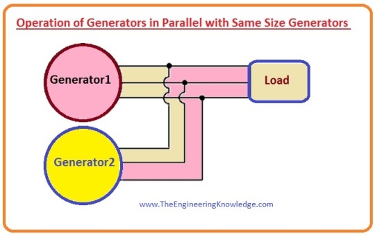

Hello friends, I hope all of you are fine. In today's tutorial, we are gonna have a look at Synchronous Generators Parallel with Same Size Generators. As we discussed in the synchronous generator operating alone article that the when a single synchronous generator is working in system the active power (P) and reactive power (Q) provided by the generator both remains constant, constrained to be equivalent to the power required by the load, and the frequency and output voltage VT were altered by the governor and the field current of the generator.
In the article Operation of Generators in Parallel with Large Power Systems, we also discussed that the frequency and output voltage was constrained to equal to the large power system, and the active P and reactive power Q were changed by the governor of the generator and the IF. In today’s post, we will discuss if we connect the generator parallel with another same size than what will be the effect on the terminal voltage, active power, and reactive power. So, let’s get started with the Operation of Generators in Parallel with Same Size Generators.
Synchronous Generators Parallel with Same Size Generators
If the synchronous generator is attached in parallel with another synchronous generator that has equal power ratings. Then the resultant diagram of their connection is drawn in a given figure.
In this type of parallel operation, the summation of the active (P) and reactive power Q provided by these 2 generators should remain equal to the active and reactive power required by the load.
In this parallel combination, the frequency of the system and the power of the synchronous generator should not be constant.
The graphical representation among the frequency and the power is drawn in the given diagram, instantly when the second generator G2 is attached with the first.

The total power of this system is given as.
Ptot =PLoad =PG1 +PG2
The total reactive power Q of this system is given here.
Qtot =Qload = QG1 + QG2
What happens if the governor set points of G2 are increased?
When the second’s generator governor setting points are increased, the curve among the power and frequency of the generator moves upward from its original point.
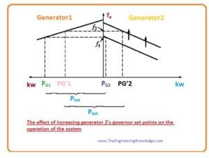
As we discussed earlier that the Ptot that is provided to the load should be constant.
At the frequency f1 that is the original frequency of the system, the power provided by the generator G1 and G2 is higher than the requirements of the load, therefore this system will not work on the similar frequency as earlier.
At the frequency f2, you can see in above-given figure that the total power of these two generators is identical to the load required power P The f2 is larger than the f1 original frequency of our system.
At the frequency f2 the second generator providing larger power than earlier it was producing and the first generator now producing less power than before.
If we summarize the effect of governor setting points increments on the parallel operation of the same size generator then we concluded that.
The frequency of the system has increased as we can see that it increased from f1 to f2.
By varying the governor points the generator’s (G2) power will increase and other (G1) generator’s power will decrease.
Now we discuss the effect of field current of the generator G2 is varied.
What happens if the field current of G2 is increased?
The resultant diagram when the field current of the G2 increased is drawn in a given figure.
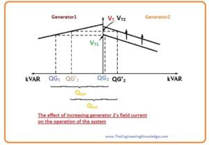
In parallel operation of the 2-similar size generator when field current increase of second generator then we get these results.
There will be an increment in the terminal voltage of both these 2 generators systems.
The reactive power of the generator G2 has increased while the reactive power of the generator G1 has decreased.
We noted that the in parallel operation of 2 similar size generator, the variation in the governor setting points of any generator will alter the overall frequency and power of both generators.
How can the power-sharing of the power system can adjust independently of the system frequency, and vice versa?
The answer to this question is simplest. As we know that if governor setting points of any generator are increased then the frequency and the power of that generator, will also increase.
And decrement in the set point of generator’s governor will decrease its power and the frequency.
So, to regulate power-sharing without altering the system’s frequency, enhance the governor setting points of the first generator and concurrently lessen the governor’s setting points of the 2nd You can see this configuration in the given diagram.

Also, to regulate the system’s frequency without altering the power-sharing, concurrently do increment or decrement in the governor setting points. This arrangement also shown in given picture.
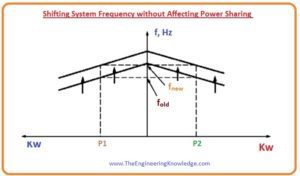
The regulation of the output voltage VT and reactive power can be done by this similar method. To move reactive power sharing points on the curve without varying the terminal voltage, concurrently upsurge the IF of first generator and do decrement in the field current of the second generator. It is shown in a given figure.
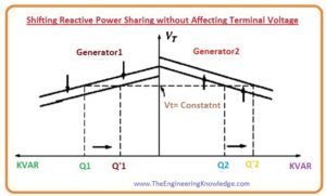
Correspondingly, to regulate the system’s frequency without altering the power-sharing, concurrently do increment or decrement in the governor setting points both the generators.

Conclusion of the Operation of Generators in Parallel with Same Size Generators
If we summarize the parallel operation of the same size generator than we get some main points that are described here.
The sum of the power provided by the generator G1 and G2 should equal to the power used by the load.
To regulate the active power distribution among both generators without altering system’s frequency concurrently increase the governor setting points on first generator and do decrement in the governor setting points of second generator. The increment in the governor setting points of that generator was done will take more load than others.
To do adjustment in the frequency of the system without varying the active power-sharing, concurrently do increment or decrement in the governor setting points of these 2 generators.
To regulate the reactive power (Q) distribution among these 2 generators without altering VT, concurrently do increment in the field current of one generator and decrease the field current of second generator. The generator will take more load whose field current has increased.
To regulate VT without altering the reactive power (Q) distribution, concurrently do increment or decrement in the field current of both the generators.
It is very significant that the synchronous generator operating in parallel with other generators shows a drooping characteristic among the frequency and the power.
It is very important that any synchronous generator intended to operate in parallel with other machines have a drooping frequency-power characteristic.
If 2 generators show the flat or almost flat characteristics, then the power distribution among them change extensively with the minor variation in the no load speed.
It shows in the given diagram.

You can see from the figure that the minor variation in the no-load speed of any generator would cause large changes in power-sharing.
To maintain suitable power-sharing among both generators, their speed drop should be two to five %.
That's all about Synchronous Generators Parallel with Same Size Generators I have mentioned each and everything related to Synchronous Generators Parallel with Same Size Generators. If you have any query ask in comments. See you in the next tutorial.
Read the full article
0 notes
Photo
1961 Gillette Fat Boy Rhodium Gold Re-Plated Refurbished G2–186
https://youtu.be/tXz4lSmFWI4 https://youtu.be/tXz4lSmFWI4 … Video
https://richardsrazorsdailyblog.blogspot.com …More Pictures
Please Be Sure to See the Pictures I've Posted on YouTube And Blogger for Any Flaws
1961 Rhodium/Gold Gillette RePlated, Refurbished Fat Boy Double Edge Safety Razor, date code G2. This Fantastic Collectible Razor Is in Re-Plated, Refurbished Condition. It Has Been Completely Disassembled, Cleaned, Tuned up, Repaired If Necessary, Re-Plated, Repainted and Reassembled into the beautiful razor that you see in the pictures, all the Mechanical Items on This Razor Work 100% as they are supposed to. The twist action to open the butterfly doors is crisp as well as the turning of the adjustment knob to adjust the shave, as each number clicks.
The razor is clean and shiny, with Absolutely No Evidence of Wear. It opens and closes smoothly, and the adjuster stops on each click and raises and lowers the adjustment plate. The adjuster plate raises and lowers as you twist the adjusting knob as it should when you adjust the shave. The lower the number, the less likely you will knick your skin. As the Pictures Indicate, There Is No Pitting, Brassing or Corrosion. The razor is 100% mechanically, Absolutely Beautiful in its' Brand-New Rhodium/Gold Plating!
The Refurbishing of This Razor Was Done by'Back Roads Gold'
*REPLATE RESTORATION*
-Ultrasonic cleaning of all parts.
-Repainting of all accents in factory colors.
-Mechanical inspection/adjustment/repair (as needed).
-Lubrication, reassembly, & mechanical function test.
-Blade gap alignment verification on all settings.
This Beautiful FatBoy Is Essentially a Brand-New Razor!
The black paint on the numbers is in fantastic condition as is the ring below the adjusting dial. The razor has been cleaned, polished sanitized and is ready to use. This item is in Excellent Re-Plated, Refurbished Condition. The razor has been thoroughly cleaned and sanitized with Barbasol and is shave ready. Please be sure to look closely at all the pictures, they are an exact representation of this beautiful collectible item also be sure to see the pictures that I have posted on Blogger and YouTube.
Price $160.00
Shipping and Handling USPS First Class Free USA
Shipping and Handling Worldwide USPS First Class International Calculated by Location. International shipping requires insurance $4.95
Also available on eBay
http://www.etsy.com/shop/RICHARDSRAZORS/
http://www.bonanza.com/booths/rckandrews45
Terms of Sale:
Please note:
The items I sell are vintage, not brand new & may have small imperfections. If you have questions or something is not clear, please email me prior to purchasing.
Forms of Payment: PayPal, Amazonpay, Stripe, Etsy
Buyer pays return shipping
Insurance is at the discretion of the buyer USA
Shipping: 1 Day Handling Time, USPS First Class Mail. International buyers pay according to location. Ships USPS First Class International Mail. Shipping Costs to Some Countries May Be Higher Than Stated, If so the Buyer Will Be Notified before the Item Is Shipped. Insurance is REQUIRED FOR INTERNATIONAL SHIPPING! NORMAL COST $4.95
Return policy: purchased item can be returned for a refund for up to 14 days… Notify the seller within Five days of purchase. If the item is not returned in its original condition, the buyer is responsible for any loss in value. Item must be returned in the same condition as when sold! No exceptions!
0 notes
Last Seen Blogs

yanyanaikinokta
yanyanaikinokta(..)

brxvxsoul
SAY / 𝒴𝒪𝒰 𝒲𝒜𝒩𝒯 𝑀𝐸 𝒯𝒪𝒪

perfectfeelings
Life Quotes

professionalcrazedfan
6 days since our last nonsense