#and it either remove all my formatting or makes random letters not colored
Note
mod. mod are you doing the thing where you don't color certain letters to spell out a phrase. i know its been used before but i can only remember it distinctly in crow strider and the trickster john event on one of the john ask blogs. you sneaky fucker. amazing work 10/10 im too lazy to decipher it

ASDFGHFjklkjjkhjghfdffs i fucking Wish........
no, tumblr post editor just fucking hates me and ive given up trying to appease it
#it wants me dead#something about the combo of having non standard colored bolded text in the chat font(probably others 2) makes the post editor freak out#and it either remove all my formatting or makes random letters not colored#i use to spend so much time trying to fix it but no matter what itd always come back#idk why................... its dumb....#like if i Could control the letters that were colored id def wanna do something like thta#but#like i Could just skip any of those steps and it might start behaving.......BUT........... it looks the nicest this way(ignoring the whole.#random formatting issues)#lmao#:'))))#rambles#ask#anon
19 notes
·
View notes
Text
La Prose Part One: Recreation and Research
What an exciting project I have been involved in through my most recent bookbinding commission: the recreation of La Prose du Transsbérien et de la Petite Jehanne de France - the remarkable book by poet Blaise Cendrars and artist Sonia Delaunay. Sonia and Blaise first met in January of 1913 and formed an instant friendship, producing this book by letterpress and pochoir in 1913. The original book was a landmark achievement for its time and remains vibrant and modern today.
The recreation project was conceived by Kitty Maryatt, the proprietor of Two Hands Press in Playa Vista, California since 1974. In 2017 she decided to publish the recreation with the help of underwriters. Kitty has created a blog of her own documenting her journey through the process of recreating 150 editions as closely as possible to the original book by using letterpress and pochoir. Her blog is totally fascinating can be found here. It is thanks to this blog, plus some additional information that was printed to be housed with the completed book, that I am able to pass on so much information about this latest binding of mine.
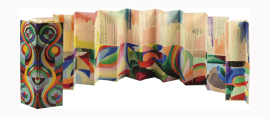
The image above shows the binding made by Paul Bonet between 1963-64, sold by Christie’s in Paris on April 29, 2004 for 350,000 Euros. Sonia and Blaise had planned on making 150 copies however this was not completed.
“Was the primary reason for the incomplete edition the excessive length of time it might take to complete the pochoir process, assuming that the pochoir was the final procedure before binding? Did World War I intervene? Were there exhibits of the book, any reviews, any publicity at all? Were the sales disappointing? Did they run out of money?”
The actual number remains unknown, 74 have been identified but the list of these has never been published.
“The edition numbering system Blaise Cendrars used is somewhat random, indicating that the edition numbers were not written on the copies when they were first made. For example, there are two copies numbered 47, two numbered 111, and two numbered 139. Many copies do not have an edition number. There is a copy numbered 1 and one numbered 150.”
The La Prose of 1913 was printed on three materials: vellum, Japon and simile Japon, they stuck to the typical formula of publishing a deluxe edition and regular edition. Japon in one of many Japanese papers sold by the Japan Paper Company; simili Japon is made with Western fibres, also sold by the Japan Paper Company. The Paul Bonet binding is one of the vellum editions.
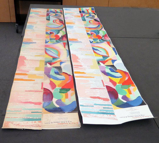
The below image shows Kitty’s recreation (right) alongside an original copy at The Getty Research Institute, Los Angeles, CA (left). This is #124, glued and folded into 21 panels, inscribed to Archipenko, the vellum cover is not attached.
“The book itself is captivating with its colorful and painterly pochoir (French-style stencil), so unlike stenciled copies of artwork at the time. The colors seep from the painted side into the poem on the other side.”
Kitty wanted to recreate the pochoir methods as closely as possible to the original using pommes (short, wide brushes) and metal stencil plates. Pochoir is a refined stencil-based technique employed to create prints or to add colour to pre-existing prints. It was most popular from the late 19th century through the 1930's with its center of activity in Paris. Numerous stencils were designed as a means of reproducing an image. (Photo courtesy of Kitty Maryatt)
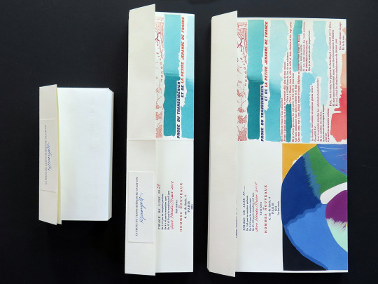
My copy was one of two that Neale Albert (New York) had underwritten and commissioned. When I received my copy of the sheets in the post (#58 0f 150) they came with three different instruction sheets of how the pages could be folded - it was rather daunting!
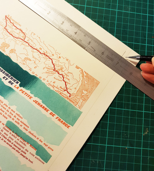
The long vertical format of the book was an unprecedented choice for a book of the period:
“The Trans-Siberian Railroad was begun in 1890 when Blaise Cendrars was only three years old, but it was highlighted at the 1900 Exposition Universelle in Paris that he attended with his family. The entire series of railroad lines weren't actually completed until three years after La Prose du Transsbérien was published. In the book, Blaise included a map of the journey from Moscow to Vlasivostok, which gives us a clue as to the distinctive folding scheme of the book. I've found tourist maps of Paris for the period similarly folded, in half first, and then in accordion – folded flat and glued to the cover. In the case of La Prose, as you open the book, you can't actually see anything in the book, neither the text nor the imagery, until the book is completely unfolded.”
It was up to me to choose which format I wished to use having been instructed that there was no set way of binding the book, so total creative freedom! Along with the written instructions, Kitty also sent all binders images of the folding and gluing process - crucial information to have before proceeding. There were three ways of folding the concertina, either like the original (left hand format), long and thin like the Paul Bonet binding (middle format) or double width (right hand format). (Photo courtesy of Kitty Maryatt)
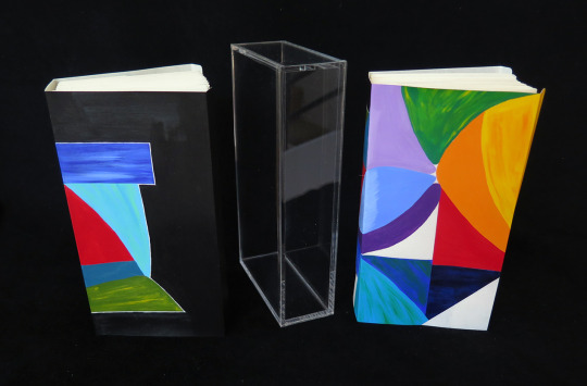
The 1913 edition book covers were painted in oils by Sonia Delaunay, some covers had a snap, which made the book resemble a purse. Kitty’s version of La Prose is bound with vellum covers however she used acrylic paint to decorate the cover as she found that the oils yellowed the vellum. The book is housed in an acrylic slipcase and is pictured below. (Photo courtesy of Kitty Maryatt)
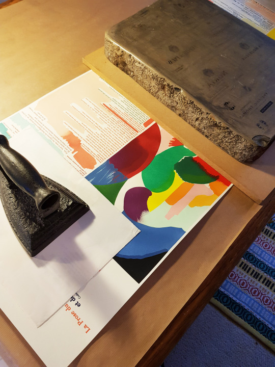
So, the time had come to trim and stick all of my sheets together!
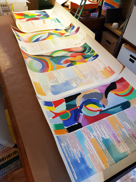
The first step was to cut all four pages to size. I am used to working in cm, I have almost never used inches, so the fact that all of the instructions were in imperial took extra brain power - I never even glance at the other side of the ruler!
The first step was to measure 7 1/18 inches from the centre fold mark at the top and bottom and to cut off one vertical side.
The next was to cut off the other vertical side so that the width of the page was 14 1/14 inches and the two sides were parallel.
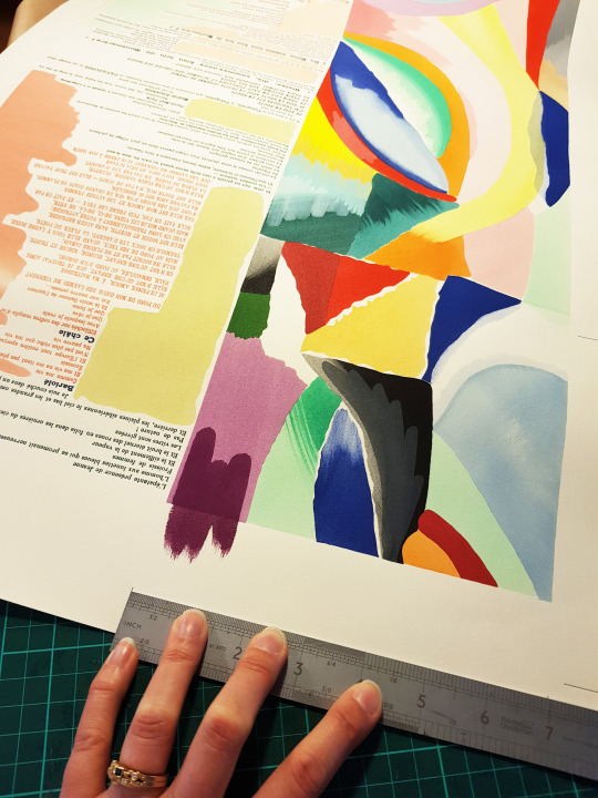
Next I had to cut off one inch at the top of page one, and to trim the top of pages 2 to 4 at the printed mark on the right side just above the first line of type. The bottoms of each page then had to be cut to meet the following lengths: Page 1 - 21.75 inches, Page 2 - 20.25 inches, Page 3 - 19.875 inches and Page 4 - 19.5 inches.
I was then able to proceed with gluing all four sheets together. I soon found I didn’t have a long enough table to work on but managed to get around that by moving two next to each other! The cut edges of the sheet were not thinned or pared in any way, they were stuck together at full thickness (the same as with the original binding).
Pages one and two were lined up along their edges, overlapping by 3/4 inch. Each page was glued to about 1/2 inch in, so that when overlapped all of the paper overlap was covered in glue. The reverse of the upper page was glued, then the front of the lower page before being combined.
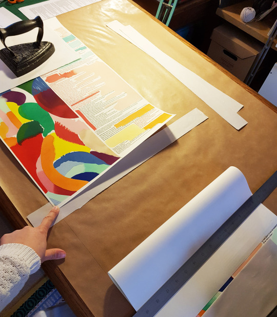
A weight was applied to the glued joint afterwards and I waited for it to dry before moving on to gluing the next joints. The instructions stated:
“Note that the images don’t line up completely at the joints. I copied the original exactly. Why did they do that? It’s odd from our perspective. The outside lines should line up pretty well if you cut to size carefully.”
Once all four sheets were glued together is was time to start folding. Her the instructions did actually switch to being in centimetres!
“Folding: I use a jig of board cut to 197mm. I place the board on to the paper at the bottom edge, blank side up, place the ruler next to the left side of the board, remove the board, and score the paper 197mm from the bottom edge, and fold up. The next fold is 197mm from the first fold, I score on the blank side and reverse the fold (or you can flip the book if you wish). Continue until you get to the top, where you will have a tab left for attaching to your binding, if you wish.”
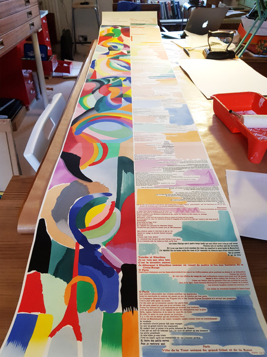
These folding instructions left me with a text block to the largest format possible. I deliberated for a long while whether to keep it at this size, but in the end took the plunge and did an additional fold in each section to give me a text block that was half the width, so the same format as that of the Paul Bonet binding.
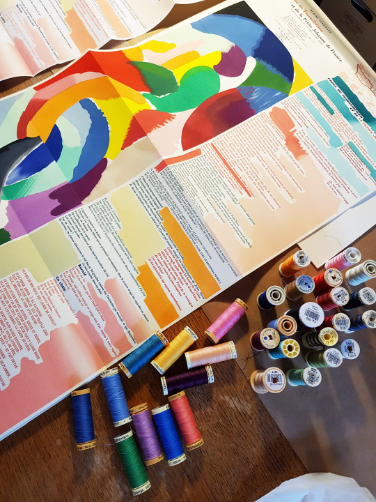
Once I had the text block size it was time to start designing the cover. I knew that I wanted to use embroidery, as I always do, so set about making sure I had threads to match all of the wonderful pochoir colours.
I decided to do some research into Blaise Cendrars. Blaise Cendrars was the pen-name for Fréderic Louis Sauser - a play on Braise (ember) and Cendres (ash). He was a Swiss-born novelist and poet who became a naturalised French citizen in 1916. He was a writer of considerable influence in the European modernist movement.
His writing career was interrupted by World War I, he was sent to the front line in the Somme from mid-December 1914 until February 1915. It was during the attacks in Champagne in September 1915 that Cendrars lost his right arm and was discharged from the army.
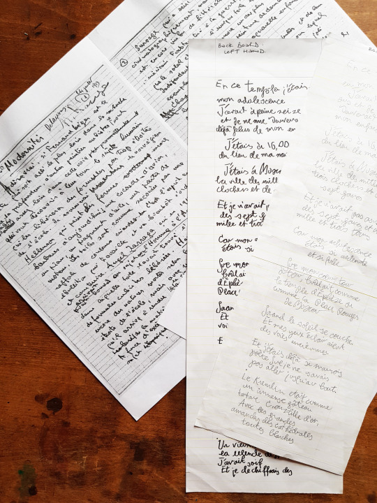
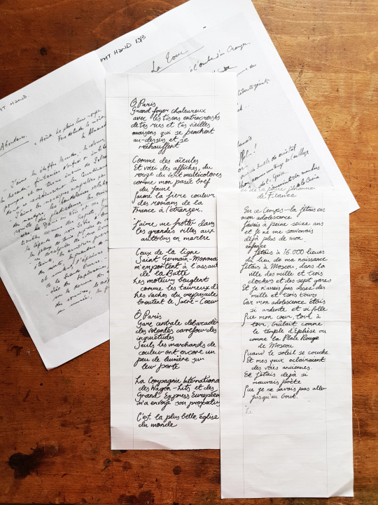
As he was right-handed, he had to learn how to write with his left hand following the war. I decided to try and find handwriting examples of his from before and after he lost his right arm which was possible online. It would have been wishful thinking to find a handwritten transcript of La Prose, however I did find some good examples of both his left and right handwriting on other documents.
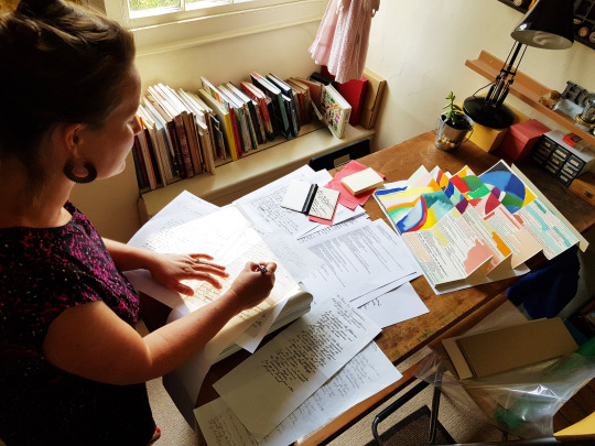
What I decided to do was to transcribe parts of the poem in each of these handwriting styles to use on the front and back of the book. I used a typed print out of the poem to refer to and found example of whole words (if possible), or individual letters, from the documents I had found, and pieced these together to try and reflect the writing style of before and after the loss of his arm - the left hand writing was more haphazard and scribbly-looking. What I couldn’t work out at first though was which should go on which cover!
I put the question to some family and friends and got some great feedback. What I hadn’t thought about before was that if I did the “before” handwriting on the front and the “after” handwriting on the back, when the book was opened up or laid flat I would have the writing on the sides which naturally correspond to the hands which were used - the decision was made.
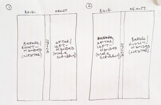
So the “after” left handwriting became the design for the back board, and I took wording from the beginning of the poem.
And the “before” right handwriting became the design for the back board, and I took wording from towards the end of the poem.
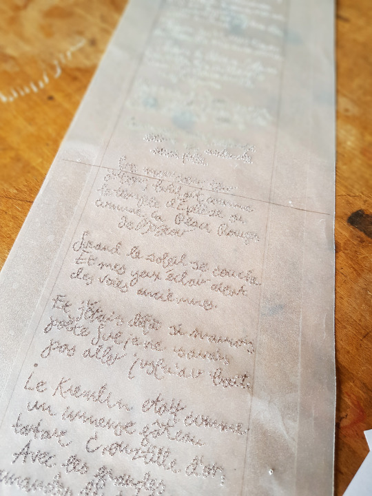
It took a few attempts to get it to the right width for the boards, and to get enough words on so that the front and back covers started and ended at the same heights. For each of the covers I photocopied the writing onto tracing paper templates so I had a master copy to work from.
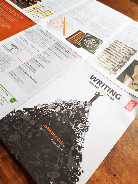
During the period of time I was working on this binding I made a trip to London to see the British Library’s exhibition entitled, Writing: Making Your Mark.
“Writing: Making Your Mark is a landmark British Library exhibition, which spans 5,000 years across the globe, exploring one of humankind’s greatest achievements – the act of writing. From carved stone inscriptions, medieval manuscripts and early printed works to beautiful calligraphy, iconic fonts and emojis, Writing: Making Your Mark (26 April – 27 August 2019) will deconstruct the act of writing and consider its future in the digital age.”
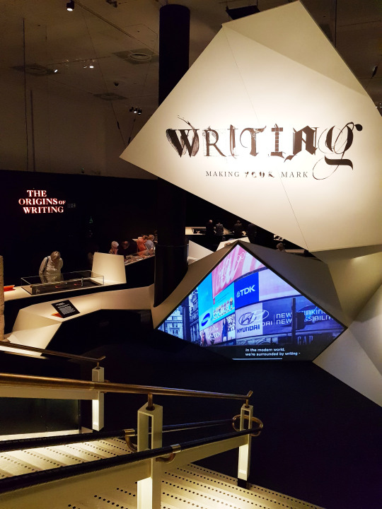
What a timely exhibition to be on whilst I was making my own mark with the handwriting of Blaise Cendrars.
“People first created writing 5000 years ago, its invention revolutionised society. Writing began in a number of locations around the world, at different times and for different reasons. People developed it to communicate across time and space, carrying it with them as they traded, migrated and conquered.”
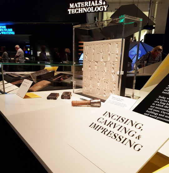
It is amazing to think that writing and technology have often developed hand in hand. What began as inscribed patterns on bones thousands of years ago has somehow led to me sitting at my computer typing away at this blog on a keyboard. I hope I have done Blaise Cendrar’s two versions of handwriting justice in my binding!
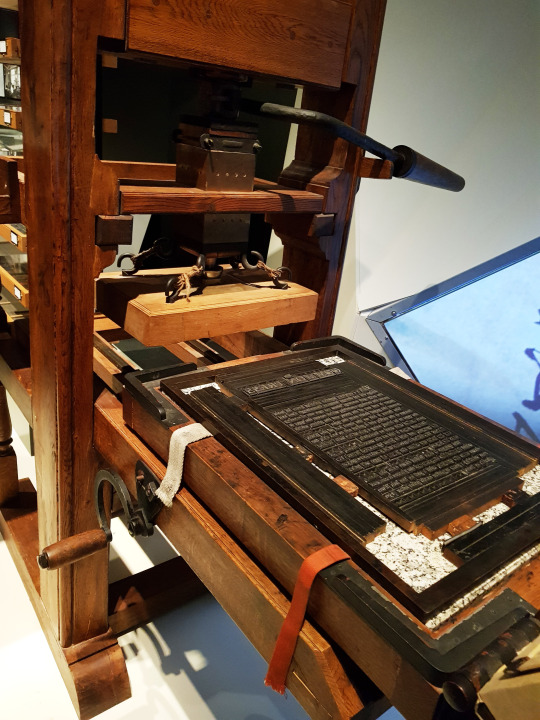
In August 2015 Kitty identified thirty-eight distinct typefaces used in La Prose.
“Blaise Cendrars printed La Prose at Imprimerie Crété in Corbeil, France because he was already in the process of printing his second book, Séquences, at Crété in early 1913. The poem is four hundred and forty-five lines long. In a brilliant and groundbreaking master stroke, Blaise decided to select dozens of typefaces for the poem.”
She was convinced that Blaise did not walk along the hundreds of type cabinets at Crété impulsively selecting type: Crété certainly would have had an in-house type catalogue to view the available typefaces.
The next blog post will go through the choices I made when it came to binding such a book, “La Prose Part Two: Structure”.
#la prose#la prose du transsibérien#sonia delaunay#blaise cendrars#kitty maryatt#british library#writing#making your mark exhibition#bookbinding#bookbinding commission#reliure#reliure d'art#livre d'art#pochoir#stencilling#typesetting#handwriting#left handed#right handed#two hands press#hannah brown#hannah brown bookbinder#shepton mallet#bowlish#embroidered binding#vellum binding
8 notes
·
View notes
Last Seen Blogs

artbymartell-blog
Untitled

neelkamalblog
Untitled

nocofamilyau
have mercy

kajalmag
Kajal Magazine

whattheshock
cam!!