#crushin on 1998
Text
#1998#crushin on the 90s#crushin on 1998#that 70s show#brandy#brandy monica#movie soundtracks#can't hardly wait#ever after#drew barrymore#usher#spice world#the odd couple II#korn#will & grace#crush#crushes#crushgasm#crush podcast#podcast#90s crush#90s movies#90s television#90s tv#90s music
1 note
·
View note
Audio
Life´s too short for weird music - Tagesempfehlung 25.05.2018
Film school / Crushin
Irgendwie ist die Dream-Pop Band Film School während ihrer ersten Schaffensphase zwischen 1998 und 2010 komplett an mir vorbeigerauscht. Doch so manches Comeback kann Wunder wirken. Das Quintett aus San Francisco ist gerade nach 8 jähriger Abwesenheit mit einer neuen Single zurückgekehrt. „Crushin“ beinhaltet das Gesamtpaket dessen, was sich Mensch von einer hochklassigen Dream-Pop Veröffentlichung erhofft. Latente Electronica, ein Refrain zum Schmelzen und diese sphärischen Soundwälle. Und ganz erstaunlich – während ich Dream-Pop / Shoegazer Veröffentlichungen eher in der dunklen Jahreszeit vorziehe, schafft es „Crushin“ ganz locker, meine aktuellen – schon Sommer geprägten Playlists zu besetzen.
2 notes
·
View notes
Text
PAGE x PAGE ANALYSIS-- BATMAN: GOTHAM ADVENTURES #1

PUBLISHED: DC Comics, June 1998
SCRIPT: TY Templeton
PENCILS: Rick Burchett
INKS: Terry Beatty
COLORS: Lee Loughridge
LETTERS: Tim Harkins
EDITORIAL: Darren Vincenzo
For the last couple weeks, the time I might have otherwise spent writing more Page x Page Analyses was instead spent writing, revising, and thumbnailing the first issue of a new series. If the winds stay southernly, I’ll have more to say about that soon -- but in the meantime, it’s got me thinking about what goes into making a successful first issue. Charged with introducing the cast and premises as well as telling an engaging money’s-worth story, they're tricky beasts, even when you’re dealing with established characters. Maybe even especially when you’re dealing with established characters. For kids.
Such is the case with 1998′s BATMAN: GOTHAM ADVENTURES #1!
I looked at issue 17 of this series in the debut installment of this feature. Aside from writer Ty Templeton and penciler Rick Burchett, the same creative team was here at the beginning, and all of the same good qualities are in play: strong meat-and-potatoes storytelling, muscular use of color to set location and mood, clear, clean inking, and solid lettering that invisibly guides the reading flow. With its intelligent use of simple character-driven plotlines and dynamic visual direction, BATMAN: GOTHAM ADVENTURES #1 is a prime example of how to introduce new readers to a full, lived-in world -- even if that world has been on your TV since 1992, and in continuous publication since 1939.
BATMAN: GOTHAM ADVENTURES #1 and all characters contained therein are property of DC Comics, reproduced here solely for educational purposes.
***
PAGE ONE

We kick off our new Batman comic by having The Joker leaping straight at the reader as the entire Batfamily gives chase.
Why mess around if you don’t have to, y’know?
This is not, strictly speaking, a splash page. The inclusion of that little “With a price on his head!” panel to go along with the title is blatantly non-verisimilitudinous (meaning it explicitly breaks any illusion we have that what we’re seeing is real, immersive). I think this was a canny move; this issue is going to do some really tricky tone-juggling where the Joker is concerned, so starting out with these two very different deceptions of him right on the first page immediately lets us know what to expect. Lee Loughridge’s colors are on the job to keep this from being confusing, clearly placing the first panel in a different spacial and temporal plane than the main image.
PAGE TWO

The first panel follows immediately from the opening page, establishing a nice fast pace of action. I love how the Batfam looks sort of like a flock of birds -- it’s a cool way to add a dynamic, distinctive element to what is essentially just a footchase.
This whole sequence has particularly clear lines of motion, beginning with this page:
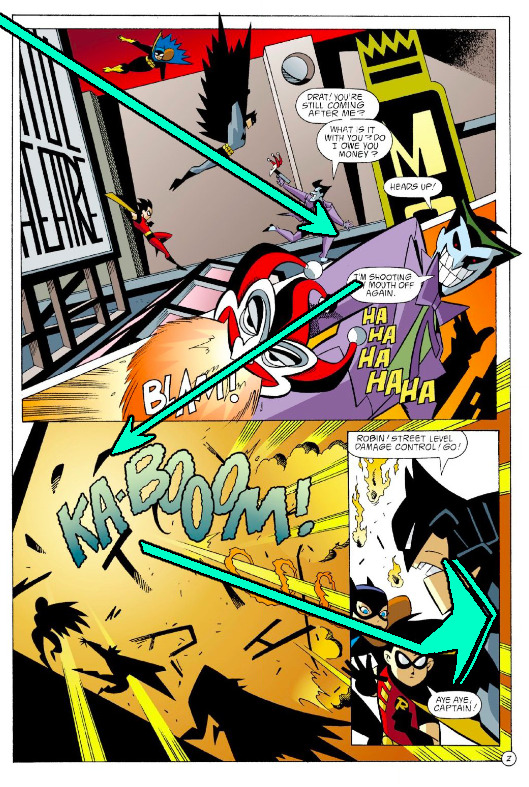
Having Batman point directly at the reader in the last panel is an effective way to snap off the action flow of the page, making it feel more three-dimensional than the simple zig-gag it would be otherwise. Side note: how great are those sharp silhouettes in panel three? Funky and distinctive, selling the force of the explosion while still letting us know who’s who.
PAGE THREE

Lots of good stuff going on with this page. Again, the action continues directly from the previous page as Robin follows through on Batman’s order and saves a civilian from the falling debris. We get a nice little bit of characterization-through-action -- Robin is a good soldier, a capable superhero, and a wisecracker -- as well as demonstrating how the Batfamily is concerned with protecting the people of Gotham City just as much as they’re concerned with catching criminals. Seems pretty basic, but it’s surprising how often that simple mission statement gets lost in the shuffle of telling a new superhero story.

See also how the space where the flaming debris land in panel two is along the same latitude as where the civilian was standing in panel one. The arc of Robin’s swing also passes through that same point. This is a helpful touch, showing us how narrowly she just avoided a fiery demise.
We do lose track of Batgirl for the rest of this scene, which could be considered a structural error in the script.

Burchett makes sure we don't lose track of Batman and the Joker by turning them into there sharp, easily identifiable silhouettes, backlit by Loughridge’s distinctive colors in the explosion and the screen. You really can’t miss them. Tim Harkins continues to help us out on the lettering front, drawing a line between Batman, the Joker, and Summer Glisan’s news report. The citizens below add to the general danger by making the city feel full of vulnerable citizens, as well as helping us get a sense for how high off the ground the action is.
PAGE FOUR

This is such a great way to get exposition across. Where an infodump like this can often kill a story’s momentum, the ongoing Batman/Joker fight keeps up the intensity of the scene in a way that really doesn’t take up all that much real estate on the page. This device also connects our main characters to the exposition by allowing the Joker to directly react to it. He really is a loathsome villain; Templeton’s script does a deft job of balancing out the goofy, whimsical elements of the Joker with the lethal. Too far one way and he’s just a clown who makes Batman look silly for having to contend with him -- too far the other and he’s a shrill, boring serial killer.
More clean movement on this page:

Note how this layout draws our attention to the horrible rectus smile in panel three from two different directions; the action line from the previous panel as well as the Joker’s shaking fist, with Batman’s head in the bottom left corner pointing up to it for good measure. All conflicts in the issue derive from the fact that the Joker murdered this young man, so it’s very important that we absorb this image before we move on to the next page.
PAGE FIVE
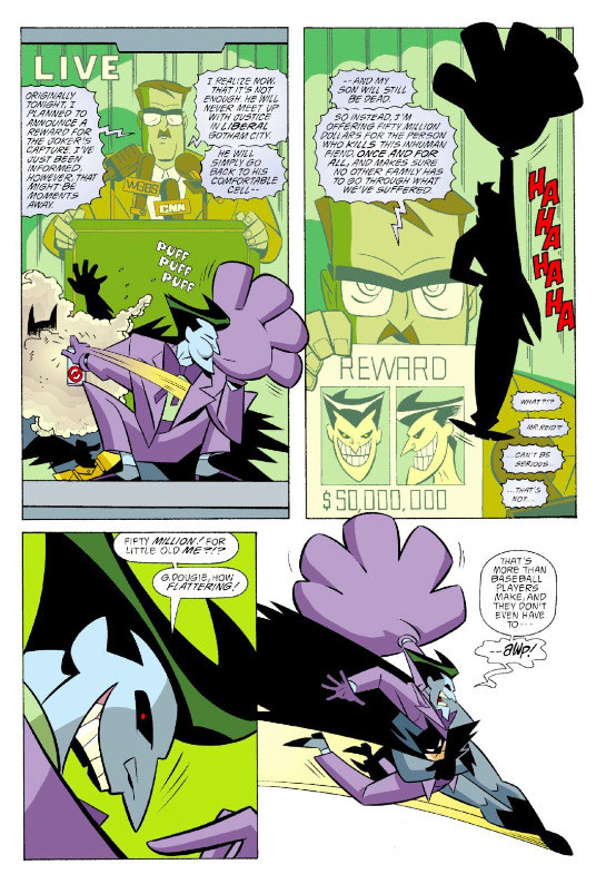
See, again, the great balancing act. The anti-bat spray and the giant inflatable glove are patently ridiculous, but when laid over the face of a father driven mad by grief, the clownish gadgets become salt in the wound. The reader really identifies with the father here; imagine if you lost the person you loved more than anyone in the world, and this prancing asshole is the one responsible. Even when you put a price on his head, he just laughs at you. Look how sinister he is in panel three. He’s the most killable man in the Gotham City, this guy.
PAGE SIX
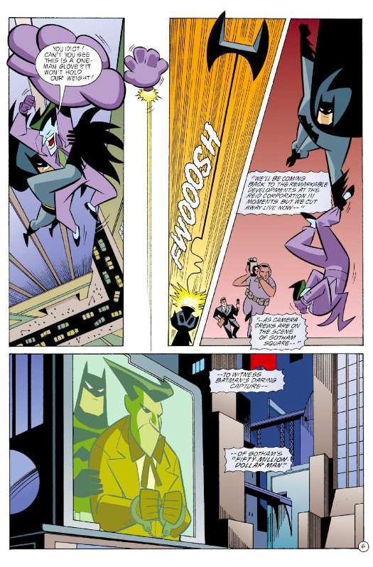
Man, how do you not read that first line in Mark Hamill’s voice?
There’s a really interesting use of space here. The action takes place all around the edges of the page, giving the whole sequence this great sense of verticality -- even if there is a slight gaff in that Burchett and/or Beatty forgot to draw the Batline in panel four. That said, I do love the inclusion of the reporter and cameraman in that panel, giving the environment a nice sense of depth that emphasizes the splattery fate from which Batman just saved the Joker.

The action, and with it the scene, ends in the left of the last panel. This leaves the city shot in the right on that panel to act as a sort of ‘pan away’ moment, creating a quiet beat without cluttering the page with another panel. It’s super effective.
Something I forgot to address elsewhere: Burchett is always contrasting the rigid, unflappable Batman with the constant mugging of the Joker. This is largely down to Bruce Timm’s terrific character models, but Burchett is a sharp enough cartoonist to know how to stage them so those contrasts really land.
See also: this great juxtaposition at the top of this page.
PAGE SEVEN
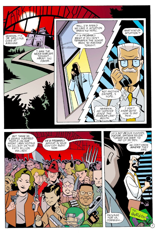
I’ve always loved this lady in the bottom corner. No analysis, just crushin’.

PAGE EIGHT

Weirdly enough, The Joker is our POV character for this page. Despite being a comic book tie-in to a very popular tv show, this is still technically the first time we’re seeing the Batcave in this comic book series, so Templeton and Burchett give us this nice spacious look at the pace. The Joker’s reaction helps sell it as an impressive space, even if he’s mostly just talking nonsense. Loughridge uses this scene to establish the cool teals and greens that will indicate Batman’s private environments from here on out, such as the cave or the inside of the Batmobile.
Cutting from the huge shot of the cave to the narrow horizontal final panel adds to the suddenness of Batman cuffing the Joker to the railing.
“Awp!”
PAGE NINE

This is our introduction to Nightwing, so of course the wayward bad boy Batchild has to come screeching into the panel on his badass black motorcycle instead of just walking in like a normal person. Templeton and Burchett give Robin something to do by having him goof around on the railing, which avoids having the scene become just a bunch of people standing around in capes. See also: wringing a moment of tension out of Alfred’s introduction. I dig Batman’s snarl in the last panel -- the most emotion we’ve seen from him so far. Alfred being in danger will do that.
PAGE TEN

Burchett adds dynamism to panel one by tossing a dutch angle into the mix. It’s a smart move -- having a diving action like a tackle go directly towards or away from the reader can sometimes come across as static or just unclear. The dutch angle gives this panel enough energy to sell the action.
Also, a rare continuity gaff: the stairway entrance has a doorjamb here, where on the previous page it’s just a rough opening in the cave wall. The Joker looks a little bit off to me as well -- could this have been one of the first pages Burchett drew in the new B:TAS style? It’s a pretty common practice for an artist on a new book to initially draw some pages from the middle of the issue, just to get a feel for the new project on some pages of lesser relative importance. When it comes to this specific page, of course, I’m purely speculating.
Regardless, Robin looks excellent in panel four.
PAGE ELEVEN

What a great page. This is the point at which the main plot splinters into its various subplots, emphasized by seeing all our players head off in their own directions in panel one. Batman hands the scene off to Batgirl in panel two, and in panel three we fully establish her as the new POV character for the Batcave scenes going forward. In the next panel, we see the rest of the Batfamily drive away on their various conveyances, the looming silhouette of the Joker’s handcuffed arm, and Batgirl herself in the midground between them, really selling how suddenly isolated she is. The last panel says it all -- even if he’s handcuffed and weaponless, no one wants to be alone in a room with the Joker.
Here, we end the first act with all our plotlines well in play:
Batman and Robin try to crack the case Gordon has for them (which, if you were paying attention on page seven, you know involves The Riddler)
Nightwing on patrol, which will almost certainly involve...
All the Gothamites who’re scouring the streets looking for the big payday
Douglas Reid using all his wealth to get his revenge on the Joker
And Batgirl, guarding the man himself in the Batcave.
All of which will unfold over the remaining twenty seven (!) pages, each of which is as dense and active as what we’ve seen so far.
There’s a lot to love about this comic, and I’ll be coming back to it in the weeks to come. But today, I just wanted to look at the opening pages of a comic that does an exceptional job of using a clever, character-driven premise to set up its world.
***

You can get this entire issue -- for free! -- on Comixology, along with every other issue of GOTHAM ADVENTURES for, like, a buck or two apiece.
For a couple of my own comic creator bona fides, check out WILL EISNER’S THE SPIRIT RETURNS and SAN HANNIBAL, and pre-order the trade collection for BATTLESTAR GALACTICA: GODS AND MONSTERS.
Additional content can be found on my website, danschkade.com, as well as my twitter!
Be well, talk soon, etc
PREVIOUS PAGE x PAGE ANALYSES:
GANGBUSTER: SWING ANNA MISS
MINI-ANALYSIS — FIRST SIGHTING: SUPERBOY
ULTIMATE SPIDER-MAN #69 (with Aud Koch)
THE SHADOW STRIKES! #13
PETER PARKER: SPIDER-MAN #13
BATMAN: GOTHAM ADVENTURES #17
#Batman#educational purposes#page x page analysis#The Joker#comics#Ty Templeton#rick burchett#terry beatty#lee loughridge#Dan Schkade
18 notes
·
View notes
Last Seen Blogs

leobiart
leobiart

iwillbeagirl
I Will Be a Girl

enkitrade-blog
Без названия

smegdwarf
The Slime Is Coming Home! 💚

justpinkgirlythingz
Justpinkgirlythingz