#edited this to make it shorter because i wanted glitter text
Text


yeehaw
reblogs are mainly art, cat pics, general positivity and goofs but this is not a hard guideline. i try to keep it jokes-only-level sfw
artposting blog is @canonkiller
i reblog art for media I'm not into if I like the vibes, so if I post untagged spoilers tell me and I'll tag them right. and also sorry
if you saw me like your art and then I unliked it later and it was like your only note and you're sad it's because I put it in my queue and also I love you. mwah
tags guide / extra info:
#scribbles - my own art
tags:
#canonqueuer - queue tag ( canonkiller+ queue )
#patch me through to palaven command - my posts, reblog-replies to myself, asks, etc
#i've got it all under control - reblog-replies to other people's reblogs of my posts ( they get long. blacklisting purposes )
#tagged for me - posts tagged for me or sent to me
#reblog - all reblogs of stuff that isn't mine
#blog stuff - themes, backgrounds, and other coding resources
honestly if you're looking for something I probably have it tagged
#words - quotes, poems, etc (noting here because it's not a standard tag)
all general subject matter is usually tagged; if you have to blacklist something, just the word ( no additional cw / tw text ) will work - ex. #art, #anthro, #videos, #cats, #clothing, etc
all fandoms are tagged when known; they aren't always fandoms I actually know anything about. I like pretty art :)
all common triggers and warnings are tagged, again without additional tw / cw text. I can add tags for anything not already covered (or be more consistent), just send in an ask about it :3
extra info:
I think pro / anti / whatever labels are vague, confrontational and kind of stupid. I think porn of children is bad. I think fiction can include difficult themes. I think there are people who disagree with both of those, and I would rather not spend time with them. These opinions can coexist, and intentionally misinterpreting them to get into fights is definitely stupid.
I don't have shinigami eyes on mobile tumblr, so please lmk if I reblog someone marked red. I don't like giving them the attention.
please do not give me reason to post the sorry my follower added that comment cake.
#also hi#edited this to make it shorter because i wanted glitter text#for mobile browsing:#patch me through to palaven command#scribbles#i've got it all under control
54 notes
·
View notes
Text
White Gold and Maple
Kazuha x reader
Dedicated to my lovely mutual for her birthday @ahtsuwu -- sorry it came so late. You deserve this!
Description: Kazuha is behaving oddly, and for what reason?
Content: fluff, humor (?), surprise birthday, Kazuha being just the best bean. Modern AU (I think), light swearing(?), mentions of a spouse passing away (don't worry it's not too sad),
A/N: Sorry if this is shorter than my usual pieces and not as detailed. I wanted to get a short piece out, I hope it's fine. Also, not edited or proofread, sooo oops.
Stirring from your sleep, you stuck a hand out to find your boyfriend and sneak in close--only to find the spot was unoccupied and cool. Lifting your head, you frowned at the absence.
"Kazuha?"
You swung your legs off the mattress and walked around, confused by the silence in your home. Until you heard some light humming.
Finding your way into the kitchen, the smell of warm maple wafted around you. You found Kazuha standing by the stove, his hair messily put up in a loose bun, as he cooked what appeared to be some breakfast. He did not appear to notice your presence yet, so you quietly walked up behind him and slipped your arms around his waist and leaned against him.
"Oh, I didn't know you were awake. I wish you'd sleep in a bit more, I was going to wake you when I was ready."
"But I missed you," you murmured, slowly breathing out a sigh of content into his back. "I'm glad to see you."
"Ok, go sit down, I'll bring the food over in a bit."
Sitting down at the stool at the counter, you propped your head up on your hands, watching him move about. He turned around, the rich scent of maple and pancakes filling the air. Setting down your portion, he continued to watch you eat, asking if he did a good job with them, before laughing at your enthusiastic nodding, since your cheeks were full of sweet fluff. Your morning had gone along well, with not too much trouble, before he pressed a kiss to your cheek.
"With deep regret, I must leave to attend to some things, but it shouldn't be long, alright?"
"Already? Ok, good luck."
And soon enough, he was out the door, leaving you to clean up after the couple of dishes left from breakfast.
------------------------------------
Bzzzzt Bzzzzt
Reluctant to get off the couch, you ambled to your phone on the nightstand of your room, seeing a text from Beidou.
"Call me."
"Really?" you wondered out loud, knowing Beidou wasn't really one for conversations in the morning. Shrugging, you
"Hey."
"Yo. Listen, can you swing by where I'm at? I'm bored and I need company. Ningguang is shutting me down again, saying she's busy or some shit, ya know, the usual."
"Uh, sure, that's fine. Just send me your location, I'll come by."
"Great! I'll text you the location. Don't be late."
Don't be late? Seriously? From Beidou? "Fine, 'captain', I won't hold your important self up."
-------------------------------
"So, I didn't think you'd be a mall person, Beidou."
"Nah, I just felt like it today, though. So, are you doing anything for your birthday?"
"My wha--"
Oh.
"Crazy that you remembered. But no, nothing planned."
The dark-haired woman quirked an eyebrow up, letting out a small sound. "Well, alright. This'll be my gift to you then. Let's go."
She dragged you along the mall, going from shop to shop, usually checking out food, candies, booze, and some clothes. After indulging in some boba tea and candies, you passed by a quaint little shop that caught your eye.
"Wanna go in? Come on, you seem interested." Beidou encouraged you to enter the shop, and you both quietly walked along the little stands. Earrings adorned a turning stand, necklaces and colorful rings were in glass cases, engraved paperweights, and other such pieces filled the room. You noted that these pieces didn't have the cold, pristine look of big designer jewelry stores.
"Huh, they look handmade, don't they?"
"Oh yes, every piece you see here is handcrafted by my family," a new voice startled you, an older woman with strands of grey enhancing her light brown hair. "Sorry for sneaking up. You've a keen eye."
"They're lovely." Indeed they were, the meticulous attention to detail. The rings looked like they were braided in gold, the gemstones inlaid upon them glittered under the light. Chains were linked carefully, the pendants all unique in some fashion. These pieces had character, something you would not mind having every day on your person.
Something caught your eye--a white gold ring with your birthstones, all laid along a pattern around. Not an engagement ring by any means, but something you visualized adorning your finger on a daily basis.
No, I might come back later and purchase it sometime. If it's not there, it wasn't meant to be.
"Ah, this one? My son made it to commemorate his late wife for her birthday, which is today. She passed several years back, but he chose to never forget her. This year, he decided he would create this ring that was similar to the one he made for her on an anniversary of theirs." The woman's eyes turned down slightly, her smile falling a bit. "But don't worry, he made this piece so that someone may show their love to their partner once again. Would you like to try it on?"
You hesitated, but Beidou coaxed you to try it on, before switching her attention to her phone. The woman slipped the ring onto your ring finger, finding that it fit you perfectly.
A grin appeared on her face. "It suits you, as if it were made for you."
Staring at it for a moment, you felt the slight longing for it, not just because of its appearance, but for the story that came along with it. You shook your head before slipping it off. "I might come back sometime later and see if it's here. I don't have any way to pay for this at the moment, I apologize. But it is beautiful."
"No worries. It might find itself back to you in some manner."
Perhaps, but unlikely. Nodding your head, you trudged along out of the store, expecting Beidou to be behind you, only to find her still inside the store, talking to the owner of the shop. Several minutes later, she hurried out, a faint smile lingering on her lips.
"Don't ask."
"I-- alright."
-----------------------------------
You parted ways with Beidou shortly after, and just as you leave the mall, you receive a text from Yoimiya.
"Hey, I can't make it on time to pick something up, could you go to this location for me, please? I'll make it up to you, PROMISE!! <3"
Shrugging your shoulders, you replied asking for the address, to which she replied with a pinpoint of the location. You texted Kazuha where you were about to go, just in case he made it home before you.
Except, the location wasn't a building. It was a large tent on the top of a hill, away from town. You found a slip of paper and picked it up, wondering whether the person was inside.
What the hell is Yoimiya picking up over here? Is she doing illegal business? What is going on here?
Just before you began to spiral in your thoughts, the tent opened up, revealing a smiling Kazuha. "Well, I'm glad you could make it. Come on, you're just in time."
"Just in time for--"
He pulled you close to him, guiding you to the other side of the tent next to the tree. Motioning for you to sit down, he settled himself right next to you. "Have you read the paper?"
Shaking your head, you pulled the slip of paper you found, finding words on the page in Kazuha's pretty handwriting.
The universe was blessed this day
When the heavens opened up
and you descended on earth
To touch my life.
The stars remain in your eyes,
And I wish on every single one,
That I can be called
Yours.
"Kazuha..." you breathed out, your mouth not able to form the words, as your gaze turned to the beautiful man before you.
"Look up."
At his urging, you turned your face up to the night sky. Several beats passed, before a streak of light shot up, before breaking into a large burst of colors. Several more shot up, taking your breath away. The show of sparkles
"Is that--"
"I had a bit of help to set up this moment. I hope you liked it."
Silence settled in, realizing that he was so excited about your birthday all this time. So the sudden texts from Beidou and Yoimiya weren't just random, they were planned.
"Oh, one more thing." Kazuha searched a pocket and pulled out a small box, bringing your hand close. "I heard from Beidou that this caught your eye, and I couldn't let it slip. So..." The ring you found earlier appeared once again before you, settling onto your ring finger once more. "I got it as a promise for us."
The emotions that built up within you finally spilled, tears streaming down slightly. "Kazuha, I swear...I'm--I'm in bliss right now, just being here with you. I just..." You placed your hands on his face and pulled him in for a soft kiss, which was immediately reciprocated.
The tenderness of the moment cemented a new shift in the relationship, one marked with devotion, rich and sweet, like maple. A birthday like this? You would remember for the rest of your life.
#kazuha x reader#kazuha fluff#genshin x reader#genshin impact#kazuha#genshin impact fluff#to my lovely mutual Ori#° ori <3
127 notes
·
View notes
Photo
MUSIC VIDEO GIF EXPERIMENT
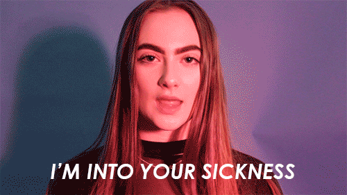
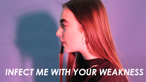
For my final Time-based media project outcome, I decided to make a series of music video gifs which I hadn’t made before. At home I researched and watched clips on Youtube of other people making their own music video gifs from existing music videos but I wanted to make my own music video using a model and the studio lighting. To experiment I set up a simple lighting arrangement, I used, a blue background, 1 studio light where I put a pink gel over it and I used a tri-pod and the camera. At first the idea was that Macie would be in the shot, but she didn’t feel confident enough to do the music video and I said that its completely fine. So instead of having a model, I decided to be in the shot myself because I knew the look I was after and I was confident enough with my modelling and acting background.
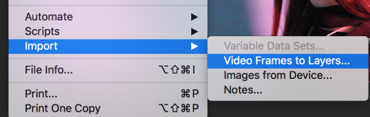
I only decided to shoot two gifs because I wanted enough time to attempt the editing side. When, I was editing my first gif, I did have some trouble because I had forgotten how to create them, so I looked up the video I watched again and this helped a lot. The first thing I had to do was import the video, by selecting Import > video frames to layers.
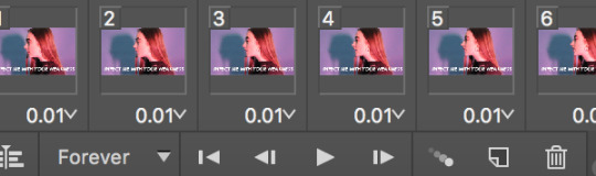
Once I had selected this I opened up the video clip that I wanted to edit and I selected the section that I needed from the video. Once I had done that, my video had been separated into frames and I made sure that the frames were selected to loop forever.
After that, I shortened my video because I wanted to make the gif shorter so it wouldn't take up to much time. Then, I made the image size smaller because the file size was massive it wouldn’t have exported. I did this by selecting Image > Image Size > changed the size to 500 pixels. Next, I added in a text box which allowed me to insert the lyrics from the song underneath the video. I did this by selecting the text box tool and dragging it over a new layer. The font size was 30 and the font was “Century Gothic.”
To save my gif that I had made I clicked file > export > save for web legacy. This allowed me to save my gif and it would make it loop forever on the web. I saved the file to my desktop and dragged it into the search bar on my MacBook and this allowed me to view my looping gif.
I did surfer from some difficulties during the saving process because the gif wouldn’t loop due to the video not being in the frames, but I figured out the problem and fixed my mistakes.
From experimenting with my first music video gif, I have learnt that I need to be confident with being in front of the camera because the more confident I look, the better the gif will look because it will make it easier for me to tell the meaning of the story. I have also found out that using the studio lighting will be the best idea because when I shoot the final gifs, I will be using glitter and the studio lighting will help to make the glitter shine and stand out. It is important for me to make sure my gifs all have the same lighting and the same aesthetic because it will help to tell the story as a whole because the gifs will all link with each other.
0 notes
Text
Here’s How to Have a STEM-Themed ‘Día de los Muertos’ Celebration
Día de los Muertos (“Day of the Dead,” running from October 31 to November 2) is an annual holiday celebrating the souls of those who have passed on. Particularly for the people of Mexico and Central America, and for Mexican-Americans in the United States, it is a day to welcome the return of spirits of the dearly departed. This multi-day event focuses on gatherings of family members and friends to take part in traditional customs, including building ofrendas (altars), candle-lighting and face-painting.
At Google’s Code Next lab in Oakland, Calif., where we work, we like to celebrate in a way that blends these customs with computer science and some technological savvy. Here are our offerings to you—two Día de los Muertos-inspired projects that you, students or anyone can do at home or at school to decorate an ofrenda. (Or, get the full curriculum print-out—and more activities—by clicking here.)
Activity One: Pillar Candles
This graphic design project encourages makers to design a pillar candle that represents a personally-significant deceased person for a community Día de los Muertos altar. This project can also be an opportunity to use graphic design software and skills to create a ofrenda (offering) candle that honors contributors of color to the fields of science and technology. Students will attempt to answer essential questions such as, “What is Día de los Muertos?” and “How can I use graphic design technology to promote diversity and cultural awareness?”
Materials / Resources:
Graphic design software (free online software tools) — pixlr.com/editor or GIMP
Blank pillar candles (wax or tall LED candles)
Color printer
Vellum, sticker paper or regular blank computer paper
Decoration: Sticker gems, decorations, glitter glue, etc.
Museum Of Latin American Art info (Day of the Dead) and Google Arts and Culture site
Directions: Using graphic design software, you can design your own image to put onto a pillar candle, honoring someone important to you and your community.
Using one of the suggested graphic design softwares, create a new file that is approximately 6”x5”. This is the image that will be printed and wrapped around your pillar candle.
Next, makers work on the layout. Because the pillar candle is a rounded cylinder, it’s important to consider how the image and text will display on the front of the candle. (Check out this image for an example.)
Next, makers can either download or scan a digital image of the person they want to honor.
Makers conduct an image search and download higher quality images so that images do not print pixelated from low-resolution versions on the web.
Next, makers save the images from the web to the desktop and rename the file to use in the graphic design software.
Now open the image in the graphic design software and cut/paste or copy/paste the image into the new file that was created earlier. Edit and modify as necessary. Explore the tools in the software, and remember that Control+Z always undoes the last action.
Print file on color printer and affix to the pillar candle. Finally, makers can place their pillar candle on a community altar, and share with others their research, stories and information on the person they have chosen to honor.
Activity Two: LED Cempasúchil (LED Marigolds)
This project encourages makers to create an illuminated paper marigold for a community Día de los Muertos altar. This is an opportunity to learn some basic electronics while also participating in a community cultural event.
“Day of the Dead” celebrations often include an altar or shrine dedicated to the souls of the deceased. On October 30 or 31–even earlier in some homes, la ofrenda will be set up in many Mexican households to ensure that it will be ready by November 2.
The traditional ofrenda usually consists of a table adorned by a cloth and decorated with fruits, flowers, vegetables and many other objects. Many ofrendas often incorporate a sky or cielo. The sky is a sheet suspended above the ofrenda or a string of colorful banderitas de papel picado (paper cut out flags). A photograph of the deceased, religious statues, pan de muerto, images of saints, candles, and a glass of water, incense and cempasúchil flowers are also important elements of the ofrenda.
Materials / Resources:
LED’s (“light emitting diodes”) - Where to buy
3V coin cell batteries - Where to buy
Electrical tape (yellow)
Orange and yellow tissue paper (cut into 5”x5” squares)
Green pipe cleaners
Scissors
Making your own LED Paper Cempasúchil: Using a 3-volt coin cell battery and LED light bulb (light emitting diode), makers use a simple circuit to create an illuminated cempasúchil (mexican marigold).
1. Attach the long leg of the LED (+) to the positive (+) side of the battery and the shorter leg of the LED (-) to the minus (-) side of the battery. The LED should now be glowing! (You can see a demo on the first 30 seconds of this video.) Next, tape the LED to the battery snug with electrical tape. Set this aside while working on the flower in the next step.
2. Layer up 6-8 pieces of 5”x5” tissue paper. Start folding the layered squares from one side back and forth in 0.5” rows in accordion style or zig zagged, like stairs. (Do not wrap into itself).
3. Next, in the middle of the folds, place the taped battery and LED so that the glowing LED if facing up.
4. Wrap and twist the pipe cleaner around the middle, securing both the battery/LED and the folds of the paper.
5. Cut the folded ends of each side of layered paper into a rounded shape. This will create the petal shape of the flower.
6. Now, open up the folds on each side. At this point, it should look like butterfly wings, with the LED glowing in the center.
7. Carefully and gently separate the individual layers of tissue paper on each side, opening up the flower petals to look like a 3D cempasúchil (marigold). The petals can be arranged to beautifully diffuse the light of the LED in the center.
8. Finally, place the LED cempasúchil onto the community altar, sharing with others the research, stories and information on Día de Los Muertos, and the people that your community chose to honor. ¡Diviértanse!
Here’s How to Have a STEM-Themed ‘Día de los Muertos’ Celebration published first on https://medium.com/@GetNewDLBusiness
0 notes
Text
Epic design fails: laughing and learning from the best worst graphic designs
Nobody’s perfect. We all make mistakes. And design is full of tiny pitfalls that are easy to miss. Thankfully, designers usually learn from their early failures and ultimately become better for it. In that sense, design fails aren’t all that bad—for the most part.
But every now and then, you get something like this poor racoon stranded at sea …
…or this…
…or this…
… or even this.
Below, we look at eight laughable design fails and the valuable lessons those designers could have learned to keep their jobs.
1. Location, location, location
—
Via Where Magazine.
Via Where Magazine.
This copy of Where magazine—that’s “Where” with two Es—shows us just how important layout and composition are in graphic design. The photographer did his or her job, but what about the cover designer? That poor woman looks so happy after a fruitful shopping trip, it’s a shame she has to be slandered by a design fail.
For starters, this problem could have been avoided by positioning the photo lower so that the E doesn’t look like an O. That seems like an easy cropping choice to make and it’s not like the reader would miss seeing the bottom of the third box. On top of that, the title could be superimposed over the model’s head, as long as it didn’t cover too much of her face.
As if this weren’t bad enough, the magazine made the same exact mistake a few months later! Perhaps they should consider a name change.
2. The importance of kerning
—
Do you know what “kerning” is? Neither did the package designers behind this box of holiday lights.
Kerning is the design term for using the spacing between letters to make text more readable. The application of kerning can get pretty technical, with precise measurements, variations for different letters and sometimes even exact pixel guidelines. That’s why it’s a field that designers need to understand to avoid these kinds of mistakes.
Via The Wig and Pen Truro.
However, most non-designers don’t even know such a field exists. And that’s why they run into problems like those faced by England’s famed Wig & Pen.
3. Brea king words
—
Via H&H Reeds Printers.
App rentals? Ice ships? Rent ice?
Breaking up words that shouldn’t be broken up is a classic design fail, but breaking up one big word four times into pieces that are incidentally their own words, that’s epic. What makes this ad even worse (and kind of sad) is not only that they’re trying to entice people to work with them, but they’re also a company that specializes in graphic design.
Yet we don’t want to dissuade designers against the technique entirely—when done well, it’s actually quite effective:
How to do it right. Logo design by Milos Zdrale.
How to do it right. Logo design by Bella” for Safari Partners.
But when using it, exercise caution. Whenever possible avoid creating real words with kerning and keep your message simple. The shorter the sentiment, the easier it will be for the viewer to piece it together—literally.
4. The “art” of communication
—
A large part of graphic design is about communicating visually: it’s the designer’s job to make a message easy to understand. But that goes both ways and poor design choices can complicate an otherwise straightforward message.
You buy 3 and get 2 free or you buy 2 and get 1 free. It shouldn’t take the reader five or six read throughs to arrive at this conclusion. But the poor layout of the message—not to mention the confusing asterisks—makes this ad repel customers rather than draw them into the store.
For one thing, the setup looks like an equation, and no one wants to do math when they don’t have to. But shrinking down the second part makes it seem like it’s a clarification of the first message, not a separate sales concept. While this is an honest mistake, these little nuances are something experienced designers instinctively know to sidestep.
5. Say what you mean
—
Via Zebra Publishing.
I mean, this may not be her best work, but wishing death upon her is a bit much.
Via Zebra Publishing.
Designers aren’t only in charge of how things look, they also need to watch out for contextual mistakes. When it comes to book cover design, that means combining the title and author name in a way that doesn’t have an unintended meaning. The way this book cover is set up, with the title and author name in the same color and font—and the name above the title—was an easily avoidable mistake.
In this case, the publishers eventually caught on and fixed the design fail in the subsequent editions using different colors and typefaces.
6. Cursive: the designer’s natural predator
—
Via Belle Chic.
The ambiguity behind cursive writing has long been the nemesis of well-meaning designers, but few have suffered from its evil snares quite like designer Belle Chic, whose girly-cute handbag accidentally transformed into a piece of neo-nazi propaganda.
Given that (1.) the cursive G is a bit too high, plus (2.) a bit too close to the L, and that (3.) the cross of the second T is overshadowed by the bold white letters above, “glitter” is not the obvious interpretation of this sparkling lettering. It’s surprising that no one noticed this mistake until after its release; any one of those typographical errors would have signaled red flags to a seasoned designer.
Luckily, Belle Chic apologized profusely for their design fail and corrected all three typography errors without throwing out the design.
Via Belle Chic.
7. Catch secondary meanings
—
Via Thomson Reuters.
Graphic designers need to be part proofreader. They have to double-check to ensure their designs don’t have any problematic secondary meanings.
That was the case with mass media conglomerate Thomson Reuters. Inadvertently, their design looks like a Venn diagram showing just how little they value trust, partnership, innovation and performance.
In all likelihood, the design was never meant to look like a Venn diagram—rather, just a playful graphic using shapes and colors. However, one tiny move and now a huge, expensive advertising campaign leaves them with egg on their face. Better to go with a designer that can catch these mistakes in the early design stages.
8. Even when you’re right, you’re wrong
—
This one’s pretty tricky. When the Ready Player One poster first came out, it was criticized for the character’s freakishly long leg. And rightfully so—just look at it.
At first people thought the image was doctored, but it turns out that it’s actually accurate! Twitter fan Captain Disillusion dissected the image and proved that the leg is completely proportional to the rest of his body; it just looks long because of the awkward angle and the pose. The image is perfectly normal—it’s the human eye that’s weird.
Via Captain Disillusion.
Which brings up a good point about graphic design: a designer’s job is to make sure everything looks fine more than actually being fine. In a field based on perception, how people perceive the work is more important than factual accuracy, which comes into conflict more than you’d think with the visual arts.
The difference between applause and faux pas
—
Not to use scare tactics, but one silly design fail could ruin your entire brand reputation. And we’d wager all of the design mistakes above were made by folks who overestimated their design skills. That’s why these things are best left to the professionals.
True design talent lies in understanding the risks well enough to tiptoe around them. The skillset of a good designer includes all the basics like kerning, color theory, typography dos and don’ts, an encyclopedic knowledge of fonts and an eye for avoiding common pitfalls. Now that you’ve seen some epic design fails, you’ll know what to look out for—and hiring a great designer is your ticket to ensuring everyone talks about your next campaign for the right reasons.
There's a surefire way to never be mentioned in a list of design fails...
Find yourself a great designer!
They're right here
The post Epic design fails: laughing and learning from the best worst graphic designs appeared first on 99designs.
via 99designs https://99designs.co.uk/blog/tips-en-gb/graphic-design-fails/
0 notes
Text
Epic design fails: laughing and learning from the best worst graphic designs
Nobody’s perfect. We all make mistakes. And design is full of tiny pitfalls that are easy to miss. Thankfully, designers usually learn from their early failures and ultimately become better for it. In that sense, design fails aren’t all that bad—for the most part.
But every now and then, you get something like this poor racoon stranded at sea …
…or this…
…or this…
… or even this.
Below, we look at eight laughable design fails and the valuable lessons those designers could have learned to keep their jobs.
1. Location, location, location
—
Via Where Magazine.
Via Where Magazine.
This copy of Where magazine—that’s “Where” with two Es—shows us just how important layout and composition are in graphic design. The photographer did his or her job, but what about the cover designer? That poor woman looks so happy after a fruitful shopping trip, it’s a shame she has to be slandered by a design fail.
For starters, this problem could have been avoided by positioning the photo lower so that the E doesn’t look like an O. That seems like an easy cropping choice to make and it’s not like the reader would miss seeing the bottom of the third box. On top of that, the title could be superimposed over the model’s head, as long as it didn’t cover too much of her face.
As if this weren’t bad enough, the magazine made the same exact mistake a few months later! Perhaps they should consider a name change.
2. The importance of kerning
—
Do you know what “kerning” is? Neither did the package designers behind this box of holiday lights.
Kerning is the design term for using the spacing between letters to make text more readable. The application of kerning can get pretty technical, with precise measurements, variations for different letters and sometimes even exact pixel guidelines. That’s why it’s a field that designers need to understand to avoid these kinds of mistakes.
Via The Wig and Pen Truro.
However, most non-designers don’t even know such a field exists. And that’s why they run into problems like those faced by England’s famed Wig & Pen.
3. Brea king words
—
Via H&H Reeds Printers.
App rentals? Ice ships? Rent ice?
Breaking up words that shouldn’t be broken up is a classic design fail, but breaking up one big word four times into pieces that are incidentally their own words, that’s epic. What makes this ad even worse (and kind of sad) is not only that they’re trying to entice people to work with them, but they’re also a company that specializes in graphic design.
Yet we don’t want to dissuade designers against the technique entirely—when done well, it’s actually quite effective:
How to do it right. Logo design by Milos Zdrale.
How to do it right. Logo design by Bella” for Safari Partners.
But when using it, exercise caution. Whenever possible avoid creating real words with kerning and keep your message simple. The shorter the sentiment, the easier it will be for the viewer to piece it together—literally.
4. The “art” of communication
—
A large part of graphic design is about communicating visually: it’s the designer’s job to make a message easy to understand. But that goes both ways and poor design choices can complicate an otherwise straightforward message.
You buy 3 and get 2 free or you buy 2 and get 1 free. It shouldn’t take the reader five or six read throughs to arrive at this conclusion. But the poor layout of the message—not to mention the confusing asterisks—makes this ad repel customers rather than draw them into the store.
For one thing, the setup looks like an equation, and no one wants to do math when they don’t have to. But shrinking down the second part makes it seem like it’s a clarification of the first message, not a separate sales concept. While this is an honest mistake, these little nuances are something experienced designers instinctively know to sidestep.
5. Say what you mean
—
Via Zebra Publishing.
I mean, this may not be her best work, but wishing death upon her is a bit much.
Via Zebra Publishing.
Designers aren’t only in charge of how things look, they also need to watch out for contextual mistakes. When it comes to book cover design, that means combining the title and author name in a way that doesn’t have an unintended meaning. The way this book cover is set up, with the title and author name in the same color and font—and the name above the title—was an easily avoidable mistake.
In this case, the publishers eventually caught on and fixed the design fail in the subsequent editions using different colors and typefaces.
6. Cursive: the designer’s natural predator
—
Via Belle Chic.
The ambiguity behind cursive writing has long been the nemesis of well-meaning designers, but few have suffered from its evil snares quite like designer Belle Chic, whose girly-cute handbag accidentally transformed into a piece of neo-nazi propaganda.
Given that (1.) the cursive G is a bit too high, plus (2.) a bit too close to the L, and that (3.) the cross of the second T is overshadowed by the bold white letters above, “glitter” is not the obvious interpretation of this sparkling lettering. It’s surprising that no one noticed this mistake until after its release; any one of those typographical errors would have signaled red flags to a seasoned designer.
Luckily, Belle Chic apologized profusely for their design fail and corrected all three typography errors without throwing out the design.
Via Belle Chic.
7. Catch secondary meanings
—
Via Thomson Reuters.
Graphic designers need to be part proofreader. They have to double-check to ensure their designs don’t have any problematic secondary meanings.
That was the case with mass media conglomerate Thomson Reuters. Inadvertently, their design looks like a Venn diagram showing just how little they value trust, partnership, innovation and performance.
In all likelihood, the design was never meant to look like a Venn diagram—rather, just a playful graphic using shapes and colors. However, one tiny move and now a huge, expensive advertising campaign leaves them with egg on their face. Better to go with a designer that can catch these mistakes in the early design stages.
8. Even when you’re right, you’re wrong
—
This one’s pretty tricky. When the Ready Player One poster first came out, it was criticized for the character’s freakishly long leg. And rightfully so—just look at it.
At first people thought the image was doctored, but it turns out that it’s actually accurate! Twitter fan Captain Disillusion dissected the image and proved that the leg is completely proportional to the rest of his body; it just looks long because of the awkward angle and the pose. The image is perfectly normal—it’s the human eye that’s weird.
Via Captain Disillusion.
Which brings up a good point about graphic design: a designer’s job is to make sure everything looks fine more than actually being fine. In a field based on perception, how people perceive the work is more important than factual accuracy, which comes into conflict more than you’d think with the visual arts.
The difference between applause and faux pas
—
Not to use scare tactics, but one silly design fail could ruin your entire brand reputation. And we’d wager all of the design mistakes above were made by folks who overestimated their design skills. That’s why these things are best left to the professionals.
True design talent lies in understanding the risks well enough to tiptoe around them. The skillset of a good designer includes all the basics like kerning, color theory, typography dos and don’ts, an encyclopedic knowledge of fonts and an eye for avoiding common pitfalls. Now that you’ve seen some epic design fails, you’ll know what to look out for—and hiring a great designer is your ticket to ensuring everyone talks about your next campaign for the right reasons.
There’s a surefire way to never be mentioned in a list of design fails…
Find yourself a great designer!
They’re right here
The post Epic design fails: laughing and learning from the best worst graphic designs appeared first on 99designs.
Epic design fails: laughing and learning from the best worst graphic designs published first on https://www.lilpackaging.com/
0 notes
Text
Epic design fails: laughing and learning from the best worst graphic designs
Nobody’s perfect. We all make mistakes. And design is full of tiny pitfalls that are easy to miss. Thankfully, designers usually learn from their early failures and ultimately become better for it. In that sense, design fails aren’t all that bad—for the most part.
But every now and then, you get something like this poor racoon stranded at sea …
…or this…
…or this…
… or even this.
Below, we look at eight laughable design fails and the valuable lessons those designers could have learned to keep their jobs.
1. Location, location, location
—
Via Where Magazine.
Via Where Magazine.
This copy of Where magazine—that’s “Where” with two Es—shows us just how important layout and composition are in graphic design. The photographer did his or her job, but what about the cover designer? That poor woman looks so happy after a fruitful shopping trip, it’s a shame she has to be slandered by a design fail.
For starters, this problem could have been avoided by positioning the photo lower so that the E doesn’t look like an O. That seems like an easy cropping choice to make and it’s not like the reader would miss seeing the bottom of the third box. On top of that, the title could be superimposed over the model’s head, as long as it didn’t cover too much of her face.
As if this weren’t bad enough, the magazine made the same exact mistake a few months later! Perhaps they should consider a name change.
2. The importance of kerning
—
Do you know what “kerning” is? Neither did the package designers behind this box of holiday lights.
Kerning is the design term for using the spacing between letters to make text more readable. The application of kerning can get pretty technical, with precise measurements, variations for different letters and sometimes even exact pixel guidelines. That’s why it’s a field that designers need to understand to avoid these kinds of mistakes.
Via The Wig and Pen Truro.
However, most non-designers don’t even know such a field exists. And that’s why they run into problems like those faced by England’s famed Wig & Pen.
3. Brea king words
—
Via H&H Reeds Printers.
App rentals? Ice ships? Rent ice?
Breaking up words that shouldn’t be broken up is a classic design fail, but breaking up one big word four times into pieces that are incidentally their own words, that’s epic. What makes this ad even worse (and kind of sad) is not only that they’re trying to entice people to work with them, but they’re also a company that specializes in graphic design.
Yet we don’t want to dissuade designers against the technique entirely—when done well, it’s actually quite effective:
How to do it right. Logo design by Milos Zdrale.
How to do it right. Logo design by Bella” for Safari Partners.
But when using it, exercise caution. Whenever possible avoid creating real words with kerning and keep your message simple. The shorter the sentiment, the easier it will be for the viewer to piece it together—literally.
4. The “art” of communication
—
A large part of graphic design is about communicating visually: it’s the designer’s job to make a message easy to understand. But that goes both ways and poor design choices can complicate an otherwise straightforward message.
You buy 3 and get 2 free or you buy 2 and get 1 free. It shouldn’t take the reader five or six read throughs to arrive at this conclusion. But the poor layout of the message—not to mention the confusing asterisks—makes this ad repel customers rather than draw them into the store.
For one thing, the setup looks like an equation, and no one wants to do math when they don’t have to. But shrinking down the second part makes it seem like it’s a clarification of the first message, not a separate sales concept. While this is an honest mistake, these little nuances are something experienced designers instinctively know to sidestep.
5. Say what you mean
—
Via Zebra Publishing.
I mean, this may not be her best work, but wishing death upon her is a bit much.
Via Zebra Publishing.
Designers aren’t only in charge of how things look, they also need to watch out for contextual mistakes. When it comes to book cover design, that means combining the title and author name in a way that doesn’t have an unintended meaning. The way this book cover is set up, with the title and author name in the same color and font—and the name above the title—was an easily avoidable mistake.
In this case, the publishers eventually caught on and fixed the design fail in the subsequent editions using different colors and typefaces.
6. Cursive: the designer’s natural predator
—
Via Belle Chic.
The ambiguity behind cursive writing has long been the nemesis of well-meaning designers, but few have suffered from its evil snares quite like designer Belle Chic, whose girly-cute handbag accidentally transformed into a piece of neo-nazi propaganda.
Given that (1.) the cursive G is a bit too high, plus (2.) a bit too close to the L, and that (3.) the cross of the second T is overshadowed by the bold white letters above, “glitter” is not the obvious interpretation of this sparkling lettering. It’s surprising that no one noticed this mistake until after its release; any one of those typographical errors would have signaled red flags to a seasoned designer.
Luckily, Belle Chic apologized profusely for their design fail and corrected all three typography errors without throwing out the design.
Via Belle Chic.
7. Catch secondary meanings
—
Via Thomson Reuters.
Graphic designers need to be part proofreader. They have to double-check to ensure their designs don’t have any problematic secondary meanings.
That was the case with mass media conglomerate Thomson Reuters. Inadvertently, their design looks like a Venn diagram showing just how little they value trust, partnership, innovation and performance.
In all likelihood, the design was never meant to look like a Venn diagram—rather, just a playful graphic using shapes and colors. However, one tiny move and now a huge, expensive advertising campaign leaves them with egg on their face. Better to go with a designer that can catch these mistakes in the early design stages.
8. Even when you’re right, you’re wrong
—
This one’s pretty tricky. When the Ready Player One poster first came out, it was criticized for the character’s freakishly long leg. And rightfully so—just look at it.
At first people thought the image was doctored, but it turns out that it’s actually accurate! Twitter fan Captain Disillusion dissected the image and proved that the leg is completely proportional to the rest of his body; it just looks long because of the awkward angle and the pose. The image is perfectly normal—it’s the human eye that’s weird.
Via Captain Disillusion.
Which brings up a good point about graphic design: a designer’s job is to make sure everything looks fine more than actually being fine. In a field based on perception, how people perceive the work is more important than factual accuracy, which comes into conflict more than you’d think with the visual arts.
The difference between applause and faux pas
—
Not to use scare tactics, but one silly design fail could ruin your entire brand reputation. And we’d wager all of the design mistakes above were made by folks who overestimated their design skills. That’s why these things are best left to the professionals.
True design talent lies in understanding the risks well enough to tiptoe around them. The skillset of a good designer includes all the basics like kerning, color theory, typography dos and don’ts, an encyclopedic knowledge of fonts and an eye for avoiding common pitfalls. Now that you’ve seen some epic design fails, you’ll know what to look out for—and hiring a great designer is your ticket to ensuring everyone talks about your next campaign for the right reasons.
There's a surefire way to never be mentioned in a list of design fails...
Find yourself a great designer!
They're right here
The post Epic design fails: laughing and learning from the best worst graphic designs appeared first on 99designs.
0 notes
Last Seen Blogs
tr4shedt0ys
The Real Karkat Vantas

q-t-i-blog
What about this...

cafetoto382
로투스바카라사이트[카페도메인.com 코드 kps74]
satoruluvies
an infinitely expanding galaxy

a-writeful-mind
Josh-Gambino