#human people have asymmetries and texture and different proportions
Text
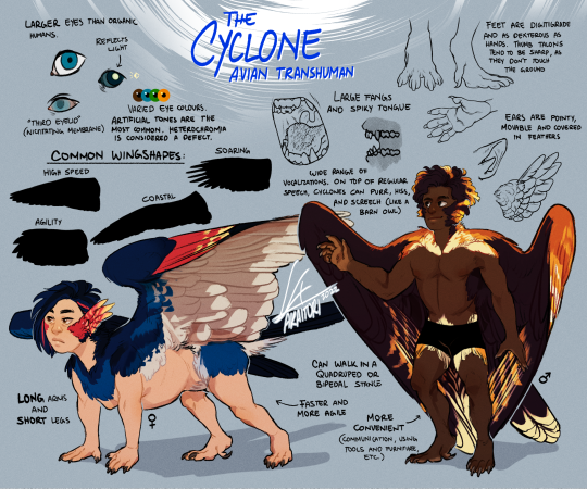
Cyclone Avians, or just Cyclones, are the oldest variety of transgenic humans, characterized by their six limbs, tails, and peculiar body proportions. They were developed in the Tarrukar Empire many decades ago, with the goal to design a flighted soldier inspired by the empire’s cultural and religious background (despite the supposed secular rule of the government).
Cyclones have intelligence on par with organic humans, though their place in hierarchy is very different. Rigid schooling and decades of societal structures have made it normal and expected for Cyclones to be subservient, usually in roles as Wardens (equivalent to police officers), soldiers, or very rarely as private security for especially wealthy investors.
In general, public opinion of Cyclones is very favourable within Tarrukar, as there are many safety nets that have guaranteed trust in the government’s handling of their weapons. However, a fact that the empire attempts to cover up is the prevalence of Strays, transgenic humans that have deserted their roles and still haven't been tracked down. Stray Cyclones are a very rare occurrence, but still, it's a matter that happens.
Cyclones are scarcely seen abroad, so foreign opinion is more bleak. Outside of the empire, these Avians are shrouded in rumor and misinformation, a strategy that Tarrukar leans into as it boosts its image as an unbeatable foe. Cyclone soldiers sent on international operations are usually treated as androids at best, but as feral animals most often.
Avians and the story they belong to is still a work in process, so anything stated may change in the future.
Some extra disorganized notes after the cut:
Height ranges 140-175cm (4'7 - 5'9), the average is around 160cm (5'3).
Cyclones can only take off from high places. This makes climbing skills very important, and they will actively avoid landing in wide open spaces (e.g. deserts) as they risk not being able to get airborne again.
Their heads and eyebrows are covered in soft feathers without barbules, similar to kiwi birds. They can't grow mammalian hair. These feathers can be straight, wavy or curly, but it doesn't get as curly or as straight as human hair can. (Feather texture range roughly translates to 2a - 3c hair)
Feather patterns are very diverse, usually randomly generated out of a trait pool. Some Cyclones may sport designs inspired by existing animals, like organic birds or insects, but these are rare.
Cyclone sight is very potent, they can see in the UV spectrum and the magnetic field. There's an asymmetry in their eyeballs that allow better focus in flight, but it does make them near-sighted on the lower part of their vision.
Sharp sense of smell, so they can detect pheromones. Because of this, they can somewhat gauge the emotions of other people, though it requires training.
Cyclones are 100% sterile. They cannot reproduce at all. While both male and female Cyclones are produced (mostly for the sake of public opinion), biologically both sexes are similar in hormone levels, being fairly high in testosterone.
With the combined efforts of their strong immune system, their highly acidic digestive track, and blazing quick metabolism, Cyclones are very resistant against disease, drugs and poison.
Even though they are an older species, their lifespan and health is still poorly understood. It's estimated they could live around 50 years, but most Cyclones have a shortened lifespan as they don't receive proper treatment.
#concept art#original species#scifi#transgenic#winged people#angel#wings#feathers#character design#digital art#worldbuilding#reference sheet
32 notes
·
View notes
Text
Nature’s Canvas: How Landscaping Transforms Outdoor Spaces
The Art of Landscape Design
Landscapes—regardless of scale—have the ability to reflect both the history and culture of a given space. With a range of both social and health benefits, landscapes not only have visual appeal but also help to connect us with nature.
Landscape architecture focuses on the connection between human interaction and natural surroundings through various landscape design techniques and construction plans. Although not every space can accommodate extensive landscaping, nature still holds a rich and often collective understanding for everyone.
Well-designed landscapes can unify people through various means, such as:
● Revealing shared human values and views of nature based on deep-seated philosophical beliefs.
● Expressing long and intimate relationships between people and their natural environment.
● Reflecting specific techniques of land use that guarantee and sustain biological diversity.
● Acting as a social container and space to reflect deep social values, relationships, emotions, and memories.
Balance, Unity, and Proportion
The principles of landscape design allow you to create captivating outdoor spaces that incorporate a careful balance of aesthetic techniques and natural elements. When combined properly, these factors can transform any exterior into a harmonious and visually stunning oasis.
Balance
Balance refers to the process of ensuring that visual weight is distributed evenly throughout a space. Typically, landscape designers will accomplish this using one of two different methods: symmetry or asymmetry.
Symmetrical balance involves creating a mirrored image that branches out from the middle on either side. Asymmetry, on the other hand, focuses on creating a balance between various elements, such as size, colour, and texture.
Unity
A landscape design won’t have the visual impact that you’re hoping for without some level of cohesion. Unity amongst the different elements not only ensures the space has a sense of harmony but also gives it an elevated visual appeal. Experts use repeated colours, shapes, and textures to help blend the entire design.
Proportion
An important aspect of landscape design that should not be overlooked is proportion. The scale (or size) of various elements about one another or the space as a whole can affect how we view things as one piece. In addition to the elements’ relationship to each other, you also want to consider how they will relate proportionally to the people in it and the surrounding environment.
Colour and Texture
What is plant texture?
In landscape design, plant texture refers to the perceived surface quality of a plant part in comparison to others. Typically, these are placed into one of three categories: coarse, medium, or fine.
Using a combination of different plant textures helps avoid monotony within the landscape design, while also drawing attention to specific elements. When effectively spaced out, textural contrasts can be mesmerizing, heightening the overall visual appeal.
Is colour scheme important?
Colour has the power to create mood, contrast, harmony, and interest in a landscape’s design. When selecting a colour scheme, it’s beneficial to consider your personal style choices, as well as the functional purpose behind the landscaping. Using a colour wheel or a palette generator can help a professional landscaping designer find complementary, analogous, or monochromatic colours that will offer the necessary visual impact.
Creating Harmony With Plants and Trees
Plants and trees are two of the most obvious elements in landscaping. They help shape the overall design and can enhance the other features within an outdoor area. Ranging from high-maintenance to low-maintenance, choosing the right plants for a given space is crucial for increasing the longevity of your landscape design.
To select suitable plants and trees for your project, consider the following steps:
1. Plan before you plant
Before actually breaking ground on a new landscaping project, it’s important to plan ahead. Knowing the purpose behind a plant or tree can help you during the selection process.
Some reasons to consider foliage type include shade, beauty, food, privacy, and habitat. Once you know why you intend to include a specific type of plant or tree, then you can easily start looking for the right ones.
2. Selecting your plants
There are many factors to consider when picking the right plant or tree for your outdoor space. Not only do you need to think about the landscape design, but also the type of environment you are working with. Three key factors to keep in mind when selecting your plant or tree are sun exposure, location, and moisture.
Ultimately, finding suitable plants for your landscape design and placing them strategically within the outdoor space helps create a better sense of harmony throughout.
Enhancing Structure and Functionality With Hardscaping
Hardscaping refers to brickwork, pathways, or walkways that are incorporated into a landscape’s design. Similar to the plant-selection process, the choice of materials for your hardscape will depend on several factors including budget, design theme, and environmental surroundings.
Choosing the correct hardscape can be made easier by defining the spaces within the landscape where you intend to install it. For example, the materials for an entryway may vary from those used to create a walkway or seating area.
Although hardscapes are not an essential aspect of landscape design, they can offer an additional element that enhances the overall aesthetic appeal and functionality of the space. A well-designed hardscape not only provides a practical means of traversing through an outdoor area but also serves as an important design element.
The benefits of installing a hardscape in your landscape design include:
● Creating a focal point within the landscape design
● Providing a designated route for foot traffic
● Customization to suit the overall theme and style of the landscape design
● Producing a sense of rhythm and flow within the landscape
● Offering an opportunity to incorporate additional elements into the landscape design
How to Select the Right Water Feature
The choice of water feature is typically determined by a few different factors, such as available space and its intended contribution within the space. When looking to include a water feature in your landscape design, it’s important to consider how it will blend in with the rest of the elements. Creating harmony throughout is essential for maintaining impactful visual appeal.
Location is also important to think about, such as whether the water feature is going to be a focal point or intended to fade into the background. Proximity to other elements within the landscape design—like seating areas or shrubbery—will influence how it adds to the overall space.
Some water feature options to consider are:
● Fountains
● Ponds
● Waterfalls
● Bubblers
● Naturalistic pieces
● Architectural additions
● Stand-alone structures
● Pools and spas
Sustainability and Eco-Friendly Landscaping
Landscaping doesn’t have to only benefit the visual appeal of your outdoor space. During the design process, you can find unique ways to build sustainable elements that help improve your environmental impact.
One example is rainwater harvesting, which is the practice of strategically collecting rainwater in order to repurpose it later. This can involve installing a rain barrel or cistern to catch and store rainwater to use later. It could also mean slowing and redirecting rainwater to a greenspace where it will infiltrate the soil and be stored for immediate use by plants.
Effectively implementing strategies like this into your landscape design will not only help the nearby environment but also reduce the likelihood of other issues such as overwatering. This contributes to your landscape’s growth and to water conservation efforts, too.
The extent to which you can apply sustainable methods depends greatly on factors like soil type, soil health, climate, sun exposure, slope, budget, and ability to regularly maintain the space.
Rainwater Harvesting and Native Plants
Designing a rainwater system for your outdoor space can help better facilitate infiltration and evapotranspiration, as well as offer natural pollutant filtering. By redirecting or repurposing rainwater strategically, deep-rooted native plants (such as perennials, shrubs, sedges, and ornamental grasses) can thrive longer. Providing increased water penetration for plant roots ensures they will grow more effectively without requiring additional manual maintenance.
When designing a new landscape, it’s crucial to develop a well-conceived plan that includes keen observations about the native plants that are already thriving in the space, existing soil conditions, drainage sources, weather conditions, and changes to climate over time. These factors will inform you about the specific needs of your plants and trees, ensuring the correct systems are put in place.
Maintenance and Long-Term Care
Designing a sustainable, aesthetically appealing landscape is only the tip of the iceberg when it comes to landscaping. Once the groundwork has been laid, it’s important to practice regular maintenance on the space in order to upkeep the appearance of your plants and trees.
Consider these tips for ensuring a long-term functional landscape design:
1. Have a clear vision
Establishing exactly how you want your landscape design to look and feel makes it easier to maintain that image over time. Whether you’re looking to create as much shade as possible for the space, or maintaining a clean-cut, colourful landscape, it’s important to have a goal in mind.
2. Consider landscape maturity
Landscape design often starts with young plants and trees that will eventually grow into maturity under regular conditions. Envisioning what the space will look like over time helps make it easier to develop a long-term plan for maintaining the design and making adjustments as needed.
3. Prepare for changing property conditions
Weather and changing conditions are both important factors to consider when developing a long-term plan for maintenance. One solution for extending the life of your landscape design is incorporating a good balance of plants and trees that can adapt to diverse conditions.
4. Commit to landscape maintenance
There’s no way around it: maintaining an outdoor landscape is the only way to guarantee your vision continues to grow and remain healthy. Neglecting to trim certain plants or trees could affect the growth of other nearby plant life, while grass or other shrubs may die if not properly looked after. This could result in additional costs involved in replanting.
The Power of Sustainable Landscaping
Landscaping has the power to rebuild a sustainable relationship between humans and nature by interlacing the two worlds. Combining functionality and aesthetic design with sustainability allows you to transform an outdoor space into an environmentally friendly oasis.
#Best Ways To Prevent The Most Common Plumbing Problems#Plumbing Problems#broken pipes#leaking pipes#clogged toilets#garbage disposals#prevent drains from clogging#plumber in tinley park#tinley park plumbers#plumber in orland park#orland park plumbers#plumber in homer glen#homer glen plumbers#plumber in frankfort#frankfort plumbers#plumber in mokena#mokena plumbers#plumber in lemont#lemont plumbers#plumber in new lenox#new lenox plumbers#plumber in oak forest#oak forest plumbers#plumber in homewood#homewood plumbers#plumber in midlothian#midlothian plumbers#plumber in crestwood#crestwood plumbers#plumber in palos park
0 notes
Text
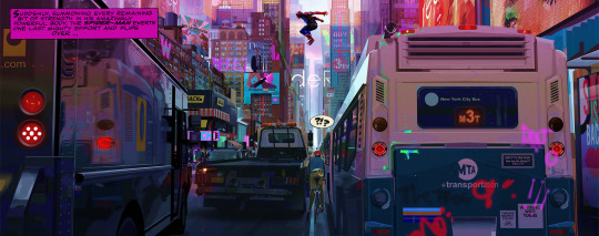
Artist Research
These are some of the main artists that inspired me during the process of creating my final outcomes.
Alberto Mielgo
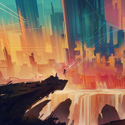
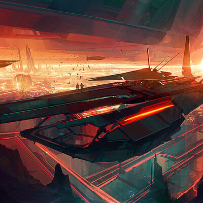
Mielgo is both a concept artist and a movie director, best known for dis Netflix debut in Love, Death and Robots. He was also one of the main concept artists for Spiderverse and one of my biggest inspiration when it comes to art in general. I decided to look at him for this project due to the uniqueness of his style. I have researched a lot of artists that have sketchy, unpolished styles but Alberto's has something that sets him into a whole different league. I love the collage/scrapbook look of his style and how each colour seems to be layered on top like a sticker. I find his work to be a strange mix between stylisation and realism which only makes his art stand out more and be easier to recognise. The asymmetry of his character designs combined with the urban fashion and environments make for a visually pleasing, contemporary aesthetic that still pays homage to the vintage days.

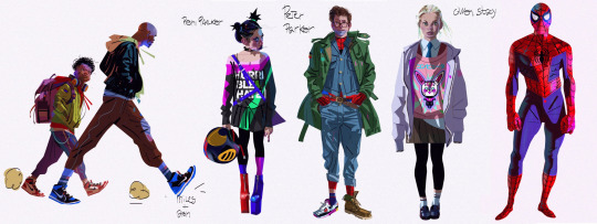
Everything seems to have so much dimension while keeping true to the iconic comic book style through textures, lines, and overall cartoonish colours and stylised anatomy proportions. His environments and city concept art inspires me the most due to how lively and messy everything is . Every part of every street or building looks as if was actually populated and held individuals that left their marks on the ground or walls through litter, graffities, etc.
Something that I could really learn from Miguel is how to draw different faces and staying as far away as possible from having to characters with the same face/body features. At the moment, my characters all seem to have similar face structures and it is hard for me to try out new body types or even different clothing styles.
Joshua Smith
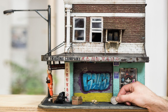
Joshua smith, although a diorama maker/ miniaturist, has helped me a lot through the early stages of my project. Since my project was so focused on the city aesthetics and the more, looking at some of Smith's dioramas, especially the bodegas and the city buildings helped me a lot with developing my own sketches and getting that specific atmosphere of a overcrowded apartment building, with graffities, air conditioners, scrapped paint, uneven bricks, etc.
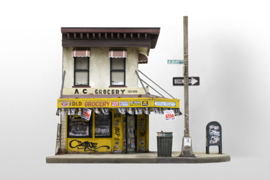
I fin it so impressive how he manages to put so much personality and authenticity in each of his works. The details are mesmerizing, especially the ones someone would most likely miss, like the ripped stickers on the door, or the rust around the metal parts, or even just the little pieces of rubbish lying around. Joshua's dioramas showed me how the more you add, the more organic it will look, especially in human settlements.
His work has also helped me in designing the building for my first illustration. I really wanted to have all the imperfections that he has in his work without making it look abandoned or unlivable but rather old and worn-out, as if it has a history of hosting people.
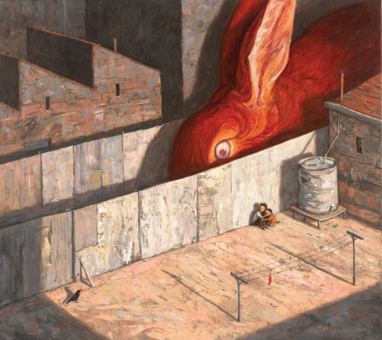
Shaun Tan
I really like Tan's Work and as different as it is from my style, it has inspired me to try out more ''painting'' techniques with my digital work and once again, visit the idea of over stylising my art to make it more appealing to younger audiences. Shaun's art has that quality that makes it look like it came straight from fairy-tale books, with it's soft blending and muted colours, it has a very specific folkloric aesthetic.
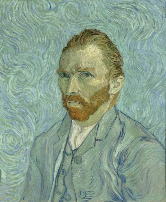
I also like how some of his artworks seem to be inspired by Van Goh's style. The mix of brush strokes seem to be very similar and the way each different section of the painting is constituted of different shades of the same colour really reminds me of Goh' unique art.
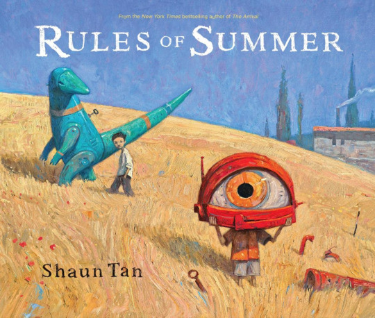
All oh his paintings seem to be so random and without much sense but I personally find it interesting how Tan' leaves each of his artworks up for interpretation and the sense of mystery works really well with the paint-y look. I feel like I can take a lot from this artist in terms of adapting my work to both be and feel suited for a set audience .
Bastien Grivet
Since I really wanted to push myself with my illustration, I decided to look at Grivet and analyse the mesmerizing way in which they paint and combine colours. Despite the chaos and explosion of colours and textures, everything feels organised and planned.
This shows a huge amount of confidence as well as a vast understanding of colour theory in order to achieve this whimsical but not eye straining look. I have noticed that although every artwork seems reach close to every colour on the colour wheel, the prominent transition between warm and cool shades is always present, which really pulls everything together into a harmonious and atmospheric piece of art.
I especially love this artwork which seems to represent an almost godly event that has a golden tree at the centre, with waves of colours spiralling around. These sort of fluid effects are something that I wish I could implement in my art more since it breaks the repetitive look of uniformity and adds the perfect level of disruption and feeling.

I have looked at this artist's ArtStation account and apparently they have posted a pack with some of the brushes they use for their art that is up for sale. It is obvious how each of these brushes is a shortcut towards creating very eccentric and distinctive textures and details and I will look into purchasing them myself since I think they would help me a lot with my backgrounds/environments.
I really like how ArtStation allows artists to sell not only brushes but also prints, 3D assets , etc. This is a great way for big artists to make a living and smaller artists to experiment and try out new things.

0 notes
Text
CHAPTER 4 DEFINITIONS AND EXAMPLES
-Unity- When the elements are similar and consistent within a piece
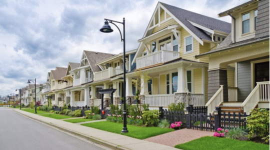
This can often be found in modern neighborhood architecture. Similar roofs and porches create a very ‘copy and paste’ feeling.
Variety- Diversity or differences in the way art is constructed. This can range from shape, style, color, or medium.
This can be seen in animals, people, and landscapes. Example; Bunnies and lizards are very different creatures not only in size but in texture, color, shape, etc.
Balance- Elements feeling or appearing even through a force.
This can be found in The Last Supper. The people are balanced on both sides. While not exactly symmetrical, there is a sense of balance with Jesus being the balancing force in the center of the table.

Symmetry- When both sides of something are nearly identically mirrored from one another.
This is found in a lot of everyday things, but the first thing that comes to my mind is a steering wheel. I have a Dodge Caliber and the ram logo Ibn the center of my wheel is extremely symmetrical.
Asymmetry- The opposite of symmetry. Where both sides of something are not nearly identically mirrored from one another.
The painting, “The Great Wave Off Kanagawa” by Katsushika Hokusai ca. 1830-1832, Is a great example of asymmetry in painting. The wave is heavy and large on the left and is sweeping to the right of the canvas while it is flat.

Directional Force- A way an author or creator guides t he audiences view through their work.
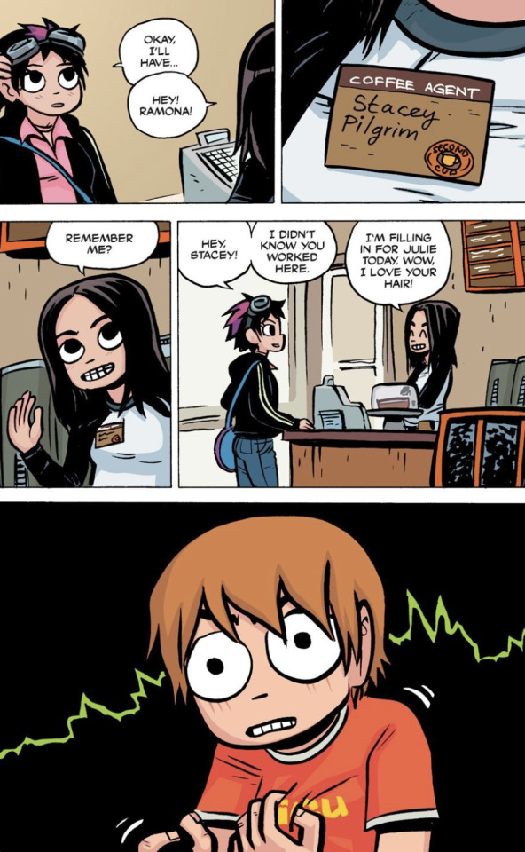
Comic strips are a great example of directional force. If done successfully, a comic can be a piece of cake to read whether the panels are vertical/horizontal. The example below is a page from the Scott pilgrim vs. The World comic series by Bryan Lee O’Malley.
Repetition- An element that is reoccurring.
Repetition can be heard in a musical chorus. Not all of them, but a decent amount of songs have a repeating chorus that is easy to remember. “It was the heat of the moment....heat of the moment....heat of the moment....showed in her eyes” Not only is it the title of the song but “Heat of the Moment” is repeated several times throughout the song.
Pattern- A repetition of specific ordering through shapes or color.
Andy Warhol used pattern a lot in his work. The “Cambell’s Soup Can” piece by Warhol from 1962, is a repeating pattern of the same soup can throughout 32 frames.

Rhythm- Repeating or regularly occurring elements that correspond to create flow of the painting.
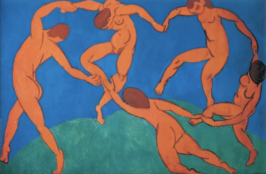
This can be found in paintings of people dancing or moving in a certain gesture. The painting ‘Dance’ by French painter Henri Matisse in 1910 represents this.
Scale- The size comparison and relation to one another.
An example of this could be an average human standing in a school gymnasium. You can see how small they may appear oppose to being in a regular classroom or hallway. Or if they were to be in an elementary school class room with smaller tables and chairs, they may appear taller.
Proportion- This is the size relation of different pieces of an object or being.
Kittens usually have larger heads and smaller bodies compared to when they are full grown cats. They ‘even out’ a bit more, with the head becoming more proportional to their body and seeming less large.
0 notes
Text
All men are designers. All that we do, almost all the time, is design, for design is basic to all human activity. The planning and patterning of any act towards a desired, foreseeable end constitutes the design process. Any attempt to separate design, to make it a thing-by-itself, works counter to the inherent value, of design as the primary underlying matrix of life. Design is com- posing an epic poem, executing a mural, painting a masterpiece, writing a concerto. But design is also cleaning and reorganizing a desk drawer, pulling an impacted tooth, baking an apple pie, choosing sides for a back-lot baseball game, and educating a child. Design is the conscious effort to impose meaningful order. The order and delight we find in frost flowers on a window pane, in the hexagonal perfection of a honeycomb, in leaves, or in the architecture of a rose, reflect man's preoccupation with pattern, the constant attempt to understand an ever-changing, highly complex existence by imposing order on it - but these things are not the product of design. They possess only the order we ascribe to them. The reason we enjoy things in nature is that we see an economy of means, simplicity, elegance and an essential tightness in them. But they are not design. Though they have pattern, order, and beauty, they lack conscious intention. If we call them design, we artificially ascribe our own values to an accidental side issue. The streamlining of a trout's body is aesthetically satisfying to us, but to the trout it is a by-product of swimming efficiency. The aesthetically satisfying spiral growth pattern found in sunflowers, pineapples, pine cones, or the arrangement of leaves on a stem can be explained by the Fibonacci sequence (each member is the sum of the two previous members: 1, 1, 2, 3, 5, 8, 13, 21, 34 .. .), but the plant is only concerned with improving photosynthesis by exposing a maximum of its surface. Similarly, the beauty we find in the tail of a peacock, although no doubt even more attractive to a peahen, is the result of intra-specific selection (which, in the case cited, may even ultimately prove fatal to the species). Intent is also missing from the random order system of a pile of coins. If, however, we move the coins around and arrange them according to size and shape, we add the element of intent and produce some sort of symmetrical alignment. This sym- metrical order system is a favourite of small children, unusually primitive peoples, and some of the insane, because it is so easy to understand. Further shifting of the coins will produce an infinite number of asymmetrical arrangements which require a higher level of sophistication and greater participation on the part of the viewer to be understood and appreciated. While the aesthetic values of the symmetrical and asymmetrical designs differ, both can give ready satisfaction since the underlying intent is clear. Only marginal patterns (those lying in the threshold area between symmetry and asymmetry) fail to make the designer's intent clear. The ambiguity of these 'threshold cases' produces a feeling of unease in the viewer. But apart from these threshold cases there are an infinite number of possible satisfactory arrangements of the coins. Importantly, none of these is the one right answer, though some may seem better than others. Shoving coins around on a board is a design act in miniature because design as a problem-solving activity can never, by definition, yield the one right answer: it will always produce an infinite number of answers, some 'righter' and some 'wronger'. The Brightness' of any design solution will depend on the meaning with which we invest the arrangement. Design must be meaningful. And 'meaningful' replaces the semantically loaded noise of such expressions as 'beautiful1, 'ugly', 'cool', 'cute', 'disgusting', 'realistic', 'obscure', 'abstract', and 'nice', labels convenient to a bankrupt mind when con- fronted by Picasso's 'Guernica', Frank Lloyd Wright's Falling-f water, Beethoven's Eroica, Stravinsky's Le Sacre du printemps, Joyce's Finnegans Wake. In all of these we respond to that which has meaning. The mode of action by which a design fulfils its purpose is its function. 'Form follows function', Louis Sullivan's battle cry of the i88os and 18905, was followed by Frank Lloyd Wright's 'Form and function are one'. But semantically, all the statements from Horatio Greenough to the German Bauhaus are meaningless. The concept that what works well will of necessity look well has been the lame excuse for all the sterile, operating-room-like furniture and implements of the twenties and thirties. A dining table of the period might have a top, well proportioned in glisten- ing white marble, the legs carefully nurtured for maximum strength with minimum materials in gleaming stainless steel. And the first reaction on encountering such a table is to lie down on it and have your appendix extracted. Nothing about the table says: 'Dine off me.' Le style internationaland die neue Sachlichkeit have let us down rather badly in terms of human value. Le Corbusier's house as la machine a habiter and the packing-crate houses evolved in the Dutch De Stijl movement reflect a perversion of aesthetics and utility. 'Should I design it to be functional,' the students say, 'or to be aesthetically pleasing?' This is the most heard, the most understandable, and the most mixed-up question in design today. 'Do you want it to look good, or to work ?' Barricades erected between what are really just two of the many aspects of function. It is all quite simple: aesthetic value is an inherent part of function. A simple diagram will show the dynamic actions and relationships that make up the function complex: It is now possible to go through the six parts of the function complex (above) and to define every one of its aspects. METHOD: The interaction of tools, processes, and materials. An honest use of materials, never making the material seem that which it is not, is good method. Materials and tools must be used optimally, never using one material where another can do the job less expensively and/or more efficiently. The steel beam in a house, painted a fake wood grain; the moulded plastic bottle designed to look like expensive blown glass; the 1967 New Eng- land cobbler's bench reproduction ('worm holes $i extra') dragged into a twentieth-century living room to provide dubious footing for Martini glass and ash tray: these are all perversions of materials, tools, and processes. And this discipline of using a suitable method extends naturally to the field of the fine arts as well. Alexander Calder's 'The Horse', a compelling sculpture at the Museum of Modern Art in New York, was shaped by the particular material in which it was conceived. Calder decided that boxwood would give him the specific colour and texture he desired in his sculpture. But boxwood comes only in rather narrow planks of small sizes. (It is for this reason that it tradition- ally has been used in the making of small boxes: hence its name.) The only way he could make a fair-sized piece of sculpture out of a wood that only comes in small pieces was to interlock them somewhat in the manner of a child's toy. The Horse', then, is a piece of sculpture, the aesthetic of which was largely determined by method. For the final execution at the Museum of Modern Art Calder chose to use thin slats of walnut, a wood similar in texture. When early Swedish settlers in what is now Delaware decided to build, they had at their disposal trees and axes. The material was a round tree trunk, the tool an axe, and the process a simple kerf cut into the log. The inevitable result of this combination of tools, materials, and process is a log cabin. From the log cabin in the Delaware Valley of 1680 to Paolo Soleri's desert home in twentieth-century Arizona is no jump at all. Soleri's house is as much the inevitable result of tools, materials, and processes as is the log cabin. The peculiar viscosity of the desert sand where Soleri built his home made his unique method possible. Selecting a mound of desert sand, Soleri criss-crossed it with V-shaped channels cut into the sand, making a pattern somewhat like the ribs of a whale. Then he poured concrete in the channels, forming, when set, the roof- beams of the house-to-be. He added a concrete skin for the roof and bulldozed the sand out from underneath to create the living space itself. He then completed the structure by setting in car windows garnered from automobile junkyards. Soleri's creative use of tools, materials, and processes was a tour deforce that gave us a radically new building method. Dow Chemical's 'self-generating' styrofoam dome is the pro- duct of another radical approach to building methods. The foundation of the building can be a 12-inch-high circular retaining wall. To this wall a 4-inch wide strip of styrofoam is attached which raises as it goes around the wall from zero to 4 inches in height, forming the base for the spiral dome. On the ground in Paolo Soleri: Carved earth form for the original drafting room and interior of the ceramics workshop. Photos by Stuart Weiner. the centre, motorized equipment operates two spinning booms, one with an operator and the other holding a welding machine. The booms move around, somewhat like a compass drawing a circle, and they rise with a spiralling motion at about 30 feet a minute. Gradually they move in towards the centre. A man sit- ting in the saddle feeds an 'endless' 4 x 4-inch strip of styrofoam into the welding machine, which heat-welds it to the previously hand-laid styrofoam. As the feeding mechanism follows its circular, rising, but ever-diminishing diameter path, this spiral process creates the dome. Finally, a hole 36 inches in diameter is left in the top, through which man, mast, and movement arm can be re- moved. The hole is then closed with a clear plastic pop-in bubble or a vent. At this point the structure is translucent, soft, but still entirely without doors or windows. The doors and windows are then cut (with a minimum of effort; in fact the structure is still so soft that openings could be cut with one's fingernail), and the structure is sprayed inside and out with latex-modified concrete. The dome is ultra-lightweight, is secured to withstand high wind speeds and great snow loads, is vermin-proof, and inexpensive. Several of these 54-foot-diameter domes can be easily joined together into a cluster. All these building methods demonstrate the elegance of solution possible with a creative interaction of tools, materials, and processes. USE: 'Does it work?' A vitamin bottle should dispense pills singly. An ink bottle should not tip over. A plastic-film package covering sliced pastrami should withstand boiling water. As in any reasonably conducted home, alarm-clocks seldom travel through the air at speeds approaching five hundred miles per hour, 'streamlining' clocks is out of place. Will a cigarette lighter designed like the tail fin of an automobile (the design of that auto- mobile was copied from a pursuit plane of the Korean War) give more efficient service? Look at some hammers: they are all different in weight, material, and form. The sculptor's mallet is fully round, permitting constant rotation in the hand. The jeweller's chasing hammer is a precision instrument used for fine work on metal. The prospector's pick is delicately balanced to add to the swing of his arm when cracking rocks. The ball-point pen with a fake polyethylene orchid surrounded by fake styrene carrot leaves sprouting out of its top, on the other hand, is a tawdry perversion of design for use. But the results of the introduction of a new device are never predictable. In the case of the automobile, a fine irony developed. One of the earliest criticisms of the car was that, unlike 'old Dobbin', it didn't have the sense 'to find its way home' whenever its owner was incapacitated by an evening of genteel drinking. No one foresaw that mass acceptance of the car would put the American bedroom on wheels, offering everyone a new place to copulate (and privacy from supervision by parents and spouses). Nobody expected the car to accelerate our mobility, thereby creating the exurbant sprawl and the dormitory suburbs that strangle our larger cities; or to sanction the killing of fifty thou- sand people per annum, brutalising us and making it possible, as Philip Wylie says 'to see babies with their jaws ripped off on the corner of Maine and Maple'; or to dislocate our societal groupings, thus contributing to our alienation; and to put every yut, yahoo, and prickamouse from sixteen to sixty in permanent hock to the tune of $80 a month. In the middle forties, no one foresaw that, with the primary use function of the automobile solved, it would emerge as a combination status symbol and disposable, chrome-plated codpiece. But two greater ironies were to follow. In the early sixties, when people began to fly more, and to rent standard cars at their destination, the businessman's clients no longer saw the car he owned and therefore could not judge his 'style of life' by it. Most of Detroit's Baroque exuberance sub- sided, and the automobile again came closer to being a transportation device. Money earmarked for status demonstration was now spent on boats, colour television sets, and other ephemera. The last irony is still to come: with carbon monoxide fumes poisoning our atmosphere, the electric car, driven at low speeds and with a cruising range of less than one hundred miles, reminiscent of the turn of the century, may soon make an anachronistic comeback. Anachronistic because the days of individual transportation devices are numbered. The automobile gives us a typical case history of seventy years of the perversion of design for use. NEED: Much recent design has satisfied only evanescent wants and desires, while the genuine needs of man have often been neglected by the designer. The economic, psychological, spiritual, technological, and intellectual needs of a human being are usually more difficult and less profitable to satisfy than the carefully engineered and manipulated 'wants' inculcated by fad and fashion. People seem to prefer the ornate to the plain as they prefer day-dreaming to thinking and mysticism to rationalism. As they seek crowd pleasures and choose widely travelled roads rather than solitude and lonely paths, they seem to feel a sense of security in crowds and crowdedness. Horror vacui is horror of inner as well as outer vacuum. The need for security-through-identity has been perverted into role-playing. The consumer, unable or unwilling to live a strenuous life, can now act out the role by appearing caparisoned in Naugahyde boots, pseudo-military uniforms, voyageur's shirts, little fur jackets, and all the other outward trappings of Davy Crockett, Foreign Legionnaires, and Cossack Hetmans. (The apotheosis of the ridiculous: a 'be- your-own-Paul-Bunyan-kit, beard included', neglecting the fact that Paul Bunyan is the imaginary creature of an advertising firm early in this century.) The furry parkas and elk-hide boots are obviously only role- playing devices, since climatic control makes their real use redundant. A short ten months after the Scott Paper Company introduced disposable paper dresses for QQC, it was possible to buy throwaway paper dresses ranging from $20 to $149.50. With increased consumption, the price of the 99c dress could have dropped to 40c. And a 40c paper dress is a good idea. Typically, industry perverted the idea and chose to ignore an important need- fulfilling function of the design: disposable dresses inexpensive enough to make disposability economically feasible for the consumer. Greatly accelerated technological change has been used to create technological obsolescence. This year's product often incorporates enough technical changes to make it really superior to last year's offering. The economy of the market place, however, is still geared to a static philosophy of purchasing-owning' rather than a dynamic one of 'leasing-using', and price policy has not resulted in lowered consumer cost. If a television set, for instance, is to be an every-year affair, rather than a once- in-a- lifetime purchase, the price must reflect it. Instead, the real values of real things have been driven out by false values of false things, a sort of Gresham's Law of Design. As an attitude, 'Let them eat cake' has been thought of as a manufacturer's basic right. And by now people, no longer 'turned on' by a loaf of bread, can differentiate only between frostings. Our profit-oriented and consumer-oriented Western society has become so over specialised that few people experience the pleasures and benefits of full life, and many never participate in even the most modest forms of creative activity which might help to keep their sensory and intellectual faculties alive. Members of a 'civilised' community or nation depend on the hands, brains, and imaginations of experts. But however well trained these experts may be, unless they have a sense of ethical, intellectual, and artistic responsibility, then morality and an intelligent, 'beautiful', and elegant quality of life will suffer in astronomical proportions under our present-day system of mass production and private capital. TELESIS: 'The deliberate, purposeful utilisation of the processes of nature and society to obtain particular goals' (American College Dictionary, 1961). The telesic content of a design must reflect the times and conditions that have given rise to it, and must fit in with the general human socio-economic order in which it is to operate. The uncertainties and the new and complex pressures in our society make many people feel that the most logical way to regain lost values is to go out and buy Early American furniture, put a hooked rug on the floor, buy ready-made phoney ancestor portraits, and hang a flint-lock rifle over the fireplace. The gas-light so popular in our subdivisions is a dangerous and senseless anachronism that only reflects an insecure striving for the 'good old days' by consumer and designer alike. Our twenty-year love affair with things Japanese - Zen Buddhism, the architecture of the Ise Shrine and Katsura Imperial Palace, haiku poetry, Hiroshige and Hokusai block-prints, the music of koto and samisen, lanterns and sake sets, green tea liqueur and sukiyaki and tempura - has triggered an intemperate demand by consumers who disregard telesic aptness. By now it is obvious that our interest in things Japanese is not just a passing fad or fashion but rather the result of a major cultural confrontation. As Japan was shut off for nearly two hundred years from the Western world under the Tokugawa Shogunate, its cultural expressions flourished in a pure (although somewhat inbred) form in the imperial cities of Kyoto and Edo (now Tokyo). The Western world's response to an in-depth knowledge of things Japanese is comparable only to the European reaction to things classical, which we are now pleased to call the Renaissance. Nonetheless, it is not possible to translate things from one culture to another. The floors of traditional Japanese homes are covered by floor mats. These mats are 3x6 feet in size and consist of rice straw closely packed inside a cover of woven rush. The long sides are bound with black linen tape. While tatami mats impose a module (homes are spoken of as six-, eight-, or twelve-mat homes), their primary purposes are to absorb sounds and to act as a sort of wall-to-wall vacuum cleaner which filters particles of dirt through the woven surface and retains them in the inner core of rice straw. Periodically these mats (and the dirt within them) are discarded, and new ones are installed. Japanese feet encased in clean, sock- like tabi (the sandal-like street shoe, or geta, having been left at the door) are also designed to fit in with this system. Western- style leather-soled shoes and spike heels would destroy the surface of the mats and also carry much more dirt into the house. The increasing use of regular shoes and industrial precipitation make the use of tatami difficult enough in Japan and absolutely ridiculous in the United States, where high cost makes periodic disposal and reinstallation ruinously expensive. But a tatami-covered floor is only part of the larger design system of the Japanese house. Fragile, sliding paper walls and tatami give the house definite and significant acoustical proper- ties that have influenced the design and development of musical instruments and even the melodic structure of Japanese speech, poetry, and drama. A piano, designed for the reverberating insulated walls and floors of Western homes and concert halls, cannot be introduced into a Japanese home without reducing the brilliance of a Rachmaninoff concerto to a shrill cacophony. Similarly, the fragile quality of a Japanese samisen cannot be fully appreciated in the reverberating box that constitutes the American house. Americans who try to couple a Japanese interior with an American living experience in their search for exotica find that elements cannot be ripped out of their telesic context with impunity. ASSOCIATION: Our psychological conditioning, often going back to earliest childhood memories, comes into play and pre- disposes us, or provides us with antipathy against a given value. Increased consumer resistance in many product areas testifies to design neglect of the associational aspect of the function complex. After two decades, the television-set industry, for instance, has not yet resolved the question of whether a television set should carry the associational values of a piece of furniture (a lacquered mah-jongg chest of the Ming Dynasty) or of technical equipment (a portable tube tester). Television receivers that carry new associations (sets for children's rooms in bright colours and materials, enhanced by tactilely pleasant but non-working controls and pre-set for given times and channels, clip-on swivel sets for hospital beds, etc., etc.) might not only clear up the astoundingly large back inventory of sets in warehouses, but also create new markets. And what shape is most appropriate to a vitamin bottle: a candy jar of the Gay Nineties, a perfume bottle, or a 'Danish modern' style salt shaker ? The response of many designers has been like that so unsuccessfully practised by Hollywood: the public has been pictured as totally unsophisticated, possessed of neither taste nor discrimination. A picture emerges of a moral weakling with an IQ of about 70, ready to accept whatever specious values the unholy trinity of Motivation Research, Market Analysis, and Sales have decided is good for him. In short, the associational values of design have degenerated to the lowest common denominator, determined more by inspired guesswork and piebald graphic charts rather than by the genuinely felt wants of the consumer. Many products already successfully embody values of high associational content, either accidentally or 'by design'. The Sucaryl bottle by Raymond Loewy Associates for Abbott Laboratories communicates both table elegance and sweetening agent without any suggestion of being medicine-like. The Lettera 22 portable typewriter by Olivetti establishes an immediate aura of refined elegance, precision, extreme portability, and businesslike efficiency, while its two-toned carrying case of canvas and leather connotes 'all- climate-proof. Abstract values can be communicated directly to everyone, and this can be simply demonstrated. If the reader is asked to choose which one of the figures below he would rather call Takete or Maluma (both are words devoid of all meaning in any known language), he will easily call the one on the right Takete (W. Koehler, Gestalt Psychology), Many associational values are really universal, providing for unconscious, deep-seated drives and compulsions. Even totally meaningless sounds and shapes can, as demonstrated, mean the same thing to all of us. The unconscious relationship between spectator expectation and the configuration of the object can be experimented with and manipulated. This will not only enhance the 'chair-ness' of a chair, for instance, but also load it with associational values of, say, elegance, formality, portability, or what-have-you. AESTHETICS: Here dwells the traditionally bearded artist, mythological figure, equipped with sandals, mistress, garret, and easel, pursuing his dream-shrouded designs. The cloud of mystery surrounding aesthetics can (and should be) dispelled. The dictionary definition, 'a theory of the beautiful, in taste and Art' leaves us not much better off than before. Nonetheless we know that aesthetics is a tool, one of the most important ones in the repertory of the designer, a tool that helps in shaping his forms and colours into entities that move us, please us, and are beautiful, exciting, filled with delight, meaningful. Because there is no ready yardstick for the analysis of aesthetics, it is simply considered to be a personal expression fraught with mystery and surrounded with nonsense. We 'know what we like' or dislike and let it go at that. Artists themselves begin to look at their productions as auto-therapeutic devices of self- expression, confuse licence and liberty, and forsake all discipline. They are often unable to agree on the various elements and attributes of design aesthetics. If we contrast the 'Last Supper' by Leonardo da Vinci with an ordinary piece of wallboard, we will understand how both operate in the area of aesthetics. In the work of so-called 'pure' art, the main job is to operate on a level of inspiration, delight, beauty, catharsis ... in short, to serve as a propagandistic communications device for the Holy Church at a time when a largely pre-literate population \vas exposed to a few non-verbal stimuli. But the 'Last Supper' also had to fill the other requirements of function; aside from the spiritual, its use was to cover a wall. In terms of method it had to reflect the material (pigment and vehicle), tools (brushes and painting knives), and processes (individualistic brushwork) employed by Leonardo. It had to fulfil the human need for spiritual satisfaction. And it had to work on the associational and telesic plane, providing reference points from the Bible. Finally, it had to make 30 identification through association easier for the beholder through such clichés as the racial type, garb, and posture of the Saviour. 'The Last Supper', by Leonardo da Vinci. Earlier 'Last Supper' versions, painted during the sixth and seventh centuries, saw Christ lying or reclining in the place of honour. For nearly a thousand years, the well- mannered did not sit at the table. Leonardo da Vinci disregarded the reclining position followed by earlier civilisations and painters for Jesus and the Disciples. To make the 'Last Supper' acceptable to Italians of his time, on an associational plane, Leonardo sat the crowd around the last supper table on chairs or benches in the proper positions of his (Leonardo's) time. Unfortunately the scriptural account of St John resting his head on the Saviour's bosom presented an unsolvable positioning problem to the artist, once everybody was seated according to the Renaissance custom. On the other hand, the primary use of wallboard is to cover a wall. But an increased choice of textures and colours applied by the factory shows that it, too, must fulfil the aesthetic aspect of function. No one argues that in a great work of art such as the 'Last Supper', prime functional emphasis is aesthetic, with use (to cover a wall) subsidiary. The main job of wallboard is its use in covering a wall, and the aesthetic assumes a highly subsidiary position. But both examples must operate in all six areas of the function complex. Designers often attempt to go beyond the primary functional requirements of method, use, need, telesis, association, and aesthetics; they strive for a more concise statement: precision, simplicity. In a statement so conceived, we find a degree of aesthetic satisfaction comparable to that found in the logarithmic spiral of a chambered nautilus, the ease of a seagull's flight, the strength of a gnarled tree trunk, the colour of a sunset. The particular satisfaction derived from the simplicity of a thing can be called elegance. When we speak of an 'elegant' solution, we refer to something consciously evolved by men which reduces the complex to the simple: Euclid's Proof that the number of primes is infinite, from the field of mathematics, will serve: 'Primes' are numbers which are not divisible, like 3, 17, 23, etc. One would imagine as we get higher in the numerical series, primes would get rarer, crowded out by the ever-increasing products of small numbers, and that we would finally arrive at a very high number which would be the highest prime, the last numerical virgin. Euclid's Proof demonstrates in a simple and elegant way that this is not true and that to whatever astronomical regions we ascend, we shall always find numbers which are not the product of smaller ones but are generated by immaculate conceptions, as it were. Here is the proof: assume that P is the hypothetically highest prime; then imagine a number equal to 1 x 2 x 3 x 4 ... x P. This number is expressed by the numerical symbol (P!). Now add to it 1: (P! + 1). This number is obviously not divisible by P or any number less than P (because they are all contained in (P!)); hence (P! + 1) is either a prime higher than P or it contains a prime factor higher than P . . . Q.E.D. The deep satisfaction evoked by this proof is aesthetic as well as intellectual: a type of enchantment with the near-perfect.
0 notes
Text
Interior Design Firm Singapore
Interior Design
Interior design is the art and science of enhancing the interior of a building to achieve a healthier and more aesthetically pleasing environment for the people using the space. An interior designer is someone who plans, researches, coordinates, and manages such projects. Interior design is a multifaceted profession that includes conceptual development, space planning, site inspections, programming, research, communicating with the stakeholders of a project, construction management, and execution of the design.
Interior design is the process of shaping the experience of interior space, through the manipulation of spatial volume as well as surface treatment. Not to be confused with interior decoration, interior design draws on aspects of environmental psychology, architecture, and product design in addition to traditional decoration.
Interior design is the art and science of understanding people’s behaviour to create functional spaces within a building. Decoration is the furnishing or adorning of a space with fashionable or beautiful things. In short, interior designers may decorate, but decorators do not design.
Concepts and Creation
When doing interior design, it is necessary to think of the house as a totally; a series of spaces linked together by halls and stairways. It is therefore appropriate that a common style and theme runs throughout. This is not to say that all interior design elements should be the same, but they should work together and complement each other to strengthen the whole composition.
Colours
Colour is a powerful design tool in decoration, as well as in interior design which is the art of composing and coordinating colours together to create a stylish scheme on the interior architecture of the space.
A way to create theme or storyline is with the well-considered use of colour. Colour schemes in general are a great way to unify a collection of spaces. For example, you might pick three or four colours and use them in varying shades throughout the house.
It is essential to interior designers to acquire a deep experience with colours, understand their psychological effects, and understand the meaning of each colour in different locations and situations in order to create suitable combinations for each place.
Combining colours together could result in creating a state of mind as seen by the observer, and could eventually result in positive or negative effects on them. Colours make the room feel either more calm, cheerful, comfortable, stressful, or dramatic. Colour combination make a tiny room seem larger or smaller. So, it is the Interior designer profession to choose appropriate colours for a place in a way people want to look and feel in the space.
Balance
In a short sentence for those who just scan this article balance can be described as the equal distribution of visual weight in a room.
There are three styles of balance: symmetrical, asymmetrical, and radial.
Symmetrical balance is usually found in traditional interiors. Symmetrical balance is characterized by the same objects repeated in the same positions on either side of a vertical axis, for example you might remember old rooms where on each side of a room is an exact mirror of the other. This symmetry also reflects the human form, so we are innately comfortable in a balanced setting.
Asymmetrical balance is more appropriate in design in these days. Balance is achieved with some dissimilar objects that have equal visual weight or eye attraction. Asymmetrical balance is more casual and less contrived in feeling, but more difficult to achieve. Asymmetry suggests movement, and leads to more lively interiors.
Radial symmetry is when all the elements of a design are arrayed around a centre point. A spiral staircase is also an excellent example of radial balance. Though not often employed in interiors, it can provide an interesting counterpoint if used appropriately.
Enemies of Design
Interior design’s biggest enemy is boredom. A well-designed room always has, depending on the size of it, one or more focal points. A focal point must be dominant to draw attention and interesting enough to encourage the viewer to look further. A focal point thus must have a lasting impression but must also be an integral part of the decoration linked through scale, style, colour or theme. A fireplace or a flat tv is the first example that most people think of when we talk about a room focal point.
If you don’t have a natural focal point in your space, such as a fireplace for example, you can create one by highlighting a particular piece of furniture, artwork, or by simply painting a contrasting colour in one area. Try to maintain balance, though, so that the focal point doesn’t hog all of the attention.
Rhythms
If we would speak about music, we would describe rhythms the beat of pulse of the music. In interior design, rhythm is all about visual pattern repetition. Rhythm is defined as continuity, recurrence or organized movement. To achieve these themes in a design, you need to think about repetition, progression, transition and contrast. Using these mechanisms will impart a sense of movement to your space, leading the eye from one design element to another.
Repetition is the use of the same element more than once throughout a space. You can repeat a pattern, colour, texture, line, or any other element, or even more than one element.
Progression is taking an element and increasing or decreasing one or more of its qualities. The most obvious implementation of this would be a gradation by size. A cluster of candles of varying sizes on a simple tray creates interest because of the natural progression shown. You can also achieve progression via colour, such as in a monochromatic colour scheme where each element is a slightly different shade of the same hue.
Transition is a little harder to define. Unlike repetition or progression, transition tends to be a smoother flow, where the eye naturally glides from one area to another. The most common transition is the use of a curved line to gently lead the eye, such as an arched doorway or winding path.
Contrast; Finally, contrast is fairly straightforward. Putting two elements in opposition to one another, such as black and white pillows on a sofa, is the hallmark of this design principle. Opposition can also be implied by contrasts in form, such as circles and squares used together. Contrast can be quite jarring, and is generally used to enliven a space. Be careful not to undo any hard work you’ve done using the other mechanisms by introducing too much contrast!
Details
Another important element of interior design where it is necessary to take infinite pains is details. Everything from the trimming on the lamp shade, the colour of the piping on the scatter cushion, to the light switches and cupboard handles need attention. Unlike colour people find details boring. As a result, it gets neglected and skimmed over or generally left out. As colour expresses the whole spirit and life of a scheme; details are just as an important underpinning of interior design. Details should not be obvious, but they should be right, enhancing the overall feel of a room.
Scale and Proportion
These two design principles go hand in hand, since both relate to size and shape. Without consideration of scale, in particular, human scale, our everyday activities would be more difficult. Scale refers to the relationship between two or more objects, one that has a commonly known size. In most cases, the size of objects is compared to our own human scale. We can find examples of this in our homes and workplaces; for instance, standardized heights.
Proportion has to do with the ratio of one design element to another, or one element to the whole. Scale concerns itself with the size of one object compared to another. Proportion is a word often used interchangeably with scale although there is one subtle difference between the two definitions. While the word scale implies the comparison of objects where the actual size of one object is known, proportion relates to the general size of two objects without information regarding their actual sizes (or scales).
While scale is more absolute, proportion is truly relative and requires the interior designer to understand the interactions between objects within a 3-dimensional space. For most designers, it’s a difficult thing to explain when objects in a room are in proportion – this is what we refer to as having “an eye for design”.
There is no right or wrong when it comes to this application of proportion. As it can alter the way our spaces look and feel, getting proportion “right” all depends on the intent of the designer.
Albedo Design is one of the best interior design firm in Singapore
0 notes
Text
Nature’s Canvas: How Landscaping Transforms Outdoor Spaces
The Art of Landscape Design
Landscapes—regardless of scale—have the ability to reflect both the history and culture of a given space. With a range of both social and health benefits, landscapes not only have visual appeal but also help to connect us with nature.
Landscape architecture focuses on the connection between human interaction and natural surroundings through various landscape design techniques and construction plans. Although not every space can accommodate extensive landscaping, nature still holds a rich and often collective understanding for everyone.
Well-designed landscapes can unify people through various means, such as:
● Revealing shared human values and views of nature based on deep-seated philosophical beliefs.
● Expressing long and intimate relationships between people and their natural environment.
● Reflecting specific techniques of land use that guarantee and sustain biological diversity.
● Acting as a social container and space to reflect deep social values, relationships, emotions, and memories.
Balance, Unity, and Proportion
The principles of landscape design allow you to create captivating outdoor spaces that incorporate a careful balance of aesthetic techniques and natural elements. When combined properly, these factors can transform any exterior into a harmonious and visually stunning oasis.
Balance
Balance refers to the process of ensuring that visual weight is distributed evenly throughout a space. Typically, landscape designers will accomplish this using one of two different methods: symmetry or asymmetry.
Symmetrical balance involves creating a mirrored image that branches out from the middle on either side. Asymmetry, on the other hand, focuses on creating a balance between various elements, such as size, colour, and texture.
Unity
A landscape design won’t have the visual impact that you’re hoping for without some level of cohesion. Unity amongst the different elements not only ensures the space has a sense of harmony but also gives it an elevated visual appeal. Experts use repeated colours, shapes, and textures to help blend the entire design.
Proportion
An important aspect of landscape design that should not be overlooked is proportion. The scale (or size) of various elements about one another or the space as a whole can affect how we view things as one piece. In addition to the elements’ relationship to each other, you also want to consider how they will relate proportionally to the people in it and the surrounding environment.
Colour and Texture
What is plant texture?
In landscape design, plant texture refers to the perceived surface quality of a plant part in comparison to others. Typically, these are placed into one of three categories: coarse, medium, or fine.
Using a combination of different plant textures helps avoid monotony within the landscape design, while also drawing attention to specific elements. When effectively spaced out, textural contrasts can be mesmerizing, heightening the overall visual appeal.
Is colour scheme important?
Colour has the power to create mood, contrast, harmony, and interest in a landscape’s design. When selecting a colour scheme, it’s beneficial to consider your personal style choices, as well as the functional purpose behind the landscaping. Using a colour wheel or a palette generator can help a professional landscaping designer find complementary, analogous, or monochromatic colours that will offer the necessary visual impact.
Creating Harmony With Plants and Trees
Plants and trees are two of the most obvious elements in landscaping. They help shape the overall design and can enhance the other features within an outdoor area. Ranging from high-maintenance to low-maintenance, choosing the right plants for a given space is crucial for increasing the longevity of your landscape design.
To select suitable plants and trees for your project, consider the following steps:
1. Plan before you plant
Before actually breaking ground on a new landscaping project, it’s important to plan ahead. Knowing the purpose behind a plant or tree can help you during the selection process.
Some reasons to consider foliage type include shade, beauty, food, privacy, and habitat. Once you know why you intend to include a specific type of plant or tree, then you can easily start looking for the right ones.
2. Selecting your plants
There are many factors to consider when picking the right plant or tree for your outdoor space. Not only do you need to think about the landscape design, but also the type of environment you are working with. Three key factors to keep in mind when selecting your plant or tree are sun exposure, location, and moisture.
Ultimately, finding suitable plants for your landscape design and placing them strategically within the outdoor space helps create a better sense of harmony throughout.
Enhancing Structure and Functionality With Hardscaping
Hardscaping refers to brickwork, pathways, or walkways that are incorporated into a landscape’s design. Similar to the plant-selection process, the choice of materials for your hardscape will depend on several factors including budget, design theme, and environmental surroundings.
Choosing the correct hardscape can be made easier by defining the spaces within the landscape where you intend to install it. For example, the materials for an entryway may vary from those used to create a walkway or seating area.
Although hardscapes are not an essential aspect of landscape design, they can offer an additional element that enhances the overall aesthetic appeal and functionality of the space. A well-designed hardscape not only provides a practical means of traversing through an outdoor area but also serves as an important design element.
The benefits of installing a hardscape in your landscape design include:
● Creating a focal point within the landscape design
● Providing a designated route for foot traffic
● Customization to suit the overall theme and style of the landscape design
● Producing a sense of rhythm and flow within the landscape
● Offering an opportunity to incorporate additional elements into the landscape design
How to Select the Right Water Feature
The choice of water feature is typically determined by a few different factors, such as available space and its intended contribution within the space. When looking to include a water feature in your landscape design, it’s important to consider how it will blend in with the rest of the elements. Creating harmony throughout is essential for maintaining impactful visual appeal.
Location is also important to think about, such as whether the water feature is going to be a focal point or intended to fade into the background. Proximity to other elements within the landscape design—like seating areas or shrubbery—will influence how it adds to the overall space.
Some water feature options to consider are:
● Fountains
● Ponds
● Waterfalls
● Bubblers
● Naturalistic pieces
● Architectural additions
● Stand-alone structures
● Pools and spas
Sustainability and Eco-Friendly Landscaping
Landscaping doesn’t have to only benefit the visual appeal of your outdoor space. During the design process, you can find unique ways to build sustainable elements that help improve your environmental impact.
One example is rainwater harvesting, which is the practice of strategically collecting rainwater in order to repurpose it later. This can involve installing a rain barrel or cistern to catch and store rainwater to use later. It could also mean slowing and redirecting rainwater to a greenspace where it will infiltrate the soil and be stored for immediate use by plants.
Effectively implementing strategies like this into your landscape design will not only help the nearby environment but also reduce the likelihood of other issues such as overwatering. This contributes to your landscape’s growth and to water conservation efforts, too.
The extent to which you can apply sustainable methods depends greatly on factors like soil type, soil health, climate, sun exposure, slope, budget, and ability to regularly maintain the space.
Rainwater Harvesting and Native Plants
Designing a rainwater system for your outdoor space can help better facilitate infiltration and evapotranspiration, as well as offer natural pollutant filtering. By redirecting or repurposing rainwater strategically, deep-rooted native plants (such as perennials, shrubs, sedges, and ornamental grasses) can thrive longer. Providing increased water penetration for plant roots ensures they will grow more effectively without requiring additional manual maintenance.
When designing a new landscape, it’s crucial to develop a well-conceived plan that includes keen observations about the native plants that are already thriving in the space, existing soil conditions, drainage sources, weather conditions, and changes to climate over time. These factors will inform you about the specific needs of your plants and trees, ensuring the correct systems are put in place.
Maintenance and Long-Term Care
Designing a sustainable, aesthetically appealing landscape is only the tip of the iceberg when it comes to landscaping. Once the groundwork has been laid, it’s important to practice regular maintenance on the space in order to upkeep the appearance of your plants and trees.
Consider these tips for ensuring a long-term functional landscape design:
1. Have a clear vision
Establishing exactly how you want your landscape design to look and feel makes it easier to maintain that image over time. Whether you’re looking to create as much shade as possible for the space, or maintaining a clean-cut, colourful landscape, it’s important to have a goal in mind.
2. Consider landscape maturity
Landscape design often starts with young plants and trees that will eventually grow into maturity under regular conditions. Envisioning what the space will look like over time helps make it easier to develop a long-term plan for maintaining the design and making adjustments as needed.
3. Prepare for changing property conditions
Weather and changing conditions are both important factors to consider when developing a long-term plan for maintenance. One solution for extending the life of your landscape design is incorporating a good balance of plants and trees that can adapt to diverse conditions.
4. Commit to landscape maintenance
There’s no way around it: maintaining an outdoor landscape is the only way to guarantee your vision continues to grow and remain healthy. Neglecting to trim certain plants or trees could affect the growth of other nearby plant life, while grass or other shrubs may die if not properly looked after. This could result in additional costs involved in replanting.
The Power of Sustainable Landscaping
Landscaping has the power to rebuild a sustainable relationship between humans and nature by interlacing the two worlds. Combining functionality and aesthetic design with sustainability allows you to transform an outdoor space into an environmentally friendly oasis.
#Best Ways To Prevent The Most Common Plumbing Problems#Plumbing Problems#broken pipes#leaking pipes#clogged toilets#garbage disposals#prevent drains from clogging#plumber in tinley park#tinley park plumbers#plumber in orland park#orland park plumbers#plumber in homer glen#homer glen plumbers#plumber in frankfort#frankfort plumbers#plumber in mokena#mokena plumbers#plumber in lemont#lemont plumbers#plumber in new lenox#new lenox plumbers#plumber in oak forest#oak forest plumbers#plumber in homewood#homewood plumbers#plumber in midlothian#midlothian plumbers#plumber in crestwood#crestwood plumbers#plumber in palos park
0 notes
Text
Interior design singapore
Interior design singapore
Interior design is the art and science of enhancing the interior of a building to achieve a healthier and more aesthetically pleasing environment for the people using the space. An interior designer is someone who plans, researches, coordinates, and manages such projects. Interior design is a multifaceted profession that includes conceptual development, space planning, site inspections, programming, research, communicating with the stakeholders of a project, construction management, and execution of the design.
Interior design is the process of shaping the experience of interior space, through the manipulation of spatial volume as well as surface treatment. Not to be confused with interior decoration, interior design draws on aspects of environmental psychology, architecture, and product design in addition to traditional decoration.
Interior design is the art and science of understanding people’s behaviour to create functional spaces within a building. Decoration is the furnishing or adorning of a space with fashionable or beautiful things. In short, interior designers may decorate, but decorators do not design.
Concepts and Creation
When doing interior design, it is necessary to think of the house as a totally; a series of spaces linked together by halls and stairways. It is therefore appropriate that a common style and theme runs throughout. This is not to say that all interior design elements should be the same, but they should work together and complement each other to strengthen the whole composition.
Colours
Colour is a powerful design tool in decoration, as well as in interior design which is the art of composing and coordinating colours together to create a stylish scheme on the interior architecture of the space.
A way to create theme or storyline is with the well-considered use of colour. Colour schemes in general are a great way to unify a collection of spaces. For example, you might pick three or four colours and use them in varying shades throughout the house.
It is essential to interior designers to acquire a deep experience with colours, understand their psychological effects, and understand the meaning of each colour in different locations and situations in order to create suitable combinations for each place.
Combining colours together could result in creating a state of mind as seen by the observer, and could eventually result in positive or negative effects on them. Colours make the room feel either more calm, cheerful, comfortable, stressful, or dramatic. Colour combination make a tiny room seem larger or smaller. So, it is the Interior designer profession to choose appropriate colours for a place in a way people want to look and feel in the space.
Balance
In a short sentence for those who just scan this article balance can be described as the equal distribution of visual weight in a room.
There are three styles of balance: symmetrical, asymmetrical, and radial.
Symmetrical balance is usually found in traditional interiors. Symmetrical balance is characterized by the same objects repeated in the same positions on either side of a vertical axis, for example you might remember old rooms where on each side of a room is an exact mirror of the other. This symmetry also reflects the human form, so we are innately comfortable in a balanced setting.
Asymmetrical balance is more appropriate in design in these days. Balance is achieved with some dissimilar objects that have equal visual weight or eye attraction. Asymmetrical balance is more casual and less contrived in feeling, but more difficult to achieve. Asymmetry suggests movement, and leads to more lively interiors.
Radial symmetry is when all the elements of a design are arrayed around a centre point. A spiral staircase is also an excellent example of radial balance. Though not often employed in interiors, it can provide an interesting counterpoint if used appropriately.
Enemies of Design
Interior design’s biggest enemy is boredom. A well-designed room always has, depending on the size of it, one or more focal points. A focal point must be dominant to draw attention and interesting enough to encourage the viewer to look further. A focal point thus must have a lasting impression but must also be an integral part of the decoration linked through scale, style, colour or theme. A fireplace or a flat tv is the first example that most people think of when we talk about a room focal point.
If you don’t have a natural focal point in your space, such as a fireplace for example, you can create one by highlighting a particular piece of furniture, artwork, or by simply painting a contrasting colour in one area. Try to maintain balance, though, so that the focal point doesn’t hog all of the attention.
Rhythms
If we would speak about music, we would describe rhythms the beat of pulse of the music. In interior design, rhythm is all about visual pattern repetition. Rhythm is defined as continuity, recurrence or organized movement. To achieve these themes in a design, you need to think about repetition, progression, transition and contrast. Using these mechanisms will impart a sense of movement to your space, leading the eye from one design element to another.
Repetition is the use of the same element more than once throughout a space. You can repeat a pattern, colour, texture, line, or any other element, or even more than one element.
Progression is taking an element and increasing or decreasing one or more of its qualities. The most obvious implementation of this would be a gradation by size. A cluster of candles of varying sizes on a simple tray creates interest because of the natural progression shown. You can also achieve progression via colour, such as in a monochromatic colour scheme where each element is a slightly different shade of the same hue.
Transition is a little harder to define. Unlike repetition or progression, transition tends to be a smoother flow, where the eye naturally glides from one area to another. The most common transition is the use of a curved line to gently lead the eye, such as an arched doorway or winding path.
Contrast; Finally, contrast is fairly straightforward. Putting two elements in opposition to one another, such as black and white pillows on a sofa, is the hallmark of this design principle. Opposition can also be implied by contrasts in form, such as circles and squares used together. Contrast can be quite jarring, and is generally used to enliven a space. Be careful not to undo any hard work you’ve done using the other mechanisms by introducing too much contrast!
Details
Another important element of interior design where it is necessary to take infinite pains is details. Everything from the trimming on the lamp shade, the colour of the piping on the scatter cushion, to the light switches and cupboard handles need attention. Unlike colour people find details boring. As a result, it gets neglected and skimmed over or generally left out. As colour expresses the whole spirit and life of a scheme; details are just as an important underpinning of interior design. Details should not be obvious, but they should be right, enhancing the overall feel of a room.
Scale and Proportion
These two design principles go hand in hand, since both relate to size and shape. Without consideration of scale, in particular, human scale, our everyday activities would be more difficult. Scale refers to the relationship between two or more objects, one that has a commonly known size. In most cases, the size of objects is compared to our own human scale. We can find examples of this in our homes and workplaces; for instance, standardized heights.
Proportion has to do with the ratio of one design element to another, or one element to the whole. Scale concerns itself with the size of one object compared to another. Proportion is a word often used interchangeably with scale although there is one subtle difference between the two definitions. While the word scale implies the comparison of objects where the actual size of one object is known, proportion relates to the general size of two objects without information regarding their actual sizes (or scales).
While scale is more absolute, proportion is truly relative and requires the interior designer to understand the interactions between objects within a 3-dimensional space. For most designers, it’s a difficult thing to explain when objects in a room are in proportion – this is what we refer to as having “an eye for design”.
There is no right or wrong when it comes to this application of proportion. As it can alter the way our spaces look and feel, getting proportion “right” all depends on the intent of the designer.
Interior Designer
An interior designer is a person who is considered a professional in the field of interior design or one who designs interiors as part of their job. Interior design is a creative practice that analyses programmatic information, establishes a conceptual direction, refines the design direction, and produces graphic communication and construction documents. In some jurisdictions, interior designers must be licensed to practice.
0 notes
Last Seen Blogs

i-know-i-am-not-alone
I KNOW, I AM NOT ALONE

finitohide
Untitled

ep1114
Holz und Faden

b00tyyyshak3r9000
💜Bones!💜

sandy-the-glader
𝑆𝑎𝑛𝑑𝑦 ♡︎