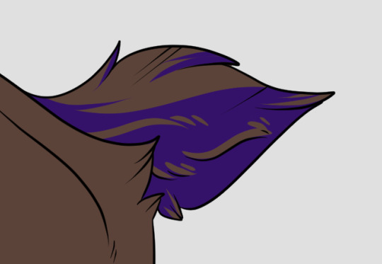
#i just wanted to play around with the bg purples ngl
Photo


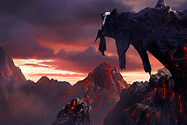


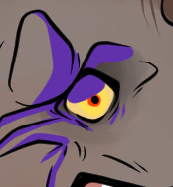
#theuntamededit#weiwuxianedit#lanwangjiedit#wangyiboedit#xiaozhanedit#seanxiaoedit#The Untamed#Wei Wuxian#Lan Wangji#Xiao Zhan#Wang Yibo#mine: gifs#WHAT DO Y'ALL HAVE ME WATCHING?#I'M SOBBING 6 MINUTES IN!#i just wanted to play around with the bg purples ngl#blood tw
328 notes
·
View notes
Photo

so i do a lot of shading like this in my art (or try to) and i asked if anyone in my discord server wanted a tutorial.... and they said yes!
so im gonna do my best to explain how i shade things under the cut....
(i use clip studio paint but honestly this should work in any art program i think)

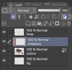
1. FIRST- have your drawing. have Layer. I usually have three layers at LEAST when im doing this- and i keep them stacked in this order: top is lineart, middle is flat colors, and bottom is the background.
the purple circle shows the icon for making a layer into a clipping layer- IMPORTANT
the pink circle shows the icon for locking transparent pixels- helpful! it makes sure you don’t “go outside the lines”

(in case you’re curious this is my csp layout)
2. create a new layer above your flat colors, and press the two little squares. this makes a clipping layer! it basically makes a mask of the layer below it, and you can draw whatever (in this case shadows) and it only follows the filled in areas of the layer below it. so if i drew a bunch of yellow stripes on the clipping/shadow layer, it would only follow the form of the werewolf flat colors and not anything else. i hope that makes sense!
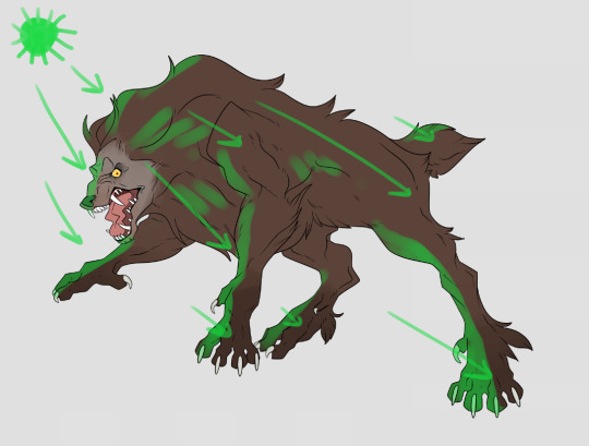
3. decide where your light source is coming from! ngl i totally draw a little sun to remind myself where the light is coming from in a piece.... in this case the green shows where i think the light would be hitting the werewolf, and therefore i would draw shadows opposite/adjacent to that. im not the best at explaining lighting though, so heres a good reference.
heres another.

4. SHADING TIME..... so for my shading i just use the default pen tool in clip studio. g-pen, i believe. Stabilisation!!! between the two pink stars!!! use it. its so good for lineart, and for drawing smooth, non trash lines and shapes. it has Saved my life. the higher the number, the ‘slower’ your brush moves, and the smoother your lines become. i tend to keep mine around 60-70 but play around with it....
i usually shade with a bright annoying color so i can tell what im doing. (purple usually), as shown in box one. thats your foreground color. 2 is your secondary (background) color, i dont usually mess with it and leave it white. hitting box three turns your current pen into an eraser version of itself... i use it a lot! dont forget about this box

i usually tend to think of shadows as shapes.... in the werewolf’s eyebrow/spot/thing you can see where ive drawn a line.....
and then filled it in! i dont normally use the paint bucket to fill in areas... just the pen. it gets too hard
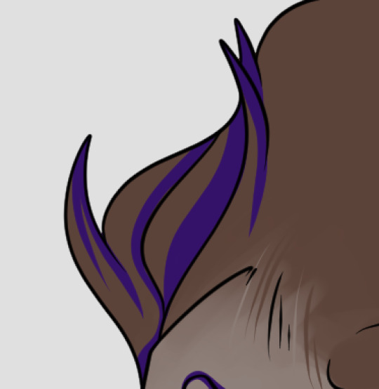
hair/tufts are the fun part!!! you can see that ive drawn solid chunks of shadow in the werewolf’s mane....

...then i click square three to turn my brush into an eraser and carve out little details

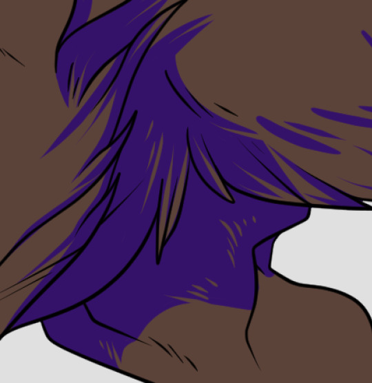

here are some more examples of that... i use it a lot. A LOT.
go wild. go crazy. sometimes i dont think my shading follows like TRADITIONAL physical rules of the laws of light but just. dewit

5. SO YOURE DONE SHADING..... if you refer back to your Layers window, you’ll see a drop down box that usually says normal and a slider.... knock that slider down to like. 50, or 30 (what i usually do). this lowers the opacity on the shadows layer so you can see through it kinda. the drop down box is the layer styles... play around with it!! you can do some really cool stuff with overlay/multiply/etc and make your shading layer super funky.....
if you hit the lock transparent pixels button, you can color your shadows differently if you want! sometimes ill duplicate the shadow layer and color it differently and run it through the gaussian blur filter... it can make it look a little softer and less hard.
usually in my art, when im done i merge all the layers together so you just have one layer left. i duplicate that layer, run it through the gaussian blur filter and drop the opacity down to like.... 20 maybe so everything looks soft. on this picture, i duplicated the werewolf layer (without the bg) and did a motion blur on it to make it look like he was moving....

.... and here he is after dropping the shadow opacity/adding other little details and running it through 5000 filters
i really hope that gave you some kind of idea on how cel shading works!! i am by no means the master, but if you have questions or tips please don’t hesitate to ask me ;a; im really not good at explaining things lol
thank you for reading!!! <3
30 notes
·
View notes
Last Seen Blogs
purposev
LIFE CONSISTS OF MOMENTS

ernestosanmiguel
Miradas
luvugus
Taylan 💖

poupinou68
HOTMENS

jose8800
Untitled