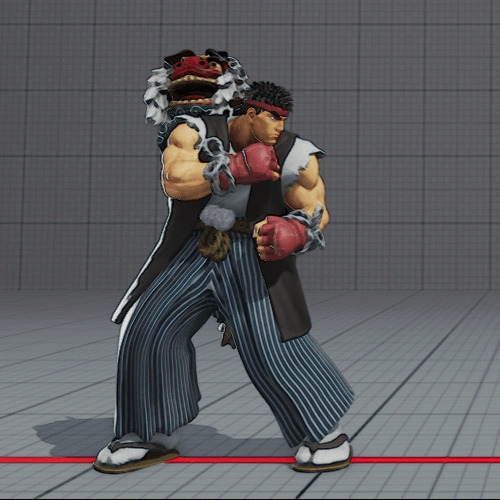
#i love my little clay minifigure
Text

He's alive!
Accidentally launched my Clay minifigure off my desk at mach 5 speeds but now hes sort of standing up so it's a win!
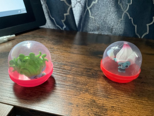
Floyd's still concerned tho
#my art#trolls#trolls 3#dreamworks trolls#trolls band together#trolls floyd#trolls clay#hes fine dw#he just has seven concussions and major brain trauma#but hes fine#the container is still too small hes like slanted in it#but hes 'standing'#the clay minifigure doesnt stand to begin with#he sits on his side asking leonardo dicaprio to draw him like his french girls#also so far hes the only figure i have whose irises dont fill the eye#hes got little dots#i love my little clay minifigure
389 notes
·
View notes
Text
RYU’S SFV COSTUMES RATED
It’s been a hot minute since I’ve done one of these, but they were some of my favorite posts on my old blog before it got nuked, so I figured I’d do another just for fun, and who better to choose than the series main character, in his final outing in the role?
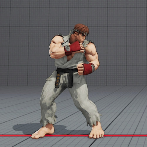
Default

9/10
Ah, Ryu’s typical look. What can be said about it that already hasn’t been said? Not a whole lot. Ryu has aged gracefully in the past more than 35 years, and is one of the characters least affected by SFV’s confusing, pseudo-realistic art direction. The only marks I have against this are the color of his gi, and his hairstyle. On the gi, it looks like he hasn’t washed it since the first SF game came out back in 1987. That thing crunches when he walks. I get they’re going for a worn, used look, but I feel like they pushed it a bit too far here. As for his hair, I was just never a fan of the black, spiked look. I much prefer the look from SFII-- dark brown and brushed forward, hanging over his bandana with some weight on it. Ultimately, though, these are small marks against an otherwise great take on an old look.
Story
7/10
“But Ava!” you may say, “Doesn’t this costume do exactly what you criticized the default costume for not doing?”
Yes it does, however a couple things make it far less appealing to me. To start with positives, the color of his gi and belt are much better, still looking worn and used but not outright dirty. This Ryu takes care of himself and his stuff. That said, in trying to replicate the Street Fighter Alpha look, they made some...odd choices. Lightening his skin makes him look paler, not sickly but...getting there. I’m not going to call it whitewashing, because I don’t think it is, but it is a strange choice. His hair looks...molded, rather than brushed, like a clay headpiece you’d customize a Lego minifigure with. Finally, they tried to apply an odd cel-shading look and, what little consistent artstyle SFV has does not work with cel-shading. Overall, I’d say it’s a good idea with less than stellar execution.
Battle
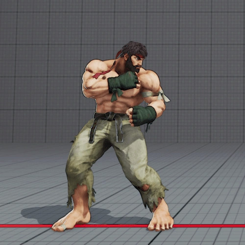
10/10
Now THIS is how Ryu should’ve looked by default in this game. Theoretically, Ryu’s story in this game is the culmination of his battle with the Satsui no Hado, and this haggard, worn-down Ryu comminucates that beautifully. The torn, dirty pants, the unkempt beard (which also shows him working to defeat the Satsui no Hado, bringing him closer to his master, Gouken, visually), the ramshackle sparring gloves made of nothing but tightly-tied sports tape, this is Ryu at his lowest, ready to reach his highest, and I’m so glad they based his appearance in SF6 on this costume.
B-Boy

9/10
Now look, I get it, this is goofy, this is out of character, this is just stupid. But... I kind of love it for that? Like, it’s so goofy and out of character that it becomes hilarious and I gotta love it for that. On top of that, it’s actually pretty solid? Functionally speaking? The silvery pants and coat mirror his gi, and the black shirt and black trim of his jacket keep the emphasis on his arms and legs, further emphasized by the red shoes, rings, and wristbands. Like...it’s stupidly fun AND doesn’t hamper gameplay. How am I supposed to get mad at this?
Halloween
6/10
Don’t get me wrong, this costume is VERY cool, but I feel like the everpresent stark red might betray its functionality. I feel like it’s at least inspired by Bishamon from Darkstalkers, but Bishamon makes up for his almost all-red color palette with gold trims and wide, open posing that makes every keyframe clear. This has the gold trims, but Ryu’s posing is very closed and guarded. I’m sure it’s still usable, but it’s not nearly as readable as, for example, the default or b-boy costumes.
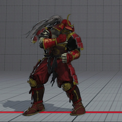
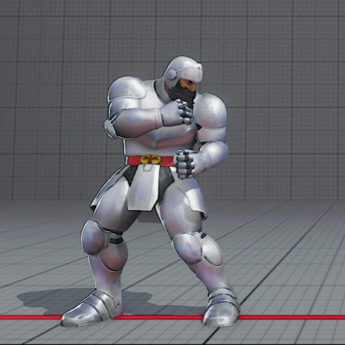
Capcom Pro Tour 2017
8/10
I'll admit, my understanding of Japanese culture is limited, but this does feel like some kind of traditional festival attire, and to that end I think it's very successful and fairly in-character for Ryu. He strikes me as a traditionalist, and I'm sure he's very popular in the village that I'm certain lies just down the mountain path from Suzaku Castle. It also works well from a functional aspect. His exposed arms and red gloves contrasted against blue/white ropes bring proper attention to his arms for moves like the Hadouken and Shoryuken, while the black vest draws your eye downward into his blue, long, wide pants to prepare you for moves like the Tatsumaki Senpukyaku. I'm curious about the purpose behind the dragon on his back, if that serves as a cultural reference, but it looks cool without getting in the way of functionality, so I can't be mad at it.
School

7/10
I question the choice to make this costume in the first place, it seems odd, but it looks fairly cool and is perfectly functional between the rolled up sleeves, long coat, and tapestry lining the coats inside to keep the legs visible. Doesn't do anything for me, and is kind of weird from a character perspective, but it does what it sets out to do and I don't have any real gripes with it.
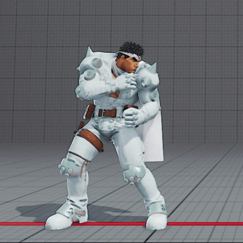
Arthur - Ghosts ‘n Goblins
5/10
I have nothing to say here that I didn't cover with the Haloween costume. I do appreciate the Ghosts 'n Goblins reference, but thst doesn't excuse bad readability.
Jin Saotome - Cyberbots: Fullmetal Madness
4/10
Same as above, but I'd say it's even worse here. If you notice, his shoulders, elbows, knees, and feet are covered by a kind of metallic material. In artwork, as well as sprites in Marvel vs. Capcom 2 (Jin's only playable appearance outside of a mecha), those metallic parts are a starker, darker silver color in order to make his posing more readable despite his all-white outfit. In other words, they actively made the design worse for...seemingly no reason.
Mega Man - Mega Man
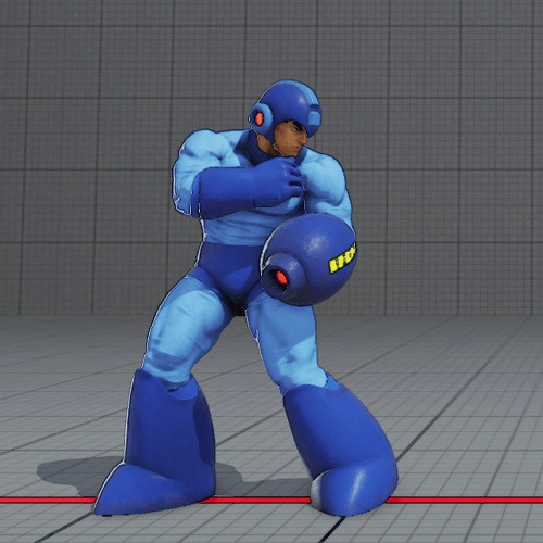
9/10
This is so goddamn funny to me. Like, Mega Man is this tiny little Astroboy knockoff, he's not even 5 feet tall. Meanwhile Ryu is this hulking, muscular mass of meat. It's so funny to me how much this doesn't fit. As for readability, Mega Man is already one of the best designed video game characters ever made, so this is perfectly fine functionally.
Kairi - Street Fighter EX

8/10
I'm not particularly familiar with this character, as I've only played SFEX once, but it's very cool to see them referencing such an obscure piece of SF history. Not to mention, it just looks cool. Not much to say beyond that.
Track Suit

5/10
Eh....if you remember my old costume reviews, you know I'm not a fan of these. They're fine functionally, but I have no idea why every character has one, and they just get boring and tiring after looking at them 14 times over.
BCRF

8/10
It's pretty cool. It looks oddly tactical, and I don't really get the asymmetrical look-- why bring so much attention to one arm over the other, it's not like Yamazaki's right arm in Fatal Fury/KoF, which contains the power of a god. Ultimately, though, it was for a good cause and it works well enough. Not gonna complain.
14 notes
·
View notes
Text
Well, since I can't seem to actually write anything about my OC's nor can I write the story I've made with them, (my brain fucking dies whenever I try to get my story out of it and onto paper/PC), I'm going to post the list I have made over years now of all my OC's. Feel free to give thoughts and/or ask about different characters Because for some reason the only way I can explain anything about this shit is when I'm telling someone who is genuinely interested in it lol.
Here we go, it has some explanation on the sorting if it first, also it might be a little hard to read... Almost 70 of them.
Letter sorting meaning:
(L) originally created when messing around with lego minifigures
(T) yet to be used In the story. (non of them have this at the moment, however a lot of them used to and I put it on oc's I make that I don't plan on putting in the story. Sadly I don't end up getting attached to any oc I make if it's not in the story... So Ive kinda stopped making new ones so that I don't overflow this thing with characters.)
(C) colors/stick figure tournament battles I did when I was little and then somehow kept track the personalitys of. (The alignment for these is for there own story, not the main one, even though they are in the main one.)
(U) used in Story
Alignment:
Good:●
Evil: ■
Neutral and/or switches sides at some point: ◇
The Characters in order that I made them, (each category is how old I was when I made them. A lot of the old ones have names I don't like anymore and/or have changed a ton in the story since then, but I hate scrapping characters and would much rather repurpose.):
7: Blue robot (LU)◇[1]{new name pending}, red robot (LU)◇[2]{new name pending},
8: Sol (LU)■[3], golden guardian (LU)●[4],
10: Jake (LU)●[5], helicopter bot (LU)●[6], Kai (LU)● [7], blue (CU)■[8], black (CU)●[9], red (CU)●[10], dark red (CU)■[11], purple (CU)●[12], orange (CU)●[13], cyan (CU)◇[14], yellow (CU)◇[15], brown (CU)●[16], green (CU)●[17], lime (CU)◇[18], White (CU)◇[19],
12: jay (LU)●[20], Icicle (LU)◇[21]{new name pending}, pebble (U)●[22], mist (U)●[23], gray (U)●[24], leaf (U)●[25], clay (U)●[26], Lucas (U)●[27], zora (shadow) (U)■[28], Jerry (LU)■[29], Dragon Mech "M1RA or Mira" (LU)◇[30], golden sage (LU)◇[31]{new name pending}, victor (LU)◇[32],
13: Nitro (U)◇[33], Aster (U)■[34], shard (U)◇[35], wither (LU)■[36], crow (LU)●[37], droid 27 (LT)●[38]{new name pending}, ray (LU)◇[39], shark (LU)◇[40], snark (LU)◇[41], spark (LU)■[42],
14: natura (LU)●[43], zack (U)◇[44], Ve (U)◇[45], wisp (LU)■[46], husk (LU)■[47], void (LU)■[48],
15: dragon moth {BB} (LU)◇[49], titan robot (LU)◇[50], Lithium (U)●[51], Silver (U)●[52], Copper (U)●[53], Sulfur (U)◇[54],
16: Cobalt (U)●[55], Ada (U) ●[56], chrome (U) ■[57], hazel (U)●[58], saitis (U)◇[59], jade (U)◇[60], Gill (U)●[61], tayla "bug" (U)◇[62], Venus (U)■[63], Zora (not shadow/My Sona/Self insert) (U)◇[64],
17: King (U)■[65],
Number of characters I have that I've been working on don't have a name for yet and havnt fully fleshed out because they are side characters that only show up a few times: 9
That is my list. It big. I love these little creations and even more so love "The Talez Of Solar" as I have named the story.
#oc#oc stuff#oc show and tell#help with writing#story#list#oc list#messy sorting#sorting#The Talez Of Solar
0 notes
Text
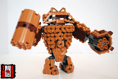
This was the best LEGO® deal I have ever seen. I was notified of the sale by a fellow fan through Twitter. As I write this, Walmart is liquidating the Clayface Splat Attack set from The LEGO® Batman Movie for $10. Yes, you read correctly, a set formerly priced at $44.99 is now $10. That is about 80% off. My local store still had several of them yesterday when I went to check. I had originally planned to review a different set this week, but this deal is too good. I thought I would share my thoughts in case anyone else wanted to pick one of these sets up before they are gone. I am also going to be doing something a little different in this review. Since I am still on my summer holiday from work, and have time on my hands, I decided to modify this set to suit my taste. So, I will be sharing that with you today as well.

Clayface Splat Attack box art.
SET SUMMARY
NAME: Clayface Splat Attack
SET #: 70904
THEME: The LEGO® Batman Movie
COST: $44.99 CAD
BRICK COUNT: 448
MINIFIGURES: 2
RELEASE DATE: January 2, 2017

Clayface Splat Attack box contents.
SUMMARY REVIEW: 80%
VALUE: 90% (At full price, you are looking at a great $0.10/brick.)
BUILD: 90% (Super nice design, I wish there was another hand option though.)
MINIFIGURES: 75% (Good Minifigs, satisfactory brick:fig.)
ENTERTAINMENT: 65% (Bad build-time at full price, but loads of fun.)
LEGO® Clayface
REVIEW
VALUE: 90%
At full price, Clayface Splat Attack costs $44.99 in Canada. With 448 pieces, you are looking at $0.10 per brick. All things considered, that is really not bad at all, and I would rate that at 4.5/5 (90%). However, as I am writing this, Walmart is liquidating this set for $10.00. If you are lucky enough to get Clayface Splat Attack for that price, each brick will cost an unheard of $0.02.

Who can say no that face? (or a discount of 80%)
BUILD: 90%
The main build of this set is, of course, Clayface. You get a small, side build as well, which is just a pile of “mud” to trap Minifigures. Clayface is quite an impressive build. I can only imagine how much time it took to design this character. The LEGO® Group has really managed to make him look as much like mud as you can using bricks. He also features seven points of articulation, and each one is able to rotate and swivel. He comes with three different hands, so you can interchange them. Two of them are stud-shooting canons, and the thirds is a hammer. One of the things that I really appreciated about this build was that the designers did not skimp on the back design. Clayface looks just as good from the back as he does from the front.

Rear view of Clayface.
As I was building Clayface, there were points where I found the structure of the build a little shaky. I found it came apart kind of easily as you were trying to piece new parts onto it. However, it redeemed itself in the end, and is overall pretty stable. My other issue with Clayface is the choice of hands. Why give two of the same canon design? I think this set would have been considerably better with a regular hand option, the canon, and the hammer. But, more on that later! My only real issue with Clayface Splat Attack is the aforementioned hand issue, so I will give it 9/10 (90%) for build.

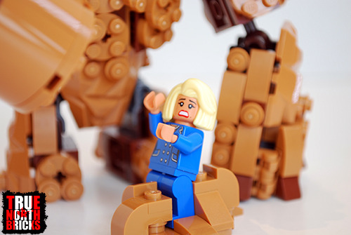
Me Clobber Batman!!!
MINIFIGURES: 75%
There are only two Minifigs in this kit, Batman and Mayor McCaskill. Batman is nothing new. That is a point of contention that I have with the whole LEGO® Batman Movie theme. Almost every set comes with pretty much the same Batman figurine. I have given him 12/15 (80%) in past reviews, so I will give him 80% again now.
LEGO Batman front view.
LEGO Batman alternate face.
LEGO Batman rear view.
Mayor McCaskill is an exclusive. She was not available with any other set in the theme. I found this character to be fun, and it really represents what I imagine a politician to look like. She also has a new hairstyle not currently seen in any other LEGO® sets. She has a double sided face as well, one side smiling, the other terrified. Based on my rating system, I give her 12/15 (80%) as well.
With 448 bricks and two Minifigures, you are looking at a brick-to-Minifig ratio of 224 bricks per Minifigure. That is not great, but not terrible either. I give Clayface Splat Attack 3.5/5 (70%) for its ratio score. Averaging that with the Minifig design score gives this set an overall Minifigure rating of 75%.
Mayor McCaskill’s alternate face.
ENTERTAINMENT: 65%
Clay Face Splat Attack took me 50 minutes to build. At full price, that would mean that each minute of build time costs $0.90. That is not very good, earning a score of 2/5 (40%). However, if you manage to get this set during Walmart’s liquidation, you are looking at $0.20 per minute, which is phenomenal, and would earn 100%.
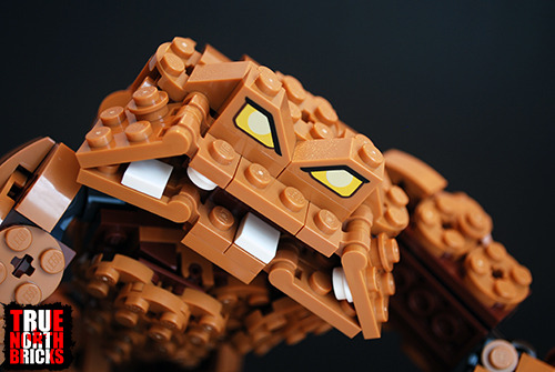
Clayface closeup.
As for my personal enjoyment of Clayface Splat Attack, as I mentioned before, I wish it came with more hand options. As a Batman fan though, I love it. I will probably keep it built, but with some modifications. I think it has some great play value for kids too. I would have eaten this up in my youth (I am eating it up now). For those reasons, I will give it 4.5/5 (90%) for enjoyment. Averaging this with the build-time score at full price earns Clayface Splat Attack 65% for entertainment. At the liquidation price of $10, this set earns 95%.

My redesigned Clayface hand, built using mostly just the pieces included in the original kit.
OVERALL: 80%
Clayface is an awesome build. There is a lot of nice detail that when into this set. I really enjoy this build, it looks great. At full price, you are getting a good set that is just worth the purchase in my opinion. It suffers a little from a low-ish brick-to-fig ratio, and a really expensive build time. But, once again, as I am writing this, Clayface Splat Attack is $10 at Walmart in Canada. At that price, I would give this set 90% overall.

Another view of my redesigned Clayface hand.
My only real issue with Clayface was the fact that he came with two mud-cannon hands. I would have really liked to get a regular hand in order to have more options to interchange. I often talk about the things I would like to change in a set, but I don’t tend to have the time when working to actually carry them out. However, I am currently on my summer break. So, I decided that I would actually make the modifications that I want to this set. I kept one cannon arm and the hammer arm. I disassembled the other cannon, and the mud patch meant to capture the Mayor. I used pretty much only those pieces, and I built a hand with individually movable fingers. I ended up using eight less pieces than the original model, but also had to add three from my own collection that were not included in the kit. So, overall, I used five less pieces than the original model included.

“Hey, look over there!”
Did you manage to get this steal of a deal at Walmart? Or perhaps you made your own redesigns to Clayface? I would love to hear your thoughts and stories in the comments area below. Until next time!
-Tom

With my redesign, Clayface can now crush Batman in his fist.
Review & Mod – Clayface Splat Attack [70904] This was the best LEGO® deal I have ever seen. I was notified of the sale by a fellow fan through Twitter.
#Batman#Canadian LEGO blog#Clayface#Clayface Splat Attack#DC Comics#LEGO 70904 Review#LEGO Batman#LEGO DC Super Heroes#lego review#Mayor McCaskill#The LEGO Batman Movie#True North Bricks
0 notes
Last Seen Blogs

realtyroundupnews-blog
Untitled

artsymii
⭐️ARTSY⭐️

kingeddy-blog
The King Eddy Saloon

shamanofthewilds
Wandering Shaman

kayleelittleton
kaylee littleton