#lifeexp
Text
import pandas as pd
import statsmodels.api as sm
# Load Gapminder dataset
gapminder = sm.datasets.get_rdataset('gapminder').data
# Display frequency table for a categorical variable (e.g., continent)
frequency_table = gapminder['continent'].value_counts()
print("Frequency Table:")
print(frequency_table)
# Select specific variables (e.g., life expectancy and GDP per capita)
data = gapminder[['lifeExp', 'gdpPercap', 'continent']]
# Add a constant term for the intercept
data = sm.add_constant(data)
# Perform linear regression for a specific continent (e.g., Africa)
filtered_data = data[data['continent'] == 'Africa']
model = sm.OLS(filtered_data['lifeExp'], filtered_data[['const', 'gdpPercap']])
results = model.fit()
# Print regression summary
print("\nLinear Regression Results for Africa:")
print(results.summary())
0 notes
Text
welcome to a Gapminder Study from blog4msd(SD):
install.packages("gapminder")
if (!require(gapminder)) {
install.packages("gapminder")
library(gapminder)
}
Create a histogram for the life expectancy variable
ggplot(gapminder, aes(x = lifeExp)) +
geom_histogram(binwidth = 2, fill = "lightblue", color = "black") +
labs(title = "Histogram of Life Expectancy", x = "Life Expectancy", y = "Frequency")
Create a boxplot for life expectancy
ggplot(gapminder, aes(y = lifeExp)) +
geom_boxplot(fill = "lightgreen", color = "black") +
labs(title = "Boxplot of Life Expectancy", y = "Life Expectancy")
Create a histogram for GDP per capita
ggplot(gapminder, aes(x = gdpPercap)) +
geom_histogram(binwidth = 5000, fill = "lightblue", color = "black") +
labs(title = "Histogram of GDP per Capita", x = "GDP per Capita", y = "Frequency")
Create a boxplot for GDP per capita
ggplot(gapminder, aes(y = gdpPercap)) +
geom_boxplot(fill = "lightgreen", color = "black") +
labs(title = "Boxplot of GDP per Capita", y = "GDP per Capita")
1 note
·
View note
Video
Finally making this into my official sanctuary of all that is lewd and crude to photo and video dump my personal made photos, clips and video creations. I hope you enjoy the items I have in store for you as I’ve been curious about how to approach displaying them.
Message me for custom requests for a video clip or picture set you would love to see me post. With that being said, you will be helping me expand my portfolio because I want to start a creative business to tribute to the organizations that are truly giving back to my local community.
Follow my journey on my social media pages to watch as I turn my vision into reality.
~KQ13~ the gemini nymph
//Lewd, Crude & Filled With Attitude//
Want to support my business as an investment? Send to $gemininymph on CashApp and label your note with your birthday and e-mail [email protected] to receive special updates on the progress & how your investment is being put to good use.
Update: linktr.ee/lovelylacystarr
#grunge#witch#altgirl#softgrunge#model#explorepage#supportlocalartists#lifestyle#reallifeexperiences#lifeexp
5 notes
·
View notes
Photo

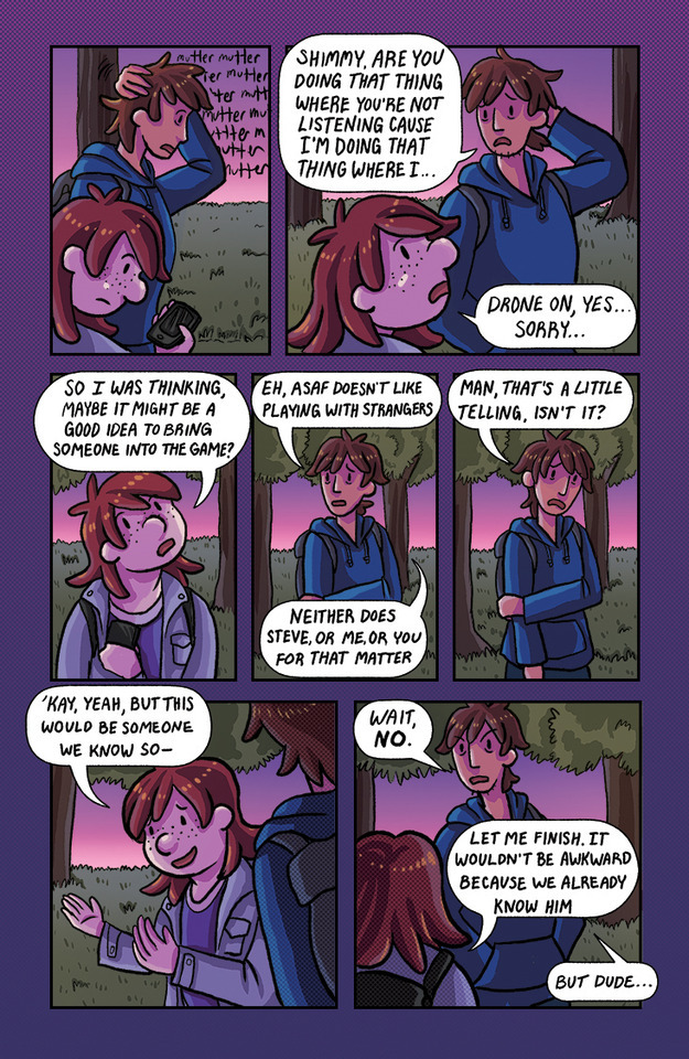
New page of LifeExp is up! In case it isn't abundantly clear, this is a webcomic about college friends role-playing together. As such, the narrative switches in and out from the actual characters to their player characters (PCs). www.lifeexpcomic.com #lifeexp #Webcomics #dungeonsanddragons
1 note
·
View note
Photo

Already missing my Crunchyroll fam! Unfortunately one of my faves had to leave before we took the pic!! It was so much working with everyone as always and I can’t wait to see them again! . . . #beshieldhero #cruchyroll #animecentral #acen2019 #events #Lieutenant #balloons #shields #activation #lifeexp #levelup #monstergrind #levelgrinding (at Anime Central) https://www.instagram.com/p/Bxuy5RvjgeG/?igshid=1fx9dsi68iok1
#beshieldhero#cruchyroll#animecentral#acen2019#events#lieutenant#balloons#shields#activation#lifeexp#levelup#monstergrind#levelgrinding
0 notes
Photo

The only thing standing between you and your goal is the bullshit story you keep telling yourself as to why you can’t achieve it.⠀ – Jordan Belfort⠀ ⠀ #quotes #quoteplay #successquote #jordanbelfort #jordanbelfortquote⠀ #lifequote #lifeexp (at Battaramulla)
0 notes
Text
CUNY605 Assignment12 Solved
The attached who.csv dataset contains real-world data from 2008. The variables included follow.
Country: name of the country
LifeExp: average life expectancy for the country in years
InfantSurvival: proportion of those surviving to one year or more Under5Survival: proportion of those surviving to five years or more TBFree: proportion of the population without TB.
PropMD: proportion of the…

View On WordPress
0 notes
Link
#Fresh Herbs#Black Beans#Red Wine and Resveratrol#Salmon: Super Food#Tuna for Omega-3s#Olive Oil#Walnuts#Almonds#Edamame#Tofu#Sweet Potatoes#Oranges#Chard de Suisse#Cereal#Oats#Flaxseed#Yogurt with Low Fat#Cherries#Blueberries
0 notes
Photo

via Seth Greene:
I was trying to make a gif like that in this blogpost http://blog.revolutionanalytics.com/2017/05/tweenr.html using the tweenr package: https://github.com/thomasp85/tweenr – but apparently rendering as a pdf doesn’t quite work :)
Code:
“`
library(tweenr)
library(dplyr)
library(gganimate)
library(gapminder)
library(ggplot2)
library(scales)
gapminder_edit <- gapminder %>%
arrange(country, year) %>%
select(gdpPercap, lifeExp, year, country, continent, pop) %>%
rename(x = gdpPercap, y = lifeExp, time = year, id = country) %>%
mutate(ease = "linear”)
gapminder_tween <- tween_elements(gapminder_edit,
“time”,
“id”,
“ease”,
nframes = 300) %>%
mutate(year = round(time), country = .group) %>%
left_join(gapminder, by = c(“country”, “year”, “continent”)) %>%
rename(population = pop.x)
pdf(’../results/gapminder-tween.pdf’)
p2 <- ggplot(gapminder_tween,
aes(x = x, y = y, frame = .frame)) +
geom_point(aes(size = population, color = continent), alpha = 0.8) +
xlab(“GDP per capita”) +
ylab(“Life expectancy at birth”) +
scale_x_log10(labels = comma)
p2
dev.off()
gganimate(p2, filename = “../results/gapminder-tween.gif”,
title_frame = FALSE, interval = 0.05)
“`
2 notes
·
View notes
Text
Data Management and Visualization - week 3

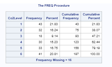
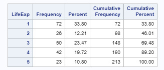
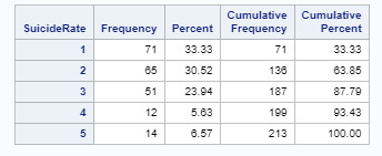
I collapsed the responses for co2emissions, lifeexpectancy, and suicideper100TH to create three new variables: Co2Level, LifeExp, and SuicideRate. For Co2Level, I got a bi-polar result, the most commonly endorsed responses were 1 (21.83%) and 6 (20.81%), meaning that most countries have either Co2Emissions less than 10M or greater than 10B. For LifeExp, the most commonly endorsed response was 1 (33.80%), meaning that almost a third of the countries have a life expectancy of less than 65 years. For SuicideRate, the most commonly endorsed response was 1 (33.33%), meaning that the suicide rate in about one-third of the countries is 5 or less per 100k Mortality due to suicide.
0 notes
Text
ggplot
aes(x=reorder(Country, Loss), y=Loss))
---------------------------------------------------------
geom_bar(stat = "identity", width=0.95, fill="black")
-------------------------------------------------------
p <- ggplot(mtcars, aes(mpg, wt)) +
geom_point()
p
p + theme(panel.background = element_rect(colour = "pink"))
p + theme_bw()
p + labs(x = "Nouvelle Vie", y = "Nouveau Monde")
p + labs(x = "Nouvelle Vie", y = "Nouveau Monde", title = "V Relationship")
p + theme(plot.title = element_text(size = rel(2)))
p + theme(plot.title = element_text(size = rel(2), colour = "blue"))
p <- ggplot(DF, aes(x = x)) + geom_histogram()
p + theme(axis.text = element_text(colour = "blue"))
.....................................................................................................
m + theme(axis.line = element_line(size = 3, colour = "red", linetype = "dotted"))
m + theme(axis.text = element_text(colour = "blue"))
m + theme(axis.text.y = element_blank())
m + theme(axis.ticks = element_line(size = 2))
m + theme(axis.title.y = element_text(size = rel(1.5), angle = 90))
m + theme(axis.title.x = element_blank())
m + theme(axis.ticks.length = unit(.85, "cm"))
--------------------------------------------------------------------------------------
k <- ggplot(dsmall, aes(carat, ..density..)) +
geom_histogram(binwidth = 0.2) +coord_flip()
k + facet_grid(. ~ cut)
------------------------------------------------------
ggplot(df, aes(x = year, y = lifeExp, colour = country)) + geom_line(size = 1) + geom_point(size = 2)
labs(title = " NVie", subtitle = "NVie ",
caption = "Source: NVie | @NVie", x = "NVie", y = "NVie ", colour = NULL) + theme(legend.position = "bottom")
0 notes
Text
‘Feeling accomplished’
This is the week of November 15th, I’m feeling pretty confident about the effort I’ve been placing into my work. Truthfully, as far as the efforts of distributing all of my content in an appropriate place based on prospects has been the biggest hassle I have ever had the pleasure of getting into.
I thought it was all about getting sponsorships and an agent was the only way to making it in this world. It was long forgotten, that branding one’s work, was an effective way to not only display a portfolio but potentially reach companies looking for that specific service that is being offered.
Now I’ve redefined a website that is long overdue thanks to a lot of mental restrictions created by myself. I surely hope to launch the website that will display opportunities to hire me as a freelancer.
So if you’re looking for a freelancer in the field of Voice Over work, specific Administrative Duties or a content writer/blogger then I’m your person to get the job done. There is even going to be a section for free consultation for your business needs and directing to reliable resources that won’t ghost you after you make a business proposition.
In the upcoming week you can also expect to see an update on my IG page quesofrescopodcast about episodes coming out. As I begin to gain listeners, I will always incorporate filming during the audio portion of the show. The only reason there has not been many uploads is because a lot of balancing need in my headspace, health & wellness before taking talking for a living seriously.
#contentcreator#creativecontentcreator#creativecontentcreatorkristincason#contentwriterkristincason#freelancer#supportlocalartists#lifestyle#reallifeexperiences#lifeexp#kristincason#thirt33n
2 notes
·
View notes
Text
Making DataManagement Decisions - Assignment3
About the Research Question:
Gapminder dataset is taken to know the association between AlcoholConsumption, BreastCancer and lifeexpectancy in a country, which are the country level indicators of health
The data is refined to get the values where AlcoholConsumption is higher than 10
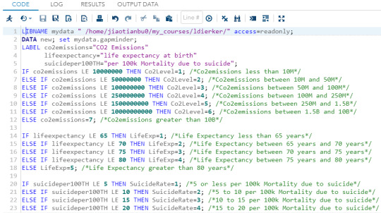
SAS Program for the selected variables in the research question
LIBNAME mydata "/courses/d1406ae5ba27fe300 " access=readonly;
/* Gapminder dataset is used */
DATA new; set mydata.gapminder;
/* Labelling the variables used for the research question */
LABEL AlcCons = "Alcohol Consumption per Adult in a year- in litres"
BCP100Th="Number of BreastCancer cases per 100 thousand women in a year"
LifeExp = "The average number of years one would live" ;
/*Subsetting the data to include only values for which AlcConsumption > 10 */
IF AlcConsumption GE 10.0;
/* Data management for Alcohol Consumption */
If AlcConsumption LE 12.5 then AlcCons = "1";
If AlcConsumption > 12.5 and AlcConsumption < 15.0 then AlcCons = "2";
If AlcConsumption >= 15.0 then AlcCons = "3";
/* Data management for BreastCancerPer100Th */
If BreastCancerPer100Th < 40 then BCP100Th = "1";
If BreastCancerPer100Th >= 40 and BreastCancerPer100Th < 60 then BCP100Th = "2";
If BreastCancerPer100Th >= 60 then BCP100Th = "3";
/* Setting aside invalid data for which no value for BreastCancerPer100Th is found */
If BreastCancerPer100Th = "" then BCP100Th = "4";
/* Data management for LifeExpectancy */
If LifeExpectancy < 55 then LifeExp = "1";
If LifeExpectancy >= 55 and LifeExpectancy < 65 then LifeExp = "2";
If LifeExpectancy >= 65 and LifeExpectancy < 75 then LifeExp = "3";
If LifeExpectancy >= 75 then LifeExp = "4";
/* Setting aside invalid data for which no value for LifeExpectancy is found */
If LifeExpectancy = "" then LifeExp = "5";
/* Generate the frequency distribution of the variables used */
PROC Freq; TABLES AlcCons BCP100Th LifeExp ;
RUN;
Screenshot of the above code in SAS

Output of the above program:
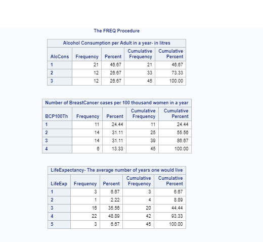
Description of the above frequency tables:
The variables namely AlcoholConsumption, BreastCancerPer100Th and LifeExpectancy (in the Gapminder dataset which are chosen in the research question) have been collapsed in to three variables AlcCons, BCP100Th and LifeExp respectively.
AlcCons: For AlcCons, the most commonly endorsed response was 1, meaning that most countries (nearly 46.67%) have an AlcoholConsumption rate between 10.0 and 12.5
BCP100Th : For BCP100Th, the most commonly endorsed response were 2 and 3, meaning that most countries (nearly 62.22% - Adding the % values corresponding to responses of 2, 3) have an BreastCancer rate above 40.0.
The response 4 for BCP100Th corresponds to the missing data, where no values for BreastCancerPer100Th were found.
LifeExp: For LifeExp, the most commonly endorsed response was 4, which means that most countries (48.89%) have a life expectancy greater than 75 years.
The response 5 for LifeExp indicate that values for LifeExpectancy were not found for 3 countries (Frequency = 3, percent = 6.67)
0 notes
Photo

New Life EXP is up! Shout out to the friends who put up with our existential uneasiness! LifeExpComic.com #LifeExpComic #Webcomics #lifeexp #dungeonsanddragons
0 notes
Text
# import libaries
import pandas
import numpy as np
import seaborn
import matplotlib.pylab as plt
# load Gapmider
data=pandas.read_csv('gapminder.csv',low_memory=False)
data.shape
pandas.set_option('display.max_columns',None)
pandas.set_option('display.max_rows',None)
#Account for the Null values and replace as NA
data.lifeexpectancy.fillna(value='NA',inplace=True)
data.incomeperperson.fillna(value='NA',inplace=True)
data.country.fillna(value='NA',inplace=True)
data.employrate.fillna(value='NA',inplace=True)
# convert the variables I am interested to numeric values, and get their mean value
data['lifeexpectancy']=data['lifeexpectancy'].convert_objects(convert_numeric=True)
data['employrate']=data['employrate'].convert_objects(convert_numeric=True)
data['incomeperperson']=data['incomeperperson'].convert_objects(convert_numeric=True)
#Create sub-groups using the mean of the age, and convert the subgroups into numeric values
sub1=data[(data['lifeexpectancy']>=81.404) & (data['lifeexpectancy'] <= 83.394)]
sub2=data[(data['lifeexpectancy']<81.404) & (data['lifeexpectancy'] >69.7)]
sub3=data[(data['lifeexpectancy']<=69.7) & (data['lifeexpectancy'] > 47.794)]
sub1['employrate']=data['employrate'].convert_objects(convert_numeric=True)
sub2['employrate']=data['employrate'].convert_objects(convert_numeric=True)
sub3['employrate']=data['employrate'].convert_objects(convert_numeric=True)
sub1['lifeexpectancy']=data['lifeexpectancy'].convert_objects(convert_numeric=True)
sub2['lifeexpectancy']=data['lifeexpectancy'].convert_objects(convert_numeric=True)
sub3['lifeexpectancy']=data['lifeexpectancy'].convert_objects(convert_numeric=True)
sub1['incomeperperson']=data[ç].convert_objects(convert_numeric=True)
sub2['incomperperson']=data['incomeperperson'].convert_objects(convert_numeric=True)
sub3['incomeperperson']=data['incomeperperson'].convert_objects(convert_numeric=True)
# cluster the data I am interested in
data_clean=data.dropna()
cluster=data_clean[['lifeexpectancy','employrate', 'incomeperperson']]
cluster.describe()
print ('mean')
mean1=data['lifeexpectancy'].mean()
print (mean1)
# Sub 1 cluster
data_clean_1=sub1.dropna()
cluster_1=data_clean_1[['lifeexpectancy','employrate', 'incomeperperson']]
cluster_1.describe()
# Sub 2 Cluster
data_clean_2=sub2.dropna()
cluster_2=data_clean_2[['lifeexpectancy','employrate', 'incomeperperson']]
cluster_2.describe()
#Sub3 Cluster
data_clean_3=sub3.dropna()
cluster_3=data_clean_3[['lifeexpectancy','employrate', 'incomeperperson']]
cluster_3.describe()
# Plot Histogram of the data
seaborn.distplot(data[['lifeexpectancy']].dropna(),kde=False);
seaborn.distplot(data[['employrate']].dropna(),kde=False);
seaborn.distplot(data[['incomeperperson']].dropna(),kde=False);
#Plot Scater Plot of the employment rate and life expectancy
scat=seaborn.regplot(x='lifeexpectancy', y='employrate',fit_reg=False,data=data)
#Plot Scater Plot of the employment rate and employment rate of each sub group
scat1=seaborn.regplot(x='lifeexpectancy', y='employrate',data=data)
scat2=seaborn.regplot(x='lifeexpectancy', y='employrate',data=sub1)
scat3=seaborn.regplot(x='lifeexpectancy', y='employrate',data=sub2)
scat4=seaborn.regplot(x='lifeexpectancy', y='employrate',data=sub3)
#Plot a scater plot of life expancty and income per person
scat5=seaborn.regplot(x='lifeexpectancy', y='incomeperperson',data=data)
scat6=seaborn.regplot(x='lifeexpectancy', y='incomeperperson',data=sub1)
scat7=seaborn.regplot(x='lifeexpectancy', y='incomeperperson',data=sub2)
scat8=seaborn.regplot(x='lifeexpectancy', y='incomeperperson',data=sub3)
scat9=seaborn.regplot(x='employrate', y='incomeperperson',data=data)
#create quads of the data
data['INCOMEGRP4']=pandas.qcut(data.incomeperperson,4,labels=['1-25th%tile','2-50th%tile','3-75th%tile', '4-100thtile'])
c10=data['INCOMEGRP4'].value_counts(sort=False, dropna=True)
print (c10)
data['LIFEEXP']=pandas.qcut(data.lifeexpectancy,4,labels=['1-25th%tile','2-50th%tile','3-75th%tile', '4-100thtile'])
c12=data['LIFEEXP'].value_counts(sort=False, dropna=True)
print (c11)
seaborn.factorplot(x='INCOMEGRP4', y='lifeexpectancy',data=data,kind='bar', ci=None)
plt.xlabel=('income group')
plt.ylabel('lifeexp')
seaborn.factorplot(x='LIFEEXP', y='lifeexpectancy',data=data,kind='bar', ci=None)
plt.xlabel('Life')
plt.title('Test')
#interpret 3 cluster solution
model3 = KMeans(n_clusters=3)
model3.fit(clustervar)
clusassign = model3.predict(clustervar)
0 notes
Last Seen Blogs

mavericksflags
MAVS FLAGS

chkbnw
BnW.(period)

phonecall1
Just me n you now!

daily-odile
An Odile A Day

zwooczki
Zwooczki - szydełkowe maskotki