#like probably an impact just as a 2d texture not animated
Text


My biggest regret is that we never got a shoot where their helmets take damage, they just fly away conveniently v_v
#star wars#star wars the bad batch#star wars fanart#the bad batch fanart#tbb fanart#tbb crosshair#okay maybe once on background characters#like probably an impact just as a 2d texture not animated#which is fine#like first probably not rated for the show's public#secondly if I was a 3D artist and got handed a storyboard with this in it I would say hell no#anticipating tbb ending by traumatizing myself uuuh
396 notes
·
View notes
Text
Magilumiere Co. Ltd. Anime PV
youtube
Another day, another anime trailer. This one though... well, it's certainly not Dandadan, I'll say that. It might still be worth watching if you enjoy the manga or are curious about the series in general, but I certainly wouldn't hold my breath over it being all that great, and for more than a few reasons.
First of all, this is a coop project. Neither studio has been too hot in recent memory. The bigger name is J.C. Staff, and they don't exactly inspire much confidence in delivering a consistent performance. On the other side, and being touted as the "lead" studio is Moe. Never heard of them? Well, can't blame you, this is their first ever anime. They came to be in 2017, and since then have worked on a grand total of, checks notes, 30 series. Rather surprising and impressive.... until you realize that it's almost exclusively CGI and photography. The studio has effectively no real experience with 2D animation, the only credit being a single episode's worth of in-between animation on the Girl From The Other Side OVA.
So yeah, pretty rough hands the series in, and you could immediately feel that from the key visual for the series.
I'll start with the character designs. They're not great, as expected from a first time character designer. They do a good job of copying the outline, but completely neglect the actual details and styles. Eyes are overall much larger, faces are sharper rather than the more round style of the manga, mouths are much larger, and so on and so forth. Even simple details like Hitomi's (the yellow haired girl) skirt. In the manga, the two tone design has different heights to add depth, but that doesn't exist in the anime.
And really, you see a similar story with the color design/composition. It's washed out and plain flat. It's incredibly bright compared to the manga, which does no favors to the art. I totally understand that you can't add near the same wrinkles and folds in the clothes, but Aoki's shading doesn't rely on lines to create texture and feel, and having that aspect of shading missing from the anime really adds to its struggles.
Anyways, continuing in this downward spiral, this is from a first time director. And no, they don't have a lick of experience with direction in any capacity. The most they've done is CG direction with Moe on the projects that they've supported. It just doesn't really bode well overall, and you can feel that a lot in how little of an impact the trailer leaves on you.
If there was one thing to say was good though, I would most likely say it was the environment art and animation. But even then that's only a 'sometimes' thing, as you get nice environment art like the top image, and then just straight up bad scenes like the bottom.

If you're a fan of the series, or even just curious about it since it was recently licensed by Viz, there's really not much hope for a "good" adaptation here. It's probably passable, and might be enough to get more people interested in the series. As supplementary material and a new way to experience the manga though, it's pretty well looking like a waste of time. Incredibly surprising given how popular the manga is. After all, it did rank third overall in the Next Manga Award in 2022 for the web manga category.
#magilumiere co. ltd.#kabushikikaisha magi-lumiere#株式会社マジルミエ#new anime#anime announcement#anime and manga#anime#anime trailer#anime pv#Youtube
4 notes
·
View notes
Text

Well I woke up and after a little bit of rest, I finally managed to beat that final boss. It only took a few more tries, and I learned that you can damage him using a few of the Emerald Powers, but you can only get in maybe two hits, three if you're very lucky.
I still maintain this boss is a bullshit difficulty spike. And for some reason, I frequently had problems where my rings would just fall through the floor, or even stranger, instead of being able to pick them up, they would just bounce off of me.
The boss wasn't even particularly interesting or different either, there was no creative spin unless you count an animation that happens between phases and even that would be a stretch.
I also learned the hard way that ending isn't different if you have all the Emeralds, meaning I beat him, endured some very long credits, made sure to get the last emerald I needed, and then challenged the final level and final boss again, with no difference.
It did unlock a new mode in the game. Seems to be an homage to playing as Knuckles in Sonic 3, where the game is a fair bit harder, the routes are a little different, and the bosses have new tricks. So it looks like I have more game left, but I think i'm gonna hold off until another month to finish up.
I bought the Switch version, and it playd fine, except when I had speed shoes. Then the framerate tanked. Also a few textures were pretty blurry. But I don't care. I maybe should have gotten it on Steam, but I wanted a physical release.
This sounds like a lot of negative but make no mistake, this is a really fun Sonic game. Some people are saying it's not as good as Mania, and maybe they're right, but I dunno, I like this a lot more than Mania just by virtue of it being a fully original game instead of a series of throwback levels and remakes of levels... there's musical throwbacks to be sure. But nothing too obnoxious... I just wish this wasn't another case of Jun Sunuoe trying too hard to sound like Sega Genesis and only ever getting the drums right.
This is the first Sonic game in a long time to actually feel like a game with a focus on platforming. And that's what I've wanted out of 2D Sonic for a long time. Mania had that too but with more emphasis on speed than platforming, at least that's how I feel.
It made me very happy to see Fang in this game. He doesn't have as many appearances as he did in Sonic Triple Trouble, but his appearances feel a lot more impactful this time. I really hope he sticks around, maybe even brings Bark and Bean with him.
I like the design of Trip. Spoiler alert, but you do eventually get to see without the mask. I won't spoil the species but I was very happy to be pretty close to guessing. I don't think they developed her enough. I feel like these games kind of suffer from Sega refusing to do voice acting, because I really don't understand what Trip is even doing in the story. I probably wouldn't have understood Knuckle's whole deal either in Sonic 3 if supplemental material didn't clear it up, but it's not the 90's anymore, we shouldn't need supplemental material for the story to be cohesive. I'm not asking this game to be obnoxious like Sonic Heroes, just a few voice lines in the beginning, ending, and the one or two key story moments later on. Even text boxes would have been better than like... two seconds of pantomime.
Anyway... I hate sounding negative, I do love this game, it's just easier to vocalize what I wish was better about it than what I already love about it, and I feel like it's more important to spotlight the things that will be a problem than the things that will just be fine and provide a lot of fun.
Mario is out in a few more days... so i'm gonna cool off on this game or a while, and catch up on my Halloween watching.
5 notes
·
View notes
Text
Little white lies
Little white lies is a magazine created with the sole aim of capturing and reviewing movies through out the year normally printing 4 times a year quarterly, though the magazine has become more well known for its independent ethos and iconic, striking illustrative covers created by a new artists each time, deadicating its front section to upcoming theatrical release.
Sin City Issue 2 - Jul/Aug 2005 this one was one of the first early covers that stood out to me, reminiscent of early grunge comic styles used for the gritty Noir/Action graphic novels, fitting for the fact that the movie itself is based of the Sin city comics, the difference for this is that the artist for this cover has taken the features form the actor to then blend it with the style used for comics; heavy sett shadows sonf light shown but blacking out the ares where the shadows are completely in black and leaving the background showing through to show where the light hits, but they still show a lot of texture in the face by using what I can assume is almost like a dry brush texture, roughing up the face implanting the idea that this character is ether rough character or dangerous, the artist also hints at the story itself with smaller type and illustration shown in the form of tattoos hidden under the layers of grime and of what I would assume are plasters, I do like the white negative look off it.
Marie Antoinette Issue 8 - Oct/Nov 2006 I personally like this one because the vibrant colours, hinting most likely to her more risky and existing life before she became romantic heroine that we know now in history, though its nice to at least learn more about the various females throughout history as there stores are normally erased or twisted, so for a historical drama I believe it works well, the one single figure of Marie Antoinette by herself standing out against the flat black background, making the character of Antoinette the main visual point of the illustration, because she is, looking at the portrait itself, id assume they took a image of the actor in their costume and thresholded it and then they most likely multiplied the layer so that they could then drawn underneath, similar to the techniques in the pen tool workshop.
Control Issue 13 - Sep/Oct 2007 the cover for this one I like the monochrome colours and black used, it gives this feeling of hollow pared along side the mood the thresholded image of the actor, I particularly enjoy the typography the font strong and bold in its shapes has these spirals exploding, visually interpreting it as them loosing control which I thinks works very well for a sci-fi mystery thriller film, so meany lose ends left unsolved. the colour palette as I said before is monochrome which I think is a interesting handle on a typical cover the highlighting the character with lighter colours showing the characters important and stands out against the simple darker colour background and text.
Let the Right One In Issue 22 - Mar/Apr 2009 This Swedish romantic horror film reinvented vampier in the love film, because lets be honest most vampire movie suck, the artist took one of the iconic scenes from the movie and beautify painted it with water colours and pencil/graphite, the iconic light eyes of the character shine through as the, watercolour blood drips down her face ones again reminiscent to the movie itself, I like the use of the hair being used to silhouette the face, the position/placement of the face itself it feels like its looking directly into your soul almost.
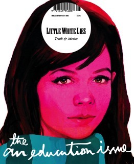
An Education Issue 25 - Sep/Oct 2009 I think this is a brilliant depiction of a coming of age movie, straight away introducing you to the main character, the bright pink hue, brilliantly used to show off the innocences of the character themselves, and that is pushed by the limited about of skin showing. the illustration itself seems to of been done with gouache paints considering the smoothness of the colours working together on the page, the hair, nose and eyes are my favourite, especially with the eyes and nose they have so much detail, you can see the youth in the eyes and the realistic look of them works so well and I love how the artist has used just shadow and light to detail the nose, and I like the hair personally because of the way they got light to reflect onto it as well as how it looks so soft and neat it looked.
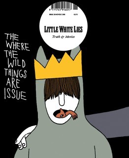
Where the Wild Things Are Issue 26 - Nov/Dec 2009 I wanted to personally wanted to look at this issue was because it relates to the movie/book that I am looking at now, I think this is a brilliant concept for the movie I personally love the childish simple drawing, reminding me of childish drawings, and I like the idea of the ‘wild things’ climbing from in Max’s mouth, I think this is brilliant due to the fact that Max has problems of acting out in such a wild way. it also relates to the original poster for the movie ‘there is one in all of us’, I like the use of the colours are quite depressing in itself, but in the realistic view of the movie where in the ‘real’ world the character maxi is struggling with the divorce of his family.
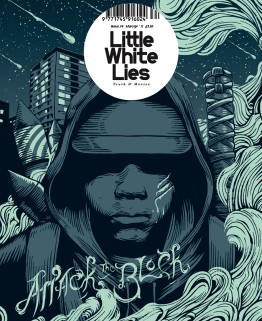
Attack the BlockIssue 34 - Mar/Apr 2011 This one stood out to me both because of the colour pallet and the style of the outline. The outline themselves reminds me primarily of the linocuts, I think it shows the mystery and the lack of empathy for there assailants and how the gang themselves blend together when the character is all one colour. I personally loved the background/the sky it has beautiful speckles of stars and meteorite shower. I don’t particularly understand the Artists use of smoke, id have to assume that it has a impact or relevance to the story itself but it beautify shapes that fit with the Lino style.
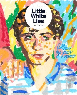
Call me by your name - issue 71- Sep/Oct 2017 I particularly like this illustration for this coming-of-age romantic drama film, though I personally don’t like cinematic worlds use of age gaps between their gay romantic relationships. but this particularly artistic interpretation, the oil pastils drawing dose defiantly scream coming of age movie and it also dose make me think of the link that combines with the main character being half Italian, the background flows but also seems to be pulled away from the page, maybe because of the fact that there is less gaps in the foreground, I also like there use of lighting its done well to be presented coming from the right side of the page. But the type that they used to show the title docent fit for the rest of the image, naturally I believe that the artists probably wanted to remove from the original type from the movie poster.
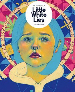
The miseducation of Cameron post Issue 76 - Aug/Sep/Oct 2018 I believe that this depiction of their movie, the colour used for the face is a direct reference to the film poster the yellows, green and pinks. the background gives away so much for the movie and the elements and its relationships with the story of being sent to a conversion camp, and the coping methods that one turns to. The expression on there face is a well done illustration of Chloë Grace Moretz, I honestly recognised her straight away without knowing that it was her in the movie; back to the expression itself shows so much betray, sadness and heartbreak all in one, its an expression that is shown through out the film a common apparition.
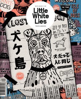
isle of dogs - Issue 74 - Mar/Apr 2018 I personally loved this movie, the entire stile used in the cover in the magazine is in the same style used throughout the movie itself, the movie used these 2D elements through out the stop animation. the posters show off so meany aspects of the movie the setting of the movie ‘the isle of dogs’ the science group trying to find a cure for the ‘dog flu’ it hints to the open scenes that were done in the original Japanese style. This is a common aspect in this imagery it has little elements of the story dotted around this.
2 notes
·
View notes
Text

A hopper approaches you. Someone dressed the critter as a postman - it even has a cap with straps preventing the wearer from losing it. Is this a weird joke?... The animal opens its bag and handles you a newspaper, then busily leaves - probably towards the next addressee. You wonder why would anyone spend their time to train one of these unintelligent grazers instead of just asking a Beast. Maybe the newspaper contains the answer...
———————————————————————
Anonymous asked:
Can you show us a glimpse of the adult Lykos yet? And this looks amazing i cant wait! Also, can the beast have pets? Like a lykos have a one of those fluff balls as a pet? (Sorry, i forgot their name XD)
Adult Lykos hasn’t got its redraw yet. At this point, we don’t plan to change its posing or anatomy, just to clean up the original image a bit to match other Beast artworks.
Yes, petpets are planned, and your guess about the designation of Furriosas is completely correct! They are collectible pets for Beasts.
rawrzskythrone asked:
Hey! I've got a couple questions about the Beast mechanics. Once a Beast grows up, will you have to continually feed it? Does anything happen if you don't? Can Beasts get sick or injured and how will that condition impact them? Can a Beast choose to abandon you instead of you chasing it away? Sorry for the barrage!
Hi!
1) Each Beast needs to consume a certain number of food points each day. Food and diet management plays a big role, but at the basic level, it's pretty much automated until you want your Beasts to eat something specific. They will go and search for food themselves, be it their inventory, your warehouse, a café somewhere outside your manor, or even utilizing their skills (gathering, hunting, fishing, cooking) to obtain something edible. Without food, a Beast will gradually lose its weight, health and raise its stress level.
2) We have an extensive diseases/injuries system in plans, but it will be pretty basic at the start. There are several statuses that raise Beast's stress level and apply disease-specific debuffs. Some examples are inability to craft with a limb fracture, increased fail chance for all actions while constantly scratching because of insect bites, reduced speed and agility for molting birds, reduced daily energy because of fever, reduced attractiveness because of rash. These statuses may fall off themselves with time or be removed through a treatment purchased from a NPC seller.
3) At a certain point, a Beast may decide to leave its keeper if its life becomes utterly unbearable. This may happen if it has a high stress level for too long, its needs are not met, it has health or personal life issues, etc. One specific need we'd like to specifically mention here is the need for freedom. It's possible to force a Beast to leave the manor by issuing too many orders and micro-managing each aspect of its life.
———————————————————————
We also have two very popular questions asked by a lot of our subscribers.
Will there be deviants?
Yes, non-heritable visual mutations are planned, i.e. unusual pigmentation like erythrism or albinism, overgrown fangs, and double horn.

What is your development progress? When the game will be open to the public?
We're not giving any estimates right now, though we can assure that we're working on the game as much as possible. At this point, the team is slowed down by significant health issues and the need to earn money for living. We still have a lot to be done, but here are some things that we've been working on!
Training hoppers. We have 2D animation with Spine 2D in our scope now, potentially allowing to introduce things like mini-games, rich explore mode visuals and even animated Beasts themselves.
Repainting all terrain tiles to larger and less busy versions
Working on isometric fauna and flora
Inventing a way to create a 2D Beast "model" that may be used for 8-side isometric movement, doesn't require enormous space to store Beast images like sprite animation does, and supports easy recoloring. Currently we're remaking 3D-rendered isometric sprites into Spine animated 2D textures.
Peeking into Unity as a way to implement everything mini-game related and maybe exploration
Extending and developing the lore
Reworking Beast psychic model from the neural structure to a proprietary pattern. The neural-like structure turned out to be producing results that are hard for players to track and understand where they came from
Experimenting with Blender to create procedural striped patterns

34 notes
·
View notes
Text
The Most Fascinating Product Design Technologies Of 2019
The technologies used in the merchandise design process have changed substantially in the last decade. It’s now very easy to build a complete product from the convenience your house, because of powerful design software and product prototyping hardware like 3D printing. In this text, I’ll share some of the most exciting product design trends for 2019 that may help you comprehend the technologies which might be available.
3D Printing
The creation of 3D printing has generated the most important adjustments to the product or service development cycle before Fifty years. It is definitely an exciting technology that permits hobbyists, inventors, and entrepreneurs to make prototypes with their inventions quickly and affordably.
While there is no need to outsource product prototyping to 3rd parties, the product development cycle is drastically shortened. It has become possible to design something and make up a prototype at your house to find out well it really works when rendered in the physical form. 3D printing allows you to determine if the design seamless comfort with your hand, whether it fits well along with other components, whether or not this contains the design aesthetic that you just were looking for and so forth.
3D printing techniques were first printed in the 1990s for rapid prototyping. The earliest 3D printers were huge machines that used a computer to make three-dimensional objects from liquid molecules or powder grains which were fused together.
In the past, we've got the technology has evolved, with several types of 3D printing technologies now getting used including material jetting, vat photopolymerization, binder jetting, material extrusion, directed energy deposition, powder bed fusion, and sheet lamination.
The most common kind of 3D currently being used is fused deposition modelling (FDM), which has been invented in 2013. It is used in 3D printers produced by various manufacturers including Stratasys, MakerBot, BD Systems, and Ultimaker.
Modern 3D printers may be small , are available at a fraction of the cost of older machines. There are also many new programs competent at controlling 3D printers which has made the technology effortless to find for designers, entrepreneurs and inventors.
3D printers have become utilized to make sets from toys, machine parts, and car parts through to functioning human organs. In time to come, the affordability, efficiency, speed, and ease-of-use of 3D printers will improve - making it one of the most exciting product design technologies available today.

Product design software with 3D printer compatibility
Probably the most sophisticated 3D printer on the planet is entirely useless without a proper computer-aided design (CAD) tools supporting it. Fortunately, gone is the time where manufacturers needed to use clunky CAD software that has been challenging to learn. Now there are an array of intuitive CAD tools which make it an easy task to harness the potency of 3D printing, including:
• Autodesk Alias
An exceptionally powerful tool for modelling, visualising, and sketching ideal for product design.
• ZBrush 2019
ZBrush 2019 allows designers to shape, texture, and colour virtual clay inside a real-time environment. It can be used everything from developing 3D models for on-line games to shaping new service designs.
• SketchUp
An online 3D modelling tool with cloud storage. Ideal for designers considering 3D printing their creations.
• Rhinoceros
This is a powerful app that's designed to create, edit, render, and animate NURBS curves (2D and 3D models).
• 3D Slash
An incredibly intuitive 3D modelling app suitable for product designers who don’t wish to be bogged down in details when mocking up a product or service.
• Modo
Powerful and simple-to-use 3D modelling software.
Examine this brilliant listing of industrial design tools to identify a few more.
Online product design apps
Many software providers now offer online versions with their design applications including 3D Slash, Adobe Illustrator, Photoshop cs4, SketchUp, and Tinkercad. Using these online versions makes it easy for product designers to operate remotely using different platforms.
Early stage website tools
Another fundamental change caused by the world wide web could be the continuing development of online collaboration tools like Miro. These tools permit multiple website visitors to collaborate about the earliest design iterations of a awesome design. Miro acts just like a virtual white board that allows designers to share:
• User story maps (illustrations comprise the way to generate a delightful buyer)
• Customer journey maps
• Product requirement boards
• Product inspiration (videos, images, notes)
• Todo lists
• Design feedback and reviews
Initial phase prototyping tools in addition have become considerably more sophisticated and useful. Tools like InVision, Azure RP, and ProtoPie make it simple to organise out many products from web applications to furniture.
Inclusive and environmentally-friendly product design
It's not a lot a technological advancement, but an essential trend affecting the joy of product design. Product designers are increasingly focusing on making products which are “inclusive”. This means the item remains functional when utilized by adults, children, the aged, and people with disabilities.
Another major trend amongst designers is always to pinpoint the lifecycle of the product and just how it affects environmental surroundings. Product designers are increasingly focussing on products that:
• Use sustainable or recyclable materials like timber, aluminium, glass
• Are designed in wherein makes them easy to recycle
• Have less toxic plastics
• Have simpler designs which have less environment impact in the manufacturing stage
Thanks for reading The Most Exciting Product Design Technologies Of 2019. Which technologies are you gonna be committing to in 2010? Leave a comment below to allow us know.
More details about Product design consultancy see this web portal.
1 note
·
View note
Text
Bad Website List 2021
It's far no mystery that websites are the spine of every commercial enterprise. in case you need your commercial enterprise to flourish on this COVID-19 generation, you’ve were given to have a properly-designed and appealing internet site. because of social distancing and the lockdown, increasingly more inherent clients are looking for products and services on line through the employer’s internet site and portals.
A well-made internet site or an internet web page allow you to establish your commercial enterprise because flawless design creates a top notch affect on your ability customers induces them to take the desired action-sensible versa due to a terrible web site design. commonplace web design or website development mistakes can fast derail your business potentialities even if you installed your first-class efforts. web sites are like a 2d home for a commercial enterprise. A internet site works as your on-line photo and is judged harshly by means of your customers. this is the reason that creating a superb design on your internet site could be very vital. And while you pay attention plenty approximately what to do while designing your internet site. however do you realize what no longer to do?
As we are speak me approximately bad website designs, we have to have a have a look at what capabilities make a internet site a bad one:
Not following tendencies
Be unresponsive
Confuse cellular-friendliness
not noted usability
Ditched accessibility
No longer optimized for search engine optimization
Overlooked safety
And now, to present you an idea, we've got mentioned forty bad website design examples that harm many companies. keep away from them while designing your internet site, and also you should have extra achievement in changing leads into your dependable clients.
Here's a list of forty terrible website designs in order to make you pull your hair:
PETER’S BASILICA – VATICAN:
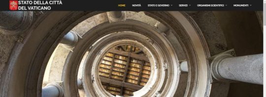
This website has illogical and inappropriate studying areas which makes the readability and accessibility ratio pretty low. also, the UI is poorly designed, making it a bad website design inside the eyes of the crawlers as well as visitors. it's also no longer very responsive, which will increase the browsing time of the customers with out gaining any more records to their necessities. And ready is the maximum disturbing thing when it comes to user experience.
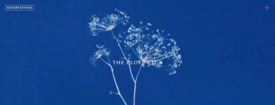
The Glove Club:
This internet site looks ok however with regards to internet design, cinematographic elements are a steeply-priced affair. unfortunately, the abundance of 86f68e4d402306ad3cd330d005134dac pix slows down the loading, and users have to wait to see the content material of the web page. gradual down load pace is a purpose why customers often refuse from browsing similarly. So it turns out that the usage of expressive cinematographic elements doesn’t actually assist, another example of bad web site design.
Adjust:
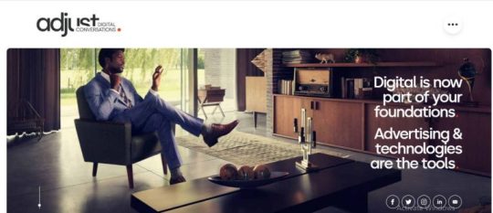
This website may have a cutting-edge design, first rate user revel in, and nicely-thought-out usability, however the smallest bugs will spoil the whole thing. modify is a case in point. The internet site is top notch and it appears true. however, what does make it a awful web site design is a massive panel that informs about the cookies. It does no longer go away. It sticks all the time, destroying the entire impression and enjoy of the user. it's miles like a sore thumb that keeps hanging in your nerves and distracts interest from the primary purpose of this website.
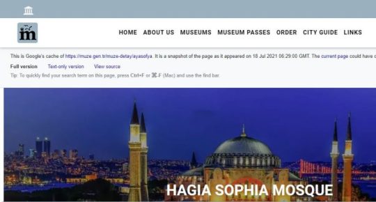
Hagia Sophia:
The website is ordinary in appears but the hassle is a pop-up. The massive pop-up at the first actual page hides the number one information at the internet site. The website is designed for travelers and may be surfed in more than one languages, however the internet site isn't always properly based, which makes it difficult for customers to navigate. This consumes quite a few time of the users in addition to the crawlers, which in turn will increase your crawling budget giving an extra load in your wallet.
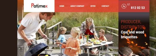
Patimex:
Test the website of the Polish family gasoline producer. The layout and usefulness are quite disturbing. So a touch Satan grilling a sausage is to the factor right here. A navigation menu at the pinnacle and any other one below a bizarre image, three links of different colorations, and even an animated emblem doesn’t really store this internet site. basic, this UI is poorly designed with a purpose to genuinely aggravate a user due to the above bugs, some other instance of horrific web site design.
IBI:
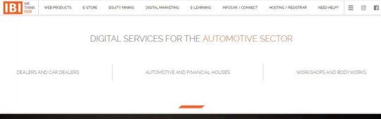
IBI’s authentic internet site could be very close to being called a terrible internet site. but, a few matters maintain it far from being the high-quality. First and essential, it is a video inside the header. although it instantly grabs interest due to its glitch effect, but, this impact ruins the whole lot. It does not undergo any statistics. it's far just a flowery distraction. Secondly, there is no information hierarchy. To push customers down the marketing funnel, you need to lead them. but, right here users are left to themselves. there is no data onwhere to appearance next and wherein to go subsequent?
MINISTRY OF ELECTRONICS AND INFORMATION TECHNOLOGY:
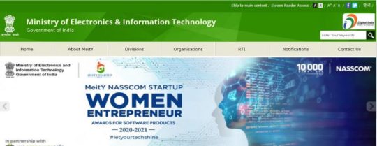
This awful internet site is brightly colourful and informational, which makes it look shiny to the eyes of the users. The stay replace animation on the website hampers the usability and user revel in of the site visitors, making them divert to other structures for the identical information. If that is optimized in an amazing way, the internet site is quite informative and can paintings wonders for website traffic.
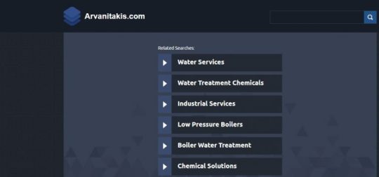
Arvanitakis:
This horrific website was already redesigned. over again, this didn’t enhance its looks and value. It has no facts about the services or organisation and nothing about the blessings and traits of its products. best its creators can probable recognize what is the factor of displaying a menu with a stock picture, highlighting popular tags, and developing an additional catalog without a right footer and header. we are able to move forward with out the looks but usability right here makes the difference.
Regal Capital Lenders:

Even though this website is not from 2013, because the above-said Tavern. It feels out of date and a bit lame. Even vivid illustrations and animation do no longer make it better. firstly, the header is just too cartoonish and really a whole lot outdated. even though it features a incredibly meaningful animation, it is nevertheless not convincing. Secondly, the web web page’s subject and surroundings do now not align with the company’s services and brand photograph. It looks as if this terrible internet site is for youngsters, no longer for folks that need a loan. Else, there are issues with the cell model, accessibility, usability, and overall performance as nicely.
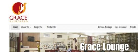
Grace Fellowship:
Grace fellowship is a small one-page website based totally on the assignment of assisting the community of their motivational genes. The bad website has decreased content material as compared to other web sites but has too much white space, which gives it a scattered and unprofessional look. The typography of the website may be very terrible in comparison to the general construction of the website. the dearth of records on the page increases the soar-back price and for this reason, users will look for other options.
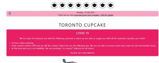
Toronto Cupcake:
What do you anticipate to look on a webpage that sells cupcakes? usually, such web sites are full of great pics, shining hues, and staggering design factors that trap users into shopping for a few more goodies. but, the owners of this terrible internet site have determined to forget the opportunity to draw new customers thru their net resources. the principle page of Toronto Cupcake is too pale and easy. It doesn’t comprise any useful statistics about the company or the logo. The text inside the footer is just too small to examine and similarly to that, there is a large blank area at the bottom of the page. users will honestly be irritated with the navigation of the internet site and the terrible pleasant of pics. If Toronto Cupcake wants to make its internet site definitely powerful, it should virtually improve its layout and usefulness.
Tavern:
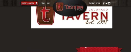
one of the predominant motives why on line homes end up bad web sites is that they stay in the past, like this authentic webpage of a Colorado-primarily based eating place that is still living in 2013. The layout is quiteoutdated. although it has some attractive functions just like the bold, charismatic typeface and a few brutal textures, stillit produces an unfriendly influence. It does now not build believe and credibility, that is a deal-breaker. any other essential flaw is that the internet site isn't always responsive nor cellular-pleasant. it can seem that this fixed boxy format seems desirable on cellphonesbut it isn't always. The enterprise loses a giant proportion of the market simply because of the above motives.
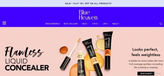
Blue Heaven Cosmetics:
The consumer interface of the internet site is smooth and exciting. on-line users may be impressed by means of its appears. The best purpose which brings this bad internet site here inside the list is the long list of bread crumbs at the pinnacle of the page. It is right to offer beneficial statistics, but it is also really useful to reduce it quick into one of a kind sections, so that you can make it smooth for the users to navigate. It has a name to action button at every level, which makes it appear to be a bit selling type of internet site instead of a simple e-commerce one.
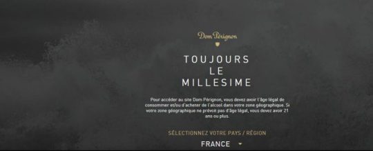
Dom Perignon:
This iconic logo of luxury champagne also hasa lot of flaws. To be more specific, not the product itself but the website that promotes the antique liquids Dom Perignon. This web useful resource has a stylish and fashionable layout, but the principle web page only tells us approximately the face and creative director of the business enterprise, Lenny Kravitz. to check the records about antique wines, users have to indicate their age and region. A key mistake is a form that gives get right of entry to to a part of terrible internet site content material. the overall information about the champagne is available without the age affirmation, but it's miles impossible that once mastering approximately the logo, users will return to the main web page to fill the required shape that gives get entry to to merchandise. This immensely complicates the person path.
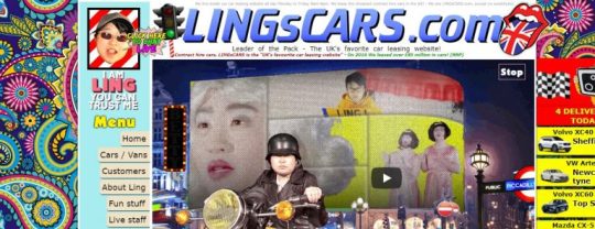
Lingscars:
After touchdown on such a horrific website, it's far tough to apprehend whether its layout become chosen deliberately or this is nothing however a fiasco. the colours, textures, animations, and fonts are overly discordant. users are overwhelmed with numerous banners, movies, and links both inside the sidebar and at the page itself. there's certainly no common sense behind the region of not unusual elements just like the icons of social media are within the middle of the principle page, there is a lot of empty space among the content material and footer, while the header is overloaded with photo and textual statistics.
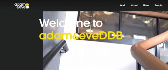
Adam and Everywhere DDB:
Content material-loaded websites are complicated to control. You need to strike a stability among being informative and being organized. As a commonplace mistake, human beings forget this. recall Adam and anywhere DDB and their awful website with visual overload. despite the fact that the net layout is higher, it nonetheless overwhelms. there is an entire bunch of colourful pictures in which each one instructions interest, causing a consistent shift in awareness. Cells are too small that the the front web page appears dense and heavy. additionally, no longer all of them are working. The masonry format may be a life-saver, but it still calls for reducing and sharpening.
Travelocity:
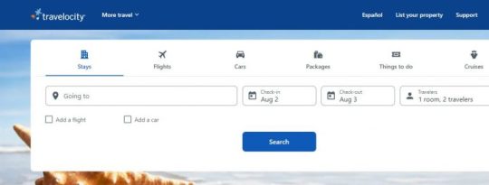
it's far a very exquisite internet site, offering journey tips and applications to the clients who plan to travel around the sector within the most inexpensive feasible ways. The purpose behind the internet site is ideal but is destroyed by means of the development, looks, and layout of the website. the decision to motion menu occupies the entire front web page space of this awful website, hiding the opposite applicable statistics. The icons used are too huge and occupy most of the location for irrelevant information. This wishes to be corrected as a way to make a fulfilling website.
The world’s Worst website:
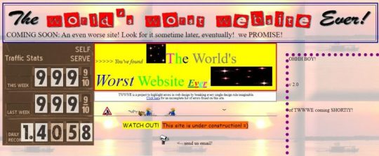
the arena’s Worst website – that’s the name of a puppy venture of designers who decided to factor out the main layout mistakes to internet site owners and creators round the arena. glaringly, everything is exaggerated right here, and you received’t come upon comparable websites. This horrific web web page collects all possible and not possible mistakes in a single location that's definitely beneficial. The combination of conflicting shades, incompatible fonts, unformatted and unstructured content, underlined links – this isn’t the overall list of things that make this website the worst within the international. no longer to say a navigation menu within the center of the page and primitive animations of various sizes blinking all around the web page! this is the pleasant example of functions no longer to position into your internet site.
The Congress Movie:
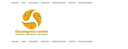
The congress film made our list of poorly designed websites due to a whole lot of mistakes. despite the fact that WordPress proudly powers it, it still lacks so much to be called an awesome website. First and predominant, the website became created to get excessive ranks in search engines like google seeing that we can see some unhidden seo text right within the header. Secondly, the layout is lame. there may be no individual, style, or subject matter. 0.33, there is not sufficient content. sooner or later, it does now not have right navigation or seek. In nutshell, the internet site was created not for humans however for search engines like google and yahoo. Google considers such projects as bad websites, so will we.
My US:

This bad internet site has major white spacing problems which carry it to this very list of awful websites. it is full of information but isn't segregated well, which makes it appearance all cluttered and nasty. The typography used at the internet site varies in size and shapes at every degree, makings it confusing for the crawlers while indexing the crucial content material. it's miles advisable to apply heading tags at every stage to assist the bots to move slowly and index your internet site for ranking functions.
The Big Ugly website:
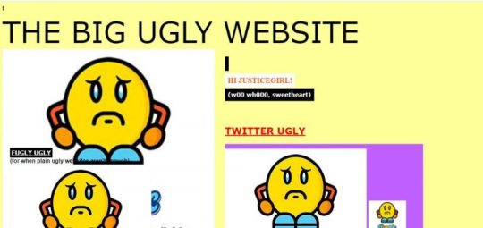
Designers deliberately created the massive unsightly internet site to show all the horrors of out of date design and negative usability. this is a exquisite example for those who consider that the relaxation of net assets aren’t unsightly and inconvenient enough to be blanketed on this evaluate. you'll in no way find the navigation here whereas huge and beneficial animations, unappealing fonts, underlined textual content, and banners are everywhere. To reduce an extended story brief, this website is only a mess.
GAO:
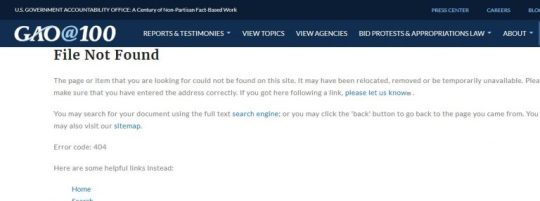
That is any other government website in our collection. This time we are going to consciousness on the legitimate website of the U.S. government accountability workplace. It positions itself as a information portal. at the same time as the internet site works for laptop customers, with regards to mobile and pill visitors, it fails for the reason that group has forgotten to make it mobile-pleasant. extra often, it is not even responsive since the two-column structure remains the same irrespective of the screen length. As a result, it's miles a actual nightmare to browse this awful website to your mobile phone. As for accessibility, there are missing opportunity texts, empty hyperlinks, low evaluation, and even suspicious hyperlinks.
Federal Trade Commission:

Apptivation is one of the web agencies that are developing packages for clients. The opposition on this industry is hard therefore, you may’t have enough money to look vintage. but, this is not the case of Apptivation since it seems that the team does no longer observe the trends in any respect. The design is clearly outdated. however, it is fully unacceptable to apply tool mockups that are dated back to 2014 to promote your services. the first impression is ruined, so does the overall one. Ignoring cutting-edge developments can turn any online portfolio into a horrific internet site.
Gates And Fences:
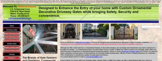
Gates and Fences have been constructed via an over-enthusiastic man or woman who wanted to infuse all the statistics of the world below one roof. it is a website that provides gate constructing and fence constructing services for homes and workplaces. It does now not have a special menu or web page bread crumbs to help the users navigate on the internet site without problems.the main purpose for it being here at the horrific websites list is the immoderate content material on the internet site. The touch information are displayed proper on the top, which hides the call of the website.
Hipmunk:

Hipmunk is a brief one-web page website. it's miles a luxurious journey and logistics business enterprise, providing deals for the excellent hotel, flights, and motors all through travel sessions. The layout is not at par with the others within the marketplace because it showcases the decision to movement form, as soon because the consumer enters the internet site, leaving no space for discovery and expertise the organisation and its services in a real sense. additionally, it has a testimonial phase inside the center of the website, which once more makes it appear like the website is simply specializing in conversion and not on providing relevant data to the customers.
Studiomix:
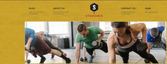
StudioMix is a medium-sized health club workout website with a uniqueness in San Francisco. What brings it right here in the listing of terrible web sites is the bulky name to movement as well as the tangled footer of the internet site. The design adjustments the whole cause of the internet site as in preference to showcasing it as a fitness know-how-driven platform; it's miles entirely portrayed as an commercial platform. also, regulate to Alt Tags, the content is displayed within the written form below the web page bread crumbs, which makes it appearance awkward in addition to takes away space for essential records.
Stack change:
Stack alternate has an awful start. It states the question and answers of the network on the top of the homepage, which must really be in the understanding or distinctiveness section beneath the web page bread crumbs or menu. As quickly as we scroll down, we see an entirely separate a part of FAQS that long till the cease of the internet site. This awful internet site has a slow loading velocity compared to other web sites, which makes the internet site get better price very excessive.
Sports LED Panels:
The official internet site of the agency that sells sport LED panels appears fairly updated. but, nevertheless, it can’t be referred to as a super website for some actual motives. firstly, there is an excessive amount of interactivity. each detail is rotating, shifting, and flipping. There are even sounds and, the parallax is overly completed. The interface reminds a flash website generation that became popular 10 years in the past. Secondly, the links do now not paintings immediately. now and again you need to click twice or thrice to set off them. Thirdly, there are irregularities within the format. despite the fact that the website appears and works well on small monitors, some flaws make it a awful internet site.
MIT Centre for Advanced Visual Studies Special Collection:
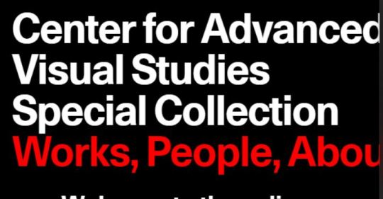
web sites of universities and governments are notoriously well-known for being outdated or the use of design solutions that nobody uses. The respectable website of the MIT middle is a consultant instance horrific web sites. although a few eccentric people may find it amazing because of offbeat answers, nonetheless, in relation to the normal crowd with a quick attention span and choice to find information as speedy as feasible, it is able to become a actual challenge. the primary flaw of this awful website lies in overdoing parallax. The latter is a powerful device in terms of creating an attractive person experience. but, with super strength comes first rate responsibility. And whilst you overdo it, you may grow to be with a bad website and bad user experience.
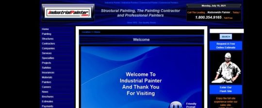
Industrial Painter:
even though Joomla-stimulated interfaces had been popular a decade ago, nowadays, they are mauvais ton. The actual deal is, this outdated structure makes it difficult to paintings with web sites now not simplest on huge computer systems but also on small monitors which includes mobile phones and drugs. The format stays the same all of the time. The font length isn't always adjusted to small screens, and the evaluation ratio is minimum. even though you may locate facts, nevertheless this isn't the best you expect from a present day internet site.
MGBD Parts and Services:
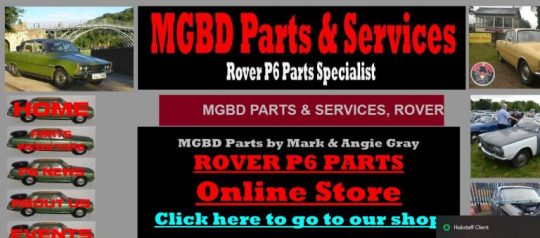
even though this horrific website seems like a large development to the previous one, the reality is, it’s not. it's miles the same horrible internet site as featured before. pix hurt the eyes. not simplest do they overwhelm right off the bat, however in addition they destroy readability making navigation difficult. Coloring is simply too severe. As for assessment, most people of essential factors like navigation and hyperlinks lack it. To make matters worse, running animation makes it hard to concentrate at the content material.
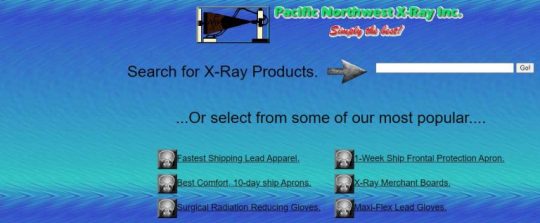
PNWX:
PNWX is an reliable website with a present day catalog of Pacific Northwest X-Ray Inc. it's miles a real internet site, and it is quite tons alive. even though it is dated returned to 1997, that could be a quite stable age, however it does not summon any appreciate. The deal is when you have a awful internet site, nobody can shop your popularity, even you have the nice builders in the global. even though the homepage functions a search input, classes, navigation, and some beneficial hyperlinks, it still scares away customers rather than luring them in. The most effective way out is to make a complete makeover and enhance consumer enjoy, search engine optimization, and performance.
Gulla’s Arrestling:
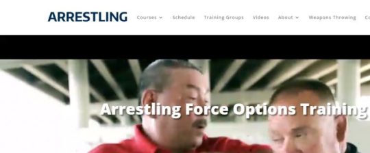
With the sector going loopy over police brutalities in certain countries, this bad internet site attracts in brutality in web site design. It looks and feels a long way from expert, and the content material is really below general. it is glaring that besides for the fashion designer, all people knows the importance of a “title” tag in seo. The worst issue is that the registration form for the imminent conference is a PDF. so that you can't edit it online. You want to download it and mail it. And the website does now not have an incorporated charge pathway, because of this you need to make the credit score card bills over a name or the usage of your phone.
University of Advancing Technology:

the moment you pay attention Advancing and era together, you anticipate a website as a way to inspire awe. nicely, some distance from awe, this inspired worry considering the graduates so that it will be made from the college. if you are having access to it from IE then it’s easy to question your internet connection pace. however in reality, it's miles quite ugly. you can hardly ever find any data you are searching out on this horrific website and do no longer be amazed if the home page takes approximately five seconds to start loading.
Paradise with A View:
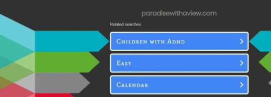
The pix on their domestic web page are of diverse sizes, and the fonts end up regularly smaller as you scroll down the page. The rainbow colours in each level of the content material do now not assist a great deal either. Flashing texts in peculiar fonts, non-responsive templates and squat navigation alternatives located within the center of the home web page will actually make you rethink what Paradise is meant to look like. while you are about to ebook a vacation your body and mind are crying for some a great deal-wanted peace. however a unmarried visit to the bad website is enough to rob you of your last bit of calmness.
Ugly Tub:

well, as a minimum the call of this internet site sums our views efficiently approximately their format. It’s provokingly random and stressful distribution of statistics will make you believe that a kindergarten kid can absolutely layout a bad website like this. So abnormal and newbie improvement can lead to disasters.
Bolen Report:

there may be a manner right here so as to learn the way antique newspapers have been edited. Or higher yet, what layout designs the information international beginners could have had rejected. Going black and white is also an art, despite the fact that black and white are not taken into consideration as colours. it is the antique Bolen document website constructed on Microsoft FrontPage. as it seems a few human beings genuinely don’t research from their old mistakes.
Rudgwick Steam show:
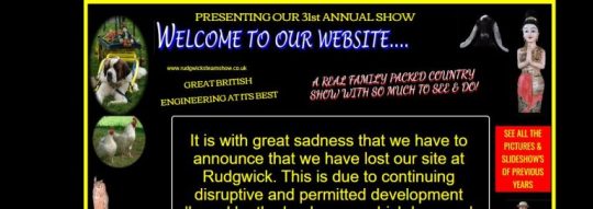
This you possibly can cross down the course fabric of pinnacle snap shots and net building institutes as a case look at on what significantly must no longer be executed. It’s an acute case of a language barrier, with the least amount of heed paid to all that meets the attention. similar to we have no concept what we're doing on their bad website, they don't have any concept what they may be doing on the internet both.
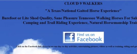
Cloud9 Walkers:
The worst instance of creativity block may be visible proper on this terrible internet site. including a history picture with a cloudy sky for a website known as cloud nine is certainly terrific. If in any respect including one had been extremely important, because it appears, a smarter, pleasanter image would have changed the sport for the better. Or not, like they say, lots goes into constructing a structure and nearly not anything into breaking one. And this one’s been long broken.
Great Dreams:
This one comes bearing as lousy a layout as you can still imagine, simplest worse. It’s possible they experimented with thoughts whilst growing the website after which left all the ones experiments- like a unmarried photo of a painting, then a small collage of snap shots and paintings, followed with the aid of a massive college of ghastly pics, ending in a sequence of solo photos- once they got bored and dumped the idea on the net for humans to waste their time on when they couldn’t take again theirs.
In nutshell, after going through all of the above mistakes, allow us to take a look at what functions a great website have to have:
Properly Designed and Purposeful
Your web page reflects your enterprise, your products, your offerings, and ultimately your logo
Well Designed and Functional
Your site reflects your company, your products, your services, and ultimately your brand
Easy to Use
Optimized for Mobile
Fresh, Original, Quality Content
Readily accessible contact information and location
Clear calls to action
Optimized for SEO and the Social Web.
0 notes
Text
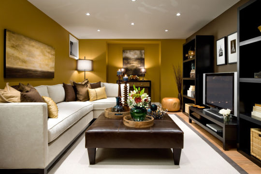
Best Living Room Design Ideas
In many homes, the living room is where families and their guests go to kick back and relax after a long day. In many homes, this room is also where the television, computer and other knickknacks come together and choke the space. This is even truer in a small living room, which fills up after putting just a few pieces of furniture inside. Because of this, many people think that having a larger space is better but that isn’t always true. The secret to making a small living room look good is to take advantage of the living space you already have.
Tiny furniture isn’t a must, but there’s also no need to fill the space with a giant couch or table. Try to resist the temptation to fill up the space when you don’t need to. This will just make you and your guests feel like you’re being crowded out. Design elements like shelving, hidden storage, accent lighting and a solid color scheme also go a long way in making a small space seem larger.
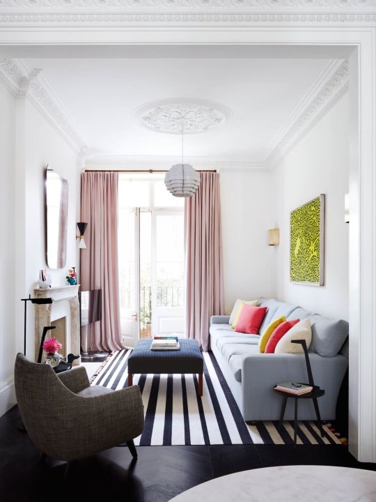
1. Eclectic Elegance
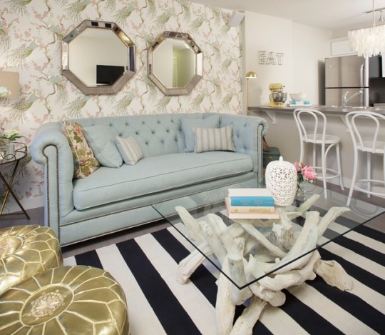
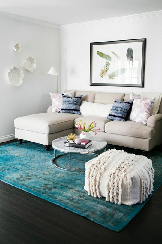
This little beauty highlights how each piece in a space can be wildly different yet still be harmonious. Visual interest is abundant in this small living room interior, from the golden leather ottomans to the glass and driftwood coffee table. On the wall behind the sofa, the chinoserie wallpaper and golden mirrors work together to give the room a touch of flash without overstating their presence and drowning the sofa out. Each piece is like a unique cast member in a stage play or television show. Every piece in this room is small, but each piece still has immense personality.
2. Earthly Pleasures
This room has a money-saving secret in its design. Can you spot it? If your eyes went to the rug, then you’re right. The rug is actually a piece of broadloom and can actually save you quite a bit of pocket change if you are designing on a budget. Unlike most ordinary carpets, you can also cut have the broadloom cut to a specific size, meaning you can fill oddly-shaped spaces you wouldn’t have been able to otherwise. Best of all, your guests likely won’t notice the difference at first glance, meaning it can be your little home decor secret.
3. Recreational Activities
Have you ever seen a room in a magazine that was just so stunning that you had to have it in your own home? While you may not be able to recreate it perfectly, decorating a small living room doesn’t have to break the bank. Print the picture out, take it with you to your favorite furniture stores and have a little fun trying to match each piece. You probably won’t find perfect matches, but similar pieces you do find will feel much more personal and make the final space much cozier. For visual interest, try some thrift store finds.
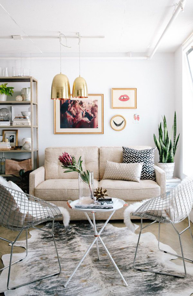
4. Monochrome with Color
If you just want to spice up a dull space, that one visual oddity can make all the difference. This is especially true in a small living room since there normally isn’t much to look at. The rug in this room is a great example because it breaks up the plainness and uniformity the room otherwise has. It also accomplishes this without being overly intrusive. It also forces you to look down at the floor, then up at everything else in the room, ensuring you see every bit of the room’s contents. The right accent pieces make all the difference.
Interior designer in chennai
5. The Fine Line
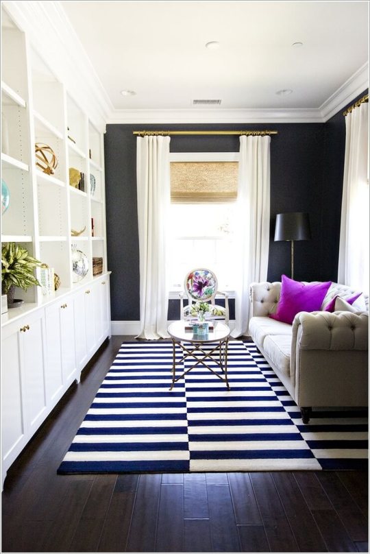
This next room illustrates why decorating a small living room is tricky. When you want to make a room stand out but are unsure how to do so, you may think of adding some visual interest pieces like pictures or pottery. In a small space like this one, however, there is a very fine line between making your space look lived-in and making your space look messy. This room walks that line spectacularly with an array of shapes, sizes and colors that make it look like someone lives here already. Make sure each piece has a purpose and a function.
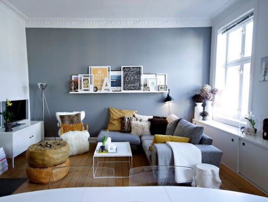
6. A Marriage of Styles
What do you do when you don’t agree with your spouse on what to do with a space? This is a very common problem that just leads to hurt feelings and an empty wallet. Rather than try to push your style over theirs, figure out what elements each of you likes and incorporate both of your tastes into the room. This small living room design is a marriage of masculine and feminine with an exceptional mix of bold lines and pastel accents. The ceiling light is also a perfect representation of the two merged styles, being both geometrical and curvaceous.
interiors in chennai
7. Wooden Wonder
Whether you are working with a small living room or a large living room, balance makes all the difference in the world. This room proves that you don’t need outrageous shapes or colors to create a beautiful space. The untreated dark oak floorboards and the earthy color scheme come together to provide an elegant balance of light, shapes, textures and colors. Nothing in this room aggressively screams, “Look at me!” but the room also has just enough visual interest to command your attention. If a room like this does not give you several small living room design ideas, nothing will.
8. New York Shorty
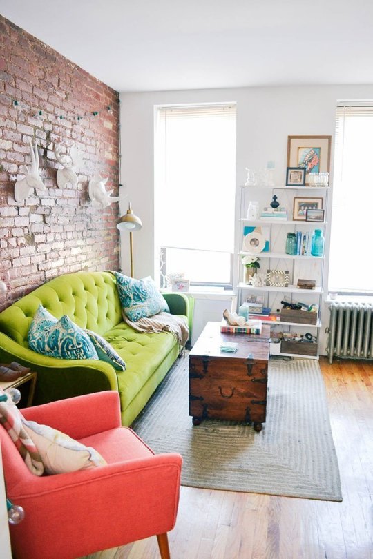
Decorating a small living room is one thing, but decorating a small New York living room is a task and a half. This tiny abode is an exceptional study in taking advantage of what you have. The exposed brick wall, wood floors and tall, sunny windows were already there when this designer showed up. The only thing it was missing was color, and this darling space is the result. This space is all about contrast with the plain white animal busts on the brick wall and the colorful sofa and armchair complementing the earth tones of the floor and wall.
Interior decorator in Chennai
9. Sunlight and Shadow
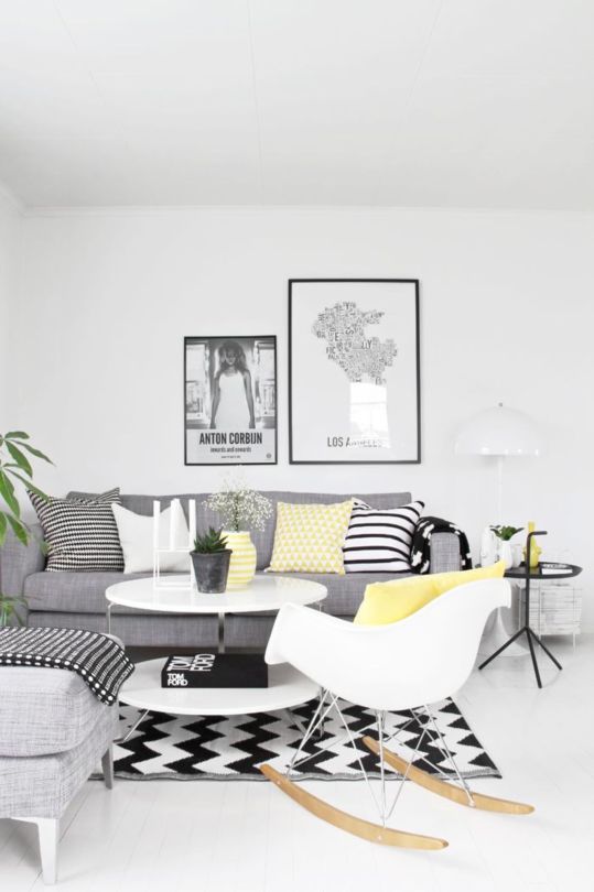
This space demonstrates why color choice has such a large impact on a room. It shows that sometimes, achieving a stellar small living room design is as simple as using black and white. Using black, white and grey as your primary colors and adding a pop of color here and there would be a dramatic departure from the norm. The eye is drawn to color by nature, so it can be used to draw attention to specific areas of the room or it can be placed all over the room to provide a concise tour of the room in moments.
10. Mirror, Mirror

When you have to work with a room with an awkward shape, implementing the small living room designs that you love becomes a major challenge. It may not look like it, but this room had some incredible design challenges, including a cramped dining area. To remedy this, the designer decided to hang some mirrors in the dining area. Not only does the space look larger, but it also transforms the way the dining area looks. By putting the chairs on one side and the mirrors on the other, the dining area doesn’t look nearly as small as it truly is.
Interior decorators in chennai
11. Seabird’s Nest
This cozy little space shows how small living room decor can quickly become an art form given the right pieces. In this room’s case, the abstract white sculptures on one wall and the feather painting on the other would probably point to an oceanic theme, but when you get to the blue area rug and notice the flowers, you begin to wonder if the room really is following a specific theme. Without those pieces of wall art, the room would look stale and a bit generic, which shows how even one piece can transform a room’s look in unexpected ways.
12. From Warsaw
When it comes to a small living room organization is crucial. This tiny Warsaw home’s living room is no bigger than your average trailer and includes the dining area and bedroom, meaning space is at a premium. This is why the accent wall in this room uses vertical stripes: to make it look taller. Not a single piece in this room is without purpose, from the shelf the television sits on to the small office niche at the end of the room. For instance, the track lighting in the ceiling replaces bulky floor lamps that would take up valuable space.
Interior designers in chennai
13. A Thousand Words
Interior design for small living room is all about balancing and contrasts, which this next home has plenty of. This home, described by the designer as “Scandinavian Rustic,” further shows how one element can change a room dramatically. This room possesses a wealth of 2D and 3D elements as well as polygonal and round elements. The eye-catching wall art literally defines how the space should feel, while the long and narrow sofa coupled with the two spool-like tables take advantage of the limited dimensions. The phrase “opposites attract” appear to be this room’s motto and it adheres to it well.
14. Urban Jungle
In home design, one practice that novice designers avoid is mixing and matching patterns or textures. Many beginning designers stick with a uniform and consistent look in order to play it safe. While that isn’t necessarily bad, this room shows how rewarding it can be to get creative and take a few risks. Leather, glass, metal, wood and even water join forces with lovely neutral tones, zebra print, jagged stripes and a spectacular art piece to create a small living room sure to get guests talking. There is so much going on in this room, but it isn’t overwhelming, either.
Best interior designers in chennai
#interior designers in chennai#interior decorators in chennai#interior designer in chennai#office interior designers in chennai
0 notes
Text
Having a look again into Style of animation
So now I’ve started on my animatic, I really wanted to dive into the style of animation I would want to put my animation in. I had previously looked at childrens animations such as 64 zoo lane and how most of them used bright, colourful colours and made the mediums used to create the animations look playful and welcoming as well as looking into more ‘adult themed’ 2D animations such as cox n crendor where the animation was very smooth and used simple colours but impacted the audio more to really bring their conversations to life. But I feel my ideas have changed quite a lot from then- from being determined to do a podcast style animation to now doing a look through Ipswich animation, so I wanted to look at other mediums that I had either previously not thought about or considered but disregarded because they didn’t previously reach my ideas of how I wanted my ‘podcast’ animation.
So I have solid character designs down, which are inspired by Anita Jeram and now looking back also at my research, is also very similar style to the Peter rabbit animation in the 90′s. (https://www.youtube.com/watch?v=fErRjperZiM&t=219s)
However, whilst I love this watercolour, hand drawn style, I just don’t think that time will allow me to be able to create this look as nice looking as the peter rabbit animations or anita jerams work and will more looked rushed and not as smooth and cleaned lined. I want to make sure that this animation is at a standard I want.
So I watched the breadwinner and the animation, particularly these cut out sections when talking about Sulleyman really caught my attention. I particularly adored the backgrounds and scenery of these scenes. The colours used in contrast of each other really grab your attention and set the tone of the scene. The red sky against the dark, grey stones with a overbearing figure ahead sets the mood that danger is ahead.
I also love all the textures the cut out provides. It really makes the scenery look natural, gives it extra character and personality rather than just having flat colours. It actually really minded me of the very hungry caterpillar animation I researched earlier for children's programmes (https://www.youtube.com/watch?v=75NQK-Sm1YY&t=1s) I had said before that I liked the textures and colours but dismissed it before. But now I’m bringing it back for consideration as I seeing the same technique but for children and more adult themes, I can see that if done right it can be used for any topic and I would like to consider it for my animation.
youtube
youtube
With the images above from the breadwinner I just LOVE the contrast of colours. Whilst the first two with lighting do look beautiful, even the last one with just the dark grey mountain, light grey rocks and the light and dark red clouds, lighting isn’t necessary for this image and I feel it gives the same dramatic appearance as the others, only using basic shading such as the mountain being darker then the rocks in front, clearly indicates it is at a distance, that its a looming presence.
I think because how I’ve started my animatic its quite playful and silly, so whilst this dark and looming imagery wouldn’t work, but I love the textures that the cutout brings to an animation and I feel that mine may need that because its quite a simple concept. Whilst fables are all about keeping it simple and clear, I would want to add something extra to give it that extra bit of character and life. This is very apparent in these the breadwinner and the hungry caterpillar which is probably more close to my animation idea as its quite silly and playful as well with a simple story line.
youtube
I decided to also look back on my previous blogs as well to see if I had anything relating to this particular animation style and I stumbled across this. Perhaps this would be something I would like to try and avoid, whilst I understand its much older then the breadwinner for me its just a bit to simple, and with my story being simple already, I feel that having an animation style such as this one the animation would lose character and the story would be lost and viewers would become bored... However if I were to consider it this style of animation could look quite cool for birds flying in the sky if I wanted extra movement within the animation, but I’m also afraid this could take the attention away from the the character on their journey and from the buildings and events happening. So might be something I will try to avoid.
youtube
Whilst I like this cut out animation for backgrounds and perhaps minor animations, I feel for the main character and the cats their movement would be quite limited if I used cut out. For example with the breadwinner animation above, the way the big cats move up the mountain they are quite floaty with their movement, but for example for the cox n crendor animation whilst I’m not going for that kind of movement, I still love the animation style, the colours and the movement that gives the recorded audio much more character and brings it to life which I feel can really add extra personality to my character walking as I feel it would be needed if they are walking in a straight line. I have already tried doing this in my animatic such as having the characters hair frizz up as the car drives past her, showing the speed of the car and adding the shock of the speeding car.
I also wanted to include aaran blaise’s animation above with the elephant as I always like to include his animations into my research because they are always so good to look at when wanting to express an action or expression in a certain setting and how his animation can be so smooth when the line work can be very rough.
youtube
0 notes
Link
Deep Dive is an ongoing Gamasutra series with the goal of shedding light on specific design, art, or technical features within a video game, in order to show how seemingly simple, fundamental design decisions aren't really that simple at all.
Check out earlier installments, including creating tension in Card Thief, achieving seamless branching in Watch Dogs 2’s Invasion of Privacy missions, and creating the intricate level design of Dishonored 2's Clockwork Mansion.
Hi, I’m Barney Cumming, artist and designer of Crawl. I created the art and animation for the game, and will be talking a little about the process and decision-making that went into the project. I've been working as an animator, designer and artist for video games in Australia over the last eleven years, with these past four under the banner of Powerhoof, a two-man games company started with programmer buddy David Lloyd.
I started making pixel animations on the computer at roughly eleven (around 1993), using HyperCard and a program called PC Animate Plus. In 1999 I started animating with 3D Studio MAX R3, which led me into the games industry; initially as a 3D animator, and later as a designer. In 2013, Dave and I quit our industry jobs to have a go at making something a bit more personal to our tastes, and to escape the crushing boredom of the mobile market and all those microtransactions.
Crawl is our first commercial game, a local-multiplayer dungeon crawler where all the traps and monsters can be controlled by your real-life friends. The art style is very low resolution, with screens tending around 150 pixels high (where screens on the NES for example were closer to it’s full 240 pixels high). Crawl uses off-grid, scaled and rotated sprites, (rather than adhering to classic restrictions in these areas), to give a style which freely combines elements from modern and retro sensibilities.
In developing this low-res art style for Crawl, we start with a simple list of requirements:
It must be efficient enough for our one-person art team to create and animate upwards of fifty unique monsters, as well as innumerable hero weapons, environments, props, menus etc, within a reasonable timeframe.
It has to be visually striking. Not just look good, but look good in some unique way that stands out from the way other games are looking good.
As I’ll be making all the art, the style should emphasize the things I’m good at, quick at, and experienced at, and deemphasize all my weaknesses.
It should be fun to make. If we’re going to be working our asses off on this thing, it’s best not to choose a style I already find laborious. Fortunately if we meet the other three requirements, this one tends to be a given.
Despite all my industry experience being with 3D art/animation, and not having touched pixels for a good fourteen years, after initial testing it quickly became clear that pixel art could be just the right tool to let us realize our design. If I took the resolution low enough, I could give the impression of “knight” “demon” or “spider” very quickly (compared to modeling, texturing and rigging in 3D), I would have access to all the fluidity of 2D animation (which you can’t ever get from a 3D rig), while magically being freed from how slow I usually am at drawing in 2D. I could focus on my strengths - animation and character movement - and avoid all my weaknesses.
I knew my tiny little 5 or 10 pixel high monster sprites wouldn’t be visually striking compared to all the amazing game art out there, but keeping them so low-res (so quick to draw and redraw) would allow me to really go crazy with the animation fidelity, and seeing such modern high-fidelity animation applied to such low-resolution art (which we’re used to seeing with only the most rudimentary animations) was a pretty bold look to my eye, and not one I’d seen anywhere else.
If we were trying to be visually appealing in the same way as other games, going for a well-trodden style but just trying to outdo everyone on execution alone, we’d have needed so much raw art firepower to be noticed above all the competition. So this technique of making our own little competition off to the side in which there are no other competitors, is a sneaky way of standing out without quite competing. It’s a bit like wanting to break the world high-jump record, but seeing it’s way too high, so creating your own “highest jump while also wearing a sparkly hat” category and winning that instead with a much lower jump (and a much cooler hat).
So the style goal I set was to take incredibly low-resolution characters, reminiscent of the games I played as a child, but instead of recreating the way those old sprites really moved, I’d animate them to look how they did in my imagination. As a kid, those clumsy two-frame attacks were heroic lunges, and the simple run animations were athletic and full of life. I wanted to recreate the version I saw through the rose-tinted lenses of my childhood imagination.
For the smaller characters, the animation process is simple. I’d start with the key poses (frame numbers with boxes around them) which in this case is mostly one frame for each swing of the sword, with the pose being drawn in the posture the hero holds on immediately after each swing. Beyond that it’s mostly just inbetweens, apart from a few cases (frame numbers with underlines) where I’ve pulled part of the pose out a little further from the upcoming key, to give a stronger anticipation.
You’ll notice practically none of my inbetweens are actually half way between the two poses. If things are moving very smoothly and robotically you’ll get half-way inbetweens, but in the case of combat (and most other animations in an action game) the movements are very staccato, so half-way inbetweens won’t suit. To get the desired movement, most of my inbetweens are actually copies of either the previous or next keyframe, with slight tweaks to indicate which direction the movement is about to go in (or which is has just come from) and some delayed and tweaked body parts to indicate where the force and weight are pushing, dragging and pulling things down. The actual “action”, the biggest movement of each strike, tends to happen between two of my frames, and I just draw a big motion-blur smear to indicate the movement of the blade over that time. This technique, which amounts to mostly just cushioning around keyframes, gives very snappy, staccato results.
For larger, more complex creatures, I’d do most of the animation work using fairly simple stick-figure type lines (which are very quick to draw and redraw) before painting over with full detail once I’m happy with the movement. Any style or process which allows you to change your mind and redraw a pose quicker, will always result in better animations as you are freed to take more risks.
You can see the process is quite approachable when broken down into simple individual tasks, with the most important decision being the order in which to do it all. If you work hard on secondary movements before you’re entirely happy with the primary, you’ll end up having to redo all that work once you change the primary. Or even worse, you’ll be tempted to just accept an imperfect animation, to avoid redoing the work.
Immediately after animating that bird creature, I decided I didn’t like the direction I’d taken and redid the animation from scratch. The efficiency of low-resolution allowed me this extra creativity and experimentation, by stripping much of the sunk-cost in time spent experimenting. If this animation has taken a few days rather than a few hours, I probably wouldn’t have bothered to try again.
Of course as a small team we still try to minimize the wastage and reuse anything we can. When it came to designing combat functionality for the bird creature, I had initially envisioned him having a big “squawk” as one of his attacks, where sound waves would fly out like projectiles, and make the hero dizzy on contact.
The attack wound up playing badly in-game, no matter how much I tried to make it work. Although the attack was scrapped I did quite like the squawk animation, so when I settled on a “grab and bite” move, I reused the old squawk frames for the anticipation on his grab.
The speed of drawing in that art style wasn’t only about making better animations, it was about game-design efficiency and the ability to experiment. I could have a brand new character designed, animated and fighting in game within a day, allowing even our most risky ideas to be tested. With a higher sunk-cost for each failed experiment, we’d have been both risk-averse in our initial ideas (playing it safe and designing moves similar to ones which had worked in the past), and much more prone to making do with not-quite-right gameplay after all that work had been done for the art.
For us little developers, art can be a tightrope between visual impact and cost. We were lucky enough to find a style for Crawl that we loved the look of and was also efficient to make, but with that now old-hat, it’s time to find a new twist for the next game. Maybe low-resolution but wearing sparkly shoes this time?
0 notes
Last Seen Blogs
lovesick0cupid
❧THE INTERNET ANGEL☙
designviet
Panpic
touer
t o w e r

kakikooo
Untitled

turnipoddity
horror enthusiast