#probably also helps that my canvas size is no longer limited to such an extent as it was on Ibis x
Text

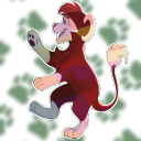
After 9-ish hours of painting, playing with Krita features, and listening to long horror related video essays, I have completed what I consider, my best piece to date
Honestly I am just so fucking proud of this, I just felt like drawing my favorite 80s horror icons with some headcanon designs and then suddenly I was practicing a bunch of stuff I needed to like Shading, color variation, and backgrounds
#spideer'sart#myart#freddy krueger#the nightmare on elm street#jason voorhees#friday the 13th#ash williams#evil dead#honestly I was also getting imposter syndrome the whole time i was working on it#its such a huge improvement on what I was making on ibis#I was so worried cause it feels like just a few months of traditional art and a small amount of practice on krita shouldnt give me-#the giant leap in improvement that it did#probably also helps that my canvas size is no longer limited to such an extent as it was on Ibis x#anyways ignoring my proud ass I think Freddy needs to be creepier and I love spiders so the best choice was clear#ohh ohh and I limited each of them to a 3rd of the color wheel which i think turned out really good#yknow what im not going to apologize for tooting my own horn#im allowed to have this one time to boast. then ill go back to undercrediting myself
78 notes
·
View notes
Note
your gifs are so beautiful I was wondering how you made your overlay gifs
Short Answer: Maximum Suffering 🤡✊🏽
Longer Answer: I can’t really make a tutorial for overlay gifs because my method isn’t consistent (and I’m not working on any overlay sets at the moment) but I can try to sort of explain the general process.
Note: This will probably not make sense if you’re not at least reasonably experienced making gifs or if you don’t make gifs in Photoshop.
So, when I first started making overlay gifs, I used these tutorials as a starting point: 1, 2, 3, 4. I didn’t follow any of them exactly (or very closely at all tbh), but they gave me a general idea of the things to keep in mind when making them.
When I make overlay gifs, I do not put the gifs together immediately. (Unlike basically all the tutorials I just linked 🤡). Rather, I crop, sharpen, color, and save each gif separately. I don’t usually do anything special here, except that I often make one of the gifs much darker/more blacks heavy in terms of coloring than the other. This is because overlay gifs work best when at least one gif has some dark parts (so the other gif can show up). Sometimes you don’t need to do this because one scene is already dark, but, because I like suffering and living on the edge, I don’t limit myself to those sorts of scenes.
Once everything has been colored and saved, I open each of my gifs, figure out how many frames I want/what frames I want (I could do all this before making the gif, but sometimes I change my mind or a certain part doesn’t overlay well at all, so I prefer just having a LOT of frames ready to go in case I change my mind. Once this is done and each gif has a matching number of frames (and you want to keep an eye on file size here. Overlaying gifs isn’t an exact science but if one of your gifs is like 5mb before the overlay, it is probably isn’t going to get anywhere close to 3mb without you deleting a LOT of frames from the combined overlay gif), I convert each one to smart object. Then I copy one gif layer onto the other.
Now at this point, what I do really depends on what I’m making. Sometimes I leave each gif the exact same size and sitting right on top of each other, so all I need to do is set the top gif to screen and then use layer masks on each gif to erase the parts I don’t want. (This part involves a lot of trial and error in terms of what will look best/make things look nicely composed).
Other times, I may end up dragging the gifs around the canvas a bit so that while they are partially overlapping, they are not completely overlapping. This is because sometimes you just can’t crop things in a way where there isn’t a bunch of extra stuff that you don’t want/that will take focus away from what should be the focal points of the gif. I have also sometimes made one gif smaller than the other, so that the part of the gif I care about fits into a specific portion of the bottom gif. (I did this a lot for my Avengers Team Set). And again, as always with overlay gifs, regardless of what I did in terms of gif positioning, I am setting my top gif to screen and making heavy use of layer masks to get things looking how I want. So, while this is a LOT and maybe not as helpful as you’d hoped, this is basically what I do.
....However, it should be noted, that I have done a lot of different things at various points to make an overlay gif look/blend how I want. Copying gif layers multiple times, inserting a layer between the gifs and painting black or white on certain parts of it, setting the top layer to something other than screen, playing with the opacity of the top gif, etc. Making overlay gifs is, perhaps more than any other form of content creation that I’ve tried on this site, extremely dependent on your own creativity and, to a greater or lesser extent depending on how you look at it, stubbornness. There really isn’t a right way to do things, just whatever way will get things looking the way you want.
19 notes
·
View notes
Photo

Starfall Mountains
Alternate title: Reasons Not to Buy the Dirt-Cheapest Acrylic Paints You Can Find
I normally do like to keep an inexpensive stash of acrylic paint around because even though acrylic paint is not a medium I dabble in often, it much like fabric/puffy paint can come in surprisingly handy. And every once in awhile I will use it for it's intended purpose just to stretch my artistic muscles.
Well, one of my art students recently started asking questions about acrylic painting and through giving them what advice I could (knowing arguably too much about acrylic painting for someone that rarely if ever does so) I felt that familiar artistic itch settle into my brain. And then I remembered that between my own one-off projects and a couple that my mom borrowed my small paint stash for, the stash that I had is down quite a few tubes that are just completely gone/empty. And what colors are left (mostly browns and greens, maybe a yellow) are not terribly pretty or useful colors.
Thus my wandering art supply eyes started watching for some cheap acrylic paints to add to and replenish the stash. And admittedly to a certain extent, I wanted to take the rare occasion to take a stab at making a proper painting, partly just to see if I could do it and partly so I wouldn't just be throwing my student to the wolves with my advice.
I found such paints in the form of an 8-pack set of 9.5 ml. tubes from Dollar General. The set was $4.
Now, I know and can accept that this set was not meant to be artist-quality by any stretch of the imagination whatsoever. What bothers me is that my pre-existing stash was a very cheap set that was probably at best meant to be student-quality paint (and there's a good chance that's being generous) and you can get craft paint from Walmart for less than $1 for much larger tubes, and both options are more pigmented than these paints were.
Do not be fooled by the results before you; I am fortunate enough that I have a moderate amount of artistic skill, pretty good knowledge of the medium (at least for someone that doesn't use it often), and I've done enough experimenting and encountered enough problems before to be comfortable trying to power through and work with what I had. If I were a humble beginner with much more limited knowledge of art supplies and how to use them, I highly suspect this would be one of those supplies capable of turning someone away from that type of art supply, if not art as a whole, in its entirety.
If you've ever used finger paints for kids--you know how in the container and one congealed drop of the paint it looks like a nice, solid color, but then when you start to spread the paint around it's way more transparent and you have to really commit to get the color pay-off you were expecting? That's an accurate description of these paints.
The thing is that they aren't totally lacking in pigment. They're about as pigmented as cheap watercolors or gouache. The problem with that is that they are still acrylics at the end of the day--the paint binder is a plastic, which means they dry relatively quickly and typically will not reactivate after they've dried. So if you want the same experience but a medium that's easier to work with, watercolor or gouache would be a better option.
But it gets weirder.
I noticed that these acrylics dry a little on the slower side compared to what I'm used to, which is a mixed bag. It helped with blending a little, but it also made the lack of pigment more frustrating, as it meant I had to wait longer for the paint to dry between layers, which I needed in order to make sure I was A. covering the canvas and B. getting the color payoff I wanted.
Additionally, it is probably a very good thing that I was using a small 4"x6" canvas board and not one of the 8"x10" canvases I have on hand, because the size of the paint tubes combined with the lack of pigmentation means I very likely would've run out of one or some of the colors. (Almost definitely I would have run out of white because white is always my most overused color).
To a certain extent, I did expect to have to layer and do a lot of "put paint on, cover it up. put paint on, cover it up, put paint on--" you get the idea. Acrylics, even when they are better pigmented, can be a more challenging medium to work with because of the aforementioned quicker drying time. But even so I feel like the work I had to do to get good color pay off, decent coverage of the canvas, and smooth blending all at once was still a little more than I should've had to put in.
The most egregious and obvious offenders of this would be the orange behind the mountains and the snow/ice caps on the mountains, the latter of which I'm still not totally happy with, but I kept going back and forth with it and eventually just said "y'know, that looks pretty okay, I'm tired of messing with it, and I'd love to not use up the entire tube of white on this one small painting, so I'm done with that." The orange I think turned out fine, though the transition between it and the rest of the sky is a little harsh for my liking. (I'd say it doesn't match the reference photo but that's not really fair as overall I took quite a few intentional and unintentional creative liberties between my reference photo and the final product.)
Anyway. Once I had layered enough various shades of purple and bluish-white on this thing to make an eggplant and blueberry salad jealous and fed myself up with the mountains, it was 4 a.m. and I was tired and so I decided to let what I had dry overnight and then finish it the following day.
I did wrap my tiny 6-well palette up in a plastic baggie to preserve the mixed paint that hadn't already dried just in case I looked at the painting with fresh eyes and couldn't help but touch it up some more. But fortunately, that didn't happen.
Instead, I used some washi tape to make a mask over the mountains and then broke out a bottle of white ink to splatter some stars across the sky, because I knew the white acrylic paint was a serious risk that was likely to not work out the way I wanted it to. (In this case. I have used white acrylic paint before that would've probably worked just fine using the same splatter method, but I didn't want to take the risk with how not-pigmented this white was.) And then I went in with white gel pens to emphasize a few stars, add some white spots in that I wasn't able to do with the paint, and I did end up adding a little extra highlight to some of the mountains in the vain hope of making them look a little better.
This is where the title comes in; I think I got a little carried away with the highlight on the mountains vs. the stars in the sky, and so instead of the traditional "snowfall/snowy" mountains, I thought calling them "starfall" mountains might make more sense based on the visuals.
One that was done and I was confident that everything was dry, I went over the whole thing with some gloss-finish ModPodge (which smells horrible by the way; the matte-finish ModPodge has a way less offensive smell to me), in two coats, and then re-applied my gel-pen signature in the top corner because for some reason the ModPodge just kinda wiped it off.
I don't like ripping on a supply so hard, and I'm sure if you look at some other supply tests of mine that it's pretty obvious I try very hard to give the benefit of the doubt when I can. These just disappointed me on so many levels. Don't get me wrong; the end product still turned out decent, but that's because I more or less know what I'm doing. As I said before, I'm not confident that a beginner wouldn't be totally frustrated by these paints.
And yet I can't deny that they're probably fine for younger kids that don't really care about proper acrylic painting, and that's really who they're probably for anyway.
If nothing else, I can say this experiment has pushed me towards getting a better quality, wider color-selection set of acrylics to keep in my stash, because I really don't see these working out as a good stash set for me. It's going to be a tricky decision though, because I want something that'll give me the option to do a proper acrylic painting like this if I want to, but has a price I can justify even if I don't use the paints terribly often. So we'll see how that turns out for me further down the road.
I really don't think I'll ever be primarily an acrylic painter (not because of this particular experience--there's just something missing that doesn't draw me into the medium like other mediums have drawn me in before), but sometimes you get an artistic itch and you just have to scratch it, and I have to admit that I don't think I've fully satisfied this itch just yet, so there may be more acrylic paintings to come out of me yet.
____
Artwork © me, MysticSparkleWings
____
Where to find me & my artwork:
My Website | Commission Info + Prices | Ko-Fi | dA Print Shop | RedBubble | Twitter | Tumblr | Instagram
2 notes
·
View notes
Text
Custom Printing: Reproducing Fine Art Prints
Purely by chance today, while waiting while my fiancee had her teeth cleaned and scaled, I found two new potential commercial printing clients.
Both are fine artists. I had commented on a painting on the dentist’s wall, which depicted the very block on which I had lived as a child, and I was told the artist was in the waiting room. I couldn’t help myself. I gushed. The conversation turned from art to custom printing, and to her need for multiple copies of her work. It turns out that she is well known around the world, and that she had received multiple commissions to do murals and paintings over the years.
What this meant in terms of commercial printing, as she and I discussed, was that she needed copies of her art in vibrant color on archival art paper. Based on the press run, she would probably need offset printing rather than digital printing.
So we exchanged contact information and agreed to meet at her studio to discuss the job further after the holidays.
Interestingly enough, not two minutes later I learned that the dentist’s office manager also needed commercial printing and potentially photographic reproductions of her art. She was a close friend of the first woman. She showed me her business card, which she had bought online. She was not happy with the results.
How I Plan to Proceed with Both Clients
In short, I am overjoyed with the serendipity of the moment, and even more so with the opportunity, given my background in the fine arts as well as commercial printing.
Here are my initial thoughts, starting with the second prospective client’s work:
The business card my prospective client showed me will never look as good as the image on her phone. A back-lit cellphone screen will make the colors look much brighter (as a transmissive technology) than will a printed piece that depends on reflected light to be seen (as a reflective technology). That said, there are ways to improve the printed card.
Her current business card from an online vendor has probably been gang-printed with a large number of other cards. In such a case, overall ink density will be chosen to benefit the overall multiple print run, not the individual business cards. I explained this to my potential client, and she understood. For her business card to receive superior treatment, it would need to be printed on a small press by itself. Then the ink density could be tailored to her specific image, her painting as reproduced on the back of her card.
Although we did not discuss this, she could choose a brilliant, blue-white press sheet, and she could add fluorescent inks to the traditional CMYK (cyan, magenta, yellow, black) inkset to make the colors “pop.”
Along these lines, when this particuler client is ready to reproduce her artwork as full-size art prints rather than as the back of her business card, my assumption is that she will produce a shorter run than the first potential client. This is because she is a relative newcomer to fine arts compared to her friend. After my fiancee and I had left the dentist’s office, I called one of the commercial printers to which I broker custom printing work and discussed their capabilities. This particular printer has an HP Indigo digital press with a B2 format (20” x 29”). This would be large enough for art prints. It would accept textured, archival paper and even canvas substrates (although these would need to be certified for this particular press, so there would be a limited number of available papers). Finally, the HP Indigo has an extended inkset. In addition to cyan, magenta, yellow, and black, you can add orange, violet, and green (among other colors) to significantly expand the available color range (and produce jaw-dropping color images).
So I’m keeping all of this information for my fiancee’s next teeth cleaning in six months. This will give the dental office manager time to develop her artwork and decide what to print (without putting pressure on her). Since she has my card, she can contact me if she needs to print business cards. After all, she now has an idea of the cost (relative to the online printer).
Back to the First Client
The first client has an immediate need. We will meet in her studio in about a month. I will look closely at the reproductions she has produced to date (with a particular eye to color reproduction and paper), and we can decide how to proceed. Today I also discussed this client with the printer who has the HP Indigo. These were the issues that arose:
Apparently, this printer can produce up to 5,000 copies on the HP Indigo and still be cost-effective. To be sure, I’ll have them price out the job once I know the client’s requested quantity.
The HP Indigo has an extended color set, as noted above. However, it will depend on the specific colors in my client’s painting as to whether this extra capacity (expanded color gamut) will be visible (i.e., necessary). It will depend on the colors in the original art.
If my client’s press run will be longer than the cost-effective digital press run on the HP Indigo, this same printer can do the same job on a six-color offset press. With the two extra press units, the printer could add two of the following: an orange, a green, and a violet. This would also expand the color gamut, but only if the artwork would benefit from the extra colors.
Both the offset press and the digital press can accept textured, archival papers. These papers would have two benefits: they would last a very long time due to their alkaline (as opposed to acidic) nature; and they would have a “tooth,” a texture that usually sets art papers above the comparatively smooth offset and digital press sheets.
If my client wanted a number of different formats (some smaller than the approximately 20” x 29” image I saw in the dentist’s office), these could actually be printed on a canvas substrate (on the digital press but not the offset press). According to the printer, the ideal size for such a canvas print would be about 10” x 13” (largest), which could then be matted and framed to produce a larger piece.
Scanning (or, rather, digitizing) the image would be an important issue to consider. If the canvas will fit the format of the flatbed scanner, this would produce the best digitized image (the sharpest and most color faithful). If not, the painted canvas would need to be shot with a digital camera. This would require specialized camera equipment, specialized lighting, and skill. The goal would be to add nothing to the art, while capturing all the colors.
What You Can Learn from This Case Study
A skilled printer can create a beautiful photographic rendition of an art print (as opposed to an individual painting or a short-run, hand-made lithographic run of an art print). While it does not have the same value as an original, it has beauty, and it is affordable by most people.
What enhances the beauty of an art print is the extent of the color gamut (how many colors can be reproduced and with what intensity and brilliance). In addition, the brightness, whiteness, and longevity of the paper (its light-fastness, for instance) enhances its beauty. It should be archival to last a long time. It can also have texture (referred to by artists as a paper’s “tooth”).
A good starting point for such a reproduction is the run-length and trim size of the final press run. This will determine if the press run is short enough for digital or long enough for offset lithography.
Of all possible jobs, if you’re printing copies of fine art, this is the time to pay for good proofs and to do a press check to make sure you get exactly what you want and expect.
After all, printing is an art as well as a craft, and the marriage of fine art prints with the art and craft of custom printing can yield remarkable results.
Custom Printing: Reproducing Fine Art Prints published first on http://ift.tt/2vVn0YZ
0 notes
Last Seen Blogs