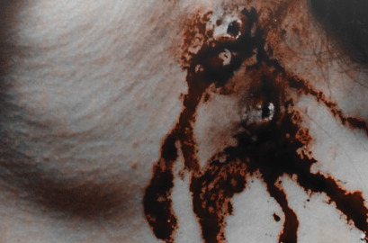
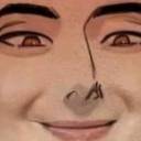
#reddish psd
Photo
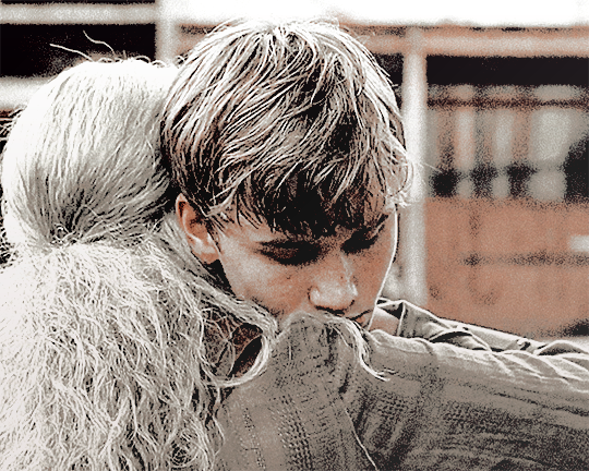
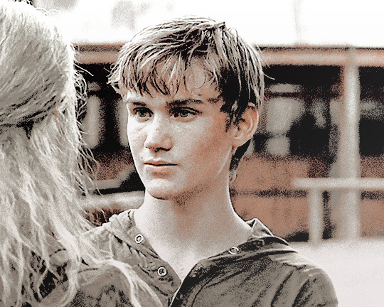
I CALL IT: “SEPH WOULD COLOR BEN’S HAIR BUT SHE’S LAZY”.
#tru facts my fc has like reddish brown hair#which turns red under most psds#but in his role in twd#they bleached his hair so he'd be blond....#and its my bane
1 note
·
View note
Text


ೄྀ࿐ ˊˎ- GENDERANCiENT : a gender system that feels related to a long forgotten era.
interpretations could include feeling like your gender originated long long ago or is of unknown/indiscernible/incredible age, feeling like your gender can only be understood with long forgotten ancient knowledge, or feeling like your gender feels foreign in the sense that it belong to a forgotten era.
this gender system may also be interpreted as a stand-alone gender.
⎯ ✶ coined by The Wayfarer : requested by no one .
⎯ ✶ to - do list : godancient , natureancient , skyancient , starancient , ruinancient
⎯ ✶ coined by others : nightancient , also ancientalien
PSD and PNG file link : ✶
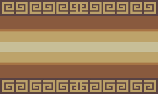
[ Flag ID 1: a flag with 9 stripes of uneven thickness in a gradient going from dark grey at the top and bottom to a light grey at the center. the flag is bordered at the top and bottom by blocky spiral shapes that intersect and create a more complicated symbol in the middle. ]
[ Flag ID 2: a flag with 9 stripes of uneven thickness in a gradient going from reddish grey-brown at the top and bottom to a grey-yellow at the center. the flag is bordered at the top and bottom by blocky spiral shapes that intersect and create a more complicated symbol in the middle. ]
[ Flag ID 3: identical to the first flag. ]
#⎯ ✶ starlight#genderancient#mogai#mogai term#mogai blog#mogai coining#mogai flag#xenogender#xenogender blog#xenogender coining#xenogender flag#liom#liom term#liom blog#liom coining#liom flag
327 notes
·
View notes
Text
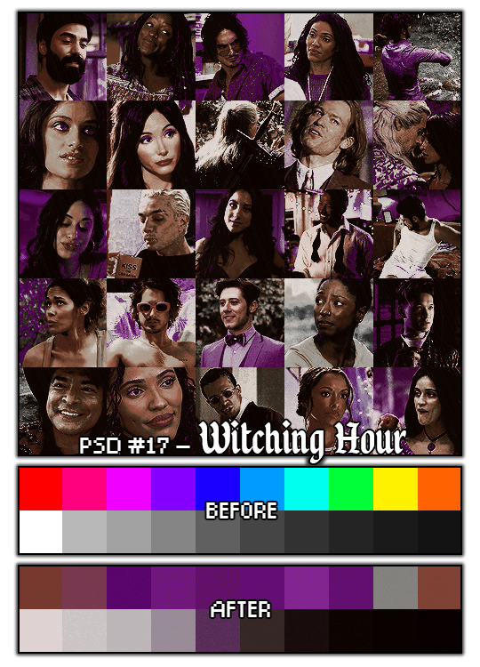
PSD #16 - Witching Hour
BY ROBSOURCES/ROBINKLOCKSLEY
Witching Hour is the third in my ongoing series of Halloween themed PSDs. Inspired by witches and witchy things, this PSD changes most colours to deep purple (great band btw)s and the rest into muted reddish greys. A PSD perfect for all your witchy need.
TERMS:
🌘 Don't claim as your own
🌘 Don't reupload (this includes in promo templates if you haven't asked)
🌘 Credit's appreciated but not necessary!
🌘 Please fave this on deviantart, or reblog this post if you use.
DOWNLOAD: DA, DB (FREE)
#psd#rp psd#rp icon psd#rp psd coloring#icon psd#poc friendly psd#photoshop psd#photoshop resources#muted psd#mutedpsd#purple psd#purplepsd#red psd#redpsd#monochrome psd#monochromepsd#my psd
41 notes
·
View notes
Text

# PULL THE SIREN : this psd coloring is a high-contrast coloring, featuring a reddish-orange gradient. adjustment layers are included. please make sure to credit me if you use it!
PRICE : FREE.
11 notes
·
View notes
Photo
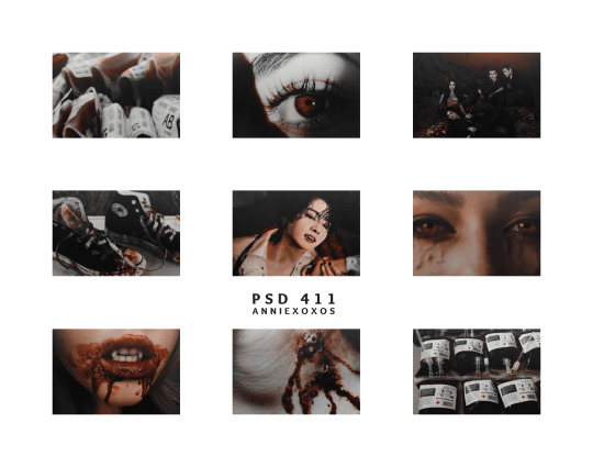
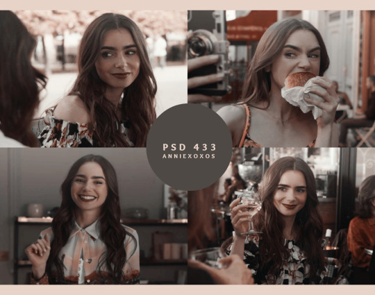
psd coloring : 𝐏𝐒𝐃 𝟒𝟏𝟏 : 𝐕𝐀𝐌𝐏𝐈𝐑𝐈𝐂
a premium/free psd coloring for my tip jar/subscribers only on deviantart, might not work on all colors the same. this psd changes blue related colors into reddish color. it will likely whitewash. this psd have not been poc tested, so use accordingly/adjust layers if using on poc
PRICE : free for my tip jar/subscribers on deviantart ( if you don’t have deviantart, hmu and i can send you my ko-fi you can donate on and ill send you the psd after it ! )
https://www.deviantart.com/anniexoxos/art/psd-411-vampiric-947794200
#vampire#vampire psd#vampire psd coloring#psd coloring#vampiric#psd colorings#psd commissions#psd resources#photoshop#photoshop resources#roleplay resources#rp resources#psd#psds#icon psd#roleplay psd#rp psd
69 notes
·
View notes
Text
B115// IT GOES WITH EVERYTHING. an icon psd .
this psd will be free to download in one week time (by July 29th). for the time being it's under a payhip wall. this psd turns most colors into a monochrome pink/reddish tint.
remember to reblog if you save/use. credit has to be visible on your carrd/doc if you use. (reblog, not like. please.) it was made to be a pinpost image but can be used as a promo or header. whatever you like.
consider donating through paypal or buy me a coffee through ko-fi.it truly helps me a lot. i am currently in the need of some cash so if you can spare a dollar, that would be great! if not, please just spread the art!
this psd is FREE (TBA) or 5 DOLLARS VIA PAYHIP. if you only use one panel, still has to credit me. i'm specially in need of cash this month, so any donations count, please!
can be found on DEVIANART (tba).
#icon psd#rp psd#psds#coloring psd#rp resources#roleplay resources#( cali psds. )#if you want it for free you can wait a week!#for now it's on a paywall
14 notes
·
View notes
Photo
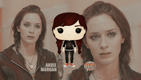
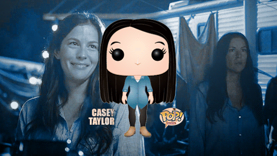

O C H A L L O W E E N C H A L L E N G E 2 0 2 2
everything else / day twenty-eight: hyperfixation cures the depression
↳ oc’s as pop vinyls - stolen from inspired by @hiddenqveendom
colouring: blue one is psd 18 (youth) by everlastinglights & reddish one is psd 171 by @urbanflowergraphic
taglist: @jemmalynette, @allaboutocs, @ochub, @arrthurpendragon, @ocappreciationtag, @oc-challenges
#ohc2022#oc halloween challenge 2022#funko pops!#my oc: andie morgan#my oc: casey taylor#my oc: jordyn emery
14 notes
·
View notes
Note
spare coloring tutorial for your colorful sandman gifs? they're stunning! 💜💫
hi! tank you so much!!!!!
so to be honest i dont remember exactly how i edited each of them because i usually color every gif from scratch. sometimes i save as psd but sadly i didnt this time.
but i tried to replicate the one i liked the most and is almost the same way i edited the rest of that gifset, maybe with just some things more or less. i hope it helps!
first, this is the first frame with the brightness and contrast adjusted w a levels layer

then layer > new fill layer > rainbow gradient
next i adjusted the layer to saturation and adjusted the fill to 17%

and now it looks like this:

i like this method because makes every color pop, even if it was ALMOST gray, you will see a color and its so much easier to use selective color after.
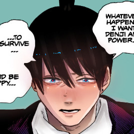
next usually i would need to adjust the screencaps a little with color balance UNDER the gradient layer. adjust to fit the kind of coloring you have in mind like for example this gif

i needed to adjust the color balance to be more reddish so i could be able to adjust the color of the floor because otherwise i woud not be able to, since this scene was too blue and if i adjusted the blue i changed everything.
but here i didnt think it was necessary.
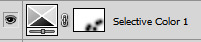
next is just playing around with selective color, the best part imo. and chose the colors you want to make more vibrant ou change the tone etc.
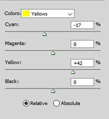
in this gif the main colors are red, a bit of magenta, yellow and blue so i played with those


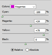
just play around and add as many layers as you want. i used one more to adjust the yellow and add a little more contrast adjusting the black


now see how it affected his hands? i used clipping mask to erase the layer that adjusted the reds on his hands

eh, its still doesnt look perfect but i didnt mind much
i added one more selective color layer to adjust the magenta a little bit to kind of make up for the red parts i erased and also adjusted cyan


add a little bit of vibrance just to make a little more vibrant, why not

anddd its done!
thats usually the way i go. levels > gradient layer (or vibrance layer) > color balance UNDER the gradient/vibrance layer > play with color balance > a little more of vibrance
let me know if i helped! if you have any more questions feel free to ask. if you’re interested i can also share the psd (since now i remembered to save lol)
26 notes
·
View notes
Note
Thank you so much for your help! The tutorials are so useful! I managed to follow so many new blogs too. I have one more question sorry to bother! Would you say PSDs are important to the coloring process too? Or is it more about the technique and colors that you choose?
of course! you're not bothering me at all, i'm always happy to help <3
hmm, for me personally, psds are very important for my coloring process. i have a standard psd that i use for all my colorings, and i color while the psd is active. of course sometimes i can't get the color quite the way i want due to the psd, and that's when i create a layer on top of the psd and color that way, so that i can get the exact color i want. this is when i usually do shading or highlighting, so that i can freely use the exact colors i want, without the psd changing the tone. but i think the techniques you use and the colors you choose are the most important part of coloring. after all, the psd is only there to enhance your coloring that already exists. if the techniques and colors are not that well-done, then there's only so much the psd can do. you can always try another psd, or even apply more psd after the coloring is done. you can always play with how the colors look, you can make it more vibrant, more pale, more reddish, more yellowish, etc! but i think what's truly important is using the right color tones and the way you apply them (technique). i deeefinitely recommend using a psd though. it really, really helps with the coloring. in fact, sometimes when i remove the psd and look at my coloring, i get scared how it looks without it 🤣😭
for example, here is the comparison between my aki coloring without psd and with psd (and a few more tweaks):
9 notes
·
View notes
Note
love love love! you're work, could i be cheeky and ask you what psd you used for these, i've been hunting high and low for a well done reddish psd & keep finding nothing works on emily, until today! post/689677446410289152/emily-alyn-lind-gif-pack-by-clicking-here-you-will
i don't know how i didn't see this but it's a PSD i've had for years so i'm sorry i'm not entirely sure where i got it !! but i'd be happy to send it to you if you dm me <3
5 notes
·
View notes
Text
# VILLAINSPEECH : A PRIVATE AND SELECTIVE RED SON OF THE LEGO MONKIE KID SERIES. PREDOMINANTLY BASED ON THE SHOW ITSELF & INFLUENCED BY HEADCANONS, JOURNEY TO THE WEST, AND OTHER MATERIALS INVOLVING HÓNG HÁI-ER / SHÀNCÁI / SUDHANA. INTERPRETED AND WRITTEN BY SYD. ESTABLISHED APRIL 2023. INFORMATION BELOW.
NOW FOUND @stillgrows
a study in: never measuring up, carrying the weight of filial piety, bearing the loss of something innate, navigating the grey line between the selfishness of villainy and the recklessness of heroism, atoning for mistakes beyond ones control, & fire-forged friendship.

note : i'm on a bit of a semi-hiatus until mid-may due to packing, cleaning, and moving
RULES :
i. i'm syd or plant. 25↑. any pronouns. lesbian. i'm very new to the lmk scene, but i'm not new at all to roleplay... on tumblr or otherwise. this blog is new and therefore uses the beta editor. i tend to delete ooc posts a lot. i'm white, so feel free to correct me if i happen to misstep. i’m also a working adult with a lot of interests and blogs in other rpcs, so this blog is going to be low activity.
ii. this blog is mutuals only, adults only, and highly selective. i’m here to have a good time with friends, although i’m welcoming of new friends as well. multimuse, duplicate, and oc friendly, with my usual selectivity.
iii. i will not send in rules passwords or fill in interest checkers. i always read rules, and if there’s a muse on a multi i do not want to write with i’ll tell you if it ever comes up. roleplay should not be work and i refuse to treat it like it is.
iv. the usual content information: i don't condone harassment, but i also don't want people who identify as proshippers in my space. there are some things that should not be sexualized. that said, there will be very heavy themes and nsfw content at times. i will tag accordingly as topic //. i don't have any triggers that need to be tagged.
v. no godmodding or metagaming as a general rule, although i do often make exceptions with friends in regards to longer threads, ask responses, and drabbles. i play it fast and loose with some stuff but, like… use your brain, please. if we don’t know each other, definitely don’t do it. or just ask. i can be very laid back.
vi. this goes without saying, but i don't own the character or the source material(s). the song in this post is intruder by the glass pyramids. all visuals are from official sources, edited by myself with a psd of my own creation. all interpretations and headcanons are my own.
ABOUT :
name: red son
age: 1,420 / appears to be in his early 20s
species: demon, with celestial blood from his mother explaining his human-like appearance
gender: all of them
pronouns: any / usually defaults to he/him lately
orientation: bisexual, if he has to label
notable features: a scar on his left cheek from when he was a child, very sharp teeth with pronounced upper and lower canines
hair: vivid red, wild when not contained in a high ponytail, and often dancing with flames
skin: medium brown with olive undertones; there is some burn scarring from having the samadhi fire removed, although most are very faint nowadays
eyes: a dark, reddish-brown, with a faint, ember-like glow
height: 5'8" / 172cm
build: lean and toned, bordering on lanky
enneagram: 3w4 sx/sp
body language: when not dramatically posturing, red son tends to appear rather languid: hands in his pockets, leaning against walls and railings, condescending cants of his chin.
disposition: dramatic and short-tempered, red son comes across as exceptionally arrogant and condescending. he can be a difficult one to get along with, with his short fuse flaring up even when trying to be nice.
about: born the first and only child of the demon bull king and princess iron fan, red son seemed to be exceptionally powerful and promising — but the very samadhi fire that had so much promise was the very thing that endangered his own existence and that of the entire world. in order to save the child and the world itself, a ritual was performed to remove it from the child and seal it away forever.
some flames lingered, but the true samadhi fire was lost to him.
while the truth of its connection to him and his violent severance from it was kept a secret from red son — was it out of shame, mother? father? — it wasn't enough to keep him from seeking knowledge: on the subject of the fire, on other ways to prove himself as useful to his parents, on the celestial plane, on their adversaries.
there is more coming but i ran out of energy for now
VERSES :
main verse. this is the verse that encompasses any point throughout the canon timeline, from the pilot on.
pre-canon. this verse tag encompasses anything involving younger red son, including possible aus. while journey to the west will be, in theory, an inspiration, given that red son's plot has nearly completely divorced itself from the character of red boy, i will be playing in this space rather freely.
kingdom hearts. one would think that the world falling to darkness would be ideal for a demon, but that wasn't the case in red son's mind. this darkness was different, and red son found himself lost in the expanse of other worlds. he usually finds himself in the company of organization xiii members, given how their power draws him in — but he has yet to ally himself with any given side as he weighs his options. ( will add and clarify things as this verse is fleshed out. )
KINGDOM HEARTS AFFILIATES :
toast: empxrical
key: bladestormed
astro: solears / obsidianrite / spellwaever / antiaquas
noir: burserks / lordxemnas / undahlia / terranorts
1 note
·
View note
Note
I've always wanted to ask this but have been too scared but i adore the way your gifs look like they have a reddish tint to them! they're slightly darker and have huge reds popping out? can i ask how do you accomplish this?? thnx!
hello, and thanks! so i love that "reddish tint" you're talking about - it really helps my gifs look colorful and over time, i've found a couple of methods that allow the scenes i gif to look bright and color-corrected while not looking over-saturated.
beyond using high quality footage, screencapping properly, and using the sharpening settings that work best for you (all of which i've touched on before here), these are some other things i find help with maintaining a consistent coloring for my gifs:
selective color layers - my saving grace! i set these layers to "absolute" and usually use 2 or 3 per gif. i don't try to go too overboard with these layers but increasing the cyans on "red" helps make the reds/pinks pop out and look Pretty. i also increase the yellows on "orange" to even things out and maintain some balance. i also set neutrals to -10 to make the gif look more even without fully desaturating the colors. selective color layers are a lot of fun to experiment with, and with practice it becomes like second nature to know how each setting will affect your gif based on the coloring. just keep playing with those layers until it looks the way you want it to look!
channel mixer - another saving grace! i've only just recently started using this adjustment layer and have def noticed a difference. like selective coloring, the channel mixer takes a bit of time/practice to understand how it works, but if you practice you'll get a sense of what to use based on the lightning of a scene. i put this layer right below selective coloring and use it if a scene looks too orange/yellow. this is especially helpful when giffing people, because it evens out skintones. again, i don't go too overboard with this layer but try to make small adjustments until the gif looks more even in tone and enhances that red tint without looking ~too~ intense.
vibrance - a vibrance layer set to +50-70 helps lock in the color and make the gif look brighter, along with one or two brightness/contrast and exposure layers. the brightness and exposure settings vary from scene to scene, so just experiment until it looks just bright enough without losing the color and pops of red.
that's honestly everything i can think of! my coloring process isn't too complicated, and like i said i don't rely on a base psd and prefer to color each gif from scratch bc each scene has different lightning/coloring/etc. but these are the general settings i tend to use when trying to achieve that red tint you're referencing.
hope that helps, and please please don't hesitate to send me an ask or reach out if you have any questions/concerns/comments (and please don't feel scared! i genuinely love helping and chatting with people, especially fellow gif makers/creators on this site, and am always happy to help whenever someone needs it) have a wonderful day/night ❤️
3 notes
·
View notes
Note
hi, sorry if this is too much intrusive but i was wondering how you come up with some many different coloring psds? like where do you get inspiration or ideas from?
Hi Kat and don't worry because you can ask me all you need to know and I'll try to help you as much as I can!
My inspiration begins with the photographs that I use as preview to show my colorings psds. Usually don't have a fixed idea in my mind, I just check the websites that I usually use (pexels and unspash) because it makes easier my work, because they usually show it some pics where the same colours appear on it and that's when I start to make a preview with some photographs where they fit the same colours and if I don't find them, when I see a photograph that I like, I just analyze the colours who appears in that photograph and then I look for other photographs that contain those same colours (or colour, everything depends of the simple or complicated that you want to make your psds. Usually, to the people who are starting to create colorings, I would recommend that you start choosing a single colour such as blue that is usually predominant in most photographs and could serve you anyone where the blue of the sky appeared, some clothes, the sea, some eyes, etc, to play with that colour and see all the chances of colours you could do… And then, when you learn how to do a basic coloring psd or you have more knowledge about the editing process, I would recommend that you start playing with two, three or four colours, such as green and blue)
Once I've my preview made it with the sample pics and I've choosed what colours changes I want to do, I just start playing with the tools in Photoshop (the base colours, the lights and shadows, etc): of course my mood influences this process because there are days that I've more cheerful mood and I want to experiment with vibrant colours, so I usually play with reddish colours because it offers me the possibility of changing them to yellow, rose or orange (for example) and others I'm somewhat discouraged and I tend to make it darker/neutral colorings where I make coloring changes to black, gray or purple. For me the key would be a mix between photography (choose a theme, I mean, a specific colour or colours) and your mood at that time that you're making it, but that is what works for me and "inspire" me because I'm someone who responds pretty well to visual stimuli, but I also know that there are people who are inspired listening to songs or podcast, watching videogame videos or makeup tutorials (or websites where it's selling skincare products! for me were also a quite crazy ideas but then, analyzing it, made more sense due I noticed that in the end all these industries they have in common that, among other things, they are also working with visual stimuli -colours- to make their products more attractive), watching photoshoots of their favorites models/celebrities or just watching series/movies/anime. I also confess you that there are days that I broken the "rules", I choose the difficult path choosing photographs where appear very different colours and I fight with photoshop trying to make a lot of colours changes or highlights of colours at the same time and sometimes the experiment works, and others don't works, and I've to erase the coloring psd and start again or rule out my preview images xD although in the end, that's how you learn something, doing practices and make mistakes.
I hope this helps!
0 notes
Text
Affinity photo youtube

Affinity photo youtube for mac#
It’s full of cracking videos (currently over 170) covering the basics of photo manipulation, through to more in-depth tutorials for creating full. If you’re looking to master the art of photo manipulation in Affinity Photo on an iPad, then Bethany Acorn’s YouTube Channel is a must-watch. That is with powerful burn-up, clone patch, patch, dodge, blemish along with reddish eye gear. Affinity Photo image manipulation on an iPad Pro.
Affinity photo youtube for mac#
Affinity Photo Crack download also is for Mac features an entire retouching software library. The tool helps you edit and retouch pictures, create multi-layered full-blown compositions, and get loads more stuff done. Anyway, it’s possible to easily fix and enhance pictures with curves, levels, white and black, white balance, shadows, HSL, high lights as well as countless additional harmful modification tools. Affinity Photo is a professional image editing software comprising a large tool-set specifically designed for photography and creative professionals. This system allows one to utilize color spaces like RGB, CMYK, LAB, grayscale, and lots more. Ezra Anderson Affinity Photo YouTube Tutorials, After enrolling on the page, you will have access to every Affinity Photo video that we have on YouTube. Affinity Photo let me open a PSD file from Photoshop, and I found it easy to select, resize, and move a text box, but not actually edit the text. If you’re taking care of a new logo or perhaps an image endeavor. Affinity Photo Torrent is also a really useful graphic style and vector file endeavor PC software.
0 notes
Photo


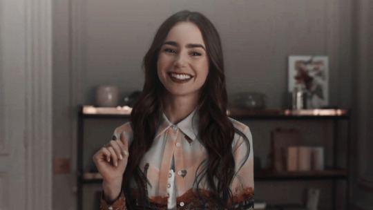
psd coloring : 𝐏𝐒𝐃 𝟒𝟑𝟑 : 𝐄𝐌𝐈𝐋𝐘 𝐈𝐍 𝐏𝐀𝐑𝐈𝐒
a free psd coloring for my tip jar/subscribers i made & spend my time on on my deviantart ! feel free to adjust layers if you want to. just keep the credit to me still ! it might not work on all colors the same. this psd changes green related colors into soft pink ish (depending on how strong the green colors are) might also change some cyans and blues. this psd also changes some pink/magenta colors more reddish. comes with some adjustments !
PRICE : none. only for my tip jar/subscribers ( if you don’t have deviantart/hmu and i can send you my ko-fi you can donate on and ill send you the psd after it ! )
https://www.deviantart.com/anniexoxos/art/psd-433-emily-in-paris-955329687
#emily cooper#emily in paris#emily in paris psd#psd#psds#psd coloring#psd colorings#lily collins#psd resources#photoshop resources#photoshop#roleplay psd#icon psd#psd filter#filter#filters#coloring#colorings#roleplay resources#resources
44 notes
·
View notes
Text
Does anyone know how to get the reddish tint from literal hell out off underworld arc gifs? I want to use the same psd in a set with non-underworld gifs but is there a way to slightly adjust the colouring?
0 notes
Last Seen Blogs
dovithedarklord
Ahahahaaahhaaaaaa....
doctorgoodnight
Long may she reign
dovithedarklord
Ahahahaaahhaaaaaa....
ravangie
Ravangie
veszt10
IsmeretlenLány