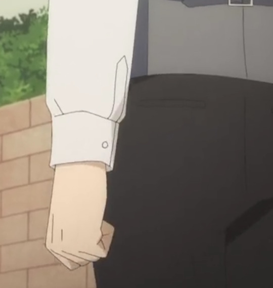
#takei katsuhiro
Text
Happy Birthday

Katsuhiro Takei (8th August)
Fugou Keiji Balance: Unlimited
#fugou keiji balance: unlimited#fugou keiji balance unlimited#fugou keiji#fugou keiji katsuhiro#fugou keiji takei#fkb:u#fkbu#fkbu katsuhiro#fkbu takei#the millionaire detective balance: unlimited#the millionaire detective balance unlimited#the millionaire detective#balance: unlimited#balance unlimited#katsuhiro#takei#katsuhiro takei#takei katsuhiro#fictional birthday#august#august 8th
4 notes
·
View notes
Text
What about character design in Tristamp?
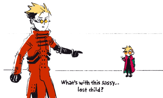
A person had a question for me, what is it about character designs in tristamp? It's like Vash from Tristamp and Vash from Trimax/98 adaptation are COMPLETELY different characters, and my answer to that is: they are REALLY DIFFERENT CHARACTERS, and I'll explain why right now.

To begin with, I would like to note that I have a great deal of trust in the Orange studio and its co-founder, Eiji Inomoto. Orange is one of the best CG studios in Japan, known for such acclaimed adaptations as "Beastars" and "Land of the Lustrous". These are not just some studio, but a really big guys, and by big I mean that Inomoto's experiments with the frame rate in the film adaptation of Lustrous at one time were a revolutionary thing in animation, which was picked up by the animators of the spiderverse and then that's all led to the beloved dynamic animation of the "Puss in Boots" sequel. I mean, these are THAT big guys. I'm not talking about the fact that Inomoto boosts the development of 3D in the anime industry as much as possible and literally shits from a high bell tower on the fact that everything is spitting with 3D animation purely out of principle.
Okay, the studio is cool, it is unlikely that they will make a bad product, we figured it out, but what about the designs? They don't even look like themselves! Vash does not look like a mop at all, he has lost his leather pants and berets, and looks like some kind of sucker in sweatpants and a windbreaker, and Meryl gives the impression of a schoolgirl who has strayed from the school excursion, instead of the stately lady in caprons, as we used to seeing her. Only Wolfwood hasn't changed much, except that he doesn't know how to tuck his shirt into his pants and has undergone whitewashing (which, by the way, I'm not ironically upset about). So, is that mean designs is bad as hell? Nope. Just because things look different doesn't mean it's inherently worse. Again, remember that tristamp is a REMAKE, and their task is not to stupidly repeat the same thing, but to breathe new life into the franchise, looking at it from a different angle. And I think they did a FUCKING GOOD job on it.
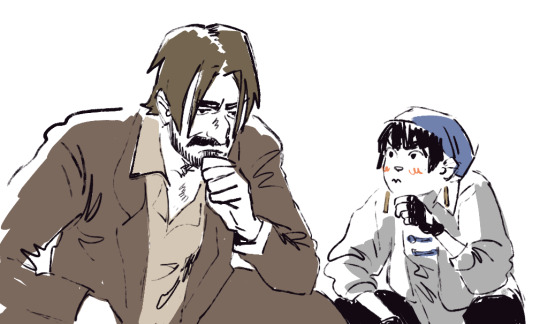
In interviews and at conventions, director Kenji Muto and producer Katsuhiro Takei have repeatedly said that they are big fans of the original manga and the film adaptation of 98, but it was important for them to touch and reveal those aspects of the story that their predecessors did not reach their hands on.
That is why, despite the fact that the Tristamp is very close to the original source (manga), the studio plays out many details differently or even saves them for later, so that the audience can fully experience the development of the characters. Therefore, in Tristamp, everyone looks much younger than their previous versions and / or very different from them.

The easiest way to prove this, however strange and unexpected it may seem, is by the example of Meryl. In the manga and anime 98, we immediately see her as a stately lady with a bunch of derringers under her cloak, but they don’t tell us how she came to this and what led to this. Yes, there is literally a page in the manga about some colleague who told her about self-defense and sort of taught her how to shoot, but finally he is drawn on one frame and, in general, we don’t give a shit about him.
While in Tristamp, this colleague has a name and is one of the most main characters - this is Roberto. Throughout the series, he acts as Meryl's senior mentor, protecting her whenever possible and pulling her out of trouble by the scruff of the neck like a kitten. That is why she looks so youthful and charmingly stupid compared to her previous version. Throughout the series, she literally hits herself with her heel in the chest, saying I AM!!! MERYL!!! STRIFE!!! I AM NOT NEWBIE!!! while Roberto calls her the same way, ignoring all her protests in this regard, and I think this was done for a reason. Specifically, in Tristamp we see her almost in the past, when she has not yet learned to protect herself and be fully responsible for her decisions, although she is very eager to do so. Although Roberto is a character, for the most part he is still a crutch and trigger for the development of Meryl. Through his death and the transfer of HIS gun to her, we see right before our eyes how she changes and from a shy "newbie" turns into the confident Meryl Strife. And after the timeskip, they generally show us the scene of exactly how she becomes the senior and takes Millie under her wing. And by the way, her image visually changes too.

I repeat once again, there was no such development of the character of Meryl in the manga, in the 1998 film adaptation nether.
Orange build her development completely differently and in their own way, despite the fact that she, in fact, is the same Meryl Strife no less than other versions of her. She just a little different character, which goes to the image already familiar to us, passing through kind of other events

The same thing happens with Vash! At first, he doesn't look like himself at all, but towards the end, we see how he takes on a more recognizable image. I think that in fact by the second season they will all mature and look much more "canonical", this can be seen from the concept art but in general


Tristump characters go a different way and get a different development, as happened with Meryl above, therefore, I I think we should perceive them rather as completely different characters that have common roots
And by the way, the studio Orange discussed everything very closely with Yasuhiro Nightou (author of the manga) and he gave her green light and creative freedom, because he saw how reverent people are about their job and want to develop the story. He even drew his and studio designs together!!!

All in all, the tristamp designs are really quite different from the original, but I don't think that's a bad thing, as the studio does it purposefully and cleverly to give them the development that the manga or the '98 film adaptation lacked.
Again, this is my personal opinion, and it’s worth notice here that I’m far from being an old fan and I flew into the fandom just a month and a half ago, so the character design initially did not cause me rejection, like many old fans.
But in this tirade, I tried to be as objective as possible and describe what was what, thanks to come in my ted talk
#trigun#tristamp#trigun stampede#long reads#long post#i love meryl stryfe if you dont get it yet#meryl stryfe#roberto trigun#vash stampede#nicholas d wolfwood#lno-x talks
893 notes
·
View notes
Text
Sakuracon 2023: Studio Orange Interview
(I just learned that Japan-A-Radio has ceased operations so the interview with the director and producers of Trigun Stampede is no longer in their website. It has a lot of interesting information about Trigun Stampede so I'm reposting it here.)
Submitted by djcruzmissile on Sun, 04/16/2023 - 01:22
Sakuracon 2023 – Studio Orange Interview
By Jun Hong Pua, Sean Cruz, Matthew Fu & Lisa Su
Transcribed by Jun Hong Pua
Edited by Sean Cruz
Japan-A-Radio was part of a round table interview with Director Kenji Muto, and Producers Waki Kiyotaka & Yoshihiro Watanabe, members of Studio Orange, the team behind Trigun Stampede, to round out Sakuracon 2023 Sunday Afternoon. Producer Yoshihiro Watanabe started off with a brief introduction.
Yoshihiro Watanabe (W): I mainly do the distribution or strategic side of Trigun. Kiyotaka and I are from Studio Orange but Muto is a freelancer so he's only tied to our studio on a project basis.
I know it's been five years in the making, but why Trigun again?
Waki Kiyotaka (K): There are two big reasons why we chose to work on Trigun Stampede this time around. The first big reason would be that we were actually contacted by the producer, Katsuhiro Takei, who is a big fan of the original Trigun anime, and he'd always wanted to work on another anime version of Trigun.
The second reason is that we had the opportunity to employ Muto as the director. He had previously worked on the Land of the Lustrous, on both the storyboards and the animation direction. For storyboards, he did episode seven. For episode direction, he did episode ten. And so, we knew from working with him that he was able to do both action scenes and really good "feeling scenes": scenes where the feelings were really communicated well to the audience. We thought that he could do something really good with this project. And so that's why we chose to make Trigun Stampede and to do it with him as the director.
Kenji Muto (M): In my case, from the creative side, it's more of an ideological thing. When I started reading the Trigun manga by Nightow-sensei, I felt that it had many themes that were very unique and universal.
For example, there are inter-species interactions, the issues of migration, and a sci-fi approach to westerns. There's many core themes that I thought were very interesting.
How much involvement did Nightow-sensei have in the production of the show? You mentioned in your panel earlier that he just gave a green light and said to just have fun. Can you elaborate further?
K: It started with Nightow-sensei, myself, the director Muto, and also producer Takei. So four people altogether, just talking to each other for quite a long time. We heard from Nightow-sensei about what kind of a person he is, what he was thinking about when he was creating Trigun, and what he wanted to cover in that story. And that's where we started. Building on that, we moved on to the concept stage. We had two main staff members working on that.
We had Kouji Tajima, who worked on the concept art, and Takehiko Oshiki, who worked on the setup, writing the text that would describe the overall concepts of the world. Oshiki-san is a huge Trigun fan, a fan of the original anime and the manga. And so, he gathered together for us a bunch of design documents, set up documents, describing the themes that were covered in the original manga, and also the themes that were hinted at, but not really ever explored. Then, bas0kind of a world text that he had pulled together and written for us, Tajima-san started creating concept art. His goal was to create concept art that would show the overall feel of this world and help us with world building, to envision what.d on to the planet is, and he took over a year working on all the concept art.
During all of these conceptual design parts, we were continually checking in with Nightow-sensei. So, even before the usual pre-production process, we're showing him the setup text and the concept art, and he gave the okay to all of that. After being deeply involved in the concept design, he told us, "Everything, from here on out, the scripts, the character designs and so forth, the regular stuff of pre-production, you can do as you wish. That's because I'm confident now that you fully understand where you're going with this, and I've signed off on all the pre-pre-production concept designs that you've done."
It's not like he gave us completely free rein to do whatever we wanted. However, because we had actually that much deep, intense collaboration at the very start, he thought that we knew where we were going with this, and he's also good with where we chose to take this.
M: Usually, when you're adapting a book, a manga, to anime, you'd just be facing the book itself. But, in my case, I really wanted to face the person who created it first.
I'm actually really glad director Muto can be here, because he wasn't at Anime Expo, right? There was a video shown of him drinking alone on the roof.
W: (Laughs) We were still in production, so…
M: Ah, thank you so much.
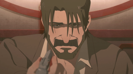
So my question is actually about voice direction for Millions Knives. There's the scene where he is rejected by Vash, and he sounds very pained. This is an emotional attack; the physical ones don't really hurt him. What kind of care did he take to direct Junya Ikeda during that scene?
M: One of the first things I wanted to show, as a director, was that Knives is an actual being; a person. I mean, he's not a human, but as a person, he's not just a simple villain. That's why we're all focused on it.
At first, when we started the project in recording, on Ikeda-san’s side, he still didn't have the amount of information that we have on our side. He couldn't fully grasp his character, so there are times that he acted as a villain. At those times, I talk with him and say, "That's not the type of direction that I want for portraying Knives." As we worked together longer and longer, he was able to grasp more of the Knives that we wanted to depict. So yeah, Knives is not a bit; he is one of the main characters.
My relationship with Ikeda-san started out from episode three, where he first appeared, and kept on track ever since then. And, I think it's because of all the resolve and communication, that we were able to achieve what we were able to achieve in episode nine.
I noticed some similarities of the designs of plants with the designs of Avatar's Na'vi. And, a desert planet and worms, of course, brings to mind Dune. How much of these and other western influences got into the production?
M: I actually grew up in Chicago, when I was really young. That was the only time I spent in Chicago though. Having grown up there, I was influenced by a lot of shows, such as Ninja Turtles, Knight Rider, and White Wolf. I have a lot of respect for western culture. I tell myself, these two cultures don't really have a barrier. I treat them equally.
As a filmmaker, I have respect for Quentin Tarantino. So, it's probably not intentional, but I think his influence is very strong.
That's quite interesting, because Quentin Tarantino is about ultra-violence, while Vash is about anti-violence.
M: (Laughs)
When we are introduced to Millions Knives, we literally see a million knives, in comparison to the original series, which didn't do that. How did you come to decide on that being Knives' introduction? Just to say the animation for that sequence is, it has a feeling of being overwhelmed and a little grotesque, because of how many knives you see. So why did you decide to go in that direction?
M: Thinking of how to answer that question is a little difficult, because at the time when we were figuring out how that scene would end up, we didn't really think of that as grotesque. I've never actually thought of it that way before. At the time, we were thinking about how we wanted to portray Knives as a character? What is Knives thinking? What is he trying to do?
And really, what is inside of his head if he's only thinking about Vash and the plants. He's not thinking about humans at all, or if he is, they're on the same scale as bugs to him. So, if they're in his way, he's just going to exterminate them. He's not really thinking any more deeply about any humans than that. So yeah, that's the first time that it has actually occurred to us that it might come across that way.
Sorry, just to make a correction in terms of the grotesqueness, it's just that there's so many knives. And now that he said, it's like him squashing bugs, it makes sense. And it looks more like a cyclone or a hurricane. It was in a very circular motion, and you see all of the knives.
M: When I really think about the characters, I always think about contrast, and in this case, the contrast between Vash and Knives. I think it was out of necessity to create that contrast that Knives came out like that. Also, with the name Millions Knives, millions of knives is the reason why Knives named himself that in the manga. I was thinking about how to visualize that, and that's the answer we have.
In the case of designing him, Knives had an incident with a girl named Tesla. You can see fragments of that in episode ten. So, when you see Tesla, you see her as an eyeball, which formed a very important, strong impression. If you look at his knife at the time, there's actually an eyeball on his knife as well. That image is very strong within him. So one thing about the inspiration is that, instead of a typhoon, it's actually more eye-shaped. That's not a clear image, but more of a subconscious image from within him.
And so, for the entire layout of that entire scene, there's the city of humans called Jeneora Rock, and the eye of Tesla is looking down the Rock.
You mentioned about designing Knives, that one of the design criteria is the contrast. The original design of Knives wasn't as contrasting to Vash. And, the new Knives design feels more organic, compared to the mechanical, man-made feel of Vash's design. Can you elaborate more on how you redesigned Knives?
M: One of the things about the costume that I wanted to do, was that I did not want Knives to wear anything made by humans as much as possible. So actually, his robe is made out of knives, and his inner body suit is from the space era. In contrast, Vash, everything he wears was made by humans.
Also, for the technological contrast in the world, there's lost technology, and there's scrap parts. So things that are made out of scrap parts have certain colors used to it, and things made out of lost technology have a different tone and color to it. The tone and color adds to the contrast as well.
I think the original Vash had scrap parts rather than lost technology.
M: The reason that Vash's arm is lost technology is that Vash's entire fashion is actually designed based on one concept: That of his relationship with humans. And, his relationship with humans is very strong with people originally from Seeds. People like Rem. There are two groups of people. One group is those that are closely related to Seeds. His fashion is basically based on that. And that's what led to the change. All the designs of the fashion that they wore, it's not just a stylistic choice. It's a visualization of their identity.
So is it a contrast between not just two, but three factions, like the Seeds humans, the scrap humans and the plants?
M: Yes, those are the three elements. I think Vash has strong ties with all of them, but the strongest is with Rem, and whatever Rem is a part of, which was Seeds.
I have a question for Watanabe-san. You're very active on Twitter. You're engaging with fans and sharing the story of Trigun. How careful do you have to be to not accidentally spoil anything and especially with the final phase coming up?
W: For Trigun, we did work closely and carefully with how the information is revealed. We can't control everything because we're just the production studio (Anime is a global distribution involving many languages). And there's distribution, and different partners. And this means that we couldn't talk with everyone at the same time. We talk domestically, with domestic partners, and through them, to the international distributors.
We try to make sure that we use specific languages. So for example, July/JuLai, how July/JuLai was revealed in Japanese was that it's always phonetically described in Katakana as well. We'd never really revealed the kanji, the Chinese letters, of July/JuLai until later, but we knew that subtitles do not work like that. So that's why for subtitles, promotional written material, and the written letters shown in the series, we designed it so that people will see different types of July/JuLai at first, and they might not associate it as other people with keener senses might, but in the end, everything comes to people who notice that.
The reason that I actually do a lot of Twitter is that it's more appealing to communicate. I think it's a communication to the fans. And anime is definitely a global market. And as an anime studio in Japan, we have a heavy focus on the Japanese market. However, I myself am originally from California, that's where I grew up actually, and my career began from being a staff at an Anime Expo as a volunteer.
I feel that community is a very important part of the anime market. It's not just about the money, it is really about the passion. And it takes the passion of the fans and passion of the creators. They're different, but the energy is something that's really important to be reassuring.
About making mistakes, I actually make a lot of mistakes. (Laughs) Not the information I tweet about, but I actually do typos and actually tweet wrongfully-written tweets a lot. I delete them immediately. (Laughs)
I do want to ask about representing Studio Orange. I want to say, compared to some of the other production studios, it's more transparent. The panels you had in Anime Expo, here at Sakura-con, and I think at other American conventions. Why is it so important for Studio Orange to be so transparent to fans?
W: So this is something that happened when I joined Orange five years ago. Something I talked to Waki-san about was that I have a lot of inspirations on how anime can be enjoyed or how anime communities can be built be extended, but I couldn't act on them at the previous studios I'd been at. I was actually looking for somewhere I could be comfortable doing so. And Orange was that somewhere. He gave me the liberty to do these kinds of things.
And as we discuss daily about how we should spread Orange, how not just as a company, a brand, or even choosing projects, we really think it's important to communicate. I mean, for communication, in the company, I am the only English public speaker. There's a few other English speakers, but they're not public speakers. So, I can't really respond to everything, but I try to communicate at least. I look at a lot of people's responses and I can't reply to each of them, but as a sum, I try to respond to the people's reactions.
One of the things that is not really highlighted on your Orange Presents panels, but that I really enjoy, is the music direction of your TV shows. From the Land of the Lustrous, Beastars, and Trigun Stampede, the soundtrack and the use of the soundtrack at the correct point of the show is brilliant. Can you provide some insight into how the music direction is done?
K: When we are creating an animation at Studio Orange, we use a technique called film scoring. Although we don't use it completely, we use what we call half film scoring. That's where we have the music first, and then we adjust the imagery to match the music and the scene. Because we're doing it in that order, we find that we're actually able to produce better results. We found that more emotion is communicated by both the music and the imagery matching each other. And because we do it in that order, we really allow the people who are composing the music to have a lot of control over the emotions in the scene, so they're really motivated to produce amazing music for us. I think that's probably why we get complimented on the music in the works that we've done.
M: As Waki-san said, I feel that it's really important about establishing relationships with composers. I can only speak for the case of Trigun, of course, but for not just the composer, but for the audio team, the mixer, the sound effects team, I was actually responsible as a sound director to direct all those people as well. Basically the relationship and passion that everyone feels is very much reflected onto the quality. And I've spent time making sure that the groove is there.
In the manga, Knives actually plays the piano, just for a few frames, but that left a strong impression on me. So, I put a lot of thought on how that can be put into this anime. That became one of the things that I focused on.
I really care for the beats per minute, the rhythm, the tempo. Those are the things where we put a lot of thought into, and I got a lot of references for the music team. I've said it in a couple other interviews as well, but when I am writing the storyboard, there's already music playing in the background, and it's my job to figure out how to convey that music to the team.
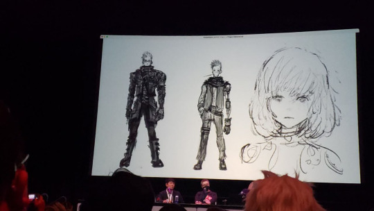
I want to ask about the character concept art by Kouji Tajima. So director Muto was responsible for adapting that concept art into what we see in the anime. Going from the concept art, which is 2D, and then taking it into 3D, there's a little bit of stylistic changes with that. With Vash, he's a little bit bigger than what you see in Tajima's concept art. Much more muscular. And, as you said before, organically built out. Can you talk a little bit about the adaptation of concept art?
K: We think of the concept art as more of just the capturing of an idea as an image, as opposed to setting the actual imagery and laying out the official visuals for the show. Once that idea has been put into concept art and shared with the staff and the director, the director can decide how to interpret that idea and how to carry it forward into the rest of the production. Things that we are looking for in the character concept art would be things such as distinctive silhouettes. We want the silhouettes of each character to actually be distinct from each other so they're more recognizable. Making some characters more muscly and other people less muscly would affect how distinctive their silhouettes are. Also, we think about what extent do we want the expressions of the characters to be actually deforming the CG models that are used. That's something that we would discuss when we move on to the adaptation of concept art?
For concept art, the main purpose is to portray the attractiveness of an idea. And when you develop a design, that design has a different purpose. The purpose could be the storyline, where they come from, where they are going, what they represent. Even though it's within the same drawing, the purpose of each design and concept art is completely different. So that's why there will definitely be a difference.
M: The concept art, it's basically this ball of ideas. From there, we look at what ideas we can distill into, shaping the ideas into a more concrete form.
One of the goals for Trigun, I think you'd mentioned, was to expand the storytelling, the universe, and I think you have effectively succeeded for the first season. However, a lot of the story plotlines were just to the point, where you just briefly touch upon and then move on. I think that there's more than enough material to have a two-cour, or 24-episodes, instead of 12 episodes. Is there a reason why you chose this length?
W: For the first season.
Yeah. And for the second season, is it going to be the same length, or can we expect it to be longer?
W: So just to be clear, we've never used the term second season at this point. This doesn't mean anything. Just to get on record, we've only specifically used the term "Final Phase".
M: The amount of information that's contained in the original manga is massive. And, when you're creating a TV series, the format is first of all different so you can't take that same amount of information and drop it into the animation format. We'd love to, but as the format is completely different, it's not possible. One thing that, as a director, I was aiming for, is that I want people to enjoy this show, in as many ways as possible. So, first of all, as a simple action entertainment people can enjoy, but people also can have the joy of figuring out the world. By having things in there that people can connect the dots to, they will discover an entirely new view in the show, and also people discovering the theme of the show. So, those are different layers I tried to create so that as many people can enjoy. That's the goal that I set and tried to accomplish.
I have a question about visual storytelling. For example, when you see Knives, he's shrouded, and kind of like a hidden figure, more, you know, in terms of the visual storytelling, versus Vash, who is very open, very bright. The humans as well, they're all very brightly colored compared to the plants that are more muted. Can you talk to us a little bit about your metaphoric or visual storytelling style?
M: There's the starting point, the manga, which has concept colors. So, from the starting point, what I want to do is to make sure that we treat those fairly. Coloring-wise, even though we're using that base color of the manga as a foundation, I really put thought into the identity associated with the color as well. So, in this case, you could see that Vash has red and green, very vibrant colors, and those colors are tied very tightly with his identity. In the case of Knives, that is the blue-ish color, which is associated with the plants.
Those colors symbolize a lot of their identity as well. And for example, humans have actually resembled Western, or more to be specific, the space frontiers. So, they're migrants. I'm saying that, but that's the base, and in July, there are more Asian things. So based on that, from the start, the base color theme was already set.
In the case of Nicholas D. Wolfwood, his identity is actually shifting throughout the series, within Stampede. He's fluctuating between Nicholas the Punisher and Nicholas D. Wolfwood. In the manga, he is already established as Nicholas D. Wolfwood, but in Stampede, he is still seeking the answer for his own identity. That fluctuation is actually portrayed within the color of his shirt.
If we're going into specifics, there's going to be so much to talk about. So, I would like to end it there. (Laughs)
We know that there’s going to be like a final season of Beastars, that's going to be a final phase for Trigun. Are we going to see a second season for Land of the Lustrous? Or, do you have any future developments you can share with us?
K: To speak to that, we've shared that we have been developing Trigun Stampede and working on that since about five and a half years ago. We've been working on it that whole time, all five and a half years, but for many of those years we couldn't say anything about it, as it was confidential for a lot of that time that we were working on it. That carries over to the other projects that the studio is working on now.
Of course, we are working on many projects, but we can't say much about them. What we can say here is what we have already shared in the panels at this con. We learned a lot, and developed new tools, while working on Land of the Lustrous, Beastars and Trigun Stampede. As a studio, we want to continually challenge ourselves to achieve better results in certain areas that are difficult for CG to achieve great results. And so once we find a good approach for these difficult areas, we use it going forward and all the works that our studio works on later. So you can expect that we will be using everything that we have learned on those works in our next work going forward as well as looking at new aspects of CG that we want to really pin down and achieve greater results with.
63 notes
·
View notes
Photo

TOHO and CG Studio Orange have announced that they are producing a new anime based on Yasuhiro Nightow's Trigun manga titled “Trigun Stampede” that will debut in 2023. Crunchyroll also announced that it will simulcast the anime upon release "in more than 200 countries and territories around the world."
Crunchyroll will host a panel at Anime Expo on July 2, 2022, which will announce more information about the anime. Guests for the panel will include designer Kouji Tajima (GANTZ:O character artist), Orange producers Kiyotaka Waki (Godzilla Singular Point) and Yoshihiro Watanabe (BEASTARS), and TOHO producer Katsuhiro Takei (your name.).
99 notes
·
View notes
Text

Read More 2024
Eisner Award
A comic book or graphic novel that won or was nominated for the Eisner Award.
Graphic Novels
The Umbrella Academy by Gerard Way
Preacher by Garth Ennis
Monstress by Marjorie M. Liu
Lore Olympus by Rachel Smythe
The Sandman by Neil Gaiman
Tokyo Tarareba Girls by Akiko Higashimura
My Brother's Husband by Gengoroh Tagame
Akira by Katsuhiro Otomo
Batman: the Killing Joke by Alan Moore
Young Adult
A Silent Voice by Yoshitoki Oima
Witch Hat Atelier by Kamome Shirahama
Making Comics by Lynda Barry
The Called Us Enemy by George Takei
Lumberjanes by ND Stevenson
Papergirls by Brian K. Vaughan
Biography
Fun Home by Alison Bechdel
Ducks by Kate Beaton
Non-Fiction
The Essential Calvin and Hobbes by Bill Watterson
Marvel Comics: The Untold Story by Sean Howe
0 notes


Text
Hello World เธอ.ฉัน.โลก.เรา (2019) พากย์ไทย
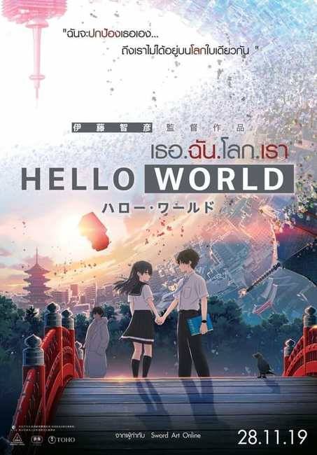
กำกับโดย Tomohiko Itō
บทภาพยนตร์โดย Mado Nozaki
ผลิตโดย Feng Nian / Katsuhiro Takei
นำแสดงโดย Takumi Kitamura / Tōri Matsuzaka / Minami Hamabe
บริษัทผู้ผลิต Graphinica
จัดจำหน่ายโดย Toho
วันที่วางจำหน่าย 11 กันยายน 2019 (เกียวโต) / 20 กันยายน 2019 (ญี่ปุ่น)
ความยาว 98 นาที
ประเทศ ญี่ปุ่น
ภาษา ญี่ปุ่น
บ็อกซ์ออฟฟิศ 25.5 ล้านเหรียญสหรัฐ
ตัวอย่าง
https://www.youtube.com/watch?v=ExGVKEWRR84
ภาพรวม
Hello World (2019) ปี 2027 เมืองเกียวโตมีความก้าวหน้าอย่างมาก ภายในเมืองมีนาโอมิ คาตากากิ คนเก็บตัว และรุริ อิจิเกียว เด็กผู้หญิงที่มีบุคลิกเย็นชา ทั้งสองแบ่งปันความรักในการอ่านหนังสือ แม้จะมีความสนใจคล้ายกัน » ดูหนังทั้งหมด «นาโอมิก็กลัวที่จะเข้าหารูริเนื่องจากนิสัยที่ไม่เป็นมิตรของเธอ อยู่มาวันหนึ่ง ขณะที่นาโอมิออกไปเดินเล่น แสงออโรร่าสีแดงเข้มก็ทะลุผ่านท้องฟ้าครู่หนึ่ง ไม่นา��หลังจากนั้น เขาเห็นอีกาสามขาและชายลึกลับที่เปิดเผยตัวว่าเป็นนาโอมิจากอีก 10 ปีข้างหน้า โดยอธิบายว่าเขามาเพื่อเปลี่ยนเหตุการณ์โศกนาฏกรรมที่เกิดขึ้นกับรูริหลังจากพวกเขาเริ่มออกเดทได้ไม่นาน นาโอมิทำตามคำแนะนำของตัวเองในอนาคตและเริ่มใกล้ชิดกับรูริมากขึ้น โดยตั้งใจจะช่วยเธอ ด้วยความช่วยเหลือจากตัวเองในอนาคต นาโอมิจึงเริ่มเตรียมการเพื่อช่วยรูริ เขาจะสามารถเปลี่ยนอนาคตได้หรือไม่?
Read the full article
0 notes
Text
The moment the firewalls broke

#fkbul#fugou keiji#fugou keiji bul#fugou keiji balance: unlimited#the millionaire detective balance: unlimited#the millionaire detective#suzue kambe#suzue kanbe#haru kato#chosuke nakamoto#takei katsuhiro#shigemaru kambe#heusc#anime#wtf#lowkey done#daisuke kambe#daisuke kanbe
2K notes
·
View notes
Text
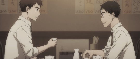


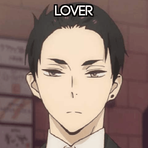
Friends until the end.
#cho san#chosuke nakamoto#takei#takei katsuhiro#fugou keiji#fugou keiji balance: unlimited#fugou keiji spoilers#fkbu#fkbul#my post#thank you both#rest easy
509 notes
·
View notes
Text
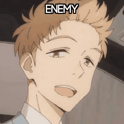
FKBU fans after watching episode 7 and wondering what the actual fUCK is happening now:
#no but srsly I'm hella confused rn#balance unlimited#daisuke kambe#haru katou#daiharu#fugou keiji#the millionaire detective#fkbu#chosuke nakamoto#takei katsuhiro
441 notes
·
View notes
Text
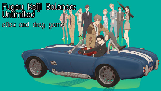


Fugou Keiji Balance: Unlimited click and drag game!
#click and drag game#click and drag#seizure warning#fugou keiji balance: unlimited#fugou keiji#fkbu#daisuke kambe#haru katō#hoshino ryo#kamei shinnosuke#suzue kambe#saeki mahoro#takei katsuhiro#nakamoto chosuke#millionaire detective balance: unlimited#flash warning#flashing image warning
362 notes
·
View notes
Text
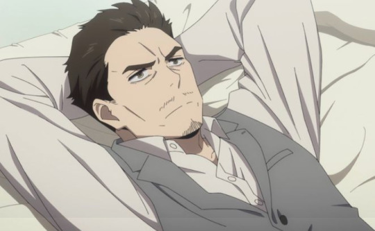
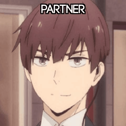
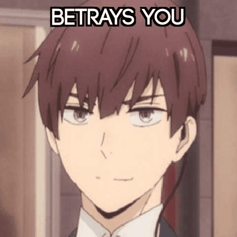
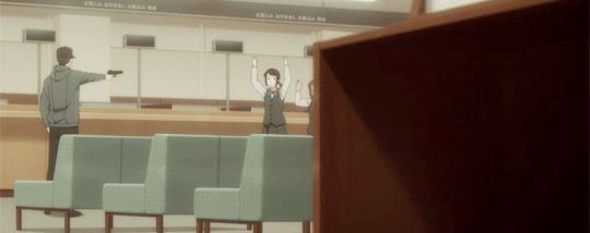
Happy Birthday

Katsuhiro Takei (8th August)
Fugou Keiji Balance: Unlimited
#fugou keiji balance: unlimited#fugou keiji balance unlimited#fkbu#fkb: u#fugou keiji#fugou keiji katsuhiro takei#fugou keiji katsuhiro#fugou keiji takei#fkbu katsuhiro takei#fkbu katsuhiro#fkbu takei#the millionaire detective balance: unlimited#the millionaire detective balance unlimited#the millionaire detective#balance: unlimited#balance unlimited#katsuhiro takei#takei katsuhiro#fictional birthday#august#august 8th
0 notes
Photo
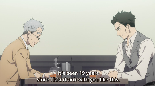


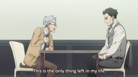


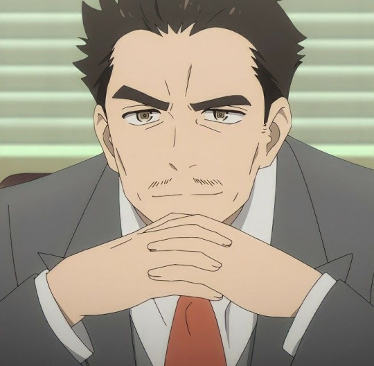
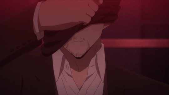
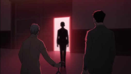
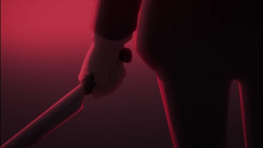
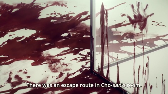
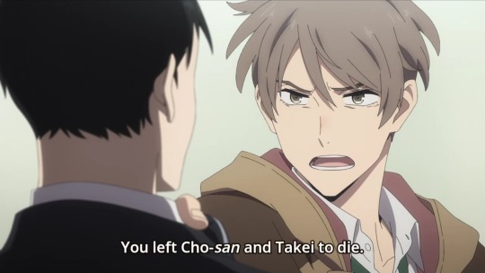
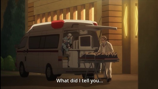
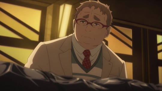
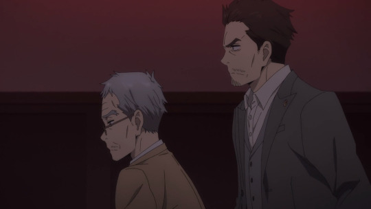
🥺 Episode 08 was... speechless.
What got me the most was Cho-san was prepared... and actually pushed Takei to escape... but Takei in the end choose to face their past to the very end.
And now Haru is overcome with emotions D: poor baby!
On the bright side, we get some almost steamy scene between daisuke and suzue lol and bunch of Haru expressions ;v;
#fugou keiji#fugou keiji balance: unlimited#episode 08#anime#daiharu#daisuke kambe#kanbe daisuke#katou haru#haru kato#fugou keiji haru#fugou keiji daisuke#suzue kambe#fugou keiji suzue#Takei katsuhiro#nakamoto chosuke#fkbu#fkbul
93 notes
·
View notes
Photo


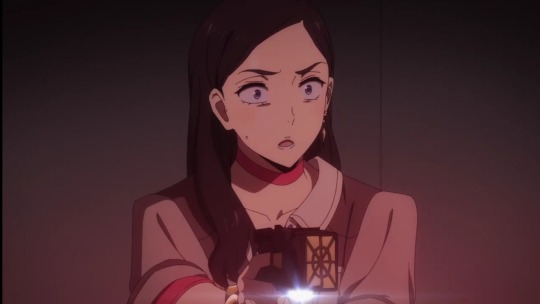
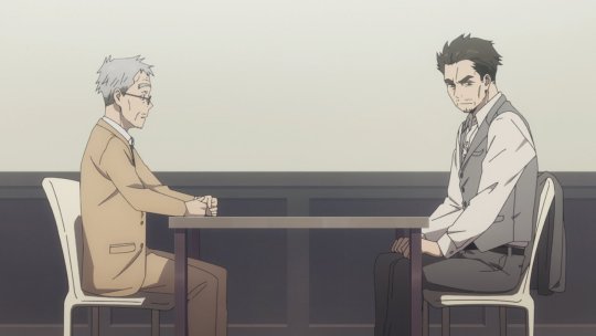
- Do you have the authority to be on this crime scene?
- What do you mean?
- Why don't you ask yourself that question?
#fugou keiji balance: unlimited#fkbu#fkbuedit#fugou keiji#the millionaire detective#katou haru#hoshino ryou#takei katsuhiro#kz:g#g:fkbu
242 notes
·
View notes
Text
THE MINDFUCKERY IN THIS ENTIRE EPISODE🙃
THIS CAN'T BE HAPPENING ALL AT ONCE— 😭😭
#Fugou Keiji Balance: Unlimited#The Millionaire Detective — Balance: UNLIMITED#Fugou Keiji#The Millionaire Detective#Balance: Unlimited#Kambe Daisuke#Katou Haru#Katō Haru#Kambe Suzue#Takei Katsuhiro#Nakamoto Chousuke#Kiyomizu Yukihiro#Daisuke Kambe#Haru Katou#Haru Katō#Suzue Kambe#Katsuhiro Takei#Chousuke Nakamoto#Yukihiro Kiyomizu#Kambe#Katō#Takei#Nakamoto#Kiyomizu#Daisuke#Haru#Suzue#Katsuhiro#Chousuke#Yukihiro
152 notes
·
View notes
Photo


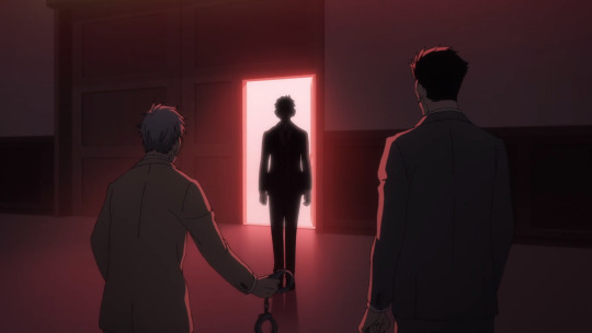
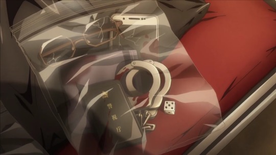
Thank you for being a part of Fugou Keiji: Balance Unlimited, Cho-san and Takei-san. Thank you for fighting for justice through to the very end 💖
#unless?#fkbu#fugou keiji balance: unlimited#fugou keiji bul#fugou keiji#chosuke nakamoto#nakamoto chosuke#takei katsuhiro#katsuhiro takei#balance: unlimited#fkbu ep 8#fkbu episode 8
142 notes
·
View notes
Last Seen Blogs
lawspriestess-blog-blog
iūdicāre

charlotteemerson
4 Months in Paris

bryantschoenheim-blog
Various review Cons And A Way To Stop

kiings-stuff
โรมิโอรักแมวป่า
lawdev
Law Dev