#the return of my single color/grayscale comics!!
Text

will you grant my wish?
an (over)dramatization of my rolls for xiao constellations drawn as a thank you and goodbye to his rerun banner
open for better quality || no reposts || image desc under the cut || ko-fi
[Image description: A three page comic about wishing for Xiao.
The first page depicts Wangshu Inn with the mountains, moon, and clouds in the background. There is a panel of a chibi Aether standing on the balcony of the inn as he looks wistfully at the scenery. The text at the bottom of the page reads, “Please.”
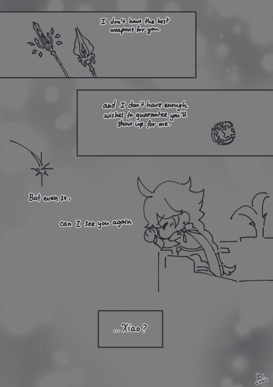
At the top of the second page, there is a panel with the Primordial Jade Winged Spear and the Staff of Homa. The text states, “I don’t have the best weapons for you.” The next panel contains an Intertwined Fate. The text in this panel says, “and I don’t have enough wishes to guarantee you’ll show up for me.” Below this panel is a shooting star and a chibi Aether, eyes closed, head turned down, and hands in a prayer position. The text is broken up into parts as you move downwards, and it reads, “But even so, can I see you again... Xiao?”
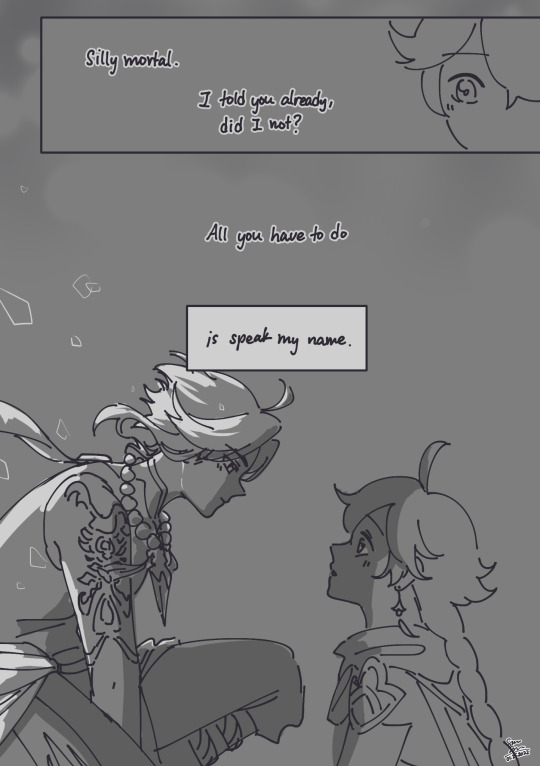
The third page begins with a panel of Aether with his eyes opened in surprise. The text states, “Silly mortal. I told you already, did I not?” Below this is the text, “All you have to do is speak my name.” The bottom of the page shows a backlit Xiao with a small smile on his face as he lands on the balcony railing. He is gazing down at Aether, who has a surprised expression.]
#xiao#aether#xiaoaether#genshin impact#genshin#fanart#myart#hello friends i come bearing gifts and they are called: my self indulgent art#i sat down to work on a different wip and promptly abandoned it for this#i spent like what 3 hours on this?#the return of my single color/grayscale comics!!#i want to draw more of them because honestly i want to draw xiao so that he looks satisfying#kind of like how i drew chlucs over and over and i'm used to it lol#but yes i have many feelings and i love xiao and aether very much#we ignore the fact that my last 5 star was not c3 but another keqing >:(#guess that's ok next banner guaranteed#comic
616 notes
·
View notes
Text
Patterns for Practical CSS Custom Properties Use
I've been playing around with CSS Custom Properties to discover their power since browser support is finally at a place where we can use them in our production code. I’ve been using them in a number different ways and I’d love for you to get as excited about them as I am. They are so useful and powerful!
I find that CSS variables usage tends to fall into categories. Of course, you’re free to use CSS variables however you like, but thinking of them in these different categories might help you understand the different ways in which they can be used.
Variables. The basics, such as setting, a brand color to use wherever needed.
Default Values. For example, a default border-radius that can be overridden later.
Cascading Values. Using clues based on specificity, such as user preferences.
Scoped Rulesets. Intentional variations on individual elements, like links and buttons.
Mixins. Rulesets intended to bring their values to a new context.
Inline Properties. Values passed in from inline styles in our HTML.
The examples we’ll look at are simplified and condensed patterns from a CSS framework I created and maintain called Cutestrap.
A quick note on browser support
There are two common lines of questions I hear when Custom Properties come up. The first is about browser support. What browsers support them? Are there fallbacks we need to use where they aren’t supported?
The global market share that support the things we’re covering in this post is 85%. Still, it’s worth cross-referencing caniuse) with your user base to determine how much and where progressive enhancement makes sense for your project.
The second question is always about how to use Custom Properties. So let’s dive into usage!
Pattern 1: Variables
The first thing we’ll tackle is setting a variable for a brand color as a Custom Property and using it on an SVG element. We'll also use a fallback to cover users on trailing browsers.
html { --brand-color: hsl(230, 80%, 60%); } .logo { fill: pink; /* fallback */ fill: var(--brand-color); }
Here, we've declared a variable called --brand-color in our html ruleset. The variable is defined on an element that’s always present, so it will cascade to every element where it’s used. Long story short, we can use that variable in our .logo ruleset.
We declared a pink fallback value for trailing browsers. In the second fill declaration, we pass --brand-color into the var() function, which will return the value we set for that Custom Property.
That’s pretty much how the pattern goes: define the variable (--variable-name) and then use it on an element (var(--variable-name)).
See the Pen
Patterns for Practical Custom Properties: Example 1.0 by Tyler Childs (@tylerchilds)
on CodePen.
Pattern 2: Default values
The var() function we used in the first example can also provide default values in case the Custom Property it is trying to access is not set.
For example, say we give buttons a rounded border. We can create a variable — we’ll call it --roundness — but we won't define it like we did before. Instead, we’ll assign a default value when putting the variable to use.
.button { /* --roundness: 2px; */ border-radius: var(--roundness, 10px); }
A use case for default values without defining the Custom Property is when your project is still in design but your feature is due today. This make it a lot easier to update the value later if the design changes.
So, you give your button a nice default, meet your deadline and when --roundness is finally set as a global Custom Property, your button will get that update for free without needing to come back to it.
See the Pen
Patterns for Practical Custom Properties: Example 2.0 by Tyler Childs (@tylerchilds)
on CodePen.
You can edit on CodePen and uncomment the code above to see what the button will look like when --roundness is set!
Pattern 3: Cascading values
Now that we've got the basics under our belt, let's start building the future we owe ourselves. I really miss the personality that AIM and MySpace had by letting users express themselves with custom text and background colors on profiles.
Let’s bring that back and build a school message board where each student can set their own font, background color and text color for the messages they post.
User-based themes
What we’re basically doing is letting students create a custom theme. We'll set the theme configurations inside data-attribute rulesets so that any descendants — a .message element in this case — that consume the themes will have access to those Custom Properties.
.message { background-color: var(--student-background, #fff); color: var(--student-color, #000); font-family: var(--student-font, "Times New Roman", serif); margin-bottom: 10px; padding: 10px; } [data-student-theme="rachel"] { --student-background: rgb(43, 25, 61); --student-color: rgb(252, 249, 249); --student-font: Arial, sans-serif; } [data-student-theme="jen"] { --student-background: #d55349; --student-color: #000; --student-font: Avenir, Helvetica, sans-serif; } [data-student-theme="tyler"] { --student-background: blue; --student-color: yellow; --student-font: "Comic Sans MS", "Comic Sans", cursive; }
Here’s the markup:
<section> <div data-student-theme="chris"> <p class="message">Chris: I've spoken at events and given workshops all over the world at conferences.</p> </div> <div data-student-theme="rachel"> <p class="message">Rachel: I prefer email over other forms of communication.</p> </div> <div data-student-theme="jen"> <p class="message">Jen: This is why I immediately set up my new team with Slack for real-time chat.</p> </div> <div data-student-theme="tyler"> <p class="message">Tyler: I miss AIM and MySpace, but this message board is okay.</p> </div> </section>
We have set all of our student themes using [data-student-theme] selectors for our student theme rulesets. The Custom Properties for background, color, and font will apply to our .message ruleset if they are set for that student because .message is a descendant of the div containing the data-attribute that, in turn, contains the Custom Property values to consume. Otherwise, the default values we provided will be used instead.
See the Pen
Patterns for Practical Custom Properties: Example 3.0 by Tyler Childs (@tylerchilds)
on CodePen.
Readable theme override
As fun and cool as it is for users to control custom styles, what users pick won't always be accessible with considerations for contrast, color vision deficiency, or anyone that prefers their eyes to not bleed when reading. Remember the GeoCities days?
Let's add a class that provides a cleaner look and feel and set it on the parent element (<section>) so it overrides any student theme when it’s present.
.readable-theme [data-student-theme] { --student-background: hsl(50, 50%, 90%); --student-color: hsl(200, 50%, 10%); --student-font: Verdana, Geneva, sans-serif; }
<section class="readable-theme"> ... </section>
We’re utilizing the cascade to override the student themes by setting a higher specificity such that the background, color, and font will be in scope and will apply to every .message ruleset.
See the Pen
Patterns for Practical Custom Properties: Example 3.1 by Tyler Childs (@tylerchilds)
on CodePen.
Pattern 4: Scoped rulesets
Speaking of scope, we can scope Custom Properties and use them to streamline what is otherwise boilerplate CSS. For example, we can define variables for different link states.
a { --link: hsl(230, 60%, 50%); --link-visited: hsl(290, 60%, 50%); --link-hover: hsl(230, 80%, 60%); --link-active: hsl(350, 60%, 50%); } a:link { color: var(--link); } a:visited { color: var(--link-visited); } a:hover { color: var(--link-hover); } a:active { color: var(--link-active); }
<a href="#">Link Example</a>
Now that we've written out the Custom Properties globally on the <a> element and used them on our link states, we don't need to write them again. These are scoped to our <a> element’s ruleset so they are only set on anchor tags and their children. This allows us to not pollute the global namespace.
Example: Grayscale link
Going forward, we can control the links we just created by changing the Custom Properties for our different use cases. For example, let’s create a gray-colored link.
.grayscale { --link: LightSlateGrey; --link-visited: Silver; --link-hover: DimGray; --link-active: LightSteelBlue; }
<a href="#" class="grayscale">Link Example</a>
We’ve declared a .grayscale ruleset that contains the colors for our different link states. Since the selector for this ruleset has a greater specificity then the default, these variable values are used and then applied to the pseudo-class rulesets for our link states instead of what was defined on the <a> element.
See the Pen
Patterns for Practical Custom Properties: Example 4.0 by Tyler Childs (@tylerchilds)
on CodePen.
Example: Custom links
If setting four Custom Properties feels like too much work, what if we set a single hue instead? That could make things a lot easier to manage.
.custom-link { --hue: 30; --link: hsl(var(--hue), 60%, 50%); --link-visited: hsl(calc(var(--hue) + 60), 60%, 50%); --link-hover: hsl(var(--hue), 80%, 60%); --link-active: hsl(calc(var(--hue) + 120), 60%, 50%); } .danger { --hue: 350; }
<a href="#" class="custom-link">Link Example</a> <a href="#" class="custom-link danger">Link Example</a>
See the Pen
Patterns for Practical Custom Properties: Example 4.1 by Tyler Childs (@tylerchilds)
on CodePen.
By introducing a variable for a hue value and applying it to our HSL color values in the other variables, we merely have to change that one value to update all four link states.
Calculations are powerful in combination with Custom Properties since they let
your styles be more expressive with less effort. Check out this technique by Josh Bader where he uses a similar approach to enforce accessible color contrasts on buttons.
Pattern 5: Mixins
A mixin, in regards to Custom Properties, is a function declared as a Custom Property value. The arguments for the mixin are other Custom Properties that will recalculate the mixin when they’re changed which, in turn, will update styles.
The custom link example we just looked at is actually a mixin. We can set the value for --hue and then each of the four link states will recalculate accordingly.
Example: Baseline grid foundation
Let's learn more about mixins by creating a baseline grid to help with vertical rhythm. This way, our content has a pleasant cadence by utilizing consistent spacing.
.baseline, .baseline * { --rhythm: 2rem; --line-height: var(--sub-rhythm, var(--rhythm)); --line-height-ratio: 1.4; --font-size: calc(var(--line-height) / var(--line-height-ratio)); } .baseline { font-size: var(--font-size); line-height: var(--line-height); }
We've applied the ruleset for our baseline grid to a .baseline class and any of its descendants.
--rhythm: This is the foundation of our baseline. Updating it will impact all the other properties.
--line-height: This is set to --rhythm by default, since --sub-rhythm is not set here.
--sub-rhythm: This allows us to override the --line-height — and subsequently, the --font-size — while maintaining the overall baseline grid.
--line-height-ratio: This helps enforce a nice amount of spacing between lines of text.
--font-size: This is calculated by dividing our --line-height by our --line-height-ratio.
We also set our font-size and line-height in our .baseline ruleset to use the --font-size and --line-height from our baseline grid. In short, whenever the rhythm changes, the line height and font size change accordingly while maintaining a legible experience.
OK, let’s put the baseline to use.
Let's create a tiny webpage. We'll use our --rhythm Custom Property for all of the spacing between elements.
.baseline h2, .baseline p, .baseline ul { padding: 0 var(--rhythm); margin: 0 0 var(--rhythm); } .baseline p { --line-height-ratio: 1.2; } .baseline h2 { --sub-rhythm: calc(3 * var(--rhythm)); --line-height-ratio: 1; } .baseline p, .baseline h2 { font-size: var(--font-size); line-height: var(--line-height); } .baseline ul { margin-left: var(--rhythm); }
<section class="baseline"> <h2>A Tiny Webpage</h2> <p>This is the tiniest webpage. It has three noteworthy features:</p> <ul> <li>Tiny</li> <li>Exemplary</li> <li>Identifies as Hufflepuff</li> </ul> </section>
We're essentially using two mixins here: --line-height and --font-size. We need to set the properties font-size and line-height to their Custom Property counterparts in order to set the heading and paragraph. The mixins have been recalculated in those rulesets, but they need to be set before the updated styling will be applied to them.
See the Pen
Patterns for Practical Custom Properties: Example 5.0 by Tyler Childs (@tylerchilds)
on CodePen.
Something to keep in mind: You probably do not want to use the Custom Property values in the ruleset itself when applying mixins using a wildcard selector. It gives those styles a higher specificity than any other inheritance that comes along with the cascade, making them hard to override without using !important.
Pattern 6: Inline properties
We can also declare Custom Properties inline. Let's build a lightweight grid system demonstrate.
.grid { --columns: auto-fit; display: grid; gap: 10px; grid-template-columns: repeat(var(--columns), minmax(0, 1fr)); }
<div class="grid"> <img src="https://www.fillmurray.com/900/600" alt="Bill Murray" /> <img src="https://www.placecage.com/900/600" alt="Nic Cage" /> <img src="https://www.placecage.com/g/900/600" alt="Nic Cage gray" /> <img src="https://www.fillmurray.com/g/900/600" alt="Bill Murray gray" /> <img src="https://www.placecage.com/c/900/600" alt="Nic Cage crazy" /> <img src="https://www.placecage.com/gif/900/600" alt="Nic Cage gif" /> </div>
By default, the grid has equally sized columns that will automatically lay themselves into a single row.
See the Pen
Patterns for Practical Custom Properties: Example 6.0 by Tyler Childs (@tylerchilds)
on CodePen.
To control the number of columns we can set our --columns Custom Property
inline on our grid element.
<div class="grid" style="--columns: 3;"> ... </div>
See the Pen
Patterns for Practical Custom Properties: Example 6.1 by Tyler Childs (@tylerchilds)
on CodePen.
We just looked at six different use cases for Custom Properties — at least ones that I commonly use. Even if you were already aware of and have been using Custom Properties, hopefully seeing them used these ways gives you a better idea of when and where to use them effectively.
Are there different types of patterns you use with Custom Properties? Share them in the comments and link up some demos — I’d love to see them!
If you’re new to Custom Properties are are looking to level up, try playing around with the examples we covered here, but add media queries to the mix. You’ll see how adaptive these can be and how many interesting opportunities open up when you have the power to change values on the fly.
Plus, there are a ton of other great resources right here on CSS-Tricks to up your Custom Properties game in the Custom Properties Guide.
See the Pen
Thank you for Reading! by Tyler Childs (@tylerchilds)
on CodePen.
The post Patterns for Practical CSS Custom Properties Use appeared first on CSS-Tricks.
Patterns for Practical CSS Custom Properties Use published first on https://deskbysnafu.tumblr.com/
0 notes
Text
The Double Take: The Multifaceted Designs of Olly Moss
Editor’s Note: This article originally appeared in HOW Magazine’s Summer Creativity issue. Get a copy to discover amazing optical illusions, exciting design exercises and more.
The work of Olly Moss sweeps across many disciplines, but whether it’s a poster design, a logo design or video game art, he always makes you look twice.
The portfolio of Winchester, UK–based Olly Moss is barely a decade old and already spans multiple creative disciplines: T-shirt design, limited-edition posters, comic books, video games, websites, branding and more. Between the larger, more prominent entities you’ll fi nd a sprinkling of odd commercial jobs. For every Batman or Star Wars project in his portfolio, design work for a small indie film or a logo peeks in.
When discussing his body of work, Moss is quick to brush off its depth. “I think you can look at any piece of work that I’ve done and reverse engineer it, in terms of its intent. There’s no real deeper meaning, it’s just a thing that I thought was good so I did it. There’s not really much more to say than that with most of it.”
Moss is in a unique position for a freelance designer. The work finds him—and with good reason. As illustrator and Mondo Gallery art director Rob Jones puts it, “Solutions flit around like butterflies in his head at all times, and he just effortlessly nets one when needed.”
[Related: The True Grit of Illustrator Eric Nyffeler | Designer Aaron Draplin Talks His Book, His Posters, His Way]
His relationship with clients begins with his sketches. In an interview with film and game concept designer Ash Thorp on Thorp’s “The Collective Podcast,” Moss said, “I love pitching [concept art] for free. It frees you from any assumed expectations that you have. You have the brief, but when you really want the job, you’re so focused on giving [the client] what you think they want rather than what they actually want from you, which is you. So I think, what do I want from this job? What do I want to give them? They’ve come to me because they’ve seen my portfolio and all the things I put there because I thought they were good; all the client work that I hate is not there. They’ve come to me for those reasons, and I want to give them more of that. I want to pitch you the weird thing. I will send you a sketch that will take me eight hours to think of and five minutes to do.”
For his work with publisher Pottermore Limited on the cover illustrations for the 2015 worldwide digital release of J.K. Rowling’s Harry Potter book series, Moss was asked for a single sketch, yet turned in five separate approaches with sketches for each of the seven books. “I pitched harder for that than anything I’ve ever pitched in my life. I wanted it so badly. They were my books growing up. I loved Harry Potter and I still love Harry Potter so much. I wanted that job.”
The approach that was chosen was Moss’ second favorite, leaving his preferred illustrations to disappear on a hard drive of unused work. “They felt the closest to what I wanted to do with Harry Potter as a fan,” Moss explains. But because the illustrations were intended for a digital release that would most likely be seen on black-and-white e-reader screens, Pottermore decided that his choice of seven illustrations with only minor element changes to a landscape of Hogwarts wouldn’t be as useful as designs that remained impactful at any size and in both grayscale and full-color. “They were like, ‘What can we do with these [other cover concepts]?’ And I was like, ‘Well, I have a little side line in posters.’”
“I WANT TO PITCH YOU THE WEIRD THING. I WILL SEND YOU A SKETCH THAT WILL TAKE ME EIGHT HOURS TO THINK OF AND FIVE MINUTES TO DO.”
FIRST STEPS
That “side line” in poster design has been a mainstay in Moss’ career. In 2007, while he was still a student at the University of Hertfordshire, Moss began submitting designs to the site Threadless.com, an internet-based T-shirt company that allows the audience to rate submitted designs, and those with the highest ratings are turned into a tee and sold on the site, with a portion of profit going to the creator of the winning design.
For Moss, the immediate feedback and critique on his work, or lack thereof, would determine the next design. “If the vast majority of people are saying it’s good, you can figure out why this particular piece is working or why another doesn’t get an immediate response. You know it’s bad when you put something up and nobody comments or cares about it. That’s the real alarm bell.”
These early designs were bright, with Moss’ ever-present intelligent absurdity. “Spoilt,” one of his more popular Threadless shirts, is a text-based design spoiling Hollywood’s most regarded film twists: “Darth Vader is Luke’s father,” “Bruce Willis is a ghost in The Sixth Sense,” etc.
“Spoilt” for Threadless.com
Moss readily admits these illustrations for Threadless were not well-executed, but as he explained in his talk at the 2012 Offset conference: “It just sort of hit me really quickly that a weak execution can be overcome by a strong concept. Any concept at all can elevate a terrible execution.”
Through his self-assigned series of red and black film posters, Moss put his concepts to the test. The series found Moss removing elements, simplifying. As he defined each concept, the audience for his work grew. Early coverage of the posters online recognized the simplicity of his execution and the brawn of his concepts, filled increasingly with sharp illusions that require a double take to fully comprehend.
At Offset, Moss explained the impetus for the self-assigned series: “I was always using movie references in my work, but I never thought of doing something actually based on a movie. I thought about my desire to keep simplifying my work, and putting the meaning and the concept as the focus, and just really wanting to have a go at something like this. These film posters are the first things I remember people blogging about or me getting inquiries about. They wanted to see work like this.”
BRANCHING OUT
Those early internet rumblings were followed by a call from Los Angeles—an offer for a position at visual effects house Prologue, creators of title sequences and graphics for films including Iron Man, Superman Returns and Star Trek Beyond. Moss, then an expat in Los Angeles, lasted a short time at Prologue, but that time was impactful.
It was there that he worked on concept design for the titles of the 2010 film The Losers, which introduced him to the work of New York Times bestselling comic book artist Jock, as well as other creatives, like Thorp, with whom he would work later. It was also there that he realized the pace of Hollywood was not for him. “It’s like boot camp,” Moss says. “You go and you learn so much so quickly because there are so many talented people around you doing great stuff. It was a really valuable experience, as much in terms of teaching me that’s not what I want to do.”
So Moss returned to his home in Winchester and focused on work he wanted to pursue. In 2009, Moss was invited to participate in Los Angeles–based Gallery 1988’s event inspired by the hit ABC television show Lost. This would be his first licensed poster. For his part, Moss created an illustration around the character Locke, pulling inspiration from the aesthetic of the great Saul Bass. “I didn’t want to ape any one of his posters in particular. I came at it from the point of view of: What would he have done? How would he have solved this problem?”
Mitch Putnam, co-founder and creative director for the Austin, TX–based gallery and poster company Mondo, was responsible for bringing Moss deeper into the poster fold. “I had seen Olly’s work around the internet for a year or two before contacting him,” Putnam says. “He had made a couple of viral design projects that showed up seemingly everywhere. He was basically the godfather of modern minimal movie poster design. I didn’t really think about Mondo posters until after his entry in the Lost poster series. His piece was definitely the shining success of the series, so the desire to work with him was pretty natural.”
The first job Moss did with Mondo was a poster for the Sam Raimi horror classic The Evil Dead. The film’s original 1981 poster is striking—a hand reaches from the earth, gripping the throat of a young woman. Moss kept a similar composition, explaining, “It’s almost disrespectful when you’re working on a project to just wipe clean the slate if what’s already been done is so good.”
With only two licensed posters under his belt, Moss was again approached by Putnam with another film poster gig—Star Wars. Mondo had recently acquired the license from LucasFilm and wanted to create a series of posters for the original trilogy. Moss looked to his previously successful The Evil Dead design and followed suit. The hand in silhouette, its interior filled with elements of the film, begat C-3PO, Boba Fett and Darth Vader in the role of the silhouetted framework.
Working directly with Mondo, Moss’ initial sketches were approved immediately. The design process on the series was smooth and unremarkable, with Putnam noting that, “Nobody could’ve predicted the unbelievable response that those Star Wars posters were met with. They remain some of [Mondo’s] most popular products of all time.”
When Gallery 1988 later offered him a chance at his first solo exhibition, Moss shunned the expected showing of film-inspired screenprints full of visual stunts and instead filled the gallery with 300 silhouettes of modern faces from popular culture cut from black construction paper.
Still, Moss remained cognizant of his audience’s expectations that each of his works would contain a higher concept or double entendre. “Sometimes I want to do something that doesn’t have a stupid visual trick, but then I’ll get messages going, ‘Hey, I’m just not seeing it. Where is the thing?’ … You have to always be aware of the context in which people view your work. That’s a blessing and a curse. It allows you to subvert expectations in really interesting ways, but also those expectations can be a little bit of a ball and chain sometimes.”
With the solo exhibition, Moss moved further away from the expected, but with the same end goal in mind. “Olly and I admire the same qualities in good design,” says designer Jay Shaw, a frequent collaborator with Moss. “It’s all about the message. The imagery is important, but it’s always at the service of the concept. It’s interesting collaborating with another artist rather than an art director or a filmmaker. Artists will take what you’ve done and start drawing right on top of it. You then get to take the new image and add your own bits and pieces until you’ve got something you’re both happy with.”
Moss’ collaborative efforts led to his first writing credit with illustrator Becky Cloonan handling the art for “Bruce,” a story featured in Batman Black and White #6. Cloonan explains, “We were at San Diego Comic-Con having a few drinks when he first told me about the idea. I loved it, and immediately thought out loud, ‘I have to draw this.’ It was such a simple story, but had so much depth and weight and humanity.”
Cloonan introduced Moss to DC Comics editor Mark Chiarello and mentioned Moss had a story to pitch for Batman. Months later, Chiarello asked to hear it. It was an immediate yes. Moss shared the script with friend and Batman artist Jock, who notes, “It just read great. It was an interesting, unique point of view on a character we all know. But that’s Olly. He seems able to just turn his hand to things and get an interesting take on them.”
EXPLORING NEW MEDIUMS
Despite being an avid gamer, Moss hadn’t worked on the design side of that industry until Sean Vanaman and Jake Rodkin approached him about art directing the first game to be released by their development company Campo Santo, launched in 2013.
The game, “Firewatch,” initially released in early 2016, follows Henry, a fire lookout in the Shoshone National Forest in 1989, and his only companion, Delilah, available through a walkie-talkie. The plot unfolds as a mystery, with Henry sent to investigate small fires and various strange occurrences.
Moss was hired as a concept artist, but his role blossomed over the two-and-a-half years to include art direction, logo design, posters, in-game textures, lighting and story. “I came to it with no video game experience. It was very frustrating to our lead 3D artist, Jane [Ng], who very much came from a place where you’d have a bunch of concept artists and there’d be a drawing of a rock from four different angles and it’s like, ‘OK, I’ll just make this then.’ And everything had an insane level of guidance behind it when you were sending it out to the world. I didn’t really do that on the game. The way it would usually work out is at the start of the project, I would draw a detailed and nice painting and by the end of the project where everything was spiraling out of control and there was so much to do, a very rough sketch of what an environment should look like, and then Jane would go and do a rough 3D blocking of that, and we’d consider the ways that a player might approach that environment.
His poster for the 85th Academy Awards might sum up his approach to visual problem solving as best as any piece of design can. “If I had to point at a piece of work in my portfolio and say, ‘What’s the most Olly thing you’ve done?’ I’d be like, ‘Oh, it’s probably this.’ I set up the rules very early in that piece … it’s every Oscar. And there are some that are harder than others. You have to figure out some that are obvious, and some that are deeper cuts, and it’s fun and hard and weird to do.”
There is distance between Moss’ current work and the work that brought him to the attention of collectors, art directors, film companies and game developers. Those poster days are in the past, for now. “It doesn’t feel like fertile ground for interesting new stuff right now. People can make a pretty good living and make really good work, but it’s just not super exciting to me.”
Once “Firewatch” was released, Moss moved on to a new project that won’t be seen for another few years—a personal project he won’t discuss for the moment. It will be released with no fanfare. Boom. Then it will exist. This is how Moss works.
As he puts it, “I think every interest I have has a shelf life of about three or four years and then I just want to move immediately on to the next thing.”
In the interim, he’s been teaching himself coding and 3D tools like ZBrush. “It feels like being back to the start, the struggle days—being really bad at them and not having the pressure to be good at anything. Just to toil away on something you don’t really know how to do on your own time without the pressure is really great.”
Following the back-to-back jobs on Harry Potter and “Firewatch,” Moss now finds some relief and stability. “I could quite happily not work for like two years, which is great. That’s the position I want to be in because it allows me to be a little pickier about the jobs that I take on and work on stuff there’s no financial reward for, but I’m keen to do.” To keep his audience alert, Moss is always looking for new ways to achieve that desired effect: the double take.
The post The Double Take: The Multifaceted Designs of Olly Moss appeared first on HOW Design.
The Double Take: The Multifaceted Designs of Olly Moss syndicated post
0 notes
Text
Patterns for Practical CSS Custom Properties Use
I've been playing around with CSS Custom Properties to discover their power since browser support is finally at a place where we can use them in our production code. I’ve been using them in a number different ways and I’d love for you to get as excited about them as I am. They are so useful and powerful!
I find that CSS variables usage tends to fall into categories. Of course, you’re free to use CSS variables however you like, but thinking of them in these different categories might help you understand the different ways in which they can be used.
Variables. The basics, such as setting, a brand color to use wherever needed.
Default Values. For example, a default border-radius that can be overridden later.
Cascading Values. Using clues based on specificity, such as user preferences.
Scoped Rulesets. Intentional variations on individual elements, like links and buttons.
Mixins. Rulesets intended to bring their values to a new context.
Inline Properties. Values passed in from inline styles in our HTML.
The examples we’ll look at are simplified and condensed patterns from a CSS framework I created and maintain called Cutestrap.
A quick note on browser support
There are two common lines of questions I hear when Custom Properties come up. The first is about browser support. What browsers support them? Are there fallbacks we need to use where they aren’t supported?
The global market share that support the things we’re covering in this post is 85%. Still, it’s worth cross-referencing caniuse) with your user base to determine how much and where progressive enhancement makes sense for your project.
The second question is always about how to use Custom Properties. So let’s dive into usage!
Pattern 1: Variables
The first thing we’ll tackle is setting a variable for a brand color as a Custom Property and using it on an SVG element. We'll also use a fallback to cover users on trailing browsers.
html { --brand-color: hsl(230, 80%, 60%); } .logo { fill: pink; /* fallback */ fill: var(--brand-color); }
Here, we've declared a variable called --brand-color in our html ruleset. The variable is defined on an element that’s always present, so it will cascade to every element where it’s used. Long story short, we can use that variable in our .logo ruleset.
We declared a pink fallback value for trailing browsers. In the second fill declaration, we pass --brand-color into the var() function, which will return the value we set for that Custom Property.
That’s pretty much how the pattern goes: define the variable (--variable-name) and then use it on an element (var(--variable-name)).
See the Pen
Patterns for Practical Custom Properties: Example 1.0 by Tyler Childs (@tylerchilds)
on CodePen.
Pattern 2: Default values
The var() function we used in the first example can also provide default values in case the Custom Property it is trying to access is not set.
For example, say we give buttons a rounded border. We can create a variable — we’ll call it --roundness — but we won't define it like we did before. Instead, we’ll assign a default value when putting the variable to use.
.button { /* --roundness: 2px; */ border-radius: var(--roundness, 10px); }
A use case for default values without defining the Custom Property is when your project is still in design but your feature is due today. This make it a lot easier to update the value later if the design changes.
So, you give your button a nice default, meet your deadline and when --roundness is finally set as a global Custom Property, your button will get that update for free without needing to come back to it.
See the Pen
Patterns for Practical Custom Properties: Example 2.0 by Tyler Childs (@tylerchilds)
on CodePen.
You can edit on CodePen and uncomment the code above to see what the button will look like when --roundness is set!
Pattern 3: Cascading values
Now that we've got the basics under our belt, let's start building the future we owe ourselves. I really miss the personality that AIM and MySpace had by letting users express themselves with custom text and background colors on profiles.
Let’s bring that back and build a school message board where each student can set their own font, background color and text color for the messages they post.
User-based themes
What we’re basically doing is letting students create a custom theme. We'll set the theme configurations inside data-attribute rulesets so that any descendants — a .message element in this case — that consume the themes will have access to those Custom Properties.
.message { background-color: var(--student-background, #fff); color: var(--student-color, #000); font-family: var(--student-font, "Times New Roman", serif); margin-bottom: 10px; padding: 10px; } [data-student-theme="rachel"] { --student-background: rgb(43, 25, 61); --student-color: rgb(252, 249, 249); --student-font: Arial, sans-serif; } [data-student-theme="jen"] { --student-background: #d55349; --student-color: #000; --student-font: Avenir, Helvetica, sans-serif; } [data-student-theme="tyler"] { --student-background: blue; --student-color: yellow; --student-font: "Comic Sans MS", "Comic Sans", cursive; }
Here’s the markup:
<section> <div data-student-theme="chris"> <p class="message">Chris: I've spoken at events and given workshops all over the world at conferences.</p> </div> <div data-student-theme="rachel"> <p class="message">Rachel: I prefer email over other forms of communication.</p> </div> <div data-student-theme="jen"> <p class="message">Jen: This is why I immediately set up my new team with Slack for real-time chat.</p> </div> <div data-student-theme="tyler"> <p class="message">Tyler: I miss AIM and MySpace, but this message board is okay.</p> </div> </section>
We have set all of our student themes using [data-student-theme] selectors for our student theme rulesets. The Custom Properties for background, color, and font will apply to our .message ruleset if they are set for that student because .message is a descendant of the div containing the data-attribute that, in turn, contains the Custom Property values to consume. Otherwise, the default values we provided will be used instead.
See the Pen
Patterns for Practical Custom Properties: Example 3.0 by Tyler Childs (@tylerchilds)
on CodePen.
Readable theme override
As fun and cool as it is for users to control custom styles, what users pick won't always be accessible with considerations for contrast, color vision deficiency, or anyone that prefers their eyes to not bleed when reading. Remember the GeoCities days?
Let's add a class that provides a cleaner look and feel and set it on the parent element (<section>) so it overrides any student theme when it’s present.
.readable-theme [data-student-theme] { --student-background: hsl(50, 50%, 90%); --student-color: hsl(200, 50%, 10%); --student-font: Verdana, Geneva, sans-serif; }
<section class="readable-theme"> ... </section>
We’re utilizing the cascade to override the student themes by setting a higher specificity such that the background, color, and font will be in scope and will apply to every .message ruleset.
See the Pen
Patterns for Practical Custom Properties: Example 3.1 by Tyler Childs (@tylerchilds)
on CodePen.
Pattern 4: Scoped rulesets
Speaking of scope, we can scope Custom Properties and use them to streamline what is otherwise boilerplate CSS. For example, we can define variables for different link states.
a { --link: hsl(230, 60%, 50%); --link-visited: hsl(290, 60%, 50%); --link-hover: hsl(230, 80%, 60%); --link-active: hsl(350, 60%, 50%); } a:link { color: var(--link); } a:visited { color: var(--link-visited); } a:hover { color: var(--link-hover); } a:active { color: var(--link-active); }
<a href="#">Link Example</a>
Now that we've written out the Custom Properties globally on the <a> element and used them on our link states, we don't need to write them again. These are scoped to our <a> element’s ruleset so they are only set on anchor tags and their children. This allows us to not pollute the global namespace.
Example: Grayscale link
Going forward, we can control the links we just created by changing the Custom Properties for our different use cases. For example, let’s create a gray-colored link.
.grayscale { --link: LightSlateGrey; --link-visited: Silver; --link-hover: DimGray; --link-active: LightSteelBlue; }
<a href="#" class="grayscale">Link Example</a>
We’ve declared a .grayscale ruleset that contains the colors for our different link states. Since the selector for this ruleset has a greater specificity then the default, these variable values are used and then applied to the pseudo-class rulesets for our link states instead of what was defined on the <a> element.
See the Pen
Patterns for Practical Custom Properties: Example 4.0 by Tyler Childs (@tylerchilds)
on CodePen.
Example: Custom links
If setting four Custom Properties feels like too much work, what if we set a single hue instead? That could make things a lot easier to manage.
.custom-link { --hue: 30; --link: hsl(var(--hue), 60%, 50%); --link-visited: hsl(calc(var(--hue) + 60), 60%, 50%); --link-hover: hsl(var(--hue), 80%, 60%); --link-active: hsl(calc(var(--hue) + 120), 60%, 50%); } .danger { --hue: 350; }
<a href="#" class="custom-link">Link Example</a> <a href="#" class="custom-link danger">Link Example</a>
See the Pen
Patterns for Practical Custom Properties: Example 4.1 by Tyler Childs (@tylerchilds)
on CodePen.
By introducing a variable for a hue value and applying it to our HSL color values in the other variables, we merely have to change that one value to update all four link states.
Calculations are powerful in combination with Custom Properties since they let
your styles be more expressive with less effort. Check out this technique by Josh Bader where he uses a similar approach to enforce accessible color contrasts on buttons.
Pattern 5: Mixins
A mixin, in regards to Custom Properties, is a function declared as a Custom Property value. The arguments for the mixin are other Custom Properties that will recalculate the mixin when they’re changed which, in turn, will update styles.
The custom link example we just looked at is actually a mixin. We can set the value for --hue and then each of the four link states will recalculate accordingly.
Example: Baseline grid foundation
Let's learn more about mixins by creating a baseline grid to help with vertical rhythm. This way, our content has a pleasant cadence by utilizing consistent spacing.
.baseline, .baseline * { --rhythm: 2rem; --line-height: var(--sub-rhythm, var(--rhythm)); --line-height-ratio: 1.4; --font-size: calc(var(--line-height) / var(--line-height-ratio)); } .baseline { font-size: var(--font-size); line-height: var(--line-height); }
We've applied the ruleset for our baseline grid to a .baseline class and any of its descendants.
--rhythm: This is the foundation of our baseline. Updating it will impact all the other properties.
--line-height: This is set to --rhythm by default, since --sub-rhythm is not set here.
--sub-rhythm: This allows us to override the --line-height — and subsequently, the --font-size — while maintaining the overall baseline grid.
--line-height-ratio: This helps enforce a nice amount of spacing between lines of text.
--font-size: This is calculated by dividing our --line-height by our --line-height-ratio.
We also set our font-size and line-height in our .baseline ruleset to use the --font-size and --line-height from our baseline grid. In short, whenever the rhythm changes, the line height and font size change accordingly while maintaining a legible experience.
OK, let’s put the baseline to use.
Let's create a tiny webpage. We'll use our --rhythm Custom Property for all of the spacing between elements.
.baseline h2, .baseline p, .baseline ul { padding: 0 var(--rhythm); margin: 0 0 var(--rhythm); } .baseline p { --line-height-ratio: 1.2; } .baseline h2 { --sub-rhythm: calc(3 * var(--rhythm)); --line-height-ratio: 1; } .baseline p, .baseline h2 { font-size: var(--font-size); line-height: var(--line-height); } .baseline ul { margin-left: var(--rhythm); }
<section class="baseline"> <h2>A Tiny Webpage</h2> <p>This is the tiniest webpage. It has three noteworthy features:</p> <ul> <li>Tiny</li> <li>Exemplary</li> <li>Identifies as Hufflepuff</li> </ul> </section>
We're essentially using two mixins here: --line-height and --font-size. We need to set the properties font-size and line-height to their Custom Property counterparts in order to set the heading and paragraph. The mixins have been recalculated in those rulesets, but they need to be set before the updated styling will be applied to them.
See the Pen
Patterns for Practical Custom Properties: Example 5.0 by Tyler Childs (@tylerchilds)
on CodePen.
Something to keep in mind: You probably do not want to use the Custom Property values in the ruleset itself when applying mixins using a wildcard selector. It gives those styles a higher specificity than any other inheritance that comes along with the cascade, making them hard to override without using !important.
Pattern 6: Inline properties
We can also declare Custom Properties inline. Let's build a lightweight grid system demonstrate.
.grid { --columns: auto-fit; display: grid; gap: 10px; grid-template-columns: repeat(var(--columns), minmax(0, 1fr)); }
<div class="grid"> <img src="https://www.fillmurray.com/900/600" alt="Bill Murray" /> <img src="https://www.placecage.com/900/600" alt="Nic Cage" /> <img src="https://www.placecage.com/g/900/600" alt="Nic Cage gray" /> <img src="https://www.fillmurray.com/g/900/600" alt="Bill Murray gray" /> <img src="https://www.placecage.com/c/900/600" alt="Nic Cage crazy" /> <img src="https://www.placecage.com/gif/900/600" alt="Nic Cage gif" /> </div>
By default, the grid has equally sized columns that will automatically lay themselves into a single row.
See the Pen
Patterns for Practical Custom Properties: Example 6.0 by Tyler Childs (@tylerchilds)
on CodePen.
To control the number of columns we can set our --columns Custom Property
inline on our grid element.
<div class="grid" style="--columns: 3;"> ... </div>
See the Pen
Patterns for Practical Custom Properties: Example 6.1 by Tyler Childs (@tylerchilds)
on CodePen.
We just looked at six different use cases for Custom Properties — at least ones that I commonly use. Even if you were already aware of and have been using Custom Properties, hopefully seeing them used these ways gives you a better idea of when and where to use them effectively.
Are there different types of patterns you use with Custom Properties? Share them in the comments and link up some demos — I’d love to see them!
If you’re new to Custom Properties are are looking to level up, try playing around with the examples we covered here, but add media queries to the mix. You’ll see how adaptive these can be and how many interesting opportunities open up when you have the power to change values on the fly.
Plus, there are a ton of other great resources right here on CSS-Tricks to up your Custom Properties game in the Custom Properties Guide.
See the Pen
Thank you for Reading! by Tyler Childs (@tylerchilds)
on CodePen.
The post Patterns for Practical CSS Custom Properties Use appeared first on CSS-Tricks.
Patterns for Practical CSS Custom Properties Use published first on https://deskbysnafu.tumblr.com/
0 notes
Text
The Double Take: The Multifaceted Designs of Olly Moss
Editor’s Note: This article originally appeared in HOW Magazine’s Summer Creativity issue. Get a copy to discover amazing optical illusions, exciting design exercises and more.
The work of Olly Moss sweeps across many disciplines, but whether it’s a poster design, a logo design or video game art, he always makes you look twice.
The portfolio of Winchester, UK–based Olly Moss is barely a decade old and already spans multiple creative disciplines: T-shirt design, limited-edition posters, comic books, video games, websites, branding and more. Between the larger, more prominent entities you’ll fi nd a sprinkling of odd commercial jobs. For every Batman or Star Wars project in his portfolio, design work for a small indie film or a logo peeks in.
When discussing his body of work, Moss is quick to brush off its depth. “I think you can look at any piece of work that I’ve done and reverse engineer it, in terms of its intent. There’s no real deeper meaning, it’s just a thing that I thought was good so I did it. There’s not really much more to say than that with most of it.”
Moss is in a unique position for a freelance designer. The work finds him—and with good reason. As illustrator and Mondo Gallery art director Rob Jones puts it, “Solutions flit around like butterflies in his head at all times, and he just effortlessly nets one when needed.”
[Related: The True Grit of Illustrator Eric Nyffeler | Designer Aaron Draplin Talks His Book, His Posters, His Way]
His relationship with clients begins with his sketches. In an interview with film and game concept designer Ash Thorp on Thorp’s “The Collective Podcast,” Moss said, “I love pitching [concept art] for free. It frees you from any assumed expectations that you have. You have the brief, but when you really want the job, you’re so focused on giving [the client] what you think they want rather than what they actually want from you, which is you. So I think, what do I want from this job? What do I want to give them? They’ve come to me because they’ve seen my portfolio and all the things I put there because I thought they were good; all the client work that I hate is not there. They’ve come to me for those reasons, and I want to give them more of that. I want to pitch you the weird thing. I will send you a sketch that will take me eight hours to think of and five minutes to do.”
For his work with publisher Pottermore Limited on the cover illustrations for the 2015 worldwide digital release of J.K. Rowling’s Harry Potter book series, Moss was asked for a single sketch, yet turned in five separate approaches with sketches for each of the seven books. “I pitched harder for that than anything I’ve ever pitched in my life. I wanted it so badly. They were my books growing up. I loved Harry Potter and I still love Harry Potter so much. I wanted that job.”
The approach that was chosen was Moss’ second favorite, leaving his preferred illustrations to disappear on a hard drive of unused work. “They felt the closest to what I wanted to do with Harry Potter as a fan,” Moss explains. But because the illustrations were intended for a digital release that would most likely be seen on black-and-white e-reader screens, Pottermore decided that his choice of seven illustrations with only minor element changes to a landscape of Hogwarts wouldn’t be as useful as designs that remained impactful at any size and in both grayscale and full-color. “They were like, ‘What can we do with these [other cover concepts]?’ And I was like, ‘Well, I have a little side line in posters.’”
“I WANT TO PITCH YOU THE WEIRD THING. I WILL SEND YOU A SKETCH THAT WILL TAKE ME EIGHT HOURS TO THINK OF AND FIVE MINUTES TO DO.”
FIRST STEPS
That “side line” in poster design has been a mainstay in Moss’ career. In 2007, while he was still a student at the University of Hertfordshire, Moss began submitting designs to the site Threadless.com, an internet-based T-shirt company that allows the audience to rate submitted designs, and those with the highest ratings are turned into a tee and sold on the site, with a portion of profit going to the creator of the winning design.
For Moss, the immediate feedback and critique on his work, or lack thereof, would determine the next design. “If the vast majority of people are saying it’s good, you can figure out why this particular piece is working or why another doesn’t get an immediate response. You know it’s bad when you put something up and nobody comments or cares about it. That’s the real alarm bell.”
These early designs were bright, with Moss’ ever-present intelligent absurdity. “Spoilt,” one of his more popular Threadless shirts, is a text-based design spoiling Hollywood’s most regarded film twists: “Darth Vader is Luke’s father,” “Bruce Willis is a ghost in The Sixth Sense,” etc.
“Spoilt” for Threadless.com
Moss readily admits these illustrations for Threadless were not well-executed, but as he explained in his talk at the 2012 Offset conference: “It just sort of hit me really quickly that a weak execution can be overcome by a strong concept. Any concept at all can elevate a terrible execution.”
Through his self-assigned series of red and black film posters, Moss put his concepts to the test. The series found Moss removing elements, simplifying. As he defined each concept, the audience for his work grew. Early coverage of the posters online recognized the simplicity of his execution and the brawn of his concepts, filled increasingly with sharp illusions that require a double take to fully comprehend.
At Offset, Moss explained the impetus for the self-assigned series: “I was always using movie references in my work, but I never thought of doing something actually based on a movie. I thought about my desire to keep simplifying my work, and putting the meaning and the concept as the focus, and just really wanting to have a go at something like this. These film posters are the first things I remember people blogging about or me getting inquiries about. They wanted to see work like this.”
BRANCHING OUT
Those early internet rumblings were followed by a call from Los Angeles—an offer for a position at visual effects house Prologue, creators of title sequences and graphics for films including Iron Man, Superman Returns and Star Trek Beyond. Moss, then an expat in Los Angeles, lasted a short time at Prologue, but that time was impactful.
It was there that he worked on concept design for the titles of the 2010 film The Losers, which introduced him to the work of New York Times bestselling comic book artist Jock, as well as other creatives, like Thorp, with whom he would work later. It was also there that he realized the pace of Hollywood was not for him. “It’s like boot camp,” Moss says. “You go and you learn so much so quickly because there are so many talented people around you doing great stuff. It was a really valuable experience, as much in terms of teaching me that’s not what I want to do.”
So Moss returned to his home in Winchester and focused on work he wanted to pursue. In 2009, Moss was invited to participate in Los Angeles–based Gallery 1988’s event inspired by the hit ABC television show Lost. This would be his first licensed poster. For his part, Moss created an illustration around the character Locke, pulling inspiration from the aesthetic of the great Saul Bass. “I didn’t want to ape any one of his posters in particular. I came at it from the point of view of: What would he have done? How would he have solved this problem?”
Mitch Putnam, co-founder and creative director for the Austin, TX–based gallery and poster company Mondo, was responsible for bringing Moss deeper into the poster fold. “I had seen Olly’s work around the internet for a year or two before contacting him,” Putnam says. “He had made a couple of viral design projects that showed up seemingly everywhere. He was basically the godfather of modern minimal movie poster design. I didn’t really think about Mondo posters until after his entry in the Lost poster series. His piece was definitely the shining success of the series, so the desire to work with him was pretty natural.”
The first job Moss did with Mondo was a poster for the Sam Raimi horror classic The Evil Dead. The film’s original 1981 poster is striking—a hand reaches from the earth, gripping the throat of a young woman. Moss kept a similar composition, explaining, “It’s almost disrespectful when you’re working on a project to just wipe clean the slate if what’s already been done is so good.”
With only two licensed posters under his belt, Moss was again approached by Putnam with another film poster gig—Star Wars. Mondo had recently acquired the license from LucasFilm and wanted to create a series of posters for the original trilogy. Moss looked to his previously successful The Evil Dead design and followed suit. The hand in silhouette, its interior filled with elements of the film, begat C-3PO, Boba Fett and Darth Vader in the role of the silhouetted framework.
Working directly with Mondo, Moss’ initial sketches were approved immediately. The design process on the series was smooth and unremarkable, with Putnam noting that, “Nobody could’ve predicted the unbelievable response that those Star Wars posters were met with. They remain some of [Mondo’s] most popular products of all time.”
When Gallery 1988 later offered him a chance at his first solo exhibition, Moss shunned the expected showing of film-inspired screenprints full of visual stunts and instead filled the gallery with 300 silhouettes of modern faces from popular culture cut from black construction paper.
Still, Moss remained cognizant of his audience’s expectations that each of his works would contain a higher concept or double entendre. “Sometimes I want to do something that doesn’t have a stupid visual trick, but then I’ll get messages going, ‘Hey, I’m just not seeing it. Where is the thing?’ … You have to always be aware of the context in which people view your work. That’s a blessing and a curse. It allows you to subvert expectations in really interesting ways, but also those expectations can be a little bit of a ball and chain sometimes.”
With the solo exhibition, Moss moved further away from the expected, but with the same end goal in mind. “Olly and I admire the same qualities in good design,” says designer Jay Shaw, a frequent collaborator with Moss. “It’s all about the message. The imagery is important, but it’s always at the service of the concept. It’s interesting collaborating with another artist rather than an art director or a filmmaker. Artists will take what you’ve done and start drawing right on top of it. You then get to take the new image and add your own bits and pieces until you’ve got something you’re both happy with.”
Moss’ collaborative efforts led to his first writing credit with illustrator Becky Cloonan handling the art for “Bruce,” a story featured in Batman Black and White #6. Cloonan explains, “We were at San Diego Comic-Con having a few drinks when he first told me about the idea. I loved it, and immediately thought out loud, ‘I have to draw this.’ It was such a simple story, but had so much depth and weight and humanity.”
Cloonan introduced Moss to DC Comics editor Mark Chiarello and mentioned Moss had a story to pitch for Batman. Months later, Chiarello asked to hear it. It was an immediate yes. Moss shared the script with friend and Batman artist Jock, who notes, “It just read great. It was an interesting, unique point of view on a character we all know. But that’s Olly. He seems able to just turn his hand to things and get an interesting take on them.”
EXPLORING NEW MEDIUMS
Despite being an avid gamer, Moss hadn’t worked on the design side of that industry until Sean Vanaman and Jake Rodkin approached him about art directing the first game to be released by their development company Campo Santo, launched in 2013.
The game, “Firewatch,” initially released in early 2016, follows Henry, a fire lookout in the Shoshone National Forest in 1989, and his only companion, Delilah, available through a walkie-talkie. The plot unfolds as a mystery, with Henry sent to investigate small fires and various strange occurrences.
Moss was hired as a concept artist, but his role blossomed over the two-and-a-half years to include art direction, logo design, posters, in-game textures, lighting and story. “I came to it with no video game experience. It was very frustrating to our lead 3D artist, Jane [Ng], who very much came from a place where you’d have a bunch of concept artists and there’d be a drawing of a rock from four different angles and it’s like, ‘OK, I’ll just make this then.’ And everything had an insane level of guidance behind it when you were sending it out to the world. I didn’t really do that on the game. The way it would usually work out is at the start of the project, I would draw a detailed and nice painting and by the end of the project where everything was spiraling out of control and there was so much to do, a very rough sketch of what an environment should look like, and then Jane would go and do a rough 3D blocking of that, and we’d consider the ways that a player might approach that environment.
His poster for the 85th Academy Awards might sum up his approach to visual problem solving as best as any piece of design can. “If I had to point at a piece of work in my portfolio and say, ‘What’s the most Olly thing you’ve done?’ I’d be like, ‘Oh, it’s probably this.’ I set up the rules very early in that piece … it’s every Oscar. And there are some that are harder than others. You have to figure out some that are obvious, and some that are deeper cuts, and it’s fun and hard and weird to do.”
There is distance between Moss’ current work and the work that brought him to the attention of collectors, art directors, film companies and game developers. Those poster days are in the past, for now. “It doesn’t feel like fertile ground for interesting new stuff right now. People can make a pretty good living and make really good work, but it’s just not super exciting to me.”
Once “Firewatch” was released, Moss moved on to a new project that won’t be seen for another few years—a personal project he won’t discuss for the moment. It will be released with no fanfare. Boom. Then it will exist. This is how Moss works.
As he puts it, “I think every interest I have has a shelf life of about three or four years and then I just want to move immediately on to the next thing.”
In the interim, he’s been teaching himself coding and 3D tools like ZBrush. “It feels like being back to the start, the struggle days—being really bad at them and not having the pressure to be good at anything. Just to toil away on something you don’t really know how to do on your own time without the pressure is really great.”
Following the back-to-back jobs on Harry Potter and “Firewatch,” Moss now finds some relief and stability. “I could quite happily not work for like two years, which is great. That’s the position I want to be in because it allows me to be a little pickier about the jobs that I take on and work on stuff there’s no financial reward for, but I’m keen to do.” To keep his audience alert, Moss is always looking for new ways to achieve that desired effect: the double take.
The post The Double Take: The Multifaceted Designs of Olly Moss appeared first on HOW Design.
The Double Take: The Multifaceted Designs of Olly Moss syndicated post
0 notes
Last Seen Blogs

toastlover21
Title
carebearsnotdiscourse
Care Bears Staring Down Discourse

gfhrxxx
_gfhr

hinatsusah
🍃 Tsunade 🐌

natasharomanoff
ENDURE AND SURVIVE