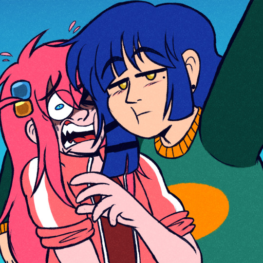
#this is a Slightly Improved Version for the simple fact that i forgot to draw Roy's fuckin face mole the first time
Text
Hey, you two. You're scarin' the hoes, stop that.
#hitori gotoh#ryo yamada#boryo#bocchi the rock!#bocchi the rock#drawin' da bocch#this is a Slightly Improved Version for the simple fact that i forgot to draw Roy's fuckin face mole the first time#it's been bothering me so i fixed it after like 2 months .-.#but other than that i still really like how this one came out. definitely the best ive ever drawn Ryo 🤔
269 notes
·
View notes
Text
Why I'm Avoiding Describing Ryuu (And Some History pt. 3)

Edit: I forgot to mention that Paradigm is now on Tapas and Webnovel.
ALL BY HIMSELF
As I have mentioned previously, with the addition of the Solo Dungeon, the time we spend with Ryuu all by his lonesome extended. Unfortunately, after writing this quest with just Ryuu, I felt the difficulties of having a single character going through events.
Luckily, because a lot of my other story ideas had been written in the first-person point of view, I had a lot of practice writing about people left alone with their own devices.
In one of these stories, I realised that the main character had to have a foil to go against his overly depressing point of view so I invented a new character that was literally in his head so that he had someone to bounce his energy off of in the many scenes that he is physically by himself.
As a warning to people who want to start writing, try not to have one character all by themselves for an extended amount of time. It would really save you a lot of trouble.
NON-DESCRIPT
Now it might seem weird that I have not described Ryuu's looks at all so far. There is one main reason why I made that deliberate writing choice, and I can provide you with one simple diegetic (in-universe) explanation as to why.
Reason: Please look back up to the picture above. It's slightly blurry and badly lit, but that is in fact the original copy of "Volume 1" of the original version of the story. When it was still a manga and had the title: Kingdoms of Darkness.
Over the years, as my drawings "improved", I attempted to redesign Benjin (who was later renamed Ryuu). However, all future redesigns fell under the trapping that was created by this original design of the character.
When I readjusted aspects of the story when I was creating/planning Paradigm, I realised that the old aesthetics of Benjin felt out of place when put onto Ryuu. Many aspects of the character's physical appearance and personality were tweaked or even outright changed and it didn't feel like the character was now represented accurately by the design originally created by an angsty, "edgy" fifteen-year-old.
Bonus Reason: Looking ahead, I also knew that if my story ever became something similar to The Beginning After the End or Solo-Leveling, I didn't want the artists to be bogged down by outdated character designs created over a decade ago.
Diegetic Justification: Ryuu doesn't think about the way he looks that often — not with the focus on hunting for the orphanage and now the life or death situation he finds himself in the Wave Rooms in the Solo Dungeon.
CONCLUSION
In the future, especially when Sophia joins the story, there will be opportunities for Ryuu to be thinking about his physical appearance, and to a certain extent I will fill in a few details about how I imagine him to look like, although I would like to leave some details up to the reader's imagination.
Once again, thank you for your time. I hope you're staying well and safe, and I hope to see you next week.
KIDdyW25
0 notes
Text
How the hell did we end up here?
Here’s an extremely compact and concise version of the history of emo: First we had folk tunes. From this we developed the blues which in turn led to the creation of jazz. Rock was then directly inspired from jazz. Things got political with punk rock and then everyone decided touchy-feely was the next cool thing and thus emo was born. Simple, right?
Now this next part may shock a lot of you, but here goes nothing: I hate emo music. There, I said it. It seems like someone (a lot of someones for that matter) forgot what music was supposed to sound like and decided that any sound was good enough to be music. Spoiler: It’s not. However, the history of emo music itself is pretty fascinating, so let’s go back and see where emo can trace its roots to.
In the early 1900′s, radio had not yet become a mainstream consumer product. As such, music at the time consisted of folk tunes that had been passed on through generations. The biggest source for folk tunes and other music at this time was the African-American community in the south. During slavery, African-American communities developed songs that typically had religious meanings and these spread throughout the south, especially after slavery had ended. Because many of these African-Americans had no formal musical training, most of these songs were A Capella with no or very limited instruments. It was here that much of our current music got its start (even emo).
youtube
It was also at this time that recording and broadcasting technology began to spread, and with it came the blues. The blues genre was still heavily contained within the African-American community and it made up a large portion of the discography of the 1910′s and 20′s. The blues relied heavily on many of the same musical techniques and styles of the folk tunes that had been around for generations, but the lyrical content was a shift from folk styles. Artists now sang about themselves and problems in their everyday lives (sound familiar?), which was a shift from the religious folk songs that had been the staple of the African-American community for decades. The blues started the shift towards secular music and expression of emotion that would be seen later in the emo movement.
youtube
As the 30′s and 40′s rolled around, musicians had really started coming into their own. The music industry was up and running and a person could have a legitimate chance to make it as a musician. One of the new major genres of this time was jazz. Whereas songs before had been melodically simple and typically focused on a single performer, jazz decided to take every rule in the book and break them all. Many songs had no lyrics, the first actual bands were formed, music was harmonically advanced, and songs were typically improvised and changed all the time. I mean, just look at this chart to see all the different ways to play a single scale’s chords. Combine this with the fact that there are 12 scales in music, you have 252 chords to choose from for your songs. Sounds fun, right?
youtube
As jazz decided to break more and more rules, eventually some people decided that enough was enough and that music needed to have a little bit more structure. It was at this point that the music scene splintered in two, with one branch exploring the possibilities of jazz more whereas the other decided to take a step back and make more concrete songs. They wanted songs to have form and structure, not just be improved as the song was being played. They took many of the ideas and techniques of jazz but decided to write it down. Bands still consisted of a drummer, guitarists, a bass player, and occasionally a vocalist. This was where rock got its start. At first, jazz and rock sounded extremely similar. But as time went on, the two kept growing farther and farther apart from each other.
youtube
After rock had been around for a while, some people got really sick of it (and some other things too). They decided that they would go against everything and do everything they weren’t supposed to. The punk rocker was born. Punk rock revolved around the idea of doing everything that society told you not to. Many experimented with drugs, alcohol, sex, and a wide variety of other things. One of the things they decided to mess with was the rules of rock. Why listen to what everyone else is telling you to sound like when you can just make your own sound? Punk rockers started developing a sound that was unique to them, and that wasn’t necessarily a good thing for their musicality. Rock at this point was a well-established genre and there was a formula for how songs should be written and sound. Punk rockers took a slightly different approach.
youtube
They made everything as loud and fast as possible. Lyrics were typically over-the-top and the sound was so distorted you could barely make out what the band was singing. It was from this breeding ground that eventually someone cried and decided to write a song about how they felt, but in the same style as punk. Welcome to emo.
Emo draws on so many genres to create the - unique - sound we all know it for. It’s interesting to think that the shirtless white boys yelling about their emotional problems in the 80′s and 90′s can trace their beginnings all the way back to the pre-war American south. So even though emo may not be the best sounding music (which let’s face it, that’s being extremely generous), the history of how it came to be is fascinating in and of itself.
2 notes
·
View notes
Text
Developing And Improving My Origami Packaging
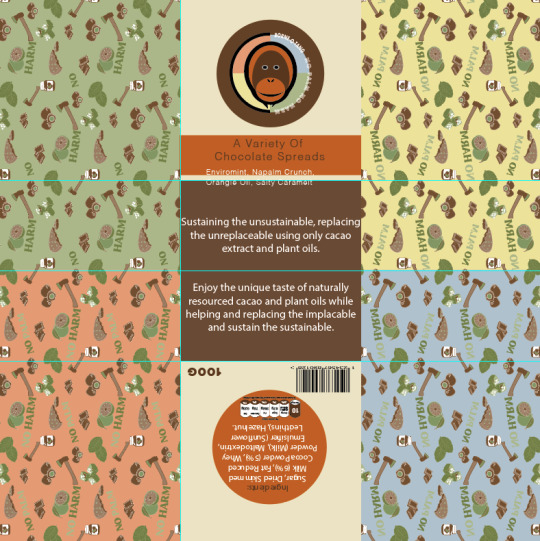
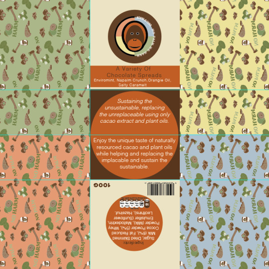
Now that I have critically reflected on my origami packaging at this point in time, I will now be making all these changes that I previously said about and picked up on. To start, I have firstly focused on the back on the design, to which I had added in a barcode and the weight too. I didn't mention this in my previous post as I only just remembered that I needed to add this on for it to become a real product. I did this by simply coping and pasting them from the previous jar labels. I decided to place these in either of the bottom corners as I thought that they wouldn't interfere with the flaps when they fold in. When looking at the back section, I have also changed the orange circle so that its no longer transparent. I have turned the opacity back up to 100%, to which I think this looks a lot more tidier as there wasn't really any need for it to match the jars this closely.
Additionally, the other thing I forgot to mention in the previous post is that the flaps covered up my little icon saying that there's no palm oil in them. This was simply because I forgot that it was there as it was completely covered up. Although, I thought that if I place it on the top left corner flap then this would clearly show this way.
Next, I decided to change the text at the front so that it would actually show the whole phrase this time. While doing this, I chose to slightly adjust the phrase so that it said something different. Instead of it saying ‘A selection of chocolate spreads’, it now says ‘A variety of chocolate spreads’. There was tow reasons for this, one being that this new version as slightly shorter meaning I could fit it on better, but also as I think it just sounds a little better and less predicable. By this I mean that I feel like the word ‘selection’ is used quite a lot of foods, so I wanted a slightly different word that mean the same thing.
Another thing I have chosen to change is the logo, so I have placed in the multicoloured logo as I feel that this just works so much better for many reasons. I then changed the circle around this logo, to the dark brown colour as I feel this gives a strong contrast this way. The reason I was able to use this colour was because I got rid of the rectangle that was going through the logo and circle. This was because this didn't show at all once it was put together so it made no sense to keep it, apart from to match the jars, but the concepts between the two packaging's, doesn't have to be this unified. As well as this, I also got rid of the same rectangle on the back too again for the exact same reason.
After doing all of this, I then remembered that I had to decrease the size of the front and back circles so that they actually fit in, without the flaps covering them. This process was very simple as I just had to hold down ‘shift’ and ‘alt’ for it to size down in the centre.
The other thing I have changed since the last screenshot is I have decided to make the repeat pattern cover the whole of the sides. So instead of it just being on the sides, this way it can show on the flaps as well. I think this small adjustment will make a massive difference as it was slightly annoying before on the position that the pattern stopped. This way, it wont happen this time.
Here, it is now showing where I have thought of a way in which I can make the base of the packaging work, with the orange colour. I mentioned in my previous post that I feel if I use the orange colour in with the dark brown, it will work, although I wasn't too sure on how I wasn't going to resent the orange shade. However, I have thought of using my them of circles to my advance as drawing a circle to fit the whole base but still have the brown showing in places. So this is what I did, where I then felt to have the type written inside this shape. To do this, I needed to copy and paste the circle and then use the ‘type tool’ and click on the shape once it changes to a circle instead of a square. I could then write out my description. Now looking at this, I think this works so much better as it actually has some interest to draw yo in now. At the same time, it has also been kept quite simple. The only other thing I have been able to change is the fonts, to which I separated the two paragraphs by using ‘ Helvetica light oblique’ for the top section and just ‘Helvetica light’ on the second paragraph. From doing this, it has just helped to show a difference, without being too dramatic.
Below is showing the final result from making all these adjustments to my design. From looking at this, I think its been massively improved as everything just looks neater and more in place.
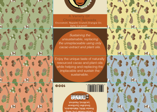
Now moving onto the interior of the design, I realised that I didn't reflect much on the this part, although just from printing it out, I already found one issue. This was that the printer cut off part of my design. This then lead to many problems, one being that the measurements of the packaging is now not 21cm x 21cm. But the worse problem is the fact that it hasn't cut the sides off equally, mainly that one side from the centre is one measurement the other is completely different. This is a problem that I don't think I can fix. Although, when I actually put the packaging together before, it wasn't too bad. I could see that the base of one side wasn't in the centre like it should be.
Another thing I have changed since last time, is the composition. So instead of having the question at the bottom I decided it would make much more sense having it at the top, which I know that I didn't want to do at first as this is quite boring. But when you think about it, everyone will read from top to bottom meaning that they will read ‘no palm’ first, then the information and lastly the title. Whereas the title is what you ned to read first.
As well as this, I edited the logo so that it matches with the exterior now. I have changed the circle so that its showing the quarters with each colour being different.
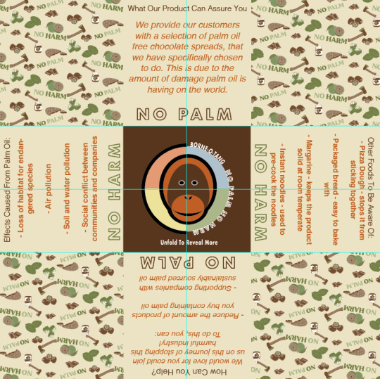
The last adjustment I made was to get rid of the text saying ‘unfold to reveal more’ as like I said before, this seemed very tacky to me. I have then replaced this with an orange circle that is going around the logo. I have drawn the circle so that its fits the base again, as this will then match the other side, where the type is and this same colour theme.
As a result, I have now finally come to a point where I’m very happy with this design, layout and colours. So now, this means I will need to print out my final design onto some more thicker paper as this will then give the final product a more luxury feel. After that I think I will add the same green coloured ribbon that I found when creating my initial origami packaging. This is because green will match with the colour from my repeat pattern and should hopefully compliment with the other colours too. The other colour I could use is white as this would then match with the lids of the jars inside, although to me this shade is a little boring.
0 notes
Text
Shadow of the Comet – Final Rating
By limbeck
The first time I played Shadow of the Comet was probably some time in the late ’90s or early 2000s. I was relatively fresh in RPGs and the Cthulhu Mythos, and still at university. So, a Cthulhu Mythos inspired adventure game definitely looked like just what I needed to fill my appetite for relevant pop culture.
I don’t remember much from that playthrough, but I sure as hell remember being impressed by the fact that I could face some of the Great Old Ones (GOOs) and frantically looking for walkthroughs through my brave dial-up connection to get through the final stages.
“Frantic” is a word perfectly associated with some parts of the game
This time around, I had a mixed bag experience, though I think that my gameplay posts mostly focused on the negatives and contained quite a few rants. I am a man of small patience it seems. Nevertheless, the playthrough was by no means a negative experience. There were many things I enjoyed in the game, namely the setting, some of the character interactions and the story, cheesy as it was. However, as Ilmari and Vetinari commented in the introduction post, the clunky interface, along with some sanity breaking puzzles broke my immersion.
I am talking about you, dark chamber puzzle
But let’s see how fair I am to the game using the PISSED rating. This is my first time, so please bear with me.
Puzzles and Solvability
We start with what frustrated me most in the game. It is an adventure game and puzzles are essential for the player’s enjoyment. Unfortunately, many of the puzzles in the game were bad. They were bad in many ways. I may be overreacting, as I am a soft adventure gamer. I play the games mostly for the stories and, as mentioned above, I lose patience with an obscure puzzle easily. I hope you will agree with me though, when I say that these features do not make good puzzles:
Timed sequences when the time you have at your disposal is very little. I like it when the game gives you time to think and I prefer it if that time is not during a reload. There were way too many puzzles that I only had a few seconds to think of something before I died. At least I died with variety. Examples include the scene at the forest clearing at night, the temple of Dagon, all encounters with cultists and that damned JONAS chase.
Action sequences that do not involve clever thinking but just being able to press the right buttons at the right time. As above, I want to play the game at my leisure. I can understand that such fast paced encounters add to the atmosphere of the game. My fleeing from JONAS fits with the horror theme of the game, but it was not enjoyable at all.
Lack of clues and feedback. There were many puzzles when I felt I was stumbling blind. Sometimes, I had no idea what I was supposed to be doing and sometimes I knew what I had to do, but the options were so broad that it practically forced you to bruteforce it. What made it worse was that sometimes items that were completely unresponsive in one scene held vital clues after an event took place.
Pixel hunting. There were many puzzles when I had to be standing in a specific point, such as the one with the key to the Necronomicon under the carpet in JUGG’s house.
JUGG sure hid it well
Mini games. Sliding tile puzzle.
Dead ends. I only encountered one, when I forgot to refill my naphtha bucket, and Charles mentioned another one with BISHOP and the cemetery key. I think that in 1993, there was enough experience in design to avoid dead ends. Still not a big problem if you save regularly, as you were not walking dead for too long.
On the good side, though there were some clever puzzles, like the last one at the stone circle or the one with the wings at the top of the lighthouse, even if the latter made no sense at all. The UI did not allow you to directly combine items in your inventory, so the designers had to find other ways to challenge the player. Some of them were clever and they make sense, but most of the time, they make sense only retrospectively. I understand their intention of pushing the player to think logically and consider what he could see in the room, but they mostly relied on visual cues. I also liked the fact that you could reuse some of your items and you didn’t have to throw them away after use.
I will keep that magnifying glass until I die
Overall, I must say I am not satisfied with the quality of the puzzles in the game, but there were good moments and many missed chances.
Score: 3
Interface and Inventory
This is another category where the game could have done a lot better. The tools were there, but they seem to have been only partially implemented. You may remember that in my first session I misunderstood the “laser sight” to work with any object I could interact with. I was wrong. It turns out that it was about what I could pick up. This made the whole game a lot harder. It meant that I had to be standing at the correct place to interact with something and the lack of feedback meant that I couldn’t know if I was meant to be standing at a different pixel or that there was indeed nothing there. This is indeed a missed opportunity to improve user friendliness.
That lack of feedback annoyed me many times. My laptop’s L (Look) key would be worn out if it was made of a slightly less durable plastic. I think I can see the letter fading away. And yet, in most cases I would never get a description (see my rant about the naphtha pool). It wouldn’t hurt to have a description of the room and something more helpful or even just some flavour text.
That rifle on the wall holds a vital clue, but it took me
some time to really look at it. Maybe that’s my fault after all.
Another problem was the clunkiness of movement. I played the floppy version and there was only keyboard support. That’s not a bad thing per se. The game was well designed around it, but it always felt that it was responding too slowly. That was a real problem when I had to act quickly, such as when being chased by JONAS. I did not have the courage to try the same in the CD-ROM version, but I remember moving with the mouse was much clunkier.
Other than that, inventory management and controls were very simple and intuitive. There was no way to combine objects at will, but that may have hurt the variety of the puzzles, not the interface.
Score: 4
Story and Setting
The story of the game is based on what is considered a typical Lovecraftian story (I think some of the best of his stories do not follow that pattern, but that’s not for this post). A small, quiet town which hides a disturbing secret, usually a cult to some horrific extradimensional beings with unpronouncable names. The protagonist is slowly introduced to the underground of the town and the story reaches a frantic conclusion, usually in a short time span, which is sufficient to kill or drive the protagonist mad.
In this game, kill more often than turn mad
Seen in that setting, the story is a bit cliché, but it works. The writers may have been a bit too excited and included too many GOOs too close together, but for someone not so much into the Cthulhu Mythos, it should not be a problem. What could be a problem, though was the way that I was railroaded into some situations, without really having any idea why I should be doing it. The whole storylet with the lighthouse and the gypsies is my pet peeve here.
The motives of the characters are explained in a satisfactory way. Each character has a small background story and their relationships are shown through your conversations with them. I empathised with some of them, particularly poor, tragic CURTIS and even BISHOP, while at the same time, could not help getting annoyed by Miss PICOTT and ZEKE. Regarding the villains, for most of the time they remained distant and I only had second-hand information.
A nice example of unnecessary, but entertaining, background fluff
In summary, it is a passable, but cliché, story, with memorable, but cliché, characters in a nicely fleshed out little town.
Score: 7
Sound and Graphics
I am torn with this one, particularly about the graphics. So, let’s start with the sound first.
In the floppy version, which I played, there were only two or three different background music scores, which they repeated a few times after loading or after some scenes, but there were long periods with no music at all. The themes were very nice and fitting to the atmosphere. If they had more storage, they could do better. I want to believe that the CD-ROM version had more variety.
Sound effects consisted entirely of digitised recordings and they were annoying for the most part. They would usually play once when you entered a new screen. For example, the same bird chirp would play every time a forest screen loaded and the same very annoying cat meowing would repeatedly play in all cemetery screens.
There was no speech in the floppy version, but the little I saw of the CD-ROM version did not leave me much impressed. MorpheusKitami’s comment in the first gameplay post seems to imply that there is much to be desired from the speech in the CD-ROM.
Now to the graphics. As I mentioned above, I am torn. The technique used to digitise photos for the exterior of the buildings gave some nice realism and added to the atmosphere of the town. Another thing that struck me as ugly were the cutscenes. It was a mix of faux-3D and 2D animations, with too sharp angles and very flat colours. That dived quite deeply into the uncanny valley.
The interiors were almost entirely hand-drawn though and this was a mixed bag. Drawing was clear. You could understand that a desk was a desk and that there was a lamp on the mantelpiece. However, sometimes the proportions were overblown, as someone commented early on.
My room is a good example. It would be impossible
to warm it up in winter and the door is twice my height
I need to praise some of the locations that were very nicely drawn and coloured appropriately to enhance the atmosphere of the particular location. That goes for the cemetery at night, the crypt of the HAMBLETON family and even JONAS’s maze. I think the colours and drawings were just right there.
Anyway, all things considered, I am sorry, but I cannot go very high on this one.
Score: 5
Environment and Atmosphere
Reading previous reviews, it seems that this criterion is the one that presents the most difficulty to reviewers. I count myself to be on the lucky side. Looking at a Lovecraftian horror-themed game like Shadow of the Comet, I believe I knew what sort of atmosphere I should experience. I was expecting a slow burn at first and a flood of horrific revelations at the end. What started as a quiet stroll in the park would end as a frantic dash through a dark forest with clawed hands reaching for you.
The game managed to achieve this feeling quite well, provided that you would not get stuck in puzzles for too long, but maybe that was part of the horror experience. Illsmouth I think is the perfect little town, with its inhabitants following their daily patterns and only speaking to you if they feel like doing so. I come from a large city, but have spent far too many summers in my parents’ village on the island. I can see the similarities and hope that my village is not built over a forgotten temple of Dagon.
I believe I would have noticed
The horror part is also well presented, but less so. There are scenes and locations that take you in, but many times it feels forced. The appeal of Lovecraft’s stories is that you do not really know what you are dealing with until the very end. Here, you are fed with a lot of exposition and are immersed in lore. I understand that this is an adventure game and not a horror story, which is also why it is not easy to get the atmosphere just right.
Still, there were scenes which worked very well, and I will mention again the discovery of CURTIS’s corpse and the section in the cemetery and in the crypt. One could say that the chase by JONAS also works towards the horror atmosphere, but I died too many times to appreciate it.
Score: 7
Dialogue and Acting
The game has a lot of dialogue, but less than half of it offered multiple options. In most cases, dialogue played as a cutscene and my only contribution was to hit enter and read the next line. The designers introduced dialogue options when they considered them critical for a puzzle or to lead me to a different branch of the story, usually my death.
Exhibit A
I believe this approach worked quite well in the building up of the setting of the game. Illsmouth locals got their life through these chats, either with PARKER or among themselves. I also enjoyed the dialogue puzzle at the town hall which opened the path to the Mayor’s office. In most other cases, however, my options seemed inconsequential, even though some answers seemed clearly more appropriate than others. A potential dead end via dialogue was reported in the comments, with BISHOP potentially leaving without ever giving me the cemetery key, but I did not have a saved game before that to verify. I am willing to give the game the benefit of doubt, but other design choices make this benefit very small.
The quality of the dialogue is adequate and mostly appropriate for the type of game. Some horrible one-liners aside (“Say hello to SATAN”), the dialogues were written keeping the characters and overall story in mind and were not too cheesy (SATAN line aside).
I cannot say much about the voice acting of the CD-ROM version. The little that I saw seemed awkward and there were problems with the synchronisation with the speaker’s sprite. May be too much to ask from a game of that era, but I think the Case of the Serrated Scalpel did it better (if it did not, I apologise. I played most of the game with sound off because of a bug).
Score: 5
So, that gives us a PISSED of 31 / 0.6 = 51.666, rounded up to 52. There was a wide range of guesses, as high as 62, but ShaddamIVth guessed correctly. That makes it two games in a row, after the Journeyman Project.
I hope you enjoyed the game and the review and that I’ll be able to write something more before Prisoner of Ice in 2025 or so.
CAP Distribution
100 points to limbeck
Blogger award – 100 CAPs – For blogging through this game for our enjoyment
32 points to TBD
True Companion Award – 25 CAPs – For playing along with most of the game and providing useful commentary
Obscure music reference Award – 5 CAPs – For putting monster mash in my radar
Adam West Award – 2 points – For knowing how hard it is to get rid of a bomb
28 points to Charles
True Companion Award – 25 CAPs – For playing along with most of the game and providing useful commentary
Superhero mashup Award – 3 CAPs – For the mental image of Bruce Wayne changing into his Batman uniform in a Gotham City phone booth
25 points to MorpheusKitami
True Companion Award – 25 CAPs – For playing along with most of the game and providing useful commentary
15 points to Laukku
Free betting cash Award – 15 CAPs – For guessing that I would not be able to solve the photo development puzzle and almost getting it right.
13 points to ShaddamIVth
Psychic Prediction Award – 10 CAPs – For guessing the final rating for Shadow of the Comet
Pipe Master Award – 3 CAPs – For enlightening all of us on the functionality of a sprague (totally unrelated to Prague)
5 points to Vetinari
TLDR Award – 5 CAPs – For summarising my review in less than 50 words
5 points to Andy Panthro
Nicholas Cage Fan Club Award – 5 CAPs – For reminding me that there Colour out of Space is now a movie
5 points to Patryk
Miskatonic Theology Professor Award – 5 CAPs – For debating the position of world religions in the otherworldly mythology of the Ancient Ones, as described by H.P. Lovecraft and the curators of his works
source http://reposts.ciathyza.com/shadow-of-the-comet-final-rating/
0 notes
Last Seen Blogs

mobikefed
Missouri Bicycle & Pedestrian Federation


machawuf
♡rui kisser♡

vxlaquenta
soft nerd aesthetic

ghostenluvs
art and chaos