
sonofthepear
Sonofthepear
The official creative blog of graphic designer Luke Pearson.
471 posts
Don't wanna be here? Send us removal request.
Last Seen Blogs
sachaa-ff
Goodbyes Aren’t Forever

roashancooperation-blog
Untitled

acn-newswire
ACN Newswire
sashagreseo
✨️MIDNIGHT SUN✨️

waititskyla
happy go lucky
Text
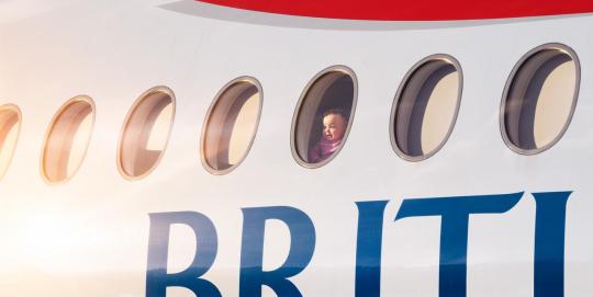

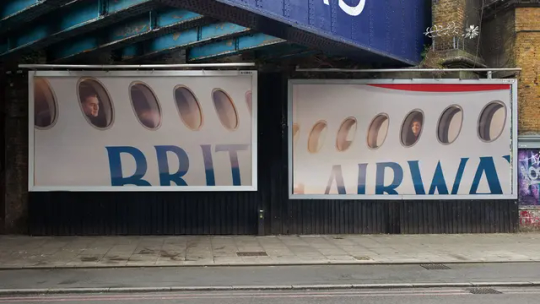
British Airways
We've all been on a plane and taken a photo of the clouds or our destination from above. Well, British Airways with their latest OOH campaign has flipped the perspective. Using photography from the outside looking in at the reactions of passengers. Capturing the emotion on the faces of people relates to everyone and is a reminder of the feeling you get when you travel. A great piece of marketing using photography to tell the story and tug on the emotions of people who can relate.
0 notes
Text

Adidas by Ad Professor
I came across this advertisement created for Adidas on LinkedIn by Ad Professor. This was a quick coffee break project but the way it has been made is great for a brand like Adidas. The famous logo of the 3 stripes as obstacles alongside the most common excuses made by people when it comes to exercising. The tagline heading brings the whole thing together, "Climb over any obstacle" emphasising excuses as obstacles. I love how creativity comes from anywhere even a coffee break can spur the creative juices.
Sources: LinkedIn
0 notes
Text


Mert Cobanov
I've managed to resist the hypnotic nature of these pieces by Mert to be able to appreciate how wonderful this work is. Being able to create a piece of work that looks like a checkerboard or spiral using elements part of the image is something next level. Satisfying to look at and with the clean edges whilst nothing being out of place as well. Some great work from Mert who was inspired by work created by MrUgleh.
Sources: @mertcobanov @MrUgleh
0 notes
Text


Amazon Prime
Interesting pun-related out-of-home adverts from Amazon Prime. Informing that Amazon has a vast range of products available to choose from. Using the link to their logo where the arrow smile goes from A to Z, they have expanded this to actual products. Splitting postcard and popstar up and using imagery to relate to the split words. Post Malone for post, and playing cards for card, whilst popcorn is used to reference pop and Dua Lipa for star. All of this with an accompanying tagline reiterating the difference in products they offer.
0 notes
Text
youtube
Hyundai Motorsport
Stunning work from the Hyundai Motorsport media team with this one, with their recreation of the anticipated Grand Theft Auto 6 trailer. Matching the trailer in a very similar way using footage of their factory, drivers, crews and live rally action. A great idea to jump on the back of something as big as the long-awaited video game.
Including cameos from their team principal, Cyril Abiteboul and drivers headed by Ott Tänak. Such a great concept and a great execution. I wouldn't be surprised if we see more of this from others.
#hyundai#motorsport#wrc#rally#gta 6#grand theft auto 6#cyril abiteboul#ott tanak#video#motion#design#marketing#media#Youtube
0 notes
Text
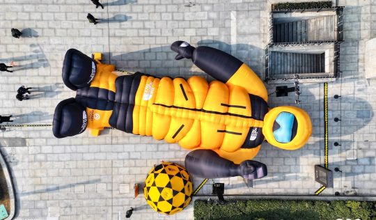

The North Face
This is a great bit of marketing from The North Face in China. Creating a pop-up store in the shape of an explorer dressed in products from The North Face. This is not only disruptive to the public which makes it more intriguing for customers to explore inside, where they would be met by The North Face products. Statements like these often cause curiosity and can lead to potential new customers after seeing what the brand can offer.
0 notes
Text
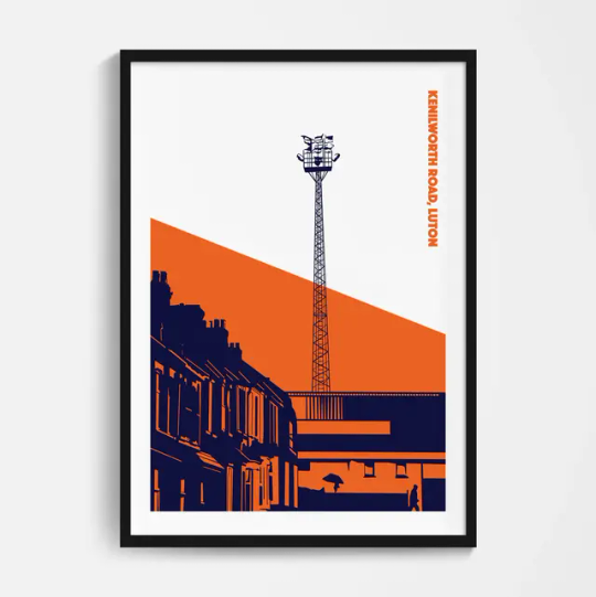


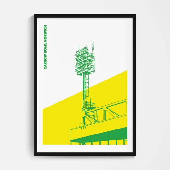
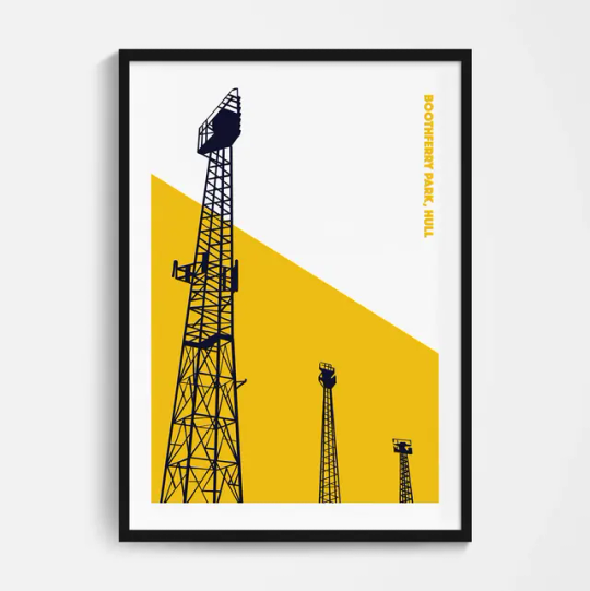
Football Devotion
I love this floodlight series from Football Devotion. The minimalistic designs of floodlights from football grounds around the country are very unique. Personalised to each clubs fan base to be able to recognise the imagery and the colours from just a small part of their ground. I love football and anything that's design and football I take a real interest in, and these are some of my favourite print designs I've seen.
Source: footballdevotion.com
0 notes
Text
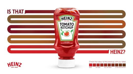

Heinz
Great piece of advertising for Heinz Turkey. Communicating with their consumers that Heinz has a distinctive colour Pantone. They also highlight the fact that some local businesses will try and trick their customers into believing they serve Heinz when it will be a cheap version of the product. A great way to show people how to distinguish the quality of Heinz and anything, not Heinz.
0 notes
Text
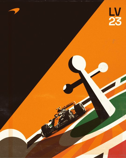
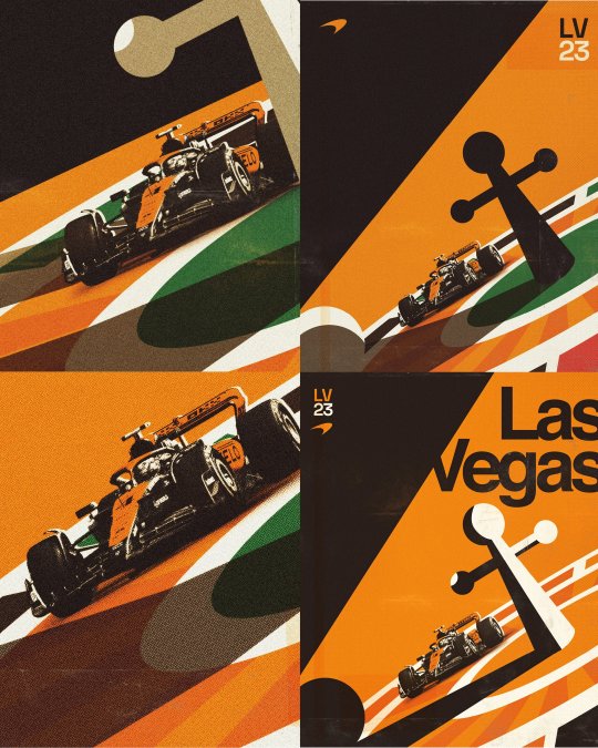
Neil Jamieson
I've spoken before about Neil's work which just gets better with each project. One of his most recent projects has been for McLaren and their Formula 1 team. Promoting the Las Vegas Grand Prix, Neil has taken inspiration from the Vegas culture of Gambling and Casinos. Love how he shared his creative process across different versions and being able to use the car like it's going around the flat roulette wheel is a great addition.
Sources: njamieson.com
0 notes
Text
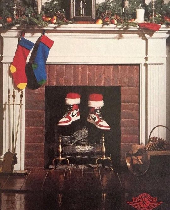
Nike
Because it's Christmas I thought why not roll back the years to 1985 and one of Nike's best adverts in my opinion. To promote the Air Jordans, Nike knew that the Christmas period would create a large demand for Air Jordans. Kids wanting to be like Michael Jordan and adults wanting to emulate him too. So by using the biggest name over Christmas, they made the impression that Santa Claus wore Air Jordans. Showcasing that they're the best shoes to own cause even Santa wears them. I like how simple it is but just shows a Christmas fireplace and two feet showing. The story tells itself.
1 note
·
View note
Text


Eileen Steinback
Eileen is one of my favourite movie poster designers out there. The way subtle movie nuances are used in the imagery to convey a key part or personality of a character is so well done. One of my favourite posters is the Social network. The top half is like the original page header of Facebook and under friend invites there are 500 million notifications, a nod to Facebook's member count. Also, the photography relates to the legal battles shown in the film. Whereas Mark Zuckerberg may not have worn flip-flops in these meetings, this is related to a specific scene in the film where he wears them while it's snowing.
Sources: sg-posters.com
0 notes
Text
Oatly
Some great marketing work from Oatly here in Paris. In the city brands are allowed to paint murals on walls as long as they're done in an artistic way and don't show any product imagery. Oatly cleverly then created the artistic adverts but then added other 3D elements to go in front of the murals such as a pallet of boxes, portaloo and even a van. They have then painted part of the advert on these objects to include the product so when at the right perspective each advert can be viewed with the product as well as supporting copy. It's genius.
0 notes
Text


Jaime Sanchez
I'm a big fan of Jaime's work throughout but in particular his Lego brick project. Using Cinema 4D, Jaime has created a generic Lego brick but then turned that into other objects in life. Using Amazon packaging to create a delivery box, one being made of candy floss and another wrapped in clingfilm as if it was raw meat in a supermarket. I also like the influence of art within this series, with one brick being designed in the artistic style of Piet Mondrian.
Sources: @jaimesanchezart
1 note
·
View note
Text
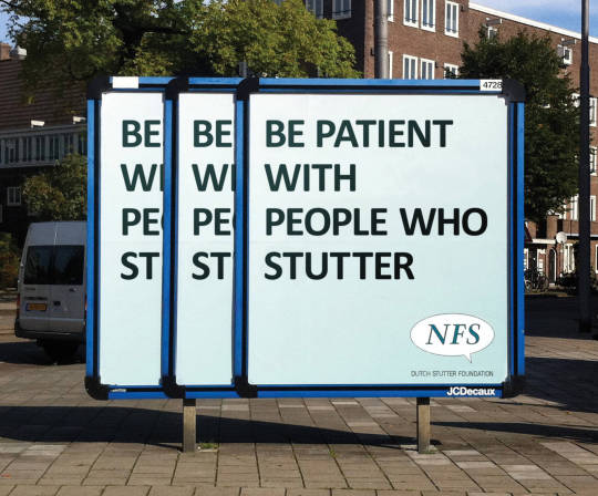
Dutch Stutter Foundation (NFS)
Great piece of advertising from the NFS. Being able to communicate the importance of patience with people who stutter. Using one advertising board to give the impression of three, to then make it read as someone stuttering. Makes everyone read it as someone stuttering but also eventually shows the main message of making sure people are patient with people.
0 notes
Text
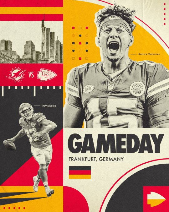
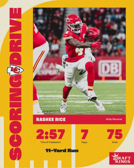
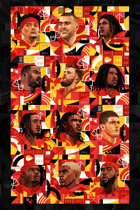

Nicholas Chuan X Kansas City Chiefs
Some great work here by Nicholas to promote the NFL taking place in Germany for the Kansas City Chiefs. Using inspiration from the Bauhaus movement I think it works so well alongside the Chiefs and German flag colours. To player illustrations to the use of the assets for social media posts. Everything aligns perfectly and and on brand for the team but also the location of the game.
Sources: Twitter - @ChuanGraphics, Instagram - @chuangraphics
#nicholas chuan#kansas city chiefs#chiefs kingdom#germany#nfl#frankfurt#graphic design#illustration#social media
0 notes
Text


Enrico Focarelli Barone (aka Frelly)
Stunning illustrations from Frelly created for Nutella Italy. 21 letters of the alphabet have a distinctive illustration that links to the Italian word associated with the letter. Starting with Amore for A through to Poesia for P and Unicita for U translating to poetry and uniqueness. I love the bright colours that make each jar stand out and unique. The illustrative style Frelly has suited the branding of Nutella for me as well by creating a family and friendly feel
Sources: @fr3lly
#frelly#Enrico Focarelli Barone#nutella#illustration#design#branding#italy#italian#art#graphic design#creative
0 notes
Text
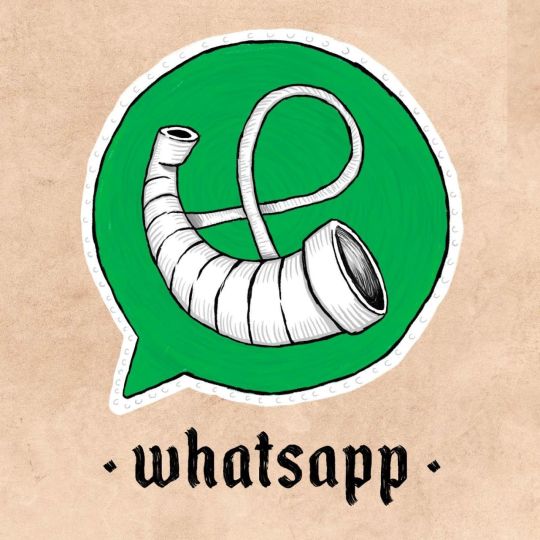

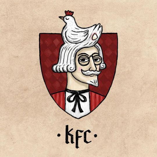

Ilya Stallone
I can't get enough of these medieval logos created for modern-day companies. Mixing different periods is always fun to see and here Ilya has done it so well. Relating modern items such as the phone in the WhatsApp logo being changed to something I wouldn't even know the name of. The smiling face arrow synonymous with the Amazon logo being changed to arrows used with bows is another example. I do like the KFC version as this just works so well and could so easily be used in medieval times where food would be served.
Sources: Instagram - @ilya_stallone_artist
0 notes