#*makes her a whole ass design*
Text
wormie wormie wormie wormi-
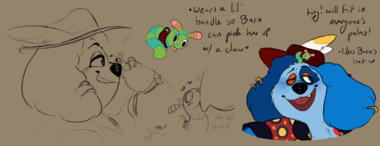
#tiny little guy!!! teeny thing!!!#i imagine that wormie acts kinda like a cat mixed with a crow#also she Violently wiggles her whole body when she sees barnaby. thank you for coming to my ted talk#fully convulsing. acting as though she's jello in a centrifuge#and she Does Not Stop until she is held so barnaby has to figure out how to pick her up w/o hurting her#its very amusing in my mind... hes laughing his ass off as she flops all over the place#she doesnt make noise except for very brief quiet squeaks!!#also wormie is not technically female. no one knows what the fuck she is if anything#but barnaby started referring to her with feminine terms and it Stuck#kinda like finding a cool object and going 'oh she's neat'#yeah like that!#wormie lore hidden in the fantasy au...#scribble salad#wh fantasy au#im melting picturing barnaby holding her by the 'handle'#he commissioned the harness himself... made out of the same leather as his gloves! & the same etched design as his boots!#guys im so soft thinking about them.... barnaby and his little pet worm...#i imagine he teaches her tricks... carries her on his hat.... baby talks her cause she's just that tiny how could he not....#im picturing a Scenario where barnaby full speed full force bodyslams eddie who was just walkin along#like Full Force. eddie flies back ten feet and leaves a groove in the dirt when he lands - everyone goes Hey What The Fuck Barn?!#but as soon as he does it barnaby is rushing over like 'omfg im so sorry but i had to - you were about to step on wormie'
264 notes
·
View notes
Note
omg i literally love wheelbitten as a comic and ur art is amazing
random question but how long have u been drawing as an artist and do u have advice.............
thank uuuu and I've been drawin my ass off since I could hold a pencil and I'm 24 (25 next month) now so this shit wasn't overnight by any means lmfao idk the way i did it was have A Thing that you like drawing and just draw the fuck outa it and eventually you'll get better for sure whether it be the desire to get better at drawing said thing makes you do research and study something to become better at it or just literal muscle memory from drawing said thing so much. I had lil spouts of taking time to get better at specific things like anatomy, shading, ect. by studying it but overall i just subconsciously got better by mentally picking up new things everytime i draw and analyzing the world around me. Even recently i got to see that with drawing tactical gear (that ive never really drawn before and never wanted to draw in my life) soley bc i just REALLY fukkin love Ghost and Konig

i went from being terrified and intimidated of drawing tactical gear (even trying to put a gun in front of it as if that was any better lmfao) it used to be vague as hell and my brain would shut down just trying to look at the references(i remember having a ''shit man am i even gunna be able to draw these characters???'' moment of dread the first time i was drawing Konig pffft) to absolutely loving drawing tactical gear and seeing how much more detailed i can make it with every new drawing, so a complete 180 but that's bc im just totally obsessed with the characters and drawing is how i express that sO thats mainly what i mean by just have a thing that you love and want to draw and the rest should follow with time, patience, and practice. I think it's about training your brain and motivation to pick up on details or a certain way something looks in lighting (or lack thereof) bc my brain is probably wired a certain way after art being like a centerpiece of my development to the point to where drawing is just What I Do and at this point if i dont draw for even a few days i start getting vaguely antsy and fidgety it's crazy lmfao SO idk if this is worded like i need it to but yeah art and the act of drawing can be frustrating as hell but it should be enjoyable and rewarding above all else at the end of the day!
#i drew bc the piece of shit im unfortunately biologically related to drew a lot when we were kids so id just copy her#then i drew winged wolves and dragons and the occasional horse for like 7 years then The Axel obsession started#where i drew axel from kindom hearts literally all the time and had 870000 aus for him where i would draw for all of them#when i tell you the obsession for him was catastrophic u best believe but it kept me drawing like a motherfucker until i made my monster oc#which was around the age of 15 is when i started consistently drawing humanoids#OH YEAH i had a whole lion king phase too in 2011 where i would strictly draw lions all the time and my first record of drawing online was#on the lion king fanart archive (which i still visit to look back its like visiting an old janky friend:') )#but yeah then my heart was stolen by my ocs and all the potential designs i could make them#and thats where i am now aside from the festering COD masked men obsession boiling over in the corner AHA#so basically latch onto an obsession and pick up that damn pencil#even as a kid if i liked anything the immediate connection was trying to draw it#didnt matter how weird to draw or undrawable it was my ass would be in that notebook bc its the only way i know how to express myself lmfao#this is long as fuck but NOW im out peace skskksk
41 notes
·
View notes
Text
Harriyanna Hook descendants designs by Rose Sparrow
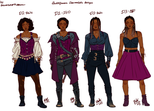
what at first was just me having some fun, turned into an early bday gift for ms @harriyanna~!!! happy birthday!!!! this was really fun to do and i think the only thing that gave me trouble was the bread this down dress, not the dress itself but its color pallet-the top was originally a brighter pink but i felt that didn't mesh well with the rest of the designs and felt more ‘Auradon’ than vk/isle, so boop bap turned it black and the belt black too~ and aaahhh~~~ i love it all~
D2 is based on her Harriyanna Hook cosplay Harri did a while back, and D3 beyond is mostly from my Poyw Rose outfit Pinterest board cuz idk rose has a good fashion sense XD i wanted to give her a constant corset theme since her harri cosplay had that gorgeous full corset, so i gave that to her two main designs from d2, and continued than into a below the bust corset for her main d3 look, which turned into a bust only corset/top for btd~!!!
i very much tried to give her, her very own vibe/character instead of trying to turn her into a copy of someone else, because like my Rose, i think Harri is inspired by Harry, but i didnt wanna just-copy paste his vibes onto Harri...so i hope that came across correctly lol. gave her a bitchin sword for its goin down, and her braids for d3 since i based her d2 look off the cosplay shoot, which then her hair was not in braids :p
again, this was alot of fun and im glad i did it.
now! its off to bed, since i have work tomorrow and i would like to get up at an appropriate time so i have more free time in the morning before work.
#disney descendants#harriyanna hook#Harriyanna hook descendants designs#art#my art#my designs#d3 designs#oh and this Harri is in my rewrite world cuz if she was in the canon world we all know she would be unfairy disgracewd due to her hatred of#you know who#and we all know ~no ones allowed to hate *her~*~#bleh#also is she appart of Umas crew or is she the captain of her own ship thats up to Harri to decide~#becuase shes not my character so i dont decide her plot XD#*makes her a whole ass design*
180 notes
·
View notes
Text
Funky Outfit Time! >:D
Tmosth but with the gang!
MASSIVE shout-out to SmileyFace098 on DeviantArt for compiling all of the game assets!
[For the record: Milo and Charlie are NOT genderbent in this, the fake screenshot above takes place soon after the exchange underneath, and Charlie's height in this is wrong because I needed her to be visible above the text box.]


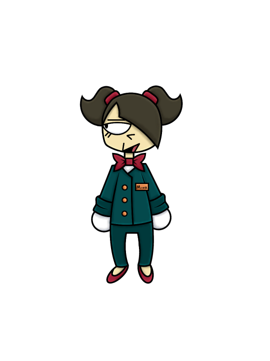


I never shaded my art like this before so let me know what you think! (I'm still figuring it out, it might look a bit messy.)
#Milo asked 'Is anyone gonna use these lashes?' and didn't wait for an answer#Charlie thinks she's hot shit dressed like that (she isn't)#Mina is regretting her life choices but at least she's looking cute with those pigtails#I don't have anything for Molly but I love her#I'll make a seperate post with the sketches n stuff#I added Charlie's guitar just for funsies I know that Rogue didn't have one#Although her ass does not know how to play lmao#If anyone spots the lil details I put in the designs ily#Anyways I spent my whole winter break drawing this so yeah#I gotta start working on some oc lore stuff#For real this time /srs#my ocs#my oc's#my art#my oc#milo#molly moon#mr. t. bear#mr t bear#charlie#mina#tmosth#the murder of sonic the hedgehog#chaotic crossover au#funky outfit time
16 notes
·
View notes
Text
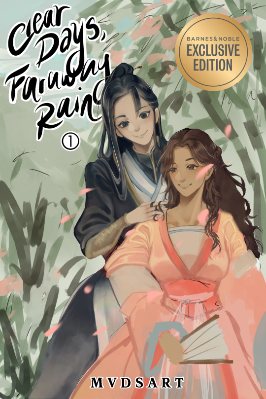
spent the whole day rendering a fake book cover for my ocs and I’m only halfway done,,,, arghhhh
#when I finish I’ll stick the polished version on my main art account#but this wip is driving me nuts#I managed to watch two movies and half of frieren in the time it’s taken me to get this far in#why does it take so long to draw#made a whole ass ‘wiki page’ for them on toyhouse too#tbh it’s all Riyuan’s fault. she’s the hardest to draw. can never quite get her clothes and hair right#<- (I say like I didn’t make her design myself…)#if this cover was just Yuqing I would’ve been done hours ago#alas. what kind of cover doesn’t have the protagonist on it#anyways. my new year’s resolution is to do more OC stuff for myself. so here it is lol#okay time for sorting tags —>#clear days faraway rain#my ocs#wip#my art
5 notes
·
View notes
Text
Ok... I swore to myself I wasn't gonna make another negative MAWS post, that I was just gonna leave it at the Twink Slade disappointment post.
But apparently there's this trend that's been happening on Twitter, where people are trying to bring up the 2004 "The Batman" designs to try and defend the designs of the MAWS rogue gallery. And that was the territory I CANNOT let go, as someone who is a fan of Jeff Matsuda and his character designs.
SO FIRST, LET ME CLARIFY: I'm simply making ONE post about ONE factor of MAWS that irritates me. I'm not here to just sit and constantly bash on the show. I wouldn't do that, I have a personal close friend of mine who enjoys the show and I'm happy for her and I want her to enjoy the show. I have SO many gripes and reservations but I recognize those are personal.
I'll be putting this under a Read More and tagging it as Anti-MAWS so MAWS fans don't have to read/deal with this post. Probably just don't read my tags as well.
So if there's one thing that has irked me the most about MAWS, it's the redesigns and rewrites of Supes' rogue galleries. Mostly the redesigns though. MAWS took a bunch of colorful, diverse, and fantastical designs and made them monotonous, bland, and simply not fun at all. And yes, while the in-universe explanation (Being that they're all mechanically enhanced rather than freak accidents or born that way) makes sense, it still makes the villains incredibly un-appealing. EVERYONE is in boring black, white, and gray armor (aside from Parasite and while I think his physical design is neat I have issues with his character rewrite too, I'm just not here to discuss that). Everyone who had incredibly fun or creative designs was horribly washed out. Silver Banshee went from being a literal ghostly wraith to a boring motorcycle-looking chick. Livewire went from a vibrant blue lightning motif (that SHE herself created) to boring merc armor. And yes, I have issues with Slade's armor, the head was promising but the overall design has color-balancing issues.
Now let's look at the redesigns of the rogue gallery for the 2004 "The Batman" show. These are mostly drastically different from their original design counterparts, just like MAWS. But the massive difference is that most of these designs are still colorful (where it applies, obviously not to Penguin), recognizable, and push the borders of imagination; They're so ludicrous and exaggerated in their design and their physical features. Even if I was disappointed in some of the character rewrites (Like Mr. Freeze having only a small cameo to Nora in the flashback, but mainly being another selfish thug), the designs are still great. You can look at The Batman villain designs and easily recognize them because they follow the basic structure of their original designs.
Joker:
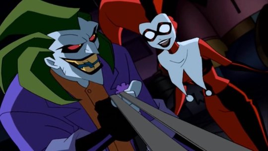
Is still in his green, purple, and orange color palette, with his trademark freakish grin. The design takes creative liberties with the spiked hair, the more athletic physique, and the actual clothing style of his outfit, but this is clearly meant to be Joker.
Mr. Freeze:
Is now essentially a cryomancer thanks to his mutation, but this is still obviously Mr. Freeze. Some kind of helmet (in this case encased in his own ice) wearing a thermal freeze suit, and his red eyes invoking the red goggles he wore in his original iteration.
Catwoman:
The design exaggerates a lot of features of the OG outfit, like the ears and the goggles (though the OG design really just has eye spaces), and uses shades of crimson and purple, but you look at the black bodysuit and the whip around her waist and she can clearly be identified.
The main argument I'm making with the 2004 Batman designs is that they're A) recognizable to their original counterparts by invoking the same color scheme and basic design points, B) Colorful and pushing the lunacy of a world full of supervillains, and C) Completely stand out from each other, no two villains look as though they're of similar origins (besides obvious pairs like Joker/Harley Quinn and the two Clayfaces, the latter which was a guy who took concentrated serum made from Ethan Bennett's Clayface DNA). The Batman designs are good because while they ARE drastically different from their original counterparts, they honor the original designs.
Whereas in the MAWS redesigns, none of the redesigns are reminiscent of their original counterparts (besides the obvious Brain and Monsieur Mallah, kind of hard to fuck that up), and lack the fantastical element that The Batman redesigns (And the original Superman show, where it applies) had.
Livewire:
Looks nothing like her original counterpart. The armored clothes, the lack of lightning motif, lack of color to her outfit (I'm not here to talk about the race-swapping), none of it is supposed to tip you off to being Livewire, especially when her character is written so drastically different. You should be able to tell who Livewire is BEFORE you see her powers.
When OG Livewire looks like this:

Silver Banshee:
Is just a regular human in drab clothing. There's some kind of attempt to give her the hint of a ghost motif with the bone legs, but then that disappears in her later costume design. Same later costume that tries to half-ass a skull motif on the helmet but it doesn't work with the helmet's angles.
When this is Silver Banshee's original design (going with a still from Batman Unlimited)

And if they wanted to stray from the whole "supernatural" aspect, they could have compromised like they did in Suicide Squad: Hell to Pay:
Which I mean I still don't like that redesign as much as Silver Banshee's OG design, but it's still recognizable and it's still cool.
The bottom line is basically this: You don't have to justify liking this new Superman show and its take on new characters. But to try and say the character designs on MAWS are like the 2004 "The Batman" cartoon redesigns is such an unequal and imbalanced comparison. The thought process for the character designs in these shows are so drastically different from each other, and the execution of said character designs aren't comparable.
#discourse#Anti MAWS#Anti My Adventures with Superman#Listen I'm not saying any other gripes publicly about the show; Again I have an irl friend who watches it#and I'm absolutely not about to drag her down or just rag on the show; so I get it#But if there is one thing that can really make or break something for me it's character design#And the one thing I'll openly criticize MAWS for is how basic their character design process seems to be#The showrunners FROM THEIR OWN MOUTHS said that they purposely made Lois look like Luz from Owl House#So there is NOT a lot of creative thought process going into these redesigns#And to compare that to Jeff Matsuda who is an industry veteran and who's worked on MANY shows with incredibly kick-ass designs#Well that is a stick in my craw that I can't let slide#'BUT AURA DON'T YOU LIKE THE 3D HE-MAN SHOW AND THEIR DESIGNS?!'#Yes I do but A) I'm not out here claiming that they're faithful designs to the original characters (Because Duncan and Teela clearly aren't#B) Nor are they badly designed characters that I'm trying to compare to a whole different level of character design#The Batman 2004 show was an incredibly fun show that captured the dark and melancholy nature of Batman; and the villain designs were fun#MAWS isn't on the same level as The Batman
11 notes
·
View notes
Text
crayon nina-chan
#creepypasta#creepypasta fanart#nina the killer#creepypasta nina#procreate#hi i come back to this account i actually left for a long ass time i actually do miss posting here.#this is just a simple edit ive recently made just to kill time#anyways i hope you like it. making her scenemo is very hard though ill be honest LOL.#anyone can use this picture if they want to i just wanted to make this for fun#anyways. by the way. ill actually work on some creepypasta designs if I feel like it because i miss creepypasta again and im making some#interpretation of the creepypasta characters cause i honestly do really miss creepypasta as a whole. they were my entire shit as a 8-13 yea#old. whatever i have some unfinished unimportant business to go get back to im done doing this goddamned lazy edit that ive did on my phone#now i am gonna dip. i miss you all truly. goodbye ♥️
6 notes
·
View notes
Text
anyways “just don’t leave me alone wondering where you are” Program and “I am stronger than you give me credit for” Vista
#Could also be Moon & Tera they’re both equally as sad#But I’m gonna just. Let that sink in.#Even in the early phases (Hansel/Gretel) they were designed specifically to be a stronger more logical machine and a human-esque creation#Vista was never meant to be as strong mentally or physically as Program could#but they pushed through anyway. The perceived imbalance between them will always get me#Vista/Gretel thought Koeia liked Program/Hansel more because he served a purpose#Program/Hansel thought Koeia liked Vista/Gretel more because they were like her “daughter”#And later Program ends up putting aside their differences to look out for them#“For the greater good” my ass! He cared about their well being more because he knew they were supposedly “weaker” than him#but realizing there wasn’t much of a difference between them in Koeia’s eyes made him feel compelled to shield them from some things#He figured that they were meant to be like siblings#he wanted to be their sibling#They wanted to too but they didn’t want to be inferior#They felt that Program was better than them in every way. It was him that made the project possible after all!#Clearly he /must/ be better right?#So they’re stuck in a weird spot of not having known each other for years and only perceiving what they thin other was compared to themself#And then being thrown into a situation where they’re trying to make it out together#Even as early as before the incident Program was looking out for Vista#Program felt threatened by Clay sometimes and would try to tell Vista to get out#Him attacking Clay was his way of trying to help#Which only fucks up Moon a little more when Procyon starts taking that same “helping” role and gets Clay…you know…speared….#And they feel so betrayed it sends them into an entire spiral of barely knowing who they are anymore#Anyways I didn’t meant to rant bye bye#S.K thinks#I hope this changes someone’s perception of Moon as a whole. Just one person I’ll be happy with that
2 notes
·
View notes
Text
homestuck fans when theres no rhyme or reason to the trickster designs and its literally just a jumbled mess of hideous colors and vague candy themes which means theres no consistency to analyze to help with making fan designs
#now imagine if you will a very distraught face. because i cant be bothered adding an image#ANYWAYSSSSSSS i wanted 2 try making one but god its just so hard bc theres so many fucking colors and i suck at coloring anyway#i tried analyzing them to the best of my abilities to see if there was any consistency i could go off of......... but no theres Nothing#the only thing is that their cheek swirls are the same color as their pestechum colors. and thats it#even the outfits are different it seems to be slightly altered versions of their original outfits?#like roxy was wearing her purple knit dress when she got bonked but it was still her original outfit afterwards#their hair colors dont make sense their shoe colors dont make sense their head ornaments make a LITTLE sense..........#jakes and dirks are the most obvious. pumpkin and orange soda its like their thing i guess#janes being a muffin makes sense cuz crockercorp baker etc etc#roxys makes the least sense...... i dont think there was ever any mention of cotton candy for her aside from when caliborn wanted his weird#smut to be color coordinated for whatever reason#whenever i make otufits its usually just varying shades of the same 3 or so colors so trickster designs are a nightmare#even my old trickster mode trollsona was like. 3 colors total LOL#not to mention i wanted to make this design for my trollsona. and we only ever saw humans in trickster mode#and looking at older fanart didnt help cuz everyone had decided unanimously that the canon designs sucked ass (they did)#and in the future we should all give each character a food or somthing similar to base the whole design off of (good decision)#blehh. i give up its too much of a pain-_-#anyway. maybe i really am sick i think i need to lay down#already slept literally all day but im still so tired..........#i took painkillers and allergy meds in case of cat hair on bed but i still feel groggy as fuck#well whatever. itll probably go away soon i never really stay sick for long
7 notes
·
View notes
Text
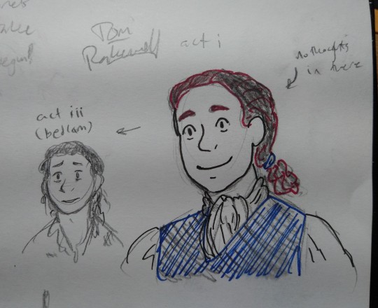
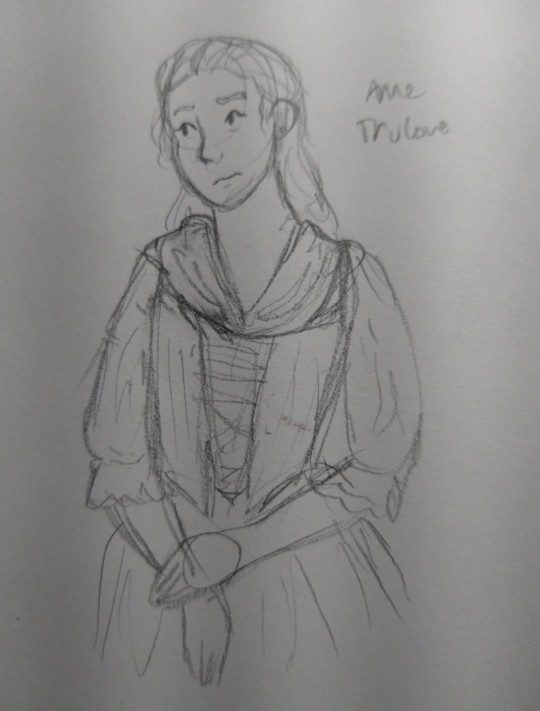
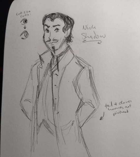
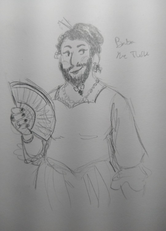
hehe. rake's progress designs
#art and soul#no father trulove cause i couldn't be bothered tonight. try being in more than one and a half scenes next time old man lol#these were fun to design...the whole Unreality storybook/fable/morality play vibe really let me get free and Into It It#tom i think should look. almost as generic as possible. just your average kinda pathetic little man#he's the only one i bothered to break my pens out for but i like the hockney design language with the limited color palette#and i'm stealing that#anne. okay i'll be honest i mostly just went with vague 18th century dress for her cause i didn't know what else to do and i'm tired...#nick shadow. okay he was fun#'evil ass goatee' (in the words of my friend lol) was simply a must. plus that slicked black hair#i think he's Tall and Looming. got those beady catlike eyes and vaguely pointed ears#and tail + cloven hooves hidden under the jacket/pants lol#and baba. well i simply wanted to make her as cool and sexy as possible. amen#the rake's progress#okay going to fucking bed now goodNight#feat my crummy handwriting. good luck with some of these lol
13 notes
·
View notes
Text
i binged 13's seasons in prep for the release tomorrow. and um. um. why did no one say how freaking insufferable she is...
#i literally hated her SO MUCH in her in every season but the Flux (WHICH i still have complaints)#she had no personality. she was just a rewash of everything the director seemed to think we liked about the other doctors#she HATED AND NEGLECTED AND TREATED HER COMPANIONS LIKE SHIT?????????#the master owns my whole entire ass tho dont get me wrong#AND DONT GET ME STARTED ON THEM STEALING VERY IMPORTANT CRUCIAL PLOTS LINES AND PROPS FROM THE PREVIOUS DOCTORS AND COMPLETELY OBLITERATING#THEIR IMPORTANCE??????????????????#I have way too many thoughts about her and how she dumbed down every freaking scene she was in. graham i love u can u be the doctor PLEASE#graham and yaz would be having the most beautiful scene about grief and living for those who are still alive and then the doctor would swee#in and not only treat them like shit but act like a 5 year old#my eyes just started glazing over when she was on screen#PLEASE DAVID FIX THISSSSSSSSSSSSSS PLEASE PLEASE PLEASE#oh oh oh AND THE SET DESIGN WAS SOOOOOOOO BAD in the first few seasons OMG AND HOW FUCKING INSENSITIVE THEY WERE TO CURRENT TOPICS?????????#god im glad shes over ill never shut up about how shit the last few seasons have been sjdfkdskfskj ALSO MAKE MORE EPISODES A SEASON COWARDS
6 notes
·
View notes
Text
it is absolutely caused by my love for the trope where a character becomes inseperable from a dead loved one's item but i think don should have been able to keep little bunny as a comfort item. its not about how feasible it would be for don to sneak into that room a second time n take it without isabella noticing its about how. well he simply deserved to have it i think
#skye's ramblings#i just think he deserved that small part of her to just cuddle and cry whenever the emotions became overwhelming. ithink he deserved that#igot this whole scenario in my head yknow. bc ive always got scenarios in my head. but would he even need to be sneaky abt getting it back?#bc after ep 8 they know isabella knows abt their role in the whole escape. he really has no reason to hide that he knows she still has it#itd really be abt whether he could stomach asking her for it n whether she'd agree. perhaps partof me wants him to be a lil petty abt it#'tell the others she mailed him back bc she didnt want me to be lonely.' 'what does it matter? he'll just end up back in that room anyway.'#ok i absolutely want him to b a little petty. n like i cant see her refusing bc she really does want them to be happy as long as they can#and like don would not be able to say any of this shit without crying. if anything she could think of it like one of ray's rewards#don just deserved to be emotional over her more. some healing anger. a few bitter words as a treat. let him cuddle th bunny plush. ass hole#just a thought i had that spiraled into a whole scene. this is always happening to me <3 if i could write or make comics you'd all see#imagine timeskip don and his design is the same except hes got a stuffed bunny peeking out of his backpack. this is everything to me#well this is wjat the little bunny patch is for which doubles as a sweet moment w gillian n the younger kids#simply a look into my beautiful library of don thoughts <3 shirai has trio favoritism i have. don favoritism
4 notes
·
View notes
Text
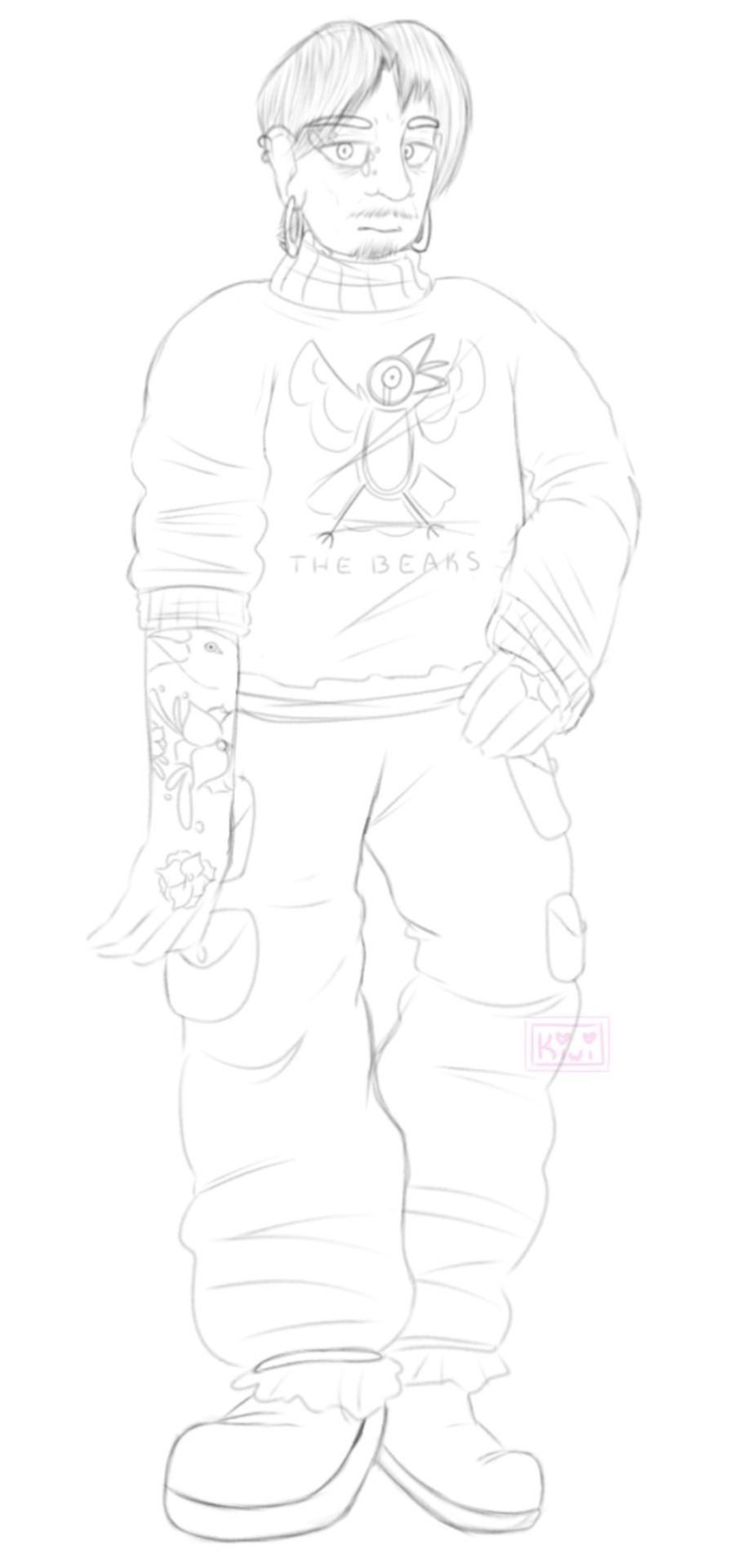
top ten guys who would uhhhhhhhh never hurt a fly. yeah we’ll go with that.
Rant incoming hee hoo
Uhhh not too much on him but his name is Archibald. Archie for short. Sometimes referred to as “The Finchman.” He gets a cool badass nickname why? Because all good serial killers get one yeah?
Sorry I meant uh. He’s so nice to you just as long as he doesn’t seem you weak. He’s got a weird “Survival of the Fittest” complex going on. Deems people weak based on an assortment of things and tries to eradicate the world of the weak cause uh. Yeah he’s just. He’s like that for some reason. Huh.
Also he’s like. One of the very few people who’ve managed to outlast that of Cuckoo. Yeah he’s a Bliss character.
(Special thanks to @pazam for helping me out with his face— I was having a little trouble with it initially!)
#like I said. man’s Bliss related#he only has any relevance in act 2 and act 3 though#a very minuscule part to act 2 and then more in act 3#he’s actually like. kinda decent if he doesn’t see you as “weak” which could mean anything in his book#but it’s hard to get around that he’s literally killed people before#ah. kiwi is actually creating her first irredeemable scum that isn’t a sympathetic villain ! wowie !#yeah daisy-mae is technically irredeemable but like.#her whole deal in my approach is to make her a character you feel bad for feeling bad for y’know#it’ll make sense one day#but yeah. Archie is kinda uh. he kinda sucks major ass y’know#The Beaks is also part of a band he used to be in. idk what happened there tbh#he got uh. malicious ig#fun fact his design takes after the very very first concept of Rupert before he became the character we know and love#I will color him one day. it will happen.#Archibald#The Finchman#Bliss#ocs#original characters#original stories#WIPs#The Kiwi Draws
2 notes
·
View notes
Text
i finally beat KH2 with Ultima Weapon with Sora's drive forms at max level so he have all the abilities at lvl 3 annnnd ended the game at level 69-- (in my defensive, i was grinding painfully for all the drive forms sdmgsmdg) and to my genuine surprise, the final boss battle just feel so much easier than thirteen years old me ever did in this game cause i knew i have to retry a few times to even beat xemnas at ALL 😭
#lori plays kh2 (2023)#no seriously i didnt think i can beat xemnas ass easily wHEEZES#also this game is making me want to do a jestellra AU so BAD#i already knew jessie def have the heart hotel(tm) like sora did because it fits with all the jesses lmafo#petra............ riku............................... dark welder babeyyyy#IDK WHAT ROLE FITS STELLA THO#I WANT HER TO GO EVIL BEFORE SHE GOES GOOD#i want her in black coat maybe then realizing this shit is bull#wait would xenohort old man fucker be PAMA or Hadrian or-#IM NOT GONNA INVES T IN THE WHOLE THING#........i will just draw my ship with keyblade designs maybe.... who knows....
5 notes
·
View notes
Text
I'm helping my auntie w the kids this week and as much as I love these folks. the way this family sleeps is a form of torture invented specifically to make me go insane. its 4:15am and my only saving grace rn is that I am 30 years old and NO ONE can make me stay in this hotel room all night... I am legit about to go hang out in my fucking car. or just stay in the bathroom all night w the fan light on instead bc that buzzing is music to my fucking ears compared to how the other room sounds rn
#me#prsnl#its not their fault#its our disabilities clashing#but literally every single one of these fuckers (3 adults!!!) makes some kind of godawful fucking MOANING wheezing screaming snore sound#and none of them ever fucking stops#and kaiya needs the light on in her part of the room so that whole ass light AND *BOTH* TVS have been on#all. fucking. night.#i asked my auntie to turn down the big one before she fell asleep#but its been the disney channel sincd 10pm#and no matter how quiet Disney is turned to#i think perhaps their commercials and show intros were specifically designed at a pitch to make your eardrums bleed
1 note
·
View note
Text
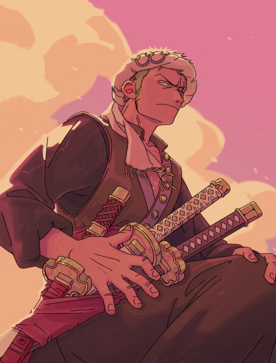
I'm not just cooking, i'm baking a whole ass CAKE
not 100% happy with the design but I wanted to get it out of my system, I went for darker and more muted colors for Zoro while still utilizing the usual elemnts of his outfit like the sash and the haramaki. also the color palette for the full outfit turned out very tasty, like it makes me think of chocolate and sweets. not sure about the use of haramaki though, I feel like it makes the proportions a bit awkward when everything else is dark, but it does make the shirt fold nicely so I may keep it in the end
now that I'm further into WCI I think I should add a suit version as well for the wedding bit hmmm
My idea for this is after coming to Big Mom's territory and fighting her commanders they get to the Germa carriage just like in canon. Zoro watches Sanji fight Luffy, restraining himself from interfering. He respects Luffy's decision to not fight Sanji back, but the moment Luffy gets knocked down it's Zoro's turn to try and bring the cook around and he's not gonna hold back
a very tense fight ensues
#I have a comic for the fight in my head but I'm gonna need time I have so many artworks started lmaooo#amazing that tomorrow is Sunday#have a whole another day before monday and going back to work#and I dont have to do anything!!#anyway#my art#zosan#zoro#roronoa zoro#sanji#whole cake island#whole cake arc#wci#one piece fanart#one piece#fun fact: I was coloring the top pic while having an evening mode on my screen and I didn't realize it#but I liked it with that filter so much that I recriated it at the end thats why it has them juicy sunset colors#wci zoro au
4K notes
·
View notes
Last Seen Blogs
wearetoho
We are Toho
generaljenobi
Hello There
enchanting-the-bookworm
Enchanting the bookworm
karkod
Karkod
fuckingaroundatfreddys
Five nights of stupitidy