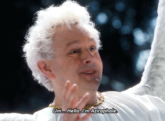
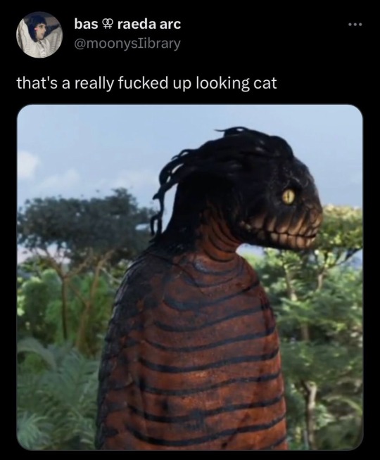
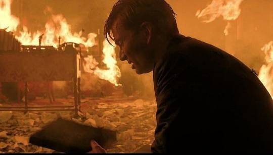
#Gomens
Text

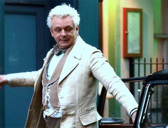
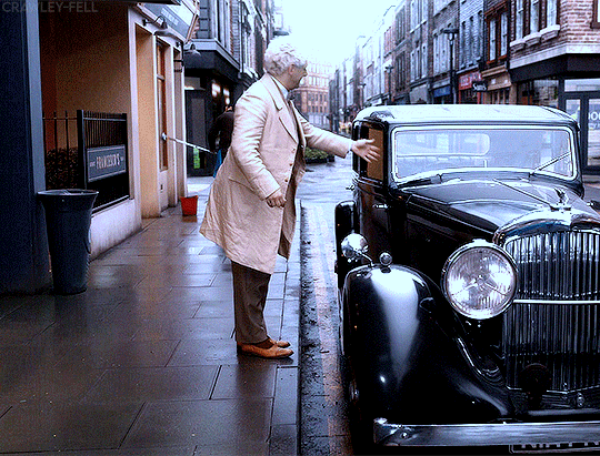

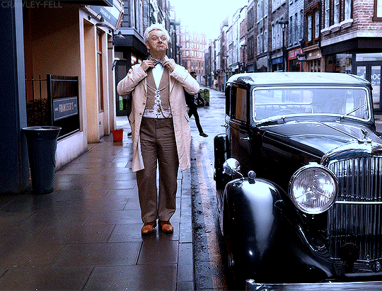
#they're everything 2 me#aziraphale#good omens#good omens gifs#gomens#good omens 2#mr fell#michael sheen#usersugar#tsusermels#userrlorelei#usereena#my gifs
338 notes
·
View notes
Text
The art director & the Good Omens book cover tier list of doom, part 1
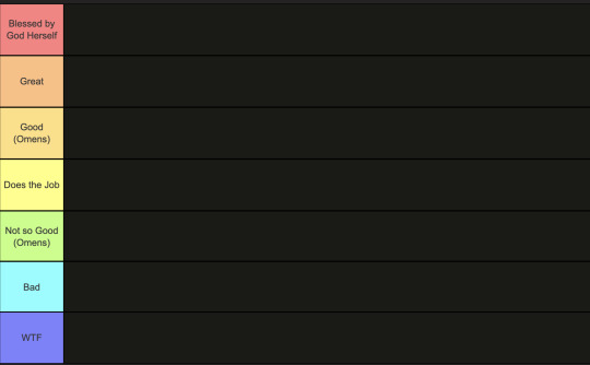
This is going to have to be a multi-part series because there are *checks notes* 64 different covers that I've found so far.
I am your resident Art Director/Good Omens enthusiast,
and welcome to my completely meta-free book cover tier list.
Listen, making a book cover is HARD. I should know. But while we salute these artists for their hard work and time, I think we can all admit that once in a while, the vision is just not on. And on very rare occasions, publishers seemed to have managed to commission the cover art directly from hell...
1. The original UK cover
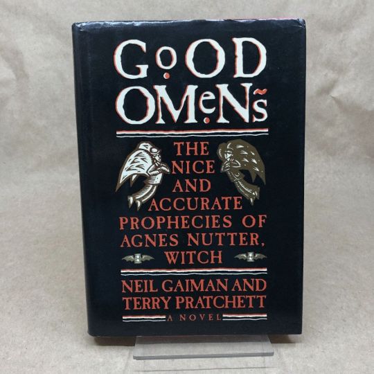
Ahh, the standard by which all shall be judged. We're starting off with a nice & easy cover, with adorable woodcuts of Aziraphale and Crowley flanking a custom Good Omens font! While I have to take a few points off for the terrible kerning of the word "GoOD", the blockprint vibes and general bitchiness of Aziraphale's teeny weeny wittle face, along with the sick colour palette puts the orignial in my good graces.
Tier: Great
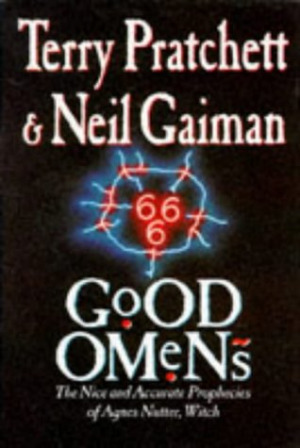
2. The duelling US covers
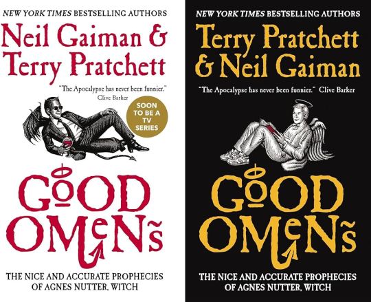
Progress! Hail to the designer who figured out trying to make "GoOD" and "OMeNs" fit the same width was a fool's errand, and even managed to IMPROVE on the original handmade title by adding a little halo and devil's tale to the design. Aziraphale and Crowley are facing each other, while also managing to serve absolute cunt. Aziraphale is wearing EIGHTIES SNEAKERS. Crowley's little snake boots have HEELS. They've managed to keep the woodcut vibes and colour simplicity, while balancing out the full title of the book. Both authors get to trade off on who's name comes first! Dare I say, this is a work of genius. I could dock some points for Crowley's sad bat wings growing out of his right clavicle, but who am I to question greatness.
Tier: Blessed by God Herself
3. The Halo Master Chief(?) cover

How the mighty have fallen... As a Canadian child, I was subjected to maybe the most horrifying ad in existence by the War Amps warning children about machine safety. This cover is the paper embodiment of that ad. I am confused by the purple haze. I am frightened by the seeming ethereal flatness of Adam and Dog. I am strangely aroused by Aziraphale's eyebrows, and intensely saddened by the terrible outline/drop shadow they had to inflict on the type to fit "Pratchett" in that god awful space.
Tier: WTF
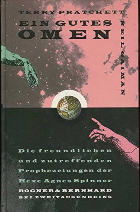
4. Germany, Ein Gutes Omen covers
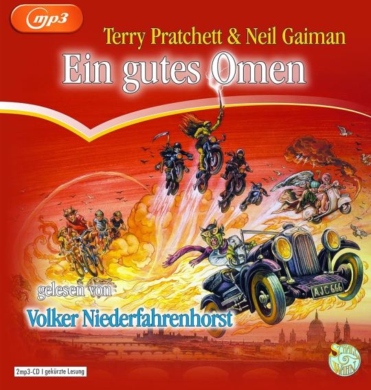
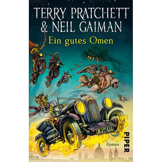
This cover inexplicably exists in two colour ways: red and teal. I put the audiobook cover here so you could experience the full illustration, and also how fucked up it is that they cropped the book version to include three horse-people of the apocalypse, but cut off DEATH on the regular cover. Points must be given for drawing a pretty slick Bentley, but I think we have to take even more points away for turning Crowley into a Ray Charles/Mike Wazowski hybrid. The ducks are nice.
Tier: Not so Good (Omens)
5. Germany, Ein Gutes Omen covers continued
I don't know if the German designer of this cover *knew* that they were using western yeehaw cowboy woodblock letters when they made this cover, but judging by how they spaced the rest of the text at the bottom, THEY DID NOT CARE. And that seems to be a running theme for this one. We get kind of a duality thing going on with the black and pink background, but it just seems like somebody whispered the general themes of Good Omens into a jar, and threw it down a well, and this poor chap came along and picked it up. The baffling choice to align every piece of text on the cover *except* Neil Gaiman's name which is right aligned and rotated 90 degrees (not even real vertical type) will haunt my dreams, I think.
Tier: Bad
6. US, UK The Traffic Jam cover
For the love of Good Omens, WHY. I can think of so many more interesting symbols to put on the cover of this book than the ODEGRA SIGIL TRAFFIC JAM. Props for keeping the good colours and type, but like, I think this cover was secretly designed by @amtrak-official, or someone who just really, really likes public works.
Tier: Does the Job
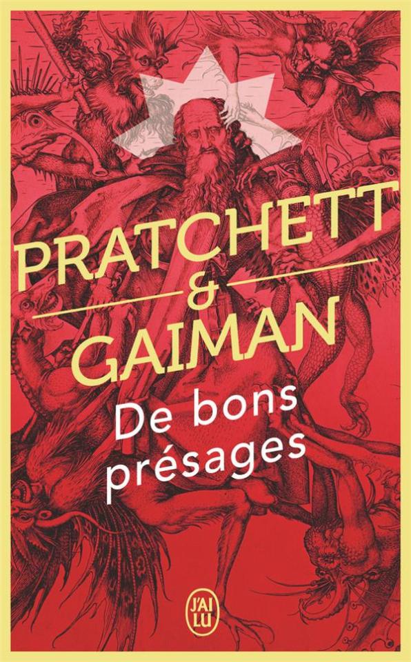
7. France, De bons présages cover
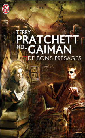
Leave it to France to make sure people know that Aziraphale and Crowley fuck severely. While I can't condone leaving out half the title of the book (and thinking a red carpenter's square counts as decoration), I can begrudgingly acknowledge that Ron Pearlman and Benedict Cumberbatch's love child is excellent Crowley casting. I think I give this a solid dark academia/10.
Tier: Good (Omens)
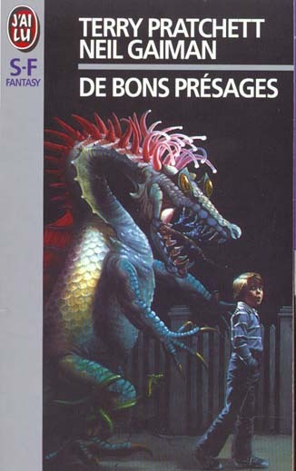
8. France, De bons présages covers continued
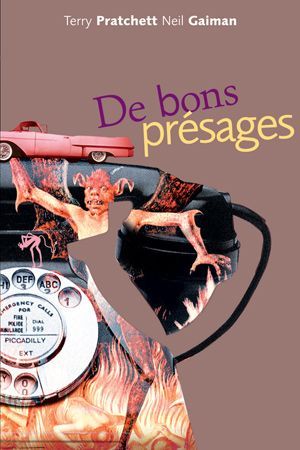
Just imagine with me, if you will, the absolutely hilarious reality that this cover posits: Good Omens is exactly the same in every respect, but Crowley drives a pink 1950s convertible. Why do all of the colours on this cover look like they've been pre-digested? Why are the font choices and placement so bafflingly bad. My face is the demon's face holding that car. I feel his pain.
Tier: WTF
9. France, De bons présages covers continued
Minus points for not managing to write the full title of the book once again. I don't know what it is with the French. They seem pretty set on Good Omens being demonic. While I do appreciate a good Bosch-style demon party, the dude in the middle confounds me. All-caps Museo Sans that isn't even *centred* in the frame is just so lazy. I am le tired.
Tier: Bad
10. France, De bons présages covers continued
Uhh. The font. The font is okay.... I think? Yeah. The font and kerning are. Okay. OHHH GOD I LOOKED DOWN BELOW THE TEXT WHYYYY.
Tier: WTF
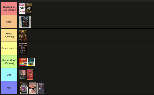
END of round one. I need a nap.
#good omens 2#good omens fandom#good omens#art director talks good omens#tier list#cover art#aziraphale and crowley#aziraphale x crowley#book cover#go s2#gomens#good omens analysis
113 notes
·
View notes
Text
that moment when the person you like is talking to you, but you're not paying attention because you're thinking about how good that mouth must taste


#good omens#neil gaiman#terry pratchett#michael sheen#david tennant#anthony j crowley#aziraphale#crowley#crowley x aziraphale#aziraphale fell#aziraphale x crowley#aziracrow#azirowley#crowley good omens#aziraphale good omens#gomens#good omens 2#good omens season 2#ineffable partners#ineffable divorce#ineffable spouses#ineffable idiots#ineffable husbands
122 notes
·
View notes
Text
One of my bitchiest and yet most objectively correct goomens opinions is that basically no one knows how to do the "Crowley calling Aziraphale 'angel'" thing correctly. People manage to both make him do it Way too much while at the same time making it out to be this Immediately 100% Intimate thing. It most certainly carries some of the romantic/homoerotic connotations as it would for human characters, and I think both the text and Crowley in-universe are extremely aware of this, but it also carries something else with it when the person in question literally is an angel. It can be affectionate, but it can also be a neutral statement of fact, or it can even be mocking or disparaging. "Doing good again, angel?" is like the in-universe equivalent of Crowley loudly revving his motorcycle and calling Aziraphale a square
#not that revving your motorcycle and calling someone a square can't be homoerotic in and of itself#but that needs to be like The Dynamic. i like that sort of teasing for them though i think it's cute#open mick night#good omens#gomens#crowley#aziraphale#aziracrow#ineffable spouses#good omens meta#??? sure! sure. who gives a shit anymore i do what i want
72 notes
·
View notes
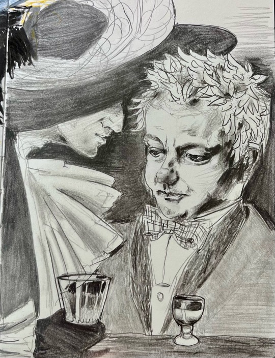
Text

for loving one
--- --- ---
BOY HOWDY AM I EXCITED TO SHARE THIS ONE WITH YOU ALL.
This piece is cover art for @thescholarlystrumpet's wonderful 1940s priest AU fic:
For Loving One (Rated E on AO3, mind yer tags)
...which you can and should read, asap. Chapter 10 (of 16!) just went up today, and yes, Strumpet does have the whole fic already written and ready to post, so you won't get abandoned on a cliffhanger.
For my part, I wanted to call upon some 1940s aesthetics with a little bit of film noir and some Leyendecker-esque vibes. I hope you like my interpretation!
Alsoooooo take some time to check out all the things I painted into that stained glass. I had a hell of a time designing it.
--- --- ---
If you like my art and want to keep seeing more of it, support me!
ko-fi | prints | commission
--- --- ---
Detail shots from the high-res:

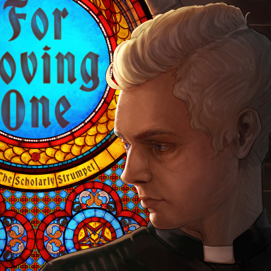

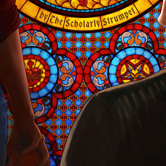
With special thanks to the WINGZ Mag/Maggie's Record Shop Ad 1 chat for supporting me through this stained glass adventure (aka listening to my bitching).
@goodomensafterdark
#aziracrow#priest au#1940s#aziraphale#crowley#good omens#good omens fanart#my art#artists on tumblr#gomens#good omens fanfiction#good omens fanfic rec#good omens fanfic#good omens human au
90 notes
·
View notes
Text
You had me at the hello
- Dorothy Boyd, Jerry Maguire
93 notes
·
View notes
Text
The horrible pickup lines AU is here!
How Am I Winning This Conversation?
Summary:
Crowley's new coworker looks like an angel and has the inane ability to take every pickup line too literally. It doesn't stop Crowley from trying to flirt with him, even though he can barely string a coherent sentence together while in Aziraphale's presence.
Somehow... it still works?
Excerpt:
So Crowley googled more pickup lines. And hoped for the best.
"Angel, if you were words on a page, you’d be fine print,” he said one day, while Aziraphale squinted at his tiny spreadsheet. He had shown him how to zoom in a number of times and yet, the angel insisted he liked this better since he could, and this was a quote,
"See all the numbers together."
What a weird man. Crowley was starting to adore him.
"Frustrating and designed to deceive?" Aziraphale responded absentmindedly. His fingers had not stopped tapping on his calculator.
Crowley found it unfairly hot. Both the words and the nonchalance with which they had been uttered.
He laughed. Then went to make the angel some tea because he hadn't had any all day.
And a bonus meme because I couldn't stop myself:

#yes this was written very much to make ME giggle#so what??#we all deserve to see them be stupid#good omens#good omens au#ineffable husbands#ineffable humans#gomens#aziracrow#aziraphale x crowley#good omens fanfiction#good omens human au#my writing#good omens 2#good omens fanfic rec#ineffable idiots
82 notes
·
View notes
Text
Ops!
@neil-gaiman
#aziraphale#good omens#crowley#michael sheen#neil gaiman#go2#aziraphale cosplay#good omens 2#good omens cosplay#gomens
83 notes
·
View notes
Text

"You know what we can do?" Anthony interrupts him with a small smile. "To make it up to me, next Wednesday put aside this perfect Lord façade of yours." The artist's hands play with Aziraphale's bow tie, while he looks at him with wide eyes. "Put on an old pair of trousers, an expendable shirt and come stargaze with me. Just me, you, a bottle of wine and an old blanket to lie on. Maybe something to eat, I'll take care of that." A pause. He seeks Aziraphale's gaze with his own, offering him a smile. "What do you say?"
"It sounds... That sounds wonderful, Crowley."
"Should I take that as a yes?"
Aziraphale melts into a smile. His hands reach to Anthony's hips and squeeze them gently. There is relief in the way he looks at him. "That's a yes."
Their lips meet again. Neither of them asks permission.
I want this, Anthony thinks, I want this every day.
And it is wonderful not to have doubts.
#good omens#good omens art#ineffable husbands#good omens au#gomens#crowley#good omens crowley#anthony j crowley#long hair crowley#good omens fanart#aziracrow#aziraphale#good omens fanfiction#good omens fanfic#good omens fic#good omens human au#sugar
51 notes
·
View notes
Text

🌠Star-maker🌠
ANGEL! 👏 CROWLEY!👏 I!👏 LOVE YOU!👏👏
I just had to, the joy on his eyes when he created the fucking universe will forever end me, like,,, *sobs* ʸᵒᵘ ᵍᵒ ᵖʳᵉᵗᵗʸ ᵒⁿᵉ
#good omens#good omens fanart#good omens crowley#crowley#anthony j crowley#angel crowley#prefall crowley#gomens#david tennant
51 notes
·
View notes
Note
might be a bit late but if you’re still doodling could you do a crowley rat
I raise you…

MANY RATS!!!!!!
#good omens#crowley#ineffable husbands#go#art#ineffable idiots#crowley x aziraphale#gomens#aziracrow#Crowley rat#rat#doodle#sketch#Lvndr art
36 notes
·
View notes
Text


I wanna stay
I wanna stay here with you
Run Away With Me by Carly Rae Jepsen - The Brainrot Series
(requested by @skinnyscottishbloke)
#not featured: me beating the warp text function to death with my bare hands#good omens#good omens 2#gomens#good omens gifs#ineffable husbands#aziraphale x crowley#crowley#aziraphale#crowley x aziraphale#aziracrow#usersugar#tsusermels#userrlorelei#usereena#brainrot series#my gifs
89 notes
·
View notes
Text
You seem cool. Have some Pinterest memes I’ve found


#found on pinterest#pinterest#pinterest memes#good omens#gomens#ineffable husbands#anthony j crowley#crowley#good omens crowley#ineffableproblem#a. z. fell#aziraphale#good omens aziraphale#good omens memes#gay memes#meme
34 notes
·
View notes
Text
WIP: Sneak peek of some art I'm working on to go with my final chapter of Telling Tall Tales, which I'll post sometime next week:

Mrs Sandwich, Aziraphale and Tracey 💗
Ahhh! I'm so excited and sad for it to end. I've LOVED writing this story.
#good omens fanfiction#ineffable husbands#crowley#aziraphale#aziracrow#good omens#gomens#aziraphale x crowley#goodomens2#good omens fanart#aziraphale fanart#Tracey#mrs sandwich#ineffable idiots#go fanfic#ao3 fanfic#fanfiction#go fanart
52 notes
·
View notes
Text
The Arrangement
#good omens#good omens 2#ineffable husbands#crowley#aziraphale#gomens#aziracrow#aziraphale fanart#good omens fanart#crowley fanart
32 notes
·
View notes
Text
You wouldn't last an hour in the asylum where they raised me
31 notes
·
View notes
Last Seen Blogs
terumi530
徒然なるままに

bewaesserungsspezialist-blog
Bewässerungsspezialist GmbH

torchiiko
what the hec ever

digitalmore
digitalmore.co

themusicalsky
Average electricity liker