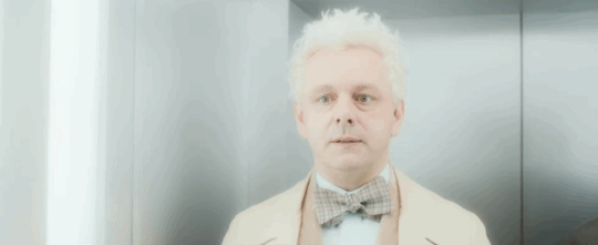
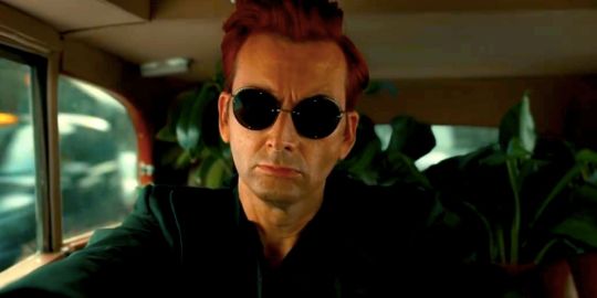
#aziraphale and Crowley
Text
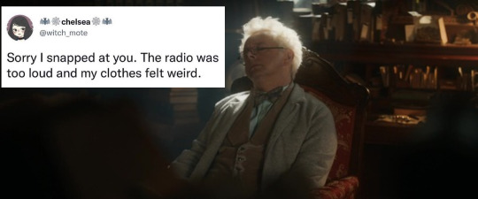


Happy Monday! And a reminder: it's always a good day to make your existence everyone's problem
Previous meme dump!
#good omens#good omens fandom#aziraphale#crowley#good omens 2#michael sheen#aziracrow#aziraphale and crowley#david tennant#ineffable husbands#good ineffable omens#ineffable spouses#ineffable idiots#good omens memes#good omens meme#good omens crack#good omens incorrect quotes#incorrect good omens quotes#incorrect quotes#good omens text post#text post meme#neurodivergent memes#neurodivergent#adhd memes#adhd#autistic memes#autism memes#crowley x arizaphale#mr brown#harry the rabbit
427 notes
·
View notes
Text
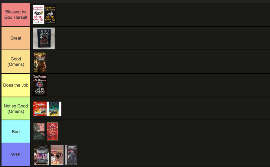
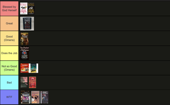
The art director & the Good Omens book cover tier list of doom, part 1
part 1 l part 2
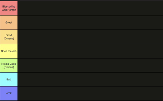
This is going to have to be a multi-part series because there are *checks notes* 64 different covers that I've found so far.
I am your resident Art Director/Good Omens enthusiast,
and welcome to my completely meta-free book cover tier list.
Listen, making a book cover is HARD. I should know. But while we salute these artists for their hard work and time, I think we can all admit that once in a while, the vision is just not on. And on very rare occasions, publishers seemed to have managed to commission the cover art directly from hell...
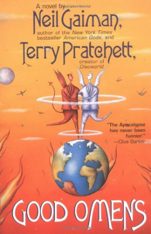
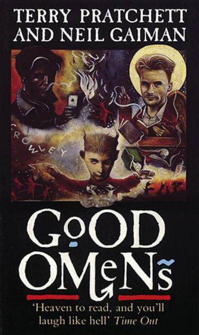
1. The original UK cover
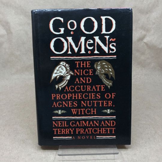
Ahh, the standard by which all shall be judged. We're starting off with a nice & easy cover, with adorable woodcuts of Aziraphale and Crowley flanking a custom Good Omens font! While I have to take a few points off for the terrible kerning of the word "GoOD", the blockprint vibes and general bitchiness of Aziraphale's teeny weeny wittle face, along with the sick colour palette puts the orignial in my good graces.
Tier: Great
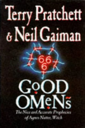
2. The duelling US covers
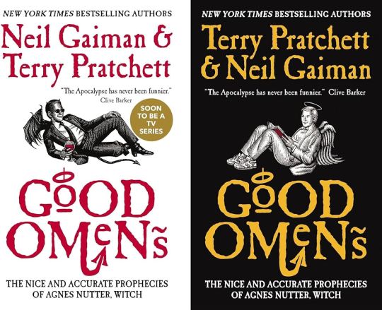
Progress! Hail to the designer who figured out trying to make "GoOD" and "OMeNs" fit the same width was a fool's errand, and even managed to IMPROVE on the original handmade title by adding a little halo and devil's tale to the design. Aziraphale and Crowley are facing each other, while also managing to serve absolute cunt. Aziraphale is wearing EIGHTIES SNEAKERS. Crowley's little snake boots have HEELS. They've managed to keep the woodcut vibes and colour simplicity, while balancing out the full title of the book. Both authors get to trade off on who's name comes first! Dare I say, this is a work of genius. I could dock some points for Crowley's sad bat wings growing out of his right clavicle, but who am I to question greatness.
Tier: Blessed by God Herself
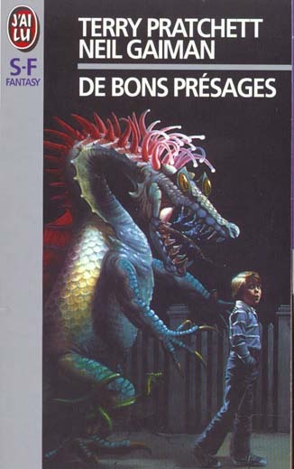
3. The Halo Master Chief(?) cover

How the mighty have fallen... As a Canadian child, I was subjected to maybe the most horrifying ad in existence by the War Amps warning children about machine safety. This cover is the paper embodiment of that ad. I am confused by the purple haze. I am frightened by the seeming ethereal flatness of Adam and Dog. I am strangely aroused by Aziraphale's eyebrows, and intensely saddened by the terrible outline/drop shadow they had to inflict on the type to fit "Pratchett" in that god awful space.
Tier: WTF
4. Germany, Ein Gutes Omen covers
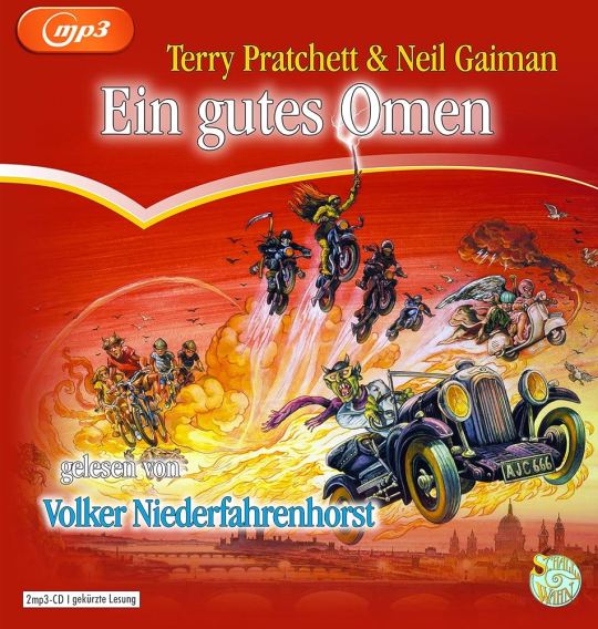
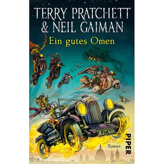
This cover inexplicably exists in two colour ways: red and teal. I put the audiobook cover here so you could experience the full illustration, and also how fucked up it is that they cropped the book version to include three horse-people of the apocalypse, but cut off DEATH on the regular cover. Points must be given for drawing a pretty slick Bentley, but I think we have to take even more points away for turning Crowley into a Ray Charles/Mike Wazowski hybrid. The ducks are nice.
Tier: Not so Good (Omens)
5. Germany, Ein Gutes Omen covers continued
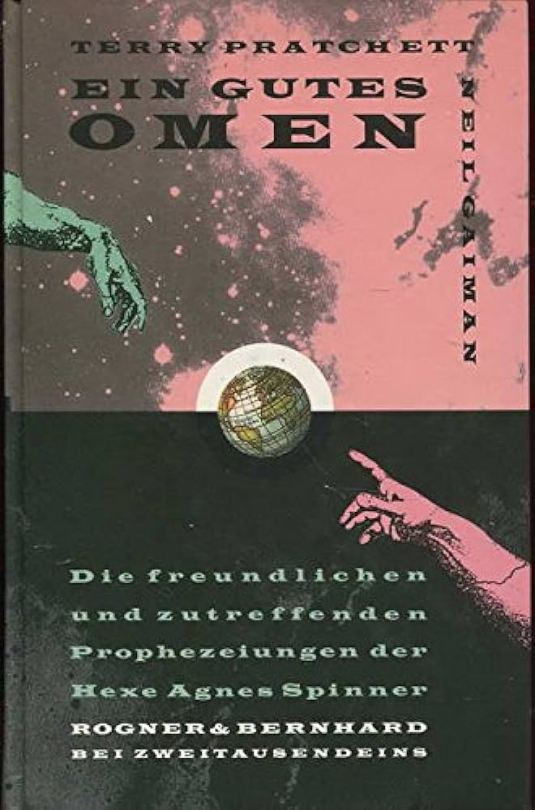
I don't know if the German designer of this cover *knew* that they were using western yeehaw cowboy woodblock letters when they made this cover, but judging by how they spaced the rest of the text at the bottom, THEY DID NOT CARE. And that seems to be a running theme for this one. We get kind of a duality thing going on with the black and pink background, but it just seems like somebody whispered the general themes of Good Omens into a jar, and threw it down a well, and this poor chap came along and picked it up. The baffling choice to align every piece of text on the cover *except* Neil Gaiman's name which is right aligned and rotated 90 degrees (not even real vertical type) will haunt my dreams, I think.
Tier: Bad
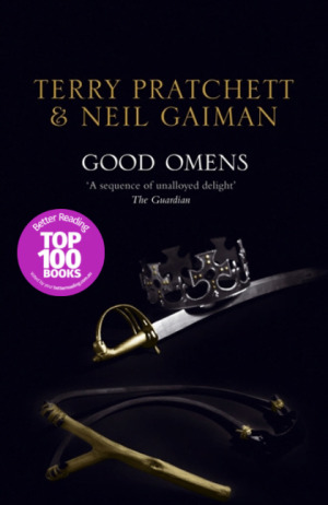
6. US, UK The Traffic Jam cover
For the love of Good Omens, WHY. I can think of so many more interesting symbols to put on the cover of this book than the ODEGRA SIGIL TRAFFIC JAM. Props for keeping the good colours and type, but like, I think this cover was secretly designed by @amtrak-official, or someone who just really, really likes public works.
Tier: Does the Job
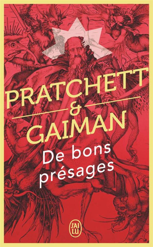
7. France, De bons présages cover
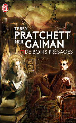
Leave it to France to make sure people know that Aziraphale and Crowley fuck severely. While I can't condone leaving out half the title of the book (and thinking a red carpenter's square counts as decoration), I can begrudgingly acknowledge that Ron Pearlman and Benedict Cumberbatch's love child is excellent Crowley casting. I think I give this a solid dark academia/10.
Tier: Good (Omens)
8. France, De bons présages covers continued
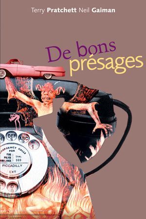
Just imagine with me, if you will, the absolutely hilarious reality that this cover posits: Good Omens is exactly the same in every respect, but Crowley drives a pink 1950s convertible. Why do all of the colours on this cover look like they've been pre-digested? Why are the font choices and placement so bafflingly bad. My face is the demon's face holding that car. I feel his pain.
Tier: WTF
9. France, De bons présages covers continued
Minus points for not managing to write the full title of the book once again. I don't know what it is with the French. They seem pretty set on Good Omens being demonic. While I do appreciate a good Bosch-style demon party, the dude in the middle confounds me. All-caps Museo Sans that isn't even *centred* in the frame is just so lazy. I am le tired.
Tier: Bad
10. France, De bons présages covers continued
Uhh. The font. The font is okay.... I think? Yeah. The font and kerning are. Okay. OHHH GOD I LOOKED DOWN BELOW THE TEXT WHYYYY.
Tier: WTF
END of round one. I need a nap.
#good omens 2#good omens fandom#good omens#art director talks good omens#tier list#cover art#aziraphale and crowley#aziraphale x crowley#book cover#go s2#gomens#good omens analysis
159 notes
·
View notes
Text
Everyone talks about The Bentley alot. About their personality, what role they'll play in S3, ect.
But I haven't seen anyone mention The Bookshop.
And I hope The Bookshop will be left alone in S3
She got burnt down in S1

And in S2 she got invaded
AND her owner left

In S3, I want Crowley and Muriel take good care of her, and nothing bad to happens. Poor Bookshop needs a break!

#good omens#the bookshop#a. z. fell#a z fell#az fell and co#ineffable husbands#crowley#aziraphale#crowley x aziraphale#good omens 2#good omens season 2#michael sheen#david tennant#good omens season 3#the bentley#good omens aziraphale#aziraphale bookshop#you can't leave this bookshop#crowley loves aziraphale#aziraphale and crowley#aziraphale loves crowley#ineffable partners#ineffable boyfriends#ineffible husbands#idiots in love
124 notes
·
View notes
Text
i'm convinced atp that good omens fic writers have the magic touch. y'all can write about anything and make it a good read. shit i'm not even into, premises i think will be silly. and you often end up touching me emotionally in the middle of full out porn. 10/10 to all of you, you're amazing
#personal#i love u fic writers you are my bread and butter#kissing you with your consent#good omens#good omens fanfiction#good omens fanfic#good omens fandom#aziraphale x crowley#aziraphale and crowley#crowley x aziraphale#crowley and aziraphale#aziracrow#ineffable husbands
50 notes
·
View notes
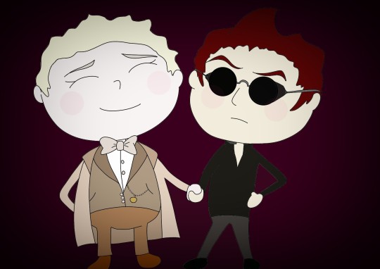
Text

"Come to bed, Angel..."
#good omens#ineffable husbands#aziracrow#good omens fanart#aziraphale#aziraphale and crowley#azicrow#ineffable idiots#crowley#chibi art#chibi#good omens chibi#i dont know what im doing#im new to this
31 notes
·
View notes
Text

#good omens#crowley#aziraphale#david tennant#aziracrow#go2#good omens fanart#i love good omens#good omens season 2#good omens 2#aziracrow fanart#aziraphale fanart#crowley fanart#crowley x aziraphale#aziraphale and crowley#anthony j crowley#crowley and aziraphale#Crowley and aziraphale fanart#digital art#whathehelldraws
34 notes
·
View notes
Text

La La Omens 🤍💫
La La Land poster, but make it good omens!! It’s certainly not the best thing i’ve done but it’s not too shabby!
I haven’t even watched La La Land I just decided to draw them as the poster 😭 Anyways hope you like it sillies!! ^_^
#foryou#gomens#good omens#aziracrow#aziraphale and crowley#crowley#gomens fandom#good omens fandom#ineffable fandom#ineffable husbands#good omens art#good omens fanart#gomens art#ineffable fanart#feed#i love them#la la land#good omens doodle#good omens drawing#silly guy
31 notes
·
View notes
Text
These two seriously are all I can think about this past week. Already almost finished watching good omens a second time through!

#good omens fanart#ineffable husbands#good omens#artists on tumblr#original art#art#artwork#traditional art#ineffable husbands fanart#gayngels#crowly x aziraphale#crowley#crowley art#aziraphale#aziraphale art#aziraphale and crowley
26 notes
·
View notes
Text
Of course im obsessed with crowley and aziraphale. They're dorks!
#good omens#crowley#aziraphale#ineffable husbands#david tennant#michael sheen#ineffable spouses#ineffable wives#ineffable partners#ineffable divorce#ineffable idiots#ineffable dumbasses#azicrow#aziracrow#crowley x aziraphale#aziraphale and crowley#good omens aziraphale#aziraphale x crowley#aziraphale good omens#crowley good omens#aj crowley#anthony j crowley#air conditioning
24 notes
·
View notes
Text

Nick Cave needs to write a song about Crowley.
#good omens fanart#good omens#goodomens crowley#crowley good omens#aziraphale and crowley#aziracrow#ineffable idiots#ineffable husbands#good omens crowley
25 notes
·
View notes
Text
We swore we'd travel darlin' side by side
We'd help each other stay in stride
But each lover's steps fall so differently
But I'll wait for you
And if I should fall behind
Wait for me
- If I should fall behind - Bruce Springsteen


#they will wait for each other#still in love#what a great song#good omens#gomens#crowley#david tennant#michael sheen#aziraphel#ineffable husbands#aziracrow#bruce springsteen#aziraphale and crowley#crowley and aziraphale
21 notes
·
View notes
Text
The art director & the Good Omens book cover tier list of doom, part 2
Part 1 l Part 2
I am your resident Art Director/Good Omens enthusiast, and welcome to my completely meta-free book cover tier list. Listen, making a book cover is HARD. I should know. But while we salute these artists for their hard work and time, I think we can all admit that once in a while, the vision is just not on. And on very rare occasions, publishers seemed to have managed to commission the cover art directly from hell... here's where we left off last time:
Onwards and upwards, as they say.
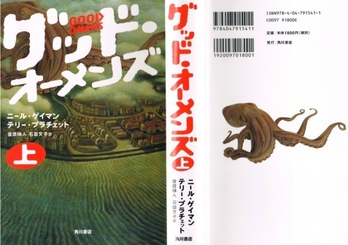
11. International paperbacks, Goda Omen
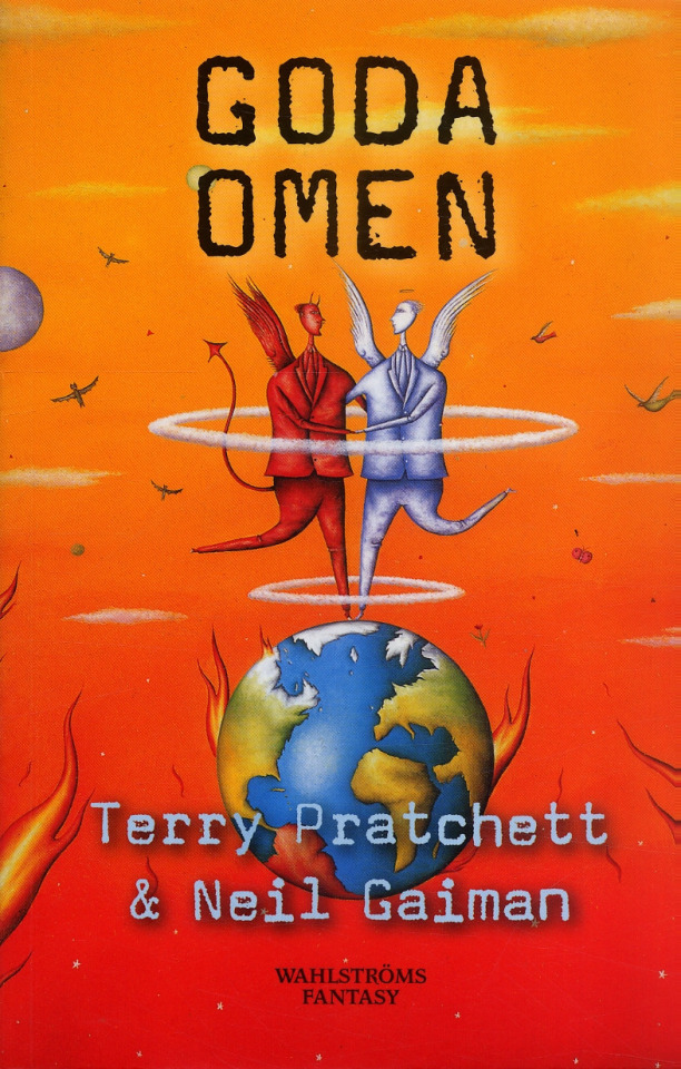
It is inexplicable to me but I LOVE this cover art. It's so sweet and innocent, the colours are contrasty and fun, and the layout leaves enough room for the text. Maybe I would call it slightly inaccurate to have our boys dancing on Greenland while the UK has drowned in a great flood, but hey. It's charming. The international cover gets a thwack with a ruler for trying to fit "creator of Discworld" in between the two wings like that, though.
Tier: Great
12. Italian Cover, Buona Apocalisse à tutti!
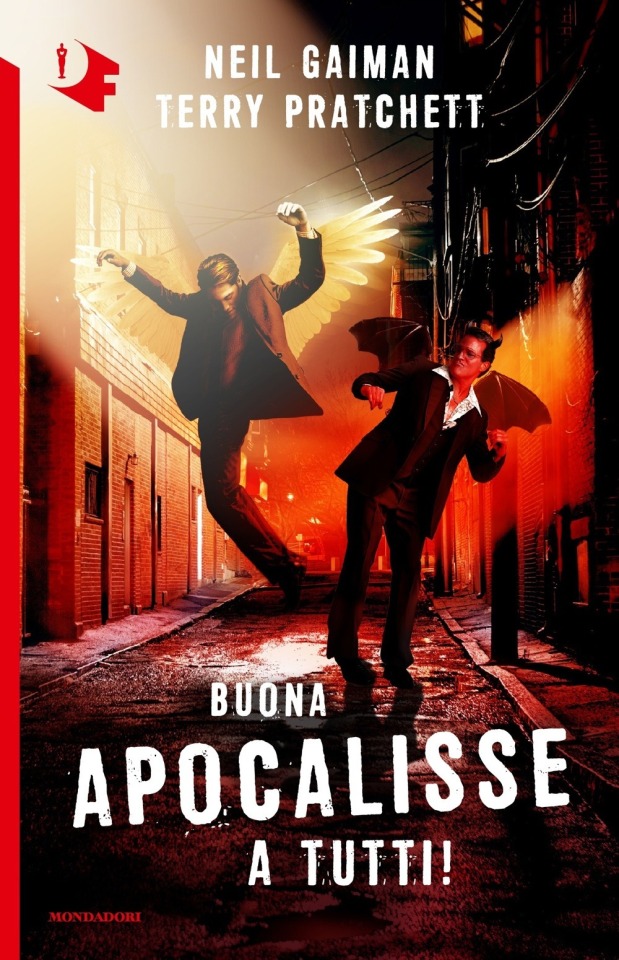
The Italian translation of Good Omens into "Happy Apocalypse to All!" really tickles my funny bone. Unlike this cover which is trying to scrape at it with a dull knife until I'm screaming on the floor. I know demons can only dance badly, but does Crowley *really* have to fracture both ankles while trying? Aziraphale pelvic thrusting his way into heaven is a visual I didn't think I'd ever want. Minus so many points for random murder alley where this is all occurring. At least the designer managed to wrangle the type into one of the best proportional layouts I've seen thus far?
Tier: Bad
13. Italian Cover, Good Omens
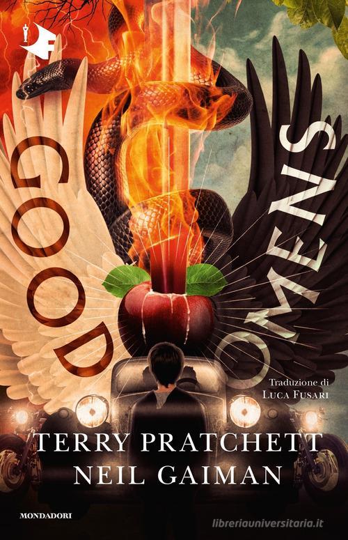
A truly valiant attempt here to rectify a terrifying situation with that earlier Italian version. While this one actually seems much more interesting at a glance, the details kinda get to me. The Bentley's steering being on the wrong side, the word Omens kindasortanotfquite fitting on the black wing, the motorcycles with no drivers... TIMES NEW ROMAN FOR THE AUTHORS NAMES. I don't think it can even be redeemed by the most powerfully rendered Sacred Heart/Cardi B W.A.P. imagery I've ever seen.
Tier: Good (Omens)
14. Japanese cover, Good Omens
Look, this designer GETS IT. Crowley and Aziraphale are a pair, a group of the two of us. Do not separate. It's also the only cover I've seen that uses shades of grey! The woodcut vibes are STRONG AND POWERFUL. The type is well placed! I should love this, except the end result kinda looks like a manual for clinical depression in the workplace? It's ending up higher on the list than it deserves, frankly.
Tier: Good (Omens)
15. Japanese cover, Good Omens
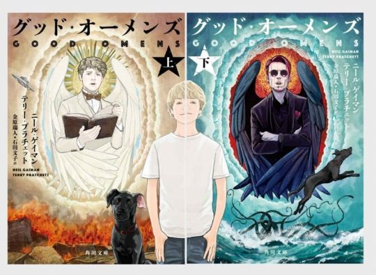
This cover might as well be an Ethereal/Occult firemen's calendar. Someone wanted teens to cut off this cover and tape it to their bedroom wall. I can't even judge the typography or the symbolism because I'm just getting hit with waves of pheromones and angst. I can't even tell if it's good but it's going in the Good pile because I can't look at it anymore...
Tier: Good (Omens)
16. Japanese covers, Good Omens

Other people have assured me that this is, in fact, a dual Good omens cover. Alas, I cannot tell. I don't possess compound eyes or even an exoskeleton, and as such lack the ability to decipher these decisions.
Tier: WTF
16. Japanese cover, Good Omens
Holy overlap, Batman! I can’t fault this designer for wanting to reuse the wonderful dual illustrations in a Ying-Yang layout, all the elements are there, but there’s a clinginess to the type and positioning that makes me feel like someone is trying to hurt the letters? Is this designer okay? Do they need a hug?
Tier: Does the Job
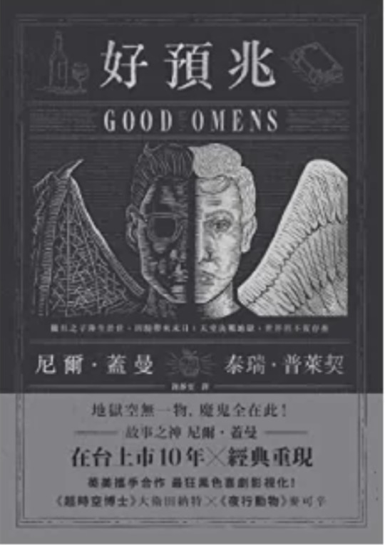
18. Chinese cover, Good Omens
Can I say how charming it is they’ve managed to conserve the halo and devils tale on the Chinese title, as well as the woodcut detailing? However, the simplicity of the cute, contrasting wing design is sadly swallowed by the intense, New-York taxi cab vibes coming off the yellow and checkerboard text block. It could have been so good! Chinese readers: I am mad on your behalf!
Tier: Not so good (Omens)
19. UK 1991 paperback, Good Omens
What are we doing here, people. I think I've stepped into a Jungian analysis of what it feels like to have read Good Omens. It's dreamy yet unsettling. Right yet very wrong. And Ol' "Tiny Hands" Aziraphale up there is really judging me for what they found inside my mind. In less upsetting news, we've kept the improved typography and layout of the authors and book title. All is not lost to the nightmare.
Tier: Not so good (Omens)
20. 50 Shades of Gray rip-off cover, Good Omens
*panic* WHAT ARE WE DOING HERE, PEOPLE...?!
Bonus : the guardian quote is almost as much of a mystery as the cover it’s on.
Tier: WTF
End of round 2.
#good omens 2#art director talks good omens#tier list#good omens#aziraphale and crowley#aziraphale x crowley#crowley and aziraphale#book omens#book cover#go2
22 notes
·
View notes
Text
WIP young Aziraphale/Ezra from the 20s party taking place in this fic, because I decided not to use a brush for the sequins (as I hate myself and also have lost my mind, apparently) so now I have to draw 272818282 sequins and I’ll never be done and I still want to show you guys.
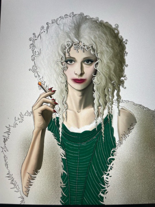
Gonna be some art nouveau something or other behind him. My hand is hurting. My shoulder. Everything.
#good omens fandom#good omens 2#aziraphale x crowley#crowley x aziraphale#good omens aziraphale#aziraphale fanart#aziraphale fanfic#aziracrow#aziraphale defense squad#aziraphale and crowley#ineffable husbands#good omens fanart#good omens fic#good omens smut#good omens after dark#good omens au#good omens wip#art wip#current wip#wip
20 notes
·
View notes
Text
#good omens#ineffable husbands#aziracrow#good omens fanart#aziraphale#aziraphale and crowley#ineffable idiots#azicrow#crowley#michael sheen#cute chibi#chibi art#chibi#good omens chibi#aziraphale/crowley#crowley x aziraphale#aziraphale x crowley#aziracrow fanart#crowley and aziraphale
31 notes
·
View notes
Text
You mad lads (gn) rec-ed me almost 4 pages of fics 😆 thank you so so much!!!
Now to narrow this down and start downloading lol
I plan on turning this into a rec list on here! Complete with links and summaries! (Maybe lol we'll see how long that gets, definitely links though!)
For now though, if you want, you can browse through the notes here! Happy reading, and thanks again to everyone who helped out!! (Especially @goodomensafterdark!! Can't thank you enough for the reblog!!)
#good omens#good omens 2#good omens fanfiction#gomens#ineffable husbands#aziracrow#aziraphale and crowley#i like to make lists lolol#ih originals
27 notes
·
View notes
Text
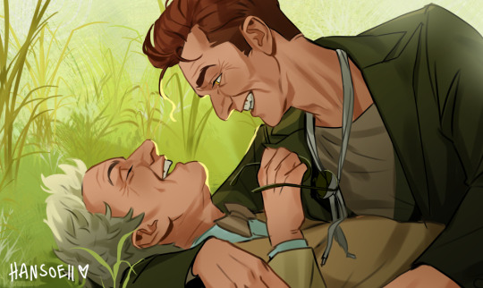
I probably won't finish this piece any time soon, but I wanted to share the unfinished version with you anyways!
#i'm just so busy these days I can't find the time to work on bigger illustrations#:(((#I still really like how this looks tho#So I wanted to show it to you all anyways#this is south downs aziracrow#good omens#good omens fanart#good omens 2#aziraphale#crowley#aziraphale and crowley#ineffable husbands#ineffable husbands fanart#good omens 2 fanart#my art
28K notes
·
View notes
Last Seen Blogs

ladyanatui
anatui
coolyo294
Imperial Fists go home

saparapapito
Ei Wepa Wepaa
imswimmingback
absolute fool about it

hubbadesigns
HubbaDesigns