#but hoo boy am I tired
Text
Missed you today, friend! How's everything going for you?
#not to state the obvious#but COVID sucks#it's milder than when I first had it for sure#but hoo boy am I tired#and bummed to be missing out on friends and church#my husband has it rough this time too#but my daughter is a champ about it#we really wore masks everywhere while we were out#but the baby can't and my in laws didn’t and we have no way of knowing where it even came from#i'm not a huge fan of our thanksgiving trips since our relationships with that side of the family are kinda shallow#(it's for the best really - they are not people we could be intimately close to)#but i hope your holdiay was spent with at least some people you enjoy deeply#on my end-if nothing else-COVID isolation means i get to see my husband more#i'll see what i can write you in the two weeks before we play again#it's a busy time of year so maybe not much but hopefully at least something#:)
6 notes
·
View notes
Note
Kinda weird question, but can you teach me drawing backgrounds? 👉👈🥺
I’m not the best person to ask when it comes to drawing backgrounds…
BUUUUUT!
I can give some tips and tricks I’ve learned over the years.
so when drawing backgrounds, what you need to know is what they’re used for. Not just for a place for characters to move around, but what feeling they give.


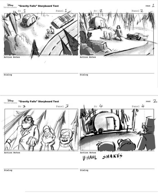
take for example of arcane, the city the show takes place gives a sense of wealth, prosperity, and upper class.

While in the depths of the under city, feelings of safety and security leaves as the colors mute and dull in color. Showing how the lower class is seen and acts.
which also goes along with describing some world building, like how they live, what’s the streets like, etc. give the feeling you want for the story and world.

Decorating the layout can even show what to know of your character, are they ambitious and an artist: their home might look like a mess or organized.
Speaking about layouts, you should also keep in mind where the focus should be depending on the scene.
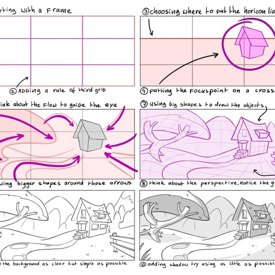
Here is a better explanation on how to do it. Guide your audience’s eyes towards where you want them. Not need necessarily, want is what you’re looking for.

Items or lighting and color can help you in what you want your audience to look at. Especially for animation related backgrounds.
which now ties to what’s important to note, perspective and space.
Take a look at how storyboards work with backgrounds, they follow perspective and spacing. This is a little tricky to understand, but what helps me is just make it rough enough to not overwhelm you, but accurate to where the guideline is. Don’t worry on the details, focus on the guide lines, simple and easy to follow.
also not that you shouldn’t always follow perspective if it will mess with the scene.
Don’t make things flat, 2d isn’t real in real life, there are hills and low slopes.
Mess with where the camera is placed and follow its view point.
Another thing to note is to not make the background become the takeaway. They’re just a place for your characters to walk and talk in. Unless they live in a empty vacuum.

Mike Mignola is a great example for simple, yet effective, background art. His perspective can be off, or they can fade out, or they can be simple that a three year old can easily trace. But it works because it doesn’t drive away the focus which is the character.
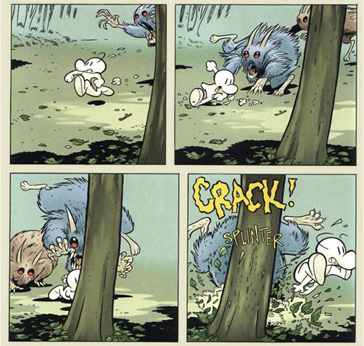
comics like BONE by Jeff smith, can be simple yet atmospheric at the same time. You can be detailed if the scene needs it for cinematic effect, but mostly you will have a blank back space with the details becoming more complex the closer it gets.


if you want detailed backgrounds, then save it for illustration or painting. If it’s comics or animation, simplicity with that flare of personality is needed. Don’t overwhelm yourself.
but don’t listen to my advice, if you want real professionals: watch Bam animation on backgrounds.
youtube
glad I can at least help. Stay strong compadre.
#Animation#background#art tips#art advice#storyboard#gravity falls#arcane#101 dalmatians#Bone Jeff smith#Hellboy#hoo boy am I tired
229 notes
·
View notes
Text
Percy: Leo when’s your birthday?
Leo: why? so you can look up my natal chart? so you can figure out my weaknesses? so you can destroy me?
Percy: ... so i know when to greet you ‘happy birthday’
#happy birthday#to mah boi#the one and only#leo leo bo beo banana fana fo shleo#...i am tired it is 3am#had to commemorate him tho#riordanverse#incorrect riordanverse#rick riordan#hoo#heroes of olympus#percy jackson#leo valdez
717 notes
·
View notes
Text
clearly sleep deprived art is the best art frrr
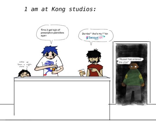
Anyone else out there a Gorillaz fan AND a Percy Jackson fan?
#the silliest of the sillies#my boy Grover got taken out of HOO cuz he had the most common sense don’t lie#percy jackon and the olympians#percy jackson#annabeth chase#grover underwood#luke castellan#pjo show#gorillaz#noodle gorillaz#2d gorillaz#russel hobbs#murdoc niccals#phase 1#doodles#i am very tired#i hate Luke sm
18 notes
·
View notes
Text

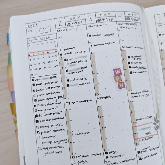
saturday, october 7th, 2023 | 51/100 days of productivity
last week I was far too busy to post, but I had the wonderful opportunity to travel to a new city and take a week-long training course. I had a great time and learned a lot. it was also super cool to explore a new city and enjoy some cooler weather for a bit. I have about two and a half months to study before I take the certification exam, so I'll be picking that up in earnest next week & you should see some more posts from me! in the meantime, please enjoy this week's bujo layout as I attempt to see if I will enjoy using a hobonichi cousin next year haha
#studyblr#bujo#study inspiration#studyspo#study#100dop#op#it was exciting to travel but hoo boy I get very tired very quickly when I am in new situations haha#it's good to be home and have some extra energy that I can use for studying
38 notes
·
View notes
Text


This weekend absolutely kicked my butt, but it was worth it.
#woolly rambles#yes i did wear the sparkliest dress i own to go see barbie#and i got compliments from both young children and old ladies alike#so i think i've done my part#however the weekend was also very busy with no chance for rest so i am now bone tired and have a work trip this week#still worth it but hoo boy i may not make it
9 notes
·
View notes
Text
ooc. logs on. thinks abt polly kissing girls. logs off
#ooc#hi friends i am hghghggh was gonna write today but then im at my parents house and its' HOO boy#it's ok just loud and im tired#thinks about bisexuals instead
4 notes
·
View notes
Photo
drawing your favorite character in an outfit of yours is self care :-]
#dungeons and daddies#dndads#dndads s2#scary marlowe#fanart#i started school yesterday and hoo boy am i tired already#i got a notebook with dinosaurs though so that was a nice lil treat#just me and my notebook against the world (campus)
54 notes
·
View notes
Text
Ok turns out I am the type of person who will faint when I see blood. It just has to be a lot of blood.
#sparklepants#came so close my guys but I managed to Not Faint#which is good bc my parents cannot handle their other kid having a medical emergency rn#was it my best idea to climb upstairs while woozy? no but I wanted my bed asap so I could stop being woozy#then I wanted my bathroom even more lol#hoo boy I am tired and it’s going to be a long night. we’re just getting started
3 notes
·
View notes
Text
#feeling extremely sorry for myself rn bc hoo boy am i in fucking paaaaaain#and im tired of it! but i can't do anything about it!!
2 notes
·
View notes
Photo
“feel like you're treading water,
but the riptide's getting stronger”
~
drawtober day 29- time!
#drawtober#drawtober 2022#rowan theta#pokemon reborn#my art#crim's art#my ocs#if u know this song then ily#bit of a lazy one today bc hoo boy i am TIRED
24 notes
·
View notes
Text
my friend pat my head while i was trying to fall asleep and it was so sweet i started crying
3 notes
·
View notes
Text
I've also been listening to the Behind the Bastards series on the Illuminati and Discordians, with bonus digression into the kind of anarchist that thinks that creating confusion and breaking down people's notions of consensus reality leads to something something praxis.
I say this as an academic who literally gets paid to produce ideas, usually at strange hours of the day, for money: some of us have to work in the morning, my dudes! If you confuse people long enough about things they are forced to care about (as opposed to choosing to chase you down trails for), they get impatient and frustrated and then they take your funding away! There's a frustration threshold there and you gotta provide people with opportunities to opt out of it.
#unformed thoughts#my brain is tired and sleep deprived from nightmares so like#be nice to me and my ability to appropriately word here#and hoo boy yes i am WELL AWARE of the hypocrisy of being cranky because someone else is pushing ontological boundaries#but I'm OPT IN dammit#I'm never going to be offended if you block me or express distress and ask me to yammer somewhere else because your head hurts today#idk I'm fully aware of being overwhelmed for other reasons but i listen and I'm just Tired#something something ableism of requiring that much energetic and cognitive investment in theory#something something neurodivergents wind up on both ends
6 notes
·
View notes
Text
It's my party and I'll write whether I want to or not.
#this is NOT what I want but alas here we are#I'm down to 3400 words! so that's exciting#doubt I will finish before noon but definitely by early afternoon#AND if I do it right I'll have what is a piecemeal draft by the time I'm done today#and then I can EDIT#but maybe I'll set it aside and write some fic first#cuz hoo boy I am tired#I am very hnng to edit this but I probably need some time in between lmao#and also I have reading to do#ANYWAY back to it
18 notes
·
View notes
Text
like. don’t the same cishet white couples ever get bored. aren’t you bored. aren’t you bored of the same fucking tropes and storylines being beaten to death over and over don’t you at least want something different. do you like getting what you expected every time? does it feel good? are you happy? do you like never being surprised do you like never seeing anything new do you like rehashing the same shit over and over and over with no variation do you enjoy this. are you having fun.
#am I having fun. am i.#i didn’t hate everything about it but. hoo boy. feeling much different coming out of volume 2.#st4 spoilers#st4 liveblog#thing is though is like. even the main couples aren’t written well i think that’s what really sucks lol#like it’s not the worst part abt the show but also. romantic relationships kind of are#i think they need to put down the pen when it comes to writing romance. jts tired. you’re done.
18 notes
·
View notes
Text
.
#hoo boy lads I’m going out of my mind I have so much to do and no time to do it#‘you could have planned this out better’ Bitch I am the first person in my immediate family#who has even thought seriously about moving to a different country#and I HAVE ALREADY lived in another country before but it was within the confines of an exchange programme#nobody knows what I’m doing this time around and therefore nobody can help me plan#I’ve been feeling burnt out since Fall of 20-goddamn-22#and last semester I learned that my master’s degree programme cannot accommodate the thesis I want to write#life took my plans and ripped them up into millions of little pieces#and yeah you can say ‘tough shit. that’s life’ but I’m SO TIRED of this happening#because my whole life has been like that#‘you can make your own decisions when you have your own house/apartment/life’#OKAY you’ve been telling me that my whole life BUT WHEN IS IT SUPPOSED TO HAPPEN?#I am TRYING to take my life by the horns and make things happen but#I can’t help noticing how precarious my position is#I have to drive across country hoping my only form of transportation doesn’t somehow fail me#I have to set up a new life in a new country where I don’t know anyone and I have never lived before#it’s like trying to build a house off the side of a cliff. one wrong move? one really bad day? and I’m toast.#and yeah I signed up for this but it’s because I’M SO TIRED OF WAITING for things to fall into a place that would make this change easier#nothing’s getting easier! everything just keeps getting harder! and no matter how many times I keep beating my head against the wall#hoping I can make things fall into place…nothing seems to change for the better. and I’m sick of it!#they say good things come to those who wait but I’ve been waiting for twenty!! goddamn!! years!! and things are still the same#like standing water it just sits there and festers#I want to stop merely surviving and start LIVING for once#I want to *do* something but I need support and I feel bad asking for it#why is it so hard to make myself believe I’m allowed to take up space? why is it so hard to ask for help??#maybe because I’m worried that I’m not allowed to take up space..and I know that when I ask for help#it’s often met with non-committal sayings and shrugs and ‘well okay. you tell me what you need to do and we’ll figure it out.’#maybe I don’t know what I need to do! maybe I need help figuring that out! it doesn’t help when all I hear is ‘yep. adulting is hard’#LIKE I DIDN’T FUCKEN KNOW THAT. maybe instead of stating the obvious we could FIGURE OUT A WAY TO MOVE FORWARD?!#I’m going absolutely out of my fucken mind
2 notes
·
View notes
Last Seen Blogs

mywillpower2
Stay Hungry my friends

ugottaloveurself
ugottaloveurself

buddabelly57-66
Untitled

whereismygun28-blog
Where is my gun?