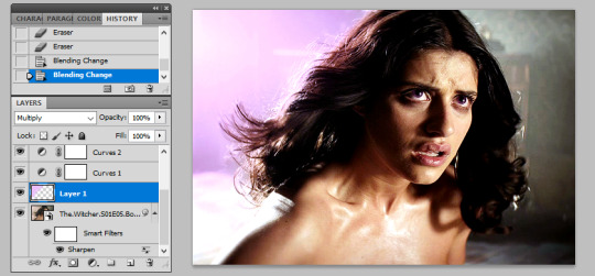
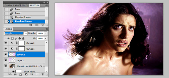
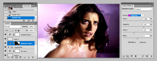
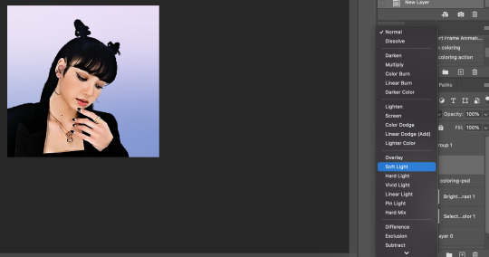
#i let photoshop auto select colors
Text
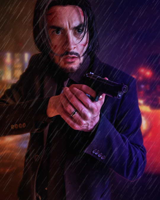
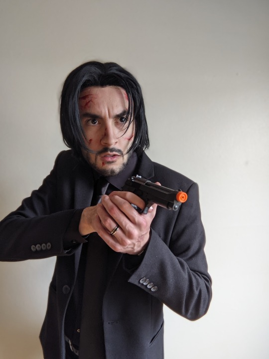
Photo editing step-by-step semi-tutorial
Trying something new here on the blog... I don't do much tutorial writing but wanted to share a little behind-the-scenes on how I typically edit my cosplay photos. A lot of this is cobbled together from various tutorials or trial-and-error over time but I think the results are pretty nice. I use Photoshop but a lot of these tips are generalized enough you might could use them in your editor of choice.
Let me know if this is helpful or cool, if you'd like to see more of this sort of thing!
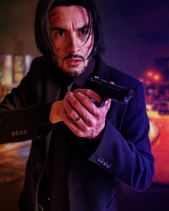
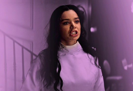
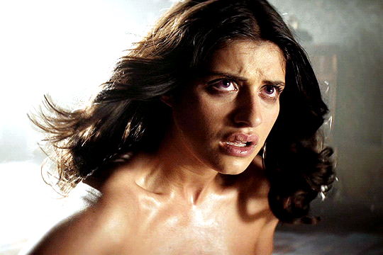
First off I just use the default photo editing tools to clean things up a bit. Tighten the crop and adjust the levels and white balance... mostly just "eyeballing" it. Notably I already like the pose, lighting, and composition - anything you can take care of in-camera rather than post is preferable!
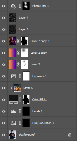
Then I gotta black out the gun tip - select the tip, tint orange toward blue, lower the saturation way down, then tweak the levels. Of course it still looks like a cap is on the tip, but the focus of the photo is kind of off the gun barrel anyway so who cares.

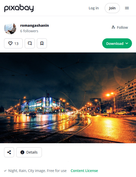
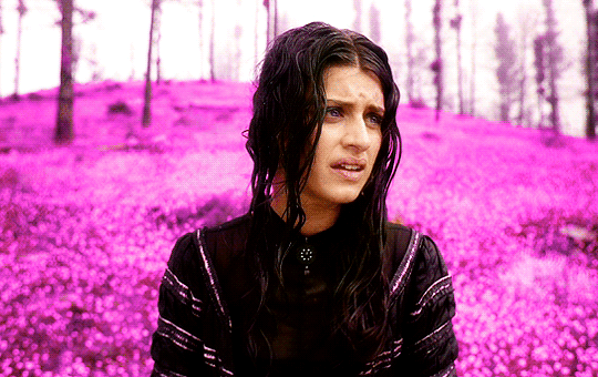
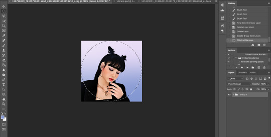
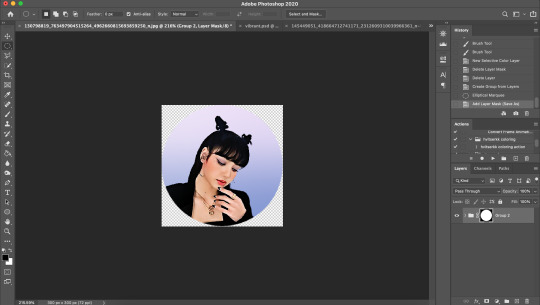
Next up we're going to swap out the background. In this case I want it to feel kind of indistinct - not a "scene" Wick is actively interacting with but more just scenery he's in front of. Wet nighttime streets are pretty prominent in the opening of Chapter 2 so I selected this photo.
I try to use sites like Pixabay that offer free-use photos rather than just pulling whatever from Google Images.

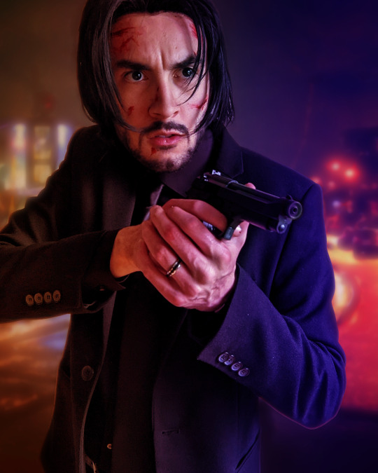
Once I have the photo, I crop it to where the horizon line looks good, add a Gaussian blur to imply depth, and mask it in the background. Photoshop's auto-select has gotten pretty robust, I tweak the cutout just a bit for clarity and to add some light leaks around the outline
In this case I set the transparency to 92% to get it a little lighter. In any case, I then add an Exposure layer to darken it for mood lighting.
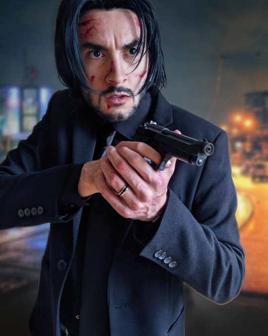

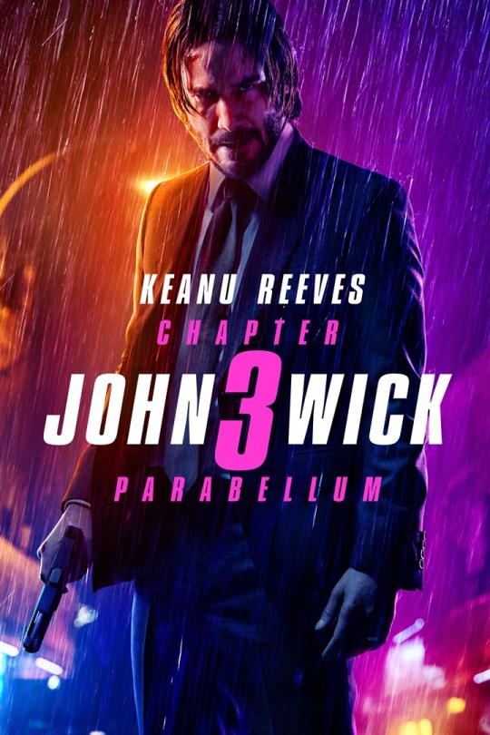
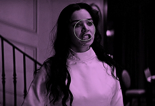
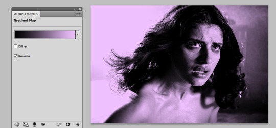
Next bit is color correction. In this case I wanted to evoke the look of Chapter 3 promo art... pulled a few reference images and took note of the orange/purple contrast and gradient they use:
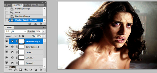
I don't recall if I used the eyedropper tool but I created a similar gradient, set to split on my face so the two halves of the background ended up as different colors. Set the layer to "Soft Light" (in this case I actually duplicated it and set that duplicate to 25%), and I masked out some parts where the light is hitting particularly hard (left of face, hands, edge of gun) to keep a more natural look.
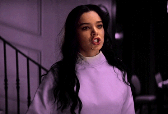
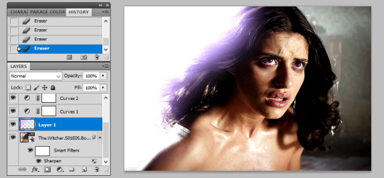
Since it's raining, I added a subtle "fog" look to the background. Created a single-layer duplicate of everything so far, masked the background, Gaussian blur - then set that layer to "Lighter Color". You can see it in the building lights, mostly - brings back some brightness after the multiple darkening we've done.

Finally bringing in some rain, again referencing the poster above.
To make the rain layers, I first make a solid black layer then "Add Noise" (monochromatic). Tweak the "Levels" so you get pockets of pure white against black (with a couple mid-grays layered in), then resize the layer so the dots are bigger than single pixels (it's fine if they get blurry). Finally, apply a motion blur to get the "falling" motion.
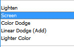
I do this twice to get a sense of depth. First layer is set to "Overlay" at low opacity (~25%), which also slightly darkens the image.
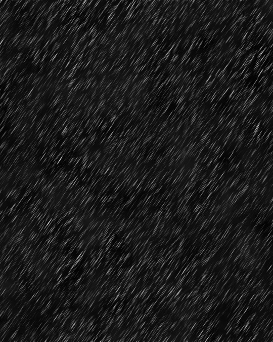

The second layer is set to "Screen", again at low opacity (~20%). Combined, it gives the effect of rain in front and behind throughout the scene.
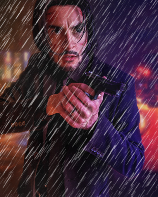

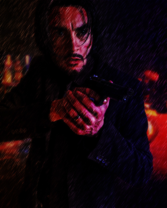
Finally I add a cooling "Photo Filter" layer, masked out to points like my face and hands, to add a little contrast. Sometimes I'll do a final pass with "Levels" or "Exposure", "Add Noise", or use some subtle Instagram filters to make sure it looks good on the small screen, but not really in this case.
All said and done, I usually spend less than an hour per image. Despite ending up with 10+ layers it's not too complex and I find the results quite satisfying!
16 notes
·
View notes
Note
How do you get your gifs to look like that? The quality is amazing. Do you have any tutorial video suggestions, maybe?
Thanks in advance
OH WOW i genuinely still struggle with making high quality gifs, so i’m so touched that you think they look good!! i learned everything from tumblr tutorials, so sadly, i don’t have any videos to share
but! i’ve always wanted to share my process, so here it is, if you’re interested (or if anyone is, really!)
i’m constantly changing up my sharpening settings and coloring process, but here are some processes/tutorials that i (mostly) stick to nowadays, with this gif as my example:

i chose a difficult gif to color because that’s how universal this process is for me (usually)!!
base gif
load video into frames, cropping, resizing
this is all standard, so i'll just share the tutorial i follow: lizzo @ tumblr (steps 1-7)

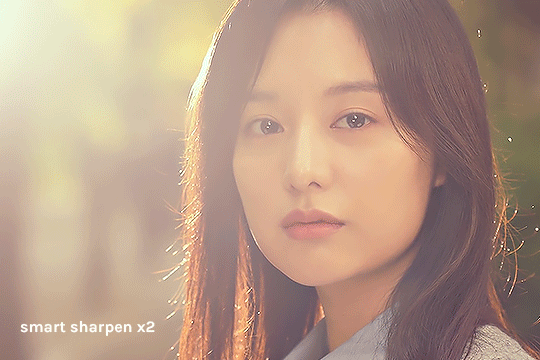
sharpen smart object
i forgot where i got this, but essentially i use the basic Sharpen command then lower the filter’s opacity (25-50%). here’s where you can adjust smart filter opacity btw:

it doesn’t look like it does much, but i usually use this to finely sharpen the gif (by changing opacity) since i try not to mess with the Smart Sharpens
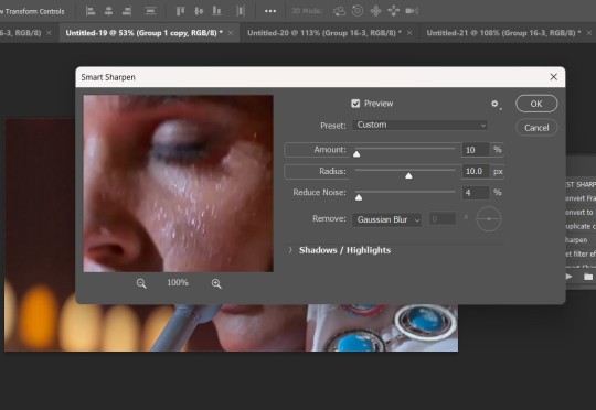
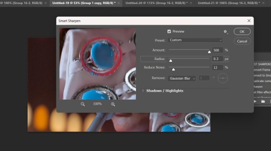
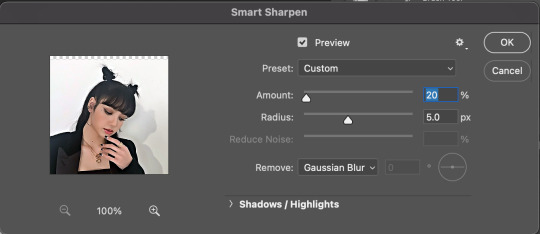
smart sharpen x2
from buckysbarnes @ tumblr, here are my changes:
Smart Sharpen 1: 500%, 0.3 px, reduce noise 20
Smart Sharpen 2: 20%, 10 px, reduce noise 4
these settings look good for this show, but i sometimes change the opacity of these filters for different shows
if the gif is smaller (268px wide), i would reduce the opacity of these filters to 50%
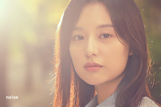
noise
my favorite thing, i can’t live without it now!!! thank you to cuddlybitch @ tumblr for sharing this technique; i use option 2 with these settings:
intensity 10; contrast 50; grain type soft; opacity 25-50%
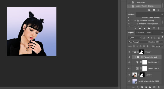
base coloring
yay it’s the fun part!!
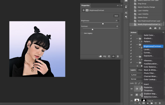
brightness/contrast
honestly, i just press Auto and let photoshop do its thing! i’ll adjust from there, and i rarely ever adjust this
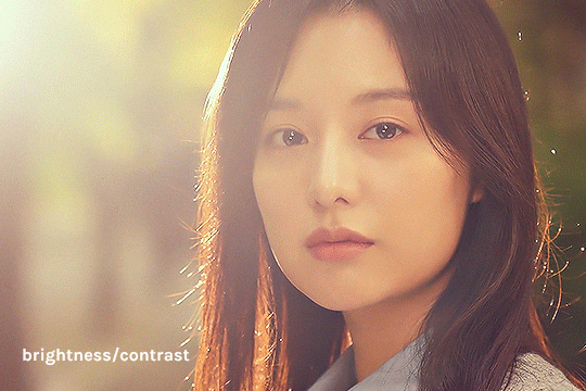
photo filter
deep blue, preserve luminosity on, then i play with the density (maximum 50%)
in this gif, it’s at 32% because it’s very yellow
i sometimes add other filters depending on the mood i’m going for (usually yellow or cyan)

levels
this usually makes or breaks the gif! i start by pressing auto:

then i adjust:
move highlights (rightmost arrow) to start/rise of the histogram to its left
move shadows (leftmost arrow) to the start/rise of the histogram to its right
i adjust midtones (middle arrow) based on the general brightness i want for the gif

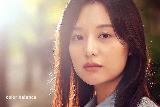
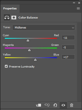
color balance
i generally like my highlights more blue, but this entirely depends on the gif! i just play around until it looks more neutral
in this gif, i added more cyan & blue to the highlights and more cyan & yellow to the midtones/shadows
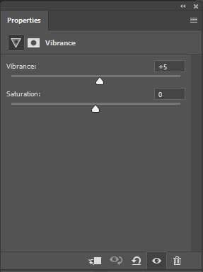
vibrance x3
i follow this tutorial from s-k-y-w-a-l-k-e-r @ tumblr (just the part about vibrance/saturation)
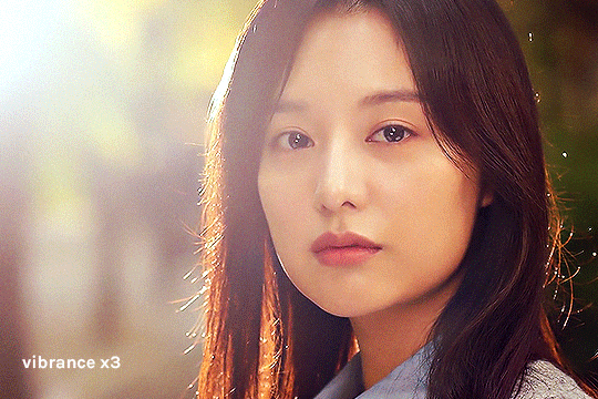
in ths case, i removed the color burn/color dodge layers because it was a little too saturated
i just kept the vibrance +50 layer

hue/saturation
in this layer, i eliminate colors that don’t really add to the gif to reduce colors and increase the quality! i check where the colors are in the gif by increasing saturation to +100, then reducing it to -100 if it seems negligible. here’s what each color looks like

obviously, reds/yellows/magentas are important, but greens/cyans/blues could be removed
i also reduced reds and yellows -10 because it was a little too saturated there

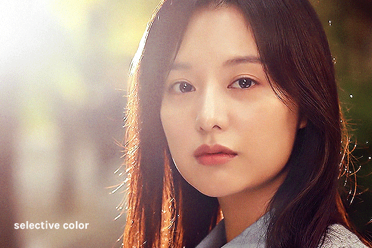
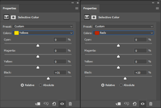
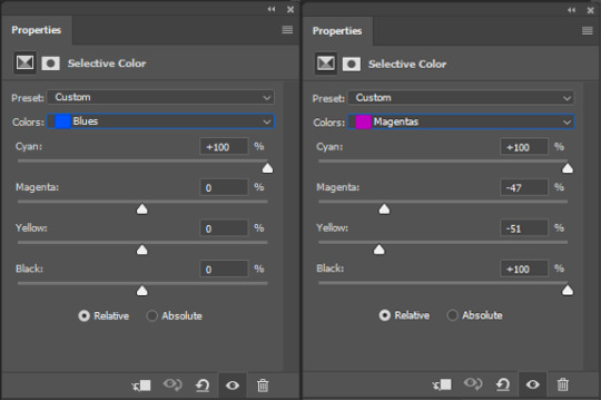
selective color
first, i adjust the black level of each color to adjust the contrast of colors (not the cyan/magenta/yellow yet)

and when i feel like it, that’s when i add subtle changes to the colors
in this case, i only touched red, magenta, and white
vibrance +25
i usually add a little vibrance +25 at the end for fun haha

additional coloring
this is where i do all the gradients & text layers, but i think the base coloring is always more important!

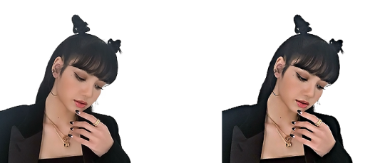
once again, we started from this
to this
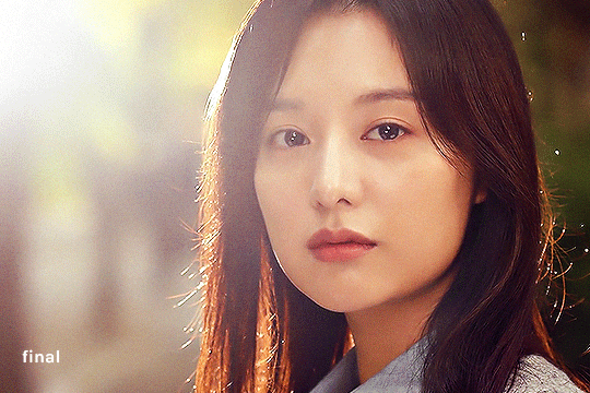
…… and that’s it!
there are probably ways to make it more efficient and use less layers, so i’m still constantly playing with these! this process also tries to preserve the original colors as much as possible, but i’m also able to wildly change colors with photo filters/color balance/selective color, if needed
hope this is helpful to you or to anyone!
#ask#hiswonderfulworks#tutorial#gif making#gif tutorial#forever grateful to everyone who's ever posted a tutorial online#so i swear i'll never gatekeep this stuff#y'all are great <3
40 notes
·
View notes
Note
Hi! I have a little request. Can you help me find a tutorial/tips for this? Every time I try to make gifs from concert videos, I get stuck on coloring.😿 It shines too much and looks white and lifeless. I've been trying to do it for minutes but this is the result, it's too bad.
Hi darling! I'd be more than happy to give color and lighting correcting tips. I'll use your photo as an example first, and then show how I'd go about it in a gif example.
STAGE COLORING+LIGHTING CORRECTION AND UN-WHITEWASHING TUTORIAL
We're going to talk about Camera Raw Filter for this, as it's the best PS tool IMO. You can find it under Filter>Camera Raw Filter

It's the only way to autocorrect coloring on gifs, whereas with static images you can use the Image>Auto Tone+Auto Contract+Auto Color options.
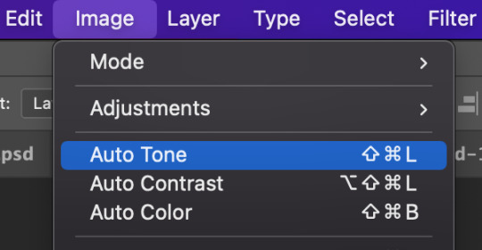
But I still prefer Camera Raw Filter on static images. So without further ado, lets jump in.
Open Camera Raw Filter (I'm going to refer to it as CRF moving forward). You will see the control panel, which has an Auto button, as well as the Basic category, which contains the White Balance dropdown selection.
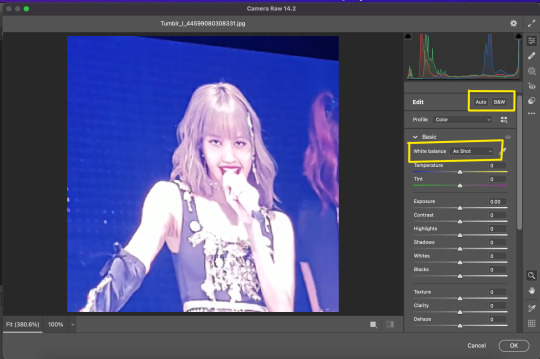
2) Click the Auto button to correct the overall lighting
3) Before you adjust the sliders to get the exact lighting you may want (Photoshop is just guessing after all, you'll always need to modify the results to your preferences) make sure you click the White Balance dropdown and select Auto

Now you can adjust the sliders or mess with any of the other CRF control categories.
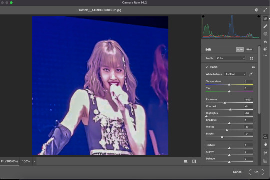
My personal favorite is Color Mixer, which allows full control over Saturation, Luminance, and Hue. Why is that any different from a Saturation adjustment layer? Well, what CRF can do that regular adjustment layers can't is target the color ORANGE.
Many times we editors want vibrant colors and to bring melanin back to whitewashed idols skin, but we don't want them to look like they have a spray tan!
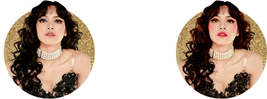
Take this unedited Mamamoo gif for example
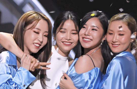
They're pretty whitewashed here due to stage lights, so I automatically darken the gif, and then add some vibrancy to bring back skin color. But adding saturation turns their skin orange:

Now I understand why many people would consider this un-whitewashing, but people are not naturally neon orange.
To fix this, we move on to the optional 4th step.
4) Desaturate the oranges in the Color Mixer section of the CRF control panel (just do this while you're adjusting the lighting and color balance so it's out of the way before you start adding PSDs and adjustment layers)
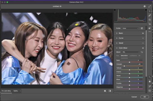
Here is the gif now with the oranges desaturated.

Feel free to disagree, but I think that looks MUCH more natural while still keeping all the vibrancy.
Hope this helped darling!
#tutorial#tutorials#ps tutorial#resource#resources#ps resources#ask#answered#mamamoo#whitewashing#ky*
92 notes
·
View notes
Note
your gifs are such quality and are so so good! ❤️ if you don’t mind me asking, how do you make them look so good? When i gif it looks like trash lol
Thank you! Honestly it was searching tumblr for gif tutorials mixed with some trial and error. Mixing different tricks from different people. Here are some that have been helpful ONE. TWO there are others, but I have to go on a hunt again to find them.
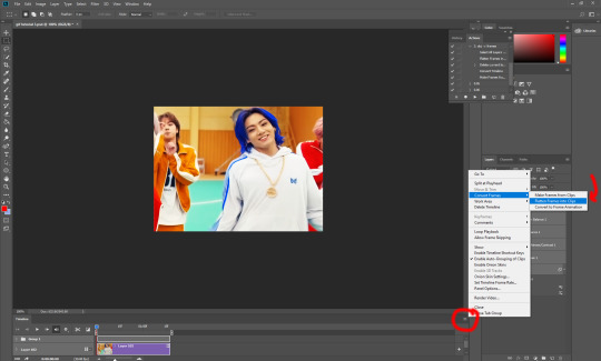
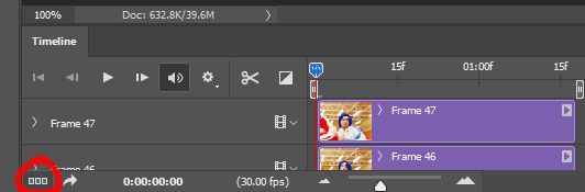
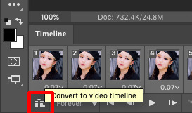
I use Photoshop via Creative Cloud subscription. The one thing that is always said when making gifs is to use the highest quality video. I use 1080 when I can find it. I use the Import Video Frames to Layers option. The main things I do is I crop how I want the gif before I do any sharpening. After getting all the frames and cropping I convert it to a video timeline to do the sharpening. So then I can convert it into a smart filter. I have 4 different sharpenings that I do. The first one is just a regular sharpening and then then other 3 are smart sharpens with different settings. Pictures down below.

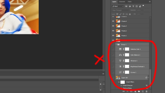
After the sharpening I then resize the image Width to 540. I don't mess with the Height I let Adobe auto do that one after putting in 540. Then that is when I do all the coloring that I am going to do on it. I mainly use Levels, Curves, Brightness (I use the auto option for all of them, but with Levels before I have it auto adjust it I set it to screen instead of normal. It makes it a little brighter already.) I then use 2 layers of the selective coloring adjustment, Color Balance, Hue/Saturation, Vibrance, and Channel Mixer.
I do those in that order so that it goes Levels, Curves, Brightness, Selective Color, Selective Color, Color Balance, Hue/Saturation, Vibrance. It's a good idea to do all of those before doing the Channel Mixer. Once you have all the others how you want it put the Channel Mixer adjustment on the bottom of all the other adjustments so it would then look like it starts with Channel Mixer THEN Levels. That is where you can get the coloring to in a way pop even more.

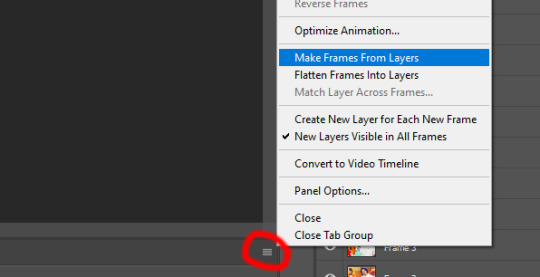
After all of that I convert it BACK into a frame animation and save it from there. (Flatten Frames into Clips, Convert to Frame Animation, Make Frames from Layers, Set the speed you want I use 0.02, then select the ones in the beginning of the timeline that are empty including the very first one that does have an image in it and delete them, then you can save to web).
I hope this wasn't confusing cause I am not that good at explaining things. I hope this is a little helpful. I decided to make this a little tutorial.
4 notes
·
View notes
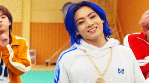
Note
this colouring looks phenomenal! especially considering it's a dark scene, his face and hoodie color make a nice combination <3 can you tell me a little bit about the coloring process if it's ok with you? thanks!
https://www.tumblr.com/blog/view/jimmymcgill/694568365799440384?source=share
thank you <3
unfortunately i didn't save the colouring for this set but i managed to make a similar one, you can download it from here + my process is basically "click and see what happens" but i'll try my best to explain, this can be a mess :')
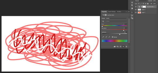
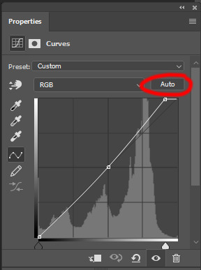
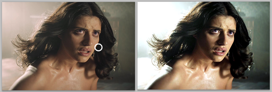
1. first with the curves, i start with the white dropper and click on the lightest spot (sometimes after doing this you will find that there's a lighter spot, you can choose that instead, play around with this until you're satisfied with it) then i change the opacity of this layer to 70% (is there a reason for this? no but i did this once and i liked the result and i kept doing it)

(sometimes i use the gray dropper after it but i didn't need it in this set, but if you need it create a new curves layer and click on the area that you want it to be gray and it will alter the colours according to that) then i create a new curves layer and since this scene is dark i clicked auto and let photoshop do its job ;)
2. brightness/contrast layer, adjust it depending on the scene, my only advice is don't go beyond 30
3. levels, this also depends on the scene, 0/1.10/240 looks great here (i didn't change the shadows because it's already dark + same with previous.. you don't have to do much)
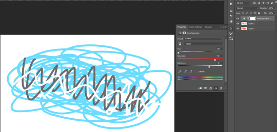
now after fixing the lighting i ended up with this:
4. channel mixer, i set the blending mode to soft light and i keep the opacity 20-60% (this is also something that i did once and just stuck with me, it gives more contrast). here i really just slide the values in each channel until the colours make sense to me, but basically since the gif obviously lacks yellows i tried to fix that. on the red channel i increased the green (this adds red to the green areas, and when you add red to green you get yellow) and i increased red because i want it to pop. then on the green channel i increased the red (adding green to the red areas in order to lower magenta) then i adjusted the green value according to it (lower it until the total equals 90-100%). on the blue channel i decreased the blue (because i want more yellows) and then i adjusted the green accordingly (i feel like this is not helpful at all sorry 😭) // this is a great tutorial that explains how channel mixer works
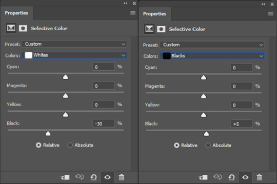
5. selective colour, here i needed two layers only, one for the reds&yellows and the other for whites (i like lowering the yellow/black levels in the whites and sometimes increase magenta a little bit, totally depends on what you prefer)
6. at the end of any gif i make i like to add: 1. black & white layer and i set the blending to soft light or overlay, with opacity 10-40%, you can click on auto or you can try the different presets and see their effect on your gif & 2. selective colour layer and increase the black to 5-10% in the blacks.
and that's it :)
10 notes
·
View notes
Text
Log 6
Last lesson before the mid semester break was pretty fun and helpful.
Photoshop tips and tricks


By pressing ‘X’ the foreground color will swap to the background color and vice versa, this shortcut is very handy for quick art.
Here I’m going to use adjustment layers to change this color.
When adjusting hue and saturation, ‘Colorize’ will put every layer onto the same hue.
To better explain this is the result if you don’t tick colorize.
Another tip when using adjustment layers is that you can click that button to have the adjustments only apply a specific layer, which will be the layer below the adjustment layer. This helps when you don’t want to adjust every layer

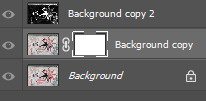
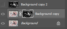
Here I am making a rectangle selection over my sketch. A quality of life tip is that you should keep ‘auto-select’ off. This is because it feels more natural to select what you want through the layers tab instead of clicking on the artboard. It’s much more efficient as you won’t accidentally select the wrong layer as much as you would with auto-select on.
Handy reminders:
- Moving a selection outside of the selected area will move the entire layer rather than what’s inside the selected area.
- Moving a selection inside the selected will move what is selected as to be expected.
- While holding ‘Alt’ when moving a selection it will keep the original selection in place and instead you will be moving a duplicate of the selection on the same layer.
- While holding ‘Shift’ when moving a selection your movement will be constrained to the horizontal and vertical axis.
- With a selection you can do the shortcut ‘Command + J’ and that will make a layer containing what you have selected.
As a quick refresher we are going back to this image and recoloring different fruit
I’ve selected this orange with the pen tool and refined my path with the direct selection tool.
(Using alt to break the anchor points is very helpful)
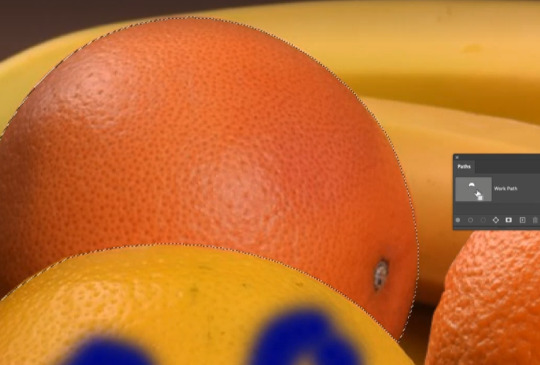
With the paths tab I’ve turned it into a selection.
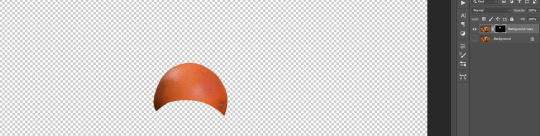
After that we can mask it, make sure that there is a copied background layer.
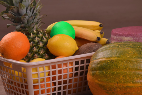
All that’s left is using an adjustment layer onto the orange and now we got a lime green orange :)
(or you could just call it a lime green)
Summary of first exercise
Essentially what was practiced was our skills in:
Selection tools, Masking, Layer management
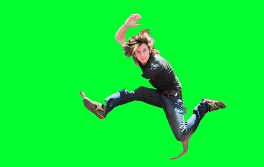
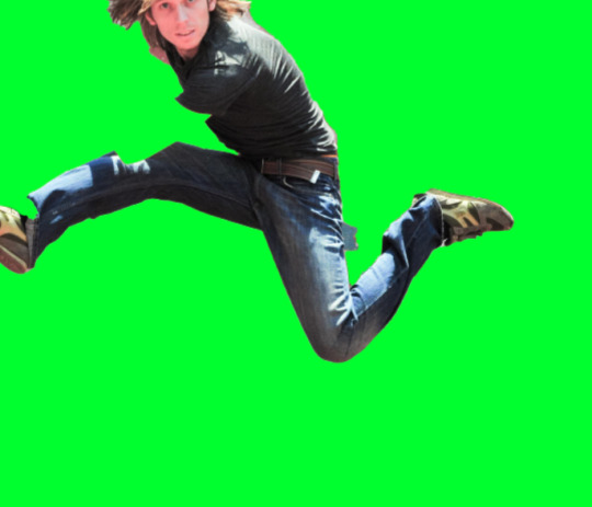
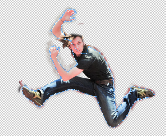
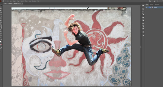
Exercise 2

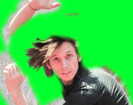
Here we have an image of a person jumping in a funny position. We are going to learn how to utilize smart objects so that we can combine the features of photoshop and illustrator.
First things first we will of course duplicate the background layer as we will be cutting out the jumping guy.

We are going to use the object selection tool as a starter to get somewhat of a shape. There are plenty other methods to do this however this feels the easiest.
I found that doing this sort of editing in photoshop is a matter of working smarter not harder.
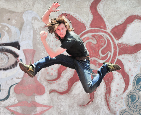
This is the selection... It’s not that good but it’s a good start to refine.
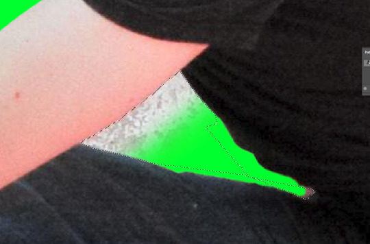
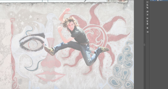
We have masked the selection and put it behind a very distinctly colored background to make it easier to see the edges.
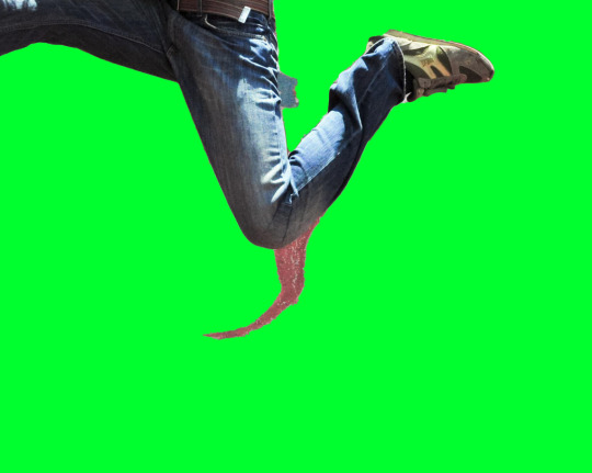
Lets start cutting of this weird part.
To be quick and efficient, we’re using the polygonal tool.


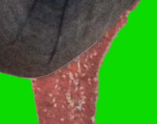
Note that when the black and white mask is selected, your two colors will change to black and white. To put it simply think of black to remove from the selection and white to add to the selection.
So with black as my foreground we “draw” (erase) the shadow away from the selection.
(I’m only using a small brush size for example)
Much nicer.
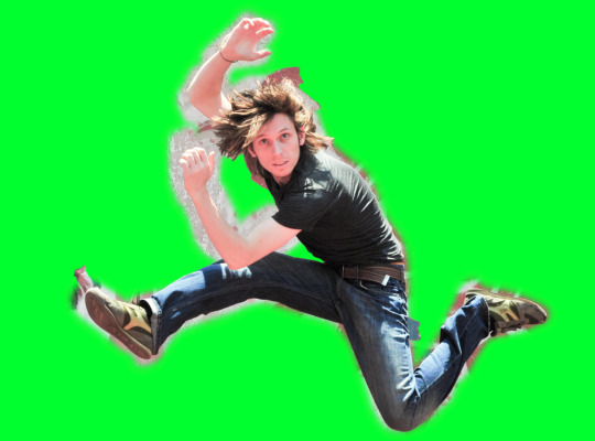
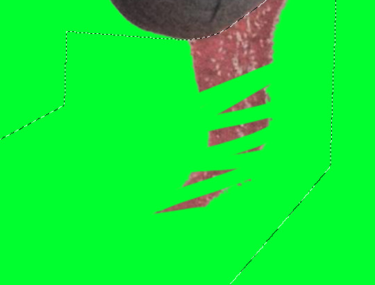
With that in mind we can also reveal what has been taken out of the selection with the white color. So here we are revealing everything that has been picked out by the auto select.
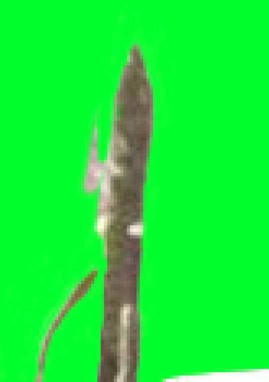
However the hair of this guy will be the hardest to extract. So I will use this helpful and special method.

To start we’re gonna take 2 more copies of the background.
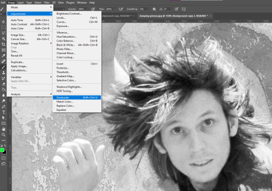
On that top background layer we will desaturate it with an adjustment. (It can be layer adjustment however this is just a one time adjustment)

Then with control + M we can bring up the curves adjustment. What we want is to make the hair very bold so that we can easily pick up on the edges.
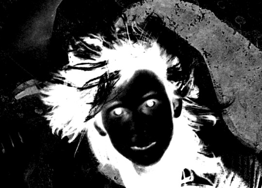
Then with control + I we are gonna invert it. And then copy that layer (control + c)
(make sure the whole image is selected when copied)
After that hide the layer and then move onto the next one down.
With the next layer we will create a mask and then...
Paste it into the mask.

With just that layer showing this is what part of our hair selection looks like.
It’s another great starting point for getting the hair done.
After that apply the layer mask then create another one on that same layer with instead of white in the mask invert it to black.

With playing with brush tool this is our result, though it is only one segment of the hair it is good progress.
Another lesson when doing this work is that it often works together in steps that eventually build to the final result.
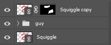
With file organizing this is how our photoshop project will look.
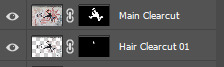
I’ve done a cut of the entire edge of the body.

Selection and then invert selection.

For the less noticeable parts I’ll just be using the polygonal tool.
Here I went with the brush tool method to get rid of the very very tiny details.
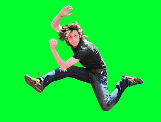
After some time (especially on the hair), this is the final extract.
Moving to Illustrator
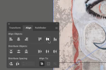
Tip: to make sure the image is aligned properly you can use the align tab.
Here I’ve dimmed the photo so that we can draw over it with clear vision.
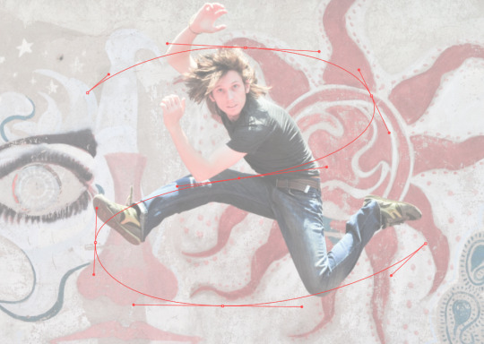
This is going to be the line that swerves around the guy to give a cool effect.
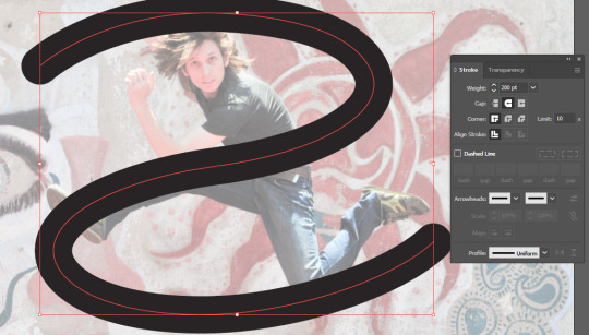
Added a thicker stroke and caps at the end to make it look more flowing.

Save as an illustrator file.
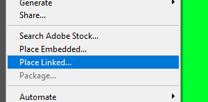
And then back on photoshop you should place linked instead of embedded.
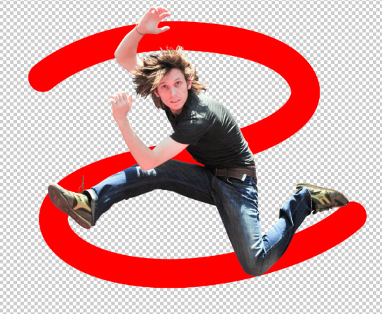

Make a copy of the squiggle and select which parts you want to remain in front of the guy. Then mask.

Looking good so far :)

This is my final result.. Super proud of it :)
Reflection
This lesson was pretty fun. Though I knew most of the techniques I was still surprised by some of the little skills that I learnt. I feel more understanding of bridging illustrator and photoshop together and I definitely feel like I can use this vital skill in the future.
2 notes
·
View notes
Text
Gif animator apple

#Gif animator apple mac osx#
#Gif animator apple movie#
#Gif animator apple install#
#Gif animator apple android#
#Gif animator apple mac#
This will make an FPS (Frame per seconds) of 100/50 and loop the animation. $ convert -delay 50 -loop 0 animation1.gif animation2.gif
#Gif animator apple install#
If you have imagemagick installed ( brew install imagemagick), run the following in relevant folder on Terminal:
Now we’ll change the animation speed and add loop to the animation.
So you need to view it quickly after loading/reloading in Chrome. Note that it does not have loop at this stage and might be animating very fast. View the animated gif in Chrome and see how it is animating. Now save the animation1.gif by clicking “File” > “Save”. If needed fix the order by dragging these thumbnails.
#Gif animator apple mac#
Drag terminal-2.gif and then terminal-3.gif on thumbnail of animation1.gif in Mac Preview. If it is not visible, click menu “View” > “Thumbnails” to make it visible. Now open animation1.gif in Mac Preview and make sure Thumbnail pane is also shown. We’ll use terminal-1.gif, terminal-2.gif and terminal-3.gif for creating animated gif.
Similarly convert terminal-2.png and terminal-3.png to gif format.
Select gif in format, Unselect Alpha checkbox, type animation1 in filename and click “Save”.
Open terminal-1.png in Mac preview and export it as animation1.gif.
Hit enter in Terminal and take window screenshot.
Type ls in Terminal and take window screenshot.
Open Mac Terminal and take a window screenshot of it. After completing these steps, we would be creating the following animated gif image:
#Gif animator apple mac osx#
Here are steps to create animated gif for command line Terminal shell on Mac OSX Yosemite. All Rights Reserved.Mac preview can be used to create simple animated gif by taking multiple screenshots of a window and then stitching then together in Mac preview by exporting as gif. All content of the Dow Jones branded indices © S&P Dow Jones Indices LLC 2019 and/or its affiliates. Click the Where pop-up menu and choose where you want to save the file. Click Next, then type a name for the GIF. Drag the Auto-advance slider to set how fast you want the animation to continue after a click. Standard & Poor's and S&P are registered trademarks of Standard & Poor's Financial Services LLC and Dow Jones is a registered trademark of Dow Jones Trademark Holdings LLC. Click the Resolution and Frame Rate pop-up menus and choose options. Dow Jones: The Dow Jones branded indices are proprietary to and are calculated, distributed and marketed by DJI Opco, a subsidiary of S&P Dow Jones Indices LLC and have been licensed for use to S&P Opco, LLC and CNN. Chicago Mercantile Association: Certain market data is the property of Chicago Mercantile Exchange Inc. Factset: FactSet Research Systems Inc.2019. Market indices are shown in real time, except for the DJIA, which is delayed by two minutes. You can further shrink it down by trimming the length of the GIF or reducing the number of colors. Start by shrinking the file to 500 pixels. Currently, a GIF must be under 2 MB and 500 pixels for Tumblr. Let's make them small enough to upload to the center of the GIF universe, Tumblr. When created without any changes, my first GIFs were a whopping 12 MB. The MOV files actually make for very large GIFs if you don't shrink them down. Experts named it number one animated GIF maker when considering performance, number of options and ease of use. GIF Animator includes a wizard tool to make creating high quality animation fast and straightforward. It allows you to easily create animated banners, buttons, userpics, GIF images for your website, presentation, e-mail, etc. I really like the $4.99 GIFBrewery tool, available in the Apple App Store and for PCs. GIF Animator is a powerful yet easy to use animated GIF maker. Photoshop gives you the most control, but not everyone has it.
#Gif animator apple movie#
There are a number of tools and websites for turning movie files into GIFs. The Live Photo videos are around 14 frames per second, a great starting point for a GIF. On average, the MOV files are around 3.5 MB, the same size as a still iPhone photo.īut if the allure of the animated GIF is too strong to resist.
#Gif animator apple android#
Tweet it, Facebook it, text it to your dad's Android smartphone. And unlike a GIF, it still includes audio. Select your iPhone as the source, and hit record while you press and hold on a Live Photo.Īt this point, you have a usable movie file that can be viewed on most platforms or can be converted into other video formats. Plug in your 6S to a Mac, open QuickTime Player and go to File -> New Movie Recording. If you want to show it closer to how it appears on the iPhone 6S - a still image that starts moving - and don't care about audio, there's another option. Locate the MOV file you want and import it to your computer. To extract the MOV file, plug your phone into a Mac and open Image Capture. If you share a Live Photo over email or text with someone who isn't on a compatible Apple device, they only receive the still image. Each Live Photo is actually a MOV and a JPG file bundled together with some secret Apple magic.
0 notes
Text
Sketch vs adobe xd 2020
SKETCH VS ADOBE XD 2020 FOR FREE
SKETCH VS ADOBE XD 2020 MAC OS
SKETCH VS ADOBE XD 2020 UPDATE
SKETCH VS ADOBE XD 2020 SOFTWARE
SKETCH VS ADOBE XD 2020 MAC
Long version: I began using design tools from a very early age. I will be happy to assist you with any further questions.Short version: Photoshop + Notepad++ > Photoshop + TextMate > Sketch + Framer > Sketch + Origami > Figma + Origami In case of any question or doubt, you can comment below. Adobe XD has the formation of something new that is offering great opportunities for students as well as designers who want to learn the web design, mobile app design and graphics without the purchasing of licenses to other design tools. Generally, Adobe photoshop is the best design tool for all creative designers to experience the digital world.
SKETCH VS ADOBE XD 2020 MAC
The sketch is compatible with only Mac OS.However, it can’t compatible with Windows and Linux users.
Uses “Pages” of within current documents.
SKETCH VS ADOBE XD 2020 MAC OS
Adobe XD is compatible in both Mac OS and Windows.
SKETCH VS ADOBE XD 2020 UPDATE
Real-Time Collaboration and Regularly Update Version.
Prototyping with Auto-Animating on Click.
Here, I have compared the following features: Now, let’s have a look to compare Adobe XD and Sketch. What Are the Key Features of Adobe XD and Sketch? In Sketch, you can add any files as a library, which you can access to combine styles and symbols to any other file you have open in the sketch if you change in the original library that can be synced in your files that use those symbols. The sketch is providing hundreds of plugins to do work more effectively. In general, the easiest way to sketch is really what you want as a creative designer. In Sketch, the right-side part where you adjust default elements, shapes, features, typography, dimensions, rotations, colors etc is responsive to the layer you select. Generally, the layouts of Adobe XD and Sketch are almost the same, so if you want to learn that software, then it’s pretty easy. The sketch is very fast which is a significant advantage for creative designers.
SKETCH VS ADOBE XD 2020 SOFTWARE
Sketch has become a choice of software design tools for a vast community of UI/UX designers due to its simple interface, plugins, free toolkit functionality, and frequent regular updates. Adobe XD doesn’t support any plugins, third party access or anything. In that tools we are creating easy interactive user experience click-through prototypes. Generally, it simply doesn’t challenge me as a designer and makes me assume that this software will eventually take over all the current software and be the king of advanced design. The Adobe XD is compatible in both windows and mac and it supports the vector-based design and wireframing of the website. Let say, this month adobe was updating the ‘dash line’ in the latest version of Adobe XD, which is useful to any designer would realize that you’ve generally had the option to do the same happening in Sketch, Figma and Photoshop.
SKETCH VS ADOBE XD 2020 FOR FREE
All great things that improve work effectiveness and put off the repetitive design steps that we had previously in Photoshop.Īdobe XD now being installed for FREE it’s quite a long back when software such as Sketch and Figma. The potential to simply drag an image from Finder straight right into shape in Adobe XD to make a cover. Designers around the world are appreciating the considerable improvement in Photoshop.Īdobe is gradually introducing new features along with repeating a layout grid. Pointless highlights and focusing on what’s essential for creative design, which is basically vector layout shapes/photos, typography, and templates. This tool is designed and worked for advanced design. Adobe is known for bringing simple, elegant, and worthy experiences all at the same time. So, when it comes to UX/UI Design and Development Services, Adobe is the first and foremost choice as it helps to create visually compelling and highly intuitive designs. Adobe XD is a vector-based lightweight graphics editing and prototyping tools for mobile and web. Two mostly used design tools that most UX designers prefer to use isĪdobe launched a new software – Adobe XD that is widely used as a newly launched software. Adobe XD vs Sketch - Which UX Tool is Best for 2020? It’s challenging to design the websites and mobile apps considering today’s requirements. Most of the creative designers have started their journey in Adobe Photoshop, but today this software has become bulky, outdated, problematic and the reason is that originally designed for just photo editing and retouching. User research, analysis, design wireframe, mockups, templates, and UI prototyping are just a few of the lists and steps. The UX design process is somewhat complicated and it requires the use of specific tools as well as frameworks.
0 notes
Text
Deactivate on1 photo raw 2018

#Deactivate on1 photo raw 2018 plus#
#Deactivate on1 photo raw 2018 series#
ON1 Photo Raw 2018 features major enhancements and updates in many areas. Modern UI Updated - Your photo is now the focal point of attention in a clean and modern UI. Transform Pane Enhancements - The Transform pane within Develop has new tools that correct perspective and rotate issues. I used Photo Raw 2018 exclusively for the editing. Although it was difficult to pick from the many amazing images, these three were my favorites.
#Deactivate on1 photo raw 2018 plus#
We asked the On1 Plus community for their images, which we would edit as if they were ours. ON1 Photo Raw allows you to capture, edit, organize and sync all your photos across all your devices and computers. They also listen to Adobe customers and provide tools that enhance photos, which can be used in Lightroom and Photoshop. You can subscribe, too, for $130 a year.Photo Raw can be integrated into your existing workflow. ON1 Photo RAW 2019 sells for $100 or for $80 if you’re upgrading from older versions. In the winter of 2019, ON1 also plans on adding an AI Masking Tool to help users identify areas of their photos to create a selection or mask. The user interface has been tweaked so that there’s less contrast and a new, more readable font along with updated icons, tabs and sliders that take up less room in the UI.Īs you’d expect, there’s also support for new cameras and lenses plus newly-added support for HEIC image files and keyboard shortcuts for changing modules.A new filter selector allows you to search for filters, learn about them and view samples of their effect. There are now dedicated film grain, curves and color adjustment filters in the Effects tab.Local adjustments have been enhanced to use RAW processing data, which ON1 says allows for more highlight and shadow details with more tonal range.Your keywords are now searchable in a single master list and you can edit, apply, clear or delete keywords from the list.Text inputs can be saved as presets and added to images in batches (good for watermarking). A new Text tool lets you add text to images with control over font size, color, position and more.Within the reorganized Edit tab is a new Portrait tab that automatically detects faces in images to improve retouching and other portrait-friendly edits.An Auto-Align Layers tool combines multiple photos as layers, then automatically aligns them based on image content.
#Deactivate on1 photo raw 2018 series#
A new Focus Stacking tool automatically blend a series of photos at different focus distances.
ON1 says this AI-powered migration tool keeps “almost every edit you can make in Lightroom.” Folders, collections and metadata are also preserved in the migration.
Lightroom users can transfer edited images into Photo RAW and keep those non-destructive changes in the program.
Using layers, you can combine other photos, text or alternate exposures with your HDR photos.
The Edit module now includes non-destructive layers, with support for moving, stacking and masking layers. Each layer has its own non-destructive settings,back to the original file.
The former editing modules are now available as tabs (including Develop, Effects, Portrait, and Local Adjustments).
All of the editing modules from previous versions of the program have been combined into the Edit module.
ON1 is releasing the newest version of its RAW processor and image editor, Photo RAW 2019, adding new non-destructive layered editing tools, focusing stacking and an AI algorithm to transfer and display Lightroom-edited images in Photo RAW.
0 notes
Text
thought this might be helpful?

^2.0mb
^2.5mb
^3.0mb

^3.1mb (different gif but the point i’m making stands)

^3.4mb

^3.8mb
as you can see, the gifs at or below about 3.0mb in size work. the major difference was the gif dimensions — it was that or going up on the lossy-ness. below are my settings for the 3.0mb gif!
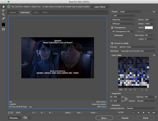
#how to gif#tumblr gif#gif process#my gif#a test for me#but i figured this might be useful for others#i let photoshop auto select colors#me speaks#long post
1 note
·
View note
Text
Coloring Tutorial Using Gradient Maps + Keyframes
This post wasn’t requested but I’ve gotten many asks asking how I do my colored gifs, this post will explain how to color moving gifsets, like these two gifsets. This will be our example:
With that being said, you will need some knowledge on keyframing on photoshop.
1. Make the gif like you normally would
Apply coloring, sharpen and other stuff you would normally do to your gifs. Converted it to a Video Timeline and your layers into a Smart Object in your gif making process, let’s proceed.
2. Adjustment Layer ➜ Gradient Map
Before creating a gradient map adjustment layer, make sure you’ve made your two color squares on the left side of your screen the colors you want.

Make sure black is the color above and the color you want the gif to mostly be is the one on the bottom. If black is on the bottom, it’ll show an inverted image.
3. Erase, Erase, Erase
Drag the playhead at the start of the gif. With the gradient map having already a layer mask, select the layer mask and erase the parts of the gif you want to have the natural colors. Some gif makers involve the whole body, but I’m satisfied with erasing only the face.
4. Easy loading
Deactivate your smart filters so that it won’t take long to load the whole gifset and you’ll be able to freely move the playhead.

Next thing you’ll do is unlink the layer mask from the gradient map in order to freely move the layer mask without disturbing the whole layer. You can do that by clicking the chain between the icon of the gradient map and the layer mask.
5. Moving the layer mask
On your video timeline, scroll down to gradient map and click on the arrow beside it.

After selecting, you’ll be able to see an option called “Layer Mask Position”. Click on the clock on the left side to activate keyframes on the layer mask. This is very important.

6. Tracking the movements
Turn off auto-select. Making sure you’ve selected the layer mask on instead of the gradient map itself. Move the playhead and whenever the face is moving outside the erased parts, drag the LAYER MASK to follow the head. If you are unable to turn off auto-select, you can just move the layer mask using your keyboard’s arrow keys, once again make sure you are moving the layer mask and not the gradient map.

AND VOILA YOU’RE DONE!
Just make sure you activated your smart filters again before saving your gif.
[OPTIONAL] HAZY LOOK
Above the gradient map adjustment layer, create a new layer and set it on SCREEN.
Using the same color on the gradient map, select the gradient tool.

When you’re satisfied with the look of the gradient, duplicate the layer, set the duplicated layer to overlay and decrease the opacity to 10% - 30%.

#**resources#tutorial#photoshop tutorial#coloring tutorial#gif help#gif tutorial#dailyresources#usersource#quirkyresources#sibylresources#chaoticresources#completeresources#allresources#hisources#userk8#tusersbeth#tusershay#userjack#usersnat#quintennyson
966 notes
·
View notes
Text
GIF Tutorial for Beginners
People keep asking me to teach them how to make gifs and I end up writing them long confusing messages, so I figured maybe it’s time to just write up an actual clean tutorial instead! This is supposed to be for total beginners! (Or people who want to switch to a new process that I’ve curated and streamlined over 8 years of making gifs.) I’ll try to keep this as barebones as possible, and won’t include all the advanced stuff I usually add. I hope it’s easy enough to follow, and I’ll include some links at the end for more stuff. I really do think it’s better to make a few simple gifs before doing more complicated stuff though, just to get used to it!
There will be three sections in this tutorial:
#1 Basics - How to make a gif in PS at all
#2 Sharpen - How to use sharpen/denoise filters in an easy way
#3 Colouring - Just a few very basic adjustment layers
What you need:
A video (most common formats should work, although .mkv doesn’t always)
Photoshop (I use PS CC 2018 - this one because I'm morally opposed to Adobe’s subscription model - but versions aren’t super different from each other)
In the end, you should hopefully be able to make something like this:
This is gonna be so long. Sorry. You can make a gif with just part #1! The rest is just to make it look better.
#1 Basics
If any of the tools/functions aren’t where they should be for you, your best bet is googling it, you might need to change something in your preferences!
Make sure to save your PS file... often. PS has a tendency to crash, especially on laptops.
First, you need to get the video file. I recommend a shorter video, a few minutes long, if it’s longer you might want to cut it into shorter parts beforehand. This is just because PS’s video import tool sucks.
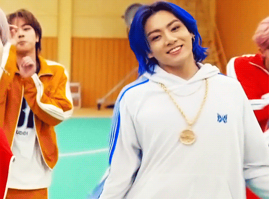
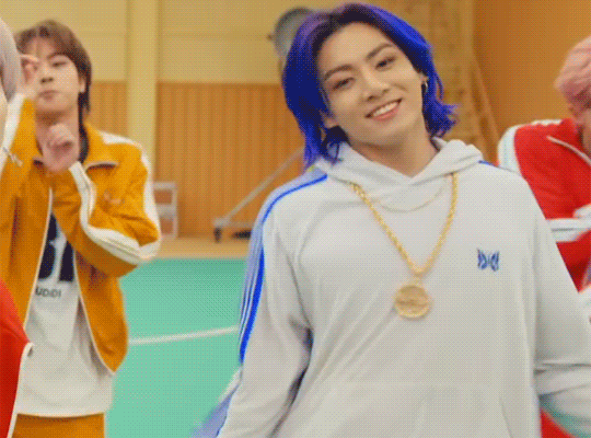
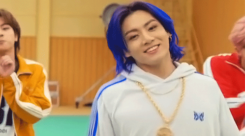
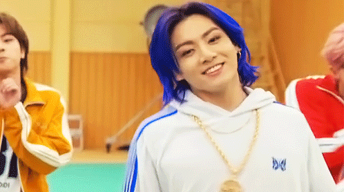
I chose the Butter MV, specifically Jungkook’s body roll at 1:24 because that’s what I want to look at for the duration of this tutorial. No further questions, thanks.
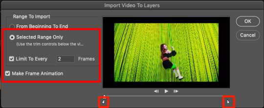
1. Open PS, go to File > Import > Video Frames to Layers

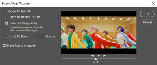
2. In the little pop-up, choose the part of the video that you want to gif. This will import every frame of the video into PS as a layer, so it has to be a relatively short part, or it’ll take ages (and gifs can’t be that big anyway). Now you can also see why it’s almost impossible to select the correct part if the video is too long.
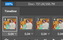
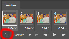
The little controls at the bottom are for trimming, the one in the middle just for the preview. Make sure “Make Frame Animation” is selected! Then click OK.
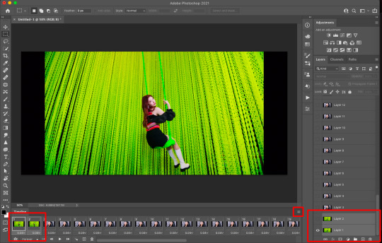
3. Now you have your layers, and you have a frame animation! On the right are your layers, that’s where we’ll apply the colouring etc. later on. On the bottom, that’s your timeline or frame animation - that’s what the gif will be in the end! So if you delete frames, the layers will still be there, but they won’t show up in the gif. If you click on a frame, you can see the little eye checkmark on the layer that’s currently visible.
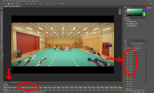
4. The timeline controls at the bottom that are relevant right now: set to “forever” so the gif will loop, you can play the animation with the play button, and you can delete the selected frame(s). The number on each frame is the speed of the gif, depending on the video I usually set it to 0.05 or 0.06 (photoshop lies to you when you play the animation, the only way to test this is to open the finished gif, preferably on tumblr or wherever you want to upload it).
5. As you can see, the animation starts a bit before the actual part that I want, so go ahead and delete all the frames in the animation that you don’t want! You can delete the corresponding layers too if you want, to make the PS file smaller, but it has no influence on the gif. (Hold Shift to select multiple frames as usual)
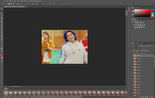
6. Next, we’re gonna crop the gif however we want! You can do this with the crop tool in the left sidebar, but with gifs like this where there’s a lot of moving parts, I sometimes just use the selection tool in the left sidebar, like so:
When you click on different frames, the selection stays, and you can check to make sure Jungkook doesn’t suddenly go out of frame if you crop it like that!
At this point, make sure the selection/crop isn’t smaller than you want the gif to be! For tumblr, what matters is the width (in pixels) of gifs. In the end, the width dimensions on tumblr should be 540px (1 gif per row), 268px (2 gifs per row), or 177/178px (3 gifs per row). Anything else will lead to very shitty resizing!
For this gif I’m going full sized, meaning 540px wide, so I made sure my selection isn’t smaller than that.
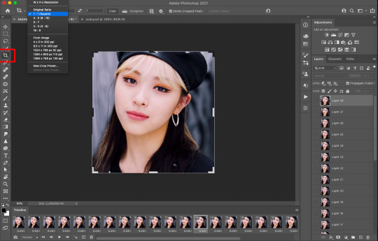
Then just go to Image > Crop, and it’s done!
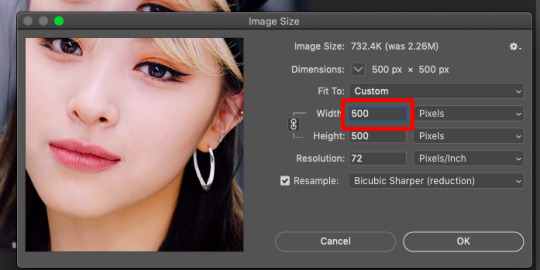
7. Check to see if this is what you want, then resize: go to Image > Image Size to resize the picture. Make sure the little “link” between Width and Height is active (to keep the same aspect ratio), then set the width to 540px or whatever you chose. I always set the resample option to Bicubic.
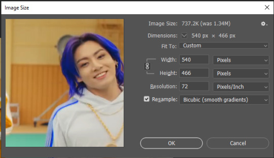
Once that’s done, set the zoom to 100% right above the timeline, to see what it really looks like.
Almost done! A little note about the sizing: width is the important part for tumblr, but if you want to make a whole gif set (especially with more than 1 gif per row!!!) make sure to make all the gifs the same height, otherwise they won’t line up and tumblr will do whatever it wants.
I ended up making mine 540 x 400 and ended up with this:
8. Time to save the gif!! Go to File > Export > Save for Web (OR just use the shortcut Ctrl + Shift + Alt + S) (or whatever it is on Mac).
In the pop-up, you can change things about the gif, but most things should already be the way you want it (Image size, Looping option forever). Selective should be the default, just like the rest.
You can choose between Pattern and Diffusion, some gif makers swear on one or the other, I go back and forth.
On the bottom left, you can see the size of your gif. Keep an eye on that! I believe Tumblr allows every single gif to be up to 10mb, but I try to keep mine under 5mb or close to it, because I think tumblr adds compression if it gets closer to 10mb?? Anyway back in my day you couldn’t upload anything over 1mb. You’ll never know our struggles.
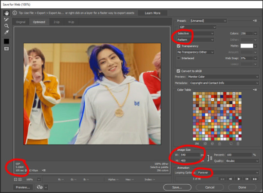
Then just save it, and that’s it, you made a gif! Well done!! Here’s the end result:
:)
#2 Sharpen
There are countless ways out there to make gifs as smooth and clean as possible! Here I’ll show you the easiest way, but it also provides a good basis for other methods. The main difficulty is that you you need to sharpen the layers, but you don’t want to 100 layers one by one. So what we’re gonna do is convert the layers into a Smart Object, which functions as one layer!
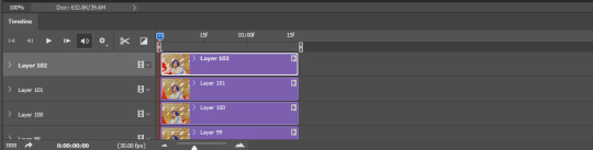
1. Convert the frame animation timeline to a video timeline with the little button right underneath on the left:
It should look like this, and I’m sorry but I can’t explain this one because I’m not an expert here, but you can just ignore it:
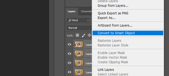
2. Select all layers: Select > All Layers, or just manually.
Then right click on the layers > Convert to Smart Object. Now there’s only one layer left, but don’t worry, the frames are still there!
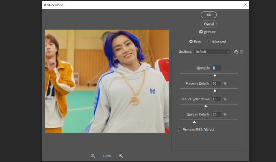
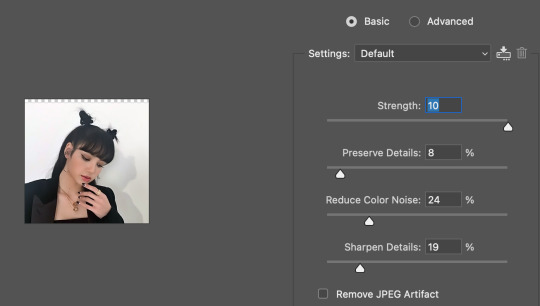
3. De-noise! It reduces noise, takes away some of that grain. More necessary in some videos. It also makes it less sharp, so I do this one first. Filter > Noise > Reduce Noise

My default settings are, Strength: 6, Preserve Details: 60, Reduce Color Noise: 45, Sharpen Details: 25, Remove JPEG Artifact: No. But you can play around, especially with the strength, and see how the little preview looks. Don’t apply too much of it! Or it will look weirdly smooth with no details in the end.
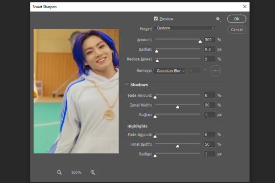
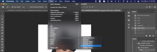
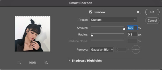
4. File > Sharpen > Smart Sharpen.
Settings: I usually have mine at Amount: 500, Reduce Noise: 5, and Radius at either 0.2 or 0.3, depending on the video. I’ll actually do 0.3 here, because I find it a bit blurry otherwise. If you sharpen more, it can quickly get grainy.
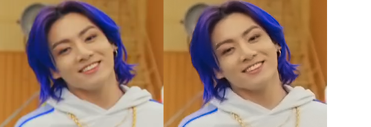
The difference isn’t huge, but here’s a little before and after denoise & sharpen:
5. Technically you can just save it as a gif (save for web) as shown above now, or you can convert it back to a frame animation, which I’d recommend especially if you use certain other sharpening methods (I’ll show you how to convert it back at the end of the colouring part), but for now, let’s go straight to the next part:
#3 Colouring
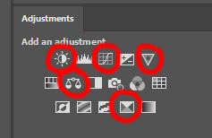
Now, you CAN do this part right after part #1, still in frame animation, without a smart object. I prefer it like this because sometimes PS acts weird, but if you want to skip the smart object stuff: select all frames, and add the adjustment layers at the very top, above all the other layers. (It only affects selected frames; and it only affects the layers under it.)
The adjustment layers should be above the layer tray, and these are the ones we’ll use today: Brightness/Contrast, Curves, Vibrance, Color Balance, Selective Color.
All of these are optional! You can do one, or all, or any combination. This is just the very most basic for me to get a gif to a point that I like. I’d recommend sticking to these for a start, but once you get the hang of it, definitely feel free to play around! It’s fun! Every gif maker has different preferences here, too, so there’s tutorials for everything.
1. Curves: Just click Auto, tbh. You can play around, but Auto works fine for me as a start, just to brighten or darken some parts as a base.
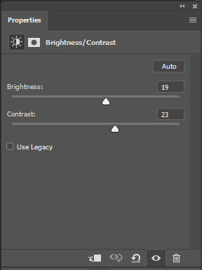
2. Brightness/Contrast: Usually videos are a bit dark, and contrast can help to make it seem sharper AND cut down on gif size, so I usually just up both of them a bit (but not too much! Or it’ll look cheap). Here I put them at B: 19, C: 23
3. Vibrance: I love very vibrant and colourful gifs, so I usually up the vibrance (and sometimes the saturation). This one is already very vibrant, so I only put +5, but if you try to colour, say, a very moody tv show, this can help wonders, especially if you want to work with the colours more later.
If you prefer less vibrant gifs, you can also lower the values here!
4. Color Balance: getting a bit more complicated now. Often, videos will have a slight yellow or green or blue tint, and this is where you can correct that. This video is a bit yellow, so I added +17 Blue. It was still too warm, so i added -11 Cyan as well. This neutralized the yellow tint, but I wanted some of the reddish tone back, so I added -5 Magenta. I usually do a similar process like that, depending on the tone.
Instead of Midtones, you can also do this for Shadows and Highlights individually.

5. Selective Color: now this is the most complicated, but also the most fun to play around in my opinion! Be careful here, if you do something too extreme it’ll look like shit or make the gif super grainy. I some rough goals in mind here: make the blue hair as blue as possible, make their skin tone a bit less pale, and enhance the black and white (which I always do).
You choose a colour at the top, and then add or subtract cyan/magenta/yellow/black values for that colour.
Skin tone: yellow and red. For this gif, I just added black to both, making them darker. Sometimes, if you change one or both those colours for a different part of the gif (for example, if I wanted to make the background less yellow, I’d subtract yellow from the yellows - but then I’d add yellow to the reds, to make the skin tone natural again.)

Blue hair: Just ramp up the cyan for the blues. Be careful with putting anything to +100, but here it’s already so bright that it should be fine. His roots are more purple, so I changed the magentas by adding cyan and black, and subtracting magenta and yellow. It’s not super clean, but fine for our purposes.
Black/white: depending on the gif, I often either add or subtract black to the whites. Adding makes the highlights less blinding, a bit darker, and flatter (I like to do that if one side of the face is bright white in the sunlight, for example). Subtracting creates contrast, makes it brighter, can wash it out. It can also lessen the gif size, and here it’s mostly just the tracksuit instead of important details, so I subtracted black. For the blacks, I almost always just add a bit of black, to make it more intense. Just like adding contrast, this can make the gif seem sharper and less grainy.

And done!
6. You could just save it as gif now, but as I said, I prefer to convert it back to frame animation timeline first, if only because I like to let it play through before I save it, and it works better for me there than in the video timeline.
Select all frames, then click the little menu on the top right of the video timeline > Convert Frames > Flatten Frames into Clips
7. When you scroll down to the bottom of the layers now, the old smart object + adjustment layers should be at the bottom, under all the new layers. Delete the old ones, we don’t need them anymore.
8. Convert the timeline back to frame animation, by clicking the little button at the bottom left of the video timeline:
9. Click on the menu top right of the timeline again > Make Frames from Layers
10. Now, just some potential cleaning left to do. Sometimes, there’s a doubled or empty frame or layer at the beginning or end, just delete those as necessary. The timing of the frames is probably off, too, just select all frames and set the delay time to 0.05 (or whatever).
Now your done! Save as gif, and you should get this:
I included some bonus links and tips after this but tumblr ate that whole part so I guess it’s going into a separate post. (Here is is)
Anyway, I tried to make this as easy to follow as possible for beginners, but feel free to send me an ask for clarification anytime. Hope this helps, now go make gifs and have fun!!
#photoshop#tutorial#gif tutorial#ps tutorial#btsgif#*#*tutorial#this took so much longer than i expected i'm not giffing for at least a week now
225 notes
·
View notes
Text
becca’s mega coloring tutorial
i’ve gotten a lot of requests recently asking me to make a tutorial for my 'colorporn’ gifsets, and i think i’ve finally gotten over the traumatic incident 3 years ago, when i spent all day writing out a coloring tutorial only to accidentally hit backspace causing the entire thing to be wiped. so, here it is, buckle up folks! it’s going to be a long ride but here’s hoping it’ll be helpful.
so we’ll be going from left side (no coloring) to right (coloring & color porn):

let’s get started! you will need some sort of photoshop in order to do this, i use photoshop cs5 so this tutorial will be based around that, but i imagine you can adapt it for whichever one you use.
this is more of a coloring tutorial than a gif tutorial, but if you’re not sure how to make gifs then this is a pretty good all-encompassing tutorial, although i use 0.05 as my frame delay speed.
we’ll start from your have your basic gif, re-sized cropped and sharpened like so:
step one: curves
so i’m going to start off with basic colouring! the first thing i’m going to do is a curves layer to sort of ‘balance’ the gif out. to do that i go to layers > new adjustment layer > curves. on this window, right next to the graph, are three little droppers. i’m going to click the very bottom one right here:

this basically allows you to set your ‘whitest’ point in the gif, aka the point that should be the brightest. so i then go to my gif and click on the ‘lightest’ point. there’s a lot of light coming in from the top left hand corner of the scene i’ve chosen, so i’m just going to click it on that point (circled below) and that immediately brightens up the scene.

next i’m do something similar, but with the ‘blackest’ or darkest point on the gif. to do that i’m going to use the very top color picker:

and i’m then going to hit what the blackest point to balance out the light:
what this is basically doing is using your white and black points as color markers to not only brighten and darken the gif in places, but it also acts as a sort of color balancer. it’s very common that shows put a sort of colored ‘filter’ over their scenes, for example the scene i’ve picked has a sort of yellowish filter over the top. you might find that some scenes it doesn’t really affect, but others it makes a tremendous difference. personally i like doing this to get back to a ‘neutral’ ground on the scene, which is particularly useful when we are taking a scene with a warmer color tone (yellow) and trying to make it a cooler tone (purple).
if you are using a darker scene you may have to put a brightness/contrast layer on before you can complete this step, or even add an auto curves layer (hit the ‘auto' button on that same window) before you have a ‘white’ and ‘black’ spot to work on. i love this trick but this is precisely why i say i have no ‘general psd’ because it is entirely scene specific! but here we are at the end of step 1:

step 2: basic coloring
i’m just going to add a few adjustments to round off my basic coloring! i added just a little increase in curves to make the gif a little brighter (a), added a levels layer to enhance the contrast (b), and added some color balance. for this i worked with adding magenta and yellow tones to enhance the skin tones in the gif. i also made the midtones a bit more ‘purply’ (c) (as this is the end colour i want to achieve) and also did the same for the shadows (d).

for a darker gif i would probably add more curves and an additional brightness/contrast layer. color balance is also a really important tool to just play around with, ‘warmer’ scenes need more cyan/blue balance, while ‘colder’ scenes need more yellow/magenta balance. our final product is:
step 3: painting colors
if you wanted, you could probably leave your gif right there, but i like colors and i’m going to embrace them!
now there are three methods that i bounce between and they really depend on the type of gif you’re working with. an ideal scene would have a strong background color (see step 4) already for you to work with, but the truth is the majority of scenes don’t. as this scene is fairly neutral in background coloring, you’ll see we can’t just use selective colors to get the purple we want, so instead we’re going to do something a bit different. warning: this method won’t work for scenes with a lot of movement! for that you need step 4 or step 5.
first, something i always do with colored gifs, is i add a gradient map layer of black + a light shade of the final color i am trying to achieve, like so:
i then set this layer to ‘soft light’ and lower it to an opacity that i think suits. for this gif i lowered it to 20%.i think this makes the darker colors a little more ‘purply’ and overall gives a smoother affect what we’ll do next.
next is the fun part! we’re going to start adding in the purple. to do this, we want to create a new layer right at the bottom of all your coloring layers, so sandwiched between the actual gif and your first curves layer. then i grab my paint brush (you want one with the blurred edges, not a solid brush), use the same purple tone i selected for the gradient mask and paint around yen’s face and body.
i like to split my left and right side into separate layers. this is because i like to use a large paintbrush to solidly paint the left hand side of the gif, and then use a large eraser to get rid of the color from her face/body. the larger eraser you use, the smoother it looks (i’m not saying try and use a 600px eraser, just a 100px rather than a 10px creates a better effect). now it looks like this:
don’t worry that it looks very white, that’s just because it’s under all the curves layers! so now all i do is change it from normal, to multiply, and as you can see we have a nice purple background:
repeat this process for the right hand side:
you may find that if you’re working with a darker gif, setting these layers to ‘hue’ or ‘color’ is better. and again, the opacity may need a bit of playing around with. remember it’s ok to play around with effects and what might work for one gif will not work for another just because scenes and lighting vary!
then i just painted a line across the bottom, over her chest area, and lowered this to a 41% opacity. this just helped to enhance the purple feel of the gif. now we’re left with:

so a few finishing touches, i noticed that there was a spot by her right arm that as she moves, exposes a bit more of a ‘yellowish’ band. to fix this, at the top of all my coloring layers, but under the gradient map, i added a layer and just put a small purple dot on top with my paintbrush, and set the layer to ‘color’.

lastly, i wanted to make the right side a deeper purple, so i used selective colors to manipulate the magentas to the shade i wanted. then with the layer mask, painted black over the right hand side of the gif so it didn’t affect this coloring.
and there we have it! i have my finished gif!

tips: sometimes it’s nice to enhance lighter and darker parts of the gif further. i didn’t with this one as i already thought the natural lighting did it well enough, but of course this might not always be the case!
while i liked the coloring of this gif, i wanted a bit more variation in the purple tones. so, under all the coloring layers again, i painted some black on the right hand side, set this to softlight, and played with the opacity (it ended up on 65%). then added another purple layer on the right hand side, but set this to overlay instead and again lowered the opacity (to 58%) and got this:

you can play around with this to get different tones, and you can even change the color of what you’re painting on to create a gradient effect! for example, if i change the black softlight layer to a dark blue, and the overlay purple layer to a lighter pink, i get this:

and then you can use blue and magenta selective colors to play around with that even more. it’s all about experimenting and seeing what works!
step 4: selective colors
to do this method, you need to have a gif that has a strong background color. it doesn’t matter what that color is, or even if it has two, but it doesn’t work well with a netural background. for example this gif (which i’ve already done my base coloring on), is perfect to work with:

as we can see it’s very yellow in the background which is perfect! so the first thing i’m going to do is is create a new hue/saturation layer, set this to ‘color’ and then on the drop down menu change the color to ‘yellow’. from here i just dragged the hue bar till it was pink/purple.

because i’m working with yellow, which is a skin tone, we find that her skin has also gone pink. now i don’t really want this effect as i’d like her to look natural! so all i’m going to do is grab my black brush, paint on the layer mask, and erase this from her face. this won’t be so much of a problem if you’re adjusting cool tones, such as blues or greens.
i then used some selective colors to adjust the magentas and the same ‘tip’ i used for step 3 to add a little bit of gradient variation and all done!

step 5: all the time in the world
sometimes, you have scenes that won’t conform to either of the two methods listed. either they have too much movement for step 3 to work, or too neutral a background, or the selective colors won’t work for the overall color of the gifset. also, if you’re working with something of a yellow background with a lot of movement, the selective color method doesn’t work great because it ends up disturbing the skin tone of the person you’re giffing.
for example, for this gif i did all the steps in step 3, and got this:
now i love the coloring, but it’s messy. the movement of her hand means that her hand dips in and out of the yellow, but leaves background exposed.and the turn of her head means half her head ends up yellow. so instead of giving up, because i am a stubborn bitch, i take my yellow layers i’d painted on, merge them into one and start coloring them frame by frame.
to do this i adjust the timing of the yellow layer to fit each scene, and fill in/erase the yellow around yennefer as required. it ends up looking a bit like this:

i must say this can be pretty time consuming. it’s fine for shorter gifs, but it doesn’t work for a gif with a lot of frames. i don’t mind cos i just do this in the background while watching a movie, but it’s not for everyone. you might just prefer to play around with selective colors as in step 4, but you also might find if you’re adjusting warm skin colors, that you’ll need to use a layer mask frame by frame to still get the clean affect you want!
anyway, i added a slight yellow layer set to ‘hue’ over her dress to round it all off, and after coloring it frame by frame i got the affect i wanted:
obviously if you did all gifs like this it would take all week, but in mixing all three techniques i end up creating the sets i want!
the end
and that’s it, i hope this has actually semi-made sense and is of help. if you have any further questions or points you want elaborating on please feel free to ask! a lot of this takes time, practice and experimenting, so my biggest tip is just be patient and play around with what works for you :)
#fyeahps#completeresources#itsphotoshop#coloring tutorial#gif tutorial#i can't even remember who's asked for this except for everyone but i hope it actually helps?? and lives up to your expectations??#saved this every 5 seconds due to paranoia lol#tutorial#tutorials#ps help#1k
4K notes
·
View notes
Text
hello everyone! ✨an anonymous user has requested that i do a gif tutorial! lol so here we are 😇 please do not hesitate to send me an ask if something still doesn’t make sense! i’m so bad at explaining things but i will try my best in this tutorial 😂
ok here we go 😂 to begin, i open youtube on my phone, find the video i’m searching for, choose the highest quality available, and screen record the part(s) i want to make into gifs. (i use my phone bc some videos play at a higher quality on there but you can do this on your computer as well using quicktime player). once i have my screen recording, i send it to my laptop, open quicktime player and trim it down to about 5 or 6 seconds. then i go to file > save. (or you can trim it down on your phone; either is fine)
now that my video is saved, i open photoshop and go to file > import > video frames to layers.

select your video and this screen will pop up. make sure your settings look like this. you can use the two little arrow things under the video to trim it more if need be, but i personally prefer to just do that in the next step ~
click ok and your screen should look like this. now for trimming ~ we just want the frames of ryujin for this gif, so select the two frames at the beginning, as well as the corresponding layers to the right, and choose delete frames/delete layers. (to delete the frames, click on those little lines in the corner). repeat this step for the frames/layers at the end.
now that we have deleted our unwanted frames and layers, it’s time to crop (if you want!) i like square gifs, so i made this one a square, but the crop is totally up to you and what you prefer.
when you’re finished cropping go to image > image size and this screen will pop up. in my experience, it’s best to keep gifs 500 or under. i just change the width and let the height auto resize. for square gifs, i usually make them 500. for any other gifs, i usually stick between 300-400. it varies with each set.
after you’re satified with the size of your gif, click those little lines in the corner again and choose “select all frames”. once they’re selected, click on the arrow under the frame and choose “other”. it will ask you to set frame delay. 0.07 is my go to option, but sometimes i’ll use 0.06 if the gif looks like it’s moving too slow, or 0.08 if it looks like it’s moving too fast. again, it’s totally up to you and what you prefer.

once you’re done with that, go over to the corner and select “convert to video timeline”. then select all your layers and choose “convert to smart object.”

your frames and layers should now look like this. (i forgot to screenshot an image without my coloring already added, i hope this isn’t too confusing but just let me know!!😭) okie dokie! now this is the part where you add your sharpening and coloring. i usually sharpen using the camera raw filter and smart sharpen. for coloring, as you can see below, i usually just stick to these few adjusments but of course it varies per gif. you can just play around with all the adjustments, highlighted in the top right corner, and/or use the camera raw filter until you’re satisfied! once you feel everything looks good, go to file > export > save for web.

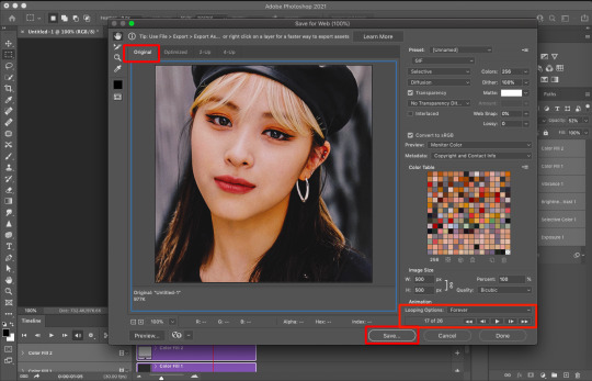
it may take a short while to load, depending on how large your gif is. when it completes, this screen should pop up. make sure you choose “original” at the top, not optimized. (optimized ruins the quality a little.) make sure the looping option is set to forever (i think it automatically is, but just be sure.) you can select the play button to preview your gif before saving. also, you want to make sure your gif is under 10MB. any larger and tumblr won’t upload it.
and you’re done!! here is my completed gif <333 i hope this helped you!! pls don’t hesitate to send me a message if anything is still confusing!! <333
#also i'd like to add i don't know anyone else who makes gifs the way i do 😂#most ccs use a video downloader i think#but this method has been working out for me so hopefully it will work for some of u as well <333#ps tutorial#ps help#gif tutorial#tutorial
10 notes
·
View notes
Note
hola! cómo le haces para que tus icons te salgan en buena calidad?
Hi! I apologize but I cannot speak Spanish, so I am going to have to translate your ask through Google Translate. Which I know isn’t the best method, I’m sorry!
According to Google Translate, you’re saying “wave! How do you make your icons come out in good quality?”
Hopefully, that is close enough to what you’re saying and if so, first off, thank you for saying they are good quality! Secondly, I’ll walk you through my icon making process. It’s actually very simple and fast (at least IMO lol I can make an icon in like 5 minutes but I also use PS for a living so I’m pretty used to the program)
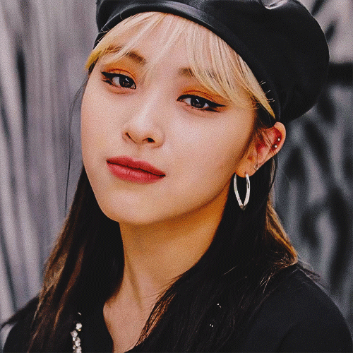
I’ll show you how to go from this random image from Lisa’s Instagram:
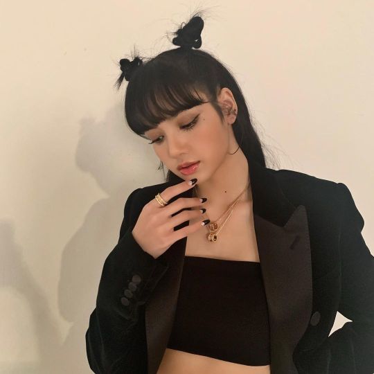
to this icon

FULL TUTORIAL UNDER THE CUT
First off, open Photoshop and drop in your image (I have Adobe Cloud PS 2020)
Then I want to clean up the colors of the image, because the image is too yellow, and was clearly taken in bad lighting.
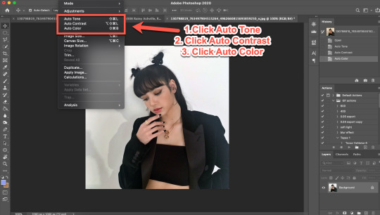
1. Click Auto Tone
2. Click Auto Contrast
3. Click Auto Color
That should help give the image a much nicer, natural color, as shown below:
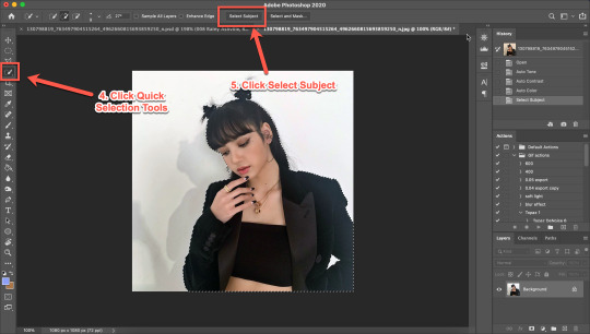
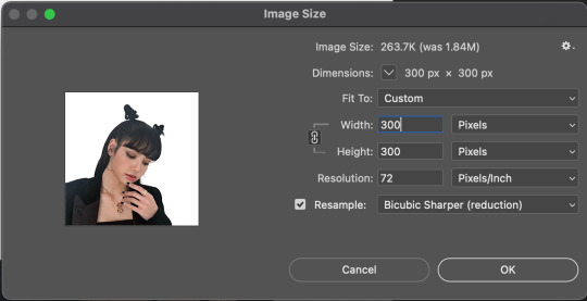
4. Select the Selection Tool
5. Click Select Subject
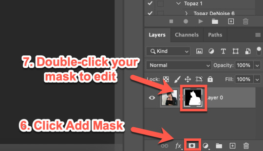
6. Click Add Mask
7. Double-click your mask to edit
8. Click View, then select Overlay V (this will help you see where you need to clean up your image)
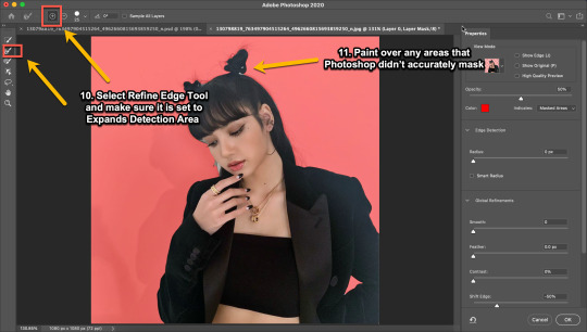
9. Adjust settings to the image (This part really just depends on your image. Generally, I always set the Shift Edge to -50%, as it helps take away any white fuzziness around the image. Smooth obviously smooths the edges, Contrast helps sharpen them, and Feather...feathers them....just don’t use Feather okay?)

10. Select Refine Edge Tool and make sure it is set to Expands Detection Area (aka the + symbol lol)
11. Paint over any areas that Photoshop didn’t accurately mask
12. Select your mask again
13. Select your Paint Brush tool (make sure it is set to Hardness 100 and an appropriate size for your image)
14. Set your Foreground and Background colors to White and Black (Just click the little black and white boxes above them)
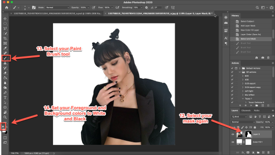
15. Using your paintbrush tool paint in (or out) details you need (In this case I just need to paint her face back in, so I use the brush tool set to white and paint where the pixels are distorted)
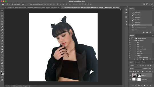
Now she is ready to be cropped and edited.
16. Flip/crop/adjust the image as desired (My best tip is to use the crop tool and put the focus of the image in the center of the grid)
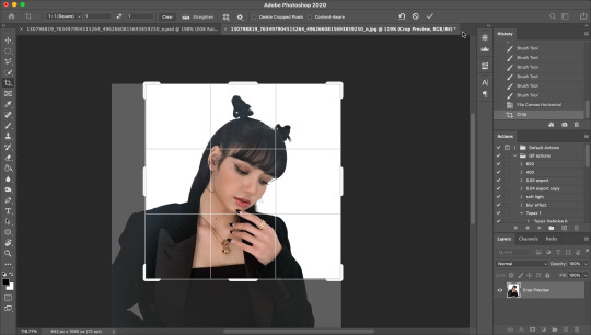
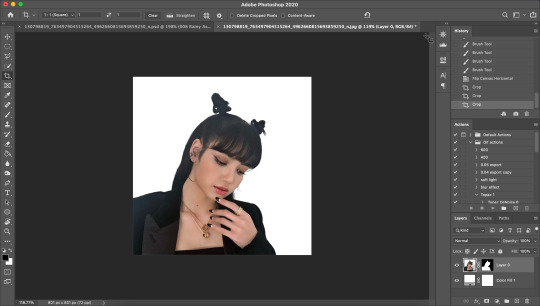
Here’s the final cropped image:
17. Click Image>Image Size
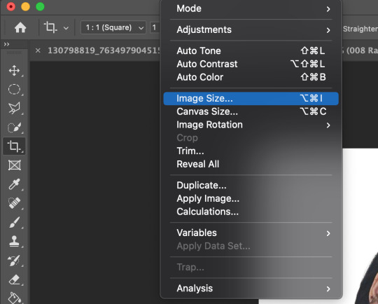
18. Set the Image Width to 300 Pixels, check Resample, and set to Bicubic Sharper (Reduction) and click OK
19. In your Layer Panel, select your Image, NOT your mask (nothing will happen if you edit your mask lol)
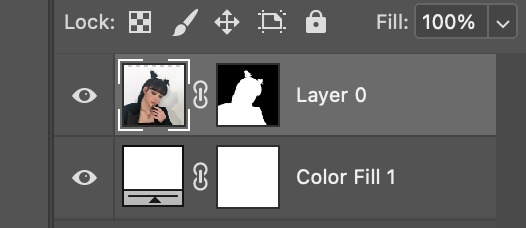
20. Click Filter>Noise>Reduce Noise...
21. Adjust to the following settings (or whatever you prefer to get the image looking smooth) Click OK
Now my image is smooth and free from noise and grain, but I want her to be more in focus.
22. Click Filter>Sharpen>Smart Sharpen
23. Use the following settings
This is a basic sharpen that many editors use for gifs, edits, icons, etc, and you can just stop there for the sharpening step if you want, but I prefer my icons sharper, so I click Filter>Sharpen>Smart Sharpen again and this time, I use these settings:
You can see the differences below. The left side has just the basic sharpen, and the one on the right has both sharpens (you can clearly see the difference)
Once you’ve sharpened as desired, we’re ready to finally get to the fun and colorful part!
24. Add a gradient bg below your image (There are tons of free ones you can download from Tumblr or Google, or you can just make your own with the a gradient layer)
This next step is optional as not all images need it, but for this image, I need to do some badly needed image adjustments
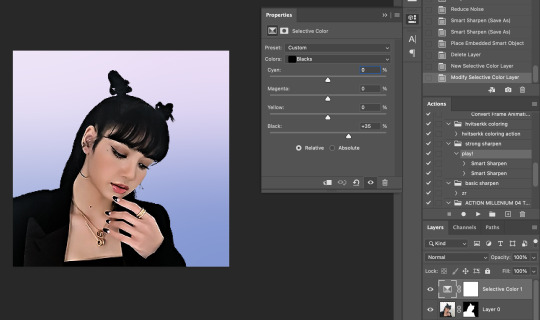
First I click the adjustment layer on my layer panel and click Selective Layer

Then I set the colors to Blacks and drag the Black to +35 to darken up the blacks on the image and give it a nicer contrast (selective colors are great, mess around with them as much as you want until you find a look you like!)
Then I make a Brightness/Contrast layer and adjust to what I feel works best for the image
26. Create a folder (if you did the above step, select the layers and then click the folder icon, it’ll just put them in the folder)
27. Holding down the alt key on Windows (or the Option key on Mac) click and drag your mask to the group layer. Now you have a folder that you can put PSDs and adjustment layers in without affecting your gradient background
28. Drag your PSD of choice. I am using this amazing PSD that is perfect for pale photos. I set the PSD to 50% opacity and it looks like this
Now, I could stop here, but I’m extra so I want to doctor up her face a little.
29. Above your PSD folder, create a new layer and set it soft light
30. Select your brush tool again, and pick a color that will work for enhancing an area of the photo. Then paint over that area.
Lisa is already pretty pale here, so I won't paint over her skin with a nice peach color like I do sometimes in darker photos. But I will add a nice pink flush to her cheeks and her lips.
Then I will use a lilac purple to paint over her eyeshadow. This brings an element of the background onto her face.
There’s not a lot that needs to be added to this particular photo, but here’s an example of another icon without and with soft light painted layers:
The left has no soft light painted layers, the right does. You may be thinking it looks too gaudy, but icons are tiny! Adding strong colors will help painted areas stand out. However, this is a completely optional step of course :)
31. Back to our current icon. Select all your layers, and click the folder icon again to place them all in a folder
32. Select your Elliptical Marquee tool and make a circle over your image
33. Click your mask button in the layers panel, and tada! You can now save out your icon and put it to use
Here is the completed icon:
If you got this far, thank you for reading, and let me know if you have any questions!
#ggnet#kgirlsquad#blackpinknet#idolady#femaleidols#lisa manoban#photoshop tutorial#icon tutorial#photoshop#tutorial#icon#icons#if this type of post doesn't belong in any of the group tags just let me know and i will remove the tag#wasnt sure if tutorials counted lol#Anon#ask
99 notes
·
View notes
Note
your gifs are so beautiful, would you consider doing a coloring tutorial?
🥺💗 thank you so much for enjoying them !! i don't think i could do a full tutorial both because i don't save my psds and because i don't know what i'm actually doing LOL but i can talk about the adjustments i use the most! i know that li and em talk about coloring in their giffing tutorials, and i've definitely picked up a lot from both of them, so you can peep theirs here and here.
this got a bit long, so i'll put it under a cut! thank you for liking my gifs enough to ask 😞🤍
the adjustments i use the most are levels, curves, color balance, selective color, vibrance, gradient map, and exposure.
levels help to ensure everything is, well, level. if your gif has wack lighting and parts of it are too dark and others are too bright, levels will help even it out. i usually just hit "auto" and let photoshop do what it wants, and if it still looks weird, i'll add my own adjustments. i usually end up adjusting the middle slider on levels, which controls the sort of midtone brightness, and the one on the left, which controls the black.
curves can do the same, but they help with color adjustments too. altering the main curves layer will change the brightness, but you can get into the red, green, or blue layers and even things out there. if the gif has too much cyan, you can move the red curves up. if it's too blue, you can move the blue curves down. curves are useful for a lot of stages that have bad lighting! and for mvs like winter falls that use a heavy blue filter. the main adjustment on jeongin's gif in this post was curves, if that gives you a good idea of how much it can do.
color balance is a little less intense than curves and a bit more self-explanatory. it's just sliders, so it's easier to deal with if you have too much of one color in a gif. these gifs had a +20 yellow balance to get rid of the blue hue that came with the stage (so on the yellow-blue slider, it was -20). the default dialog opens to midtones, but you can adjust the shadows and highlights too! highlights are helpful when skintone needs adjusting. those gifs had a lot of shadow balances too, again to get rid of the blue.
selective color is probably THE most used adjustment by me. when i'm correcting skintones, i use the reds, yellows, and whites a lot, usually decreasing the cyan and upping the black on all of them. i end up with multiples of each color because it's usually best to stack little adjustments -- +5 black here, -10 cyan there -- than to have just one with huge adjustments. it's also nice for adding or removing colors! i used them in this set to get rid of a lot of the blue (especially in the last gif; that bg was wholly blue to begin with). if i wanted it to be more blue, i could've gone to the blue adjustment and upped the cyan, decreased the yellow, and increased the black. they can turn green into blue, purple to white, etc... they're really versatile! i definitely recommend playing with them as much as possible. neutral selective color is insane. tiny adjustments on that layer can change the whole look of your gif; it's like color balance but way more intense.
vibrance is self-explanatory! if you want your colors to be more vibrant or saturated, you can increase it on this adjustment. vibrance has a little more subtle effect, while saturation can change the look of things very quickly. if your gif looks too grainy in tumblr, decreasing these can help too. again, i use it while coloring skintones a lot, since the colors tend to get washed out. if the video is whitewashed enough that skin doesn't respond to red selective color, upping the saturation within the vibrance adjustment can help!
if it doesn't, i pull in a gradient map. a tan gradient map with its layer style set to multiply can restore skintone, but they're useful for color correction too. if a stage has too many red lights, putting a blue gradient map over it can tone things down. as long as it's the opposite color of what you want to cancel out, it should help! whatever i'm using them for, i play with the layer style and opacity -- i never use them at 100% opacity and usually not even above 50% unless the original video is just awful. i used them in all but the middle column of this set -- it was a tan gradient map set around 15% on multiply. if i'm doing it for like stage lighting correction, i usually have it on soft light, but it depends!
i used to add a gray gradient map over my gifs, but now i use exposure to do that. exposure can obviously help if the gif is overexposed or needs some brightness, but i mostly use it for the offset adjustment. lowering the offset lightens black and adds a little fade to the gif. i used it for that purpose in the last set i linked, but it's most obvious in this one! it just makes it look a bit softer, and i personally like the style.
brightness / contrast is useful too but pretty self explanatory. playing with layer style can make a big difference too! sometimes i'll put selective color layers on linear dodge or soft light or something. just messing with those settings can change the whole look of the gif!
i hope that this is at least somewhat useful for you & that it made sense !! again, thank you so much for enjoying my gifs 😣💞 everyone's style is different, and i know yours is lovely too! i hope you have a great day / night 💘☁️
5 notes
·
View notes
Last Seen Blogs

fantomycelia
‧₊˚⊹𓍊𓋼 Mycelia's Garden𓋼𓍊⊹˚₊‧
notebooks-and-laptops
Oh Grey Warden, what have you done?
jebotom1
개 인 소 장

icekingtiger
Untitled
irlsmii7y
you have bear fists??