#late night chat
Text
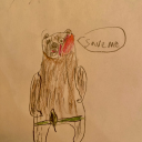
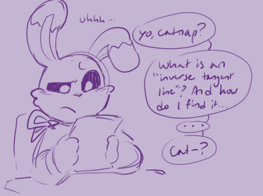
Late night perserverance design idea because fucking nerd =/= cannot slay baybeeeeeee
#pushes into locker#says i dont have plans to make all the fallen children#immediately thinks of deaign ideas for the remaining ones#late night chat#pedias art#stealing karmas ideas#doodles#devin#perserverance
247 notes
·
View notes
Text
Origin tweet: https://x.com/kiwmyu/status/1757561437738729785?s=20
10 notes
·
View notes
Audio
i needed this for, reasons,
#asvatthaman#ashwatthama#ashwatthaman#fate grand order#late night chat#the growl awakens things in me
25 notes
·
View notes
Text
hear me out
i was chatting with a friend yesterday and i was asking her to rate tgcf characters and then i got to qi rong and said about how he has a son and how he hangs corpses and my friend came up with an idea
"what if qi rong planted trees to hang the corpses as a last offering to let them rest"
and ofc this is very ooc for qi rong but then we made the idea even better
"what if guzi did it? what if guzi when he accidentally kills someone he would do something similar to his father and hang the corpse on a tree, but with his own twist, that being planting a tree specifically for the corpse and instead of hanging the corpse he places it carefully on a branch and prays for it's soul to rest"
#qi rong#guzi#gu zi#tgcf#heaven official's blessing#great idea thanks bud#late night chat#tian guan ci fu#ooc ideas#this idea makes my heart warm and idk why because it's literally about hanging corpses#qi rong and guzi shenanigans
15 notes
·
View notes
Text
Space And Earth Chat
Bruce: Will you watch when the sun swallows the earth?
Clark: Bruce, that's in five billion years
Bruce: ...
Clark: No
Bruce: I would
Clark: Morbid Bruce.
Bruce: I understand why you wouldn't-
Clark: I wouldn't becuase I won't let it happen.
Bruce: It's physics Clark, you can't stop it.
Clark: I can.
Bruce: How? You're going to feed it more hydrogen?
Clark: Sure, why not. I am a farmer's son.
#Batman#Superman#dc comics#bruce wayne#Clark Kent#DCAU#Bruce can only open up. super late on his back staring up lol. And yes he lays just like Alfred does in my other Late night chat pic#Because he's subconsciously has picked up Alfred's mannerisms#This was originally supposed to be boys on an unfinished skyscraper chit-chatting and then It somehow just got super abstract lol.#the starts of peice has been in my draft for the last 4 years ....#My art#Fanart
2K notes
·
View notes
Text
you ever get the feeling that you’re not really liked but just kinda tolerated?…like you don’t really belong anywhere and you’re just kinda always on the outside but you don’t fit in or wtv.
#just me? okay#this prolly my hormones talking anyways#I’ve always hated that corny ass term popular loner but that’s what it feels like#like I’ve always loved my friends and stuff but no matter what I’ve always felt like I wasn’t as close as everybody else#and I’ve never really had like a bestie or anything so I’m just kinda sitting here like 🧍🏾♀️#I literally feel like this with my own family and it’s the weirdest feeling ever#cherry chats 🍒#this app is a mess#but it is free and therapy is not so ignore my late night depression rant
783 notes
·
View notes
Text
Thinking about the symmetry of Catwalker and Loveybug.
Yes, they’re both just a version of their civilian selves, but those versions have been pushed to extremes. For Catwalker, he’s the embodiment of perfection and doing what he’s told, but Adrien the civilian often pushes back against being controlled. For Loveybug, she the embodiment of daydreams and affection, but Marinette the civilian is often gets in her own way of fulfilling her romantic dreams.
But these two aren’t just mirroring their own civilian selves, they’re also mirroring their superhero partner. Like Ladybug, Catwalker is focused on the mission above all else and tries to be professional. Like Chat Noir, Loveybug wears her heart on her sleeve and indulges in grand romantic gestures at inappropriate moments.
And this new version of the heroes is simultaneously all their partner thinks they want, and yet not at all what they truly need. Catwalker can help her carry her burdens, but he can’t be the partner who knows Ladybug well enough to be her best friend. Loveybug can shower him with affection, but she can’t be the partner Chat Noir knows well enough to love him for the real him.
And even when you remove the partner they know from the equation and just have it be Catwalker and Loveybug, they still find themselves drawn to each other. Loveybug knows from prior experience that Catwalker is a total sweetheart and is exactly the sort of boy she’d drool over if she didn’t have Chat Noir and/or Adrien. Catwalker knows from prior experience that Loveybug is totally lovey-dovey and is exactly the sort of girl he’d want to have close to him if he didn’t have Ladybug and/or Marinette.
And both are internally screaming just being transformed like this. Catwalker is stressed over having to force himself to conform to a strict standard for Ladybug’s approval, but he thought that having this clean slate would let him be by her side after facing rejection. Loveybug is stressed that letting loose on her emotions so much will be lead to a mortifyingly embarrassing rejection, but she thought that having this clean slate would let her act on her feelings for once without having to worry about long term consequences.
And in our scenario where Catwalker and Loveybug have become partners, it’s only a matter of time before they both crack from pushing their identities to their limits (her from showing a boy more love than her comfort zone has ever allowed, him from restraining himself from reciprocating the love he desperately wants). And once those cracks finally show? Then they’ll be able to see—just a bit more fully—who their partner has been hiding under the mask all this time.
485 notes
·
View notes
Text
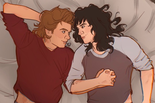
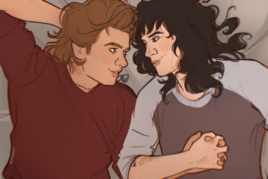
#late night/early morning chats for these two#I just like them holding hands#I’m sure I’ve read posts or fics where Steve wears a ring of Eddie’s? not sure which or where but I thought I’d add it cause it’s cute#I picked the skull cause he wears it on his ring finger 🙃#if I remember right#not super happy with their faces in this one but ehh#stranger things#steve harrington#eddie munson#steddie#steddie fanart
1K notes
·
View notes
Text
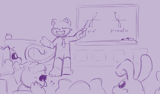
Class is in session!
Idea inspired from this that I've been meaning to draw for the past few days
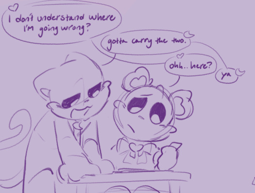

#He'd be a half decent teacher except every other time someone tries to ask him a question outside of lectures he's asleep#Part time math teacher full time sleeper 👊👊#ever so slightly lazier quality because I was tired when making this#Nearly fell asleep at my desk thrice oops#No sleep only catnap#Less lazy work when exam prep stops kicking my ass after late May yahoo#Still don't know how to draw critters from a behind and over the shoulder angle I'll figure that out someday#Going to bed first tho night chat👋#poppy playtime fanart#poppy playtime chapter 3#poppy playtime#smiling critters fanart#smiling critters#catnap#dogday#bobby bearhug#hoppy hopscotch#kickinchicken#Minor piggy and bubba not enough to tag me thinks#The critters playing school together and each one takes on the role of a different teacher for a while#he just has the patience for math
278 notes
·
View notes
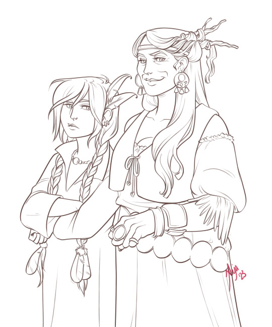
Text
Absolutely nobody asked but patience design concepts i jotted down at 4am one night
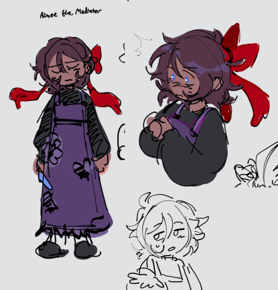

Their name is aimee and i copy and pasted their outfit directly from when i shitposted my ocs as the fallen children because the impulses won
#aimee#patience#i dont have plans for designing all the fallen children#but i like the idea of only posting them at late night hours when i do think of ideas#the they/them children yearn for the mountains#pedias art#doodles#late night chat
212 notes
·
View notes
Text

First of all, I’m pretty sure I’d give both my legs to hear Barbatos call me his sacrificial lamb. Like can you imagine him saying it to you just before he goes down on you?
Second, who is this taste tester?? My top guesses are Diavolo, Little D No 2, and Solomon. I would’ve said Luke but let’s be real, Barb loves him too much to make him a test subject. He’d have Luke be a taste tester for something he knows is delicious.
And lastly… “I jest.” I just know that if I spent any time with this man, I would end up talking exactly like him. I’d be saying that instead of “just kidding” to one of the bros and they’d just be like you’re spending too much time with Barbatos again. And I’d say no you’re wrong I’m never spending enough time with Barbatos 😡
#oh nothing just Barb thirsting as usual#I don’t even remember what this chat is from#I just found the screenshot in my camera roll lol#eta: I looked it up & it's from the UR card Believer :)#late night nonsense posting#obey me#obey me nightbringer#obey me barbatos#om barbatos#misc naughty times#misc rambles
342 notes
·
View notes
Text
Okay wait so I thought of something and I feel kinda bad for him??
Alastor is trying so hard to make Radio seem like it’s still some popular thing, and nobody caaaares. Not many care about radio anymore, bc the times have changed.
Maybe when he first got to hell , because it was like super popular bc yk, the times and stuff. Everybody listened to the radio because that’s all they really had. Television wasn’t as popular because not many people could afford it. Radio was simple.
But he’s trying soo hard to still broadcast, and show it off, but no one really wants to hear it. Times have changed, they all want tv’s and electronics like their phones and stuff. And I just feel kinda bad for him bc like,, he’s trying to make it popular but it’s just never gonna be it anymore. It’s a thing of the past
222 notes
·
View notes
Text
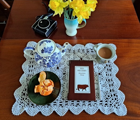
She lives on a moor in the north.
She lives alone.
Spring opens like a blade there.
#happy very very very early spring from the moors#the signs are starting. very soon everything will erupt. i can't wait#had a walk this morning and had a chat to the elderly farmer next door about his late-night lambing#lambs love to be born at the silliest time on the coldest darkest sorts of nights#anyway. i'm breathing deeply. the spring is coming. i'm having a lovely week off from work.#ted hughes#anne carson
92 notes
·
View notes
Text
shin for day 2 🐺 my poor little meow meow
#wait i forgot my signature.. its ok#its late cuz well chat we ate a little too much gummy™️ last night#shin hati#star wars#star wars art#star wars fanart#ahsoka series#ahsoka show#inktober#drawtober#inktober 2023#drawtober 2023#hidatafrost art#artists on tumblr
168 notes
·
View notes
Text

itty bitty sleepy lady and kitty
#mlb#miraculous ladybug#ladybug#chat noir#ladynoir#marinette dupain cheng#adrien agreste#my art#i think i made this in like an hour late at night#struggling with the Block + L + i do not like my art rn + ratio#have some sleepy ladynoir…miss them#prob on a roof or smth#YES I FORGOT CHATS RING LOOK TF AWAY#chat ur adrien is showing in this im ngl
140 notes
·
View notes
Text
Crisp those Lines!
Or: a small collection of suggestions for a crispy, neat lineart.
SO MANY OF YOU ASKED FOR THIS (it feels absurd to say, yes), so here you go.
A premise: there's no right or wrong way of inking, and some of the following tips entirely depend on the type of inking I do. Which is neat and clean, with no blacks, and moreover: digitally. More under the cut because it's gonna be long and full of explanatory pictures. Here's an example:
SOFTWARES AND BRUSHES:
Let's address the elephant in the room: Photoshop SUCKS for inking and linework. The stabilisation of the brush there is SHIT. Good for colouring and painting and doing photobashing, but for Lineart you want it to be precise. Do yourself a favour and don't use Photoshop.
I generally use Clip Studio Paint, but i have to say that the best program for it that I've tried keeps being Paint Tool SAI 2. It has few functions, it's true, and I use CSP because it has more instruments. But if you don't want to pay much, SAI is incredible as for brush rendition and stabilisation.
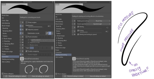
As for the brush: you don't need a fancy brush, anything in your software will go. What I use and what works best tho must have:
Tapered start and end.
High stabilisation (I go from 60 upward, lower it down for trees and grass or anything more natural that needs to be less neat and flowy)
Low tapering.
It must be set so that pressure controls only the dimension. The more you push on your pen, the bigger the line gets. No colour or opaciy variation!
On Clip Studio Paint, I use the G-Pen in the program. It's good as it is, but I think I did some variations as per here:
FILE DIMENSIONS:Better work larger and then resize down. Sizing files up digitally is possible, but it leads to unfocused images.
I generally work on files at 600dpi (300 is fine too, but don't go any lower. Particularly if that's something you want to print later on, any printing wants a minimum of 300dpi). in roughly an A3 format (bigger dimension is 43cm). Most pictures I upload here are 6000x5000 pixel.
A bigger file will give you more possibilities with brush sizes, and it'll be easier. Remember: digitally, sizing down is ok, sizing up is not something you should do.
SKETCH:
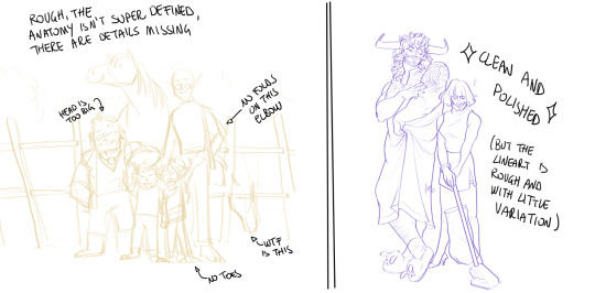
This is the suggestion I should follow but never do.
Having a clean, polished sketch simplifies your life A LOT. This is because if you don't have to worry about drawing details and fixing the anatomy of your drawing during the lineart, and doing it so GOOD because it's the lineart... You'll go that much slower and your life will be more complicated (it's not impossible, my sketches usually are very rough. I am ok with it, the most I do drawing wise is during the lineart... But I'm lazy, don't do like me. A good sketch will help you out.)
Compare the two sketches below:
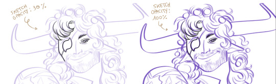
Another note about your sketch layer: you know those memes that complains that the sketch looks good but when you hide it the lineart is shitty? That's easily solvable.
When you're inking, lower the opacity of the sketch layer down, A LOT. I generally go for a 30 or 40% opacity (depending on the colour of the sketch. the yellow sketch will go around 40% because it's less visible, the purple one lower).
When you're inking, you MUST see clearly the lineart you're doing. If the sketch isn't contrasting enough, you won't see clearly what you're doing... It's like trying to sketch with a dim light, not seeing the paper clearly. See the difference:
BEFORE YOU START:
You probably have read it everywhere, but it bears repeating: warm up your hand.
You're using muscles and for more than five minutes. The warmer they are, the firmer your hand is, the easier it gets controlling your lines. It also prevents you from damaging your wrist. Stretching is also great, and grippers are nice to have. Keep your hand fit!
As for warming up: I usually do some calligraphy exercises, practicing on flowy cursives. You want to practice varying the pressure of your lines in a single trait, hence why calligraphy is good. But generally, what you can do is...

PRESSURE VARIATION AND LONG LINES:
So. My main tip and trick is to vary the pressure of your lines. In the same line, and between different details. This will help making the lineart more dynamic and interesting.
A note: this works for semi-realistic styles. If your goal is obtaining a Cartoon Network style: they have generally little to no variation and it works. My suggestion would be to study the kind of style and effect you want to obtain, different styles will work best with different linearts. If you're aiming at hyperrealistic painting, there's no point in spending time over a lineart, for example, I inked the same lineart, but with a brush that doesn't vary it's dimensions with pressure, and not changing the dimension of the brush.
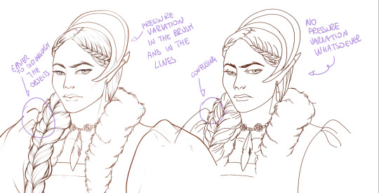
What makes my linearts look "flowy" and "neat" is the fact that I tend to draw less lines and longer, and pay attention when I stop, to start the line where I end it. This will give the impression of one continuous, single line, and make everything more fluid. See above in the french hood: on the right, I left the line rough on purpose, you can see where I stopped and started again. On the left, where I took care of it, you can't.
Generally speaking:
Thick, dark lines communicate that the object is close to the viewer (always keep the viewer in mind!) or in shadow. Lines should be thicker on the outside of your objects, to separate two planes, and in stuff closer to you.
Thin lines are delicate, they should be used in the background, for small details (see the hair, the lips, the small wrinkles around her eyes.)
As for line continuity: in both cases, the line of her face is one single line I drew. This can be obtained with a smooth result, particularly in curved lines, by getting the brush stabilisation on higher settings (80-100): sacrifice speed for accuracy.
MORE IS MORE, WHEN IT COMES TO LEVELS:
Particularly when there are two objects intersecating, or more characters interacting… Instead of inking all on the same level, I always do one level for each object, trace the WHOLE line as if there was nothing above, and then erase where it's not shown. This is a little thing, but pays off. Always in the drawing of above, the feather and the hem of the bodice were on separate layers, and then I erased the bodice under the feather. Take advantage of being inking digitally and not traditionally!

For many characters, here's an example of a vignette of a comic page before cleaning it up and erasing. Every single character and the weapons are on separate layers

For this it's very useful knowing your recurring mistakes. For example, I tend to draw heads bigger than they should. I know I do, so generally I keep the head on its own level, and the body on another, so it's easier to modify and size down just the head without getting crazy selecting only the lines you want with the lazo.
Again, you're inking digitally. It's not easier than traditionally necessarily, take full advantage of your instrument!
OTHER TIPS AND TRICKS:
High brush stabilisation sacrifices speed for accuracy. The line will lag a little from your cursor. Get used to watching the cursor and not the line, and trust that the line will follow.
GO SLOW.
Rotate and flip the canvas. Don't ask me why, but tracing long lines towards me is always easier than not the other way around.
Use the Free Transform, Warp, Distort etc etc and the Liquify to your heart's content if you notice the lineart has something wrong. The only cheating in art is using fucking AI generators (and AI pictures are not art, sorry not sorry)
References are your friends. Study how an artist you like does the lineart. Try and imitate them, and if you can and need to post them: tag them! (don't trace and sell it as your own)
Experiment with brushes, find one that you like for the effect you'd love. You do you, there's no right or wrong way of inking.
Remember to breathe when you trace those lines! (and to drink and do pauses and stretch, you don't want a tendonitis!)
Have fun. Lineart is not evil, lineart is your friend!
I hope this essay is exhaustive enough. I'm tagging ALL THE PEOPLE that requested it (and giving each of you a muffin).
@ndostairlyrium @narina-gnagno @salsedine @whimsyswastry @layalu @n7viper
If you have any questions, don't hesitate in asking!
#tutorials#lineart#inking#digital inking#digital art#tips and tricks#petrel explains#COME LO FECI (cit)#listen if we're mutuals and we chat... ask me to share my screen I don't mind the company when I work if it's not something I can't show#or if it's not too late at night for me#also I unironically like how Alyra inked without variation looks even angrier and more judgemental than normal LOL#also some spoilers for The Last Bacchae if you follow that#“Marmotta” means “Groundhog” in italian#art ref
122 notes
·
View notes
Last Seen Blogs
wallpapedits-vvc
wallpapers-edits

the-shrine-of-noodle
Noodle's Place

accountingassignmentshelp
Accounting Assignment help

loadprojects116
Untitled