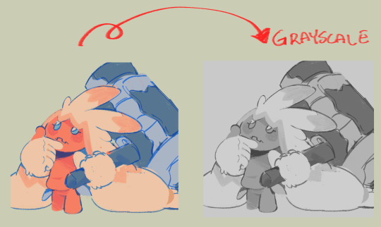
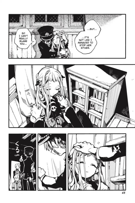
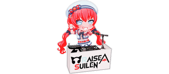
#so now im just hoping its not /too/ saturated
Text
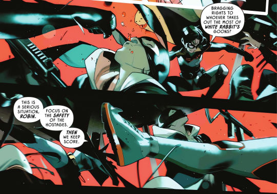
yeah, and who do ya think knocked em out
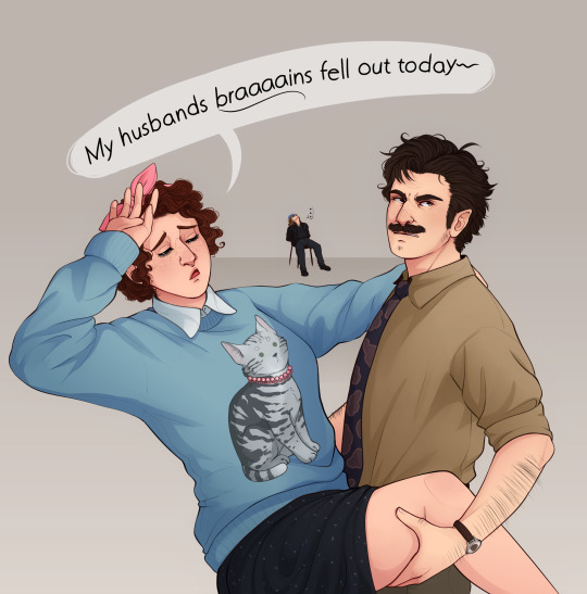
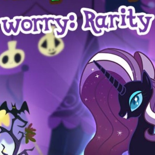
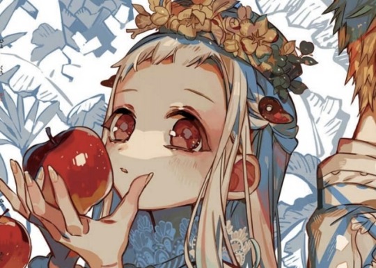
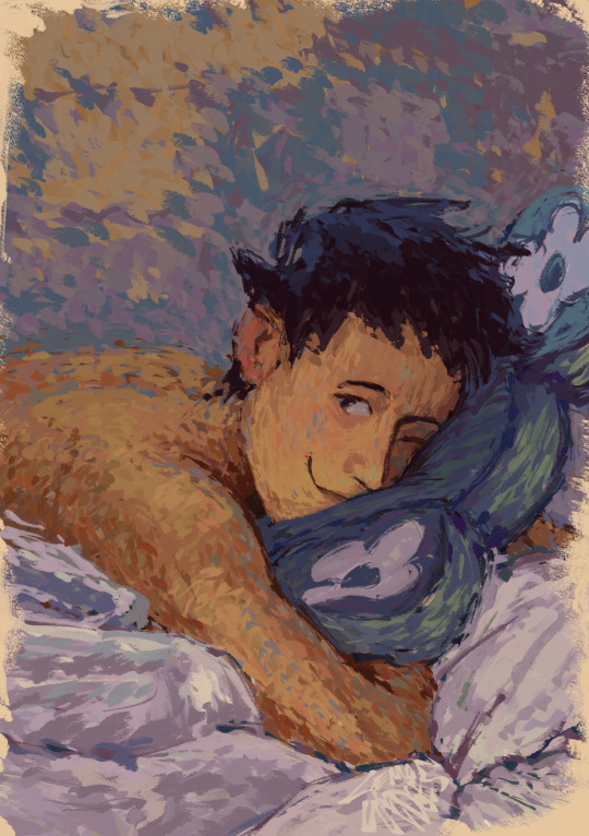
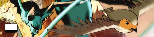
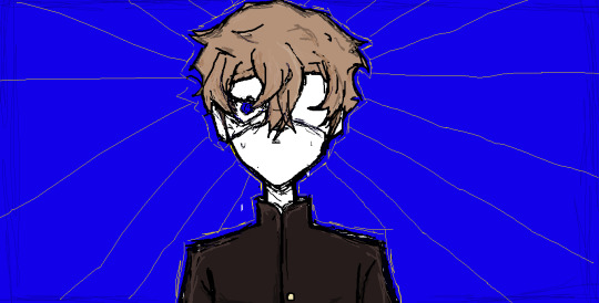
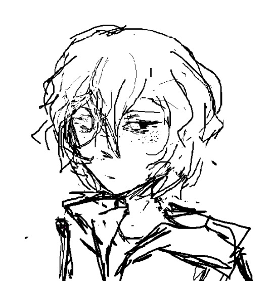
#Can't think of a good caption- and i didn't wanna quote the whole thing 😔#but also i cant leave it without a caption! or it looks naked! lOlol#I messed with the saturation on this one a bit because i'm too aware of how pale my art is once i see it on another screen OTL#so now im just hoping its not /too/ saturated#but i guess i'll just die on this hill for now#tgwdlm#the guy who didn’t like musicals#ted spankoffski#charlotte sweetly#Sam sweetly#kind of#does that tiny speck of him count?#also this is another case where i feel like i should have just left it as line art#i think my lineart always looks better then the finished thing grr#but i cannot stop myself from coloring ever#its like a curse
643 notes
·
View notes
Note
your shading is AMAZING specially when its conveying organic forms..... do you have any tips for people who dont know wrf going on (with shading)
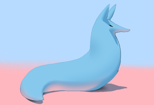
ok so HI. hi. my old tutorial pisses me off so i will make a new one
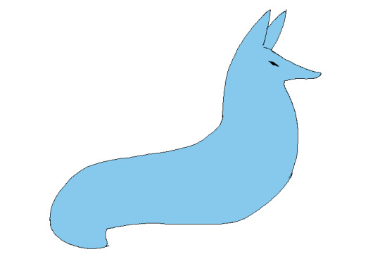
i made a guy whose sole purpose is to be shaded so dont worry he likes it. and his name. his name will be mr. Boob. mr boob does not have to be blue
theres probably way better explanations of how to do it but unfortunately trying to "emulate" shading does ask you to somewhat understand ur character in a 3d way. like what would the 2d shape be if you "sliced" it? mr boob is made of so many circles. his tail also does a kind of weird perspective foreshortening thing because its pointing at you. is this being conveyed
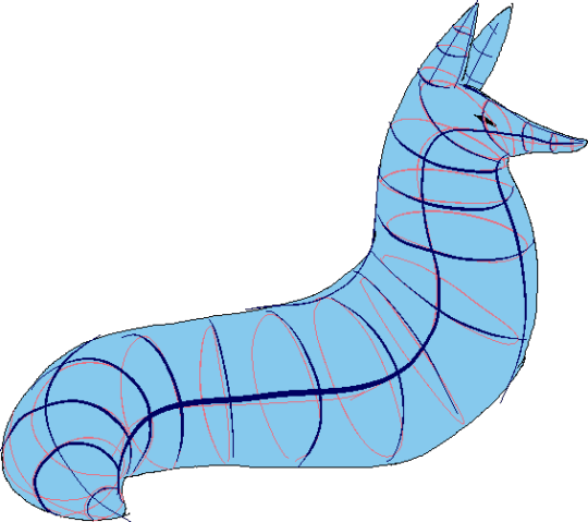
you obviuously dont have to draw a horrendous grid on your characters skin to do this . BUT it helps you put down (or at least envision) the lines of the form shading :
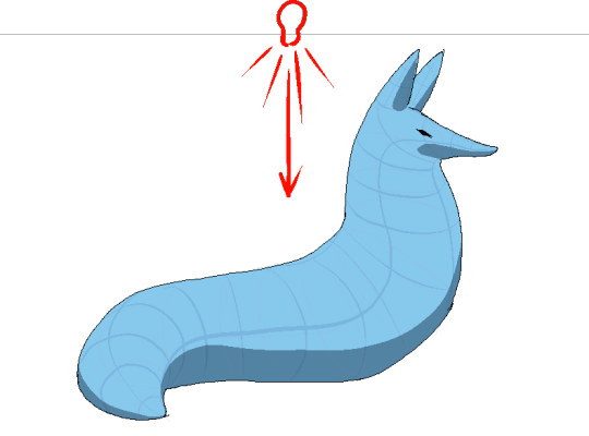
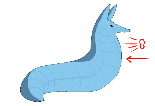
dont worry about cast shadows or the shading color because this is FORM SHADOW time only. think about what surfaces of the character are obviously facing away from the light source and put down the "separation line" of the shading based on that. thr most important thing is that youre trying to separate light from dark
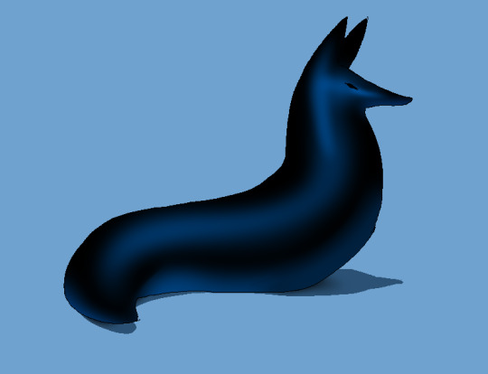
im going to pick the first one for cast shadows bc it will be the most obvious to me
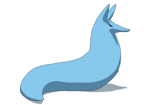
ok so. his ears and snout are blocking other surfaces of his body from the light, which means a shadow is cast!!!! bam. i saw someone describe cast shadows as what the light's pov "can't see." his entire body is putting down a cast shadow on the ground too

im impatient so i blended the form shadows now. its usually the easiest to just NOT blend cast shadows as a way of conveying that they are still cast shadows. but you can still blend them if you want to show "distance" between the obstruction and the surface its blocking. but its just a way of saying form and cast shadows should not be treated the same even if their softness coincides
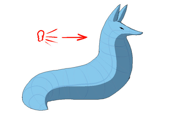
im going to lump reflection and ambient light together because theyre like. similar. reflections dont just happen in mirrors
since the sky is blue, making the ambient lighting, i tinged mr. boobs existing shadow to be a bit blue. (*this is kind of important because it can help you decide a shading color, which should USUALLY be based on the environment) (unless your character is just in the transparent void then it doesnt matter)
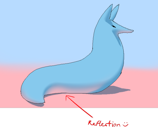
since the ground is pink, i made pink light bounce off of him. pointed and labelled. i dont rlly know how to go more in depth than that

contact shadows are literally shadows formed from direct-touching contact. very little light can reach in there, even from how reflections disperse, which means youre free to use the darkest color available (black). in this case mr. boob is making contact with the floor. because he is sitting on the floor.
i touched him up a bit and wow!!!!!!!!!! look at mr. boob!!! he is so beautifully sculpted.
and one more thing
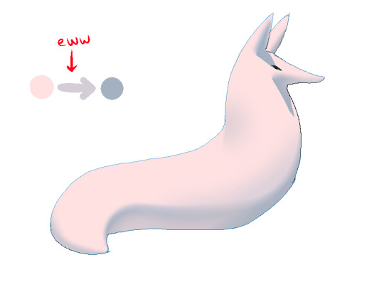
thats right. i made mr boob PINK. hes fucking ruined now. just kidding i would never say that to him
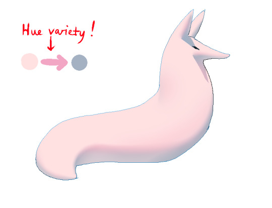
what im trying to convey here (its the easiest with really light colors) is a transitional color. this can also show subsurface scattering depending on how you use it which is fun to look at. the mistake i made on my last tutorial was "Just pick a warm saturated color!" which is really wrong in examples like Blue mr boob. because it would be weird to use a warm color to transition from blue to blue.
if you have a character that isn't bright enough then obviously the shadows wont be as visible. its BEST to bring more attention to highlights and reflections to reveal the form a bit. they play the biggest role with darker colors
thats all i can think of. fun things to look up:
structuralization + contour lines + foreshortening etc. 3d lingo
form shadows
cast shadows
ambient light
contact shadows
subsurface scattering
im also just speaking out of my ass otherwise. i didnt look up any of these terms until the end now im inferring and hoping i got them right
and remember every time you shade mr boob will be rooting for you
2K notes
·
View notes
Note
Hello there!
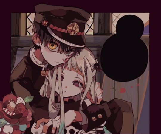
I've been a huge fan of your art of Seb and Clora here on Tumblr for quite some time now. Maybe a year? Idk time is weird aksbjs. Anyway, I'm an artist myself, and I was just wondering, put simply, whats your art process? Like how you shade and color and stuff.
Anyway, have a nice day! And uh- sorry if this is awkward sksbdn.
DAMN youve basically been here since day 1 THANK YOUU😭 im glad you like my stuff!! and ur not awkward at all!!🥹💖💖
and i actually posted a timelapse of my process on twitter not that long ago, so ill post it here as well!
as you can see seb takes me the longest LMAOO hes such a menace for me to draw still...and i dont even think seeing my process helps since its just so much trial and error and warping until it looks right BAHAHA (this is from like a month ago and i ALREADY think seb looks off here too 💀)
but my process is super simple, i just colour and cell shade on multiply and then i add a grain texture on soft light 10% at the end. i dont rly do anything fancy for colouring, bc i used to over-render my art and make it really complicated, but now im a fan of just having it look kinda...flat? if that makes sense LOL. i like it aesthetically AND its also easier.
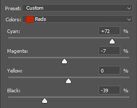
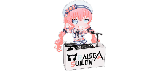
OH also something i add to the end of almost all my pieces is this auto-action from clip studio assets which basically adjusts the hue/saturation/brightness. here's an example of what the original flat colours look like vs. when i add this filter:

even if you dont have clip studio the same effect could be achieved with just manually tweaking with the hue/saturation levels afterwards, but i like this filter just cuz its easy and makes the colours more how i like them
HOPE THIS HELPS💖💖
#ALSO UNRELATED TO THIS ASK BUT NEXT CHAP WONT BE OUT TOMORROW SORRY probably tuesday at this rate🙇♀️#i forgor that not only do i have to write this long ass chap but also editing these long ass chaps takes a while too#ask#one of the first asks i ever got was asking for a timelapse but i didnt even know how to do that back then#i just recently turned on my timelapse feature in clip studio LMAO its cool#i have another one on my twitter that i didnt post here too maybe ill post it her eventually
202 notes
·
View notes
Note
Hey seiishin, I'm a beginner artist and i was hoping you could give a full tutorial on how you color?
hello! this is a bit of a hard question to answer since i dont think giving a tutorial of how i colour without learning any foundational colour concepts first would be very beneficial, so i'll try to give you some basic tips on picking colours instead since this is a very VERY expansive topic and im simply not the kind of person that can pass on that knowledge very well especially since im not the best at it lol
when im picking colours for my drawings, i try my best to "unify" the colour pallet so that it seems more cohesive, this tip from ggdg sums it up pretty well i think
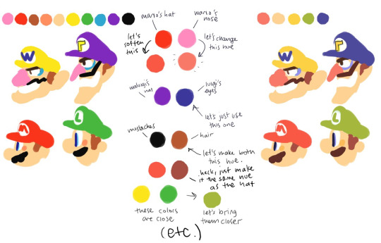
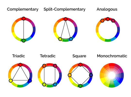
other than that, i usually try to pick colours that generally look good together based on different colour harmony concepts, like these!
i'll try and show you an example with something i'm working on right now. you'll notice i didn't colour pick tinkaton's colours from its art and went for a warmer pink and saturated the blues of the hammer a little.
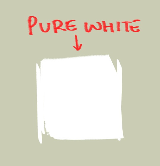
you'll also notice the canvases i draw on are NEVER pure white. this isnt to say pure white is something that can never be used but white is a colour that usually influenced by surrounding colours, so pure white in most pallets just wont look right. so its not usually a colour i would use as a backdrop if youre trying to pick good colours for your art. but again, there's always exceptions and this isnt a hard rule. here's pure white compared to the colour my canvases usually start with
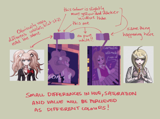
another thing i should touch on briefly is colour relativity and the importance of value and saturation.
value is SUPER SUPER important for making sure all the colours in your art stand out from each other and read clearly. as you can see here, most of the values here stand apart from each other, and i can see that i probably need to adjust the darkness of the light blue in comparison to the pink hair tips, though the lineart separates them well enough already i think. this is also a good way tocheck you havent made any dark skinned characters too light. values are important guys!
hot tip: put a layer of pure black on top of your art and set that layer to "colour" and BOOM! you can see the values of your art in grayscale.
and i'll also briefly touch on colour relativity. because we percieve colours relative to each other, we usually read a colour as something its not when its surrounded by certain other colours. let's take a look at my background drawings in the cover i did for the shuichi saihara zine:
though i only used a bunch of different purples, when all of them are perceived in relation to each other, a warmer purple can look like blonde hair amongst all the other purples!
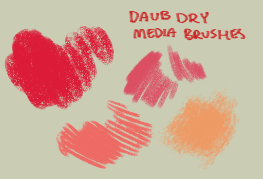
as for the brushes i use while colouring, i like textured brushes! i bought these so i cant share them for free but im sure there are many free alternatives out there
anyway, sorry if this isnt exactly what you wanted, but there are TONS of people out there that have worded this better than i ever could, i would suggest looking up some youtube vids on colour theory, but i hope these little tips are useful enough!
2K notes
·
View notes
Text
Hey Linked Maze fans! It's me! :D
Another update another ramble from yours truly! :D
I love the smol updates just as much as the large ones cause it gets me thinking ngl. Makes me wonder what's gonna happen next!
(Especially in situations like this)
Okay enough from me
A link to the comic page can be found here! Please do go and check it out and give it a lil reblog to show your support! It's wonderful.
Importantly!
Linked maze belongs too @linked-maze and its creator @frulleboi. if you've not seen it note that it's for more mature audiences! :)
without further ado!
You might not need snacks for this one, but get some water, I know you need some right now. Got some? Awesome, let's begin!
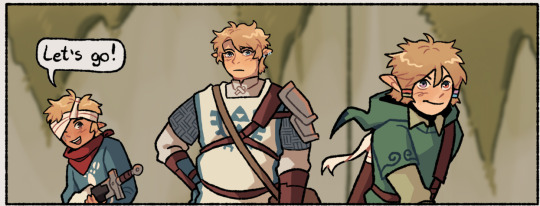
We start with this panel!
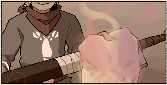
First off the saturation of the image, we know that wind's outfit is like blue blue. So it's interesting to see it so discoloured. Makes me wonder if this is how wolfy sees generally or if it's just in wolf form.
(Ha you thought I was gonna go straight to the sents right, nope :D)
But now I will
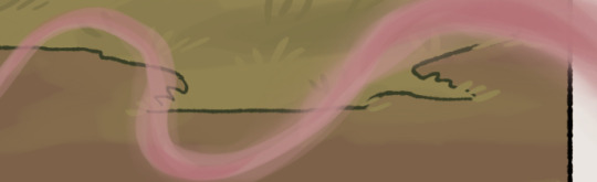
So we can see 3 colours here. A reddish pink, A purple, and cream? I'm gonna call it cream.
So this confirms something
Three people have had enough contact with this object to leave an impression.
And here we can see two of them
If im understanding this correctly, Red belongs to Sky. The purple belongs to this second figure who I am going to assume is Zelda.
Also who I can assume is Wolfie seeing this red in his eyes. A cool touch!
A visual representation of whose scent he is following I can only assume., which would defo be useful later. For like when we oh I dont know
Go looking for the cream-coloured scent owner?

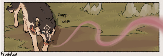
This is the only frame we see this cream-coloured scent. So I'm gonna call this now and assume that this scent belongs to Angel or djævel. Probably Angel since she's the one we've seen wandering around collecting the hero's items.
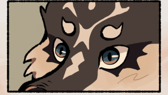
He sniffin

it's the windy boi
I love him, your honour
Also totally not Wolfie pretending that sword isn't his.
It's not mine what are you talking about :))))))))))
I like this shot, it's very nice.
I am a little worried as to why Warrior looks worried. Surely he must know about dog scenes. and I feel like Wolfy has proven himself by now as to not be a threat to him.
Unless...
Do you think Warrior noticed Wolfy does not smell the sword handle? And smell the random fabric instead.
A sword handle would have the most intense smell of something right? Because of the sweat. So...
Warrior is wondering and now so am I.

This is the face of a man who knows something is up with that wolf
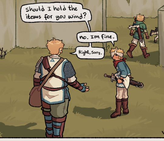
Man is trying to be a good friendo
Warrior dont apologise you smol cinnamon roll it's fine let the kids lead
The mix of the colours here is interesting.
(Totally not me zooming in on the coloured lines to see if I can figure out what colours they are made from)
I see mainly that pinky red here.
But something in me wants to say that there's a little bit of cream in here.
You think they are gonna use the sailcloth to find Angel later? That could be cool. Maybe get Wolfy to smell a bunch of items to build a scent profile for Angel so they can go looking for her later?
Just a thought! let me know what you think! I love doing these and it's great. Thanks again to @linked-maze for the permission to do this. I love doing them.
Thats all tho so I hope you have a wonderful day/night! :D
#linked maze#linkedmaze#linked maze analysis#zelda au#links meet au#loz au#lm twilight#lm four#lm warrior#lm wind#lm wolfy#comic analysis with major#ramble corner with major#suitable name for these#warrior looking like that makes me think#he's totally got suspision#he dont know#please do let me know what you think!#:D#I love talking about this#its wonderful
108 notes
·
View notes
Note
do you have a preferred method to get vsts and other such instruments for a DAW?? im poor as heck and dont know ANYTHING about piracy, im so scared of getting goobered by people on the internet
i wish i knew more about the best go-to sites for pirating rn unfortunately i have no clue. ppl on the internet can have such shit intentions too so i dont even know where to look or who to ask. but also here's some free + VERY cheap things u may consider (below the break):
vital synth (i will always shill for vital bc i use it constantly and its free lol)
ob-xd synth (it says buy for $49, but the free download is on the left. the buy link is just a donate)
klanghelm plugins (all these are made by one dude. mjuc is a great vintage style compressor, the dc8c is a pretty featured compressor for the price, sdrr has a particularly nice tube saturation/distortion, and vumt is a great metering plugin, i have vumt on every single project since 2019)
analog obsession (if you donate $5 to their patreon you can get every single plugin they make. also all made and maintained by one person. lots of different things, so i recommend just downloading everything and exploring the functions of the plugins)
tokyo dawn labs (all very high quality mixing stuff. they have free versions of most of their premium stuff and they're quite featured despite being free. ez.)
kilohearts (they recently made all their main effects free. and if you want their flagship stuff, its all rent-to-own as well.)
sforzando (soundfont player. if you dont know what soundfonts are, theyre essentially really condensed, lightweight sampled instruments. they can often sound rlly cheap or tacky [which might be good, i definitely love that sound] but just install this and google [instrument] soundfont and just find lots of free instruments that way)
togu audio line (some free effects and instruments if you scroll down. but i also recommend TAL Sampler if you want a cool sampler and can afford it)
meldaproduction (has a free plugin suite. theres an annoying watermark at the bottom for free versions, but everyone understands. shit is expensive)
native instruments (they have the komplete start bundle which is just a bunch of free decent stuff)
musicradar FREE SAMPLES (ive sworn by a few of the sample resources that i've gotten from musicradar as far back as 2011 lol)
looperman FREE SAMPLES (looperman is a user-sourced sample website where ppl upload samples they've made* and you can just download and use them for free. sometimes people request specific credit, so check for that if you can. *NOTE: its very possible for people to upload unlicensed samples or stuff they didn't make so use your best judgement when sorting through stuff)
freesound FREE SAMPLES (freesound rules always reliable)
synth1 (AHHHH IM SO HAPPY I CAN RECOMMEND THIS RIGHT NOW!!!! synth1 used to be abandonware but was finally picked up again and is supported by modern systems once more. i used this religiously from 2013-2017. and i'm going to start using it again honestly)
valhalladsp (this is the only exclusively premium thing i'm going to leave in this thread [aside from bitwig, below], but it's just that god damn good. every plugin of theirs is $50, so if you can manage to go for ValhallaVintageVerb and/or ValhallaDelay you will basically never need another reverb/delay ever again; would recommend NOT pirating from them if you can help it bc theyre definitely a very small company but u know.. ur call)
bitwig (if you need a DAW, i can now heartily recommend Bitwig. it's on the rent to own program through splice if you're ok getting it legally...)
—
i know this isnt what u asked but i hope its still helpful. i've also rescinded my recommendations for spitfire audio bc the company was revealed to be run by a bunch of queerphobic knuckleheads. everything in this list i have personally used for my own music and can vouch for them from actual experience (YES even bitwig, i made the song "Futura" on Carousel exclusively with Bitwig, making it the first time i've made an entire song outside of Ableton since 2014).
again i hope this helps, forgive me for not knowing enough about pirating at the moment 😭 please make so much music and please look at this animal:
490 notes
·
View notes
Text
Nene’s Dead Corpse and her ghost bf
randomly made a crap ton more sense to me
why?
fricking school (screw school I hate you (no not rly I’m just stressed))
Anyway I’m a biomed class where unit 1 is studying medical investigations forensic science style
and one of the things is like, what happens to a person after the body has been dead for a while (post mortem or sum, see im learning :D)
Things like algor mortis, livor mortis, I’ve heard of. In fact I’ve even studied the clouding of the corneas before, but it never got to me till today
maybe it’s cause I cannot for the life of me study forensics without my wild imagination giving me nightmares or just panicking when I’m alone but aNyWays
I tend to imagine characters associated with death in these scenarios so I don’t lose it in class💀
*cough* Nene *cough cough*
So as I was taking notes on the slideshow, some of the images of clouded corneas reminded me strangely of something familiar, but at that point I couldn’t tell. There’s something haunting about the eyes (or maybe it’s just my over-analytical brain loving small details like this) they’re GORGEOUS
LIKE
IDK THEYRE PRETTY
Maybe it’s ‘cause the true color of the iris is completely visible in all its glory, without the pupil obscuring it
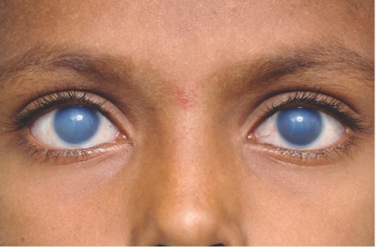
(something like this?? A little vivid tho lol)
but like
there’s no
life
no reflection, no emotion…nothing (which is so hauntingly beautiful leave me alone I’m a sucker for this now)
it’s literally just an eye with nothing but color
and then it hit me…it’s exactly the look Nene had when Mirai fast-forwarded her time
you can see in the image it’s just her plain magenta eyes with a fuzzy de-saturated blob in the center…aka clouded corneas
And that honestly made me realize that in this scene she’s not—she’s not even unconscious
No she’s literally, physiologically dead
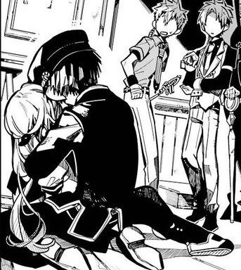
THAT IS A CORPSE HE IS HOLDING
she is literally a dead body this hits me so hard😭😭
and I can imagine algor mortis kicked in by then, her body was probably cold to the touch
so imagine how he felt, and I’m aware people have analyzed his emotions but just think about it
he’s always seen her so full of life and hope, and now all he has left is an empty shell of her, cold and dead with no life left inside
…just like him
the more I think about it Hanako is just an animated corpse
he has no reflection in his eyes most of the time because he is ✨dead✨
I mean Mei, Mitsuba, and Hanako don’t have a little white reflection dot like Nene and Kou
Or maybe I’m overthinking it and Nene’s eyes are just super reflective
even for someone who presumably took his own life, he probably never saw tsukasa’s body start postmortem and actually feel dead bc it looked extremely bloody ngl (I’m guessing he killed himself right after 💔)
and now he’s holding someone he cares about like this for the first time and I’ll bet that scarred him
and he figured out that never, never ever did he ever want to see his sweet assistant like this again, lifeless in his arms
and so after that, cue Hanako in his villain era who basically became a yandere the entire picture perfect lmao
and he was unbelievably adamant about it too
I mean honestly if I held anybody I knew lifeless like that I’d be scarred for life and crying for days
seeing the light drained from someone’s eyes is so interestingly sad to me
Look at the difference:
Happy
vs Sad/Determined
vs Depressed (ig??)
vs Dead
She still has so much emotion in her eyes
and then d e a d
literally looks like a porcelain doll
wait she looks so pale in the last image compared to the others now that I think about it
I love aidairo’s eye for detail it’s so fun to figure out
Well anyways thanks for coming to my Ted Talk essay atp-
IT’S PAST 1 AM AND I SHOULD BE STUDYING FOR SAID BIOMED CLASS AND HERE I AN GOING ON A TANGENT ABOUT A FICTIONAL CHARACTER’S EYES
send help
anyways excuse me while I grab a box of strawberries to munch on and cry my eyes out all over my homework before I sleep-
#hananene#tbhk#jshk#hanako kun#toilet bound hanako-kun#yashiro nene#tbhk manga spoilers#aidairo#my ramblings#my rambles#i literally have to wake up in 3 hours what am I doing#Yknow screw school Hananene is more important#i love angst#they’re so bittersweet#and beautiful
152 notes
·
View notes
Note
Seeing your recent work made me curious as to how you pick your colors? I always feel like mine are too flat.
oh man, COLORS. my angel.....and my devil......
ok im going to try and figure out how to break down my thinking process
i guess the first question is. what do you want your art to feel like? i dont say "look like" cause sometimes i fall into the trap of obsessing over a painting being one for one PERFECT while "feel like" helps me think about atmosphere
heres a some paintings with a few of the inpso color palletes i wanted them to "feel" like

Heres an example of how i would give myself a jumping off point.
In this homumiko painting i started off by thinking about how i wanted something that feels like a Jules Chéret poster.
Now the next question is. What are the rules to these set of paintings?
the use of pure primary colors, blue tends to be in the bg while yellow and red are the focal point
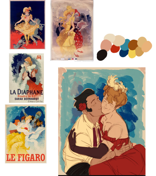
for this i wanted only the red dress to be the focal point with yellows being a less saturated and blue still being the bg. this means since herlock is the focal point mikotoba has to be muted. but i wanted to tie him and herlock together so made the flower in his hair the same color as the dress
Meanwhile my lastest otacon is a bit more complicated cause now we're dealing with lighting but again,
what are the rules to this set of nature paintings?
shadow areas are bluer
places where light hits the main figure will be an intense yellow
skin will be redder with darker areas being saturated red/brown and areas closer to the light source start skewing towards yellow
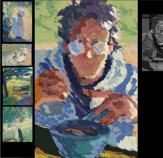
this is when we start getting into color theory and THAT is a whole nother can of worms. but its extremely helpful when trying to figure out how to add colors that arent in the inspo you picked out or figuring out what the FUCK is happing in pieces like this

those patches of purples in this are just a very specific type of red/orange grey tones matched in a way to make it feel like its blue. IT MAKES ME WANT TO SCREAM
i actually tried to attempt to figure it out while working on my pin up ryuu piece......
anyways.....i think im off track now....
i hope that helped a little? I tend to stick to late 1800s/early 1900s art cause thats just my personal preference. so the colors im gonna pick are gonna limited a very specific way (if ur into history its really fun breaking down why certain colors appear in certain time periods and how styles evolved as more paints became readily available. or painting for portraits vs painting for mass printing vs painting for animated movies affects an artists pallete. or maybe u dont give a shit? in that case...ignore this....)
49 notes
·
View notes
Note
What process do you use when your colouring art…?
Btw just a disclaimer, I don't have very good foundation and just "trial and error" most drawings. But... here u go anyway ;)
I start with flat colours, then add some slightly darker/lighter zones to separate front and back when there is overlap of the same colour in different objects. This also is used to show whats in front or behind. I may add ambient occlusions if needed, but cause the drawing's already dark enough I won't put it.
Then slap a multiply layer on top, in this case I use light purple. Then add another add/colour dodge layer above of it. Sometimes I just use a brighter flat colour for the light, that way I don't need to add any extra details in the light section. I normally do some iterations for the lighting before going forward (if im not lazy...)
Sometimes this phase is done before cleaning up the base flat colours, but I can come back and fix that afterwards (but generally only before adding details, else things get complicated and messy)

Now details: I usually add a border around the lit areas (the colour for that is usually slightly less/more saturated, or a colour adjacent to the light colour on the colour wheel)
Then I add extra folds, textures, or reflected light in places that look a little too flat still. And the final image usually starts coming together at this point.
I like sorta changing the colour just a liiiiittle bit in some places that still need extra detail. See the purple inside?
Sometimes during this phase I find that the lighting I chose isn't ideal, and I change it like I did in this drawing. So the details, colour dodge and base colours are on different layers to not affect everything when one changes.
And its done! I hope it helps, but you can probably find way better explained versions online.
45 notes
·
View notes
Text
BATMAN AND ROBIN 2023 #1 (Take 6 (yes))
(im not writing this as i go since ive already read the issue before. ill also be mentioning gotham war since this takes place during it (just a warning for spoilers!))
i just noticed the bat and robin on the cover! so cute
OH........(just noticed this too) that doesn't look good
look at them goofing off n having fun
this is cute but the way bruce acts here and in gotham war is so jarring its kinda funny
bruce in batman #137: can't stand my fake ass family
bruce in b&r: me and my son damian 🤗
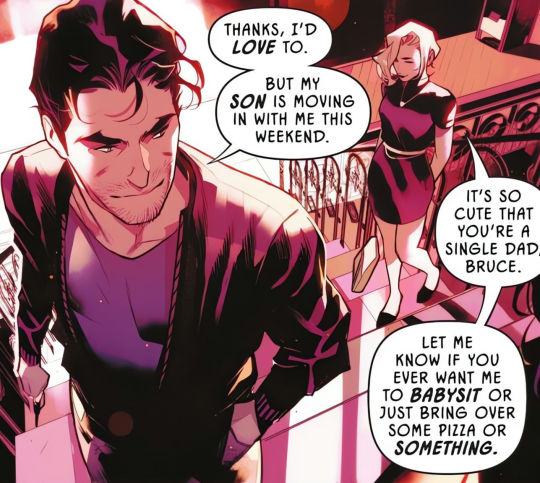
bruce is in his "local dilf in the area" era rn
damian having talia's mannerism that bruce noticed is so <3
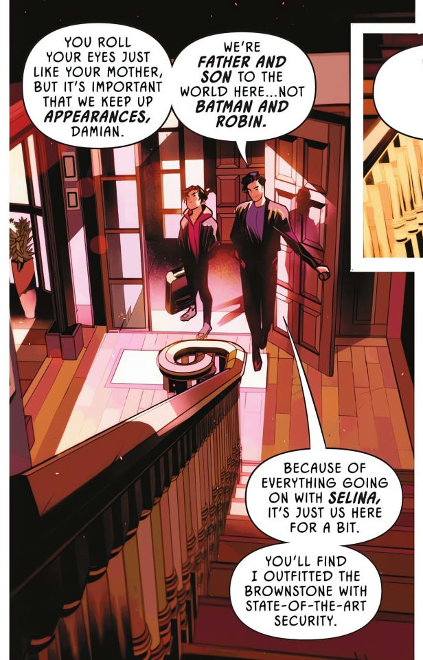
and here its confirmed that this takes place during gotham war. not sure how to feel about that
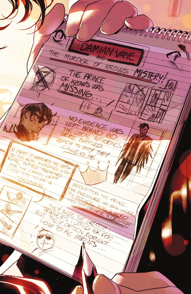
STILL INSANE OVER THIS baby first self insert fanfic
damian went from drawing hyper realistic gore vent art to anime eyes in the corner
i think it'd be fun if we see damian write more as the story goes on. like him daydreaming n doodling in class
wonder if theres any meaning with damian putting talia as a hero n bruce as a criminal here...or maybe its just a "totally original character do not steal" thing
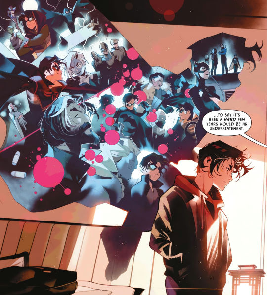
you dont say bruce 🙄
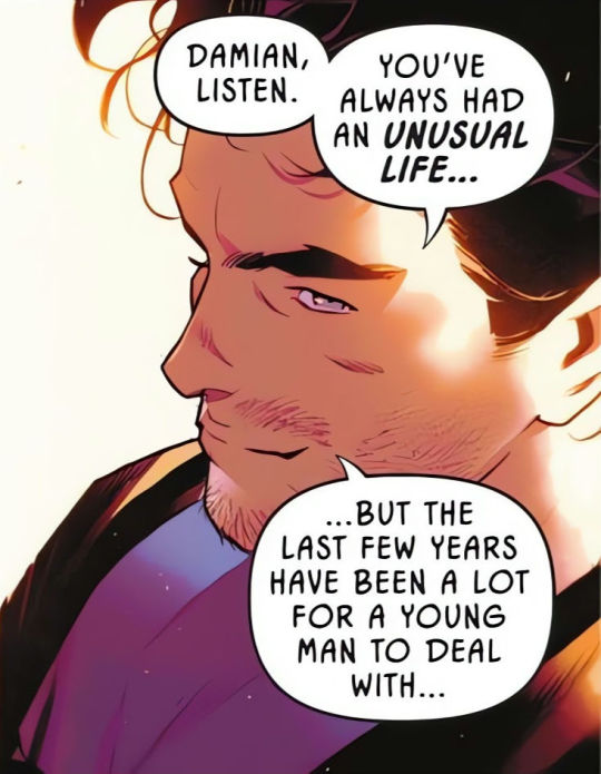
"the last few years"?? pretty sure the events shown there all happened not even in 2 years since damian turned 14 around the start of the lazarus tournament
also why are alfred n talia not shown there? alfred's death has huge impact on damian (he literally hallucinated him) n talia was there as much as ra's
i dont like how damian looks here but that white connor should be a crime
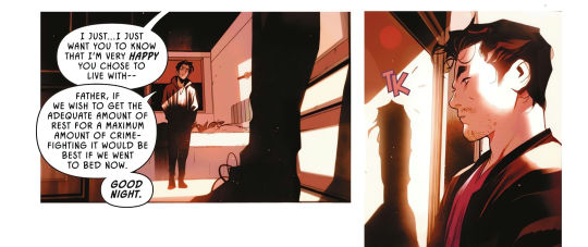
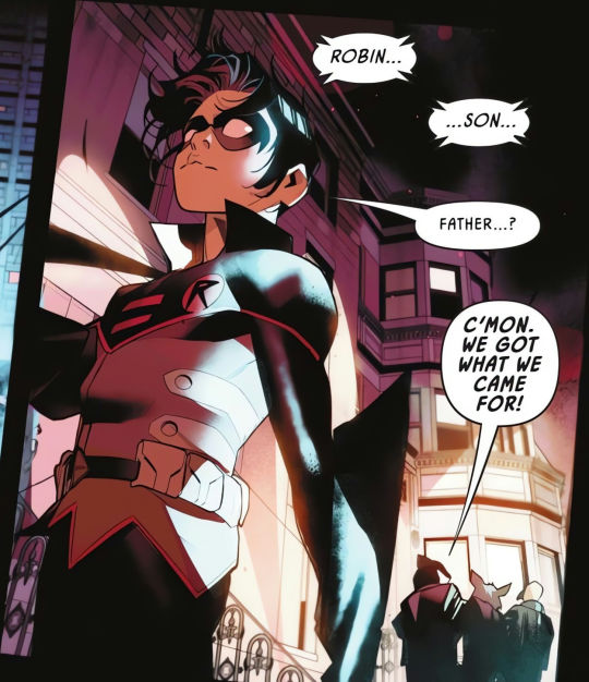
"thats enough emotions for tonight father" [slams door]
i wonder why damian is staying with bruce tho (outside of making this book exist) didn't bruce n talia had a custody battle moment™ n damian's like "nah i have my own life (is literally 14)"
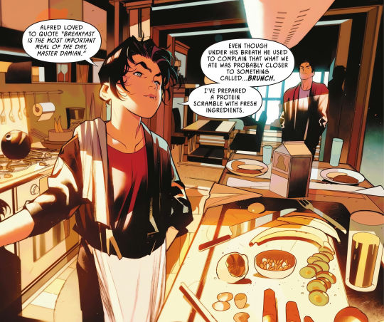
HELL YEAH MY BOY CAN COOK
he's quoting alfred ohhh im gonna sob
this is kinda embarrassing for bruce...like ur son is finally living with you again n he's the one up early cooking?? sir u better step up
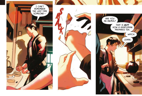
aw he's making tea the way alfred did
*squints* did bruce get his hand back? thats a pretty normal looking hand to me
did damian's comment on it in batman #137 made bruce think "shit i cant give damian any ideas of getting a robot hand" n he just. magically grow it back
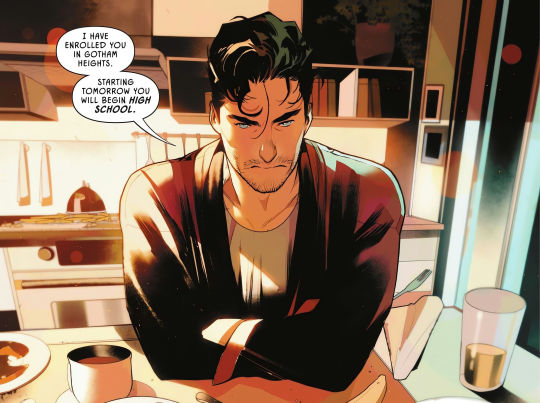
[GLASS SHATTERING SOUND]
gotham...heights? n. not gotham academy? no maps? no damian joining her dnd team?? no detective club finally hanging out with damian??
ik damian got expelled from gotham academy BUT. WHY
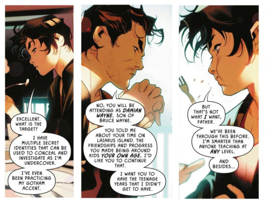
okay? whats the point if he's not going to the same school that his friend went to?
interesting how damian fantasize for a normal life in robin 2021 (with him liking the mundanity of shoujo manga) n now that bruce is offering him that he's rejecting it (or maybe he just rly don't like school which is. fair enough)
wellll just cuz we're not getting maps n the detective club doesn't mean damian's other friends arent showing up right? RIGHT? (maya plz come home)
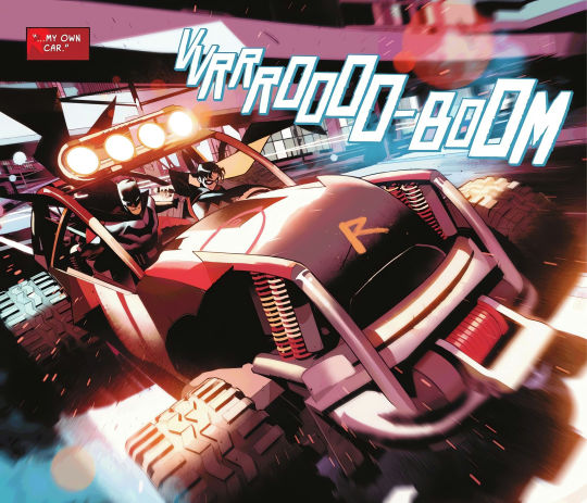
THE ROBIN MOBILEEE it looks so ridiculous i love it
HOLD ON. DOES THIS CAR HAVE NO SEAT BELTS?? BRUCE UR LETTING THIS SLIDE?
ik that thing is rly loud too damian waking up the whole neighborhood here
not rumors abt the batfam fighting getting spread around?? this is so embarrassing omg
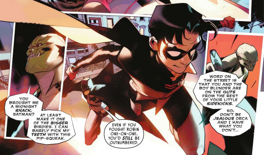
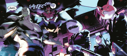
am i the only one getting gotham academy flashbacks here? with killer croc n the trio with the fox shark n bird masks
they're very comfortable with calling eachother father n son while in suits huh. ig everyone in gotham knows that batman is a dilf (who's beefing with his adult children) now
not much to say abt the rest: bruce got shot with something n now bats are attacking him
end thoughts: i hope with all the focus on animals here means that we're getting damian's pets back soon n that gotham war wont affect this book much since i rly want to see damian interact with his siblings again. also is it just me or does the day scenes looks very bright? saturated? it kinda hurts for me to read idk. the night scenes r pretty tho
next issue is damian's first day on his new school that is not gotham academy but im still excited for it! (coping)
bonus bestie corner
#damian wayne#bruce wayne#batman and robin 2023#FINALLY tumblr keeps posting it while im editing it but its done yippee#this is inspired by makeste bnh/a liveblogs! i remember how much fun it was reading them that i wanna try it with b&r#tho i dont think i could ever write as much for a single issue...#still figuring out how i want to do this
42 notes
·
View notes
Note
ive noticed you're actually very particular about colour choices! is there anything from the chuuyaus you'd like to highlight or elaborate on?
SPOILERS FOR VARIOUS STORIES OF MINE BELOW CUT! and an additional warning for eyestrain
im so glad you asked
now i use colour symbolism 24/7 so instead of wasting time explaining how its used in multiple things i'll stick to just one
i have a colour to corelate each of my main three and today im focusing on the yuuko au
look at this joyless guy
Today im specifically focusing on the alt plotline here
the murase plotline!!
Now green is this stories colour, its used a LOT
The saturation is especially important,
i use saturation a lot to highlight distressed emotions
using crychu here as an example
when it comes to the yuuko au though the saturation is more paticular, people in distress on their own get washed out
(as seen here)
and only the interference of others gets highlighted in saturated tones, (see above)
this changes when two people are experiencing that sort of adrenailine at the same time
like here (excuse the old art)
people's colour schemes are very important in this
chuuya's pretty desaturated (obvioulsy this isnt coloured in but bare with me)
he doenst have his green jacket so he looks a lot duller, and when he gets more clothes he continues to dress in the same grey ways, mature clothing and blandness
misacho's always been beige, sometimes its hard to see what colour is actually the base of her outfit since everything is so light.
etsukos got more of a purple scheme which sticks out against most the other people in it. its really intresting how that fits her charecter later on.
I CANT SAY TOO MUCH THOUGH
theres a LOT of colour symbolsim in this au i havent mentioned but im not telling for spoilers sake
hope again that this makes any sense at all
#bsd#bungo stray dogs#bungou stray dogs#chuuya#i love him#my corrupt art#bsd au#chuuya au#evermore answers#au asks#yuuko au
23 notes
·
View notes
Note
Hi do you have any tips for using lighter color palettes without it being eyestraining or washed out? Or just tips to avoid eyestrain in general? Ty in Advance!!!
oh anon i love psds and colors id love to help. i hope my thoughts and tips arent too messy, if they are feel free to ask for me to elaborate!
anyways. do you want nice light colors like THIS??!?!
boy am i here to help.
so first of all, to avoid eyestrain, i also have some tips in my contrast post. however if its more of a "one color is causing too much eyestrain" then id just use selective color to balance it out a bit.
poor chiyu here is a victim of horrendous eyestrain

i used one selective color layer to even that out. a really simple way to use selective color to fix these kinds of things is to keep in mind the opposite hue of the color youre trying to tune down. and to take advantage of the black/white slider
of course, it looks a little duller now, but an easy fix for that would be a vibrance layer
here i just lowered the vibrance and upped the saturation a bit.
working with lighter color palettes can be pretty frustrating sometimes, but i find the best way to do it is to not try and make *every* color light. sometimes its important to have slightly darker colors to create a good amount of contrast to prevent all the colors blending together too much.
anyways, i hope something i said here was helpful. im a horrific explainer, but i hope my enthusiasm makes up for it! if theres anything super specific youre struggling with, feel free to send an example in and i can also explain how id personally fix it. happy editing and good luck!
6 notes
·
View notes
Text
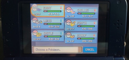
Oh it feels good to be brave! Went onto facebook marketplace and built up the nerve to message a seller about their copy of Pokemon Platinum. After scanning and double checking their images they had up beforehand, and then double checking and comparing AGAIN once I had it in hand, I can safely say with 100% certainty that I finally own a legit copy finally! My collection is no longer tainted with counterfeits~!!
Now I fought myself with the pricing (100$ CAN mind you) but it was also the best deal I'd get with the game AND the case (no manuel but no biggie) so Im content with what it was.
The game didnt have much on it, but they don't deserve to get reset, so Im gonna trade them over to my Diamond to give them a home (also the moment I put it in my 3DS, love my modded babeyyyyy)


For those wondering how to tell the difference I can show you in the read more below!
The fake will always be on the left for easy comparisons and to not confuse!
First off the front,
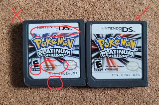
-The saturation alone is an indicator if you have a good eye, the left is very faded, almost a tinge lighter than it should be to the right, and the border for the "Nintendo DS" box isnt very defined.
-The font is not as bolded or clearly visible either, if you have a REALLY hard time reading "CONTENT RATED BY" thats above the "ESRB" text, or if "The Pokemon Company" text is hard to see against the red streak in the background. The fakes text is also oddly spaced apart compared to the real copy, like it got stretched a bit becasue the font is so thin.
-This will be the same with the other examples next, but the little insert arrow on the fake is too clear, its more pressed into the cartidge than it should ever be, the real one is perfectly flat all the way across with thr rest of the cartridges face, only difference is that its smooth to the touch as opposed to the texture of the cartidge. You run your nails across the arrow and you shouldn't feel anything stop you or feel a difference!
Next is the back

-Same as the arrow, it should not be as pressed in to give it a noticable difference in feeling. You rub your fingers across the text you will feel it ever so slightly on a real cartridge, it is more surface area than the arrow, but its nothing that should be of note. The fake will be too pressed in again and you WILL feel it.
-For American, the "NTR 005 PAT. PEND." is on both the fake and real here, most times its not on the fakes but they can be there, just be mindful!
-Some may have been faded overtime, but the black text on the back (for american games, double check your versions region) has a specific code to it. An indicator for being authentic is if the carts have the "CPUE" letters on them on the front and the back, as opposed to the VERY wrong fakes like mine having "CPUE" on the front, but the back has "ADAE" instead XD
Now another indicator may or may not be as viable, but it can be another way to see if its legit or not, it is however NOT a guarentee. Not all carts have these but sometimes at the very top of the cartridge you may see a slight indent (top is fake, bottom is real)
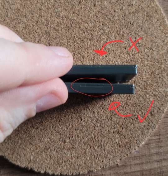
So far with my copies of Diamond, Pearl, Platinum and HeartGold, they all have this little indent. It may not always be there, but it may be slightly more reassurong that it is there if it is XD
Heres hoping its helped those wondering if there game is a fake or not with my own version of discrepancy. If you want more ways or maybe a better explanation of differences, here is a link to a handy guide for all the pokemon games! Same guide i used to tell the difference!
#Now to use the DNS exploit and get ahold of the old event pokemon before resetting XD#SO HAPPY I GOT A AUTHENTIC COLLECTION AGAIN#i can't believe the one game that was fake was my platinum copy like eveything else was real because ive had them since they were released!#y'all have no idea how anxious i was just trying to message to say hello like it was baaaaaaad#I nearly missed the opportunity if i waited til the weekend like i planned#buddy was going to move out of town this weekend like fate aligned so well im happyyyyy#pokemon#pokemon platinum#authentic#pokemon games#pokemon gen 4#smashwolfen#smish pokemon
25 notes
·
View notes
Note
hi, just a question…. in your latest art piece, why did you color kitty and emma yellow???
Hello! I noticed this a Few days ago in my Own artafter i Had posted it!
The simple answer is that i Colour dropped from a reference photo of them both! I had never drawn them Before with colour, and hadnt realized that their skin colour would be so much more Noticeable in my art style, nor Did I see the issue in it until after i Had posted this, as I always colour drop from characters. (I may have put filters on my art too, and the saturation Made the colouring even brighter. Im not sure If this was the case with this drawing though! Either way, It will not happen again!)
I planned to alter it more naturally Next time I draw them, but This wasnt at all intentional! If this has made anyone uncomfortable, I am very sorry, and I will fix this anytime i draw them from here on!! I have doodled them a few times now privately with a more Natural skin tone!
While on the subject, I have seen a few people getting mad at Artists for colouring them like this (Not you! You were simply asking!) and insulting them, calling them stupid or racist, However I would like to say that i Do not believe its Ever intentional! The problem lies within how TDI character design made their colour palletes, so I hope others Realize this and instead directs their anger at the show’s character designs, rather than the artists who have also made this mistake! Though I do think it’s Important to pass around that they should be coloured differently!
#Thank you for asking respectfully!#total drama#ridonculous race#Tagging this in Case others need to see and realize their mistake too!
13 notes
·
View notes
Text
🖤 - about me - 🖤
----------------------------------------------------------
hello gang im making introduction posts for all my blogs rn so!!
first, my name is sam or charger (pseudonym), and in terms of astrology, I'm Mercury/Saturn/Uranus/Neptune ruled bc my chart cant make up its mind but if i absolutely HAD to choose 2 planets, it would be mercury and uraneptune 👍👍👍👍 man i cnat choose 2 i cnat do it-
i was also born under a last quarter moon and i have a couple posts where i say this, but im a taurus/gemini sun (29° taurus and gemini fits way more for me) and a cancer rising 🙏 (gemini mercury ✨)

as for how i got into astrology, i always had a vague interest in it that grew over the years until it eventually snowballed one random day and here i am now, writing newsletters weekly and it's the whole reason i actually started using tumblr again.
my mom was into it WAY before i was, but she fell off of it and then i picked it up and actually got her back into it somehow-
other things abt me include:
- i am an avid korn enjoyer
- im an editor
- my whole "twisted" thing that i have in 2 blogs now including this one, literally comes from twist and twisted transistor by korn
i figured it fit super well too because i like twisting things around in everything i do, and im a pretty dark person (despite loving incredibly bright and saturated colors sometimes as evidenced by my most recent image edit as of writing this- i love super dark ones too tho dw 🙏🙏)
and before i go, my other blogs are @scxtt75 and @twistedyapping
scxtt75 is my main acc where i post my image edits and photography and stuff like that (i have links to my other socials there too), and twistedyapping is where i will literally just be yapping about whatever crosses my mind because i LOOOOOOOOVE going on long ass rants about whatever 🙏
thank u for ur time and i hope u enjoy ur stay here
4 notes
·
View notes
Text
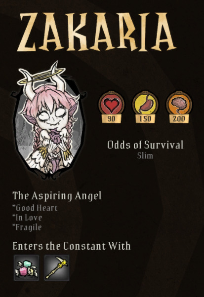
my journey in DST modding: day 6
these are the last few days of making character art for this mod. im pretty hopeful that the "Tale of Tails" will finally come to an end!
.
but first, there's some stuff i need to tweak. when i tossed her into the game, i noticed the game itself adds a filter that makes her hair way too light. i did desaturate it a little but with the filter on, it looked almost white.
then i just darkened and saturated it a little more just so see if that would fix it. here's the before and after:


it's not a BIIIG change, but to me it looks much better. excuse the difference in the tail, i remade the tip so it wasnt curved. from the front, she looks perfect. but today is the day we conquer this damn tail layer.
.
i tried to look for the animation template in the Klei forums (again), but the files werent available for download, then i added it to the game via steam workshop....but the game said it was crashed and it was disabled.
.
i found another one in the workshop that i was able to download and look inside its files, but god fucking damn it, there was NO layer in the place i needed, and if i have to rearrange layers again, id rather just stick to what im already doing.
.
but now ive got an idea and that will be my last ditch effort. i just made a backup for the entire folder and here i go.
.
i redrew the tail in a way that mimicked the back of the coat. but i had to make it so the tail is coming out of it. it looks a little weird but it's what i got.

time to jump back into the game! im sure it's gonna look a little fucked up when the torso animates from the back and distorts a little. but whatever i just want this to be over.
.
the first screen looked really promising, but i fucked up the pivot points for the hair and tail again. but that's absolutely fixable.

i think i have to make the braids even shorter and get the pivot points working again, but hey, that wont take too long. and things are looking up.
.
eventually i fixed it, but there are two things left still.
.
the ghost, and the big portrait.
.
it was hard to mimic the art style but i think i managed:

(the watermark wont be present in game)
.
theres only the ghost left, i think i'll have to resize the png and straight up paste the elements i need. but its getting kinda late. tomorrow will be the last art day, actually. have her page in character selection as an extra:
#don't starve together#don't starve together mod#dst modding#dst oc#original character#oc#sunny speaking
4 notes
·
View notes
Last Seen Blogs
wishingsparkjar
Wishing Upon A Spark
trainwreckgenerator
unrequited love for life

hip-hop-homoerotica
Hip-Hop Homoerotica
babybluemezzz
babybluemezz

wanderlustingandwandering
It's Fandom, Darling