#topographic
Text
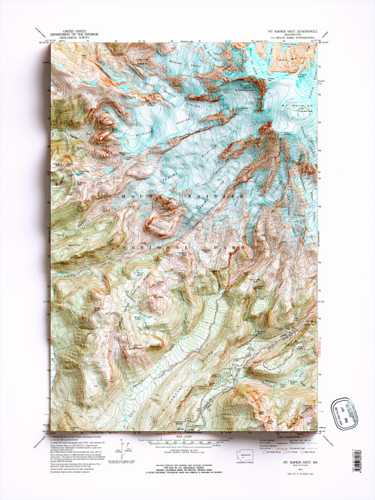
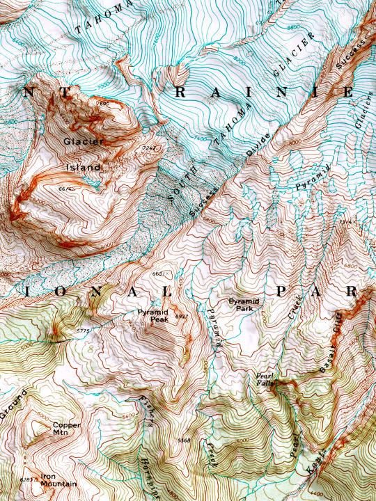
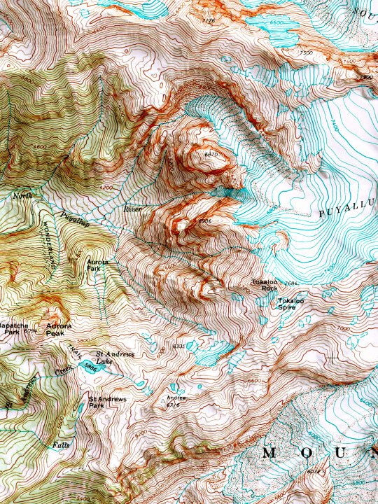
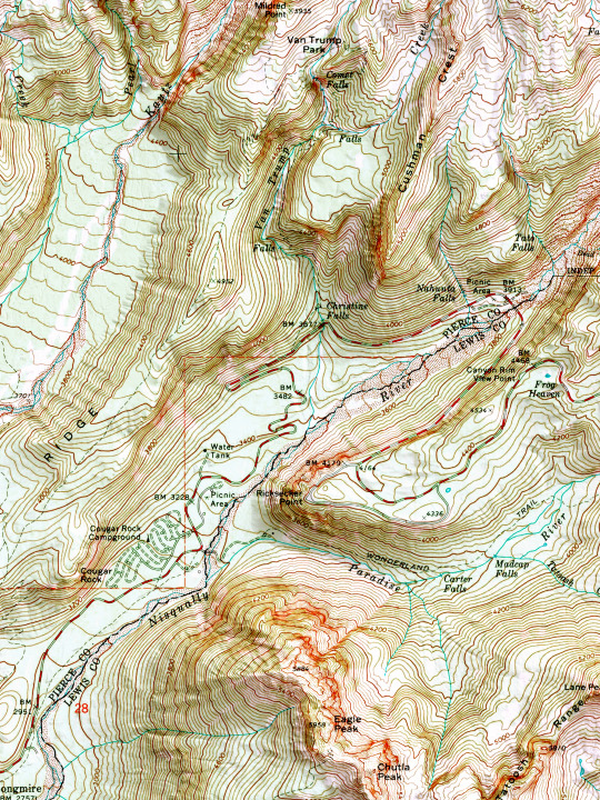
2D printed shaded relief map with 3D effect of a topographic map of Mount Rainier West, Washington (United States of America), from the Quadrangle series map and prepared and published by U.S. Geological Survey in 1971.
If you like our work, want to see our daily updates (or want to say hello to our studio), consider to follow our Instagram or Twitter account. Otherwise if are interested in our prints or have a custom request check our shop.
#mtrainer#mtrainernationalpark#mtrainiersummit#Washington#washingtontrails#mountaineering#mountainlife#mountain#topographic#topographicmap#wallart#wallartprint#mapdesign#naturegeography#wildgeography#usanaturetour#mtrainierdesign#mtrainierwatch#framedart#framed
57 notes
·
View notes
Text

"From Wyld's map of the Western Pyrenees." A practical course of military surveying. 1864.
Internet Archive
182 notes
·
View notes
Text
Faultline
11 notes
·
View notes
Text

DAY 402- SHALLOW EDGE
#abstract#art#surreal#scifi#daily#futuristic#trippy#neon#graphic design#3d#vaporwave#retro#retrofuturism#80s#vintage#ocean#landscape#topographic
30 notes
·
View notes
Text
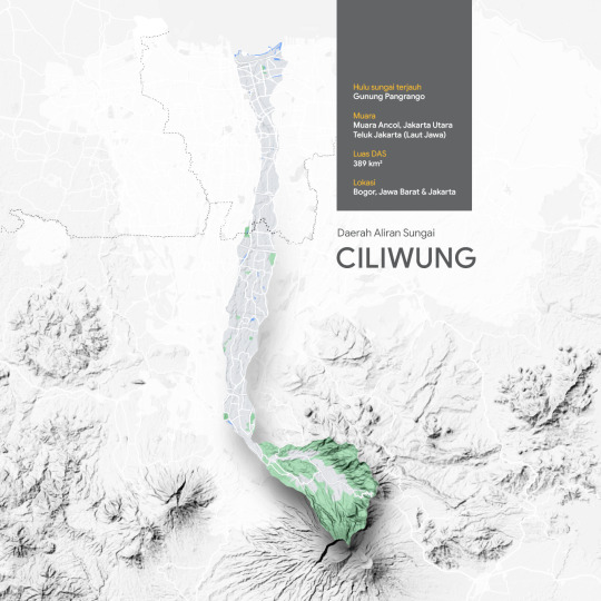
DAS Ciliwung
10 notes
·
View notes
Text
oldie but a goodie
1 note
·
View note
Text
Whispers of Tranquility: The Origin and Popularity of Pastel Color Decor 🌸🎨
The Gentle Origins of Pastel Hues
Pastel colors derive their name from the soft, muted tones reminiscent of pastel art mediums. The origin of pastel hues can be traced back to 17th-century Rococo art, where artists sought to create delicate and airy compositions. These subtle shades, often achieved with chalky pigments, started to influence various aspects of visual arts, including fashion and interior design.
Pastels in the Victorian Era: Elegance and Sophistication
The Victorian era (19th century) embraced pastel colors as a symbol of elegance and sophistication. Soft pinks, blues, and greens adorned the walls and furnishings of Victorian homes, creating a sense of refinement. These hues were favored for their ability to infuse spaces with a gentle charm while maintaining an air of opulence.
The Mid-20th Century Revival: Lightness in Modernism
After the bold colors of the mid-20th century, a revival of pastels emerged. The mid-century modern movement, known for its clean lines and simplicity, saw the reintroduction of pastel hues. Soft blues, muted yellows, and delicate greens became synonymous with a desire for lightness and simplicity in design.
Pastels in Pop Culture: The 1980s and 1990s
The 1980s and 1990s witnessed a resurgence of pastel colors in pop culture. Pastel-themed bedrooms, often featuring soft pinks and blues, became iconic in movies and TV shows. This era embraced the dreamy and nostalgic quality of pastels, associating them with a sense of comfort and whimsy.
Contemporary Allure: Pastels in the 21st Century
In the 21st century, pastel color decor has become a staple in contemporary design. Its popularity can be attributed to the calming and versatile nature of pastels, making them well-suited for various design styles. From minimalist interiors to bohemian chic spaces, pastel hues continue to captivate homeowners, bringing a touch of serenity and modernity.
Exploring the Palette: Pastel HEX Codes
Baby Pink: #FFC0CB
Powder Blue: #B0E0E6
Mint Green: #98FB98
Lavender: #E6E6FA
Buttercream Yellow: #FFFACD
Incorporating Pastels into Your Space
Whether used as wall colors, furniture accents, or decor accessories, pastel hues effortlessly enhance the visual appeal of any space. Their versatility allows for creative combinations, encouraging the play of colors and textures.
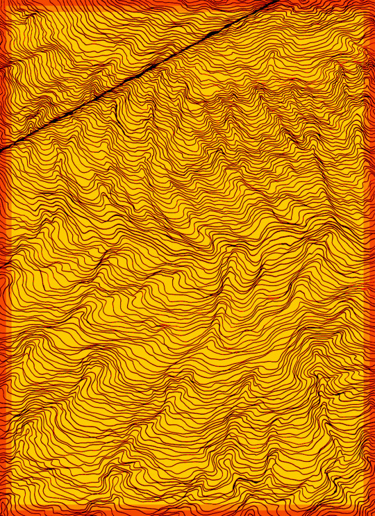
#contour#minimalist#pastel#dark#topographic#mapping#simple line#topographical#geological#abstract#landscape#geographic#outline#doodle#terrain
0 notes
Video

flickr
Yellow poles - Echuca 2023 by Alan Thexton
0 notes
Text
My elevation is approximately 5,522 feet above mean sea level. My altitude is between 0 feet and 6.1 feet above ground or machinery level.
* My elevation is approximately 5,522 feet above mean sea level. My altitude is between 0 feet and 6.1 feet above ground or machinery level.
* My elevation is approximately 5,522 feet above mean sea level. My altitude is between 0 feet and 6.1 feet above ground or machinery level.
0 notes
Text
MARTYN HAYES
Martyn Hayes, is a designer and artist born, bred and working in Leeds.
I’ve lived the life of an ‘old school designer’ where having the ability to draw your ideas quickly, was the only way to communicate your thinking for clients were valuable skills.
Over the years drawing has become less part of my professional life, and much more part of my personal creative life. The work on this website…
View On WordPress
0 notes
Text


Lagos was the capital of the region from 1578 to 1 November 1755, when it was hit by the disastrous earthquake that is also remembered for the severe destruction suffered by Lisbon on that occasion.
The map was realized by the US map Service in 1944.
🗺Map info:
Iberian Peninsula 1:250,000: Lagos, sheet 67. Series A.M.S. M581. 1944
Source: University of Texas.
If you like our work, want to see our daily updates (or want to say hello to our studio), consider to follow our Instagram or Twitter account. Otherwise if are interested in our prints or have a custom request check our shop.
#lagos#portugal#map#3dmap#print art#poster art#shaded relief map#geography#cartography#blender3d#mapping#dataviz#reliefmap#3d art#topographic#vintage map#old map art
3 notes
·
View notes
Text

they both don't know right from left
#art#artists on tumblr#digital art#clip studio paint#clip studio paint art#opfanart#op fanart#one piece zoro#one piece luffy#one piece#one piece fanart#roronoa zoro#zoro#monkey d luffy#monkey d. luffy#straw hat luffy#luffy#zolu#where to#topographic cretinism
2K notes
·
View notes
Text

Photographer Mark Forbes
1K notes
·
View notes
Text
Harmony in Hustle: Navigating the Balance Between Work and Nature 🌿💼🌐
The Urban Jungle and the Green Oasis: A Symbiotic Dance
Contemplate the symbiotic dance between the urban jungle of work responsibilities and the green oasis of nature's tranquility. As professionals navigate the bustling cityscape, the call of nature stands ready to provide solace, inspiration, and a much-needed breath of fresh air.
Nature Breaks: Recharging Amidst the Leaves and Breezes
Discover the power of nature breaks in recharging the mind and body. Whether it's a stroll in a nearby park during lunch or a weekend hike to escape the confines of screens, these breaks offer moments of serenity and reflection, enhancing focus and creativity upon return to work.
Digital Detox: Unplugging for Mental Wilderness
Reflect on the importance of a digital detox as a means to wander into the mental wilderness. By unplugging from screens and immersing oneself in the sights and sounds of nature, individuals can cultivate mental clarity, reduce stress, and foster a deeper connection with the world around them.
Outdoor Workspaces: Where Productivity Meets Fresh Air
Explore the concept of outdoor workspaces where productivity meets fresh air. The integration of work tasks with the natural backdrop of parks, gardens, or outdoor cafes creates an environment that harmonizes professional duties with the invigorating energy of nature.
Seasonal Reflections: Aligning with Nature's Rhythms
Align with the rhythmic cycles of nature to foster a sense of balance. Embrace the changing seasons as an opportunity for reflection, adaptation, and intentional shifts in work-life integration. From the vibrant blooms of spring to the serene blankets of snow in winter, each season offers unique perspectives on balance.
Work-Life Blend: Redefining Boundaries for Well-Being
Contemplate the concept of work-life blend as an alternative to the traditional work-life balance. By integrating work and personal life in a more fluid manner, individuals can create a harmonious existence that acknowledges the importance of both professional aspirations and the nurturing embrace of nature.
#outline#doodle#terrain#contour#minimalist#green#topographic#mapping#simple line#topographical#geological#abstract#landscape#geographic
0 notes
Last Seen Blogs

official-forg
forg
anniadomina
Maîtresse Annia

todout
Todo Ultimate Team

kudinoxixuto
Untitled
x-xd
xenophiliaq