lunger42-blog
My Photography Research Blog
Research for my Critical Theory module
9 posts
Don't wanna be here? Send us removal request.
Last Seen Blogs
pah-rus
paris.

culture2videogames
Culture 2 Video Games

gossamerheart-blog
EPHMERAL GIRL

anime-severler
Otaku

omgdaeneryss
Six seasons and a movie
Text
Yannis Behrakis - The Migrant Crisis
“Photography can leave people speechless with its power and beauty. It can send a message to the audience, make people cry or laugh or both. It can make people feel guilty – or give money for a good cause. And it can make people think twice before pulling the trigger.” - Yannis Behrakis
Yannis Behrakis has worked as a photojournalist with Reuters for the last 20 years. He has won several awards on the international stage. In 2015, he was awarded by the Guardian as the best photojournalist of the year 2015. This was in response to his work covering the migrant crisis and the economic collapse in Greece.
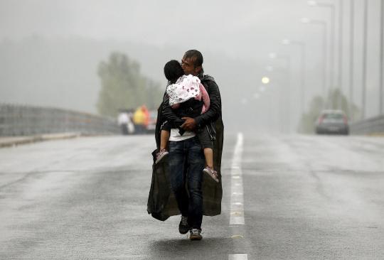
A Syrian refugee kisses his daughter as he walks through a rainstorm towards Greece's border with Macedonia, near the Greek village of Idomeni, September 10, 2015.
Behrakis presents the issue of the ongoing migrant crisis in a far more brutal and honest way compared to Mosse and his Heat Maps series. Behrakis is ultimately working in a very different sphere. His remit is to capture the news, to react quickly to breaking stories. His work is all about capturing an event and sending a message. In an interview with The Huffington Post, Behrakis said, “Working for Reuters, you work for the planet. We have a billion people looking at our stories and pictures, so it’s heavy on my shoulders to be in the middle of a big story and know that all these people around the world are expecting to see the right capturing of the image.” Pressure indeed.
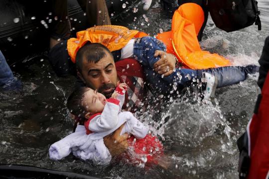
A Syrian refugee holds onto his children as he struggles to walk off a dinghy on the Greek island of Lesbos, after crossing a part of the Aegean Sea from Turkey to Lesbos September 24, 2015.
Behrakis must work quickly and act instinctively to events as they unfold around him. He may be able to pre-empt certain moments but this can all change in a split second. He is very aware of his obligation to the world. He knows that a specific image can draw huge attention to a situation. Ultimately, it may make a difference. High stakes are involved for all parties involved.
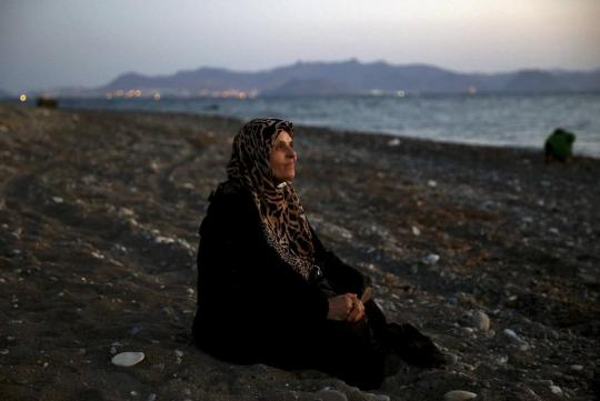
Amoun, 70, a blind Palestinian refugee who lived in the town of Aleppo in Syria, rests on a beach moments after arriving along with another 40 people on a dinghy in the Greek island of Kos, crossing a part of the Aegean Sea from Turkey to Greece, August 12, 2015.
“The emotional impact of covering the refugee crisis is devastating. I have suffered from insomnia and nightmares, and felt guilty many times for not being able to do more. I have refugee blood myself – and I am a father.” – Yannis Behrakis
His images show the fear and panic facing these people every day. They demonstrate the extent people will go to for a better life, a safe life. Behrakis also captured his images against a backdrop of the Greek financial crisis. One element that did raise its head was a certain degree of nationalism. This connects with Mosse’s work as I feel his imagery also brings this aspect of the situation in to question.
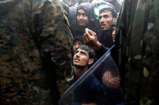
Migrants and refugees beg Macedonian policemen to allow passage to cross the border from Greece into Macedonia during a rainstorm, near the Greek village of Idomeni, September 10, 2015.
“Some people ask me, or in some cases it feels like they accuse me, saying “you see these people coming in boats and you take pictures, you should help them. I explain there are so many people around who help them. I’m here to take a picture because this is how I help them, you look at the picture and you say “maybe I should go there and help” or “maybe I should give money to a charity.” – Yannis Behrakis
Reviewing his work, I am very conscious of my emotional response. I am angry at the situation that exists. I am upset that many people seem not to care. I am frustrated that people choose to believe what the Daily Mail tells them about immigration. I am disappointed with myself for not doing more to help. I am proud that a photographer works tirelessly to capture the images that can help to make a difference. I am fuming that my own Government does not do enough to help, and in some cases, causes the issue with their actions in other countries.
For any body of work to evoke so many emotions and reactions demonstrates quite clearly that it is effective. Behrakis uses his skills to smack you in the face and say “Look!!”.
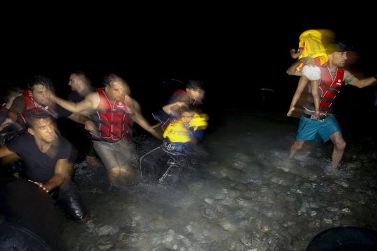
Refugees carry their children off a dinghy on to a beach on the Greek island of Kos after crossing from Turkey. The vast majority of those arriving are Syrians - 2015.
I also feel he reflects the history of documentary photography in some of his images. In the above image, we see refugees carry their children off a dinghy on to a beach on the Greek island of Kos. The image is blurred and shows motion. It adds movement and life to the picture. It reminded me of Robert Capa’s famous photograph from the D-Day Landings in 1944.
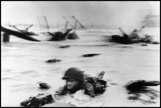
Robert Capa - FRANCE. Normandy. June 6th, 1944. US troops assault Omaha Beach during the D-Day landings (first assault).
There is a similar feel emotionally and aesthetically in both images. Whilst it can be great to be a trailblazer trying new ideas and methods, it is crucial you understand the history. Understanding the development of photography assists in finding new ways to use the medium. It also highlights good working practices.
Some of his images also have an artistic feel to them. They act almost as periods of light relief in his work. Even in a difficult situation he is finding beauty. More importantly, he is giving the viewer a rest. If each image was a punch to the face you would soon be knocked out. Behrakis almost employs an iron fist in a velvet glove in his work. This allows the emotions connected to the work to build. It helps to avoid what is now called ‘compassion fatigue’.

An overcrowded inflatable boat with Syrian refugees drifts in the Aegean sea between Turkey and Greece after its motor broke down off the Greek island of Kos, August 11, 2015.
Between Mosse’s work and the images of Behrakis there is a visible difference in styles and approach. They are both effective in different ways. It proves that there many ways to draw attention to an issue. More importantly, that photography must continue to highlight issues. The medium still has a lot to say.
#Yannis Behrakis#Migrant Crisis#Immigration#Refugee#Asylum Seekers#Humanitarian#Greece#Turkey#Syria#Macedonia#Richard Mosse#Reuters#University of Sunderland#Critical Theory#Social#Political#Documentary#War#Media#Unseen#News#Government#Invisible#Photojournalism
0 notes
Text
Richard Mosse - Heat Maps, Jack Shainman Gallery, NY
“A camera is a sublimation of the gun” – Susan Sontag
Heat Maps evolved from a body of work created by Mosse in the Democratic Republic of Congo. Released in 2013, The Enclave was a documentary film which juxtaposed a beautiful country against a backdrop of extreme violence. He also produced a limited-edition book entitled Infra where he used a colour infrared film called Kodak Aerochrome. This was something previously used by the military. Aerochrome shifts the colour palette. It renders all the green shades in hues of crimson. Perhaps Mosse was describing the blood spilled on the green and pleasant land.
Suspicious Minds (2012)
Heat Maps itself evolved from his latest new documentary, Incoming. This time, Mosse has focused on refugee camps and staging sites. He visited routes frequently travelled by refugees. Instead of using Aerochrome film, he has used a telephoto military-grade camera that can detect thermal radiation, including body heat, at distance. The camera has proved able to detect a human body from 19 miles. Instead of using the technology to monitor combat activity and protect borders, the camera trains its eye on the fall-out from such activities. No longer watching military units, it is now watching the displaced; the human collateral damage. These people are largely invisible, hidden in plain sight. Mosse highlights the reality of their lives in this work whilst himself remaining invisible.
Hellinikon Olympic Arena (2016)
The camera creates a world comprised of heat signatures, visually displaying differences in temperature. It highlights where there is human life, though arguably not humanity. It does not display differences in skin colour; we all glow the same way to this camera. People take on a luminance, an ethereal glow. They are dehumanised.
Tempelhof Interior (2016)
To capture these stunning images, Mosse attached the camera to a robotic motion-control tripod. He scanned sites from a high eye-level, creating incredibly detailed panoramic thermal images. However, it is not simply one image captured. Each final panorama has been constructed of almost a thousand smaller frames, stitched together to create enormous vistas. Each single image has its own vanishing point. This creates an unbelievable viewing experience.
Detail of Moria in snow (2016)
What Mosse manages to capture is the daily struggle for survival by millions of refugees and migrants. We see people living in poor conditions, often in camps in First World countries, but ignored by governments. The UK Government has just carried out another U-turn on the Dubs Agreement. This means approximately 2,700 children in ‘The Jungle’ in Calais without family links to the UK will not be allowed into the country. Who knows where they will eventually settle. There is a rise in far-right politics across Europe and in the USA. Immigration is the current political football. This is the sort of behaviour I believe Mosse wants to challenge. These are people, not just anonymous blobs of thermal radiation.
Mosse has taken a weapon, the camera is considered so and subject to the International Traffic in Arms Regulations, and used it to generate compassion and understanding instead of violence and alienation. Instead of seeing troops marching across country, we see people queueing for food. Perhaps a port may be monitored for arms activity, now it is looking at those suffering from the consequences of said arms.
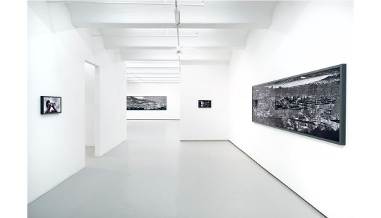
View inside Heat Maps exhibition at Jack Shainman Gallery
I had seen this work in magazines and online. It looked interesting and different. Nothing could have prepared me for just how breath-taking it was seeing the work in a gallery space. Amongst the huge panoramic images were smaller images. These were stills taken from Incoming. I felt that some of the images added to the overall experience, but not all. A few seemed like space fillers.
If I get the opportunity to see this work again, and to see Incoming, I will jump at the chance.
Key points of learning
The main thing I will take from the exhibition is the importance of seeing this work in all its glory. A double-page spread in a magazine of one of the thermal vistas does not come anywhere close to a print measuring 50 inches by 289 inches. The sheer enormity of these prints overwhelms you at first.
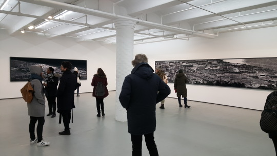
Sense of scale of the larger images on display
Due to the nature of how these images are constructed, the real gasp of amazement comes when you start to view them. As you stand back you get a sense of place but it could be anywhere. A landscape in thermal form. As you take a step forward, you uncover another detail in the image. After another step, you reveal another detail until you get close-up and you start to see people in the image. Not just that but you can clearly see them carrying out tasks or hugging their child. You become your very own Google Earth. You become surveillance. You go back again and pick a different point to focus on and go through the same process, constantly uncovering new details, learning new things about the image in front of you.
The use of many single images gives these images this unusual effect. Each image has its own point of focus and perspective. You begin by looking at possibly 1,000 images together. You finally end up looking at one single image. This is not a technique I have experienced before but it fascinates me. It creates a mind-blowing optical illusion. I must visit more exhibitions and installations.
Quality of my learning
Seeing Heat Maps has been a bit of a revelation. Seeing work from a Magnum photographer, albeit a brief membership, should be a good learning experience. You are viewing work from leaders in their field. It should provoke a reaction whether positive or negative.
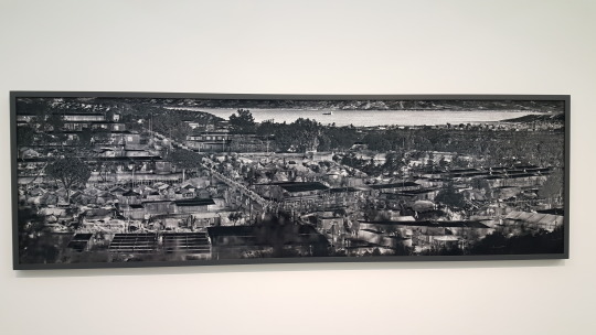
Moira in snow on display at Jack Shainman Gallery
Seeing a very skilled photographer utilise unusual technology and create a massive collage of images has opened my eyes to a very different way of working. This project could have fell flat but Mosse was prepared to take the risk. I feel that risk taking is something I need to embrace more. Be more experimental in my approach to projects. I realise that I research the project to death before daring to strike out and create some images. I need to find a better balance between these two tasks.
It has demonstrated a different approach to the unseen. Although the media constantly report on refugees, immigrants and asylum seekers, they are basically an unseen group of people. You may get a few quick shots of a few people in camps but this is just the tip of the iceberg. Being able to literally unwrap the unseen before your eyes is a very clever approach. To see people appear out of the landscape challenges you to consider what the photographer is saying. What once was an interesting landscape image has now become something very different. It is a form of social/political documentary photography I have not witnessed before.
I will hold this exhibition as an inspiration.
#Richard Mosse#Heat Maps#Incoming#Infra#Documentary#Social#Political#War#Arms#Thermal#Jack Shainman Gallery#University of Sunderland#Critical Theory#Military#Refugee#Immigration#Asylum Seekers#Media#Unseen#Invisible#Collateral Damage#Government
0 notes
Text
Wait Watchers - Haley Morris-Cafiero - United Photo Industries, NY
Haley Morris-Cafiero is a photographer and associate professor at the Memphis College of Art. In her series Wait Watchers (alongside her book The Watchers) she aims to shame the very people who have ‘fat shamed’ her.
The project began when she discovered a man gesticulating behind her back as she took a self-portrait in Times Square back in 2010. Interestingly, the image she was taking was for a project about places where she felt self-conscious.
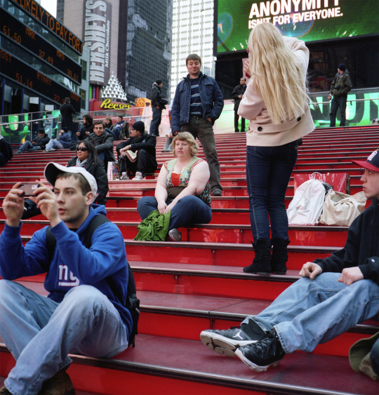
Anonymity
Morris-Cafiero has suffered from hypothyroidism (a medical condition which causes weight gain) since she was in college. During an interview with NYMag.com she explained, “I never thought that I would capture a glance that can last a microsecond”. That chance capture led to her series Wait Watchers.
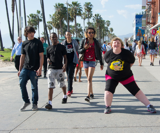
Morris-Cafiero either uses the help of an assistant or lone works with a tripod. She chooses to take images of herself in highly trafficked areas. She only shoots for approximately five minutes. She explains this is because “I don’t want to become a spectacle”. Later she reviews the images and selects instances where she sees the people around her visually reacting to her appearance.
Or are they?
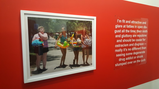
On my first viewing of this exhibition of work, I felt I understood what the photographer was trying to communicate. Seeing derogatory text from ‘fat shamers’ sets a tone and initially puts you on the defensive, on her side of the fence. How dare people react the way they do just because of someone’s appearance. However, this feeling started to dissipate as I continued to the view the images on display.

Stripes
For example, we are meant to be focused on the woman behind Morris-Cafiero in this image. She is looking slightly down, her hand over her mouth and appears to be smiling or laughing. This is the type of reaction the photographer wishes to capture to support her project.
However, she appears to be with someone who is directly behind the photographer. It may be a friend or partner of the woman reacting. Have they just shared a joke? Is there something funny on the back of the photographer’s t-shirt? Is there something funny just out of the frame that we are not allowed to see? There could be many reasons why the woman reacted. It is possible that it was a reaction to the size of Morris-Cafiero. To assume it is the reason is unfair. I feel it makes the photographer potentially as bad as those who do critique her size. Does this make her as much of a bully? Is this victimisation of passers-by?
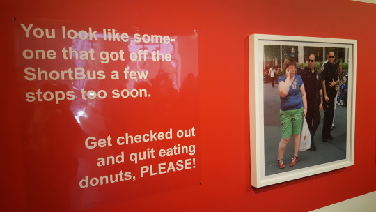
Blondie
In the above image, you can apply the same set of thoughts. It is very plausible that the people behind the photographer are judging her because of her weight. They may also be wondering why there is a woman standing in a strange pose, who may have been there for a few minutes and may have been spotted by the passers-by as they walked up the street behind her.
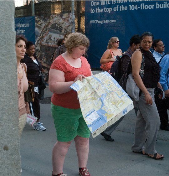
Map
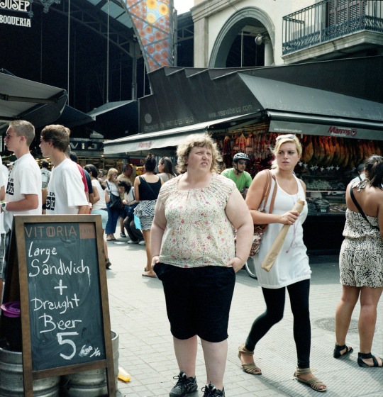
Vitoria
The more I viewed this work, the more annoyed I became. What is a worthwhile project about body image became a piece of work where I felt Morris-Cafiero was as bad as those who judge people and critique other people’s weight, body size and shape. It certainly does spark debate, but I feel her message becomes lost the more you look.
Key points of learning
The most important point I learned is the need to spend time in an exhibition. View the work and then view it again. Do not take the artists statement as gospel. Just because they tell you they are saying something specific, it does not mean that they are doing this successfully. It is important to challenge the view of the photographer. It may result in you agreeing wholeheartedly with the photographer. You may enjoy the work and the experience of seeing it. However, it may result in a completely different interpretation.
As someone who has been bullied in the past because of my size I wanted to this work to be championing the cause effectively. Unfortunately, it left me feeling like Morris-Cafiero was just having a strop and wanted to kick out against her foes. However, feeling this way is very interesting. It has sparked an emotional response. It has made me be very analytical of her images (and book). It has shown to me just how careful you need to be to tackle a very emotive and challenging issue. As a photographer interested in the unseen (particularly regarding mental health) it has shown me some of the pitfalls that await me and the loss of support and empathy as a result.
Another key point learned is that Morris-Cafiero raised $24,297 from 615 backers via a Kickstarter fund. It proves that financial backing is out there if you have an interesting idea and the confidence to promote it.
Quality of my learning
United Photo Industries is only a small gallery; however, this exhibition proves that you do not need a showing at MoMA or the V&A to gain good quality learning.
The main aspect of this exhibition that demonstrated the quality of the learning to me was the feeling of frustration I got from being disappointed. I believe this has been the first exhibition that I have truly looked past the front layer of the work and become very critical. I have not only questioned the work in front of me but also considered why I reacted on an emotional level; anger, frustration and disappointment.
I believe it has raised my awareness of how to critically read an image. I am certainly not the finished article, but I possibly benefitted more from this one exhibition than I have in all others I have visited combined.
As someone who will no doubt continue to make works of a personal and introspective manner, seeing how Morris-Cafiero has worked for Wait Watchers has been valuable. It has clearly demonstrated the issues I could face if I do not fully consider how the viewing public connect to my work. I would be very upset if I created a very personal piece of work only for it to be seen in a negative light due to my positioning of the images. It would prove counterproductive and would leave me uncertain whether to tap into a similar stream in the future or to walk away.
#Wait Watchers#Haley Morris-Cafiero#United Photo Industries#Body Image#Bullying#Body Size#Critical Theory#University of Sunderland#Exhibition#The Watchers#Book#New York#Brooklyn#Harrassment#Judgmental
0 notes
Text
Aaron Siskind - Abstract Expressionism in Photography
In his early career, Siskind became a member of the New York Photo League which focused on social documentation through still and moving image. It trained several notable photographers from that era, including Berenice Abbott whose work I enjoy. Siskind lead a group of photographers who produced photo essays of working-class, depression hit inner-city life when he was appointed as director of the Photo League's Feature Group in 1936. Siskind contributed to a body of work entitled The Harlem Document.
These documentary photographs certainly show Siskind’s ability to seek out line and form. This is something that continues to evolve during his later works as he moved from social documentary imagery to more abstract expressionism.
Fascades (1938)
“The business of making a photograph may be said in simple terms to consist of three elements: the objective world (whose permanent condition is change and disorder), the sheet of paper on which the picture will be realised, and the experience that brings them together.” – Aaron Siskind
In the early 1940’s, Siskind left the Photo League and began to closely associate with members of the New York School of Abstract Expressionism. His photographic interests moved away from social documentary and journeyed towards more poetic, graphic and conceptual images. His images from this trip demonstrated his ongoing development in understanding how line, shade and texture could produce interesting, abstract work. This style of work that Siskind produced drew the attention of the art world in New York.
The Charles Egan Gallery started to show some of Siskind’s work alongside abstract expressionist painters such as Mark Rothko, Willem de Kooning and Franz Kline. Siskind and Kline developed a close friendship, which continued until Kline’s death in 1962. Ten years after his death, Siskind created a series of images across six groups of work in homage of Kline.

Seaweed 8 (1947)
In the above image, Siskind takes strands of seaweed and a shape in the sand and captures the image. To me, the image looks like an embryo in the womb, the creation of new life. Yet all we see is sand, rock and a minimal amount of seaweed. By framing this way, he has created an object, an image that makes the eye wander and question what they are seeing; something worth photographing. It is clear Siskind was influenced by the genre of abstract expressionism.
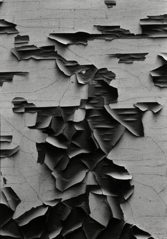
Jerome 2 (1949)
I find it fascinating how capturing some peeling paint on concrete can conjure up so much interest for me. Siskind’s use of framing, along with his technical skills, has created an intriguing image. By capturing the light delicately bouncing off certain parts of the paint he has created a wonderfully three-dimensional image in a two-dimensional form. He has captured decay which is often seen as ugly and produced something containing beauty.
The paint creates a shape. On the first view, I saw it as a dog. Yet on additional viewing, I also saw the shape of a person and a clown. Each of these interpretations is correct in my opinion. I feel work such as Siskind’s is designed to make you look and then look again. If you see something different to the next person, then that is acceptable. It is more about the individual’s interpretation and how it connects with them on an intellectual and emotional level.
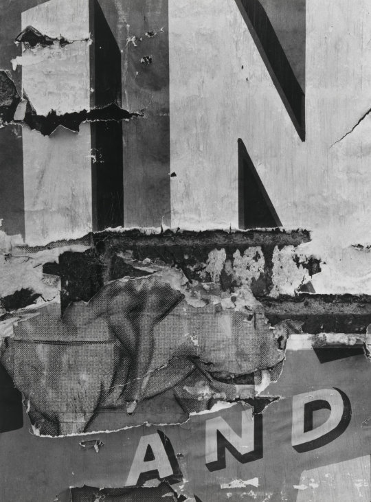
North Carolina 30 (1951)
I find this to be a cheeky and playful image with a shadier undercurrent. A pair of women’s legs projects out from the centre of the image, suggestively. It is sandwiched between the words ‘in’ & ‘and’. There is a whiff of the Carry On movie at first view. Then I questioned why it was placed in this space. As the ‘in’ being more explicit in terms of its meaning? Also, what would follow the ‘and’? The framing of the image is crucial. If more or less text had been captured, it may have compromised the idea behind the image. Or would it have made it even stronger? Without being there at that time I will never know unless his contact sheets could answer the question. Ultimately, Siskind has seen something that many would have simply walked past. He has taken this photograph and created something new from something seemingly insignificant; a form of regeneration.
“If you look very intensely and slowly things will happen that you never dreamed of before.” – Aaron Siskind
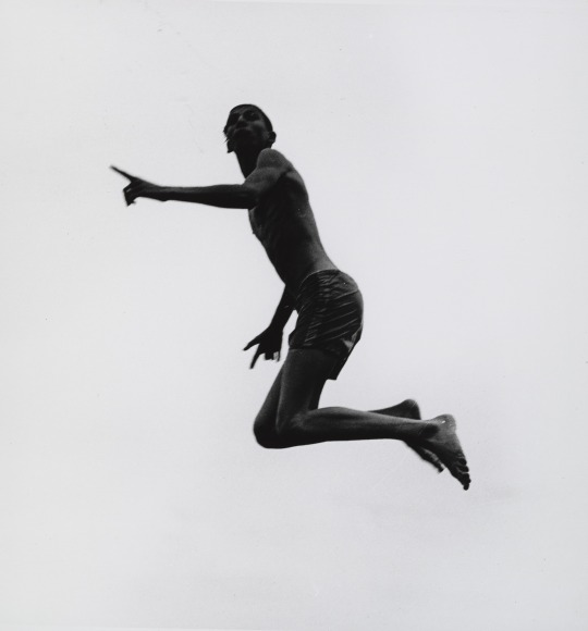
Pleasures and Terrors of Levitation 55 (1956)
The Pleasures and Terrors of Levitation photographs depict the dark shapes of divers captured mid-leap against a plain white sky. These almost statuesque figures are photographed twisting and contorting their bodies. There is a feeling of Eadward Muybridge in this series of images. However, where Muybridge looked to explore motion and biomechanics via still images in series, Siskind does the opposite.
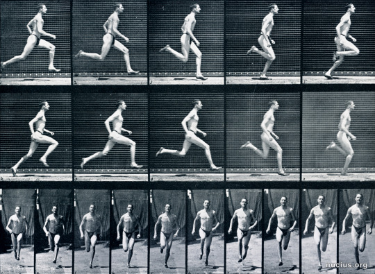
Eadweard Muybridge: Athlete. Running. (1887)
He aims to suspend time to allow the viewer to focus on the shape and form of the individual. It is not about what went before or what happened afterwards. It is simply observing the moment. By photographing against a blank white background, Siskind has removed all context from the image. This encourages more examination of the persons captured as you wonder exactly why they are diving, twisting and falling. Or are they floating? With no reference points in the frame, you cannot be certain. You cannot calculate where the camera was located when the image was captured. It creates the feeling of zero gravity.
Jalapa 48 (1973)
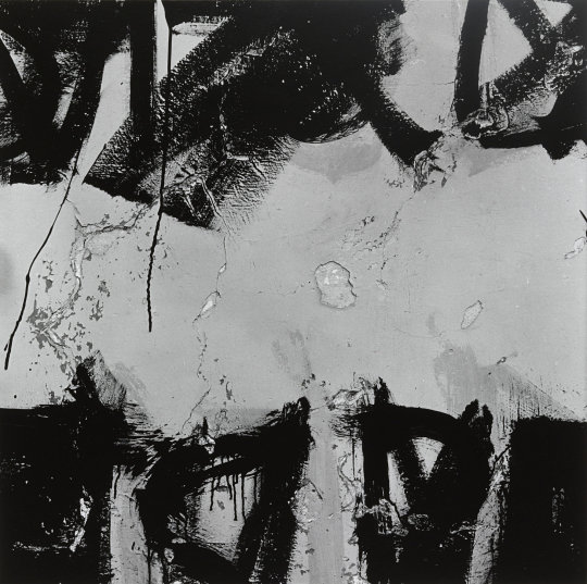
In his work The Homage to Franz Kline, Siskind explores his friendship with Kline. He also looks at the influence Kline had on his work, along with the wider abstract expressionist art community. Siskind photographs items such as flaking plaster, paint marks and damaged walls to replicate the effects Kline created using paint.
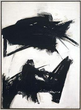
Franz Kline: Black Sienna (1960)
Were it not for the textures visible in Siskind’s image (Jalapa 48), it could well have been a painting by Kline. It is visible that the paint marks are on concrete in Siskind’s photograph. Kline utilised oil on canvas. The paint marks are a nod to Kline, the decay on the wall is Siskind’s stamp on the piece.
There is an unease in this image in my opinion. On the first viewing, I saw a figure with similarity to the Archangel Gabriel above a city, the buildings along the bottom of the image. He was blowing the trumpet announcing the return of the Lord to Earth for Judgment Day. Then the decay captured within the image, along with the black paint took me in a different direction. It felt more oppressive and apocalyptic with a darker being encircling above the people. It felt more demonic and angry. The paint drips down the left-hand side of the image, almost like blood dripping. There is an argument that either outcome would be quite epic and troublesome for the population. It certainly created an emotional connection with me.
With the close crop, it only offers you a certain amount of information. An inch closer or further away may have created a completely different image. It is quite likely that the image would not have worked. It demonstrates the importance of the crop to maximise the power and the message within an image.
I have enjoyed exploring the work of Aaron Siskind. It has amazed and engaged me. Seeing how photography and art overlap has confirmed to me the need to explore outside of your chosen medium for knowledge and inspiration.
#Out of Chaos#Aaron Siskind#Abstract#Expressionism#Abstract Expressionism#Art#Photography#Franz Kline#Object#Black and White#Shape#Line#Form#Texture#University of Sunderland#Critical Theory#Film#Film Photography
0 notes
Text
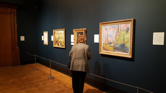
Out of Chaos - Laing Gallery
Out of Chaos is an exhibition of works taken from the Ben Uri gallery in London. The gallery was created in 1915 to encourage Jewish artists as their work was not widely accepted by the public around that time.
The exhibition explores the themes of migration and fleeing from oppression predominantly as a Jewish artist. It contains pieces from artists such as David Bomberg, Marc Chagall, Frank Auerbach and Behjat Omer Abdulla. It contains paintings, photographs and sculptures ranging from 1915 to modern day.
The exhibition explores a wide range of issues, many of which are still relevant in 2017. The artworks delve into topics such as identity, immigration, religion, persecution, poverty and sexuality. The curators of this exhibition have certainly tapped into a raw nerve of modern day Britain. Whether this was intentional or coincidental, it certainly adds an additional dimension to the exhibition.
Many of the earlier artworks explore the impressionism, abstract, futuristic and vorticism schools of art. This is an area of art I am finding myself more and more drawn towards. It is something I wish to explore within my practice of photography. Being able to see this work has certainly helped to increase my understanding of the genres.
I found the works by David Bomberg and Frank Auerbach particularly inspirational. The use of line and colour is intriguing to me. They produce very different works and they appeal to me for different reasons. The dynamism of Bomberg’s vorticism paintings excites me. The use of impressionist blocks of colour in Auerbach’s work is fascinating. I enjoy how he can say so much with so little.
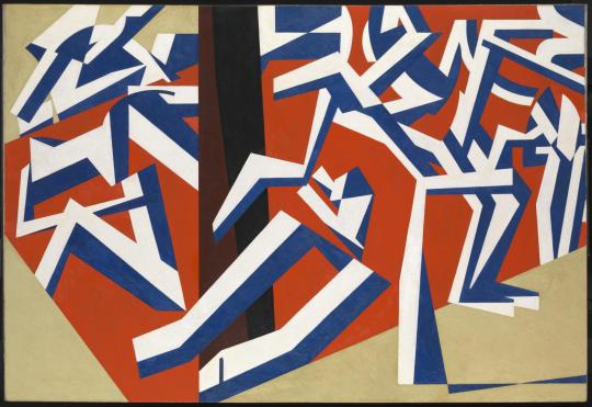
David Bomberg - The Mud Bath 1914
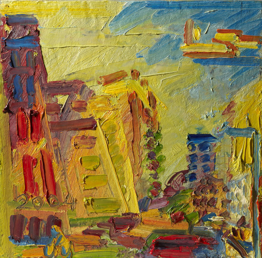
Frank Auerbach - Mornington Crescent, Summer Morning II 2004
Josef Herman was a Polish Jewish painter who fled Warsaw in 1938. His emotionally charged painting Refugees shows a scared Jewish family fleeing during World War II. The buildings in the background represent an archetypal Polish village, a demonstration of what once was. The large cat devouring a rat is used as symbolism, alluding to the fate of the refugees.
This was the last piece of work I viewed at the end of the exhibition. It shook me and made me feel very emotional.
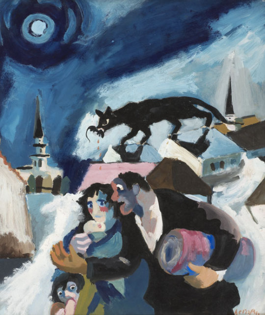
Josef Herman - Refugees 1941
The exhibition ran across two rooms. I was quite amazed at how much the Laing were able to exhibit in these two rooms without it impacting on the works on display and the quality of the exhibition.
I was disappointed that there wasn’t more seating available. The only seating provided was for the above video installation. I like to be able to sit and absorb works, to be able to take in the collection as well as individual pieces.
I found this exhibition to be rather emotional. I left feeling sad, low and angry. I felt I was in a loop of history repeating given our worrying relationship with refugees in Britain, and across the world, at this moment in time. If proof were needed that art, in all its forms, must continue to engage with challenging issues, this exhibition demonstrates it in spades.
Key points of learning
For me, there were two key points I took from this exhibition.
Firstly, there is a need for challenging artworks. The art community, including myself as a photographer, has a duty to draw the public’s attention to difficult and challenging issues. It is all too easy to be guided by sensationalist headlines in the mainstream media. However, the real stories of the people involved are usually lost. The hardship faced by many who flee persecution is often replaced with stories of benefit scroungers or stealing our jobs. The media would rather dangle this ‘Schrodinger's Immigrant’ line of attack it would seem. The work shown in this exhibition hits you with the real emotions of those caught in this trap of fear and despair. With some imagery, there is a dark humour that simultaneously raises a smile and a frown. It creates discomfort. It would be interesting to try and recreate this using photography.
Secondly, I understand more and more that it will benefit me as a photographer to engage with more forms of art. I have a tendency to stick with researching other photographers work. I realise that this is actually quite restrictive. Whilst the emotional aspect of this work, and how I connect to it is very clear, I feel it is how I can use line and colour in a different way that has been equally beneficial to me. It has shown me that there are other ways to explore photography. Also, that experimentation is certainly valuable for my progression.
Quality of my learning
I have taken so much from this exhibition. It has been an excellent learning environment.
Being exposed to such a multitude or work of varying styles and methods of display has opened my eyes to new streams of research and different methods of working. It has inspired me to spend some time experimenting with what I can do with the camera, along with trying out different ideas in post-production.
I will research into photographers who have an abstract or impressionist approach to their photography. I would like to see what methods they use and how they approach their subjects.
A key point for me was being able to see the works ‘in the flesh’. Understanding the scale of the work was important. You do not get a sense of that in a book or online. Web sites or books may state the original size of the canvas or photograph, but this does not help to replicate actually seeing the image in a gallery space. It also allows you to see the textures and materials used. Again this is often lost in translation to a two-dimensional media.
The curators have assembled a wide-ranging and effective body of work for the exhibition. This is something that adds to the experience and has expanded my learning. The expertise and knowledge of the curators is something I simply won’t get from web searches and trawling through a library. It creates a condensed hit of knowledge and learning from experts in a specific field.
#Out of Chaos#Laing Gallery#Painting#Photography#Identity#Persecution#Immigration#Refugee#Politics#Social#Judaism#Fascism#Abstract#Impressionism#Vorticism#Frank Auerbach#David Bomberg#Joseph Herman#University of Sunderland#Critical Theory#Exhibition#Religion#Islam
0 notes
Text
Fact or Fiction? Now and Then.
Following on from Lord Puttnam’s lecture, I felt it would be interesting to look at two UK documentaries that were from very different generations. I wanted to see what had changed and what may have stayed the same. For this, I watched Listen for Britain (1942) by Humphrey Jennings and Stewart McAllister and Britain’s Modern Slave Trade (2016) by Jason Gwynne.
These may already seem like unusual choices, however, I felt that I would see Britain portrayed in very different ways in these two films. I also thought I may still see some similarities too.
Listen to Britain was produced by the Crown Film Unit which was a division of the Ministry of Information; a Governmental department commissioned to make wartime propaganda and information films for public consumption. This immediately made me wary of the idea behind this film. Was it documentary or propaganda?
The twenty-minute film gives the viewer a ‘Day in the life’ view of life in the UK during wartime. It documents the everyday things, the mundane aspects of life that keep the wheels of the nation turning. It is the heartbeat of the country.
The film has a largely poetic feel to it. It paints a positive view of Britain during the challenges of war. It plays to a fabulous rhythm of imagery that guides you through the film. At times, we eavesdrop into individual conversations and interactions. This brings a personal element to the piece and allows us to connect to that moment in time.
It is not all roses during the film. There are moments that jolt you back to the reality of what is happening. One scene shows a woman looking through a window as children play in the schoolyard in a small village. She turns to look at an image of a soldier on the sideboard, probably her husband. Next, we see military vehicles passing through the village. The reality of the situation is clearly visible. We go from village green whimsy to the reality of war in a few seconds.
We see women working in the munitions factory helping with the war effort. Everyone in the factory looks tired but are keeping going to help the greater good.
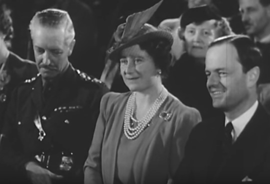
Later we cut to a concert hall where we see a mixed crowd of people enjoying some classical music. A lady is engrossed in the music and seems to be oblivious to the camera as she looks past it intently. We see a man, possibly a soldier, with his head bandaged listening to the music with a slightly distant expression on his face. The film cuts back to someone who appears to be Queen Elizabeth, The Queen Mother also enjoying the concert. It tries to portray the image of ‘we are all in it together’. The scene reminds me of the following lyrics from Billy Bragg’s Rumours of War:
Life goes on as it did before
As the country drifts slowly to war
The scene felt very much as if life was just going on as normal and there was no war. The only reminder is the bandaged man as a subtle reminder. The film ends with Rule Britannia loudly played over the closing sequence and end credits. This takes me back to the topic of documentary or propaganda.
I feel this documentary is a great piece of work. It feels different to many of the documentaries that came before it. It is accessible and does capture the period well. It does demonstrate the issues of war but it does not overplay them. It is subtler in its approach.
I cannot shake the feeling that this is not just a documentary film. Nor do I feel it is pure propaganda. I feel that it plants a foot in both camps. Perhaps morale lifting is a better term to use than propaganda. Whilst it does touch on the aspects of the war on the Home Front it does not dominate the film. Is it OK to have a documentary with a bias? I believe that most documentaries do to some degree, both positive and negative. Essentially, Listen to Britain does not appear to fabricate the truth. For me, that is the most crucial point. It may be tinged with a little propaganda, but it is also honest in its depiction.
Britain’s Modern Slave Trade by Jason Gwynne is a very different type of documentary. Where Listen to Britain portrayed a largely positive and resilient country, Britain’s Modern Slave Trade shows the unpleasant underbelly of the nation.
The forty-seven-minute film focuses on people who illegally enter the UK on the promise of a better life. Many are fleeing from poverty, crime, persecution and violence only to arrive in the UK and find themselves in the very same position all over again.
Whereas Jennings and McAllister painted a more positive view of Britain containing sing-a-longs to Flannigan and Allen and happy children, Gwynne along with reporter David Harrison show us a seedy and unpleasant corner of our great and pleasant land.

The documentary shows the viewer that there is a great deal of slavery in the UK that takes place in plain sight. While it is not surprising to see that some women end up in prostitution, there are also a lot of women who end up working in nail bars. Many customers will be treated by a modern-day slave and will not realise it. The film shows a group of men trapped working at a hand car wash. They are paid very little and often have their wages docked for no genuine reason.
There are two key factors that make this film stand out in comparison to Listen to Britain. Firstly, there is an open and honest frankness about some of the conversations that take place. People talk about the aspects of mental control that help to keep them trapped in these desperate situations, describing them as “psychological chains”. Women talk about the physical abuse they have faced as prostitutes. There is no sugar-coating of the facts.
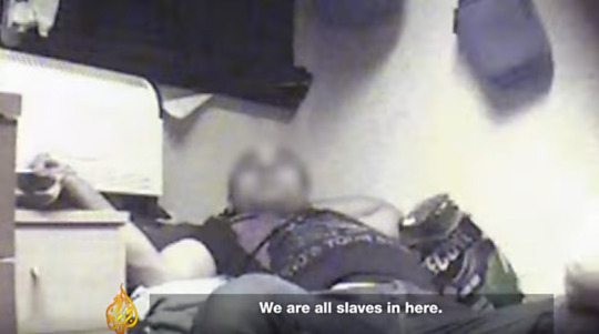
Secondly, technological advances mean that people can wear very small cameras and go undercover. This is something that would not have been available in 1942. It allows Gwynne to get us closer to the story. We can begin to understand from the footage how these people are suffering. We see squalid living conditions. Workers stating that “even the rats are free” and that death would not be such a bad outcome as it would at least allow them to escape their situation. Being able to rely on this technology allows us access that is both revealing but also uncomfortable. We gain a greater understanding of the story but it is also disturbing to view. There is a very real sense of fear, hopelessness and despair. This is very much at odds to the feeling from watching Listen to Britain.
The film also includes the views of experts. This is something that is common in modern-day documentaries but was absent in the Jennings & McAllister film. However, it would have been out of place in their film. It would have disrupted the flow and weakened the piece. Even the inclusion of narration during the film would have felt unnecessary and cumbersome.
One thing that both films can proclaim to do is to be positive albeit in very different ways. Listen to Britain is more of a feel-good film, a documentary to lift the spirits. Britain’s Modern Slave Trade tries to raise the profile of an important issue to attempt to gain a positive outcome.
Many of the scene setting shots in Britain’s Modern Slave Trade are like Listen to Britain. They build up an understanding of place, time and space. The key difference is that the former shows darker imagery which makes the piece feel more oppressive and moody. Both demonstrated an honesty and integrity in their storytelling but used different methods to do so.
Whilst the two films are very different there are certainly connections that can be made despite being made seventy-four years apart.
#David Puttnam#Fact or Fiction#Documentary#Film#Film Makers#University of Sunderland#Truth#Stories#Alternative Facts#Social History#Politics#Debate#Humphrey Jennings#Stewart McAllister#Jason Gwynne
0 notes
Text
David Puttnam Lecture – Fact or Fiction?
Friday 3rd February – David Puttnam Media Centre
Lord David Puttnam discussed Fact or Fiction in a post-truth society. It was an interactive lecture exploring filmmakers’ use of documentary footage within film and invited us to look past the blurred line that separates Fact from Fiction.
The lecture looked at film makers, past and present, to investigate the changes in cinema and documentary over the years in relation to telling factual stories and how they were received. This included works by people such as Humphrey Jennings, Adam Curtis, Giuseppe De Santis and John Schlesinger.

Key points of learning
The most salient point I took from this lecture was the issue of impartiality when tackling a subject. If you have an agenda to promote, the truth will become tarnished. However, artistic license to promote a subject is less of an issue assuming you are honest about this from the beginning. Crucially it comes down to the integrity of the practitioner. For example, Puttnam discussed Leni Riefenstahl; a film maker who decided made the Nazi propaganda movie Triumph of the Will in 1934. By aligning herself with the Nazi regime any further work is questionable, such as her 1938 movie Olympia.

Interestingly, Puttnam made Midnight Express, released in 1978. The movie shows the story of William Hayes, jailed in Turkey for drug trafficking. Turkish authorities still dispute a number of claims made by Hayes, some of which are included in the movie. Puttnam always maintains the movie is the telling of Hayes story and facts were checked where possible. Puttnam’s integrity holds up as he is not trying to deceive nor create a bias in his work in my opinion.
The final key point is concerning the vehicle used to relay the story. Whilst this was discussed in terms of movie creation, I feel the same is true for photography. What method are you going to use to relay your message? Is it a relationship between people? Is it using still life objects as a metaphor? To effectively relay your point, you need to find the way to connect to your audience.
Quality of my learning
In my opinion, listening to David Puttnam is a privilege. He is a film maker with an amazing pedigree. His experience is vast and he understands the need for film makers to tell stories that may go under the radar and to provoke debate. He provokes debate throughout the lecture, which is interactive, and posits questions and thoughts for you to mull over long after the lecture has finished. I have visited several of the Puttnam Lectures and always come away with new areas to explore. These may be works to watch or topics to read about in greater detail.
As a result of the lecture, I am going to embark on a mission to watch works by a some of the film makers discussed, or of a similar standing. It will allow me to see the evolution that has taken place and give me a more rounded understanding. It will also give me additional points of reference to draw on for future projects.
youtube
I intend to try and view these in chronological order if possible. This will allow me to see the curve of change a little clearer. I will be looking back to people like Humphrey Jennings (illustrated above) through to Josh Kriegman and Elyse Steinberg.
Finally, the lecture made me think a lot more about the context of my work. What methods can I use to ensure that my ideas for a project are fully understood by the audience? Without that ability to create that connection my work may be distant and aloof.
#David Puttnam#Documentary#University of Sunderland#Film makers#Film#Fact or Fiction#Alternative Facts#Truth#Stories#Social History#Humphrey Jennings#Politics#Debate
0 notes
Text
Photographic Carbon Printing
I found an interesting and very informative illustration which shows the development of the carbon printing process:
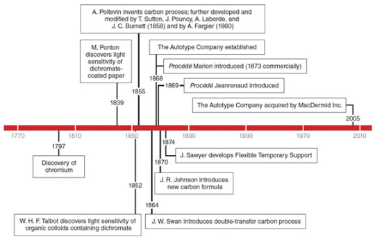
It was twenty-five years after the initial discovery by Mungo Pontin of the light sensitivity of dichromate-coated paper that Joseph Swan introduced his double transfer carbon process to the photographic world. This method is often described as the Autotype process. But what exactly is an Autotype?
The dictionary definition of Autotype is ‘(Photography) a photographic process for producing prints in black and white, using a carbon pigment.’ As a process it is still used by some practitioners today.
Swan created The Autotype Company in 1868 which brought his invention to the photographic public. To my great surprise, this company actually still exists today. However, it ceased providing materials for the photographer in the 1950’s.
Although there were a number of changes to the process Pontin discovered, it was Swan’s modifications that helped to bring the process up to a standard where professional, and later amateur, photographers embraced the method.
One of the early issues with carbon process printing was tonal range.
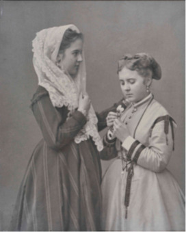
Adolphe Brown, Two Girls, date unknown. Early carbon photograph. Private collection.
Swan added a small amount of sugar to the gelatin-carbon mixture used in the process. This produced a less brittle image layer when the print had dried. In Swan’s process, a sensitized gelatin-carbon coated paper was exposed under a negative and attached face down on a temporary or permanent final support (paper or other substrate material). The original paper substrate was then stripped away in a warm water bath. The carbon image was then developed by dissolving the still soluble gelatin-carbon mixture.
The new substrate Swan added meant the less soluble parts of the image layer were better protected. This meant the halftones in the image were better protected which produced a more contrasted print.
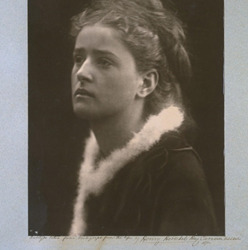
Julia Margaret Cameron, The Angel in the House, 1873. Early carbon photograph. V&A Collection.
There is a problem with this procedure that must be noted. The final image resulting from this single transfer was shown in reverse. To rectify this, Swan developed the double-transfer process. In this process, the carbon print from a temporary support was transferred again to a final support, thus correcting the orientation of the image.
This illustration demonstrates this process:
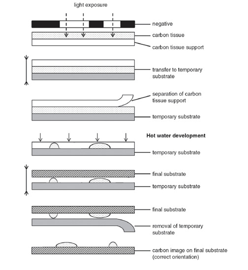
Due to the nature of the print production, the surface of a carbon-image sometimes demostrates a relief effect. This can be seen by tilting the image to almost a 180 degree angle. The darker areas will appear more raised from the substrate than the highlighted areas of the image.
A lot of effort is placed in trying to make modern day prints fade resistant, especially in the ink-jet print market. However, carbon prints, providing they are only made using carbon pigments, do not suffer from this issue at all. Fading only becomes problematic if organic dyes have been introduced to alter the colour cast.
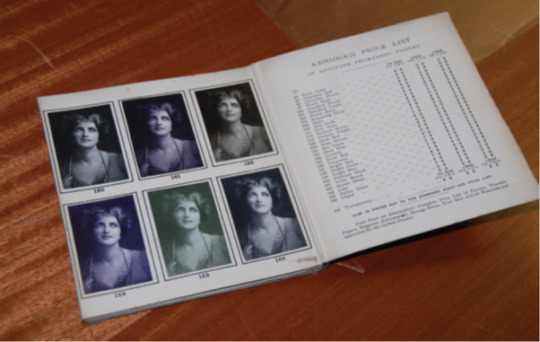
Catalogue of different carbon tissues available from the Autotype Company, 1907. Collection at National Media Museum (NMeM), Bradford, UK.
The carbon process was also used to apply images to objects. The method used was sometimes dictated by the surface the image was to be applied to. For example, if an object was porous, such as wood, the area where the image was to be placed would need to be sealed. If fabric was being used as the substrate, a number of layers of sealant would be applied.
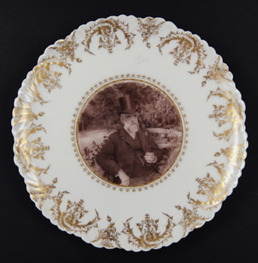
A plate with a carbon print in the centre
0 notes
Text
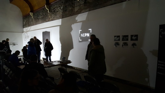
Joseph Swan and Photography in Sunderland
Wednesday 1st February 2017
NEPN and Breeze Creatives presented an event called “Joseph Swan and Photography in Sunderland” at the Athenaeum Building, Fawcett Street, Sunderland. The event looked at the life of Swan, his connection to the Athenaeum Building, the history of the building and surrounding area and his involvement in photography.
Joseph Swan was inventor of the incandescent light bulb but he was also a photography entrepreneur. In 1864 Joseph Swan became a partner in the firm Mawson and Swan. He worked out the carbon process, known as the "Autotype," an early l method of producing permanent photographs.
Key points of learning
Creating the flow around the exhibition. Each section was set up to allow people to view and participate in the exhibited work. You could move around the space in a number of directions which created a greater feel of interactivity.
The use of interactive pieces. Allowing people to actively participate in the event adds an additional dimension. It increased the engagement of the viewing public. It demonstrated that photography is not simply an image on a wall. It created different layers of learning and understanding about photography and how it can be used.
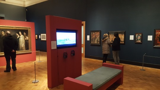
How and where you display your work is a process all of its own. Karolina Maciagowska displayed a number of images (a breakdown of a map of Sunderland from around the period Swan started his photographic journey) on glass plates.
These were hung in strips from above (a deconstructed map almost). There was a plain white wall behind. They were placed in a corner of the room. They were floodlight from beneath using a spotlight. These plates projected ghostly map images on to the wall behind, magnifying the plate images slightly. However, the also created an interesting display on to the adjacent wall. Again these created shadows but not in the same way as the wall behind the plates. It created dancing shadows, movement which was a little hypnotic. It almost created a second body of work. It was creating an added dimension to the work.
Quality of my learning
Although this was a small event (attendance 60) I found it very helpful; possibly because it was a smaller event.
I was afforded the opportunity to move around the space and to engage with other visitors. Also, listening to how others perceived the event content and presentation was interesting. For example, many were wowed by the dry plate collodion demonstration. However, the talk about architecture seemed to be less well received.
I am looking at ways to engage with people as part of “The Image” module. Seeing the methods employed at this event showed me that there can be many different, and unusual ways to display work and interact with the public. It has taught me to unravel my subject to look for ways, not always obvious, to engage people. The use of the “selfie station” may be something I can adapt for this project to increase interaction with my target audience.
I took the opportunity to speak to Karolina about her work. To be able to hear the artist speak about their work is very revealing. It helped me to understand her process, her ideas and her method of displaying her work. It alerted me to the idea that people may well ask the same questions of me about my work. It has made me consider the approach I would take depending on the audience.
Finally, how my work would fit in to a collaborative project if commissioned? What would I include in an event if I was a curator? Seeing this event asked these questions of me. It is something I had not really considered previously.
#Autotype#Joseph Swan#19th century#Vintage Photography#NEPN#Sunderland#Carbon Printing#Photography#photographic history
0 notes