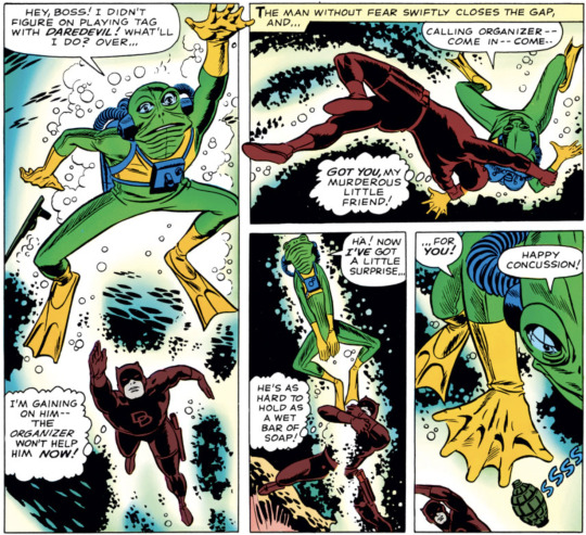
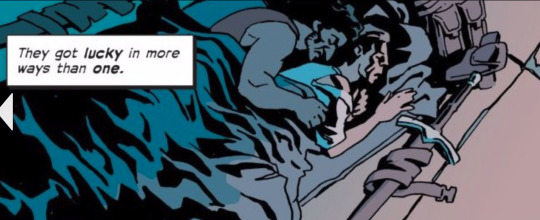
#ALSO. THIS IS MY FAVORITE PAGE IN THIS ISSUE! the panel layout/flow is great. and the panel break outs too!!! wonderful composition overall
Text
Daredevil #10 - "While the City Sleeps!" (August 1965)
Written by Wally Wood
Art by Bob Powell (pencils), Wally Wood (pencils, inks)
#marvel#daredevil#matt murdock#frog-man#francois le blanc#wally wood#bob powell#i lied. i will tag their actual character names when it is just one of them.#ALSO. THIS IS MY FAVORITE PAGE IN THIS ISSUE! the panel layout/flow is great. and the panel break outs too!!! wonderful composition overall#my friend was very correct in saying they are literally swimming through the page. it's so delightful! i love it! love it a million times!#back issues box
1 note
·
View note
Text
Starring Sonya Devereaux: Spider-Shark vs. Snake-Bear #1
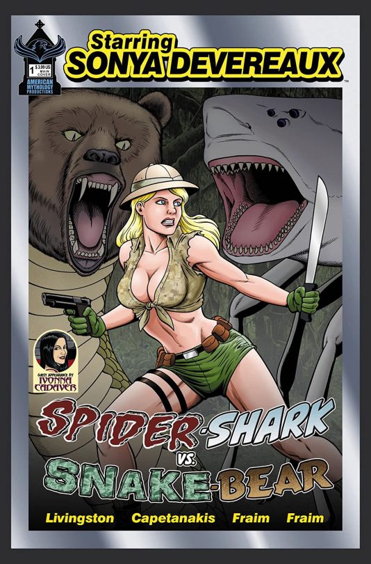
Starring Sonya Devereaux: Spider-Shark vs. Snake-Bear #1
American Mythology Productions 2020
Written by Todd Livingston & Nick Capetanakis
Illustrated & Lettered by Brendon & Brian Fraim
Coloured by James Couts
Hollywood's 306th best actress is scream queen Sonya Devereaux, whose career consists entirely of ultra-low budget, straight to DVD horror movies - the kind you find in the bargain bin at the grocery store or playing at 2am on cable TV. In this issue: "Spider-Shark vs Snake-Bear" - a hilarious 30-page horror/sci-fi/action parody filled with ridiculous monsters, beautiful babes and outrageous comedy! When an archaeologist goes missing in Africa while investigating the myth of the Spider-Shark, Dr. Haley Lord (Sonya Devereaux) is released from a government psychiatric ward to lead a rag-tag team of operatives into the jungle to find her. Also in the "cast" are genre favorite actors Damion Poitier and Magda Apanowicz, adult star Caroline Pierce - and a special appearance by horror hostess Ivonna Cadaver of Macabre Theatre!
So this the fourth in a series of one-shots and I have to say that it reminds me of the old USA Up All-Night movies, with Made for SyFy sensibility, that I used to shake my head at as my father loved them. I mean men love titties after all. So going in with that kind of mind-set it is so easy to fall in love with this book. There are these wonderful tongue-in-cheek moments throughout that just reinforce this for me. The story & plot development reads very much like a made for SyFy film and how we see the sequence of events unfold as well how the reader learns information is presented extremely well. The character development is about what you’d expect to see and it certainly does not disappoint in the slightest. The pacing here is fantastic and as we see it take us through the pages we can see how well the book is structured as well as how everything works together to create the books ebb & flow.
While I personally am not a fan of mindless humour there is something about this that is more like nostalgia for me so that I connect with it more. Simply put this is just genuine fun in the most absurd way possible and it needs to find its way into your world. It is high time we started putting the fun back in funny books, as my grandmother used to call them.
The interiors look like an all-ages cartoon affair with not so kid friendly imagery. So while it has the cartoonish styling don’t let that fool you because in all reality it’s exactly what this title really needs. It adds the levity of the idea of Sonya and it’s brilliantly handled by the Fraim brothers. Would like i like to see some more attention to detail, sure but what we see shows a nice understanding of how to utilise linework and its varying weights. The utilisation of the page layouts and how we see the angles and perspective in the panels show a nice strong eye for storytelling. The colour work is nice to see as well. I appreciate how we see the camo effect as well the hues and tones within the trees being utilised. There is some beautiful use of the various hues and tones within the colours being utilised to create the shading, highlights and shadow work we see as well, plus those eggs man that’s some killer marbled shit.
This is fun people, I have a great time reading these stories and seeing the crazy stuff that Sonya gets into. Though I will say if she’s going to remark about her cleavage, Ivonna Cadaver (great drag name by the way), then she needs to be stacked better than Elvira not less so. If you want something fun to read to forget about this crazy Covid-19 world then treat yourself to the world of Sonya Devereaux!

#Comic Books#Comics Reviews#American Mythology Productions#Todd Livingston#Nick Capetanakis#Brendon Fraim#Brian Fraim
1 note
·
View note
Text
Reacting to The Old Guard
She Is Not In Any Way Playing
The Setup: It’s our first Reaction to a comic book! And it’s not from the Big Two! Written by Greg Rucka (Wonder Woman, Gotham Central, Black Magick) and drawn by Leandro Fernandez (Punisher MAX, The Incredible Hulk, Deadpool & Cable) -- a duo who previously collaborated on Wolverine and Queen & Country -- The Old Guard is about (mostly) immortal warriors who can trace their lives back through Napoleon’s attempted invasion of Russia, the Crusades, and the conquests of Alexander the Great. They’re led by Andromache of Scythia, but you can call her Andy.
Andy’s fought and fucked, loved and loathed her way across thousands of years and at least six continents, and she is tired. So when a seemingly routine rescue mission goes way off the rails, and just a few hours later her team learns that -- contrary to what they’ve believed for a century or two -- they’re not the last immortals left after all, Andy has to find out if she can still surprise a world that she didn’t realize could still surprise her.
Kris, who briefly studied ancient military history in college, really liked Rucka’s Batwoman: Elegy and his webcomic Lady Sabre & The Pirates of the Ineffable Aether, so when he learned about The Old Guard he asked Marchae -- a BIG fan of Rucka’s Lazarus -- if she’d want to react to it.
Two spoiler notices below, but until the jump it’s just first-issue stuff.
KRIS: So we’ve both read some Greg Rucka before
I don’t think I’m an expert, but I’m fairly aware of at least the range of his work
MARCHAE: I am a HUGE fan of at least one of his comics!!!
KRIS: And he seems to be One of the Good Ones re: male feminist writers
MARCHAE: YES I absolutely agree and spent even more time thinking about that as I read The Old Guard
and this notion that I have about “super heros”
but also I like some of the things he examines in his works, at least what I’ve read
KRIS: Oh good I think we’ve all wanted to hear more from you about your theory of superheroes, so definitely feel free to get into that when it’s relevant
MARCHAE: LOL
I definitely will talk more that’s for sure - and especially since I’m reading Jessica Jones at the moment
KRIS: Also I really like how distinctive most of the faces in this are, just wanted to say that upfront although I am not super qualified to discuss the art
MARCHAE: So I’ve spent some time making connections between what I’m currently reading , a traditional comic, versus the indie books
Neither am I - but the art is gorgeous
KRIS: OH and for our readers who may not be super into comics (yet), maybe we should say how we’re reading
I’m using the Comixology reader on their website, in Guided View mode
MARCHAE: And I use an app from my public library called Hoopla
I also use a guided view mode - however I definitely prefer hardcopies
KRIS: I like Guided View a lot, although occasionally you lose some of the impact of splash pages, and there are very rarely (but especially with older comics) sequencing errors
ANYWAY sorry tangent
MARCHAE: I am reading newer ones mostly, it definitely feels more cinematic to me reading it electronically.
I like it a lot especially for fast paced ones like The Old Guard
like an action film
KRIS: But I wanted to just get it out there that there are good accessible digital ways to read comics, which is often more affordable, and also for some reason Amazon is selling a bunch of Marvel comics at massive discounts
Yes! Thank you for getting us back on track -- the action layouts here are great
MARCHAE: Affordable and FREE!
and you’re welcome!
I am a newbie to comics- I’ve only been reading them for a year maybe less - and I am obsessed with how much I can relate to them from a screenwriting perspective in terms of sequencing and layout. In this weird abstract way. This was one of the best one’s I’ve read in a while in terms of the pacing with layout - and I love it. I actually started re-reading the book just to gawk at the art etc

KRIS: Oh you should check out Rucka’s web comic Lady Sabre and the Pirates of the Ineffable Aether [see above] -- it was like the equivalent of a page or so twice a week, and Rucka’s script for each entry was included
MARCHAE: **GASPS**
KRIS: I always mean to really break down and study a comic book or two but just like with studying TV, I end up being too lazy, and just hoping I’ll absorb lessons through sheer osmosis
MARCHAE: LOL -
I have studied the dialogue
I think more closely than anything
although I really need to study their structure
KRIS: That’s interesting
I would not guess that most comics writers do dialogue as well as Rucka
MARCHAE: It’s something about these short bursts of dialogue that kind of flow with the quick images we get that makes sense to me… I’ve read a couple that I really prefer
KRIS: I’m interested in how comics people obviously think in “shots”
MARCHAE: Revival is good and so is Alex and Ada … it shouldn’t come as a surprise that they are super character driven
KRIS: and I think a lot of screenwriters don’t
MARCHAE: YEAH
KRIS: or aren’t necessarily really well trained to
MARCHAE: It is fascinating when you think about because there are SO MANY correlations between the two
because as screenwriters and movie makers we end up having to think like comic writers when we get to the storyboarding portion of the work
which i guess is more of a production function
but
KRIS: Right, it should be super obvious, and we do get TOLD to think in shots but there’s still such a division (at least in our film school experience) between learning to write and learning to tell stories visually
MARCHAE: I feel like with comics the action - even in some of the not as good ones I’ve read is all about taking you to that next shot
EXACTLY!!!
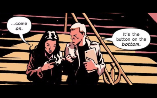
KRIS: Honestly this is one of my very favorite parts in the whole book, just as a visual storytelling beat:
MARCHAE: I was grateful that I had the experience of reading comics at least near the end of my time in school… i did take a lot of lessons from the comics
OHHH
tell me why
KRIS: I think a lot of the impact for me was in the guided view
The panel before this is Booker trying to talk Andy into the mission: “He says there are kids involved, Andy. Kids.”
Then in GV you get everyone looking at Booker, and you can linger on that panel
MARCHAE: The guided view makes a tremendous difference!
it feels like a moving image
KRIS: Then the next panel makes you sort of realize that it’s not really “everyone” looking at one person, but Joe and Nico looking back and forth between the new guy and the boss
although I guess you don’t get the “new guy” information until later
MARCHAE: Exactly
KRIS: Yes! The movement is there, and can have this weird interaction with how long you can linger in a single shot
But I guess what I like about this page is how the visuals help establish the relationships even without Andy’s exposition
MARCHAE: And i feel like you should be able to tell the story without the words
some of my favorites were the panels without words period
I especially love the first few pages
KRIS: Yeah, and in a nutshell that’s what comics writers are trained to do and what a lot of screenwriters (including me!) are often too precious about their own dialogue to internalize
MARCHAE: its just a few bits of inner dialogue
(side note your dialogue is beautiful!!!)
KRIS: Yeah but I didn’t become a playwright

MARCHAE: YESSSSSS
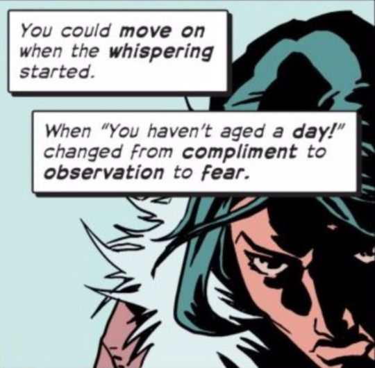
KRIS: ^That spread is so amazing and efficient
MARCHAE: YESSS and YESSS
those were my favorites
oh my word and its just pretty
KRIS: It’s not even a really dense two-page spread by any means and there are only like 30 words on it
But it tells us so much about Andy
MARCHAE: I’m looking at it now on my device and its in guided view - so it shows up as each individual panel
YES!
KRIS: Right
MARCHAE: and I’m hooked from the beginning and that’s what I think makes this story effective and invests you in it
Rucka does this with my favorite comic - Lazarus
also
KRIS: She’s a warrior, she’s been around forever, she’s bi, she’s tired, she doesn’t have a lot of meaningful human connection in her life
MARCHAE: And we get that quickly
and efficiently
KRIS: and obviously the sense of repetition
in her day-to-day (century-to-century)
MARCHAE: thats been going on for centuries
[SPOILERS throughout below]
KRIS: Oh sorry did you want to say more about Lazarus
MARCHAE: It’s okay -
I was just going to say that there are some definite similarties between the two books
Specifically just the idea of strong female protagonists who are capable and leaders
and also the notion of these women dodging death
All. the. time!
I thought it was interesting to have read and to be a HUGE fan of both books now
and think critically about what he means to demonstrate and also why i consider the woman he portrays more heroic than other “heroes”
that was a long rant LOL
sorry
KRIS: And there’s a quietly great line in chapter 2 about how everyone just defaulted to Andy being the leader because she was the oldest, so it was obvious
MARCHAE: Yes I remember that
KRIS: And I haven’t really thought about this, but it’s interesting and I’m assuming very deliberate that the oldest and the youngest leads are the women
But so matter-of-factly
MARCHAE: Yes - I did note that and remember being worried for Andy and what it meant later on in the series
and also the conflicts that we could expect to see in the future books
I think it’s smart honestly and kind of this mentorship that also gets to happen between the two women
we know that historically women have a difficult time finding mentors so I guess it is great to see it demonstrated in this medium
I think we’ll eventually see some bickering between the two , but ultimately a respect which is also not often depicted in other medium as much as I feel like it should be
KRIS: I’ll save it for a little later but I did screenshot that great (affectionate) bickering toward the end
MARCHAE: YES!
KRIS: We often write these in a way that sort of assumes the reader knows at least generally what we’re talking about but maybe we should try explaining a little about at least the main character relationships here
MARCHAE: That’s true - especially considering this is our first time reacting to a comic book
KRIS: Oh my god wait I just want to show this page transition I didn’t pick up on in Guided View
MARCHAE: I was trying to find a good article that listed the main concept with characters (mostly because I need to know how to spell andy’s real name)
KRIS: The color palette!
MARCHAE: It’s beautiful I liked these panels
KRIS: They only say Andy’s whole name twice but it’s not the same both times!
MARCHAE: I have this weird way that I read them… 1. for story. 2. art with story 3. only with art
KRIS: Oh interesting
MARCHAE: even the layout is nice
KRIS: I’m not much of a re-reader (or re-watcher) but I should be
MARCHAE: I don’t generally - but because I am so used to reading “regular books” I have to almost get the story then go back so I can appreciate the art with the story
then just the art cause #pretty
KRIS: Oh man I sidetracked us again
OK so
Andy!
MARCHAE: its okay really theres is a lot here to talk about actually!!!
Yes, Andy short for Andromeda?
I think
KRIS: I THINK Andromache is what her name is supposed to be, since that’s what the Comixology store “logline” uses
MARCHAE: YES
KRIS: and that’s what Booker calls her
MARCHAE: I was all off LOL
KRIS: but when she tells Nile an issue or two earlier, she says Andronika
which I’m assuming is just a continuity mistake on someone’s part
MARCHAE: I am now curious if it changes with the time
KRIS: and maybe a reprint will correct it
MARCHAE: like each century she modifies it?
yes but she’s centuries old
and most important
KRIS: But I got the sense that we were given everyone’s “true” name at least once
MARCHAE: Immortal - she can’t die - at least she’s not able to right now
KRIS: So “Andy” is her modern day shorthand and maybe in the 1800s it was something else, but Andromache is her birth name
MARCHAE: yeah! that’s my deduction at least
KRIS: So Andromache means “battle of a man”
(I think Andronika would mean something like victory of a man?)
MARCHAE: I love your to the minute, on the spot research!
KRIS: Well Andromache I knew because I briefly studied Greek in undergrad and have always been a little bit of an Ancient Greek Stuff nerd
What I’m not sure of is in what sense “battle” is being used
MARCHAE: are the names from the same era?
I guess it could be two fold
KRIS: Like, is it a battle as in an event, or is it in the sense of “she’s got fight like a man”
MARCHAE: Oh i was going in a different direction!!!
wow
yours is probably more appropriate LOL
KRIS: Andromache is at least as old as the Odyssey
MARCHAE: I was thinking more of “battle of a man” - as in battle against one’s self
KRIS: Oh interesting
MARCHAE: like man against man conflict which i suppose is fitting considering that she’s somewhat immortal
KRIS: oh I meant the Iliad -- Andromache is the wife of Hektor
MARCHAE: OH YEAH
Also thinking of “battle of a man” to mean battle of time and life
we always want to live longer, better, never die
KRIS: I don’t know much at all about Arabic so I don’t know how old Joe’s real name is, etymologically speaking
MARCHAE: and here Andy is wanting to be done
I loved that scene where introducing himself
KRIS: Yeah, that’s pretty classic
MARCHAE: and we get to Joe!
So I am checking an article and [the Newsarama interviewer] says Andy’s real name is Andronika
https://www.newsarama.com/33272-rucka-joins-the-old-guard-with-queen-country-artist-fernandez.html
(also side note I feel redeemed and a bit smart that he mentions some of the themes I pointed out and made similar comparisons! )
KRIS: OK skimming now
“John Wick meets Highlander”
That’s pretty great
MARCHAE: Truth!!
KRIS: Oh Black Magick I should link to that [see above]
MARCHAE: I haven’t read that one
KRIS: Anyway where were we?
MARCHAE: Ok we have digressed again! I guess a brief synopsis of the main characters
KRIS: Right right
So we have this 4-person mercenary team
MARCHAE: Right and they’ve been connected FOREVER it seems like
KRIS: Led by [Andronika/Andromache?] Andy, who is literally biblically old
MARCHAE: Well it doesn’t seem like - they have been together for ever
KRIS: Then Nico and Joe (Nicolo and Yusuf) who met during the First Crusade, so 1090s
And presumably they linked up with Andy sometime between the Crusades and the Napoleonic Wars, when we get Booker
MARCHAE: There is a lot of history here
KRIS: And there’s this stuff about how when a new immortal dies for the first time, other immortals (maybe within a certain range?) start having dreams about them
MARCHAE: and that’s how they are introduced or at least made aware that they will be meeting someone new? did I read that correctly
KRIS: Yeah
MARCHAE: HA - I misread your text LOL
I literally rephrased what you said LOL
KRIS: Andy had to figure it out the first time it happened, like the dream doesn’t spell anything out for them
MARCHAE: They are often killed or incredibly injured during their battles and they heal themselves which is how they discover ultimately that they are immortal
for a spell at least
KRIS: Oh there are some GREAT “match cuts” in this
There’s a really good one in the Nico/Joe origin story
MARCHAE: OH YEAHHHHHH
KRIS:
But that whole sequence is great
MARCHAE: I loved the twist there
KRIS: So yeah sorry for our readers my mental leap isn’t obvious, but this is preceded by a couple pages of Joe and Nico during the Crusades repeatedly killing each other
MARCHAE: I sent over a few screen shots hopefully they will come through…
The book definitely has a distinct aesthetic that’s for sure

KRIS: It’s mostly serious but lightly comic, like they just don’t question it, like okay yeah I guess I’ll just kill you again
Oh getting your screenshots now
Yes the faces (again)! You can see the modern Nico and Joe even under all the facial hair
MARCHAE: you mentioned my idea of hero
KRIS: Yes
MARCHAE: and your point “it’s mostly serious but lightly comic”
that’s the thing… saving lives/the world is a serious thing
these people have real problems that are connected usually to slightly dystopia ideas of our current world
I feel like with more mainstream comics we are in some alternate reality all together and the people are trying to be funny and trying to save the world and trying to be cool…
I feel like in Rucka’s books (and also a few other’s I read) it’s rooted in something that i can grasp and their problems are real
so in this text it’s when does my suffering end
in a book like lazarus it’s why won’t my family love me
and it’s not in this over the top let me fly all over the place and shoot missiles out of my hands kind of way
it’s serious
it’s business
KRIS: But I think tonal variation is a good thing
for the genre and the industry
Like a lot of the recent DC movies are SUPER SERIOUS on a surface level, but they’re not necessarily handling ideas in an intellectually rigorous way
MARCHAE: I absolutely agree I guess in a world I could see myself being saved by someone who is more similar to Andy than say Captain America
I think that’s the thing I like is that it is this exploration of more complex ideas in these types of comics and I feel more connected to the work
it’s more accessible
KRIS: And even though the Marvel movies are lighter, and not SUPER thematically driven, they’re relatively smart about the thematics they do include
See I think most people would say Marvel’s tone is more accessible
But I think you might mean accessible in a different way
MARCHAE: LOL hence the mega fafillion dollar industry
KRIS: Like you’re looking for something concrete to latch onto
MARCHAE: I think I agree with you there - I want a take-away
KRIS: And I think the Iron Man tone is more “here is a world that speaks the language you speak with your friends” in a generalized sense
MARCHAE: I can give you that…
the more mainstream comics make the business of saving the world seem less serious
I also am a lover of drama and heavy topics so I think there is also the attraction - these people don’t always feel like they have be “on” to me
they are trying to make it
and that I can relate to!
KRIS: I think that’s because “saving the world” isn’t REALLY what they’re about, though, to the extent that they’re about something
I think at some point, maybe with all four of us, I do want to talk more about the difficulty you have with comedy
MARCHAE: It’s like an intervention LOL
KRIS: No! Well maybe a little. But it’s so ingrained for you that I think I also just want to understand
Maybe when we eventually return to Sweet/Vicious, which I still really want to do
MARCHAE: comedy is truly a challenge for me with the exception of a few - but even those make a larger statement in my opinion!
we do need to finish S/V
KRIS: I’d also like to see you and Keely talk about comedy
ANYWAY
We should talk about Nile
MARCHAE: that might be fun - Keely and I have talked about why I like her brand of comedy best…
OK NILE
KRIS: So Nile is an American Marine
in a Female Engagement Team in Afghanistan
MARCHAE: I absolutely adore her
she’s the “youngest” immortal
KRIS: So at first I didn’t realize she didn’t know she was immortal
For some reason I assumed she had abandoned the team at some point
MARCHAE: OHHHH
KRIS: But then she becomes our (great) audience surrogate
MARCHAE: Which is why I like her - she’s new- but it’s clear she’s competent
and is legit just trying to understand “what the heck is going on here”
KRIS: Yeah, and she gets to push back a lot when Andy is like “don’t worry about it”
But never in a way that sells out either of their characters
I feel like so often the “new one” is obnoxious
or the “old one” is a tired “Asshole with a Heart of Gold” trope
MARCHAE: Agreed! it is very organic and you can believe in them… but also it establishes what the relationship can be
I also think that because we know that eventually these people run out of “changes” to live - I almost felt like we are operating on a clock
ticking clock*
it ramped up the tension for me when reading - my mind was legit going a mile a min.
KRIS: And it’s this female friendship that never really leans on “the women! they are alike and get along because they are women!” but also doesn’t completely pretend gender doesn’t matter
Oh man that freaked me out when Andy shot herself to convince Nile
I was like “WHAT IF THIS IS THE ONE, ANDY WHAT ARE YOU DOING”
MARCHAE: YESSS
Because she doesn’t know when the one will be
that’s what makes me nervous about this entire series …
KRIS: The moment when they find Booker [temporarily] dead was amazing to me
MARCHAE: like antsy and I like the characters so it’s worse LOL
KRIS: Andy’s narration is like “he’s the youngest, if he’s really dead it would be so unfair”
And we’re trained to THINK that means “unfair because he was so young”
But then there’s the reversal of “unfair to ME (Andy)”
MARCHAE: Right! But he isn’t young at all - none of them are except for Nile
it kind of plays with your mind when you put into context that one of them is 5000 years old? did I read that or am I making that up - either way it’s insane
But there is also this entertainment of how in real life we all want to live forever, Andy is ready to kick the can
KRIS: Yeah in the last issue Andy says she’s over 6000
so the others are ALL babies compared to her
MARCHAE: yet they don’t ACTUALLY live forever at all
geesh i was off by 1000 years
good googley-moogley
KRIS: haha
So we get what becomes, by a little bit, our central relationship between the oldest woman in the world and the youngest woman on the team
MARCHAE: I love that! LOVE LOVE LOVE IT!!!
KRIS: although the book really does manage to make all the relationships pretty robust
Nico and Joe are our romance, and where a lot of our humor comes from
MARCHAE: The majority of it actually… and they are some deep relationships
KRIS: Andy and Booker obviously have a lot going on because of her dependence on his tech savvy and then The Twist
MARCHAE: (but this isn’t unusual for Rucka which is why I’m #obsessed and why he was my entrance into comics)
KRIS: I loved how the running joke of Andy’s inability to learn new tech ends up becoming a totally serious, really important story detail
MARCHAE: It actually does and it runs through the entire story
it’s smart and well thought out and incredibly problematic in our current world
KRIS: Only tangentially related but I really like how well the body language is rendered in this panel:
MARCHAE: and intentional on the writers part and what I’d imagine- if I were a 6000 years old hero - a real real problem
KRIS: Here’s a better one for the “joke” aspect
MARCHAE: LOL
KRIS: If you had that panel out of context it would be totally relatable for a lot of people
MARCHAE: she is so clueless - and it’s funny
KRIS: Although maybe with relatives who don’t look as young as Andy does
MARCHAE: Oh god I know all too well!!!
It’s also funny because she’s so on top of it in every other area of the job
I want more of her backstory too - I am so curious - I’ve already downloaded the other book
KRIS: which other book?
I love her
MARCHAE: I misread - I just looked and it doesn’t exist LOL
😟 sad face
I was curious about what your thought were about the exploration of being immortal
or mostly immortal
KRIS: I mean personally I still find the idea of death terrifying, maybe because I’ve never really dealt with it yet
So I’m kind of in the “yes we should try to become immortal” camp most days
And I tend to feel that the idea that immortality would ultimately be boring or soul-crushing is kind of a self-serving one, to make us feel better about mortality
BUT
I think this is a really good exploration of it
MARCHAE: interesting!
KRIS: The speech Booker gives to Nile about why she shouldn’t contact her family is really really good
MARCHAE: and kind of sad I loved it (not because it was sad, but because it was good)
KRIS: And Andy’s ultimate epiphany -- she doesn’t want to die, she wants something to live for again -- is really simple in the best way
And it’s also really sad, and I think mostly unremarked upon, that it takes Booker betraying the team for Andy to realize that the team is what she has to live for
MARCHAE: yeah…. she’s incredibly melancholy to me and I like that she’s wanting to push again
they are her family
KRIS: And it’s great that part of how Nile pushes the change in Andy’s mindset is very specifically “millennial” -- she’s always hustled, she’s worked a bunch of jobs briefly and picked up a bunch of random skills
in a way that’s convenient to the plot but doesn’t feel TOO Convenient
MARCHAE: Exactly - I could believe and buy into each and every single character
KRIS: Everything about Nile is like, That’s So Real
MARCHAE: I wanted to be on the team by the end of it
even the emotions that Andy experiences
there is a lot of hurt …maybe that imitates from the page
A lot of it is in her inner dialogue, the panel placement and the colors
but you feel for her
and you want her to win and win hard
KRIS: So hard
It was amazing to me that they actually fit a Booker redemption arc into this
and it works because of Andy’s feelings
MARCHAE: they do! A lot rides on the protagonist here - And what I think is amazing is that she carries so much of the tone for what we experience over the story - because of her we are able to buy the rest of them
I think if we had been led by anyone else it might not have been as effective
KRIS: It’s very successful at being clearly led by one character but still having a really strong “ensemble” feel
And that first issue and a half have to do so much heavy lifting to establish the team relationships so we buy the motivations when they spend most of the rest of the story separated
MARCHAE: It really is amazing from a storytelling standpoint
I could see the movie adaptation as I was reading it
Its so well crafted
KRIS: I think this arc could actually work as a feature
MARCHAE: (have you read lazarus?)
KRIS: and not lose much detail
Not yet
MARCHAE: (KRIS!!!!!! THAT IS A FEATURE WAITING TO BE MADE)
(BUT KRIS READ IT STAT!!!)
And it would be beautiful to shoot those period scenes
KRIS: It would
(I just love the face drawing so much in this book)
MARCHAE: they are much more expressive than others - I feel like other books Ive read are more sketch like
?
KRIS: This sequence was VERY cinematic too
Not in a spectacle way but just in a general visual storytelling way
with the elevator door
I feel like a lot of superhero books don’t bother making faces distinctive
MARCHAE: That bugs me too - I think it’s why i started reading them three times
KRIS: It can get especially ridiculous when people don’t bother drawing Clark Kent and Bruce Wayne differently from each other
The one issue I can think of in The Old Guard is that in the first issue, it wasn’t super clear to me that Joe was a man of color
And I feel like Andy’s skin tone was also a little variable, but it’s more or less obvious that she’s supposed to be from Somewhere In the Mediterranean
MARCHAE: I didn’t entirely register that either until he said his name
I can agree with that too
I also get the impression that Nile is also likely a POC as well
KRIS: Nile for sure read to me as a black (or possibly multiracial) woman, I guess the color was just off in the first chapter
MARCHAE: it was refreshing to see a more diverse group of characters that’s for sure
KRIS: Oh shit my mistake I guess the Scythians (Andy) are of Iranian/Central Asian descent
Yes! Which was why I was so glad Joe turned out not to be white -- at first I was like “hmmm this is an oddly white book for someone as woke as Greg Rucka”
MARCHAE: OH NO WAY!! (Re Andy)
KRIS: I really should have known that from like freshman year classics courses
MARCHAE: You are much more well versed than I am in historical references and I definitely don’t have a tremendous breath of the classics
KRIS: I guess we should talk about the action
It’s almost funny that we haven’t, much
This is very much an action story
MARCHAE: There is so much action that’s for certain and I LOVE IT
KRIS: And all of the set pieces are distinct
MARCHAE: I love seeing it on the page, the pacing of it, how the panels are set up and YES the set pieces!!!!
KRIS: Which is definitely something superhero comics struggle with
Guided View is GREAT for these layouts
MARCHAE: It works beautifully and makes the work fly
KRIS: There have to be some good interviews out there with comic artists about how that’s influenced their approach in the last several years
MARCHAE: like the action legitimately in this comic soared off the page in my opinion I wanted to be in it
that’s really interesting I’ll have to take a gander
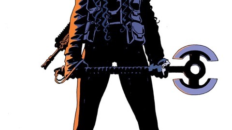
KRIS: I do have to say, I wished Andy’s axe had come back
MARCHAE: YES! She’s fierce!
theres a cover where she’s flailing that axe
She’s powerful
the look on her face
even and her posture
I LOVE THIS IMAGE
KRIS: For our readers, that variant cover is by Nicola Scott, Greg Rucka’s collaborator on Wonder Woman: Year One
Yeah even though I’ll tag this as a spoiler post I won’t include the axe sequence, everyone should have to go read the book to see it
It’s short but awesome
MARCHAE: Its so unapologetic and that makes me happy as a woman!
(re the axe photo)
but to talk about action
I really liked this and how it looked!
KRIS: so good
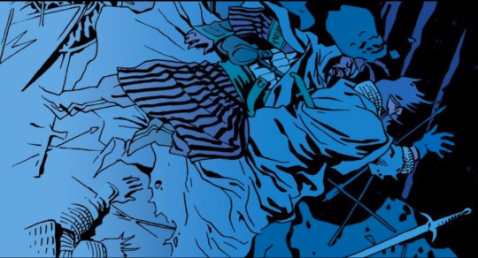
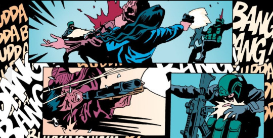
The other standout for me was the Crusade battle -- the use of silhouettes in the night scene
MARCHAE: it reminded me of the old school batman TV show but also has this frantic feel to it like if you are in the room - the images move almost
KRIS: And the use of the BANGs in the background instead of within most of the panels is really interesting
MARCHAE: OHHHHH that’s a great one too
KRIS: literal background noise
MARCHAE: it reminds me of sound
AHHHH YESSSS!!!!
visual cacaphony
which i suppose is a bizarre pairing of words but the best i could come up with
KRIS: It conveys the chaos but also leaves the actual action layouts clear
MARCHAE: nothing is left to confuse the reader - which when I was a newer reader of comics was always confusing
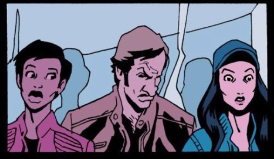
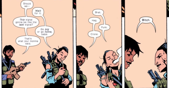
KRIS: Oh here’s that great banter scene:
MARCHAE: these comics are new user friendly
KRIS: Definitely an advantage of indie books
MARCHAE: I like that one - laughed a few time reading this book like legit noise came out which doesn’t happen terribly often
KRIS: I mean I get it, if you’re writing Big Two characters, you want to reference the stuff you grew up with, it can’t be an easy balance to make it accessible to new readers and rich for longtime readers, but still, you can’t blame people for having trouble getting into most recent Marvel or DC stuff
Yeah I guess a way to describe how humor works best for you is that in a scene like this it’s like, cathartic?
Or it’s a release valve
You like it as punctuation, not as the baseline
MARCHAE: I can read it now but I tried starting with Hellboy and was like ABSOLUTELY NOT!
KRIS: Oh that’s interesting because isn’t Hellboy indie? Was it that you jumped into a late story arc?
MARCHAE: I am not sure… if it is… All i know is that it was a challenged to follow on the page
I think I started at the beginning?
Also YES! in regards to humor!!! It’s kind of like a sigh 😊
KRIS: I only know the movies but I’d believe it’s just a weird-ass book as a first comic
MARCHAE: I do not love humor as a baseline - ever generally
LOLOl
it was not a good first jaunt I didn’t finish it and sold it back and the comic book store owner was like what do you like - we chatted and he handled me Lazarus
and I’ve been hooked on the comics since and they all have the same tone save one that I like called Alex and Ada
We’ve digressed again
KRIS: yep
I’m just grabbing a link for Alex and Ada to put into the post [see above]
MARCHAE: yeah its drastically different in tone from what I generally read - but the characters and story were pretty good!
Also an Image comic if I’m not mistaking
KRIS: Yes
MARCHAE: Yup!
KRIS: (For readers: Image is a publishing house like DC and Marvel, but all of its books are creator-owned and independent of each other, rather than company-owned characters in a shared universe)
MARCHAE: Correct! The ones I’ve read seem incredibly character driven to me and tend to be more focused on themes and ideas
What else are we missing - I feel like we’ve covered so much with this one trade!
?
KRIS: I was just gonna ask you that
We haven’t really talked about the villain but I think that’s okay
Don’t want to spoil everything
We really want you to read it yourselves, everyone!
MARCHAE: I really hope people read this one!
Along with the others we’ve recommended!
KRIS: It’s very accessible if you’re new to comics, the art is clean and you won’t have trouble following it, and Greg Rucka is arguably one of the most acclaimed writers in comics right now so I promise it’s not a risky buy
although MM did you get it from the library, you said?
MARCHAE: I did using the Hoopla App but I will probably eventually buy it for my collection (I do have a comic collection and I keep them in plastic!)
KRIS: Should we talk about the ending? I can add another FOR REAL MAJOR SPOILERS warning around here
[the VERY END is briefly discussed below]
MARCHAE: Can i just say I was absolutely sad when it ended
I was mad indeed
but yes let’s
KRIS: I really liked it
MARCHAE: I think I just wanted the book to keep going LOL
KRIS: Oh for sure
But there’s just a lot of great storytelling in those few pages
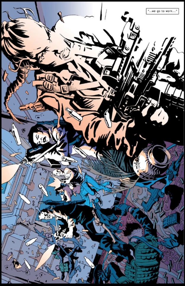
Even just that first page in Malta
MARCHAE: And it really is a hero saves the day type deal and shows Nile and Andy working collaboratively
again the art is beautiful (I just sent another image let me know if you get it)
KRIS: Just got it
Yeah it’s such a hero shot
MARCHAE: The entire team really comes together!
KRIS: And the use of light is great
MARCHAE: (sent over another one)
KRIS: Yeah I don’t think I’ll include that in the post for spoilers’ sake but it’s a great page
I think the “zoom out” makes it
MARCHAE: but even the quote at the end is amazing: “ Soldiers live and wonder why”
and it perfectly encapsulates what this story is about thematically
why do they - survivors guilt
the desire to move forward and be better
the desire to end something peacefully and in your own time
KRIS: Glen Cook is a fantasy author you might like -- maybe check out The Black Company
MARCHAE: but you do want this story to keep going and be with these characters for much longer than the trade allows
I WILL!!!
KRIS: Someone’s adapting that series for TV, I forget who but I think for one of the premium cable channels
More great body language:
MARCHAE: http://deadline.com/2017/04/eliza-dushku-star-the-black-company-series-adaptation-david-goyer-im-global-1202076367/
There are so many interpersonal nuances in this book it was fun to look at
KRIS: I like that Nico is very clearly ignoring Joe here -- no word balloons, but it’s obvious that this is heated
and classic Andy not wanting to deal
MARCHAE: he’s turned away from him entirely
KRIS: (I love that I can say “classic Andy” after just five issues)
MARCHAE: LOLOLOL
she’s so unimpressed by the entire situation
probably mentally sighing
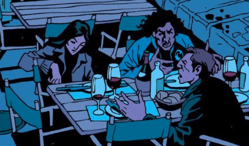
KRIS: So what do you think of the punishment?
MARCHAE: its kind of devastating I think for Booker - It also makes me curious about what time feels like for these people
KRIS: Yeah
MARCHAE: What does 100 years feel like when you’ve lived a fafillion years already
KRIS: They have no friends besides each other
You don’t even really get the sense that Booker sleeps around the way Andy does because the team is a liiiiittle bit judgey about it in #1
MARCHAE: LOL they kind of are!
and it would just be complicated - we see that with Andy and her relationship
it reminds me of the first book of a series i like called the discovery of witches
just that idea of engaging in a relationship with someone who is mortal you’re constantly reminded that you are too much - and that the person you are with will never be enough for you because they will perish
https://www.goodreads.com/book/show/8667848-a-discovery-of-witches
(the text is now being turned into a major television show)
KRIS: I really love that the last two pages have no dialogue
It’s not a long epilogue at all but it also doesn’t feel too abrupt because those last two pages are a really well done kind of fade-out
MARCHAE: it’s incredibly effective - just as much as the opening which had very little dialogue
KRIS: I mean, just to really drive this home for everyone, not that I think anyone missed this, but THE LAST LINE OF THE BOOK IS “you’re alone”
And it’s so simple, it’s not a Dramatic! scene at all, it’s so understated, and that’s why it lands so hard
Andy’s not a Dramatic! person
MARCHAE: and you absolutely know she means it and is not in any way playing with this man
KRIS: ANDY DOES NOT PLAY
MARCHAE: Almost like I’ve worked to hard to get us here - I’m disappointed and i hate to do this but it has to be done
KRIS: It’s so good
This will probably not be our last comic Reaction. Marchae really hopes you read not just this but other Rucka work. In the meantime, follow us on Twitter!
#The Old Guard#Greg Rucka#Leandro Fernandez#Opening Fire#Andromache of Scythia#reaction#comics#Image Comics#Kris#Marchae#Literally Strong Female Characters
15 notes
·
View notes
Text
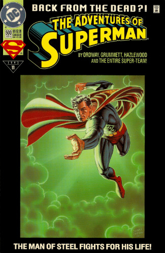
PAGE x PAGE ANALYSIS — “GANGBUSTER: SWING ANNA MISS” from THE ADVENTURES OF SUPERMAN #500 (1993)
PUBLISHED: DC Comics, June 1993
SCRIPT: Jerry Ordway
PENCILS: Tom Grummett
INKS: Doug Hazelwood
COLORS: Glenn Whitmore
LETTERS: Albert De Guzman
EDITORIAL: Mike Carlin with Jennifer Frank
A couple days ago, I took a look at a short segment of the sixty-five page ADVENTURES OF SUPERMAN #500 — specifically, the four-page introduction to Superboy by Karl Kesel and Tom Grummett. Today, I wanted to revisit a different part of that same issue: the nine total pages of subplot that focus on the nobody’s favorite hard-hitting hero of Suicide Slum: GANGBUSTER.
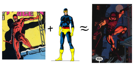
Oh, Gangbuster. While many casual comic history buffs may cite 90s comic character design trends in terms of pouches and spikes, I feel like Gangbuster represents the aesthetic of that era in an equal but opposite way. His “What if Firestorm was Robocop” look is such a prime example of what straight attempts at designing new comic book characters in the classic superhero mold looked like at the time. The shoulders. The helmet. His little logo. He’s so serious. He’s just the worst. I think I might love him.
But hey, Andrew Weiss I ain’t — far better to let you see my man Gangbuster in action and let his performance speak for itself. So let’s tuck in and take a look at his subplot in ADVENTURES OF SUPERMAN #500, which I’ve entitled, for the purposes of discussion: “GANGBUSTER: SWING ANNA MISS.”
THE ADVENTURES OF SUPERMAN #500 and all characters contained therein are property of DC Comics, reproduced here solely for educational purposes.
***
PAGE ONE
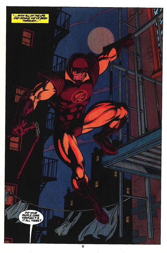
Aww, yeah. Drink him in.
Grummett and Hazelwood create a sense of distance between the buildings by showing the foregrounded building Gangbuster’s hanging off of in full detail, while the buildings in the background are rendered in black silhouette, suggesting they’re far enough apart that light affects them differently. This has the side affect of giving Gangbuster a sense of height — if the buildings behind him feel far away, we automatically assume the ground must be equally far below. This is a great hero shot, besides. From this first image, we know what kind of superhero Gangbuster is: the weapon and helmet suggest he has no powers, the collar implies he’s kind of a squarejohn. To my eyes, his design invokes two moralistic Marvel characters: Daredevil and Cyclops.
The message is clear: the Super R.A. is here to kick some ass.
PAGE TWO

Excellent establishing shot of the alleyway — going with an over the shoulder angle concretely places Gangbuster, our audience surrogate character, relative to the other characters below. When added to the previous splash page, this gives us a very strong understanding of the space: a narrow alleyway with entrances on both sides.
Note how Grummett makes panels two and three a smaller inset of panel one, giving the feeling that what we’re seeing is a detail of the larger scene. Colorist Glenn Whitmore even makes the gutters of these panels a dark red, a color we already associate with Gangbuster, further coding the scene as being observed by him, even though panels two and three are not literally from his POV. This might be reading into things too much — this color coding might just be a happy accident. Super minor continuity issue with his nunchucks: they’re dangling free on page one, but gathered into his fist here. Personally, I’d think the clinking chain connecting them would give him away. But who knows? It’s the DC Universe. Maybe they’re hard rubber instead of metal. Moving on.
Also, that guy next to the car. Keep an eye on him.
PAGES THREE AND FOUR
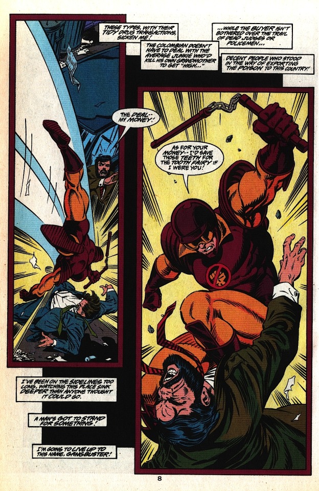

These pages work together as a sort of splash in three parts. The black field floating behind the panels on page three is a great way to add depth to the layout — Grummett employs this several times over the course of the issue, always to good effect. On the big splash page, I really like the visual representation of the whipping motion of the nunchucks; it adds force and speed to a weapon the can often look sort of ineffective on a static comic book page. The slowly increasing size of Gangbuster across both pages conveys the growing intensity and brutality of his attack on these guys. This also sets up this moment as the height of Gangbuster’s evening — we’re clearly meant to be more or less on his side right now. After all, we need a hero now more than ever. Superman’s dead.
PAGE FIVE
The first three panels on this page consist of tight action shots, limiting our ability to see our environment, so we share in Gangbuster’s surprise when we pull to a wide shot in the last panel. Dropping out the border in panel four, surrounding the figures in negative space, enhances the feeling that the cops have swarmed him from out of nowhere — although note that Grummett adds enough puddles and junk on the ground to make the figures feel like they’re standing on something solid. Lastly, making all of the figures the same cool shade effectively equalizes them; Gangbuster isn’t a superhero, he’s just some schmuck that’s about to get canned.
PAGE SIX

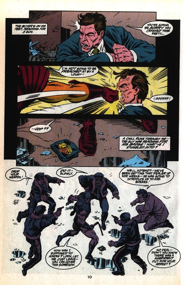
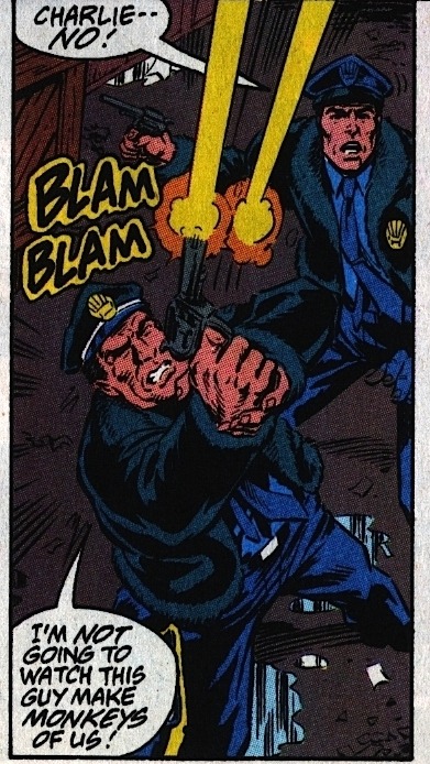
Is the cop who calls out to Gangbuster in panel four the same one who fires at him in panel five (“Charlie”)? Logistically, It would make sense — there’s no one in front of him in panel four, and Charlie in panel five is clearly in front of the “Charlie -- No!” cop in that panel (who we’ll call “Killjoy”). Character-wise, however, it would make more sense for the panel four cop to be Killjoy — he’s even holding his gun the same way in both panels.
I point this out as an example of the pitfalls of making characters in identical outfits too physically similar. If you’re drawing a group of big city cops, there’s no reason not to make them diverse in race and gender, if for no other reason than to add easy distinguishing elements between what is otherwise a totally homogenous pack of unnamed characters (although there’s plenty of other reasons why this is a good idea).

All that said, great bit of action between panels one and two. The close-up of Gangbuster grabbing the cop in panel one, a right to left motion, leads directly into the huge left to right throw in panel two. I love the anatomy in this scene — you can really feel how much effort the decidedly non-superhuman Gangbuster has to put into the throw. Once again, Grummett and Hazelwood create a feeling of space in panel two by dropping the back two cops into black silhouettes, with their badges still visible to create a feeling overwhelming, encroaching authority.
Also, considering how ineffective small arms typically are against costumed crimefighters, our boy Charlie is one crackerjack marksman. Or maybe — just maybe — Gangbuster is a goddamn terrible superhero.
PAGE SEVEN

Here is where I point out a minor flaw in this whole sequence; now that we’ve left the alleyway, we can say conclusively that the guy in the suit standing next to the car on page two never showed up again. He’s not even in the pack of cops surrounding Gangbuster on page five — we just lose track of him entirely. It’s a small thing, but since Grummett (or possibly Ordway in the scripting process) chose to include him in that establishing shot of the alleyway, it would have been nice to see him again when the Undercover Cops twist goes down. Losing him like this adds to the hash this scene makes of the work done to establish this space on the first two pages.
Couple possible fixes: One, take the guy in the suit out entirely. The initial interaction of the undercover cop and the drug dealer is framed very tightly and personally, so just have them be there (ostensibly) alone. Then pull the reveal of the undercover cop as is, and all the uniformed cops still swarm him from — the walls? I guess? They kind of come out of nowhere.
Two, and my preferred fix, would be to have a couple of guys in suits sanding by the undercover cop’s car on page two, with one distinct guy standing next to the drug dealer — a big guy in a leather jacket, something that screams “bodyguard.” On page three, Gangbuster takes out the bodyguard in panel two instead of the drug dealer. We keep Gangbuster wailing on the drug dealer on page four — that looked great. On page five, instead of just punching out that one cop, we have Gangbuster diving into the men in suits in a more “superhero takes on a bunch of thugs” type fight. Then the men in suits reveal themselves to be undercover cops, instead of the uniformed cops just appearing out of nowhere at the end of page five— something I keep bringing up because it really does bother me, since the geography of the narrow alleyway was so well established on page two, making the sudden appearance of the uniformed cops feel a little like a cheat. Wouldn’t Gangbuster have been ideally situated to see them hiding in the alley, from his vantage point on the fire escape high above? This proposed scenario cleans all that up, and loosely preserves the extant flow of action. And even though I did ramble on about this for a goodly while, it is ultimately a minor flaw. But then, that’s the thing about minor flaws; there’s usually a pretty easy fix.
Meanwhile, this page: Really strong lettering from Albert De Guzman at play here. Look how he guides our eye down the page, helping Grummett’s already clear line of motion by creating an arrow of words pointing right to Hob’s Bay.

Grummet consistently makes Gangbuster small (I.E. less powerful) on this page, a clear contrast to how huge he was during the opening pages. Here he’s dwarfed by everything on the roof, from vent pipes to chimneys, culminating in the huge cop’s hand + gun in panel four. I personally would’ve liked to have shown a little more of the cop’s arm, enough to see an official insignia up on his shoulder, but we’ve already established that the cops’ jackets have furry cuffs, so it works fine enough as is.
PAGE EIGHT
There’s been no shortage of great layouts in this issue, but this page is a cut above. The narrow verticality of that first panel bleakly lays out the stakes at play; the cop on the roof, the three story jump, the bay below. Grummett and Hazelwood use the fog off the bay to drop the buildings beyond into the deep background, visually “clearing the path” to the bay.
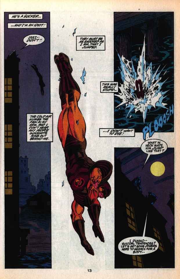
The second panel eliminates everything but this huge full-figure shot of Gangbuster diving, with a couple scraps of lead paint from the roof to place him in space. We can’t see his expression, but his captioned dialogue is tremendously affecting. Note also how while Gangbuster is diving towards the bottom on the page, the lettering still leads us organically to his plunge into the bay in panel three, even though that panel is layout-wise much higher on the page.
Nice reverse shot in that last panel, reminding us how far Gangbuster has just jumped and adding tension to the idea that he might not have survived. The last line is continued in a caption on the following page: “…No way anyone could’ve survived THAT!”
Another note about the last couple pages: Grummett always has Gangbuster moving in the same direction, left to right, throughout the entire rooftop chase. For this reason, the bullet Gangbuster catches is in his right arm — the arm that’s always facing us.
Oh man! It could’ve been a cool visual dichotomy, if we had seen the official insignia on the sleeve of the cop pointing the gun at him at the end of page seven! The officer of the law has a symbol of his authority where the vigilante has a bullet wound! Ahh, well. Still a phenomenal page.
PAGE NINE

We come back to this subplot after about twenty pages with a nice, low-energy establishing shot of the docks. The wafting, flapping paper is a great way to suggest windchill and urban decay. The bay is to the left of the page — when last we saw Gangbuster, he was making a rightward dive into the bay. On a storytelling level, we’re on “the other side” of the bay. Gangbuster got away clean.
High-Pockets is immediately helpful here, despite having a crummy night. No deep analysis to be had here, I just like it. Good little character trait for a good little character. As he hauls Gangbuster out of the drink, we see he’s transferred his wine to the pocket of his coat, which he then gives to Gangbuster. High-Pockets doesn’t offer him his hooch, mind you — Gangbuster just straight jukes it. We end on a nice reverse silhouette as High-Pockets and the slumped, defeated Gangbuster lope off into the shadowed, Superman-less city of Metropolis. Gangbuster’s last line concludes in caption on the next page: “…Then I’ll be finished with this stinking place!” Our hero, kids.
Again, this is one of the first comics I even read. When I think about it, Gangbuster has to have been one of the first, say, fifteen superheroes I was ever aware of. Before Green Arrow or Daredevil or The Question or Black Canary, I knew about Gangbuster — a character who, as depicted here, just isn’t really cut out to be a superhero. He’s a washout, a bencher, a big ol’ can of coulda beans. He’d be one of the hockey pad Batmen from The Dark Knight, only they wouldn’t let him join because he’s just such a giant prick. He’s awesome. Gangbuster, man! Gangbuster.
***
You can buy the full 65-page issue of THE ADVENTURES OF SUPERMAN #500 for the surprisingly low price of $1.99 off Comixology! It’s absolutely worth the read, containing a truly emotional Pa Kent story as well as the introduction of Cyborg Superman, which is, if nothing else, exceptionally well-paced.
Meanwhile -- we’re in the final days of the Kickstarter for SECTION ZERO!

Tom Grummett reunites with writer Karl Kesel to bring back the high quality old school team-based adventure comic — one of the few types of fiction that genuinely does work better in the medium of comics than it does anywhere else, and these guys are high in the top list of creators who can pull it off. If these awesome Gangbuster pages above did anything for you, SECTION ZERO is totally on your frequency.
If you want to read some preview pages and learn more about the project, I highly encourage everybody to check out the SECTION ZERO Kickstarter — it’s entering its last week and I very much want to see this book on my shelf.
***
As always, feel free to check me on any mistakes I might have made, add your own commentary, or share similar examples of good comics done well. I’ll be back next week with a different comic to peruse.
Be well!
PREVIOUS PAGE x PAGE ANALYSES:
MINI-ANALYSIS — FIRST SIGHTING: SUPERBOY
ULTIMATE SPIDER-MAN #69 (with Aud Koch)
THE SHADOW STRIKES! #13
PETER PARKER: SPIDER-MAN #13
BATMAN: GOTHAM ADVENTURES #17
#Gangbuster#Page x Page Analysis#comics#educational purposes#Superman#DC Comics#Tom Grummett#jerry ordway
5 notes
·
View notes
Text
Web design layouts from beginning
Web design layouts from beginning
When you approach a new website design, what is the best way to solve the layout and deliver winning content? Shares Elliott Jay shares his best advice on web design
Ah, white cloth: maybe my part of the preferred design process. What I like about it - it's a lot of opportunities to offer: to create freedom of action, not tied to the constraints that play its role on the line. anything could happen!
At this stage, there are several ways. Some people like to jump right into Photoshop (or some life-size model tool of choice), but personally, I try to stay "analogue" for a while and work with a good pen and paper.
These tools are much more free to use than the mouse and computer screen. They allow us to throw ideas as soon as they come in our heads, to be expressive as, certainly not interested in things like accuracy, which - at this stage at least - just get creative. If you have not worked, try: very obvious.
To bypass your comfort zone, try to make their designs in a completely different environment, where you can make ready-made projects. If you do not use a computer, you can travel light and do not worry about things like electricity, and use it as an excuse to go outside. If on a sunny day, get a patch of grass. If there is rain, enjoy the hustle and bustle of the local cafe.
The sketchpad
My weapon of choice at this point - this is my rugged A5 plate, which is small enough to carry easily, but large enough to fit in a lot of ideas. I prefer to be empty, because it feels "the most free." Many designers support Moleskine. Later, when you're preparing to assemble their own graphics (indecently obviously continue along the chaotic disorder path), using a square grid of paper can be a great way to handle your network structure, but more so in an instant.
Best Website Design: Carsonified Cartoon Events
Drawing sites developed by others and can be a great way to rethink your approach to the model (here is my sketch of Carsonified Mike Cos)
If the sketch is for you a new concept, you do not know the best way to approach it, try this process. Look at your current location - ideally, one created by a designer that you admire - and recreate it as an approximate drawing in your palette. First, they will help you become familiar with the relationship between drawing and the final product. Second, long pages with lots of content, this will help to illustrate how right the page is connected - that is, the total height of any page, not just the bits that we see in a limited browser window.
Drawing - A convenient way to come up with ideas and refine their plans before you go to Photoshop, so you can quickly sort out good ideas from the bad, without wasting time planning the actual application. However, it makes no sense to redraw the graphics too much, because the detailed design is the most suitable for the environment which will never be tested: screen. Personally, I would write in my pad, so I'm frustrated that I did develop technical capabilities in Photoshop. At this stage, it is time to start locking elements with skeletons.
Wireframes and grids
Frames can mean different things for different people and even vary from project to project. Some designers or clients, such as skeletons, have been carefully deconstructed and determine the exact proportions of the network that will eventually follow the site. Others see them as nothing more than "elegant" copies of the finest graphics. In fact, there are no solid and fast rules of life, only to say that wireframing should let you see how the site will be positioned before any of what I call "good things" will be added from the top. As I mentioned in the last issue of the article about working as a single web designer, this is why it is a good idea to highlight skeletal and aesthetic design stages: although they are part of what you might call the "design phase", focus customer attention on different aspects, One at a time. Very easily, you can say that skeletons allow them to think about planning in terms of interaction, and aesthetics allows them to focus exclusively on a dynamic experience.
Best Web Design: Alternative Networks from Andy Clark
Experiments Andy Clark with alternative networks are legendary. Here presents a poem in the traditional book version
If you decide to select your exact network during the frame phase or later, when approaching the "correct" design, this is an important decision. The popular network is the 960 Grid System, which can be viewed - with a width of 960 pixels - in many different internal displays, for example 16 or 12 columns broadly unified with gutters. However, it does not really matter which network you use, whether it's your own or those created by others, because they should be very appropriate for the appropriate content, and provide you (the designer) and other users (associated site) that allows you to arrange various elements of the page aesthetically . This is due to the fact that you are viewing various pages of the site, allowing you to create visual consistency. "For large sites with lots of dynamic content, we're developing a system rather than a page," says designer Andy Clark in his presentation, Walls Come Tumbling Down. (Andy is also a great fan of creating his own web networks, dictated by the content of the site.
To learn more about web-based theory and how the principles of the art world can help choose our layout - for example, use the rule of the third or the golden ratio to determine your relative presentation - see Mark Bolton's book "Practical Guide to Web Design" or my last book, Sexy Web Design.
Thus, with the help of our guiding drawings on our frameworks and framework, which helps to control the network on which we will build the actual design, it is time to move to the most urgent part of the project and start transforming our ideas into something like an -site network.
My favorite tool for this task (and frame stage) is Photoshop, which, although not ideal, is a powerful program that allows me to visualize as quickly as possible what is in my head, at least in the first part design stage. Others prefer fireworks, created for a specific design task of the Internet. But again, the tool is not important: that's what you do with it, what matters!
Designing in the browser
Over time, I find more and more that there is actually one tool to do all the functions that I need, and I am increasingly turning to the browser and treating it as a development tool in itself.
One easy-to-use reason makes the design in the browser very logical: the site will be displayed after completion. There are many other reasons, but for me the printing house is one of the biggest - I still have to find an application that can accurately simulate the browser view, and since the text is displayed differently in different browsers and on different operating systems, right right".
The flexible display, for example, on Clearleft.com, is difficult to represent in Photoshop's static layouts - an excellent reason for the development of a browser
Design in the browser is also a great saving time. Changing the line or two of CSS to affect something such as column width or row height in the entire test site may be much faster than making the same changes to the format where the change must be made for multiple elements - export and so on. It also means testing to see what works, and what can not be done in seconds. Consider a 20-page site
Layout constants
I'm a fan of creating websites that violate the agreement, and do something more interesting than all other versions. However, innovation is only effective when it is balanced with compliance, let's face it, sometimes we just have to match it! There are some elements in web design that appear again and again, and why not? Take a humble title: It's hard to find a site that you do not own. But the clearly defined address adds some branding and consistency to the entire site, and when it contains navigation, it gives users a secure base they can go back to and find their way. Headlines do not have to be at the top of the page: I think they're more focused. Take balhar.com, for example: "header" is actually a bar that is vertically centered in the middle of the screen.
The blog of Jason Santa Maria published the idea of directing art to online designs
At present, huge appendices look crazy. If you're thinking of a common side panel is a regular post often found in a blog, there is a lot of information, which lies along the actual content (which is usually the last blog). The problem is that the sidebar often contains elements that are not necessarily related to the message itself: think of the search window, general lists of categories, recent statements links to other reports, etc. D. Why mess up your page with these things that detract from the main article. ? Of course, there are compelling reasons to take care of these elements, but we often throw them out without thinking. Not so with a large footer: a way to represent a large number of different information (eg, blogs, links to social networks and your daily link), without interrupting the flow of the main article read.
Art direction
If the web design is one of the areas I see now, the concept of art direction is introduced so that we approach the model: something, until recently, unfortunately, absent in the world on the Internet. A popular approach by Jason Santa Maria for his blog entry, mantle is now chosen by a number of designers who wish to deal with blog posts with the volume of services normally allocated to items in a magazine currently. The main thing is that each job has a unique design or diversity in the "basic" design and, therefore, is a unique experience in itself. Instead of succumbing to hardness of molds (something we all are guilty of), each article is developed according to its content. Dustin Curtis is an excellent example: in addition to the navigation bar and footer, each individual page looks completely different. Greg Wood's site is another example in the same context with fewer constants. Each article has an excellent personality and looks very beautiful.
There is no doubt that art that manages each page individually can not be applied to all websites. In fact, if we are honest, the number of sites that will be suitable for this approach is relatively small. But this shows that the online model is finally growing, and we are beginning to see that print design has been used for years. So if it just serves to give a subtle effect to other sites where the entire router is inappropriate, it is undoubtedly a great thing, and a sign that web designers are no longer afraid to do what they do best - design!
from Blogger https://ift.tt/2KcEbwf
via IFTTT
0 notes
Text
INTERVIEW: P. Craig Russell Brings Neil Gaiman’s American Gods to Comic Books
P. Craig Russell and Neil Gaiman have a shared history of making fantasy. Their working relationship dates back to “Sandman” #24 (where Russell inked Kelley Jones) and includes the legendary 50th issue of “Sandman,” “Endless Nights,” “Dream Hunters,” and many adaptations of Gaiman’s prose stories, including “Coraline” and “The Graveyard Book.” Russell’s lyrical layouts bring Gaiman’s visual, vivid prose to life like no other artist.
Russell and Gaiman are working together again, this time to bring the Hugo and Nebula-winning novel “American Gods” to the comic book medium. This time, Russell handles scripting and layouts, while artist Scott Hampton (whose own history with Gaiman goes back to “The Books of Magic”) provides the heavy-lifting illustration.
RELATED: “American Gods”: Meet Neil Gaiman’s Deities Before You Watch Them on TV
This March, “American Gods: Shadows” #1 from Dark Horse Comics starts Russell and Hampton’s journey in Gaiman’s world. Russell carved out some time from a very busy schedule to answer some questions for CBR News, on what impact the upcoming “American Gods” television series (debuting in April on Starz) had on the adaptation, Russell’s thoughts on making the unspeakable speakable, and which sequence he wanted to take a crack at drawing himself.
CBR: You’ve worked on several Gaiman adaptations. What drew you to “American Gods” this time? Did the upcoming TV series play into the decision at all?
P. Craig Russell: I’ve been working with Neil for 25 years and my attraction to that partnership has always been the quality of his writing. The unique challenge of “American Gods” was the sheer size and scope of the project. 598 pages of script and layout is a major piece of work. I know that a TV series will bring a whole other dimension of attention to the project, but it had no bearing on my decision to be a part of it. Just being Neil’s novel was enough. Also, I can’t even look at the TV series until I finish my adaptation. I can’t risk the cross-pollination. It was the same situation when I did “Coraline” and there was a competing animated film in progress at the same time. I do look forward to binge watching it once I’m finished.
Do you have a favorite character to bring to life in comics?
The three Eastern (or were they Central?) European “Yaya” sisters were great fun to work with.
“American Gods: Shadows” #1 variant cover by David Mack.
Were there any new or unexpected challenges this time around?
The first story arc of nine issues comprises about 200 pages of Neil’s novel, which means there is approximately one page of prose to one page of graphic novel, and Neil can get a lot into one page. So there is a lot of serious paring down, more than will be in the next two story arcs. There are times when whole scenes are pared down into two or three wordless panels. If done right the reader should have no sense that anything is missing.
One of the wrinkles to adapting prose is how much of the internal narration to keep — Neil’s a very visual writer and his prose very distinct and conversational. Is ever it tricky to find the balance in how much to show versus how much to tell?
My first impulse is to put in as much as I can and I do. But then I let that simmer on its own for a while and come back to it fresh. That’s when it becomes obvious, looking at it on the art page as separate from the novel, what more can be pared down. It is tricky to find that balance. Sometimes a scene can be done entirely with pictures and no prose at all. Other times you can do that and it works as a story but curiously feels as if you’re watching TV with the sound turned off. That’s when you go back and add in the writing. It’s very subjective but with experience you get a feel for what works.
How much of the language comes directly from the text? And obviously you’ve established a level of trust in your handling of his stories, but how involved is Neil with a project like this?
The language comes directly from the text, at least that which survives the paring down. Descriptive prose is usually the first to go because the picture of a location is doing that already. Where I might have to do some original writing is where a scene has been condensed to the point where existing prose no longer flows seamlessly. My contribution there to Neil’s voice is pretty much limited to two or three word sentences, just enough to sew up the seams.
Neil’s involvement is that he gets back to me whenever I have a question on the text or where I need to know if my trimming an event isn’t going to impact the story later on. I should know these things but it’s hard to keep all the events of a 500+ page novel in your head. The author is better at that than I am.
“American Gods: Shadows” #1 variant cover by Dave McKean
Although you gain a very powerful visual impact by putting a story like this in comics, you’re also surrendering some visual mystery. I think, for example, of Silas in “The Graveyard Book,” who is never explicitly said to be a vampire but is clearly drawn as one. Here, that visual reveal is not as apparent, but the various deities have physical traits that are more apparent illustrated than in prose. Did you have any concerns about character designs or visuals giving away some of the mystique?
It’s true that an author can evoke an image in the reader’s mind that may be spookier or lovelier or more transcendent than reality. When you attempt to draw the ‘unspeakable’ in the Lovecraftian sense you’ve made it ‘speakable’. Nevertheless, we try. In “The Graveyard Book,” Neil described the unseen Sleer in the pitch black pit as the sound of dry rustling leaves. First off, we can’t draw it as pitch black or we’d have nothing but pages of solid black panels, as tempting as that might be to an overworked artist. So we work with the colorist to come up with a color palette that evokes darkness while still showing our characters. With the Sleer I drew in abstract swirling shapes that felt like rustling leaves and incorporated the Sleer’s speech into those shapes, as part of the shapes so that the lettering is in the art as opposed to outside it in word balloons which would have looked ridiculous.
Scott Hampton is handling the artwork from your layouts. How has that collaboration gone? Did you both work on the designs?
Scott is doing the character design. There are times where my layout indicates what the direction of a character’s design might be but that’s about it.
“American Gods: Shadows” main cover by Glenn Fabry.
You provided full line art for a side-story in the first issue. Why did you take that piece for yourself?
I thought that short story was so gloriously outrageous in its action and would be such a challenge to illustrate without an X-rating being slapped on it that I wanted to have a go at it. I even thought about asking Tim Vigil to illustrate it but then I’m sure we would have earned our ‘X’. A man being swallowed whole by a giant vulva is a visually tricky business.
Do you have anything else in the works that fans should watch for?
I’m within a few months of completing a 178-page adaptation of Lois Lowry’s “The Giver.” Coincidentally, Scott Hampton is illustrating about 20 pages worth of ‘memory’ sequences in that novel. I wanted those memories to have a visual look separate from the rest of the book. And of course, there’s my final fairy tale from Oscar Wilde that I should be able to get to next year. I’ve been waiting to get to that for a long time.
“American Gods: Shadows” #1 is scheduled for release on March 15 from Dark Horse Comics.
The post INTERVIEW: P. Craig Russell Brings Neil Gaiman’s American Gods to Comic Books appeared first on CBR.com.
http://ift.tt/2jmknbq
0 notes
Last Seen Blogs

vartha24-blog
vartha24

human-rocket
🚀hello there🚀

parkmi
𝐁𝐋𝐀𝐂𝐊𝑆𝑊𝐴𝑁*
writerfreak001
WriterFreak001

tht0nesimp
Yandere HxH personal bitch