#Aeonik Pro
Text

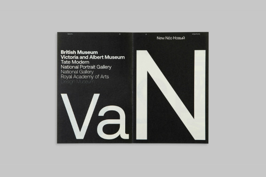
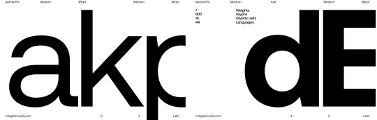
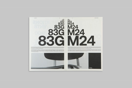
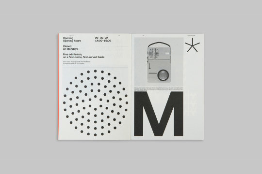
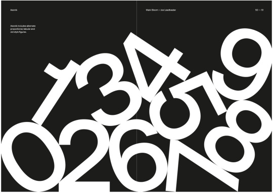
Semiotik Design Agency (SDA) / CoType Foundry / Aeonik Pro / Specimen / 2020
Download
#semiotik design agency#sda#cotype foundry#aeonik pro#specimen#2020#printed matter#shopsystem#spread#typeface#typography
65 notes
·
View notes
Photo

https://forthandback.la/
#Forth + Black#design#studio#Los Angeles#shop#portfolio#typography#type#typeface#font#Aeonik Pro#2023#Week 12#website#web design#inspire#inspiration#happywebdesign
7 notes
·
View notes
Text
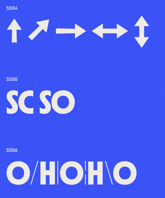
Type Specimen Example
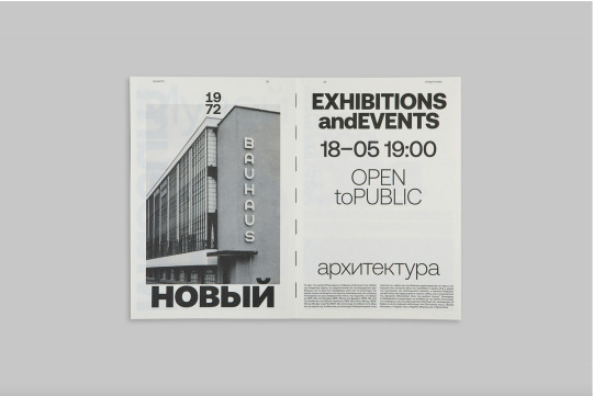
Here is an example of a type specimen design using the font Aeonik Pro
It is a very clean and makes good use of scaling and negative space. It has done a good job featuring the typeface and its range of styles and weights. I hope to use this as inspiration when designing my type specimen book.


By Mash Creative & Semiotik Design
Captured from: https://www.behance.net/gallery/101491107/Aeonik-Pro?tracking_source=search_projects%7Ctype%20specimen
5 notes
·
View notes
Text
Type specimen book research
These are a few type websites I came across last week, essentially digital type specimens.
This one is for a very simple sans serif typeface Aeonik Pro. I like the way they have used large type in their book as well as the enlarged glyph-like graphs. It really emphasises the detail of the character and its form; this would be really good for highlighting the details. Their use of one stand out colour in their design is also quite striking (I get now why David mentioned that keeping colour to a minimum makes it the most effective).
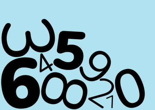
Something else that I quite like, for its display purpose, is the 'homepage' graphic seen above where the lines of type include a range of upper and lowercase letters and numbers, glyphs, and sub/superscripts. I think that could be a interesting technique to use.

Another website I found was https://typespecimens.xyz the website domain alone I quite like (I've never seen .xyz before) :). I found two type specimens from there.
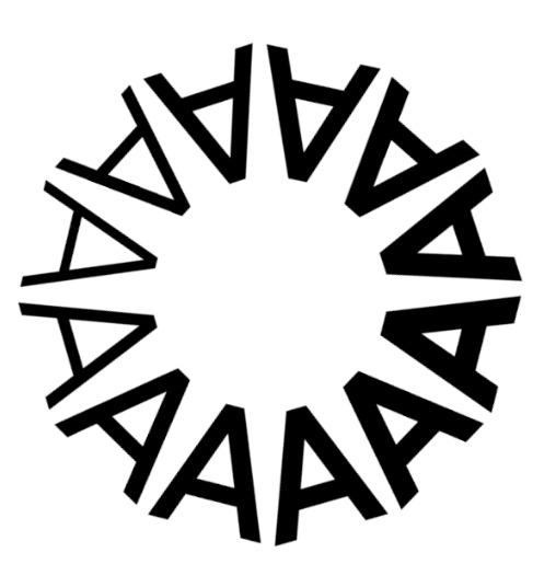
Allianz [below] > I like the dynamic range of type displayed on this one. It is animated (though some ideas I could build on for our later assessment). Elements I really like [1] character set grid [2] using font in shape/creating image [3] use of glyphs to make interesting shapes.


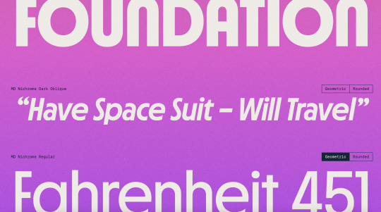
MD Nichrome [above] > I found this one a much more graphic/colour involved type specimen. Some elements that I like from it [1] The proportion/x-height/weighting/spacing graphics image 2 (they are moving but I like the format as a still image with the lines and gradients) they also showed the subtle ink traps in the type between weights for legibility as well as stylistic alternative [2] the open type section with combinations of letters, characters and glyphs etc. [3] the showcasing of each glyph in the character set against the cap height, x-height, and baseline lines.


Another website for later reference https://contrastfoundry.com
0 notes
Text
TYPE SPECIMEN BOOK RESEARCH
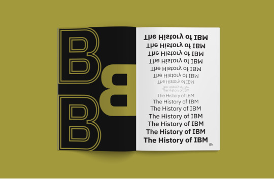
IBM Plex Sans Typeface Specimen
I was happy to find a book specific to the typeface I'm using. It focuses on IBM Plex Sans and has some really great layouts and colour.
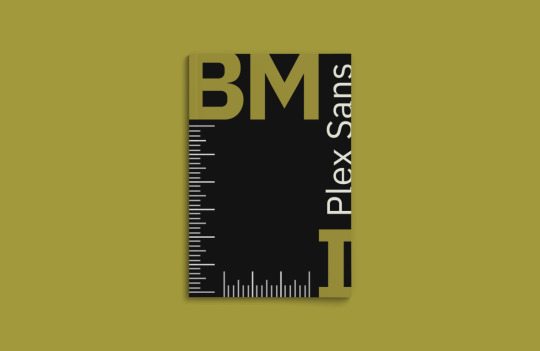
The cover of this book uses an interesting layout. I like how the letters in ‘IBM’ have been asymmetrically placed and the ‘Plex Sans’ fits nicely in-between.
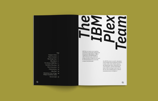
There is a lot of Swiss elements throughout this book which I think works great with this typeface as it’s a sans serif. The text at the top of the right page has a nice angle and balances out the body text nicely as a spread.
The left page here features only 3 letters but is still impactful with the experimentation of colour and line. The right page has a nice waterfall effect and I really like how the top half has been rotated to create a mirrored style.
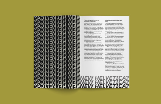
Although seperate pages, the text from the left page looks to be entering the right page at the bottom. This shortens the right page and almost acts like a border. I think the way in which it has created a new form is really clever.
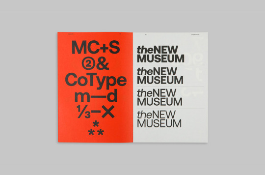
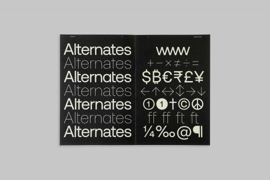
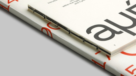
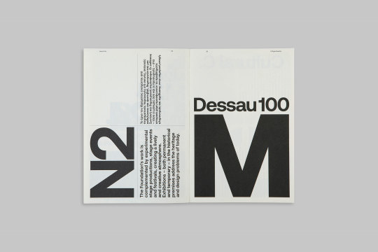
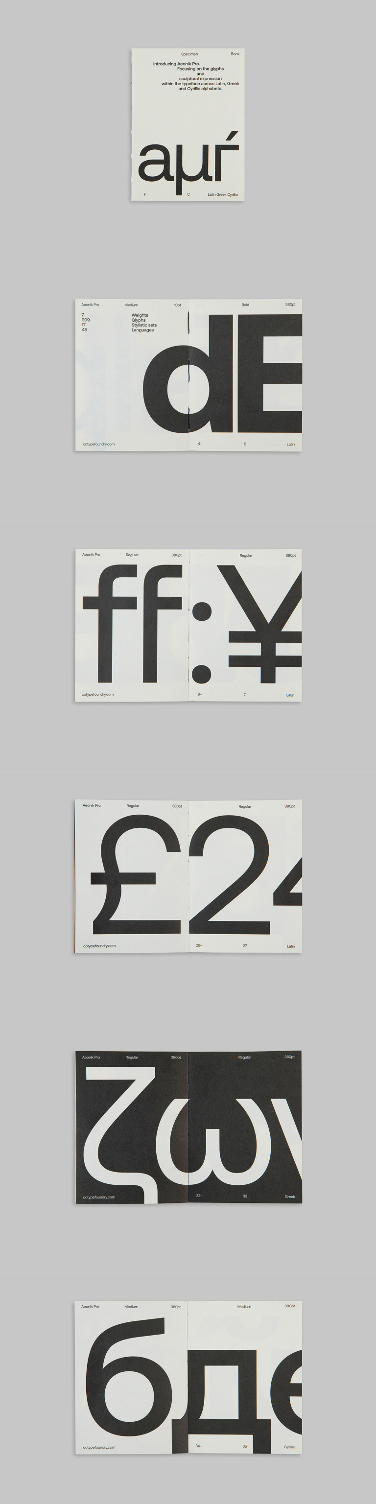
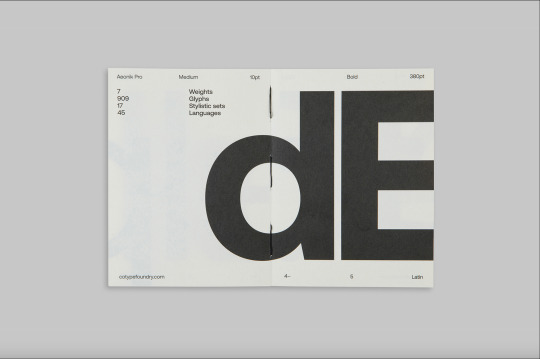
Aeonik Pro
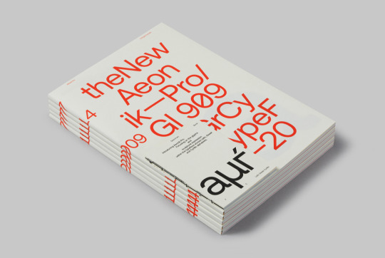
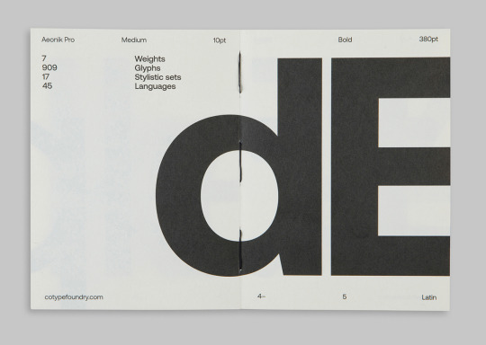
The cover of this book is super playful, featuring letters, numbers and glyphs and even has a smaller version (black and white) which focuses on the glyphs and “sculptural expression within the typeface across Latin, Greek and Cyrillic alphabets”. I like how the type moves down the spine when stacked like this.

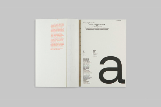
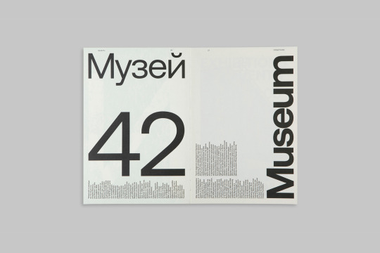
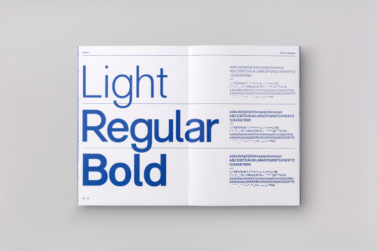
This spread has a really nice balance between colour and point size. As an intoduction/beginning page I think using the ‘a’ is a nice way to signal that.
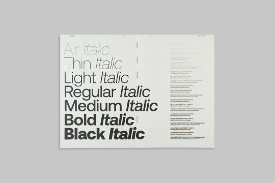
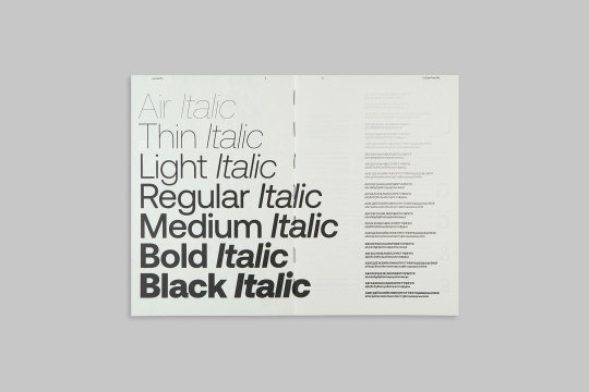
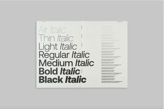
The way this design has utilised both regular and italic fonts in individual lines is really clever and the reader is able to further understand how each one operates through a small paragraph aligned to each. I definitely want to try create something similar to this in my book.
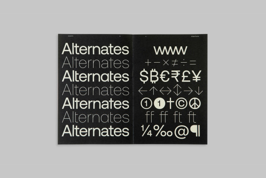
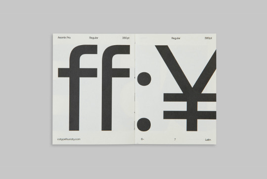
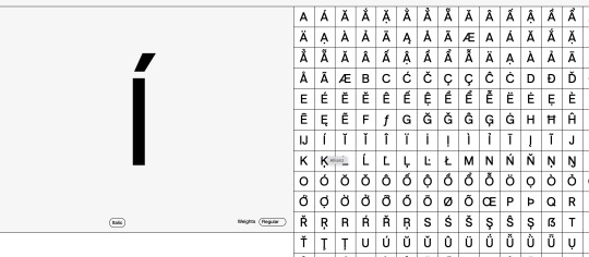
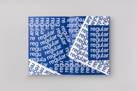
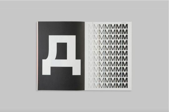
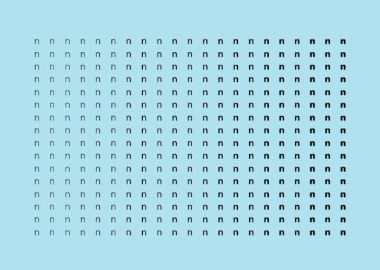
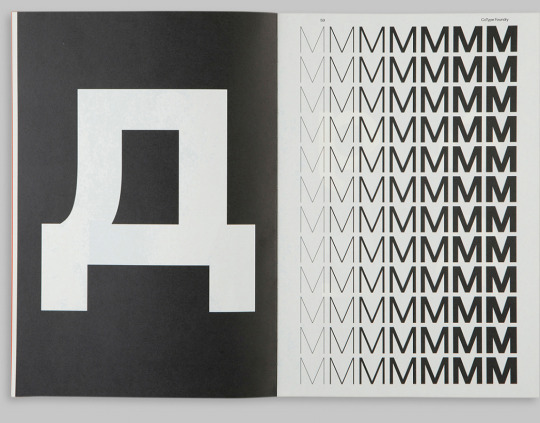
A nice break from the black text on a white page and an interesting way of representing glyphs. It’s very tidy and I think something I will consider when exploring the IBM Plex glyphs is the placement and how each one works with each other to create an interesting visual.
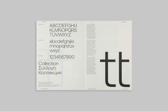
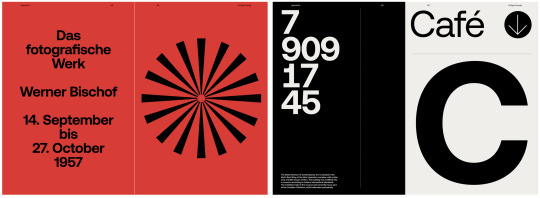
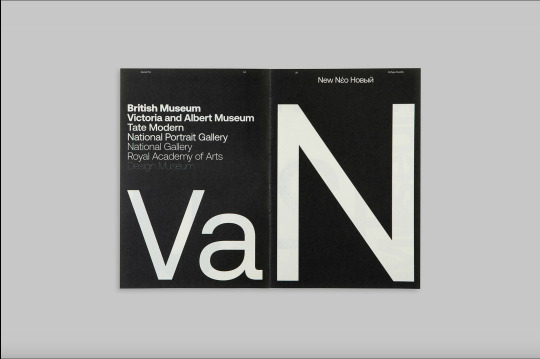
This is probably my favourite spread in this book. The balance between the large text and body text is sharp and clean. By rotating text 90 degrees it creates a second layout and the variation in styles is another great element to this spread.
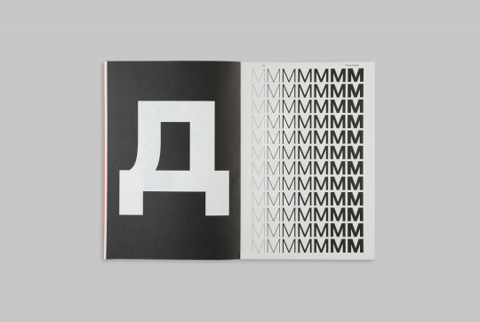
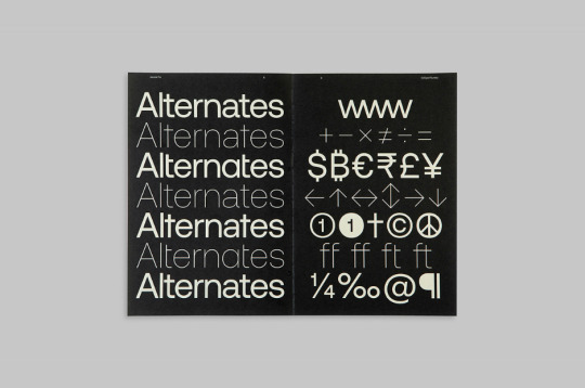
This spread is another big inspiration for the direction I want to go in. I like how there is a colour inversion between the pages and the gradient style on the right page sits nicely against the bold glyph on the left.
RM Pro Font
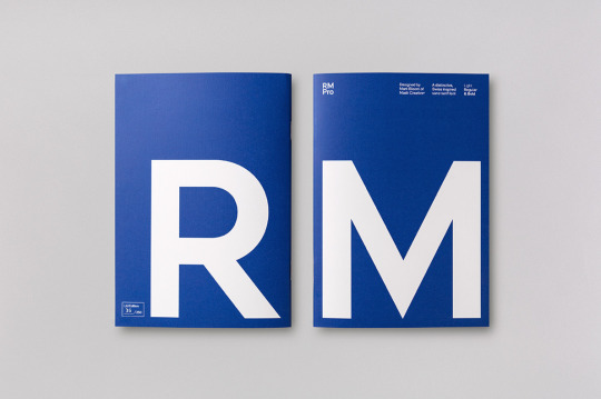
Because the name of this typeface is simply ‘RM’ I think it was a good choice to present the front and back covers of the book in this way. I will also be using blue and white for my typeface specimen book so it’s really nice to see these colours presented in a similar format.
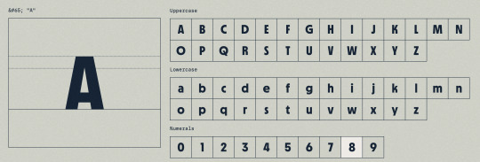
This spread is very similar to a lot of other work I’ve seen but that’s probably because it’s just a really effective way of presenting the different weights in a typeface. I like how this one in particular uses both the alphabet and glyph forms as body text instead of just a paragraph or excerpt from something.
A really nice layout to display a single font. The placement of colour is well and angles is well thought out and I think overall this spread has a nice rhythm to it.
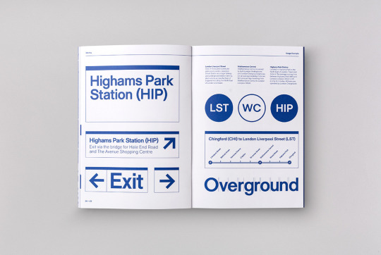
Type presented in a park subway system signage which immediately made me think of the work of Massimo Vignelli. This is something I haven’t seen a lot of in my type specimen research and I think it’s a great way of emphasising a typeface’s features and legibility.

Another great way of displaying the alphabet and glyph forms in a this typeface. There is almost a flush-left, ragged-right style due to the top and bottom lines falling short however it still has a nice balance. Again, the placement of each glyph is well thought out so that each one works in harmony to create an effective visual layout.
0 notes
Text
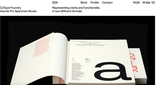
Specimen Booklet Research + Images
I've researched different sorts of specimen booklets to understanding ways in how they display typefaces - to convey the meaning and showing what makes this typeface unique.
In ways, this will help to set the basis in regards to how I would like to convey my typeface and its background behind it.
Aeonik Pro
"As a result, Aeonik Pro is now sharper, tighter, and more versatile than ever... The A6 sized booklet focuses on the glyphs and sculptural expression within Aeonik Pro, whereas the A4 booklet showcases the possibilities and visual expression of this extensive typeface."
Simple, yet effective way to show contrast that focuses the differences in regards to weight, layout of text etc.
https://www.behance.net/gallery/101491107/Aeonik-Pro
0 notes
Photo
Semiotik Design Agency (SDA) / CoType Foundry / Aeonik Pro /... https://ift.tt/339aqFT -> Telegram Design Bot
29 notes
·
View notes
Photo


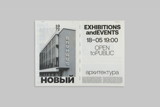
https://www.behance.net/gallery/101491107/Aeonik-Pro
20 notes
·
View notes

Photo
Aeonik Pro Font Family from CoType Foundry
See more here.
Follow WE AND THE COLOR on:
Facebook I Twitter I Pinterest I YouTube I Instagram
8 notes
·
View notes
Photo
Semiotik Design Agency (SDA) / CoType Foundry / Aeonik Pro / Specimen / 2020
Download
#semiotik design agency#sda#cotype foundry#aeonik pro#specimen#2020#printed matter#shopsystem#spread#typeface#typography
36 notes
·
View notes
Photo
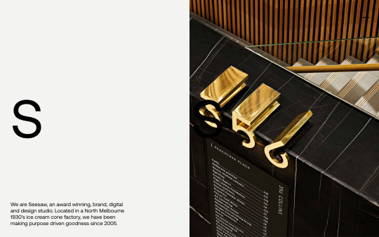
https://seesawstudio.com.au/
#Seesaw#design#studio#Melbourne#Australia#portfolio#typography#type#typeface#font#Aeonik Pro#2023#Week 14#website#web design#inspire#inspiration#happywebdesign
6 notes
·
View notes
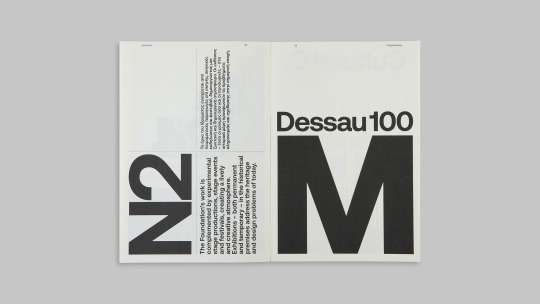
Photo
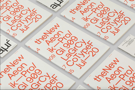


week three - monday
type specimen research part three
these were type specimens I found that I really liked and thought was similar to Zilla Slab.
Aeonik Pro Type Specimen by Mash Creative & Semiotik Design
all from Behance
26.07.2021
0 notes
Text
References
Here are some references I’ve done in my work. Some are more straight forward than others, but to be safe I’ll include them all.
This was a reference to one of the spreads in the Aeonik type specimen.
This was a reference to a spreads in the Ambit type specimen
This was a reference to one of the spreads in Aeonik Pro
0 notes
Text
References
Burton Booz. (2017, January 12). Gotham Type Specimen. Behance.
https://www.behance.net/gallery/47318867/Gotham-Type-Specimen
Conner Nielander. (2015, December 19). Gotham Type Specimen. Behance.
https://www.behance.net/gallery/32224139/Gotham-Type-Specimen
Christian Robertson. (n.d.). Chrstian Robertson.
http://christianrobertson.com
Font Squirrel. (n.d.). Roboto.
https://www.fontsquirrel.com/fonts/roboto
Figma. (n.d.). Roboto Font Pairings.
https://www.figma.com/google-fonts/roboto-font-pairings/
Graphic Assets & Top Elements. (2019, July 29). Dreamer Photograph Magazine. Behance.
https://www.behance.net/gallery/83474637/DREAMER-Photograph-Magazine
Google Fonts. (n.d.). Roboto.
https://fonts.google.com/specimen/Roboto#glyphs
Jessy Thevenin. (2021, February 18). TYPEFACE | TYPE REGULAR.GAMMA. Behance.
https://www.behance.net/gallery/113032017/TYPEFACE-TYPE-REGULARGAMMA
Luc Devroye. (2021, August 8). Betatype.
http://luc.devroye.org/fonts-23924.html
Mash Creative & Semiotik Design. (2020, July 29). Aeonik Pro. Behance.
https://www.behance.net/gallery/101491107/Aeonik-Pro
The Designers Foundry. (2017, January 19). Modern Typeface and Specimen. Behance.
https://www.behance.net/gallery/47632005/Morion-Typeface-Specimen
Xuanyi Lin. (2018, September 5). Gill Sans Typeface Specimen Book. Behance.
https://www.behance.net/gallery/69843053/Gill-Sans-Typeface-Specimen-Book
0 notes
Photo
I think this was a really cool way to introduce a font to the book by Mesh Creative on Behance
https://www.behance.net/gallery/101491107/Aeonik-Pro?tracking_source=search_projects_recommended%7Ctype%20specimen%20booklet
0 notes
Last Seen Blogs

creepypastabookclub
New episodes every other Friday

sylkius
SYLKIUS

inhumanshape
i'm your boogeyman

tunestree
TunesTree

totallycorrectdannyphantomquotes
I'm going to become ghostly!