#SpecialistPractice
Text
Presentation Layout
To help plan what we will need to create for our game we decided to start creating a lose plan for our presentation. To see how this would need to be laid out, I suggested we looked art past D&AD winners to see what worked well. I felt this helped us because it allowed us to see how we can create concept throughout the presentation, by including our visuals alongside the information consistently. The order we decided to use was:
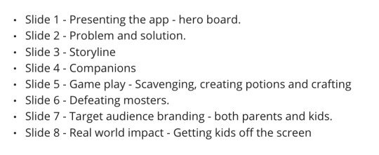
I like how this order makes the app easy to understand without overwhelming the audience with too much information. It introduces the user to the components as they would be revealed during game play.
This allowed us to see what visuals we need to focus on creating to make our presentation successful. This allowed us to separate tasks and split them between everyone in the group, allowing us to work independently when needed.
2 notes
·
View notes
Photo

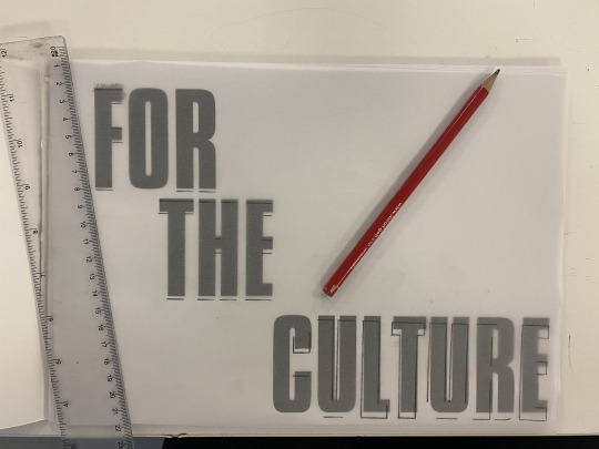
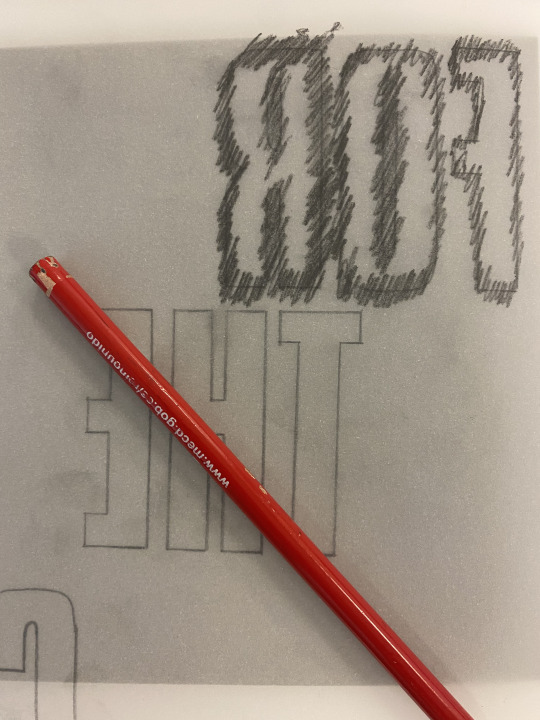

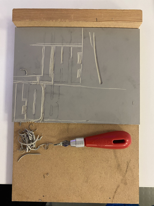
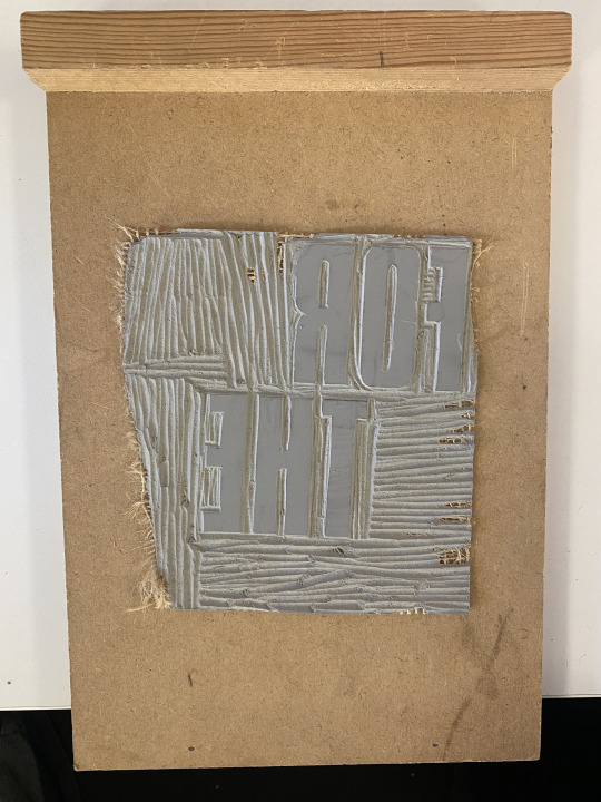

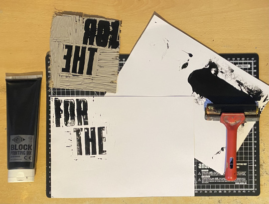

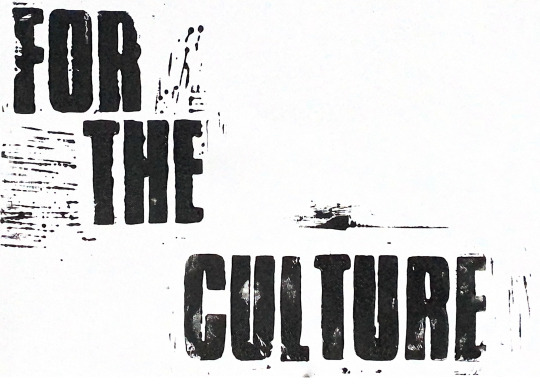
Experimenting with Linocut Printing - ISTD Project
Here I have carved the title of my final outcome ‘For The Culture’ using a rubber surface so that it can be printed. I thought the aesthetic of a hand-made font would bring a personable aesthetic towards the subject matter. The process of making these prints was very fun because I used materials that I would not often use, and it was beneficial in terms of my practical work during the experimental stages.
Firstly, I gathered my materials together so that I could begin the experiment. I watched a few tutorials on YouTube prior so that I knew what I was doing. I printed the title of my project from an InDesign document, which I then transferred into a PDF. Then, I used tracing paper to draw over the text, and I applied the typography onto the rubber surface. After that, I used a lino cutter and handle set to carve the negative space, in order to apply ink/paint on to the letters. During this part of the process I made a few errors by accidentally carving corners of the letters. Despite this, I used the 5 different blades to make a precise carving of the letters. The printing ink stage required me to use a roller and multiple sheets of paper so that I can practice printing my carved lino print.
From this experimentation of linocut printing, I was able to follow the step-by-step tutorials in order to provide a typographic print that is aesthetically pleasing. When I practice this type of printing again, I will make sure that my carving technique is precise, and that the ink is applied onto my linocut so that it prints completely on the paper.
2 notes
·
View notes
Text
Examples of icks
Our main focus was to generate ideas for icks that are diverse and represent icks that people get in different settings, as well as experiences that different communities undergo.
Examples:
She didn't move in with me after 24 hours. I can't believe I didn't get the ick
He still wears a face mask. ...
He got me roses ...
They took me to the cinema on our first date ...
She didn't hold the door for me ...
They didn't look at memes I sent them
I have been on delivered for 5 minutes ...
He slept with his socks on, I can't ...
He tripped over ...
She choked on water ...
He has moustache ...
I saw her pick her nose ...
#viscom#viscomyear3#specialistpractice#spproject#d&adgroupproject#bumbled&ad#bumblebrief#bumbleproject
0 notes
Text

To photograph my final outcomes, I set up a makeshift ‘photography
booth’ under my desk, this was far from perfect but I was content with the outcomes after some playing around in Photoshop.
Overall, I really enjoyed this project. Initially, I found choosing a brief very difficult, but the various workshops and sign-up tutorials helped me come to a well-rounded decision. Exploring cybersecurity and big data, subjects I hadn't previously delved into, provided valuable insights, especially regarding data breaches like the Yahoo incident. I'm pleased with how my designs evolved throughout the project, and I believe my design skills significantly improved through the various experiments. Exploring new aesthetics, such as the newspaper style, was particularly enjoyable, as was working on typography-based projects, a realm I hadn't explored much before. Creating a posterzine was a fascinating experience, introducing me to a new format. Reflecting on the project, I acknowledge the need to improve my time management, especially towards the end of the project when I felt rushed creating my 'Malware' and 'Phishing' zines after spending a significant amount of time on the 'Password' edition. For future projects, I plan to better allocate my time and consider practical aspects, such as using a photo booth instead of creating my own. In conclusion, I'm very satisfied with my outcomes for this project and believe the skills I've acquired will benefit me as a designer in future projects. The products I've created are not only fulfilling from a design perspective but also potentially beneficial for my grandparents, to whom I can share the information within.
0 notes
Text
Specialist Practice
- Will it Blend?
For this project we were given two words each. Following the words, we have to come up with 6 pieces of experimentation to blend the two words together and visually show our interpretation of the words.
My words: control + soar
Here I have come up with two different lists of synonyms for each word to help me come up with ideas to blend the two together.

This list has helped me discover different meaning of the two words. I thought soar was describing something that's flying clouds high and always floats up in the air or flies, but actually it means take off which had me envision planes. This also relates to control as a plane takes off in a controlled manner. I personally think that control and soar compliment each other as we see this in nature and how birds have so much control when they fly, visualising this in many wild animals such as squirrels as well. I think potential ways of experimentation that I'd love to do is videography, screen printing, drawing, mixed media, collage of imageries, digital collage. Those are only a few that I will look to persue in the next couple of days.
0 notes
Text

https://bethanyjadelane95.wixsite.com/specialistpractice/teeth
0 notes
Photo

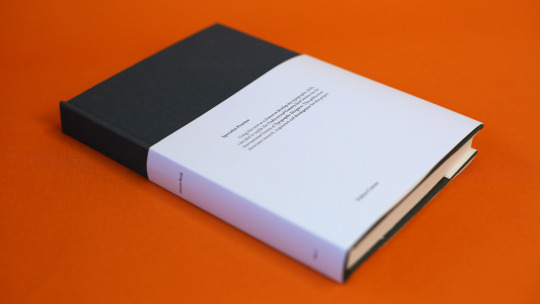


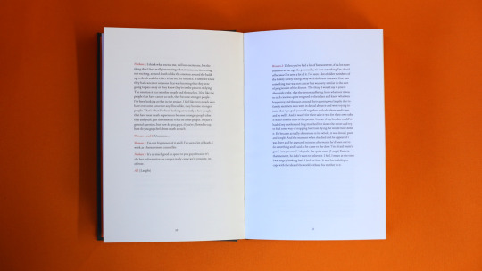
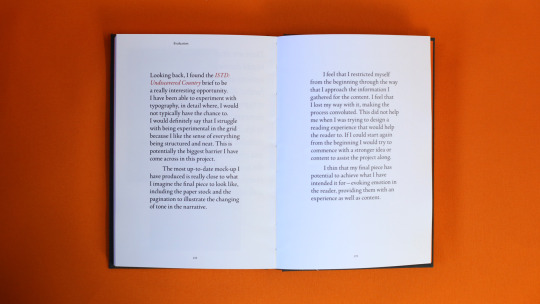
Using this unit as a chance to develop my typographic skills, I decided to tackle the Undiscovered Country brief written by the International Society of Typographic Designers. This publication showcases research, inspiration and development for this project.
#SpecialistPractice#Type#Typography#InDesign#Editorial#EditorialDesign#Design#VisualCommunication#VisCom#AUB#Art#Book#BookDesign#HandMade#TypeSetting#Orange#Process#Uni#University#Project#Photo#Photography
1 note
·
View note
Text
Bibliography - Specialist
Websites
https://uk.pinterest.com/charlotteodaly/roadtrip/
http://www.ignant.de/2014/06/03/top-10-road-trip-photographers/
http://www.ignant.de/2013/08/22/a-restless-transplant/
http://www.ignant.de/2013/10/18/thirteenth-month/
http://www.ignant.de/2014/01/06/black-patagonia-by-neels-castillon/
https://www.google.co.uk/webhp?sourceid=chrome-instant&ion=1&espv=2&ie=UTF-8#q=fay%20godwin
http://www.michaelkenna.net/
http://www.toddhido.com/
http://stephenshore.net/photographs/five/index.php?page=4&menu=photographs
Books
Landmarks - Fay Godwin
The nature of photographs - Stephen Shore
The print - Ansel Adams
Photographing water in landscapes - David Tarn
Landmarks The fields of landscape photography - William A. Ewing
Videos
https://www.youtube.com/results?search_query=travel+video
https://www.youtube.com/results?search_query=road+trip+video
https://www.youtube.com/results?search_query=landscape+photography+video
https://www.youtube.com/results?search_query=how+to+capture+great+landscape+images
0 notes
Text
Brand identity

Our main goal for this morning was to start creating the games brand identity as this will help form all the assets we will create. We started by creating the colour palettes, using adobe colour to find the colours we wanted.
When choosing these colours we kept in mind that we wanted to create a medieval/fantasy environment. However we also wanted to use brighter colours to appeal to our target audience, which is 10-13.
The first purple we chose was dark and reminded us of a medieval cape colour that we often see in movies and games. However, when looking at it on Miro we decided to choose a light purple to fit our target audience. Similarly, this led us to choosing quite muted colours that were still fairly vibrant.

After deciding on the two colour palettes, we started to look at typefaces we could use to create the logo and headers. for this we wanted to use a serif typeface, as these typefaces are commonly found in fantasy and modern games. using Adobe fonts, We chose these typefaces because we liked how they were easy to read but also had the small flourishes that made them look fun.
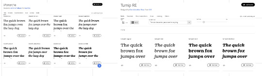
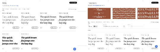
For the main body text of our game, we decided to choose a more simple sans serif font, as we wanted our young audience to be able to read it without difficulty. We decided to choose 4 fonts as this will allow us to test which typeface will fit our visuals once created.
2 notes
·
View notes
Photo
Physical Hand-In - ISTD Project
0 notes
Text
Logo icon - 10 years
After discussing options for the actual text of our copy-led campaigns and considering the visual feel of 10 years, we decided to manipulate the icon.
Kriszta's idea was to rotate Bumble's icon and turn the lines into 10. She created an animation of this movement on Procreate, which we are planning to use in advertising on social media. This will also be supported with the 10 years clicking at the end.
#viscom#viscomyear3#specialistpractice#spproject#d&adgroupproject#groupproject#bumbled&ad#bumblebrief#bumbleproject
0 notes
Text


I printed my final posterzines on 170gsm a3 paper, and assembled them all using a paper scoring tool, mechanical ruler and scalpel.
0 notes
Text
Research in to techniques

https://taxidermy.by/mammals/no-white/hyena/
https://www.stanwinstonschool.com/tutorials/fur-transfer-electrostatic-flocking-and-hair-punching

https://lauradickey1.wixsite.com/professionalmakeup11/hair-punching-cjub

youtube
youtube
https://bethanyjadelane95.wixsite.com/specialistpractice/fur-transfer--flocking---hair-punching

youtube
0 notes
Text
Evaluation
Overall, I'm happy with how the film has developed and that I was able to achieve my desired effects - although in some cases I feel that could have been done much better. I found this project challenging, as I handled the music, filming and editing alone so for that I am pleased with the outcome. I enjoyed exploring into the themes which were used within this piece; as I feel that it hasn't been fully concentrated on before in this format. I'd like to think that there are some unanswered questions and hints of mystery inside this film; such as the relationship with the boy and the house, or what was the true story of the boy and the girl - what was said in the letter, and why were there only memories from that point in time. I intended on making it both easy to absorb but also there could be more depth added to it; this could have been done better, but I wanted the music and the visuals to take the audience on a journey, and to hopefully feel the same emotion as the characters within the film.
I believe that I have interpreted my own style within this film; I like to play with the opacity and colour schemes, as well as the costumes the characters were wearing, the props and the settings. It could link to my previous work in terms of the way I create the music - tone, atmosphere and also the visual content - pleasing on the eye yet not so straight forward. The shots I took were what I had in mind at the beginning of this project, and along the way I found more sources that I could include in order to fit the piece. The research I made helped a lot in terms of understanding how to portray certain themes that made improvement on my work.
There are some aspects that I could definitely improve on; such as managing the effects to make them more powerful for the audience. I also had trouble with rendering the film at best quality, so I tried a few different option by looking at tutorials. Furthermore, thinking back to the effects I feel that some water scenes overlapping the 'memory' scenes may have come a little too strong.
1 note
·
View note
Text
Evaluation - Specialist
In this assignment I wasn’t as technical as I would have liked to have been as I would have liked to have produced a video as well as final images. I could have achieved this if I had spent more time researching and planning. However with the images I have taken did require some technical aspects. I faced a lot of problems when shooting in the lake district as the sun was coming over the hills in one of my images. I had struggled to keep the foreground at a good exposure while still capturing the sun coming over the hills as it had a very atmospheric feel to it. I tried to resolve this problem by changing my white balance to try and correct the exposures within the image. This did help the overall outcome but the image was still quite dark. In post production I did try to exposure the foreground some more but not too much as I didn’t want to over edit the image as I feel that it could have ruined the image.
Visually I put a lot of effort into this assignment as I had tried to plan out the way my shots looked before taking them. I stood in an area and thought about the photographic outcomes I could have and where could I shoot them from. I am quite pleased with how some of my images turned out as I have never really shot anything quite like these locations before. I do think I can improve by figuring out how to be technically better and carry on researching to see what other people shoot and see if they visually have any ideas that I can work on myself. For example could my composition and framing be something I should work on but it will always be something I’m working on. Visually I feel my framing and composition has a good outcome in my images as I like to like up either trees or have something symmetrical or even.
Organizing this brief myself was pretty difficult at first as it had no guidelines. Once I got into the idea I had came up with I started to find images that became great influence to me while researching. Evaluating every shoot is a crucial part of an assignment to me as it gives me time to see what I have done wrong and give myself time to think about what I could have done to improve my final outcomes.
This brief was great as you had to make your own. This gave me the chance to shoot something I have always wanted to shoot. I have always wanted to film/ take images of a road trip/ holiday. I have been influenced by images on Pinerest and Instagram and travel is something I love and I wanted to incorporate that into my work as I have never had anything final from trips I have had previously. I have also not got the right outcomes I had wanted either.
0 notes
Text
User Persona
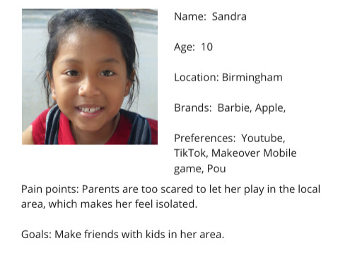

To make our designs more audience focused, we decided to create user personas to allow us to refer back to throughout the project. We decided to create two very different personas to cover our full target audience.
I started by using the website Thispersondoesnotexist to create two photos to visualise our personas. As a group we then came up with the names and chose locations that are seen as rough, or low income.
Tamara and I then started to think about the preferences of our audience and what brands they may like. This will help to inform our visuals and colour palette. We also decided to lay out what their main goals were as when consider this we realised that some might have different goals to others.
2 notes
·
View notes
Last Seen Blogs
imkshastrian
imkshastrian
dontletmedr0wn
Seja bem-vindo quem vier por bem.
sototallyineffable
an ineffable blog

bed4salemelbourne
Wholesale Mattress Melbourne
hey-ho-whoa
I Declare Bankruptcy!