#Wild Carrot Letterpress
Photo

It’s Fine Press Friday!
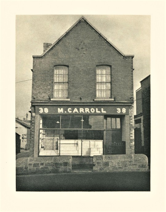
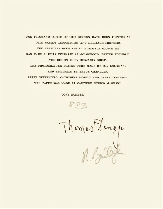
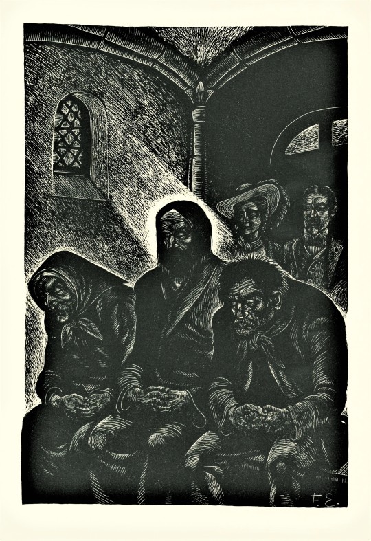
This copy of James Joyce’s, Dubliners, with introduction by American academic Thomas Flanagan and photogravures by Irish artist Robert Ballagh (b.1943), was published in 1986 by the Limited Editions Club (LEC), New York, in an edition of one thousand copies signed by Flanagan and Ballagh. It was in 1905 that Joyce first took his manuscript to a publisher, although he had a lot of difficulty finding someone to print his book. After many rejections a publisher accepted but demanded changes, resulting in the termination of their agreement. This drama continued for years until the book was finally published in 1914 by Grant Richards Ltd., London.
Dubliners is a collection of fifteen short stories that is a portrait of Dublin during a time when Irish nationalism was at its height. Joyce used his own family, friends, and acquaintances to depict the people of Dublin “in all their uniqueness, their generosity, and love of music, as well as their moral confusion and psychic paralysis” (LEC Letter number 547). This psychic and moral paralysis stems from the long history of Ireland’s subordination to British rule.
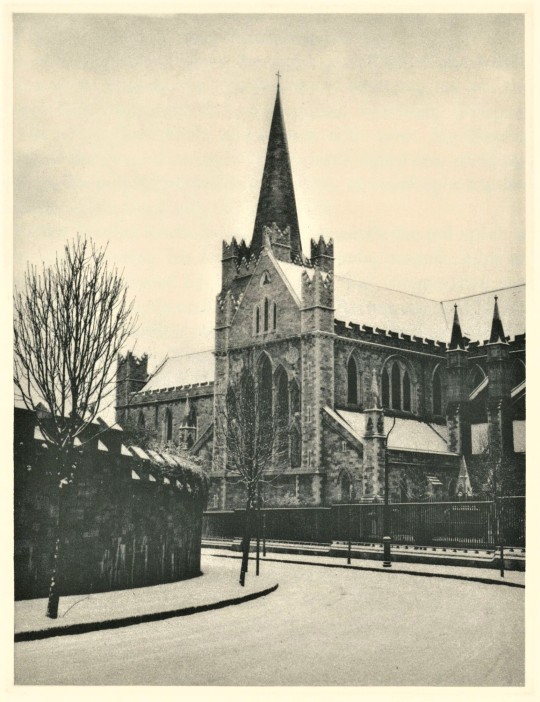
Robert Ballagh was born and raised in Dublin and shares Joyce’s fascination with his city. His six photogravures express the sense of isolation and paralysis that exists within the stories. They are velvety and still, and rest alone in the center of the page. They themselves are isolated by the many pages of text that exist between it and the next image.
The type design also illustrates a sense of isolation, with each short story beginning with a title in a single line on the right resting in the expanse of an empty page spread, and after turning the page, another blank page, and opposite to it the beginning of the text with no header, but space for one.
The type was printed at Wild Carrot Letterpress and Heritage Printers. The text was set in Monotype Scotch by Dan Carr and Julia Ferrari at Golgonooza Letter Foundry. Benjamin Schiff, son of then LEC owner Sidney Schiff, designed the book. The photogravure plates were made by Jon Goodman and printed by Bruce Chandler, Peter Pettengill, Catherine Mosely and Greta Lintvedt. The paper was made at Cartiere Enrico Magnani. The book was hand sewn and bound at the Jovonis Bookbindery in West Springfield, Massachusetts. Our copy is a gift form our friend Jerry Buff.
View more Limited Edition Club posts.
View more Fine Press Friday posts.
– Teddy, Special Collections Graduate Intern.
#Fine Press Friday#Dubliners#James Joyce#Irish Literature#Ireland#Dublin#Fine Press Fridays#LEC#Limited Editions Club#fine press books#Photogravure#Printmaking#Intaglio#English Monotype Scotch#benjamin schiff#Thomas Flanagan#Robert Ballagh#Wild Carrot Letterpress#Golgonooza letter foundry#teddy#Heritage Press
56 notes
·
View notes
Photo


James Joyce (text) – Susan Weil (etchings and collage), Giacomo Joyce, Vincent FitzGerald & Co., New York, NY, 1989, Edition of 50. LetterPress Printing: Wild Carrot Letterpress. Type: Dante. Etchings: Marjorie Van Dyke and Vincent FitzGerald, The Printmaking Workshop. Calligraphy: Jerry Kelly. Collage: Zahra Partovi. Handmade Papers: Paul Wong, Dieu Donné Papermill. Binding: Zahra Partovi assisted by Kristin Winkler, Vincent FitzGerald & Co. and Priscilla Spitler, Hands on Bookbinding
#graphic design#typography#art#etching#collage#drawing#book#cover#book cover#james joyce#susan weil#zahra partovi#wild carrot letterpress#marjorie van dyke#vincent fitzgerald#vincent fitzgerald & co.#jerry kelly#paul wong#kristin winkler#priscilla spitler#hands on bookbinding#1980s
80 notes
·
View notes
Photo

Fragments of Light 2, Kelly Driscoll, 2003, Brooklyn Museum: Arts of the Islamic World
Excerpts from the Mathnavi-i Ma`navi, the masterpiece of the poet Rumi (1207-1273), appear laser-etched onto the panels of this glass book conceived by the Brooklyn-based artist Kelly Driscoll. The 7 plates (a-g) are made of Depp Glass, each plate with a laser etching of the selection of Rumi's poetry in addition to its English translation. Laser etching accomplished by Laser Edge Designs. The type for the English translation is Diotima. The calligraphy is by Jerry Kelly. The printed colophon (h) is by Wild Carrot Letterpress. The pages are contained in "binding" box (i) made of pale sea-green suede with drop-down sides and held together by magnets imbedded in the panels.
Size: 2 x 25 x 10 in. (5.1 x 63.5 x 25.4 cm)
Medium: Glass, laser etched; ultrasuede binding
https://www.brooklynmuseum.org/opencollection/objects/188976
10 notes
·
View notes
Link
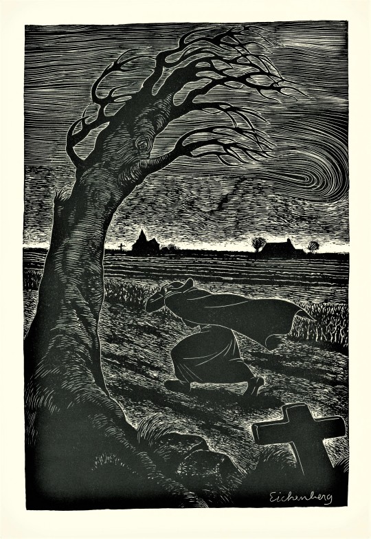
First Limited Edition Quarto (8- 3/4' x 12-1/8') bound in Oasis goatskin and Belgium linen. Introduction by Robert Coles. This French novel won the Grand Prix by the Academie Francaise. 'A man of humble origin with a great love for mankind,' the priest's story unfolds in diary form. Copy #887 of 1000 numbered copies illustrated with 5 woodblocks by Fritz Eichenberg printed at the Wild Carrot Letterpress on all-cotton Italian paper and SIGNED by the artist on the colophon page. Monthly Letter laid in. Spine mildly sunned. Close to Fine in a Fine felt-lined slipcase
0 notes
Text
Rustic Illustrated Carrot Coaster Save The Dates
Eat your veggies, folks! With carrots this adorable, I will happily eat twice my portion. Amanda of Wide Eyes Paper Co. created these rustic illustrated carrot coaster save the dates for a wedding on a farm in New York’s Hudson Valley. The dainty cuddling carrot illustration is paired with a classic serif typeface with a sweet and simple save the date message. So perfect for a farm wedding!
From Amanda: As designers, we are always on the lookout for new avenues for creativity within the wedding stationery industry. We derive inspiration from tackling new projects like these rustic, farm-inspired, save the date coasters. This custom letterpress design was a downright fun project and a chance to offer a new product to future clients.
Lucy’s custom order brought our team into new territory and gave us a chance for innovation, but what was really great about it was that it was such a fruitful collaboration of different skills. As she was actually living on the breathtaking Stonegate Farm that was to be her wedding venue, Lucy was truly a well of agrarian inspiration. She had done her own illustration of what she wanted – two carrots growing together in a sweet, twisting embrace. It was great to get that running start on the creative vision and then head to work within our individual expertise.
First, we hand-illustrated the cuddling carrots in a style inspired by woodblock printing. Then, we paired the intricate line drawing with some graphic design magic. Creating organic-inspired pieces is often a balancing act; to counter the playful whimsy of the embracing carrots, we chose a serif font with a more stately feel to ground the design as a whole. The beauty of these coasters is really born from this delicate interplay of styles. The whole is definitely greater than the sum of its parts, in this case! Once we found a harmony between text and line, we fired it off to our letterpress printer.
For letterpress printed designs with multiple colors like these coasters, each color requires a separate plate. The metal plates are fabricated, coated in ink, and then run through the letterpress printing machine one by one. These hearty coasters were printed on 220 lb 2-ply Pearl White Crane’s Electra Cotton Letterpress stock; basically, the finest, ultra-thick letterpress stock available.
Thanks Amanda!
Design: Wide Eyes Paper Co.
Letterpress Printing: Clove St. Press
Wide Eyes Paper Co. is a member of the Designer Rolodex – you can see more of Amanda’s work right here or visit the real invitations gallery for more wedding invitation ideas!
Photo Credits: Kelly Wilde
from Oh So Beautiful Paper http://ift.tt/2jixKpP
via IFTTT
0 notes
Photo
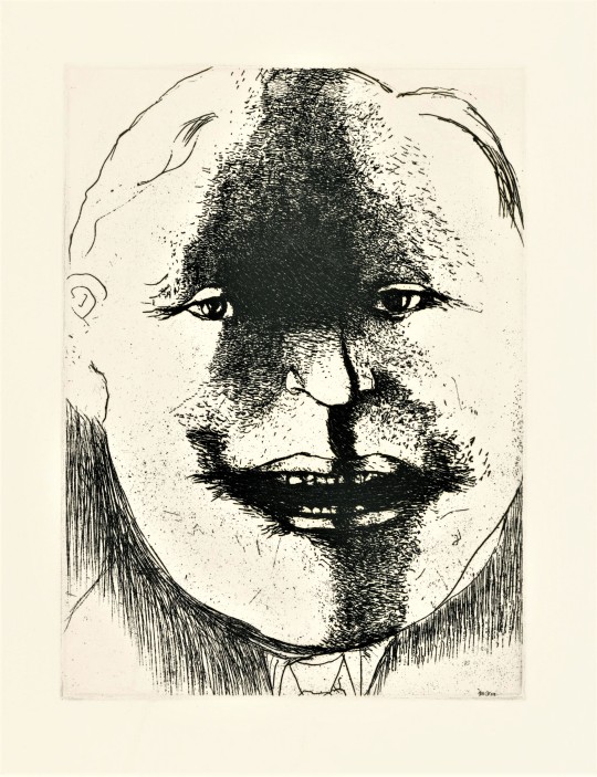

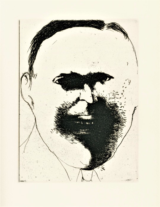
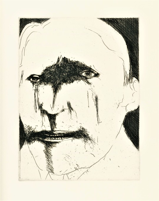
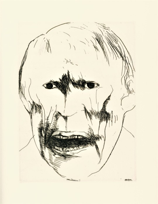
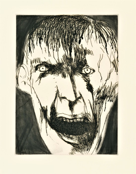
It’s Fine Press Friday!
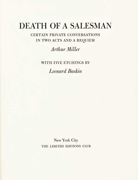
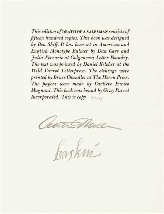
Death of a Salesman: Certain Private Conversations in two Acts and a Requiem, a tragedy by American playwright, screenwriter, and essayist Arthur Miller (1915-2005) is here published, with five etchings by American graphic artist, Leonard Baskin (1922-2000), by the Limited Editions Club (LEC) in a limited edition of 1500 copies signed by the playwright and the artist in 1984.
The play, Death of a Salesman, first opened on February 10, 1949. It was incredibly popular, and is considered by some critics to be one of the best American plays. It has since been revived on Broadway five times and adapted to film ten times, and has won numerous awards. Salesman is a fine example of one of Arthur Miller’s dominant themes,the importance of the father-son relationship. It is somewhat inspired by Miller's short time working for his father. His biographer wrote:
Arthur particularly loathed the vulgarity and aggressiveness of the buyers, who treated his father and the salesmen with arrogant contempt, and he became acutely aware of the meaning of self-respect when he saw how cruelly it was abused.
The play is about the unrealistic expectations we have for ourselves and others, expectations that cause us to lose sight of what really matters even to the point of falling out of touch with reality. In this case it is the expectations a father has for his children.
This edition marks Leonard Baskin’s third time illustrating for the Limited Editions Club. Other tiles he has worked on include, Eugene O'Neill’s The Iceman Cometh, 1982 and Aristotle’s Poetics & Politics, 1964, both of which we may feature at a later date.. The striking etched portraits are very characteristic of Baskin’s work. Baskin often works in themes of death. His etchings richly portray the mental degradation that the main character, Willy Loman, suffers from.
This book was designed by book designer Benjamin Shiff, son of LEC owner Sydney Shiff. He selected American and English Monotype Bulmer fonts, which were set in type by Dan Carr and Julia Ferrarie at Golgonooza Letter Foundry. The text was printed at the Wild Carrot Letterpress by Daniel Keleher and the etchings were printed at The Heron Press by Bruce Chandler. The paper was made by Cartiere Enrico Magnani and the book was bound by Gray Parrot Incorporated. Our copy was a gift from our friend Jerry Buff.
View more Limited Edition Club posts.
View more Fine Press Friday posts.
– Teddy, Special Collections Graduate Intern
#Fine Press Friday#Leonard Baskin#Limited Editions Club#LEC#Arthur Miller#Death of a Salesman#Ben Shiff#Benjamin Schiff#Wild Carrot Letterpress#The Heron Press#Catiere enrico Magnani#Gray Parrot Incorporated#Julia Ferrarie#Golgonooza Letter Foundry#Dan Carr#Monotype Bulmer#Teddy#Etching#Book Design#Fine Press Books#Printmaking#Fine Press Fridays#Pioneer Valley School
44 notes
·
View notes
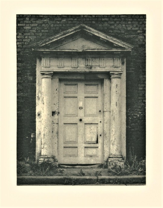
Photo


Wood Engraving Wednesday
FRITZ EICHENBERG
We hold quite a number of books illustrated by the German-American illustrator and wood engraver Fritz Eichenberg (1901-1990), fourteen of which include original wood engravings. Today we present his engravings from the 1986 Limited Editions Club production of French author Georges Bernanos‘s Diary of a Country Priest (Journal d'un curé de campagne), printed by the Heritage Press in an edition of 1000 copies signed by the artist. The blocks were printed separately at Wild Carrot Letterpress on Cartiere Enrico Magnani paper. This was one of the last major commissions of Eichenberg’s very long career before he died of complications from Parkinson's disease in 1990. Our copy is another gift from our friend Jerry Buff.
View other posts with illustrations by Fritz Eichenberg.
View more posts on works by the Limited Editions Club.
View more posts with wood engravings!
#Wood Engraving Wednesday#wood engravings#wood engravers#Fritz Eichenberg#Georges Bernanos#Diary of a Country Priest#Limited Editions Club#Heritage Press#Wild Carrot Letterpress#Cartiere Enrico Magnani#Cartiere Magnani#fine press books#Jerry Buff
41 notes
·
View notes
Photo


It’s Fine Press Friday!
First published in 1922, My Sister-Life by Boris Pasternak is here translated by Mark Rudman, Illustrated by Yuri Kuper and published by the Limited Editions Club, New York, 1991.
Russian poet, Boris Pasternak wrote My Sister-Life in 1917 in the summer after the October Revolution. Pasternak's poems were received with enthusiasm by young intellectuals as “spontaneous outbursts of a genius.” However, Pasternak did not receive worldwide acclaim until after 1958, when his only novel, Doctor Zhivago, was first published in Europe. Pasternak was nominated for a Nobel Prize in literature, but because of an anti-Pasternak campaign by Soviet Russia, and the banning of his book in Russia for being anti-Soviet, acceptance would have appeared traitorous, so he declined the award.
Subsequently, most of his work was translated and widely read in the western world. My Sister-Life is considered to be one of the world’s great love poems.
Russian born British painter, Yuri Kuper’s etchings accompany Pasternak’s poems. The etchings are printed in a grey or graphite ink, which complements the handmade papers. The objects in the etchings seem to form order within a field of texture and tone. Similarly the text takes shape over a soup of letters in the papers.
The papers used for the text and cover were made by H.M.P Mill in Woodstock Connecticut, to resemble the stock produced in 1920’s Russia. The Cyrillic letters used for inclusions in the paper are from various recycled texts. The text was set in eighteen-point English Monotype Scotch Roman by Dan Carr and Julia Ferrari at Golgonooza Letter Foundry and printed at Wild Carrot Letterpress in Hadley, Massachusetts, in an edition of 250 copies signed by the artist. London graphic designer Michael Anikst designed the edition. Aldo Crommelynck printed the etchings in Paris, on Hahnemuhle paper.
Click here for more Fine Press Friday posts!
Click here for more Limited Editions Club posts!
-- Teddy, Special Collections Graduate Intern
#fine press friday#Fine Press Fridays#limited editions club#LEC#boris pasternak#russian poetry#Teddy#Handmade paper#Etchings#Fine press#Fine press books#HMP#HMP Paper Mill#Golgonooza letter foundry#Julia Ferrari#Dan Carr#wild carrot letterpress#poetry#English Monotype Scotch Roman#typefaces#Michael Anikst#Aldo Crommelynck
37 notes
·
View notes
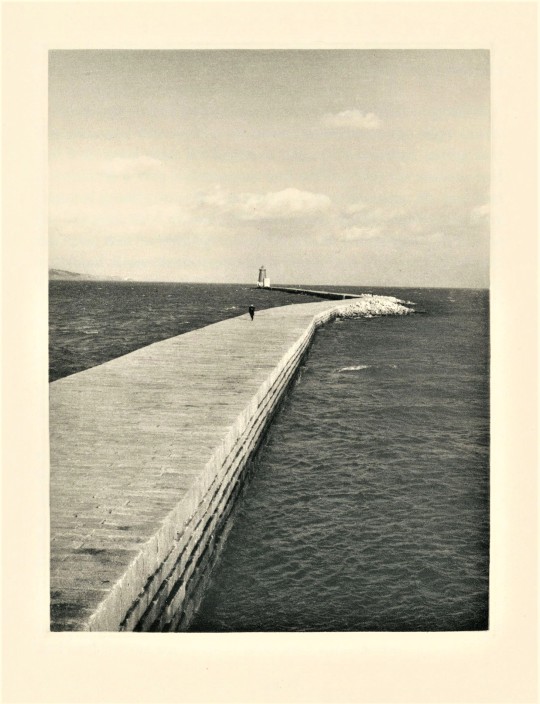
Photo


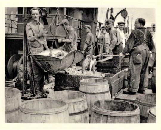

It’s Fine Press Friday!
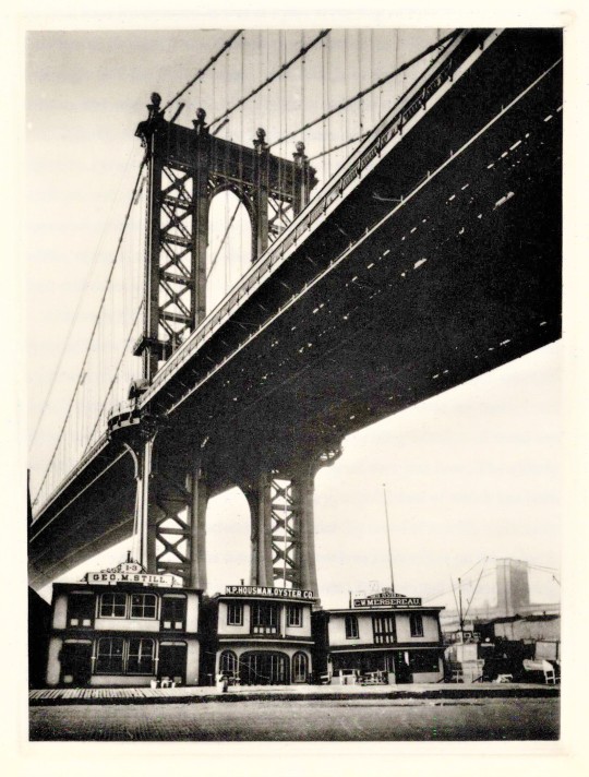
This week we bring you The Bottom of the Harbor, by the The New Yorker writer Joseph Mitchell, with photos by by celebrated American photographer Berenice Abbott, printed by Wild Carrot Letterpress on a paper made at Cartiere Enrico Magnini, and published in 1991 by the Limited Editions Club in an edition of 250 copies signed by the author. The six stories that comprise the book were first published in the The New Yorker, and then first published as a collection by Little Brown in 1959. The collection has been recognized as Mitchell’s best and most “elegiac account of New York,” featuring his distinctive focus on the everyday underdog characters of New York City.
Berenice Abbott spent her career documenting New York City as it underwent massive changes, particularly in the 1920s and 30s when millions were immigrating to the United States through Ellis Island. Abbott’s and Mitchell’s works are complementary as they both focused on often overlooked places and people, emphasizing the importance and beauty of the small things.
The photographs are produced here in photogravure by American photogravure printmaker Jon Goodman. Photogravure allows a photographic image to be printed in intaglio. These images were produced using the original negatives taken by Abbott. The result is a rich velvety tonal image that is fully integrated into the paper though the extreme pressure used in the printing process.
Goodman’s photogravure plates were printed by Sara Krohn and Wingate Studio on handmade paper. The text was set by Michael and Winifred Bixler in Monotype Bell. Our copy is a gift from our friends Megan Holbrook and Eric Vogel.
View other posts on books published by The Limited Editions Club.
View more Fine Press Friday posts.
-- Teddy, Special Collections Graduate Intern
#Fine Press Friday#Fine Press Fridays#finepressfriday#photogravure#intaglio#photography#limited editions club#joseph mitchell#The Bottom of the Harbor#berenice abbott#monotype bell#Wild Carrot Letterpress#Cartiere Enrico Magnini#Jon Goodman#Sara Krohn#Wingate Studio#Michael and Winifred Bixler#Megan Holbrook#teddy#fine press books#Eric Vogel
44 notes
·
View notes
Photo


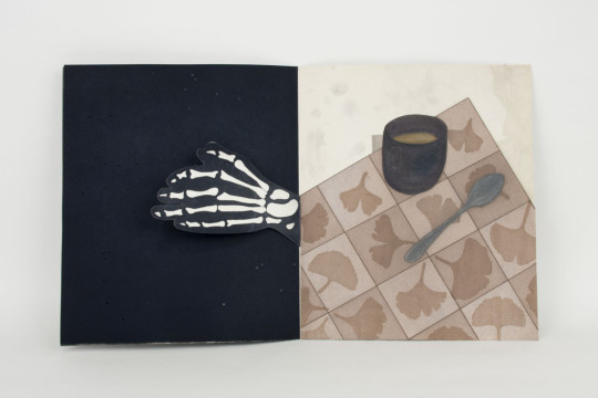
James Joyce, The Epiphanies, Interpreted by Susan Weil and Marjorie Van Dyke, Vincent FitzGerald & Co., New York, NY, 1987, Edition of 50. Etchings: Editioned by Marjorie Van Dyke and Vincent FitzGerald at The Printmaking Workshop. Lithography: Editioned by Rhae Burden at The Printmaking Workshop. Calligraphy: Jerry Kelly. Collage: Zahra Partovi. Letterpress Printing: Daniel Keleher and Bruce Chandler at Wild Carrot Letterpress. Type: Janson
Paper: Moulin du Gue. Binding: David Bourbeau, Thistle Bindery
#graphic design#typography#art#etching#drawing#epiphanies#book#cover#book cover#cardboard box#james joyce#susan weil#marjorie van dyke#rhae burden#jerry kelly#zahra partovi#daniel keleher#bruce chandler#wild carrot letterpress#david bourbeau#thistle bindery#vincent fitzgerald & co.#1980s
57 notes
·
View notes
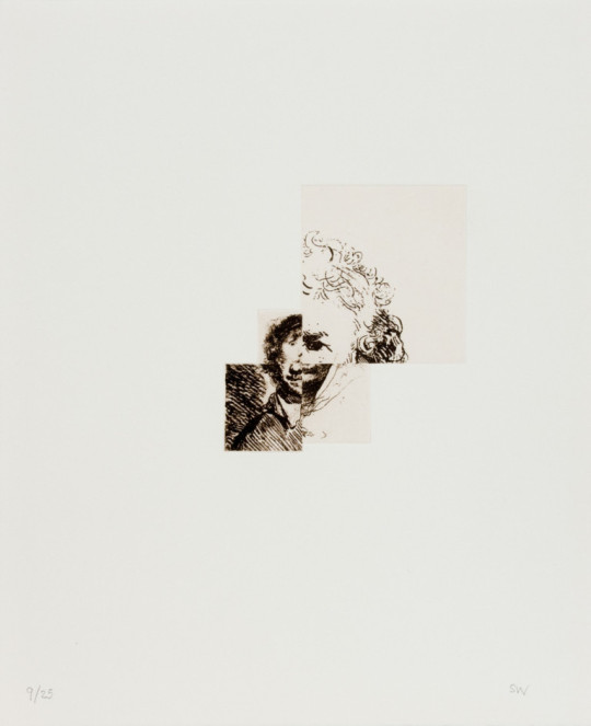
Photo

From: Susan Weil, Remembrandt's Self, Vincent FitzGerald & Co., New York, NY, 2001, Edition of 25 [Letterpress Printing: Wild Carrot Letterpress. Photogravure: Jon Goodman. Printing: Peter Pettengill, Wingate Press. Binding: Zahra Partovi]
#art#etching#drawing#photogravure#portfolio#susan weil#zahra partovi#wild carrot letterpress#jon goodman#peter pettengill#wingate studio#wingate press#vincent fitzgerald & co.#2000s
53 notes
·
View notes
Photo


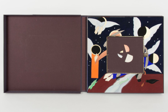

James Joyce (from 'Finnegans Wake') – Susan Weil (etchings and original watercolors), Brideship & Gulls, Vincent FitzGerald & Co., New York, NY, 1991, Edition of 50. Letterpress Printing: Wild carrot Letterpress. Type: Janson. Calligraphy: Jerry Kelly. Paper: Apta Royal Laid paper by Richard de Bas. Binding: Zahra Partovi. Box: David Bourbeau, Thistle Bindery
#graphic design#typography#art#etching#drawing#finnegans wake#book#cover#cardboard box#james joyce#susan weil#zahra partovi#wild carrot letterpress#jerry kelly#richard de bas#david bourbeau#thistle bindery
46 notes
·
View notes
Photo

From: Susan Weil, Remembrandt's Self, Vincent FitzGerald & Co., New York, NY, 2001, Edition of 25 [Letterpress Printing: Wild Carrot Letterpress. Photogravure: Jon Goodman. Printing: Peter Pettengill, Wingate Press. Binding: Zahra Partovi]
#art#etching#drawing#photogravure#portfolio#susan weil#zahra partovi#wild carrot letterpress#jon goodman#peter pettengill#wingate studio#wingate press#vincent fitzgerald & co.#2000s
27 notes
·
View notes
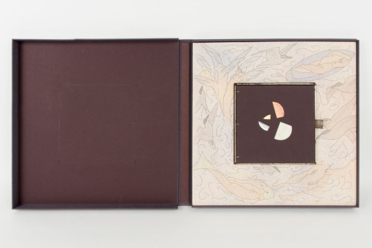
Photo


Jalaluddin Muhammad Rumi (text) – Susan Weil (line etchings and mezzotins), The Reed, Translated by Zahra Partovi, Vincent FitzGerald & Co., New York, NY, 1989, Edition of 50. Letterpress Printing: Wild Carrot Letterpress. Type: Diotima. Etchings: Shigemitsu Tsukaguchi. Calligraphy: Jerry Kelly and Zahra Partovi. Papers: J.B. Green & Dieu Donné Papermill. Binding: Zahra Partovi
#graphic design#typography#art#etching#drawing#binding#leporello#book#cover#book cover#jalaluddin muhammad rumi#susan weil#zahra partovi#wild carrot letterpress#shigemitsu tsukaguchi#jerry kelly#vincent fitzgerald & co.#1980s
27 notes
·
View notes
Photo
From: Susan Weil, Remembrandt's Self, Vincent FitzGerald & Co., New York, NY, 2001, Edition of 25 [Letterpress Printing: WIld Carrot Letterpress. Photogravure: Jon Goodman. Printing: Peter Pettengill, Wingate Press. Binding: Zahra Partovi]
#art#etching#drawing#photogravure#portfolio#susan weil#zahra partovi#wild carrot letterpress#jon goodman#peter pettengill#wingate studio#wingate press#vincent fitzgerald & co.#2000s
26 notes
·
View notes
Photo

From: Susan Weil, Remembrandt's Self, Vincent FitzGerald & Co., New York, NY, 2001, Edition of 25 [Letterpress Printing: Wild Carrot Letterpress. Photogravure: Jon Goodman. Printing: Peter Pettengill, Wingate Press. Binding: Zahra Partovi]
#art#etching#drawing#photogravure#portfolio#susan weil#zahra partovi#wild carrot letterpress#jon goodman#peter pettengill#wingate studio#wingate press#vincent fitzgerald & co.#2000s
22 notes
·
View notes
Last Seen Blogs

godsmus3
angel fangs x

twinkling-moonlillie
Twinkling_Moonlillie

forworkidm
Untitled
parcelingrecordedsalesz
Partition saving energy today

robertcable
Untitled