#Wilhelm Deffke
Photo


Wilhelm Deffke
3 notes
·
View notes
Text
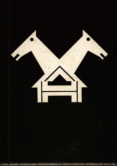


Wilhelmwerk was an advertising studio run by Wilhelm Heinrich Deffke and Carl Ernst Hinkefuss from 1916–1920. Most of the works here are from that period.
6 notes
·
View notes
Photo
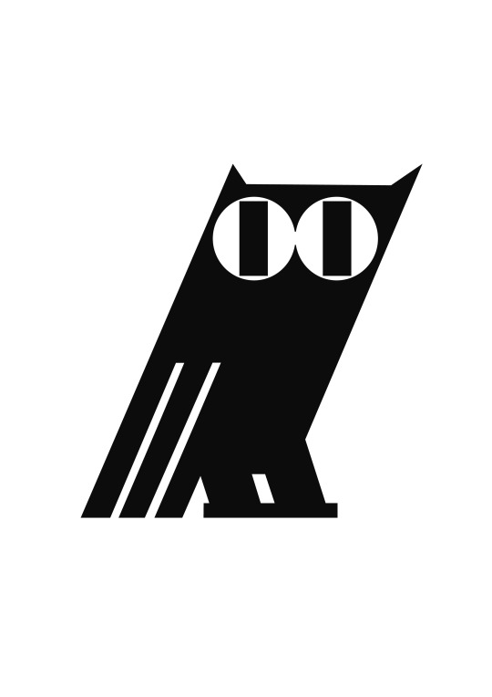
Wilhelm Deffke - Owl signet, 1917
24 notes
·
View notes
Photo
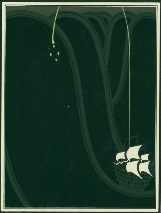
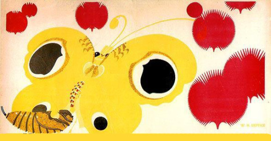
Wilhelm Deffke, Illustration for Imperator auf See, 1913
364 notes
·
View notes

Text
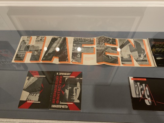
This brochure by the Swiss Bauhausier “Xanti” Schawinsky incorporates a remarkable photomontage within the letterforms of the word HAFEN (port or harbor). During the 1920s, the arts and crafts college in Magdeburg was a pioneering center of the new typography. Under Johannes Molzahn, Walter Dexel, and WIlhelm Deffke, graphic design was given priority, and modern equipment and teaching methods were introduced, emphasizing the use of photography and asymmetrical typography. Deffke, a prolific designer of trademarks and logos, led the design department in the college helping to promote a modern and professional training in graphic design.
#xanti schawinsky#printed materials#bauhaus#johannes molzahn#walter dexel#wilhelm deffke#graphic design#die neue typographie#the new typography#museum#new york museum
1 note
·
View note
Photo

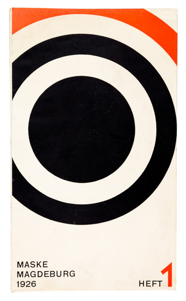
Wilhelm Deffke, cover artwork for magazine “Maske” 1926. Magdeburg, Germany. Via Nosbüsch Stucke
#typography#graphic design#wilhelm deffke#german design#1920s#zwanziger jahre#red and black#circle#kreis#geometric#editorial design
318 notes
·
View notes
Link
Resultado de imagem para wilhelm deffke
0 notes
Photo

Wilhelm Deffke
1929
Monoli Gold
Fotolitografia
Desenhado para um companhia de cigarros em Berlim.
Fonte: https://www.moma.org/collection/works/6435?locale=pt
0 notes
Photo

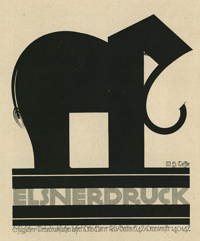
Wilhelmwerk Studio. was an design/ advertising studio run by Wilhelm Heinrich Deffke and Carl Ernst Hinkefuss from 1916–1920.
144 notes
·
View notes
Text
How does a logo become iconic? - rough script
How does a logo become iconic?
In 2017 strong visual identities are more important than ever. Jen Muller, the author of Logo Modernism says that “Today it seems that the logo gives designers greater freedom than ever beforem but it also makes it more vital than ever to stick to a manageable number of basic design parameters”. It takes 400 milliseconds for the brain to process a logo and generate a reaction. A logo we are familiar with acts as a link to an experience you have had with that brand triggering an emotional response; nostalgia, excitement happiness etc. In my GARP I am going to explore the question, what makes a logo iconic? Is it the brand behind the logo that gives it its prominence, or is a logo itself as an image enough to become iconic?
Branding comes from the Old Norse word Brandr, meaning fire blade. Branding livestock dates back to Ancient Egyption times, however, within Ancient Roman times “symbols used for brands were sometimes chosen as part of a magic spell aimed at protecting animals from harm.” As logo marks developed, monograms became more commonly used for more than just symbols of spirituality “A monogram is a design based on the initials of a person’s given and family name .. it might consist of a handwritten signature or as a stamp or seal for use in official communications” One of the best-known and most striking examples of a monogram was the “AD” used for the first time in 1498 by the artist Albrecht Durer.
In the 1920’s modernist logos began to appear. Influenced by De Stijl and Bauhaus and design movement, the still-new discipline began to change the face of commercial art significantly. Oskar Schlemmer’s 1922 Bauhaus logo is a perfect example of the move towards refined and abstract graphics. Frederick Henrion claims the job of a graphic designer is to “bring the future to the present”; and contemporary art movements such as these did just that.
In 2017 a lot of the logos we consider to be iconic of our generation, such as McDonalds, Nike, Apple and Instagram have all undergone visual changes within their branding. Instagram state their reason for changing the logo “We've been inspired by all the ways the community has grown and changed, and we wanted to create something that reflects how vibrant and diverse storytelling on Instagram has become”. Apple are a prime example of a company that has modified their identity to fit their current state of business; “the first image to represent the computer company was Isaac Newton, the man who first discovered the company when a fruit (apple) fell on his head”. However, this illustrative drawing was not suitable for a computer company any was only used in 1976 before Steve Jobs commissioned Rob Janoff to create a logo that was more suitable. Over the 40 years following, the logo took on various cosmetic appearances, with the monochromatic logo that has been returned to recently only being used briefly between 1998 – 2000.
Does this mean a logo must be dynamic and frequently mould itself to contemporary culture to make itself iconic? Recently Subway ‘updated’ their logo, stating “The new logo stands up tall, bold and confident, capturing the essence of the brand in a fresh, contemporary look. The core colors have been optimized to live and work across all channels. And the symbol, a new asset for the brand, distills the iconic arrows into a powerful and simple mark. Capturing the essence of the brand in a smaller footprint, the arrows symbolize the choices SUBWAY® provides its guests.”
Although the new logo type has obviously been reduced and far more considered than the previous logo, any sense of motion the arrows and official statement prove they are trying to convey have been lost. However, the new symbol to be used on social media is clever, and bound to be successful; I feel that using negative space in a logo for a fast food chain is something that has not been done before, provoking a reaction.
However, it is Subway’s need to adapt to contemporary culture that has lead them to consider a rebrand. The new logo is intended for social media, as this wasn’t something to be considered when the original logo was designed. It is impossible to know for sure, but I feel this version of the logo, backed by a popular brand, has a high chance of becoming iconic.
In this instance, will the logo drive the company further, or is simply a new profile picture?
If the logo isn’t as important as the service itself, why do we buy designer clothes? Brands such as Ralph Lauren, Chanel and Supreme are all acknowledged as being known for their logo first, and garments second. Fashion brands like these can charge more for clothing with only their logo on and no extra design, because they know as consumers we want to show off the brand we have just bought, not an artist’s print or any extra design.
The Supreme box logo based on Barbra Kruger’s propaganda artworks, was designed in 1994. The logo has become iconic alongside the brand mainly due to brand devotion and limited number of stock; meaning when new stock is released there are queues of hundreds of people waiting in line to buy something form the store. However, interestingly it is the basic clothing that is the highest in demand. Sold only second hand, prices are as high as £500 for a logo t-shirt or hoody. To me this proves that within the designer fashion world, a logo or recognisable icon is as important, if not more important than the service of the company; i.e. quality of clothing etc.
To begin answering my GARP question I am going to conduct research over summer. Although I have made a start, I am going to continue to add to, and work my way through my reading list. I am going to study both sides of design books, from edited collections like Logo Modernism to biographical and books such as FHK Henrion: The Complete Designer and design essays such as Arthur Koestler’s The Act of Creation. I plan to directly compare different opinions of the iconic designers biographical entries around the theme of commercial design, to what is presented in logo books, and then seeing how this compares to logo design moving forward beyond 2017.
“The designer Johannas Molzhahn, a close associate of the Bahaus group although never a member traced the thought process of an avant-garde artist bringing a logo design to fruition “the meaning of the brand is paramount and the form is determined only by visual and mechanical laws that are intrinsic to design. Here, as in engineering function dictates form. In reality, the creation of a brand is not so much an artistic problem as a technical and scientific one, involving both wit and imagination. Just like a machine, an aesthetically pleasing form is no more than the result of perfect construction combined with the objective of achieving the best performance.” This philosophy is immediately apparent in ground-breaking logo designs like those of Wilhelm Deffke or Karl Schulpig. Many of the succeeding generation of international designers, such as Paul Rand and Yasaku Kamekura, acknowledge the Bahaus and its achievements as a major influence on their creations.”
I am going to contact as many graphic designers and design practices as I can, from students and social media designers, to professional freelancers and design studios. I am going to construct a series of questions that I will ask each practitioner in an aim to develop a wide spread understanding of logo design from a designers perspective. Parallel to this I will produce a survey and interview people who are not design conscious to gain a perspective from the eye of a consumer. I want to learn what a good logo looks like to them, how they think logos are made, who they are made by, how much they are worth, and concluding with the question: what makes a logo iconic? I have been documenting strong use of design that I see in my every day life for the last year, and I will continue to do so over the summer. By visiting antique dealers, charity shops and other independent organizations that revel in the past, I aim to further my understanding of the history of every day commercial design.
I am going to convert what I have learned from design essay and use that knowledge to create a practical response to my theme. As Hull, my local city, is the City of Culture for 2017 I am going to explore the city, studying local businesses and their branding – mainly their log design. I plan to apply design principles from 1920’s – 1970-s from design practices such as Bahaus to 2017 logo designs ‘improving them. I would then present them to a non-biased selection of people, as a memory test. I would present the old logos and the names of their businesses (without type) and test the memorability of the existing logos. I would then repeat the process with my versions of the logos and see which is more successful.
0 notes
Last Seen Blogs

religionen
Religionen im Blick

luci29
Untitled

sadbeastjun
ジュン
crispyghoul
Crispyghoul

rsage244
🐈⬛🌙🔮