#artg251
Text

APP 3: PASSAGE
For this design I worked with the manifesto Think different by Apple. I used hierarchy to bring emphasis to the most important parts, by using a bolder typestyle and making some words bigger. I algo played with the alignment to balance the weight of the bold words. Adjusting the tracking and the kerning made the text look different, so I also adjusted the tracking in some words to make them look longer, without having to make them bigger. I learned that the way you stylize the words can give a whole new perspective to a text.
Manifesto:
Apple: think different
Here’s to the crazy ones. The misfits. The rebels. The troublemakers. The round pegs in the square holes. The ones who see things differently. They’re not fond of rules, and they have no respect for the status quo.
You can quote them, disagree with them, glorify, or vilify them. About the only thing you can’t do is ignore them. Because they change things. They push the human race forward.
And while some see them as the crazy ones, we see genius. Because the people who are crazy enough to think they can change the world, are the ones who do.
Keywords:
Hierarchy
Bold
Different sizes
Alignment
Left align
Right align
Important
Important words
Leading
Kerning
Tracking
2 notes
·
View notes
Text
Final
Rationale: This is my final draft of my poster after about four drafts. Some tweaking is needed for alignment, spell check, and visual cohesion. Aside from that, this is the basic layout, colours, elements, and sizing I plan to go with.
1 note
·
View note
Text
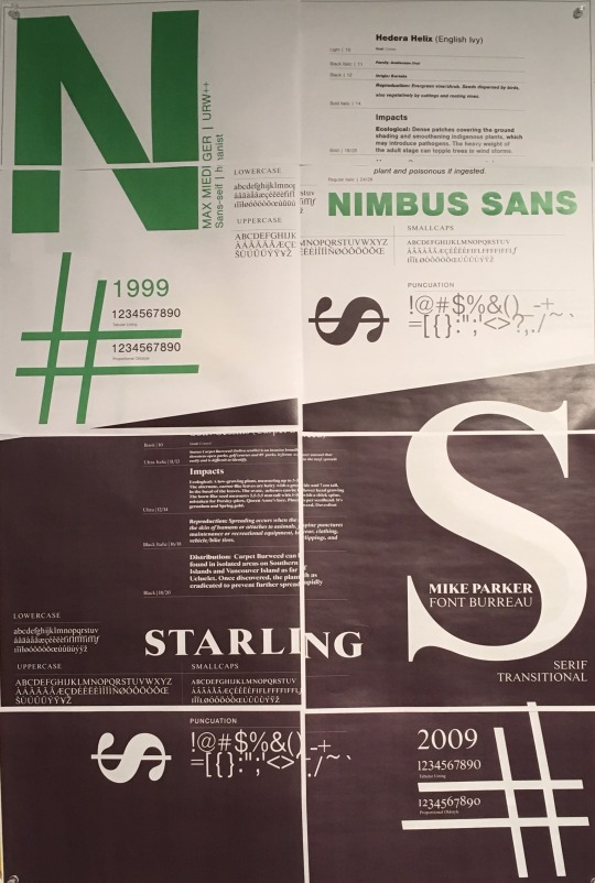
Project 1: Discovery Phase: Type Choices

Baskerville is a serif typeface designed in the 1750s by John Baskerville. It is classified as a transitional typeface, intended as a refinement of what are now called old-style typefaces of the period. The play “A Midsummer night’s dream” was written in 1596 by William Shakespeare gave it a classical vibe. Therefore, a serif typeface is my prior choice for the poster. Baskerville Old Face typeface has a great contrast between thick and thin strokes, making the serifs sharper and shifted the axis of rounded letters to more vertical position makes. Thus, it provides a clean and classic appearance to the title, which is what I’m looking for.

Another stunning serif font: FF Meta Serif Pro. FF Meta is a sans-serif typeface originally designed by Erik Spiekermann in 1991. In 2007, the serif version of the typeface has been developed through the practical aspects of previous styles. The typeface looks solid, clean and modern, very versatile and flexible with the expression of energy and a sense of pace. With the bold appearance, the typeface is solid, clean, reliable and readable with the curvy refinements of the terminal makes it more apparent at display the headline size.

Perhaps for some reasons I have to choose a sans serif typeface for the title, it has to be Alfran. Alfarn is based on capital letters that Bauhaus student Alfred Arndt (1898–1976) drew for a poster in 1923. The typeface has a wide and condensed width with a geometric appearance, which captures the spirit of the 1920s poster provides it with a timeless style and greatly suitable for this poster.
You can’t go wrong when combining a sans serif with a serif typeface in a design. Therefore, I decided to choose a sans serif choice for the content of the poster. Futura is a geometric sans serif typeface designed by Paul Renner in 1927. It is a typical and famous typeface that I don’t need to talk much about it. I love everything about the typeface, the cleanness, the crisp stroke, it’s simple geometric circles, triangles and squares represent function over form, taking away the nonessential and decorative elements.
0 notes
Text
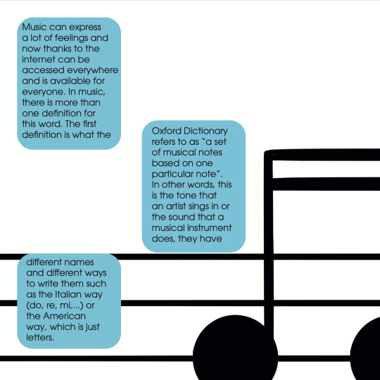
App 7: Triple S
For this design, I used the material of my project 2.
Keywords:
Music
Splice
Columns
Organized
This week I used splice. For this, I made different text boxes where I put my text and linked the boxes. I had to use a blue box behind the text because it was getting lost with the image lines. I tried with different definitions and positions, but I ended up deciding on the musical definition of key and the text on the left.
Software: InDesign
1 note
·
View note
Text
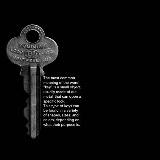
APP 6: Vernacular
This design was very hard at first because I didn’t know what the word “vernacular” meant, but after some research, I finally got an idea.
Keywords:
Key
Black & white
Grid
Outline
For this design, we had to use grids, which I’m not very used to using, but this time it was easier to place the text. I used a picture of a key in the background and then I put my text in white to make it readable against the black background. For the text alignment, I aligned it to the straight part of the key to make it look cleaner and tied together.
0 notes
Text

APP 5: Dilation
This week's topic was dilation. Personally, I didn’t know anything about this topic, but I found it really fun and interesting to do
Keywords:
Dilatational system
Overlap
Greyscale
Corners
Different thickness
Circle with fill
Organized
Revered type
With the given text I wanted to use a dilatational system instead of an axial, radial, or any other system because I think it’s the most interesting one. At first, I was going to use white for the background, but then I realized that the revered type would have more contrast with the shape. Some words have more weight than others to highlight the most important parts, like the time and date of the event. For the circle, I tried placing it in different places, at first I made it a dark grey and placed it in the center of the circles but even tho it looked good, I wanted to balance the design as well.
0 notes
Text

APP 4: Symbols
Negative space is really important for design, it can make something look organized or clearer. Negative space can make a text look more readable or less, depending on the amount of negative space used.
Keywords:
Symbols
Greek letters
Mony symbols
Negative space
Triangle
Reverse type
Diagonal
For this design, I used the typeface “museo”, which is a serif typeface, I also used the Greek letter delta as my symbol because I thought it was an interesting shape. I also wanted to align the text around the symbol and use the thinnest style this typeface has to make the symbol stand out more.
Text recovered from: https://en.wikipedia.org/wiki/Greek_alphabet
0 notes
Text

STORM
For this design I used the poem “Por una mirada” by Gustavo Adolfo Bécquer, this is a small love poem. Some of the words in the design are from the poem, and others are the feelings and other related words that came to my mind after reading this poem. I used the typeface Condor because it has a lot of variations, as well as transmitting elegance (that’s something that crossed my mind after reading the poem). The word AMOR it’s the central word, so I tried giving it emphasis by making it bigger and layering it, making it bigger, this became the focal point. Amor means love in Spanish, so it made sense to choose it as the focal point. The rest of the words have different brightness and opacity, as well as sizes, to show the hierarchy.
Poem used:
POR UNA MIRADA (BY GUSTAVO ADOLFO BÉCQUER)
Por una mirada, un mundo;
por una sonrisa, un cielo;
por un beso… yo no sé
qué te diera por un beso.
Keywords:
Mirada
Beso
Sonrisa
Cielo
Mundo
Amor
Sentimientos
Pareja
Love
Relationships
Loving
Calmed
Confianza
Dar todo de sí mismo
Regalo
Ojos
Miradas
Enamorados
enamoramiento
Por un beso… yo no sé qué te diera por un beso.
Por un beso
Yo no sé qué te diera por un beso.
Conocimiento
Sabiduría
Regalar
Tranquilidad
Dar
Recibir
Amar
Ser amado
Identidad
Personalidad
Felicidad
Poema
Simple
Corto
Corazón
Relajación
The bold words are the ones used in the design.
1 note
·
View note
Text

FINIAL
For this first design, I used the letters q, b, p, d, e, m, a, o, and g. My inspiration at first was a mandala, but later on, I shaped it as an abstract sun shining. I learned that the typeface can change the whole appearance of a design, whether it has serifs or not or if it’s a more graphic font that might be better for some projects. But slight changes such as the thickness of a line or the width of it, can make a design look totally different. The parts you use can also affect this type of design because using the bigger or the thinnest part of a letter, even though it could have the same elements (such as the “E” just 4 lines), can change how the viewer perceives it.
0 notes
Text
Assignment B - Step 2
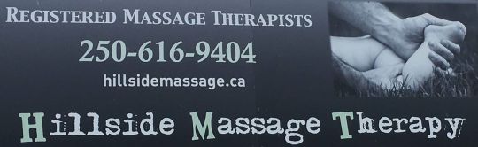
Hillside Massage Therapy
Type classification (Title): Monospaced
Typeface Name (H, M, T of Title): Slab serif
Typeface Name (H, M, T of Title): 1906 French New Caps Bold
Typeface Name (Rest of Title): Uncle Typewriter 2

Vancouver Island Health Authority
Type classification: Sans-serif
Typeface Name (Vancouver Island): Superia Normal Caps TF
Typeface Name (Health Authority): FF Scala Sans Pro Bold
2 notes
·
View notes
Text
Assignment B - Step 1
Poor Typography

Glass Art Studio

Mutts n’ Such Pet services
Good Typography
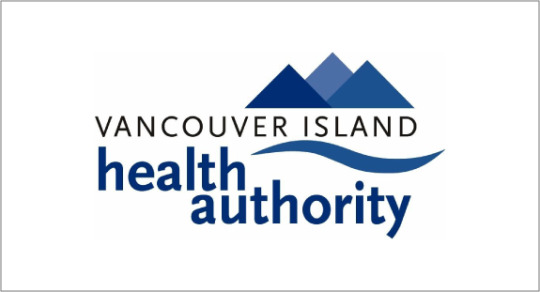
Vancouver Island Health Authority

End of the Roll
1 note
·
View note
Last Seen Blogs


2dmenenthusiast
it's mental illness, innit?

cudjunaught
Cudjunaught