#bad typography
Text

If you can't read it, it says "I'm OFFLINE!" with an anime eye in the background. Navy blue text over black is very hard to read. Either find a more contrasting font or give the text a contrasting outline.
2 notes
·
View notes
Text
Ok, what is this font and what's the point of bigger capital letters when it's in ALL CAPS! And why is it only some of them??
These bullet points are just... what's the point of centering the text when you have bullet points??

Also, these are all just snippets of text out of context, I don't wish to post the whole thing, I'm specifically pointing out the shitty font and formatting.
2 notes
·
View notes
Text


PVRIS — "Oil and Water"
"If you give me your cold shoulders
I'll bravе the storm and keep my arms wide open
We're oil and water, it's true
But I still fall into you"
#OK EVERYONE I MADE A MISTAKE IN THE LYRICS pls reblog this version instead skdjfksdfjs oops#caitlyn was singing this song in the shower i just know it LMAO girl rlly got the gay yearning song in this show shes down bad#caitvi#animationedit#arcaneedit#vi#wlwedit#arcane#arcane league of legends#league of legends arcane#caitlyn#caitlyn kiramman#netflixedit#piltover's finest#arcane lol#vi arcane#arcane vi#media: arcane#type: gif#s1 ep 5#s1 ep6#s1 ep7#s1 ep8#s1 ep9#im always so ???? with typography lmao im not every good at it so i kept it super simple#also i get why they say the song was cut from the soundtrack i cant think of any scene where i can put this song into#also ugh this took me an hour and a half to make skkdjdjd for a simple edit LMAO i couldnt get inspired for the typography and just#scrapped everything all tgt lol
530 notes
·
View notes
Photo
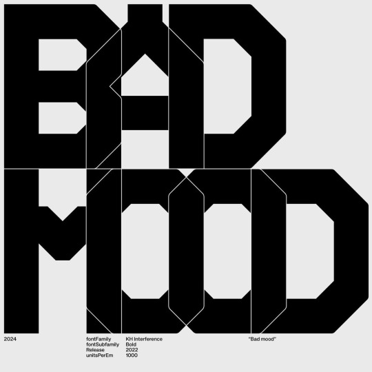
Kurppa Hosk (KH) / KH Type / KH Interference / Bad Mood / Typography / 2024
Download
431 notes
·
View notes
Text
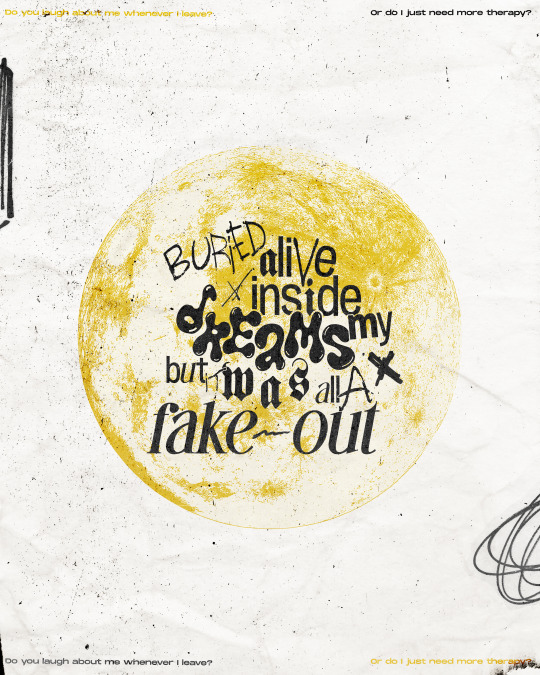
Remember us just like this forever but this can't last, won't last
#fob#fall out boy#so much (for) stardust#fob art#so much for stardust#smfs#fake out#can you tell that the thought behind this one was ver complicated like dreams->night->moon#and the yellow is just because i felt like it#as always i think i pretty much hate this but i just want to put it out there#also you can probably tell that i was running out of ideas there at the end with the typography composition but oh well its over complicate#enough as it is so i decided to just leave it#i hope compression isnt too bad on this one i honestly dont know what the hell i did ñflkajsdl
511 notes
·
View notes
Text
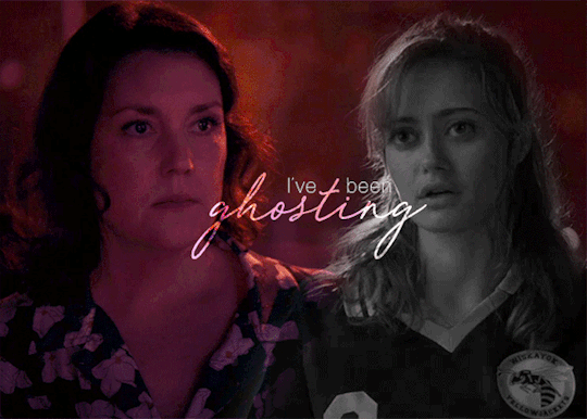
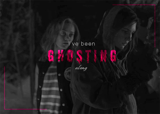

YELLOWJACKETS
⤷ GHOSTING by MOTHER MOTHER
#im not gonna whine about the pixels bc im a big girl and im still proud of the coloring and blending and typography#please tell me theres an overlap of yj fans and mother mother fans bc this song is PERFECT FOR JACKIESHAUNA#this song is so fucking beautiful its literally about a ghost falling in love with the person theyre haunting are you fucking kidding me 😭#actually this whole album is very yellowjackets i want hayloft to play in the show so bad#my gifs#yellowjackets#jackieshauna#jackie taylor#shauna shipman#yj#yellowjacketsedit#mother mother#tusercj#tusermiles#tuserdana#tuserdee#tusermich#tvedit#wlwsource#userlgbtq#pink#this is my favorite gifset ive made since my pinned post#might be time for a new pin….. 👀
199 notes
·
View notes
Text


YOU WERE MISTAKEN, WITCHER.
#thewitcheredit#witcheredit#the witcher spoilers#the witcher#geralt of rivia#yennefer of vengerberg#cirilla of cintra#jaskier#userbecca#useravia#userava#ughmerlin#tusermich#edits#it's about the tragedy of it all#i just wanted to use this quote so bad but then i had a mental breakdown over the typography as usual#and rethought about my existence#then decided i couldn't let angsty gifs go to waste and here we are#the way this line was delivered wheeeww#the sense of powerlessness that it brings#when doing your best to protect those you love isn't enough#such a heavy burden to shoulder
530 notes
·
View notes
Text


Come back if you miss home. (r.s ; crush)
#unknown#unknown the series#chris chiu#kurt huang#y'all saw it too right???#i'm so bad at typography#edits#drama: taiwan
131 notes
·
View notes
Photo

COUNTDOWN TO #THIS IS WHY
● day 4: favorite lyric from this is why
c'est comme ça / paramore
#damn every one else's gifs/edits for today's prompt are so good this is so bad in comparison#countdowntotiw#paramore#c'est comme ca#paramoreedit#pmore#pmoreedit#lyrics#lyricsedit#dailyladylyrics#usermusic#collage#collage art#typography#typoedit#userkam#usercaro#dailywilliams#usercellphonehippie#*myedits
860 notes
·
View notes
Text
Anaïs Nin, in a letter to Henry Miller, d. March 2, 1932, from A Literate Passion: Letters of Anaïs Nin & Henry Miller, 1932-1953
#anaïs nin#anais nin#henry miller#a literate passion#lit#literature#typo#typography#fragments#light academia#dark academia#aesthetic#oops typo!#ANAIS YOUR MIND#she was so right#maybe this is only revolutionary to me bc i sometimes feel bad abt living in my head so much ahskdlf#240327
64 notes
·
View notes
Text

Taylor Swift - Down Bad
#taylor swift#down bad#taylor swift eras#the tortured poets department#the tortured poets society#taylor stans#taylor swift lyrics#lyrics#tswiftnation#lyric posting#lyric quotes#lyric edit#i love you taylor#typewriter#typography#writers and poets#poetry#poem#taylor nation#the eras tour
93 notes
·
View notes
Text
“Look at You Now!”
mixed media
#mm#my art#my edit#digital edit#oddcore#ventcore#weirdcore#angercore#ragecore#nostaligiacore#dogcore#dog motif#bad dog#mixed media#typography#visual poetry
55 notes
·
View notes
Text
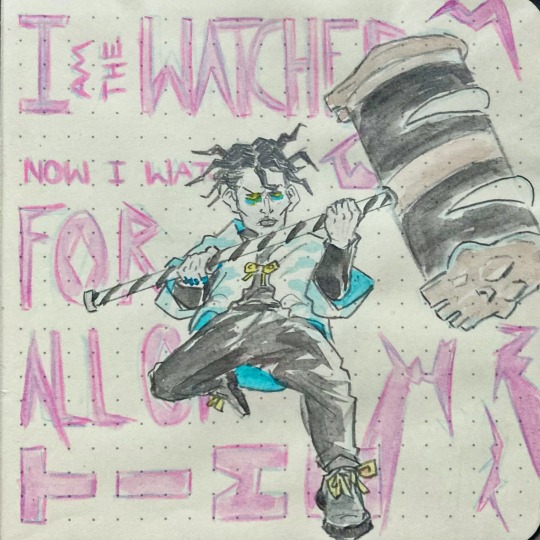
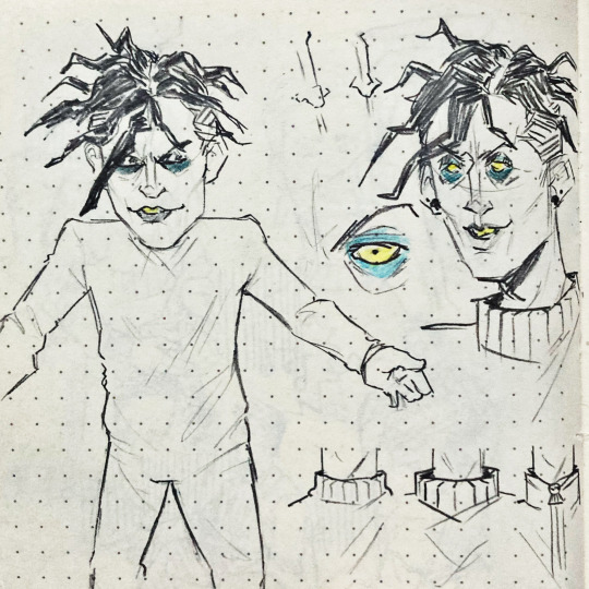
I saw this lil jacket and immediately thought of my favourite corpse man

#by god i‘m so bad at typography#these were actually the last two pages of my sketchbook and i love to have him there#bigtop burger#btb#bigtop burger cesare#btb cesare#bigtop burger fanart#btb fanart#fanart#my art
126 notes
·
View notes
Text

GOOD or BAD day? 😇 Typography design
Get your unique & creative logo now!
PM for details & reservations! 💌
🙏🧡
#good#bad#ocean#sea view#water#typography#logotype#smart#minimalism#geometric#artwork#ui ux design#business#company#marketing#luxembourg
89 notes
·
View notes
Text

memes that won't leave my head until i make them
593 notes
·
View notes

Last Seen Blogs
cinematicbits
CinematicBits

houflo27
In_sane
corvidhours
noah czerny winter
alansbakery
🍉 Sunny 🍉
regiszinkron
gruber hugó